Transcripts
1. Let's Make a Writing Set with You Art: Hey, there. If you are looking to build
your watercolor skills, you are in the right cloud. My name is Tanya.
We're exploring and planning our three projects. This is our main objective. I'll show you how to plan out, and also how you are going to
warm up in your sketchbook. Your three projects are going
to form a mini collection. This little collection, you'll
be able to share proudly. Come on over to my
creative corner, and let's play with
our watercolors, while exploring how to
plan like an artist. Putting everything together
from the inspiration phase, the planning out of the project, the Sketchbook Warmts, everything works
together in this class. We will go over the
winning strategies that I use every
day as an artist. Join me so that we
can get started. In the next video, I'll go over the class
project with you.
2. What We'll Paint Together: Hey, there, isn't it wonderful to come
together to co create? We are going to make
three projects, a lovely card, an embellished
and a letter set. Our theme is vintage florals, and each of them can be
interpreted in any way you like. You can have imaginary
flowers, real flowers. You can copy your favorite
blossom from your garden, or you can just follow
along as I demonstrate a few varieties while I plan and warm up
in the sketchbook. Because our class is mainly about planning like an artist, I would like to see
your planned events. I'd like to see a picture
of your sketchbook, a written plan or a little
bit of a brain storm idea. And then a picture of
your color palette. Which colors did you choose
to get to where we are going? Remember, our theme
is vintage floras. And you can post a few
individual elements so that we know what
elements we are going to repeat in
our mini collection. Lastly, a snapshot of
the completed pieces. Once your project is complete, you can upload
your work by going over to the famous green
button on the right. This is just below the videos. Here you can add a cover image. Give that image a name
and a show description. You can post additional images by clicking on the image icon. And then the whole
class community can see what you were up to. Remember, to like
each other's work. This is a supportive community. We can share this class
over as many platforms as we like so that others
can find it easily. There you have it.
In the next lesson, we are putting
together and gathering inspiration from our
old sketchbooks. If you don't have any
sketchbooks, that's all right. You can follow my plan. See you in the next lesson.
3. Creatively Inspired: Finding inspiration. I know all too well
how important it can be to find that perfect
piece of inspiration. The importance of a
sketchbook is very relevant now because everything you've done in a sketchbook can
be referred back to. That way, you have a memory. Another excellent way to find inspiration is by re a palette. All of the colors can be
repurposed into something new. I often keep some remnants of watercolor paper near my desk, and when a project is complete, I place the colors
onto it as a reminder, or I swatch out the colors as I'm
experimenting with them. Sometimes, isolating the
mixed colors from the rest of the palette can give you a clearer idea of
the overall mood. At this stage, you could add
a few variations to play with and see what they look like before you
decide on any colors. There are so many ideas, and you don't have to be
stuck on color choices, too. They are endless.
Keeping a record of the old colors can
come in very handy one day when you might
need some new inspiration. Taking a fresh look at some
of your favorite colors. The ones that will always
be referred back to. Making these new combinations
is an excellent way to come up with more mood
enhancing scenes. When I look back at my
2020 color palette, I'm still surprised
at how many of these favorite mixes I
refer back to altogether. Almost every collection
was created with only this palette of
favorites in 2020. With all my sketchbooks, I mix up colors and adapt the palette and set the mood
for the following year. Every sketchbook becomes a
reference to shades and colors I've loved and each stage
of my artist adventure. Looking at the images
in the sketchbooks, you will see a reoccurring
theme with the colors. Here are some more examples. Even though you can use
nature as a direct reference, I often draw imaginary flowers. I'll study one, and
then put it away and sit down with my sketchbook
and recall from memory. I recall the shapes
and the patterns, and sometimes the colors, or I just change the colors. Our imaginations will fill in the missing information to
bring the florals to life. Even something simple like
a page can be filled with mark making and elevate your
inspiration and mood boards. This way, you can experiment with brushes
and mark making.
4. Set up & Colour Discoveries: Setting up our desk and
getting our tools ready is as important as any part of
planning our project. So as an artist, I know, it's extremely difficult to be creative and tidy
at the same time. But before we can
plan anything out, we need to set up our
desk for success. As always, we have
water, a napkin, or a blotting paper, a candle, and flowers
for reference. The other things on the
table are as follows. If you are right handed, keep your water brushes and
paint on the right side. And the same goes
for the lefties. That way, there are less messy accidents across
your work surface and paper. Keep your coffee, tea, or other beverages on
the opposite side. That way, your brush doesn't get dunked into the
beverage by accident. Hasn't that happened
to all of us? Grab some of your favorite
watercolor papers. I'm using Saunders water fit and a student grade cold press. The best brushes to use are the ones you're
already familiar with. When we make the cards, you can either paint on the front cover of
watercolor paper, or you can paint on
a separate piece of paper and stick that
onto regular card stock. You will end up with a
pretty original image when you do it on a
watercolor folded sheet. Regular card stock, buckles
with watercolor paints, and I do not suggest
that you do that. Use the set of watercolor paints you already have access to. The set I'm going to
use for this class is the Medan watercolor
set of 45 half pounds. It has become a favorite over
the last couple of months. Start by mixing some
shades that you like. Mixing these in wells
will ensure that you have a nice puddle
of each of the colors. If you don't have wells on
your palette, then it's okay. You can always use
a dinner plate. A dinner plate works well. Once you have your vintage
floral colors mixed up, you can take a few moments to concentrate on the next section, as I'm going to go over a
little bit of color adjusting. When you look at
your color wheel, you will notice that there are colors that are
opposite each other. So if you have a red and you dunk in a
little bit of green, your red is elevated
to a next level. The same goes for the green. When you tip in a little bit
of red into your greens, that color already looks better. Using the complimentary colors goes for the other ones as well. Each color has their opposite, and that is their compliment. Look how a small amount of
green into a red can move the color from a playful and whimsical to a
sophisticated scene. H. The same goes for those
bright bright colors. If you add a drop
of its opposite, the color doesn't
scream at you anymore. Take a few moments to
play with your colors, adjust them and swatch them
out until it looks good. Test them out on that
little test paper. In the next lesson, I'm going to show you how to plan
out everything.
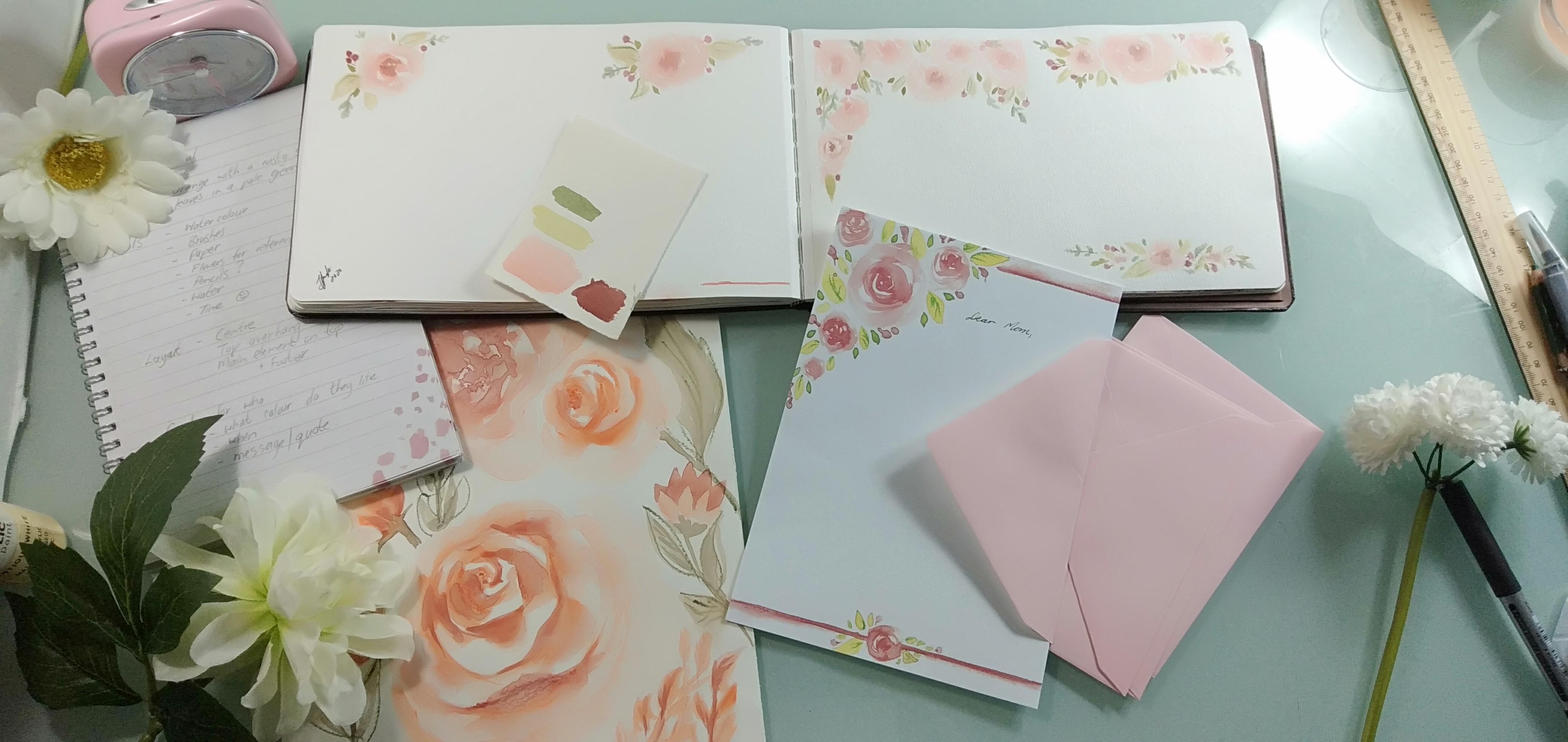
5. Plan it Out: If Brainstorm with a few ideas to get your mind organized. Plan out things like the theme. Our theme, of course,
is vintage roses. Choose your final colors, collect your supplies and tools. Consider the layout
you'd like to use, maybe something in the center or an overhang from the top. What about elements
around the page? Maybe leave an opening
for you to write a quote. You can think of making
this for somebody, and that means it will be
according to what they like. Maybe you are planning
for your next commission. Using the colors you have chosen from our
previous lessons, you can warm up with
a few floral sketches in your guest sketchbook. Yes. Don't make these
any kind of special. These are just warm ups. I don't know about you, but I can't just jump in and create. I need a few warm ups
before I can do that. And that's just another reason why I love my
sketchbook so much. Jotting down your
progress helps to get your mind in the zone. This is an excellent
habit to keep, and it helps you to stay on track of what you did
with previous projects, just in case you need
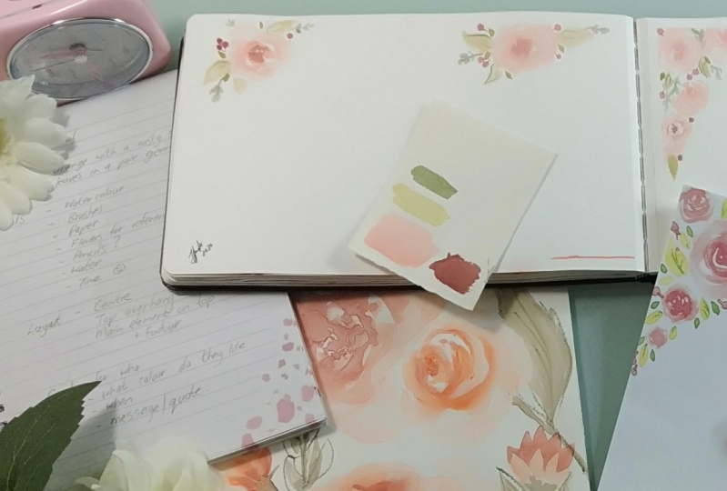
to repeat them again. Oh. Step four. For the
planning phase, I've set up some more colors and narrowed it down to
just four shades. I took an orange from
the inspiration piece, a light green, a dark
for the berries, and a deep green for
those smaller leaves. Swatch them out on
the water color paper and see if you like
the color harmonies. You can still refine some of
the colors at this stage. A hint of something added can shift the colors
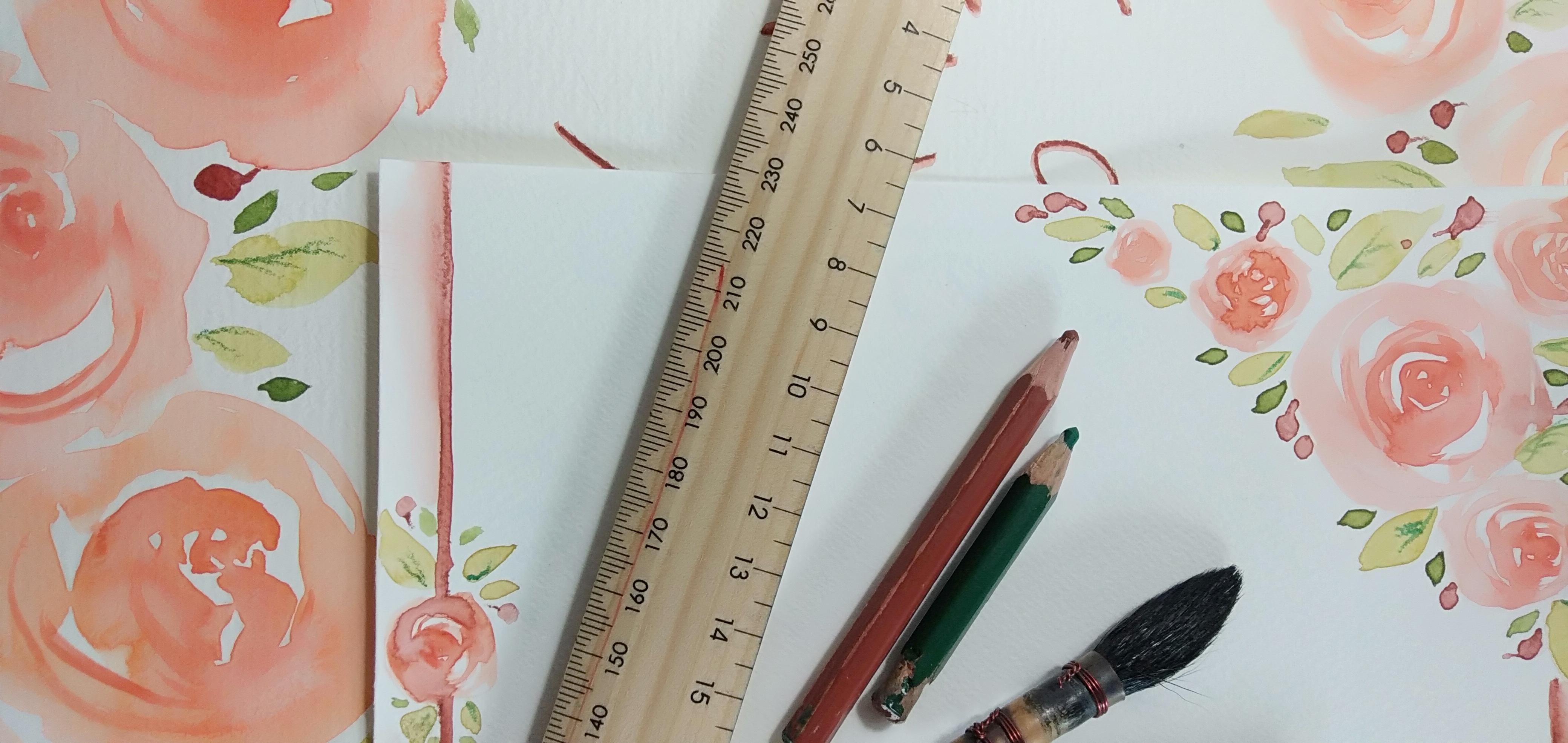
into balance. Step five. Draw out the basic shapes of
the four elements. You are going to repeat
across the projects. Trying them out here and playing to see how the
sizes work with each other is a good
indication of whether you are going to like
the end result or not. Deciding on a single
large floral element, a large set of leaves, small sets of leaves, and a few berries will bring the planning phase
near completion. It's time to start
with a flower. I chose a rose. Get some colors on your brush
and begin in the center. Dip the tip of your brush
in water as you go around, and for the final outer petals, just use clean
water to spread out that pigments and create a real watery
feathery petal look. If you consider the area that
each element will take up, the flower is the
biggest element. Therefore, the large leaves must take up less space
than the flowers. The same goes for
the smaller leaves as they will take
up even less space. And lastly, those berries are scattered between
all the other elements. Oh. Use a watercolor pencil to
draw out the berry stems. That's only if you want
to get into details. Step six. Time to go over our sketchbook and
put everything together. Mark out the four sections with either washi
tape or a pencil. Remember, we are practicing
in our sketchbook after all. Nothing needs to be precise. Thinking about
composition, we can place our first rose in
the top left corner. In the next block, add a
rose in the top middle area. For the third block, we can overlap several roses to hang over the
top end corners. Throughout the process, I'll be darkening the centers just to keep the elements as close to the desired end
result as possible. For the fourth block, add three roses to the center. O large one in the middle with two smaller
ones on the side. Also add a small
rows at the bottom. Next up is our large leaves. These are in the
lightest green shade. Go over all four blocks, adding some leaves strategically and keeping the
cover area in mind, like we practiced in step five. Everything is
pretty random as we are not creating
a repeat pattern, but practicing the layouts. Fill a few darker leaves in and keep them
random, remember. Speckle in the last few berries, Maybe add a few
more darker leaves here and there and finish
off your sketchbook. Oops. Maybe add
here at the bottom. We could fill in our names
or add some branding. Step back to see if you like the layouts and add
more if you want to. But don't get carried away. It is now time to commit to our larger piece and apply what we have
learned here today. Throughout our project,
I'd like you to maintain the theme and
the selection of colors. When you repeat your
knowledge with more products, you can use any other
color you like. This way, you'll have
cohesive collections, and after this clause, you'll be able to implement
them over and over. Sticking to a theme is a wonderful way to
build on a collection. That is our focus so that
our work can be unique.
6. Paper Prep: Do you know what helps me the
most when it comes to doing my art is having those
reference pictures, reference colors,
and our examples. This helps you to keep focus and that way you know
where you are going. Let me get the
sketchbook out again. Our random warm ups, and of course, the planning. Now, you don't have to copy your practice images
or anything I'm doing. But you can use these
as references instead. That way, you can
also try and keep your mind focused on the
projects that we are busy with. So when I'm looking at
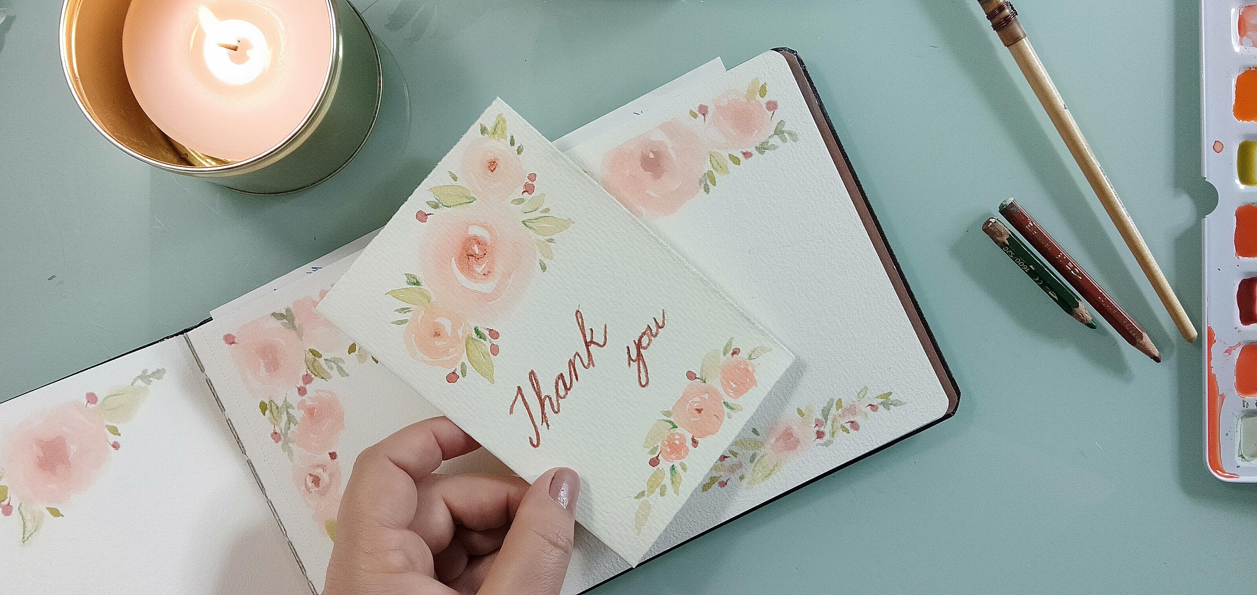
these Each one of them will be able to bring
something to a creative piece. Now, in the
beginning, I told you that we are going
to make a card, and the card is going
tosist of a five sheets. You can either cut them from larger pieces of paper
like the A four, can be cut into two
pieces, just half it. This is going to
be for the card, or you can tear
them out of a pad, a watercolor pad. Okay. So what you're
going to do is take that one sheet and
fold it in half. I normally go corner to corner and then just
pinch the paper. And then while it's
on a flat surface, line them up, and then drag your finger across the
middle and up and down. Then you can take
a sharp object. Don't use your nail
with nail varnish on because the varnish will
transfer to your paper. I normally use a blunt object. Or a bone folder. Just press down and get
that fold nice and even. That's the card, and we're going to work directly
onto the card. You can, of course, have
regular card stock, which I don't have to show now, and only use part of a sheet. Paint your picture on there and then stick it onto
the card stock. I'll set this aside. That's for our
card. The next one, we can do a little letterhead. I was thinking of
this design and then repeating it at the bottom. So we'll have roses overlapping there and
roses overlapping here. But there'll be a
definite indication of where the top
and the bottom is. So I'll keep that one
aside for that process. And the last one
is for the quote. Now, I'd like you to frame
your quote when we're done, just so that you
can have something inspirational in your
office or creative space. For that, we are going to
use a full A four sheet. Now, it depends on you, whether you like a landscape
scene or portrait scene. You can decide. We'll be doing a little bit
of planning so that you can just orientate yourself
before we set color to paper. For our final product, we are going to do
a light drawing, then the main painting
of the layout that we selected from
the ones we practiced, doing the final details, and if we're going
to add any writing, we can write that
in straightaway. O lovely way to keep track of your progress is to keep
your notebook handy. Sometimes I make notes
inside my sketch books. But mostly, I keep the pictures and the words
separate from each other. Let's make some room so that we can start with our projects. I think we can start
with the card first. I'm not going to take this
too far away because I want something to look at
while I'm doing the work. This is going to be a reference. And I'll be putting this
up in front of me as well.
7. Paint all 3 Projects with Me: Because I might be
going over the edges, I'd like to protect
the inside and the back from any color spools. I'm just taking a
normal piece of a paper or printer paper and putting it in
between the like that. And I'm going to draw
ever so lightly, a little rose on top with the two smaller ones just to indicate where
I might want them. And just a line here and there to guide my eye towards
where I want the leaves. With the rose color,
dip your brush in, start in the center,
and add water as we go around just like we
practiced in a sketchbooks. A it There's nothing much
different than the card, except we're not
folding our paper, and we are not going to do a
large element on the front. We are simply going to add a
little rose composition on the top and align with a small little
rose detail over there. That way, you'll be able to
fill in your addresses and dates over there and continue in the rest of the
section for your letters, just like in the old days. Again, small little indication of where you want your rose, one or two smaller
roses on the ends, and then down here, one element, maybe two, and then just a line or two to indicate where we are
going to place our leaves. And it's the same flower
we are painting because we're not varying and
switching to other objects. We are sticking to the
ones we know are working. And that way, we'll have a whole collection
that looks the same. Make sure your bottles are replenished with the same color. Keeping your recipes in mind, and also keeping notes of
your recipes will help you to remember which
colors you created. Before I start on
the big project, I want to make sure that
I have enough paint. Let's do this one landscape
since the previous one. I practiced. I'd like
to make a few changes. So let me show you
what I'm doing. Looking back at my collection. I feel extremely proud. And I'm sure when you
have finished this class, you'll have that same feeling. Even though these two are the
same, they are different. And you can use both of them. We've got a collection, and that collection can become.
8. Bonus Video: Print Your Set at Home: Now that you have created
a mini collection, there are a few things
that you could do with it. Since I need a letter set today, I am going to print
out my letter design. This is how you used to do it
in the old days, you know. We didn't all have
computers in our homes or fancy programs to
edit and upload our art. We may do with what we had. And my favorite way
to use what I've created is by printing
it directly at home. If your design is pristine
and clean without any marks, you can also just scan and print it directly on
your own printer. Start by cleaning the
glass surface as you may have stray fingerprints
or dust particles on it. That will influence the
outcome of your print. Print out a few pages, as many as you need
to write your letter, and take them over to
your cutting board. Here, you can align your papers. Make sure they all
on top of each other and use your cutting
tool with your ruler. Press firmly down so that
the sheets can be exact. Now start cutting by
gliding your blade across the surface against the ruler as oftentimes as is necessary. This will give you an even cut. By going over it several times, you will ensure a clean line. And there you have it, a
letter set printed at home. All you need now is an envelope, and then your letter
set will be complete. You could have your letters and envelopes printed
professionally. This will give it that
real luxury feeling. When you have a favorite
one of your art pieces, frame it and have a
look at it every day. Even full an empty
spot on a wall. And if you're really fond
of your little collection, just add all of it in a frame
and keep it near your desk. That way, you can admire
your art at any time. So right now, I'm off
to finish this later.
9. Thank You & Final Thoughts: [No Speech]
 Tanya J. De Wet, A Creative Mindful Life