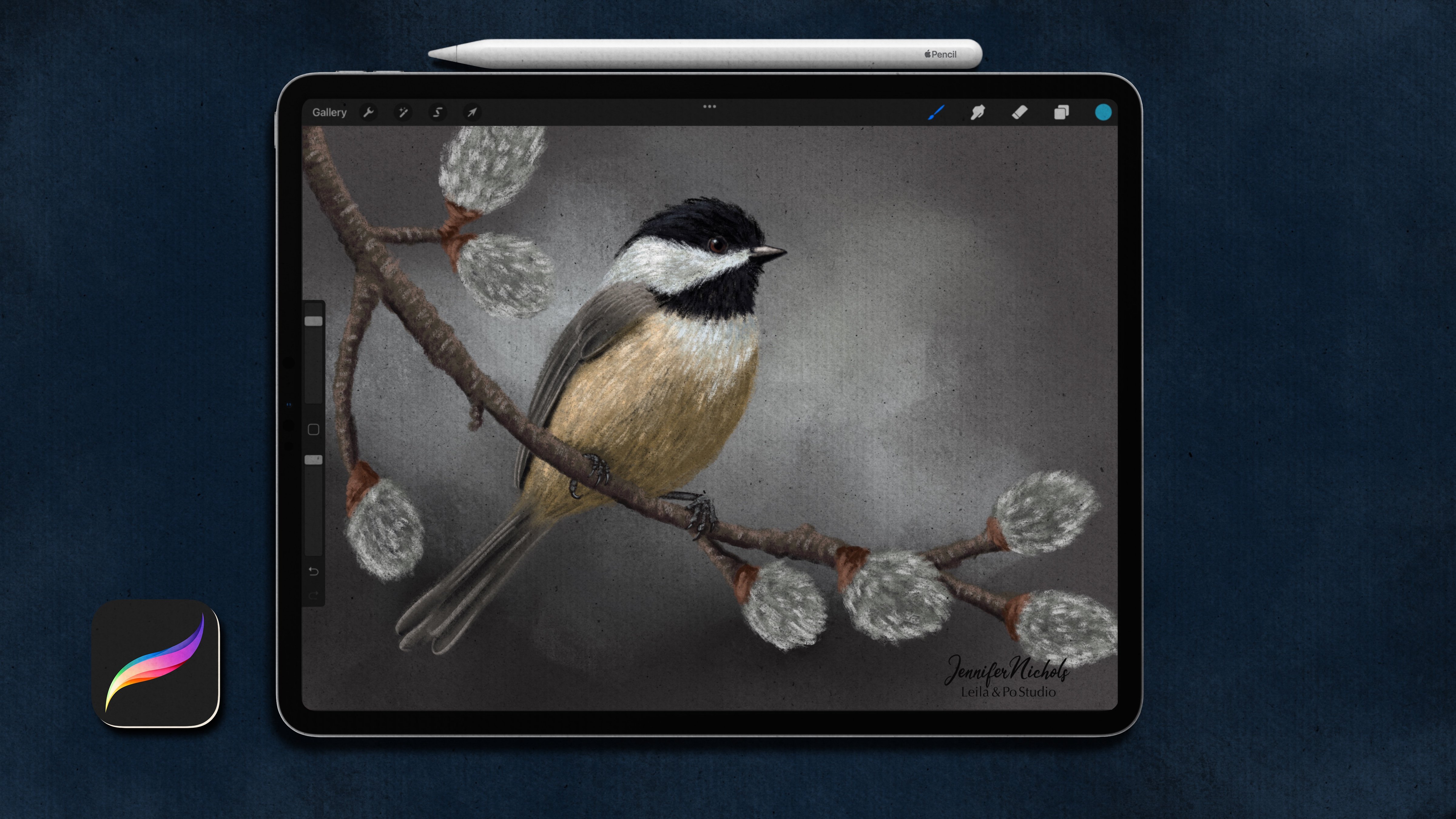
Transcripts
1. Introduction : Hello, my name is
Jennifer Nichols. I'm an artist and teacher
and a fabric designer. I loved the Procreate app and teaching everything
I know to you. I've always been a
teacher and I've been teaching Procreate
for quite some time now. And it has been so fulfilling
to help other people on their art journeys to
improve on their skills. Learn more about Procreate and just have a more fulfilling
creative outlet. I have dozens of classes now on various topics and styles. So there's something
for everyone. I love making procreate brushes. I teach how to make
procreate brushes as well, but I gave away a
lot of Procreate brushes to my
newsletter subscribers, also to people who
take my classes. But be sure to sign up for
my newsletter as well. And you'll get access to all of the past brushes
that you've missed. And continuing to access each
month to new free brushes. You can find a link
to sign up for my newsletter over
on my profile. And also in the about
section of this class. I first taught this class in a creative retreat
that I was part of. And I'm really excited
to bring it to everybody else who wasn't able to
be part of that retreat. I'll show you a very easy
and colorful round and then we'll delicately put
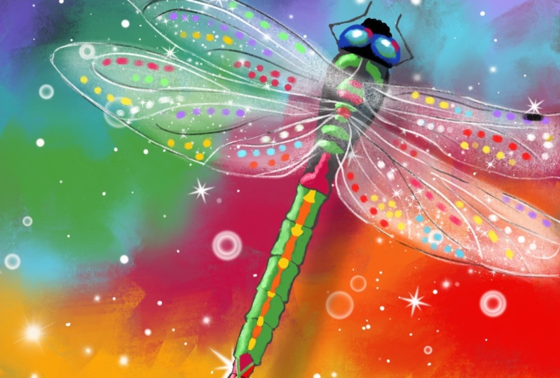
together the dragon fly in a very simple way. You're gonna be surprised at how simple and beautiful
this project is. I do provide a
bright color palette for you that you can use. Any color palette,
any color palette. You can use your very
favorite colors. You can do some fun things
with warm and cool colors. Anything goes. It's a really fun class with gorgeous results and I can't wait to see
what everybody makes. Be sure to post
your class project so everybody can
see what you make. Leave a review so we can all
see what you think of class. And I'll see you in class. Enjoy.
2. Downloads & Class Project: Alright, to get
to the resources, you need to be in a browser
in landscape mode like this. And this is Safari. I hear about some other
browsers having some problems. So if you have problems, try a different browser. If you go to the projects
and resources tab, this is also where you create a class project and your
resources are right here. Really quickly. For creating a class project, you just tap that button. This first button is specifically
for the cover image. This button, the image
button down here, we'll add images to the
main part of your project. And even though you can only
have one project per class, you can come back
and edit it and add as many images as you
like, and then publish. Your class project, of course, is to create your own
gorgeous dragonfly, and I would love to see it. To download these resources. I quickly wanted to
mention that if you have taken my pastel chickadee class, you do not need the brush
set of genes pastels. That's the same brush set. And you'll just need the dragonfly brush and the
bright pastels palette. So for downloading
anything here, you just tap on it. It will ask you if
you want to download, you just say yes,
you can see it. Download right there, and
tap on the other one. Download, tap on any of
the ones that you need, and then you can get
to them right here. Just tap on it there, or in your files app right here. And it will be in recents, and it'll be the very
top ones right here. These are not zipped folders, so you can just tap on them and they will open up
right into procreate. If you have Procreate
already open, then they will just
go ahead and import. Just like that. When
you have a zipped file, you have to tap on it
first and it will end zip. And then you can find
the resources within it. Your brush sets will be at
the very top of this list. So the dragonfly is a stamp that you're going to need
along with the pastels. And your pallets will be, if you tap this palette
option at the very, very, very, very, very bottom. And then you can
drag and drop it and reorder it however you like. This sparkle brush
in case you missed it in the intro, Is a brush. I teach you how to make
in the Dual Brush class. You can find that
class by going to my teacher profile and going all the way down to
the brush making classes and the Dual Brush
Class is right here. You can see the sparkle
brush right on top. And be sure to check out my other classes
while you're there. I've got quite a few of them. Alright, let's get started.
3. Prepping the Canvas: So here's one example
of many that I've done. They all turn out a
little bit differently. So we'll just see
how it goes today. The first step is
going to be to set up our canvas and get this
lovely background. You can create any
canvas size you like. So if you have a favorite
size you like to print or post online, whatever you want to do. I'm gonna go ahead and create
an eight by ten at 300 DPI. So if I tap the plus sign, plus sign again, go two inches. And let's see. I think I might make it
eight inches wide and ten inches tall so that I
have something different. I don't think I've tried a portrait mode
for this work yet, so that's just something
different for me. And for color profile, I always choose this. Interesting. This very second when it, this actually is,
something's wrong here. This should say
Display P3 right now, it says unnamed, but yours
might say Display P3. I don't know what's
going on with that. And then the one
directly under it. This very first sRGB profile is a great profile
to use in general. So I don't have a lot of
details on color profiles, but this works
really well for me. And tap create, your
Jens pastel brush set has way more than what you
need for this activity. We're gonna be using
this side stick pastel and this soft
pastel and blender. But if you like a different look than what those are giving, then try out some of the
other brushes as well. These are gonna
be pretty smooth. And then we're also going to be using some of these
texture brushes. So we'll get a nice
texture on the canvas. You'll also need this
dragonfly stamp. So first let's get our textures. And to really see our textures, I'm going to change
our background to something that is not white. So I'm going to bring it down to a mid tone
gray if you want to just go straight across to
gray for now, that will work. I'm going to add a
few layers and just kinda come to the top here
and start with some textures. Play around with these textures. If you have not taken my chickadee pastel
chickadee class yet, then there's some really great information
about the textures. But I'm going to
go ahead and do. I really love this
craft paper texture? So let's do craft paper. And on a mid tone gray. So again, just kinda go straight across and you can
play around with this. And then we're going to change the blend mode to color burn. Figure out what size you want. You can see the grain size
changing and whatever you do, just make sure that you cover the whole canvas without
lifting the pencil. And then hopefully you can
see that texture on there. Now here's one thing
about Color Burn. It doesn't show
up on all colors. So I'm going to come down to a different layer
and just pick a, a fun brush and get some
colors on the page. So if you find your
bright pastels palette, then if you just tap on
one of the colors or you can tap on the three
dots and set as default. That's two ways to get
it to set as default. And then you can switch to this disk mode or
whatever mode you like to view your palette in and have your bright
pastel palette here. This is probably
pretty close to the gray that we've
been choosing here. And I'm just gonna
go ahead and pick a bright red and get
some bright red down. I don't know if
you can see this, but the texture of the
color burn is barely, barely, barely
showing up on that. And then if you get a
really light pastel, the Color Burn layer barely
shows up on that as well. But some other
colors do just fine. Let's see. So you can see the speckles and you can
still see them on the pastel. But what really works is getting a layer that is on multiply and you can
test out other layers, other blend modes as well. So here I'm back up to our blend mode layer or Color Burn texture layer and I'm just going to duplicate it. And I really like
it like that too. I'm going to switch
that one to multiply. So I tapped on the N and now
I've gone down to multiply. Now you can see here, if I come back down to this colorful layer
and add a white too. Without the multiply layer, you really can't see any
texture on the white at all. But with the Multiply layer on, you can see the texture, but it's very gray. And you can see it's
very gray on the pink. So we're just experimenting with trying to get some
texture that shows up well on lots of colors without changing the color
to drastically, it will change it some. I'm going to turn the opacity
down on the multiply layer. And I've zoomed in and I'm watching the pink and the white mostly to make sure that
it's not looking super gray. And I can still see some
good color on that red. And I think I might go ahead and duplicate this Color
Burn layer again. Maybe we could have used a darker gray to get it to
show up a little bit more. That craft paper layer
itself, it's just speckling. It doesn't really show
up super-duper well, so it's not a really
obvious texture. Now, I think I like that. I'm going to test out
some more colors. It's showing up quite a
bit over here on the gray, showing up on purple. We've got an orange. How about a yellow? Yeah. And so I'm going to swipe on my three
texture layers. I can probably combine it. Let's try this. Let's watch and see if this
makes a difference. I'm going to combine the
two Color Burn layers here. And nothing changed. So that's good. So it kind of just
joined them into when. It looks good. I think I like that, but let's group those two texture layers together and just toggle
them on and off and decide, did those really change the colors so drastically
that it's going to make it really hard to figure
out what color to really choose when you
want to pick a red, for example, I think it's good. It's adding texture
and it's adding depth. But it hasn't darkened
anything to too much. It does darken some of it,
but I think we're good. So that again was the craft paper texture and
definitely play around. You can see that this one
is going to be darker. So if you test that one, if we just come in here and add a new layer and maybe
change that to color burn. Choose a gray. That's darkening
things quite a bit. So if you turn that
one on and off, look how bright that
oranges getting. And I'm pretty sure
the camera is showing these two colors way brighter
than they actually are. So definitely test out. This one looks like a totally different color with that layer. Test out all sorts of
different layers of texture. I like doing two sets. So a color burn and a multiply
of two different brushes. So you can do another one with the pastel board or
whatever you went. Then you can clear this layer. You can go into the wrench
tool and go to videos, turn the time-lapse off, purge it, and then
turn it back on. So now all of that testing
that you just did isn't going to show up in your time-lapse if you like to use time lapses. So that's nice. You can label your layers here. I'm really bad about that. Maybe just label
the group textures. But I do recommend
labeling layers. So it's been about three months since I've done this lesson. When I came back to review
which layers that I used, I had no idea. So if you think he might use the information
in the future, if you come back and go, ooh, I really like those textures. I wonder which textures, those where it's probably a good idea to go ahead
and label your layers. I'm just really bad about it. I think I was gonna
go ahead and do the background in this video, but I'm going to push
that to the next video and we'll get started
on the background.
4. Background: All right, Here we are. Let's go to the
very bottom layer. And I'm gonna go
ahead and darken my background a little bit more. I don't want it black. If I, if I go black, it's not going to show
any texture at all. I'm gonna go pretty dark. And let's go to this
side, stick pastel. So if you think about this
color wheel and three colors, so you have red, orange, yellow, green, blue, purple. So three colors in a row, no matter where they are on the color wheel, are
analogous colors. So red, orange, yellow,
orange, yellow, green, yellow, green,
blue, and so on. If you're choosing analogous
colors next to each other, then when you smudge, they're going to
blend really well. So red and orange blend
together really well. Orange and yellow
really well, and so on. If you're choosing colors
that are complimentary, so they're on the opposite side of this color wheel
from each other. They are going to get a little
muddy when you blend them. They still look really
good together though. I really like this
blue, for example, like this bright blue
and red together. So if you're putting complimentary colors
near each other, just be careful when
you're smudging. We're gonna be adding a bunch of colors right now and then
we're smudging them. If you want. This side, stick pastel smudges as it goes. So not really, but it kinda makes it look
like it is smudged. And think of this as a little
piece of pastel that you're holding on its side and
wrapping around on the paper. So as I'm thinking about colors, I want contrast, I
want some darks, and I want some lights. I don't want it to be
all these brights. So I am going to add some black, even though I have
this dark background. And I am going to just
keep that in mind. I'm probably not going
to use white at all. Maybe it will look good. I haven't experimented
with white and I'm not wanting
to do stripes, but that is a really fun Look. If you wanna do
stripes or circles, start out with a super
bright center and get darker and darker,
anything you want. So I'm just going to pick
some of my favorite colors. And you can see here it, depending on the size
canvas you used, the percentage is different. So if you want a small piece of pastel is just going to take you longer
to fill your page. If you use a larger one, if you use a really big when you're not gonna be able to get very many colors on there
before it's all filled up. So just pick something
a little in-between. I think I'm gonna go for about this size
right here. Alright? And I'm really lightly
holding my pencil and just add in some color without
it looking like stripes. Bouncing around a little bit. I know I didn't stick with an analogous thing
here because I really like the bright blue with the red and the pink
near each other. But you can stick to
some analogous colors. I'm going to go with
this real navy here. It's not quite dark
enough for me here. Maybe even black.
I've been here. I might stick with black
just up in the corners. They cover up that navy blue. I'm not a fan of that right now. And I don't think
I want the green next to the black either. I'm also not doing just a
little tiny patch of color. I found that it ends up being
kinda too spotty, I guess. I don't know how to explain it. You just do whatever is
your preference here. And this will take
experimentation as well. Of course everything does. Use maybe just your
favorite colors. Did I do this orange
yet? I don't think so. I'm personally being
a little bit careful about getting black
next to orange and yellow just because I worry about it looking like
a bumblebee or something. Alright, so I have some dark
and then all of my brights. And I'm going to tap and
hold this smudge brush so that the same brushes
selected for that. This is another
thing where you can change the size to
get different looks. So a smaller size,
again, take longer. But you can have some really cool smudgy streaks going on that aren't going to smudge big chunks at a time. So that's a really fun Look. I mean, a two-finger undo there and go a
little bit bigger. Personally. You could also smudge with this blender brush here or the blending
fingers brush. Definitely test out
and I barely tapping, just like I was barely tapping
when I added the color. And the reason I'm barely
tapping is because I can drag color and keep
the texture that way. I don't want to smooth
something until it's got no texture except for the texture layers
that we just added. I really liked the
brush texture too. So depending on your own
preferences for that, maybe you want a smooth
texture for your pastels. I'm really liking
this color down here. So spend some time doing some
smudging unless you just like it exactly how it is
once you get your color on. This part really is flexible. It doesn't really need
to be any certain way. And that's it. That's
as simple as that. And so when you're ready, when you're done and
you're happy with your background just
however stripy, certainly a morphous
you want it to be. Comeback to the next lesson, I will show you the dragonfly.
5. Dragonfly Body: All right, Time for
our dragonflies. So go to the dragonfly brush
and get a pretty big size. Well, let's go to
a new layer first. We're gonna go to
a layer just under the texture layers because
this is just gonna be our sketchy outline brush is not going to be used
in the final design. I'm going to choose
a different color here. So you can see it. Since this is a sketch layer that we aren't using
in the final design. You can move it
around quite a lot. Normally in Procreate you can, you really should only
move something one time. You can move it a lot while it's selected before
you de-select it. But once you
de-select something, you should just
keep it how it is. So you may have noticed that if I'm pinching my canvas
out here are my screen, it's not even my canvas. I can move the canvas around, but if I pinch in here, I moved the selection around. If you're way zoomed in
and you can't really get to a space where you're outside
of the canvas like this, I'm barely able to do. Then you can tap and hold
that arrow and then pinch inside of the selection to
move the canvas around. And pinch outside of the selection to move
this selection around. So that's just a little trick. That is fentanyl. So now is the time to pick where you want your
dragonfly to be. And since it's a sketch, you don't have to
worry about if you change your mind and move it. If you have it going
off the edge and you de-select it will crop it, but you can two-finger
undo to get it back to its original state
or just re stamp it. I'm gonna make it pretty big. O when Look, I keep
seeing online is a really big version
that's kind of off to cut in half like this. So that's kind of fun. I think I'm just going
to do what I've been doing a lot lately with this. And that is just sort of add an angle and crop it a
little bit over here. Alright, so I'm going
to de-select that. Now. If you have some
darks and lights had, you can't see the whole outline? I can see all of
the white outline. Go ahead and alpha lock by two fingers swiping
to the right. And it's a good idea to alpha
lock the layer anyways, so you don't accidentally
draw on that dragonfly layer. But it's also a good way to go ahead and change
some of the colors. For example, I could choose black and go back to
my pastel and say, I wanted this area right
here to be more noticeable. I could change just the outline
of that area right there. If you have if you're dragonfly, is over dark and light colors and you can only see part of it. Just darken or lighten certain areas so that you
can see the whole thing. I'm gonna go ahead
and leave my white. And I'm going to turn
the opacity way down. So you should turn your
opacity down as far as you can so that it's not really
impeding your actual art. Let's go ahead and just go ahead and add a couple
more layers down here. We have our dragonfly
Alpha locked so we don't accidentally draw on
it and our background. So let's go ahead and go to a layer right above
the background layer. And I'm going to start
with the body itself. We're gonna do really transparent,
sparkly lovely wings. But let's go ahead and
get that body there. And the body is something that you can do with most
of these brushes. Just play around. If you haven't experimented, I'm going to choose
the pastel pencil. And I'm going to choose
a pretty dark gray. Just for the base. I intended this stamp
to just be a guide. There are so many different
shapes of dragonflies. So you can use this as a guide, but make it super skinny, make it really abstract,
whatever you want. So I'm definitely going
to make mine just kinda skinnier just because I haven't really tried that recently. And I'm on a pretty big size. And I'm just going to, whoops, that ended up being this just
as thick as the outline. I'm just going to
spend some time maybe fast-forward this and
just start filling and just a base color
of the dragonfly, of just the body and the eyes
and the head, and the legs. If you want legs, you can change this color later, so don't worry too much about
what color you're choosing. It's gonna be on its own layer. So you can alpha lock that layer and change
it at anytime. And you can see I'm
bumping out at each of these segments just
as a little bit of a design choice there. What dragonflies do? Amazing segmented bodies there. I'm filling it in
pretty solidly. Also, I'm gonna be
using clipping masks. On top of this. I'm just trying to see if I got a similar look on both sides. Since I'm not really
following the outline. I'm going to go with
the full big eyes here. This brush has a very solid
edge and then a faded edge. So depending on, if you want the solid edge on
that outside edge, you might want to turn your
Canvas so you can get it like that and have the solid edge
right where you want it. And I'm going to go for a
smaller size to do these legs. Or you can do these legs
on a different layer. And I'm being really
sloppy with these legs. Now we're gonna go
to a layer above it, tap on it and tap clipping mask. So the only color that's going
to show up now is right on top of whatever we
have on this layer. So that'll be nice. We don't have to try
to stay in the lines. I'm going to choose some greens and bright pinks
and bright blues. And just get some fun
symmetrical designs on here. So first think about
if you're going to have light coming
in what direction? So if you, if you pretend
like you have a light up here and it's shining
on this dragonfly. Then maybe put some
light colors on this top-left kind of facing that direction on the
eyes, especially. And we'll get to that.
But also along this side. Along this side, if the
light is over here, might be a little brighter
than the other side. Generally, let's just
go ahead and do some back-and-forth symmetrical
designing here. And I'm going to, I'm going to stick with
this pastel pencil. I think. If I do some sort
of green design here, I'm gonna do the same thing
over here or similar. You don't have to
follow these lines. This is the first
time I'm choosing to follow these lines actually. Then whatever you do over here, It's just really
doesn't matter as long as things are symmetrical. It's going to look
like a dragon fly. If you want to put some little cut diamond shapes in here. Some lines that go
all the way across. Switch to a new color, maybe a bright pink, move it up brighter a little bit and get some splashes
of pink in here. It's kind of a psychedelic you can do to a new clipping
mask if you don't want to. Add this right to the layer
that you did with the green. You can do a new clipping
mask and have them separate. I'm going to choose
black and come in around the eyes a little bit, just to add some contrast, we're going to
brighten those eyes. Maybe up here on
the little nose. I know they don't have noses. Maybe you get some fun. Wet. I might go under. So I'm gonna go under
this green layer. I'm going to tap on the body
layer and add another layer. And it's automatically a
clipping mask because it was added underneath
another clipping mask. That's really nice. And I'm going to come in here and get a little
dark areas here. And they're sort of makes this segment stand out a little more where they are divided. Maybe on the sides here. You can always come
back to this two. And then either layer
works for the eyes. I really like the blue eyes. So I'm going to choose
first this really vibrant blue and get
some blue on there. Maybe some of that teal. And a super bright blue eyes are really going to reflect
whatever's going on out here. So you can do all sorts
of crazy colors here. Maybe a little splash of green. And then finally, a
little bit of white. Remember our lightest
coming from up here. So if we do a really
firm spot of white, it's going to make
them really look shiny when you zoom out. I think they need a little
splash of pink too. How about just some pink on this inner curve here and
the outer curve here. Alright, so spend
some time on that. And I'm also going to get some lighter reflective
areas on the back of this, but I'm gonna do it back
up on a higher layer. You can do it right
on the layer you did your colorful Stefan or add
yet another clipping mask. If you want to tap
the plus sign or just grab one of these
layers that's already there. All you need to do to make
it a clipping mask is tap the menu or the layer
and tap clipping mask. I'm just gonna go ahead
and do it right on the same layer as my
greens and pinks here. How about the green and
go really bright with it? It's really bright
and neon here. Yeah, I like that a lot.
I think I am going to go to a new layer just in case
I change my mind later. So go to a new layer and tap clipping mask and my light
is coming from over here. So I'm just going to put
some highlights here. Some bright, bright, bright
green here and there. On this top left side. Makes a big difference. Alright, spend
some time on this. And when you're
ready for the wings, start your next
video and we will do the weightings. See you then.
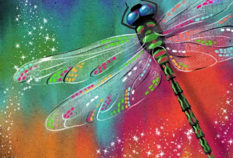
6. Dragonfly Wings: Layer 1: Okay, For the wings, we're going to go up and
layer not a clipping mask. And we're going to choose white. And we're gonna go to this soft pastel and
blender brush. Again. Just my recommendation, you
can try some other brushes. And I'm going to go
to a pretty big size. I'm just kinda thinking
about how big my wings are. This is our layer
where we're just doing some very faint
transparent anise on our wings is transparent
as a word. Alright. So I don't want it too big. I don't want it small
because I don't want just little tiny lines. And it's okay if you go out of the lines because you can erase. And there's a few
things to focus on. So I don't want to
fill the whole wing with white, even faded white. I want some of it to be
completely transparent. So I am going to focus on a
little bit on the tips of the wings and also
this inner corner here and sort of along the top. So I am going to go right
along the top here. Inserted define the
top of that wing. I don't want it to be
just a line though, so I'm fading it
down here as well. I am going to focus a
little bit on that tip. I'm going to come back
and erase some of these areas here so that
are outside the lines. It does not need to be
the same on this side. In fact, maybe where
it's over a dark color, it might be a little
bit more transparent. In that case, I might tap and hold and get that
same brush on as an eraser and take some of
that off. This bottom wing. I do want to focus a little
bit on this just so I make sure I can see
that the wing is there, right there and
they're going to go a smaller size and also define this area a little
bit right here and here. And then come out bigger and spread some of this
white around a little bit. Sorry, I'm talking so
quietly and concentrating. And again, I'm going
to erase maybe on a smaller size and sort
of clean up my edges. If I went out of
the lines anywhere, I don't want it a sharp edge. So I am using that same
brush to erase width. Alright, and then if you turn
your outline layer off and see what does it look like
without the outlines at all? I kind of see a stripe here, so I'm not liking that. Alright? So we can come back
and do more to this layer. We can add or remove from
this layer at anytime. If you want to label
it, if you can't see it very well there,
you can label it. And in the next lesson, we're going to add
all the details.
7. Dragonfly Wings: Layer 2: Alright, in case we want to change more on this layer later, we're gonna go to a new layer. And here is where we're going
to have fun with details. So we're going to stay
on this same brush. This is a great brush, the
soft pastel and Blender, we're gonna go pretty small. So if you can't
quite get it small exactly to where you
want it, get it close, and then drag your
pencil out and you have much more precision over your sizes over here
when you do that. So I'm just testing it out here. I want we're gonna be doing
sort of the main outlining. And so I don't want it to dominate the whole illustration. So pick a pretty small size. We're gonna do some
white and black. So you can do them
on two layers. I'm going to do them on
the same layer and have them overlap and smudge
each other a little bit. So I'm going to
start with white, and then I'm going
to switch to black. I do not want to have everything super
outlined like this. So what I'm doing is I'm pressing and lightening
up my pressure and heart, my pressure enlightening
my pressure and just getting some wisp beer lines. And I'm personally choosing to not trace very many
of these lines. The stamp has quite
a few lines on it. You can trace as many or as
few of those as you want. But let's now focus on the
outer edges of those wings. So I'm going to zoom way in so I can show you what
I'm talking about. I'm going to press enlightened
and press enlightened. I do want to make sure
that I can really see the wings up here in this area, that they don't just
disappear into the body. And I also like to focus on these little corners here
and these outer edges here. For this, it's fun
to just kinda do a little swoop down
and around like this to define that
bottom edge of that. Can go over it again. And remember, we're
gonna do some black to say you don't need to have every area like this super
defined in white right now. And you don't need to do the same exact thing
on both sides, so don't worry
about that either. Again, it's nice to turn the
outline layer off and see. Does it look like a wing? It does. It looks like
a wing. That's good. I'm gonna go stay on this
layer and switch to black. You can go to a new
layer if you like. And I'm going to
do this same thing with some black just
here and there. Not necessarily
following the same lines as my white lines. In fact, I'm really
liking the white. I've always used a
black with the white. I've never just use white. I'm not liking them next
to each other like that. I think I might make sure they're overlapping
a little bit. So I'm just kind
of figuring this out as I go making changes. I might be doing it
differently from the last time I've done
this demonstration. One thing that a lot of
dragonflies, if not all, maybe have their top wing here, is this big patch right here. It's like a big spot. So doing that on both
sides would be kind of a neat thing to really
define it as a dragonfly. I'm going to turn
my outline layer off and see if I like that. I think I mostly like it. I'm not a big fan of my
little loop, the loop, so I've got down here, but I'm going to leave those. And I being well, actually, you know what, I'm
not going to leave those. I am going to carefully
erase the black. Try not to erase the white. Maybe I'll just leave that
white one or the one. And then I'll come back with white and just do
something else here. Okay? I don't see a very
good definition right there either. Alright. So spend some time
on your sort of main outline areas with the black and white
or black or white. And look in here on top of the dragonfly
and make sure you can see hints of the wing outlines
overlapping the body here. If you can't see them very well, it doesn't really
end up looking like the wings are
attached to anything. And then the final step
in the dragonfly part is to get some
really fun splashes of color on these wings
and we'll do that next.
8. Dragonfly Wings: Layer 3: Alright, we're gonna
go to a new layer. This layer can be under or above the black and
white that you just did. I'm going to go under. So here I have the layer
that has this faded white. And I'm just going to add a layer right on
top of that layer. And that way if I end up
going out of the lines, it's not going to overlap
my black and white here. What I like to do is look at the colors
I have underneath. Those colors are gonna
be reflecting in the beautiful iridescent
dragonfly wings. So if you have like I do blues and purples and a
little orange over here, I'm going to think
about those colors when I'm adding some specs
of color on this side. And over here I'm gonna be
thinking about the yellow, green, and blue,
maybe some pink. So that's how I'm doing
my color choices. And I'm not choosing
these colors exactly because they'll blend in
to what we have down here. So what I'm gonna do is bump
up the brightness on all of these and add little
blobs of color. If you look at a
real dragonfly wing, it looks like a mosaic. So we're not getting
all of that detail, but we are going to get a tiny bit bigger of a brush size. And we're still on this soft pastel and blender unless you want to
pick something different. Let's start with this
swing down here. I've got some bright blues
and some yellows and pinks. So what I can do is grab the pink and then just go
really fluorescent with it. Just bump it up to super
saturated and bright. So I'm not necessarily
just gonna go with pink on top of the pink area and
blue on top of the blue area. That's not really important. Stick with these
general colors in this, these two wings here. And it'll look great. I've just been doing
little dashes like this. I'm making them pretty solid. I'm not really doing really
faded faint colors right now. I'm following the lines. If you want to turn your
outline layer back on, if you, if you don't have too many
of these main lines traced, turn your outline layer
back on and follow the direction of these different little flowy
sections like over here, and it's all going
down this way. Over here. You can come down this way and just get some dabs of
color here and there. I think I'm going to put
some pink up in here as well with just a few of these
little hints of color. Without doing filling in
the whole entire wings. You're going to really
give it that mosaic lip. I'm going to pick
the bright blue. It go towards white, eminent saturated got going
all the way to the edge. But I'm also brightening it. I can't really see that
blue in that area. I'm gonna go to yellow and bump that up
really bright here. I don't have any
yellow over here, but I think it's okay
if I add a little yellow because I've got yellow that might be
reflecting over there. Definitely adding some
yellow up in here. Let's go back to that
really vibrant greens. So we can, if you
still have it there, you can grab it there
or just tap that green and go way up here. Neon green. Yeah, great color. Might be going a little
crazy with that. Green. Probably shouldn't
have added green over here. Actually, there's
really no green nearby. The yellow is a little
closer to the yellow here, but the greens way over here. Maybe I'll come down
here and add some green. I don't have too many
colors right in here. I think I might go ahead
with some bright orange. Let's see if I can get it
to look nice and vibrant. Might need to go in
closer to white. Yeah, that orange isn't
really showing that for me. So take a look. If you zoom out and
make sure that you have a nice disbursement of colors and approximately
the right amount of dots on both sides. Not the right amount, but
kind of a similar amount. So you're not really
concentrated with the dots on this side and
hardly any on this side, for example, I only have green and yellow here with a tiny bit
of blue over here. I think I might get some
of that bright pink. I'm going to go
back over to pin, can get some pink in here now. And I think I want
something right there. Also can have a big void
right here as well. I want something
really bright there. I think I might pop that
bright green there. Alright, so this is
different for me every time and just have a
lot of fun with it. You can even do some white that'll make things
look really shiny. So any amount of white, we'll just really
make things pop. Like if one little patch that I was talking about on each wing, right about there on each wing. White or black there
would look really good. And then any other little
hints of white here and there will really make things
look shiny and sparkly. That is the sparkle layer, mosaic layer, neon layer, whatever you wanna call it, Have fun filling
in as much or as little of your dragonfly
wings as you like. Next we're gonna give him a shadow and make
him look like he is hovering above
this rainbow pond, maybe whatever you wanna
call it underneath him.
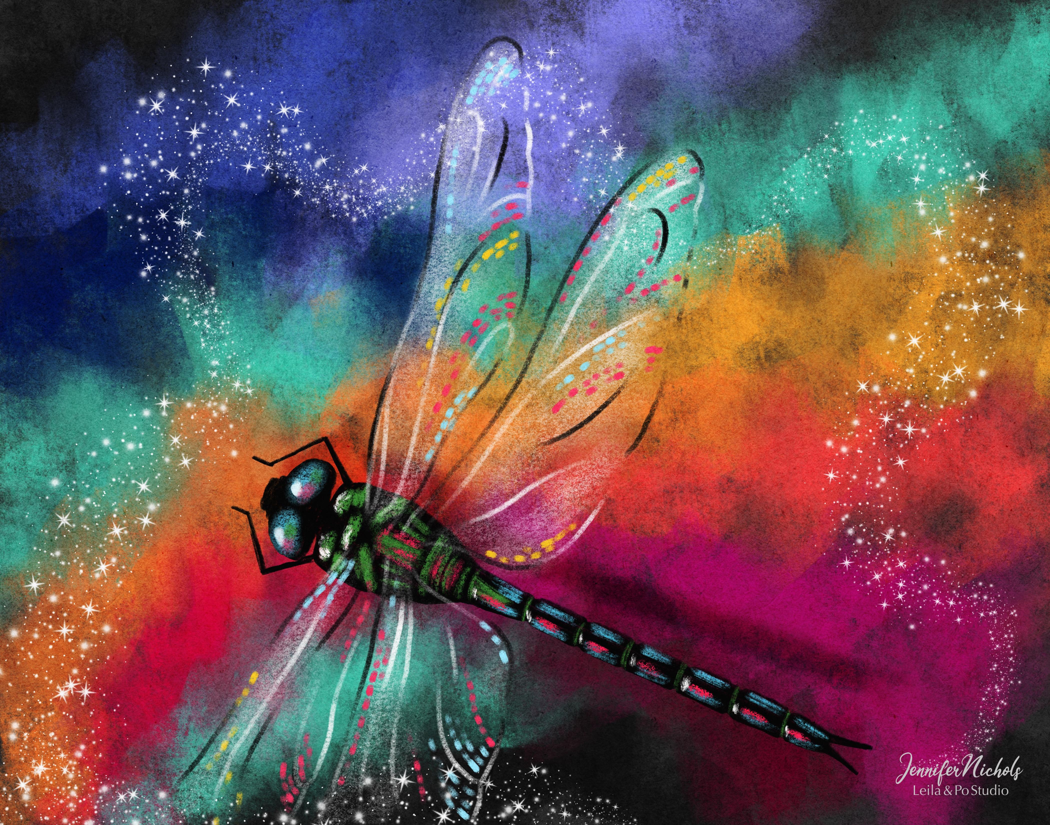
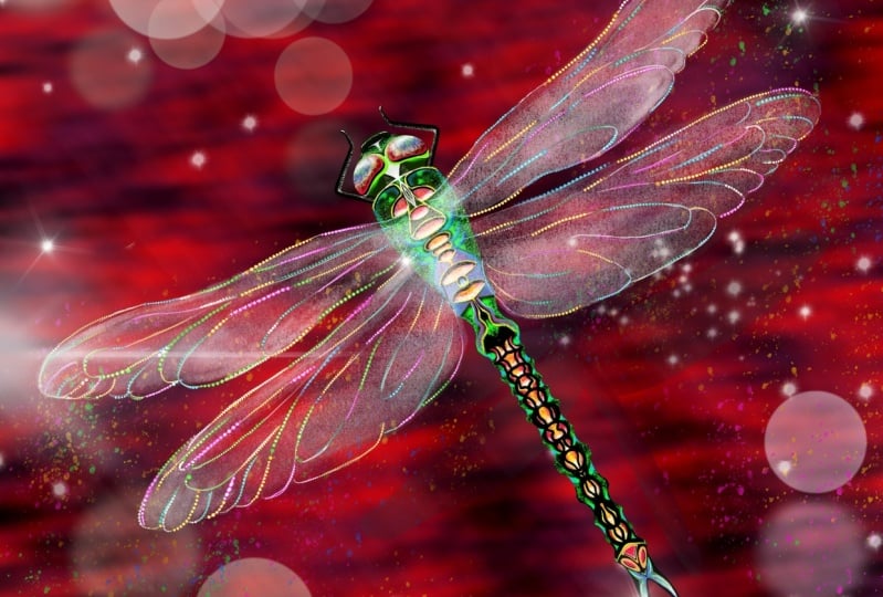
9. Blend Modes & Shadows: So for the shadow
of the dragonfly, we're going to duplicate
this body layer. So just swipe it to the
left and tap duplicate. This top one is still connected
to these clipping masks. So we'll leave that one alone. And we're going to grab this one and you can move it around. We might want to change the
color of this and we're gonna be moving it down here and
we're gonna be blurring it. But one of the things
that I like to do is test out some different
colors and blend modes. So to make this a little easier, I'm going to group
my dragonfly all into one and group and
just turn them off. So I'm going to go
to this layer above. And I'm going to put a stripe. I want to cross as many colors that I have on this page as I can so I can see what
the blend modes are gonna do to all these colors. And I'm just doing
some dark, light, medium gray, white, even although white we
don't need right now because we're
doing a shadow. This is just a fun experiment
to do with blend modes. Now I can just play around with this one layer and see what these colors
do for Blend Modes. So let's go up to the top
and start with multiply. So the white just disappeared. The white was right here. But then multiply
on this light gray. Looks really good. We might want to go
ahead and do that for our shadow layer,
for the dragonfly. And we can reduce the opacity. It looks good across
all of these colors. It is very gray looking still. Multiply dark, that lighter
gray disappeared and darken. Color Burn. Color Burn is one
of my favorites. But if we used this light gray, for example, it's gonna be really vibrant
purple over here, wherever that shadow of
the dragonfly is covering up any of that color
and it's gonna be really bright here. So that might not
be the best option for a shadow layer here. Linear Burn works pretty well. Overlay with black works to darken things for
most of the time. But you can see here with red, it makes it still quite bright. That's not bad. So the hard light with
this dark gray is not bad. I love doing this plane
with blend modes. Subtract is interesting on
this black and dark gray. I think I'm going to
stick with multiply, multiply with this lighter gray. So the white was here. We can't see it at all.
And this lighter gray is a good one, I think. So. I'm gonna delete this layer. Well, actually, you know what? If I want to remember what
shade of gray, What's that? I can just go back to normal. Now I can see it was
that one right there. But I have the textures
turned on so I can't really just
select that color. But if I turn the texture's off, then I can select that color
and turn them back on. And then maybe just
turn this layer off for now in case you want
to use it again later. Let's turn our dragonfly back on and go down to
that shadow layer. And you can alpha lock it by tapping here or two
fingers swiping. And we're just going
to fill it with that gray that we liked in our example and turn it to
the multiply blend mode. Now I'm going to alpha locket here and reduce the
opacity a little bit. And I'm going to blur it. So go to the magic wand, Adjustments, menu,
Gaussian blur. It won't blur if
it's Alpha locked, so make sure you turn that off. And I'm just kind of
watching him as I swipe. You can see the blur setting there and I'm going to swipe to the right and blur
him quite a bit. So I'm at 5% here, 8% now, it might be a good idea to turn the opacity down
after you blur it to. So I'm turning it
back up a little bit. Alright, and I'm
happy with that, and I'm going to move that
shadow layer into place. I don't want it to just be
a straight duplicate of that same shape, the same angle. So if you change the angle of it a little bit and get
it tucked under there, if you have it a
little further away. Our light is coming
from this side, so we actually need to move
the shadow to that side, in which case I'm going to
tip it this way a little bit. So I'm having the head
and the legs a little closer to the actual
body of my dragonfly. And I'm having this abdomen be a little further away
from the actual body, so the shadow is
further away here. And that's going to
give it a look like it's pointing down a
little bit like at this. The head area is lower to the ground or whatever
this rainbow layer is. And the abdomen is
raised up a little bit. So if you don't want
it to look like that, you can straighten it out and
move it out here a little bit and the whole
thing will look a little higher off the ground. Be careful and figure this
out before you de-select, because right now I've
gone off the edge here, so it will crop if
I de-select it. So spend some time
figuring this out. Technically, your
shadow layer should be pushed this way
a little bit too, if the light is
coming from it here. So you don't want it to
just be lined up, up here. Alright, I think I like that, but I think I'm going
to blur it somewhere. I can't help it. I have to play with blend modes somewhere here. Yeah, color burn, linear burn
actually works pretty well. I would probably
reduce the opacity. It just depends on
the colors you've got your shadow layer on
top of there, um, the color of your layer and
the blend mode you have, and the color that's underneath are all going to play together. So I'm gonna go back to, oops, I'm gonna go back to multiply and bring that opacity
back up a little. Here we go. Zoom out. I do like that a lot. And I am 100% complete with my base drawing
at everything. But come back to the
next lesson and I'll show you a couple of more
fun things that you can do.
10. Final Touches: Alright, one thing that's
super fun to do is do some swirls and smudging
on that background. But I spent a lot of
time on that background. I really liked that background. I don't know if
I'm going to like the changes I make to it. So I'm going to duplicate
it and turn off the original in case I want
to come back to it. So now I have the duplicate
and I can do whatever I want. I'm gonna go ahead and make
sure I'm on the right layer, go to the Smudge Tool and pick
my brushes that I was on. And I'm going to go to maybe
the pastel stubby blender. Definitely play around with all of these and see what works best for you or any of the
other brushes that you have. If you can smudge from
dark to light like this and pull some of that dark
out. That's kinda fun. Or pull some light into
a darker area like this. I might go to a smaller size. Different brushes are going
to smudge in different ways. Some of them might not have
a lot of pulling power. So this is just a fun, fun way to get some swirls. Saturday swirled there. They're not showing up
super well on this one. So that's one option and then play around with
it all you went, if you don't like it, you can always come back
to your original, maybe go to that
streaky brush and pull some Lyons who it could look like it's
raining a little bit. That's also kinda fun. You could splatter,
splatter paint splatters all over and
add speculate dots. You can add another layer and be adding all sorts
of things to this. And then, of course, if you have my magic
sparkle brushes, they are called Jen
star dust brushes. I think this star does starburst
dust when is a nice one, white or whatever you want. And this is really
pressure sensitive. But you can add some, maybe some sparkles
to your wings. Adds a little magic for sure. And then I always
like to zoom out and decide what I like, how much I like something. And maybe you can toggle between the two different
backgrounds that you have. Now, I'm thinking I
like this STP when actually I really like
this blue pulling down into the pink and the orange
pulling up right next to it. Remember, you can always
come back like we talked about the very
faint white layer. You can always come back and
make adjustments to that. Now that it's all complete, maybe you want to
erase some areas. Like actually I think I do
want to erase some areas. So having this be a
little less white. Here is good. There's one more
quick thing I want to show you that's fun
to do when you're playing around with an
alternate background is to change it with the
hue saturation brightness. So select it and go to the Adjustments menu, hue
saturation brightness. And you can change, it's going to change
every single color. So you're going to want
to change the colors on the dragonfly wings as well. So play around just like this. This kinda looks like Aurora
Borealis, doesn't it? You might find a policy. I like that a lot. It's a little more tropical
instead of rainbow, so that's at 46%. So I'm going to
remember that number and I'm going to go change my layer here of the little reflections
on the wings as well. So I can go in and
find that layer. I'm going to duplicate it
and keep the original. And then just adjust one of
them and go down to 46%. With that too, it did
make a difference, not a huge difference. But one of the ways you can see the difference is if
you're still in this mode, you can tap the layer
and tap preview. And you can go toggle back
and forth between the original and the current
setting that you're on. So I don't know if you
can see I'm changing. They are a little bit different. And then you can just
go ahead and apply it. Or you can exit by tapping the brush
and it will apply it. So that is just a slightly
different color version. I really love it. All right, see you
in the next lesson.
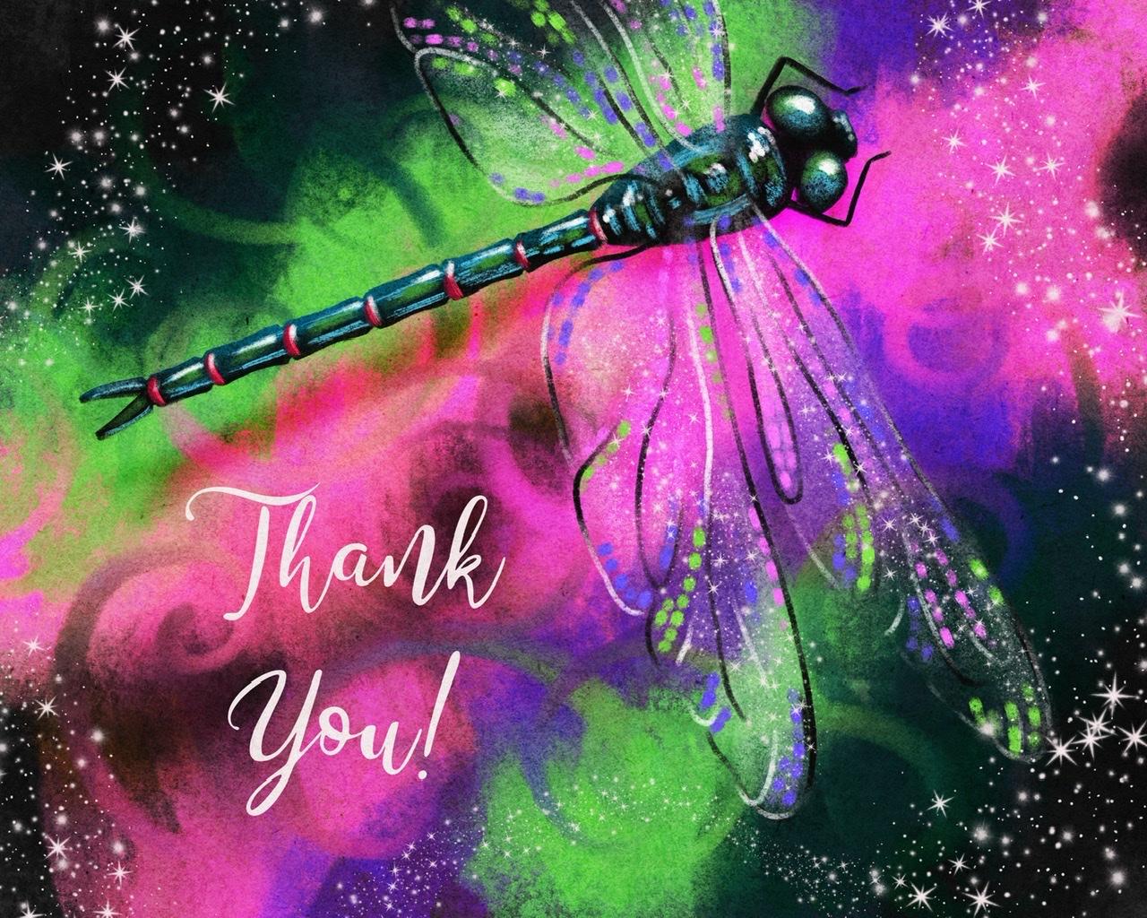
11. Text Tool & Thank You!: Alright, Just one last thing
for those of you who maybe aren't as familiar with the
text tool in Procreate. I am going up to a layer above my group of my
dragonfly layers. And I think it's going
to add a layer anyways, but I'm going to
the wrench tool. Add and add text is automatically goes to
whatever color was selected. So that worked out. And I am going to
save, Thank you. And triple tap there. And you can tap on the font
name there or tap the double A's here and find a font
that you really like. I'm just gonna go
to Cherry Here. I have a whole class on working with fonts,
finding free fonts, importing, deleting and
playing and all the things and making them look like hand lettered fonts and everything. So if you aren't familiar
with how to do all of this, definitely check that class out. But this is just
a fun way to say, to turn your illustration
into a little thank-you card. There's a ton of things
you can do with the font, but I just wanted to
use this as a way to show you that
text tool and say, thank you so much for
taking this class. I can't wait to see
what everybody makes. I hope that you have fun with these brushes and
with this style. I can't get enough of this
pastel, smudge the background. I do it a lot now. Definitely go check out
my pastel bird class. We do a little smudgy
background in that as well, but it's a more
realistic bird class. If you want to tag me on all the places where
you follow me, I would love to see. Thank you.
 Jennifer Nichols, Artist & Teacher, Procreate