Transcripts
1. Class Intro: Do you wish there was
a magic button to streamline a few
tasks in Photoshop? Well, I can't promise
you a magic button, but I can help you work smarter with a magic
of smart objects. In Photoshop, I guess I
could promise a magic click. Hi, I'm Tais. I'm a surface
designer, an artist, a creative entrepreneur, and aware of many hats as creatives. We constantly hear
about the importance of having multiple
streams of income. And it's true, but also
extremely time consuming. So I'm always looking for ways
to work more efficiently. I remember spending so
many hours manually readjusting designs to fit different products for
a print on demand, or creating individual
mock ups for each and one of my Etsy digital products. Not to mention trying to
keep up with social media, only to have to do
it all over again. Anytime I came up
with a New York, it felt like such
an endless cycle. And I knew there had to be
a better way to do this. That's when I came across smart objects and it
was a game changer, gave like the secret weapon
to working efficiently. Coming up with a workflow that
I'm going to teach you in this class took it even further. And it was such an Aha moment that I knew I had
to share with you. So in this class,
we're going to learn what are smart objects
and how do they work? How to resize your
art so we can fit different products and formats with basically just one click. How to create mockups for different products that
are super easy to update, and how to batch update
multiple mock ups at once. And while these are
the main topics, as someone who has been using Photoshop for over 20 years now, I couldn't help but share my
favorite tips and tricks. Including some lessons
on the layers, blending modes, clfping masks, time saving shortcuts,
and even a bonus, many lesson on the magical
vanishing point filter. This class is all about learning by doing so at the
end of the class, share your mock up in
the class gallery. And if you have an online store, don't forget to share
the link as well. This way we can
support each other and grow together as a
creative community. Whether you're spending
too much time creating Fen mock ups for your
Etti digital products, saving your art in different
formats for print on demand, or resizing your art
for social media. This class is your ticket to a more efficient workflow and the potential
doesn't stop there. Did you know that
high quality mock ups are a highly sought
after digital product? Once you master these skills, you can create and
sell your own mock ups in platforms like Etsy
or a creative market, generating an additional
income stream. This class is perfect for
fellow creative entrepreneurs, surface designers,
graphic designers, digital product sellers, and anyone who wants to learn
how to work smarter, not harder, even if you're
not a full time designer. This class is still
going to teach you valuable Photoshop skills that you can use for your
own personal products or for social media for example. I'll be here every step of the way guiding you
through the process. And if you have any
questions at all, just post it in the class discussion and
I'll be happy to help. Imagine a world where you
can finally have time to work on the creative
aspects that you really love. That's the paros Smart object
and I'm super excited to help you unlock that
potential. Let's get started.
2. Smart Objects Overview: Let's start with an
overview of what are smart objects and
why should you care? Smart objects are a
type of layer that work as a container to hold
information about an image. Let's take a look at
these two images. You can see they're
exactly the same. I'm going to write,
click this one and select Convert to Smart Object. Now when you look here
in the Layers menu, this one has a little icon on the corner indicating
that it's a smart object. If you double click this icon, you can see it opens
on a separate window. This is part of the reasons
why I call it a container. It shows up on your
working file as one layer, but when you open it, you can actually have multiple
layers inside. I like to think of smart
objects as mirrors present. You're walking
through a fun house, you can see the reflection
on a scratched mirror, on a wavy one, but
the original image, which in this case
is remains the same. There are many benefits to using these so
called containers. For starters, it allows you to make non
destructive edits. This means that you can make
a whole bunch of changes to your image without
permanently affecting it. Let's see what happens when I change the size of these images. To do that I'm going to select
both layers holding shift and then hold command to
use the transform tool. Then to enter to apply
the transformation. Same thing to make
the images larger. Again, see how the image that wasn't a smart object
has completely lost its quality while the smart
object stayed the same. You can also apply filters to your smart objects and
edit them at any time. If I apply a filter
to a regular image, I can't edit anymore
unless I undo, which has a limited amount
of steps, you can go back. But with the smart object, you can find a listed here and
make any changes you want. You can also work with vectors, like an artwork from
Illustrator, for example, that otherwise would be
rasterized in Photoshop. In a nutshell, vector graphics are like a recipe
for the computer to draw clean and
resizable pictures that you can scale without
losing the quality. While raster images are made of a bunch of
tiny colored dots, they can become blurry
when you resize it. If I copy the start from Illustrator and paste
it into Photoshop, I can select in the
Options Smart object if I want to edit this object. When I double click the icon, it opens directly
in Illustrator. But I think my favorite
use of this tool is to link images with smart objects. You can connect and replace images in your
documents in seconds, edit one smart object, and it automatically updates
all the linked items. Let's take a look at
the stars for example. I'm going to copy it
here on the other side. Now if I want to
change the colors, I can just double click one of the icons and it doesn't
matter which one, since they're all
using the same link. I'm going to change the
stars to hearts and save just like that. My Photoshop file has
been updated as well. I always think it's
magical when I go back to Photoshop and
see all the changes. I love it, It never
gets old anyway. What if I don't want to change them all?
You can just write. Click the smart object and select new smart
object via copy. A new smart object via copy will duplicate the
layer you have selected. But as a new separate
smart object, which in turn will have its
own separate container. This way, when you
make any changes to the layers that are linked, it will not affect this
one and vice versa. Just make sure you
keep track of which objects were
duplicated This way by renaming your layers
since there's no indication of which ones are linked and
which ones are not. This also allows
you to work across different apps and
link separate files. For example, the lettering
was done in procreate, which I then transferred
to Photoshop. Since both Photoshop and
Procreate use raster images, but I wanted the ice
cream to be vector, I made this part an illustrator. To put the pieces together, I went to file place Linked. '. My link is now placed
as a smart object. This chain on the icon shows that it's linked
to another file. Now say I want to change the color of the
hands to yellow. I can just open my
regular file in. Those greater make
the changes and save. When I open it in
Photoshop, it's updated. A lot of companies use
this to work across teams. For example, company making
a T shirt might have a fashion design team
working on the garment while the graphics team work on
the art with the link files. If one of the teams
makes an update, it automatically shows up
for the others as well. Just note that you can't
do any actions that change the actual pixels directly
to a smart object layer, like painting or
erasing, for example. When you try to do
that, Photoshop will prompt you to rest. Ize it first, but then you'll lose all the smart
object qualities.
3. Efficient Multi Sizes Template: In this lesson, I'm going to show you how to create
a template that allows you to export
multiple sizes of the same image at once. And while having this template
is already super helpful. The cherry on top here
is just how easy it is to update so that anytime you
come up with new artwork, it's basically on autopilot and only takes
seconds seriously. This method really helps
me speed up my process for uploading for print on
event sites like society six. So not only I can export
in a variety of sizes, but I can also include
copies with new backgrounds, for example for T
shirts or stickers. And even have a
social media post ready to go on the same batch. This is also how I create the digital products
for my Etsy shop. I like to offer
principles in a variety of sizes to give the
buyer plenty of options. And sometimes I offer a
printer friendly version with a white background as well. And just like for
a print on a man, this method allows me
to do it all in one go. The first thing I
have to do is check the size of the original
image that I want to link. And I'm going to do this
by going image image size. If you're working with a vector, this isn't the
problem because you can scale it to whatever size. But the raster images, you don't want to make them bigger than the original size, otherwise you can
lose the quality. This image is 49, 61 pixels by 66, 14 pixels at 300 DPI.
Let's make our template. I'm going to create a new file. My first image will
be a letter size because I want it to be a
principal greeting card. Make sure you select Art
Boards and then hit Create. Now that I have my
first Artboard, I'm going to change its name
by double clicking here. This will be greeting card. Let's make a new
one on the menu. I'm going to go to
Layers, new Artboard. Artboard two will
be for a poster. I follow the required sizing for a print on demand
website to society Six. The next part will
be for a T shirt and I'll just duplicate the poster art board by holding option and dragging
it to the side. You can also create a new
art port by clicking on the art port tool on the menu
and dragging it out here. Then just adjust the size
up here on this menu. This will be 1080 pixels by 1080 pixels for an
Instagram post. Lastly, I'm going to make
an art port for a mug. This will be 4,600
pixels by 2000. Now I'm just going to drag
this over here to keep it organized. One more
thing to do here. I forgot to change the
background layer from white to transparent for my boards, but I can still change that. Now. Under Properties,
go to Artboard, Background Color, and select Transparent from
the drop down menu. You can do this for one layer or select multiple layers
to do it all at once. If the Properties menu is
not showing up for you, all you have to do is go
to Window Properties. Now let's set up
our smart objects. I'm going to choose the
largest of these art boards. Then here on the Layers menu, I'm going to create a new layer
and fill it with a color. I use the shortcut, but you can also click on the
bucket icon here on the side. It doesn't really
matter which color. It's just so we can visualize the area that the smart
object is going to be. Now I'm going to write, click
this layer and convert to Smart object and double click it to change
the name to Art. Now I'm going to drag it here to the square with a plus
sign to duplicate it. And I can just drag it to
the T shirts art board. I'm going to duplicate it again and drag it to the
mug art board. It's too big here, of course, commend for the transform tool and I'm going to
scale it down a bit. Duplicate it again, and I'm going to drag it
to the other side. I have my image on
both sides of the mug. Same thing for my
instagrment post. I copied another one
for the greeting card, and hit the layer for a second. To get my guides in place, I selected the artboard and pull the guide to help me find
the center of the art board. Selecting the artboard
before you pull the roller, we'll make sure it
snaps to the middle. Now I'm going to resize the
smart object to fit the card. I'd like to add my logo
to the back of the card. I'm going to add it
to this template. I have mine saved in my
library for quick access, but you can always just copy
and paste yours here or type your website or whatever you
want to add to the back. This will be a
printable card that someone can buy
then print at home. Once they fold it.
The front cover is going to be on one side and
the back cover on the other. The inside of the card
is the other side of the page where they can
write their own message. Now this is the front
part. I'm going to double click my smart object to open it in another window. Then I open the image
that I want to use. Hide the background. Select
everything by holding command a and copy the image
in edit. Copy, merged. Then I go back to my smart
object and command V to paste. I don't want this
for the background, so I can just hide it. Finally, press
command S to save. Just like magic,
all the rectangles have been replaced.
Final adjustments. Now I'm going to scale down the image for the
poster to give it some breathing room and make a new layer underneath to fill with the
background color. Same for the mug and the Instagram post for
the greeting card. I'll add a very light outline
so when somebody prints it, they can select fit to page. This way the card will always
keep the right proportions for the cover image and the logo in the middle of the back cover. And they can just cut along
the light gray outline. I make a new layer command a to select the whole
part, then edit. You can see it's
really light and thin. I'm going to rename the layer
here to keep it organized. I can also add color to the cover by creating
a new layer, dragging it below
my Smart object. For the mark tool, I'll select from my guides
to the end of the page. Then for the eye dropper to
select the background color. And for the bucket tool
to fill the selection, Commend to disselect, commend to adjust the size
because it was way too big. Now I can go to File Export, Quick export as ping, select the folder and save. And here you go. The best part is that once you have
the template set up, all you have to do is update the smart object and
the background colors. Let's take a look.
To use this image, I can command A to select
all command C to copy. Then I'm going to go
back to the smart object and double click to open it. Commend V to paste the
new image, then save. Now I can replace the
background colors and save it into a new folder, PZ.
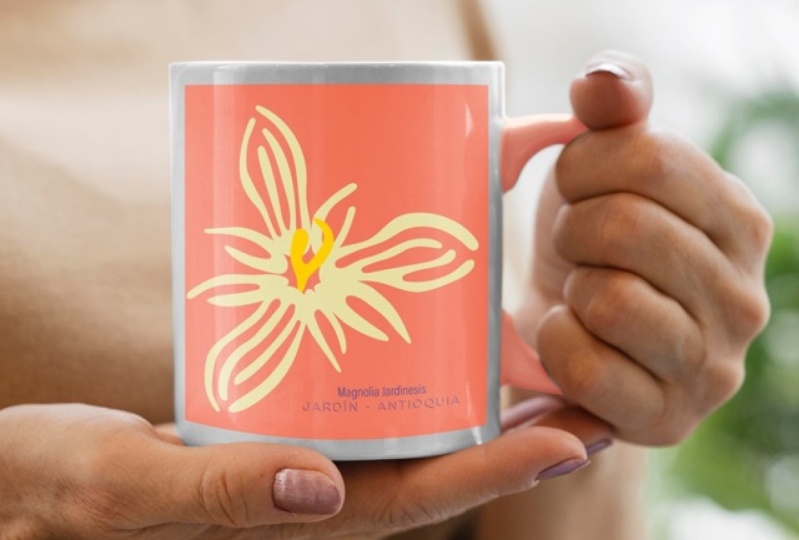
4. Wall Art Mockups: Mock ups are a great way
to display your art. They can really help
people visualize what the end products
going to look like and make your artwork
more relatable, since not everybody can
look at a flat image and really picture how that
will look like in real life. They're also a very
popular digital product that you can sell online
for extra income. And using smart objects in your mock Ups means that you
can update it in seconds. We're going to see how
to create mock Ups for different products
like Wal Art, light color T shirts,
dark color T shirts, mugs, and gift boxes. I got this photo for free from Pexels.com It's a flat image, which means that it
only has one layer. I'm going to click
here to unlock it with the rectangular
marquee tool. For shortcut, I will make a rectangle proportional to
where I want my art to be. In this case, the picture frame. We're going to adjust
the fit later. It's better if it's
a little bigger, just don't make it
smaller than the frame. Now I'm going to
create a new layer and add color to the selection. Like in the previous lesson, there can be any color command D is the shortcut to de select. I'm going to rename this
layer Art Goes here. Then right click to convert
it to a smart object. Now I'm going to hide the
smart object for a minute. To select the inside of the frame where I
want my artwork to appear with the background
layer selected. I'm going to use the
Quick selection tool, although I'd normally use the polygonal lasso tool
here to be more precise, especially if there was less contrast between the edges and the inside of the frame. After the area is selected, I'm going to make my
smart object layer visible again here
on the Layers menu. I'm going to click
on Layer Masks. Now you can see the
smart object is inside this mask and only visible
inside the picture frame. To add the image, I double click the smart object and it
opens The art goes here, layer on a separate window. I already have the image. I want to use open command
A to select all and command C to copy back
to the smart object, command V to paste. I'm
going to resize it. In this case, since
it's not for a T shirt, I can actually keep the
background color here. Come in, or file, save, bam, my mockup is updated. Now I'm going to change the
blending mode to multiply. Multiply is part of the
darken blending mode. When using this category, the result will always
be a darker image. White is a neutral color, which means that any
white areas will become transparent and
won't affect the blend. Multiply works well
here because it allows the shadows from
the picture frames to show through the print It's done now to update this image, I just go back to smart object, drag a new image
in here and save. And just like that I
have a brand new markup.
5. T-shirts Mockups - Light and Dark: Now let's take a
look at T shirts. I'm going to use the same print
for both of their shirts. So just like before,
I start by making a rectangle where I
want my artwork to be. Neo layer, fill it with a color and right click to
convert to Smart object. I'm going to rename
the layer and double click to open
the Smart object. I already have my image copied, so I'm pasting it here, hid the background because your T shirts
resize it and save. I'm going to keep the
same smart object so both of them can be
updated at the same time. I'm going to duplicate
this layer by holding the option key and
dragging it to her shirt, just the size since hers
is a little bit smaller. If you're in a rush,
you could simply change the blending mode to multiply like we did for the wall art. But I actually want to take it a step further to make it look more realistic by making a
few additional adjustments. Let's bring back some
of the highlights and shadows on their shirts. I'm going to start by hiding
the print for a moment and then roughly selecting
their T shirts using the quick selection tool. Then I'm going to duplicate
the selection into a new layer with a
shortcut command J. We don't need the
selection to be perfect because the
adjustments we're going to make will only show up on the inside of the print.
You'll see what I mean. Now I drag this layer
all the way to the top. With the layer selected, I'm going to image
adjustments, hue saturation. Then I'll slide the
saturation all the way down. Even though these T
shirts are white, there's still a bunch of
colors reflecting on them. This step removes any
colors from the layer. The reason I'm doing this
is because the layer will only serve to add
shadows and highlights. I don't want all the other
colors interfering with it. Next, I duplicate it because I need one for her
shirt and one for his. But I'll hide one of
these copies to do one at a time just because the adjustments will be
better that way. I'm going to right
click the Adjust a layer and hit
Create Clipping Mask. This means that anything
in the top layer, in this case the one
with the T shirts, that now has this little arrow, will only show through the existing pixels on the layer it's been clipped to
the bottom layer, which in this case is
the print on her shirt. I'm going to adjust
the blending mode on the T shirts
layer to hard light. We saw that multiply is part of the blending mode and will
only affect the darker pixels. The contrast blending mode
is a mix of the darken and lighten when the color is darker than 50% gray
or middle gray. Photoshop will apply
a dark blending mode when the pixels are
brighter than 50% gray. Photoshop applies a
brighten blending mode, which is why this mode
works great here. Since we're adding both
shadows and highlights. After that, I'm going
to adjustment curves. This will adjust the shadows, mid tones, and highlights
of the T shirt. You can adjust the shadows
by moving the line towards the bottom of the graph and
highlights to the top. Play with the
settings here until you find a good balance
for your image. But basically, we want to bump up the highlights and shadows of the creases of her shirt and make it visible
through the print. Can you see how her shirt looks a lot more natural
than his right now. Once hers is done, let's
do the same to his. Drag this layer above the layer, you want to clip it
to the smart object. Then right click
and clipping mask, changing the blending
mode to hard light here again, adjustments curve. His T shirt is going
to be a lot more subtle because it's not
as creased as hers. But we can still bring back a few highlights here and there. The last adjustment
I want to make is line up the top of the
artwork with her shoulders, since you're a bit slanted. Since the T shirt layer
is on top of the print, I need to deselect
the auto select box in order to be able
to move only the art. Make sure not to move
the adjustment layer. It needs to perfectly
match the main photo. So the shadows and highlights
line up and it's done. Now, since the adjustments are, click to the smart object layer. Once we update the print, all we have to do is
readjust the placement, but the shadows and highlights
already show through. Just like for the white T's, I created a smart object from a square and
placed my print. Adjusting the highlights and shadows is especially
important to make mock ups more realistic when using a dark color T shirt. This time I'll just duplicate the entire layer instead
of selecting part of it. Then I'm going to write click Create Clipping Mask
for the blending mode. This time instead
of heart light, since this is a dark color. We're going to go to Screen. Screen is part of the
light and blending modes. As you might have guessed,
it's the opposite of the dark and blending
modes we've saw before. When using this category, the result will always
be a lighter image. Black is the neutral color, which means that any black
areas will become transparent. Then image adjustments, curves to bump up the
highlights, again, play a role in the
curves here to get a feel for it and find
the best settings for your image when I'm
making these adjustments. What sometimes
helps me visualize the changes and
know how far to go, it's to just go to the
extreme and then pull back. This also helps me a lot when
I'm not really sure about a specific function or when
I can't see any changes. I take it all the way up to the extreme until
it's super clear, and then I undo and adjust. Lastly, I sometimes
like to add a bit of apacity to the print
to make it sit better. Here's our black T shirt.
6. Mug Mockup: Now let's make a mug. To
keep the lesson short, I already have the smart
object here because the process is the same as
for the other mock ups. And I'm going to hide
the smart object for a minute to make the
selection for the mug. So I'll select the
mug layer and I'm going to use the
polygonal tool here. And again, I'm just
going pretty quick. But normally I take
my time making sure the selection
is super accurate. Now just like I
did with a shirt, I'm going to
desaturate this image, but this time via the layers
menu in this circle icon. You can create a new
adjustment layer. When the menu opens, I can
click on Hue and Saturation. Desaturate the image by
adjusting it on the slider. This square on the menu clips the adjustment just to
the layer below it. The cool thing about using
the adjustments layer is that the selection is stored
whenever I need to use it. Again, I can hold
the command key, click on the layer and
loads the selection. Here again, I want
to shape my prints a little bit better to the k. I'm going to set the
blending mode to multiply, then turn down the opacity for the smart object in order to see the image underneath it and get a better look
at what I'm doing. Then I use the short
cut R to bring up the rulers and drag one to
each side of the smart object. This is just to keep
me in track and make sure I don't go too
crazy with a warping. Then, edit, transport work. Now we can shape this image by dragging the grid and
using the handles. Once the worping is done, I'm going to hold
command and pull up the selection again by
clicking on my map. Now I want to trim
the selection, holding the option key
to remove the handle and the inside of the
mug in order to get just the area where the
print is going to appear. When using the selection pole, holding the shift key will
add to the selection. And holding the option key we'll remove from the selection. Then I'm going to select
the Smart Object Layer. And click on the rectangle
here to make a clipping mask. I can bring back the opacity to 100% One more thing we can do here is add
color to the handle. I'm going to load
the full selection again with the
polygonal Ssl tool. I can hold the option key again and cut away
the rest of the mug. Know that I have only
the handle selection. I can create a new layer
in the circular icon. I can select solid color here. I can select a color
from my image. And then hit okay, then
change the blend to multiply. The last thing I want
to do here is add the highlights because
the mug is pretty shiny with the layer selected. I'm going to image
adjustments, hue saturation. And I'll slide the
saturation all the way down.
7. Gift Box Mockup: Vanishing Point Filter: In this lesson,
we're going to place the pattern on the box using
the vanishing point filter. This last mock up doesn't
technically use a smart object, but it was too cool not to
share like a smart object. It's also super easy to
update. I can't resist. I have this picture
of a box and on a separate window I have the pattern I want
to apply to it. The first thing I'm going to
do here is select all with command A and command C
to copy back to the box. I'm going to unlock it
and create a new layer. Then I go to filters
vanishing point, a pop up window opens. The default is already in
the create plane tool. The second button
on the tool box, just click on the four corners of the box to create a plane. To connect the second plane
for the side of the box, I'm going to hold the
command key and drag it out from the middle point
of my existing plane. Now that I have these two grids, I can use the edit plane tool to drag the points and adjust the sites new plane for the lid. If you get a red
or a yellow grid, it means that your
plane is not valid, so just the points until
the grid turns blue. Again, holding the command key, I'll drag the middle
point to create another plane and the dust. If I drag this middle point
without the command key, it extends the plane last part command and drag the middle point
to cover the top. Now remember the pattern that I copied time to command
V to paste it here, then just drag it into one
of the planes. Here you go. You can move it around,
adjust the size, then holding the option key, you can drag it up to fill the other planes. When
you're done, just hit. Okay. Now I have two layers, one with the photo and
one with the print. I'm going to borrow this
layer to get the selection I want with the magic wand tool and the print layer selected. I click anywhere outside of the box to select
the empty space. Then shift command
I or select Invert. Now the selection is around the box and not on
the empty space. Next, I'm going to click
on the photo layer and command J to duplicate this
area into a new layer. You can see I have
the original photo, the print, and the box cut
out in separate layers. On the box cut out layer, I'm going to
adjustments layer here on the bottom and
hue saturation. This adjustment is affecting
all the layers underneath. So I have to select this little
square here and now it's clipped to the layer immediately below it, the box cut out. Now that the box is desaturated
and not pink anymore, I can move the print up to the top and use the
multiply blending mode. The last thing to do here is
do something about this bow. Since part of it is desaturated, I'm going to hide
the other layers for a minute and select from
the original photo layer. Can you guess the next step, if you're guessing, come and G to get the bow into a new layer? You're absolutely right. Now
I have the bow separately from the rest which I can drag all the way to the
top and it's done. You edit this mock up. I can copy a different artwork. Either create a new layer or select the one that
already had the print. Then go back to filters,
vanishing point here, you can still find
the grade that we set up before it's
saved in the file. Just paste your artwork here. And one less touch. I'm going to select the layer
with the bow. Go to layer adjustments,
hue saturation. But this time, instead
of saturation, I'm going to change the hue. Oops, forgot to clip it. Now I can change the color of
the bow to match the print. It's dead.
8. Multiple Mockups Magic: We've just covered
how to efficiently create multiple versions of your artwork and also how to create mockups for
different products. So in this we're going
to kind of combine both so that you can update and export multiple
mock ups at once. I came up with this
workflow while I was making mock ups for the digital
products in my Etsy shop. And I needed ten product
images with the same artwork, even though the smart objects are already super
easy to update. In this case, I
knew there had to be an easier way,
and that was right. I'm going to create
a new file and make it 2000 by 2000 pixels. Then check art board
and hit Create. Now I'm going to
select my artboard and copy it according to the
number of mock ups I need. I usually do ten, but to keep this lesson short,
I'm going to do four. The first three will be
mock ups and the last one will be a close up to show
off the artwork details. Just like I have set
up for my Etsy images, I'm going to open the
first mock up that I created in this class,
the wall art one. Then holding shift, I can select both layers and drag them
directly to the first artboard. Keep in the layer selected, I can use comment to transform and adjust
it to the artboard. Next, I'm going to open two other images that I'd like
to use as Waller mock ups. For the fourth, I'll
write a little caption so people know exactly what
they're looking at and when they see my Ts listing
holding the option key, I'll drag the smart object from the mockup that
was already done. I don't need the mask
from the previous frame. I can click the icon on
the layer s panel and hit the lete to transform just like before. It's better to be a little
bit bigger than smaller. I'll come back to adjust
the fitting in a minute. From this one I can drag it
into the next art board. And since this is
a smart object, I can resize it without
losing resolution. Remember that it's not
actually changing any pixels, the image is safe and sound. In the fourth board, I
want to show the details. I'll make it even bigger. Now I'm going to make
the mock ups neat. I got to go back to
the second artboard. Hide the artwork. Select the inside of the frame with the area and the
artwork layer selected. I can click on the
layers mask button and move on to the next one. I didn't have to change the blending mode
this time because the smart object copy from
artboard one was already set. Same thing here, hide artwork. Select the inside of
the frame layer mask. You can change the
artboard names here and file expert. Save us pine as usual. To update, just double
click the smart object, change the art and save.
9. Conclusion: Okay, that was a
lot of information to take it so you
can breathe now. I hope you're feeling
empowered and excited to put your new found
Photoshop skills to the test. Thank you so much for
taking this class. I'm super passionate
about helping other creatives streamline
their workflow. And I really hope you
enjoy this class. Now it's your turn to shine. Head over to the class galleries and share one of your mock ups. I can't wait to see
what you create. Feel free to share your work in progress if
you're not done yet. We're supportive community here to learn and grow together. Your feedback is extremely
important to me. So if you enjoy this class, please consider
leaving a review. These reviews are super helpful to help me improve as a teacher and reach other
creatives like you that might find this class
helpful as well. Remember that the key to mastering new
skills is practice. So keep exploring experimenting, and most importantly, have fun. I'm super confident that
you're going to create amazing things with
these powerful tools. So thank you again.
Happy creating, and I'll see you
next time. Bye bye.
 Thais Queiroz, Designer/ Artist/ Curious Creative