Transcripts
1. Introduction: The cover of a magazine, he is the first and most important impression
given to readers. So it is crucial to get
it's designed right. I'm Martin. I have over 20 years of
experience as a graphic designer, illustrator and Adobe
certified instructor. I have worked with
companies like BBC, these knee, Google, ikea, and I cannot wait to share my best
practices with you. This is a streamline
hands-on course focusing on a real
life design project. I will be walking you through everything step-by-step
and you will get all the exercise files
so you can follow along in case you
prefer not to copy me. You can also follow my workflow using alternative
assets provided and create something
completely unique that you can showcase in
your creative portfolio. I am pretty sure
this course will inspire you to create
something amazing. We will start by analyzing great magazine covers
and know about all the editorial design terms like mass had covered lines, path, skyline, and their
role in the composition. We will then jump into Adobe
Photoshop to edit and refine our main cover image and professionally separated from
its original background, we will use Adobe
Illustrator to put together a creative and engaging
title design and some decorative shapes that
will be used in our comp. And finally, we will put our magazine cover together
in Adobe InDesign. Besides all the technical stuff, we will also cover some important graphic
design theory that you will be able to apply in any of your future
creative projects. You can join this course without any prior knowledge
in graphic design, illustration or
Adobe applications. But to complete the project, you will need access to Adobe Creative Cloud and a
desktop or laptop computer, but now it's time
to start creating. So I will see you
in the next lesson.
2. Magazine Cover Workflow: In this project, we will
work on a magazine cover. First, we will start
in Photoshop and prepare our cover image, which will have to be modest
in order to be able to place the title and some graphic
elements behind the person, but still keep it in
front of the photos. Original background. Just to make it
easier to understand, this is the original photograph and these are the elements
that will have to be in-between the
original background and the person in the shot. Once we have done in Photoshop, we will switch to
Illustrator to work on the title of the magazine, and to prepare the
graphic elements as well in the background. And finally, to put
together everything, we will end up here in InDesign, where we will add the dateline and the cover
lines at the bottom, where we will utilize
some very handy features of paragraph styles to make this project
more fun to work on. You will be able to pick your own cover
image to work with. And you will even
be able to make up your own magazine title using this creative alphabet that you will have in
the exercise files. If he's completely up to you, whether you want to
follow step-by-step and recreate exactly the
same version that I am going to work
on or be a bit more creative and based on the
techniques I'm going to cover, create a more unique
and personal design. But before we get started on the project, in the next video, I am going to explain the
most important terms and definitions used in editorial
design for magazine covers.
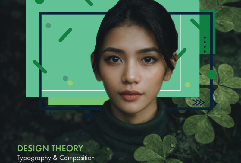
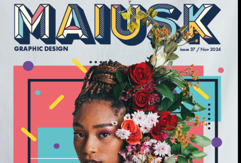
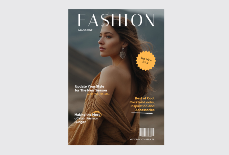
3. Magazine Cover (Part 1): The most prominent and
probably most important detail on a magazine cover has
to be the masthead, which is short for master hat. And this is the title, design, or name of the publication, which you find here on the
top third of the cover. And most of the time, this is created with a
custom font and kept consistent throughout all
the issues that come out. Sometimes maybe
the color changes or the position slightly, but generally the font and the style is going
to be consistent. The phrase mass
had actually ended up being used in
web design as well. That again, it stands
for the logo or the main brand image that's usually on the top-left
corner of the site. Most of the time, the
masthead takes up the whole width of
the magazine cover. But if it's shorter than that, like with Computer Arts or GQ, then it's usually on
the top left corner. Now this is mainly
because when you go to a news agent or a shop and the magazines are laid
on top of each other, then this left third is
the only visible part. So you should still
be able to identify the name of the magazine just by seeing that
section of the cover, the type of font, color and size, and even the
kerning of the masthead. It really helps you to
establish the target audience, our target market
for your magazine. And you can clearly
see that with the example here on Empire, which is a bit
more masculine and bold compared to stylists, for example, which is
much more feminine. The next element that
we normally have next to the masthead
is called tagline. Or it can also be
referred to as cell line, strap line, or even
Magazine back. And this is usually a smart than VT way of defining what
the magazine is about. The GQ, its look sharp, lift, smart, or Esquire, it's men at his best or read, Computer Arts is inspiration,
technique, great design. So as you can see, the tagline
is usually a powerful, effective statement that
can help to specify the subject matter or
category of the magazine and other similar elements
to tagline is called skyline or also referred to
sometimes as banner or strip, which again is usually placed on the top or the
bottom of the cover. And again, it's as
wide as the magazine, so it takes up the whole width. And it, these two things
can be very similar. But most of the time the
skyline actually includes article titles or even names that are relevant to specific
articles in the magazines. So it's almost like the
extract of contents, like a mini table of
contents in a sense. So just to be clear, which shortlist as an example, this I would consider as skyline because of its
position and because of the way it promotes the different categories or
genres that is covering. But it also works as a
tagline at the same time. Since we have this example, we can also see that
there's usually a dateline, again, very close
to the masthead. In this case, it's
very tiny every Thursday because it's
a weekly magazine. But if it was
monthly, then again, it would specify that
there or quarterly. Once again, and normally
you would also get Bian Shu number
near this dateline. However, here we have a vertical placement
on the left side. Here we can see it's issue 507 and also the actual
date when it was published. Notice that we also have a URL, the website for this
magazine that again is usually placed close to the mass tab, somewhere
around there. Or also it can be
close to the barcode, which usually is at the button. Now it's shortlist.
We don't have a price because it's
a free magazine. But instead of that, we have something that's called a pug. Now, this is indicating
that it's a free magazine. And we specifically call these things pugs
when they are on the corner or attached to
the side of the cover, these elements should always use strong color and high contrast. So make sure that they stand out from the rest of
the cover and they are there to promote exciting news
incentives or promotions. So the fact that this
magazine is freeze, obviously an incentive for you
to pick it up and read it. So in case of this magazine, I would consider this sticker to be doing the
same exact thing, what we just described. But in these cases, instead
of calling it a pug, I would call it a path. Or you can also use the
term qualifier or flesh. And actually the sticker
effect is very commonly used. So a bit of drop shadow and maybe stronger
outlines or even like a star shaped like a burst is a very commonly used
in magazine covers. The examples that I
have on this board are very stylish and really
nicely designed. But if you look for
cheaper publications, you probably would find a lot
of these paths and pugs and flesh elements that just
really wants you to pick up the magazine and really
tries a heart cell. So you have to be careful not to overuse these type of things. Because just like everything in design less is
more and a cleaner and neater look usually looks more elegant and feels
more professional.
4. Magazine Cover (Part 2): Now it is worth mentioning
that you don't always need a container or bounding
box around a puff. You can also just have texts
like here as small symbol, in this case that asterisk. So this is again, something that really makes you want to pick up
this magazine and really entices you to read about the things contained
in the magazine. So instead of this relating
to a specific article, this is more like a
general sales pitch for this particular issue. Now even though in this
cover besides the mass here, this is actually
the largest tax. This is not the main cover line, the main covered line, That's something
that directly is connected to the main image. So in this case, I would
call all of this section here the lead story
line or headline, sometimes also referred
to as splash or as I mentioned before,
main cover line. And within the headline, you can also have additional elements
like the model credit, where we actually see the name of the person in the main image. And besides the main tax, which in this case is
the music that matters, we would have this
smaller text or subtexts, which normally we call anchorage text or strap
line or most covers, you would also get additional
supporting cover lines, like in this case, this
special report part here at the bottom left. And these relate to
additional articles within the magazine that are not
connected to the main image. These are usually best
place to the edges, making sure that they
don't cover up too much of the main image just to
avoid the confusion and making sure
that they are not mistaken to be connected
to the main image. It's quite common with these supporting
cover lines that you would get some buzzwords. And here it's a perfect
example, this special report, but this could also
be something like exclusive or plus or, and even more stuff like that. Now when every cover, the most important than largest
detail you would see is the main image and this takes up usually the most
part of the cover. So in this case we have
Daniel Craig as James Bond. And notice that also there are some cool
effects here with these shots that also in a
way part of that main image. But most of the time, these images would
have a person who is looking straight
into the camera. That's a way to really
get your attention. Because when we see
someone looking at us, That's just really
gets us drawn into, in this case, a magazine. And these pictures of people, I've usually a medium
shot like this one here. Or they can also be a close-up with a strong crop in this case. But some magazines would
use main images in a more creative way,
like with stylists, we have this main
character jumping over the masthead,
which is quite cool. But what if creates also is a massive negative space
here in the middle. Now that's also quite common
with these main images, that the background be quite empty or at least out
of focus or not too busy to make sure that
the main character or the main subject of the
photo is highlighted. But because once again,
in this example, the character is all
the way on the top. It just opens up that white
empty space in the middle. This is a unique and
clever cover design, which really proves
the point that once you understand the rules, you can break them. And that's when you can create
very effective designs. It's worth mentioning that
the main image doesn't necessarily have to be a
photograph of a person. It can also be an
illustration like this. And most of the
time, by the way, it can overlap the math SAT as long as it keeps it still
legible or recognizable. But it can also be even more complex
illustration like here, where it really takes
up the whole cover. Or it can be less complex and
just simply use typography. So in case of this wired issue, the three logos closed out would be considered
the main image. Besides the main image, you would sometimes also have secondary images like these, which are sometimes also
referred to as thumbnail images. Even these at the
bottom would be considered thumbnail
or secondary images. On this cover, we can also see the barcode here on the right, which is required
if the magazine is sold in news agent or show, but it is not necessary if
the magazine is sent to a subscriber or obviously
for a digital version. And last but not least, you
can also have frames like the iconic yellow frame of the National Geographic or the red frame of Time Magazine, just like a frame painting
or a photograph on a wall. These also helped to
make the magazine stand out when it's on
the news agents stand. And it also helps to create
a very clear visual margin. But it's sacrifices the
size of the main image, all the additional
information inside it. So everything has
to be probably 10, 15% smaller than what it
would be without the frame. And most of the elements
that I went through in this video would be usually used consistently
throughout the issues for a particular magazine, likely time apart from the
masthead and the frame, that will be also placement of certain things like the
dateline and the price, which would most of the time won't move between the shoes. So consistency really
helps readers to quickly spot the latest
issue of the magazine. But also they will
learn where to find the relevant information once they have been reading
that magazine for awhile.
5. Preparing the Cover Photo in Photoshop (Part 1): Once you've decided which
image you want to work with, just open it in Photoshop and follow the following
couple of steps to separate the person and mask it out from the
original background. Now to help you get
used to this method and make sure you understand
how to do it. I am going to show you the same method on
four different images, but I will continue using this one for the
rest of the project. So let's get started. The easiest selection method
is the subject option, especially because it works
really well with people. So once we choose that, even though this character is quiet blended into
the background, it does actually
a quite good job on finding and separating
it from the background, even though the hair is really dark and these details are dark, it has done a good job. The parts that we need
to improve will probably be easiest by using the
Quick Selection Tool, which is like a brush. So we can use the
square brackets on the keyboard to increase and
decrease the brush size. And then holding down
Alt or Option key, we can just click a
couple of times on areas that we don't
need in our selection, like this one here. And let the selection snap to the edges that
we want to work with. Now I can zoom in even closer. And if I don't hold
down the Alt or Option key and click on areas
or even paint on areas, then it's going to
extend the selection. So here once again, we need to remove, so I'm holding down
the Alt or Option key. And if it goes too far, then what I recommend to do
is to undo the last step. And instead of using the
Quick Selection Tool, use the Quick Mask instead, which can be accessed by
pressing Q on the keyboard. And here we will see a visual representation of the selected and
the selected areas. Anything that's not in our selection is
highlighted in red. And we can actually use our
normal brush tool here, which by default is
going to paint v Divide, which will reveal details or add details to the selection. But in this case we
need to remove details, so I'm going to swap to black. You can also do this by
pressing X on the keyboard. So now we have the black. I can just paint
over these areas here and make sure
that we have a clean, nice edge around the year. Again, I can use the
square brackets, reduce the brush size. And I'm not going to spend too much time on this
because it's a small detail. But I feel like that
looks already quite good. Now if we zoom back with
Command or Control 0, we can see the
whole selection and maybe a few more areas can
be added here at the bottom. Remember switching back to white if you want
to add details to the selection and using black if you want to
remove from the selection, I think this leaf should
also be in the selection, even though we won't be
coming down this far. The most important parts are
around here where we will have our title and also
those graphic elements. So just to make sure
that they will work, I am just going to paint over these leaves here as
well on the left, just very quickly, create
a rough edge there. I think it's going to work. So now that I'm ready
with my selection, I can press Q on the
keyboard again to switch back to seeing a
normal view of the selection. And to finalize this, I am going to turn this
into a layer mask. So click on the little icon here at the bottom
of the Layers panel. And let's save this as
a Photoshop document. And if you want to make
it easier to find it, you can just type in Moscow
at the end of the file name, because at the end in InDesign, we will be using both
the original photo and the master version. So you will need both of them.
6. Preparing the Cover Photo in Photoshop (Part 2): Now if this workflow make
sense to you and if you decided that you will be
working with the same image, you can already move
on to the next video. But in case you would
like to see me doing the same method on the
following three images, then you can stay here
and watch me doing it. So once again, I am going to start with a subject selection. And in this case, it's done
an almost perfect job. Again, there's just a
few little mistakes here on the bag. And I think further down
maybe around the trousers. We just need to
refine it slightly. That's already good. Sometimes
I just use the quick mask, pressing U on the keyboard
just to see my selection in a little bit more
contrasting way so I can judge the
selection better. And yes, I believe this
is ready for a mask, so I am just going to
add the layer mask. And once again, I can save
this as a Photoshop document. Make sure you remember
where you save your files and also to add additional titles if you wish to make your work
a little bit easier. Let's move on to our next image. Let's see how subjects
selection works on this one. In this case, Photoshop again, has done a really good job
considering that the ladies wearing a red hat and the background is
predominantly red as well, is still made a very
nice selection. So let's just turn this already into a mosque
without any changes. And just so you can see
the selection on the hair, I'm going to use the
Option or Alt key and click on the Mask thumbnail
here in the Layers panel, which will show us the
selected details in white and the hidden
details in black. And if I zoom closer, you can see there's a lot of fine details in the
selection on the hair. So even though it was
a complex background, Photoshop did a really good job with the subject selection. And maybe the only
detail that needs a little bit of touch-up
is around here. Even though this is
already a layer mask, we can still continue
refining it. Just make sure you
have the Mosque itself selected and then switch to the brush tool and paint
over the area with white. Because remember why
I chose black hides? So if we paint with white, we are revealing details and we can do the same thing
here on the right as well, just to make sure that all the details of the hat
is going to stay visible. There may be a little bit
of the hair as well here. So let's zoom back and I think the rest of the
image is perfect. So we can once again save this. And this time I'm going to use the shortcut Command
or Control S and just typing again, mast. And finally one more image. Just to practice,
I'm going to use again the subject
selection first, which again has done
a great job overall. Just these bottom details
need to be added. So I'm going to use the
Quick Selection Tool and just quickly
paint over that part. Now just to double-check, I'm going to press Q on the
keyboard for Quick Mask. Have a final look at it. Yeah, I'm happy
with all the areas, so I can press Q again and
click on the mask and finally, save it as a Photoshop file. So you can see how
quickly we managed to go through all of these images
using the same method. And if you want to practice, feel free to do all of
the images that are included or even experiment
with your own images. By the way, these images
are all from Unsplash, which is a great website
and resource for high-quality free stock photos. But now that we're
done in Photoshop, in the next video, we will continue working in Illustrator on the title
and some graphic elements.
7. Designing the Title in Illustrator: In this lesson, we
will be working in Illustrator and
we will work with the following two documents,
title and shapes. You can download these from
directly below the video. Let's start with the title. I decided to use create as
the title of my magazine. So I am going to work
with those letters, but feel free to give your
magazine a different title. As you can see, you have the
full alphabet here so you can make up whatever
title you want. And once you've decided
which characters you need, use the black arrow, the selection tool
to select them, and they're holding down
the Alt or Option key. Click and drag to duplicate them onto the new art
board on the right, I've set up this document
in a way that this is the first art board which will
be imported into InDesign. And if you're interested, this is something you can change. Here in the artboards panel. You can see that the alphabet is actually the
second art board, even though it's here
on the left side. And the title, which
you see here on the right is odd
board number one. So when we are going to place this Illustrator
file into InDesign, it's going to use whatever is on this art board instead
of the one on the left. And if you want to change
the order of art boards, you just simply have
to drag the Artboard names up and down here
in the artboards panel. This is something we
already covered earlier. I just wanted to remind
you how to do it, but all we have to do is now to continue dropping the
letter C here on the right. So I'm just holding
down the Alt or Option key while I'm doing this. And it creates the
duplicates for me. And then we can just duplicate this letter once
more to the right. I'm going to press
Command or Control Zero to zoom closer to this title. And now we have
to make sure that these characters are
aligned to each other. So first I'm going
to select them all, and then from the Options bar, I will use the Vertical
Align Bottom option. If you don't see the
control bar in Illustrator, remember you can find it from the window menu that has
the control option there. Or alternatively,
you can also use the Properties panel and that also has the align options here. Now, if I want to keep my
character's mind apart, I can also horizontally
distribute them evenly by using this icon. The same can, again be found in the properties panel by
clicking on more options, that's where you will find the Horizontal Distribute
Center option. But here you even have
an option to adjust the actual spacing
between the objects. And this will only
work if you change the alignment to key object, which will select one object, but you can always
change the selection. I normally select
the first character and then going into alignment. Now, we will be able to
specify the distance. Let's say we want five
points between them. And then I just click on Horizontal Distribute
Center again, as you can see, if I reduce the distance, maybe 23 points. Again, I can move them
closer to each other. But there is an issue
here because this doesn't look evenly distributed. And that is due to the
unique shape of each letter. And the most obvious
one is the a and the T, where it seems to have a huge empty space or
negative space here. However, the actual
physical distance between the edges of the bounding boxes of these two characters are
actually the same as the others. Because if you consider the
a to be a square or a block, then you can see there's not much space between it
and the next letter. This problem usually occurs when you have
characters like a, V, W, or the round ones like O and C can also be problematic. So whenever you prepare titles, especially when using more stylized graphic
letters like these, you will need to visually balanced out the
spacing between them. And this method is
called kerning, and we will learn more
about this later on. But for now, all
we have to do is to move these letters closer. Let's just select T and E. And holding down
the Shift key, I will start moving
them towards the a. And when I get close I can
see I could even overlap them if I wanted to and if I want
to change the order of them. So having tea in front of a all I would have to do is
to go to the Layers panel, select the letter
T in this case, and just make sure it's moved
all the way to the top. So then it can be in front
of a or another technique. If I undo this last step and maybe zoom a
little bit closer, is to do it by selecting the
letter and just right-click, arrange, bring to front, or notice there's also shortcuts for these arrangement options. I actually prefer these
letters to slightly overlap, maybe not this much,
something like that. Then let's move E as
well closer once again, we can use the
right-click arrange, bring to front, or dragging
it up in the layers panel. And now let's move all three
of these closer to the E, and then we can also move
the other letters closer. In this case, I can keep
it probably around here. And then C can come
also fairly close. Now it's always important to look at the whole verb together, and I think this
looks quite good. So I am happy to use this in InDesign and to make sure it's
prepared for it properly, I will also do one last thing. So having the word selected, I'm going to choose Object. Artboards Fit to Selected Art. So that way there is
no negative space or empty space around the title, which will give us
more control in InDesign and the
bounding box 1.5, that unnecessary big
empty space around it. Now you might notice
another strange thing here, especially now we
have the art board so tightly cropped
down to the word. And that is that
the C character is slightly taller than
the other letters. That's another
unique thing about the alphabet in general. And normally fonts
compensate for these round characters
like see all q, by making them slightly
taller than the rest. Because if they had
exactly the same size and put next to each other, they will feel slightly smaller. I'm not sure whether
you can tell, but it does feel slightly
smaller now than the rest, even though it's perfectly
aligned to them. So to make sure that
this title works, I'm going to undo
this last step, keep that slightly larger C, but instead of aligning my letters all the
way at the bottom, I'm going to move
them slightly up by pressing the up arrow on
the keyboard once or twice. I think just simply pressing
it once is already good. This way the size
difference is less obvious. Now we can save our work. So I'm just going to
go to File, Save As. And I recommend saving
this as a separate file. Don't overwrite the
original exercise file in case you want to go
back and start again. So in this case I'm
just going to type in, create and save it. Once the dialog box comes
up, just click Okay.
8. Organizing in Illustrator: So our title is ready. Now we can move on to the
other document called shapes. And here we have a fun and exciting composition
using some shapes. But when you look at
the layers panel, it's a little bit of a mess, so there's no organization
and it will be quite hard to move things around in case we want to make changes. So for instance, if
I want it to move these three arrows
a bit further down, I won't be able to do
it quickly because I would have to select
them one by one. So they are not
grouped together. As I said, they are not
organized currently, even if I decide to make
a marquee selection, I might accidentally select other items as well
at the same time. The task here is to
organize everything using the layers panel
and the Selection tool. So I'm going to start with
these arrows on the left side. Once I selected them, I will group them
together by using Command or Control G will repeat the same thing
here on the right side, Command or Control G and keep
an eye on the layers panel. You can see how things are already starting to look better. I will also group those little dots there on
the left side together. And also these ones here. We can group together. Now when it comes to shapes
that are overlapping, other shapes, you can do
the following methods. So select the dots with
a marquee selection. But then if there's anything
else that was behind, also added to the selection, just shift, click on
that object once more. So shift can add or remove
items from a selection. Now that I have only
the dots selected, I can press Command or
Control G on that as well. And now, just to make
things even more organized, I'm going to group
similar objects together. So let's start with
these circles. I'm going to select one and
then Shift-click on another. Shift-click. Shift-click, continue until
I have all of them selected. I can see the
selection highlighted here with the little
blue squares. And I can also just
double-check on the thumbnails that
there's no other circles. So I can use Command or Control
G to group them together. We can even rename
this group and call it circles just to make
it easier to find them. Because now the thumbnail image doesn't really tell us what we have inside this group until we actually click on
it and it opens up. So now that's much
more organized. Let's do the same with
these other shapes. And in this case, because
they are the same color, we can even use
the magic one tool with which if we click
on a single shape, it will find all the other
shapes using the same color. There is actually
one additional shape that looks similar, just uses a different color. That's why the magic one,
we didn't select it. So to add this, I'm going to switch back to the selection tool and
shift click on it. So now they are all selected. I can press Command
or Control G, and again, rename
this group as lines. So let's just check, turn it off and
turning it back on. Now I noticed in the
layers panel that there's actually
one more circle. If I click on it, we can find where it is. And the reason why we couldn't
see it is because it's the same color as
the shape behind it. So to make sure this is visible, I am going to move it
a bit further out, maybe placing it somewhere
here on the outside. And to keep things organized, I'm going to drop this
into the circles group. Now things look much
more organized, but since we started
naming our groups, I am going to also call
these actually arrows. And then just copy this title and place it on
these other groups as well. Good thing in Illustrator, you can use the same name
on multiple objects. It won't give you any shoes. So I will do the
same thing here, dots and then these
adults again. And I intentionally keep these as separate
elements and not grouped them together
because this way it is easier to access them
and move them around. But of course, if I wanted to, I could still select
the three groups of arrows and press Command
or Control G again, which will create a group of
additional groups inside it. And you can end up having
several subgroup levels in Illustrator sometimes when you work on very complex
illustrations. But in this case it's a
fairly simple illustration. I don't think it is necessary. So I'm going to remove
this large group by using Command or
Control Shift G. And finally, just
these shapes at the bottom are easier to
select from the layers panel. So I'm going to click
on the little circle and then Shift-click
on the others. So all of these rectangles in the background and then press Command or Control
G to group them together and just
call it rectangles. Now we can check if
we turn this off, these are all the other
elements in our composition. And then again, we can check
circles, lines, arrows. You can drag over icons to
quickly turn them on and off. And again, the dots, these three groups
at the bottom. So this is much more organized now and it will
be much easier to come back to it and make changes once we place it into InDesign, make sure you save this
file again separately. Don't overwrite
your original file. I'm going to call it organised. And now we are ready to jump into InDesign in
the next lesson, where we will put
everything together.
9. Indesign Composition (Part 1): Now that we have everything
ready in InDesign, we can start by creating
a new document. I'm going to use an A4
portray size document. So this is the template here. You can find it under print A4. Just make sure you set the
orientation to portray. We won't need the
facing pages option since we are only going
to work on the cover. So you can take that off. And for the margins,
I'm going to set 15 millimeters on all the edges to make sure that
they are the same, you can use the little
chain icon incase. It's not turned on by default. If you want to see a
preview of the document, just check preview
and you can take a look even before
you click on Create. So for instance, if I
change the margins, I can see it live
updating there. And I'm happy with this, so I can click on Create. Now, for this project, it will be important to have the following three
panels or pan layers, paragraph styles, and swatches. It's completely up to you. Where do you want to place
them on the interface? But remember, you can find
them all from the window menu, paragraph styles you will
find on their styles. Layers is just here and
swatches is under color. So now that we have
everything ready, Let's start by placing
in the original image. We will do that by using the
File menu and choose Place. Remember our shortcut
Command or Control D, that's another one
you can use here. And there's my cover photo. Just have to click
and drag and I already align it to
the edges of the page. But when I zoom out using
Control or Command Minus, I can also move it up or down to see how it
fits on the page. So the aspect ratio
of this image is slightly different to
the A4 page format. And I can press W on the
keyboard to see how it's going to end up once it's actually trimmed
or crop footprint. Within this view, it's
a little bit easier to tell whether we need
to move it up or down. I feel like moving it up. We are expected in this case, I'm going to press W again to
go back to the normal view. Zoom a little bit closer. And I will already named this
first layer as the image, or we can call it photo. And I will actually duplicate
this whole layer by right-clicking on it and
choosing Duplicate Layer photo. This will create another layer with the same image inside it. So we can see it is
exactly the same, but this new one, I'm going to rename and call it. Let's just type in last photo. And I will change its
color to maybe yellow, just so it looks different. These highlight colors of
the layers will actually show up when you make
selections in the document. And since they are on
top of each other, I am currently selecting the image inside the
mask photo layer. But if I hold down
Command or Control and click once more, I can select what's
underneath it. And that's the same image. On the other layer, we can see that the bounding
box color changed to blue, which is corresponding to
the color of that layer. Remember, anytime you want
to change these colors, just double-click and there you will be able to
change the color. Now what we need
to actually do is to select the one on top, the one we call master photo. And by going to File Place, we can select our mask image,
the Photoshop document. And by having that frame
selected originally InDesign already replaced the contents
of it with the Mazda image. We can even see that
the name changed here. And if I turn off the visibility of the other image underneath, which has the
original background, we can already see that
the mask version is placed on top of it and they are perfectly
aligned to each other. Now I can close these layers
to keep things simple, and I will create an additional
layer which is going to be used for our
title and shapes. And I will make sure
that this layer is placed in between these two. So title and shapes
underneath the mask photo, but above the photo, having this title and
shapes layer highlighted, make sure that
whatever I'm going to place will end
up on this layer. So this is our current
drawing layer, as InDesign calls it. But I also have
to make sure that there's no frames selected. Or even better, we can even
look our master photo layer and also the photo layer to make sure that we don't accidentally
move things around there. So now that we've done that, we can go to the File
menu and choose place. And this time let's
bring our title n. So the one that we
saved separately as an Illustrator file and click and drag and
try to align it to the margins in the document are those purple lines in case you make it too
small or too big, you can always use
Command or Control shift, drag a corner point to
increase or decrease its size. And the cool thing is that
if I move this title down, you can already see how it goes behind the person in the image, or even behind those
leaves at the bottom. And that is all thanks to
the masking that we've done and the clever preparation of layers here in InDesign. So I can just move
this up a bit. Again. I press W just to
check how this looks. I feel like that
works really well. So now we can bring in
the shapes as well. Once again, makes sure you
don't have anything selected. You can just click
somewhere outside and then go to File Place again. And this time we will bring
in our organised version of the shapes and click and
drag to place it in.
10. Indesign Composition (Part 2): Now, even though
these shapes were created in a vertical format, we can always rotate them around here in InDesign and
holding down the Shift key, we can also make sure it is constrained to a
90 degrees angle. And if you wanted to
scale it up or down, just use the command or
Control Shift drag technique. I will also align this to the margins just for consistency
and visual alignment. And to have a better
look at this, I'm going to press W to
go into the preview mode. Now I can move it up or down
just to see how it works. And we can also use these icons here in the Options
bar to flip it horizontally or vertically to check which orientation
looks best, I feel like probably this one
is the best out of all of them and maybe we can even
move it slightly further up. And the best thing about using the Creative Cloud applications together in a seamless
workflow like this, is that it allows
us to be able to go back and make
changes very easily. So for instance, if I wanted to move one of
these shapes around, all I have to do is
to hold down the Alt or Option key and
double-click on it, which will take us
straight back into Illustrator, where for instance, we want to see how
it would look if we don't have the rectangles
in the background. So we can easily just hide those and keep only
the smaller shapes in. So if I go to the File menu and save this and then
jump back to InDesign. We will already see it updated. In this case, I feel like the shapes are
actually really fun. So I'm going to go
back to Illustrator, turn them back on, and then save the document
again to see it. Once again updating in InDesign, but sometimes in design might not show you the
changes straight away. In these cases, the quick fix is to go to the Links panel, which you can find from
the window menu links. And they're just look for
a little exclamation mark and simply double-click on it
that will refresh the file. Usually you get this
modification error or synchronization error
that you can just simply fix by refreshing the
link to the source. Fine. Now similarly to this, if we spot any issues
with our cover image, we can also fix that directly
from within InDesign. Like in this case, I
feel like this part of the hair needs a
little bit of refinement. We just have to make sure that
that layer is accessible. So I'm going to lock the
title and shapes layer, unlock the master photo layer, select that image and holding
down Option or Alt key, double-clicking on it will
open it straight back into Photoshop where
we can zoom closer. And the easiest way to fix
it would be to switch to the mosque View
Option or Alt key. Clicking on the mask thumbnail will give us that
black and white view. Here we can use the Brush tool and by pressing X
on the keyboard, I switch to black. And with that, I can just paint over these details
that I don t need. Maybe also just tidy up
here a little bit like so. We can also switching to white. Just paint over this
little detail here around the ear because
anything that's black is slightly see-through
and we don't want the year to not to be
fully visible or solid. So yeah, I think that
works quite nicely now. So we can switch back to viewing the image
by Alt or Option, clicking on the mask, and then saving this
here in Photoshop, we'll again have
that direct link and update the
image in InDesign. And I am very happy with how
things are coming together. So in the next video,
we can finalize everything by adding
all the missing copies.
11. Formatting the Cover Lines in InDesign (Part 1): For this part of the workflow, I am going to switch back to the normal view by pressing W. And I will also lock
the most photo layer. And instead I'm going to create
an additional layer which can sit on top of everything
else that we created so far. And this is going to
be the cover lines, which is going to go
here at the bottom. But before we use that, I will actually revisit the
title and shapes layer. So I'm going to unlock that and select it because
I would like to place in our tagline and dateline just
underneath the title. And I don't want
these to overlap the person in the cover image. So they might also slightly
overlap with the hair, but we will see how
much space we need. So having this layer selected, I will use now the type tool and click and drag to define
a new text frame. And in here, I'm just going
to type in graphic design. But currently this is hardly visible because of
the color used. I will change the color to
paper so that keeps it white. It's much more visible now. And I'm going to use the same font as we used
in the previous project. So that should already
be synchronized. If you finish that
one, It's the Futura. And in this case I will
use bold and also I believe it would look good
to keep this in all caps. So all capital letters, that's the icon
that you can find here in the character
formatting options. I think this can be
slightly bigger as well, so let's just increase the
size of it and then we can check if it looks better
by moving it further up. Yeah, I feel like
that looks good. Also. I just align it to
the margins so it's nicely aligned to
the main title. And to keep things easier, I'm going to select
this text frame and holding down Alt or Option
key with the selection tool, I can duplicate it and
move it to the right side. If you want to make sure it's aligned to the
other texts frame, just make sure you wait for the smart guides to show
up those green lines. Or you can also use the shift
key to keep it moving only horizontally and
drag it until it reaches the other margin
on the right side. Now this is going
to be our dateline. So here I'm just going to
type in something like issue 54 and then the date
which is just randomly, let's say October 2022. And because there's
not enough space here, I'm going to select
all of these texts. There's a shortcut for that, That's Command or Control a, which can be very handy, especially when you don't
see all of the texts anymore because there's not
been a space to show it. So having it all selected, I can just reduce the size. And yeah, I just added an additional number
to that at the end. But this deadline
is actually not as important as the tagline, so I will also change
the style of it. So instead of bold, I'm going to switch to book. And I will also remove the
all caps option from it. And I think that looks good. Now I just need to make sure
it's aligned to the right again to make sure it's
visually aligned to the text. So using a line right from the paragraph
formatting options. And now we have
both texts frames ready to make sure that they are aligned
well to each other. I am going to select their
frames and double-click on the bottom center point to make sure that there is no empty
space underneath them. And this way I can drag this text frame a bit further
down to make sure that their baseline or
the bottom edge is aligned to the
tagline on the left. Let's just see this without
all the bounding boxes, I press W on the keyboard
to switch to normal view. And also I zoom out a bit
to see it from a distance. Yes, I am happy with
how that looks. So now we can continue with our cover lines at the bottom. For this, I'm going to copy this text frame since we are
going to use the same font. So I'll just select that and
press Command or Control C. And then I will lock the title and shapes
layer and select the cover line's layer
where I will press Command or Control V
to paste this text in. You can also find
this option here, paste and let's move
this text frame down. So zoom a little bit closer
and we can switch back to normal view to see our margin by pressing W on the keyboard. And then let's just increase
the size of this text frame because we will need
more copy in here. And the first thing I'm
going to do is to switch to the type tool and change
the alignment to laugh. Now the copy for this
part I prepared as a text file which you can
download from below the video. And once you have it downloaded, all you have to do is
to select the text in here and go to the File
menu and choose place. Similarly to placing in images, you can also bring in some copy from text
files or Word documents. And once you accept this, it will replace the text. But unfortunately the
formatting is also gone, but that's not a
difficult thing to fix. We can just select our texts. Also. Choose Futura PT book. And we can increase
the size a bit, but we will do a couple of
additional things here. First of all, we have covered
lines and supporting lines. So design theory,
creative projects, and tools of the trade
are the ones that I would like to have as the
main cover lines. So they should be
more dominant while the other three will be the
supporting cover lines. So let's just establish the styling for the
first governor line. First of all, I would like
this to be all capitals. And instead of book, I want this to be maybe Demi, so that will make it thicker. I might want this to be
slightly larger as well, so maybe go up to 22 points. Now, this is much closer
to what I've imagined, but I am not going to be a 100% until I see it on all
the three cover lines. So it is best to save this as
a paragraph style that way. First of all, we can easily
apply it on the other two, but also it will be much easier to come back to
it and make changes. So instead of doing it
always three times, we'll have to just
do it only once.
12. Formatting the Cover Lines in InDesign (Part 2): So the way you create
a paragraph style is by having the text selected. And then either going to the Paragraph Styles panel and holding down Alt or Option, clicking on this little icon
here to create a new style. Or you can go to the paragraph formatting controls
in the options bar. And there you can click on this icon and choose
New paragraph style. Once this dialog box comes up, you can call these cover lines
and make sure you have the apply styles to selection checked and also the
preview checked. You don't need to use CC
library option for now, so you can take that off. Let's click Okay to create this. And you can see it's
showing up here in the Paragraph Styles
panel already. The good thing is
now that we can just select the next cover line, creative projects and simply click on cover lines to
apply the formatting. You can do the same with
tools of the trade and again, clicking on cover lines
to apply that formatting. I like how this looks. Now we have definitely a
clear difference between cover lines and the
supporting cover lines. But I would like to have some
separation between them. So some spacing between
the groups of texts. And to be able to do this, all we have to do is to update our paragraph style slightly by right-clicking on it and
choosing edit cover lines. And here, under
indents and spacing, we can find an option
called space before. Now once I start
increasing that, you can already see how it
separates the groups for us. I think six millimeters
is good enough. So I'm going to just click okay. Now to be able to do the same with the
supporting cover lines, it would be worth saving that as a paragraph
style as well. So let's just highlight
the first instance and Alt or Option click on the
new paragraph style icon. We can now type in
supporting cover lines. Same options apply here. So we can just click
okay and then make sure that it's applying to
these other instances as well. So we can either
select it from the drop-down and apply
it like that, or selecting it from the
Paragraph Styles panel. Now that we have this also
set up as a paragraph style, we can easily right-click on it, edited and make changes to even things like
the character size. So we can go into basic
character formats and start increasing or
decreasing that attribute. And we can see it updating live thanks to the Preview
option here on the left. I think the 1800s was
actually already good. I'm not going to make
any changes here. Just click Okay. And finally, just
to make things more colorful and also consistent, I'm going to use the colors from these shapes in the background
on the text at the bottom, so on the cover lines. So for this, we will need
to bring in the colors swatches that I already
prepared in advance. So why do you need
to do is to jump to the swatches panel here in InDesign and from the panel
menu, choose Load Swatches. Amongst the download
the project files, you can find the
swatches ASE file, that stands for Adobe
Swatch Exchange. And it's a great A5
format to easily move colors between
Adobe applications. So this one we can just import
directly into InDesign, and that will create a
new color group here. Later on we will
learn how to use CC libraries to be able to work with colors more universally and even
easier than this. But this is also a
useful technique. That's why I wanted to show you. I'm going to select
the first line of the tax using the type tool. We have to make sure in
the layers panel that the cover line's layer is
accessible so it's not logged. And then we can just
highlight the first line. And by going back to swatches. For this, I will use yellow. Then for the second one, I will use maybe
this cyan color. And then for the last one, we can maybe use that pink. That again is the same as the
shapes in the background. So now let's take a look
at the final design. We just zoom out, press W
and now seeing it together, maybe this text frame can
come down ever so slightly. I feel happy with
generally how it looks, but there's one tiny thing that I'm going to
make a change to. That is the title is even though it is aligned
to the right margin, it doesn't actually
look like it, since the
three-dimensional shape is so dark against the
dark background, it doesn't have enough contrast. It doesn't feel right. So we have to visually
balanced things out, which is often different
to physical alignment. So I'm going to unlock
the title layer, select this and holding down Command or
Control and Shift, drag out until it feels right. We could even move this
slightly to the left again, having the sea just
going slightly over the left margin will
make things feel more visually balanced
here on the right side. Yeah, so something like that. I feel looks much better. And Shift W, we can even have a full screen preview and
lag before for wrapping up, we have to make
sure that this is saved as an InDesign file. I already went ahead
and gave it a name, so I just have to save it again. And I recommend to save
the InDesign file in the same folder where
your other assets are, the Illustrator files
and the Photoshop files. That way you can make sure that the whole project can
be easily archived. But in case you didn't store your files originally
in a folder, you can also use a
very handy feature at the end in InDesign
called package. You can find this
under the File menu, which will produce a new version of all the files involved
in this project. So that is the
InDesign project file, a PDF for print and all the Photoshop and
Illustrator files. So once I click on package, I'm just going to call
this final version. That's going to be
the folder name. And you can see these are
the options included. Once I package it, we can see the folder created
with the InDesign file, the PDF next to
it, and IDML file, which is a backward
compatible version of the InDesign document. In case someone needs to
use an older version, they will still be able to
work with this file and all the assets neatly placed into a separate
folder called links. And we have an
additional folder even for the fonts used
in this project, I highly recommend
always to save a package from
InDesign at the end of a project because this is the safest way of
archiving your work. And to make sure that
you don't end up missing any assets that
you've worked with.
13. Conclusion: Well done for completing
this project. I hope you had fun working on this magazine cover design
and that you've learned, again how to use the three Adobe design
applications together in case you follow
me step-by-step and recreate it everything
exactly in the same way. And you feel like
you would like to practice a bit more
techniques that we covered. Now is the time maybe to be
a bit more creative and pick another image for the cover and also to come up with
a different title. And besides changing these, you can also feel
creative to add additional elements
like a sticker or even secondary images, a skyline, or even add more
visual interest by using the same shapes that we
had in the background and pop a few of them
in the foreground. In case you are working
with other photos, you might even need to
change the colors of the shapes to ensure that
there is enough contrast. And don't forget to share
your final design or designs under the projects
and resources section.
 Martin Perhiniak, Graphic Designer, Illustrator & Educator