Transcripts
1. 01 intro: What if you could create an entire illustration
collection without spending
hours on planning, sketching, and trying to get
every single line right? Hi. I'm Jutta An artist
and educator from Germany. And in this class, we're giving my low pressure
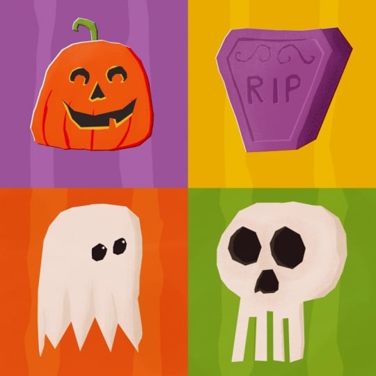
art making method a spooky little twist together, we'll create a cohesive
Halloween collection using Wonky Shapes, a limited color palette, and a process that is
designed to get you from a blank canvas to a finished illustration,
surprisingly quickly. And while we're
creating our motifs, you'll learn how to
simplify your subject, make strong design decisions. And work creatively
within limitations. This way, you can turn your happy accidents into
part of your artwork rather than something
that needs to be fixed because we're
not lowering the bar. We're just removing
the pressure. And at the end, you won't
just have a bunch of spooky illustrations that
look great together. You'll have a simple system
you can use again and again to create collections
around any theme you like. Use your artwork
for your portfolio, turn it into patterns, stickers, cards or prints or simply enjoy the fact that you've
made something really cool. So grab your iPad and
your Apple Pencil, and let's create some
wonderfully wonky Halloween art. I'll see you in class.
2. Class Project: In this class, we
are going to create a Halloween themed illustration
collection together. Now, you might wonder what
collection actually means. Simply put, an illustration
collection is a group of individual artworks that are connected by a
common visual idea. That could be a theme, a color
palette, a certain style, similar shapes, or,
like in our case, a combination of all of these. Each illustration can work
perfectly on its own. But when you put them together, you can clearly see they all belong to the
same little family. Now, for your class project, I'd love for you
to upload one or all of the illustrations you've
created during the class. And to create your project, just head over to
the Project and resources tab and
click Submit Project. You can give your
project a title, upload your artwork,
and if you like, tell us a little bit
about your process or how you felt when working
with this technique. Then hit publish and your project will appear
in the Project Gallery. And whenever you
finished another piece, you can come back, edit your project and add
it to your collection. I absolutely love
seeing what you create, and it's always so much fun to watch a collection
grow piece by piece. And now that we know what
we're working towards, let's get everything ready and start working on our
Halloween collection.
3. Class Resources: Before we start creating
our Halloween collection, let's just quickly
have a look at the resources I've
created for you. For this class,
you'll get a ready to use color palette and
appropriate brush set. So you can follow along using exactly the same colors and brushes I'll be using
throughout the class. You can download everything from the Projects and Resources tab. I recommend downloading
the ZIP file directly to your iPad. It should then appear
in your files app, usually in your
Downloads folder. Once you've found it, simply tap the ZIP file too, unzip it. Open the new folder and tap each of the Procreate
files individually. They will automatically
import into Procreate and should be
ready for you to use. You'll also find my Wonky
Collection Inspirator inside the folder with
some extra inspiration. On the first page, I've included more spooky prompts in
case you want to keep going after the class and add even more illustrations to
your Halloween collection. And just in case you discover
that creating collection is so much fun that
you simply can't stop, I've added a second page with lots of different themes
for your next collections. You can use exactly the
same process we're using in this class and keep creating as many wonky little
collections as you like. Of course, you'll
also need your iPad with Procreate installed
and an Apple Pencil, or another compatible stylus. And that's everything we need. So let's head over to
the next lesson where we start creating a
fun, wonky ghost. I will see you there.
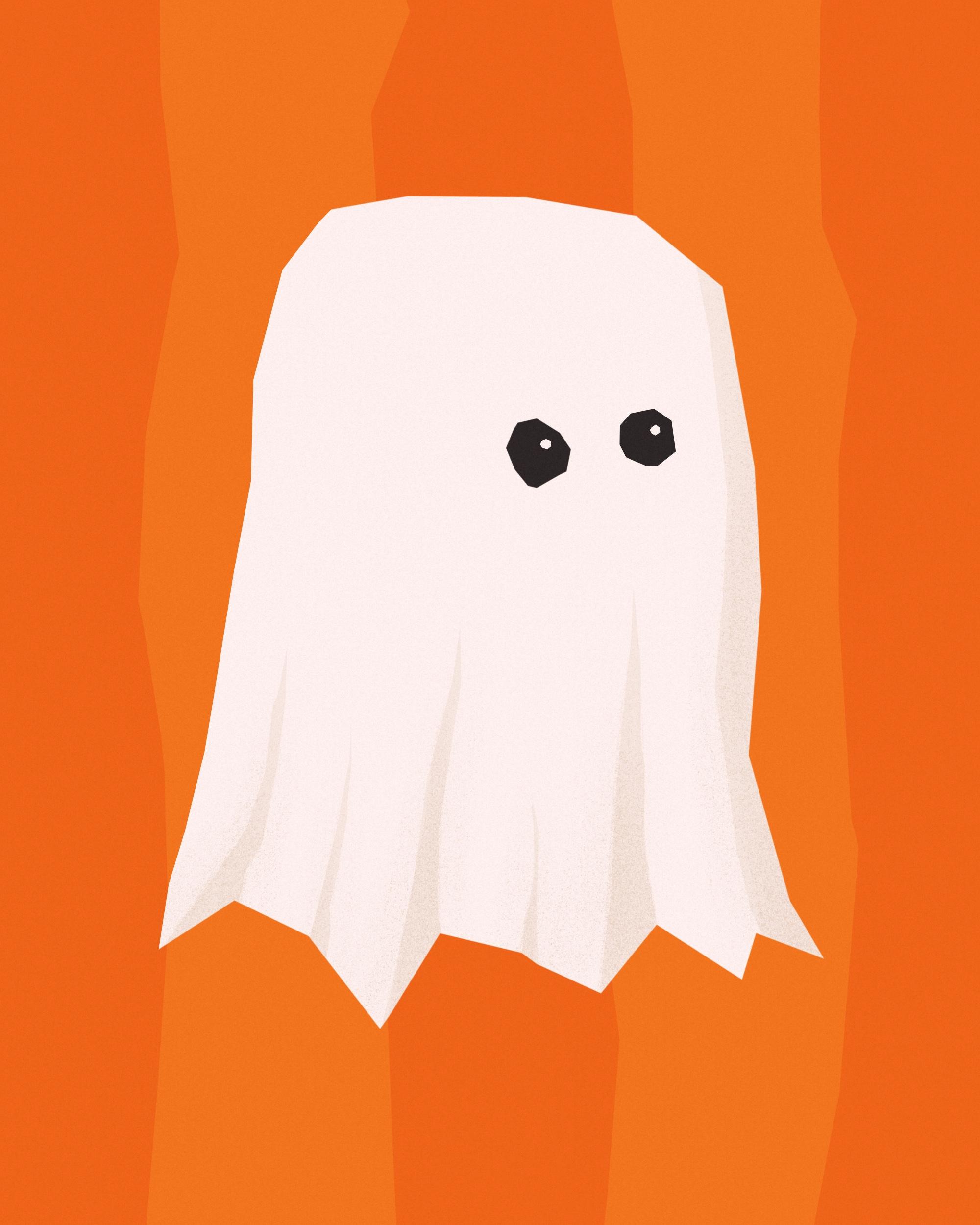
4. The Wonky Ghost: Alright. Hello, and welcome
to our first project. Let's crack on right away. And I've already
opened my canvas. It's 2000 by 2,500 pixels. This size doesn't really matter, as long as you use the same size for all
your illustrations. This method, we're not going to draw in the traditional sense, but we are setting notes and create our shape
with a selection tool. If you've watched
my signature class, low pressure art making
with wonky shapes, then you know already. If not, I'm going to explain
everything as we go, so you will be able to
follow along anyway. However, if you know me already, you know that I don't like drawing with a
white background. So let's get rid of
that in our first step. Let's open the color menu by
tapping this dot up here. And here we want to look for the low pressure spooky
collection palette. And in this one, we're going
to pick orange for now. Great. And now
we're just going to drag the dot onto the canvas and let go to color drop and just create an
orange background. In our next step, we
want to draw the ghost. So let's add a new layer. We tap the layer icon and tap plus to add a
new layer on top. And we also want to pick white because a ghost has to be white. As I've already explained, we are working with
the selection tool, and the selection tool
is hidden here under this ribbon S shaped
icon, we tap that. Down here, it opens a new panel, and we need to make sure we
have free hand selected. And for this technique, we also need color fill enabled. So we're just going to tap
that so it appears blue. And now all we need
to do we need to tap on the canvas to
put down the notes, which then will
create our shape. So when I think of a ghost, I always think of
these pac man shaped like half circle
ish kind of shapes, and this is what we are going
to lay down here as well. So let's just start by
tapping on the canvas, we just go up and down. And then we're just going to add a little bit of a
zigzag pattern here. And now when we
tap the gray dot, it's going to close the shape and it's going to
fill it with color. Tata Beautiful. The shape already
looks pretty good. Let's just rotate
it a little bit. I just feel like here is
a little piece missing. I guess I wish it would be
a little bit longer here. So let's just add a
little bit more white. We tap the selection tool again. All the settings
are still perfect. And now I just want to add
a tiny little portion here. Close the shape, and now I'm really happy with
my ghost shape. I just want to make sure it's right centered in my canvas, so I'm going to
tap the move tool. Snapping enabled, I'm
just going to drag it until we see these golden
lines here forming across. That means it's in the center. Okay, that's a great
ghost already. I just think it needs a
little bit more definition. So we want to add
some shading here. First of all, let's add a ned layer on top
of our white layer. And now I want to turn this
layer into a clipping mask. It's very easily done. We tap the layer and
we tap clipping mask. And now you can see this
tiny little arrow here. That means this layer is clipped onto the
white layer below, and we can only draw on this layer where there's
the shape from below. We cannot go beyond the
edge of the white shape. That's very handy. And
now I want to pick my beige tone it's down
here in the corner. And again, we're going to
pick the selection tool. And now I just want to tap here and add a tiny shape here. And by closing it, it's going
to be filled with base. As you can see, it's only
appearing where the ghost is, but not next to it, even though the shape
is technically bigger. And that's exactly what
we're looking for. So we have a litt shady side here because our sun's
coming from this side. So let's add a little bit more to just create
some definition here. Let's go to the selection tool. Go up in a wonky way, go down in a wonky way. And here again, we
go up here this crease and down again
and maybe here, just a tiny one. And here maybe a bigger
one again. Cool. Oh, that looks gorgeous. It creates some
depth right away, although I feel like it's
a tiny bit too dark. So let's turn down the
opacity of this layer. Let's tap the N. And here
we have the opacity slider. We just make it
more translucent. So we just turn that down, and as you can see,
it's getting lighter. And I guess I like this
with 25%, much better. That's brilliant. I feel though there could be
some texture, you know? Sometimes digital
illustrations appear like really digital and
boring and flat. And by adding some texture, we are going to take
that away right away. So let's add another layer. And turn that into a
clipping mask, as well. And I want to draw with
my shader grainy brush here from our low pressure
ghost brush set here. It just adds some stipples. As you can see, if you go, it just adds some, you know, speckles
here and there. And that creates,
yeah, more definition, like a subtle texture
without being too strong. And it takes away this
flatness, this digital feeling. Very, very nice. And if you think it's too dark, you can again tap the N
and play with opacity. But I guess I'm pretty
happy with the way it is. Of course, our
ghost needs to see, so we want to add some eyes. And by adding eyes, you can turn a good illustration into a very cool illustration. If you know some principles, you could add the eyes now let me show you
with a regular brush. You could add the eyes here. And that would look good. However, it also is
a little bit boring. And by keeping a
tiny rule in mind, you can always, you know, bump the quality of
your illustration up quite a notch by putting the
eyes not into the center, but more towards the side. Let me show you. And we're
going to put the eyes down the same way with
a selection tool. We are on a new layer, and now let me show you. I'm just going to create
a circle more towards the right and another
one right next to it. And now our ghost is kind
of rotated to the side. It looks kind of this way. It creates a realistic
perspective, no matter how
simplified you are, and it just shows that you know about basic drawing principles. So when you turn the head away. The eye that's further away
appears a little bit smaller, and the eye that is closer to you appears a little bit bigger, and we don't have a straight
eyeline any longer, but it's tilted a little bit. However, I feel like this
eye has gotten too big, so we could keep it that way, but we could also just
draw a circle around, tap our move tool. And just make it a
little bit smaller. Just a little bit. Here we go. It's still tiny bit
bigger than this one, but it's a little
bit further below, and it looks like our ghost is rotated and looks
kind of to the right. And another trick I
want to show you is to add instant life to
your ghosts eyes. And that's also super easy. We just add another
layer on top. We go to the white, and now we just add
some light reflections. That adds some makes
it lively right away. So let's tap the selection tool. And tap a tiny circle into this eye and another tiny
circle into that eye. And now let's look and now
it's alive. Isn't that fun? With those simple tricks, you can enhance the quality of your illustration so easily. Overall, I'm pretty happy. I just feel our ghost has
a weird bump up here. So I want to get rid of
this kind of section here, and I don't need to erase, in that case, very
simply done, as well. So I'm going to go down
to my ghost layer here. I'm gonna pick the
selection tool, but I want to turn off
color fill. Here we go. So I'm going to tap here and create this
kind of shape here. I've marked this portion here, and that's what I
want to get rid of. So as you can see, it's not filled with color because
we've turned that off, but there's some stripy areas and some sections
without stripes. So this here,
without the stripes, this is the section
we've just marked. And if I now do the
three fingers crap, We've erased the portion that was selected here in our shape. And there's another bump
which I kind of fight weird. So let's get rid of that, too. We're just gonna create a
shape here around this bump. We do the scrub, and off it is. Beautiful. So our first ghost is done. Let's put it in the
center of our canvas. By just swiping all the
layers to the right, which selects them all. And now we tap the move tool. We can rotate it a little bit. Beautiful. I'm really happy with how this ghost looks here. I'm just not that happy
with the background. So let's do something
with the background, and this is something
we are going to do throughout all the
four projects. We want to create the
same kind of background. By now, in pure orange,
it is too boring. So let's go down to the orange layer and
add a layer on top. And now I'm going to show you
a trick with blend modes. The blend modes are the built
in function in Procreate, which helps you to create
tints or shades of other colors by having them interact with
layers underneath. Let me show you. It's
hard to explain. So for now, the end shows we are in the blend mode normal. There's blend modes that
make everything darker, and there's blend modes that
make everything brighter. And then there's
blend modes that make a whole other stuff, which is not as important
for this lesson. For now, I want you to go
with screen blend mode. Screen turns the
color you're using brighter when it interacts with a color from the
layer underneath. And I show you how this works. Let's just pick our
background color, the same orange we've
used for the background. And now I just want to create two bold wonky stripes
in our background. So I'm going to go to
the selection tool, make sure color fill
is enabled again. And now I'm just putting down a really wonky
crooked bold stripe. And by closing the shape, even though we've picked the same orange as
the background. Due to the blend mode, it's been turned into a really
nice and glowing orange. So let's add another
stripe here. I guess is great, and I'm really making
them wonky on purpose. Beautiful. So we've
created another color, even though we didn't
have to pick one in the color wheel that
matches the color palette. I just feel like it's a bit too bright, a bit too obvious. Somos, I'm going to tap the S again and I'm going to turn down the opacity to, let's say. Um let's say, 25%. This way, it's subtle, but there is still something in the background and
makes it interesting. Let's pull the layer
into the center with snapping on. Beautiful. And one last step and then our first illustration is done. So let's add a new layer
this time at the very top. And now I'm going to show you the other blend mode that
makes it a little bit darker. Let's tap the N and
go up to linear Burn linear burn also not only makes everything
a little bit darker, so it kind of multiplies or adds the colors from this layer with the colors from
the layers underneath. It also creates a nice
vibrant saturation, and that's really
something I like. So with my beige
tone here selected, I want to go to my brush set, and I want to pick the
texture noise brush. And now I'm just going to
draw over the entire canvas. And this adds a very nice, grainy texture over the
entire illustration. So the grain is
within the black, it's within the white, and it's within all the
orange shades here. And that's really, really
handy because it kind of makes a very cohesive
combined image, and it completely takes away the digital flatness of
a digital illustration. However, I think it's too dark. So let's tap the
B for linear burn again and play with the
opacity until we are happy. What you want to have is
a subtle grain texture. Yay. Our first piece in
our series is finished. It was super simple. It looks absolutely gorgeous, even though it's just a
few very simple shapes. Let's move on and
create our next one, which is going to
be a fun skull. I will see you in
the next lesson.
5. The Wonky Skull: And welcome back to
our second project. And in this one, we're going
to create a fun skull. You might think, Oh, my gosh, a skull that's super difficult. No, no, no, we simplify here. It's gonna be super easy. But in our first step, let's just get rid of the
background right away. This time, I guess I want
to go with my green. I just color drop it onto
the canvas super easy. I'm already adding a new layer, and for me, a skull
is white, obviously. So let's pick white. For me, it's basically
just an oval on top with, like, I don't know, a
rectangle underneath. And the rectangle is
not straight down here. We want to create the
teeth right away, so we want to go
like igaki here. So I'm going to go
to my selection tool and let's get started
so you see what I mean. Color fill is selected,
we have white. We are on a new layer. So I'm just going to start here a little bit in the center. Then I create here an oval. And now I want to go down
and create the teeth, and they're really
wonky and fun. When I close the shape, this is what it looks like. It's a gorgeous skull. I really love the shape here. Let's drag it in the
center ish Beautiful. And now we want to do the same. We want to give it some
depth by adding shades. So let's go ahead and
add a layer on top, turn it into a clipping mask, and we do the same
as we did before. We're going to pick
the beige tone here. And again, my light
source is over here. So we're going to have some
shade here, some shade here. And we could even add
some shade down here with the teeth to just indicate
that they're a little thicker, not just flat like
a piece of paper. Let's do that. It's super easy. We're going to go to
the selection tool, color fill still on. And now let's just start, tap down and we kind of create some banana
shaped thing here. And it's filled with color. And now you see what happens. If you don't make the
layer a clipping mask, it goes beyond the skull
shape, but that's no problem. We just tap the layer,
tap clipping mask, and now it's just here over the shape of the skull and
not going beyond the edge. But it is way too
dark, of course. So we turn down the opacity. Let's go with Let's go with
30% and see where we are at. Beautiful. I almost
feel this is too light, so make it a little
darker, maybe 50%. I guess that's better. So now we want to add
another shade here. And also, let's make the
teeth kind of dimensional. This portion here kind
of doesn't belong there. It looks kind of weird. So I want to get rid of
this top section here. So let's go to the
selection tool, and we do our erasing trick, so that means we need
to turn off color fill. And we just get rid of
this top portion here. Scrubby. And off it is. Yes, that's much better. Okay, that's great. I just also want to add
some texture because, you know, we don't
like the flatness, so we add a new layer. We turn it into a clipping mask, and we go back to
our shader grainy. And now I think we can bump up the brush
size a little bit, and we can just add our
speckly texture here. And I guess I also want to
indicate something where I guess the eyes are going to be and maybe even
here where the nose is. So let's move on to the eyes, add another layer
on top, pick black. Let's go to the selection
tool, color fill on. And then we are just
going to create two eye kind of shapes here. They don't have to be
on the same height. This is brilliant. Wonky and kind of crooked. That's exactly what
I'm aiming for. And we also need the nose, and the nose is, of course, only a hole in a skull, and it kind of looks like
a upside down hard shape. So let's do that here. I'm just gonna go like this. And this is a perfect nose. I really like it. Awesome. In this one now, we want to indicate that the skull is not
as thin as paper. It has a little bit
of a thickness, and we can indicate that
super easily by adding, like, another layer here,
which shows that there is a little bit more of the bone structure going
inside of a hollow skull. Let me show you what I mean. So here's our black layer. Let's add a new layer on top
and make it a clipping mask. And now we want to
pick our beige tone again. So we start here. We just go down and add basically another layer
here on top, like this. And that creates a
depth right away. It is just a little bit too
bright, so let's fix that. This is gorgeous. So
I'm here with 84%, and I guess I really like that. And we can do the same
with the other eye. And then we need the
same with the nose. Okay, so what's missing? Of course, the
background is missing. So let's go down to
our green layer. Add a new layer on top. And if you remember,
then you know we want to set it to screen blend mode. And then we're going to
pick the same green. And we put down two bold stripes
with the selection tool. Brilliant, and of course,
it's way too bright. So we turn down the
opacity a little bit until it's subtle. Like this time, I guess
I want to go down to 18 maybe 18%. This creates interest without being too disruptive
for the eye. We just want to add the
final texture layer. So let's add a layer
on top of everything. Turn the blend mode
to linear burn. And then we're going to pick our beige tone again
and our texture noise. We add the texture,
and this time, you can really see how it turns the skull a
little bit darker, which is not what we want, but the grain is
really, really nice. So let's turn down the
opacity until we are happy. Let's say, 50%. So the grainy texture
is still there. The noise is still there,
and the flatness is gone. And this is our second
part of our collection. How fast was that?
It's gorgeous, and it looks super cool. I'm really happy
with the result. So let's move on to the next one where we're going to draw a tombstone in which
we're going to add some wonky
lettering as well. I will see you in
the next lesson. H
6. The Wonky Tombstone: All right. Welcome back to
Project Number three. In this one, as promised, we are going to create
a super cool tombstone, and I'm here in
Procreate again with my 2000 by 2,500 pixel Canvas. Again, you go with
the size you want to use in your illustration
you've started out with. And this time we want to in
the background in yellow. So let's go pick our yellow and throw it onto
the canvas. All right. And in my next step, let's add a new layer. We are going to
draw the tombstone, and mine is supposed
to be purple. We are using the selection tool again with color fill selected. And my tombstones are always kind of a trapezoid shape
with kind of slanted corners. So I'm going to start
here at the bottom. I'm going to go across. I'm going to go upwards. And now I'm going
to slant inwards. Slant down and go down
to the bottom again. Great. Awesome. I guess I don't like
this weird bump here, so I'm just going to add
a little portion here. I want my tombstone to also have dimension to be
a little bit thick. And this is also
super easily done by just adding a little
piece here to the side. We're going to start
here down in the corner, go a little bit slanted upwards. Like this, and then we
go over to the corner, close the shape, and now we've added the thickness
to our tombstone. It's super boring, though, so there's not really
much definition. So let's do a cool trick here. We want to duplicate this layer. And if you've watched my signature class,
you already know, let's duplicate this layer, go to the bottom layer, and we are going to
turn this white. So we tap white. We go back to the Layers panel, we tap this layer
and we tap Select. And because we have
color fill enabled, our bottom layer has
been turned white. Oh, that's cool. Now we want to move our bottom layer a little
bit to the top left. Because as always, as I said, my light source, I want to
be in the top left corner. So by moving this white
layer to the top, we create some sort
of an outline, and this outline
kind of works like a highlighted section that happens when a light source
shines onto something, right? When a light source
hits an item. We can create even
more definition by changing the blend
mode of our purple layer. Let's tap the N, and
let's say we turn the blend mode of our purple
layer into linear burn. And then you can see down here, we created some darker outline, and that's due to the purple is interacting with
the yellow underneath. And now we want to define
the side of our tombstone. So let's add a new layer
on top of our tombstone. Turn that layer into
a clipping mask. Also change the blend
mode to linear burn. You could also go
with color burn, shade, darken or multiply. I'm just picking linear
burn because it just creates a very vibrant
shading color. If you want to go for a
little bit more muted colors you can go with multiply. Just try it out. Play around
with what you like best. I want to keep linear burn, and now I want to create
a shade with my purple. Let's pick the selection tool. So I want to start
here in this corner. And I kind of go parallel to the outline of our tombstone. So let's go down at some wonk, go back up and close the shape. And here we've defined our site. It's just way too dark, so we can use the opacity. Let's say 22%.
That's what I like. And, of course, our tombstone needs a little bit of texture. So let's add another layer, turn that into a
clipping mask, as well. And we also want to give it
the linear burn blend mode. And then we are going to pick the shader grani And because this section of our
tombstone is a little bit brighter because here is the spot where
the lights hits it, we are going down to
our tombstone layer, and we pick the shader
grainy as our eraser. And now we just erase
some of the purple here. Just to add some speckles, some texture and get rid
of the digital feel. It's very subtle, but it
makes a huge difference. Okay. So, like, the shape of
our tombstone is done now. I just want to indicate
some engraving here. So let's find the
layer with our shadow. That's the layer
with our shadow. And here I want to indicate
that someone just took a chisel and made it indent here around the edge
of the tombstone. When you think about the
light source comes from here, that means the light doesn't
hit the carving here, so this appears darker, but the light hits the
carving down here. And this is going
to be brighter. So it's hard to explain. I'm going to show
you what I mean. We're still on our shadow layer. We just pick the selection tool, and I'm just going to follow
the top of our tombstone, and then I go down here, and then I go back up
and close the shape. Here we have, like, a little shadow added. And now we need the
brighter opposite side. So let's add a new layer. And this time,
we're going to turn the blend mode into screen. And now we're going to go this way and make this line
a little bit brighter. And it's filled with color. However, I think we didn't
really turn it into screen. So let's turn it into screen, and boom, here we have
the light right away. Of course, it's way too bright. So let's play with opacity. And this is already enough now. It looks like here we have an indent in the center
of our tombstone. So I really like how that looks. Next step, I want to add
some swirls up here, you know, some decoration. And we can do that
on our shadow layer. So let's go the layer
below in V linear burn. Tara. And in the
other direction. Yes, let's just move it a
little bit into the center. I guess, it's a little bit of center and we can
rotate it a little bit. So for now, it looks like
a shadow, which is fine. We add more to it in a second. But I also want to write
rest in piece like RIP here. And we can do it the same way. So let's go to the
selection tool. Let's start with the R. It
can be crooked and wonky. Let's just move it a little bit. It's too far to the right. So, of course, we need to
have the holes in here. So let's go to the selection
tool, disable color fill. And now we just create
those holes here. One here and one there. And now we can just scrub. And we've erased those holes. Super cool. Since we know the light source
is coming from here, we know we need to add some brighter section
at the bottom. We need to add a
new layer for that. So let's do that. Turn
the blend mode to screen. Awesome. And here, don't
forget the worlds. It looks really great. But I
guess a little bit too much. So let's turn down the
opacity a little bit. Then our tombstone with this engraving is done.
It looks really cool. We just need the background. So let's add the stripes
in the background. Let's go to layer one. Add a layer on top, set the blend mode to screen, pick our background
color, pick the yellow. I drag them in the center and play a little
bit with the opacity. Maybe 33%. And I guess we need to move our tombstone a
little bit to the center. Let's mark all the
layers belonging to the tombstone and just track it wherever you
think it should be. Kind of like this. Beautiful. And then our final layer
with the grainy texture. So we add a new layer on top. We turn the blend Mtolinea burn. We pick our beige and
the noise texture brush, and we drag it all
across the canvas. And then we play
with the opacity. Kind of like 50% again. Oh, yes, I love it. I'm really, really
happy with the outcome. And that's our third
collection piece done. So let's move on to the
final one where we are going to draw a Jacko lantern.
I will see you there. H
7. The Wonky Jack-O'-Lantern: Hello, and welcome back
to our final project, which is going to be
a Jack-O'-Lantern. I'm going to start with my
background, and this time, we pick the color we
haven't picked yet, and it's our purple. So let's drag it
onto the canvas. Great. Of course, there are a lot of pumpkins and a
lot of pumpkin shapes. And the one I want
to portray today is kind of the regular oval
typical Jack-O'-Lantern shape. We are going to add a new layer. First, we are going to
pick orange, of course. And then we are going to
pick the selection tool, make sure free hand and
color fill is selected. And now we are going
to put down our shape. Let's start up here and just kind of create
something like this. We want to add the
white layer now to create some additional
outline and interest. So let's duplicate the pumpkin let's turn the top
layer into linear burn, of course, it gets
really dark because the two orange layers are interacting now
with one another. Let's tap the bottom layer. Pick white, tap the bottom
layer again and tap Select. Now the dark color is gone because now with the
white layer underneath, there's not much to interact. So let's move the bottom layer. Again, my light source
is coming from here. So here's the highlighted area. And here, of course, is the shady area. If you look at a pumpkin, it has those ribs, right, those ridges in the flash, and we want to indicate them. Of course. Let's open
the layers panel, go to the pumpkin layer, the orange one, and
add a layer on top. We are going to turn this
into a clipping mask. And of course, we want to
work with blend modes. So let's go to linear burn, in that case, pick orange again. And now we are going to
lay down our shady area. So of course, when the light
source comes from here, the darker outline already tells us where we have to have
some shading happening, and this is just
what we are going to add here around parallel
basically to the edges, and I want to have
it ending here. Just kind of a banana shape, and that makes everything
darker right away. And if you think
of those ridges, they are curved like this. When the light
hits it from here, that means this side of the curve must be a
little bit darker. And since our shadows
are too dark, right now, we are going to
play with the opacity again. So let's turn it down
until it's subtly there, and it already looks like
a great pumpkin here. Of course, we want to add some speckles, some
speckle texture. So let's add a new layer, turn the blend mode to linear burn and also make
it a clipping mask. And then we pick
our shader grany It's back to Max here. So let's turn it down again too. Let's say, 30%, I
guess, that's enough. And, of course, where there's shadow, there's also highlights. So I want to erase
a little bit of my pumpkin on the orange layer just to create some highlight. Let's check. We're still our eraser is still
with a shade or granny. And now I'm just
erasing a little bit. A pumpkin also
comes with a stem, and I guess we are going
to add that too in green, but behind the pumpkin that we don't have to pay attention where it starts
and where it ends. So let's go down to our
purple background layer. Add a a layer on top. And now I want to pick green
and my selection tool. That's gorgeous. And we want
to add the same effect here. So we duplicate this layer, turn the bottom layer white. We go back to the layers panel, we tap the bottom
layer and we say select now on the green layer, we change the blend
mode to linear burn for the full cool effect. Go to the move tool, and then we give it
some notches up, and here we have the outline and here we have the highlight. It needs some shadow, obviously. So let's add a new layer
on top of the green one. Make that linear burn
and a clipping mask. Pick green again. However, it's also way too dark. So let's play with opacity. I'm a 20%, and that's
exactly the shade I want. And if you look at the
stem of a pumpkin, it kind of has those
ridges and hair and stuff, and I just want to
indicate that with lines. So let's add a layer on top. Make it a clipping
mask, as well. Play again with the blend modes. Let's make it a
linear burn for now. And now I want to
pick my nice liner, and I'm just going to add
Oops too sick, though. We just need some
speckles because it's too digital right
now, add another layer. Make it a clipping mask. Turn the plant mode
to linear burn, pick the shade or grainy and add some speckles wherever
you think they should be. Maybe like so. Then we can
also add some highlight. By erasing in the
green bottom layer, we pick the eraser. Let's now put everything down
to have it in the center. So we need all the layers
belonging to the pumpkin. By swipe them all to the right. Go to the move tool. And then we're just going to track them where we
think it should be. It's maybe even a bit big, so let's make it a bit smaller. Of course, our Jack-O'-Lantern needs a Jack-O'-Lantern face. Let's add a new layer
on top of everything. And now we are going
to pick black. So my eyes usually my eyes
usually look like this. It's hard to explain. I just feel like they could even be a little bit
bigger, so, Michael. Just make them tiny bit bigger. Like this. Cool. So, and now we need the nose, which is basically
just a triangle. And, of course,
it needs a mouse. It's kind of off centre. Maybe we can pull the entire face up a
little bit like this. And I feel like this
eye is too big. Let's make this one a
little bit smaller. Yes, that is super cool. Also, the pumpkin is not as
thin as a piece of paper, so we want to
indicate the flash. And this is something
we can do as a clipping mask on top of
black. So let's do that. Let's go to the blackface layer, add a layer on top, and turn that into
a clipping mask. And now for me, the flash of
a pumpkin appears yellowish, so let's pick yellow. We go down here like this. And then we probably are
going to see some flesh here. You also see something
here at the nose. I'm not happy with
this eye here. I guess because
this is too much. Let's go to the selection tool. Turn off color, Phil. I guess I want to take
this portion away here. Yes, I guess even
this pointy top here. Yes, that's much better. The only thing that's
missing is our background. So let's add a new
layer on top of purple. Turn the blend mode to screen, pick purple, go to
the selection tool, make sure color fill is enabled. U Cool. And then turn down the
opacity to kind of 25 26%. Beautiful. Oh, I love it. Of course, the final grainy layer is
missing, the noise layer. So let's add the
last layer on top. Turn the blend mode
into linear burn. Pick beige. It's
always the same steps. Pick the texture noise, drag it over and play
with the opacity. 50%, maybe and it
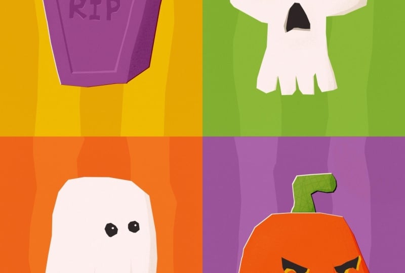
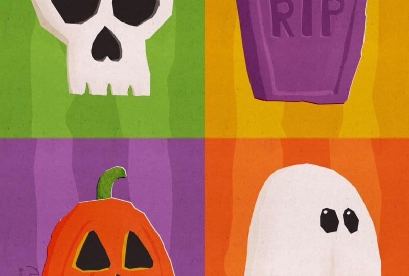
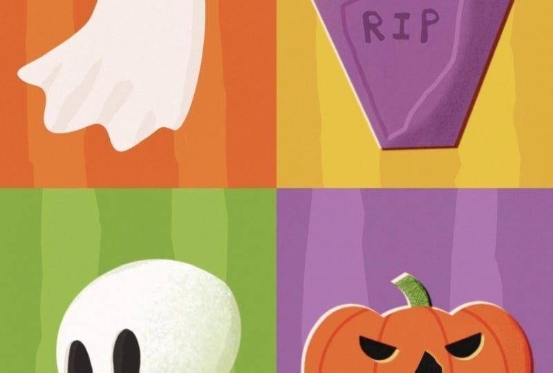
looks fantastic. So now let's look how all of our illustrations
look in one piece. So I'm here in a new canvas, and I'm just going to add all four illustrations
to this canvas. And here's what I did. I
just used the wrench tool, and I said, Insert a photo. And then I just uploaded from my camera roll my
four illustration, and now we can arrange
them in one canvas so we can see how
they look together. So let's go to the move tool, make sure snapping is on. And then we're going
to just drag it in the top corner until the golden lines appear
to make it half the size. Then we have the tombstone, and I guess the tombstone
just goes top left. This is how it looks. It is fantastic. And that's it. We've created a super
simple, wonky, visually, super interesting
collection that is cohesive, colorful, and fun. And if you want to know
what you can do next, then follow me to the
final session where we are going to wrap up
the class and look at how you can use
this technique to create whatever sort of
collection. I will see you there.
8. Before You Go: And here we are. You've made
it to the end of this class, but most importantly,
you've created your very own wonky
Halloween collection. Throughout this class, you've practiced simplifying
your subject, working with a limited
color palette and making strong design
decisions within limitations. You've also learned to
embrace wonky shaves and happy accidents instead of worrying about the perfect line. And you don't have to stop here. In your Wonky
Collection Inspirator, you'll find plenty of
extra spooky prompts to add even more pieces to
your Halloween collection, as well as completely
different themes you can use to start
your next collection. But before you dive
into your next one, make sure to upload
your class project. I would absolutely love to
see what you've created. You're also very
welcome to share your artwork on social
media and tag me. I love sharing student artworks and giving them a little
shoutout in my stories. And if you enjoyed this class, I'd really appreciate if
you left me a review. And make sure to follow me here, or join my newsletter
list if you'd like to stay in the loop
about new workshops, classes, or whatever else I'm
cooking in my art studio. And if you're craving
even more art making with live workshops in
a gentle community, then you should definitely
join my Wonky art society. It's free, and I'd
love to see you there. And now thanks so much
for creating with me. Keep it wonky, keep having fun, and I'll see you next time. Bye.
 Jutta Schneider, Artist | Educator