Transcripts
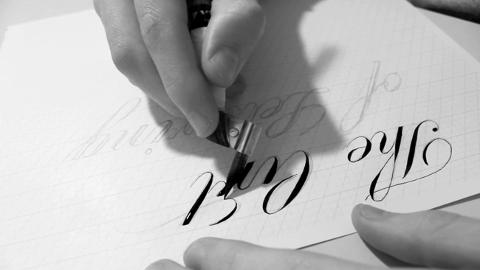
1. Letterform Composition: Hello everyone, welcome to week 1. I just like to say thanks to all you for joining, I think we have over 600 people, which is pretty incredible. With that being said, this week we are going to be talking about what lettering is, how we build proper letterforms, how lettering has personality and preparing with research and working on our sketches. Let's get to it. What is lettering? I think a lot of people have this misconception that lettering and calligraphy, and typefaces and fonts and typography are all the same thing when they actually aren't. Prime example of this, I was looking at Skillshare's Facebook page, and I've seen someone had commented on my class saying, I thought that you call that calligraphy. Looking back, the biggest difference between lettering and calligraphy is that lettering is drawn and calligraphy is actually written. A good example of this would be, let's say someone came to you to do 200 wedding invitations and they want you the hand letter those, that would take a lot of time. You'd actually want a calligrapher to do that, because they can write that out a lot faster than someone who is drawing each individual character. Then looking at the difference between fonts, typefaces, and lettering, because I think a lot of people think these three things are the same, but they're actually not. Lettering can be seen as completely custom. For example, I made this just for this purpose. If I rearrange the letters, they wouldn't look good, and as well, there's no extra characters. Then a type designer would create a typeface for layout large amounts of text, and font would be the actual software that enables you to use that typeface. A major part of lettering is actually the letter forms themselves and how legible those letter forms are, and also working those into a composition, whether it's well balanced or not. The thing I notice with a lot of beginning letterers, what they're doing is they're not drawing from a reference material. They're just starting out with what they think letters should look like. I also did that myself, and it really lends you too drawing improper letterforms, and in the middle of your career you're going to end up having just relearned everything. I think a great place to start is by looking at copperplate script, something where it actually started out and building a basis off of that. Here's an example of a copperplate script, just something that's really bare bones and you can really learn from and build off of. But first, when you're looking at a copperplate script, you really want to build a grid when you're drawing. Because this enables everything to stay on not only the same baseline but slant. I see a lot of beginning letters in the phrases, words, all the letters aren't on the same slant and that ruins the legibility of that phrase or that word, and also learning to where to apply the stress of each letter. This comes from writing with a copperplate pen. You'd start out here and then you'd push that a little bit harder right here. They get that thickness and then let off as you're turning around. There's actually, here's a video of someone writing out flourishes and you can see they're going to start out heavy, and then as they turn their letting off light. Then looking at another video. Just teaching you how to keep everything on slants and all the parts of writing copperplate, and I'll post these in the discussion so you guys can all see them. Now, that we've talked about copperplate, I wanted to show you example. This is by Doyald Young. The idea here is that he's taken something like I've shown you that's bare bones, but he's added small variance to it to really create something unique. He's also used, it's faint, but you can see he set up a grid and there's also slant lines along all of it. I think that really keeps it on the same line and it makes it really legible, and also the space in between the letters is all even, and that's something that takes practice, but the grid will also help you maintain that. Looking at another piece by Doyald Young, we can see the same concepts still apply. The baseline would've shown here along with the slant line but I think they got lost when he inverted this sketch. But looking at it, everything is still on the same baseline and everything's the same height, everything. The widths are all in proportion, and also he has the straps on each letter correct. Also looking, it is bare bones, but he's added a lot of variance to this decree, a really unique composition. That's what a lot of letterers will do, is it'll take something that's really legible and then build off of that. You can see a lot of letters will also use flourishes to balance out composition, because without these flourishes, you'll maybe on one side, the other side would be really heavy compared to the other ones, so it really creates a great balance. While we're talking about copperplate script, I also want to bring up another style which is Brush Script. The same concept applies except we're using a brush this time, so your stokes, you'll be a little bit thicker and you can also vary a lot more thickness as I'll show you. Looking at letters here, you still have to apply pressure and taking off that pressure. You're going to start out heavy right here, and as you're moving down, you're going to take off that pressure as you turn around and get that contrast. In looking at an example in the video right here, you can see that it's almost like a flick on the tail of each letter. Also here's another varied style. It's more casual, a lot thicker, less variance. But it still looks really good. Now, let's talk about personality. I think we've all seen personality in letterforms, but maybe you just haven't taken account for, because we're not trained to. But maybe you've looked at a certain logo and you've gotten a certain feeling from it and you really didn't know why, and that really could have been because of those letter forms have a personality to it. Looking at an example on the slide, we can see that the masculine type is actually really girly, and I think this aids to a lot of the flourishes around it versus the other, which is, really big, really bulky and also has texture to it, and this really makes something like really masculine. I'm looking at another slide here, for the ladies in this class, I'm pretty sure you wouldn't want to get a Valentine's card with love written like this. You'd probably prefer something a little bit more elegant, a little bit more script in. That's just the personality of those letterforms, and also looking at something that has to do with more on the illustration side. While we can give people certain feelings from lettering in these ways, we can also actually take actual material items and apply them to the lettering, for example, right here, and there's many examples, but this is just three, variance of ribbon, and rope. Looking at that, maybe that's something you can apply to your your phrase. For tools and materials, I just made a video of me showing you each individual item. I just wanted to talk about some of the materials that I had shown in the slide so you guys can actually see them in person. First, this is the Staedtler lead holder. The difference between a lead holder and an actual pencil is that you can take the lead out, so you have a separate piece of lead, and this is just an actual holder. When you push it down and opens up, you can insert the lead in there and wherever length you want it. Then if you get a sharpener, someone said it comes with a sharpener, but I like this one better, and you can just you stick it in there and you rotate it and it gives you a fine point. Next, we have the PENTEL color brush. This is it. It's a refillable brush. It's nice. That's opposite because it's made in Japan. These are the refills. I'm not going to turn it over because it will spill. That just screws on nice, and easy. It's good for brushwork, and brush practice. Also, the Mac brushes are really nice. They're some in the US. I really like them, nice and soft, and they spread paint really evenly. If you like painting or if you want to get into practice like brush learning, they're definitely something to get. Then the Parallel Pens. This is the six millimeter, the biggest one. They're called parallel because there's two plates and the ink comes in between those two plates to spread. These are also refillable. If you see right here, if you unscrew this, there's an ink cartridge right there as well. That's nice. They run out quick, but I don't know, it's worth it. There's four different sizes. There's a 3.8, a 2.4, and a 1.5 millimeters. You get a lot of different variances. This is what the cartridges come in, a pack like this. The Dot Print book, which is from Behance. I highly recommend this. As you can see, it's really easy to draw straight lines on it, and it's really grid ready for you so I definitely recommend using one of these. For reference material, Dangerous Curves by Doyald Young. A really good book. I have pulled a lot of examples in the slides from it. As you can see, there's just a lot of examples of lettering. A lot of examples of his work in lettering in there. It's where I draw the inspiration from. Another book. This is more of just a reading book in the history of typography, Just My Type. It makes it fun to read about. I'm about halfway through it, I'm enjoying it so far. Last but not least, Scripts by Louise Fili and Steven Heller. Lots of all different samples of lettering and mostly scripts, but from different countries; Paris, France, Germany, US. It's really during the Golden Age and there's lots of great stuff look at in this book. I highly recommend this book because it's not that much either. The Doyald Young one is $100, so a little bit more on the expensive side. Research and inspiration. This is usually one of the biggest parts of a lettering project. It usually is the first thing to happen, even before sketching starts. Usually, if you're working with a client, you're going to get a brief and they usually give you some examples of what they're looking for, but a lot of the times, too, you have to look on your own and just browse through maybe old books you have. There's also a lot of stuff online. I'd give you an example of this Pinterest board I love by, I think [inaudible] , and it's just got a page after page of completely different examples of lettering. I just look at this a lot, and try and get the feeling for a certain piece through multiple examples. I think it's best to look at a lot of different examples because then you're not going to have a piece that looks exactly like someone else's piece, or it really helps aid to you having something unique, and really building a style. Looking at a recent example from a project I had worked on, art director came to me looking for a crate label illustration for the front cover of their magazine. For my research and inspiration, I looked at as many vintage food crate labels as I could. Just taking inspiration from as many as I could and trying to mix them together. The project actually got killed because I think the publishers love photography and hate illustration, but the art director loved it. Looking at the final, you can see that it's definitely inspired by food crate labels and has sort vintage look to it, but still, it's not exactly the same. I put a little twist on it to make it my own. Last but not least, let's talk about sketching. Now that I've shown you techniques for creating really legible letter forms, and also setting up grids, and things to create, balance compositions, I think that it's a good idea to apply these to your sketches. Maybe some of you start out with small thumbnails, working the composition, that's fine. Everybody has different sketching. I don't expect you-all to have perfect renderings of your sketches that will look exactly like your finals, but I think it's best practice to try and get there because it not only makes it easier on yourself when taking it digitally, but if you're showing it to a client, they can really get the idea of what the piece is going to look like. For example, here's a piece that I recently worked on. Here's the sketch. I really wanted to show the client what they were going to get when it was vectorized. If you look at the vectoring, there's not really much of a difference in the two, and it really helped. It got approved really fast, and they loved it, and there was no changes I think because they could see everything beforehand. I hope this lecture was helpful and informative, looking at [inaudible] script, and baselines, and working those into your sketches to create really legible lettering. It doesn't have to be this exact style but the same idea applies for all the lettering you're doing. Also, looking at balancing our compositions, adding personality to pieces, it's always something to think about. Next week, I'm going to be talking about taking your sketches, and moving them into the digital realm, and factoring them. There's a few different ways to do this. I'll be showing that, and also, I'll be doing office hours, which is me just answering questions live, so if you have any questions, you can post them in the discussion boards. I'll create a main one that you can post them all in and I'll be answering those. I also think you can type them out during the actual office hours too. If you don't get here in time, I'll still be able to see it, I think. Thanks.
2. Vectoring: Welcome back to week 2. This week we're going to be looking at taking our sketches and turning them into vector artwork using the vector-based program, Adobe Illustrator. If you don't have a copy, you can download one at Adobe.com for a free 30 day trial. Let's get into it. Now that we have Adobe running, we're going to open a new document. To do that, you go up to the menu bar, hit File, New, and then this new document box will appear. I'm going to keep all the settings pretty standard, let's hit "Okay." This is what your typical Illustrator document will look like. This is called the art board, and this is what we'll be working on. You may be wondering why we're using Illustrator versus another program like Photoshop. The main reason for this is Illustrator is vector-based, it uses the Bezier curve, which is a mathematical solution for two points that create a path. It doesn't rely on pixels, it just relies on constant points being placed and then the path in between those. Now that we've talked about the Bezier curve, let's look at how to use it in Illustrator. Looking at the left, here's our toolbar, there's many tools in Illustrator, but the one that we're going to be using most of the time is the pen tool, which is the fifth one down. You can click it or you can also click P to get to it. This is what you use to lay down those points, so you just click to lay a point down and then click anywhere and you'll see that it creates that path along these two points. Zooming in, you can notice that this line does not pixelate at all. That's the beauty of vector. Further looking into this vector path we've created, we can connect multiple points to create a shape. By doing that, you're just placing more points around whatever object you want to create. At the end, which is always the first point that you've created, you'll hover over and you'll see a circle, that means that it will close this path to create that object, so you want to click there. There we have a rectangle shape, pretty simple. But another great thing about these paths is that you can create curves with them. You can really fit around any shape you can think of. To do that, you click as you normally would, but on the second click, you want to hold it down and drag either up or down. This will create an anchor point, which from there when you pull, it creates that curved line that you're looking for. When you let go, you'll have that curved line, and I'll take away the fill, so you can just see the stroke. When you click again, it's going to automatically assume that next curve to match the original one. This isn't always the greatest thing, but sometimes it works out well. But if you don't want that second curve to match, all you have to do is hit Option, hold down Option and click on that point where you see the two anchors, and that will delete that automatic assumption of the next point. You see here I can create any weird curve I want. These can also connect in the same way, you go back to the original point and you see when I click, it closes. Now there's nothing inside of it because I don't have a fill set. But there we go, so I have a really weird shape. But this is the basis of how you vector letter forms. Because essentially, letter forms are just shapes, so what we're going to be doing is tracing around these shapes with the pen. Now lets put all of this into context. Let's start tracing a sketch. I'm just going to use some of your guys' works as examples. I hope you don't mind. I have one of your sketches on my desktop, I'm just going to drag it and drop it in and scale it down. Also, there's a few different ways to bring in a sketch. The simplest way is just to drag it from desktop or folder you have it in. But you can also go up to File, Place, and then find it wherever it's at and place it in there. A good tip about sketches, if you're scanning in, it's obviously going to be flat, but if you're taking a picture of it, try and get it as flat of an angle as you can and not on a weird angle, it just makes tracing it a lot easier. The first thing that I like to do when I have my sketching is build another grid system around the lettering that I already have. In the start off, you need the ruler up, I already have it up, but if you don't see it, which you probably won't, because it isn't set to be up, go to View, Rulers, and it'll say, instead of hide rulers, it'll say show rulers, and you just click that or you can hit Command+R for short key. You just click in the ruler space and drag down. I'm just going create a baseline right there, and then the x height. Now for the slants, I don't think there's a ruler that goes on slants, but I'll just use the Bezier points to create a slant line. There we go. If you click on it and you hold down Option and Shift together, you can drag a new copy out and make multiple copies. It doesn't look like the slant line is exactly right, but that's not a problem, just drag one end a little bit. Let's just work on e for now, for the show. Now I've got everything set up. Now I'm going to take out my pen tool by hitting either P, or just going up there and selecting it. I'm going to zoom in a little bit. You can hit Command plus the zoom in for short key. Now I'm just going to start tracing this shape. I'm going to do the outside first because the es are actually going to be two different shapes, and I'll show you what I mean by that. But first let's just start. I usually like to start around the top and just work my way around. I then click, because I have it on plus, there we go. Then other thing is why it wasn't working before, it's because I had it on plus, which I'll show you in a little bit what that means, but you just hit the plus key to get to that, and you can also hit minus too. But to get back, you just hit P again. When it has the X on there, that means you're all good to go. I'm just going to start plotting points, holding down the second one to get that curve, and then it will automatically assume the next curve. Like I said, sometimes this doesn't match what you have. Right right it's not perfectly on there, but it's fine for showing for now. Then I'm going to click off at this point by hitting Option, like I said before, holding down Option and clicking it. Then I'm just going to actually zoom in a little bit, I'm going to create the end here. That's good. I'm also going to click off again. I'm going to start. It's a lot of playing around too. I know that this isn't going to connect perfectly, so I might have to bring this up a little bit, and turn this to 10 bit. Good enough for now. Now for this inside shape, you can create a lot of these, you don't have to use the pen tool for most of them because they're just actual ellipses or circles. So if you go over here to the menu on the left, right here you'll see a box. It usually has a square in it, but if you hold down this box, a sub menu will come up and you can choose from there. I'm going to choose the ellipse tool and zoom back in. I'm going to create ellipse. Now, it's not on the same angle as that. So what I'm going to do is, if you go to the box that surrounds it, if you go to one of the corners, this will come up and that means that you can rotate it. You just whole down and move and you can move it whichever way you want. I'm going to move it. That perfectly fit the strip. There we go. Now we have two different shapes. I'm going to click both of them and hold Option Shift is to drag out and copy. This show you over here. What I mean by these two different shapes not working is, we click both of them and add a fill color to them. We see that the inside shape disappears. What we have to do is exit punch this shape through the other one. I'm just going to change the fill color to the background color. Now, it may look it's punched through already, but it's actually not. I'll show you an example by just drawing a background there. We can see that it's not actually punched through. To punch it through, we have to use the path-finder, which is over here, but it might not be up for you to find it. You just go to Window and go down the path-finder over here and just click it. If there's a checkbox by it, that means it's up. What I'm going to do now is select both shapes. What this tool is going to do is it's going to punch this ellipse through the e-shape. So I'm going to go to the second one, which is minus front, and click that and you'll see. There we go. Now we have an e. That's one path. If we go to just outline view, you can still see that if you click on it, it's clicking on all the outlines. That's the first way how to trace your paths using how I talked about closing the points around it. Another example, maybe without having to use the path-finder tool, would be through the T right here. So what I'm going to do is just trace around this T really quick. Here is the end point, the original point that I started off with, which will be the end point. So I'm going to click that with the head of the circle on it. That closes this. Then if we just add a fill, we can see that we have another vector shape right there. That's the first way how to trace letters. It's pretty standard. But there's two other ways when things get a little bit tricky, like using more high-contrast stuff that goes from thick to thin, where you just have one line. I'll show you how to do that. Now, let's look at a second example of something that's more high contrast, goes from being thick to thin one line. Let's drag this in and do the same thing. Setting it up, I'm going to scale it down a little bit. Let's see here. I'm going to match it up with the ruler lines. Almost. There we go. Let's create the baseline, xi looks. It changes a little bit throughout, but that's fine. Now, looking at this, we can see that we have one line width right here that goes into something that's thicker. This is a bit more of a difficult process, but once you get the hang of it, it's a bit simpler and there's actually two ways to do it. So I'll show you this way, then for CS 5 users, there's a new way to use, and I'll show that too. Well, we're going to start off the same way by clicking there to start our path off. I'm just tracing it. I said I'll have to stroke I know that's why you can't see that. Let's start. I'm going to continue this around this one with stroke. These are X3. Again, there's a lot of playing around to get everything exact. So I can add that circle in. For now, I'll just put that right there. So I'm going to go back down to the bottom and do the other side now. I'm just going to go straight up. Now, here's where the tricky part is. You could continue how I showed you the first method. Oops, sorry, I'm zoomed in so far. It's hard to get. You could go around like this, but what you'll notice is it's going to look sloppy and uneven because it's hard to follow the same path twice when it gets to that thin. What I'm going to show you is to take the point and just get it up to right where they're supposed to meet. If you click on the line right here, it won't connect it because an illustrator does a weird thing where just anything that's on the same line won't click in between the same. It won't let you add another line there. So I like to just click right outside the point. Right here is fine. Now I can also show you what I mean by the plus tool that I was talking about before. If you hit plus right here, you can get a plus and a pen, and you can add points within the line. A good thing for this is, I don't want this point right here. So I'm going to delete it so it end where I put that last plus point. I'm just going to drag this over to meet with that original line, I'm going to try and make it blend in as best as possible. That's good enough for now. The more time you spend with the cleaner, you are going to get the look, but just for an example. I'm going to drag this over. This is why it's tricky. It's going to delete this right now. This is why it's tricky because, now it looks like we have one path, but it's not closed. So if I change it to a fill, that's pretty ugly there. So what we have to do is a few things with the path-finder tool and expanding it. I don't know if there's any other methods for doing this, but this is how I found out how to do it. I think a lot of other lettering artists do the same thing. So I'm going to select it and I'm going to go up to object, expand and fill in stroke here. I'll select it and you just hit Okay. What this does is, it expands that stroke so that it's just a fill color. Now, what I want to do is I want to delete this white space that's in between there. Also, I'll just bring it back. To click in there, you can't do it with the regular selection tool. You have to go to the white fill one, which is the direct selection tool, short key for it is A. This lets you get inside and clicking these points. I have to do all the expanding again. There we go. Now we have a shape that goes from thin one line to thick. It's not perfect right there. That could be a little more rounded, but just for example. I'll do another one. Let's see here. Let's do this S. Again, I'm going to change it to stroke. I'm going to click there. I'm just going to start tracing one side. I'm going to hit "Enter" there. Close that, not close it but to stop it so it doesn't continue on. Then I'm going to start up here again. Actually, this time if I just click off of it, I can start out in the line. So I'm going to start right there. Unlike before, because I was using the same line, it wouldn't let me create more lines. But this time it will because I'm not selected on that original line, if that makes sense. I'm going to again try and blend it in as best as possible. There we go. I select that. Drag it out. So again, we have our two lines that are meeting together. But if we add a fill color to it, this really weird stuff. So all we have to do is to go to object, expand, hit "Okay," fill in stroke selected. Hit the guitar direct selection tool. Then go within the inside. Actually, it's not working this time because there's another step sometimes. I don't know why it didn't do it with this one. But you normally do have to do this. So I'm glad this came up with two separate lines, I think because this one was all one connected line. Because that connected around right here, but this is two separate lines. It's not going to want you to delete the inside points because one, it's just part of that line. So you have to merge them together. So to do that, just select both. Go over the Pathfinder. This first one, it will say unite. Click that. That will unite both of these lines together. So then I can just delete the center again. There we have another shape. So that's the basis of doing the second method. Now I'm going to show you the third method. Now for the final and third method, it's similar to the second one when you use it with stuff that is high-contrast. Goes from thick to thin one line. So I'm just going to bring in another example. This time my work. All right, let me set it up again. Actually, that's not on the right line. All right, so taking a look at this, we can see that for the h going into the t, that forms in the one line at certain areas, also in the e, i, a, h, basically everything. So the most proficient method for this is using the width tool. But if you do not have CS 5, you will not be able to do this. It was added on CS 5. So I know that's a bummer if you're using CS 3 or CS 4. But you can always use the method that I showed you previously, which will work pretty much the same. It just takes a little bit more time, I guess, you could say. Although the width tool does take practice too. But let's start. So let's say for the H shape. What I'm going to want to do is start by, again, I have to add a stroke. their we go. So I might want to go through the middle of the letter form this time instead of the outsides because I'll show you what I'm going to do with the width tool. I'm going to go through the middle. Let me try this next. I'll keep it right there. So now I have this one line. But to add strokes to it or to add a width to it, I'm going to use the width tool. To get to the width tool, first, you have the pen. Actually, I don't even think you need the pen. You just shift W. Yeah, you don't need the Pen tool. You can have anything open. But you just hit shift W. Also over here, it looks like this. On the toolbar, there it is the width tool. So what this does is it adds when you click into the line, you'll see like a little point in the center. You can put those anywhere, but you click and hold and you can drag out creating width. If I just do that right here, you can see it doesn't look good because it's taking the whole line and applying to all of it. So to get around to that, why I showed you guys in the first lecture about learning where to add pressure to your drawings, this helps out a lot right here. So you're going to click and add points to where the pressure starts. I'm just double-clicking and just hitting "Okay" and it's adding points there. So I added two points. One right there and one right here. This is where the pressure would be taken off to go into that one stroke. So now when I click in the center of here and pull out the width, you can see that starting to resemble the H shape. Again, this also takes a lot of playing around to match it. I'm also going to add another point right here. If you hold option, you can control one side only. It usually drags both sides. So option can control one side. It's just all about adding points and equalizing out each side to get it right. This is a little too much. It's not perfect. But let me drag it out and show you. There's the first part. A lot of lettering just takes a lot of playing around to get everything exactly right. Let's hope this doesn't take a half an hour. I'm going to move on. Let's do the H now. Again, I'm drawing in the center of where it's thick. See, this is where it doesn't assume the next step correctly. I said that wrong. I'm going to click off that point, and I'm going to work around. There it is again, clicking it off, zoom in. Another thing to try and use is the least amount of points as possible. The more points you have, it becomes more frustrating with any of the three methods. This just takes a lot of practice learning how to get around these curves nice because you want to keep dragging that out. Again, I'm going to hit Shift+W or going over here to get the width tool. I must start by placing my points, I'm going to place one up here, and then I'm going to place one right here. I'm going to place one right here. Again, I'm placing it where with a copperplate pen, you would start putting the stress. This way when I pull it, it's going to only add thickness to where those stress areas are at. Let's start here. We'll start pulling right there. It's looking pretty good. At the bottom, it will always taper down, so you can just go to the bottom part and pull that out. Then I'm going to go right here, extend that endpoint right there too. Let's try this out so I can show you. Actually, I can see it better too that it's not perfect at all. You can move these points along too just by dragging them through. Let's take this one down. This curve is not right. This is really messy right now. But to get the idea across, that is how you use the width tool, and so I'll show another example. Let's do a third one with a second letter but a third time with example. Again, I'm doing the insides. Again, Command+W, going to add the points. Right there, add right there, right there, and right there. Then I'm going to start dragging from the center. This taper's too fast, so I'll add another point in there. There we go. Let's try and get this. Even know a bit. We go also right here. All right, let's pull this out. There we go. We can see, again, it's not perfect. Some of this has to do with the actual lines I'm doing, so you can just go back with the direct selection tool, out of the width tool and moving the lines around to get them more correct. It's not perfect, but just to show you, see if I still have it. Here we go. This is what it would look like with time spent with the letters. I'll hit Command+Shift so I can show you the same thing. I have the point set up. You can see I'm just going through and that just helps with that knowledge of how the stress works on copperplate, so you know where to add these points and where it's going to thin and thicken around each area. That is the third method which seems to be pretty popular now. I know a lot of people still use the second method just because you have to play around a lot more to get everything that even now with the third method, and they like the more consistency with the second method that you get. But I think this is a lot more consistent because once you practice with it a lot you can get really consistent with it and I think it's a little bit quicker too, because you don't have to do all that expanding, and then using the Pathfinder unite tool as we did in the second one. I hope this helps, and if you have any questions, just let me know.
3. Lettering Case Study: Bye, bye. Right? Okay. Yeah. Okay. No. Okay. Okay. No.
4. Texturing Effects in Illustrator: I'm just going to do a quick video on effects because some of you want to see that. Let's start with the first effect, which will be roughening the edges to make it look like it was printed. This is something that's just really clean looking vector. I'm just going to duplicate that. Now to get this rough look, you have to go to effect, then the distort transform, then roughen. I like to use absolute, and smooth, usually take the size down to 0.1 inches, detail A. Now, you see it doesn't look that good. Let's undo that. It goes by the size of the artwork. Usually you're going to have to scale it really large. I don't know why, but that's just how it is. But I want to show you that I would do that. Scale up large first, and then from there again, you can do the same effect, and you'll notice that you'll have rough edges. In some spaces like right here, it's rough and that rounding it which makes it come out a little bit, but you can just drag that point. Pretty simple. But it adds a nice printed look to the artwork. The next effect is 3D. I'm going to duplicate this again. Then for this, you want to go to XML or copy this, and then paste on top. You set command C to copy and command off to paste it on top. I'll change the color of this so you can tell. To get the 3D, you want to go to a fact. Again, go do 3D and extrude and bevel. Then up in the settings right here, you usually going to always have one in one. Sometimes you'll make them negative. Then this third one will always be zero. Then you go to extrude depth. It's playing around and see how much you want. Once you hit preview, you'll see that's going to be that much. Hit okay. But now it's like a weird path. What I usually do is go to the object, expand appearance to get it all to one, and then see the different shades as well. Just to make it all equal, I go to the pathfinder and hit this first one, which is unite, which just makes it all one. Then click that, send it to the back, and then you'll have to drag it behind it. You hold shift as well it'll drag around the same angle. There you have a 3D look. It's a messing up right there. Sometimes you just have to delete the points, and then join the new ones. Look at that. Then the further work with this, people want to know how to put lines in. What I do is make a line pattern with the pen tool and then duplicating the lines across. I found the best way at least for me. You may have another way, but I'm going to again duplicate this extrude that I had. There's two copies, and then I'm going to take this, copy it. Again, click back on that duplicated extrude. Then over on the right panel here, you will see transparency. You want to click this one, it's like two overlapping circles. You'll have a rectangle right here one showing you our work. On open space double-click it, and this is creating a mask. Then I'm going to copy my lines into that mask and hit invert mask. I can also turn it to match the angle of the extrude. To get out of that mask, you'll see a black box, that means the mask that get out of it. Just click back on the artwork. You don't see anything right now because it's the same color. I'm just going to click a different color. It looks wonky just because they're so far apart, but that's the basis of putting lines into the bevel. You can make them closer together which I usually do, but they would just require making this pattern larger. That's the second part of creating lines into your 3D. Then the third thing I want to show is people ask about applying texture. I do that in Photoshop. Actually I like to use brushes a lot. If you go to Dribbble, and search Liam McKay, you'll find that he has three or four sets of brushes. They're called function. I don't know if you've ever been in dribbble. If you just go to his page, you guys just type and dribble.com/liammcKay. Here's set number four. If you go older is three, and then there's two and one. But anyways, click on those, and then you'll see a download link, and you just download it. It'll give you the brush. What I'd like to do, is first create a mask, which is down here in the right corner. You'll see the mask right there. Most of these techniques are advanced too so they take a little bit to learn. You might have to find tutorials on each separate thing to learn how to use the program first. But anyways, if you click down here it'll add a mask, you can see it right there. Now that I have the mask, I'm going to click B for brush. Then if you click over here on your brush pallet, you'll see a whole bunch of brushes. These ones up here are the standard ones, but Liam's are down here. It's just a whole bunch of different textures. For example, just click this one. What masking does is it hides wherever you're brushing at with black. White means it brings it back. This is non-destructive, meaning you can always change it. Whereas if you're just erasing, it wouldn't change, or it would be permanent. You can see that by brushing with the black and the mask it's taking away and giving a textured look. I'll play around with a whole bunch of different brushes. They get certain effects. Then like I said, if you change to white, it'll take away the texture. That's pretty much what I do with texturing. Another thing is scanning in texture, which is pretty popular as well. It's taking a second to load. Here we go. This is from a scan. I just scanned in the artwork and then deleted the way in it, which is tutorials to teach you how to do that as well. But fairly is simple. You can also find these textures by searching form. By putting this, it's basically the same thing as the brush, but sometimes you can get more unique and controlled. You can just add a cover color overlay to this, just to see what it would do. There's also a technique since that like let's say I had a colored background because if I did that white overlay, it's not going to match the background. This way is destructive, meaning it's permanent once you do it. But first you have to right-click on it, and hit Rasterize Layer. Then from there you hit command, click this your texture layer smoothed over there. Then you command click on the artwork and then command click the texture to highlight the texture. Then you just hit delete, which will punch it through. Then you just have the texture within your artwork. That's pretty useful when you have different background colors and you don't want to keep hitting overlay and your changing the color and your texture that match the background. Let's just do one more thing. Here's another sample of doing something. I just got this texture offline. Let's change the background vector white. Another thing I like to do is just using the blending modes. This can give you cool things as well. Sometimes is you see a rough and would look to it. I'm going to rasterize it so I can make it black and white. I'm going to go to a levels just by changing levels in the artwork in the photo of whatever texture you bring in you can make it look more rougher. You hit command L to get the levels, or you also can go up to image adjustments levels. Curves works pretty much the same as well slight differences, but you can use that as well. It's just messing around was a lot of this scan stuff, and blending them together to get unique textures. That's pretty much for effects, I hope this helps.
 Neil Tasker, Calligraphy and Lettering