Transcripts
1. Introduction: Watercolors are my
favorite medium. I use them in my
personal artworks, in my illustrations, and
as a relaxation tool. Hi. I'm Shelley Scale. I'm an artist and illustrator
in Edinburgh, Scotland. I paint, and I teach. I also work in IT. And I'm a m and home
improvement over thinker. And a general kind
of planning out all the scenarios in
advance kind of a person. And while I enjoy all
of my many roles, well, most of them. It can get overwhelming. I've got so many
balls in the air. Wait, am I allowed to say that, you know, like a juggler? Yeah. Okay. So it's
really important for me to find ways to wind myself down and unravel all that, you know. So that's where this
class comes in. This is all about creating a little time and space
where we can sink into our brushstrokes with a short and fun self
care art practice. I share my head with a
productivity tyrant. This activity really pleases it because it is purposeful in that we learn how to create gestural brushstrokes to
make loose suggestive marks. We develop our eye for
composition and color. We practice dealing with
common watercolor issues. These are all skills that help when we're doing
a proper painting, and they're being developed while we have some
self care time. So work along with me, and by the end of this class, you will have created at least three lush watercolor paintings. You will also have
learned how to do a mindful art activity that you can practice anytime
you need a bit of calm. You don't need
anything more than basic watercolor supplies and a small amount of time to spare. Each practical exercise has been designed to
take only 5 minutes. So, who's this class for? Well, if you get out of
bed head already full of to do list like a vampire
rising from the crypt, or your brain is fizzing
even at bedtime. This class offers
a more gentle way to start and end the day. If you want to deepen your understanding of
color, composition, and mark making in a low pressure sort of a way,
this is the class for you. And if you just want to paint watercolors with
me, I've got you. All of my demonstrations
are in unhurried, real time, so you
can do just that. So are you ready
to turn the volume down on that productivity
tyrant with some mindful art? Great. I'll see you in class.
2. Class Project: So what are we going
to do in this class? We are going to create three
lush watercolor paintings. You need just basic
watercolor supplies for this. So that's watercolor paints, a medium to large round brush, watercolor paper, water, and rag or a paper towel
to dry your brushes on. You'll also need a pencil and somewhere to
mix your paints. Remember to take pictures along the way and upload them to
the class project gallery. I'd love to see what you make. So are you ready? Grab your supplies,
and let's do this.
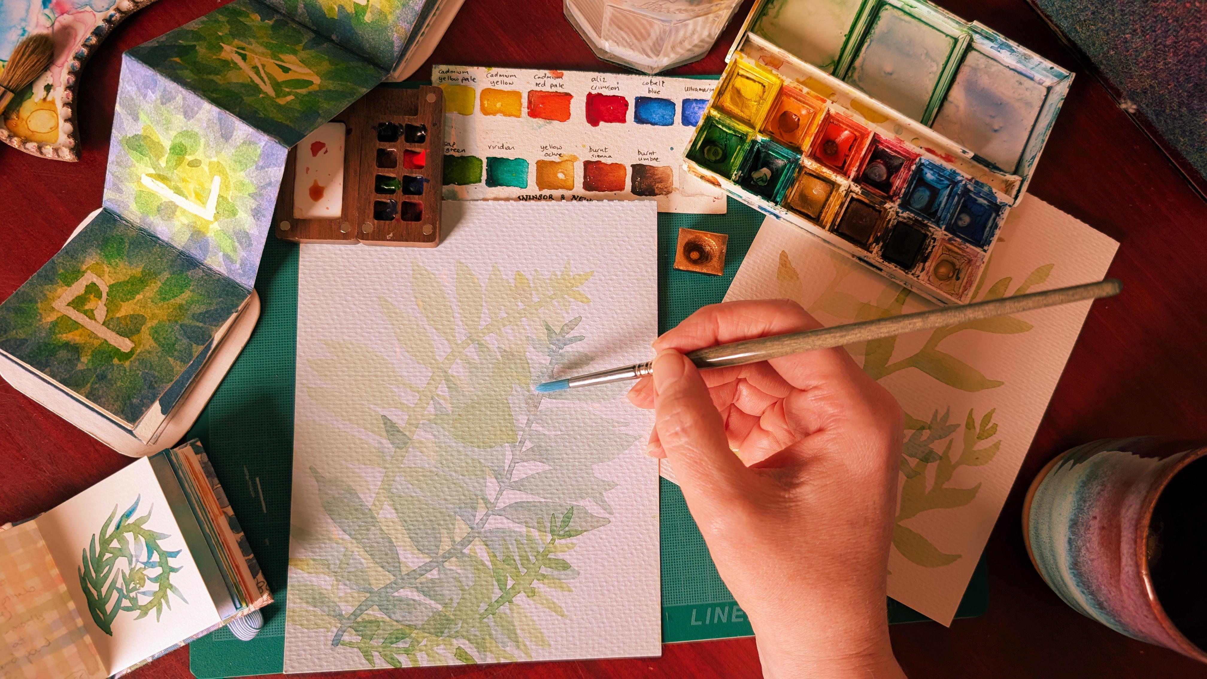
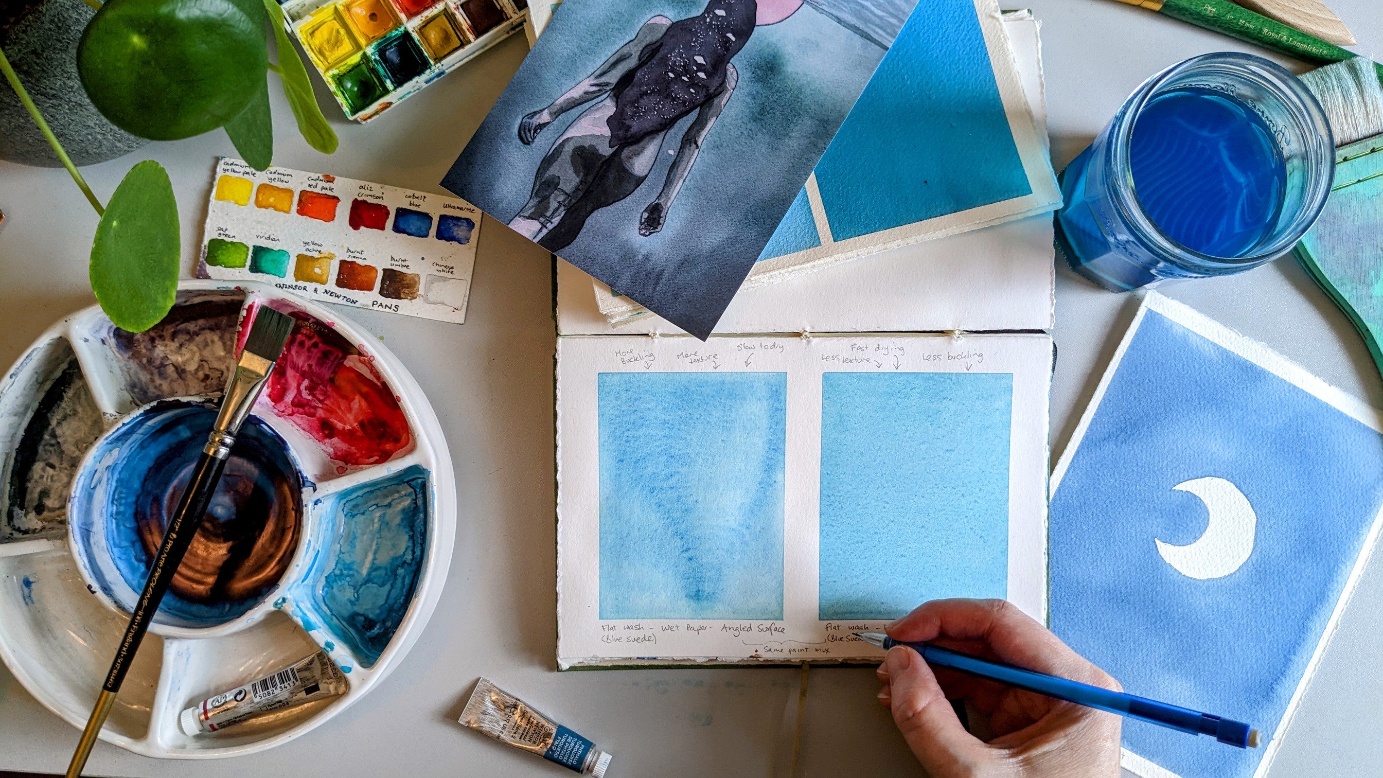
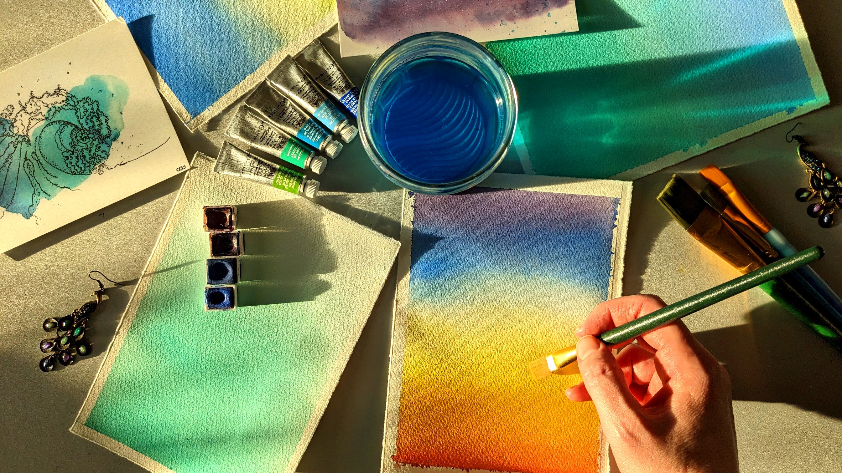
3. Transparency Check: Not all watercolors
behave the same. Even watercolors from
the same supplier behave differently
because the color, the pigment in them, they're all different chemicals, so they react differently. For this exercise
to really shine, it's important that
you use colors which are at least
semi transparent. If you buy them in little
pans, it'll sometimes say, but the quickest way I think
is just to test the colors that you want to use and maybe some extra
ones for backup. So that's what
we're going to do. We're going to do a transparency
check on our colors. So get yourself a bit of paper. Get yourself a pencil or a pen. This is the thing that
we're going to see if we can see it
through the colors. Just draw a line. And then what we're
going to do is we're going to just swatch each of our colors on top of that line and then see if we
can see the line through it. If we can, then
we're good to go. If not, let's pick some
different colors to use. So just to show you, I'm going to swatch
all of the colors in this little palette from my grand. But you
don't have to do that. You can just swatch the colors
that you're interested in. So let's go for it. I'm just loading up my
brush and then doing a single sweep over the color. I'm starting with my yellows because they get
muddy really easily. So now, that's not picked
up much of the color, so I'm going to do it again. That's better. This orangy red has cadmium in it, which is heavy metal. And it's quite a domineering
color. You'll see that. So depending on what
colors you have, you might notice that,
that particular color, maybe that's not a
good one to use. Some of the colors, I'm going over them again because
when I paint it, they look quite pale and I
want to see them a bit darker. All right. That's me watched
all my colors now, and I can check to see which of the ones are going to work
well for this exercise. Looking over them, this color
here, this yellow ochre. You can't really see the pencil line through
the middle of it, which tells me it's not very transparent and it's not
good for this activity. This cadmium red here, you can still see
the pencil line, but it's a bit harder
to see, which again, to me is an indicator
that this wouldn't be a particularly good
color for this activity. I'm fine with all the ones
I wanted to use anyway, the greens and the blues
and I like this red. I think it's Alizarin
crimson is what it's called. Even this yellow is
pretty decent as well. So I feel comfortable
using any of those colors, but not that yellow ochre and not that strong orangey red. Have a look at your colors
and based on what you see, pick the ones that you're
going to use for the exercise. Now that we've done our
transparency check, come join me in the next
lesson where we're going to be learning about
suggestive brush strokes. See.
4. Suggestive Brushstrokes: Welcome back. In this lesson, we're going to be
learning to use suggestive brush strokes
or gestural marks. This is where we're
learning to make a leaf shape with just
one stroke of the brush, not using the brush to draw
it and then color it in. So you'll need a medium
or large round brush. You want to mix up some of a color that you
feel like using today. I'm going to make a
turquoise green color. And what we're going to
do is we're going to vary the angle and the pressure
with which we use our brush. Predominantly, how I do this
is by changing the angle, but the pressure that I apply
will also have an impact. And what we want to
be able to do is go from having a very
thin little line, and that's by having
your brush very vertical to a broad line, which is by tipping over
and then come back again. That's how we make
our brush strokes look like leaf shapes. So I'd like you to do is
load up your brush with paint and then make sure it's not soaking
wet because you'll find it hard to get a thin line if your brush is very wet. Then you're going to start
by having it very vertical, drawing it along the page,
letting it fall over, and then pulling
it back up again, and then repeating this kind of trust fall process
across your page. We're going to do
this a few times to get really comfortable
with the movement to practice doing
different things with your brush to see if you like the
results that you get. If you don't like it's fine. We're just learning here. Take your time or if you're enjoying it and
you want to go fast. We're just going to make
these undulating marks by varying the angle and
the pressure of our brush. Once you feel comfortable
with this movement, I want you to just
do the complete up, down and up again once to
create a finished leaf shape. I'll show you what I mean. So Brush isn't too loaded. I go along, down, and back again and
lift the brush up. And there I've got my
suggestive brush stroke that suggests a leaf. And again and again, I'm just going to do it
until I'm happy with it. And by happy, what I mean is
that I can do it reliably. If you're struggling to
get a really thin line, make sure that your
brush is quite vertical and that you're
not pushing down too hard. Just keep going with
this until you're happy that you can
reliably create leaves. Or if you're into it like I am right now and
you just want to fill your page up with these
patterns, then do that too. There. In the next lesson, we're going to look
at how to deal with some common mistakes or
things you didn't mean to do. We can call that a mistake. Common issues when you're
doing this exercise. Finish up making
your gestural marks and come join me in the next lesson for
soaking up your mistakes.
5. Soaking up your Mistakes: Welcome back. In this lesson, we're going to look at how
to soak up your mistakes. And what I mean by that
is when we're doing this, we're going to want
some thin lines that have some water,
but not too much. When that happens and it's really common that you
put too much water down, you can soak it up. You can use your brush like a little sponge to
soak it back up again. I'll show you how that works. I'm going to create the issue. So I'm going to get
this really wet. So my brush is very damp, and I'll try and paint a line. Now, this paper
is quite thirsty, so I'm just adding a bit extra
to make it too much water. So when that happens, what I would do is get
the color off my brush, dry my brush on a
paper towel or rag, and then use that brush to
soak up some of the water. Hopefully, you can
see the color lighten as my brush soaks up
some of the excess. Now, different brushes
behave differently. They're not all
equally good sponges, I'll use this other one over here to show you what I mean. I'm going to paint a second
line, get it really wet. There. Now, this brush is pretty dry because
I haven't used it. But you'll see it
doesn't soak up paint the same way
the other one does. That's fine. Every brush
has its own way of working. But if that is what's
happening to you, just be aware, you'll
have to soak up some, dry off your brush, and then go back and soak up
some more. And that's fine. It's just all about learning
our tools. All right. Now that we've learned
how to soak up our mistakes and you've
checked your brushes. Come join me in the next lesson where we're
going to look a little bit at composition.
I'll see you there.
6. Composition Thoughts: Welcome back. In this lesson, we're going to have a
little look at composition. Now, if you're anything like me, composition can maybe feel like a thing that's out
there and maybe for other people rather
than something that's in here or in your
art that you make. But composition is really just the way that
you put the things on the page and how your
eye moves around them. It can be a bit of a memento, like a recording of what it was like to
make that painting, and it can also be a
little bit of a spell. Because it can capture
the feelings and lead you or whoever's looking at it through the picture
in a particular way. The particular way
that I've been thinking about it for this
class is really chill. That's the kind of vibe
that we're going for. So when I am thinking about the composition for
this class is artwork, what was really important
to me was that it was both relaxing to make but also
relaxing to look at. And so I experimented to try and find a composition
that reflected that. At first, what I did, it was based on this plant
or well, its sister. And I noticed it one day with the light
shining through it, and it was beautiful. And I wanted to capture that. So I started off with this painting that was kind
of how it looked in reality. But what I thought
about it after I painted it is that it didn't capture that chill thing that I was also
trying to capture. So I had another go at it, and I thought maybe a
composition that had, like, a more central stock with a
little bit of overlapping to give it a bit of symmetry
might feel a bit more chill. So I tried that, and it's fine, but it didn't feel quite
right to me either. What I did notice was there was a bit more of this white space, which we sometimes
call negative space, the background, the
unpainted bits. There was more of that
and I thought I could go for even more of
that and it might help. I did it again and this time, I made it off center, so not symmetrical and put
more white space in it. I was much happier with it. I thought, this really
when I look at it, it gives me the feeling of calm, and it captures how
it felt to make it. So I did some others like that playing with
different colors, and I found that this
kind of curving S shape, which is like, one of the compositional shapes that's used quite a lot for landscapes, because we see it
a lot in nature. You know, you've got
meandering rivers and stuff. I really kind of lent itself to the atmosphere I was
trying to create here. So when you're thinking about the composition
you want to use, I suggest you try things out. Look at what you've made, see what you like about it, what you want to
try differently, and then go from there. You're very welcome
to follow along with me and use the composition
that I'm using. But you're also very welcome
to develop your own, and I'd love to see
either or both. I guess what else I would say is these earlier
pieces that I made, I don't think of them as bad. They're just not what I wanted, ultimately, and they're
steps in a progression. It's also about
training your eye to pick out the kind
of overall shapes. These first two pieces didn't have much of
an overall shape. They had some directions, but it was very representative, like what the
plants really like. Whereas these later
ones are much more like the feeling
that I wanted to give. And there's this sort of curved shape that comes
through in both of them. Find the pieces that you enjoy and figure out what it
is about them that you like. For example, I like that some
of this goes off the page. It gives something
free that it's not just constrained
by the boundaries of the edge of the paper. Bear this in mind when you
come to do your class project, and remember, it's all just
play and experimentation. Come join me in the
next lesson where we're going to look
at incorporating the central stock and the shapes that we're going to create
with that. I'll see you there.
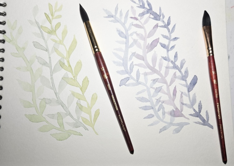
7. The Central Stalk: In this lesson, we're going
to look at how to paint the central stock so that the leaves can connect to
it and look continuous. What I mean by that is if
you paint the stock and then allow it to dry
before you add the leaves, then you'll get
this discontinuity that you can see in here
in this first example. Whereas if you paint the stock
and whilst it's still wet, add the leaves, then they all appear to be part
of the one thing. Neither approach is
the right approach. It's just that for this piece, having that continuity really helps add to the look of it.
I'll show you what I mean. I'm going to pick
one of my colors up, I'm going to have to mix
some more of my color. But I'm going to paint a stock. I want it to be quite wet. This paper is thirsty, so you can see I'm going
back in and adding more paint to where I've already painted to try and keep it wet. Not like soaking, just wet enough that when I
paint a leaf from it, the watercolor will
flow both along the stalk and the
leaf like this. You can see that joined
upnes where the paint flows. That's the look that
we're going for here. Give it a shot. Paint your central stock, make sure it's wet enough, and then add the leaves. Now, depending on your
environmental conditions, the kind of paper you've got, how wet your paints are, how much water your
brush can hold, that'll all determine how
quickly you need to paint in order to have that continuity from the stock to the leaf. So practice with what you have in the conditions that
you're in to find out the ways of working
that you need to adopt for this approach
to be successful. Once you've had a shot at that, come join me in the next lesson
where we're going to talk about color combos.
I'll see you there.
8. The Use of Colour: Alright, welcome
back. In this lesson, we're going to start
thinking about color combinations because
when we paint our picture, I would encourage you to use at least three
different colors to create a bit of variety and
interest in your piece. Now, there's loads
of stuff out there about color theory and
all that kind of stuff. I'm not going to go into
it because what I'm most interested in is what you enjoy. There are colors that
I like working with, and if you look at my paintings, you'll see that I have a
preference towards the blue, green, purple end
of the spectrum. You can even see it in my home, my cups and everything. So those are the colors
that I like working with and that I
tend to work with. You'll have colors
that you like, and they might be similar
to mine or different, and all of that is fine. What it can be nice
to do, though, is experiment a little bit and take inspiration
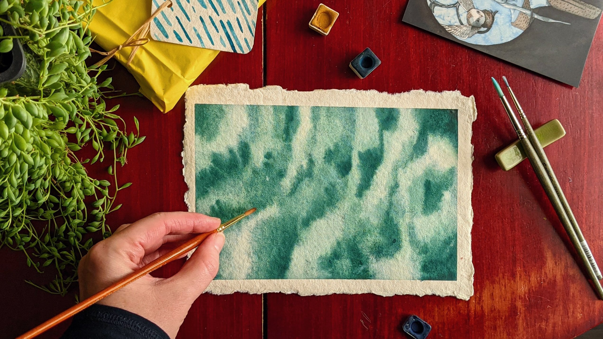
from different places. So I take inspiration
a lot from nature, and in nature, you get
a lot of muted colors, so not really vibrant
bright colors, but things that are maybe a bit closer to gray than the
bright end of the spectrum. And I think it can be fun
to have those kind of muted colors alongside a
pop of something else. You can see that in my awakening painting where I've
got quite blue, green gray tones for
the figure and the sea, but there's this pink moon and the reflected
moonlight on the figure, and that draws the eye. And that's using color
as a compositional tool. You don't need to worry
too much about that, but what I would suggest
to you is experiment. Think about the kinds
of colors you're using, how well they sit together, whether you want to use
really vibrant tones, whether you want to use more
muted tones or a mixture. And then we're going to experiment with that
in our project. I suggest you pick three colors to start with and
get them ready, and we'll use those
for our class project.
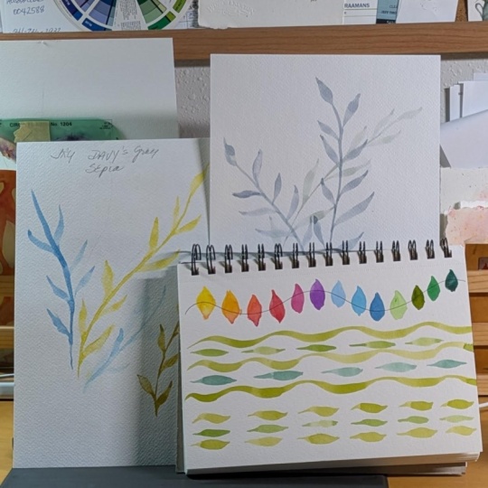
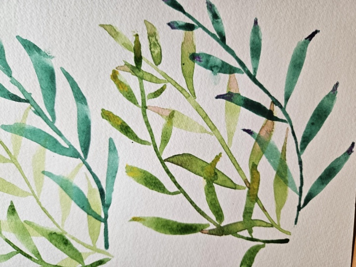
9. Your First Project: All right. Are you
ready to do this? We're going to take everything
that we've learned so far and apply that to
our class project. This is our five
minute mindful leaves. We're going to paint
our central stalks. We're going to add
leaves to them. We're going to do at
least three stalks. So hopefully you've
got your colors ready. Let's do this. I'm starting with different shades of green. You'll see I'm adding
a red into the green. This is to get a muted color, which you can do by
adding opposites. I want a more bluey
green one here. I'm going to paint each
stock in its own color. I'm going to make a nice curving one here and
dampening the stock. And then I'm going in
and adding the leaves. Now, what I would say is, if you routinely tape
your paper down, I wouldn't do that for this because you might want to change the angle of your paper to do leaves on one side of
the stem or the other. And if you've taped it
down, you can't do that. It might be a little
bit frustrating. I like to make the leaves a bit smaller as
they get to the tip. That looks like an empty space. Okay. I've got my first stock. I'm going to go in with the next one now
using my next color. I'm going to take
this up and over the additional stalks don't all point in the same
direction as the first one. But they all create
together a shape. I think it looks really nice
when the leaves overlap. Don't avoid that. Lean into it. I would encourage it. That's my second stock. Now I'm going to add a third
one underneath and complete that shape. I've got a little friend. I got this damp stem, which I can then
add my leaves onto. I am purposefully letting them overlap with
the other ones. Sure, we're done. You might notice that you get little darker spots at
the ends of your leaves. I think it's really charming. If you don't like it,
it's something that if you make sure your brush
has more wet paint on it, it won't happen so much. When you lift your brush up, it deposits, like, a
big rush of paint, and if that can flow away
into the rest of the leaf, it gathers at the tip,
which makes it look darker. I think it's one of the lovely unpredictable
things about watercolors, but other opinions
are available. So if you don't like it,
that's how you fix it. So that's our first go at this. Join me for another go
at this where we do some on the page color
mixing. I'll see you there.
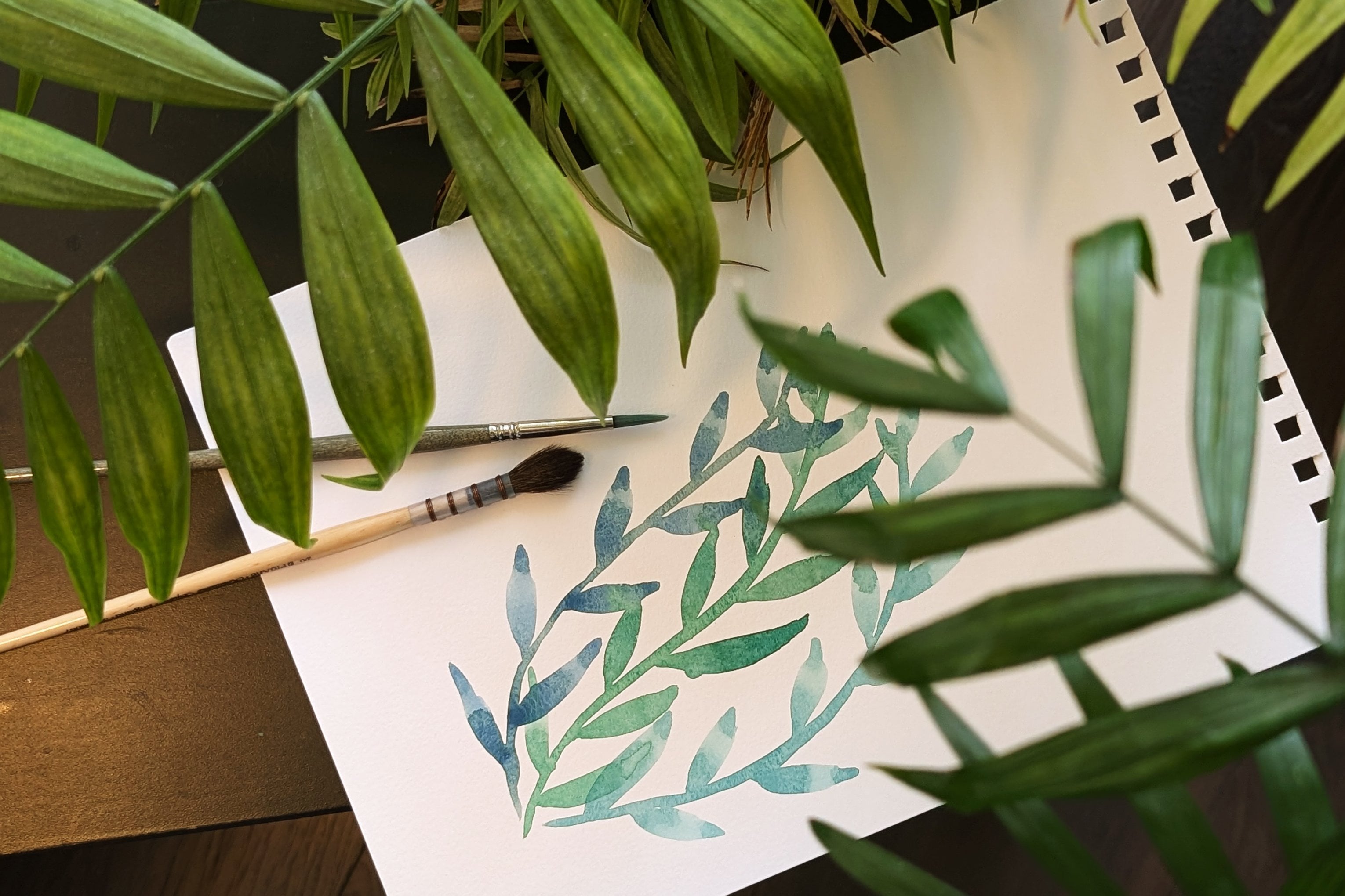
10. Colour Mixing Project: Welcome back. In this lesson, we're going to repeat
the previous exercise, but we're going to do
something a little bit different with our colors. As we put our colors on the page and while
they're still wet, we're going to drop
in other colors so that they disperse and mix into one another and create really beautiful wet
and wet effects. So get your paper. I'm using different paper for this paper that's less thirsty
than the other stuff I've got because I want
the paint to stay wet for as long as possible
whilst doing this exercise. Because that gives time for the colors to mix in
with one another. I'm going to mix up
the main colors, and I'm also going to mix up some extra colors that
I want to drop in. To make it a bit interesting, I'm going to drop in some contrasting colors or at least one or two
contrasting colors, just to see what happens really. And I'll mix up some
more of my greens. This is a really nice
opportunity for you to experiment with other colors maybe that you
wouldn't normally use. To try and help
this be harmonious, I want to keep some of
the colors the same. This green color that
I'm using Vidian, I've got it in each of those
two mixes and this one. And this color I
want to drop in, I've added it to
one of the mixes, and I'll do the same
with this yellow. So I think I'll add
this yellow in here. That way, they should all
play nicely with one another. Adding a bit of extra water because I want these really wet, not like a puddle, but damp so that the colors
will mix with one another. Same with these
ones here as well. All right, so let's do this. Going to start with this
brighter green one. Paint in my stem,
going to wet it. I'm going to start
adding the leaves. And as I paint them, I'm adding more
of that coloring. To keep them nice and wet. All right. I'm going
to see what happens when I add a bit of red into
the tips of these leaves. And then maybe a bit
of that muted color. Why not into the stem in places. All right. Let's
do the next one. Because this is wet, the
colors are really going to blend into each other
instead of layering cleanly. That's totally fine.
It's just different. I'm going to go up and over. I'm wetting the stem some more painting my leaves and I'm going to leave this
one for a moment or two. Just give that side
some time to dry. But and now I'm going to come in and go over. We've already got some
color mixing from that, but I'm going to add a bit more. And I think I'll add some of my third color in
here and there. Alright. Now we're on to our third stock. I want this one to come off the page. I'm gonna
lift it like that. I forgot to add extra into
those leaves to wet them. So I'm just going to add color in where I can see
that it's still wet. I might add just a we
touch of this yellow. Holding it up to the
light to find damp bits. Okay. Now, after you've
dropped the color in, just leave it alone,
let it do its thing. If you try and mix
it on the page, you won't get as nice results
as you might otherwise do. So I'm just going
to set this aside and we'll come back
and look at it later. All right. So with that said, we're going to
repeat this again, and we're going to use some
deliberate color choices to make things look like
they're in the foreground, so that's close or in the
background as in far away. So come join me there.
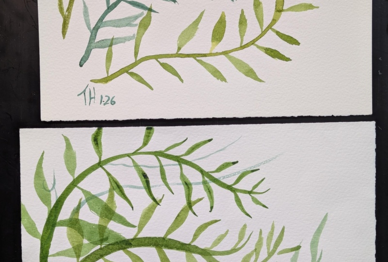
11. Working With Depth Project: Hello. So in this lesson, we're going to look
at choosing colors to give the idea that things are further away or closer to us. And the way this
works in real life, looking at landscapes
or anything really, is that colors that are further away from us
don't seem as vivid. So like mountains on the horizon tend to
have a kind of faded, bluish, purplish tinge to them, whereas things that are right
up close look much more bright and vibrant
and often warmer, depending on what
the real color is. So we're going to pick some colors to see
that with this thing. So we've got three elements. We've got three stocks. One of them, we're
going to make a kind of faded purply blue edge to it. The other one will just be sort of something
in the middle, and then the third one will be like a lighter and brighter. So we'll maybe use more yellows and bright colors for that. So to make our faded color, you mix opposites, and that's like opposites on
the color wheel. So that's blue with orange, that's red with green, that's yellow with purple. So since I'm predominantly
using greens, I'm going to mix them with red. And that'll give me
a background color. Now, I picked up
this one by mistake. I didn't want to use
that because it's one of those colors that
isn't very see through, but I only got a
little bit of it, so I think it'll be fine. That's looking a bit
too brown to me, so I'm going to add more green
into that to bring it back into the right part of
the color spectrum. That looks pretty faded to me. Now, this one, I'm going to make our nice bright
foreground color, so I'm going to make it
quite a yellowy green. Well, as much as
the palette will allow me. We go. Then the last one's going
to be somewhere in between. All right. I think
that will work. So I think I'm going to lay
down the one in the middle, which will be our mid ground. Is that a word? We'll
do that one first. All right, so that's
our middle one. Next, I'm going to
add in my background, and I'm going to do
that down the bottom. That stock is very dry, so I'm going to darken that
down a bit or rather wet it. And now adding the leaves
and letting them layer. Even though this is
the background color, I don't think it really matters
that I'm layering it this way around because this
is abstracted, right? I'm not trying to create
recreate reality exactly. What's just nice is
that there's layers. Now onto the brights. This is our foreground colors. I think I want to do that
with the stem this time. Darken it down a bit. I should say, I have
my leaves alternating. You don't have to do
that. You could have them coming out in pairs. Totally fine. I just
happen to like this. So now we've done
this a third time, but we've been
quite deliberate in our color choices to
give the suggestion of a background and a foreground to give a bit of
depth to our picture. It's all just experimentation, so find what you like
and work from there. It's not quite dry yet, but hopefully you can
see what it looks like. So that's the end of
our practical sessions. Come join me in the next
lesson where we're going to look at how you can take
this further if you want to. I'll see you there.
12. Taking It Further: Well done on making it this far. We've completed all the
practical exercises. But I'd like to talk to you about where this stuff can go. So thinking about
color choices and composition for our
mindful painting gives you the experience and
the tools to think about composition and color choices for other kinds of paintings. You can take what you've
learned from this and apply it to landscapes. That's the most kind of direct transition because of the colors and the
shapes we've been using, understanding about foreground
and background colors can help you when
you're painting a landscape to add depth. Thinking about composition and trying out different
compositions, even if it's not painting
the full thing in, but maybe just quick sketches until you find
one that you like, that can really help capture something in a way that says
what you want it to say. Thinking about which
colors you use. You don't have to
be representative. You can be telling a
story with your colors, and you are free to
experiment with those things. As you practice these
kinds of exercises, you're developing those skills. You're developing an
eye for composition. You're developing
an eye for color, and you can take that
anywhere outside of this. I mentioned how I used a kind of splash of color to draw attention in this
awakening painting. You can see other artists
do similar things, and you can experiment with
that in your own works. So the sky is the
limit from here. These are foundational
building blocks that you can do while
you're chilling out. Like, it's just it's wonderful. So that's what I
wanted to say about where you can take this. It's not just an
exercise for self care, although it's cool if that's entirely what
you use it for, but you can also use
it to practice or to hone your color and your
composition skills as well. So with that said,
we're almost done. Come join me in the last lesson, where I'll share some final
thoughts with you. Thanks.
13. Final Thoughts: Thank you for joining me in
this self care art practice. We packed a lot in for something that is self care oriented. We looked at sinking
into your brush strokes, but also how to make
gestural brush strokes, how to do one stroke
leaves and paint a suggestion of the thing rather than fully realistic
depiction of the thing. We also learned about
composition and how to enhance and practice and
develop your compositions. We learned about
color combinations, how to search for combinations that you
like and that work, and also some general tips about how to make things
look close and far away. But for all of that, if there's one thing I'd like you
to take from this is that you can absolutely lower the barrier to entry for
any of these things. These small five minute
self care activities also help you passively develop these other skills that you can transfer to your
other works of art. Yeah, this self
care art practice helps you develop as an artist without feeling like you're putting time aside to
get better as an artist. Taking care of yourself,
and that's wonderful. So thank you thank
you for joining me. I'd love to see what you've made if you're
willing to share it. And if you are, please pop it in the class projects section. And while you're in there,
if you could stop by and leave a kind word for
other people's projects, that would be super nice. If you could also take the
time to leave a review, I'd really appreciate it. It helps let other students understand what this course
is like and what it's about. And that's really, really
helpful to hear it from people that are also in
your position. So thank you. I've got other classes on self care art and
watercolor techniques, if you're interested, and I hope to see you in
another class soon. Thank you. And bye.
 Shelley Skail, Artist, Illustrator, friendly nerd