Transcripts
1. Introduction: Hey, want to do some watercolors? But do you have a tiny tyrant in your brain that's always wanting you to be productive? Well, I think I can help with that. Hi, I'm Shelley. I'm an artist and illustrator and I work mainly with watercolors. I like to create magical things with a touch of wenzy, but I'm actually a trained IT analyst. I'm a nerd. Being a nerd is super awesome. It can be really creative exploring different ways of doing things and figuring things out, but I have a problem-solving brain that never shuts up. What will I make for dinner tomorrow? What did he mean when he said that? If I buy that stuff where can I store it? What will I do for lunches next year? I've had to figure out how to get it to quiet down and let me be creative in paints. This class is about tracking that tiny productivity tyrant in our brains and so letting us have some time for some self-care art activities because whether they like or not, practice makes progress. Ever watch an artist painting live and think, wow, that looks so effortless, and it probably is? They've practiced so that making these marks becomes second nature to them. With these short me-time exercises, that's exactly what we'll be training ourselves to do as well. Specifically, we'll be learning how to use the brushes we already own, how to make different kinds of strokes, bold lines, sweeping arches, confidence circles, and how to work with the colors we already have to get color combinations that really work for us and not just suffering envy from binging on beautiful pre-made palettes on some gorgeous website. This works really nicely if you can set aside about 15 minutes each day or maybe once per week. Although if you want to binge the whole class, go for it. I'm not the boss of you. This class is for everyone. If you're new to watercolors, this is a great place to start. If you're wanting to explore color more deeply, dive right in. If you're looking to get a bit of a break from a busy brain, these are my exercises to do just that and I find them tremendously helpful. Are you ready? Get your art supplies, take a breath, and let's get started.
2. Class Project: Hello again. What are we going to do in this class? We are going to mindfully work through five prompts that fully explore the use of color. The pieces that you create as you work through these prompts are your class project. The prompts are arranged to build on one another from a deep exploration of one color through to looking at how to pull colors together in a way that really works for you. As we work through these prompts, I'll share what I've learned about how to step out of that busy mindset so that we can be more free and more creative, as well as more practical tips about how to get the best out of your materials. What materials do you need for this class? You're going to need at least six different watercolor paints, paper suitable for watercolor, so that's thicker paper, that's around 300 grams per square meter. It won't buckle so much when it gets really wet. You'll need brushes, depending on your size of paper, small or medium size, round brushes are best. You'll need two containers for water, a paper towel or a rag to dry your brush on. You'll need a pallet or something like a white plate to mix your paints on. Make sure you've got enough room to make six different colors. You may want to have some washi tape or some masking tape, and you might also want some drying towel like a hairdryer or a heat gun. You're also going to need about 15 minutes of time per prompt when you're not going to be bothered. The choices that you make about the colors you explore, the way you make your marks, and how you combine colors will really speak to your uniqueness and I hope you feel brave enough to share that. You can do that by sharing your creations and the projects gallery. To do this, take a photo of your creations, a smartphone is totally fine for this, although if you prefer to use a digital camera or scan your pieces in, that's all good as well. Get those images onto your computer. You can email them to yourself or upload them, or use a cable to send them there and then from there, you'll be able to add them into your Skillshare projects. To create a project on Skillshare, they'll be the big green Create Project button. When you click on that, you'll come into the project creation screen. You can add a cover image, so that's a single image that represents your projects and a title. When you go into class description, you'll see the Add More Content section. Then there's the Image button, and that will allow you to add more pictures if you like. You can also type in the project description box to add any thoughts that you'd like to share about your experience along the way. When you're ready, you can click "Publish", up near the top and it'll be uploaded to the projects gallery. At any point, you can go back in and add or change anything that you've already added, but you can only have one project per class. If you'd like to share what you've made with me on Instagram, feel free to tag me. I'm @shelleyskail. My aim for this class is to provide you with a mindful painting approach that you can continue to use if you like, whether it's part of a regular practice or something that you can refer to when you're in those periods of your life that are a bit more hectic and maybe are in more need of a break from your mind. Know that this class will always be there for you if you want to refer back to specific sections or even redo the whole thing. I hope you're able to escape that tiny tyrant in this class with me. If you've got any questions or comments or things you'd like to discuss, feel free to use the discussion section of this class to do that with me. Are you ready for your first lesson? Come join me there.
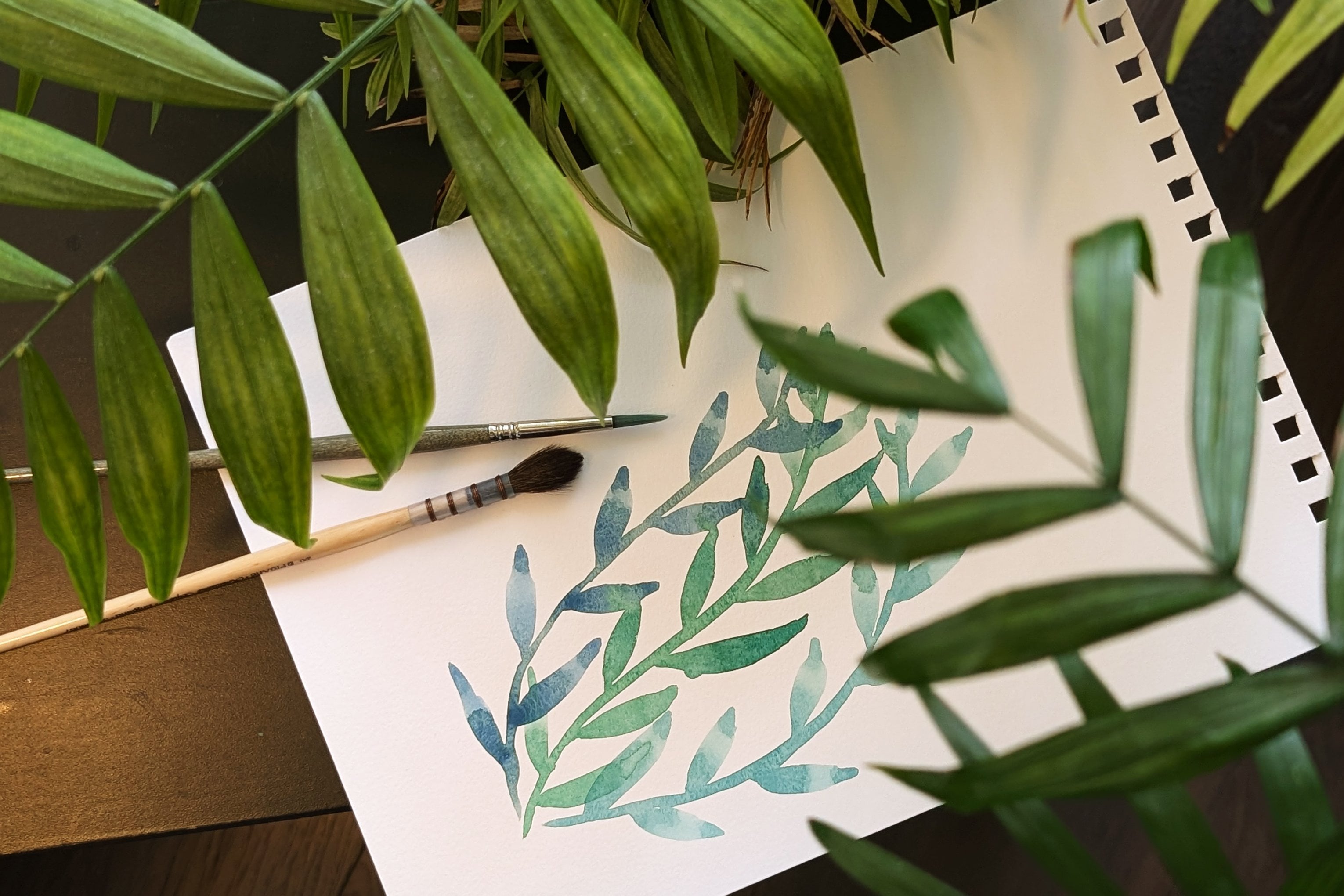
3. The Small Brush, Big Page Approach: Hi again. Before we get into this class, I'd like to take a bit of time to explain the approach or how and why I've structured this class the way I have. In this lesson, we're going to talk about the approach, the science behind it, and my experiences that have shaped this. Let's start with the approach. Throughout this class, we're going to be using a small brush relative to the size of page that you use. Cunningly, I call this the small brush big page approach. The size of brush you use is going to be relative to the size of paper you have. If you've got a small piece of paper, you'll want a really quite small brush. For this, I would probably use something like this, which is a size 1 for this particular brand. Maybe a two, maybe a three is fine. For this one, which is A5, I'd probably use maybe a four, maybe a bit smaller depending on how much calm I need it. For something larger again, you might want to go up to something like a six or do a smaller brush. It depends how much time you want to devote to the activity. Often with watercolors, doing things quickly can be quite important. There's bits of it that can be time-sensitive. If you're doing a large area, you need to be mindful to keep the edges wet so that you don't get hard sharp edges unless that's what you're going for. In this approach, we're going to deliberately construct things so that we do things more slowly, because that time pressure with watercolors isn't important here. Why are we slowing this down? Well, what we're trying to do is give our analytical, critical part of our brains a break. Let that have a bit of a rest while we let our hands be busy, which can then free up our minds for other things. Personally, I've got a very analytical mind that's always problem-solving, reviewing stuff that's happened, planning things that are happening next. I'm not talking rocket science here, this could be, what do I need to order or buy in the groceries so that I've got the right things to make dinner next week? What dinners am I going to make next week? Just all of these thoughts are very often running around in my head and it's quite useful for me to have activities that give that part of my brain time to rest and let other parts of me come more out to the four. I call this mindful painting when I'm deliberately setting out to do an activity to quiet that bit of my brain. Mindfulness is about being really present in the moment. Not ruminating about the past or worrying or planning about the future, it's just being really rooted in the present. In terms of the nerdy science bit of this, there's a part of our brain that's quite important part called the anterior cingulate cortex. That does lots and lots of things, but part of it is involved with focus and emotional regulation. There are some studies that show mindfulness can help regulate that part of the brain. It's certainly been my experience that doing these kinds of activities can help if I need a break from that planning. But if my brain or if I've got big emotions that I just need a little bit of time out from. Recently, my daughter started a new school year and like it does every year, I got big feelings about that. So I came home and I had a bunch of stuff that I needed to do. But what I chose to do was take a bit of time out and do some mindful painting to just let myself have a bit of a break from those big feelings so that I could come back and process them in a more calm and peaceful state. That's what I did. I first started this small brush big page thing after seeing an illustrator who I really admire, Cecil Messer. You also might know her as Cuckoo Illustration. I saw her working on an A3 piece and she was working on background details using, I think it was a size 0 brush, and it just blew my mind. Because I have always worked on backgrounds like that with as big a brush as possible to get it done quickly. It never even occurred to me to do things small and slowly. I thought, I'm going to try that. I just received some new paints. I decided to try this approach to swatch the paints. It made me work much more slowly than I would have otherwise done. But it also unlocked my creativity, which I didn't realize was locked away until then. I went on to paint some other things, went on and made flowers after that experience. Later I thought I'd try it again, but just with one color, and I did this whole page with this one turquoise color that I just love. I had a similar experience of slowing down, getting out of that analytical part of my brain, opened up my creativity and I thought this might look interesting with some gold beads. Then I thought, I'm going to add a girl with her bunny here. I ended up with this piece. I also used it as an opportunity to make friends with this brush. It was a size 4 brush that I'd got quite some time before, but I've never really quite got the hang of it. Doing this process helped me get more comfortable using that brush. That's just some examples that how it worked for me. It'll be interesting to see how you experience it. Speaking of brushes and brush control, come join me in the next lesson and I'll talk a bit more specifically about brush control and how we'll be making marks in the rest of this class. Come join me there. Bye.
4. Brush Control Preparation: Hi again, welcome back. In this lesson, we're going to look at the preparation activities that we're going to set us up for success both in the brush control exercises and later in the mindful painting prompts. Pick brush that's the right size for the paper you're going to be using. I'm going to use this, which is recycled cotton rag. It's about A5 size. I'm going to use this size 4 brush to work on this. Then you're going to choose a color. It really doesn't matter which and get it ready to be used. If you're using pans like me, that means adding a drop or two of water into the pan to activate it. While that's activating, you're going to divide your paper into six sections. You can draw those if you like, I'm going to just use some washi tape to divide up the page because I like how that looks. You don't need to worry about the sections being exactly the same size, it doesn't matter. It's just so that we've got six small areas to do some practicing. Now, we're going to look at how we hold the brush. Depending on how familiar you are with your brush and the way you like to paint, you'll probably have a different way of holding it. The closer you hold it to where the vessels are, the more control you have over exactly where your stroke is. But too much of that really tight attention can cause tension in your body and it's not very comfortable. You might want to experiment with holding your brush a bit further back. If you hold it right at the end you've got less control, and if you hold it somewhere in the middle, you'll probably find a sweet spot for you. Maybe experiment with where you hold your brush while you're doing these exercises. See how it feels in your body as well. Because there should be a comfortable experience. It shouldn't leave you all tense and tight. You want to be feeling relaxed and comfortable. The last thing that we should prepare is ourselves. To help with that, I invite you to try a simple breathing exercise. We'll breathe in through our nose if you can, for a count of four, and then out through your mouth for a count of four or longer without holding it in between. I invite you to try this a number of times. Hopefully, that'll help settle your body and your mind and put you in a good place to start these activities. Let's get on and do our brush control exercises. I'll see you there.
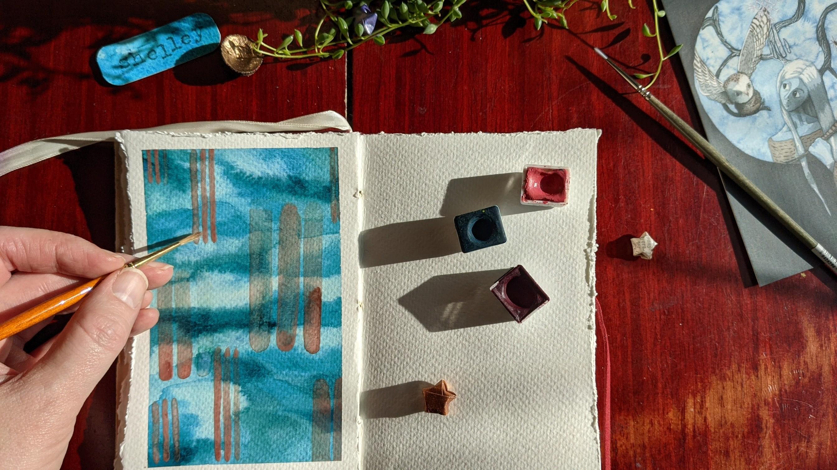
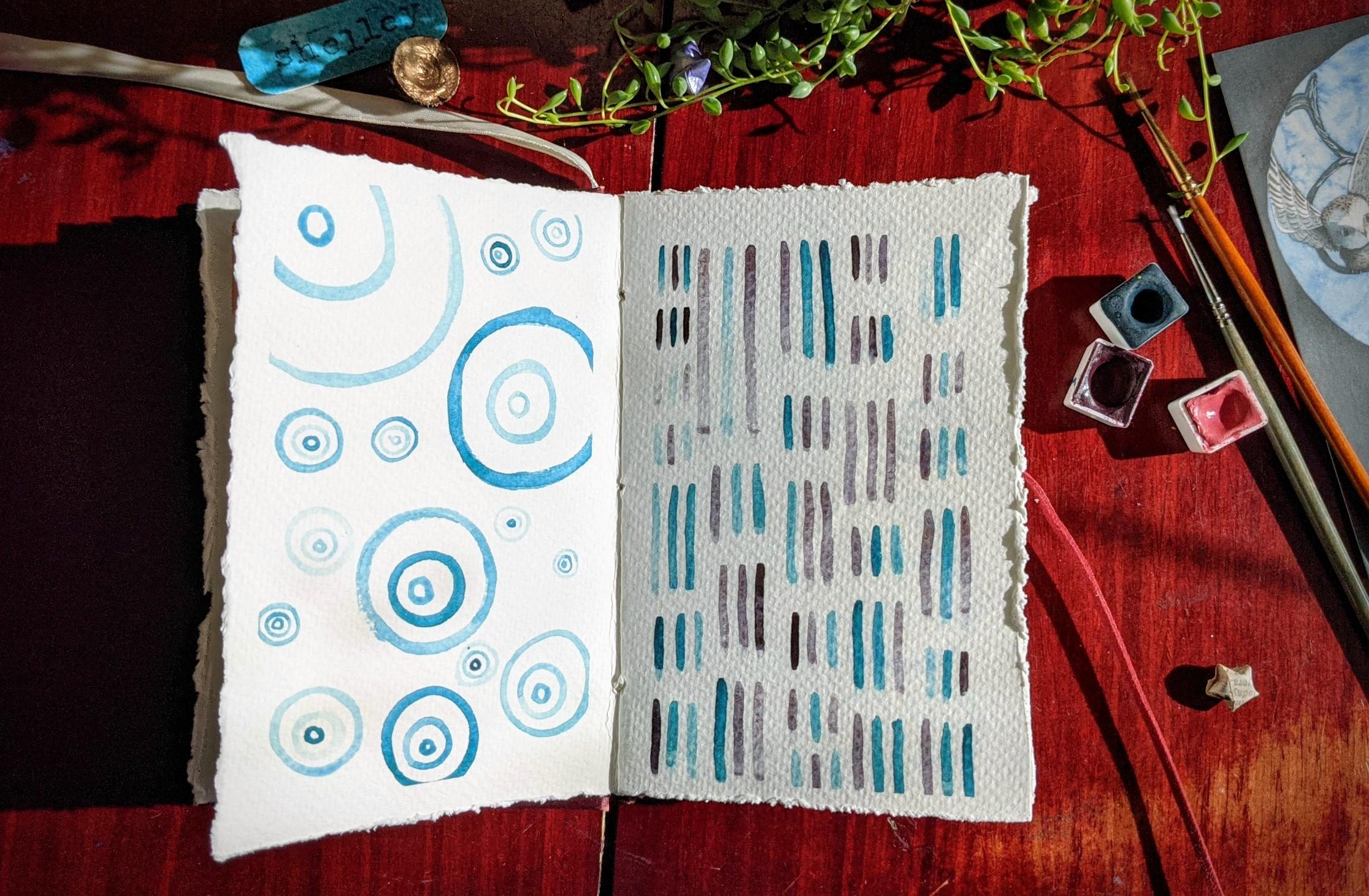
5. Brush Control Exercises: Hi again. In this lesson we're going to look at how we make the marks that we're going to be using for the rest of the class. When we're making our strokes it's important to remember to pull the brush in the direction that you want the paint to go. Don't push the brush. The bristles, and particularly in water color brushes, are quite delicate and they don't like that treatment. It will ruin the points that you have on your brush quite quickly if you're pushing it often so try and remember to pull when you're using your brush for water colors. The first thing we're going to do in our first square is we're going to make vertical strokes, so just little vertical lines. I'm going to get you to pull from top to bottom like you're writing an L or a 1. I'm just going to get you to do a whole row of vertical strokes, one after the other. It doesn't matter if they're not exactly the same size. As long as they're roughly there that's fine. Once you've finished your row go on and do the second row. Carry on in this way until you've filled up your box with vertical lines that are painted from top to bottom. Once you've finished your first box we're going to go on to the second box where we do horizontal strokes and we'll go firstly from left to right. We're going to do these in columns. Similar to the first box we're going to fill the box with these strokes. While you're painting check in with your breathing. Is it relaxed? Are you holding your breath when you're making your strokes? If you are, can you deliberately relax your breathing? Consciously slow it down a little bit. When you've finished that box of horizontal left to right strokes we're going to the third box and we're going to do vertical strokes going from bottom to top. If you're similar to me your vertical strokes going from bottom to top are not as well controlled, mine are more wonky and wiggly and not straight, and that's fine. It's all just information, there. Now when you finish your third box, the fourth box we're going to go onto is horizontal lines again, but this time we're going from right to left. Now, depending on which hand you are painting with that will be easier or harder than the previous one because you may be going against your natural inclination, so bear that in mind and don't be too hard on yourself. Particularly if you're going in a direction that's tricky for you, you may have an inclination to push the brush because that'll be easier in terms of your dominant hand and the directions of movement that it's most comfortable with. But do avoid that temptation. You should now have four boxes filled with straight lines. The next thing we're going to go onto is making arches. I'd like you to make rows of arches, rainbow shapes. This is a bit trickier because you're having to pull the whole way around. But don't worry, with a bit of practice you'll be fine. I tend to make my arches starting on the left and moving over to the right. I presume that's because I tend to use my right hand for painting. But I can always do it in the other direction. It might be worth you experimenting to see which direction you enjoy painting the most. We're now on to our last box and we're going to do circles. I think this is the trickiest of all so just take your time with it. Figure out what direction works best for you whether you want to make a circle with one movement of the brush or whether you'd rather make it with two or more strokes. Don't worry at all if they don't look like proper circles. Practice is the key here. If you used tape you can have the super satisfying experience of peeling the tape off once your paints are all dry, and then we're done with this activity. Come join me in the next class where we're going to take a mindful painting prompt of looking at values, darkness and light. Come see me there.
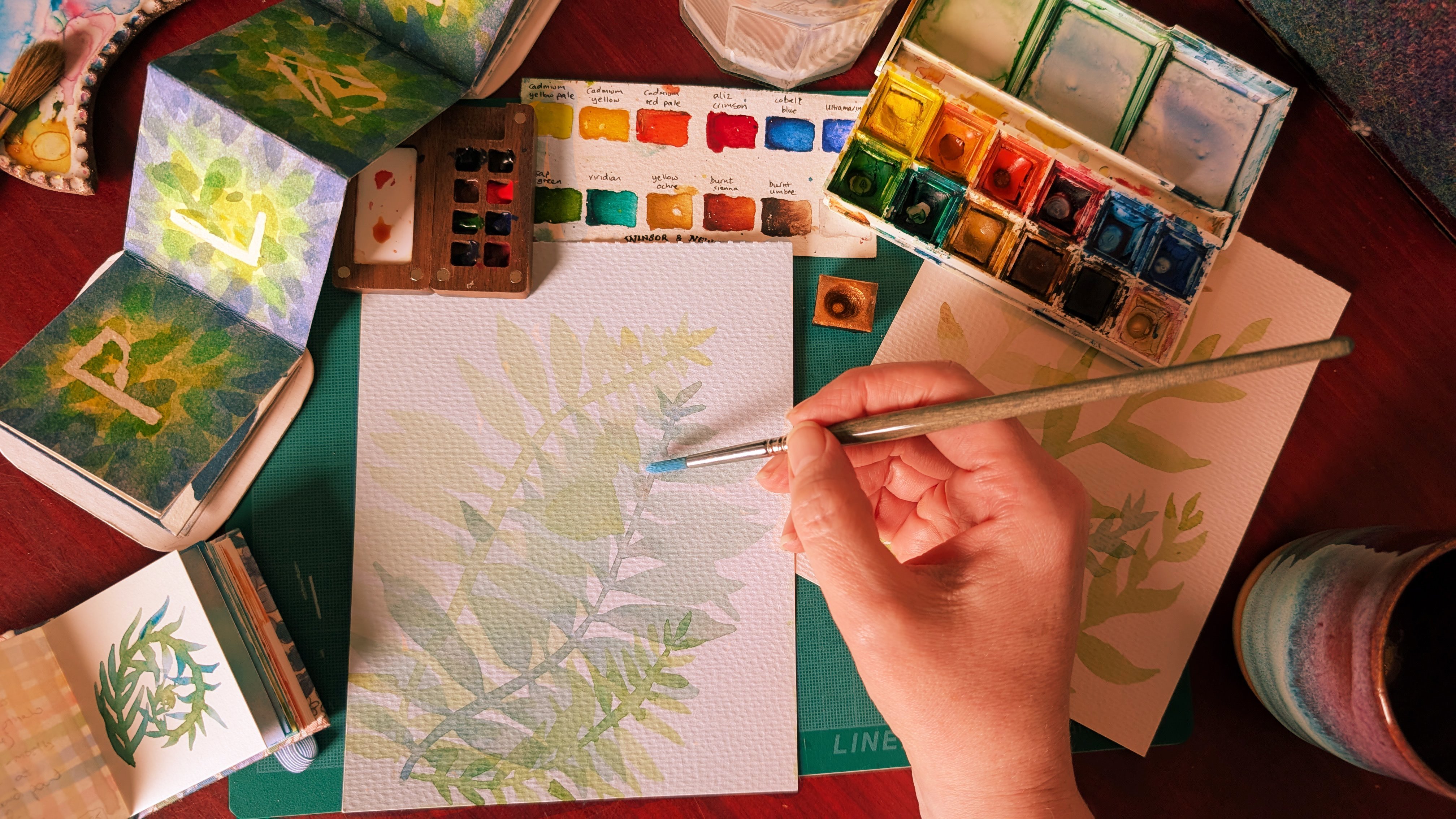
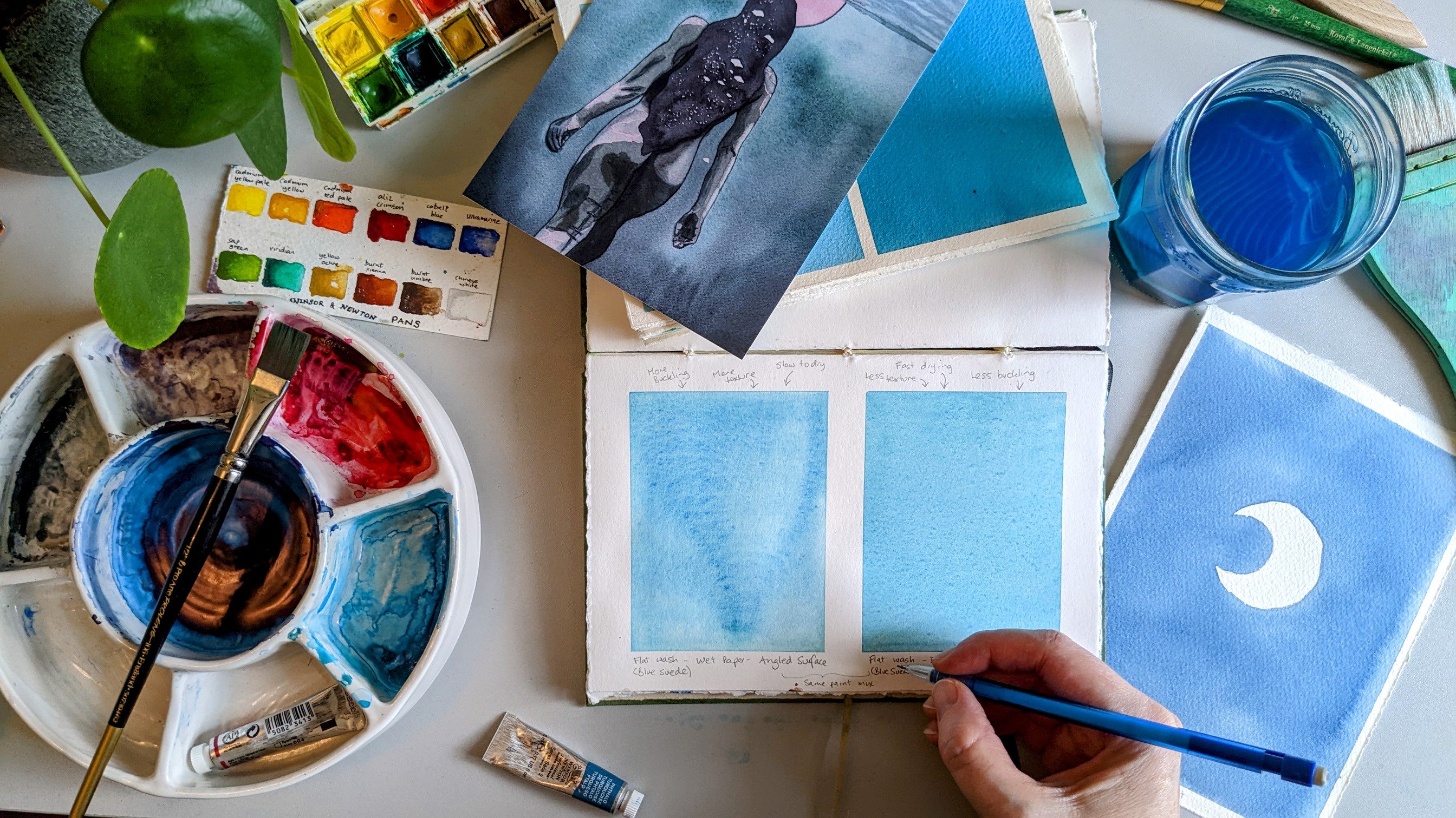
6. Between Darkness & Light: Values: Hi again, welcome back. In this lesson, we're going to look at values. We're going to mindfully explore darkness and light through painting with a single color. When I talk about values, what I mean is how dark a shade of that color we have, or how pale a shade of color we have. For example, sky blue as compared with midnight blue. They're both blue, but one is a really light value and the other is a really dark value. With watercolors, the way that you get lighter values is by adding more water to the color. Maybe if you did painting in school, or you're used to using things like acrylics, the way you get lighter values is by adding white, and you can get darker values by adding black. With us we're going to get lighter values by adding water, water as our whites. We're going to explore that fully in this exercise. Pick a color. Whatever color happens to spark joy for you in this particular moment. What I'd like you to do is activate it and then make a mix and some palette. This can be a dinner plates or if you have a palette, you can use that. I want you to make a mid value for that particular color. Try not to choose a color that's too pale. Yellows can be difficult for this because it's hard to get a very big range with yellows, particularly like the lemon yellows and the lighter shades. Go for one of your colors that easily gives you dark, like maybe an ultramarine blue or something like that. You'll use the pan or a really thick version of the tube color for the deepest value of that color. If you make a really watery version of it, you'll get the palest version of that color. Or you can do I do, which is to lazily dip my brush in the water, and that really dilutes that heavily. I also want you to pick one stroke direction from the first four that we looked at in the brush control exercises in the last class. Try and stick with that particular direction for the whole piece. I'm going to pick the first one just because I like painting in that way, but feel free to do whichever one works for you. I'm going to use this sketch book. Because it's small, I'm going to use a small brush. I'm going to use this size zero brush. I've got my rag for cleaning my brush if I want to, I've got my colors and then we'll get clean glass of water. Prepare your materials, prepare yourself, and let's begin. It doesn't matter which value you start with. Whichever one you feel like starting with. What you'll see that I'm doing is I'm overlapping my strokes to create a big patch of the same value. I just dipped my brush in the water to get a lighter value of that particular color. I'm using those vertical strokes, pulling my brush the whole time to create the colors that we see on the page. What I'm also doing is overlapping earlier strokes. What that can do is soften out any hard edges that are left. This absolutely isn't necessary. It's just something that I quite like to do. There's no particularly right or wrong way to fill your page with color. This is just quiet exercise to explore the range of values in whichever color you've chosen. Let you practice brush control, and give that planning, analytical, critical part of your brain. Some time off. It works hard for you so it deserves a break. What you can see here is this edge has dried so that when I do the new thing on top, it's not blending in. I'm getting a hard, sharp border. Unlike these ones which are more fuzzy. There's absolutely nothing wrong with that. Just something to notice. If you do like what I'm doing just now, where I repeatedly brush over one of these hard edges, it can soften it. If that's what you want to do. Almost got my brush completely covered in water here, so the result on the page is very pale. That's useful because it lets us see the full range of this particular color from its darkest or deepest shade, right the way through to its lightest. As I move across the page, there's no particular order to when I use a deep tone or a pale tone, or a value, or a mid value. It's really just whatever I feel like in that moment, because this is play. I'm deepening my mid value here. I wanted it to have a bit more color in it. Is a little bit too close to the palest shade for my liking, so I'm darkening it. One of the other things about watercolor that you'll learn from this is that colors dry more pale than when they are wet. As you're applying the color, the color you see is not the color it will end up being, it'll end up lighter. Which if you use gouache is quite different. Gouache goes the other way. That ends up darker. When you're finished and your piece is dry, if you've used tape, be mindful that you don't rip the page when you're taking the tape off. If it seems a bit sticky, when you start to pull it, I suggest you use some tool like a hairdryer or if you have a heat gun and that will melt the glue a little bit and make it easier to remove. Also, if you pull the tape at a 45 degree angle, that helps prevent rips as well. When you're done, you can look at your finished piece and take a moment to enjoy what you've created here with your mindful strokes and see all of the range of values that you can get out of just one watercolor. The next lesson, we're going to look at exploring hues, different colors and how they work together so come join me there, bye.
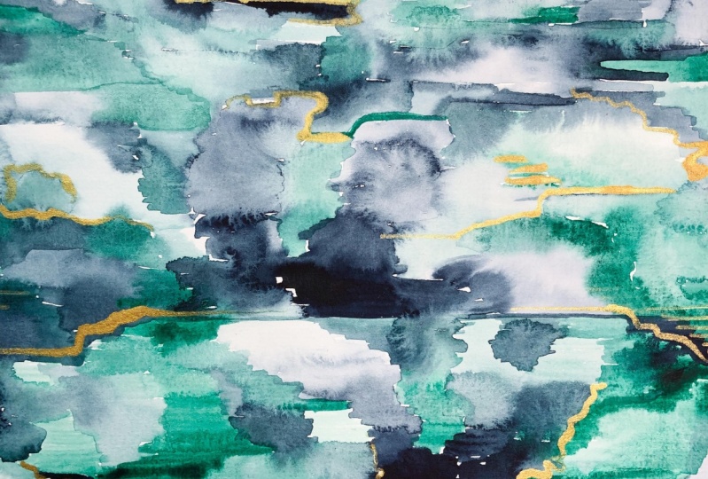
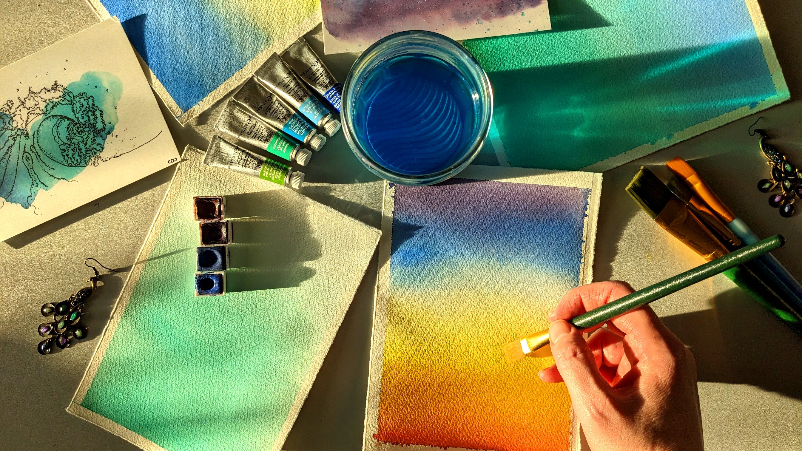
7. Hues: More Color! : Hi again, welcome back. In this mindful painting prompt, we're going to explore hues, which is another way of talking about colors or shades of colors, blue, yellow, red, green, turquoise, all different hues. You may even have seen this terminology on your phone. If you've done any tweaking to photos you have, you may have a hue slider, and that changes the shades of the colors in the picture. If you do any digital art manipulation, you'll see that hue value there too. To explore this, we're going to use two different colors in this mindful painting activity. They can be quite similar colors like blue blue and the green or they can be quite opposite colors, maybe a blue and an orange. It's entirely up to you. I just recommend that you pick whatever two colors really speak to you in this moment. Once you've picked your colors, prepare them as you have done previously. I'd like you to make, like we did last time, some different value mixes of these colors. We'll get a mid value mix by using some palette where you mix up your paint with some water. We'll use the pan itself or quite thickly from the tube to get the deepest value. You can either mix up a really watery value or use my technique of just dabbing your brush in water to get a really pale, watery value. Similar to the last prompt, I'll get you to pick a stroke direction from one of the first four that we did in the brush control exercise. Then I want you to carry on in the same way. Fill your page with careful strokes of these two colors and trying out different values of these two colors to see how they play together and to explore your colors as fully as you'd like to today. Prepare your materials, prepare yourself, and let's begin. This can be super fun because you get to see what happens, not just when you put two different hues together, but when you put two different hues and different values of those different hues. If the edges are wet, they will bleed into each other and you'll get a soft edge. If the edges are dry, they'll give you a hard edge. What you may notice when you do this is that some colors, their edges will soften more easily than others. Reds, once they're down, have a habit of staying down and not being quite so easy to soften into. This is a nice way to learn about these personalities for your paints. One of the things you might also notice is that some colors, by nature are more vibrant than others, so they'll have a greater range of values. One of the ways you can look at a value scale when you've got color in the mix because that can make it a little bit more tricky, is to screw your eyes up and squint so you only have a little bit of light coming in. That can make it a lot easier to see the dark and the lightness, and not just the colors. Because for example, this is much darker than these values here and that can be hard to see when the hues are different. There is no need to plan what's going to go, where on the page like, I'm going to put a dark value of this color next to a pale value of this other color. I suggest you try and go with the flow and in the moment and each moment by moment to just make decisions based on wherever you happen to feel like at that point in time. There is no perfect way to do this. Everyone's pictures are going to look different and that's what's wonderful about it. When you're done, let it dry or use a heat tool, and then take off your tape and have a look at what you've done. Well done. We've explored hues, we've explored values. If you come join me in the next lesson, we'll start to explore form through patterns. I'll see you there. Bye.
8. Bringing Form: Patterns! : Hello again. In this mindful painting prompt, we're going to explore patterns, bringing form into the things that we make. Patterns are really simply just repeated elements. It could be repeated colors, repeated lines or marks or repeated shapes. That's all that a pattern is. Patterns are ancient. We've been making patterns for tens of thousands of years. You can see amazing examples of these in places like ancient caves where you've got hands that were used as stencils. A wonderful example is the Cueva de las Manos in Argentina. You can see these patterns that humans created thousands and thousands of years ago. Pattern-making is clearly an important part for people in making art. We're going to explore that a little bit today using a single color. We're going to use different values of that single color to create patterns. There will be a choice of four patterns. We can have the horizontal lines, the vertical lines, the arches, the rainbow pattern or the concentric circles. You may want to try out each of these four patterns before you commit to making a whole page of them. For a variety, I would suggest you have at least two different value mixes of the color that you're going to use. In addition to the deepest value you'll get from the pan or the tube and the lightest value you'll get from your wet brush. Take the time to prepare your materials and yourself and then fill a page with your chosen pattern. Prepare your materials, prepare yourself, and let's begin. I'm going to choose to do the circle pattern for this and I'm going to vary the size of the circles for my own interest. Something else that's worth emphasizing is that the purpose of this is not perfection. The line quality that you end up with just gives you information. Are your circles or lines wobbly? What does that tell you about where you're at in the moment? It's not good or bad. What it is, is information and you can choose to do what you want with the information that you have. If you do things and it's not quite how you'd like it to be. If you can, try and accept that as information and remember, the imperfections are what make things interesting. If we wanted a perfectly uniform pattern, we could do on a computer and it would be exactly right and you could copy it and paste it and make a pattern with exactly the same shapes over and over and over again, but that's not what we're doing. Now I think these are quite similar in size and I'd like a bit more variety. I'm going to try and make a really tiny one. While I go tiny, I try and get as good a point as possible with my brush. Then maybe over here, I'll do something much bigger. One of the things that I do when I'm trying to get a point on my brush is to roll it against the side. That rolling motion helps bring it to more of a point. Well done. We've made patterns. In the next mindful painting prompt, we're going to expand on this by bringing more color to the forms that we create. Come join me there. Bye.
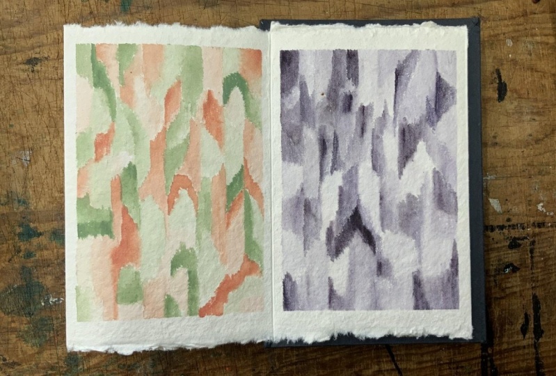
9. Building Form: Combining Colors: Hi again and welcome back. In this mindful painting prompt, we're going to explore pattern-making with two colors. In the last exercise, pattern variety came from size and value. Here we're adding a third compositional element, color. Through experience learning how to balance these elements and ways, we find pleasing. Similar to the last activity, you're going to pick one of the four patterns. When you prepare your materials for this exercise, pick two colors that are calling to you today. Make at least two value mixes of each color so that we've got variety, and then fill your page with that pattern. Prepare your materials, prepare yourself, and let's begin. I'm going to pick a different pattern from what I picked last time. This time, I'm going to make a pattern out of horizontal lines. Now one of the things to bear in mind is not every element of the pattern needs to have multiple different colors in it. You can still have some single color patterns within a page of multiple colors, and that can look quite nice. You don't need to plan this out. Pick your colors and the different values of colors, or just whatever calls to you in the moment. We're trying to give that planning but of our brain arrest and go with our gut a bit more. Have a go with that, take your time and enjoy it. If you accidentally put too much water on, you can always draw your brush and then use it like a sponge to soak up the excess. When you're finished, take some time to look at it and enjoy it. Try turning it in different directions. Sometimes that will change how it appears to you and it might give you a different appreciation for what you've made. Well done. You've created a whole page of colorful patterns. Take time to look at it from a distance. It can change your perspective literally as well as figuratively. Also have a really good close up look as well. Can be quite interesting to take a bit of time and just appreciate what it is that you've created. If you'd like to, I'd love it, if you wanted to share your creations in the project section, it'd be really nice to see what patterns and color schemes you've made. Then if you join me in the next class, we're going to look at creating color schemes, creating palettes, and in particular, creating palettes that are personally meaningful or compelling to you. Come see me there. Bye.
10. Exploring Palettes: The Odd Choice : Hi again, welcome back. In this last mindful painting prompt, we're going to look at creating palettes that are personally compelling. Palettes that you like looking at and enjoy working with. If you're anything like me, get into a bit of a color runt where you use the same three or four colors for everything, and that's fair. There's colors that we enjoy more than others. But sometimes it can be helpful to try new things and expand the range of things that actually we do enjoy working with that we didn't know. To help with this, pick your favorite three colors that you like working with and get them prepared. But also pick your worst three colors, the ones that you avoid working with. You can usually tell which ones those are because they won't have much sign of usage on either the chips won't be that crinkled or the pans won't be that dimpled. Pick your worst three, and prepare those as well. I suggest you have at least one value mix of each of your colors so that you've got that matte value color in addition to the really pale one you can get from dipping your brush in the water, and also the really deep one you can get from using the pan or the tube almost straight. When you're ready, you're going to use all of these colors for your pattern-making. An optional extra is if you want to randomize which colors you use. You can use something like dice. If you've got a six-sided dice and number your colors and then pick accordingly. Or there's random number generators online, if you like. Although that might be a bit clunky and slow things down. It's entirely up to you. You might want to create a whole bunch in advance. Another optional is a constraint, which is each part of your pattern has to contain at least one of your worst colors. These are optional. You don't have to do either of them. I just offer them up as interesting constraints to try and help you get out of any kind of a color rut that you might be in. Prepare your materials, prepare yourself, pick a pattern, and let's begin. While you're doing this, you might find combinations that you maybe wouldn't have necessarily used before but that are actually quite compelling to you. For example, I'm quite enjoying the pink with the brown here. I think they work together quite nicely. I want to explore that a little bit further, which is what I'm doing here. One thing to bear in mind is that you don't have to use three different colors for each of the elements. You can use different values of the same color and see how that turns out. A bit of advice I got given was that when the artist is in the room, the critic has to wait outside. While you are creating, you're the artist and don't be judging what you're making as you're making it, it kills the process, or at least it makes it a lot harder. If you can invite your critic to wait outside, they can come in when you're finished. That's fine. But while you're making stuff, let the artist be in the room while the critic waits elsewhere. I rather like that combination of the blue, the turquoise, and the earthy green. I'm going to try that again, but in a different order. Well done. If you haven't already, take the time to look at your colorful pattern, both from a distance and close up. Look at the little pallets you've created with your three line patterns and see if any of them appeal to you. This is the way that we find personally compelling pallets. It's much less of an intellectual thing and much more of instinctual. I like that. We only get that by trying things. You'll get some things that you don't like and some things that you do; and that's fine. That's just part of the process of investigating color to find the combinations that you really like. If you do find things that you really like, maybe take it further and try other forms of creation with those specific color mixes. See how it turns out. I'd love it if you wanted to share that with us. I would love to see your colorful patterns as well and any comments you want to share on how you found that process. Were you able to let the critic wait in another room while the artist worked? That's the last of our mindful painting prompts. I invite you to join me in the next lesson where I'll talk a little bit about other applications for these kinds of works. I'll see you there. Bye.
11. Other Applications: Hi again. Welcome back and well done for completing all of those mindful painting problems. I thought it would be nice to take just a little bit of time to talk about other ways that we can use these activities. In much of the class, we've talked about learning about your paints, learning about the range of values that your colors can make, and learning how colors work together and picking out palettes that you like. But it's also a very calming process doing any of these exercises. It's a way to help settle the mind if the mind needs a bit of a rest. As well as learning about colors in a really experiential way, this is also a way of taking care of yourself. It's something that I use personally, like I've talked about before. It's something I encourage you to try and see if or how it works for you. Another way to use this is patterns are great for decorating things. Everyday things like cards, bookmarks, gift tags get transformed from a blank bulk of paper into something that pops with some simple patterns. You can take your art out into the world in that way if you like. In a completely different tact, the techniques of filling a page with one or two colors are techniques that I occasionally use for background elements and paintings where I want it to not be a flat background, but I don't have any specific features that I want to paint in the background. In this piece, which is called Queen of Stars, I use the second mindful painting prompt, the Hughes one, to fill the background with two different shades. I wanted it to have a spacey abstract feeling to compliment the rest of the piece. I also used it to an extent in this piece, which is called Owl Mother, and the pale blue background here. I also added salt to give it more texture, but I used different values of this blue in addition to that to create texture without detail. There you have it. There are some other applications for what we've done, and I'm sure you'll think of some yourself. If you'd like to join me in the last lesson, I'll share my parting thoughts with you. I'll see you there. Bye.
12. Conclusion: Hey, you made it. Well done. You have worked your way through all the lessons or maybe you skipped to the end to see if you'd like it or not before you did all of that. Either way, that's fine. You're here and thank you for that. We have fully and mindfully explored color. We looked in depth at one color to start with, fully exploring all the values we could make with that color, then we pushed that by adding a second color in and looked at how they interacted with each other. Then we went on to add form, looking at pattern making and started to bring in the idea of balance, learning experientially how we compose images that feel right for us, first with one color and then two colors, and then with a whole bunch of colors. That helped us figure out what color combinations we really liked. Maybe you surprised yourself with colors you wouldn't necessarily reach for, but that looked good and combination was your more favorite colors. I know I did. What I would really like you to take away from this class is that showing up and doing this practice is valuable. Taking time out of our hectic lives to slow down with these art moments is okay. In fact, it's more than okay, it's wonderful. For some of us, maybe even necessary. If you'd like to share what you've created, please do. Go ahead and upload it to the projects gallery, and while you're there, maybe say a kind word or two on other people's projects. If you like to share things to Instagram, feel free to tag me. I'd love to see what you create. If you want to get notified when my next class comes out, click on the green Follow button. If you click on my name, which should be next to it, that will take you to my profile, and if you scroll down, that has the other classes that I've made in there too. If you could leave a review for this class, it would be super helpful. It can help flag to potential students what class this is and help them decide if it's right for them or not. Thank you again for coming on this mindful art journey with me. I hope that you enjoyed the experience and I look forward to seeing you in my other classes. Bye.
 Shelley Skail, Artist, Illustrator, friendly nerd