Transcripts
1. Introduction: Hey you, I am my mom, a watercolor and more than calligraphy instructor from India. Today, I am going to teach you how to paint, lose watercolor leaves and floated. This is going to be a very fun class wherein you will let loose and not worry about any particular thing and just paint your heart out. We are going to start with a practice class in which we will cover several types of leaves, floras, and filler elements. Basically, a full package of floral elements with which you can create any number of projects in future. This class is for both beginners and seasoned artists, which will help you to unwind from your daily routines and have some fun. And along with it, learn to paint some very easy floated elements. Then we are going to make two projects in this class wherein we will make two reps. One will be a very pride and flattery draft, and one will be a completely leafy red to which you can add any quotations, positive affirmations, or any littering. Later on. We are going to learn about several colour combination and also how you can position your elements when you are making them in the form of a dread. As always, the class is in real time so you can paint along with me. And I am so excited to see what projects do you guys make. So, yeah, let us just get started with this class and being some very beautiful reds.
2. Class Projects: In this class we are going to make two very beautiful reds, along with which people have a practice class in which we are going to learn several types of leaves, floaters, and filler elements. Basically, you will have a full bunch of floral elements that you can use to make any number of threads. We are making two reds for this project. Mainly. One is this bright flooding red and the other is this leafy red. So you can use actually these elements or to form so many different types of reds in different shapes and sizes. Also, don't forget to share with me your projects here. And I would love to share them on my Instagram to make sure to tag me when you post them on Instagram. And also it would mean really alive to me if you can leave feedback for me here or leave a message in the discussion area. So now let's go ahead and see what the materials exactly do we need for this class.
3. List of Materials: Welcome to the class K's. For this class, we will be needing the following materials. The first will be a watercolour paper. I am using Irish people or watercolor paper. It is to 70 GSM vapour. You can take any particular people that you have. If you're an Indian resident, I have a code with which you can get 10% off. So I will leave that on the screen. And I'm using two sizes for the whole class. One will be the A4 size. And for the final project, I'm going to use this smallest seven cross seven sketchbook. So that is about the papers. Next, we are going to need some watercolors. You can take any particular watercolors. There is no particular restriction on them. You can use the band ones or you can even go ahead and use the tool plans that is totally up to you. Then about the brushes we will be needing or two sizes around brushes. Here I am taking die size 64, or that will be enough to complete all the black processions and also the projects. So make sure you have any size of round brushes. E1 should be larger, one should beautiful smaller. That is the whole requirement. Then we need a water jar. You can keep to water jars as well. For making the red, you can use masking fluid to make up effect so or even you can tape down using any particular washy Dave do have perfect edges, so we will need that. And yeah, that is about it. Let us just get into a force class where we are going to practice a lot of floral elements.
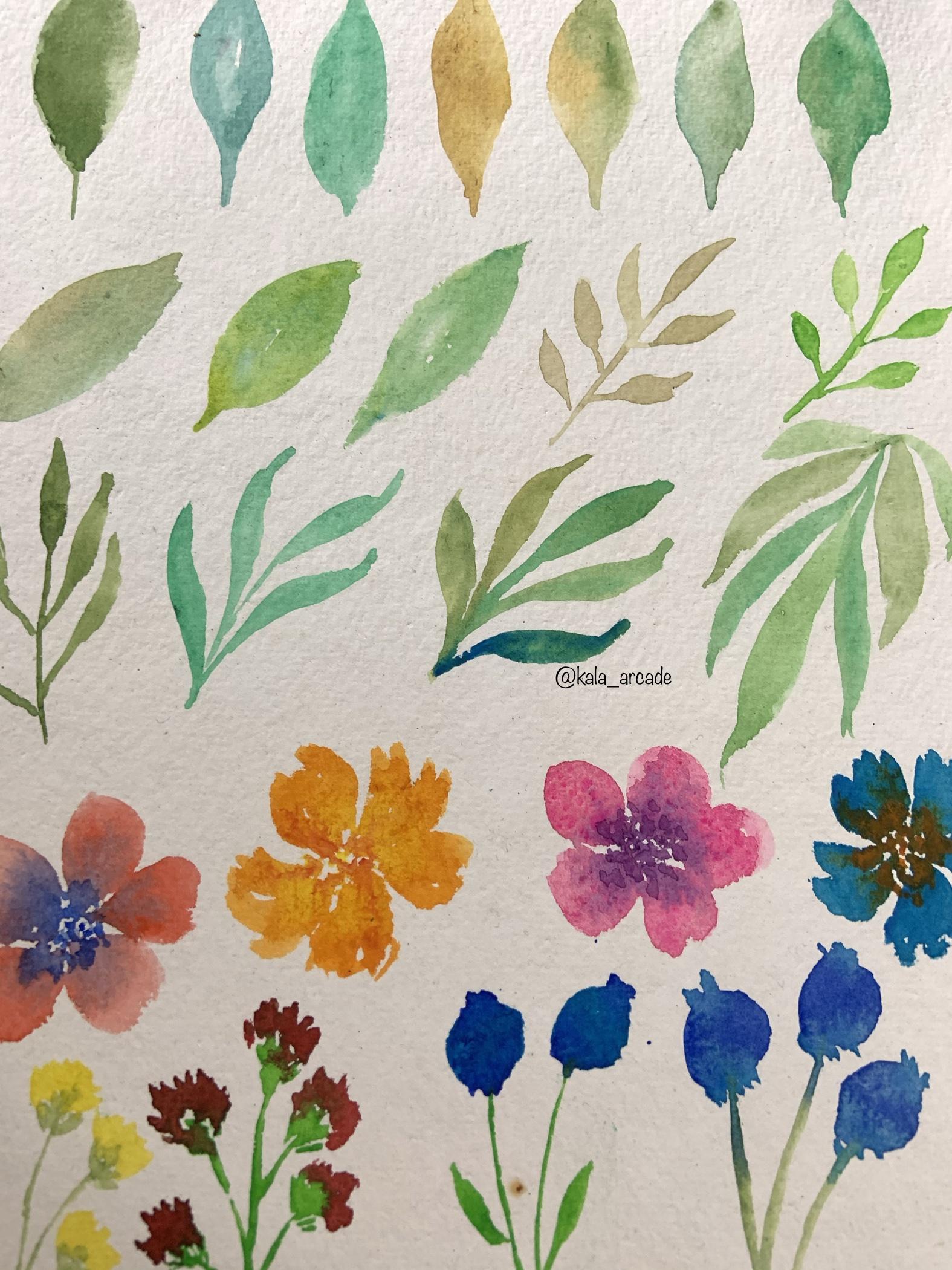
4. Practice: Loose Watercolor Style: So in this practice session, or we are going to be creating many floral elements. Like we are going to make several types of leaves, fluorophores, and also fillers that will help us to make the Reds. So starting off, I am just using some green color for the leaves. You can take any particular colors, but I have tried to keep the colors are literal related to fall or maybe just greener. So the first type of leaf is to basically start at 1 and go from the bottom to the top. The way I am showing you guys making a little curve. This will act as the first part of the leaf. The second part we make in the same way as shown. And we will just conclude our leaf shape with adult stem at the bottom. So that is how I have made the first leaf. That is the simplest way of making a leaf. I have also tried to replicate that. In this, the difference is only this much, but I have not made the Leaf very much around as the first one. There is a lateral shearing or, or you know, a less, or we'll see you can make leaves in tight way also that gives a literal different look when you're making it on the red. The third type of lives that we are making does not have a stem. We are going to make in any particular oval shape as you want, do what? It does not have a stem. We are making just a leave. So that is actually similar to the first two, but we are just learning this hero because we might need these types of leaves and red. So they also come in very much handy. One other color that I am just showing you here that you can mix to form a very beautiful foil color is to add a Lagrangian law to your brown sheet that will give this very beautiful autumn Cano that looks amazingly well on the leaves. The next step of lease is actually a mixture of two colours. On the one side, I have added the beautiful yellow, brownish color. And on the other end, or keeping my brush entirely wet, I have mixed a green sheet, olive green shared with that color. Now you can mix any two colors. It looks very beautiful on a leaf. I have tried to mix many differentiates further in the class as well. And it looks very, very pretty when we mix these sheets. One other example is to mix cobalt green and olive green. Now these are very similar shades of green, but when mix on a leaf together, they give sort of a gradient to the whole leaf. And it turns out very pretty. So you can even mix similar shades that will give a gradient to your elif entirely. Another way to achieve a similar effect is to mix on the brush together, like you can see what I did. I took some green color on my brush. And then on the tip of the brush, I took brownish, yellow color. And when I put them on the paper, they together form of very beautiful different shade so that there's one more way of mixing leaves or basically making leaves of more than one sheets. I am showing you some more examples of the same technique in alerts lined way also. Because when you are going to work on the jets, you will need to make the leaves in a literal slant manner and not in the street of uptight manner that I made in the first row of the sketchbook. You can totally go crazy with the colors like here I took some blue and undertake, I took some yellow. And I was really, really happy with the outcome. You can see what beautiful green at forms. It looks very, very pretty. So that is basically your hidden trial and different colors that you can even think you can just try in your practice session. And yeah, it will turn out very good and you will understand more about these elements. So I would say that go ahead and practice leaves in a slant manner or in different shapes rather than keeping them straight because that will help you to get acquainted with them. Oh, get acquainted when you are going to paint directly on red. The second different type of leaf that we are going to make here is going to be this tape. It's sort of a tropical leaf. But what we do is we make a center stem with one leaf at the top, and then we add several smaller leaves to that stem. So you can omit these several leaves on the stand there in a very compact way or leave even spaces in between. That is totally up to you. But this also gives a very beautiful effect on reds. And it looks very pretty and it actually fills up very much space on the red to, not to make it look very empty in the end. An alternative way to make these types of leaves is don't make the leaf and not elongated way. Now what are elongated leaves? Or basically you follow the same method of making two arcs, but you extend the ends of the leaves in this way I am showing. So as you can see, a round brush really comes in handy when you want to make these types of leaves. You don't have to make even do arcs. You just don't press the brush entirely on the paper for the stem. And the leaf. Just press the brush completely on the people that forms your leaves very easily. Okay, so that is why I asked you guys to use brown crash. It looks. It gives you a very much benefit and basically makes the whole process easier. Now at these types of leaves, you can even go ahead and make every single leaf of the whole bunch. But different colors. And now not going like very crazy with the colors, but like similar shades of the greens or yellows, blues looks very good like here I took many differentiates the greens and it looks good over oil, so you can do that too. And to make this leaf in unmoored tropical away, you can go ahead and make this leave in upside down detection like I am doing. So, I just started with the point on the top. And at that point I am making all the leaves in the downward direction, such as they are falling from a branch or anything. So that is one way to give the in Frankfurt tropical look. I will also pop in one big jaw on the screen wherein I use this technique to make some tropical leaves. So that was about leaves. And you can, guys can practice over and over again if you're not very much acquainted with it, that will help you to understand more about leaves. We will move to Florence now for the first type of floral, I have taken this red colour and I am just going to follow the same stroke the day followed and the leaves, but in opposite manner. I am making boost strokes and I am converting it into a round shape or giving the better shape basically. So I am making a five peddler flyer in which you can see I have made these five petals next to each other, but I have not joined. There's ten does not that does, that does or on purpose. So first of all, we will make these five petals. You can make these petals around as I have made, or you can even make them pointing. Then using a different color, I have big in blue here. I will make descend DO when the entire flight is wet. Ok, so this way you can actually judge which colors to mix together. So that is totally on your choice. I have mixed blue here because it looks good with red. And when it is wet, it is completely going to blend together. The second type of floral is a little rough one. You can see I'm making the five petals again, but this time I'm not following the round shape. I have just followed random strokes of the brush so that my bet bills are not even and they are all at random. And in dissent dry again, Arab, some yellow color. It looks very pretty with it. So basically for these types of flow rules, every time you make a flyer, it will look different because the brush strokes are different every single time. And that is what the beauty of these Florence is. That even if you make them over and over again, they will look very different with each other and give you a very beautiful look. This is a little close up to give you a clean look on how these colors blend and they looked. So, so pretty. Now here I'm showing you some color options for the 4s, two types of loads that we need. I'm going in the same direction or same way as I did in the first place. Or you can also mix or basically join these petals or likely made in the forest floral, we made them separate, we made them very much apart. But you can even join them. And you can even put the color of the dissenter color in a more dark away, as you can see here, I have put a lot of poeple on the pink so as to blend the petals in a very good new shade, which is sort of a mauve color. But yeah, so basically by idea is that you can even add a lot of colors ender also that looks overall very pretty. Now don't think that a flyers are done here or leg just by adding the center. We are done with the flowers. No, not a Doyle. Once this LED will dry completely, we will go with brighter color, the color that we're using in the Sando, we will go with a little brighter version of that. And we will add small dots on top of this that will entirely complete A-flat, but we will do that in the coming time. So now for the third type that we are going to learn in this practice class are the fillers. Now what our fellows with ASA, basically, as their name suggests, they are used to fill the spaces in between. And they also act as smaller flowers for your Reds and they look very nice. So the first type of filler that I'm using, I've just zoomed out, zoomed in a little bit to help you get a better view. First tape of filler, I have made some strands and then I am making these little stems again by using a random brushstrokes. Now these will add as though lower part of your fellow flowers. So what I'm gonna do is I'm gonna take some yellow when my green is still a little wet. And I'm going to use the same random motion of my brush to create these little flowers on top of the green stems. So the next type of fellow, I am going to make the two strands again as we did earlier. And here I am adding small leaves to this, to this strand. You can see I'm adding the elongated leaves that we learned just sometime back. So that gives a little good luck to the whole Fellow. For the flyer, we are making a circle or make sure to make like a not a perfect circle, but yeah, it should look a little so Kilo, something like the bed annual flowers or we are making those here. Not exactly those, but yeah, somewhat like them. Now using a darker color like I've taken darker blue, I'm going to add a little detailing to the lower part and the top part that will actually complete the auto, complete whole filler. This looks very nice when you make it on a read, it. Complete the whole look of the red. I'm going to make one more in opposite color shade. Basically I'm using lighter and darker blue for both of them. You can use any particular shades. It looks very good with any color. And as I said, the above flood has dried completely. And now we're going to go with like I was purples and going with proper poeple brighter sheet. And then making some small, small door to complete the whole flyer. It gives a fuller look to the entire flight. And it looks much pretty. I'm doing the same thing on the blue one. I have used a blade that orange shade. And you can see how beautiful it looks after this little detailing. So yeah, that is about it. In this lesson, we have learned so many things about the fluid elements. We have learned several shapes, sizes, and radiations in leaves or different types of tropical leaves, different types of Florida's, and also some floral elements. Now using all of these are going to make our next two projects for the whole class. You can just keep practicing these a little bit. And yeah, let's move on to your force Project.
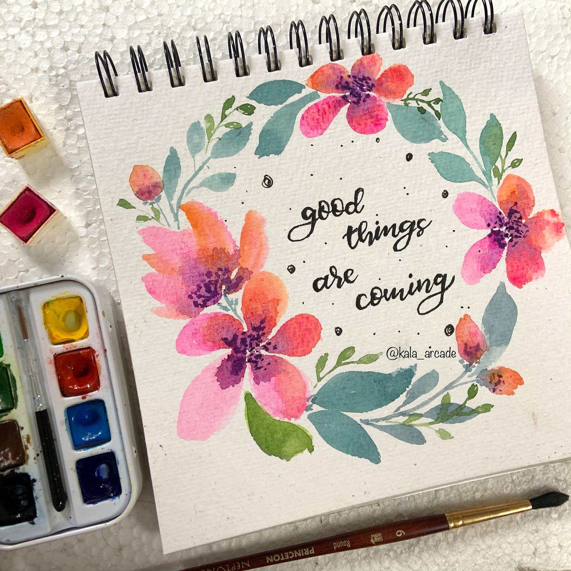
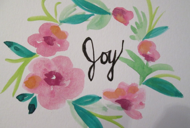
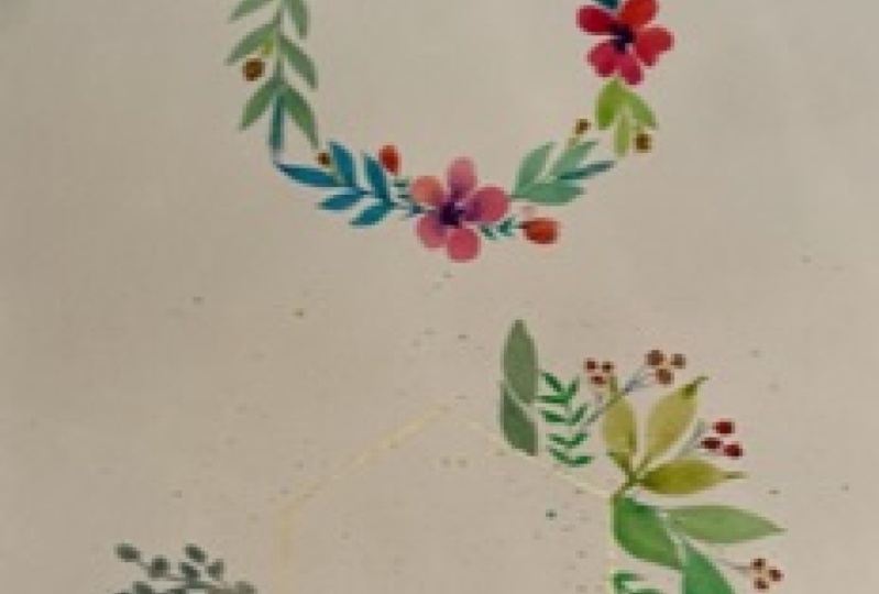
5. Project 1: Floral Wreath: For the first project, I'm using there seven cross seven sketchbook. Basically it's a square sketchbooks so you can use any particular one. I have used a compass to make UP affects. So for the red, you can use any particular circular element lying around in your house too. That is totally okay. We just need a circle. Now if you want to make like a perfect circular and not have any oh, elements inside the circle, then you can add some masking fluid or any positive to the center of the circle. So I'm going to be using the elements that we just practiced in our previous lesson. And using those only I am going to add an abrupt variations to them to make the whole red. So first of all, I am going to make the pink flower that we used. Okay, so why I am referring to it as a pink flower because it is a type of a loose floral. And I am going to change it a little bit using the same color, pink, but this time I'm going to use a little orange with it. Now you can see what I'm doing is I've started with the left end of them. So good. And I am making an elongated better. It is not as round as we made an applied practice class. It is a little elongated. And when I am making this being peddled, to add a little gradient to my patterns. I have a mixed a little orange with the pink color on the brush itself and not on any other palette. And you can see it gives a very beautiful variation and gradient to the entire better. For the center, I'm again using the purple color only. And I'm going to drop in some drops of that book will tell my flour is a little red particle radiation and are different or touch to the red, or remember the leaves that he made or the tropical leaves that we need. In the same way, I am not reading leaves here and making a flood which will look as if we are looking at the slide from this side. So basically a sight of you of the flyer. I am not doing anything. I'd just taken 1. And from that point I have made these battleships or leaf shapes emerging out. So that will give honor to the side view to the entire floor and also a different look to our whole red. In the same manner as my first floral, I have made some more flow rules on the entire read in different angles, like at different positions in the whole circle. So you can go ahead and try out using your own imagination, using your own positions and then DIA, so good. But I chose to make like in a triangle format. I don't know what really works good for me when I make Florence in literary triangular format. Now you can see why I'm saying triangle because first I have made on one left and then on the same line in the right end, and then on the top, it works really good for me. Ego form the shape of the red. So you can use this method as well, or you can go ahead and go crazy over the position and make in any particular way. The main aim is to practice red and not to just get blown away with the positioning. Now, as I told you that, we will need to make leaves in a slant detection as an add black to sketch book. We did. So in the whole red. Now you can understand, since we're making a so-called format, we will definitely make a difference land physicians, entire leaf. Now, I have decided to go ahead with different shades of green for the n diode or red, but not also going to crazy with the shades. I just kept lake due to three sheets for the entire red open mics, too many of them. So with the pink, this green color goes really, really well. I have added a little blue, blue, dark green, lighter blue that makes a shade somewhere near to Ocho while green, but backhoe go while green, you can add a little Pope will as well. That gives a very good greenish need. Color. Then you can see basically I'm mixing and matching the different types of leaves that we have learned. So always. Remember one thing when you're making reds, that whatever flowers that you have made always tried to make leaves emerging out of those flowers, but basically emerging out of the ends off those flowers. Like I am doing cure. I made different types of leaves emerging out of all of my flow rules. And that basically covers the entire red in it. One. And oh, yeah, I'm not following any one particular shape of the leaves, but yeah, I'm just reading their sizes or some are little larger, some are smaller. And yeah, just mixing and matching them completes the whole red. You can even rotate your sketchbooks so as to make it easier for you to draw, because it gets a little difficult sometimes to draw an awkward positions. So try repeating your sketch books. And I have made this whole lesson in real time so that you guys can paint along with me and I am not just or you know, or running away with speed and you guys can not catch up. So here it is in real time. So I hope that you guys are following along with me. Now, since this read is already a lot of dynamic, I am not making too many fillers elements. Or these filler elements are the ones that we made in the first one, the yellow one. These are similar and I am not making like a bunch of tools. So everywhere or these random, but just in the circular shape, I'm mixing the orange and the pink color together. And I'm making the round shape of the bytes and then making some stamps to that. So yeah, I'm not making though like book will affect failures because. Already a red looks a lot dynamic. I just thought that leaf goes, going a little off the entire color, shades of my death. So I just made made it a little darker or using or different green sheet on top. Now comes the good part of the red. Here. We're just going to follow our heart randomly. And using the smaller round brush, we are going to make some smaller leaves. Remember the leaves that he made, in fact procession. Then we will making several leaves emerging out of the center branch. I am making the similar type of leaf on the entire red here and dead emerging out from the species that I thought were looking a little at either M. So I tried to make these leaves or there so that the whole red looks or more fuller and complete. Now don't be afraid to overlap the leaves, because obviously the leaves can overlap and it looks actually pretty clear. But just make sure that when you're overlapping the shades of green or whichever color using the shades should be a little different like here, my lower leg has more bluish green shade and the top has more olive green. So it gives a good contrast and they look good together. To give you a better glimpse and to actually complete the rat. Or I'm adding some finishing touches to it. As I mentioned in the practice class, I am making some center dots on the flow rules that will give it more depth to these Florence. And it will make them look or more, or you know, cuter, I guess. Or basically it will make them look a more complete. A little tip there for you. I sort of made up or added some extra pain from my hand on the sheet. So to just remove that, just take your brush. Dependent clean water, add some offered on that wrong area where you have extra pained and then take a tissue and just pick it up. So yeah, what the colors? You can even do this with them and they save you. So yeah, that is it about our final project. And it looks so pretty to me. I am really excited and it looks so good with these shades. I'm so excited to see what colors do you guys choose. Make sure to add in your projects in the project section. And I would love to see them and feature them. Let's move on to our second project now.
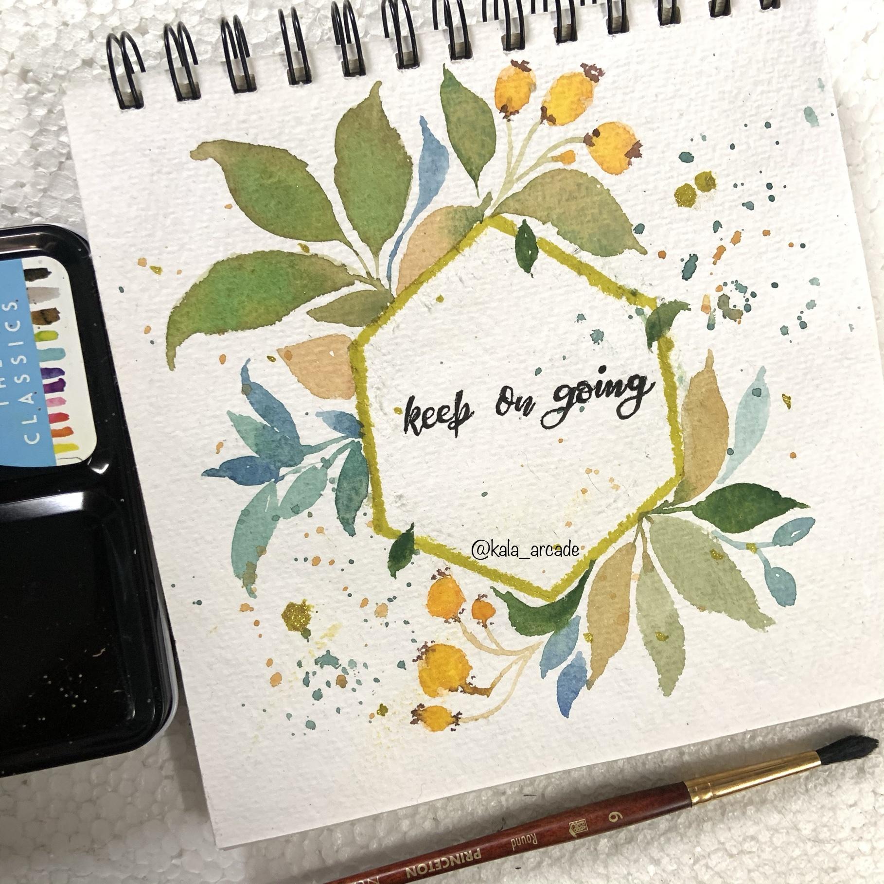
6. Project 2: Leafy Wreath: So for this project two, I decided to not make it in the conventional so-called form. I decided to make a hexagon. So using my scale and just some simple measurements, I made a hexagon. I did not buy the about the proper proportions of the hexagon. I just made a random looking hexagon late, not exactly aligned to the people, but yeah, you can totally go ahead and use any hexagonal stencil also for this. Or you can just go ahead and make using a simple scale and pencil. For your reference. I made the hexagon of site five centimeter each. So you can just follow along my particular measurement. You can make your own According to the people that you're using. Now, when that was done, I will use this hexagon shape as my guide to meet the leaves and the flowers around the red. So what I did is I just decided to not go ahead and neglect floaters and leaves or on all the six sides of the hexagon. And to just limit them to two sides or do do foresights basically. So I chose the left topside and the adjacent side to that. Now, I have just mixed my green with brown and yellow to form a little darker or live green or little muddy shade. And I'm just going to make my leaves with Dad. They look very pretty. This color looks very pretty with leaves. So on the side that I chose to make the leaves, I have just made the leaves with a little stem, the ones that we learned forced in our practice class. So alongside one leaf, I made one more, but a little smaller. And you will see I'm just adding a little variation to work. Like I have not made it in proper oval shape. I have tried to move my brush unilateral roughly manner to make make little rough ends to my leaf. So I just made a collection of three leaves, they're next to each other. And then I added a little lighter green shade on the top of these to mix them. Or Now this technique I showed you in the practice class as well. And it looks very good. They mix properly when they're wet. So just remember when the background or your leaves are wet, you can add any particular colors on them. Now I added yellow to my brown color to form or TM color, basically that I did in my previous project as well. And I added a leaf in lying down direction basically to just basically gave all feeling that it is hiding behind the hexagon line. So I just added two leaves there, or to give a little feel that some leaves or hiding behind the hexagon shape. Now using similar shades of olive green and green, basic and m varying though olive green shade. And the brownish yellow sheet that I have. Or you can basically use a buoyancy and all burnt umber as well for this. And I'm just reading the leaves. And in-between these leaves, I have made these small strands, which we will make into fillers or just after some time, I am just finishing off the leaves first of all, so I've just made strands using the same colors. This read is more of a foil or related Red, I think. So I just added a little bit of a brown or to my orange, very literal to form the proper autumn colors. And I have made these literal fillers also that we learned in our practice class, the round ones. Actually they go perfect when you're making any autumn related things, they look very, very nice. If you think that you have a literary darker color or you want to reduce, you can anytime pick it up with a tissue that is totally convenient with watercolors, you can vary the amount of water or anything. Now I have added a little bit of blue and purple to my green color that gives a very beautiful cobalt green type of a shape. And on the next side, on the main site that I was using to make leaves the site just next to it, I decided to add some these coloured leaves so as to give it a read gradient and variation to my whole red. And here I am adding a little bit. I topical type leaves that we learned in the practice session, but they are totally random directions. Wherever I thought that there was space to add a leaf, I was just emerging out a leaf from that side. One technique I used here is I added a little bit of darker blue color mixture. And you can see I am overlapping the darker leaves with the lighter leaves, you can do vice-versa. This gives a very beautiful look, look to the leaves overall. And yeah, we are done with one side of the red. Or now you can either just rotate your sketchbook or you can make it in the same direction if you feel comfortable. And I'm just going to make a very similar type of a pattern on this side as well. Because it looks good to have symmetrical reds. And so I am not going very different with the pattern on this side. I am making some board or similar pattern as I made on that end. Ok. I have also varied the green shades on little bit on this side. You can do that a few 12 I was actually just going on with what I had in my mind and not really thinking about anything. And I was just enjoying the process of making the red. At the end of the day, enjoying the whole process is the bottom line. And make sure you do that rather than worrying about making it perfect listener triggered anything. And then I made the similar type of Florida's I did on the upper end. And to complete the debt, I just did an a good sputtering technique. You can use it hand to cover up some leaf part or you can use any cardboard and any people. And then I just splattered some are Danko cobol green shade on the sides where there were no leaves at any Flourens. Just to give it a little more or clean dynamic effect, I guess. But it looks pretty even you have these tapes as flat as an amnio paintings. And yeah, I was just going for that look. I also added some plateaus with brownish yellow shade or just to give it more good effect. And then use my green color to make these smaller leaves on some sides of the whole red, just hanging like that. And in no particular order direction I just made these leaves here and Dennett, when you are by now my flow, floods. All the failures were also dry enough. So I used brown paint up daughter but on Bain. And I added detail into that as we did in the practice glass or I did that when these were dry because I didn't want my Brown to mix with the orange at all. So that was what I was going for. Now when the complete that dried or little, I used my golden what? Ben and I made the outlining of the hexagon using that 1A Ben. I also it is the pencil Lane's first, but make sure you do all of this. Bend your red is dry enough. Either my advice, you might go ahead and smudge some paint, so make sure you be patient with that. And yeah, so basically this is the finishing touch of the red. And I added this golden edge, DO, DO whole hexagon dread because I think that golden was really going on with the autumn and the foil feel of this read. I also added some golden splat doors, but it was really dark for the whole painting. So I picked up some golden paint using a tissue. And yeah, that is pretty much it. Uh, we are completely done with our project. I am so happy with the autumn field of this one and yeah, it looks really pretty to me. I hope you guys enjoyed it too. I am really excited to see what do you do with this project and how you make it more beautiful video creations. Make sure to some media project in the project section. And yeah, thank you so much.
7. Finishing Touches: Now the red slope looked a little bit empty, so I just decided to add a literal quotation in between. I am using micron pen or now the SUS or 0.8 micron pen. You can use any particular pen, even a boil Ben, I am doing for calligraphy here, which is basically impersonating calligraphy. If you don't know any type of calligraphy, you can go ahead and write in your own handwriting. That also looks very pretty. So the first one I decided to write this very amazing quotation, or good things are coming. Now I am all about positive quotations and motivational things. If you guys know me from my Instagram site is decided that this quotation was very naive. And I wanted to write this quotation in between this bright flurry red. So yeah, I basically did for calligraphy as I told you. And you can totally leave it like this. You can see I have just written normally and then started falling out and make it look more like calligraphy. You can leave it just with your normal pain handwriting or you can use any marker as well. When that was done, I just decided to add a little soak goods or dots in the entire empty space inside the red to make it look a more complete. So I just added small dots and circles here and there throughout the whole space. For the second project that we did, I am using the same n again and I decided to write, keep on going on the spine. That is also a very beautiful quotation that really helps me to stay motivated to paint or do anything basically. So I decided to write that for this one also, I followed the four calligraphy. Or again, you can use any particular hand lettering style that you. No. But even if you don't know, you can use your normal handwriting. And yeah, that is pretty much eight about these reds that we made in this class. I hope you guys enjoyed making these and you will also try these out. And I can't wait to see your projects. Don't forget to share your projects with me in the project section. And yeah, I would love to share them on my Instagram. To, it would be great if you can leave a review here or a message in the discussion area, it would mean a lot to me. Thank you.
 Mahima Tiwari, Watercolor Artist | Calligrapher