Transcripts
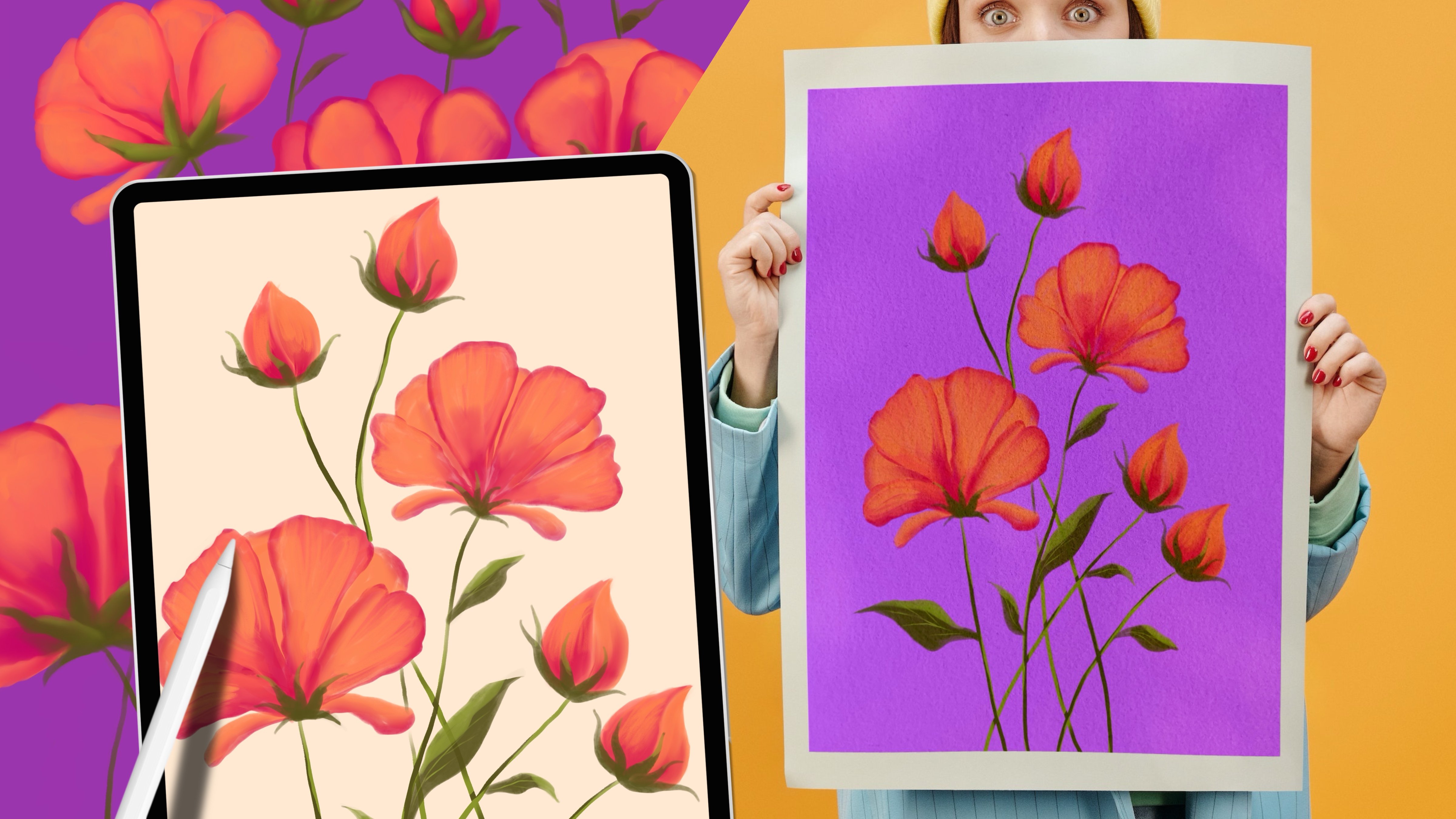
1. Introduction to Class: Have you ever wanted to paint watercolor florals on your iPad? In this Procreate
illustration class, I'll show you an
intuitive way to bring vibrant florals to life with
satisfying watercolors. Perfect for adding charm
and character to your art. Hey there, I'm Yifat Fishman. I'm an artist and illustrator. I specialize in portraits
and vibrant compositions, and I love incorporating
florals into my work. Flowers play a key role in my more intricate
client projects. Plus, their endless colors and shapes make them
a joy to paint. Join me in this class as I share fun and
creative techniques for painting vibrant leaves and stunning flower
arrangements. The techniques you learn
here can be applied to future projects to create
beautiful watercolor effects. You learn how to
illustrate buds, leaves, and a variety
of expressive flowers. We'll jump right in with a
process that create beautiful, surprising results in no time. Instead of relying
on reference photos, we'll use our
imagination to create florals that reflect
your personality. You learn which
brushes I use and why they work best for
different parts of the project. By the end of class, we'll
explore the option of creating a greeting card
with your class project. This is a hands on class. I'll be guiding you through every step of this
satisfying process. You'll need basic experience with the Procreate app to
follow the lessons. This class is perfect for
anyone looking to bring charm and character to
their digital floral art. I'm looking forward
to seeing you in class, so let's get started.
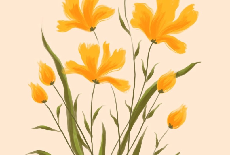
2. Project: In this hands on class, you'll create stunning
watercolor painting of wildflowers. The class lessons walk you through the creative
process using a step by step approach to make it fun and easy to follow along. We'll illustrate buds, leaves, and expressive flowers,
starting with a loose sketch. I'll cover all the techniques you'll need for this project. And by the end of class, we'll explore different ways to bring your
illustration to life. And I'd love for
you to find ways to make your class
project uniquely yours. You can transform your artwork
into a beautiful design, experiment with vibrant colors, whatever makes it truly yours. Once your floral
illustration is complete, share it in the class gallery. I'd love to see your work, and I always leave
encouraging feedback. With that said, let's begin. I can't wait to see
your beautiful florals.
3. Sketch: All right. We're ready to begin. I've set up my color palette
directly on the canvas, and I'm using the same palette available to you in
the class resources. My colors are placed
on a separate layer so I can easily access
the colors I need. This makes the process
quicker and more efficient, since we already know the colors we'll be using for this project. And of course, feel free to use other colors of your choice, colors that you
connect better with. Your first step in creating
your floral illustration is to sketch out the composition
using a pencil brush. Start by loosely marking where you want your
flowers to be. I'm drawing simple
blobs to get a feel for how I want to arrange
the florals on the canvas. When planning your composition, keep your sketch loose. Don't worry about details yet. Just focus on placing each
element and defining its size. Pay attention to scale. We want a few larger
flowers to serve as focal points and smaller
shapes for the flower buds. To create a balanced and
dynamic composition, place each element at
slightly different heights. Finally, sketch stems
extending from each flower. This step helps establish the structure of
your illustration, giving you a clear plan to
follow as we move forward.
4. Stems: For painting the flower stems, you want to choose a brush
that is highly pressure sensitive and scale down enough to create
fun delicate lines. I'm using one of my own
watercolor brushes. Watch what happens when
I adjust the pressure. This is exactly what
you're looking for. Varying the pressure as
you draw will create natural dynamic strokes that
brings your stems to life. Now, here are things to keep
in mind while drawing stems. Keep a steady hand. These lines are long and while they don't need to
be perfectly precise, we want them to flow
smoothly and look elegant. It might take a few tries until you get your stems
right and it's okay. Vary your line weight. Adjusting the pressure
on your pencil will create beautiful organic
variations in your strokes. This is why we're using a
pressure sensitive brush. Create natural intersections. Let some stems
overlap or cross each other to add depth
and visual interest. Finally, I'll refine the ends of each stem to smoothly
transition into the flowers, setting the stage
for the next step. This technique helps mimic the organic flow of
real flower stems, making your illustration feel more natural and expressive.
5. Buds: When drawing your florals, be sure to add a new
layer for each element. I have separate
layers for my colors, sketch, stems, and now I've added one
more for the flowers. This is where the fun begins. We're going to start
shaping our flowers. Now since you need a variety of shapes in your illustration, choosing the right
brush is important. Pick a brush that you
enjoy drawing with one that's wide enough
and possibly textured. Testing a few different
brushes will help you find the one that feels
right for your style. I'm looking for a pressure
sensitive brush that creates expressive strokes
with interesting texture. Dry brush, for example, has a fantastic texture that mimics a real dry
brush. I love it. It's adding so much
personality to each stroke. It's fun to use and brings a lot of character
to the flowers. As I draw the flower buds, I apply more pressure
at the base and then lighten up towards
the end of the stroke. This way, the bottom of
the bud is rich in color, while the tip fades out with
a beautiful dry texture. With just a few brush strokes, we create expressive,
delicate flower buds. Next, we'll adapt and dimension
using a darker shade. So when we do this, use the same brushwork
as you did for the buds. Adjust your pressure to create variations
in your strokes. And apply the darker shade
at the base of each bad, then blend it upwards. But don't color all
the way through. Keep the lighter color dominant to enhance
the sense of depth. I love seeing the colors
interact in this way. It's interesting to me how
every bad looks slightly different even as I use the same technique to
create all the buds.
6. Flowers: Now that you've mastered
drawing buds with two colors, we'll use the same technique to bring our flowers to life. For each flower, I want to
create four expressive petals, two in the center
stretching upward, and two complementing
them on either side, forming a balanced
and dynamic shape. This is where you
get to be super creative and let your
brushwork shine. The dry brush technique
will help define each petal and add unique
character to your flowers. You can experiment with
adding more petals, but I like the simplicity and elegance of this four
petal arrangement. I love how, although I'm
using just this one color, every flower has its
own unique shape. The more you draw the flowers, the better acquaintance
you get with this technique and you
gain more confidence. Plus, I think it's super
enjoyable to do this manually, draw each petal, follow
those shapes that we did in the pencil lines and seeing how our
flowers take shape. Now, since we're
working in Procreate, we can easily copy and paste the flower to create a new one. However, I think it's more
fun to draw each flower individually and experiment with the direction it's growing. This not only helps you
practice your technique, but also adds a sense of spontaneity and surprise
to your artwork. Next, we'll add more
dimension and depth. Just like with the buds, we'll use a darker color
to enhance each petal. Apply pressure at the
base of the petal, then gently stretch
the brushwork outward. Be sure to leave plenty of space for the lighter
color underneath. It's important not to
cover it entirely. That contrast is what creates depth and richness
in your flowers. It's already looking great, though we have one more step before this illustration
is finished. These blooms stand
out so beautifully.
7. Leaves: You'll see that
incorporating leaves along each flower stem not
only fills the space, but also adds so much character and charm to the composition. For drawing the leaves, choose a slightly textured brush
to create visual interest. I'm using a brush
that I specifically designed for drawing
flower petals and leaves, and it's perfect
for this process. By adjusting the
pressure on your brush, you can create
leaves effortlessly. I start with light
pressure at the base, increasing it at the center, and then release it
towards the tip. It's a simple yet
effective technique. When needed, I can
always use the eraser to refine the tips of the
leaves for a clean finish. So as I draw, I switch between the eraser and the brush
when forming my leaves. This step is
incredibly relaxing. Draw leaves along
the flower stems, ensuring each one has enough
space to avoid overlapping. I like to make the leaves
smaller near the top of the stem and slightly larger towards the base
for a natural look. To enhance the composition, let's add a few
longer, larger leaves. I use the same brush as before, but scale it up considerably. Keeping the same brush for all the leaves
regardless of size, helps maintain a
consistent texture throughout your artwork. Another key detail, place the leaf layer behind
all the other layers. This allows the longer leaves to grow behind the
buds and flowers, creating a stronger
sense of depth. Once I'm ready to refine
the leaves further, I lock the layer
with alpha lock. This allows me to add details and shading while preserving the natural transparency
and textures of the layer. For colors, I recommend
using three shades of green. Start with the middle
shade for drawing the leaves and then
use the lighter and darker shades to add
highlights and shading. With the leaves in place,
your floral illustration is really coming to life. They add movement, depth and a natural flow
to the composition. By using texture,
layering colours, and refining, you've created detailed leaves that enhance
your stunning flowers.
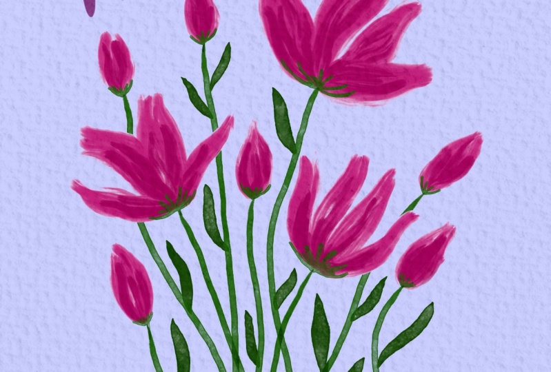
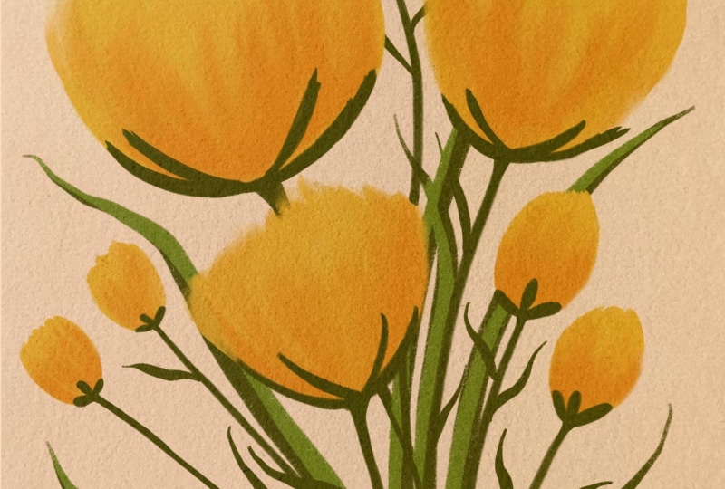
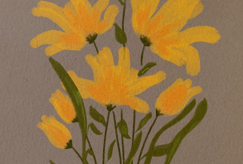
8. Design: Start by duplicating
your project so that you can experiment freely on the other version and
keep your original. Turning your floral illustration into a card is an
option for this class. But I think it's
an exciting step, plus it's a fun
exploration process. Exploring different colors is a great way to discover
new looks for a project. I feel that it opens my mind to possibilities that I
had no idea about. Our creative choices
when it comes to color are truly exciting. I'm starting by trying
different colors for the background and watch how each color feels different and how it interacts
with the flowers. Think how you feel about
each color you try out. Each option creates
a different mood. Play around and consider
making a few color variations. You can choose more than one. Next, let's import
a paper texture and place it above
all the layers. You can use the same
texture I'm using. It's available in
the class resources. First thing, make sure
that your paper texture is covering the canvas and
scale it accordingly. Then place it on top of
all the other layers, and now we'll experiment
with blending modes to find the one that
enhances the texture best. I'm trying out a few options. Some create a refined look while others add a rougher feel, and I'm just going to
pick one that I like. Finally, let's add
a personal touch with some hand drawn lettering. For this purpose,
you'll want to pick a simple brush so that it won't draw too much attention
from the rest of the page, which we want to be more
expressive and really stand out. I'm not a calligrapher, but I do love introducing
hand lettering in my work. So how about writing a
positive message for the card? And I can embellish it and
make it really fun and pretty. There's really no need
for perfect calligraphy, a simple heartfelt message
to complement the design. And that's it. Your beautiful floral
illustration is complete. I hope you have fun
experimenting with colors, textures, and brushwork to
bring your flowers to life. Whether you keep it as a standalone artwork or
turn it into a lovely card, you create something
truly unique. So I hope this class
inspire you to keep exploring and have fun with your digital
watercolor florals.
9. Final Thoughts: I hope you had as
much fun painting these wild watercolor florals as I did guiding you
through the process. By now, you've explored
different techniques, experimented with
colors and textures, and brought your own unique
floral illustration to life. Remember, the more you practice, the more confident you'll become in your digital
watercolor painting. So be bold and play around, try new brushes and color combinations and make
these techniques your own. I'd love to see
your final project, so be sure to share it
in the class gallery. I always enjoy leaving supportive feedback and
celebrating your creativity. If you enjoy this class, please take a moment to
leave a short review. It really helps me improve and lets other know what to expect. Thank you for joining
me in this class. Happy creating, and I'll
see you in the next class. Bye for now.
 Yifat Fishman, Artist & Illustrator