Transcripts
1. Class Trailer: Hello, I'm Matt. I'm an After Effects artist for Uken Games in Toronto, Canada. We're the company behind titles like Jeopardy and Who Wants to Be a Millionaire, and you might have heard of our latest game, Ava's Manor as well. I use After Effects a lot, and it is genuinely one of my favorite things so much so that I actually have an After Effects stopwatch tattoo on my arm. That's real, that's with me for good. The reason that I love After Effects so much is because it gives you the power to create nearly anything that you can come up with. But I totally understand if it can be a daunting thing if you've never opened the program before. But lucky for you, I've condensed years of After Effects knowledge into this perfect package that I wish that I had when I was first starting out. What I love about animated loops, is there such an eye-catching medium? Whenever I see one as I'm scrolling through my feed, I always stop and appreciate it for a minute. Another thing that I love about them is that there's such a cool way of expressing your love for a certain subject. Personally, I love stuff like food, rap, and puns, so all of my animated loops tend to be about those subjects. Clearly, after seeing those dope examples, you must think that they're conjured into this realm with some magic ritual. No, all you need is After Effects and After Effects' good friend, Illustrator. Let me demystify all of the confusing junk in After Effects, so the program can get out of your way and you can get to creating your very own animated loop. There's a bunch of different pieces that go into making an animated loop and that's why I think there's such a great beginners project. You'll get your feet wet with character design and illustration, as well as more technical things like rigging and animation. It's the perfect sample platter of all of these different creative fields. If you discover that one of them is interesting to you, like if you get really into rigging, then it's going to be super rewarding to pursue that field. You get a more robust sense of how After Effects works this way. While I could teach you something cool, like, oh yeah, my hand is on fire. While this looks dope, it's only going to get you so far. This is a big statement, but I think anyone that's remotely interested in creating anything could benefit from having a little bit of After Effects knowledge in their tool belt. It's such a powerful program and one that's really rewarding to learn. You might have caught on by now, but I'm aiming to make this class at least a little bit entertaining as well and you might be saying to yourself, but Matt learning is kind of boring. You can't make learning stuff fun, [inaudible] watch me. Does this not look fun to you? If that sounds interesting to you, then please come hang out and we will make our very own animated loop together. Can't wait and I'll see you guys there.
2. Project Intro: Project intro. In this class we're going to be making animated loops. In order for you to do that, you're going to need a couple of things beforehand. After Effects installed on your computer. I don't know how you thought you were going to take this class without having After Effects installed. Illustrator also definitely helps. That's what I'm going to be using for my animated loop. But if for whatever reason you don't have access to Illustrator, that's totally okay. You can make your characters in After Effects. I designed this course with modularity in mind. If you don't have access to a certain program, that's totally fine. That's all right. After Effects is the mandatory one obviously. But even if you can't install Illustrator, you should still be able to follow along. Another program that you might want to install is part of your Creative Cloud subscription. It's called Adobe Media Encoder. That's just going to help when we export our animated loop. Once they're done, it's just going to give you a lot more options than what After Effects is built-in. But again, if you can't install it for whatever reason, you can totally complete this course with just After Effects alone. In order to help you get around in After Effects, one of the things that I super recommend having is a mouse, with a scroll wheel, It's just a lot faster to navigate After Effects that way. You can do it with a trackpad and that's fine. But a mouse, especially one that has the numbers on the side, an MMO mouse, is super beneficial to have just for being able to input stuff faster. I find that it's helpful to have a pen and paper or a note-taking program of some sort, open on the side as well, just so you can jot down some quick ideas. Or I might give you a really good tip and then you can just jot it down and have it for later so you don't have to re-watch this entire course. There are also some plugins for After Effects that I'm going to be using. The primary one being a plugin called Duik, which is going to help us rigor characters so we have better control over their hands and joints and stuff. It's totally free and I'll show you how to install it later on in this course. There's another one that's not mandatory, but like if you're using After Effects in any capacity it's worth an install, and that's called FX Console. Again, I will show you how to install it later on in this course. There are some paid plug-ins that I might use as well during this course. But I will definitely make sure to show you a free way of doing the exact same thing. It just might take you like five clicks where it only takes me one. I've invested in these tools for myself to help speed up my workflows just because I use After Effects so much. If you're just starting out, don't feel pressured to buy extra plugins unless they sound dope and useful to you. This is a little bit behind the movie magic, but the classes are already done at this point. Initially I had it broken up into eight steps, but I think as of now we're sitting at like 24, 25 episodes. Clearly there is some deviation in this master plan. If you already feel comfortable with the basics of After Effects, and you don't want to watch the After Effects primer that's included. That's totally cool. You can skip over it. You might miss a call back to a joke that I made in a previous episode. That's the cost of skipping around. But these lessons were made sequentially. As long as you feel comfortable getting yourself up to speed to a certain point, it's up to you to determine how you learn best. But also at the same time, I put a lot of work into all of these episodes. I'm going to be a little bit mad if you skip some of them. This is the animated loop that I ended up with at the very end of this course, I designed the course in a way where you can use these tools and methods to create your very own animated, not this exact one. The ultimate goal of this course would be to have your very own animated loop that you can hand in either as a GIF or an MP4, and you'll be able to upload that to the project gallery. I'm genuinely super enthusiastic about all of this stuff. I'll be more than stoked to help out anybody who is struggling in any of these steps. While you're in the project gallery, if you want to take three seconds to drop a compliment on somebody else's work, you should totally do that. It's free to overmeet from both sides, and you might see a cool idea that somebody else is making and that might inspire you to put your own spin on it. That about wraps it up and I'm stoked to get into the creative process with you. That's a weird way of ending this episode. That about wraps it up. We're going to jump over to the next episode where we're going to enchant your eye holes. I'll see you guys there. Well, I won't see you guys there past Matt will see you guys there. Again this was recorded like maybe a year ago. Quality's going to dip a little bit, but then it's going to rise for the remainder of the course and you can see me get better at creating classes. It's not going to be bad. Just watch it. You'll see.
3. Enchant Your Eyeholes: Enchant your eye holes. Step 1, enchant your eye holes. What does that mean? Well, what's great about learning stuff is that a lot of the work is already done for you. There's already a bunch of people out there who do animated loops. We can go look at their work and steal from them. I don't mean directly copy them, but they've already figured out what works. We don't have to figure out what looks good. They've already done that work. I could just sit here and Google animated loops and see what comes up. But since I'm such a huge fan of this medium, the same thing that I said when I bought this shirt, I already know who does great work in this field. I think it'll be beneficial to take a look at who's making the best animated loops in the game and what we can learn from them. The ones that I really like are Slim Jim studios, James Curran, Deekay Motion or Deekay Kwon and Chris P, which is Chris Phillips. Right now we're not too worried about breaking down their work. We're just looking at the cool, good versions of what we're trying to make. We just want to save their work in one spot. Personally, why I like using OneNote is because I can drop screenshots in there really fast. I can drop URLs in there. I can draw or sketch an idea really quickly just with my iPad. It's helpful. It's what works for me. But I think it's beneficial to have some system like that in your life where if you get a cool idea, you're able to jot it down and if you keep at it, you'll have years of just cool looking arch stuff that you're into. There's very little reason not to do it. I would get into the habit of if you see something cool, be able to find it later in an easy spot. Just like a horde cool stuff that you find online. Become a content dragon is what I'm getting at. Plus, it helps that you can look back at these places later when you're like, "What was that one guy who had that one cool thing?" Doing this step is doing a solid for future you. Generally, it's good life advice to do future you as many solids as possible. There's things called extensions that you can add to Google Chrome in order to add functionality. The ones that really help me out are Pocket, which allows you to save whatever you're looking at into just a giant pile of cool stuff that you can look at later. If I don't have time to read an article right this second, if I just quickly hit "Save to Pocket" it's a lot easier to pull from that list rather than trying to pull from my own memory. That's going to help you in the future. Don't get me wrong. Instagram is a great place for finding new art, but it's also a little muddy because you have your friends who are artists who are posting pictures of their babies or their cobb salads that their babies made. My point is follow hashtags like hashtag motion design, hashtag character design, and you'll see cool new art that way. But if you really want to focus in on a certain thing, one of the best websites that I use is Dribbble with three B's. You can really hone in on what you're looking for. I need specifically mobile designs. Then it's got a subcategory for it. It's just cleaner, it's laid out better. There's also another really great extension called custom new tab URL where when you open a new tab in Chrome instead of just the default Google screen, it'll be whatever URL you said it. Either your Pocket list or I use to do that way I can see the things that I need to do and it's fresh in my mind every day because chances are I'm going to open a new tab at least a couple of times a day. By the end of this lesson, you should have a bunch of reference and hopefully started in one central location. You already did one of the hardest parts. You decided to start and that's not something that everyone decides to do. So congrats. If you continue making decisions like those, you're going to have a sweet animated loop on your hands in no time. That's it. That's all that we need for the very first thing. We're starting off easy. I'll see you in the next episode.
4. Dissect Them Guts: Episode 2, Dissect them guts. This is basically just my fun and gross way of saying now that we've found a couple versions of the thing that we're trying to do that we really like, we should take a closer look at them and see what they're made out of. I've got a loop here from Chris Phillips that I think perfectly encapsulates all the things that I love about animated loops. There's three fundamental pieces that go into making an animated loop, and we're going to figure out what they are. Let's bust out our microscopes and see what this bad boy is made out of. This is going to take so much visual effects work. I'm so sorry, if you drew bad, but it'll be worth it. It's going to look like. One of the first things that you'll notice when you're looking at an animated loop is that they all have very colorful backgrounds. This becomes especially noticeable when you made a bunch of them and you're seeing them all in one spot. It's usually a solid color. But even if you decide to add more detail, they tend to be monochromatic. If you don't know what monochromatic means, mono, meaning one and chroma meaning color. So just one color. The reasoning behind this is so that our loops become very legible. Any action that happens inside of the loop is front and center and won't get lost at any of the background details. But you can't just render out colorful square and call that an animated loop. Now, can you? We'll need something happening inside of our loop, and that's where assets come into play. If you want to loop about a snowman, then you're going to need to make some artwork about a snowman. Snowman artwork. The characters all tend to be simple, not basic, but like no extravagant, crazy details. Characters tend to be rendered with two tone shading, which is also something that'll show you how to do later on. But for now, it's just something that we should jot down and notice that it exists in all of our favorite loops. Cool. We have a fun, colorful background and our character on it, but it's still not a named to be the loop. There's no action happening. That's the last piece of our puzzle. We have to have our characters doing something. This next part is probably one of the most important things in the entire course, so make sure you're paying attention. In order for any action to loop, the beginning and the end have to be the exact same thing. Animation and all video for that matter is broken up into individual frames, which are pictures that are played in succession. Frame rate is how many of those pictures are in one second. Thirty frames per second is 30 individual pictures played in succession in a second. The more frames that you have in a second, the smoother your animation is, but the more that you have to worry about inside of those seconds. To put that into perspective, a typical animation is usually in 24 frames per second. If your loop is only one second long, then the first frame and the 24th frame have to be the exact same thing. If our snowman here is doing a sweet flip, the loop is easy, although a little boring. However, if our snowman does a flip and loses his top hat midway through, then the loop will jump, it won't loop seamlessly. It'll play to the end. He won't have his hat. Then it will start at the beginning again, and his hat will just pop into existentry. The loop is no longer seamless. He could pick up his hat and put back on, or he could find an identical hat and put that on. You just have to find a way of resetting your scene so the animation can happen over again. As long as the beginning and the end are identical, then your animation will loop. Once all three of these pieces are in place, my cat just switch jump out there. Once all three of these pieces are in place, your colorful backgrounds, your character assets, and your character doing some repeatable animation, then you have an animated loop on your hands. With these concepts in mind, let's jump into our next lesson where we're going to generate some cool ideas.
5. More Guts!: Now there's more guts. This time we're going to come up with a fun idea. In this video, we're going to look at some methods and shortcuts that we can use in order to generate our very own idea that hopefully you'll be excited about working on it. Even if you have an idea already, I think this video is still worth to watch. I use these tools all the time and they come in handy a bunch. There's two very useful tools at our disposal here and they are juxtaposition and exaggeration. Juxtaposition is having two elements in the same location that have contrasting effects. For example, just to keep running with our snowman theme from before. If you have a snowman in the arctic, you're thinking great, that's a good place for a snowman. On the other hand, if you have a snowman in the middle of the desert, you have a much more interesting scenario on your hands. If you only have the first half of an idea, think about what doesn't make sense and then explore that space. Hey, so real quick. Future Matt here. By explore that space, I mean ask questions about your scenario. Like, how could the snow man survive? How did he get here? What would have to happen to make this possible? Maybe he has an umbrella and a portable fan to keep himself cool. Asking questions about your scenario is where you're going to find those fun ideas. Back to past Matt. If you're making a ninja, then instead of having him in a shadowy castle somewhere in Feudal Japan, maybe try throwing him in a highly populated and very well-lit grocery store. Or conversely, if you were dead set on making your loop add on F1 track, then maybe try adding in a really sleepy character who's just yelling at the cars as they drive by. Being like, "I have to be up in four hours." He's just really mad that he's trying to sleep next to a F1 track. The things that don't make sense are really endearing to people. You get to leverage empathy this way. Maybe you, like me, don't really super care about tennis. If your loop was only about a tennis player playing tennis, then you might lose your audience. But if you can leverage empathy and put that tennis player trying to play tennis when it's super windy out, then you've got a lot more interesting scenario on your hands. It's a useful tool for hacking people's interests when previously there might not have been any. Juxtaposing your ideas really makes them endearing to people. The other thing that was on our making good ideas tool belt was exaggeration. This is the idea of taking something about your character and pushing it to the absolute limit for comedic effect. Let's say you wanted to make a loop about your pet wiener dog. Your dachshund. You can make a loop about it as is and that's great. But it's more interesting if we choose one of her defining attributes and really exaggerate. Wiener dogs are pretty small as far as the scale of dogs go. But what if she was really small like the size of a penny? Then you've suddenly got something that's a lot more worth watching, but you have to play to their existing strengths. This idea doesn't work nearly as well with a Tibetan Mastiff, for example, because that's a very big dog. Shrinking him to the size of a penny isn't as interesting. It's still interesting, but it doesn't make as much sense. You want to exaggerate what makes your character unique. If you're making a loop about a giraffe, then make his neck reach the stars. If you're making the loop about a barber, make sure it's visible that he's holding scissors. You want to have clarity in your ideas. I would try to avoid making a loop about that barber and he has laser vision and an evil twin brother. The more that you add to your loop, the harder it is to maintain that clarity of what's actually happening inside of it. Try to add some limitation for what you're actually going to execute on for this animated loop. Some of the best jokes on Twitter are there because of the limitation of the platform. Jokes written in 140 characters are a lot more interesting than jokes written over the course of 10 pages. It's more succinct and to the point and fits social media really well. Just keep in mind the end goal of where this is going. Another technique that I think could be really useful is using a random word generator and then just seeing if you can mash up concepts from the word set it generates. I'm not going to do a live demo of that because it will both take too long and you don't want to listen to me trying to slant rhyme words until something clicks. We're just going to fast forward until I have a list of cool ideas. But keep in mind, you want to actually be excited about the things that you're working on, you'll actually be motivated and want to finish it that way. If I had to make a loop about biochemistry, I'd very quickly lose interest and probably abandon the project. But if it's a loop about your favorite TV show, then every time that you sit down to work on it, you're probably going to be like, "Oh hell yeah, this is going to be sweet." That's what you want. Learning new skills is a lot of fun and you should be at least a little bit excited that you're turning something from just existing within your head into an actual thing that other people can look at. Isn't that exciting? I think so. Anyway, next lesson, we're actually going to dive into making stuff. We're going to get the ideas out of our heads and into the real world, not the real world, the digital world but still. I'm genuinely excited to see what you guys come up with. I'll see you there.
6. Illustrator Primer: Illustrator primer. This video is just a quick little primer for anybody who's new to Illustrator, who's never opened it before. I'm just going to get you up to speed real quick. It's not going to be all inclusive or exhaustive by any measure. I'm just going to run through how it works really fast and you'll get a quick working knowledge of how to build a simple piece of art. This program is great because it's super-duper powerful at creating shapes. This might blow your mind, but everything, and I mean everything is just shapes. You all remember shapes from grade 2, grade 1, kindergarten even I don't know when kids learn shapes like squares and triangles and stuff, it's all shapes. Cute cuddly cow, its shapes, fire hydrant, shapes, crazy elaborate light structure. You best believe that's also shapes. Here's a circle, watch what happens when I add another circle. Boom, it's a Death Star, but you didn't see that coming. Know who else didn't see it coming, Alderaan. Another blown-up, literally everything is shapes and getting okay at Illustrator is going to be super beneficial to both your career as an artist and if you want to make a thing, it's going to involve making shapes. I'm not very good at drawing, but knowing that things are just shapes and being able to do them in Illustrator has allowed me to create some okay artwork. I've got Illustrator open and I've got some shapes that I want to make. How do I do that? Well, you've got options. There's your basic ones like your ellipse tool for circles L Ellipse Tool, L is the shortcut for it. Rectangle tool, which makes squares. You can hold down Shift to constrain these to squared dimensions this way. Rather than like a weird ellipse, you have a proper circle, a weird rectangle, you have a proper square. Do that by holding down Shift. The shortcut for the square tool is M, that's a good square. What if you want to make a crazy shape that's not a square or a circle? What if you want to make a weird shape. We can do that with our pen tool. If you hit P for pen, you can start to draw all weird shapes. I'm clicking around a bunch and this is neat, but it's all very jagged. Everything's all pointy. What if I want stuff to be smooth, easy. If you click and hold while using the pen tool, you get Bezier curves, these little lines that jut out. You can grab these lines and move them around to adjust the curviness of your curve. There's probably a proper slope. Slope is probably the word that I should have used. Now you know how to make pointy bits and curvy bits. What if you wanted to change a curvy bit back to a pointy bit, but you're like 10 minutes later and you can't just hit undo to switch it back? Easy. With the pen tool selected, if you hold down Alt or Option and click on these points, they will revert back to their original 90-degree Sharp style. What have you made a shape, but you wanted it just to be a little thinner or a little thicker or got to move a couple of points over to the right and then it'll be perfect? If you hit A for, I just need to move some points. Not all of the shortcuts mean anything. But if you hit A for your point selection tool, you can grab points and push them and pull them or even use like the keyboard to move them left, move them right. You can move them around to your heart's content. That's cool and everything, but what if I wanted half a circle? I'm not seeing a a half a circle tool on this toolbar. Don't worry, I got you. Draw a circle and then draw a rectangle above it. Go to Window and then Pathfinder. If you don't already see this box on your screen, and you'll have some ridiculously good tools at your disposal. So useful. The first one's called Unite. It'll take separate shapes and combine them into one shape. The next one is called Minus Front. It doesn't take a rocket surgeon to figure out that it minuses the shape that's in front of the other shape. Boom, half a circled. The next one is Intersect, which takes two shapes, and if you only want the piece that overlaps, then you hit that and bam. Honestly this last one's weird and I don't use it much, but it's called Exclude. It's like intersect but opposite. It'll subtract the piece that overlaps and then make a shape out of the remainder. If you find a use case for this and it works great for you. But low key, you're probably not going to use this one a whole lot. Well neat, but what if I want to make a thing that different color? Just drag a color onto it or select it and then double-click on this box to the left, choose a color on your color slider thingy. But what if I wanted to make my shape this exact color of this flower that I really like. If you hit I for Eyedropper, click on the color that you want and it will sample it and apply it to your shape. What if I need to bring the square forward or back in the stacking order? You hit Control Left square bracket, and Control Right square bracket, which will move it backwards and forwards accordingly. You can also right-click and Arrange and Bring Forward or Send backwards. The shortcuts, which are helpfully labeled beside them as well. Bring to Front and Send to Back to send them all the way forward or all the way backwards. I made this rad snowman, but I'm trying to move him over here, but it's annoying moving him piece by piece, no sweat. Select all the pieces and hit Control or if you're on a Mac Command G. That will group all of your shapes together so you can move them all at once. But I'm trying to select a thing and it's too small and hard to click on. I can't just drag a box around it because it'll accidentally select the other thing that's behind it. You're good, Don't worry. Control and the number 2, will lock a shape. Then you can hit Control Alt and the number 2, and it will unlock the shape. This isn't an exact science because it'll unlock all of the shapes that you have ever locked when you hit Control Alt 2. But it's relatively simple to just select things and then lock them again if need be. In that same vein, you can also hide objects if you needed to get behind something for whatever reason. If you just needed to stop seeing whatever piece, then you can select it and hit Control 3 to hide it. Then Control Alt 3 will bring everything back. That's it. You're basically caught up on how to use Illustrator for the purposes that we need it for. Now you'll be able to follow along with the next lesson relatively easily. See, it's not that bad. All right, cool. I'll see you in the next lesson.
7. Shape Language: Shape language. Now that we've gotten a lot of the theory out of the way, we can dive right into actually making things. This is still going to be super nutritious and good for your brain. But instead of being like Popeye and I just taking it all in one shot, we're going to use a spoon and it's broken up into more digestible pieces. We're actually going to start making the assets that we're going to use for our animated loop. This is where we're going to create. the artwork for our characters and then we'll be able to bring those into After Effects and break them up so they can move and then we'll get into animating later. It doesn't super matter where you make your assets, so I'm going to make them in Illustrator but if you're more comfortable in Photoshop or Procreate, if you really wanted, you can make them in MS Paint and you'd probably still have something to work with at the end of this. It's just wherever you're the most comfortable. But before we even start making any of the artwork, we should probably put some skill points into shape language. Mini lesson 1, shape language. Shape language, squares, circles, and triangles all mean different things when you include them in your character. Squares are usually used in strong and stubborn characters. Think like Carl from Up or Ralph from Wreck-It Ralph. If your character is a bit of a hard ass or could throw a punch if he really needed to, then see if you can include some squares when you're creating your character. Circles are usually used in round, obviously. Obviously, they're used in round characters. Circles are usually used in cute characters, soft, round lads like Snorlax or a half dimension Kirby. Kirby is literally just a circle with a face on it. He's done extremely well for himself. If you want your audience to really have empathy for a character then include more rounded shapes. Finally, triangles are used in fast and agile characters. Think like Pikachu, for example, lots of triangles. But it's also used a lot in villains, so look at malevolent. She is very pointing. Now, none of this is set in stone, so feel free to mix and match what you think will look good and work for your character. I always use Patrick Star from SpongeBob as an example. He's triangular shape because he's a starfish and like he needs to be. But if you look closer, there's no hard points. He wear on him all. Even the tip of the triangles are all rounded because he's fat and slow. Play around with it. See if you can include some shape language in your character design. While we're on shape language, this isn't strictly related but it's worth mentioning. If you take away all of the detail from your character and it's only a black blob in the shape of your character, you should still be able to know who that character is. This is more important when you have a variety of characters that you're making but any character would like super-strong character design that comes to mind. If it's only a silhouette, then you'll still be able to know who it is. This is why who's that Pokemon work so well. You can tell I'm a '90s kid. Even if you're like a little bit familiar with the roster, then you should still be able to tell that this is a pincer, for example, without having to see the color and the line work. Mini lesson 1 done. I will see you in the next episode.
8. Structure & Form: Structure. Let's jump right into mini lesson 2 and take a look at structure. It's time to actually start making a thing, and that's exciting, but you don't have to go in blind. You can start pulling in reference from all the other places that we talked about in previous episodes. Every great artist does this. Steal, steal, steal, steal. Just don't steal directly from one person, steal from 10 people, take separate elements and combine them into your own artwork. Then you've created something brand new, and it'll have the DNA of all of those different pieces that you have taken from. Create some super hybrid, but for artwork. Take the pressure off of yourself. Just don't worry about perspective or detail or anything like that. Just make a full page of sketches of your character. Just get in there, hammer it out, try to include shape language where you can. Look, honestly, you're not going to nail it on the first try. Probably not going to nail it on your fifth try. But do an entire sheet of sketches, choose the one that you like the best, and then start making iterations on that design. The more that you do this, the stronger that your design will become. There is 100 percent of point of diminishing returns here. Don't spend like 10 hours on this. But if you feel that your designs are getting better, the more that you're doing it, keep going. Then once you plateau, once you stop seeing like, "Oh, this is dramatically better than Version 6," run with it. Use that design. If ultimately you change your mind, you can start this process over and hammer it out. Do this as much as you can stomach, and you'll probably come up with something pretty cool. Now that you've got a design that you're happy with, let's jump into Illustrator and we can start blocking out our character. What I like to do is keep it grayscale for the beginning phase. We're worried about value here, not necessarily hue or saturation. Look up a grayscale value chart or screenshot the screen right now and use this. Then we can color pick from this chart to differentiate our shapes from one another. This will make color a lot easier once we get to it as well. Because once we nail these values down, then it'll be a lot easier to change what color our character is, depending on different areas that we may want to explore. Just worry about blocking out your character, putting all the big shapes in place. Don't worry about any of the small details. If you're new to this whole creating thing, then make a simpler character. Don't go too complex and then have a harder time with everything later. Once you're more familiar with these concepts, then you can start using them in more advanced ways. But if you're up for a challenge or if you've done something similar to this before, then try making something that a little bit more complex. Add a crazy accessory in there. Challenge yourself and see if you can come up with something cool. Important concept alert. For any part that's going to bend, we need overlapping circles on the joints. Here's a quick leg that I made. For example, if you just made the shin and the thigh out of rectangles, once it bends, then you can see the break between the shapes. Now, if you have overlapping circles for where the joints are, when it bends, it's still one continuous shape and it will look better. Once your character is blocked out, then you can go in and add the supporting shapes of the smaller details if you so choose. Important concept alert. What? Again already? I told you this is going to be nutrient-packed. Please, make sure that you separate your character onto different layers. This will be a huge help when we're rigging our character. As a rule of thumb, you want to keep anything that you're going to want to move separately on your character, on its own layer. For example, if we're making an apple character, we want the apple itself and the leaf to be on separate layers. That way we can move them independently of one another. The more that you separate your character out now, the more control that you'll have over its later. You'll get a feel for how this works the more that you do it. But err on the side of too much separation on your character because it is so much easier to put the character back together within after effects than trying to take it apart. Also, I'm not going to hit you with another important concept alert, but please name your layers. If you have to hand off this file to anyone else in the future, then they will be so thankful that you took the four seconds out of your day to name each of your layers. It also helps you when you're in there and making these things happen, it's so much easier once everything's labeled properly to get the results that you actually want. Do yourself a favor while you're at it and just name everything. It's such a small investment in time for such a huge pay off later. That's the end of this mini lesson. We'll jump into the next one right now.
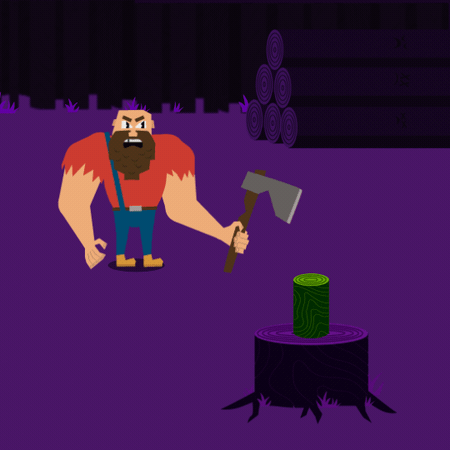
9. Color: Mini-lesson three, color. My advice would be to keep in mind what feeling you want your loop to have. If it's a Halloween-themed loop, then keep it with purples and oranges. Spring colors like pinks and greens don't necessarily fit as well in a Halloween-themed thing. Look at some references online for other things to do with whatever your loop has to do with. Then see what colors they're using. There's a couple of different colors sites that you might want to choose from. My favorite by far though is Coolors. I recommend going to the Explore page. Forest seems like a good search term for our Lumberjack character so we'll type in that. Great. We'll choose this one. You can either screenshot the palate and then paste it right into Illustrator, playing colors there with the eyedropper tool. Or you can click on these and it'll copy the hex code and then you can paste that hex code into the color picker right inside Illustrator. Play around, see what you think looks good for your character. Show that to one of your friends, see if they think it looks good. This can totally be a collaborative process between you and your loved ones. You can always change this stuff later. Nothing is set in stone. Don't worry about messing anything up. If you think, "Oh, this character should obviously be orange." Later, then you can make it happen. It's not a big deal. Keep in mind that we're probably going to have a monochromatic background though. You want to make sure that the main color of your background still works well with your character. Just make a rectangle and put it behind your character and then try out different colors there just to make sure that any animation that's happening is still super legible on that color. You can steal colors from anything though. If you take a picture of a cool plant that you saw, you can color pick directly from it. You can take a still from a movie that you think has a really good color grading and just directly apply those colors to your artwork. Become the Hamburgler of colors. Take them from anywhere that you think looks cool. Color theory is a whole different kind of spinach that I'm not going to get into. That's a way out of the scope of this course. Once you're happy with your design and you've separated everything out onto different layers and hopefully named them, then it's time to jump into our next lesson where we're going to import our artwork into After Effects and start rigging it. We're going to set up the controls to make it a lot easier on ourselves when we're animating and I'm stoked. I'll see you in the next episode.
10. Plugins: Plugins. You can think of After Effects as your kitchen. It's a place with a purpose by instead of cooking a sweet meal we're editing a video. Inside it, we have a bunch of different tools that will help us do a bunch of different things. You have a knife that can cut things and a stove that makes things really hot. But unless you're a professional chef, you probably don't have every single tool that you need to do every single thing. This is where plugins for After Effects come in. If you know you're going to be making a bunch of different pizzas as your hobby, then you might get a good rolling pin, so you can roll out the dough easier. For one of those sweet pizza oven things that people have in their backyard sometimes, is it possible without it? Sure, a 100 percent. But if you know you're going to be making a bunch of different pizzas, then maybe you want to invest in some tools to help you make pizzas easier. It's the exact same thing with plugins for After Effects. You can add in a bunch of different tools to your After Effects kitchen, making certain things a lot easier. My all-time favorite is a plugin called FX Console. It's totally free, and you can install it, right now I'll show you how. This thing saves so much time, it's ridiculous. I honestly wouldn't be surprised if it gets included in After Effects at some point. We're just going to jump over to Google and type in FX Console, and it should be the first link right here. Once your file is downloaded, we'll open it up with the 7-Zip or WinRAR. If you're on Mac, I think there's a built-in utility for this tweet. Once we open this up, we can see that there's a file called FX console.jsx. Future Matt here. Past Matt was actually wrong. There isn't a.jsx in that zip file, it's a.EXE, and it's a program that will install FX Console for you. This is actually a lot easier than what I was attempting to explain. Hopefully Past Matt hasn't made any more mistakes and I can jump back to editing. The other plugin that we're going to install is called Duik. Duik is a super powerful tool that is going to help a ton when we're trying to rig our characters. But I'll go through a really quick version of it just so we can get up to speed and make a cool animation for our animated loop. However, if you did want to go super in-depth with it, checkout Fraser Davidson's class for making a walk cycle within After Effects and also Jake Bartlett has an amazing class as well on how to use Duik. Feel free to check them out, they're both right here on Skillshare. To install Duik, we are going to need to grab the files for it. Let's jump right over to Rainbox lab's website and grab those files. Hopefully your internet is in a better state than mine, and it doesn't take you this long to download this file. I'm just going to ahead and jump ahead to when this actually finishes. Once it's done, then let's use 7-Zip or WinRAR again to unpackage this file. We really only need the one that's called Duik Bassel2.jsx. But you can take everything here and put it in your script UI Panels directory. Let's navigate to C, Program Files, Adobe, and then just whatever version of After Effects you have installed, Support Files, Scripts, and then ScriptUI Panels. Then we'll paste it in here. On mine there's a bunch of different files in there already, but don't sweat it, it's just because I use After Effects so much. There's a bunch of other different tools in here as well, but I'm not going to be covering everything in this course. Feel free to play around and see if any of these are cool and useful for you. They're all stored within that pretty non-intrusive menu within After Effects, so don't sweat crapping everything. It's not like it's going to clog up any of your After Effects UI unless you specifically ask it to. Let's just open up After Effects and make sure everything is installed correctly. Yours should look a little something like this. If it doesn't, just go up into this top right corner and click on “Default” or “Standard”, maybe essentials. Any of these should get you back to a somewhat familiar looking place. If it doesn't, just right-click on the word and then reset to saved layout. Once we're in, we're just going to hit this “New Composition” button. We're not super concerned about any of these details, but let's just make it 1920 by 1080 for now. We're just testing out to make sure everything is installed correctly, and we need a spot to put things to check that. Once this new composition is open, let's hit “Control Y” to have a solid. A solid is exactly what it sounds like. It's just one solid color as a layer within After Effects. Again, it's going to ask you for a bunch of different settings. The defaults are fine, just leave it as is and hit “OK”, and then let's select that layer, the big red bar, at the bottom. The first thing that we're going to test is FX Console. With that layer selected, let's hit “Control” and “Space” on our keyboard, and you should see this little dialog box pop up. If you don't go back, re-watch this video, make sure everything's in its appropriate place and try to get. This box always pops up wherever your mouse is, and you can type in whatever effect you want to apply to this layer, rather than having to search it manually and drag it onto the layer. This only saved a couple of seconds, but you're going to be doing this a lot within After Effects. If you use it as much as I do, it's probably saved me hours. Use FX Console, get into the habit of using it when you can. Let's try out a random effect, type in Fill, and then hit “Enter”. You can see that it has now applied a fill to this layer. It's changed it from its default color to this nice, lovely red. You can click on that red box and change it to a different color. It's fine. This is just a default thing to make sure that FX Console is working, and it is, so we're good. The only thing left to do is do a quick check on Duik just to make sure. If you go up here to Window, I have lots of different options because again, I use this a lot. But one of them should be Duik Bassel 2. Click on it, agree to their terms and services, hit “Next”. It looks like it got installed okay. Once you reach this popup, that means you're all set to jump into the next lesson, where we're going to import our artwork and actually start rigging our character. You can totally click “Next” on the video right now if you want. This is a little nerdy and probably too much information. If you're curious as to what.jsx means at the end of the file script. It's JavaScript XML, and XML in itself stands for extended markup language. If you've seen any of that before, it's probably on the Web. The only reason I bring this up is because some After Effects plug-ins are actually based off of different websites. The plug-in flow, for example, is based off of a website called Cubic-Bezier.com. If you know a bit of JavaScript already, then you can actually use some of that within After Effects. Or even if you don't, it's okay. I'm going to be brushing on expressions a little bit later on in this course. Expressions use JavaScript to manipulate certain things within After Effects. We have some control over art with code. I don't know about you, but that is super exciting. That's all I wanted to mention. Let's jump into the next episode, where we're going to be importing our artwork and actually starting to like rigor our characters.
11. After Effects Primer : After Effects primer. You guys, we freaking made it. We're finally at the After Effects part of this After Effects-centric class, but I promise, all of the work that we've just done is going to pay off. This lesson is primarily going to be if you've never opened After Effects before or you could just really use a refresher. I think a really great way of doing that is by making a really simple version of what we're ultimately trying to do, so let's dive into After Effects and make a really simple animated loop. Here we are within After Effects. The very first thing that I want to draw your attention to is the word Default up here. If you right-click it and "Reset to Saved layout", it'll reset your After Effects to look like this. If, for whatever reason, you started up your After Effects and it looks weird, if you have different panels in different spots and everything's broken and you're like, "Oh, what's this? This doesn't look familiar," just right-click, "Reset to Saved Layout". Now that we have a bonfire that we can return back to, let's venture off into the catacombs of After Effects. There are three different panels that you primarily have to worry about, but there's also a bunch of different options on the right-hand side as well that are just extra context-specific tools. The primary one is your composition. It's where you're going to see all of your artwork, whatever you're working on, it's like your view port. The one on the left that says "Project" basically just a list of all the things that are inside of your project, and then the bottom one is your layer manager. That's where the bulk of your work is going to be done. If you're going to be making artwork, changing properties, adding keyframes, stuff like that is all going to be made on this bottom panel, and then on the right, we have a bunch of different options or context-specific things, so if you're making text, for example, Character gives you a bunch of options for the text like the size, the color. After Effects is a layer-based compositing software, which is a lot of fancy words, but essentially it means you're able to stack things on top of one another to create different pieces of artwork. When you're working on a project within After Effects, it's going to primarily be made of two things: layers and groups of layers known as compositions. The order of these layers matters, so things at the top of the layer stack will be closer to the front of the camera. To better illustrate this point, let's just dive right in, and I'll make a new composition by hitting this big old, ''New Composition'' button in the center of my screen, and we're going to call this Main. It's going to ask us details about our composition before we make it. I know that this is going to end up on Instagram, so we'll just make it 1,080 by 1,080. We're going to be using square pixels. Frame rate, we're going to set to 24. That's basically the standard frame rate for most animations. Resolution, full. Timecode, zero. Duration, 45 seconds is a lot of time for an animated loop, so we're going to bring this down to 10. If you just type in 10, it'll only make it 10 frames long, so you want to make sure it's 10 seconds long. There you go. It's 10 seconds, or if you want to do that faster, type in "10", and then hit ''Period'', and it'll move it over. Background color, black. Good. Yes. Great. Now, we have a new composition, completely empty. We're going to need some layers to throw inside of it. Layers, much like pieces of paper, can be a ton of different things. The main type that we're going to be using though are shape layers, which should go without saying are layers that contain shapes, but to reiterate, there are a ton of different options for layers. It can be a picture of a duck or some footage of kittens that you found online. There's solid, adjustment layers, there's nulls. Oh, boy, there're so many options. The contents of a layer vary more than whichever city makes this relatable for you. Seattle? If we go up to here, where it says Layer, and then go New, Shape Layer. Cool. We have our shape layer inside of our composition, but there's no shape on that shape layer yet, so with our Rectangle tool selected, we will draw ourselves a new rectangle. If you hold down "Shift", it'll constrain it to an actual square rather than a loosey-goosey rectangle, which is what we want for now, so we will hold down "Shift" and draw ourselves a nice little square, and then change the fill to just a bright, let's say, pink color. Cool. We have ourselves a square. Before we go and change anything about the square, let's put a background behind it, so we'll go to Layer, New, Solid. It'll do a solid color that's exactly the size of our composition. We will change this to nice, neutral, dark bluish color. As you can see, our square has now disappeared behind the solid. That's because the order of the layers matters, so if we drag our solid behind our shape layer, you can see that it's now rendering on top of it. Beside our layer, you can see we have a bunch of different options, so if we click on the eye, you can turn on and off the visibility of that layer. If you click on the white circle it will solo it, so it's the only thing that you see. You can solo multiple things, by the way. Then the lock is so we lock our layer and can't accidentally select it. For our background layer, if we lock that, you can see I can click in here as much as I want, and I'm not able to select it. I'm still able to select my square. We should actually get into the habit of naming our layers right off the bat. If you select it and then hit ''Enter'' and call this background, or if you right-click and then go to Rename, it does the same thing. We'll call this Square Guy. Now, we've got a square on a shape layer and a background behind it. This is riveting stuff, I know. If we come down here into our layer manager, you can see my layer is actually already opened. The little arrow beside the color for the layer is how you get inside of it to see all of the contents, the content itself. You can see that we have one rectangle inside of our shape layer, and then if we open up that rectangle and go to rectangle path, you can see the size is constrained to 230 pixels by 230 pixels. We can click and drag that up and down to make it larger or smaller, what have you. For now, we'll just make it 250, so it's a nice, even number. While we're inside of the shape layer, let's open up the transform properties down here. It's tricky because there's the transform for the layer and there's also the transform for the rectangle itself. We want the transform for the layer. You can see that there's a bunch of different options in here for position where our layer is. Scale, how big it is, and rotation, but you can see that there's some jank happening here. The rotation of the layer is actually centered on the anchor point, which is not aligned to our square, so it's going to rotate around this point over here rather than having the square itself rotate, so we'll just go back in and zero these all out. With our layer selected, if we hit ''Y'' on our keyboard, we can go to the anchor point move tool, and then we can click and drag the anchor point around. If you get it roughly close to the center and then hold down "Control", it'll snap. This is exactly in the center now. Now, when we rotate our layer, you can see it's behaving the way that we want it to, but it would be annoying if we had to open up all these menus to access these properties every single time that we wanted to do it. Instead, I'm going to hit ''U'' just to close all that stuff, and then with our layer selected, we can hit ''P'', and it'll open up for position. R will open up rotation. S will open up scale. T will open up opacity. What's cool is you can open up multiple of these at once. We hold down Shift, E, R, S, and we can open up multiple properties all at once. It's just a faster way of working rather than having to dive into all those menus. On the topic of shortcuts, there's actually a tone built into your After Effects. We come up here to Edit, Keyboard Shortcuts. You can see that there's a lot of different options here. You can go through and change these to your liking, but the default layout is actually super intuitive. You'll learn these more as you continue to explore After Effects, but you should walk before you run. Again, this is super-duper, not all inclusive and I'm going to have to glaze over a bunch of different things. This is just to get you back up to speed and somewhat familiar with After Effects. I'm trying to respect your time here and not walk you through every little thing. Now that we know how shape layers and properties work, I'm going to do the exact same thing that I've already done just a little bit faster to make a face for your square guy. I challenge you to follow along and make your own face for your own square person, that's in your composition. Cool. We just do this a little bit faster. We're going to go Layer, New Shape Layer, going to change our Rectangle tool to our Ellipse tool. We're going to change our fill to white. The reason that menu came up is because I clicked on Fill itself rather than Color, just in case you run into the same thing. We're going to click and drag, holding down Shift. Then if you hit V, it'll swap your Selection tool rather quickly. Then we'll rename this to IL, and then Control D will duplicate our layer, and drag it over. Rename that to IR. Going to center our anchor points real quick, and then we're going to duplicate that layer again, change the fill to a darker gray. Then we're going to change the scale of the eye way down. Duplicate that, move it over and drag it above the other eye. I'll call this Pupil_R and Pupil_L. If you want to jump between layers really fast on your keyboard, then you can do Control and then the arrow keys up and down. The last thing that our square person needs, it's a mouth. Again, we'll go up to here, Layer, New, Shape Layer, or you can also right-click in this empty space, right-click, New, Shape Layer, same thing. Then instead of like a pre-made shape, we're going to use the Pen tool beside it to draw a quick one. We will do this clicking and dragging to make Bezier curves rather than points. We can fix this because I know it looks pretty bad right now. With our Pen tool still selected, we'll grab these points, some adjustments. You really pull these handles out to get that nice curve going. Then we'll change that fill using this Eyedropper tool. Pick that same white, and then do that. Then for the mouth, you can see this up here. We don't want it to be in the center of our layer, we want it to be in the center of the mouth shape, so we'll just do one of these. You can eyeball it. You can actually see that my background has moved. We will go to the Align panel in the right side. Now we have a square character. I forgot to rename him, it's Mouth, there we go, which is comprised of a bunch of different shapes. But if we wanted to move him to the other side of our composition, it'd be annoying to drag each one of these one at a time over. That would take forever. We're going to get into a bit of a confusing concept known as pre-compositions. Recomposing can be pretty confusing for a lot of people, but once you wrap your head around it, it's a super powerful way of working. I'll walk you through a quick example. Let's select all of our square guide layers and then right-click and Pre-compose. Or you can select all the layers, then go to Layer, Pre-compose. Or if you're fancy, you can use the keyboard shortcut. We will call this Square Guy Comp 1. Then, there is an important difference between these two options but as you can see, only one of them is applicable to our situation. You'll learn what the other one does the more that you use After Effects, but for right now, we're just going to hit "Okay". Again, I have to gloss over a lot of things just to keep this in a reasonable amount of time. I'm not going to go through every single option in After Effects because that would take forever and would be pretty boring to watch. Now that you can see we have a composition here with our square guy in it, but we no longer have our background because our background is back in this main composition. Now we can select our Square Guy Comp, and move it to a different spot, without having to drag each individual piece. That's what we want. It's faster to work that way. We hit Control D and make another square guy, move him just like the bottom right, let's say. If we go back into our square guy composition and change its color to a bright green instead, when we go back to our main composition, you can see it updates both. Why is that? It's because we still only have one composition with our square guy in it, but just two instances of that composition. Any changes that we make inside of our square guy composition, say we rotate him to be a diamond guy instead, negative 45, and go back to Main, you can see it updates across both compositions. I'm just going to do for now. There you go, back to his regular square self. If we wanted two square guys with different colors, we need two compositions. With our Square Guy Comp selected in the Project panel, we Control D, and then drag this one out. We'll just delete our other instance of the square guy. With our square guy comp 2 we double-click on that to open it, and then change this to a different color again, like a nice yellow and go back to our main composition. You can see now it's updated. As you can see, each one of these has their own properties as well. We can move them around, scale them up and down, do everything that a regular layer can do, but it's just contained in a box known as a composition. Now we'll just get rid of our other square guy. Now we'll dive into a concept known as keyframes. Basically the way that we get things to move within After Effects is by setting certain values at certain types, telling things how much and when. Let's say I want to move my square guy from the top left to the bottom right of our composition. While our time still at zero, you can see the time indicator here. The time play head is this thing down here. With our time at zero, we will set our first keyframe by hitting the stopwatch position and then moving ahead to like three seconds and dragging our square guy down here. Then if we hit "N" on our keyboard for end, and then you should also know B is for beginning. We'll set the beginning and end of your playback area. For now, we'll just keep our beginning at zero when we hit "Play" by hitting "Shift Space." Or if you have a full-size keyboard, you can hit zero on the number pad, does the same thing. You can now see that it plays from the top left to the bottom right. We've successfully made a very boring and not great animation, but it moves over time and that's cool. Hooray, we did an animation. If we want our animation to be faster, we can move our keyframe from three seconds to let's say 1 and a 1/2 seconds. Now it moves faster. Same if we drag our keyframe further into time. If we say five seconds, it now moves slower. We'll drag our keyframe back to three seconds and then hit "N". You can see this animation doesn't loop though. Because its ending value is in the bottom right instead of ending in the top left. Like I said in a previous lesson, if we want our animation to loop, the beginning and the end have to be the exact same thing. If we instead move this to halfway, to 112, you can see that our keyframe is exactly on where our playhead is, with this thing lighting up. If the keyframe wasn't exactly aligned, then it won't line up there and click that to make a new keyframe. Instead, we will line that up that way, it's saying, there's already a keyframe here. Then if we copy this key frame and paste it at three seconds, control C and control V. Now when we hit "Play" our square guy, now technically loops, and this is technically an animated loop. But I'd be pissed if this is all that we made too. Don't worry, we're going to get into a better version of this. But we're not there yet. I know this animation sucks, and deep down you know it sucks too. We're not allowing anyone with this. We can do a lot better than this and we will. But for now it's just important that you know, that we're using this fundamental method of telling how much and when. We're going to try to include an animation primary as part of this course as well, which will hopefully help boost your animation skills a little bit more than just setting three keyframes. We'll get a little bit more in depth into what makes an animation look good and how you can apply that to your own animations. But for right now and in the interest of time, let's just move right along. Let's just recap where we're at. Layers can be a bunch of different things. But for right now, the ones that we care about are solids and shape layers. Primarily shape layers, which are layers that contain shapes, the order of the shape layers matter. Layers that are closer to the top of the stack, render on top of things that are further down in the stack. We can drag, you can see that example. You can have multiple compositions inside of one composition. There's a difference between multiple instances of the same composition or multiple compositions with similar things inside. We have our square guy 1 and our square by 2. I know it can be a confusing concept, but it's a really powerful way of working. Let's say we had 100 square guys and we get a note from the client being like, we actually want our square guys to be circles instead. This way you only have to change it once instead of having to go back and change 100 different square guys. Keyframing is just setting values saying, I want you to be this value at this time. I want you to be this value at a different time. Anything with the stopwatch means it's keyframeable. That is for sure a lot of things to digest. But we're almost done and I saved the best for last, it wouldn't be After Effects if we couldn't apply effects to our layers. Unfortunately, we can't just type in things like shoot I lasers. Is anyone watching this? Unfortunately, we can't apply those types of effects to our composition. The effects are more like specific helpful tools that we can apply to our layers to make them do certain things. We're actually going to make a new composition repeating the same steps. Let's call this Text Effects, all these same things can apply. Now you can see we're in a new composition, I'm going to move a little bit faster. New solid background. I'm going to rename it to background and lock it. Now we going to make a new text layer instead and type "Some Words. " We're going to scale them down. Here you go. Now we have some words inside of a composition. With our text layer selected, we hit "Control Space". It'll open up FX Console, which hopefully you have installed at this point. If for whatever reason you haven't, you can also come to effects and presets. Wait for it to load and then type in whichever effects, let's say fill and then clicking drag it onto your layer and it'll do the same thing. But that's a really slow way of working compared to just selecting your layer, hitting "Control Space" and then typing the word fill and then Enter. It's just a lot faster this way. Now you can see it's changed the fill of our layer from the default's white color to this bright red color up here, you can change that color around to green. You can see all of these have different properties as well so you can change all of that. You'll notice that there's the stopwatch that we've seen before. The effects can be keyframed as well, which is pretty cool. The order of the effects matter as well. If we dropped like a gradient ramp on top of our text. You can see the gradient ramp is now the thing that we see rather than the green fill. That's because the gradient ramps being applied after the fill. It's the reverse order of the layers stacks. Things lower down get applied afterwards. If we drag the fill down see now that's the thing that gets applied after the gradient ramp. One of my favorites to show is polar coordinates, let's swap that, see it now wraps around a circle. Or for example, we've worked. You can mix and match effects to do all crazy stuff. That's where I'll call it again, totally not even scratching the tip of the iceberg of what After Effects is truly capable of. But hopefully now it's not this love crafty and thing that bends your mind when you look at it. If you're struggling with any of these concepts at all, by all means ask away in the comments below, and I'll try to get to everyone and just love this stuff. To recap, everything is either a layer or a group of layers known as the composition within After Effects. Or if you're cool, we call them comps in short. All layers, regardless of their text, images or even comps themselves, all have things called properties. Stuff like position, scale and rotation. We can change these properties over time with a method known as keyframing. Anything with a stopwatch means that you can create compositions are basically boxes that hold things. It can be multiple copies of the same box, or it can be different boxes with similar things inside. You can apply effects to your layers to make them do all crazy stuff. Consider yourself primed and we'll jump into the next lesson.
12. Importing & Anchor Points: Importing and anchor points. Ahoy mateys. Welcome to this pirate themed episode. Today, we're going to learn about anchor points and importing your artwork. Yarr. I'm not doing this for an entire episode. We're actually going to import our artwork into After Effects. But let's just make a home for it first. We're going to make a new composition. Call this Instagram-Main. 1080 by 1080 because Instagram uses squares for their posts. Twenty-four frame rate, which is perfect because we're making animation. We're going to make this something easily divisible, so we'll say 10 seconds and we'll set our background color to black. If you're curious by the way, as to why there's not actually a black background in here, there is but I have alpha transparency turned on. If I turn this off, now you can see our black background. Just to prove that point, Control K to open up the composition settings again by the way, change it to red, you can see that this color changes. The reason that it doesn't actually show up is because it's using the thing known as alpha. You might be familiar with alpha channels already. But if you're not, it's just a method of controlling what we're able to see. Compositions by their very nature are only rectangular. They only have a width and a height. What if we wanted to make a star composition? Alpha is how? Just as a quick example, this is a 100 percent at tangent, but it'll help deepen your understanding of After Effects and that's ultimately why you're taking this course. If we make a new shape layer in the shape of a star. Pro tip, if you double-click the shape tool, it will automatically make a shape the size of your composition. Very helpful. If we toggle switches in modes down here and use alpha matte, it will only appear where that shape is. We can move the shape around and it's like a window showing what's behind. Behind the scenes what's actually happening is this, there's a black and white matte, where white will show through whatever is behind it and then black won't. But for right now, we're actually not interested in doing any of that. As a matter of intentionality, we're going to make our own background. That way we know that there's not going to be an alpha channel. We will make a new solid and then we're actually just going to change this color to a dark purple. We will rename this BG and then lock it. This way we already have a composition setup to bring our characters into. It's still going to make a new one when we bring in our artwork, but we're not going to use those settings. I'm just going to port it over to our composition that we made that has the correct settings for what we want to do. However, before we do that, there are some settings that we should change in After Effects to get the best results before we actually start working in it. We come up here to Edit, Preferences, General. If we check the box that says center anchor point in new shape layer, make sure that this is checked, so when we make new shape layers, the anchor point will be in the center of it rather than just in the center of the composition. Keep this panel open on yours. I'm just going to hit "Okay" for now and then show you the difference. You can click and drag and then it will automatically make that anchor point go to the center, which is good. That's generally the behavior that we want. However, I don't like doing it this way because, let's say we make ourselves a new, solid. We'll just say that this is some footage of something. Fractal noise on it just so it looks like something else. If you click and drag with your rectangle tool, it will mask the footage, which is a whole other thing that I'm not going to get into in this course. But this is why I like making shape layers on their own. If I go Layer, New, Shape Layer and then draw, it doesn't automatically move our anchor point to the center. There is a difference there. There are some caveats, but turning on that checkbox will definitely help at some point in the future. While we're in the settings, there are a couple of other things that we might want to change. If you come down to Media and Disk Cache and then enable the disk cache and then just choose a place on your computer that's faster, so hopefully on an SSD or an NVMe drive, that would be perfect. Basically, enabling this setting will help with playback because it'll have a fast location to store all of the frames that you're making and then you'll be able to play it back faster. Autosave is a no-brainer to turn on. I prefer having it every 15 minutes and then 10 versions of it. Always next to the project. If you throw in some custom location. If you're working on multiple projects, it's going to get really messy really quick, so just keep it next to your project that way it's easy to find where your previous versions are. If we come down to memory and performance, you'll want to drag this value all the way to the left. Give as much RAM as humanly possible to After Effects. It really benefits from having high-speed RAM. When you're playing back your animations, it'll play back a lot faster and a lot smoother by having more RAM. If you're looking for it in the future, under Audio Hardware is where you can change your default output device. For me, I just like it on my headphones. If you're dealing with sound a lot, under Previews, I like having checked mute audio when preview is not real-time. If you don't have this checked, it gets weird and distorted, trying to play back sound at not real-time. It slows it down and makes everything sound really super creepy. For example this sentence is being played back at 60 percent speed and that sucks. It doesn't sound great. It's annoying to listen to. I just leave it muted and then when it's ready to play back in real-time, then that's when I want to hear it. Cool. Those are the settings that we should worry about. For now, we'll just hit "Okay". Now it's time to finally import our artwork. We can do that in a couple of different ways. We can double-click in the Project tab or you can also come up to File, Import, File. Or you can hit "Control I" and it'll also import the artwork. Then just locate wherever you saved your Illustrator file. Or if you're fancy, you can just click and drag this into your Project tab just right from your file explorer. Click and drag this in, it will ask us a couple of different things. We want to import it as a composition, not as footage. Then our footage dimensions, we want to keep as the layer size, not the document size. Cool. That'll make a new composition which we again double-click to open. If your colors look dramatically different in After Effects than they did in Illustrator, just quickly make sure you come up to File, Document Color Mode, make sure that it's at RGB color and not CMYK color. CMYK stands for cyan, magenta, yellow, and black, which you might be familiar with from yelling at your own printer. It's primarily used in the print medium. RGB is the one that we want for now, so we will make sure that that's an RGB instead of CMYK. Then your colors should match a lot closer. As you can see, it brought in all of our layers, which hopefully you named in Illustrator. If not, you can click on them, hit "Enter", rename them to whatever it is that you want. Cool. Our lumberjack has safely made it into After Effects. Now we're going to take a look at our layers and do a little bit of clean up. If we just take a look at our layers, it brought in our references which we don't need. Another one down here, get rid of that. The reason that we made our composition called Instagram-Main is because this has the proper dimensions and frame rate and stuff for Instagram, whereas our Illustrator one has a weird dimension. We could always change this to be 1080 by 1080. That's fine, but it's good to get into the habit of intentionality with your designs. Just leave this to be whatever the Illustrator dimensions were and then we can bring this into our Instagram-Main composition afterwards. We're actually going to get rid of our background colors. We're going to use the ones that we're creating in After Effects, not the ones that we brought in from Illustrator. Then we can break these up into two compositions. Take all of the layers for our tree guy. Just hit Solo, make sure that's the only thing that we have selected. Great. Pre-compose, we'll call this Tree Guy Comp. Make sure that we un-solo all those layers afterwards. Cool. Un-solo. We're going to hide our tree guy and I'm just going to lock him because we don't need him for right now and then here's where you'll have to make a choice. You can either keep working with your vector layers just as they are imported directly from Illustrator or if you prefer, you can select all your vector layers and we can do this with the tree guy cop afterwards if we so choose. Right-click, "Create", "Shapes from Vector Layers", and then it'll hide all of our vector layers and then make shape layers with the exact same properties. This is beneficial if you wanted to, let's say, change his legs in after effects. You'll have access to all of these colors. Now his leg is bright blue and that's cool. It makes shape layers and you have more control directly in after effects this way. However, it makes this weird bounding box. If I click here, it's still clicking on his nose. By the way, if you click on something in your viewport but you don't actually see which layer you have selected, if you hit "X", it will jump to that layer, which is nice. Yeah, it'll take the topmost layer and you have to go in and pre-compose and set anchor points and look how laggy this playback is. I have a pretty good computer and this is not great. I don't like working with shape layers. We'll just undo that for now. We'll keep it as vector layers and then what's cool is, let's say I wanted to move the gap in his tooth over to the other side. If I do that in Illustrator, just click and drag this over, obviously it's now intersecting with his beard, but that's fine. If I hit "Save", it's not updated yet, I think if I just drag my playhead a bit further ahead, it'll cache new frames and then grab new data. That's pretty cool that you can make changes in Illustrator and then they'll reflect in after effects. But I'm just going to undo that for now and then we will jump back to after effects where you can see the gap went back to its original position. Another thing that we're going to want to check is to make sure that continuous rasterization is on. Basically, that means it will continuously rasterize. So if we blow it up to giant proportions, you can see that the edges get all fuzzy and this doesn't look great, but these are still vector layers till we come down here to toggle switches and modes. Then this column with the little cross here, we just click and drag on all of our vector layers. You can see now they're still sharp, sharp like New York. This was a $25 joke and I'm going to milk it for what it's worth. We're almost ready to start rigging. We just want to make sure that all of the anchor points for our layers are in the right place, so they're rotating around the joints. There's a plug-in that I use every single day called Motion. Basically, it has a really good anchor point alignment tool. I come up here to Window, Extension, Motion-3. Give it a second to load and then we'll just dock this panel over here on the right side. Correct this over. Say I grabbed my ax layer. Actually, no, I'll make a new shape layer just so it's super duper obvious. Shape layer, drag. Cool. Then we're going to solo this so it's the only thing that I see and move it into the center of our composition. Right now the anchor point is in the center. I don't think it actually is. Let's say our anchor point's over here. It's obviously in the wrong spot. With motion, if I click on any of these buttons on the grid, the anchor point will snap to the corresponding position. For example, in the center, in the bottom, top, left, right, all that stuff. This is way faster than having to manually go to Y, click and drag the anchor point, get close and control. So if you see me using Motion in the future, that's all that I'm doing, is just quickly moving the anchor points around. I'm sure there's probably a free script out there. However, Motion is paid and you can still totally follow along. It's just going to take you an extra second to move your anchor points around. We're going to select all of our layers. We're going to hit "T" to bring up opacity and then we're going to set it to 50 percent. That way, we're actually going to turn off transparency just so it's a little easier to see as well. Basically, where these hotspots are of circles overlapping is where our joints are going to be. If we go in and start adjusting our anchor points to be in the center of each of these circles and we want to move upwards through the IK chain, that would be a benefit of keeping your layers as shape layers. You'd be able to snap more easily to the center. But extremities, you want to have the rotation closer to the body. We are working from the outside in, and then just roughly in the center of each of these circles. I know that his head's not going to be rotating around all that much. He literally doesn't have a neck so I'm not super worried about where the anchor points are for each of these layers. Quick way of checking is if you hit "Control A", it'll select all of your layers and then that means you can see all of your anchor points. This ax should actually rotate from where he's holding it, so just somewhere in the middle of his hand. Then all of these don't necessarily matter so I don't think they're going to be rotating all that much. Another helpful workflow is if let's say I wanted these two branches to be separate, that way I can control them independently of one another, if you come up here to the Pen tool and just draw a mask around, I'll just turn off transparency so you can see there's a little bit easier, you draw a mask around one of them and then we will rename this to Branch_R and we control D to duplicate it, and then rename that to Branch_L. If we hit "M" to bring up our mask properties and then set this one to subtract and see that now we have two layers, different branches on them. Move this anchor point over here. Cool. Now we have our Branch_L for our left branch and Branch_R for our right branch. This way, you don't have to re-import all of your artwork from Illustrator. One thing that we should note is where the root of our character is. Basically, everything else is going to be connected to this point. So when we grab it, everything's going to move. You want to make sure that the anchor point for that is in the center. Also, make sure that you're saving your file. If you hit "Control S" and then choose a location on your computer, hit "Save" and then that way, you can see up top which version you're working on and you'll have all of those auto saves that we set up earlier in this episode. Cool. So just repeat those steps, make sure all of your artwork has centered anchor points. His beard actually might move, so I'm going to move it up here. We can definitely have some overlapping animation with his beard. I'm getting sidetracked. Basically, follow those steps and you will be ready for the next episode where we're going to learn some parenting skills and for extra credit [inaudible]
13. Parental Controls: Parental Controls. I'm not talking about the secret setting in After Effects that prevents you from naming a layer 80,085. But rather if we want one layer to follow another layer, we do that through a method known as parenting. Inside of After Effects, if we look at our columns in our layer manager, there should be one that's called parent and link. If you don't see it, you can right-click on this top bar, go to columns and then parent and link so it should show up. In here, you'll find a thing that looks like a roll of bubble tape. Do you guys remember bubble tape? But this thing is known as a pick whip. If we click and drag this onto another layer, it'll set that layer as its parent. As you can see, our square has two keyframes on it, one here and one over here. Then our circle doesn't have any keyframes on its position, but it's parented to the square. When the square moves, our circle also moves with it. Parenting also affects scale and rotation. If we jump into this composition, you can see that you have a square rotating around and then if we parent our circle to the square, it'll now rotate from the anchor point of the square. It's rotating around that point. Same thing with scale, if we wanted to adjust the scale and see scaling from that point as well, for whatever reason, opacity doesn't work. If we adjust the opacity of the square, you can see even though our circle's parented to it, it's not inheriting the opacity. That's not to say that we can't parent opacity. We totally can. I'll circle back to that later on in this lesson. But for right now, we want to jump back over to our character and make sure that all of the layers are parented in a way that makes sense. This will be pretty easy and straightforward if you named your layers earlier and if you haven't, we'll go a head. I'm going to keep mentioning it. Name them already. With your layers named for sure this time we're going to go through and parent things in the proper order. A lot of this should be pretty intuitive. You want to connect to the eyes, to the head, the head to the chest, the hand to the forearm, the forearm to the biceps. Every single piece of your character should be connected to the root somehow, either directly parented to it or parented to another layer that's parented to it. I'm going to do that now. It's nice as you can also use this drop-down menu to select your layers if you don't want to manually drag to them. A quick way of checking to see if everything is connected properly. Once you think you're done, select your route and then move it. If something stays behind, in this case, his eyebrows just turn on transparency so they're easier to see then you know that the eyebrows haven't been connected properly. We will just go ahead, select our eyebrows, parent that to the head. Then once we move our route, our entire character should move with it. You should be able to rotate your characters joints around and have them ideally look pretty good. The fingers, not the fist. There you go. You can see the fist actually has bad anchor points, we'll move that to the center of the circles. Now when we move, it looks a little bit more like a wrist, it's not perfect, but we're not too worried about it. Once that's done, we're actually ready to jump into our next lesson where we'll set up our Duik rig and have an easier time controlling our character. You can go ahead and jump to the next lesson now if you so choose, but I think you should stick around because there's a couple of more things that will ultimately deepen your understanding of After Effects. Again, that's probably why you're taking this course. Side Quest. Though we're hopeful side quests thing is knowing how to parent things to a null. Let's say if my square animation is perfect but I want to move it somewhere else. We'll just turn off the circle for now just because we don't really need it. Instead of having to redo these keyframes, but let's say lower down, we can instead, unlike just to really illustrate this point. Let's say we had a bunch of keyframes, where the squares do a whole bunch of weird and wacky stuff. Now we have this really weird and interesting square animation. But we wanted to move it. Instead of having to manually redo all of these keyframes, if we make a new null, go to Layer New Null Object, drag it to where our square is, and then parent our square to that null. We can move the null around and it'll interpret these keyframes for us. Our entire animation has been moved down. See that there. Even if I wanted to scale down the animation, so it happened in a smaller scale, this is way quicker than having to remake all of the keyframes for an animation. This comes up a lot during my day-to-day work. What's cool is you can even delete the null afterwards and it'll have updated the values for these keyframes. That way your project stays nice and clean and you don't have just a bunch of nulls everywhere that you don't really need anymore. I want to take a second to really cement the idea that properties and keyframes are all just values at the end of the day. What's cool is you don't have to manually set those values every single time. We can write instructions for After Effects to figure out the values for us and those small pieces of code are known as expressions. We're back at the opacity problem now. We want this square's opacity to change our circle's opacity. We want them to be the same. Rather than making a keyframe at a 100, going to three seconds, making the zero, doing the same for the circle. This is at 100, this is at zero. This works. But there's a lot of work. What if have we want to change something on the square? Let's say jumps back up to a 100 and then goes back down to zero. I think that's a lot of work. Ultimately we want to save time and only have to do keyframes once. I'm just going to click on the stopwatch to get rid of all the keyframes for opacity on our circle and it's at a 100 percent. Just good. If you've noticed, there's also another pick whip below the layer pick whip this one's the property pick whip. I can tell this opacity to be the opacity of the square. Then you'll see that it turned to red. We click on the arrow beside the stopwatch. We can open it up and see what's actually happening there. Then we have this piece of code, this expression that says, thiscomp.layersquare.transform.opacity, which is basically saying, look at this composition, the composition that this layers in, look at the layer square, one that's called square. Look at its transform. If you remember, if we open this up it's underneath transform at opacity, look at the opacity. Now when we play this, scrub through it, at least. These values update and they're perfectly in sync. We don't have to manually keyframe the circle anymore. The opacity does what we want it to do. Just to wrap up this side quests, let's quickly make a new text layer. We'll say, WORDS!. Just make this bigger so you can see what's happening. We open up the text layer and go to its source text. If we Alt click on the stopwatch, it'll let us write our own expression. If we don't have to use the pick whip, we can write our own instructions for what we want this layer to say. Right now it just says text.source text, which means, I can write whatever on the layer and then I'll say whatever I have written. But what if we say, 4 plus 4? It calculates it to be eight. Pretty cool? Let's just jump to a point in our timeline where opacity is lower to like 32 percent. What if we say 2 times, and then use this pick whip to drag to the opacity. We'll say, 2 times the opacity of the circle. It spits out this really ugly number because this isn't an exact value. But you can see that at 63 point whatever, whatever. We can write instructions or what we want our keyframes to be. You can write all crazy instructions here and After Effects will solve it. This is just barely scratching the surface of what expressions are able to do. We'll get a little bit more in-depth with it when we're animating. But if I was going to make another Skillshare course after this one, it's probably going to be about expressions because the subject runs very deep. But for right now we're just going to jump to the next lesson where we're going to set up our Duik rig for a character.
14. DUIK Rigging: Duik rigging. Now that we've parented all of our character's artwork together, we can set up some controls with Duik. Duik contains a bunch of different tools inside of it, which will help us rig our character together so we'll have an easier time animating them. Hopefully you already have Duik installed. If not, go back and watch the previous episode where I explain how to install plugins. Let's open it up and get right to it. We're just going to do the theory part of this first and jump into a simple comp, and you can see we have a problem. This dumb ghost has stolen our ice cream. We have to punch him in his stupid smug ghost face in order to get our ice cream back. We'll have to rig this arm in order to do so. First things first. You can see we have the arm here and I've just lowered the opacity so you can see all the overlapping joints. We're going to need to open Duik, so we'll just come up here to Window and then Duik Bassel 2. Inside of Duik Bassel 2, I just have it docked over here on the side. I'm actually just going to move it to the left side just so it's a bit easier to see. Push all the stuff to the back. Inside of Duik, you can see that there's a bunch of different tabs on top here. We're going to click on the first one, it says Rigging. Then inside the Rigging tab, we have different sub-tabs. We're going to click on the first one that says, Create structures. Then we're going to need to create an arm structure for an arm here, so click on Arm. It does some things. It made it an arm, and that's cool, but it's not like our arm, so we have to adjust this structure to look like our arm. You'll want to move from the uppermost thing first, because if we moved the end part and then moved this, you can see the hand moves. If we dragged our hand into position and then move this, everything moves with it. You want to start with the uppermost bit, and you want to make sure that these black circles are right on the joints of your character. Then there's another one here. I know it's a little hard to see, but there's one on the end of the hand as well. We just want to drag that to the end. Now, we have a structure which looks a little bit more like our arm. Again, just double-checking that these black joints are lined up with our joints. Once you think you're structures are in place, we'll want to parent our work to the structure. We will parent our right-facing fist to the hand, our forearm to the forearm. I call it bicep, but I do it because of the arm, same thing. For our joint layers, I just saw them real quick. We'll want to parent these to the appropriate structures as well. For the wrist that goes to the hand, the elbow goes to the forearm, and the shoulder can actually remain unparented. This would normally be parented to the rest of your structure. But since we're just doing a theory part right now, it's fine to leave it undone. Cool. With all of our artwork now parented to our structures, we're going to jump over to the Links and Constraints tab. Then in the very first option is Auto-rig & IK. We select all of our structure layers and then hit "Auto-rig & IK." You can see our arm now is not magic. It can still break if you drag it too far. But still, just make sure you play within the constraints that you're given. If your arm is bending the wrong way, then you can come over here to the Effects tab with your controller layer selected, and then hit "Reverse." Then you can see it now bends the opposite way. With our controller layer selected again, we will go up here to Icon. You can actually change the colors. I'll make it a nice pink color, and then we'll adjust the position and size as well. This will just make it easier for us to wrap these controllers when we're animating. Change that there. What we can do is select all of our structure layers, and then you should be able to see these little shy guy toggles. If you don't, just right-click up top and then I believe it's under Switches. Yes, Columns, Switches. If you don't see it, there's also a toggle, switches, and modes down here at the bottom, which will swap between those two modes. If we click on that, and then we will click the shy guy just to hide them from our layer manager. We still have those layers. You can see Layer 1 and then it jumps to Layer 6. They're still there, but it's just a way of keeping our composition clean and focusing on what actually matters to us. What matters to us is punching that stupid ghost in his stupid ghost face, which we can now, easily do by selecting our controller and punching him right in his dumb ghost face. Hey, ghost, you shouldn't eat that, it's going to give you a fun tummy ache. Look, it was incredibly hard to come up with things that included punching, ghost, and ice cream. Now that the theory is out of the way, I'm going to apply these same concepts to my own character. Just add 150,000 percent speed because I'm just that good in everything to 50 percent opacity. I'm actually going to use a hominoid because it'll give me a bunch of different controllers, and it'll roughly line up to what I want my character to look like since he is a human after all. But you can actually just delete pieces that you don't need from these rigs. I only want his foot, I don't care about his toes. My structure is set up. Now, I'm just going to parent all of my artwork to the appropriate structure layers. You can hit tilt up to full-screen, whichever panel your mouse is currently hovering over. That way, I'm able to see all of my layers a lot more quickly. Its arms are looking all right. It's head is looking all right. It looks like there's some shrink on his left fingers that we're going to have to address. But other than that, its attached to the arm, and it should be attached to its hand. There we go. Just grabbing these controllers to test to make sure all of his joints are moving properly. See this leg is currently bending the wrong way, so we will come up here to the Effects panel on the left and then click, "Reverse." That way, his leg bends like it should. My boy is looking pretty good. I actually don't want this parented to the structure, I want this parented back on the artwork. It will be his left thigh, no selection matters. A great way of testing to see if your rig breaks is just grabbing the root and moving it all around. Seeing any junk is unexpected. But right now, this is actually looking pretty good. I move his hand, his ax still follows, which is good. Our character is now rigged. Just to reiterate, now that he's done, the layers that begin with C are our controllers. The S layers or your structure layers, are the bones for your character, and then these ones are all your artwork layers. I still have our tree guy cuffed in here. I'm just going to drag him to the bottom for now. Obviously, we still want to see our artwork. But we don't really want to see our structure anymore, so we're going to select this label group, which will only select layers that are this color. Then we're going to toggle switches and modes and make sure that it's shied. We're going to hide it, and then we're going to lock it. Then we'll come up here and click on the shy guy, and that'll hide all of those layers from our composition. This is still part of our composition, I'm just making it a little bit cleaner, so we can actually see what's happening. You can see the layered numbers go from one through seven and then jump all the way to 30. That's because our structure is still there, and if we want to make it come back, just click on that button again. Some final touches. We're actually just going to make these controllers a little bit easier to see. If we come up here to the controller icon, good practice is having your left and your right colors different, so we will make it bright. Just make a nice bright pink. Left, we will make a nice green. Now, it's just a little bit easier to tell which hand you're grabbing. I'm going to do the same thing for the feet. We'll make this the same pink, then make this one the same green, and then the center ones, we can make a nice orange. Now, that our character is rigged, we can finally jump into animation. We're not going to animate our character in the next episode. I'm going to include an animation primer first so we can dump some skill points into the animation principles and learn things about timing, and squash, and stretch, stuff like that. We'll get into it more in the next episode, so let's go ahead and jump over right about now. Side quest. Once your character is rigged, Duik can actually make an automatic walk cycle for you. You'll want to grab all of your controller layers first, and then jump over to the Automation tab in Duik. Here, you can select Walk cycle. Some magic happens, and it has made a walk cycle for you. It's probably going to need some adjusting, but we can do that by jumping into the Effects tab and looking at things like Walk speed, Energy. You might need to reverse IK on some of the limbs if they're bending the wrong way. Effect general motion, is another setting that you might want to mess around with, and there's a ton of secondary controls in here as well. Today, you did it. You made a walk cycle with your character. Except you didn't do it, Duik did it and anybody who's familiar with this will probably recognize the general motion of that walk cycle. But if all that you were setting out to do was making a walk cycle, then you're done. You're good. Now that our character is rigged, we can jump over to the next episode, where we're going to put some skill points into the animation principles. We hopefully make a better animated loop, and then we actually get into animating our own character.
15. Animation Primer: Animation primer. Now we know how to keyframe different properties, setting how much and when, but we also know how to change the how in-between those two extreme values. How do you know which keyframes you should be using on what things? If I want to move a ball from the left side of the screen to the right, that's pretty easy and straightforward, but what if we're trying to make something a little bit more complex than that. You can probably go off of instinct on what you think looks good and you'll achieve a result that looks fine. But a long time ago, a bunch of old guys in suits came up with 12 different rules or principles that will help out any animation. These pioneers of animation came up with this secret ingredient that you can apply to basically any animation, and I can almost guarantee you that your animations will look better if you apply these principles. Now, these 12 principles are not weighted equally, in my opinion, some of them are way more beneficial to you than others are. A lot of them weirdly enough are related to physics. Even in the most stylized cartoons, things have mass and are affected by gravity. It's all in service of helping build a believable world to help sell the illusion of life. These 12 principles are squash and stretch, anticipation, staging, straight ahead and pose to pose, follow through and overlapping action, slow in and slow out, arcs, secondary action, timing, exaggeration, solid drawing, and appeal. Let's break down each one of these principles real quick. Squash and stretch. This is a great one and one that most people should start out with. Rather than your shapes being rigid, they'll feel more fun and fluid if they squash really wide and stretch really thin. This is intentionally breaking realism to have your objects feel like they have more weight and flexibility. One thing to keep in mind though is they should have the same amount of mass when they're squashing and stretching. If your shape is squashing when it hits the ground, it should stretch out real wide, but it shouldn't be as tall as a result. Same with stretching. If your shape is stretching out real long, then it should have to thin out to compensate. The squash here, it is the software that object would feel. Anticipation. Anticipation is all about helping direct the audience's eye. For example, if your character is going to throw a punch, it's lame if he just throws a punch from stationary. Like he just raises his fist to hit you, but rather if he winds up and gets a running start to the punch, it's going to be way more impactful. If you're trying to throw a baseball, what do you think is going to result in throwing the ball further? If you just bring up your arm and release it or if you wind back and take a step back and get up on one leg and then push forward with all your might then release it. Which of those do you think is easier to understand what's happening if you were to watch someone else do it? To help the audience follow what's happening in your loop, you should add anticipation to your characters. The audience knows where to look and when. Staging. If what's important in your scene is the square guide, then he's going to take up the appropriate amount of space so that he can legibly do his action. This is also about directing the audience's eyes so they're looking in the right spot to fully appreciate the work that we put into the next action. You shouldn't have competing elements all vying for the audience's attention at the same time. If your character is too big in the frame, then they won't have the room to do their action. Same with if they're really tiny and we can hardly see them. Straight ahead and pose to pose. This is the method of breaking down complex animations into key poses. But with more organic stuff like if you're hand animating fire or water, you'll want to start at the beginning and then draw the next frame and keep going one at a time until you're done. Post to pose is the method that we'll be focusing on in the next episode when we get to animating our own character. Follow through and overlapping action. When your character has done their main action, they shouldn't just come to a complete stop. This is like the other end of anticipation. If your character is swinging like a giant sword, then anticipation is going to be them lifting it, preparing to strike their target. Follow through is going to be seeing the repercussions of them swinging that giant sword. Maybe their cap comes up in the air or like their feet come flying up, it'll help make it a more believable scene if we get to see the repercussions of the huge action that your character just made. Ease in and ease out. Surprise, we did this one in the last episode. It's the concept that things don't accelerate instantly. A Tesla Roadster does get close. Anything with mass takes time to start moving to get up to full speed and heavy things don't stop instantly either, unless you're talking about that guy from The Expanse, oh boy, it did not go well for him. Think about if you're driving your car, you don't take a corner at 60 miles per hour, you'll die. Instead, you slowdown, make the turn, and then speed back up again. Arcs. Almost everything moves in an arc rather than a linear motion. Robots move linearly at like production plants, but it's your job as a motion designer to make visually appealing things. Even if your loop is about a robot, you should still be throwing some arcs in there. You'll notice this a lot in big dynamic movements like swinging a sword or like throwing a punch, nothing just moves linearly. It's always like an arc in motion. What's nice is After Effects will actually show you the motion path if your keyframing the position of an object. If you ever see this and it's just moving in a straight line, it's a pretty big red flag that there's an opportunity to throw some arcs in there instead. Sometimes linear motion is what you want, but I'm going to say like 98.5 percent of the time, it's not. Secondary animation. You should know that you have like a big action that you know you want to convey, but that doesn't mean it has to be the only action that's happening in your loop. You can add additional actions that will help support the main action. But the most important thing to keep in mind is you don't want those additional actions competing with your main action. This brings us back to staging almost, where you don't want different elements all vying for the same attention. For example, if your loop is about a hot dog jumping around on a grill, trying not to burn his little hot dog feet, that's your main action, but you can also have like a secondary action of like a hand coming in and adjusting the grill to like shoot up more flames. All of these will add small details to your world to help make it feel more alive. Timing. This is basically like staging, but instead of making sure the where is legible or making sure the when is legible. Is there any rhythm to your animation or is it all like staccato and chaotic. I love the word staccato, it's so good. You are composing after all. These are compositions that you're working in. If your character is like a slow old lady crossing the street, then she'll take up more time onscreen than like the cars narrowly avoiding her as they like swerve out of the way. Some of my favorite loops have a great sense of rhythm to them. To me, it's the tail of a true craftsperson. When you're bobbing your head along to the loop, even if there's no sound, it's just exaggeration. I mentioned this earlier in the concepting phase, but it's worth repeating. You'll want to take reality and push it to where it's more interesting. If something in your loop is spicy, then you'll want to make it like 10,000 million Scoville omega death sauce that needs like a special container to hold it in. A great way of reinforcing exaggeration is by having things reacting to whatever this exaggerated thing is. We have no way of knowing how hot that hot sauce is unless there's a character there to taste it. If your loop is about a scary monster, make sure there's people reacting to how scary that monster is. Solid drawing. This is the concept of drawing characters with the weight and volume. Instead of circles and squares, you'll want to use spheres and cubes, rectangular prisms more accurately, I guess. This was before 3D modeling or any animation programs, this is when you actually had to animate by drawing frames by hand. I honestly probably should have followed this advice back when I was creating my character for this loop, but I'm learning too. You'll also want to avoid things like symmetrical movements. Your character moving their arms in the same way on both sides. It's more interesting to like have dynamic movement and like asymmetry is just always more interesting to look at them like perfectly symmetrical things. For example, if your character is catching like a vase, it's lame if they catch it in the center of mass of their body, like that's not visually interesting to look at. It's a lot more interesting if they like fumble and then just catch it barely with one hand, unlike stretch out. Appeal. What's your character about? Do they exist in this phase that makes sense for them? Every possible aspect of the scene should be in service of what your character is about. If your character is like really smart, they should have like tons of books and stuff in the background to convey how smart they are. If you make a movie about a race car, it'd be a bad movie if that race car never went fast. Ask yourself, if you went to see a movie about a dragon and you didn't get to see a dragon breathe fire in it, would you recommend that movie to other people? It's not easy. Even with years of experience, it's still something that I have to remind myself to come back to. If you feel like your animation isn't working, it's probably because you haven't incorporated these key principles into your work. It takes a ton of practice and you shouldn't sweat not being able to master all of these right away. But hopefully this episode, it helped prepare you at least a little bit as we jump into the next episode where we get into animating our very own loop. I'm stoked and I'll see you there.
16. Makin' Moves: Making moves. We're finally at the point where we get to animate our very own loop. This is where it's going to get vague because I can't tell you how to animate your character doing whatever your action is. Unfortunately, I am not going to walk you through me animating in real time because it's going to take so super long. Animation is not easy and it takes a long time. Rather than having like an two and a half hour video of me animating and figuring stuff out for my character, I broke it down into the steps that I took. I think this is going to be a lot more useful for you because you'll be able to take similar steps and apply those for your own character rather than following along with me exactly and doing the exact same motion. There's going to be a little bit of divergence here. But ultimately I think this will result in a better animated loop for everyone. Let's jump right into After Effects and get started. This is basically where we left off before. We have our character rigged. You should have something similar to this. First things first, you're going to want to duplicate your composition by coming over here to the project panel and then just hitting Control D on your selected comp. Then just rename it to something safe. Just so you have this checkpoint to go back to in case you super-mess up your animation and want to start over, rather than having like mess around with key frames and stuff. Then you have this comp that you can duplicate open again and then start fresh. You'll want to plan out your action. For me, I know the lumberjack is going to be swinging his acts around, trying to chop up this little tree guy, or maybe he even successfully does cut them in half. I haven't decided yet. It's great if you can find reference for whatever your action is. Just look online on like YouTube or whatever to find somebody doing that action. You'll be able to pause the video and go through frame-by-frame using just period and comma. This way you get a better sense of what actually goes into making that action happen. You'll be able to exaggerate these key poses later. For me, I know the key poses for a lumberjack swinging and acts are the anticipation of him bringing the acts up. Then obviously the main action of him swinging the acts down. But then I know also I want him to have some follow through with his action of maybe his feet come flying up in the air to really emphasizing how much weight that he just moved with does this giant acts. Then I think it'll be funny if ax gets stuck and then we can make him struggled to get the ax out of whatever he just swung into helping sell this, this illusion that he's really moving this giant axes around. You'll want to set key frames for any position and he controller that you're going to be changing for your animation. Just go ahead and set a key frame on the very first frame of your animation. This is what pose to pose is, where you're setting your key frames for each of these key poses for your animation. This is what I started with. We'll set our poses. I'm actually going to delete walks circles. We don't need that note for now. I'm just changing each one of these controllers colors to be their corresponding color in the composition. You can change any layers, label color by selecting the color over here on the left. Then just changing it to be one of these pre-made colors. What's nice is you can also select label group, and then it'll select any layer that's also that color. Very handy to know. We're going to set our first key pose. I'm just setting the position and then I'm just going to hold Shift and then hit R to open up the rotation for all of these layers as well and make key frames for all of these things. We're going to make sure everything's key framed on all of our controllers, of the properties that we know that we're going to change, we've made key frames for and then we're just going to make R posed by dragging these around. Like maybe he's winding his ax back. Something like this. Making our cool key poses. I'm just doing something super fast because I've already done this. But full transparency, once you think you have them in a good spot, just click and drag a box around all of your key frames. Right-click and then toggle hold key frame because we're not worried about the interpolation, but how in-between these poses for now, we're just worried about making good posts. A more visual way of looking at that is something that you might have heard referred to as step mode. Go hold on this position and then jumped the next one. Once they get more information and then hold on. That jump to the next one want to get more information and so on and such work. You can do that by selecting your key frames, right-clicking on them. Then toggle hold key frame. Or you can also go to Key frame Interpolation and then just make sure that this says hold. One thing to keep in mind is you want to make sure that your poses have a really strong silhouette. You can push poses way past what you think looks normal because nobody is really looking at your animation frame-by-frame. It's a lot more about how your animation fields. I think it's always better to push your poses too far and then dial it back later, rather than trying to push them further once you already have an animation made. For me he's just like in this idle position. Then he jumps to this anticipation of him like bringing the ax back. Then he brings the ax flying down and we get to see the aftermath of that where if you'd like, recovers from this giant action that he just took. Then he gets the ax again and then returns to his default position. One helpful tip is characters lead with their eyes. Insert DJ Khaled, GIF. Usually they'll look at where they're going or what they're doing first and then carry out their action. Break down your action into these key poses. It helps if you have reference for whatever you're making and just roughly spaced them out. You don't have to be accurate in timing at this exact step, just make sure you have a rough idea of knowing what your character is doing. This isn't even close to what the actual timing is going to be. But it's just giving us a vague idea of what we're doing. Something that you want to keep in mind though, is even if you're not changing anything between these two poses, still make a key frame anyway. If we just look at these ones, for example, even though nothing's changing between here and here, I'll still made a keyframe in-between. This is just purely as an organization standpoint, it'll be a lot easier to move each of these key poses around later as like linear columns and it has the added benefit of preventing unwanted interpolation. Where you're like adjusting your characters right foot on a frame 150. But the last time that you had a keyframe on that layer was on frame 13. Then it's going to interpolate between frame 13 and 150 rather than where your last pose was 140. You want to be interpolating between there instead. Hopefully that makes sense. It'll probably make a little bit more sense when you jump into actually animating. Once you've made your key poses and make sure they're on the hold frames, then we'll jump into the next step, which was tweens. Setting the key poses in-between your key poses. Look at what your two extreme key poses are and then go roughly in between them and then set. What would this look like in between here and here? Got him like raising his leg to anticipate this huge action, like taking a step back. It's because once we take these hold frames off, it's going to interpolate linearly. We want to give it as much information as possible instead of the ax being back and then swinging forward and just doing like a linear motion that we want to set like this in-between frame of the ax of this motion. It's going to start here and down here, it'll just like linearly move rather than like ax move. Hopefully that tracks. Once you have all of these poses set up, then you'll want to start adjusting the timing for your animation. Obviously, your animation is going to look choppy because you're still in step mode, but you'll want to get a feel for what your animation is actually going to feel like. For me, I know him swinging the ax is going to be a lot faster than the anticipation of him bringing it up. Instead of having all of our key poses and our tweens equally spaced apart like we did in this step, we're actually going to start moving them into spots that are a little bit more interesting. This is what I ended up with. I also added him breathing a little bit in between just to help space out the loop. This felt a little bit better of his ax swinging takes a lot less time than like the anticipation of him bringing it up. Again, just keeping everything on hold for now. Play around with the timing, with your poses. It doesn't have to be perfect you can always adjust this later, but just get a sense of the timing that you want your animation to have. Once you feel like your poses are taking up the right amount of time and you have a loose sense of what the timing for your animation is going to be like, we're going to do the scariest part where we take our poses off of hold and change the interpolation to linear. There are certain things that you can't take off of hold primarily things that only have a linear on or off state. For example, the reverse on the IK for our arm can only ever be either on or off. You can't transpose in between those two values. We're going to take all of our hold keyframes and put them onto linear. Which you can do by selecting all your keyframes. You can hit Control A to select all of your layers. Then if you hit U, it'll both show and hide your keyframes. If you hit UU, so U quickly twice, then it'll show you every property for every layer, which makes this a huge list. That's not what we want. Yeah, just hit Control A and hit U to show all of your keyframes. If you've messed with the IK in any of your hands or feet, for example, then you'll just want to hide that one specifically. Then you can select all of your layers, right-click keyframe interpolation, and then set it just to linear for now. It's probably going to look junky but we can solve this. For example, I know that when my ax is hitting the ground here, it should actually just go back to being on hold until he gets it loose again, until here. Right-click, toggle hold, and that should help it out a little bit. Obviously it's done some junks still for like when his arms literally like breaking here, you will just want to go in and adjust the position of some things. Oh, just want to change the extremes maybe this comes too far. Once you take everything off holds, you'll just want to keep playing around with all of those poses until you have something that looks pretty good. Like I said in the last episode, we don't want everything to just be linearly moving we want to add some ax in there we want to change our easing. Right now all of our key poses happen at exactly the same time as one another. For example, like his feet come flying up in the air at the same point where his hand is at its highest point. Nothing moves like that we want to offset it so it's more visually appealing. We jump over to 06, hit Control A, and then hit U see all of our keyframes. We just drag this up a little bit so you can see it a little easier. You can still see where like key poses were as like these linear columns. I've just offset these keyframes a little bit to hopefully look a little nicer. Just cash this real quick. This was just me playing around with offsetting these key poses. A really helpful tip to fixing linear motion is if you grab one of your controllers and then grab the pen tool or hit G on your keyboard, you can use it to change where these keyframes are. Instead of these linear angles, if we click on it, it'll change it to be more of a bezier curve. Then you can grab these handles and change how these keyframes work. But you can just ease these out a little bit more, it'll just fit nicer. Then just repeat that step with all of your controllers. You just click on the nodes, should convert them. Then give you these handles that you can click and drag it out. Be careful not to have your handles twist by the way. This is incorrect where this is better. We don't want it twisting you want them straight and like nice ax. Then just keep playing around with your key poses. Offset rotation to happen later than position that'll give you some nice follow-through. Then you'll eventually end up with something that looks like this. One huge thing that you can do is add the loopOut expression to your properties. If you Alt-click on a property that you know you want to loop, you can write the loopOut expression followed by two parentheses. Then if we go beyond where keyframes end you can see that our action is now looping. You can do a similar thing by writing loopIn, and it'll do the time before when your keyframes were but 98 percent of the time you'll want to use loopOut. LoopOut actually also has more options within it. By default it's on cycle, but there's different modes within the loopOut. If we write in quotations, "ping-pong", you can see it then plays our animation backwards and then loops it to then play forward. There's also offset and continue as well. You can play around with those and see if either of those options work for you. But if you don't write anything in there, cycle will be the default and chances are it's probably the one that you want anyways. This is honestly going to take a bit of time to figure out and it's totally okay to fail and start over again. You can always reload these safe compositions, these checkpoints that you set up and take another stab at it. Hopefully by the end of this episode, you'll have an animation that you're at least a little bit happy with, but you are not done yet. There are still a couple more tricks that I have up my proverbial sleeves, wearing a t-shirt that will really make your animated loop stride. Stay tuned and I'll see you on the next episode.
17. Pump The Brakes: Pump the brakes. You just learned a lot of stuff, and just did a bunch of work, and you're probably feeling either one of two ways. Either A, yay this looks sick and I'm ready to post it online, or B, oh no, this is complete trash, what am I doing with my life? Either way, you're wrong. Now is genuinely important to go take a break. Just walk away, go do some stretches, or go watch a video of some cats doing some stretches. Adorable. When you come back with a fresh pair of eyes, you'll notice so many different things about your animation. For me, my break is going to be going to go get a haircut for the first time in like five months. This this is what I've been dealing with underneath that hat, by the way. It's not super long but, well, it is thick. Damn boy, that is way better. This is because your mind is great at a thing known as neural adaptation, which is basically just a fancy science way of saying your brain filters out things that it's constantly exposed to. For example, your nose is always in your field of vision, but since nothing really changes about it and doesn't provide useful information, your brain just filters it out. It's the same concept if you watch or animate the loop 500 times in a row. Your brain will use neural adaptation to filter out small junky details that you'll probably want to end up fixing. This is why it's important to take a break. Take a break, go for a walk, get out of here, you big dumb animal. Then I'll see you in the next episode where we will put all of these pieces together, and really make your animated loop shine.
18. I Can't Believe It's Not Better: I Can't Believe It's Not Better. Hopefully, you took some time to step away from your projects so you can look at it again with a fresh pair of eyes. You're probably noticing some things that you weren't noticing before. If you're less than happy with your loops so far, that's actually a good thing. That means you have good taste and you can see that something's not working. Developing a critical eye for your own work is actually a super valuable skill. It's the same way that you would treat writing an essay. Writing your thoughts down and getting it out, and then editing, and polishing it are like two separate modes. It's the same way with animated loops. Don't get discouraged. You can switch modes from, I'm making the loop to I'm now polishing it up. If you feel like your innovation isn't working, go back and watch it again with the animation principles in mind. Is your character moving linearly, or do they have some nice arcing motions in there? Are they squashing and stretching. The more animation principles that you can include, the better your animation will look. If you're still struggling, then try reducing the scope of your animation. Trust me, it is a lot of work. If you can't make your character fighting a dragon look right, scale it down to make him fighting a stationary training dummy instead. It's very tempting to bite off more than you can chew when you're first starting out. But contrary to what the normal saying is, you're actually aiming for quantity here over quality. Your skills will get better a lot faster by making 10 smaller scale loops and finishing them, rather than trying to make your magnum opus loop on your first attempt. Now I'm going to walk you through how I took my animated loop from this, to this. All of these steps are optional, but I feel like they're the extra little bit that makes a loop go from good to great. The number one landmine to look out for here is adding something to your loop that distracts from the main animation. We just spent a lot of time making this character and putting a lot of work into the animations web. It would be a disservice to include a Ferris wheel with a bunch of flashing lights. That pulls attention away from the work that we've just done. Adding background details is a great way of improving your loop. Instead of my animation just happening in a purple void, we're going to give some context to where it's happening, to flash out the world a little bit. Let's jump into After Effects and I'll show you how I did it. Here we are in After Effects. I have a bunch of different layers, but right now we're just going to talk about the background. I started with a purple void in the back. I broke it up by just adding another solid and moving it down a little bit. You can see this is just a solid. Just to add a horizon line to give our scene some perspective here. Then I made some stuff in Illustrator. You can see the file is a little bit messy, but I will organize this a little bit more before I hand it off to all of you guys. I just drew a couple of quick assets that I know that I would be needing. This stump for the log to be on, the log itself. The log split in half, drew some quick grass around the stump as well. Nothing too complex happening there, and some background trees which are literally just rectangles, with some wood grain pattern on it. You'll notice that they're all in green instead of the purple that you see them in the loop. That's because it was just faster for me to take colors from my reference wherever it is. Yeah, just for my value reference up here. Then it's super easy to change colors around in After Effects itself using effects like Tritone and Levels and stuff like that. I made some background assets and then brought those in to After Effects. Those are my trees in the background. The tree comes interesting because it's like those four trees just duplicated and repeated a bunch of times. It's like these go so deep. But you can see I just used a Tritone effect and a Levels affect to adjust the values and the color. Then I took the grass from the stumps and added that in just to break up that line a little bit. Then I made this log pile, which we zoom in, you can see there's faces, more dead trees in there. It's just a small background detail. I don't think that's going to pull any attention away from the actual animated loop itself. This was all that I added to my environment. The background trees, a little bit of grass, the logs, and the stump in the foreground. Just adds a little bit of depth. You don't want everything to be super condensed onto one plane. But it's more visually interesting to have things that are closer to the camera and things that are further away from the camera. That's the environment done, it's super easy to go overkill here and add way too many background details. Eventually you'll hit a point of diminishing returns. The important part here is just adding context to where your animation is happening. Another thing that you can do to improve your animated loop is adding particle effects to impacts. For example, when our Lumberjacks splits the log here, you can see all of these little pieces flying out. Which just gives a little bit more impact to the hit. If I dive into my log trap and I'll hit "Comp", you can see it's just a couple of shape layers that I made in Illustrator. You can see them down here. Then I'm manually keyframing the position to start where the log is. Then they do nice little arcing motions. Then Phaedo, [inaudible], just a little bit more oomph to that hit. I could have set up like an actual particle system to handle all of that trap knoll. But honestly it was just way faster to make those shape layers really quickly in Illustrator, bring them in, and then add some keyframes to them. This is good for two reasons. Both because it was faster to produce and I have way more control over the feeling of the hit. Another helpful tip is using the camera snapshot feature within After Effects. You can just go to your first frame. Then if you look at the bottom part of this composition, there's a little camera, that says "Take Snapshot", click that. It makes a super annoying sound effect. Then if you go to the very last frame of your composition. Then if you go to the show snapshot button that's right beside it, it does what it says and shows you that snapshot that you took. Let's say I move this log. Now our animation is not going to loop because this last frame is different than this first frame here. Gives you a simple AB to compare against. This is a weird method, but if you spam the button, you can see where the log is moving to. All right. You can see it's jumping to the left. So if we try manually aligning it and then doing this, you can see it still shifts to the left, which means that our log still has to come a little bit to the left. There you go. Now it's in spot, so this animation should loop again. I use that tool all the time. Another super helpful tip is you can change the draw order of a layer by splitting it and then swapping the duplicate to a different order in the stack. That sounds complicated. I'll walk you through how it works. It's not that bad. So for example, I have set up a dummy composition here. Let's say I needed this yellow square to appear above the red square in the composition at two seconds. You can use Control Shift D to split your layer, or you can come up here to edit, split layer, and then it will duplicate your layer and then trim it to be where your play head is. So I have my first yellow square that exists behind for the first two seconds. Then we can drag this duplicate up. So it'll automatically switch over at two seconds. Super-helpful to know to swap the draw order of objects in your composition. We've seen split layers in practice. This tree shadow. The first part I animated manually, because I didn't want it following the trees up and down movement. Shadows don't follow you when you jump in the air, they still stay on the ground. But then I split the layer here and parent it to the trees movement. So when he runs away, it's still exactly where he is. Whereas if it was parented here, when he's jumping in the air, it would be up here instead. So splitting layers, definitely it's super helpful to know. So while I'm giving you tips to make your animated loops better, this wasn't applicable for my animated loop, but it's still something that you could possibly add to yours. That's a really cool effect known as parallax. It's not an effect that you'll apply your layers. It's more of an effect in the traditional sense of something that you can accomplish by doing a certain thing. Here I'll show you. All right, so I've made another quick dummy composition here just showing the effect in practice. Basically parallax is things closer to the viewer's perspective, move faster and things further away from the viewer's perspective move slower. So our blue square is taking a lot longer to move across the screen than our yellow square is, and then our red squares literally not moving from the left to right at all, it's just bobbing up and down. But it looks like it's running to the left in our scene here. Again, you can do a lot better than this. I set this up in like 30 seconds. The next time you're a passenger in a car, notice how things that are closer to you, like street lights, appear to move faster, from your perspective, than things further back like buildings. This is a super cool effect and I love seeing it in animated loops. So another thing that you can do to help improve your animations is add external footage. After effects is a great animation tool. Don't get me wrong, but it's also super good at compositing. One of my favorite weapons in my arsenal is a website called ProductionCrate. What separates this from regular stock footage sites, is it specifically for compositing in mind. So if for example, I type in "fire." It's going to give me fire that's separated from its background. So I can download any of these and they'll all have alpha channels. They'll just be super easy to drag into our scene and apply the fire effects to whatever it is we want to set on fire. Even though I paid for the pro membership for that website, I only used free effects for my animated loop, just to prove that you can still make something great without dropping extra cash. So here we are on ProductionCrate. I grabbed one of these anime cloud things. The ones with stars are paid items, the ones without stars are not. Which one I grab specifically, but it's definitely from ProductionCrate. I applied it to my animated loop. Over here when he runs off screen, this over here. I just changed the blending mode to add. Here blending modes, and then add just so it shows through. So you can still see some of that background. Then I applied the tritone effect to it and blended it a little bit just so it doesn't stand out as much. I don't want to pull focus too hard over here, because I know very shortly the log's going to come out, and this is what I want the audience to be looking at. Just turn that tritone effect back on, so it blends back in a little bit nicer. So I'll just turn on and off this tritone effect so you can see what it does. Another thing that you can do is add audio to your loop. So all of these yellow files up here, are all audio files. Again, only using free things from ProductionCrate, they have sound effects and music as well. If I take an ax, there's probably not an ax split or anything, which sucks. But Soda Crush sounds so much like an ax splitting through wood, that I decided to grab some of these, again, I just grabbed the free ones. Perfect. Then when he runs off screen, I added a car crash. We will just scroll down. Yeah, Crash 1 was the one that I added. I think I had leaves rustling, yeah ruffled leaves. One of these for when our tree guy jumps in, you can see SoundsCrate ruffled leaves 5. Oh, I also added leaf particle effects to when he lands. Again, just hand animated, quickly made in Illustrator, same way that the splinters off the log worked. So SoundsCrate, is a great website for sound effects. There's also a freesound.org. I grabbed the blink from here. Then there's also sound effects included with your Adobe Creative Cloud subscription. I'll leave a link to this website down below just so you can find it a little bit easier. But there's a ton of different packs of sound effects in here. They're all really good quality. Definitely check them out, play around, see if you can add some sound effects to your animated loop. There's also paid sites like Motion Array and Envato Elements, where they have tons of different options for background music and sound effects. Again, I will leave links to all of these resources down below.
19. More Butter: Another tool that you can use to lay out your composition to choose where you decide to put things is a fancy thing known as the golden ratio. Some mathematician magician a long time ago figured out a ratio that when our eyes see it, it's automatically pleasing. How cool is that? I think we should use it whenever we can. You could use that ratio and do a bunch of calculations in junk to figure out where things should go in your composition. But spoiler alert, the work's already done for you. The golden ratio gives us tools such as the golden spiral and the Phi grid. I'll show you how they work. In After Effects, I have the golden ratio applied to my composition. It's just an overlay that I've added to it. As we follow the spiral, it should go from less complex to more complex. As we follow this, our eyes will be guided to our Lumberjack and his face. Things don't have to line up perfectly for it. As we continue, you can see it gets a little bit more complex down here with our tree guy, more complex still with the roots of the stump. This is the highest level of complexity in the scene. Of the detail on the top of the stump and the particle effects that will fly out to here. The ax coming down, our eyes are just drawn to this part of the scene. Drag the golden ratio onto your composition. I like to set it to like a lower opacity and then lock the layer too. So you can organize the elements in your scene to hopefully fit something that looks like this. What's nice is it doesn't have to be this way around. You can actually flip it. If you right-click either on your layer itself or on the object in the comp-view, go to transform, and then flip horizontal. This is totally valid. If you had the most complex thing up here and everything's leading to it in this way. The opacity backup so you can see it. This is totally valid. Or you can also flip vertically, and then you can see this works as well. If our focus was on our guy's face, this is also a complex area, with his beard and his facial expressions and stuff. This works, but I like it better in its other form dark here, turn that opacity back up, there you go. I think this is the easiest one to explain of our eyes following this pattern. But that ratio also gives us a thing known as the Phi grid, which again, you can import to your composition, just use to full effect and lower the opacity, bring that back up. It's a little bit easier to see on the recording. Basically with the Phi grid, you'll want to have points of interests in your composition where these lines intersect. It doesn't have to be perfect. Like you can see our log doesn't perfectly align with where it is, but these are just general guidelines to where you should place elements in your scene. Another super-useful thing about the Phi grid is you can also contain things within these sections. Our tree guy comes into scene here and is almost perfectly framed by this lower part of the Phi grid. But basically you'll just want to align points of interests to one of these cross hairs. It doesn't have to be all four. I don't think it would work if all four had high levels of complexity and stuff to look at on each of them, but contain things within these squares, or make sure focal points of your composition are aligned with one of these cross hairs. There's actually something similar to the Phi grid that can be built right into After Effects if you don't want to import this image. Just turn this off for now and lock it. You go up to Edit Preferences and then go to Grids and Guides. If you change proportional grid from whatever the default values were to three-by-three, a pre horizontal to vertical. I click, '' Okay'', then you can come down here in your composition bar and then go to proportional grid to turn it on. This will give you the rule of thirds. Again, things should line up where the cross hairs are. Points of interest should be on one of these intersections of lines. Again, you can contain things within the boxes that it gives you. Just general guidelines to lay out your composition to make things clear and easy to see. You should be able to explain at least a little bit if you add this overlay onto your composition, why things are where they are. The log is basically on that cross hair, guy's face is on another cross hair, this guy is contained in that box. I think compositionally this works out. Same tips apply, the points where they intersect is generally good places to put interesting stuff that you've made. Just one last sanity check of, did I explain everything properly in this. I've got our guy parented to a null, just so it's easier to move him around if need be. His animation is separate from where he is in space. You've got particle effects happening just to help sell those impacts. Got sound effects to help sell them a little bit more. We've got reactions to things happening in the scene to help sell it even more. You can see there's a central theme here of selling this idea that we were trying to convey. We brought in external footage from one of my favorite websites, footage crepe. The sticks and twigs and stuff that are getting thrown out of this explosion that's happening off-screen. Again, we're just made in Illustrator super quickly. I think I used all of them. While I'm in here explaining things, I should explain how the eyes work. I don't think I did that in any of the previous episodes. The way that I move his eyes around is with a null. The eyes themselves are made out of a couple of different parts. Turn off the background so it's easier to see. We've got the white of his eye. We've got the pupil, the black part of his eye right there. But then we duplicated this bottom white part of his eye and then put it above the pupil, which is this part. Now we'll just drop a fill on that so you can tell that it's different. We've got the white of his eye, the pupil, the white of his eye again on top of the pupil. Then we're just using an Alpha Matte to make sure that the pupil only shows up where this red part is. It's turned off. If I were to drag this off, the white part of his eye, you can see it clips and you can't see it anymore. No black on blacks problems. Really not the easiest way of explaining this. You can see as the pupil leaves, it doesn't show up where the white part is anymore. I duplicated those layers and renamed them to pupil L. Then we parent the mask to the base I. Then we're going to parent the pupils to this null. When I move the null around, it moves both the pupils. I found it funny that his mouth moved in the same direction. Usually you wouldn't want this, but it just help sell him as a character of him looking around. Then to set up the blink, I just put a slider control on the null. That's an effect that we can do. Let's just call it slider control. Then I wrote a quick expression on the eyes. The same expression is on both the left and right eye, which is just basically instructions saying, we need two values for the scale. There's both the x scale and the y scale. I wrote some variables called scale x, etc. It's always going to be 100. Then scale y is going to be that slider that we set up on the null called blinked control. Specifically dot value, the value from that slider. Then we're passing in scale x is always going to be 100 and then whatever the value of the slider is. Then as I change this amount, you can see that's how we can have him blinking. That's how I set up eyes for my characters. Then it's a super similar thing for the mouth selector. It's just got key frames. On that same null from before that face control, it's just an effect called drop-down menu control. You can see there where you can change these items to be whatever you want. That's what I'm using for the mouth, select, key framing these values. Then the way that we're changing between them is I set up a variable that points to that drop-down menu in the other composition. Then just a simple logical if statement saying if now selector is equal to 2, then your opacity, we're using this expression on the opacity for this layer. Your opacity is going to be 100 percent if that selector doesn't equal 2, then like in every other scenario, else, it'll equal to 0. Similar expressions on each one of these, just changing that value from 1, 2 and 3. That's what's letting me key frame the mouth. I guess I could have changed the mouth with a lumberjack who uses the same note, entire composition, but that's fine. I like him being dumb and brain-dead. Like just mouth agape. Yeah, that's how the notes work. I think that wraps up everything that I did to take my loop from just an animation happening in a void to hopefully adding a little bit more life into the scene. You can see that there was a reoccurring theme here. The stuff that I was adding was to help sell the original premise of a lumberjack cutting some wood. Even though there's a lot more detail in this version, it's all to help reinforce the same idea that I started out with. Constantly check back in with yourself, are the things that you're adding to your loop making it better or making it worse? It's totally okay to spend half an hour trying out an idea and then ultimately saying, "No, this is making my loop worse and then just deleting it." There's a reason I didn't do this in real time. I tried out different things, failed along the way, scrapped the idea, started over and then just kept pushing through. Again, don't get discouraged. It takes a long time to put these things together. But ultimately, I think it's worth it. I think this art form is really cool and something to be super proud of. This is a window into the world that you made. It's totally up to you how much detail you want to add to it. Even though these faces on the trees back here are barely visible, I like to add extra background details for the people who stop and look for them. I want my work to be rewarding to interact with regardless of how much time you spend with it. That wraps it out. Now we'll jump into the penultimate episode where I'll show you the optimal settings to export your loop and post it online. I'm super stoked to see what you guys make and I'll see you guys in the next episode.
20. Expert Exports: You did it. You made an animated loop and that's huge. Now you're finally ready to share it with the world. But how? How do we get from a composition within After Effects to something that everyone can see on the Internet? That's what we're going to go over today in this episode called Expert Exports. Yeah, is this another nautical themed episode? No. No, Pirate Matt. You get out of here. I'm just like, yeah, whatever I guess. I hate that guy. Anyways, in order to put your animated loop on the Internet, you have a couple of different options. You can render it directly through After Effects, but you have a lot more options with another program called Adobe Media Encoder, which is also part of your Creative Cloud subscription. This isn't going to cover third-party options like Anubis. Battle Axe is great, go check them out. In After Effects, if we come up here to Composition, we can go to Add to Adobe Media Encoder Queue. If for whatever reason you can't install Adobe Media Encoder, you can always go to Add to Render Queue and then you can render it through After Effects itself. You just don't have as many options as you do it with Adobe Media Encoder. If we click this, go over to our Adobe Media Encoder. Then after a couple of seconds it should appear as an option here in your queue. This takes a while adding it through this composition menu. What you can actually do is if you grab your composition in the project manager, if you don't see it, you can always right-click your composition, reveal composition in project and it should highlight the one that you're on. You can actually click and drag this into your Adobe Media Encoder and then it pops up a way faster. Helpful tip to know. Right now I don't need two of them, so I'm just going to delete that other one. Once your composition is added to the Media Encoder Queue, you'll have a couple of different options. You click on H.264, yours might say something different and then wait for dynamic link to connect. It'll open up another page that gives you a lot of different options. Format or codec is the output that you're going to make. What I like to do is just make it H.264. That's basically going to be your go-to. H.264 is used primarily in everything just because it's the perfect balance of looking really good but still low file sizes. If you get further into the industry and you're working on my TV stuff, then it might be like Apple ProRes. But for now, you don't have to worry about any of that just H.264 is the one that you want. Then under Preset, you can see there's a tone of different options. Right now you just want to match source and a high bit rate. Bit rate is the amount of data per second that your video takes up. A high bit rate means more information being added to the video, but also results in a higher file size. If you are uploading it to a platform that needed a lower file size for whatever reason, bit rate would be the first thing that you would change. If you click on Output Name, you can choose where you want to save it and what you want to call it. I'm just going to call it Lumberjack Loop. Then it's always nice to include a version number, just incase you have to re-render later. Yes, I want to include the video obviously and also going to include audio because I put some work into the sound effects as well. Then, you really don't have to worry about any of these other options. But clicking Match Source just to double-check in case anything is wrong on this, just because we want the video to be what we made it in After Effects. Then if you scroll down, there's also bitrate settings, which gives you a couple of different options, variable bit rate and constant bit rate. Again, right now you probably don't have to worry about any of them. That's all that we really have to worry about. We'll just hit "OK". Once everything is looking good here, all we have to do is come up to this Play button, hit "Play", and then Adobe Media Encoder will get to work. Again, this probably want to take all that long. Once it's finished, it'll have a green check mark beside it. Then you can click on the output file location and it should open up right here. Once your video is rendered, you can actually just click and drag it onto Facebook or Twitter, and it should upload fine. The only one that's going to give you issues is Instagram, because as of this recording, you can't upload to Instagram just through the website, you have to do it through your phone. What you can do is, I'll make a new folder here called Animated Loops. Right-click, copy the video. Then I like to use OneDrive but you can use whichever Cloud service you want, either Dropbox or Google Drive. Then we're going to paste it right into that folder. Then over here on my phone, you can see I'm in OneDrive already and we can already see that folder that we just made. There we go. There's our animated loop. You can just hit those three dots and then hit Download. Then just save it to be wherever you want on your phone. Once everything is downloaded, just come over here to Instagram. For now, I'm just going to put this into my story and if you click there, you can already see animated loop has made it safely over. Then from there it's up to you to write a witty description for it. Make sure you include a pun that people will hate and also include the hashtag Loop hole so I can see all of your work. A word of warning though is, compression will absolutely ruin the quality of your work sometimes. When you upload your work to the sites like Instagram, YouTube, Twitter, Facebook, they will compress the video down into much smaller file size so it's a lot faster to stream to other people. If you had to download the actual file size for every post on Instagram, it would be so much slower and feel a lot worse than it currently does. When you lower that file size, you tend to lose some of the detail. That's why we try to limit the amount of colors that we include in our animated loops, it so they work better with compression. Tom Scott has a great video about compression, where he fires off a bunch of confetti. Go check it out. He explains it way better than I can. If you need an animated GIF version of your loop, you can actually open it up in Photoshop. You can see I have mine opened up over here. Come up to File, Export, Save for Web Legacy, and then this gives you a lot of different options for your animated GIF. Down in the bottom left you can see the file size. If you're trying to get your GIF under a certain limit, then that's the number that you want to keep your eye on. Right now this is a 10 megabyte GIF, but if we come up here and drop the colors down to 64, you see this color table is going to get a lot smaller. But then we lose the quality of his genes or whatever. But we also shaped like three megabytes off of our file size. You can also reduce the file size by adjusting the stither slider. Instead of 100 percent, we bring it down to 50. You can see the quality of his Axe is worse, but we're also had half the file size. You can also change the size of the GIF itself by using this percent. Then once you're happy with it, just go ahead and click Save. Then once you save that out, you can see you have the GIF version of your animated loop. There you go. You just took something from being an idea in your head to something that everyone can see and enjoy and never forget how cool that feeling is. Make sure you stick around to the end of the last episode for a extra cool surprise. Hope to see you there.
21. Conclusion & Thanks: Conclusion and thanks. I have the unique perspective of having created an entire course about the subject matter. Let me tell you, you've just learned a lot of different things. Like a lot of things we touched on so many different disciplines that you might not have even been aware of before starting this course. You learned about shape language and color theory. You learned about Illustrator and how everything's literally just made a loop shapes. You learned the core skills of After Effects. You learned about parenting expressions and anchor points. You learned how to rig a character with Duik. You learned about the animation principles and how to animate a character effectively. You learned how to think more critically about your own work and gain a fresh perspective, and you learned how to export your work and put it up on social media. That is a lot of things. The beauty of it is you can explore any of these subject matters deeper and it's super rewarding to put skill points into those areas. If you get really good at rigging, artists will love and respect you. You get really good at animation, so many developers are going to be like, hey, can you make good thing for me real quick? Everybody is going to be jealous of your newfound skill and they're going to be like, wow, Hannah, you can make a cool thing. Can you teach me how to make a cool thing? Then you can link them this class, don't forget to check out the project gallery down below. You're hopefully not the only person that has taken this course. You can go check out others' work. If you think somebody else might enjoy this class, please don't hesitate to send it to them. Not only will more people watching this course increase the likelihood of me making another one, but it's also just such a pleasure to make a cool thing about a subject that you're passionate about. If you enjoyed our asymmetrically shared time together, then please leave a review down below. Even if you didn't, if you thought this course is absolute trash, then please leave that feedback as well, so I know to do better for next time. If this class is well received, I would love to do another one. I like learning stuff and I think there's great value in being able to condense a lot of information down into something palatable and hopefully at least a little bit fun. I'd love it if you use the hashtag loop pool, so I can check out all of your beautiful work on whichever site you're posting it up. I'd like to thank my friend Max for all of the great background music that you've been hearing throughout the course. Make sure you check them out at these links down below. I'd like to thank Amy for all of her awesome artwork that she provided for the course. Again, links will be posted down below for her stuff as well. I'd like to thank Stephanie from Skillshare for her constant support. This course took like a year and a half of my admittedly little free time to put together, and it's low key, something that I'm super proud of. One final tip I guess would be to check out the After Effects Discord. It's full of incredible people and I wouldn't be where I am today without their love and support. I'd like to thank UCO, Cup Studio, Claim Your Brother, James Curran, Chris Phillips, DK Kwan, and so many more for the constant inspiration throughout this course, and as a special thanks for sticking around to the very end of this course. As you probably know, this course is called loop pool, which is an anagram, spoke the same forwards and backwards. Not only does the title loop, but so does the course itself. Starting in a couple of sentences, I will play this entire course backwards, so the last frame will be the exact same as the first frame of this course, obviously with some slight timing adjustments. Not only will the title of this course loop, but the entirety of the course itself will loop. What now Christopher Nolan, [inaudible]. Thanks for watching.
 Matt McCormack, Motion Specialist, Digital Extremes