Transcripts
1. Intro: A lot of people think
that a good logo needs to be decorated
with a lot of symbolic meanings and test to convey all kind of
hidden messages. But the truth is, a
good logo communicates one core message that clearly reflects the
essence of the brand. Hey, my name is Robert
Mattias and I'm a multidisciplinary
graphic designer from Transylvania and the
founder of Panther Vision. I provide branding services for luxury screen and tech brands, and I also create
educational content for designers on Youtube
and on Instagram. I like to call myself a math scientist when it comes
to branding and design, because I'm always exploring and experimenting the
boundaries of creativity. I also like to play around
with special effects, optical illusions,
and typography. There's so much you can
do with graphic design, but when it comes
to creating logos, it's all about the process of simplification or a reduction, or the process of striping
away all unnecessary details. So the core message is clearly translated into a
strong looking mark. In this class, you'll learn
how to create effective logos that can stand out even in
a saturated marketplace. We'll start with
the fundamentals of what makes a good logo. And throughout the process will cover the basics of typography. And how to design word marks, which create optical balance. How to use composition and color in order to create
a cohesive logo. Some basic strategies around logo functionalities and the full logo design
workflow from ideation to final deliverables
will cover how to conduct research Storm with
the use of moodboards, sketching, and the full
digital design process in Adobe Illustrator. From building from
basic shapes all the way to the final
refined logo design. As a bonus, I also
show you how to create the presentation
for your client. This class is perfect
for beginners or more intermediate designers. It is filled with case studies, supportive resources, and examples of good
versus bad logos. So you can understand
better in which direction to go
and what to avoid. It'll give you the
knowledge and clarity you need in order to create strong and cohesive logos and a workflow you can replicate
time and time again. So you always know where to start and what
your next step is.
2. Class Project: All right, welcome to the class and we're
going to talk about, of course, the project and
how it's going to be divided. And of course in the
first part we are going to cover up the
theoretical part, you know, the
fundamentals of logo. And of course, after that
we're going to get into practice and we're going
to start creating logos. And I'm going to show you
the process from start to finish and of course how to present your logo
to your clients. I decided to go
with this approach because it's more flexible for beginners and you don't
need as many skills yet. Literally broken down to the simplest approach
that is executable. In this class,
you're going to need a laptop or a PC pen and paper. And of course,
Adobe Illustrator, the software that we are
going to use to create logos. This class and its tools only works if you keep on practicing. If you keep on
researching sketching, and of course designing
logos digitally. This practical side is going to be a more longer process for you in order to develop on a
better and better position. The more practice, the
faster you're going to grow. In this class, you're also going to find the guidebook with questions and other kind of resources which
are downloadable. Also, I would like to
upload your logo designs to the project gallery
sketches that you have or screenshots of the logo
design process so I can see the full picture and send you feedback if you
upload your logos. It also helps my
logo design course get more exposure and
help more students. And it would mean a lot to me. When you finish the course, don't forget to give
a rating as well. If you want to see
more educational content from me for free, you can check out my Youtube
channel at Panther Vision, where I have
uploaded hundreds of videos related to
Adobe Illustrator, Photoshop, After Effects,
and the journey. And I try to upload
consistently on a daily basis.
3. Logo fundamentals: All right, so the first
thing we're going to cover up is the
logo fundamentals. Now most people think
that this logo design is just a five minute thing. That you can create these
logos in a couple of seconds with some text
under it, and that's it. Well, it might seem like that, but things get a little
bit more complicated and a logo might be just
the tip of the iceberg. So you should imagine the
logo design on a huge ocean where is basically the tip of the iceberg, the
logo underneath. There's a couple of more
things that are going in. We got a couple of more pillars. And the first one and
the most important one would be the brief workshops, brand strategy,
marketing analysis, focus groups and surveys. Now, freelancers only
do the briefing part and some brand strategy most of the time
because it's like, this is a too complex
elaborated process which basically huge brand
agencies can tackle up. You know, they got like
a full staff member who can cover up all of
this and extract the right information in order to create the
perfect logo for it. Because we've got
like bigger brands who want rebranding and that's a little bit more complex where you need more data, you know, and you cannot do
all kind of logos there. It's like super objective. And then after
that, we can get to the next pillar which is basically the research,
the style scape. In other words, this is the
mood board, by the way. And then we also get
the mind mapping. Only now we get to
the creative process after we extracted the
information, the data. And then we got
brainstorming, sketching, digital design process, we
got the presentation process. This is one of the
most important part of creating the logo because
this is what sells your logo. And then we get like
the style guide book. After you finish the logo, you basically send a
style guide book that contains the rules and
regulations of the logo. What can you do
with the logo and what can you not
do with the logo? And this is going to be sent to the design department of the
company so they can read it, to understand it,
how to implement it. Not at least we got a
trademarking part of the logo. This is one of the
most important parts. A lot of companies don't do this because it's
quite expensive. But bigger businesses actually trademark their logos because
they find it important, and at least nobody can use
your logos in the same niche. And finally, we got
the final logo. So that's how you get
to the final logo. There's a few steps for it, and today we're going to
cover up the brief part. Research, mood boards,
brainstorming, digital design
process, presentation, and then source files. Personal versus
professional. All right, most of the beginners
designers think that they should create some
design that they like. You know, some logos that
they like personally. But the truth is you're
going to need to create a logo that is
going to work first of all for the client and most importantly for the client's
brands target audience. And of course, it's
going to serve the company's goals,
mission and vision. And it needs to be strategic. Now you know, for an artist, as an artist of course, they should create
something that they like. And eventually they
are hoping that some customer is going to come and you know,
they're going to buy it. This works basically vice versa. You need to create something
that is going to complement that company's
mission and vision. So with that being said,
you design something, how you feel versus you
design for the company, how their identity should look and feel. Now this is a pitfall. A lot of beginner designers
fall in because we like creating and
designing. It's amazing. But in order to create 100%
something for the client, it's not going to be
so much fun anymore. Some projects is
going to be amazing, but quite a bit of them also
won't be that much fun. But the main idea is
to serve the client. Local designers also need to know fundamentals
of graphic design. If you're new in
design and you're planning to jump
into local design, I also highly recommend you
to study the fundamentals of graphic design because
these fundamentals are going to help you
create really good posters, you know, UI logo
design typography. And these fundamentals are
going to help you know, in every design branch, basically these are
branches and every, each has its own rule. And the fundamentals of graphic design basically
applies everywhere. Meanwhile, we've got
logo design rules or rules in typography, or rules in UI or web design. So that's how you
should perceive these. Next we've got typography. I also included this because in logo design we tend to
work with a lot of typo. We've got like the word mark, we've got combination marks, or you've got like letter marks, monograms, and so
on and so forth. And typography has
its own rules. We're also going to talk
about the fundamentals of typography in
discourse sketching. You don't need a lot of
skills for sketching, but it's really
important to sketch down your ideas and what
you have in your mind, because eventually
they are going to be lost and you won't
remember it anymore. You don't need to have skills. You can doodle it, you can
scribble it and whatever. Just have that sketch, that
idea done on the paper. Now, on the other hand,
some of the clients also might want something
more illustrative, looking, something
more stylized. And there you're going to need more sketching skills
and stylization skills. But most of the times, you're good with, you know, simple ideas on paper. Next we've got marketing skills. Now you might ask, why do
you need marketing skills? This is a logo design
course right now. It's good to have
some of the basics also in marketing because
the logos are going to be implemented in different
kind of marketing campaigns and they're going to be used in different kind of
marketing materials. So it's good if you
can show the client how can the logo be implemented
in these scenarios. Then we got print skills. Again, if you know some basics
in here, you're all good. Clients tend to ask
things related to print. Yeah, then we got
negotiation skills. This is one of the most crucial
and important soft skills you can develop in logo
design and design in general. This is going to
help you because most of the beginner designers usually have this complaint that the clients are usually
choosing the bad concepts. Or clients are coming up with bad design ideas that
they need to execute. You know, and they
are really frustrated that they need to create
like really bad designs. But truth is, you don't have the skills enough to
negotiate with the client, convince the client, and redirect the whole design phase into the good
direction eventually. With that being
said, this is also going to complete with
the presentation skills, how to present the
logo to the client. You need to create a
solid presentation, and with that you can
give context of the logo and at least you're going to show how it's going to look
on different materials. These two basically are
communication skills. The more you practice them, you better become and you better become also
in sales in general. Then we've got animation skills. This is really,
really underrated. A lot of designers are
kind of intimidated from three programs and from animation software such
as Adobe After Effects. The main point is to animate the logo and also present
that to the client. And this part is a little
bit more complicated, but if you know how
to master these, then you can achieve
great success. A lot of brand agencies
double down on this. And they also hire
animators who can do this because they know that they bring
really good benefit. And then we got the
brand strategy. It's good if you know some
of the fundamentals here. Also some of the most important
things in brand strategy. And most of the time brand
strategy usually gets mixed up with logo design
process anyways. So it's good to know not, but at least we got research. A good designer is
a good researcher, a designer, a logo designer going to need to
research the target audience. The competition is going to need to research
like good ideas, inspiration, and
a lot of things. I love to research,
I don't know why, but it's just, it's a
really good pleasure. And with that being said, the best investment you can make is an investment
in yourself. The more you learn, the more
you learn Warren Buffett. In the next lesson,
we're going to cover up the reduction phase, in other words, how
to simplify the logo.
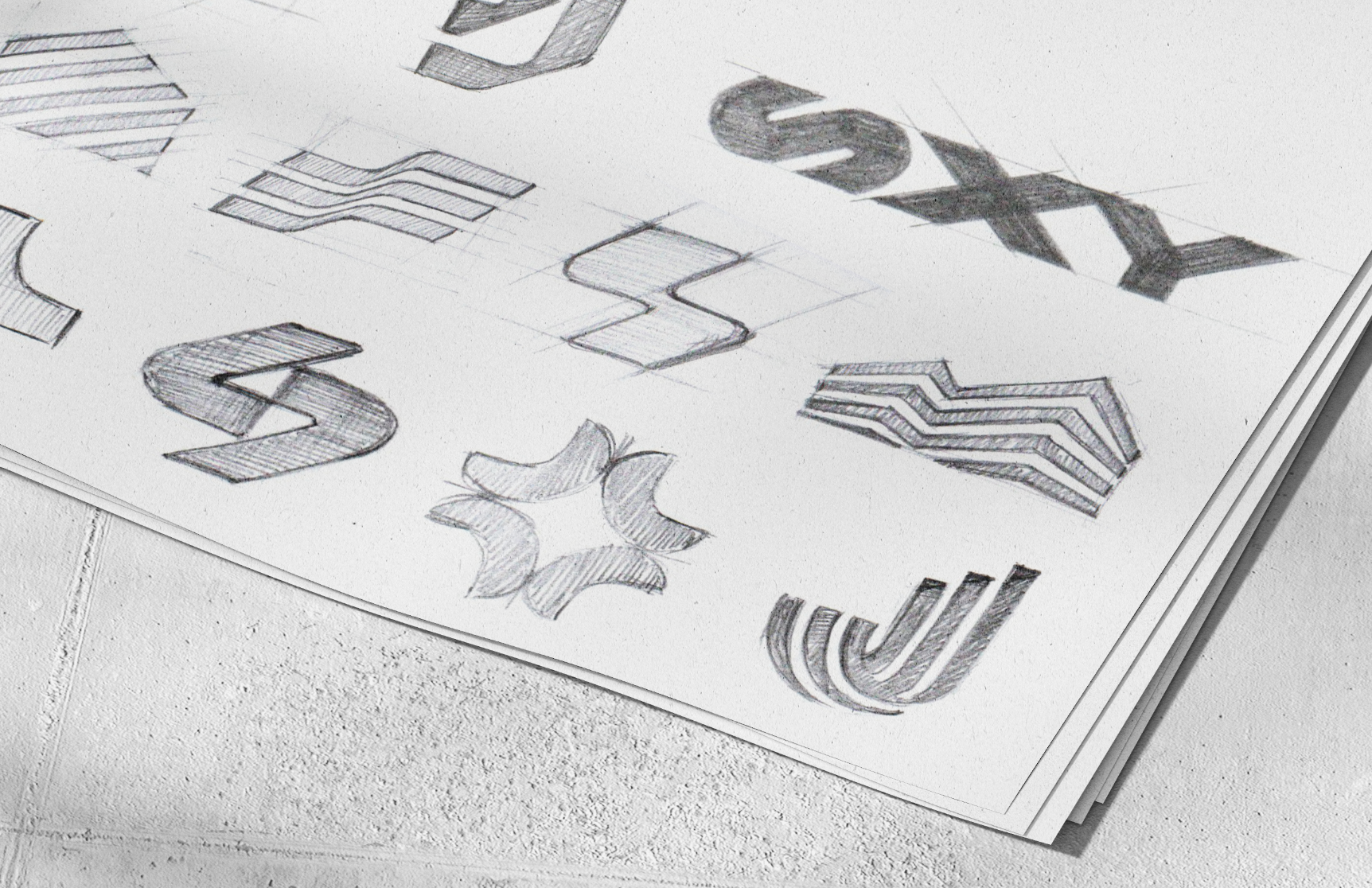
4. Simple: The Reduction Phase: Okay, top, most important
rules in a good logo. We got simple, distinctive,
and appropriate. These might seem
simple on the surface, but the truth is it gets a
little bit more elaborated. But I'm going to show
you quite a bit of case study so you can understand what
we're talking about. We got simple and I dissected
this in a couple of pieces. The first one would be
the reduction phase. Reduce the amount of
meanings and ideas in a logo and remain
with just one idea. A lot of beginner designers want to implement
a lot of ideas, a lot of symbolic elements
and stories into the logo, and also clients
want to do this. By the way, truth is
this is incorrect. You're going to need to
stripe away as many details as possible and remain
with a strong logo. The more elements you want
to add into the logo, it's going to create
like a Christmas tree. It won't be that
scalable and you cannot implement that easily in
different kind of applications. So we're going to
discuss that also here. First example, we
got the Apple logo. You can see here
how simple it is. It's just an apple
with a bite inside. When you look at it,
that's what you see. Now Apple thought
about, you know, that byte written with the B YT, that's basically the smallest
size of a computer file, we got byte kilobyte, megabyte gigabytes,
so on and so forth. It's simple, it's just
a little meaning. And truth is nobody
knows about it. Only a couple of people,
maybe designers, know about it and the company
owners knows about it. And that's it. We got BMW. Bmw had been producing airplanes back in the
days and they had been inspired from the
propeller that eventually created this crossing pattern. And they turned that
into a BMW logo, which is really simple
and minimalistic. Fed ex you can see the purple and orange color that creates this
really nice contrast. And there's also
a hidden element in between the letter
E and the letter X. You can see that
negative space arrow. This basically represents
speed, accuracy, achieving goals, strive for perfection. Da made it simple. Not a lot of people
know about it, but that's not even important. Then we got the Nike Swoosh. Nike had been inspired from
the Nike Angela Victory. Specifically, the bronze statue where you can see the
wings of the statue, that looks like a Nike Swish.
That was the inspiration. And they also took the Nike name from Nike Angel of Victory, a Greek goddess, Adidas, the three stripe company. They also redesign the logo into these three stripes and this indicates and represents growth, mainly growth of the athletes
because they start at the beginning and
they get better and better until they
become the best. For example, the
shortest stripes represent the
beginner athlete and the longest stripe it represents the athlete when it becomes
the best top tier player. Here is the Audi four
interlocking rings. These are basically four
car manufacturers from Germany and one
of them are Audi, DK, Horse and Wanderer. And these four companies
formed the Auto Union. It wasn't even called, Audi
was called the Auto Union, and after that, they
rebranded it S by Dre. Most of the people think
that this is a really nice, stylized letter B into a circle. But truth is, the
designer thought about where the
circle is a head. And that letter B, basically it's a headphone, so it's a head with a headphone
viewed from the profile. A logo doesn't need to say much. It's an identification mark. You saw the Apple logo. How simple it is not. A lot of people know about
what that means, what it says. These are irrelevant. Putting a lot of meanings into a logo because nobody
cares about it. The most important
thing, how you implement the logo on
different surfaces, if it's going to work or not. If it's scalable or not, you need to stripe
away as many details as possible and remain with the most important
elements that are relevant to the logo
to be bold and strong. All right, we're
going to jump into some creative word marks. And we got here the info secure. This doesn't contain
any symbols. The symbol is in the word mark. You can see the letter C
here facing downwards. And inside that there's like a pick clock in negative space that basically
represents security. Then we got Maca. This is a company
that sells hammocks. And I made the letter really wide in between the letter legs. It looks like there's
like a hammock inside Gun Properties. And Gun is a cattle breed
indigenous to Southern Africa. Of course, Gun Properties
is a real estate company, and I transform that
letter U to look like a cow with those pointy
corns, honey apiaries. This is a local high form and I transformed the letter
into a droplet. And I also included the yellow
color into the droplet. If I would remove
the yellow color and make the droplet
transparent, people would think that
we're talking about water. It's important to add the identification color for people to understand
what is going on. This was quite a bit of a detail there,
we've got visible. This is an online
app related to maps, and I transformed the
letter E into a pin. Gas lamp, I transformed the
letter L into a gas lamp. So these are like
really basic mandatory, but they look also really nice. Bad versus good examples. I also included this
section because I consider it's important for you to understand what are some
of the bad examples, so you can avoid those
and on what you should concentrate on rather
making the wrong mistakes. Okay, so firstly,
we got info secure. I did this logo back
in the days like ten years ago and I didn't knew what I'm doing
and why I'm doing. So I was just doing it. And we've got a couple
of problems with this. The first one would
be that letter that I recreated as
a messaging bubble. I thought that's represent
the information. But the truth is,
a messaging bubble represents messaging. You know, when you're
sending messages, it's not information related, Information represents
something else. It's represented by
some different symbols and it's already too many symbolic
elements into this logo. Then we got the letter
C turned downwards, which was a great idea
that negative space. But I also added this
color in order to highlight even better that
negative space in there. It was basically a bad idea. I don't consider it doing this because there's too many
things going on already. And then we got the distance
in between the letter, as you can see in the info, we got bigger distance in between the letters rather
than into the secure. I try to distance
the letters into the info versus the secure to create contrast in
between the words. Because we've got two words that are working as a
word mark together. So you need to create some
contrast in between in order to people to understand that
there's like two words. And that way it creates contrast so they
can read it better. Then we also got the colors going on that creates
more contrast. Also, the blue color represents also security
and information. By the way, there's another
thing I observed that we got the contrast between the funds we got the
info is done with a thin fund and the secure
is done with a bolt fund. There's a lot of solutions
in here that create contrast where basically it's
too many solutions already. We got here the simplified
version of the info secure. As you can see, I removed
that messaging bubble from the letter and I
removed the color from the letter C. But even this way, we got a lot of things going on. I reduced this
even more simpler. I reduced the distancing
between the letters in the info word and I
also remove the colors. This is also another solution, but I also would change
the fonts on this, but it's enough for this. Then there is a vine click. I also did this like ten years ago when I
was a beginner in this. And I added a couple
of things here. For example, we got the letter. This letter I contains the legs, like it has these legs going on. And by the way, in the click word you can see the letter I doesn't
contain any legs. So we got like two
types of letter I already, which was weird. These legs are, are coming from, basically from the serif fonts. To be more precise, this
is a slab serif font. I did complicate
it a little bit by adding those legs because
of course this one has it, the right one doesn't have it. It makes it a little
bit more complicated. And then we got this
three stripes going on. I simplified the letter because back in the days
it looked really cool to remove parts from the letter E and make these three stripes. It looks really cool. But the other hand, you don't know what does that
mean or what does it do for the logo or it doesn't
have any clue. Because you're a beginner. Yeah. Meanwhile basically these are views in tech industries. They implement these
three stripes in the letters because it
looks really modern, it looks really tech,
it represents servers, it represents data,
those kind of things. Eventually after I created
this logo and I delivered, they also put the
normal letter back. That was like really funny. Yeah. Then we got this letter. I did separate the letter K in two pieces and I
recolored the right part of the letter K. This
looks like an arrow which is pointing or clicking because
it's all about clicking. It reads, Click This. Basically emphasize
this meaning there. But the problem here is if
you separate the two pieces, the left side of the
K, it looks like an I. Of course, if you recolor it, the right side of the letter K is going to emphasize this. You got to read it like
click instead of click. That also creates a little bit of confusion problem there. Of course, we got like the
color contrast, which is good. But you can see we are
adding and adding and adding all these elements which are
unnecessary and incorrect. Eventually, this is the
simplified version of the wine. Click you can see the
letter I got simplified. I removed the seraph, the letter got back to normal, and I removed the
color from the letter K. Now this would
be the default. Next we're going to talk about functionality in logo design. Aka how the logo is
going to be implemented on online versus
offline platforms.
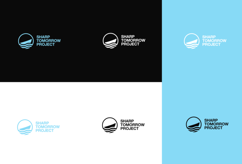
5. Simple: Functional: All right, functionality. A good logo going to need
to work on any kind of application we're talking
about like online application, on phones, on pre
materials, everything. We're going to start
with a small logo, which you can see it
on the right side. We've got 16 pixels
by 16 pixels. And a logo need to be clean and understandable on these
small proportions. And 16 by 16 pixels is for
website fa, icon format. And also these days, most of the people access brands and websites and products from their mobile phones where basically things get
shrink down even more. You're going to need to create a mark that eventually going to be clean and understandable
onto small proportions. Then we got like 100 pixels and bigger and bigger than that. Not all the logos
look great when they're scaled up
on big proportions. And not all the logos are understandable on
small proportions. So you're going to
need to test it, check it if they still
look good and clean. Understandable. Next we
got Pixel platforms. We're talking about
here websites, mobile applications, everything
that is on a monitor. And you can see the
iphone in case you are developing an app and
you want a logo for it. You can see in this
situation and how many times the logo gets scaled down in
different small proportions. Of course, Apple requires
different dimensions for it. Things get a little
bit more further when we're talking
about an iphone watch. Here they get scaled
out even more ipads. And again, different
watch formats like 42 millimeters versus
38 millimeter watch. As you can see, Apple, how it's requiring the logos
in different dimensions. We've got print applications, now we're talking about print
formats, physical format. Mostly you can see here the
logo embossed in leather. This is a complicated
format because not all the logo is going to be
look, embossed in leather. If the logo is more
more detailed, it's more complicated
that it won't look good. Scale down, embossed in leather. Even this logo, you can see it has a little bit of
difficulties on the pattern, but overall it looks good. Like 95% passes the test or we got an acrylic
print on a business card, you can see the
pattern and logo. Then you can see
the logo sealed, decorated with
different elements. You can see made out of steel, or you can see
decorated with colors. You also can see on
the right embroidered. Now, this is also a little
bit challenging for not all the logo is going to work pretty good
with embroidery. I also had logos, illustrated, logos that I tried out embroidering but
turned out pretty bad. Simple bold logos
work really good.
6. Distinctive: Distinctive. When you're analyzing the
client's competition, you might see those logos. And you want to avoid
creating the same logo or similar logos because that's going to create like
market confusion. And if you create
something more different, and it's basically
going to stand out from the competition
a little bit more. Here we got logos from luxury brands and
one of my clients, which is right here, Ali, this is a jewelry manufacturer
from Uva Arabic States. He wanted a logo that stands out from the top competitors. And of course, he wanted to sell jewelry on line worldwide. He wanted me to create something that competes with these guys, and I made a really
strong bold logo. And of course, with
has the look and feel of these Arabic elements. Arabs have these really
nice decorations. And then we got a
bad example also. By the way, Panther
vision is my brand, and I rebranded it in this way. That looks like
the Louis Tongue. Now, this is really bad. You might get backlashes if you post similar logos to
other competition. You know, I highly
not recommend this. Try to create logos that are different,
avoid similarities. Don't make unique logos. Unique logos doesn't
exist out there. But make something
a little bit more different to not look the same. In the next chapter,
we're going to cover up what is an appropriate logo.
7. Appropriate: Appropriate, the look and feel. This is also a crucial element when we're talking
about logo design. So the question is, when
you look at a certain logo, how it's going to look and feel. And when you look on it
without reading the story, without reading what
this brand company does, you know you're going
to need to have a slight idea what is
this company about? I'm going to show you
a couple of examples. For example, we got here a
pretty interesting logo. So when you see the
symbol, it's really spiky. It looks kind of aggressive. You read the word mark, it reads Nuclear Blast. Again, it's a little bit
more hardcore sounding. It looks really modern. And in the background there's this guy with a lot of tattoos, Hot, long hair in the
grunge environment. So I might think on
a rock and roll, you know, heavy metal
or something like that. So this was made for one
of the biggest label, heavy metal label
companies in the world. And they wanted me to redesign
this with a really modern, aggressive logo because we're talking about like
heavy metal rights. So they wanted something
more hardcore for them. And then we got Uka Buka. This is a pastry shop from Oman, and I basically recreated
the letter from Uka, but it also looks
like a doughnut, and I wanted to make the logo creamy and delicious
as possible. So you can see this abstract
circular motion there which looks really wavy and
looks really creamy Dr. This is an online platform where you can
consult the doctors. On line, I made two hearts that they are colliding and
overlapping each other, and it's creating
this Apple logo. I also used appropriate colors. Here you can see the
mint and blue color. Mainly, these two colors
represent the healthcare. If I would add, for example, yellow or I don't know what purple color that wouldn't
represent the healthcare. Mainly, we've got blue, mint, green, and red colors that represent the
healthcare industry. This is how people
recognizes it. It's also really friendly looking and it's
really modern looking. Gray step media. And these guys are
photographers and they are photographing interior and
exterior of penthouses. And they asked me to
create a Mexican pyramid. And I made it really
modern looking, really abstract looking
that eventually complement these abstract simple
concrete buildings. Nike. The word mark
of the Nike is a condensed tall bold
looking type face where in which you
can see it's tilted. It, it's like an italic font. And when you tilt
the font this way, it basically indicates speed, it indicates motion,
it's energetic. You know, it represents
the athletes. And this way it
represents sports. A Lego, we got this
red intense color, which is really energetic. And there's also
this yellow color that looks really
friendly and positive. And of course, the letters of the word mark is really
bubbly and positive, friendly looking, that
it's mainly made for kids. A role, the word
mark is written with classic sera fonts with
a royal green color. And of course we got
the crown above. You can see this way
we're talking about a luxury logo, a luxury brand. Next we're going to talk
about timeless logos.
8. Timeless: Okay, time less memorable. If you make the logo simple
and strong and bold enough, then of course it's going
to become timeless. And the main idea of the logo is to live up for
decades and decades. For example, you've got
the Coca Cola logo. It lives like more than
100 years already. They redesigned it
like 100 years ago. And still they are
using the same thing, same as with Apple logo. So I'm going to show
you some examples. Leave the trends to
the fashion industry. Trends are coming and going. Back in the days, there was like these three dimensional
logos everywhere. Everyone implemented
into their logos. And then we got vintage logos. These days we've got
modern logos with a lot of vibrant gradients all
live up like 234 years. And then some other
trends come in. So you need to
research the trend, see what's out
there, avoid those, and create something
really good that basically is going to
stand the test of time. For example, we got
the Apple logo. They rebranded the logo in 1977, and they kept the
same silhouette. They only changed the
style of the logo, they only changed the interior of the silhouette of the logo. And you can see in
2,001.2007 they also implemented this three
logo style effect, which was a big trend
back in the days. But they kept the
silhouette the same, which was a really good idea. Mercedes, they rebranded
the logo in 1916. They added those
triangular stars, and they kept the same
triangular star till today. They redesigned it
a couple of times, but the silhouette is the
same, exact silhouette. All right, now we
get the homework. Take a walk in your
downtown where you can find the most
markets and stores, search for logos on stores, banners, signs, et cetera. And see how you can apply the most important
rules in a good logo. You also can take photos and
bring them home with you and upload them on your computer
to see the differences. Good luck. In the next lesson, we're going to cover up
some of the differences between the word marks
and the symbols.
9. Wordmarks vs Symbols: Word marks versus symbols. Now theoretically speaking, word mark is more
simply to remember, when you include also a symbol. Things going to get a little
bit more complicated. People are going to
need to understand, what is that symbols?
What does that mean? Also word mark is more simpler to understand because
it's also written there. What does this says? If you promote the symbol only, then people might get a
little bit more confused. If you promote the word mark, only people can read it, they can understand it,
depict what is there. But there's also
like brands who are combining the symbol
with the wordmark. Also there are different
strategies to it. I also going to show you some
of the examples. Sd lauder. They are using a
beautiful monogram with the letter E and the letter L. And there's also this really
nice word mark, ST, Loud. There you can see
the letter E that contains that line above with a beautiful Sera Fonts without Serif of course,
but it's really modern. They're implementing
these different ways. For example, on
these products you can see they're
implementing also the symbol with the word mark combined together
perfectly symmetrically, and all the information
are symmetrical on it. Then in this situation, they are implementing
only the word mark on all these products. They start from left to right. I mean, all the composition basically starts
from left to right, and it creates this
beautiful design. Next is the La Paris. Now Lac Paris has this nice
simplified abstract rows. Not a lot of people
know about this. They mainly use the
Lac Paris word mark because it's enough,
it's just beautiful. You also can see the
roof on that letter. It's a really distinctive
word mark already. In some scenarios they are
also including the symbol, for example, in the stores. But mainly they are using
only the word mark on their products and on
their marketing campaigns. In the upcoming
lesson, we're going to cover up the logo
functionalities.
10. Logo Functionalities: Logo Functionalities. Dynamic Logos, one
of my favorites. Dynamic logos are basically the logo silhouettes decorated
with different elements. In a situation we got
like City of Melbourne. As you can see, they
chose geometrical shapes, isometric shapes with a lot
of vibrant strong colors. They basically are implementing these elements in
their campaigns, in the print materials. And it's really a
strong decoration for a full brand
identity system. You probably remember
the MTV logos, if you are from the '90s, MTV used to rebrand their
logos. I don't know. Every three or four
months they created all logo animations of
the letter M TV logo, and they made a versions which looked really,
really amazing, Nike. They also did a couple of
variations back in the days, I think this was made by the designer who also
made the Nike swoosh. And you can see how many things you can create out of the logo. You also can see
another story of the Nike swoosh when
basically it's rebuild, renovated into a really
modern, minimalistic mark. Here you can see only
the Nike word mark redesigned in different ways. These all contain special
effects that indicate speed. Because we're talking
about sports, we're talking about
energy and speed, and these are representing
those pretty nicely. This is my brand,
my personal brand. I also redesigned the
logo in a couple of ways in order to create
marketing for it. Now you can see in my
situation, I have a word mark, and I redesigned the word
mark in different styles, in three dimension,
two dimension. I got out of the
comfort zone quite a bit and entered into
different directions with it. Also here you can see the logo with a lot of special effects. Yeah, these are going to be good for different
banners, campaigns, pre materials, and
a lot more Romans. And here is the Romans logo, you can see the
letter M stylized. And here you can
see it implemented already in different
kind of posters. For example, on
the first poster, you can see this
letter M symbol. This works as a silhouette
and inside of it, and there's like an
image on the second one. The letter M silhouette
is also decorated with different kind of abstract
forms without images. And the list goes on. And all these posters looks
quite a bit beautiful. Okay? Responsive logos. Now, a lot of brands also found out this
thing that you know, a lot of people, most
other people are accessing their websites and products from their
mobile phones. And things get scaled down
on small proportions, and everybody needs to advertise
their page on websites, on landing pages, and
so on and so forth. And also, for example, Heineken and Disney
had complicated logos. I mean elaborated logos. And they need to come up
with a solution in order to simplify and implement the logo in these new platforms. So as you can see, Heineken, it had these beautiful
floor decorations. It had these ribbons and
all kinds of things. And how the logo
gets simplified with only the star and only
the Heineken word mark. And eventually you can
see only the star. And I really like the Wall, the Disney option here, because they had these
castles going on and they had these
beautiful animations. When you see in the movies, you can see that
huge castle that basically gets transformed
into this logo. They remove the castle and
then they figure out they also need to remove the Wald
word in order to simplify. And then we got the Disney word. By the way, a good word
mark is in 5-7 letters. Those are the really good and easy rememberable word marks. And then eventually,
we got the letter D from the Disney simplified. And of course, a really, really good logo
fits into a square. So you need to remember this, make sure that your symbols
also fit into a square. In this situation, you can see the Heineken star and the
Disney letter D fits perfectly. Also, the Disney with the
full word or Wall Disney, they fit in horizontal
lockups as well, for example, in banners. But I'm also going to show
you different examples. Okay, I had this client, Devin Williams Speakeasy, and they had this really
beautiful Art Deco bar. And on the left you
can see decorated with Art Deco elements that
looks really luxurious. And on the right you can see only the word mark
simplified or you can see the edge of the DW monogram
simplified on the left, which is just the monogram and it gets decorated more and more. On the right you can see with all the beautiful decorations. And there's like also
another example, more Art Deco
variations, logo lockup. There's like a couple of lock
ups I want to talk about. For example, this is the
perfect symmetrical lock up. Here you can see the symbol is on the top and wordmark
is on the bottom. Next we got symbol on the left, word mark on the right. This works really nicely. Horizontal situation for banners on websites on really
narrow, tight ******. We also have this example Mogi. You've got the wordmark on the
top, symbol on the bottom. There's like another
horizontal lock up version, the badge. Now you also can modify
the logo how you want. You can combine the word
mark with a symbol and different aspects
and situations. Put it in different places, test it, experiment with it. You can discover
like new lock ups. Also, next chapter
is going to be about understanding colors in
logo design and branding.
11. Understanding Colors: Understanding colors. What's the identification
color of your brand? Maybe you thought that symbol
and wordmark is the most important when
we're talking about branding and we're talking
about a brand identity. But the truth is,
it's the color, color improves brand
recognition by up to 80% So this
is what people see. First they see the
color of the brand, and then they see the
symbol of the brand. And lastly, they're going to see the word mark the
text of the brand. Because people don't
like to read them much, they're more visual,
they mainly like to see, the brain doesn't do a lot of effort just seeing a symbol
or just seeing a color, but it does more effort reading that text there or word
mark, for example, when you see a brown truck, there's not a lot of
brown trucks out there, but when you see
it, you probably notice that it's the UPS truck. Or when you see a
purple color banner in New York or somewhere, you probably think
about T Mobile. Every brand should
have a signature color and should stay consistent with that color choice without changing it for a
long period of time. It works the same way as
the symbol and the logo. You made a logo to live up
for decades and decades. And same thing works
with the color. If you change it constantly, people won't
recognize your brand. You're going to have
problems like that. Try to simplify
your color palette through a primary
and secondary color. If you have two colors that are contrasting
each other really, really nicely, that's good. And by the way, if you use
only one single color, you don't have any primary
secondary color that is even better because
people recognize it and remember that more easily. But having two colors, three colors, four colors, that's totally fine also. But don't mix it up
with too many colors. That's a little bit more
pro, advanced level. For example, we've got
fed ex perp and orange. Really nice contrast to colors
or hana can red and green. Ikea, blue and yellow. Really strong contrast. Lego, red and yellow. Subway, green and yellow. This is less contrasty
UPS, brown and yellow. We're going to talk
about the color wheels. This would be a little
bit more boring, but I'm also going to show you
how to implement these and what other brands took
from the color wheels. We got the basics here, monochrome where you
use only one color. We've got the analog which
are using similar colors from the color palette where it's using totally
the opposite colors, it creates a strong contrast. And then we've got split
complementary colors, again, totally opposite colors. By this time it also
includes another one. On the bottom, we got
the triad colors. This is 120 degree
angle color choice, where we can find really, really beautiful
color combinations. Then we got the tetradic, which is basically 90 degrees
angle and uses four colors. Let's see how brands are implementing these
color pellets. For example, we got the
Lego red and yellow. You can see this is a triad
fed ex per pen orange. We got another triad, Ikea, blue and yellow. This is again another triad. You can see a lot
of companies uses triads because they got like really beautiful
color combinations. And then we got Subway
green and yellow. This is an analog. Similar colors doesn't
create that strong of a contrast but
still looks organic. Hanken, red and green. This is a complementary.
All right. Color psychology, basic. It's also important to know a little bit about
the color psychology. I'm going to leave you
an image where you can find all the colors and all
the meanings of the colors, and also which brands are
implementing these colors. This also plays some importance when we're talking about
coloring the logo, coloring the brand identity, but it also can get
really detailed. In the upcoming lessons,
we're going to talk about the basics of typography.
12. Typography Basics: Typography basics. These are the four main
fonts type that we've got. We've got the seraph, which
is a classic seraph is the modern slap serve that comes from the seraph and it's
like really thick and bold. And then also the
handwritten fonts, I'm going to use this word as a reference and we're
going to dissect it. The bottom part is the baseline. Then we got the x height. The letter X basically
is the shortest letter. And as you can see,
this is going to be the height of the
lower case letters. All the other lower case letters are going to go
beyond the x height. You also can see the letter U. The top part doesn't go
beyond the X height, but the bottom part, it
goes out of the base line, which is totally normal. And then the top line
is called the median. We've got the cap height. This is the upper
case letter height. You can see some of the letters also go
beyond that height. Which is the ascender line from the lower case
letter K. That would be the top, most tallest one. Then we've got the
descendant line, for example, the letter
P that goes downwards. These are the two main fonts. The left is the seraph and the right is the sans Serif
Classic versus modern. I'm going to show you
what are the differences. The seraph are basically
these little legs. And also there's like
another thing going on. We got the contrast. You can see the left leg is a thin leg
and you can see the right one is more thicker and this weight creates contrast
optical balance. We've got here three
geometrical shapes. We've got the triangle, the
square, and the circle. You can see that the triangle
is a little bit bigger. And also the circle gets out
of the grid lines as well. Now it has to be like this, because if you scale
down the triangle, if you scale down the circle, they're going to look a
little bit smaller than the rectangle in the square. This is how it also is
applied in every letter. Upper case or lower
case situation. It gets scaled up
a little bit more beyond the grid lines
than it used to. This is how the
geometrical shapes are also the silhouettes. You can see how it works with the letters we got
here, the X example. And as you can see, the letter doesn't pass the grid lines. Here is a situation where on the left it doesn't
pass the grid line, and on the right it passes the grid line where the letter
is a little bit bigger. I think I made it a
little bit too big. But the main idea is
that the two letters to look almost the same, to have almost the same weight. There's also beginning designers who do this mistake when they have only a thin font and
they add a stroke on it. So we're going to make the
letter more thick looking. But this is a big mistake
because when you created the font more thicker and thicker from thin to
other way to black, it's just making it more wide. The accurate way to do this, you're going to need to recreate the font and make it more wide. Now, this is time consuming. You need more knowledge and technique in
order to create this, but this is the right way to make a font more
bolder and black. Look in kerning. This is basically distancing
between the letters. When we're talking
about the sensory font, this works pretty nicely, even if they're like the same distancing
between the letters. But when we're talking
about the Serifs, you're going to need to
customize them because when you write down something
with the software, it won't adjust the kerning. So for example, we
got this situation, the May on the top part, you can see that I wrote
it with Adobe Illustrator. And this is the default. This is the distance
that it's going to put between the letter
A and the letter Y. On the bottom, you can see I
had to reduce it manually, the distancing between the
letter A and the letter Y. There's like a
couple of websites. You also can check
out and exercise your kerning skills
and typography skills, and we're going to
check out that also. Here I'm going to add
some fund websites. The first one is funds, Google.com So these are
non licensable funds. You can use it anywhere. You can use it however you
want to distorted whatever. This doesn't contain
any licensing. You also got Adobe funds. This is also a
really good source for funds. This is not for free. Of course, fund,
Squirrel.com Again, free funds do fund Fund.com
Now on this website, not all the funds are amazing, but you're going to find
some really cool scripts. Funds or decorated funds which is going to eventually
work really nicely. Not necessary for the logo, but you got a couple of
variations but they're not, all the funds are clean. Okay Not, but at least we got
fund type.com This is also a really nice place to find
tall bolt condense typos. Don't download too many funds, stick to a set of funds. Again, I had this situation back in the days I downloaded
all kind of funds. I don't do that
anymore because I overload the system
with a lot of funds. And then the software is
like going to need to load. And it's going to
take more time, and of course you
are not using it. It's going to sit
there uselessly. So. Stick to a set of funds. You memorize those
funds and you're going to know where to use
and what kind of funds. So that's the main
point of these, okay, display funds
versus text funds. First we got to talk
about the display funds. Display funds are mainly
used for title funds, for example, on
posters, also on logos. And these are mainly funds
that you can use it for, like titles, Mainly if you
are using it for a text. If you are using it for a book to read it like long hours, like 200 pages, this won't be good because it's going
to be hard to read. These funds are a little
bit hard to read. They're not that optimized. They're mainly
optimized for titles. First one is a Trade
Gothic in line. You can see this is
used for restaurants. It has this interior
line into it, it's decorative, it
looks really nice. It's a little bit
complicated to read again. This is just title,
fund, display. Fund, noi has grotesque display. I hope this is how you
pronounce it correctly. I think this can be used
also for reading fund, but you can see it is a
really modern fund that is used for pharmaceuticals
or other kind of packaging designs dot this is a modern Sera fund that mainly fashion industries
are implementing it. Then we've got Alternate Gothic. This is a bold
condensed type face. You can read it
from far distances, it's really in your face, it's super bold.
The list goes on. You can see the FDN implemented different vintage old school packaging designs. And then we got the text font. This font is mainly
used for reading. And the best one of course,
is the Seraph font. That's the most natural and organic for the human
brain, for the human eye. Seraph is a little
bit more modern, but that's also still
a very readable. But the seraph is basically the most readable, 100% we got. Helvetica, this is great for display fund and it's great
for text fund as well. And Caslon Classic regular
again, another classic. All right, let's check out the type method and here
we can adjust the kerning. You can see we got
four letters and I can pull the
letter V. Basically, this is the maximum we can do. I'm going to pull it here
and I'm also going to. So it seems like I can pull only the letter V.
After you adjust it, you can click on Done Here. Let's see if it's correct. Oh, actually I could adjust the letter A two.
Let's go to next. But your score is 100% here, so it's good. Click on next. Here you can see you
cannot adjust the letter. You can adjust the letter Y. And this is the max you can go. That's extreme, I think I'm guessing it's
something like this. It's about optical balance. You need to trust your eyes and not the mathematical
calculations and the grid lines. Those are not available here. They don't help in
this situation. You're going to need to do
it optically and Gal done, oh, it's only 73. All right. That didn't
work that well. You can play around
like this quite a bit and just practice it
until you get these right. Then we got the shape method where you can practice
your pento scales. As you can see, you can pull
the handle at the letter. I'm going to pull it and
I'm going to pull it here. Where is the doted lines are? We've got ten remaining
in this situation. You don't have any
guidelines anymore. This is totally free handed. Also, if you press
and hold shift, it's going to isolate it
horizontally, perfectly. Again, you need to
trust your instinct. Plus you need to have a
good amount of skills. But here you can
practice it quite a bit. I'm going to click on Complete. Oh, I needed to pull
a little bit more, but 80% is pretty good. You go on, check this out. Oh, wow, this is fun. I think this is a lot of fun. And you can practice it. This app is really smooth and that doesn't even
look that good here. But anyways, you
get the main idea. There's also a website
called Fund in Logo Here. You can search for
the logos you like and then it's going to show
you the funds that they use. For example, we got Lufthansa
and they use Helvetica. Loreal Trade, got LTS, Std, check it out. Helvetica is used
quite a bit and we go, Louis Viton used the Futura. These are popular
funds out there. You just type in here to the
search bar, for example. Nike look at that,
it's going to show up. The Nike uses the
Futura and Adidas uses the ITC Avant
guard view all logos. And this is how you
find out what brand, what fund uses for
their brand identity. Now in the upcoming lessons, we're going to jump into
the practical part. And of course, we're going
to start with a brief, and I'm going to show you
some of my brief questions, what you also can apply
for your clients.
13. Brief: The process. Finally we got
to the process where I'm going to demonstrate to you
to how to create logos. From the brief to the sketch, to the refinement process
and all that stuff. So the first thing is the brief. First we got some
basic information related to the business. Like companies names, description of your company,
company's location, company's website,
brands, Logan tag line, a list of products, services
your business provides. I created a fictional brand
that I'm going to fill up the brief and I'm also
going to show you those. The business name is Mo Amer provides effective online
marketing solutions to small businesses in Arizona and New Mexico to grow their online presence
with website design, SEO optimization, and
social media marketing. It's based in Arizona website Gamer.com slogan,
empowering your success. Then we got goals
of the company. What goals do we need to
achieve with the logo? Where do you want
to use the logo? What should I avoid
designing the logo? The last one is a really
powerful question because the client is going to provide you with information. We're, he's going to
send you examples with logos where you should not
go in those directions. Like logos which
he don't like and images and color palettes and that he don't like, fonts
that he don't like. Where do you want
to use this logo? We're talking about like
online or offline applications that I showed you before. I did the response
with a visual showcase what Jamo does in marketing. The logo should be
modern, simple, and it should be a balance between corporate and friendly. It should be used online, on website, and social media. Other applications as business
cards, marks, T shirts, and signs in the future, avoid vibrant, trendy gradient colors that our competition has. Next, we got examples. What are some of the logos you like and why this is
a really good one, because at least you are asking the client to come up
with logos that he likes. You can understand from here
what direction he likes, what direction, basically you
can go on with this logo. For this one, he
mentioned the target. It's simple, bold,
and distinctive. They are also
implementing the logo in all sorts of marketing campaigns
that looks incredible. Target audience. Who
is your target market? How do they look like?
What's the age range of your target audience? How old are they?
How do you want your target market to feel
about your brand identity? This is super
crucially important because it's mainly about
the target audience. Of course, the client wants to create something for themselves
so they can like it. But the main goal is to create something for
the target audience. And create products for the target audience that
eventually it's going to sell. The target market is small
businesses and start ups. Age range 25-50 years old. Excited and positive
competition. Who are your top competitors? Quantum Advertising
Agency, Amplify, digital marketing catalyst,
Creative and not. But at least we get
the brand attributes. Please describe your
business in three words. What is the personality
of the brand? And here in the next slide, I also included a list of keywords that
eventually is going to help the client select the right keywords that is
going to represent the brand. This is also very
important for you to narrow down into the
right keywords so you can understand in which
direction to go and how you can make the logo according
to the keywords as well. Okay, brand attributes in my
case would be professional, creative and growth,
clean and modern. You also can check out the good brief and there
it's going to generate. You automatically briefs with fictional companies and see if you can create
some logos for that. As a homework, assemble your fictional brief using the questions from
the brief video. You also can rebrand an
existing business with an outdated logo or use the brief generator
on good brief. Here we got good brief here
we can select the type. We got logo
illustration packaging like what would be the
brief about the client, let's say one logo in our situation and we
got here the industry. We got technology, food, retail. I'm going to go this time with fashion and I'm going
to click on Generate. So you can see it chooses
a fictional company name, the West Home
Company Description. We are a fashion company that
sells plus sized dresses. Our items are made with low cost materials and are
sold in your favorite stores. Our target audience is women. We want to convey a
sense of power while at the same time being
professional job description. You must create a logo using the information
given in the brief. They will prefer a letter mark that uses the color yellow. The color will be
embroidered on uniforms. Take into account
the company's values and preferences and make sure it will work for the planned use case
deadline. Three days. Now, three days, it's
really unrealistic. Now, this is a fictional
brief of course, but I usually do logos like in one or two
weeks or three weeks. Next we're going to talk
about the research.
14. Research: The next phase would
be the research. Here you're going to need to
research the target market, the competition, and gather
all the information you need. Here's a quote, a good
designer is a good researcher. I also mentioned that before. But it's important to do
the research and exercise. Your research is
based on keywords and see what you can find
inspiration is like bathing. You need it on a daily basis. Of course, you're
going to get a lot of information related to logo samples and brand
identity designs. Is that going to work
for this project? You need to collect
those and I'm also going to show
you how to do it. But if you try to get inspired
more often as possible, you're going to become
more and more creative. And you're going to have
more and more data in your brain and more knowledge
related to brand identity, homework, research, the competition which
are in the same niche. Okay, regarding to
the competition, when you ask the client to
show you the competition, basically it's going
to write it out. My situation, these are
like fictional competition. But I'm going to do
some manual research and I'm going to show you some real marketing
agencies actually. But when your client is going to write down their competition, you're going to research those. And eventually you're going
to research even more. And I'm going to show you how. Let's go to Google.com and
I'm going to search like this marketing agencies in Arizona and we're going to
have a couple of links. Google does great research and I highly recommend
to start there. I'm just going to open up the
links and you can see here, it's going to open up in
tabs because I'm pressing the scrolling
button on my mouse, we get like top advertising
agencies in Arizona, 2023 or top 30 digital
marketing companies in Arizona. Look at the top 15 marketing
agencies in Phoenix. I get a couple of results that
we're going to check out. But what I'm looking
for is basically pages like these
where are collecting multiple marketing
agencies and you can see reviews and you can see a lot more
information from them. So this is one of
these. For example, we got also the top 30 digital marketing
companies from Arizona. Let's see what is this
top 15 from Phoenix. And you can click
on a visit website. So this is how you
start, You know, we got like you already got here, all of the brands logos, So this is how you
start with now. You can see how they look. You also can go here basically, you can see even better, we got some good logos, bad logos, That's the start. Just to see the logos. Now, we don't want
only the logos because the logo is not the
full brand identity. I'm going to start, for example, with the Co digital. You got also this button here. Visit website. I'm going to
click on. See what's up. Oh, look at that. These
guys already have something cooking that actually looks
really professional. For example, when
you're talking about their website, they
got their color. You can see it's red,
black, and white. The website is professionally,
almost professionally. This should be also in
red and white and black. But here you can see it's
already inconsistent. But they did a better
job than the rest, usually because most of the websites or
most of the brands, they don't look
professional enough. Anyway, they're going to go up because this is pretty
much unsuccessful already. They implemented all colors. Anyways, I'm going
to go to the menu. We can see here their
social media pages. I got to go to their Facebook, their Instagram. What is this? They got hands as well. Interesting. I got
to check their work. Let's see what they are doing. Check this out. Also on
their social media page, they are implementing this red, white, black nuances,
which is pretty great. They're combining the logo with the serif fonts. All right. It's not that bad, this
is a decent company. This is a decent brand growth
oriented digital marketing, best in class web
design and development, professional video production,
business to business, business to client and
so on and so forth. So these are pretty
good this way. You check out and read about them and see
what they're doing, see how they look alike. Let's see what I'm going
to check this also, let me see something
even more interesting. This one Interior digital. That sounds interesting.
I don't know. It makes me think of interior
design. Check this out. Also, the colors
are implemented. Well, you've got this blue
combined with mint colors, which they are consistent with. The logo also looks pretty good. Let me see if they got
some social media pages or do they got only
their websites? Yeah, they got linked in. Anyways, let's go on. This looks like a
tech logo, Keta Tech. It also says it's tech. Make it easy for
your business to thrive in competitive marketing. This is what they do,
mobile app web design, web and size applications,
web development, SEO. Okay, this is a
really good method how to research when they
got a full list of brands, for example, related
to marketing agencies. There is also another one
which is pretty nice. You also can see
here all the logos, all of their identity. You can see some information
about these businesses. Of course, most of them
look really unprofessional. I mean, they don't look
that big of a deal. Nothing really stands out. I like more these
simple word marks in my situation because
that's like timeless. Yeah, these are not
impressive as much. In this situation, you got a really good
advantage to create something really nice and
stand out of the competition. Look at Web. Look how
strong this word mark is. This word mark outperforms
actually most of us. Oh yeah. This is
also good avenue. I want to see this
website to see what's up. I also want to see
the web website. I'm just going to go
and check out some of the best identity visuals that are actually
good meta jive. This is also pretty good. This is a really
old school three D gradient trendy logo
from back in days. It's really awful but I'm
still going to check it out. It has like 24 reviews, I don't know what is
that, but I got to go with this really
bad website then. Looking identity. Yeah, they are really working
with this one. It looks like a stock
template web page which doesn't have a lot of
trust. But check this out. They actually have a huge staff. They also collaborated with
the big brands in there. All right. You can see up here
the social media you got. Instagram, Facebook.
I'm also going to check out the Youtube. Seems they have one.
I'll look at this. They actually
implemented the color from the logo, which is amazing. So they got the red, green, blue and yellow implemented in these story circles in here. And you can see here
also in the images, they implement these colors. Down here in this line, which is amazing, they got
a specific typography. Of course, the logo typo is slab seraph and this
one is a san seraph, which is really modern. They communicate really
good with each other, the seraph and the san serf because they create a
really nice contrast. So that's a good approach. Yeah, the images are good. It's not that bad, but I don't
know what to say about it. It's not the top notch
that I would think of it, Best visual identity
that I can think about. Look, they got Google Partners. The logo is also like in the
same scenario. I don't know. Somehow it's not
clicking for me. But let's go on. I can
check the What is that? This is amazing. Wow.
The website is amazing. They are using this green
color as an explosion. Here. As an effect.
Yeah. They're really consistent so far with imagery, videos,
colors, typography. Typo is amazing.
It's really simple. It's minimalistic is
exactly what I like a lot. Look at this huge video in here. I don't know, is this a video? I don't even know what
is this, but yeah. Okay, it's switched
up to work company. Look at that green
hand in there. All right. It's really
consistent with the colors. It's really consistent with the brand identity system so far because the whole
thing is minimalistic. And check out the logo
up here in the corner, it only shows the letter M in a perfect
square right there, so it's not showing
the full word mark with the meta jive. Look at this, all services, it's going to bounce out again, we've got the same toxic green going consistent
on all the pages. It's a really good website now, it basically checks everything. So far, I'm going
to go check out their Instagram,
eventually their Facebook. Yeah, I'm going to go
back to their work to see a little bit more about
it. Look at this. User experience is amazing, image qualities is not
that bad because I'm on four K. But anyways, you can see that they did some work and they are
not messing around. This is a serious
business already. Look at their Instagram. It's like really
professional looking. You've got great graphic
designs in here. Great imageries, fonts, colors,
everything is consistent. Yeah. They're doing a
great job. Check this out. They're really highlighting
this toxic green digital creative agency
focused on creating great experiences for brand, pursuing excellence, amazing. This is their symbol and when
you go on their website, you can see the full word. If you can see it actually you cannot only can see
it on this website, the word mark, but it's amazing. Anyways, this is their Facebook, again, really consistent.
Check this out. So you can see a calendar with this green
color or everything. They are trying to push this brand identity
color in the right way. I mean, strategically
you get the main point. Next is Webley, super simple
word mark. I love it. It's perfect, It doesn't
have any issues. I mean, they chose a
really good font for it, that's for sure they're going
consistent with the colors. It's simple, it's minimalistic. Again, it's really clean. And I want to also see this one because their logo
is really good. Check this out. I love
this logo a lot and yeah, they are also doing a
great job with this. Their social media
is not the best, but overall the logo
is pretty nice. They still have to work on implementing the full brand
identity system correctly, but overall it's nice. So far, this is the best, this is how you should think
of when you're designing. You know that the
logo is one thing, but it's all about
the full picture. When you're helping a brand that we're talking
about, like symbols, word marks, fonts,
typo patterns, colors, and a lot of
things in between. Next, we're going to
talk about mood boards, and I'm going to show
you how to create them.
15. Moodboard: Mood board. It gives an idea of the full picture
and the elements that will be used
in the identity, such as fonts, colors,
logos, images, layouts and textures,
inspiration. We're going to talk about pages where you can get inspired. This is not the same research as from the previous chapter. This is going to be like a
creative inspiration research going to find like
logos, colors and fonts. And different elements
that are eventually going to collect and
create mood boards for the clients
where you can get also inspired to
implement into the logo. We've got platforms
such as Pinterest. I consider this is
the most important and the best one that
you can find out there. Because when you find
a photo under it, you can find more similar photos and you can get lost
into the process. Gathering infinite
amount of ideas. Great ideas. I think this
is the best search engine and search structure
for inspiration. At least then we got. Dribble is way more
modern vector based. It doesn't have all the bells and whistles like Pinterest has. But it's still good,
but it's like really, really niche down to
modern vector graphics. And then we got hands
Hands is mainly based on full portfolio
projects where you can basically present the
full brand identity of one project on mock ups and on different
kind of scenarios. That's also a different
thing, but you also need it. It's very important not. But at least we got Instagram. A lot of designers showcase their designs on Instagram
quite a bit now. And it became like a really good inspiration source as well. Software where you can
create your mood boards. We got Photo Shop and I also
included there the Pure Ref. I'm going to show you how to
do moodboards in Photoshop, but pure Ref is way
more easier as well. You just drag and
drop the images in there and assemble
it. And that's it. I created two moodboards. I created one moodboard
that was from the example that the
client like with the logo, with the target, because this is really bold and distinctive. I did gather all the information
with campaign materials, how they implement the
logos in different posters, and how they implement the
logos on different packagings. And then I also made a personalized mood board that eventually is going to
work for the company. The logo, of course, going to be bold, like this Moodboard, bold,
distinctive, very simple. And I created the
moodboard where, you know, it's using the fonts, the colors, and the
imagery that is going to eventually incorporated
into the brand identity. And you can see on
this color platelet, I use a lot of blue. I also combine it with a
little bit of pinkish red. That is going to
make it look more friendly rather than
with only the blue. It's going to make it look more cold with the white combination. So that pink, red going to
balance it up quite a bit. And you can see like
really modern marks and different scenarios, different symbols that
represent growth. You can see also the arrows
plays an important role, like in the rising logo there right here, that
represents growth. Or we've got these
scenarios here, these logo concepts that
also represent growth. Like you saw before,
the Adidas example. Okay, homework assemble
one or two mood boards that are relevant to your
brief and style direction. All right, let's get into the most fun part where we're going to do a research
on Pinterest. We're going to check
out some identities, logos, and what the
brief is all about. So I'm going to open up Pinterest and I'm going
to go to the search bar, and I want to search
first for bold logos. Okay, I'm just going
to enter it like this. It's going to show quite a bit of logo directions here first. As you can see here, we've got arrows that we're talking about, like arrows represents
growth, something like that. This is a direction with arrows, this is another
direction with arrows, this is a little bit bold. Also, this is more thinner as you can see
when you scroll down. They're basically
going to add you more and more ideas with arrows, bold looking arrows that
basically looks like this, similar to this one. This is what we want on
Pinterest directions, and this is what
Pinterest is made for. For example, we got here, again, more arrows, White
background, black logo. And when you scroll
down, it's going to add another one of
these or another one of these and it's going to give you like even bolder logos. Okay, let's go on and
I'm going to open up, let's say something else. Let's say like an abstract direction
or something like that. For example, this one. This also looks
really interesting. It looks like the letter J. I'm curious what
it's going to bring. We got this concept, but the main idea is
that you can scroll down and you can find
more crazy ideas. Look at this, I
really like this one. You can turn it upside down and it's going to look
like the letter J. It's going to represent growth
and so on and so forth. And if you scroll down. It is going to bring
you even more crazier, bold, strong looking logos. Of course, these are like logo modernism and this and that. But these logos are
really, really timeless. They stand the test of time. They're really versatile.
They're simple, they're really strong marks. Now of course, you need
to balance it out between feminine and masculine vibes, but that's more in the process. Okay, after you find
the logos you like, let's say you open up this, you scroll down, and you maybe open up another one. This one. And this is how it goes
and goes to the infinite, because there are so many ideas, you can see that these can
be transformed into arrows, and it's just a lot of fun. You get really exhausted also. But I recommend you to do like 40 minutes of
research, then do five, 10 minutes of pause, and then do another 40
minutes of research, and so on and so
forth, because you're going to get exhausted
quite a bit. And then after that,
you're going to hate it if you don't do any pause. Okay, now I'm going
to drop these images into pure F. And I'm
going to drag this, I'm going to put it
half of the tab here. We got here the pure wrap that
I showed you before here. I'm going to drag the image, I going to drag and drop
the image like this. This is it. You got
screw in, screw out, you can scale the image so
that it's not distorting it. And you just research
and add all the images. It's super simple. It's going to make the artboard bigger. Okay. Next thing, I'm going
to also research for Growth. I'm going to click Growth Logo. Let me see if we can find
something here. Look at that. Actually, these are pretty good. So these are some
of the directions that represent growth. But this is also like a
trendy default logo that you can find on Shutterstock and
whatever stocks website. This is a trend.
If I scroll down, it's going to bring more
trendy logos in here. See that, for example, this one, this is
like super trendy. Everyone is using it as a basic, simple look at that. This is one of the
most trendy logos. These are logos that
you're going to need to avoid,
especially this one. If you scroll down, it
is going to open up even more unwanted stock logos. Look at these, of course. You can find the
website here as a link, 123 Rf.com This is a
stock website. Already. Look at this. These are not good directions,
these are trends. These are stock logos. They're unprofessional
looking, of course. They represent growth,
it's financial, corporate related marks,
but not the best ideas. Eventually you're going
to need to refine, take the ideas of these
three stripe lines and apply it differently. But this is quite
unprofessional approach. Okay, let me search for better direction
related to growth. Sec, scroll up here
and this one is good, but this also looks more sporty. It's tilted, it's
indicates speed. It's really bold. It's a gym looking logo. Then we got here level up. I really like how they implemented the negative
space, the arrow. So this would be like a
really nice approach here. You scroll down and eventually you might find or
you might not find. In this situation, there's like other similarities
here. Look at that. We got expert three
stripe lines, it's a little bit more common. What is still really good, still can create like
really good ideas. I'm going to scroll
down on this one, see if we can find something. Look at the letter M, again, implementing the arrow here. We look at this, the matrix. Look how nice it looks. It's really simple,
minimalistic, and it still looks
authentic. Check this out. This is from Dribble.com
This gives me even more confidence to go on
Dribble and research there. Also, I'm going
to go to Dribble. What is that Ball.com
growth logo? Let's see if we've got
something interesting here. Yeah, so here the moodboards
are way different. Like you get like way different
results, that's for sure. But this research
goes on and on. It takes quite a bit to
find out the best results, so yeah, I'm going to stop
here and do a better research. I'm going to show
you how to create moodboards also in Photoshop. So let's go to create a new, I got to go with Web ten, ADP, click on Create. I'm going to uncheck
the artboard and click on Create.
There you go. I'm going to unlock the folder, and what I gonna do
is just drag and drop the images that I
saved. There you go. And I'm going to press Enter. Enter. Enter. Enter.
There you go. And make sure to select
the auto select. This way you don't need to check all the
folders separately. And that way you can select
basically the logos. You just select the logo and you can reposition it to
wherever you like. For example, I'm going
to put this here. From here I'm going to
press control to scale it. If you have a newer
version of Photoshop, you don't need to press and
hold shift just freely. You can do it like that. You position it
however you like. You scale it however you like and make a really
nice composition there. You also can bring
the layers up and down and arrange the
logos accordingly. And of course, if you want to expand the artboard
a little bit more, you can press the
letter C for crop. You can find the crop
also here and you can pull it more. There you go. If you want to repaint
the background, click on the background
and select the white and repaint it with
a paint bucket tool. There you go. In the upcoming lessons, we're going to cover
up the brainstorming AKA the sketching part. One of my favorite
parts in design.
16. Brainstorming: Sketching: Next is the sketching process, one of the most controversial. At the same time, I guess
it's much quicker to experiment with a pen and
paper than doing it digitally. If you try to create
ideas directly digitally, that might take you some time or the software might push
you into some direction because it has these
automatic grid line systems where you can create
perfect shapes. It's, it's strict. A pen and paper gives
you more freedom. You can sketch it down and
it's like really fast, you can do it really quickly. It doesn't need to be perfect. It doesn't need to be clean. It just needs to be
a scribble that is going to be eventually
showcase that specific idea. So you won't forget it,
that's the main point. You don't need design
skills for ideas. For example, you've
got Aaron Draplin, one of the most biggest
and notorious designers, logo designers out there. And as you can see, I
also added a screenshot from his book and you
can see his sketches. He's also creating really, really fast ideas in
a short period of time and doesn't require
any skill for it. These are not incredible
highly detailed sketches. These are just like
simple ideas which eventually are going to
be reproduced digitally. Okay, what comes into your head? Sketch it before it's gone. Now, some ideas stay in
your head. A lot of ideas. You know, you forgot them. So it's good if you had a pen and paper and
sketch everything down and because you might
forget quite a bit of ideas. Drilling process, 2040
sketches 34 times per week. It's like a workout. All right? The more you sketch, the better. Of course, it depends how
many ideas you can gather. But if you try to do it often more often in a week
like 34 times a week, you're going to train your brain to become more and
more creative. And that's the main point, like try to invent ideas. Try to put your brain
in workout mode, at least your creative
part of the brain to invent more and more
ideas on a weekly basis. The 110% rule, let's say
you can do ten ideas. You can sketch down ten ideas. Try to sketch down 11 ideas. If the goal is
ten, try to do 11. Try to get a little bit more
out of the comfort zone. Make it stretch it a
little bit more in order to expand.
Don't do it too much. Don't try to force it too much, just that ten more percent. A lack of drawing skills,
disadvantages. Okay. I also going to highlight
this a little bit, we won't get into it too much, so we got typography lettering. If you don't know how to draw, of course you won't
be able to draw beautiful handwritten
funds or you won't be able to
create like read nice sera funds
or this and that, where you're going to use
like more stylization skills. Then we got illustrative
logos, for example, if the client wants
like a rabbit or he wants like a lion to
be created as a logo. For that situation,
you're going to need some illustration
skills for sure. Stylization problems, this is a little bit
more crucial because the stylization process is in the software pooling
need to work with Pento. You're going to need to
stylize, for example, these illustrative animals with Pentool and recreate
them perfectly. Or probably you're going to
need to stylize the letters. It needs a little bit of
practice there with the pentool. That's a different
science there. Examples, These are
some of my sketches. I usually sketch
it on four paper. Here you can see on the top, ideas are really simple. You can see those circle
sketches as well. I used ruler that has
these holes in it and you just can create these circles
perfectly and fill it up. These are also a little bit more stylized, but not
overcomplicated. There's like really fast ideas. Then we've got
these, you can see the L and R combination
made out of just 12 lines. And also versus a stylized
L and R monogram there. How should be looking like? That's a classic version. Again, in this situation you need more skills a little bit. In some scenarios you just
don't need any skills. Sketch it really quick
and you're good to go by the way these examples
here with the apples were made for the duct file logo
that I showed you before. And these are really re
organic forms that can be done mainly with
pen and paper. You can just jump into the
software and try to design it. In this scenario, when
you have a pen and paper, you can sketch these
really quickly. If you try to do this
in the software, it's going to be
way more slower. Again, in this situation, you're going to need some skills in order to make
these aligns really nice looking and just create the right
composition overly. We got scripts. Again, a little
bit of skills for typography and of course the illustrative
part of the logo. When the client asks for some mascots or ask for some
animals or I don't know, this is like the more
cartoony illustrative style. This is how they look refined. And there's also like the
more stylized versions of mascots and animal logos which are basically not
mascots by the way. They're like stylized logos which looks a little bit
more geometrical as well. These are like Arabi logos. Already, I had quite
a bit of clients who were from the Arabic
countries like Oman, Dubai, Saudi Arabia,
and so on and so forth. And they love these really
smooth, stylized shapes. Or we got like the
Uka buka from man. This is, again, this couldn't
be done in software. First, this idea came from a paper and I could
sketch it really fast. And of course,
typographical part, you can see you can
miss out quite a bit of things if you don't know
how to sketch correctly. But beyond 50% of the logos are made out of
just geometrical shapes. Anyway, I'm going to show you how to create logos with
geometrical shapes. And after that, I'm also going to come up
with some courses, how to create with
organic shapes. All right, we work, try to
sketch 1020 or more logos. It doesn't need to look
good. Ideas matter now. All right, now we're
going to start drawing. Before that, I
also going to show you some pencils that I'm using. This is the four B, for example. These are like really good
quality drawing pencils. We got 628b. The more you go down, the weaker it's going to get. The more up you go.
For example on eight, B is going to create like
really strong lines that, like these really thick lines. Then we've got two. This is
creating really thin lines. It's more like a
sensitive simple pencil. Now, this is too complicated
for local design, we're just going
to use the four B. Then also you've got
the mechanical pencils. These are really nice for
details, I don't know. This is a 0.7
millimeter, really nice. Then I also can
include these markers. This is the fake Faber
Castle marker and this one, I don't even know what is this, but they're really good quality. And check this out. The tips are really
strong and you can draw amazing lines
with these really amazing. You can draw like thin
ones or thick ones. This is also really good
scripts or creating stroke lines on the sketch
in order to highlight. All right, we're going
to start drawing now. I'm going to go with
the letter J first. This is a structure of
the letter J of and make a thicker letter J just to see how this is
going to look like. Okay, Then I'm thinking to another J. I'm going
to just pull it here. Okay? So you can see it better, that are crossing each other. Maybe see that I can really
paint it in real fast. This is a really
interesting idea that goes some like this. As you can see, I'm
drawing with confidence. I'm drawing really fast. If you try to do it
with confidence, the lines are going
to be more stronger, more bolder, more straight. Okay, I'm going to do the growth sign that
we saw quite a bit. These were three stripes. We get the sh, the
longer and the longest. I also tried to
incorporate mix it up with the letter J. Ti is
going to look like, I'm going to draw it here. This one is going
to be longer and this one is going to be the
longest. This would be. One of the ideas is just simple. It's not stylized, it's
not overcomplicated. Okay, I'm going to go
to a different idea. I'm going to go with this J and another one that
is overlapping, like in this example here. Then I'm going to
go with another one which is overlapping again. And it's creating this
really interesting. Wow, okay, this looks
quite interesting. This might be a good idea, but you cannot see
the letter J. I might want to create
another idea. You can see the process here. And I'm going to go here
and recreate it again. Put the lines more
next to each other, eventually is going to
go here, here, and here. Now, I might say we get
a proper after that, I might take the marker
and just draw over it. This would be the small one. This one is the bigger one. And yeah, just as a reference, this would be a pretty
interesting idea. I don't know. You might use also the
mechanical pencil. Usually, I use the
mechanical pencil because I like it quite a bit. I can draw a lot of lines. I like drawing a lot of lines. I like to put the logos
into a square because a good logo usually fits into a square
perfectly like this. I'm starting to stylize
this, for example. I want to create an arrow. I'm just going to
create these lines. I'm going to make
this more rounded, and I'm going to
add another here. I'm going to make the
grids. Check it out. Create the grids first. Yeah. You can make grids as
meanwhile you're sketching. Yeah, you can make the
line stronger after that, but it's good if they
fit into rectangle. This also fits in some square. I mean into a square, Sorry, this is also square is you can make it more square looking
at the end of the day, but you get the main idea. I going to make another square. I can make four squares out of it and create arrows that
eventually indicates growth. These are, oh, wait a second,
these are three arrows. I'm going to add another one, but this way is
going to be boring. I also going to create another
one here with only three. I'm going to make the grids
for that, really light lines. See that? I'm going
to make it like this. I make another one. We get like a plus one that is crossing. I go one arrow here and here,
which is going to be sh, sh, it's going to be like a triangular concept
looking like growth, but I won't make the
lines thicker that way. I'm going to use this
marker to do it. Check this out how
nice it looks. Just going to do the
stroke lines like these. This way you got like
a more complete sketch if you want to do it a
little bit more detailed. I took a little bit
more time to stylize, this is just
stylization process. This is not the idea
how you should sketch, how you should sketch basically using just these
ideas really quick. Doing like this,
this was an idea, boom, we got the double. You can do the triple
with, boom, boom, boom. You get a new idea,
you just scribble it. And then after that, you
refine it into the software. And don't forget to
practice drawing lines. Drawing shapes, see that. Try to make it reduce and try to practice curvatures or circles. You also can use a ruler
that has circles in it, different kind of size circles. Try to put things into a square. All right? Try to make
them fit into square. Good, Next we're going to dive into the
digital design process, AKA, how you can redesign
your sketches into software.
17. Digital Design: Digital design
process. All right, now we're at the digital
design process where we're going to refine the
logos from sketches. So first thing you need to practice your problem
solving skills, logo design and
design in general. It's all about problem solving. Solving the issue, for example, for the client, for example, if you have a design concept, you need to figure out
how to create that logo, how to create that
specific design, how to assemble those shapes
in the correct manner. That is going to
look aesthetically great and it's going to work in terms of the company's goals,
mission, and vision. Then we got creative skills. You can practice your
creative skills by sketching quite a bit
a few times a week. And also trying to research and search for inspiration
as much as you can. And practicing this, is it like working
your creative mind? Like doing that workout, that daily workout for
the creative mind. And this is how basically
you're going to get used to creativity and
evolve your creativity. Because this elemental stuff, what I'm teaching you is
going to show you the road. But if you're not practicing it, you will not get to
where you want to get practice with quite
a bit of practice. Then you're going to
get good, eventually, creative buys, software skills, and then we got shortcuts. So we're going to work
in the Illustrator here. You will need to understand
the full software, how it works, and you're
going to need to learn it. And of course, the best
thing to do is learn the shortcuts and work as fast as possible
in the software. Because if you do access a lot of menus
with a lot of clicking, that basically going to break
the flow with shortcuts. The whole thing is
really smooth and fast. We've got two techniques, the one is geometric and
the other one is organic. And we're going to talk
about the geometric first. And these are
basically done with perfect forms and shapes
in Adobe Illustrator. And eventually grid lines, as you can see in
this example, Nog, this is done by grid lines only made out of straight lines
and 56 degree lines. Then we've got another one, this is made out of rectangles. Another straight lines, everything is perfect
in these concepts. You've got your circles, grids, and eventually it creates
a really strong logo, or this one made out of lines. We've got another one. This is also looks like a special effect already
made out of straight lines. Again, it's all about
geometrical shapes. You don't need to
stylize anything here. You just need to apply circles, rectangles, straight lines,
and so on and so forth. And on the other hand, we
got the organic shapes which basically we refine these to illustrator
with the pen tool. Pen tool is a little
bit more difficult, not quite a bit difficult
because you're going to need some skills in order
to master this tool. And you're going
to need to create everything from scratch. When you're working with
geometrical shapes, you already got those
shapes perfectly done. You don't need to
create it from scratch. But for example, in this
situation you can see there's like two hearts that
eventually form an apple. And those hearts
needed to be stylized. And you need quite a bit
of stylization skills there in order to
achieve these are, some of these are a little
bit more geometric, others are more organic, but they're refined
still perfection. And also this enters
the monogram world. This was also quite
a bit of challenge to stylize this with a panto. Yeah, all of these
are made with pant. But yeah, you might say that when we're talking about
monograms or letter marks, they don't need to be stylized at all or you don't
need to touch them. You just type in two
letters and that's it. But things get a little bit
more challenging sometimes, and Pan is crucial in
Adobe Illustrator as well. It's a trial and error
process where 99% of the concepts will fail and only one will be used as final. So the main idea
is to refine logos more and more and create as
much concepts as you can, as much variations as you can. So from that pile of variation, you know at the end of the day
you're going to search and find the final concept that actually going to
work for the company. And the rest of it, of course, it's going to be useless,
but this is how it works. There's like a ton of
variation and simulation in logo design until you get to the final concept homework, redesign the sketches
in digital format using only geometrical
shapes in Adobe Illustrator. Try to design 23 or more symbols that fits the best for
the given business. All right, now we are
getting to the fun part, where I'm going to show
you and demonstrate to you how to recreate the sketches and how
to redesign those in the software with geometrical
shapes in Illustrator. So this would be the mood board. Eventually it got edited. As you can see, it
got edited with some gold and blue colors
because this yellow gold is, is like more positive looking. More friendly looking.
And it's neutral. It's between masculine
and feminine, So it works both ways. But if I added that
pink color before, that pink red, that would
look like more feminine. So this would be quite
a great balance. It looks also a little
bit more luxurious. Okay, these are the sketches. The dribbles or what is that? The doodles. Scribbles. And I'm going to
select one of these. I'm going to work on
those. Okay? This is it. I'm just going to
screenshot it real quick, like this and I'm going to
create a new art board, control V, and here
we have the concept, it looks something like this. The first thing I want to do is go to the field and stroke. I'm going to click on the field, click on the non and
select the stroke. So it's going to be on the top. And I'm going to
go to the colors and select the black color. Okay, I'm going to
select a shape. I select the ellipse tool, present ship plus odds. I'm going to create
an ellipse and I'm going to select the
direct selection tool. Select the top anchor point. This is an anchor point here
where basically you can select it with the direct
selection tool and distort it. But that's stylization,
we don't want that. I'm going to press on Delete. So it's going to delete the top. Okay, I'm going to select
the Pen tool from the menu. And I'm going to click here
at the right, Anchor point. And I'm going to drag it up. Also, press Shift to isolate it, so the line is going
to be straight. And I'm going to click
here, check it out. We've got the J. I'm also going
to add another line here. Select the pen tool again and I'm going to click on
the left anchor point, present hold shift, and I'm
going to go somewhere here. Yes, something like
this. I'm also going to select
the anchor point. Press the down arrow. This way you can go up
and down with it. Okay. And I'm going to press
and hold out from here. And this way I'm going
to duplicate the letter J. I'm going to press
and hold Odd, drag it. Also, press shift to isolate. This is how it's going to look, the letter J in perspective. Okay, so these are going
to be the first lines. I don't want to continue
the design process on this, because I want the original unfinished
letter J, like this. So I'm going to create a new
copy because I mess it up. I won't use the control Z because we're going to
have a lot of variations and I want to have
all the logo options in here where I can see where I mess it up and redesign those eventually
with the control, if I use the control, Z basically is going to go back and forth with
only one concept. We got the original
here, these two lines. And I can from these lines,
new concept as well. With these, I'm going
to connect with the Pen tool here and
here, for example. You can see in
this example here, the letter J is a
little bit more narrow. I can go back, I can test
with a more narrow letter J, but I also can create a new
copy of this present hold. I'll drag it down where I can reposition these and
make it more thicker. Make it more bolder.
Somewhere here for example. This is a little
bit more thicker. I think it's too much already. But I'm showing you just as an example and
connect it like this. This way you can
see the contrast. See that you can
compare the two. This is what control
cannot show you. Now you've got two
different concepts, two different variations. And you can see in
which direction to go. So far I cannot see it. But I'm going to
need to test both. For example, I'm going to
create a new copy of this. I'm going to swap it
from field to stroke. I mean from stroke
to feel like this, I'm going to press and hold out Duplicate and press
control D to duplicate it. Again, this looks
pretty nice so far, it might be a little
bit too thicker. But let's see what
happens with this. I'm going to do
the same process, it's too thick, But what if I do a more thinner
version because these two might seem too thick? Also, I might create
a new copy and reduce the distance in
between just with one. I won't over exaggerated. One is totally enough. I'm going to do the same
process. There you go. The first one I think is the
winner is the perfect one. Because at the end of the day,
you're also going to need to test these on
black background. I'm going to pull these, I'm going to group them together, and I'm going to
paint them white. I'm going to click on the Feel. I'm going to select the white. I'm going to select,
for example, these, it's going to
highlight the black color. And I'm going to go and
select the rectangle. Select the logos, Right click. A range sent to back. So the background is
going to be at the back. This way you can see the
weight of the symbol, how thick it is going to
look on black background, because on black background
things are going to change. You can see the first option it holds up well,
but for example, the thick option, it looks even more thicker than
this bold option, it's even more bolder. The second one, of course, it still looks even bolder rather than
on white background. This is a pretty good accurate representation
of the logo. Now we test it, this would be the one that I would go with. I'm going to put this here, scale it down a little bit more. Wait a sec, I'm
going to activate the scale stroking effect. With the scale stroking
effect, basically, when you scale down
these strokes, it will look the same thickness. Okay, let's go on. We got the symbol, I'm going to work with this, We've
got a new copy. And now I'm going to
work with the height of these so we can create
that growth effect, how you can see on the sketch. I'm going to create
one rectangle. I'm going to swap it from
field to stroke, okay? There's a stroke options and I'm going to
recolor it real quick. Okay? I'm going to put it here and I'm going to
create another one. But you also can do this
with grid lines by the way. But we're going
to need to create two exact same size rectangles. I'm going to select this one,
I'm going to double click. This way is going to highlight. I can work only
with this letter J. If I select these, it won't select it because
I double click on this one. I'm going to select the
direct selection tool, select the top two
anchor points. I'm going to drag it
down present shift, and I'm going to go here
where they intersect. Of course this is not
perfect, normally I here. And I'm going to correct it
real quick. There you go. I'm going to double click on the first select the
direct selection tool. And let's go down to the
bottom rectangle there. I'm also going to leave an
example with the rectangle. I know where I
started and I know where I can re
customize this again. Now as you can see that this
letter J is really short. I'm going to need to
make it more tolerant. Select the direct
selection tool. Select the top anchor
points of all of the top. I'm going to pull this up a little bit more
somewhere here. It starts to look
better and better. I'm also going to select
the direct selection tool. Wait a sec, I'm going to select these
two Js and I'm going to press the down arrow, 123. And I'm going to
select this, 1123. All right, wait, whoa. Let's see what we got. I think this is great. This modification
looks really good. Now, I'm going to
create a new copy. I'm going to do another thing. As you can see, we got here
these crossing lines in here. I want to minimize the detail that's an
unnecessary detail for a logo. You need to simplify it even
more because when you scale down those or you are printing
them or whatever overall, it's like unnecessarily,
basically these crossing lines. I want to remove these
ones and these ones here. Basically this J is
going to be on the top. It's going to look like in
three dimension, but it's not. Now I'm going to
select the pento. What I'm going to do
is just click here, select this part where
I want to delete these. Oh, by the way, seems like
these are united together. See that we cannot group them. What I'm going to do first, I'm just going to put
this on the bottom right. Click, arrange, send to back. I'm also going to repaint it. Wait a second, I'm going
to click on the field, also going to repaint it real quick so you can see
the shape there. But first what we need to
do is divide the shape. I'm going to go to
the Path Finder, and there's this
option here, divide. Click on it, right click group. So this way we can
separate these. This is very important in order to cut out these elements. If you don't have
the path finder, you can go to Windows and select the path
finder which is here. I'm going to do the same process with all of the rest separately. I'm going to select
the middle one, Click on divide, and I'm
going to select the end one. Click on divide. You
can click on group. Select the middle one,
right click on group. This way we are
working separately. So these are going to
be remaining the same. What I'm going to do
is cut out these two. I'm going to select
this line and present hold shift and select this also present shift again. And now we selected these. Selecting press shift plus M, or you can go and select here, the Shape Builder tool. And I'm going to press hold on, and I'm going to draw this. See that? Now it's
cutting out these forms. Now we got some shapes cut out. Now you can see
this clearly here. They are not
crossing each other. Here you can compare
the two concepts. See that the one that
has the crossing lines, because that also has
its own aesthetics. It also looks good and then we got on the right without
the crossing lines. This is why you need
to create every step separately and not use the
control Z in this situation. Just create a new copy, compare those and see how it looked before and how
it looked after that. And compare which is the best. Of course, see the full
evolution of the logo. You can see here we started the way comparing
three type of weights, testing it on black background, re finding the growth lines and then cleaning up the logo. I'm going to remain with this also where you can
see these cut off. Now I also have one version which the lines are
crossing each other. And then I'm going to
create another version where I'm going to
unite all the shapes. These shapes basically will disappear when I'm
going to unite it. So I'm going to go to the
Pathfinder and click on Unite. See that it's like now
it's a full shape. We don't have any separated
shapes until we group it. Of course, there going to be like separated these two guys. But anyways, now
we're going to go to the word mark and we're going to test
out that a little bit. I also going to highlight this concept here that
this is the winner. Good, now we're going to
work on the word mark, and I have a special
fund for this. Let's select the type tool here. Click. I'm going to type in Jamo President Ship
plus scale it up. I'm going to go to the
funds. There you go. Where's the typo
and the properties. And I'm going to go with
Inter. This is a free font. You can download
from Google.com It's a Google fund and it
has no licensing. Okay, this is the bolt. And as you can see, we got some distance
between the letters, which I don't necessarily like. I basically going to
do the same process. I'm going to scale
it down a little bit and I'm going to
create a new copy. We're going to decrease the distance in
between the letters. I'm going to go back to
the properties and I'm going to decrease
here the distance. Set the tracking for
selected character. See that you can also click on the arrow and go with minus. This is even even more easier. I want to go with -50
This is pretty good. Might change the curling
between the letter, and it also seems pretty good, but not that satisfied with it. Yeah, this is a little
bit better, I think. Yeah, there you go.
This is perfect. Actually, this is really good. Now, I want to see more
variations of this, because I might say like bold
is not the right choice. I want something more thicker. So I'm going to
press and hold a, drag it down, create a new copy. I'm going to go back
to the properties and I'm going to
change the bold. Let me see. We got
also extra bolt. Check it out. This
also looks amazing. And we got also black. Okay, this is too much, but the extra bolt
is quite cool. We've got two variations here, both look fine, both look great. But I don't know which is going to work the
best for the symbol. And I'm going to
create two new copies. Of course, I'm going to
write click Create Outlines. It won't be fully editable, and I'm going to
place it like this. I'm going to press and hold out create a new
copy of the symbol. I'm going to press and
hold Shift, scale it down. And I'm going to place
the symbol on it. And let's see how
it's going to look. Oh, wow, it looks pretty decent. I'm also going to
scale it down a little bit more. There you go. I'm also going to add another
one here so we can see the differences we can compare. And I also going to create, because I cannot see here
the difference, that, well, I'm also going to create
a new copy and I'm going to test them on the black background and see
if they actually perform. I'm going to put it on
a black background. Right click, Arrange,
send to back. You can see the
Shift plus controls. What is that left bracket? That's the shortcut
and I'm going to select every element.
Where are those? Yeah, both look really
thick by the way, but the bottom one
looks even thicker, which I'm quite not a fan of. Look at how Yeah,
it's more thicker. Bottom one, I don't
like that necessarily, so this would be
like the winner, that's for sure, these two guys. I'm going to go with this one. I'm also going to drag a
rectangle on this to highlight. After all this, we are
going to create the colors. We are going to add
the color combos. I'm going to select the logo
also with this rectangle on. I'm going to present hold
out, create a new copy. We're going to go to
what is the Moodboard? And we're going to get
inspired from the colors. I'm going to switch it, stroke to feel, and I'm
going to try to recolor it. Go to swatches, I might
choose a background color. This would be this vibrant blue, which is quite nice,
but I don't know. I'm also going to
choose some yellow, yellow, orange ish for the logo. Yeah, this might be good, but as you can see, the
blue is really strong. I'm going to try out the navy
blue. Now this is not good. Eventually I'm going
to modify this one, double click, I'm going to
double click on this color. There you go. Oh wow. Look at this color.
It's not that strong, it might look a little
bit more dirty, but it's basically diffusing
quite a bit of colors. I also going to
double click on this, might make it more lighter. A little bit more
orange. Wow, okay. It starts to look
better and better. So this is one inspiration
from this color palette. I mean, this mood board
that we have here. I'm going to go back
and I'm going to put it here just to
see what we've got. This is one of the
colors and you can test it out with
different color nuances. You can switch it up
and I'm going to select the blue and background is going to be the yellowish color. See now you can see better the background with this
yellow, orange color. It's not that good. It
doesn't look that good. I'm going to select it. Double click and test it out. Better colors out.
This light color, it looks even better. Let me test it. Yeah, I think this would
be, this would be. Yeah. It's more lighter. It's more friendlier. This does actually work. I'm going to do two more, make the backgrounds white. Eventually, I'm going to see how they look
on white background versus how they look
on black background. Of course, now the
blue won't be that, we won't look that well
on back background, but you can see the
yellow looks pretty nice on black background. I'm going to try
another alternative, how these are going to look
where the symbols are white. Yeah, now I got the full
picture of how things look. This is how basically
test out the colors, and now you got the full picture of the full identity process. This is a solution, okay? Until you get to the solution, you might go through
quite a bit of trial and error process until you
figure out this solution. You might do it from scratch, making a circle and making a rectangle and trying
to create the letter J. If you don't have
some background in typography or this and that, this is the thing
you need skills. You need this attitude
to problem solving, because at the end of the day, you're going to need to
find the right solution, how to create the right logo. Until that you might
feel a little bit, but that's totally fine. That's how I also did it like at the first time I didn't
knew this technique, I didn't e the solution. I was like testing
out different methods and those didn't work
that well until I found this idea like how to recreate this letter G. And then this was it
which I showed you. Next lesson, we're going
to talk about the mockups, and I'm going to show
you where you can find pretty nice mockups and
how you can use them.
18. Mockups: Mock ups. This is one of the most important aspects in the logo because
eventually you're going to show the logos
on different mock ups and you're going to give context
to the client like how the logo is going to look on different formats and how eventually is going
to be implemented. If you just deliver a logo just by itself without anything, let's say you add some
colors and that's it. It doesn't have any context. The client basically
is going to try to imagine how the logo is going to look somewhere
or how it's going to be implemented for his de brand. And probably he's going to feel at it and
he's going to say, hey man, I don't
like the logo a lot. Can you come up
with another logo and another logo
and this and that, But if you create
a lot of mock ups, you know the client is going
to see you put a lot of effort into it and he also going to see the
context of the logo. Then he going mainly
leave you alone. So with that being said, we've got two types
of mock. Ups. We've got the
downloadable mockups and then the self made mock ups. The downloadable mockups
are pretty simple, but the main idea is to create a line of mock ups that
are in the same style, that work in the same, you know, that has the same colors, they're in the same mood as the company that you're
trying to serve. And then we got the self made mockups and the
self made mock ups. If you can't find
downloadable mock ups, the right mockup you need, you're probably going to need
like mock up by your own. Take a picture or download some stock images and you can create some really nice
mockups out of those. Okay, downloadable mock ups. For example, we got
the nuclear blast. You can see all both two
mockups are in the same style. They use like these gray, really clean clinical
environments, really modern looking business
card, and also the hoodie. Everything is in black
and white and gray. Or we got the DW speaks, this was based on black, red, and gold color nuances. I made the whole
thing like that. You can see also the iphone, it has this gold frame on it and the background is using
this black and red color. And also the website
is in that team style. Of course, the website
uses the gold too. Again, we got here on a
sign with a backlight sign. Then again in
different scenarios, on different bars or client can see how it's going to be implemented in his store, in his bar or different packaging
and so on and so forth. This is like a
gold emboss print, how it's going to
look on their website and stamped on the mug as well. You can see all three or four color
combinations in there. Really nice contrast on a mug. All right, self made, I did a couple of self
made mock ups as well. For example, in this situation, when I couldn't find the
appropriate mock ups, I needed to recreate that. Again, everything
is really dark, grungy looking, really
modern, minimalistic. Right one is a mock up, the left one is made by myself. It's hard to notice
which is a mock up, but basically both are mock ups. The left downloaded. The right is self made. Check this out.
We got this logo. It's an apparel brand and
these are all made by myself. I downloaded an image from Unsplash.com You can find
unlimited images there. Basically, I downloaded
all these images and replaced it with the logo. All right, homework research the appropriate mockups
for the logo design and create a nice collection of 78 mockups with
different applications. Okay, now let's research
some mockups I'm going to enter up. There you go. We've got a couple of examples going on already on Google, so you don't need to go
complicated, just Google it. And you've got thousands of mockup website all
over the place. Paid or unpaid, that's for sure. But I'm going to go and
access, for example, the first page we got mock up World.com and here we got
the Brose free mockups, or we've got free mockup bundles also, which is really nice. I also going to
check this out and I'm going to go and let's see paper and books,
poster and pictures. I want to see that to sign and billboard, I want to see that. Fashion and pull. And you've got all sorts iphone, you're going to need one. We got Netbook Corona vehicle. Okay, I got to go and jump in real quick to the bundles
and see what's going on. This is also
delivering you a lot of mockups in a
bundle that look, they're in the same
style language. They're in the same
design language. Okay, I won't go with this. I'm just going to go and see what's the paper and the book. Here we got like beautiful
examples, everything for free. And you can scroll and
just download the mock. Ups you like posters
and what is that? Wow, this is insane. All right, so I want to
download a couple of mockups. Look at these, all right. I found, for example, this one. I'm going to open up this one. I'm going to open
up in a new tab, and I got here the
free download. Click on it. This is going to redirect you to another page. It's going to redirect to the original page
of the mock up. Here you can download, scroll, download for free. It's
going to download it. Click it's going to open up the file and
I'm going to double click on the PSD file,
basically double click. It's going to open up in
Photoshop, and here we have it. So we've got a couple
of layers going on in here, which
you can notice. We got this folder with the
light box and we got here, change this, We got a
layer with the name. Change this, so you know that you're going to
need to change that. But how this layer has
to be a smart object. How you know it's
a smart object, basically because of this
little Tom nail here, this indicates that
it's a smart object. Also, it's written here, Smart object, Tom nail. All you need to do is double
click on the Tom nail and it's going to don't show
this message again. It's going to open
up a new tab with the logo from this image that you can navigate
between the tabs. I'm going to go back to
the tab with the logo. And I'm going to go
to Adobe Illustrator and I'm going to check
the logo that I created. And I want this nice blue logo. I'm going to press Control
C. Go back to Photoshop, Press control V. I want
it as a smart object. Click, okay, press and
hold out, scale it. This is how you apply.
Double click, release. I also going to repaint
the background. I'm going to select
the paint bucket tool, select the white color click. I'm going to repaint
the background. There you go. I'm
going to save it. I'm going to go
to File and save, or you can press control
S. This is going to save it in this stab and basically
to replace the logo. I also can change up
the color of this wire. You can see there's a
folder with the wire here. I'm going to click
on this arrow here, you can see the color of
the wire at the stomach. I'm going to double click on it. And now this way can change it. Now I want to change it to
the brand identities colors. I'm going to go back to
the Adobe Illustrator and I'm going to make it yellow. I'm going to scroll zoom in and I'm going to select
the yellow color. As you can see, we
got here the yellow. I double click and I'm going
to copy paste the hex code. This is the hex code. I'm going to press control C
and I'm going to go back to Photoshop here I can copy
based in this little thing, the Hex code control
V and it's going to replace it with the
color of the brand. You also can change the color of the backgrounds
however you like. Maybe you can go with the
blue or something like that, but I'm going to leave
it as a default because the brand's identity is going to be with a lot of white space. This is quite good. This is how I work with downloaded mockups. Next phase, we're
going to talk about the presentation part
of the logo design. And I'm going to show you how I assembled the presentation
for this project.
19. Presentation: Presentation. Now we
got to the last stage, almost to the last stage, where you're going
to bundle up nicely, the logo with the mock
ups and you're going to present it to the client
and give full perspective. So I'm going to show
you how to do this and what are some of the
slides I also included, okay, the first slide is
the name of the company, Jamo, of course, brand identity design,
as simple as that. And then we're going to go next, I'm going to highlight the goal, what we, of course,
discussed with the client. This is very important so the client knows exactly
what we're talking about. And it's going to
redirect the client to the direction that of
course we discussed before. So we don't get into
these issues that, hey, I wanted, you know, another thing and this and that, we exactly wanted what
we set as the goals. So we got goals.
Visually showcase what Jamo does in marketing. The logo should be
modern, simple, and it should be a balance between corporate and friendly. The logo will be used in online application as
websites and social media, other applications as
business card marks, T shirts and sign in the future. Avoid vibrant trend, the gradient colors that
our competition has. The next slide, we got
three interlocking rings. I separated the values of the company in three
different categories, and the first would be modern,
simple, and corporate. These work with each other. They are in the same
theme, you know? And then we got the second ring is the friendly, approachable. And the third ring is the professional,
creative and growth. Now you can create a
logo that goes into these different directions
to create a logo which is like only
friendly and approachable. Or create a logo
which represents growth or modern,
simple and corporate. But you also can bundle
this up and create something with all these
elements, all these keywords. So this is what
was my goal here? To create that sweet
spot, you know, collecting all these
values and ideas, and the logo contains all of those.
Eventually, most of it. Next we got the Moodboard. This was the first mood
board with the pink color. And then eventually, it got
updated to this version, which has this really
nice gold color. And of course, this is very important to showcase
to the client. So he can see the direction that we agreed on before
at the very beginning. So we don't slide into
different directions where we don't know what to do in there that wasn't discussed
at the very beginning. This is very important.
And the next slide would be Logo design 01. I recommend you to present at least three logo
design concepts, so it's going to be like 010203. You can also customize
it in different ways, but the main idea is to present
three concepts maximum. If you're going to
deliver more concepts, it's going to show
you more concepts. The client also might get a
little bit more confused, so it's a little bit more
difficult to navigate. But that has its own art also. But as a beginner, it's enough. Okay, The next slide would be on a white background with
a black logo. That's it. It's important to showcase
it without any color first, so the client can
see exactly like how the symbol looks and how the logo looks without
anything on it. After that, you can
dress it up with colors because
colors already give some other context to the logo and it's a
distraction at the beginning. Next slide would be the contrast using white background
versus black background. We also discussed
before like how a black background is
going to impact the logo. You can showcase this to the
client that the weight of the logo also it's doable on white background versus
on black background. And then we're going to showcase
the colors of the logo. And here you can see the gold mixed up with the
navy blue white. There's a bonus slide I did
include, which of course, this version of the
logo could work really good in the
full brand identity. Because this logo can be
used for more things. And this one is a little
bit more illustrative. It has more colors into it. I also included that
lighter blue in it. And this can create a
different results when the logo is implemented in pre
materials or online usage. Now we're going to
showcase the logo on different mockups, for example on Business Card. And you can see here the logo recreated in a
ribbon, for example. Because it's like
functional as well. You can create with
these curvy lines, multiple shapes and
multiple things about it. This was also a
really nice idea. Here you can see on
different pre materials how the logo is scaled up and
use also in the identity, more mock ups on
different signs. The ribbon has been implemented
also in different styles. You can play around
with the logos parts and eventually transform
them into something else. But also the look and feel remains the same
as the original logo. Some parts going to still
remain as the original logo. Yeah, you can see all of these mockups are basically
in the same style. They're in the same team. Everything is every mockup,
a lot of white space. It's really light and friendly. We got to the last slide. The last slide
would be with logo, of course, on a white
background with the black logo. And then you showcase all the three concepts
like these on mockups. And then the final
would be The final. Final would be all
the three logos placed next to each other. The client can see and
he can choose, okay, we got three logos and he can
make up his mind homework, Assemble your
presentation in Keynote, Google slides or Powerpoint Next lesson
logo deliverables.
20. Deliverables: Finally we got to the
end to the deliverables. And here I'm going
to show you what to send to the client and what you should prepare as source
files, export formats. We got pixel platforms
such as JPP, NGS, BPS, D, and RGB formats because
this is the monitor format, of course, color codes. And then we get the
print formats, PDF, EPS, and these can be in CMYK
or Pantone color formats. Usually, this is how
I export the logos. The first on the top, you can see the symbol
with the wordmark. The second is symbol, wordmark and tag line. The third one is a
horizontal lock up. Fourth one only the symbol, and fifth one is
only the wordmark. Then we got another slide
here with the vice versa. I also export them in white
without any background. They can have it also in the
black and white version, pure black and white. And the third export, basically it's with the colors. These are the color codes and the color palette of
the Amarro brand. You can see all the information
of the RGB color code, CMYK, Hex, and
Pantone color codes. You can send this also to
the client as the PDF. So he can see all the color
codes of the color palette. And you also can see here
the RGB versus Penton. So, for example, when
you try to print with these colors or with the colors of the
brands that you choose, the colors, then if you print, for example, in Penton, the colors won't look
the same anymore, So that's totally
normal and the Pentons going to look the most accurate
to the RGB as possible, but they will never
look the same. Okay, Homework, prepare and
explore all file formats, color codes, and
fund license links to finish the project. Regarding to the funds, if you're using a
purchased fund, then you should send the link of the funds where they can
also purchase the fund. Because you cannot send
them the funds, of course. You cannot send your funds
which are under licensing, of course, so they're going to need to
purchase that as well. Or if you are using
a free funds, you also can send the
link to the source. Next, I'm going to show you some really nice book
recommendations.
21. Conclusion: The end. And mainly
this was a Guys, I'm glad you made it through
and this course should help you to go 0-0 Of course, not a super professional
logo designer, but it should give you
enough knowledge in order to understand how to do a full
process of the logo design, how to deal with clients, you know how to show the
presentation to the client, and eventually not run
into too many problems. Now if you're a beginner, you're going to need to practice quite a bit in order
to become better and better in logo design and
take in mind that client. A lot of times are right. And of course, don't
sell yourself to the lowest budget clients
because they're up to no good. If you're trying to make logos, reach out to some friends
who basically need logos. Or reach out to some local
stores or something like that. Become friends with
them and try to pick somebody that you like and
try to do design for them, instead of just, let's say, create something for
low budget clients. With that being said,
thanks so much for watching this course and getting all the
way through this. I hope this is going
to help and yeah, have a good one, guys.
See you next time.
22. Books: So I'm going to do some
book recommendations. And the first one would
be log design Love. I highly recommend this book
because it's filled with a lot of golden
nuggets case studies. And this author is taking
everything to the point. This book doesn't include a
lot of unnecessary reading. It's on the point, it has
a lot of value in it. It's like describes, like
full brand identity designs, case studies, and of course, it also includes a lot of things from his
personal experience. Let's take this to the
content, let's check it out. The importance of
brand identity, the process of design, pricing, design from pencil to PDF, the art of conversation. This is also really good. And check this out. We got on the last page 31 practical
logo design tips. Interviewing the
client, think clearly, Expect unexpected logo design doesn't need to show
what a company does. A symbol isn't always necessary. Offer one thing to remember. So these are very
important things when it comes to logo design
and you know, when it comes to rules of logos. So this thing has it all, you know, packed in
in a smaller book. You should check this next. We got from Aaron James Draplin.
Pretty much everything. This is the guy. It contains a lot of bold, strong looking logos, which are, of course, timeless, a little
bit more vintage looking. But I highly recommend it
for inspiration because it contains a lot of good
concepts and logos. Check this out, for example, this sketching the logos, this is letter S. Then look at this refined digitally and check out how many
variations he did. Refined and also mockups, again, strong looking logos, bold logos, a lot of
colors. It's really good. He also did a lot
of scribblings, but at the end of the day
were the refined logo design look is looking
flawless, Check this page out. This is for you for motivation. For example, if you don't have ideas related to a
logo design project, for example, you got like
five ideas or ten ideas. This is a good for motivation
because check this out, this is the coal word, mark. And check this out how
many iterations and variations of refined
concepts he did. This actually
proves that you can have unlimited amount of ideas. He actually
demonstrated that here, there were like another
page, this one. So you can see here also
how he does the process. He starts from here and
it goes all the way. So these are all
the trial and error concepts that eventually
goes to the final one. And this is which
basically gets sold. And the rest are pretty much
unimportant at this point. This is how local
design is all about. This is really good book. Next is the Designing
Brand Identity. Now this book is on a
corporate language. A lot of you might not like or might dislike this
book because of that, But it's going to teach you to talk in more in a
corporate language. At least, or at least to understand these
corporate people. Because at the end of the
day when we're talking about brand identity is like
a strategic thing. And you also need to talk this language because
the whole brand identity and this design field, it's on this language
at least at, you should learn a
little bit about it. But mainly field really
good case studies you can understand better
how brand identity is but what
approaches they used. Also it's going to be really good handling
objections with the clients and so
on and so forth, because you're going to go through a lot of
experiences here. Not least, we got
the logo modernism. This is one hefty book. Look at this, how massive it is. For example, if I take
the logo design love this small book
and I compare it. By the way, logo design love
is a normal sized book, if I put next to
it is like putting six books in order to create
this big chunky of a book. But this book actually
is the Bible of logs, let's say that I'm going
to try to open this up. This book is nothing new. These contains concepts from
the '80s, from the '70s, old school logos which look really timeless
these days as well. Nothing has been changed. The same logos, the
same concepts and the directions are used
in these days plus, minus, it's like trying
to reinvent the real. This has been invented
in the '70s and '80s, the days working with the same shapes and
the same elements. This book is done with
only with shapes, strokes, and grid lines. Yeah, it also has
like word marks. Yeah, I highly recommend this. Now, this book is going to be a little bit more expensive. But take that in mind
that this book size, it's like six books in one book. It is actually cheaper. These would be other books. I hope it's going to
help you and have fun.