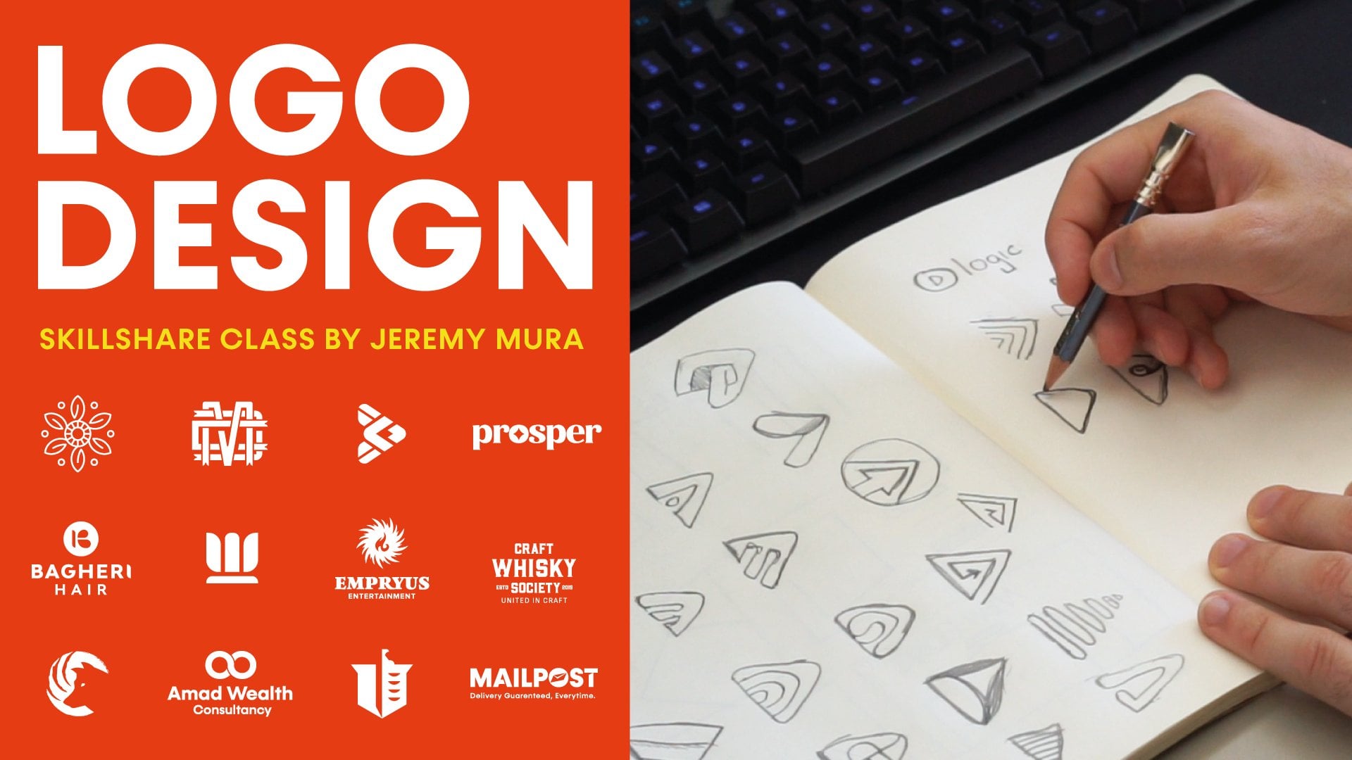
Transcripts
1. Class Trailer: Hey, my name is Jeremy, I'm a designer and [inaudible] from Sydney, Australia. In this class, I'll be showing you how to create some awesome looking logos. What I'm going to do, I'm going to be showing you my process of creating a logo mark from scratch, using some inspiration online and really doing some research and finding some in certain books, and just combining some tips and tricks, that you can use for your own projects and build your portfolio. I'm going take you through the process of some different variations of taking illustrated and using the tools in there, and really creating a cohesive logo that's going to work for any project. What you have to do is create a space themed logomark, using basic sketches, and then apply your final result in the skill ship. There it gets stack in and enroll now, I look forward to creating the most of logos.
2. What is Logo Design: What is logo design? Logos are signs, they're marks of identity designed for easy recognition. That's just what it says in the book Logo by Michael Evamy. I love that; it's just a simple definition of what a logo is. A logo is the first impression someone sees of someone's brand. A logo is not a brand identity, it's not an identity itself, it's a logo. It's a mark, it's a symbol representing a business, or a brand, or a company. See, look at these two doors. I want you to see which one would you most likely enter. Obviously the first one. It looks like an abandoned door, maybe some dirty basement or warehouse, it's got even a lock on it, and it's very dirty, and rustic, and doesn't look appealing. But if you look to the one to the right, you can see that it looks like a nice, maybe a house or a mansion. It's got some nice vines and the door looks clean. It's got a nice wood embellishment on it. It's got a doorbell, and it looks very appealing. A logo is a first impression someone sees when they come into a brand or they interact or experience a business for the first time. The logo is the first door. It's a good simple analogy. If the door looks good and appealing then people want to check out more. Logos are very important; it's not the most important, but it is one of the keys to having an effective brand. It's always good to design good logos that are going to work well for the target audience, as well as ultimately bring profit in for a business and allow people to know that brand for the future. A cool quote by Dieter Rams, he is an awesome product designer. He was from Germany. His awesome quote goes, ''Good design is: innovative, makes products useful, aesthetic, makes products understandable, unobtrusive, honest, long-lasting, thorough, environmentally friendly, and is as little design as possible.'' I just love that quote. There is so much things about design that normal people can't catch and they don't understand, but if you really know what design is, it's very important in today's age. You see design everywhere: on packaging, on signs, when we catch transport, on the train, in books, everywhere. It's very important. It's one of the key things that as humans we need in our life or we wouldn't have clear messaging on things. So I just love this quote and I thought that it would be helpful which is awesome. When you look at this, what do you see? I'm pretty sure you have already guessed it, it is McDonald's. If I added the red color, you would have probably get it straightaway, but sometimes it might take a few seconds. But you can see it's just the simple mark of the arched M, and the yellow M. It's simple, it's a mark, it's a logo, and straightaway you can identify it because that's what logos do; they identify. It's a mark that identify with a certain brand or a personality which is the key. That's just a quick example of a great logo that's obviously global and works well. Same as Nike as well, that tick, it can be used forever. It's awesome. Another cool quick quote from Saul Bass, he's an amazing designer as well, ''Logos are a graphic extension of the internal realities of a company.'' So logos are one of the fundamental things you need as a graphic designer. It's one of the main skills you need because you're going to use it whether you're working in-house, if you are doing freelancing, if you're working in an agency or doing whatever; you're going to need the skill as a graphic designer, and is very important.
3. Types of Logos: So I'm going to show you some different types of logos that are mainly and commonly used in today's age. So the first one is LOGOMARKS. I'm going to show a quick example. Don't mind the blurry images that is from Google It's just one examples in these logos, but I'll show some examples of more logos later on. But you can see this is a logo mark. You can see, it's mainly a symbol. It's just one mark. It's sort of like an icon, but it's more of an abstract logo. So these are some examples of logo mark and its most simple, it doesn't have any topography. You can see some of them has letters in it, that's true, but it's a stand alone, is just a logo mark, which is pretty awesome and they can have color, they can be black and white. The second one is a WORDMARK. So what a wordmark is, for example, you can say Disney and Coca Cola. It's pretty much a custom topography or lettering that is used as a stand alone logo. So that's what a wordmark is, it's the main logo for a Company, even a Tussy there, that's a brand, and this can be really good to get a certain type of look. Maybe it's a bigger accompany or maybe it's a vintage company and you want that nice calligraphy fill, using type gives that personality and gives that custom vintage look as well depending what you're using, but it's also can be for modern contexts as well, which is pretty awesome. Third one is a LETTERMARK, similar to Wordmark, but this one is just like a monogram. A monogram is pretty much when it combines two or three or more letters to create one symbol. So you can see E, we got the GE, we got the EA is combined. So it's a letter markers just using a few letters and combining it into one symbol, and then they can put it within a message shape. It can be stand alone or just be combined, like legal chart, top of connection with the type, which makes it pretty cool. So that's a letter mark The fourth one is a combination mark. So these ones are pretty fun to do. This is a combination with of typography and a symbol or a mark. So you can see these are the main ones adidas, Domino's, Converse, and even that KFC one, that's more of a mascot as well. But we won't go into detail about that. So you can see here, these are combined even prima one's pretty sweet. It's got a silhouette of a jaguar and then just simple bold type, and it gives it that nice sporty field, which is pretty sweet. That's a Combination Mark, and then we have EMBLEM. So, emblem is like in a badge format. I loved doing badge designs but, I can see a lot of sports type of logos do it. It's even interesting, the famous Starbucks and Harley-Davidson, they use these type of emblem style design, or you can call a badge design as well. So, this is really cool. If you want a very youthful fill and it's more experimental, more obtain and abstract, which in a maximal unique, which is pretty cool. So I'll just show you a few other examples of styles that I like. There's negative space, geometric, there is badges, there is sports type of Logos, and here's a few examples of that. As you can see the body and the top, that's a negative space Logo. The second one is the geometric, and the one on the bottom left is more of a badge style, and then the fourth one is a sports type of Logo. So you can see there's so many different styles of Logos. So that's why you always have to do your research before signing a project so you know what your client needs, and what the target audience needs as well. So you can specifically design for that and not just design anything. But that's why you got to understand the different styles. So, I'm going to show you examples of my Logos I have done in the past. This is some of the old stuff I've done, like in 2014 when I first started designing. Some of them was a bit bad, but this is sort of my better stuff. But there's heaps of Logos I have done that are being crappy. I used to even do it in Photoshop when I was only using Illustrator, and that was pretty messy. But you can just see example, and you could see I slowly improved. This is 2015 and 2016 as well. You can see I start getting into a bit of lettering and then I start again to badges and stuff. Just experimenting in some some of my clients some was just for fun. Then you could see, this is 2016, 2017 as well. So you can see slightly improved practicing, doing design more. Started getting some more freelance projects. Then you can see my logo doesn't start getting better and better, and I'm always improving and learning as well. So those are some examples of my work and yeah.
4. 10 Useful Logo Design Tips: I'm going to give you 10 Logo Design Tips that I use and that you should be using whenever you're doing a logo design, because it's very important that you try and follow these steps. Number one is keep it simple. Don't over-complicate the logo. Keep it clear and concise. Look at the Nike Logo, it's just a tick and when you look at the Macros logo is just an M. Keep it simple. I'm not saying all logo should be simple, depending on what the client needs, but you want to try and keep it as clear as possible. So when people see it, whatever age they are, if they are young or old, they will be able to recognize it clearly and distinctly. You don't want to put too many effects and drop shadows and all that stuff, just keep it as simple as possible, so that it's easy to understand and that it's legible as well. Number two is, keep it memorable. Let it be on top of the mind of consumers and allow them to remember it for ease. As soon as they look at your logo, as soon as they turn away, and if you asked them 30 seconds later what they just saw, they should be able to remember it. If they can't remember it, then your logo is too complicated. You want to make sure they remember it even if it's a week from now, a month from now. But when they see it, they recognize that, "I remember that, it looked like its a lion" or whatever it is, and they should be able to remember it, so it's got to be unique, got to be distinct. Number three is consistency. It has to correlate with the brand and the style and personality of the brand. It has to be consistent with spacing, with the balance, with symmetry, all those type of things and even hierarchy as well. You got to put those design principles into practice here. Keep it consistent. Make sure it's not all over the place, obviously, depending on what type of style of logo you're designing. But make sure it's in line with the brand and with the brief as well and you're going to obviously design a better logo. Appropriate. You always want to keep it related with the brand's identity. Obviously, you got to keep in mind that sometimes you can see on the net, people design logos and it looks like something else, it looks like an inappropriate or has a correlation to sexual images, which can be bad, and maybe they didn't intend for that, but it looks like that. You got to keep in mind the shapes you're using and every style. You're looking more on the shapes you're using and everything that you're adding into a logo to make sure that it's appropriate, as well as for the brand. If you're designing for a financial firm, you're not going to put bright yellow colors and yellow and blue and make it colorful, it's going to be a simple logo. Obviously, it's for like kids playground or something then it's going to be more vibrant. Keep it appropriate to the brand and design that you're designing for. Be unique. Avoid cliche things, always customize and explore different concepts. Don't always stick with the literal. You can always make it more of a motif or a metaphor. It doesn't have to be like a literal logo, keep it unique and avoid trends as well. You always want to customize your logo and get fresh ideas, don't copy others. You don't want to always be scouring through Dribble or Pinterest, and those things are good, but you got to keep in mind that it's going to influence your mind and your ideas and your thoughts, so you always want to try and research and go through books and go for a walk and get your own ideas flowing. Then do lots of sketches and then through that process, you're going to find something that's going to work and be unique and not just the standard logos at people directly go for straightaway. Typography. Typography is very important. You got to pick the right typeface because it enhances the personality. Sometimes if you're not doing a letter mark or a typography mark, usually there will be typography involved in the part of the brand. So it's very important that you use the right typeface, whether it's Sans serif, Serif, Script or Brush font, you got to keep in mind: What's going to be most effective for the brand and what's going to communicate the brand's values and principles, best to the target audience using this typography especially in the logo. It's got to make sure it's clean, it's easy to read, and it reflects that personality. Another cool thing is, you have to keep it black and white. Another important tip is that, you have to make sure the logo works in black and white. Don't always jump into color, you want to see in grayscale because usually in black and white you can see the negative space and the whitespace as well, and you can see if it's more balanced. Also you want to check in small sizes and big sizes in the black and white format. Then once you've done that, then you can elaborate and expand on it. Because if a logo usually looks in black and white, it's going to work in color, and it's going to work in other forms as well. So it's best to test it like this first, then go on to expanding it and developing a logo. An important one is color. Color evokes emotion and it draws the right target audience to the logo. As I said before, if you're designing for a firm or an accounting firm, you want to use colors like blue. If it's for a place that does growth or maybe it's for investments or it's a plant place, so they sell plants, then green, earthy tones like browns and grays and that type of thing, then you can use those colors. Always use the colors that are going to relate and that the target audience will most recognize. Another cool factor is that, blue builds trust and this comes into color theory. The funny thing is that women and men both like blue, but if you'd put color yellow, it's 60-70 percent of women like that color instead of men. So these are cool tips that you should know when you're doing color. You have to be adaptable as well. The logo should be able to be used in every context, whether it's on a little pin or a badge, whether it's on a booklet, whether it's on a brochure, on the web page or on a billboard or a poster, it has to be adaptable. It has to be able to work in small sizes and big sizes, on digital and on print. It's going to work on both. You want to make sure that you're designing a logo that's going to be able to be adaptable, even on T-shirts and everything. You got to take that into consideration. When you designing, make sure the process have the flexibility to actually edit it and always change it in case things come up and you have to edit things as well. Remember, it has to be adaptable. Now lastly, it has to be timeless. Longevity is important. Don't design fads and stay away from the cliche trends and logo trends because they fade away. Sometimes it's good to practice for that, but you want to keep it timeless, especially if you're designing for bigger brands, you want that logo to last forever. You don't want them to keep changing the logo every year or every two years. You want it to last for five, 10, 15 years before they have to update it. So keep that in mind as well. You want the logo to be timeless and it's going to have an effect on the overall brand success.
5. 3 Logo Design Keys + Tips: I want to share with you three key logo design tips, and some updated things that I believe are really key when it comes to logo design. A logo is not a brand, it's one piece of the puzzle, a logo is just a symbol, it's a mock. The thing is, it's a small piece of the overall big picture, of a brand or a business. We need to treat it like it's not the end of the world, if it's not the best thing ever. You want to produce good quality, but remember, it's only a small piece of the puzzle. I love using this illustration of an iceberg, you can see the top of the iceberg, you've got the logo, it's just the very tip. Then under the water, which is 90 percent of the iceberg, because above the water is typically 10 percent. You can see it's messaging, brand assets, strategy, the business model, ideal customers, values, goals, the mission. All the big-picture thinking, the systems, the processes. All those elements make up the full business and the full brand. A logo is just one piece of the puzzle, but the puzzle was made up of all these other assets and things like that, that connected all together. This is a good illustration to remember: a logo is just a small piece, and it's only the tip of the business, the first impression, and that it's really key that you get it right. These are three key things that I've learned from Sagi Haviv, he is a logo designer and he has designed brands like National Geographic and also led the US Open and things like that, and it's really awesome. I've learned these three tips from him, he talks about a logo should have three things. It should be appropriate, what's the feeling, the personality, is it appropriate for the audience, is it the right audience and what are the goals. Is it distinctive, is it unique, how ordinary is it, does it stand out in the market, does look different from competitors. Then number three, is it simple, how simple is it, can it be remembered, is it memorable. How can we reduce it to a point where it just the necessary elements to have that simple, clean logo. These are the three key ingredients for a great logo: appropriate, distinctive, and simple. When you're working with a client and maybe it's for your own business, here are some questions that you should be asking yourself, to really define how you're going to approach the direction of your logo. I've put seven questions here. What do you think about your current Logo. Why do you need a new logo. Do you think the current logo has recognition within your audience. Who is your ideal customer or audience. What is your vision for the future of your business, in the next five to ten years, or what is your ideal future desired state, let's always look in the future. Number five, who are your competitors. The next one, if there was a single idea or feeling that can be distilled into your new logo, what should it be, you talk about descriptive words, in how you describe the look and feel of that logo. Then the last one, what brand logos do you love and hate. You can get some inspiration from other brands out there. Here are some logo questions for some inspiration, to help you really, start to guide, why do you need a logo, what are the next steps. If you're working with a client or maybe it's for your small business, then these can really help. Here is another really key point I believe as well. A logo should not be subjective, it should be objective. It's not about what the designer or the client likes or dislikes, it's actually about the ideal target customer, and how they'll respond to it. Whenever you are designing a logo, think objectively, try not to put your own bias and belief system on it. Think about the end customer, the end-user, how they will react, how they will respond and think about them. Don't think about you, leave your ego aside and try and be objective. That's why asking the right questions, will help you clearly create a logo that's going to be effective, and work in the marketplace. Then lastly here, always present logos in context with relevant mockups. You always want to show the possibilities, the potentials of the actual logo itself. If you're a designer presenting to a client, you want to show it in things that they can actually use. For example, a business card or maybe, you're working for a restaurant and they want a menu, then you can design a nice menu, which is really cool. That's just a few examples, but always use mockups that are relevant to the project and to the end goal, and to the real-world application.
6. Is a Logo a Brand? : So is a logo a brand? People always assume that just by having a logo or some topography, some colors, makes your business turn into a brand magically, but that's not the reality. I love this quote from Marty Neumeier. He says, "A brand is a person's gut feeling about a product, service, or organization." Marty Neumeier has so many years of experience, he has been in the industry for over 30 years and he's worked with big brands and companies, so he knows what he's talking about. A brand is an internal thing, it's internal mindset, it's the person's gut feeling intuition, and it's how someone perceives a brand. It's all about perception, that's why I love saying this quote. So let's look at Nike, for example. Nike's logo was created for only $35 in 1971 and it was created by Carolyn Davidson. You can see, this was the pretty much first innovation or first design sketch of Nike. You can see the pattern there as well. So I just got this image of Google, which is pretty cool. Literally, [inaudible] it was a simple logo, very basic, but it did the job. But the logo itself is not a brand, it's just a mark. What happens is over time, you can see that the Nike logo develops from 1964 all the way to now, we have a simple just that swoosh tick mark that's so iconic in today's world because it's so used to it. Over a long period of time, the logo starts to form in someone's memory. It actually starts to form in the brain and the mind and they get used to it over a long period of time. Realistically, no matter what logo you do, over time, it's going to have an impact anyway, and it's going to be implanted in someone's memory. Obviously, you want to design an amazing logos and create a great design, but it's not everything. You can see here some of the ads that people do and something that Nike has created, the website, some posters, and just their messaging and you can see Just Do It there. What happens is when you mix the logo and you mix it up with the brand's identity, what tends to happen is the distinctive brand assets mixed together with the values and messaging of the brand sticks in the consumer's mind over many years of exposure. As you can see here, we have all of this and the logo itself with all these creative outlets and imagery and every time it forms in the consumer's mind. So a logo is important, yes, but it's not everything. Think the big picture. Think how every part has its role and plays its part in the big picture of forming that brand image in someone's mind.
7. Logo Case Study: I want to show you the example of a great logo design done by Pentagram, and by Michael Bierut, awesome designer. Their team created a logo for MIT Media Lab, which is in Massachusetts. You can see the old logo here, and this was the new logo here on the right. This on this site called Brand New. I love it because it shows the process. A good logo should be adaptable, it should be able to expand into the whole brand. When you start off with a good logo and you design it well, then it'll be used in a variety of uses and it can extend to all capacities. That's why you want to make sure you logo design is always well done. You can see here they just used a simple grid. They used the grid from the old logo as you can see here, and they applied it to that new logo. What they did, they just kept it simple using just a simple strike and type. Then what that did was allowed them to use that grid and use it for multiple uses. You can see here was the main logo just like that. Clean, simple, balanced, symmetrical, and has appropriate white space and awesome. You can see some different ways of using the logo here. Because MIT is such a big brand and had many departments, you can see now how the logo bodies in that grid extends into multiple other logos just like that. You can see here they use it for everything and is really awesome. They can use a wide range of acronyms for each of the research groups as it says there. It's powerful. You can watch a little video there. They even use that same grid and built a topography phase out of it, which is awesome. They put their own type base, which is super cool, just from that one logo. See that one logo it expanded into all these characters in other things. You can see there they've built even an icon set from that. Then you can see some of the branding, the print design there. It's just simple, simple logo, a simple ID and concepts, that actually flows and works well. You can see that the uses is being used in the actual place. Patterns on the walls, some posters, even a cube. Then you have it. Just from one simple logo that's adaptable and flexible, and they did the research and they worked on a lot, it can be very great. Logo design is important and it's going to have a big impact on your portfolio and it help you grow as a graphic designer.
8. Finding Inspiration: Logo design is so much fun and it's interesting because you can find inspiration anywhere in your world. I usually always carry my phone with me or a camera and just take photos when I'm out with friends or if you go out for lunch, or even if I'm traveling around while doing some work, I'll always pay attention to my surroundings. Whether I'm in the city or in the country, it doesn't matter. I'm always ready to take a quick picture. If I see some cool type or if I see some nice colors, you always want to be alert. That's where you're going to find the best inspiration, not online, but when you're out in the world, I'm going to show you some links that I found useful. I've got plenty of links, as you can see, I've got all these photos up here in my link, in my crime, but I just so my Instagram right now. You can see, if I scroll down, you can see how I love batch style logos. I love simple, minimal logos, love logo types, different marks. Here there's so many different types of logos you can create. So I'm going to just show you some things that I use. One of the first ones is Pinterest. I love using Pinterest because it's easy just to check your images on there, as well as adding photos online. So you can actually download the extension that allows you to just quickly upload photos from other websites and make a quick board. It's good for mood boards, inspiration. You can see here is a different styles that I love, anything, I like. You can see here this is like batch style logos, which I love doing. It's the best when you want to play around with typography, or you want to get a retro vintage field. So that's really cool. You can see I have another logos design bolt here as well. It's so good to explore and get inspiration from other designers and see what they do, learn of them, as well as experiment yourself. You're not going to get good unless you practice and experiment and play around with stuff. There's no rules. Just do your best and just play around and get better. When I first started my logos it looked pretty bad, but then over time my ideas started evolving and my thinking patterns started getting better. Another inspiration is dribbble. Dribbble is amazing. It got the best designers, a lot are visual design. Sometimes it doesn't show the thinking behind it, but it's okay to look at it. It gets them inspiration. Then always spent too much time on here because you're not going to learn anything. So you can see here's some of the people that I follow. You can see he got some logos. Quote someone aligned Tavistock [inaudible]. I love illustration as well, but I love scrolling through here, if lacking some inspiration, I will just jump on here really quick and then type in some tags at the top. You can type in some tags here. We'll find something cool. Another thing as well, is getting some books. Logo Design Love by David Airey is an awesome book, you can see here is a quick video. He just shows you some stuff in there. It's a highly recommended book. I recommend you get that as well as a few other ones that I'll mention later on. logopond.com is awesome as well. You can see I love how he got some featured legacy. So you can scroll a lot of great designs. Oversee it another context. Sometimes people just make logos for fun. Maybe it's for a client. The cool thing is that you can actually filter it through this. So you can see, if you want to see a students who work you'll click on that. It's actually going to filter through that, so you can see all the students' works. If you want to see client work, you can click that and filter it all out. You can see it's a bit slow, but this is how you can see and get some inspiration that way. Another cool thing is logolounge is another popular one as well. You could actually get an accountant here, but I think it's like a $100 or something a month. It's called great designs. This is more professional. For the order type of crowd that use this, but you can see he got logos. You can also click upheaval, different logos and you can even look at the trends as well. So you can see here look at the sign up, if you want to upload your logo you'll see more. You can even click on trends as it'll show you all the latest trends. As you can see that I had been doing it for a while. It's really awesome, you can learn a lot from them. Another cool side is logo inspiration.net. This is pretty cool as well. Can see he just got some inspiration, even branding. You can search by categories as well. So I'm going to categorize it can get logo types, and then I can just look at any one of these. So maybe I won't let him mock type of logo. It should load up. As you can see, let a mock type, boom, you got some awesome logos. So they're nice that's taken some inspiration there. Another good one is xyz.com. This one purely focus on logo design, but it's a bit of a mix, but I was stopped in logo design in the search bar and so it popped up. So you can see. A lot of it will show you the design prices they go through whoever writes the post. So this is another one I love. I'm just going to go to the main page. You'll find some different stuff here. So they do a lot of mix, mix of everything, but there's just a few blogs that I follow. Another one good is creative block. You can find some logo design TFC. They also recommend books and programs and processes in videos and tutorials and everything. I love this one. I always learn off these when I was in college, this is one of the best bugs that I always follow. So right now I'm going to show you some personal design that I love and follow. One of the main ones is Aaron Draplin. He's awesome. I've learned a lot from him. His book is also really good as well. I think it's everything in Draplin. We're going to use the DDC book. Yes. So pretty much everything aren't Draplin, you got to get that book because it's really awesome. You can see artist work on his work and you can see all his logos, his past clients l because it's just simple. You know, it doesn't have to be complicated. You have a simple concept and you work with it. You come up with many ideas. It's not always your first ideas that are initially going to work. It's the bad ideas that lead to the good ideas, and I love how this puts up most of these identities and so sweet. So you can get some quick inspiration, not just to copy them, but to get some inspiration and see how that playful and what he's done, which is awesome. Another cool one is Allan Peters, he's awesome as well. Last one is logos page. I love these ones. This is super cool. A really well designed. It's a professional, the designer has been doing for many years. I love this type of logo design. A lot of the logo designer I follow from America, which is pretty cool. Second to see, they're scrolling through just looking at these logos, which is awesome. Another one is Von Glitschka. As well. I've learnt a lot from him. He's got really vector-based style, which I like, and it's very illustrative as well. So you can see he doesn't make some stuff. He's got logo design. Then he does a lot of the illustration, but you can see some of these logos, I can see it's so awesome, really well done. He knows what he's doing. It's perfect. So here's another designer I follow. Another popular one is Nick's slider [inaudible] as well. A lot of people may know him from Tupelo, Instagram, but he's awesome. He does a lot of bad style logos, which I love as well. He experiments and plays around. He's always learning and growing and it's awesome to follow that. You can see here this one is portfolio page. You can see different stuff playing around with the type, playing around with monoline logos, badges, awesome stuff, a lot of that. That's just some inspiration where I got to look online. Some blogs, some places to build up my own mood boards inside that on Pinterest and then also designers that I follow. The best thing to do is use this inspiration and it's going to really build your mind and your thinking. It's going to allow you to draw ideas from, not necessarily copy, but it's going to help you build up yourself and build up your portfolio too.
9. My favourite logo designers: I want to show you some of my favorite logo designers that I've been following at the moment, and they're really awesome. The work is top-notch. I just want to share some of these link with you. So the first one is Jeroen, and he is from the Netherlands. I don't know how to say his name properly, but he's really, really cool. He actually has a Logo grid course as well, which is cool. But his Logos, are clean, great for tech companies, very professional, great color palettes, and very innovative. So you could see some of his logos here, they are really, really great quality. I think they are great. Number two is Yoga, this is his Drupal account. He also go to Instagram. So you can see some of his Logos, he's got a distinct style. Using gradients and light and shadow to really create some awesome Logos here. As you can see some of his sketches. The way he likes to create icons as well. Like that one, that's cool. He also uses some [inaudible] stuff. So this is his work. I think it's really amazing, and it's a really distinct style. Number three is Monika. She's from Europe as well, I think. She's got a really cool style, she loves black and white and I just love the mocks she creates. Its very abstract and even topographies. You can see some of the shapes, just very intricate. I like the way she presents them, just simply presenting the logo mock. You can see some simple ones with the topography. They are tight mocks. That looks cool as well. So she's on Instagram. You can follow her, and I think she has an amazing account with amazing design. Steve Wolfe is another one that I've followed for many years. He's got amazing work. Better zoom in there. You can see here, Austin FC, that's amazing. Hive, Artist for education, Via Citrus, that's cool as well. So plenty of amazing design logos, packaging. That's really cool as well. Obviously if you go for the work, you can search him out. So this is Steve Wolfe.co. You can check him out. Their design studio based in the US. I think they're awesome. Marcus. I don't know how to say his last name, but he's really cool as well. He's got a great project. He recently did Alison, like a beauty brand. You can see how he presents his logos. They're really nice and simple, very logical, and they present him with great mock-ups to support that quality. So overall, I love his mocks. He is more of a balanced Logo designer. He loves mixing type and Logo mocks. He did one for Bent Hansen, which is like a furniture place. You could see how he constructs everything, I just like the presentation there. You can see before and after, really, really well executed. It's a great job, as you can see there. So you can check him out. Awesome Logos and design. Another one of my friends is Bless Creatics. He is a Logo designer as well, and he's been designing for a while. You can see some of his presentation here. Look at these very elegant, very beautiful. As you can see there. Love that, that's really awesome. He's got another one here. He's an all-rounder. He loves creating different types of Logos for brands and stuff. Then you can see he does some challenges. So, playing with type on the letters in alphabet and typography. Really, really cool. So that's another one. Connor Fowler is another one as well. He does really great work. This is a recent identity he did. Amazing stuff. This the logos there, [inaudible] , local logo, construction brand. You can see the electric cubes really cool. Whole range of different types of brands, and they get some of his mocks here that he's done. Really solid designer. Another one is Jonathan Rudolf. He owns Logo inspirations. That channel has over like a million followers on Instagram. But he really loves doing. He has a passion for like logo design, and he loves doing, redesigning logos that have like look outdated, and he updates them. He shows you like what's working, what's not, and how he like improves logo. So I love seeing those presentations. He's going to fit a few of those, so I think they're really good. Then also some custom original designs. So he's really awesome as well. Peter's design Coso, Allan Peters. He's a great designer as well. I think I've already showed him in one of the other modules, but you can see his logos, he is just amazing. Bright, bold, simple, just elegant, distinctive logos. Like just amazing. Like the City of Eagan, like this that's powerful right there. You can see how they utilize a logo there in real life. That's like a big logo for a city. Badges, amazing badges. So just a perfect execution. You can see here, and I just think he's a great designer. He knows what he's doing. There is how to execute and present really well. So many different designs here. That's really cool too. They've got some pins on. That's amazing. So he's an already good designer as well to follow. Another one is gardener design. So he's Bill Gardener, he runs Logo lounge. You can see some of the packaging, you can see some of that stuff. I'll click on work. You can check out some of their logos. Really powerful, great work. For example, let's just go through and click Krystal. Just amazing. Look at that whole smock. That's crazy, and custom type. You can see that, it's so interesting. Really great mock and they have a great team. I think that's awesome. So definitely check those guys out. Chermayeff Geismar, and Haviv, so psyche Haviv, you can see he works for this company. They got amazing logos and some are really iconic ones. As you can see, mobile. You've got, let me scroll back up Us Open, National Geographic, Animal Planet, Showtime, top-notch big companies. So you can definitely learn a thing or two from them. Hoodzpah design. These guys are from, or should I say, yells, they're from the US. They really have great identity where like a logo design, and they have a YouTube channel as well they show their process. You can see that. That looks amazing. Really great design work, and they've got plenty of other stuff as well. Maybe if I check out, the Instagram, you can see we've got really cool stuff. They have a retro vintage vibe and you didn't see that much. So that's why I like following them. So you can check them out. The hoods betweens. Lastly is Paula Scher, she works with pentagram. So you can see some of the work here, and she's worked on some of these projects. So you can see a little cool stuff, tender green's. There's plenty of logos here, but she's really inspiring. Just click on one of these ones as an example. So you can see some of the design work. That looks awesome. So definitely check them out. So these are some of my favorite Logo designers at the moment. I recommend following them. You'll learn something and I just think they really inspire me, and they're really great designers and I think it's really amazing.
10. Book Inspiration + Tools: Here are some books I use to find some inspiration and some tools I use when I'm doing my sketches and designing. The first one is, How to by Michael Bierut. It's an awesome book. He shows you his branding processes, all the big clients he has worked with. It also shows some good logo designs in them. It shows the logos in context as you can see here. I love looking in here. Looking at his process in the way he thinks, because that's how you learn of those people who have actually worked in the industry. You can see here's just some examples of some good identities and logos which I love to look at and see them in the full form, which is pretty awesome. Another good one is Pretty Much Everything by Aaron Draplin. I love his design style. His vector-based style He's an awesome logo designer and in his book, he's got all his life's work. You can see his sketches, his logos. When he goes junking you can see all of the patches and stuff that he's got for inspiration. You can find symbols in there, color and I really just learned some tips and tricks of him as well in that book. So it's really awesome to check it out. I love how he shows his process from some client work he's done, and even the basic sketches that he does. See a logo to start with a simple idea it's not complicated, it has to start off with one simple concept and then you break it down and create a nice logo and symbol from it. You can see here just going through for some inspiration. I love this book. It's a must buy if you want some inspiration. The third one is Logo by Michael Evamy. It's got some cool information in there as well about logos. But the book is just full of different symbols, logos, logo types, letter marks. It's full of everything, so I love it. If you want a quick inspiration. Most likely all your ideas most likely someone's already done in this world. It's good to just go back and just get some little tips and see some little patterns that you see that you can actually use in your own modern logos today. I love this book. It's really just a quick burst of inspiration and looking at all the types of different logos in here. As you can see, it's got some cool ones and I love it. Here are my few tools. I use a too big mechanical pencil, the lead lasts longer and you can actually have a nicer grip. Then I just use a copic liner 0.5 thickness just to go over my lines to give them that nice hotter look. Just a simple eraser, and then I use a 2B pencil with a plain most [inaudible] notebook.
11. More Logo Book Inspiration: Another one is a book of ideas by Radim Malinic, he is from the UK and his work is amazing. He loves doing 3D stuff, playing with topography, different types of layouts, and you can see some Logo and icons here. It's a really great book for design inspiration. He shows you his work that is worked with in the past, and he also gives a tip in each chapter. That's a really, really cool book. Another one is Logo design Love by David Airey, he shows you his sketches, some client work he has done, how he approaches the process of designing a logo from start to finish. Overall, it's got a lot of practical advice and he answers many questions that beginners have. It's a really great book to see his process of working and to see all the little details, its a really great book. He just flicking through here and you can see some of the clients as well, that's Logo Design Love. The next one is from Radim Malinic as well, this is his recent book, it's called Book of Branding. He has just stunning work, a lot of 3D stuff, he shows you how he lays out his identity designs, your typography, color, texture, packaging work as well. He's a really cool website as well. He shows you a lot of this work and he also gives his personal tips. You can see I've highlighted some stuff in there, beautiful icons, and logos. He just breaks it down and keeps it simple. If you want inspiration, I think this is probably the best one to get out of his collection. It was a really good one and I think it's going to really inspire you to start creating more That's the book of branding. Second last one is Identity Design this is from David area as well. He's just a really great professional and he's from the UK as well. You can see some of his great work. It's very text heavy in this one, but he also shows you real live projects he's worked on, and it's just really professional. It looks great, great layout, great packaging, and he talks about some of the process and things he's learned along his journey. You can see here some examples, some smoke ups, different types of clients. You'll get really inspired by this one, it's really practical and I think every designer should have this one. I like how he's got a range of different types of projects from like different industries, like fitness, and stuff like that which is cool. Then last but not least is Logo Modernism, it's a huge book by camera, I don't have a wide lens with amendments it has to say the full thing, but it's really big. I'm just going to flip through here and show you some logos. Just like hundred and thousands of logos over the past, like, I think 60 to a 100 years.You're going to see a lot of abstract mocks and shapes in creative ways and probably logos yet you've seen before. If you look through it, you're going to find amazing inspiration and just crazy logo marks. It's a must have for designers.
12. Sketching Ideas: Before I start any logo design, I always jump into sketching first. Never jump into Illustrator straight away because it's going to actually cause you to waste time. You always want to spend more time sketching, getting out your initial IDs, and then brainstorming, exploring because with your hand it's more free hand, you can flow with it, you can be rough you don't have to focus on the details. That's why I love sketching, and what I do first is try and write down some words, which I did on the other page and making connections. My idea was doing a space camp. Think of camping from space, rockets, planets, like all these rather these things, and I make connections, and what I'll start to do is start to write down in capital letters, in lowercase letters, and using the SC as a monogram, and that's why I started to see on the left page, you can see that. That's what I first thought to do such as to write out things. Just be really roughing and quick, it doesn't have to be crazy. You could just use simple shapes, simple letters. But maybe if I wanted to go not a letter mark, but more of a symbol or a logo mark. I started sketching out some astronauts helmets and some planets and rockets and trying to incorporate the whole logo, the word mark and maybe abstract of logo mark together. That's what I tried to do, and you can see here, I just explore and always sketch. It's going to improve your drawing skills the more you do it. But always try and aim for a few pages even more, and this is a crucial presses when you're doing your logo design. Then as you can see, here as I start to finalize it, I start to focus on one ID and I start to blow it up and make it bigger, and then what I'll do is I'll take a picture of that and bring into Illustrator and start to work on that. Yeah, you get sketching and start to work on your projects.
13. Creating Logo Mark: We're going to be working on these awesome logo, you can see this logo mark there, it's just a simple mark here, and then I've added some topography which I customized as well, just to give you that extra touch and to clearly identify what the company or businesses, I'm going to show you how to create these. It can be different, whatever you're working on for your project, just keep the theme around space and work on it like that and what we're going to do is just go to file at the top left corner and go to New and we'll just open up a new folder and we going to call it, SpaceCamp because that's what my company is called and you can say I'm just doing it, 1,920 by 1,080, leave on RGB in points. That's pretty sweet. You can see here I've got my art-board and what I want to do, I'm just going to drag in my sketch. What I went for, I went for a more of a Spaceship instead of an astronaut head and all this other sketches, that's why it's good to do a lot of sketches so you can get some ideas and you can see here, I went for this one here. What I'm going to do is just create a box by pressing M and I'm just going to create clipping mask, so I'm going select both of these and get object clipping mask make. I can just keep it that I don't want to look at all the other stuff, I just want to have this mark by itself. What I'm going to do, I'm going to malaise panel and just put that on another layer. I'm going to double click and just rename that sketch and I'll probably lock that sketch too. You click this little spot there and it's going to lock that layout, so it's locked. I'm going to make a new layout and we'll call it Spaceship, and I'm going to press Control or commands R, and this opens up my rulers, as you can see here, and I'm just going to drag like that holding left-click, and what I'm going to do, I'm going to press Control Alt semicolon, just to unlock the guide, now I can select it, and then I'm going to P and select the alignment to sensor the guides. As you can see there. So now we have senate guides in the middle of the art-board and we can start to use these to create a symmetrical logo. We know it's going to be fully neat, and then numbers on the control semicolon to lock those guides again. You can see that everything's ready. What we're going to do is I'm just going to start off with the triangle. I'm going to my shape tools on the left here, I'm going to right click and then go to the star, and what I'm going to do is hold, left-click and drag, and then I'm going to press the down arrow key, and what that does is it decreases the sides. If you press up it increases the sides by if you plus down, it's going to decrease it. I'm going to hold shift, so it's going to be in the middle and let go, and then I'm just going to select a bright color, will just get that on your channel. You can see that we've got a triangle here, and the reason why I went for a triangle because it's space camp, I thought of like a tent and all that type of stuff. I incorporated a tent usually is just a natural shape of a triangle, and it usually has an opening in the middle, that's why I went for more of a negative look for the logo, negative space, and that's what my thinking was for that I might make this a little bit wider, so I'm just holding Alt. Well option if you're on a Mac and just dragging this out, it's actually widening that triangle a little bit. That's pretty cool, what we're going to do now is start to work on the spaceship and I want to make it just a bit bigger. But it's dragging out the sides and holding Shift and O. What I'll do now is get the pen tool, I'm just going to stop the strikes. Get the pen tool by pressing P, and you can see my mouse is changed now, and what I'm going to do now is just go through here and slowly holding shift just to get that nice curve. You can see I've got that nice curve because there's two anchor points, you want to minimize the amount of anchor points so it can be as smooth as possible, and whilst this is still selected like this, I can just hold out and shift drag the handling because I don't want a big cave, I want it to come down here. Then I'll left-click on the point to get rid of the handle and hold shift to get that split like this, and then I'll connect it like that. You can see they've got a Spaceship there, and I'm going to start to build out these other parts. I'm going to get the pencil again, press P, I'm going to build out this wing, and you can see how that purple, you see this purple line, that means my smart guides are on so it's recognizing the points there. I'm just going to do this, we're going to connect it later on, and to get your smart guide, you can go to View, Control U, it's pretty handy, and then for the window, I'm willing to hold, press L for the ellipse tool and I'm going to get a circle out and holding left-click an Option and Shift O, it's going to drag up proportional circle like that. I had that in the middle, and then for the fumes or the gas, whatever you want to call it, and I'm just going to click there, hold Shifts, click, click, click. So I have this one piece here, that's all the main pieces we need, and what I'm going to do now is select these three pieces that I created, and I'm going to press O for the reflect tool, and you can see your mouse changes and I'm going to find the center point. That's why we have that guide so we can find the center, and I'm going to hold optional or left-click once, and you'll get this box pop up, and what I can do is just press preview, and we're going to flip it vertically. It's going to flip it on the other side, we know it's going to be symmetrically perfect. I'm going to press copy, and now that we have it, you've got those two spots that we need or our shapes. I'm going to go to my transparency, my path finder tool. If you don't know how to have been that got a window path find out down there. I'm going to select these too spots, press Unite, and I'll select all these other points as well. What we have the do, all these united it, but we've got to get rid of this middle strikes, I'm going to select that, just delete that, and you can see these two points. It wasn't aligned, I'll just align that to the center, and then I'm going to select it and get the object's path and join. That's going to connect it, you can see that it's one point now. Sometimes you just edit as you go along, you can see here this is messed up, let's delete that, and we're going to click these two and then we're going to actually want to delete these two, and you can see that it's not connected. I'm going to set these two points and go to path object path try it again, you can see that's joined there. Also we have our Spaceship ready, and what I'd like to do is extend this art-board, I'm going to get my art-board tool extended out, and what I'm going to do is I'm going to select all the strikes and drag this out by holding option and shift, and we can see that I can turn off my guides. I'll just turn it off and also change the color of the stroke. You can see here I've got all the strokes and we're going to start to play around with it. But first I'm just going to get some color. A good place to get a color is if you go to color hunt and you can see you've got some awesome colors that we can play with, and you've got some nice purple, even bright colors. It got some awesome colors, I'm going to stick to the colors that we used before. I'm just going to quickly do that, I got my colors here, I'm just going to go to my swatches, select unused, and delete those. Now I can just select these and then press the group button and make sure this is ticked. Press Okay, and I will just make this one to, we've got our colors there. I'm going to use these purple colors that we have, and the reason why I did purple is because it's an advance space so. Purple usually connotate some magic in uncommon things, it's an uncommon color. It's bright, it's not spiritually, it's sweet, it's cool, It's exciting, and it adds that little bit of magic to it and the unknown that's why I pick that, and also with the yellow, yellow is a complementary color to purple. They work really well together and has a nice contrast. We're going to use that. What we're going to do, I have the stroke C, and what I'm going to do now is select it, and I'm going to press Shift M to get the shape of the tool up, and I'm going to hold Alt and just drag down to minus the section off. Now you can see we've made some negative space, what I'm going to do is copy it across again. Because if we want to make changes we didn't just want to do on that one and we want to always have a copy there so we can go back, and what we're going to do now is I'm going to round it off. I'm going to select this stroke. I'm going to press A for the direct selection tool. You can also select it up there, and you can see these round corners. That means this little white bowl you can actually drag it in and it's going to round that off. If you want a little bit around or hips rounded, you can see that at it's rounded up like that. Because maybe the SpaceCamp, I'm aiming at is sort of at a younger cloud and it's all about like learning about space, and it's like an adventurous thing. I don't want to make it to sharp, I want it more rounded and then once again, I will copy that across again, and then now you can see if there's any excess stuff to get rid of that and I'm going to select that now I'm press shift X, and I'll select the circle press shift X, and then I can just group these together. Now it's grouped or instead of grouping that you can actually go to path finder and unite it. Then it becomes one shape as well, if I change the color, you can see that, this is awesome. What I'll do now, I'll just make a separate art-board, with the art-board tool. I'll drag this out. I'll make it white I'll press M and I'm just going to make it quick background, using dark purple and then to bring it to the back, you got to object, arrange, bring backward and that sends this to the back, and then we have our logo mark. I'm just going to make it smaller and I'll center it. Then we have our simple logo mark of our Spaceship, and then we can work on some topography next.
14. Adding Typography: What I usually do when I'm working with typography. So we've got a simple logo mark. You can stop there if you want, but I usually try and add the type as well. Even though we're not going to focus on customizing it a lot, and making a custom letter mark, we can still play around and learn some tips from that. I'll press t for the type tool, and left-click, and then I'm just going to scale this up, so you can see that letterhead, or we'll just make it like that. I want to bring it up and just make it white, and then what I usually do, I usually type out the name, and then a cool trick is that,you see how it's lowercase, you can go to the top left corner, press type if you need kink, and change the case and go uppercase, or title case, whichever one you want. Just like that, and it can change it like really quickly. What I'll do, I'll go to my text panel and my character panel, and I'll stop flicking through some typefaces. I already have a few in mind that I think will be useful. You can even use free ones like Bebas, try that one. Another style, selecting ones that I feel could work, that will get DDC. Obviously as you get better as a designer, you will know what works and what doesn't, and I'm trying to go for a sans serif look, because it's more of a bold modern type of logo, so it will fit nicely with that logo mark. Like if you use a brush or a script font, it will look too feminine. So you got to keep that in mind when you're selecting fonts. I'll go through, and once you start to know your typefaces more often, then you know how to pick. So I've picked Jaapokki, that one's pretty cool, and some of these are free, some of these are not. The top one's not free, but the rest are. You can see here I've already just jumped, laid down on my type, and I'm already starting to see which ones is starting to work. So you can see Bebas is a bit too condensed. The DDC hardware, it's got some nice curvature, but it [sic] think it's a little bit too thick. I like this font as I used before, because it's got that nice point, but it's also got some interesting curves in the letters, and then you've got Jaapoki, which is cool, it's got custom letters already there, and the E there makes it more intricate, more abstract, as well as you make it stand out a little bit more unique, but then we can customize that and make it work. What I'll do, I'll just select one of these, and I guess we'll select this one up the top here, and we can customize that, because I like this M, how it flows out like that. We'll use that one and then I'll just move these ones to the side, and I'll just bring this out, and I'll just make copies of it. I'm just holding Alt and shift and it's dragging copies out, and I'll see what it looks like. The key to type is that you always want to customize it, you never want to just leave it like that. Always try and customize your type when you're working with logos, you know, because anyone can just slap a typeface up, but you don't want to do that. You want to actually design and customize it. I'm going to type and just scroll. So I'm just playing around with the words. As you can see there, I'm already starting to see some things that I want, some things that I like. So you can see how the typeface looks, and then zoom out and see how it looks, and if you can print it out, print it out. So you can see there, I like it being all caps, which is better. I'll use that, and I don't think I'm going to use that color. That's not really the viable going for here. I want it to be clean and simple. So I'm just going to stick with this typeface for now. What I'm going to do, I'm going to make it a bit more bold. I'm going to go to the Type, Styles, and go Black, make a little bit bolder. I'm going to hold Alt option if you're on a Mac, and I'm going to press right arrow key as well, and that's going to bump up the kerning to give it some more space, and more breathing room. What I'm going to do is, we're going to edit this, so I'm going to close that and go to type, and create outlines. What this does, it's actually turns into a shape, but before we do that, I'm going to make a copy of this, so we can always go back to it if you want to edit it. So I'll select it, go to type, create outlines, and you can see there that it's all shapes now. What I can do, I can ungroup it, if I want, by going Object, Ungroup, so then all the shapes is separate, and then I can just go ahead and edit it. I want to edit these A's, because I want that pointy look, that pointy just triangular motion, it's like pointing up. So it's like a rocket. It's like you're moving forward. It's like a space can you can crobe, and that's the thinking behind these design decisions. So I'm going to get my pen tool and I'm going to just use these anchor points as help, and I'm going to left-click, left-click, left-click, and boom, like that. Then I'm going to get my eye dropper tool and just select the background color, and you can see now we have that shape that's covered up. You can see how it's a little bit bent here? I don't know if you can notice that, but it's not completely straight. We can also just go from here and just make it, as you can see, that space there in the middle, it's blanked out. We can edit and do it like this if you want, and cut that out, or we can just fix it up. That's some ways you can do it, but we can just leave it like that for now and I'll just copy this across to over here. So over here we've already customers our type, and I'll just make another copy. Select it all, just copy it, and then maybe we want to edit this. No P, you can even put the rocket in there if you want, or even just make it a circle, just to customize that, so it's like a planet, if you want, or you can just leave it. What else can we do? As I'm always trying to think of connections. What can we do to customize the type? Maybe we can extend this out, drop that down. Now play around with it. You can put it on the bottom here. So it's all about like playing around customizing the type, and seeing what you can do with it. You can even probably extend these out as well, but I'm kind of liking it so far. I'll make another copy. I think I'm happy this. So what I'll do, I'll just scoop these altogether, and what I'm going to do is select it, and I want to make it transparent and get rid of really shapes. I'm going to press Shift M, and just minus these shapes off like that. Holding out minus, and then for this one I'm just going to not hold option, or Alt. I'm just going to select this like that. It's going to plus theses shapes together. Alternatively, you can get a pathfinder and press unite, and that's going to unite them together, which he's probably been option. You can see there, it's all one shape now, and I'm just going to drag this across and make it smaller. Maybe you want to have it like this, or you want to have the logo mark dominant. We can have it like that. Just like that. There you have it, there is our logo, and just playing around with that logo mark, and simple typography in customizing it, we've created a custom type that works well. Just by making a logo mark, and using some typography, you can create some simple logos that's going to work for your client, and that's going to boot your portfolio up.
15. Extending Logo Mark : I'm going to start to experiment with the logo. You might be happy with that. But it's fun to practice and experiment around and come up with some different variations to present to your client. I'm just going to copy this across. I'm going to start to use these. First off all, stop playing around with color. I'll start making copies of it. What if it was all yellow? What if we had white? You can see that I'll make it smaller and see what it's going to look like. What if it was all purple? So you can see there. Then I'll start to test the logo by itself. Maybe I'll press "P" for the Pen tool, just to play around. I'm going to make a triangle. Then we use a shape able tool just to minus that off. So you can see, maybe you want to multiply that. So when you start to just play around, but also think about what you're doing about your IDs. Maybe I want this well perfect, purple, and see how it looks like. It's also good to work in white. Then will just jump to gray, see how that's going to look like. So very quickly we can start to see different variations and then you can present it like that. So what if a client liked the color version and then obviously if you saved it, you won't just have this one version. You'll start to save out like a black and white colored version, just the icon itself, what if the logo mark was within a circle as well. So I'll just copy these. What if it was within a space? I'll bring that to the front there. So what if it was like that, would it work? If I extended it, how would that look? So you start to ask yourself questions and start to see how it can be used. Like even that's pretty cool. But as well as you want to make sure that you're keeping it consistent with the brand and with the brief. So you can start to see, I'm leveraging that negative space. So you can see, just by using the opposite, it comes out in a nicer way. Then I'll start to lay it over some other colors as well. So it's good to see how I'm placing the logo on a dark background to see the contrast. You also want to test it on a lighter background as well. It's good to test it on the white. So I'll just drag a box there and I'll just lock that. Then maybe test it. Maybe I'm just going to use that dark purple cause it's close to black, or you can use black if you want to test it, but I'll use a dark purple. I'll change this. So you can see that looks good. I'll test it like this, and you can see the yellow is a bit too bright. You can see that because spacing looks different, when you have black, the space looks more closed in and compact, but with white there's a lot of white space. It can look like it's two out of there and it's not cohesive. There's too much breathing, so maybe you'd have to bring that up as you can see. I'll start to play around with the horizontal versions. Like the semi options you can do, I'm just going through this quickly. So you can see there. Another cool thing as well, cool trick is that I'll make a copy of the letter so ungroup that. You want to have some spacing. So I'm just making copies here. So this is a rule we're making that the space around this Lego has to be the size of the S. So you can see if I'm putting hit's too close. These are some things we stopped putting into brand guides, but I won't go into that detail. But you can see, we are making a limit there. So think about this as an imaginary SSS. So that means I'm not going to put anything within these bounds. So I'm just going to make a box. So you can see the box there. Obviously, it's going to be one, here two. So you can see this box. We're not going to put anything within these bounds. So the logo has breathing space as you can see there. So that's a cool trick you do and it's a cool principal to use. So we're never going to have issues with legibility and messing up the inconsistency with the logo mark. So we got that. So you can see how it works in horizontal. Test it with the other color as well. Maybe we don't want them. We want this way. As you can see there, so already we've just gone through heaps of variations that we can actually test and see if it's going to work. Then what we would do is, put it into a context that you can do a mock up and test it out. And then when you present to your client you can make it look nice. And then show them how it's going to work within that context. So play around with color, with the shading, with tone, with spacing, negative space, tests in different versions, horizontal, vertical and just experiment and you can come up with some nice designs that's going to help you visualize the logo in multiple cases and how the client would use it, and it's really going to benefit you and show you that you are a professional.
16. Presenting Your Logo Mark: I'm going to show you example of how I lay out and present my logo if it's for a client or even if it's on my portfolio. I'll do it this way and it's going to really help you and make you look professional as well as help you practice so when you get better and you get clients and then you can use this. You can see I've just done this template. I'm using my logo and my brand colors here, so you always want to keep it consistent. Then the same with the topography as well. I'm clearly laid out the concept and which project we're working on. As you can see there. I want us to go through this I have already shown you the one concept that we worked in this class. But usually sometimes I have three to four concepts that I'll lay up and always pick the best ones that are going to work for the target audience and to the brief. Sometimes you might have heaps of concepts. It doesn't mean you have to show them all. You just share the best ones that will most likely work. You can see here, I've started off showing a bit of a mood board. You can see I've got my details down here just some information stating what's on this board. You can see because it's space camp I thought of tents and a rocket ship, astronauts and you can even see a custom scout badges. He just gets some idea on shapes and form and I went for some color palettes by building it from some photos from NASA and stars and nebula and stuff, which is pretty handy. Then I decided to go for a negative mark look as you can see here using negative space. This just gets a bit of a mood board that you can show. Even you don't have to show it to your client you can keep it for yourself if you don't want to show it, but it really helps you start to visualize what direction you're going to go in. Then you can see I start to lay out my logos. I'll put on using the colors, the final colors that will probably most likely use. Show it on a dark background and light backgrounds to show show contrast, as well as the vertical format. Also, I'd like to show the mark by itself and even the topography and you can see [inaudible] sometimes I add some numbers day just so that the client likes a certain direction they can say oh, I like number 3 or whatever. We're going to adapt those concepts and ideas from that one and then work on it for the next round. Then you can see here I'm showing you in the horizontal and then just showing the icon in maybe a few other variations. This is just a quick way of just showing those ideas that we worked on and yeah, but you can obviously make it much more extensive and show it in a lot. But wanted show it in some mock-ups now. As you can see here always show your logo in context. You want to keep it simple and you want to make sure that the client can actually visualize the logo being used in real life. So that's why I'll try and get some mock-ups in. These are vector t-shirts that you can just make up using the pen tool. Very simple, but very impactful because you can see the logo and how it's going to look on a t-shirt, which is pretty handy. You can do Photoshop mock-ups as well or you can do it in vector form, doesn't really matter. It's going to help that client and help them see what direction it's going to take. So you see that? Then I went and worked on a business card. Just keeping it consistent you can see our logo and the colors are consistent, the topography, everything that the logo consists of, and that expands into every other aspect of the brand and all it's other elements. You want to make sure that it all works together. Then once again, because we live in a digital world, and maybe this client has a website, maybe it's a login or membership site where students can login and they can learn about space and all that type of stuff. Could be a school program. Anything like that. You can see here how I showed. Did a quick mock-up, just got a free mock up online and they just put that on the screens there and it really starts to show how it's going to be used. It really is going to help overall your professionalism and increasing the value of the project. So the client can actually see that this is worth the investment.
17. Exporting Your Logo: I'm going to show you how to export your logo. If you are working with a client, maybe you want to export it for them, so they can have the files ready for the website or social media or maybe, it's just for you. It's a quick way to actually export things. This extension is a paid plug-in which you can get for Illustrator, and it's really cool. It's called Logo Package Express, and it's really worth it. If you go to Window and go to Extensions, you can see, I have it selected, so if I click on that, it should open this window here. I will put a link to it in the product section which you can check it out. What I have to do is just select my logo and you can see, it's one group. I'll go to the "Logo Picker" and click "Set Logo." Once I do that, it will automatically generate the logo file. You can see, it made a new document, and we have the logo here. What I can do now is just select this icon. I'm just going to make sure the icon by itself is grouped together. I'm going to click "Set Logo Mark." The Logo Mark is pretty much the icon by itself. If I want the text by itself, I can just select the space camp text and click "Set Logotype." It's going to make three separate logos, the mark of the icon itself, the text, the name of space camp, and then the one that's all together, so the mark and the text. Once you've done that, all you have to do is click "Make Web Logos." You can see, it will start to generate all these logos for you in black and white. If you do print logos, it'll do PMS for you. You can see here, if I move this out of the way and move that, you can see here, I have the color version, the yellow and the white version. I got a black, all white, yellow and white, and then a gray-white version. You can see, they're really useful. I want to bring back my toolbars. I'm going to click "Export Web Logos." I'm going to browse my Desktop and I'm going to save it there. I'll make a new folder and call it, space camp logo, and then I'll call it space camp logo and click "Create Logo Package." Then you can see, it will start to save all these files and export it into different folders. We can see the one that will set the full Logo, the Logotype, and the Logo Mark. Now, if I double-click into these folders, you'll see I've got the Full Color, One Color, and Reverse. If we go to Full Color, Digital, you can see I've got the AI file and then I got PNGs there. I'll double-click on that. You can see, I got a high-resolution PNG, which I can drag into Illustrator. For example, if I just go back into my other folder, I can drag, should be able to control and paste that in. Look at the PNG version. This one's the JPG version and then the PNG. You can see, that's an image now, and we can scale it up. It looks really good, looks sharp and amazing. Once you do that, you can go back to the Logo Express and click "Make Print Logos" or "Finish Logo Package." Then if you want to do another one, you don't have to, you can click No. This is a really cool extension and it's really great. If I click on the Settings, you can see, you can make it save Pantones, I can turn this off and on, it's got inversion, you can save SVG, JPG, and PNG, you can change the size, the DPI, and the size over here, really easily. I can tick off whatever I don't want and make the different logo. Overall, it's a really great tool, and I think you should get it. Let me just go back here, so you guys can see the file. If I double-click on the AI file, you can see, it gives you the logo. If you have a design in the future, you can hand over the logo files. You can use these files for your website or social media or whatever it is you need to. I'll just go in here and show you, so you can see the icon here as well. It's really easy and efficient. I think, this is the best tool for efficient logo.
18. Logo Client Presentation Example: I want to share with you a few businesses that I've actually worked with in real life, just recently. This is how I present now. Obviously, it depends on if it's a small business or a larger business. But I'm always adapting my deck and learning and things like that. I'm just going to go through some of the identity presentations I do when I present a logo. Offset discovery in strategy phase. You can see, this one's for BillSave. The brand attributes we count with his professional corporate friendly. The target is small business people and corporate and also families as well. He offers a few services. His Concept 1, logo design. You can see I take the logo through a white space, then put it on black and white, and then start to show some small mockups. Example of Facebook page, the color palette and then some business cards. You can see that as well, in the white. Concept 2, typically, I do two to three concepts on a project. This is a for small business. See how I put that together. The pin. It's very similar in the mockups there. Then I showed the logos at the end, next to each other. That was for a small business and I've got a few other ones as well. You can see this was for a university campaign, for Macquarie. You can see the logo there. I had to follow strict guidelines with this one. Showing on social media how the banners will look like. It was a mixture of photography and typography and just simple layout there. Really clean, professional. Some examples of cards there. The custom icons I created. Showing the design of a poster because they needed a poster. The mockups. You can see that mockup there as well. That's a very simple way. Obviously, there's more revisions but I'm just showing you the first round, I'm going through. This one from Mac Macleod, this is a recent project as well. It's for a personal brand. You can see there, the discovery phase. Then I went onto a style scape, so this is the selected style scape. I'm just showing you from the identity point of view. We said that that's style scape. Then we went on to typography. This is the font that I chose. Just showing there neatly and tidy and then going into the concept. This is the logo. You can see the main logo there, black and white. Just on white. Just the icon by itself with some of the colors there. The color palette, always try and give creative names. You can see Saffron Wolf, Hot Red, Navy. I go on Google and do research and pick something creative. Showing in Instagram, how it's going to live and breathe in the actual Instagram. Which is cool. See a letterhead example, pin. Pins is there. Business card. Then how some of the carousels or single quote posts will work as well. Using an Instagram for mockup as well, to make it come alive and make it look real. Also, how the Instagram could look like and work. Showing these mockups really show it living and breathing in that space and it just makes it really good. Then we talk about next steps. Then closing slide, which I feel it's a really nice touch. Then lastly, I'll show you one more. This is for new clients, so I'm recapping on the goals here. Then the brand spectrum you want to meet. This helps the look and feel of the project. How we want it to look like, how we want to feel with the brands. You can see that's how I do that. Recapping on our target audience or our user profile who we selected. This is a simplified version of that and we have that Jason there. Going to the style scape that we had. Showing the color palette there. Really picking grays and blacks. I love always having grays as a secondary color. Showing the icons as well and then Concept 1, logo design. This is for a credit company. They are offering a product. Credit Academy, an online course/products type of coaching thing. You can see logo, the mark, the logo on color, and a package mockup. Business cards, how that can look like. A website, rough prototype. Concept 2, Credit Academy, similar look and feel. Both typography, showing a black and white. The icon there. Logo on color. Then get those mockups again. Changing the background to make it feel different. Then a different web mockup there. It's really cool. Then mockup design for the packaging banner, which is really cool for the website. That's pretty much it. Hope you guys enjoyed that. That was showing you some of those projects that I worked on this week and it's actually really fun. That's how I presented.
19. One Page Style Sheet / Guide: I want to show you a quick example of a one-page style sheet. Some might call it a single-page style guide. But typically when it's a small project of a smaller client, then you don't want to do a full expansive style guide, you want to keep it simple. In this quick example, let us go to the next slide here. You can see it's just very simple, I'll zoom out there. Just keep it simple. One-page showing topography, logo, brand colors, some graphical assets, and I'll just share a bit of the positioning and values at the bottom there. Just keep it as simple and something that the client can just look at really easily and understand it and also hand it off to a designer to make it easy. That's one example, recent example. Then I've got a couple of older examples here. I'm just in a PDF. You can see this is another one that I created for Billsave. You can see they are showing the logo and the business cards, the palate, and the topography. Those are really the key things. Obviously if you create a bigger style guide, which I won't show in this course but it's more extensive and it has more pages and small in-depth giving more information. This is another example as well. You can see the use of the icons how it should look like. Carousel examples on the bottom there. The key space of the logo, the icon mark at the top as you can see there. Just keep it really raw, keep it simple and professional, and that's how I typically do A1 page.
20. Thank You!: Thanks so much for enrolling in the class. Go to the top left corner and press the "Follow me" button that will keep you up-to-date with new classes and discussions I've posted. Don't forget to leave a review as well and any feedback is welcome. I really appreciate it if you can do that. Make a thumbs up and I look forward to creating more classes for you.
 Jeremy Mura, Brand and Web Designer