Transcripts
1. Introduction: [MUSIC] I love that image
is power and I love using that power in my illustrations to create a captivating image. My name is Andrea
Pippins and I work as an illustrator,
author, and designer. You may have seen my work in children's books such as Young, Gifted and Black,
Step Into Your Power, and Who Will You Be? Today's live is about creating a mood board and taking
that inspiration into an illustration based
on a message that inspires you and hopefully
inspires others. I chose this topic for
my class because this is something that really
drives my work. It's important for me to
share or infuse my work with messages and I wanted to share that inspiration and
that idea with you. I hope students take away
from this Skillshare live, a mood board for their work, a creative mission statement, and a sketch that is
inspired by the message. Thanks for watching my
Skillshare live class recorded with participation from the Skillshare community. Something to keep in mind, this class was
recorded live and I got to interact with the
audience as I was working. Let's get started. [MUSIC]
2. Getting Started: Hey everyone. My name is Ali. I'm an associate
producer here on the originals team
at Skillshare. Today we are joined by Andrea Pippins to create a
mood board for your message. She's live from Sweden and
we're so excited to have her. Will you tell us a
little bit about who you are and what you do? Yes. Thank you for having me. Hello everyone. I am an illustrator, author, artist, and I mainly focus
on children's books, but I do a lot of illustration
and editorial for campaigns and brand
collaborations. That's in a nutshell what I do. Awesome, I love it. Then so what are we
going to do today? Today we're going to talk about incorporating a message
in your artwork. I want to show a little
bit about my process, how I incorporate things
that I believe in, things that I align with
and passionate about into my art but thinking about using a mood board to
inspire that piece, and also talking about creating a creative mission statement. Creative mission statement. I feel like that is so useful, not even just for creativity, just for life to have a
personal mission statement. But what can students expect to come out of this class with? Three main things. One, maybe some notes on creating
that mission statement. Also a mood board
and if there's time, some sketches or even
just some little doodles for the inspiration for the semester that
you're creating. Awesome. What materials will students need to
follow along today? I think just a pen
or pencil and paper. Then if you have any other materials that you
feel more comfortable using like paint or markers or
crayons or something like that to do the actual sketch,
that could be great too.
3. Finding Inspiration: Why having a message
in your art, why is it something
that I like to do? I like to create
captivating images that are going to
share a message, that are going to educate, hopefully inspire, and share an idea that I really
feel passionate about. I understand the image is power. When we look at things online, on social media, and the news, the thing that captivates us
first is the image itself before even reading the caption or any texts that
accompany that image. I'm going to utilize
that power to share things that I really
feel passionate about. There are three artists who I think encapsulate this
idea really well, and I tried to emulate
their work in so many ways. The first one is Corita Kent. She was an educator, a social justice
advocate, an artist, and she was always trying
to infuse her work with ideas about love
and hope, faith. She spoke out against
the Vietnam War. She's very much thinking about the Civil Rights Movement when
she was creating her work. I love looking to see
how she does that, while also incorporating
beautiful colors, graphics, and text. Emory Douglas is
another person that I am always looking to. He was the official
minister of culture for the Black Panthers,
also artist illustrator. I just love how he created
these graphics that spoke to the injustices that were happening within
the community, but in a very graphic,
powerful way. You've seen a lot of, I guess, references to
his work in my work, it's my way of paying
homage to him, with the protest buttons
that he has on his figures. I always incorporate that
in my work in some way, and that's my way of
just saying, I see you, Emory Douglas. Then Luba Lukova. She is an artist, illustrator, graphic designer, and she's always
incorporating ideas of what's happening in the
world in her work. I'm really inspired
by the way she uses minimal color in
very simple ways just to get this message across. These are three people
who I think really hold this concept
of visual activist. I try to incorporate that same thinking and
bringing messages to my work.
4. Writing Your Mission: I created a creative
mission statement if you will, for my work. This is basically a
guideline for the way that I approach my projects and also
what I say yes and no to. You can see our
mission is to create vibrant and celebratory images that highlight stories often overlooked and empower
women and girls to be fully who they are by nurturing their creative and
wellness practices. I highlighted
vibrant, celebratory, and empower because those
are the three things that I'm always going to incorporate
in my work in some way. Vibrant, bold,
delicious candy colors, very important to me to try to capture
somebody's attention. It's going to be celebratory. You're going to see
wings and crowns, things around a figure, and then empowering
in some ways. So the message itself is going to be talking about
how do you speak for yourself or how do you live your day-to-day life as
a person who is empowered. These are just some
of the questions. I'm not going to
spend too much time on writing a mission statement, but these are some of the
questions that I think about when I was starting to develop this mission statement. Just brainstorming
a lot of words, thinking about the things
that I wanted to say. What do I believe? What are my values? What is the visual language
that I'm already using? Sometimes we already are doing the things that we are
saying that we want to do. So looking at what we
have and then going back, looking at the
colors that we used, the stories that we are
interested in talking about, what's already happening
and how can we make it more focused
in those areas? Then of course, who
am I speaking to? Who's the audience that I'm
going to always create for? Just some examples of
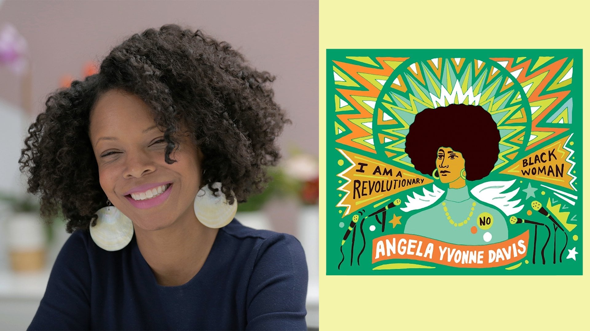
what that looks like. These are some images from
Step Into Your Power. This is for girls 12 and up. Just this idea of
using your voice, speaking up for yourself, really reflecting and
figuring out who you are. It is a resource for girls to do that written by Jamia Wilson. There's those bright
colors and then also that empowering message. Young Gifted and Black, highlighting voices that
are often overlooked. A lot of people in
this book people know. But there were a lot of people
that I didn't know about when I was doing the
illustrations for this. Then also thinking about
again, celebratory. You see the crowns, you see the wings, you
see bolt, you see energy. It's really just
vibrant and filled with power which is always
willing to try and to incorporate in
my illustrations.
5. Making Your Message: Let's talk about
making your message. I have a downloadable item
that was in the register page. I'm not sure if everyone
had access to that yet. That's okay if you
didn't download it. You can just get a piece
of paper and pen or pencil and you can just write
down things as we go along. This gives you a guide of
what I do in my process. When I am thinking about a
message or an idea, topic, I'll write that down
and then start jotting some ideas based
on that direction. At the top here it just says, what do you want to
say in your drawing? Write a short phrase.
You write your message. What I try to do is to
keep it in a few words. In my case, I try
to do 3-4 words, and then writing some words
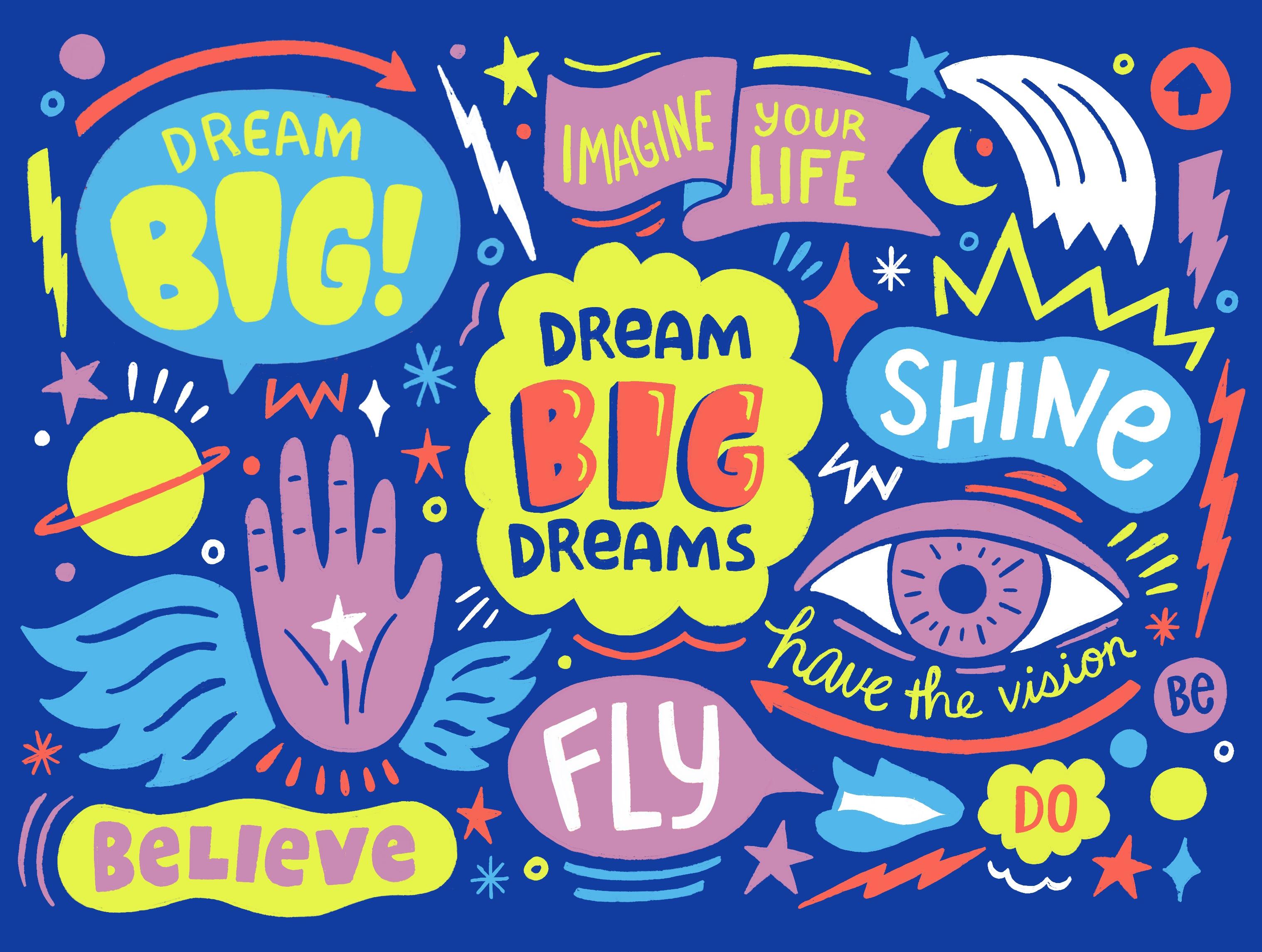
that relate to that message. My message is dream big dreams. I'm really excited
about getting people to think bigger than anything that they can imagine and believing that you
can do these things. What are the words that
relate to that for me? I think about energy, I think about power, this idea of flying, people can't necessarily fly, but what does it look like if we can fly, believing, imagine. All these are some
of the words that I would think about
that relates to this message and then
could possibly be incorporated into the
illustration itself. Then some images that
relate to this message. Thought bubbles, when
I think of dreaming, I think of shooting stars
in the sky, clouds. We tend to dream at night, but then also
shooting for the sun. The sun is this thing that's far away. What
does that look like? These are images that I
could potentially use in the illustration as well.
Then what's the vibe? What's the feeling that you want to ingest or infuse
into this illustration? What do you want people
to feel when they are engaging with this drawing? Is it airy, vibrant, inspiring? What does that look like? I think that really
informs the color too. If it's airy, maybe
it's light blue. You're thinking about the
sky with relation to dreams. For me, orange represents
action and energy. That's something that
could be incorporated. This is not steadfast. This is just a baseline of
brainstorming anything can happen and then you
use this as a guide to inform the next stage. This is my mood board
for dream big dreams. You can see some things starting to develop here in
terms of some patterns. The colors, just like this
light blue that's happening. Maybe my mind just goes to these colors because I
was already starting to think about it with my form that I filled in for the colors. Then there's a moon,
there's a person dreaming. I typically don't incorporate other people's
illustrations in my work. That's a rule of thumb for me. But in this case, I really liked how the children were seen in relation to these images because when
I'm thinking big dreams, I'm thinking something's
really big and grandiose. I loved how, in this case, this child in this figure is standing here and
it's like this big, huge mirror or
graphic behind him. The same thing with
this text, shine on. I'm thinking more of that
relationship of the figure to the art and less
about the art itself. The Danny lines
seeds floating away. These balloons just make
me think joyful and fun. Is that something I can bring
into this illustration? Then just started to build
this palette of colors here in relation to what I'm seeing consistently
in the photos.
6. Starting Your Sketch: Now we have these words, we have the mood board
for inspiration, so I thought we could
do a little bit of drawing to just see how
this all ties together, so I'm going to share
my iPad screen. I already have here a sketch
that I did in pencil, which I typically do. I prefer to sketch everything
in pencil first and then maybe I'll scan it
in or I'll take a picture to bring
it into my iPad. You could see here this is just a rough idea of
what I'm going to draw. But I will turn off that. I think I'm just going
to freehand it here. I have my palette at the top. I just did a screenshot
of the palette that I created and I'm going to
turn one of these off. Generally what I do is, I just start with my main
message in the center. Someone would like to know
what tool or software you use to compile the mood board.
Karla would like to know. I usually use just Photoshop. I'll collect all
of my images and then bring them in there to make a nice layout with
everything together in addition to the
color palette. I'm going to start
with my message, so "dream big dreams" [MUSIC]. Since the word 'big' means
big I want to make it huge. I love having a dark background, I feel like colors always
pop so much better, so I use dark backgrounds a lot. 'Dreams' on the bottom. I think I'm going to do a
different kind of text. [MUSIC] Make some adjustments here. [MUSIC] Sometimes the colors aren't even what I
want them to be, or how I want them
to be applied yet, it's just to get an idea
of the layout first and then I can go back and
add colors that I needed. 'Dream big dreams'. I'm going to add another
layer underneath for the shape that I
want this text to be in. I think I wanted to
use this bright, this is like this
acid yellow that I feel like I always
use in my work. All right. I'm going
to just combine these. One of the words that was
on my list was 'believe', so this idea of believing first. Believe me, I can
achieve this thing, so I want to incorporate that into the messaging
of my illustration. Usually what I'll do is go
around the image and apply those words and messages and
then I'll go back in and add little decorative elements. Also, Francis says that they are very impressed
by the colors. One hundred percent found
through mood board though. Is that where you
found the colors? Yes. I pulled those colors from the mood board, absolutely. I'll show you in the
finished piece that I actually created, that this reddish color
is like a reddish pink. I didn't love it, so I changed it to a
more orangey color. The mood board is
a starting place, but you can always
go in and make alterations based on
your preferences, it's not solidified
once you make that mood board basically. I didn't talk about how I
choose my colors really. I always have a dark color, because I'm thinking
about that being the background and then I'll have maybe 2-3 colors that
will operate together, next to each other
side-by-side on top of that ground and then
I'll have a light color, so a pastely color to offset those really
vibrant bold colors. Francis would also like to know what brushes do you use here? This is my go-to,
its the blackburn. I like how it looks like
my drawing tool basically, like the pen that I usually use. I'm really an analogue person, I don't use Procreate that much. I'm starting to pick
it up here and there for client projects, or even for book projects. I don't know, mainly because I really like to do
things in pen and pencil first before I
hop onto the computer. I feel like the computer
with its colors and everything being so flashy
just really distracts me, so I like to really
get the idea down first before I hop
onto anything digital. We talked about wings. There are wings on my list. [MUSIC] I'm going
to go ahead and add some decorative elements now. I really love limited
color palettes. It's rare that you'll see
me use a ton of colors, I try to stay within five. Five is usually a lot for me. I just like to be able to think about how many
different ways can I use this color or
these colors together. Julie wants to know,
do you always start at the center and then add to the composition organically or do you ever map out
the composition first? I generally start
from the center, but then I do always have a sketch so things can
change or move around, but usually I do
start with the center and work my way out
towards the edges. What I think is really fun is, a message doesn't always
have to be serious, it doesn't always have
to be something that's really deep and
thought-provoking, it could be as simple as 'brush your teeth' or 'take a nap'. I think those are
really great ways to think about how do you show that in an illustrative way that's fun and captivating. If it looks a little close here, then move this over,
make it smaller. I'm just adding some
energy lines and I love bursts of energy too, so let me make one here. There was no clouds
in the mood board and there were balloons. I want to add some, but they won't be
literal balloons, maybe some big circles. Here's some of our little
decorative elements. I can go back and mess with this main message in the
middle so, 'dream big dreams'. For now, I'll keep
the color as is, but maybe 'big' can be
emphasized a little bit more giving it some
width, some depth. Now we can add a
little squiggle here, it could be in a different
color, it's color white. I think I'll just add
one more thing and then we can see if
anyone has any questions and I can show the title
Illustration I created. I have the word 'fly'. I also like to put speech
bubbles in my drawings. This is what it would look like in the end based on that pencil sketch
that I'd had done. Cool. Then you can see that red
changed a little bit, so I am really biased, I don't use a lot
of red in my work, so its probably why I needed to change it
to a little bit more of an orange color, orangey red. That's so cool. You had that outlined before, do you stick to that outline, does it change once
you get to the end? Do you know you're finished because it looks
like the outline, or do you just keep playing until you have some internal
cue that your done? I keep playing until I
have an internal cue, I have to. This is done. Yes, that's such
a great question, because you could see how
it changed a little bit. Let me see if I turn this off
we can see where it aligns. The text might change. In this case, before I
was repeating dream big, just like pounding on
that message even more, but then I decided to change
the text a little bit, so instead of it saying 'dream
big every time' I have, 'imagine your life', 'believe', 'do', so to your question, yes. I go in and think, it needs a little bit
something else, something has to change, different wording and I'll give myself the liberty to
do that beyond the sketch.
7. Q&A: We've gone through the
project, it looks so great. Now is the time let's take some questions
from the audience. Elana would like to know, how did you discover
what signature motifs are images which show
up in your work? That really goes in
line with the idea of me wanting to
celebrate the figures, the message, whatever
it is in my image, I want to highlight it, celebrate it in some ways. That's why I'm using those
crowns and the wings, the burst, energy power. That's something that's
always going to show up. It became signifier of my work because it's
something that I always use, they're my go-to pieces
or my visual language. That's your signature, language go to pieces? Is color a part of that too? Because you said you
don't like reds. But is there a color
that's always in there? Yeah. That ascites
yellow is my go-to. I feel like maybe 90
percent of the time it's in my work so I try to
bring it in in some way. Awesome. Just would like to know how did you get
discovered as an artist, your work is so
inspiring, playful. Thank you. Who discovered? Well, I would say for me, because I started out
as a graphic designer. I was working as a designer for many years and was teaching, but always doing illustration on the side and that was the thing. I was always making art and just making until an opportunity came where I could have a book
published and I think that's when things started to get the ball rolling in essence. But it was just doing the work and doing it because
I loved doing it. There were personal
products that I would do on the side or freelance
work while I was working my full-time job and I would say my advice to anyone is just keep doing the
work and keep doing it for the right reasons and that right reason is
because you want to do it, because you have something that you want to say and share. Not necessarily
because of money or be famous or to get more followers, is just because you
want to do it and then things will
fall into place, the things that are
important to you, the things that will allow you to shine,
those things will come. Beautiful and so true. Could you share about how
your style has developed over time and how do you refresh
your style over time? Yes. Well, the thing is, because my background
is in graphic design, I feel like I approached my illustration products
from a design perspective. I usually allowed the brief to guide what
that style would be. If you look at the
breadth of my work, you would see several
different styles. But there are a few
things that tied together like the color, maybe some of these icons. I think it's hard for
me to say because it evolves based on the
project in some way. But I am in a place
right now where I do have this
signature look and thinking about what does
it look like moving forward as I start to
pursue some other projects. Just trying to challenge
myself and see how do I evolve this really graphic look into something that's maybe more layered. I love patterns. How do I incorporate
that a little bit more? That would just be me playing, just making more time to play in my own personal work
to make that happen. Do you feel like that
play that you designate is something you use for creative blocks or
anything like that? You feel like it's so
visual, so creative, there has to be moments
where maybe it's not as flowy for lack of a better
word than other times. Yeah. I haven't been able to
play as much as I'd like. But when I do play, that is when things open up. When I feel things do flow and it does feel like
I'm evolving my work. But right now because the work is coming and
I have limited time, I'm going into my go-to toolbox. I have these things that I do that I know that
I can do quickly. That keeps me in the same vein
of the work I'm doing now. But hopefully, I
can make time to play so that I do branch
out a little bit more. That toolbox you
said that you have, how long do you feel it's
like to develop that? I feel like that's especially
for working artists, that's such a really
great thing to have probably when you get work and you don't
really have the time. Like you said, it's
really just like let yourself play or like
set aside this time. You just know that these
are the things you're good at that you know
how to produce well. You know what? I
think it goes back to that mission statement. These are the things that
I want to say and this is the way that I
like to save them. That is my baseline. It's my guideline for
what I'm going to create. Then from there, it can shift
and change a little bit, but I want it to be celebratory. This is the project
that I'm going to say yes to because of
that and then I can use these different
elements in that way. The mission statement
makes sense. That's the touchpoint that everything grows out of so you always know what
to hit back on. Has it changed much since you set it for yourself
the mission statement? Does it ever fluctuate
in one way or another? I think it changed in terms of the products that I accept, the ones that I feel like are in alignment with what
I want to create and who I am as an artist. Whereas in the beginning, I was saying yes to a lot of things because I
didn't know and I think that's important for people who are just starting
out in their career or who are professionals
young artists, students. You have to say yes before you can understand
what your nos are. Just figuring out, does this
brand make sense for me? Does this is work
make sense for me? It's just trial and error
and seeing what works.
8. Final Thoughts: Thank you so much Andrea for coming through and really just guiding us through this
really beautiful exercise and showing us your journey
and sharing your vision. Do you have any closing thoughts or final thoughts to share with students as they take off and
create their own reports? The only thing I can say and
share is just keep going. I think all of us whether we consider
ourselves an artist or not, we need to have some form of creative expression
whether visual, whether it's singing, whatever it is
that fills you up, make time to do that every single day especially during these times.
We got to do it.
 Andrea Pippins, Designer & Illustrator