Transcripts
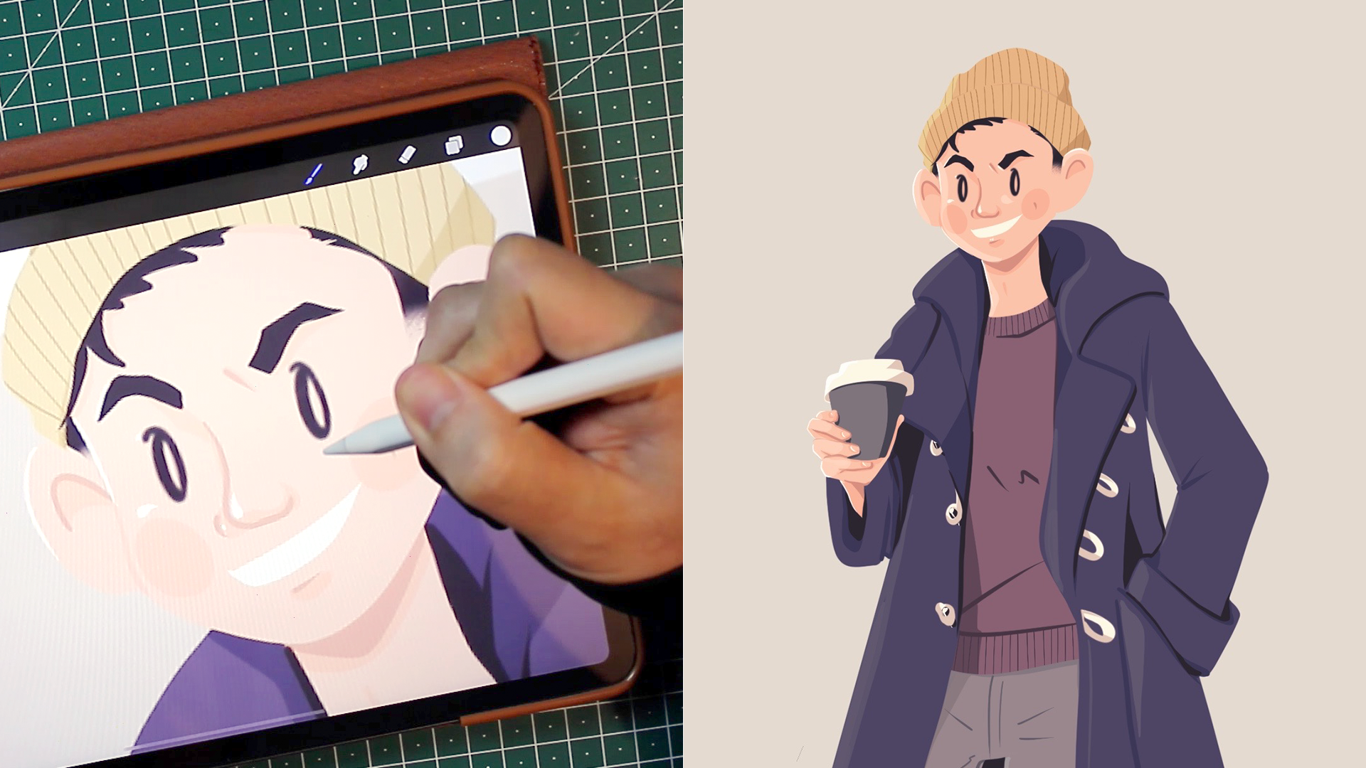
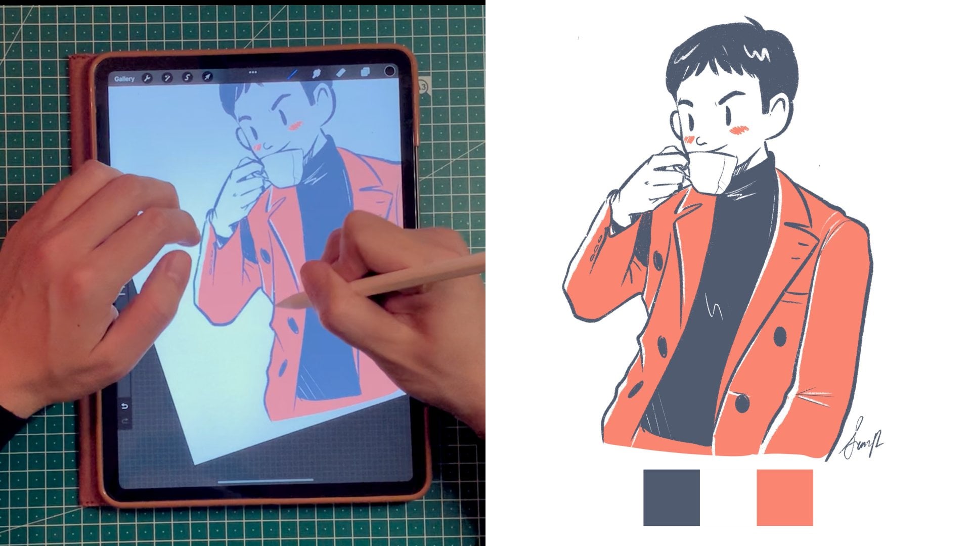
1. Introduction: The beauty of lineless art is in it's clean and simple shapes. You need to be really good at creating clean and confident lines and finding a proper harmonious color palette. You're in luck because this is what we're going to tackle in this specific class. Hey you, welcome to Lineless Illustration on Procreate 101; drawing with color and shape. Hi, I'm Simon, I'm a digital content creator and illustrator, and I love to draw illustration that really brightens my life. I've recently completed my 100 days of happiness, a personal project I started on Instagram as a gratitude journal using Procreate. Through this class, I'm going to help you get more confident with the basic tools and functions that Procreate has to offer. You'll also be able to create an illustration with very clean and confident lines. You'll know the difference on when to use a brush with high streamline versus when to use a brush with low streamline. Also you'll get more comfortable with adding your mid-tones, darker tones, and highlights. Finally, we're also going to look at different blending mode to really add some contrast to your illustration and make it pop. This class is really good for beginners and intermediate level artists on Procreate. Helping you to get all the drawing foundation that you will need in the future and not focus too much on embellishing with textures and fancy brushes. In this class, I'll also introduce a three-step project that will help you find your limited color palette, help you pick your reference photo, and finally show off your masterpiece. So what are you waiting for, just click on the next video lesson and let's get started with the project. See you in the next class.
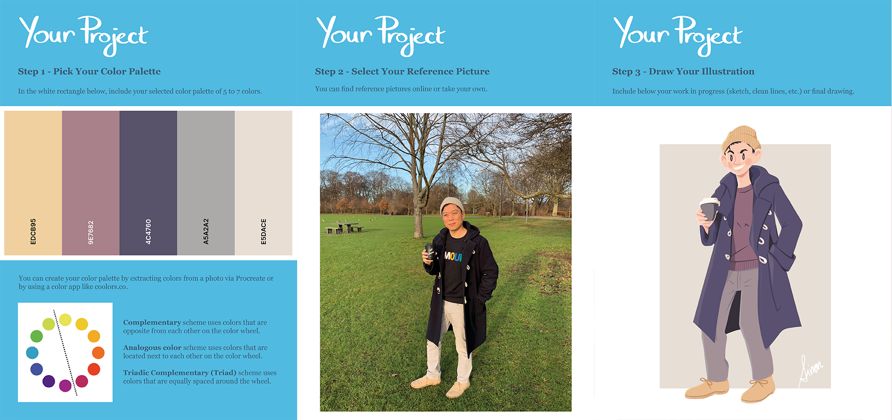
2. Your Project: Hi, and welcome to your project video lesson, where I'll be describing the different steps to your specific project, and don't worry, I'll be there along the way, just one mouse-click away to help you if you have any question. After all, this is an interactive class and I just love to receive your comments, feedback, and also to see your illustration progresses. Under class resources, you can find my class notes that you can review if you have any question or things are not clear. I've also created a template for the project. Now the project template is available in PDF, but also in JPEG. I think JPEG is much easier to use if you're working directly on Procreate and you'd like to upload your template and start working from there directly. You can also see my completed version of the project that you can review if you have any questions. Now we have a three-step project for this specific class. The first one is for you to find your harmonious color palette using 5-7 color. You can find more about it under our color-dedicated video lesson. The second one is about you uploading your reference photo. In this class, I'm not going to give you a lot of direction on how to take your own reference photo. But I always favor for people to take their own reference photo if possible to ask your partner to take a picture of yourself or for you to take a picture of a friend, a family member. Finally, show me your art. I'd love to see what you've come up with. Of course, along the way, you're welcome to duplicate the last step and include your rough lines, your clean lines, and anything along the lines. If you have any question, you know I'm only one mouse-click away. See you in the next video lesson wherein I'm going to explain to you the difference between a brush with high streamline and a brush with low streamline. What is streamline anyway? See you in the next video lesson. Bye.
3. Customizing Brushes: To kick up the topic, I wanted to start talking about brushes because I know it's such a hot topic on the Procreate comedian. Everyone's always asking about what type of brush set they can get and they create beautiful textures. Honestly, with lineless art, it's not about the brush, it's more about the confidence of your line and that's why you don't really need a lot of fancy brushes, not at least in the initial phase. Sorry to disappoint, but in this specific class, we're not going to talk about brushes and texture, but I am going to help you create settings on your own brush and the only thing that you need to know, it's about streamlined. Streamline is like when you're learning to bike and you have your training wheels on. It's basically kind of a helping hand in order to help you create very confident line. If you want to start creating art with zero percent streamline, it will be the same way as drawing or doodling on a piece of paper with a normal pen, meaning that you're not at a disadvantage, but you are not being helped as well. When you put your streamline at 100 percent, then you won't be able, for example, to sign your name in the same way that you signed on the piece of paper because all those jaggedy line in your signature will kind of smooth it out. So streamline smooth it out all of your lines. It's important for you that a brush with zero streamline and a brush with 100 percent streamline serve different purposes. A brush with zero streamline is when you're sketching and you don't want to be constraint on your creative flow, and a brush with 100 streamline, it's when you're creating your very clean lines and when you're also coloring. So this is how you create a brush with zero percent streamline or 100 percent streamline. To customize your own brush and not necessarily create a new one, it's quite easy. First, we'll go to your Procreate app and we'll select the brush tool. Then under the Brush Library, we'll select Inking, and then we'll choose Technical Pen. Now, good practice to always duplicate the brushes that you find as a default. Here we're going to tap on the duplicate version of it to access the brush studio. Now, on the stroke path, you will see stroke properties and streamline. In this specific case, I'm going to create a technical pen version with 100 percent streamline, since the technical pen here is at zero percent streamline. I boosted up to 100 percent and before pressing done, we go to Properties, click on "Technical Pen 1", and let's call it technical pen streamline 100 percent and then we press "Done" and it save. Now in order to be able to find it, I like to create a brush library with all my favorite or customized brushes. So on the brush library, go all the way up and you will find a plus button, press it, and then create your own favorite brush library. Here you can just drag and drop your technical pen 100 percent to the favorite library, and there you have it. Basically in this class, all you will need is a technical pen with zero percent streamline, the default one and a technical pen with 100 percent streamline. I'm very excited to get started. Meet me in the next video lesson where we're going to start conceptualizing our ideas into paper in the sketch phase. Bye.
4. Sketching: Let's start about sketching. I think a lot of us are very afraid to be confronted to a blank sheet of paper. Well, because we are afraid of messing it up. That's the purpose of this video lesson. Actually, is to tell you all to just get started because it's never going to be perfect. Now the beauty of digital art is that if you mess up, it really doesn't matter. That's why we have layers. Layers are a great tool to just do it again, try and try and try again. The reason why I really like this sketching phase is that it really allows you to let your imagination run wild. You'll have an idea. You want to put it on the piece of paper. You can try to be as prepared as you want. It doesn't matter because you need to take action to see how it would look like. Maybe, actually not maybe, it never looks like how you had imagined it would be in your head, but it often looks better than what you thought it would be. Let's just turn on Procreate, and click on the plus button on the top right corner. Now we're going to select Canvas Square 2048 pixels by 2048 pixel. You can choose any canvas size that you want. This is the one that I personally prefer because most of my illustration end up on Instagram. I think that's a good web format. Once you've selected your new canvas, let's look into the reference photo. My preferred way of uploading the reference photo is to go to Action, select Reference, and then toggle the reference. Then you will see that there's a pop-up window that will show up. Select Import, and then look for the photos that you would like to import. The great way about this choice that you can move to a window in your Canvas here and there, so it doesn't obstruct your illustration. For sketching, I do use a customized brush that we've created on the previous video lesson. We have zero streamline. Zero streamline means that the pen tool will not have any assistance, and you will be drawing as if you're drawing on a normal sheet of paper. It's great because then it really allows you to make doodles, make mistakes, and not really care. It's your time to create and to be uncensored. Once you have a sketch that you like, I recommend to lower the opacity. To lower the capacity, you select a layer, you double-tap it with two fingers and then you swipe left with one finger. Usually, I like to lower the opacity at around 20 percent, let's say around this. Then you go back to the layer and then you lock it. It's always good practice to lock your layer so you don't accidentally draw in it. It's a great way to create a more confidence sketch by drawing on top of your previous sketches. For example, I created a sketch here. I press the Plus button to create another layer on top of it. Then I start sketching on top of it. Sketching is a lot of fun and I want you provide you with an extra piece of advice that you can use. I've bought the iPad 11 inch. I think that if I could go back in time, I would actually spend more money under 12.9 inch simply because on the unrestricted Canvas, I have the tendency of drawing a little bit too big. If I'm trying to draw myself from head to toe, you can see that I'm currently drawing myself from head to mid-thigh and then I have to readjust to Canvas or readjust my sketch. But that's okay because we're working digitally, and nothing is actually staying there forever. We can always adjust and correct things. I want to talk about the select and transform tool. For example, you can see here that I drew my left arm a little bit too big. If I click on the Select tool, use the freehand tool, I'm able to select that specific portion. I usually make sure that it's on uniform. Then we're not changing the proportion of it. Usually, that's not a problem that I have, but it's read. Then you can see that I can make it bigger or smaller. In that case, I want to reduce the size of my arm to make it a little bit more proportionate. Now that we've discussed sketching and a few of my tips and tricks, remember the following. First, create a lot of the layers, change the opacity, and remember to lock it for a good practice. Also, use a brush with zero percent streamline in order not to censor your creative thoughts, translating into the paper. Then lastly, use to select and transform tool in order to change the proportion of a specific area if needed. Then repeat the process as many times as you want. Remember that sketching is really the way for you to translate on the piece of paper your ideas. Well, I think that's it for sketching. If you're ready now, let's look about how we can create some cleaner lines.
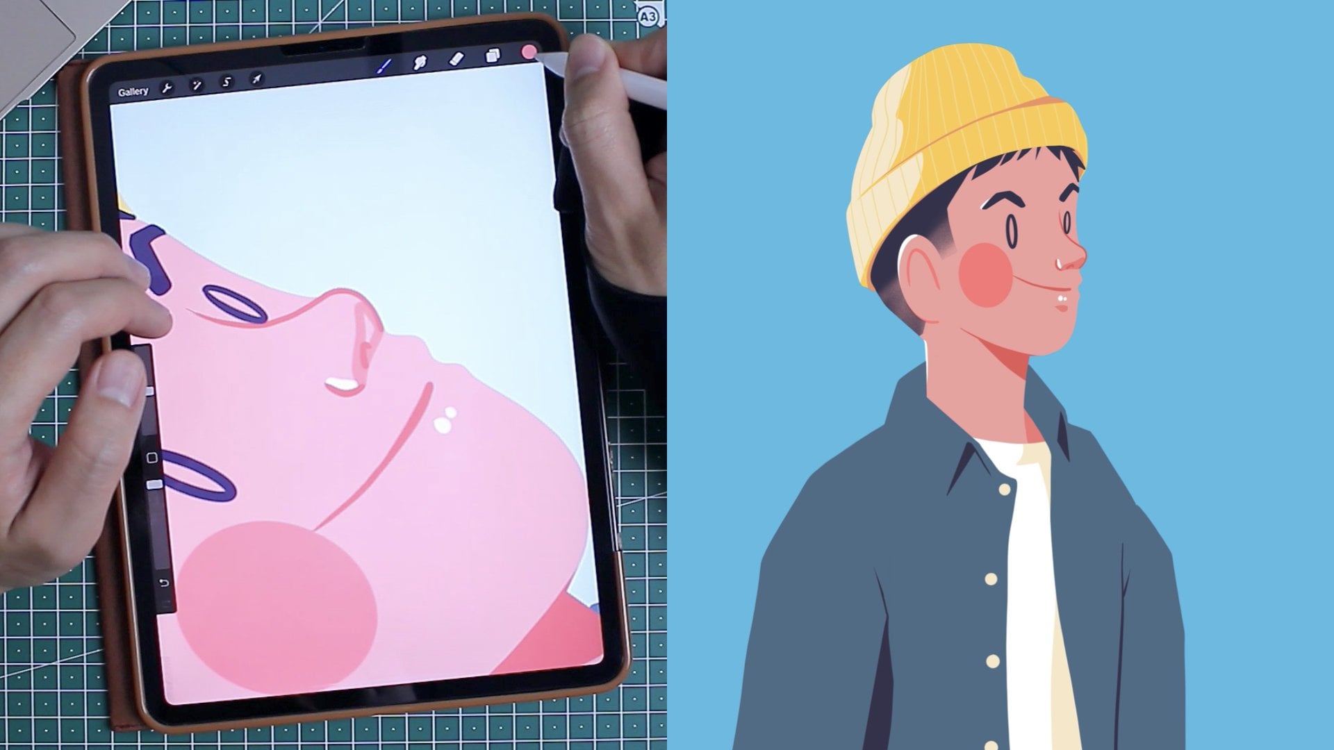
5. Clean Lines: There's something about creating clean line that it's highly satisfying. I think it stems from when you're a kid and you see those perfectly shaped lines that you just ache to color them. In the previous video lesson, we talked about how to create the initial sketch from idea to concept and to not be afraid to ruin that perfectly fine piece of white paper. You can see that throughout the video lesson, there's a pattern that stood for me and that digital art is basically about using a lot of different layer and retracing your illustration until it appears more and more confident. In the clean line section, there's an extra tip that I'm going to give you, and it's to use the proper brush. Now in the previous video lesson, we talked about how to create that perfect streamline brush. A brush with very high streamline means that it's a brush that's going to help you create very confident lines. Now is the time to use the technical pen with 100 percent streamline because we want to have very, very clean line. This is the secret to achieving a good lineless art, is to have very good lines in order to remove them after. Let's get started. We have our several sketches layers available. I'm just going to select or make visible the latest one, the one that is the most confident. On top of it, I'm going to create a new layer called clean lines. You can see that I start drawing the head and the coat. An extra tip that I can give you, is that to not be afraid to create several clean line layers. Let me explain. Here you can see that I'm drawing the hoodie of my jacket and I have a layer on top of it where I'm starting to draw the neck and the head. Draw that line uninterrupted and I delete it after. Because it's the layer underneath, I don't have to worry about deleting the lines from the neck because they're on separate layers. The recurring theme is really to create a lot of layers, lower the opacity, create another one, et cetera, and not be afraid to create mask or to delete. Now that we've created a nice line illustration, I'm going to show you how to set up the color foundation, which means we're going to color. Well, see you in the next video lesson.
6. Coloring: Now, let's talk about coloring. For me, coloring is a very satisfying step into the whole process. I say that about most of this test because I think they all bring something different to it. In the previous video lesson, I asked you to find your color palette, probably limiting them between 5-7 colors. The reason why I do this is because when you start working digitally, you have access to a rainbow of colors, an infinite amount of color and that can be overwhelming. I want you to think of when you were a child and you receive a coloring book. You have a beautiful drawing with very clean lines and you have a box of 12, 16, 24 crayons to choose from. Because you are limited in the amount of colors, you become creative and you know how to put those color down. Now, if you have too many colors, it becomes overwhelming and you're not sure where to start from. That's why in the previous video lesson I talked about finding your color palette first, creating your clean line so then this whole exercise can be relaxing and satisfying. Well, maybe not relaxing but let's get into it. Now, I'm going to show you the way I import this color palette from an app called Coolors. Of course, there's different ways to select a color palette, and I talked a little bit more in depth in the previous class. But for the sake of this exercise, we're going to use this specific method. I use a coloring app called Coolors, which allows me to find harmonious color palettes. Once I decide on the color palette that I would like to import on Procreate, I select the three dots. I go to Export palette and I pick Procreate. From there, I go to Save to file. Now, my iPad is connected to my iCloud Drive and I pick a relevant name, save it on my iCloud Drive, and there you go. Now, I go back into Procreate, I select the color dot on the top right corner. I press the plus button. I go to New from file, it accesses my iCloud Drive and here I'm able to select the color palette that I created earlier on Coolors. Another tip is the way I create my layers on Coolors. I actually do not draw on top of my clean line layers but right underneath. The way I do it is that I like to create a colored layered underneath the clean line layer. I select the clean line layer, first of all, with two fingers to change the opacity and I'd usually lower it to a very low, 2, 5, 7 percent. Then I make sure to locking it by swiping left. It's just good practice because you can accidentally draw on it. Then you create your first color layer and put it underneath the clean lines. Now there's different ways also to organize your colors. I like to organize them in region. For example, I will have the foundation of the face and ears, then the cheeks on top of it, etc. Then for the hand and for the arm, I put a different folder for them. After, I put them all into a single folder called color. I will say that my biggest tip would be to make sure that you can create enough layers in order to draw because layers are your friends and it really allows you to make as many mistakes as you want if you're on a separate layer. If you don't have the luxury of having a lot of layers, make sure that you merge them by using your two fingers and pressing them together. Of course, once you merge a layer, it is irreversible and you can't separate them after. Remember that the coloring part is also a tracing exercise and that's why it's so important to have clean, nice, defined lines. To color, now, we're going to start underneath the clean line layers. We're going to use the technical pen to stream line 100 percent and that's because it's really important to have those sharp, nice edges whenever we start coloring because we're going to remove the lines and this is all we will have. Here I select a peachy color for the tone of my skin. I trace it. Now, make sure that you close your loop properly. Then if I take the color and I drop it, the more right you go, the more color it fills. If you go too much to the left, you will have some jaggedy line and it might not be filled completely so you'll have this weird in-between line between the outline and the shape color. Make sure that it's in-between, mostly around three quarter. Now, that we've set up the right foundation for the colors, in the next video lesson we're going to talk about how to properly mask them and also add more contrast to them. But I'm quite happy with it. Now, it looks a little bit flat, but it's just part of the process. See you in the next video lesson.
7. Midtones and Shadows: Here we are, another video lesson on colors. I have to emphasize the importance of focusing on colors especially when we want to achieve that beautiful lineless art, because the lineless art will not rely on lines in order to make an impact but mostly on colors, on the foundation of the color, on the midtones, on the darker tones, and on the highlights. In this video lesson, we're going to refocus on the midtones. I have to say unfortunately there's no shortcut in order to get better at creating shadows when illustrating. It has to come to a lot of practice, observation, etc. We can have a strong reference photo that can help us and also through a lot of practice we'll get better at it. I also think it's super important that you have a reference photo because if you have a good reference photo, that will help you also use it as a guideline to know where the shadow and the light is going to hit the character that you're drawing. Finally, I like to use a consistent light source. For example, I like to draw my light source always on the top left corner and this really helps my brain get better at knowing how the light is going to hit the character. That being said, nothing beats practice and observation and putting in the hours. All the best of luck with that and you'll see that you'll take a lot of pride once you start knowing intuitively how to put shadows and light. Now, this is after all the procreate class. I'm going to give you a bit of technical advice. In order to create strong midtones, I like to use clipping mask. Now, a mask is a layer on top of a shape that visibility is impacted on the shape below. Let me give you an example. We have this layer called Layer 15. I know I should have called it coat because it's really the foundation of the jacket, but I've been lazy. So let's call it Layer 15. Now, Layer 15 is a nice purple color and I want to add a darker purple color to create the shadows or at least the midtones. First of all, I have my reference photo so I know how the sun is hitting the jacket and I can see that in this part behind my neck on the hoodie, there is supposed to be a darker tone. In order to create the darker color, I can use my index finger, select that purple color so I'm going to sample it, and then if you go on the second panel here under color, you will find a classic view. If I go under third row and I swipe left to select a darker version of that color purple. There you have it. Let's get back into the clipping mask. I go on the clipping mask layer and you'll see it's indented right on top of Layer of 15, my jacket layer, and I start coloring it where the shadow is supposed to be. You repeat this process. Meaning that if I press the plus button to add a new layer, well, as a default, it will automatically become a clipping mask layer. Pretty cool, and now I can repeat, put a darker color but I can go a little bit more extreme and pick a purple that's really close to black by going to the classical view again and putting my cursor almost all the way to the left and then add a bit more drama and add a little bit more dark here and there. You'll see that the darker spots are often under the neck, at the sleeves, and close to the armpits. There you have it. This is how I add my midtones and my darker tones. Finally, another tip that you can do is that if you are not satisfied with the midtone, well, you can always double tap on the specific layer to activate the opacity and then lower the opacity. I find that sometime if I draw something that's a little bit too dark, I can lower the opacity to 50 percent to find something that is a little bit more within the range. Well, now that we're done in adding the midtones and the darker tones, let's see how we can add some highlights to add more three-dimensional contrast to this illustration. Thank you and see you in the next video lesson.
8. Highlights: All right. So we've added some type of mid-tone, darker tone, and it's time to add some highlights. We can see by adding these different layers of colors that the illustration is less flat and it's getting a life of its own. Now with the simple step of adding highlights, you'll see that those little white line streaks are really going to make a huge difference. First of all, before adding highlights, let's define the light source. As previously stated, and I'm probably repeating myself, we want the light source to be consistent with the other steps, so we're going to place it on the top left corner. This is very standard in order to be consistent with the previous step and also to have a similar look and feel, so it feels like it's the same drawing. I like to use a technical brush, so under my favorite, I will pick my technical brush, but with a streamline of 100 percent. I'm also going to lower the stroke of the brush so it's not too thick, but something that's small to medium. I also like to put this highlight layer on top of the other ones, so it's not muted. It's really, really strong and it's there. Now, the secret to highlight is first to use a pure white. Don't be afraid to use white at 100 percent to really have this strong impact, but also to using sparingly, and that's why we like to use a brush with a lot of confidence because we know where we're going to put that thin line of white color. Now, if you think that it looks weird and it's not where it's supposed to be, we can lower the opacity just a little bit, maybe at 85 percent, 65 percent, but I want you to try to have it at 100 percent, and if you think it's too much, then I want you to maybe lower the paint brush stroke and see if we can use less of it, but still at 100 percent opacity. These are my tips and tricks for the highlights. Let me know what you think and how your illustration ends up, if it's a huge step or not, in order to make your illustration pop up more. In the next video lesson, I'm going to show you a specific technique that I use with gradient map in order to add more depth to your drawing, and that will be the last step. I'll see you in the next video lesson. Bye.
9. Final Touches: Congratulations. We're almost done this class. By now, you should have a product that you're quite satisfy with, it's an illustration with lots of colors and different depth and layers. You'll be closer to the final result if you also reduce or completely remove the lines. That's what will make a great lineless piece of art. But I wanted to show you one more technique in order to add more depth to your illustration. This is a technique that I've developed on my own and I think it will really add the desire effect that you might be missing. Let's get started. What I'd like to do, now that you have all those layers, is to select all of the colors layers that you would like to include in your final drawing. That means we're going to remove the sketch layer and we're going to also remove the line layers. We don't have to delete them, but let's just not include them or make them visible. Now, I'm going to select all of the color layers by tapping on them. If you want to add multiple layers, you can slightly tap on them, but with a swipe left motion, a very subtle one and you'll see that you start adding them. Once you've added or once you selected all of your color layers, you can group them together by pressing on the Group button and you can also duplicate them. Let's duplicate them because we need that duplicate layer. We don't want to mess up all the beautiful layers that we have in case we change our mind. One though piece of advice is to get an iPad that has enough RAM. That's why we always recommend an iPad Pro versus iPad Air or other type of iPads, because it will really constrict the amount of layers that you can have. Now that I have all those layers, let's flatten to duplicate it. One, to flatten them, we can just pinch them together and we're going to go to Adjustment Gradient Map. I'm going to pick a warmer type of gradient map. That's just one of my favorite way to do things. There's a lot of really nice gradient map. I would say, take a look at them. I usually pick instant or grays. It looks nice. It's nice and reddish. Now, I go back to this flattened layers, I press on the end for normal and I'm going to select Multiply and here I'm going to double-tap and lower the opacity to a nice 20 per cent. Because we don't want the effect to be too extreme, so this is just the way I do it, but I also recommend you to play with maybe Color Burn or other type of filters. Now, we're going to create a mask. To create a mask, we're just going to tap on it and select Mask and here you will see a white box that shows up. Now, white means that everything is revealed. That means that we are hiding stuff behind. What I would like to do is, I'm going to use the layer underneath that is a little bit lighter to reveal some of the illustration to really show as if it was light. It's same principles as the highlight but we're going to use a black streamlined technical pen. Here you can see that I'm going to follow the highlights route just to reveal a little bit of brighter layer underneath. Here, I can reveal some of the light around the face, the tip of the nose, the hand, always thinking about the light source coming from the top left corner. If you remove the clean line layers and a sketch layer, you will have your final lineless art. I hope you find this class helpful. Show me your progress throughout the class and I'll be happy to send you a comment or to help you along the way. Also, make sure that you use the resources to this class. There's a bunch of images and PDF that you can use to help you follow the specific step but also color or sketch directly from them if you need a little bit more help. Well, that's it. Well, thank you very much. Bye.
10. Conclusion: Hey there, congratulations, you made it to the end of this class. Also bridge up on your project and if you're haven't had time yet to upload it, please make sure to upload the different steps, 1, 2, or 3 into your gallery and I'll make sure to give you my comments. I hope you've enjoyed doing this lineless illustration. As I mentioned earlier, lineless art is all about the art of removing lines and details to really at its core, have a strong foundation of shapes and colors. How did you feel about the whole process? Please ensure to let me know in the comments and to provide your feedback, I'd really like to know so we can improve on the next class. Throughout the different video lesson, we've covered quite a lot. But if there are three things that you need to remember, I think the first one is to really understand the difference between streamline, how to use a brush with high streamline, for example, for your clean lines, and low stream line for your sketches. Second, you also need to remember that in order to create strong, confident line, it's mostly an exercise of tracing and retracing your own illustration. Make sure to create a lot of layers on top of each other and to also lower the opacity of the layers below. Finally, have a consistent light source so you can build your mid-tones, darker tones, and highlights. Also don't beat yourself up. Drawing doesn't come overnight. There's no easy way. It's all about practice, practice, practice, so don't be afraid to just get started, make mistakes, enjoy the process, and be persistent. Also along the way, if you have any questions or you would like me to review any of your art pieces, please don't hesitate to contact me. Have a wonderful day. Thank you so much for joining this class and also for submitting your beautiful illustration. We'll see you soon. Bye.