Transcripts
1. Intro: Hello, hello. I am so glad you are here truly. Thank you so much
for joining me. We have what is going to be both a fun and beautiful
class in front of us. As you can see, we
are going to be working with ink and watercolor, otherwise known as line and
wash. Now I have always been intrigued by this art form
and although I will be the first to admit that it
is not my expertise, what I do have to offer
is a unique approach. So we're going to dive in. We're going to learn how to make beautiful, loose
illustrated art. We're going to learn
all about our supplies in the next video. So go ahead and park
yourself somewhere, cozy, grab yourself
something to drink, and let's get to it.
2. Supplies: Before we begin, let's
go ahead and briefly discuss the supplies that we'll need to complete the class. Beginning with paper,
we're gonna be using legion 140 pound
cold press paper today. A little different. We've used it in
a previous class. However, it's been awhile. Typically we use our Canson
140 pound cold press. But I've chosen this paper
for us today because it has a really nice tooth
to it that's going to, the watercolor is
going to pick up that texture and it's
gonna be really beautiful. Since we are not going to really be focusing on the
watercolor aspect, but rather the combination of detailed pen lines
with loose watercolor. I thought it would be
a nice change to have a paper that's just a little bit more gritty into the for us. Feel free if you do not
have this exact paper to use a substitute or
something close to it. For paints, we're going to be
using a variety of paints. I've always a covered my preferred brands
in previous classes. So you can look back. The paint brand is so long as it is an artist grade
paint, I am happy. It does not need to
be a specific brand, but if you do want to achieve the exact results with the
color blends and whatnot, then I will obviously give
you exactly what I'm using. I'm going to be using
Sennelier, blue, indigo. I'm going to be using Daniel
Smith undersea green. And then a variety
of my merry blew, this is Rose lake, this is yellow ocher, and this is sepia. And we're going to
be mixing all of these colors together to get
a variety of different u's. I tried to keep
it simple for us. Keeping it five might use
another color for our white. We're probably going
to use a lamp, black. I'll cover that
when we get there. But you should have whatever
colors we're gonna be using in your toolbox. I'm not going to be using
anything outlandish today. So for brushes, we're
gonna be using a variety of Princeton brushes
in round and filbert. Any variety is great. I love for you to
have some duplicates, so size 6.8 rounds is
great for filbert. I like fours and sixes. And then I'm also
going to be using this tiny little filbert here. It's a size two for
our lavender here. But again, you can
use the tip of this round brush for pretty
much the same results again, because this is not gonna be focused on watercolor and it's mainly going to be
about the pen work. Or the watercolor is
going to be secondary. So whatever brushes you have
on hand will work great. I'm going to want you
to have a pencil. I'm using favorite Castile. I like their brand of pencils. I'm gonna be using an HB because
it's very easy to erase. And when we're all
done here, um, we wanna be able to
erase the pencil lines. So what I've done here
is you'll find in, you'll find the worksheets
for this class, which is going to
be all the sketches which had been done in pencil. And then you would go
ahead and print those out, trace them on a new piece
of paper with pencil. And then you'll be able
to then at the very end, use your dust free eraser to erase all of
those pencil lines. So it's just the pen
and the watercolor. But the pencil that you can
see is really beautiful too. So there's many options here. It doesn't have to be pen, it can be left pencil. I love the look of graphite
and watercolor too, so I wanted to give you both. So you can do this class in
pencil and pen in marker. There's so many
different ways you can use the material today, but we'll focus on pen. So speaking of pins, we're gonna be using Micron. The first pen here is a graphic pen and you're
not going to need this. This is really just an example. I'm gonna be showing you the different looks that
have previously been covered in classes that I've either taken or just
work that I've seen. Because I want to
be able to show you the difference in the pins. So we'll have this kind of graphic pen to show an example of what it
looks like traditionally. And then for my
approach to this style, we're gonna be using the, the Pigma Micron 05 and the 01, That's the 0.4, 5.0, 0.25. And then I'm also going
to be using the sepia. So if you have if you just have the black ones,
that's fine too. I have the black here
off to the side. A lot of people like the black. I think the brown just kinda
adds a little bit more of a vintage touch,
the overall look. So that's why I typically
like to use this API a pin, whereas the black is
just a little bit more. I wouldn't say harsh,
that's not the right word, but it's just a little
bit stronger of a look. And I feel like the
brown religious kinda makes it look a
little more gentle. So you will need both
varieties of the micron pen, the 0.2, 5.0, 0.45, because we'll use both of those. Other than that, you'll
need a cup of water, you'll need a palette, and obviously a paper towel
to block off in between. You can have a device such as an iPad if you want to be looking at
reference pictures, but they're absolutely
not necessary. What I've done is
I've saved all of the reference pictures
to a Pinterest board. I will provide that link in the class description
so that you can see where I pulled
inspiration from. You'll notice that I've
definitely taken some liberties. But you can get the
basic concept for the drawings that I'll
be showing you today. Alright, let's go
ahead and move into the very first
portion of our class.
3. Exploring Micro Pens and Loose Watercolor Washes: Before we begin painting
our illustrations, I want to help you get familiar with the pens
that we're gonna be using. We're really going to only
be using these two today. However, I did put this one in the supply list just
so that you can, if you like the look
of it, purchase it, and use it in your
explorations and creations. So we're going to start
with the Pigma Graphic. So that's going to
be the boldest of all of the pens that
I'll be showing you. So let's go ahead and just, I want you to use
full pressures. You can really see what
this pen is capable of. So that's about as thick of a line is you're going
to get with this. And so if we were
to do a flower, it would look
something like this. And then if we were
to add a stem to it, we have something
that looks like that. The next pen that
we are going to be using as the micron
pen, the 0.45. So that's the next boldest pen. And you have a stroke that's
going to look like this. So you can see
it's significantly thinner than what we have here. This is very graphic. A lot of illustrators
really love that, that pen. So doing the same thing here. We have a flower and then
if we were to add a stem, we have something that's
quite a bit thinner. Then lastly, we have
our 0.25 micron pen, very thin little stroke. This one is great for initially
sketching the outline. And then what I, what I like to do and we'll
enter that in more detail, is adding fuller pressure
strokes to add in some of those boulder richer
aspects of the design. You start with some
dots and then begin to outline our flower
and adding a stem. So there you can see we have three pretty different looks. This one clearly
looks much different, not only because it's black,
but because it's thicker. And then you can
see that there is some variation between
these as well. So I just wanted you to kind of get familiar with the pins. You can see what they're capable
of as we go into working from start to finish through a sketch and then pending it and
then painting it. You'll see how these two really works so
beautifully together. So the next thing I
wanted to do was show you three different
approaches to washes. There are more approaches than even what I'm going to show you. But these are the
three that I am most familiar with
and that I have occasionally used within my own just creative
pursuits and exploration. So we're gonna get out our
primary blue rows lake. And just dab a little
bit on the palette here. We'll be using that later so you can give yourself
a generous amount. And then I'm going to use one of my Princeton round brushes. And I'm just create a really light wash
with broth consistency. So that's going to be about
90% water, 10% paint. So the way that we can go about this is a
couple of different ways. We'll multitude of
different ways, but the three that
I'm going to show you are essentially a very loose, almost as though
we're just kinda splashing color onto the design. And then there's an
in-between where we're working within the
design and the framework. But we're also taking
care not to be so painstakingly
precise with our, our wash. And then there is the third way which is to fill in the line work
essentially and to not color outside the lines. I'm going to show you those
different approaches. So if we were to just
splash color on a design, it would look
something like this. It's very loose. It doesn't really have
any sort of shape. It's circular I suppose. But it's not really being
mindful of the shape, it's just splashing color. The second way is to lay color
in within the framework, but also being okay with going outside the
lines and then possibly leaving parts of the design open and available to just
being as they are. So you can see we have
a floral shape here. We're working within
the framework, but we're not being mindful
to stay inside the lines. And we have something
that's just a little bit more
formed than this. And our third option would
be to color in the design. So here, we're being careful to stay
within the framework. Using our brush to gently guide the watercolor only
into the pond area. So if you've taken
any of my classes, you know that I am a huge proponent of
giving you options. I do not like to teach and say that this is the
right way to paint, draw, whatever and so forth. I like to say these are the ways that I've enjoyed painting. And I want you to
find the way that's most nurturing,
nourishing to you. So there is no right way. None of these are the
right or better way. I would love for
you to find which one most service your
creative process. So this middle one is
where is my happy place? I like this. It's formed, but it's also loose. It's just sort of in the middle. But you may really
like just this look of splashing color
on the flower. Or you might, you might be
one of those rule followers. And were you just want
to keep the color exactly where it's
supposed to be. And that's completely okay too. So it's completely up to
you what it is that you want to do and how
you want to move forward with this art form. So the next thing
we're gonna do is I'm going to just
splash a little bit of undersea green
onto my palette. And we're gonna do
the same thing with the leaves just to
give you an idea. One thing I don't think
I've mentioned yet, a lot of people are always so excited to hear
that there are pins that don't bleed
with watercolor. So if this is a new kind of an eye-opening
experience for you, yes, there are pins
that you can use with watercolor and they
will not bleed. And then in fact, once
everything is dry, if you are using
pencil as we will, you can go in and erase all of the pencil lines and your pen
work will still be there, your water color
will still be there, and it's so beautiful
and so much fun. Um, I try not to assume
everybody is on the same level. So if this is a new
concept to you, just know that not all pins
are capable of doing this. That you need to make
sure that they are bleed proof pens micron is
a great brand for this and then also Winsor
and Newton makes a brand of pens that I've used
and I've tutorial. They're called fine liners, so you can look that up as well. Okay, so doing the
same thing here with the undersea green. Same concepts when
a splash color. And here we'll just do
sort of an in-between. And then here we will
fill in the lines. Okay, So that should, that should get you
pretty familiar with our pins and what
they are capable of. So you might gravitate
towards one of these more than the
other. And that's great. I really just wanted to let you know what they're
capable of doing as we move forward and begin to do a sketch
from start to finish. So let's go ahead and move into the next portion
of our class.
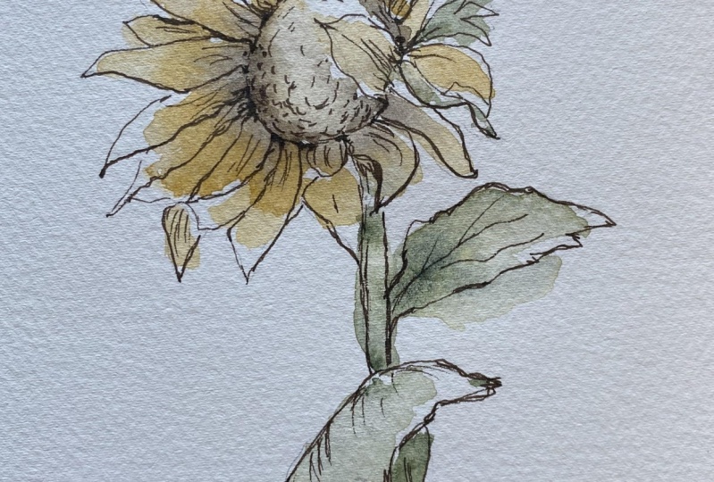
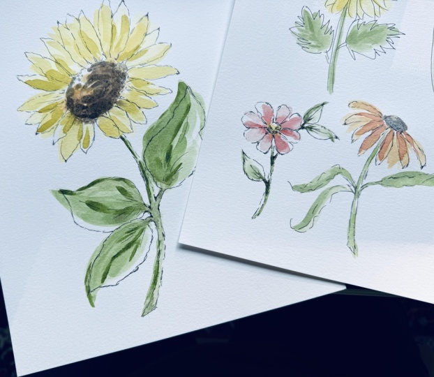
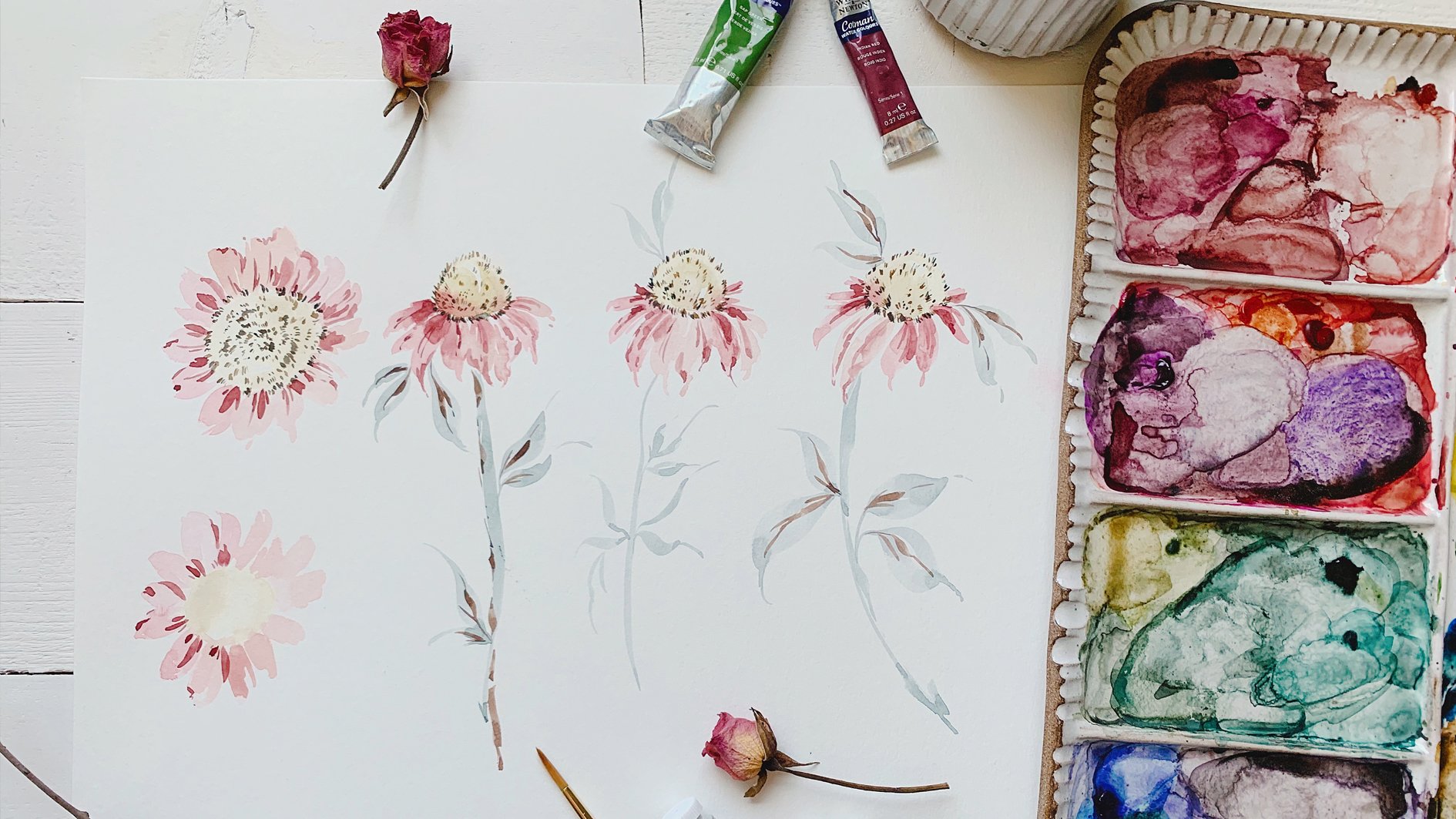
4. Sketching a Sunflower: I have found us a
lovely flower and inspiration flower on Pinterest. And I did want to
mention now that all of the flowers that I'm
teaching in this class, I've saved on a board marked Skillshare on my
Pinterest account. So you can see, although
it's not necessary, because I will be
providing all of the pencil sketches which
are then yours to print. And you can either pen and paint directly on them or
you can trace them, which is what I would
recommend that way you can erase the
pencil marks later. So those will be provided. But I thought it would be
nice just for you to have the inspiration pictures
so that you can pull from those reference images
later on if you want to do the work again or if you just want to
try it differently. I'm obviously each artist sees something different
in each picture, so we're gonna go ahead
and use our HB pencil. If you don't have an HB pencil, just something that's
light is great. I used this pencil
much firmer when I was doing the sketches for you so that they would show
up when I scanned. But typically when I sketch, I do sketch lightly because really the sketch is just
it's the groundwork. I really don't rely on
the sketch so much, but I've also find the more detailed and the more
accurate that it is, gives me more freedom. And I find that I
have more liberties, or at least the room to take them when it comes time
to actually pin it out. So you'll see, I'll, I'll draw and then
I'll have petals, but then I will break
away from what it is that I have actually sketched out. Intuitively. I am very much an
intuitive painter and there are a lot of
artists that will say, draw what you see, not what you, would you
imagine or what you feel. And I'm, I'm quite the opposite. It doesn't always look, I guess anatomically correct would be botanically
correct is the better term. But it's where I find the most joy being able
to take those liberties. And it may not always look
exactly as it does in nature, but it's not supposed to be. My style is very gestural and it's supposed to intimate
at the subject matter, not capture it exactly. So you'll see that in my
approach to this style, I'm not really looking to
capture every single detail. It's really to get the
essence of what IC. So that was a bit of a preamble, but I do want you to
understand the why behind my choices and then also give you permission to
do differently. So I'm going to take from this inspiration picture just
the concept of the shape. And I will be making
some pencil markings. But then later on as I pin, you will see that
there'll be times where I just don't go exactly
over that area. So looking at the sunflower, I see that it's at
a slight angle, which is why I chose this. We can always do as
sunflower that's face on. But I really like being able to, I like choosing
flowers that have just a little bit of
movement to them. I feel like that
gives them a more life-like appearance when we go to the pen work. So let's start here
with just a center. I like to adopt that. And you'll see
that this is very, this is a very rough
and messy process. I use my eraser a lot if I
haven't already told you, go ahead and grab
your dust free eraser because what I see, It's sometimes doesn't
always translate when I'm putting it down on paper. So just a nice big sunflower
shape here in the middle. We have, it's sort of like
a sideways all men here. If it's not showing up, I'll try and pin
it or excuse me, sketch it a little bit
darker so you can see. That just gives us room. It gives us a shape not to intrude upon as we
are creating the petals, I like to start working from this direction and then
filling in this way as I go. Just to give myself an idea of how wide the
petals need to be. We can see that they are longest this way and they
are shorter down here. Let's go ahead and just begin
sketching out the shape. Again. Feel free to take liberties with the
shape of the petals. Some I will make a
little bit thinner. Some will be wider, some will have pointy tip, some will have more of a
rounded shape to them. It's really entirely up to you. The little too long. So I'm gonna go ahead
and erase that. Typically a sketch like
this can take me anywhere 5-20 min if I if I'm not warmed up and I'm
just not really getting the shape of what it is
that I'm trying to capture. So if it takes you longer, you are more than welcome to completely turn
off the video. Use this reference image. You don't have to
follow along with me. If you feel like you're
not able to catch up, I want you to have a pace
that feels good to you. Here. I'm going to take some
liberties and I'm not going to fold the petals
over so much here. Just kind of a gesture. The little too long. Again, you can see
that I'm just sort of rushing the pencil up
against the paper. I'm not pressing too hard and I'm not really
aiming to like permanently pencil down anything because I haven't decided
yet how I how I like it. I'm just sort of
looking, sketching, looking sketching
make other changes. And I just wanted
to walk you through this from start to
finish just on one. Because this is not
a how to sketch from reference images or live nature. This is a ink and watercolor
class or linework and wash. But I didn't want to
at the very least just provide you with one from beginning to finish so
that you have an idea of how I worked
through this process. So now I'm just kinda
looking at what I have and I'm gonna go
back through and just make sure I feel as though I've captured the
shape well enough. I already feel like these right here are not quite
at an angle enough. They're not giving
me that sense of the sunflower being on its side. So I'm gonna go in and just
make a few modifications. Must have picked up a
little bit of color here. It's not coming off,
but sometimes I use this with my pastels and it
picks up color as I work, so disregard that stroke. Alright, so now I'm
just going to kind of deepen some of
these pencil marks. Again, we're going to be
erasing these at the end. So you don't want
a pen too dark, but you also want to be able
to see what you've done. The shape of these are looking a little bit too similar to me. So I'm just going to
kind of break it up here with some different shapes. Having more of a daisy
feel to it to me. Then also one of my favorite
thing to do is to leave a gap somewhere
within the flower. I feel like it really brings
in this lifelike feel. So I'm going to create a
gap right here between these two petals
just to break it up. And now I'm really
feeling as though, okay, We're on our side here. I'm not really loving those two, these two petals here. I think it works when
it's being painted. But with pen work, I think it's gonna get sloppy
here because we're really going to accentuate
the details of this center. I'm deciding to omit
that completely. You do not have to, but it's just what I'm going
to do this time around. So I'm just taking one
last look at what I have. I feel pretty confident
about this now and feel as though I'm in a
pretty good place with it. So I'm willing to continue working around the Sunflower
by creating the stem, which kinda curves out here. And we'll just imagine
that it's kinda coming down, finishing off there. And again, I'm just creating
the framework here. Nothing permanent. And then I'm going to
sort of break it up with some loose lines. Do that, but just kinda
wiggling the pencil so that it doesn't look so
stagnant and so streamlined. Then I'm not going to go all the way up to the pedal either. I'm going to leave
some room here. I find that it just looks a lot more natural. If
I do it that way. Then I'm going to start to
create some leaves here. And I'm not going to
follow exactly what I see. I'm just going to
sort of intuitively look and then make decisions. Don't love that, So that a little bit better. And then I'm gonna do one kinda coming down in this direction, connecting the leaves
to the stem here. And I'm feeling pretty good about the shape of the leaves. They have these kind of pretty curves in the
body of the leaves. And they really actually have
a lot of ridge work here, which I don t think
it's going to come out so well in the pen, but we'll put a little
bit of it in there. We'll see how that goes. I like to lay down initially the shape and
then go back in with my pencil and create those little ridges
by just coming in a bit rough that up
a little bit too. So we have something that
looks a little bit more like a sunflower leaf. Okay, so I'm just
taking one last look. I feel pretty good about this. So I think the next step
is to get out our pin. So we'll do that in
the next section.
5. Penning the Sunflower: So this is where
things really began to take on a stylistic approach. I feel like it's this
next portion that might set what I create apart from somebody else who
does line and wash work. It's really how we
interpret the material and what we see in an
intuitively what we add to it. So when I create
something like this, I never take my pen
and simply just outline what I have
done in pencil. I feel like that's definitely
very therapeutic for people to just be able to
mindlessly work the pen around. But I like to be able to
add more vintage, a soft, and I have no other
word to describe it, but shaggy appearance to whatever it is that
I'm I'm outlining. You'll see as I work, I almost moved the pen is though it's a
paintbrush and I'm really trying to just use
words that help you get an idea because you'll
see how I'm working. But I want you to get a sense
of what the pen is doing. So later on, if there's any questions
about this approach, please feel free to
reach out and ask me I'm more than happy to
address any questions. The only downfall with pre-recorded classes is that nobody can raise their
hand or speak up. That's why I love live
workshops so much. But I'm always here
after, after the factor, if you're working
through the material and something's
not making sense, I am always here to
answer your questions. So the first thing
I really like to do is to use the 0.25 to begin really framing what
it is that I'm doing. So I just kinda
look to see where my pencil marks are and I began making gesturally
accurate marks. So I'm going to begin here
with the center of the flower, and I'm going to
make some lines in between the petals where
I saw and I've taken the picture away because
I really want to intuitively just
work now and not have anything competing with what it is that I
want to create. I'm going to intuitively put in some markings
in-between the petals where the center is sort of
emerging from the middle. I'm just taking my
pen and I'm just sort of using it as I
would a paintbrush, just laying down some
quick small strokes. I'm not doing it everywhere. I'm not going to do the
whole center and just kind of intuitively placing it in between where the center is emerging and the petals
are extending outward. And you can see with the brown, it really is such
a lovely color. I can't emphasize that enough. You know, the black, the
black can be very striking, but I just really do find myself gravitating
towards the brown. Okay. And so once
I have that done, then I'm just I step
away and then I'm going to move into a different
part of the flower. We'll come back here adding
more details as we go. But again, I'm going
to start here. And I'm just gonna begin really lightly working over
the pencil mark. But I'm also one thing to keep in mind is I'm not going to completely outline every
part of the pedal. I'm going to leave intentional little breaks within the flower. And so I'm modifying the
pressure as I work starting light and then
pressing down a little bit firmer to get a
darker line here. And then completely
breaking away from the paper to leave an
intentional break. Sketching, sketching firmer
pressure at the tip, coming back down
from her pressure. And concluding back
at the center. I will not do the same thing
on each petal because I want there to be variation
with each petal. So this one I'm going to
do just very lightly. Starting here lightly
taking a break here, firmer pressure, pressure
back to the center. Lightly coming off of my
original pencil marking here. And back to center. I'm going to switch
positions here so that you can see
me from an angle. Now I wanted you to have some
overhead so you can really see what's happening in
this part of my hand, but I also want
you to be able to see coming at this direction. So we're going to do that too. So coming from this angle, you should be able to
really be able to see the pen as it's being
applied to the paper. Roughing up the edge
of that puddle here, coming back to center, pressure, lighter,
pressure, light, really kind of
shaggy strokes here. Pressure light. Coming off with my
original pencil here. Trading a little bit of
a fold in that pedal and finishing off here. And then we will head
into the stem now. Again, not coming completely
up to the petal here. Just shaggy strokes here. Being mindful of where the stem is connected
to the leaves. Can you hear pressure creating these
intentional little grooves within the stem, these imperfections that
really make it feel lifelike. And then we will work our
way out now into the leaf. And just beginning lightly, lightly the paper a bit. So I can get a
better angle to show you connecting these stems here. Lightly, lightly creating really loose
gestural pen marks here, really swooping the pen in here, adding pressure
at these grooves. Okay, so we can see that we have clearly outlined our flower. And now it's time to move in with our 0.45
pen for some more, some stronger details
to really lift out the parts of the sunflower that we want
to draw attention to. So I'm gonna move you back. No more overhead. Okay, so we have
slightly more overhead, but I still want to come
in at an angle so you can see what's happening
between pen and paper. So I'm going to take
this pen and I'm just going to look
for areas where I can really accentuate the
beautiful pedal shape and also within the center. And then we will
head into the center as well for some details. I'm going to start here with these intentional little
marks that I've made and I'm just gonna
kinda pull them out by making them bolder. And I won't do this at every
area just intermittently. Then heading into the flower, you can see pressure. And then I'm lifting up on the pen here for
something lighter. Pressure and lifting. Darkening within here. Making some outlines
along the edges. Darkening these areas where
the petals are overlapping. I try not to overthink it and
move a little bit quicker. If you come off of your
lines, that's okay. Even encouraged. It's supposed to feel loose, it's supposed to feel shaggy. The more exact it
feels, it starts to, it starts to just take on
a very inanimate feeling. Anyway, I won't do it to
every single petal or this, I'm excuse me, I won't do the same markings to each petal. I really make it varied so that each petal
really does feel like its own personality. Just looking at what I have. And then what I'm
gonna do is I'm going to take my pen and
I'm going to make some grooves within
the petals where there are grooves naturally
within the sunflower. Taking the pen and just lifting
it up towards the middle, sort of flicking it
towards the top. You don't have to do
it on every petal. Can just be some. Then you can darken in some of those areas to give it more of a bold, accentuated look. I'm pretty satisfied with that, so I'm going to
move into the stem, creating some really
bold markings. Not every spot, but just
where I want to pull out the details of the design. Really just sort of flicking my pen around the
way I would a brush. Making little loops
and gestures. You will get into a rhythm
as you're not Watching, to repeat every single
line that I'm making, you really find your
way with the pen and it'll start to feel like
an extension of your hand. Which is why I like
intuitive anything. Because as you look and you study what it is that
you're trying to capture. I feel like you can
gain accuracy that way, but I feel like
you lose the flow. So that's why I like to be as
detailed in my pencil work using a reference image and then pulling away from
that reference. When it comes time to
add in those details. Just darkening up some areas where I want to draw the eye. And I'm pretty satisfied
with where I'm at. So I'm gonna go ahead and
erase the pencil marks now. So take your desk free. Nothing should be wet so you
shouldn't have any issues. You can just start moving over the entire flower and it
will lift out the pencil. Haven't decided yet
if I'm going to put those veins back
into the leaves, I don't want something
overly detailed, so we'll see how that goes. All right, so I've pretty much lifted out all of the pencil, so I'm gonna go ahead and
add a few detail veins. Same thing over here. Flicking that pin around, creating some bolder areas. But nothing to
botanically correct. Okay, last thing we're gonna
do is we're gonna go into the center here,
adding some markings. I'm taking this, I'm
taking my pen and I'm just making these little
half c marks, these little half circles. And then darkening up
certain spots as well. I don't wanna do
the entire thing because I want to leave work. I want to leave areas to
work with the watercolor. I'm feeling pretty
good and happy with the balance between
detailed and loose. Just going to darken
up a few areas. And then head in here one
last time to really darken up in-between these petals and
pull out the framework. Okay, There we have it. Our pin, this sunflower. So in the next portion will go ahead and lay down
some watercolor.
6. Painting the Sunflower: So as I mentioned before, we're really going to aim for this middle ground as we did
is a crude representation, obviously compared to
what we've just done. But we're going to aim for this middle version
where we are taking care to paint within
the framework but also being loose with the
watercolor and allowing it to, you don't have a
mind of its own. So let's go ahead and
get you to dip into your yellow ocher and add
a bit of water to that. So we're at I am a
broth consistency. Then go ahead and grab one of your other round brushes you should be using to round brushes and get your step you're ready. Again at broth consistency. Be doing a little
wet into wet here. Splashed a little.
What I get for having the palate
and the splash zone. So I'm just gonna begin to making intentional strokes
within the petals, but also leaving
areas open and white. And you'll find that
this is the least time-consuming of this process. The pen work and the sketching obviously takes much longer. The watercolor is really
secondary is to accentuate, but it's really to emphasize what we've done
with the pencil and the pen. I find this part
very therapeutic. I'm going to pick up
a little water now so that this petal is
just slightly lighter. And brush off some of the paint as well and just continue
getting a little lighter here. And then again picking
up a little bit paint, darkening this area
so that we have some really beautiful
variation of color here. I'm not going to go all the way up blotting off a little bit of the paint so that I
have mostly water here. Picking up a little
bit of paint. You can see it's
already coming to life in such a beautiful way. This is really truly one
of my favorite processes when I'm trying to take a
creative break from whatever else it is that I'm
pursuing at the moment, It's always feels good
to come back to line and wash and blotting
off a little bit. And coming in with cough
syrup consistency. Little bit darker. Here at the base. Working my way up, blotting off. And we're going to
head into the center here very lightly, leaving some areas of white. And then at broth consistency, dipping into your sepia and
coming along the perimeter. Some beautiful wet
into wet here. You can pick up a little
more cough syrup, darken it in some areas. And being mindful to leave a nice whitespace
can come in with a cough syrup consistency
for a little bit more sepia coming along the perimeter here where
this area is still wet. Darkening up those areas. Beautiful, right? So therapeutics, so rewarding to watch it come to life with
the watercolor. I find this process again. I know I'm repeating myself, but I find it just so therapeutic
and just so beautiful. It really is just
such a beautiful way to use watercolor and pen. So let's go ahead and
continue working. We're going to
blot off our brush and pick up a little bit of the Daniel Smith undersea green. And do the same thing
here with our stem. Rinsing off a little
bit of the water here. Taking cough syrup,
darkening up, maybe one side of the stem here. Maybe darkening at it in
as we go into our leaves. Then rinsing off a bit as
we move into the leaf. And I'm just going to gently
lay in the watercolor, putting a lot of water
on my brush now, coming outside the line
here to create a new shape. So this is the extension
of the leaf here. Coming in, cough
syrup at the vein. Letting that water, excuse me, that paint to spread, do what it loves to do. You'll need a lot of
water to achieve that, so it makes sure that there's
enough water on your brush. Let's do the same thing here, really laying on the side of your brush and
pulling it through. Coming off the line here bit, picking up a little
bit more paint, cough syrup consistency. Coming in here towards
the center of the vein, adding a little more
color here as I see. And our last leaf, cough syrup consistency
here at the center. Pulling it out just
so that we have something a little
bit different here, but have a darker feel. You can do that with
any of the leaves, doesn't have to
be just that one. You can darken up
areas as you see them come to life on the page, it really is up to you how dark or how light you
want to leave things. You can see that our paint
is already drying here. So if you wanted to, you could pick up a
little more sepia in that cough syrup consistency, lay it in one more time. You'll see it's still
pretty wet here. And we can darken
up these areas. Taking my brush, rinsing it, just guiding that color
along a little bit. There you have it. Our complete sunflower. I think it looks beautiful. I hope you're happy with
yours too, but if not, you can always give
it a go again. So let's move into
our next flower.
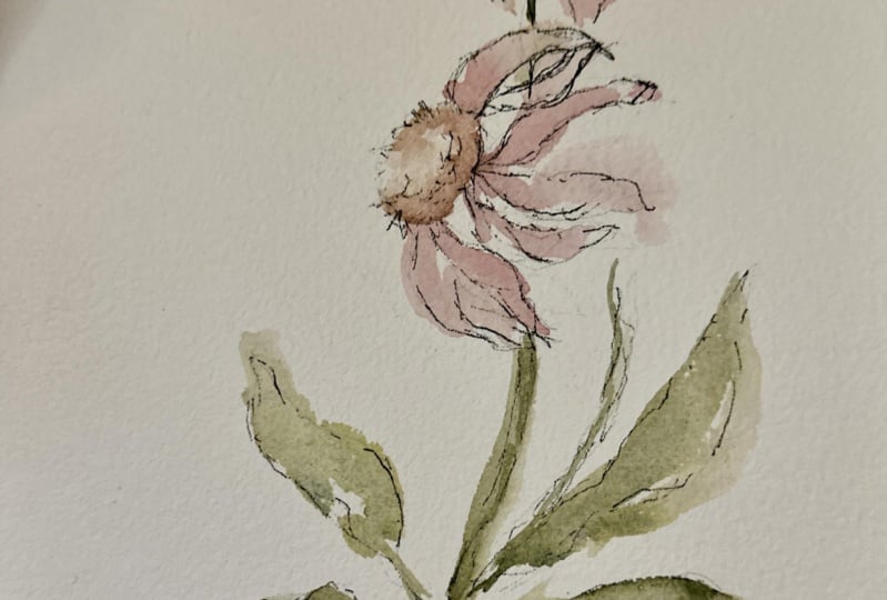
7. Penning the Coneflower: Alright, next up we have
our beautiful cone flower. I chose this one to come
after our sunflower because it is the most similar. So I just want you to continue gaining confidence as we move forward and feeling
like you're really able to grasp the whole concept. Again, if, if, if line and
wash is completely new to you, it's a learning curve. It really is trying
to marry and blend this idea of outlining something without outlining
something completely. And it really takes a mental shift to
really begin to feel as though you have this flex and
flow of both pen and brush. So give yourself grace and patience as you work
through the material, it will come together as you become more
familiar with it. And let yourself intuitively work within your, your sketch. So you can see I have a
pretty detailed sketch. I also have a very dark sketch. I would never again
sketch this dark, but because I wanted to scan
to be as clear as possible, I did intensify it. So we'll do the same
thing we did before, beginning with our
0.25 micron pin. And we'll start here at this
smaller cone flower with the outlines Coming
here in between the petals making some
intentional grooves. And then as you'll see, if you do visit
my Pinterest page and look at the reference image, you'll see that it has these, these little spikes that
come out from the top. So we're going to
capture that here. And I'm going to move a
little differently here, working within the middle. First before we go
into the petals. One of the reasons I like
to sketch lightly too, so that I can tell where
the pen is emphasized. If my pencils too dark, it will look a lot more
bold than it actually is because I'll end up erasing those lines and not to say, you can't go back after you've
erased the pencil and say, I don't like that. In fact, even at this
point I can say, Okay, I have enough down
to get the concept. Let's erase that. Now you can see it
really looks much lighter than what was
there just a moment ago. So if you need to
rewind and go back, you can see it looked completely filled in and looked very dark. Now that we've erased
the pencil line, you can see it's very open
and airy and beautiful. Okay, So I'm going to begin now moving through the
outline of the petals. Again with light,
scratchy, shaggy, and then intensifying
the pressure. You can see we move
a whole lot quicker. Now that we're not working
through the sketch. Sometimes what I'll do is I'll sketch out a bunch of these so that when I need to or
feel like I need a break, I can just lay them all out. The watercolor and
it's really such a, I can be creative
without feeling as though I'm wasting
paper or wasting time, whatever it is we artists
tell ourselves when we're not doing the thing that we
think we should be doing. It really is such a
mental game, isn't it? This is such a fun
way to just let loose and not take
it so seriously. Because there are just no,
there are no mistakes. It doesn't matter
where you're making. Your bold lines are
your light lines. It's all about how
you interpret it and what you gravitate to
as far as just aesthetics. I'm going to come here at
the stem and just rough, leaving some spots
where it's open. And I'm gonna come down here. I know I'm working a
little bit different. I don't want you to
feel like you have to work in the same
order each time. This is supposed to feel good. Supposed to feel as
though you're just flowing within the composition. Guiding the pen work. Backup here. Okay, but now I feel ready
to move on to this flower. We're going to do
the same thing, making some markings
down here to anchor ourselves into
the composition. Coming out here with our spikes. I'm gonna make these a
little bigger because this flower is a little bigger. And it will naturally be
where the eye is drawn. Coming in here
towards the middle, darkening up these areas
that I've done in pencil. And again, we'll erase that
in just a moment so you can see that it's really not quite
as dark as it's looking. I love these pens because
truly once you lay down the Pen and ink, you can erase
it without smearing. Okay, now looking
at what I have, making a few modifications
and adjustments, really coming out with
those those spikes, darkening here down at the base. And then I'm ready to
move into the petals. We'll start here on the left. Remember, you'll
be going in with your broader tip pen in a moment so you don't need to
create super bold lines, but you can increase the
pressure in certain areas. You also don't have to
use both pens each time. You may like the look of
just the initial 0.25 pen, which is completely fine. Or you might like
the broader tip initially and you can make
some thinner strokes with it. You just have to be careful about how lightly
you're pressing it really is a pressure process. I'm not going to add the
grooves into the petals this time because they're
already quite busy because the
petals are smaller. So that's my why
behind my choice here, you start to add in
those lines here. It's going to get very detailed, which is not necessarily
a bad thing, but I feel as though
we lose a little bit of the looseness to this style. I'm gonna come back
here and finish up with the leaves and the stem. Just gradually dragging
the pen through the pencil work lightly. You can even use dots
as a representation. So you can see here just
kind of intuitively I added some dots
rather than lines. So let's try that again. Dots, line, line pressure, Dots, pressure, pressure,
dots, lightly pressure. Moving within the framework
here of my pencil. Little bit more pressure here. Moving here over to our leaves. Dot, dot, dot, pressure, pressure, lightly dots
pressure, lately. Pressure, dots. Shaggy, curvy, shaggy. Hopefully this helps you as
I'm working to just kinda see the difference
in each little bit, it all contributes overall to what we get at the very end, which has a varied,
complex, not complicated, but complex and intricate
design that also bears a loose this and a light
of hand appearance. Okay, so I'm gonna go ahead and now fully erase everything. See what I'm left with, see if there's any
areas where I didn't capture what I feel like
I should have captured with that initial
pen, but usually not. Usually, it's just a
matter of going back in with the boulder broad tip. Make sure you lift up as much
of that eraser as possible. Just because it is a little
bit trickier to erase. Once you lay the
watercolor down, sometimes the watercolor
will lift a bit. So I find that if I
erase thoroughly here, then I don't have
to press quite as hard when it comes time to erase if there's
still pencil left. Okay, So picking up our 0.45
and then to do the same, just kinda looking
around to see where the overall composition might be benefited from
some bolder marks. Again, I don't do
it in every area, is just taking the
pen to a few areas. I really try and draw
out the details within a certain part of
the flower and then leave other parts
completely open. Coming down here at the base where the leaves
and the stem meet. Just darkening things up a bit. Roughing up the edges here
with C shapes and zigzags. Pressure, light
pressure, pressure here. I feel as though it gives us this various serial
old-world field book almost appearance. I love old field guides. Would I go to the thrift
store? I hunt for them. I love weeds and I'm constantly what I dropped
my daughters off from school picking up
flowers and between the cracks in the planners. There's some of my favorite
flowers to be honest. Alright, so I'm feeling
good with where that's at. Again, take a look at
what you have if you feel as though
there's some areas that need to be modified, go ahead and do that
now before we lay in the watercolor in
the next segment.
8. Painting the Coneflower: Okay, so we're going to mix
up a couple of colors here on our palate to create
a pink cone flower. So we're going to
use the rows lake. And we're going to make
it look nice little pile. Move this over so I can show you nice little pile right
here for our rows lake. And then I'm also going to
start another pile here. And I'm going to dip in to my step yet it just
darken up one of the piles to create a more
cough syrup version of it that we can add in when
we do wet into wet. So it's still very
pink but it has a bit of that sepia in it to mute it. If you follow any of
my classes, you know, I love muted vintage
tones and I have a line of color guides on my website
under artists resources, if you're interested
in learning more about that all sorts of vintage and muted
colors that you can use then that I use in
my professional work. Make sure your brushes
are rinsed off from our last lesson
with the sunflower. And I'm just going
to make sure I have a separate pink here that
it's not combining too much. Then I'm also going to
have a little bit of the yellow ocher here
off to the side. It's okay if it mixes
with your pink a little bit and then add a bit of
sepia in there as well. So that we kinda pick up a
little bit of a peachy orange. We'll be using that mixture of colors when we do
our garden rose, but I'm also going
to use it here. Within the center
of our cone flower. Create a little divide. Here. We go. Now we have two distinct colors. Let's go ahead and start with
our smallest cone flower. I have three brushes
that I'm working with. I have them all preloaded
with different colors. So I have the sepia and the rows Lake in a cough syrup
consistency on this brush. It's the round eight. And then I have the rows lake in broth
consistency on the six. And then I also have the yellow ocher and the
pink on this other six. So three brushes that
I'm working with, you're welcome to do
things one at a time. I just find that preloaded
brushes really does help. Just for the concept of flow. Going to lay a
little bit of color in and then just move it around. And then had n with
broth consistency. My rows lake, letting that lead into my wet
media here at the center. I'm going to rinse off a
little bit more to get even more pale wash
and even more renting, renting to get a
even paler wash. So you can see we start
with dark living too light, leaving some areas
of white here. And we can, if we want to take our brush
with the sepia and rows lake and darken up
this area here at the base. And we can, if we like, even add some strokes here very lightly that
aren't even pinned. Just some gestural,
really lovely markings. Okay, we're gonna
do the same thing, starting with our
yellow mixture. Laying into the side here, blotting off the brush so
that it's mostly water. And coming back in
with our rows lake, you can start to see it's
coming to life so beautifully. Really aiming again
for that mixture between just slopping color on and trying to get every bit of paint into the nooks and
crannies of the flower. Heading in with the
rows Lake and the set B at the base here. Pulling it down can darken
things up here too, if it's still wet and it will get significantly
lighter as it dries. So you may need to do this a
couple of times before you feel satisfied with the results. So pretty It's
something you really can keep poking out
for a long time if you let yourself came in to
rinse off my brushes here, there's not too
much paint on them, so I don't feel like
I need to really, really rinse everything
off too well. But you want to try and
have the majority of pink removed from your brushes. I'm going to pick up the Daniel Smith green and I'm going to add a little bit of the
sepia to it this time just to kinda
change up the green. I will show you what that
looks like in just a moment. As soon as I've
finished mixing it, we have something
that looks like this. And I'm going to
use it beginning at broth consistency.
So very light. Will start with the stem. I'm going to start
down here at the base. Rinsing off a little
bit, bringing it up. And through, adding a little bit more,
bringing it through. Rinsing off a little
bit of paint. As I come through here, getting a lot of water
on my brush as I began to lead through the leaf. Same thing. Lot of water on my brush following through
with the stem lately. So as to differentiate
from where the leaf is and
where the stem is. Coming back in with a
cough syrup consistency. Darkening these areas. Heading back in with broth, dragging the brush
through, guiding it down, picking up the paint and
cough syrup consistency. Intensifying the color
here at the edges. Again, it will get
significantly lighter. So if it's feeling
too pale to you, you can always go
back and re-wet the media and make it darker, but I like where
that's out right now. So I'm going to
pause watercolors, a lot of just sitting
back and pausing, seeing what it's doing and then making your modifications. But I'm happy with it. I love where this has dried and she'll really good with it. So again, just take
a look at what you have and see if
there's anything that you want to change before moving on to the next segment.
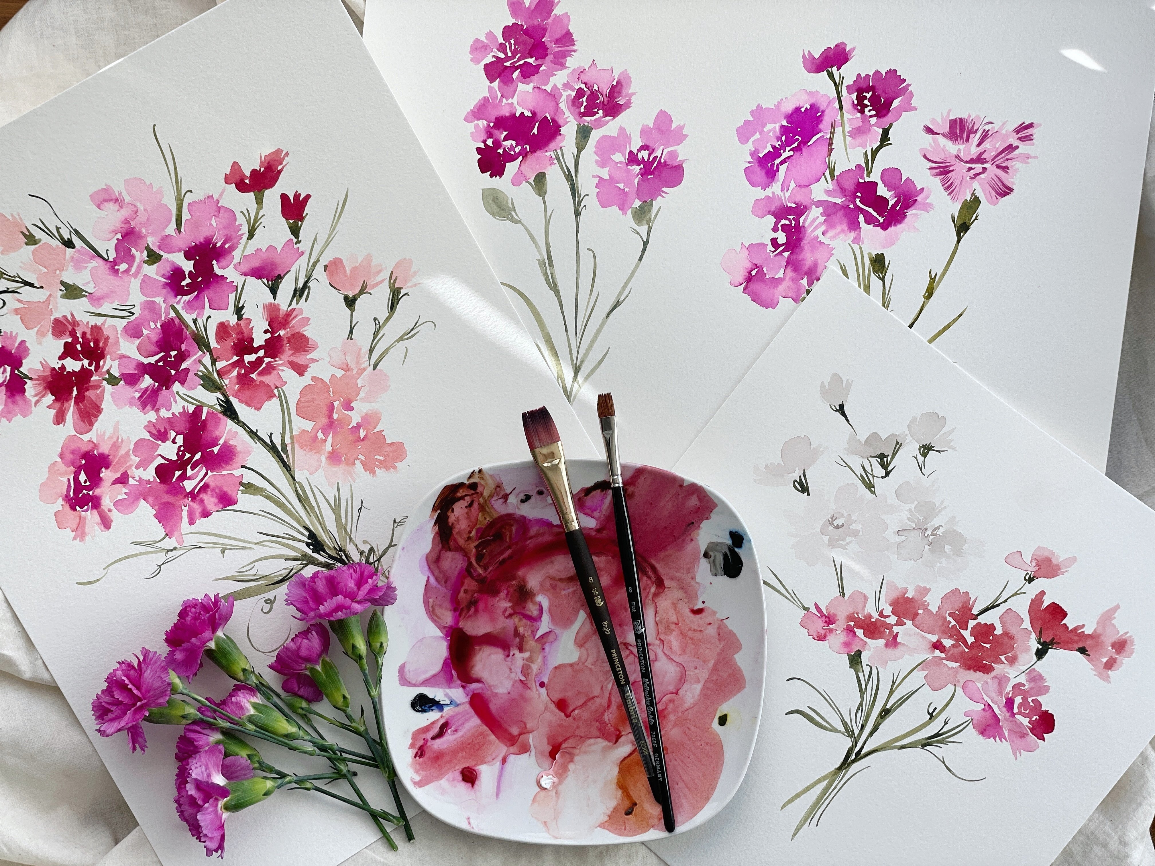
9. Penning the Cosmo: We have our Cosmos flower app. Next we are going to do the same thing that we
did with our two previous flowers beginning here at
the center with our 0.25, just kinda carving
out the shape of that cosmo darkening in some areas. But also knowing that we're
going to head back in with the broader tip
and just a moment. And then I'm gonna
begin to outline. You can see this is a lot more streamlined than some
of my other ones. I really wanted to make sure
the scan came clear. Again. I just want to make sure you
have those to draw from. Alright, so beginning
to cover my pencil, really loosening things up. I don't want these very
stagnant graphic lines. I want it to be rough. And I want it to be more pointy and square,
not so rounded. Really just allowing the pen to flick kind of all
over the place. Pressure, lifting
up here, pressure. And then I'm going to leave
that spot right there open so that there's a little
break in the pen work. Like I said before,
I feel like that's a really beautiful thing
to do just to give, give the eye some rest
within a composition. Sometimes I like to choose
the points where I'm going to apply the most pressure and then work out from there as well. So starting here and then coming out a little bit
lighter towards the edge. Same thing. Starting with the pressure
and then flicking the pen. If I say brush, when I mean
pen, you know what I mean? I'm so used to teaching
with watercolor brushes. Very, very rarely do
I teach with pen. Now working our way through
the stem and the leaves, we won't go all the way up. Dot, dot, dot, pressure. Roughing it up. Same thing, not going
up all the way. Light, light dot, dot, dot, pressure, pressure. Coming here through. Light. Cosmos have these very thin, needle-like leaves that
are really beautiful. I'm trying to capture
that loosely. Pressure moving through. Coming off my pencil, just slightly darkening up here at the base of the leaf. Again, I will erase
to see what I have before I go
in with my bold. Let's go ahead and
begin over here. Pressure and then
just roughing it up, leaving breaks within the leaf. Dot, dot, dot pressure. I'm gonna come down and
work my way up now, pressure, shaggy. Pressure. Dot, dot, dot. Really sketching
here with the pen to create the shape dot, dot, dot. And finishing off case next, I will erase everything just
to see what I'm left with before heading back in
with the other pen. I'm really having to
work here to erase because it was so
dark initially. You probably won't
have to work that hard to erase if you've
sketched lightly, spray, clear off the
debris, see what we have. Looks pretty good to me. Okay. Just a few little areas
that need touch ups. And now I'm ready to
go in with my 0.45. Start here at the middle. I'm really going to emphasize the middle of this
Cosmo by coming out and darkening
up the center here. And then we'll head
into the middle using some circular marks, loops and small little
lines that curved slightly. I really want the focus
to be on the center with this flower because
the leaves are, excuse me, the petals
are a little bit, they're bigger and
they're wider. There are simple. And so I want the center, the eye to be drawn here will work within
the pedal framework. Darkening up some areas, roughing up the edges here. Going back over the areas
where I have left in bold. To really accentuate the petals. I'm going to create
some dots here now. Along the outside,
along with some lines. Just to give it a little
bit more variation. Just using dots to
represent seeds. Part of the center. A really beautiful
Cosmo coming together. I'm gonna do the same thing
now here with our leaves. Really looking at where I've left it light and where I've
intensified the pressure, resisting the temptation
to darken everything. I think that can be, sometimes we get a little happy
with the pen and we just, we start making every little
detail shine in which essentially means that none of the details shine because everything is at the same level. And add some points to these leaves so that
they are a little bit more needle-like sword like the way they appear in nature. Just sort of working
my way around. You can see I just sort of
pop all the way around. I really don't feel like you
need to stay in one area. You can work intuitively. As you see things. Darkening up some areas here and feeling pretty
good about where we're at. So we'll go ahead and mix up a new batch of color
and began to paint.
10. Painting the Cosmo: One of the reasons
I wanted to be so detailed within
the center here is that we're going to be
painting this Kosmo white. If you've worked with me before, you'll know about white
watercolors already. But for white, we
use tones of gray, brown and sometimes
green and yellow to create what we call
white watercolor. For this particular mix, I'm going to use a little
bit of lamp black and sepia, and then we're really
going to water it down. So we'll start
here with a color, the lamp black, and
then adding in a bit of the sepia just to warm
it up a little bit. That lamp black is very cool this up yet
just warms it up. And then I'm going to
pull out a new pile. And lightest consistency so that we have something
that's really beautiful. Warm, not too cool. Began to lay in our color. Really lean into the
side of the brush. These are white petals
you can even use. In fact, you know
what, we're going to break it up just a little bit. We're going to use
our filbert brush. I put those in the supplies because I intended to use them. But sometimes as I work through, I stick to that same brush
if it's working well, but I want to give you
a whole different look. So let's go ahead and pick up our six filbert and make sure you have your
pile mixed up to the right. Consistency should be
lightest consistency. It should look like this. Let's go ahead and begin
to lay in the color. We'll start here at this petal. And we'll do a nice big stroke, rinsing off a little
bit of the paint. And working our way
around the flower. Really laying into the
framework here at the center, and then pulling out
towards the petals. You can use this side
of the filbert to get some really pretty lines. Which kinda helped to give
it that Kosmo feel where it's a little bit more ruffled along the edges and
not so streamline. Same thing here. I'm going to come up
on what is the tip of the filbert using a little
bit of a darker wash now, to come here at the center and
lean into my center a bit. Coming back here at the edge
on the tip of the brush. Can see we really were
intentionally here with painting. One of the puddles almost
completely solid and then leaving
white-space along here. I feel as though we've created a really balanced look here
between paint and pen. That feels good to me. So I'm gonna go ahead
and pick up my round six now using the same
mixture is before that, undersea green and sepia. And we'll go, we'll go ahead and start with the
leaves over here. A little bit too much
water and paint. So I'm going to blot off. There we go. And just kinda begin
to flip the color into the leaves here. Coming off of my pen a little. So as not to paint it
exactly on the line. I come down here
at the bottom now, worked my way up, rinsing off a tiny bit
lighter through here, adding a little bit more paint. And then coming through
to do the leaves. Flicking the paint through and add a little bit more paint in cough syrup consistency along this branch here
and through this stem. And then also here at the base. Just gently dabbing it in. We have what I feel is a
really well-balanced flower. Again, is going to
lighten up as it dries. It's always best to start
lighter with watercolor. You can always lift
out color with it is a little bit
too dark afterwards, but I find that if
you start light, then you don't have
to do so much work. Post dry. So that
feels good to me. Go ahead and check and see
if there's any other areas that feel as though they
need to be modified. You can also take a
look at the pen work and think to yourself, okay, did I do enough of darkening of the lines
as it feel as though it's not quite as intense
as I want in some areas. So again, as it dries
in 15 min or so, you may see areas
where you just want to lift out more of the
details of the flower, either in the center
or in the petals. So again, completely up to you. So we'll move on to the
next couple of flowers.
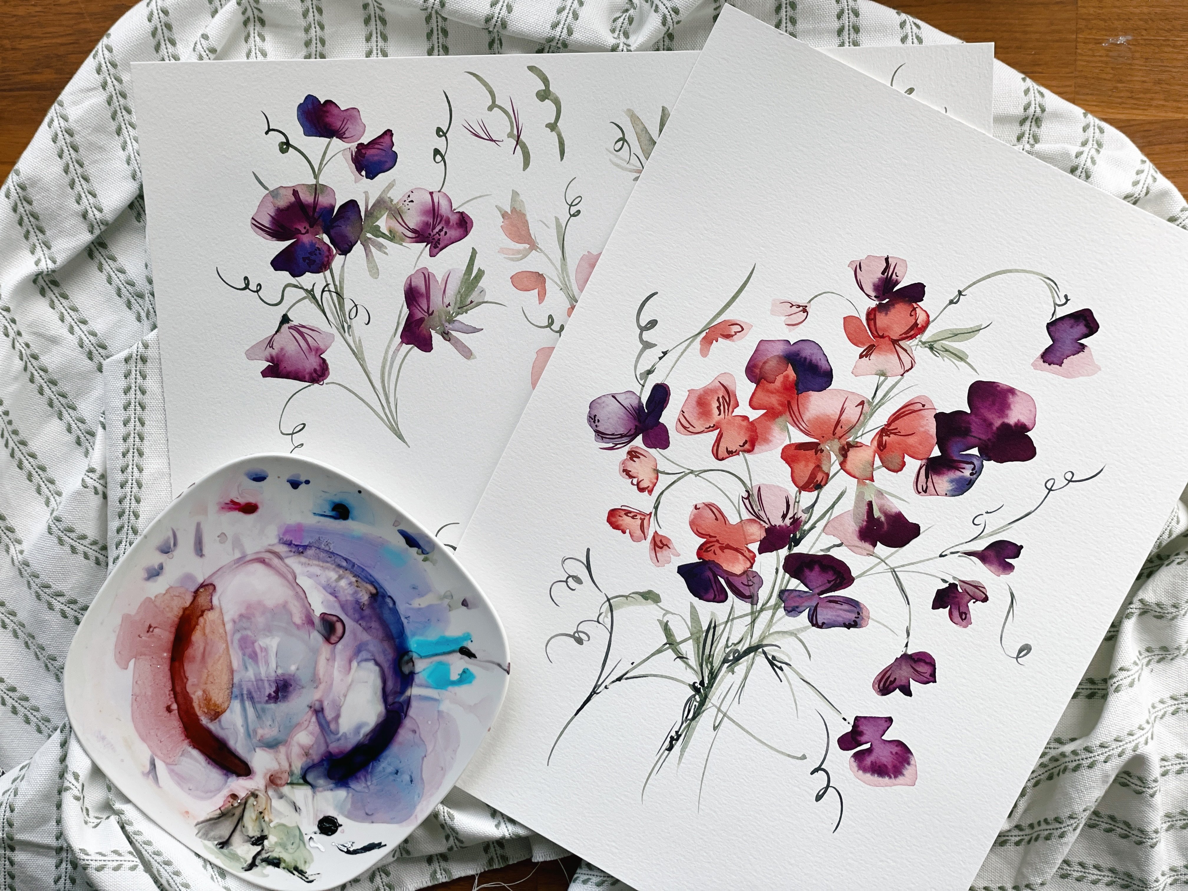
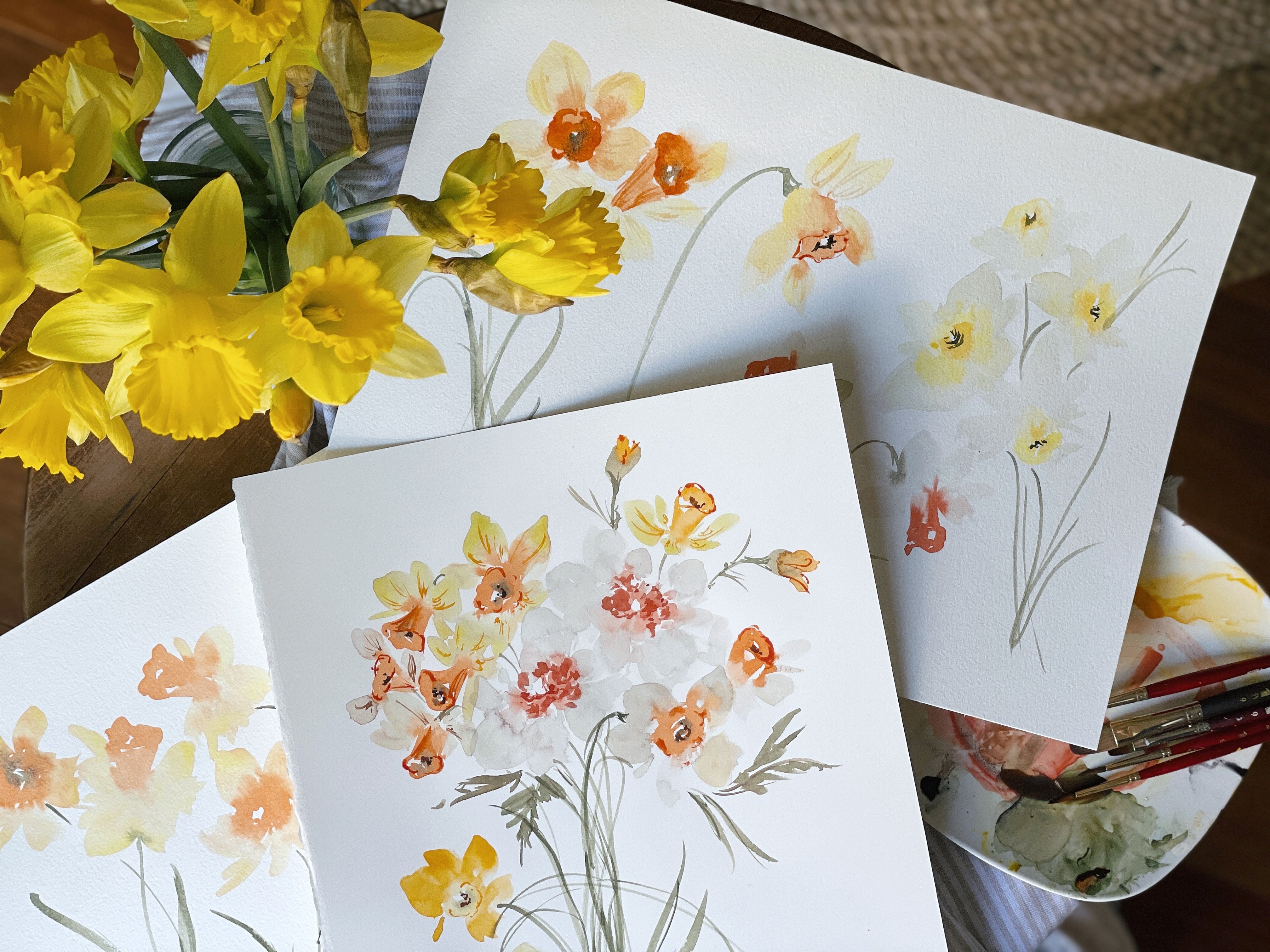
11. Penning the Garden Rose: So I've drawn the
next two flowers on the same piece of paper, although we'll do each one
step-by-step painting, painting, painting, painting. I thought it would be fun
for you to just kinda see what they look like
next to each other. How darling they would
be if you were to create a set of five note cards, you could use
obviously each one of the compositions to create
a whole variety packs. So again, just trying
to give you options, these would be darling,
also in a pattern. If you wanted to make a really simple motif
using the compositions, that would be great as well. One note before we
head into the roses is that less is more
roses I typically stay away from when I'm
doing pen because it is such an ornate flower
that with lots of overlapping petals and
curling of the petals that I find that when I
was too detailed with it, it just ended up
looking overworked. And so I find that especially depending on the rows like this is a garden rose, it has less petals than those
roses that you might find. The ones that are
more oblong shaped, long stem red roses. Those just do not ever end up looking very
aesthetic to me. The garden roses are much
more amenable to the style. And then wild roses as well that look very much like a Cosmo, work really well as well. So just a little note, moving forward, trying to
save you some frustration. You obviously are welcome
to have a go at it. It's just that's
been my experience. So alright, let's
go ahead and we'll start with the center
of our rows here, making a few C-shape
marks to intimate here at the center of
this flower you can see I have a framework in here, gesturing toward a center. But I'm not going to do too much crazy pen work because I really just want to again, capture the essence
of this flower. The smaller petals really
should just sort of be indicative that there is a center of the rose
and not overworked. Start here, moving our way out. Less is more like, I know I've already said that. But, and softer is more as well. Start soft. You can always
bold things later, but pen is pen. You cannot erase it. So it can be frustrating
if you spend all of that time to get a
really beautiful sketch. And then you end up making
a line that is just feels way too thick. Again, you can see I'm
coming off my sketch here. To rough it up a bit. You also will want to erase the pin so that you can
see what you're left with. My sketch is quite dark, so it's feeling very
heavy right now. But in actuality it
will be very light. Trying to combine some of the more like pointy
aspects of the puddle with the softness of the
round petals as well. Getting into those
grooves there. Feel like those are really
what make this flower, those little variations
and the puddle, those rips those tears
the way it curls. I try not to capture all of it, but just some of it. To give an idea of how the
flower is just overall laying, rounding it out a bit. And then I'm going
to just leave this little break here for now. I may go back with
pen to increase it. But for now I really like
just having that open look. But I am going to take
the eraser now and just work through the design. If for some reason
you are able to pick up the sound in the
background at this moment, there is legitimately
a murder of crows. That's what they're
called when they gather like this outside my window, there's about 45 of them
and they are circling a palm tree and making the
most ruckus I have ever heard. There must be like a little baby or some sort of predator. But boy, are they at it? It reminds me of I don't know if anybody
watches **** sheets creek, but Moira does this movie where she is in a Crowe movie
and it's just it, it makes me laugh every
time I hear crows, I can't I can't
see anything other than Catherine O'Hara is face. Like they're gonna
be at it for awhile. Okay. So I love where
we're at with this. But I obviously see some areas where I just
want to intensify, going a little bit deeper. So I'm gonna go ahead and
take my 0.45 pen and do that now before I work in with
the stems and the leaves. So here at the center, just indicating that it's a little bit darker
through here, just making the line
a little bit thicker. So I'm really not
creating new lines. I'm just making what what's already been
previously pinned. A little bit thicker,
heading into these grooves and
then coming out. Again, that's shaggy. Combination between
rounding the softness of the puddle with the point
minus that combination. Looks really, really
nice together. Darken the crease
here where you would imagine that this is the deepest part of
the petal coming out to these petals folding outward. There's been times where
I've really tried to intensify this area
because this is where it would be in nature darkest and it just ends up
looking so overworked. So again, just trying to save you a little bit
of pain and suffering. Alright, that's coming along. I'm going to darken
it up over here. Bold, bold pressure. A little bit of pressure here. Darkening here. A little bit darker in there, just to indicate okay,
that is the center. That's where it's darkest
and coming along here. And then I thought
it would actually, it might be fun for you to see what it would look like if we were just to use the
0.45 pen on the leaves. So not doing the double. The reason I like the double
is because you can get to thicknesses of lines and that combination
together is just really beautiful to have a thinner
line and then have a heavier, thicker line over it. But I did want to
show you that it is very possible to just use the one pen to create
something that's similar. So not that you would be in a hurry or need to
rush this process, but some people don't like having to use
two different pens. So let's go ahead
and do that now. So I'm going to start with just some initial lighter lines. I don't know if you can still
hear them. My goodness. There's got to be 45 of
them and they're just, it looks like the Wizard of Oz. They're just like, It's
like stormy out there. They're just like launching
towards this tree. Like goodness, I hope
everybody's okay out there. Scary times. Okay, so making
some light lines, pressure, pointing here. Let's turn it around so you
can get a better angle. And some thin lines here. Let's work our way down here. And moving through pressure, light area all the way up and then down here where
the two stems connect, I'm going to make it darker. And dot, dot, dot. Then let's come back
through here to finish off this dot, dot, dot. I really loved the dots. Dots are my favourite.
Light, light sketching here. And sketching lightly. Really roughing it up. Coming through to
the middle here, do a little vain work. We'll put in a couple
of more veins to our leaves as we finish up. And lightly coming through. Dot, dot, dot. I find that this is the area
I really liked to accentuate this beautiful stem and then be lighter in loser
within the leaves. So I'm going to erase now
to see what I'm left with. And then we'll make
our modifications. Again. I'm going to have to
push pretty hard because this initial sketch
was pretty happy. One of my favorite parts though, is taking the pencil out and seeing what
you're left with. I think I got most of it. So I definitely see some areas that I want
to make a little darker, starting with this
line right here, I'm going to darken that up and continue so that
you can see that this leaf was folded over. And then I'm just going to
begin to darken up the areas. So I'm still going to move over the lines that
were initially drawn. So those light areas, I'm going to intensify and double up so that
there's a thin and a thick doing the
same thing over here, creating that thick line
right around the thin line. And then also adding in
some veins as I move along. Finishing off here, heavier
dots working in the veins, thickening up these leaves. And obviously you are
more than welcome to keep these loose and
light or really go heavy, It's completely up to you and I feel like you don't really know what you love until
you've done it both ways. So give yourself again that
permission to to do that. I'm just kinda looking
to see what I have. There is just areas
where I'm like, okay. I feel like that could
be a little bit darker. Right around here in the center, I'm going to add a
little bit of detail, but not too much. This leaf over here, I think, could benefit from just a
little bit more shaggy hiding in the veins. I feel pretty good about that. I feel like it's a
really nice balance between detailed and loose. So I'm gonna go ahead
and take one last look. Darken that up just a tad. Alright, I'm happy with it. Okay, So take one last look yourself and see
where you're at. And we will see, I'll see you in the next
section for painting.
12. Painting the Garden Rose: Okay, so we're going to use
a really pretty peach color. So I want you to go ahead
and dip into your rows lake. If you have a little bit
of sepia on your palette, go ahead and mix
that into there. If not, pull out a little sepia. So it's nice, it's a
nice muted pink here. And then we're going to
pull in a little bit of the yellow ocher. I want something really light. And you're going to have
to play around before it's not pink and not
yellow but peach. So just keep playing with it. You can get it as
dark as you need to really figure out
what color it is. And then you can draw out a separate pile too
late in the wash. So this feels like a
really nice peach to me. Not too dark. I am going to add just
a little bit of water because you don't know until
you put it on paper and starting light is always best. Alright, go ahead and move
that off to the side. We're going to use
our filbert brush. I'm using a size six. All of this is in the supplies
and the materials list. But just in case this
is the Umbria series. And let's go ahead and start here at the center and
we're just going to make some light marks. Nothing too detailed. Don't even feel as though
you need to go over the pen. Just creating a little
bit of a center here, using the tip of the brush. And then gradually
we're going to move our way into the petals. Move slowly. Don't feel rushed. Look at what you have. Think about the shape. Think about what shapes
you want to achieve. Leave whitespace. I cannot emphasize that enough. Leave whitespace. Whitespace is magic
and watercolor. The pen work will
shine no matter what. You don't need to emphasize
that with the watercolor. The watercolor is just meant
to be the cherry on top. Going to come out here, the very tip with some
light, light wash. Again, coming in here with a little bit of
a darker color now, not darker color, darker
version of the same color. So that happens by just adding, picking up a little bit
more color and not blotting off before moving on. Remembering that
things are going to try two to three times later. You can darken some areas if
you feel like it needs it. Adding in a little bit of dark. Connecting here. For some bleeds. I had here. That is one
of my favorite colors, this beautiful peachy pink. As I said before, take
your time mixing it up. You don't want it to be pink, you don't want it to be yellow. Is that beautiful marriage
between the two colors? I use it all the time. It's one of my favorites. I believe it's in
my sunset series. With the vintage color guides. I can't don't don't
quote me on that. I think it might be, but if not, you already know the
recipe, so enjoy it. Okay, So I am happy with
where we're at with the rows. I'm going to go ahead and
add in color to the leaf. Now we're going to continue
to use our undersea green. This is my favorite
color combination, undersea green with this peach. I saved it for the rows
because I love Roses. Roses and peonies
are my favorite. Well and a little bit of
camomile like you can't get me quoting my favorite
flowers because then I will, I will, I will end up betraying myself
with just a little later on when I
paint something now, oh no, that's my
favorite flower. Now. The filbert brush
is really great for these wider flowers
because what we can do, or excuse me, wider leaves, we can start at the tip and then gradually turn the brush
and pull the stroke downward so we can start here at the top and then gradually
pull that stroke downwards. Make sure it's not
too dark initially, you can always go darker. So just make sure that
whatever you've mixed up is at that broth consistency and being mindful of not trying
to color in everything. So it can feel like a lot to keep in mind
as you're working. You can always do a little test. Because what is on the palate might look completely different. So if you want to take
whatever you have, you can say, oh, yeah, that's too dark. Take a little off. That's much better. Alright. Bute to full. Probably my favorite so far. Really just a one
stroke leaf here, not trying to add
in too much detail. Go. I'm continuing to work our
way through flattening out those bristles,
coming to the tip. We have a good balance between what's covered
and what's not. And then let's go ahead and let those two colors
run together. That peach in that green, you can do more and more
of that as we work. Papers should be staying
pretty nice and wet. I'm going to blot
off a little color because it's a little dark. And I love that so much. I feel as though it's just, it incorporates all of the beautiful facets
of this style. I'm gonna go in with a little bit more concentrated color. The undersea green
and the sepia. But not too much because
I really like how light and airy everything is. Just here at the
base. I'm going to add a little bit
more color because I know that this is
going to dry lighter. And I really love
what's happening here. The wet into wet of the
leaves and the petals. Let's intensify that,
bring attention to it. I'm going to leave
this whole stem white and let the leaves
just speak for itself. I feel as though these
are the areas that really mark your art is yours. It's what you don't necessarily do in a painting
that speaks volumes. It's where you don't paint. Negative space is a statement. So keep that in mind
as you are sketching, as you are painting
and painting, a lot of what becomes your style are the things
you choose to omit. Take one last look, feel it, feel good about where you're at and then go ahead and clean off your brushes as we move into our very last flower
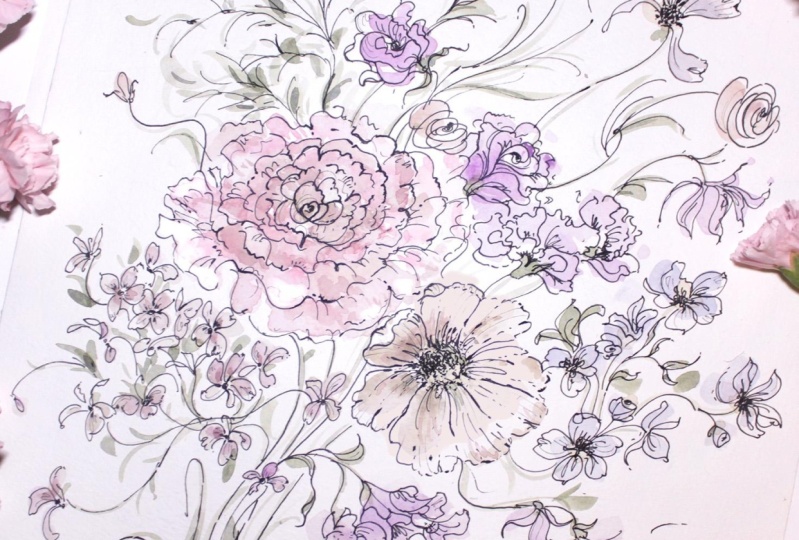
composition or lavender.
13. Penning the Lavender: Okay, again, I've made my
sketch really dark here because it just was not coming out
when I was scanning it. And I wanted you to
be able to see all of these beautiful little
lavender details. I'll have to work
a little harder as I erase, but no big deal. We will begin with our 0.25 pen. I'll start here at
the top over here. And these are just
beautiful little, they're just loops there. Almond shape loops. And I'm not going to
go over each one. But I wanted to just get the overall shape
of the lavender. Again. The exact reference image that I used is on
my Pinterest board, on Skillshare or excuse me, is on my Pinterest board
and marked Skillshare. Keeping in mind that
I'm going to head back in with my darker pen
or my broader tip pen. The tip, I think when
doing these marks, is to put the next loop
in-between two of these petals. So if you lay down a petal
here and a pedal here, let your next one rest in
between the two of them. And feel free to just use lines to indicate
a pedal as well. So it doesn't have
to be a circle. You can break it up and do
some lines and some loops. It's all it really is. When we're approaching it
this way, lines and loops. It won't have that generic feel. If you are keeping in mind the two petals
and then placing that, that next one in-between
off to the side. And then obviously you want to interchange the width
of each one as well. So do some that are really thin, and then do some that are
thick and really come out. Another really beautiful part
of this plant is the stem. It is very streamlined
and we're going to honor that when we get there. But in our own way. So you can see two petals, one in the middle
line, line, small, small, big line, line, small, small, small, big, small. That even helps to just
say that out loud. I think sometimes
it does because we're just getting
ourselves along. Don't feel as though you have to connect every single
part of it as well. That's another big. You don't have to circle the whole thing. You can just circle half-life that and then come
down for the next one, make some small marks. Do big one, make
some small marks. And the middle, small, small, small, big line, line. Big, small, big, small, small. Also, you can feel free
to just put me on mute. I will not be offended. I know some of you probably do. And you just work
along as you see. That's fine too. I'm here to guide you and help you feel more
capable and confident. But once you feel
you're at that point, you can always just
turn me off and work. Finishing up here lots
of little details on this one line, line, okay, Now we're going to be very careful
with this stem. I do want you to
be careful here, because if you encroach on
the inside of the line, it really does lose its look. So let's go slow. Dot, dot, dot, dot,
dot, dot, line. I feel like with the lavender, the stem is so much
a part of of it. It just really, because
kinda ties it all together. Okay, bringing it
down, dot, dot, dot can leave some
intentional breaks in here. Dot, dot, dot. Be mindful
of the leaf here. And finishing it off
here at the end. Coming back up,
bringing it through. Getting thinner
and thinner as we head towards the flower. Again, you may need to, once you erase things, see what you're left
with and began again. Okay, I'm actually
going to do it in reverse now I'm
gonna do stem first. Start here at the bottom. Dot, dot, dot. Intentional break. Again, intentional
break to honor these little leaves
coming out of the stem. Line, dot, dot, dot, coming back here. Coming off my
pencil line because it's encroaching
here a little bit. Honoring the space here, in this space here. And this space here. Keeping that open. So as to merge into the leaves. Line, dot, dot, dot. Finishing it off here. Okay. Let's go ahead and
start at the top here. Same thing we did before. Combination of loops and lines. Some lines moving my way down. Intentionally left room
with the stem here. So that is the petals could
overlap on top of it, makes it look more natural. Can do the same thing on the other one if you feel like okay, they're stems just sort
of floating there. You can a little
pedal on top of it. You'll do that with
your last look. I always like to give
final last look liberties to my students. Like I said, don't
feel like you have to connect every single line. You can do some some M's. Who's kinda what I'm
doing here m work. The only thing to keep in
mind is that these petals do move in an upward position. Okay, go ahead and
move into the leaves, starting with these beautiful
little scrolling tips. And just begin to lightly
sketch out their shape. Really feeling loose with
these gestural strokes here. Am I taking liberties here
to cross over into the stem? I feel like when you
honored some spaces, you can have a little bit
more freedom to get messier. That's what I meant when I said, I can take more
liberties like this because if the sketches
super detailed, then I know where I can
just be a little bit more loose and free
form with the pen. I'm gonna go ahead
and erase now and see what is left. Okay. I'm pretty happy
with what I see, but I am going to still had back in with the 0.45 and
darken up some areas. We'll start here at the top. I'm gonna be very mindful
of how much I'm doing because I want there to be areas of white because we're
gonna be adding in color. So just darkening and not
even doing full loops, just kinda coming in between. The marks that
I've already made. Darkening up some of the lines, leaving areas of white. It's really looking
so beautiful. That combination between those
thin lines and the thick, the lavender I think is
probably my second favorite. You'll see that when
we do the watercolor, It's very secondary,
but it just, it brings it to life. It goes from being remote and field guide to really feeling like
a true illustration. Darkening up as I go. Same thing over here. Going slow, being
careful not to encroach. Just looking for
areas where he feels though it could benefit from something a
little bit thicker. Not too many, honestly. I love this little
crisscrossing here, so you'll want to make
sure you honor, that. Don't go too intense here. You'll lose where
those lines meet. And I really went gestural
here with these leaves, nothing to shapely
like our rose leaves. Trying to give you
different approaches with each new flower composition. Okay, I love that. I think it looks
absolutely marvelous. So we will meet back in the
next section for one color.
14. Painting the Lavender: Okay, We will mix up a new batch of color
in just a moment. But I did want to bring
your attention to how this dried and the rows. It is just absolutely beautiful. I hope that you're
feeling that way as well. If not, again, you
have those sketches, you can have as many
goes at it as you like. But those bleeds here just
really worked so magically. And I hope that you're
feeling good about it. To the next color we're going to do is a beautiful purple
we're going to mix together, or pink arose lake
and our blue indigo. I'm going to be using my
little baby filbert here. This is the size too. It's called the mini detailer. And I'm going to pull out
a little bit of the row sleek and little bit of the blue indigo and
make a pretty purple. Little bit more
of the row sleek. And pop in a little bit of the sepia just to
mute it a little bit. And we will use both
of these colors. So we'll have one that's
heavier on the sepia. And then we will have
one that is more of your run-of-the-mill
crayon box purple. So go ahead and
leave both options. Let's go ahead and start
with our muted purple. We'll begin to lay it in. Budding off a little bit here. Remember it is going
to dry a lot lighter. I'm really not being super mindful of where I'm
laying the color. I'm not trying to get the dots or the circles are the
loops are the lines. I'm just brushing in color, rinsing off a little
bit of the color. So that what I
have is very pale. Line work really speaks
for itself in this one. And then heading in with
our traditional purple. To add a little bit
of variety to it. I'm going to add a
little bit of pink to it just to really differentiate between
the two colors. There we go. So I have a color that
looks like this now. Pinky purple. You
can see there's a nice strong difference
between those two. Can use your little
mini detail there for some beautiful
little fine lines. Really get the shape of the
lavender doing it that way. You don't have to stay
on your pen lines so you can definitely
come off of those. There we have it. Beautiful. Okay, we're going to
mix a little bit of the blue indigo with the undersea green for
a new green color. If you like that color as
is kind of a turquoise, green, blue. Go for it. You can just keep it like that. I'm going to add a touch of sepia because I do
love my muted colors. And that's going to
make it a really beautiful gray green. Okay, try not to
overthink this part. Just laying in the color. Blocking off a little bit here. Lying it in here. Love this color. One
of my favorites. And going in for the stem, I really like where certain
areas where it's left white. So I'm going to try
and honor that. And some of the spots just being mindful,
connecting every little bit. Hunting back in with
a little bit of the cough syrup
consistently consistency now in this color and darkening
up some of the areas. There we have it. Beautiful lavender. So beautiful. I can't say that enough. It's just, I, I get so
happy when I get to play with this style
in this process because it's so different
from what I usually do. So I'm hoping that it's the
same for you if you felt stuck or created,
creatively blocked. We'll just open up
the channels and just allow you to feel very
free, form and loose. So that concludes our
five unique compositions. We're going to pull it
all together and make a really beautiful bouquet. Would be perfect in time for we're just about
at Mother's Day, but would be perfect
for summer too, as we come into these months, at least where I'm
at, obviously, you'll be watching this
whenever you watch it. But I wanted you to have
something special to make as we roll into
the different seasons.
15. Class Project Part 1: Welcome to our class project. I'm so excited about this. We have a really beautiful
whimsical vintage ask bouquet on our desk. And if you haven't already, you will definitely need to
print this out either onto watercolor paper or printed out and trace it onto
watercolor paper, which is obviously
what I suggest. Just so you can remove the
pencil marks. As you can see. Again, my pencil
marks are very dark, but you'll see even in the scan, there are some areas
where the pencil does not show up quite as significantly in some areas. But you will be able to obviously
to fill in those blanks since we've learned all of that material in her
previous segments. So we're gonna be
doing this together. We'll use all the same concepts, everything that we've learned
in our previous videos. We'll pin everything first
in both pens and then we will lay in the watercolor at the very end and watch
this bouquet come to life. You're welcome to
use this composition and any way that you like
there is no copyright on it. It is yours. You can
make cards from it. A pattern. I wanted to give
you something that you could play with
and improve upon, add to take away. It's completely up to you how
you would like to use it. I'm going to go ahead and begin with my point
two-five pencil. You'll also see that I've
added a couple of new flowers. I wanted to do something
a little different. I didn't want to do just
the same flowers that we did from our previous section. So you'll see that I've
added a little bit of forget me nots and just
some other flowers here. We still have the
sunflower and the rows. But I wanted to bring in some fresh new concepts so that you can continue
learning and continue growing
using this style for any other flower that you might want to create with
this approach. Let's go ahead and begin
here at the very top. Outlining our pencil. Beginning with those circular
marks will be some areas where I lift off of what
has been drawn in pencil. Just to give it a
little variation. The pencil work again, like I said, I've said before, is really just to lay the
framework down so that you can feel confident about adding
to it or taking away. The petal shapes that I've
created are very generic. So there are places where I am changing the entire
shape of the petal. Now that I know
which direction I want the flower to
be pointing in, a lot of that is really that
initial work is just to have an understanding of
what direction is the flower facing isn't
an open face flower, is it on its side? And then once my
brain knows that, then I can intuitively began to change that just slightly to create something that just feels a little bit more unique, a little, little looser. Roughing it up a
little bit here. We'll be going in
with our our 0.45. So we'll have time to
just make it a little bit looser, not so geometric. I suppose. Let's go ahead and jump
down here to our rose. Creating this as our center. These are all flowers
I drew intuitively. I did not use any
reference pictures, so there will be nothing in my Pinterest for this bouquet. This all just out of my head. Sometimes it works,
sometimes it doesn't. This little illustration just kinda flew out because I've been obviously working with you and using the pen
and watercolor. I was very ready to create something for us to do
in our class portion. So sometimes it's like that it just comes out, it's quick. And it is exactly the way
that we hoped it would be. And then sometimes it
takes a lot longer. Alright, so anchoring in
some detail lines here. And creating and carving out
the center of this flower. Forgot a little bit of this
rose petal right here. So I'm going to add that in. Layering here with
these two lines. Creating some darker parts
of the flower. Jump up here. Some darker areas over
here off to the side. We'll pop over here
to our sunflower. Carving out a really
nice round space. This is more of an
open face on flowers. You can see we're looking at it head-on versus these two which are clearly
on their sides. And this one. This really plays into the whole composition aspect
of I'm designing something. Anytime you're working with
multiple subjects matters, it's so important to have
things in different sizes and facing different directions
and different shapes. Those are the key ingredients to any well-balanced
composition. Putting in some of those lines, being really loose with it. Just looking at what I have, making sure that it's
ready for the next step. And come in here and
start adding the stem. Dot, dot, dot. Just moving through being mindful of where the stem
is and connecting it to the farmers and to the leaves. Leaving breaks
within the cluster. Come down here. We're
cutting or leaves. Again because I
have the framework. I feel like I have a lot more liberty and can make those gestural
markings come up here. Then let's create some
stem work in here. There's a lot of
stem happening here, so it's best to go
slow and to make sure that you feel good about where each
thing is connecting. I have these three connecting
to a larger stem down here. Pressure, lightly, coming over here, roughing it up along the edge. Leaving those
intentional breaks. And then honoring where there is overlapping,
overlapping happening. Tongue twister, dot, dot. Now we are free to connect
this one is it lays over the other stems and some
really gestural leaves here. Okay, I'm gonna go ahead and
erase and see where I'm at. And then I will head back in
for those detail markings. Everything's gonna lighten up significantly because it was
so dark from the pencil. Just a little note
whenever I'm making original pieces that I plan to put in the shop or
if their commissions, I always use a paper
towel to brush that way, whatever oils are in my hands
are not left on the paper. When I scan things, all of that so erased. Any markings or
yellows that might have been in my hands and
have been touching the paper. But when I'm doing original pieces and if you
are doing original pieces, you want to make sure that
your hands are touching the paper as seldom as possible, just because it does
pick up everything, even if you can't see it. It will affect the overall age and how the piece holds
up to and preserves.
16. Class Project Part 2: Okay, let's go
ahead and head back in adding little
details at the center. These details look
small, but they, they leave a really big impact. It, the illustration
goes from looking just very clip art to something
really special and unique. When you add in just
that little extra step and you go the extra mile. Just increasing
the pressure here. Really FlipKey overlap lines so that there are
two lines here. And in many instances
it will look like the petals ruffling
or it's curling, which only benefits
the composition. Adding a little bit
of veins there. Then we'll head back in
first stem, pressure, pressure. Just overlapping here. Mindful of that intentional
break that I had left. Darkening up these lines. Careful not to encroach into
the petals of the sunflower. And then we'll
begin to darken up the areas of the perimeter. Really stretching these lines along the edge and
then working our way with these sea marks. These little circles
into the center. Being mindful of the direction. Curling them inward. Using dots and little C shapes. And then beginning to outline darkening up the veins here
using really scratchy, quick FlipKey gestural markings. Just kinda looking over
what I've already done. Seeing areas that
might need some help. Looks pretty good to me. I'm going to continue
with the stemming dot, dot, dot pressure, overlapping. Pressure, overlapping. Take one last look at it. Sure. I have the areas
that I want to lift out, evident and apparent,
but overall, I think it looks
absolutely fantastic. So let's go ahead and begin
the painting portion. We're gonna go ahead and
start with the forget me nots by picking up
a little bit of the blue indigo and
mix that with sepia. I'll show you what that
looks like in just a moment. So it should be a really
nice, dusty blue. The blue indigo. This up, yeah. We'll start with
broth consistency. You may need to even
add a little bit of water to it if it's
looking too dark. And we'll begin to
lay in the color. Try to be careful about coloring every little detail in and
religious kinda grasping. Overall flower. Will watch as this
illustration comes to life. Okay, we're going to
pick up a little bit of the yellow ocher and pop that into the middle
of some of those flowers. Can it doesn't have
to be exact and it does not have to
be on all of them. Then let's go ahead
and mix together our rows lake and our yellow ocher for a
beautiful peach for our rows. Same color we used
for our rows earlier. Make sure you test the color
on a scratch piece of paper. See if it's too dark, too pink or to orange. It's a little dark, so I'm going to add
some water to it. And just making sure I have
the right consistency. You're going to see
how the blue and the pink look really
beautiful together. The pH, I should say. Using our filbert to just guide the colors through the petals. Leaving whitespace. Whitespace is always key. Let's go ahead and move
into these lovely blooms. Don't really have
a name for them. They were kind of intuitive. We're going to mix up the sepia and that lamp black to get a really beautiful warm white. We'll lay in or filbert just taking the toe of the brush and then also
laying in the side. Do it again for this
flower up here. Remembering you don't have to color in every single detail. Then I'm going to pick up a
little bit of yellow ocher, mix that with the sepia and add that into the
middle of that flower. Okay, now we're going to
use straight yellow ocher, so rinse off that filbert brush, or it's going to end up looking like the middle of that flower. And like I was saying,
with composition, variation between color, shape, size, and positioning, those are the magic
components of composition. I have a sketch and
palate guide on my website that goes into this in more detail about why we
make the choices that we make when composing a piece and
how one benefits the other. Alright, so yellow ocher
right here off to the side. It's gonna be a little dark at first and then I will blot off. After a few strokes. Beautiful. Add a little bit of water to it. Now, just intuitively filling
in the space, can see how beautifully muted and vintage
this is looking. Can use our round brush to pop in a little bit of brown and yellow ocher
into the middle, little bit darker. And then we can pop that
into the perimeter as well. If we want to have some darker areas of the flower as coming
along so beautifully, I'm going to pop in a
little bit more color here to just to darken
the center bit. And then last but not least, we will head into
the undersea green. And the sepia. You should have a mixture
that looks like this. We will begin with our
number six round brush. For these little
details up here. I'm getting splitters. That's all right. Taking my time. Gently guiding the watercolor
into the general area. Be careful of your
hand not to put them into anything wet.
And it does happen. If you wanted to use
a different green for each part of the bouquet, you could do that and that would add just one extra layer. You could use a green gold or
you could use a sap green, and those would look
really beautiful. So you could do these more
in this evergreen gray green and then you could do the
leaves and more of like a, a verdant grass green. It's completely up to you. Just guiding it through. Come over here. And I'm going to put my round
brush off to the side and work with my filbert again
for these bigger leaves, I feel like the filbert
really is more conducive. It can start at the tip and then just work that stroke down. Then flicking the brush up. If we want to get
some more shape. Can we can turn our
paper that always helps to start at the tip here and then drag
coming to full shaft. And just pulling
the brush through. You can see how it
went from being just very clip art to a lot more
detailed of an illustration. And then you lay in the
color and it becomes absolutely magnificent and
beautiful composition. So it doesn't have
to be done here. This is just a very quick initial first wash.
You can always wait till things are dry and then go in with more
color or detail. You can always decide after that you want things to be more bold
to take your pen, go back over certain areas.
It's really up to you. There's so many
different options. I hope I've given you a lot of things to think about
to work through. And I hope you will revisit this material as you
approach different flowers. I had so much fun I
truly did teaching you. I look forward to our
next class as always, and I thank you so much
for joining me today. Have a wonderful day.
 Cara Rosalie Olsen, Floral Designer + Watercolor Instructor