Transcripts
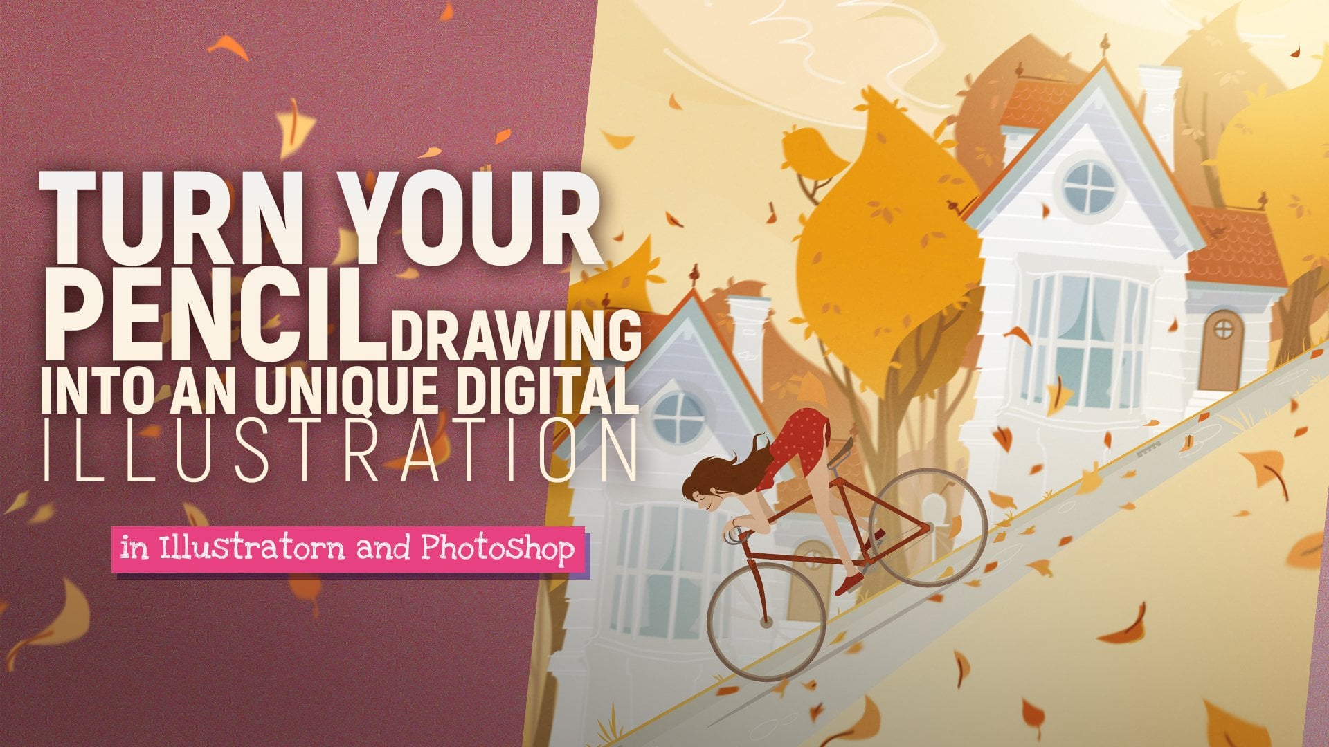
1. 01 - Promo: Hello. I'm Peter Illustrator, three D artists on motion Designer. In the following lectures, I will show you a worthy use was catching mode in photo shop. Forget a pencil tool and alliance. At this time, we will create beautiful sketch with using my custom brush that I made for this course. We work with only seven different gray scale tones from white to black. I made a palette as well, so you can work quickly and easily. I can show you my personal technique to define the elements off. Seen what can be more than a simple lines Catch, I guess Dida off the scene and the right owns can help us later to define the colors for the final art. Just follow my practical method and the end of this course you will able to create creeks, Catches like this joint in my course on turn your sketch technique into higher level
2. 02 - Import the brush and the palette: Okay, Now let's see the final art of this course. And of course, we will make a monochrome sketch. Why is it different on May be more than a simple line sketch. One of my ah spurs is the depth with this method we can define. For example, the death off a landscape with using the tones defined the atmosphere as well. Orly contrast. I guess the most important thing with this mattered is to represent the connection between the lights and shadows in the sample with using few great tones, we can explain that this tree is in the foreground and the lie gray mountain is in the far background. If you have a tablet and you want to paint a quick sketch for Colorado, this time is really perfect because this is a quick technique. Okay, does the question What about the colors? Sometimes it is hard to find the right colors with using the right tones for our art. The strong contrast, like in this great scarce catch, can help us to understand and find the right tones before we define your colors. Before we start to dro, I share my custom brush. I made it before sketching. All right. Creating new cameras. The size doesn't matter at this time. Grab the brush tour, then. Right click gear icon. Then find import brushes. It called dear, comes a pastor. Choose open. Here it is on. Let's try. I'm not sure about the shape dynamics. So increased the minimum diameter do 80%. It would be better Then click today. New brush icon. Okay. We saved a modified brush Also, I made a great palette for this course. Find on doggie libraries down. Import my library. There are seven different gray scale tones in here for on white do Beck. If you have no connection, we d had a profile. You can define these stones easily. As you can see, I named all tones, jumped a window and switches. Then find a color panels to in here. Choose grace care ramp. Just type a well, you, for example, 20 person. Then in the switches, click to the empty part. Good. That was easy. Okay, let's try the new brush with these grace. Feel the camera Sweet, kind off blue or any color. Then try them. Ni White on black. Where? Okay, naturally. Actually, to find the five tones between them was not so easy. I choose These were used finally, which are used for force catching in monochrome. Actually, to find the five tones between dam was not so easy. I choose. These were used finally, which are used for force catching in monochrome.
3. 03 - Some quick tips and tricks: clear the chemists again and let's see some trick on paintings died before we start drawing . I guess these stones are enough force catching. If you want more stones were free to change the opacity of the brush for the background. I mean sky, I usually use the Graddy into it. Make a selection first, choose a great own them press X so you can define the other grave for the radiant. Then use the brush on it. One of my favorite tool is the less 02 and nice. Do it if you want to dro as well feel free to use it like a pencil. If you want to hide the stroke of selection, press command or control H which press shift, you can add more selection to the recent selection with using God. You can expect from this election feel free to combine the radiant with the brush and there oh, a tree quick and easy. I guess this is the easiest way to draw graphs. For example, - when you use less so to always focus on start and endpoint, if you don't want were shapes wrong method. And right now I thought okay,
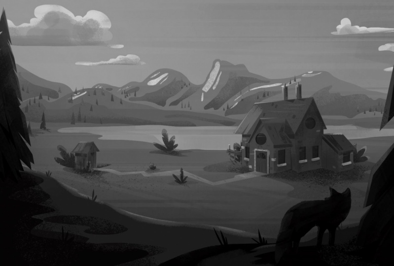
4. 04 - Define the scene: All right, let's start to paying something. Actually, there is another help. I did. I made a quick line sketch. Yes, it sounds weird. Sketch of the sketch. But I guess it can help A little bit to imagine this scene at this time or if you want, forget this draft and started with clear campus. Now we will work with this draft. As you can see, there are two layers in here. The roughly here is in multiply. You can lock this layer if you want. We want use it except delay or of a city. I always started to define this guy. The clouds on the sun In the far background I try to imagine a color for blue sky So I choose to darker grace. Andi Grady in tour Dr. Grey in the top on lighter one is in the bottom. Okay. With a lasso tool Dro diesel Let off the mountain in the background Because this mountain is in the far on. That is an atmospheric fog. I'm going to use the bright and gray of the sky. Fill it with d brush. We have to define the direction of the sun in a new layer I will draw an arrow. Maybe this is our son. It's just a reference with a less so, too will define the brightest parts of the mountain press shift so you can add more selections easily. Good. The lower pressure, we'll add. No, is a brush patterns, and it looks good. Dro some pine trees on for us with the Lascaux two. Nothing special. I'm going to draw some kind off try Angers. I don't want perfect shapes. I just want to catch the mood. I also used the brighter grace, and in here I'm going to paint some bright patches because this trees are higher than the mountain peak with a lasso to withdraw some huge patches on the sky and everybody the clouds. This will be in the far, - and this one is a bigger one. It's huge so we can see only his bottle, which is darker grey in the left side. I'm going to pain brighter ledges net. So now it looks more realistic. Go back to the mountain again and the darker parts to it as well. They are also soft shadows, so I'm going to use Grady and tour with brighter grace. The mountain in the foreground. We'll get darker shadow parts. I was aerobics elections. And with the new brush, I pain big batches, so increase the brush size. Okay in the clouds. I'm going to paint some small and right edges. This will be the brightest parts in there.
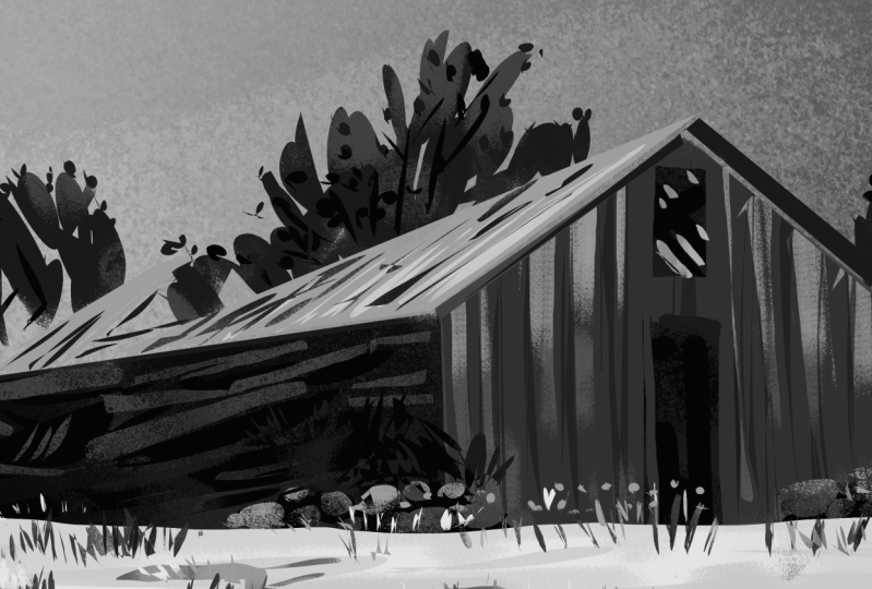
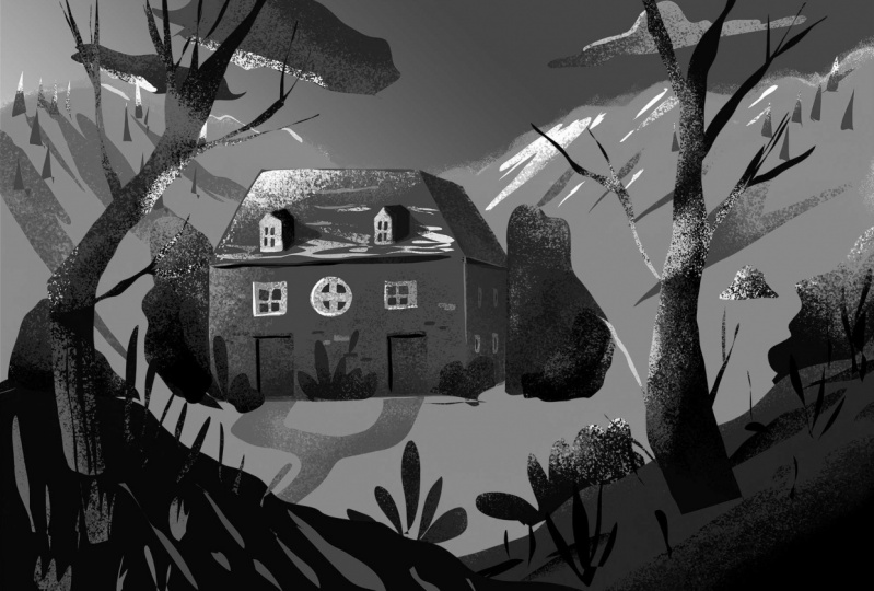
5. 05 - Sketching of the buildings: in the next steps, we were approaching two D four round with a selection to what? I'm going to redraw the building in the back. For us, the chimneys done the war. This building will be darker it on the mountains because this one is closer to us. Defined the brighter sites of the chimney. Dender o som cast shadow on the roof that is a darker lines under the ledge. Now continue with the window frames Use brighter gray for them. This size should be darker because the shadows pain some patchy lines to represent a bricks. Brighter patches will be the parts of the roof. The windows were get the brightest stones. After that, with a selection, I try to define the window glass I'm going to use dark and greater it also. There is a good trick if you paying the window glass. He was brighter color in the top and darker one in the bottom because the sun and the bright sky, but some breaks to hear again and continue with the other house. I'm going to start it with the war building with the same grade. This will be the darkest wall, so choose another doctor. Great to it. The next one is the cast shadow of the ledge. Dan defined a roof like this. It has bright surface because the reflection of the sun chimneys are dark. A great like the shadow. I guess they are rusty metal or stuff like that. So I tried to catch net. Look, the other roofs are in the shaded side of the building. - That would be the doorframe, and this is the windows. The next house were from mood. I guess it's a kind, off blank house. - Just throw some lines horizontally, them painted with darker grey. You seem in a technique to paint the plant proof good. The last building were get the highest contrast. It's kind off whitewashed house. On the other hand, I would like to add more contrast and focus point to the scene. First defined the darkest parts, the roof under custody for the wall. I choose to bride grays and dig radiant, too. Now is looks diferente, little bit dandy. Other buildings nice in here. Now we be a big white window with huge frame, some bricks to the wall and maybe add more chimney to the roof, also at some blanks to the war
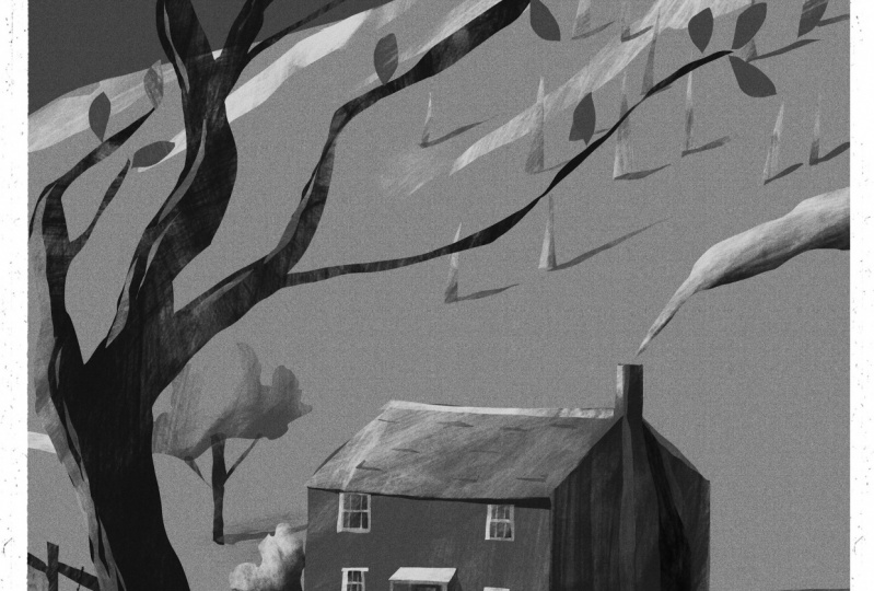
6. 06 - Paint the foreground: the next steps. We were working on the environment and vegetation. Now, with selection toe, I'm going to define the bus or road at some quick bushes next to the buildings. And as you can see, I use only five. Russia's deal Now the five brightest ones Okay in here. Now we be a fans. There are two trees in here. - Bush's for here, so we have a background with sky clouds on. Here's and here we have made the middle ground as well. Let's work with the foreground with the fifth darkest gray defined a hell or hump no some grass and feel it with the second, darkest grade. Now, with a lasso tool, I'm going to draw a three we branches, keep the selection and use the second darkest color for in its bottom. You can hide the selection with common H as well. Try to mix it with brighter grace may be used bigger brush size. If you want exciting textures, I think it looks good like a tree with grasp. Some lives were be nice at the end of the branches, and don't forget the cast shadow of the tree. I'm going to work, according the sun direction that we specify. Earlier in the left side there will be another hump. Also, it has done great owns. No, some grass You have the party going to again Andro a three again. The base don't is dark. It has got green areas. Well, just throw some big form with the lasso tool and use biggest size brush defined the shaded parts of the greenery. The trunk looks flat at this time, so grab the lasso tool again. Andro grass. Do it at some bigger leaves Did. In your foreground. They will get the darkest don't in the scene. So the back looks nice at some dark leaves to the greenery. - I'm good. I guess some darker branches of the trees were looks fine in the middle ground. All right, I pleased with these results. Okay, So the main rule I followed in this course is brighter grace for the background and darker wants for the near four round. As you can see, I use only two layers. I guess after a time, with a lot off practice, everybody can create quick on better sketches I can't believe in by
 Peter Nagy, Illustration, Drawing, Motion design, 3D,