Transcripts
1. Introduction to Lettering in a Circle: So you're a lettering person and you love the paper to pen thing just like me. And you've been practicing and making some cards and doing some words, and you're looking around for the next fun thing to do with your lettering. Well, I have a project that I think you'll really enjoy. I'm Suzanne and I'm a calligrapher, and I want to share this fund technique with you. We're going to take a line of your lettering, and we're going to turn it into a complete full circle, so it fits perfectly when it's finished. You could turn this into a card or create a frame for a photo, or make it into a wedding invitation or announcement, or even have rubber stamped made from your finished artwork. You don't have to be an expert calligrapher, and you can use any tool that you're comfortable with. It works in all styles, so join me as we get started and talk about things like the tools you might use the practice you need to get into your rhythm and how to calculate the size of your circle as well as some of the pitfalls to avoid. And we'll start talking about all that in the next lesson. See you there
2. Supplies: uh, welcome back, letter lovers. We're going to talk about supplies in this lesson of lettering in a circle. I'm going to give you an overview of supplies you might like to use for this project, but in the end, it doesn't really matter what you use, because this isn't a class on lettering as much as a class on how to use your lettering. So we'll start with this nib. It's the Mitchell round hand nib and it's abroad edge nib, and it's flexible and sharp and easy to clean. And I've loved this nib since the first time I tried it. I'm a calligrapher that's trained informal hands, and that's the type of lettering I love most and you may not. And that's just fine, because it doesn't matter what tool you use for this project. For pointed pen laddering, this is a Jola 303 Nip with an oblique name polder. You don't need to use an oblique nip holder for pointed pen, but it's sometimes helpful. There are all sorts of pointed pen Nibs, and some are more flexible than others. This one is extremely flexible and sharp, and probably not a good beginner nib but it's my favor of the easily obtainable Nibs. If you're new to pointed pen laddering, I encourage you to try a variety of Nibs because there are lots out there now you can use the humble pencil. There's no reason you can't do this project with a pencil or a pencil crayon. And then for the modern calligrapher, you can use thes fund brush pens that air a fiber tip, and they're like a brush. But they're easier to handle, and there are lots different sizes of those. I quite like these current tacky brush markers. They have a little snap and stand up to a lot of use. And like all markers, they're handy to carry around for sneaking in a few minutes of lettering when you have the chance. So would is calligraphy. In simple terms, it's pen, paper and ink, but there's a whole bunch of pitfalls that happen in there. We've talked about the pens, and now we're going to talk a little bit about Incan, paint this actually wash, and it's paint and all dried out. The great thing about paint is that in general it doesn't fade, and you can mix it to any color you want. I can add water to this and reconstitute it and work with it if I want to, with a broad ege pen or pointed pen or bristle brush. My favorite Inc is Higgins eternal, and it's a black ink, and it's the eternal, not the calligraphy ink, and it flows well out of the pen. It requires a little stir because it's a carbon ink and those little bits occur. Been can sometimes settle to the bottom of the bottle, so you need to give it a little stir, and that will help mix it. So when I talk about carbon ink, what I'm talking about is black ink that will not fade. And part of the problem with inks is there all sorts of inks out there in beautiful colors , and they're totally irresistible. But a lot of them will fade, and you don't want to do a beautiful piece of laddering and give it to someone, and they hang it on their wall and it fades in a few months, so it's a good idea to check with the manufacturer about that. I just want to show you a little fade test that I did years and years ago. I took a piece of paper and I made strokes on it with different inks. And then I covered half of it up and stuck it in the window for six months, and you can see what happened. Some of these inks disappeared. Some will disappear within weeks. The other thing you're going to need, of course, is paper to work on. And many lettering tools such as markers will work just fine on any paper, such as bond paper and copy paper. When I work, I particularly like this cancer on marker Pro layout paper. It's pretty slick. It's very white, and the great thing about it is that you can use a liner underneath because it's translucent and you could still see the lines. Now I'm inherently lazy, so I don't like drawing lines all the time, and this allows me to see right through the paper to the liner. Just keep reusing the lines and do your lettering on top. You get this practice liner sheet in the resources so you'll be able to download that and use it if you wish for final pieces, calligraphers will often use watercolor paper and that's what this is. It's 100 and £40 arches are sh hot press Watercolor paper. I tend to steer away from the £90 paper because it will sometimes dimple when you're carrying at home. From the store, you'll see a crescent shaped dimple, and that could end up right in the middle of your lettering. And we don't want that. And the other things you're going to need for this class is a ruler, and it's best to have one with millimeters a compass because you're going to need to draw a circle. And another thing that might be handy for you is one of these T squares. It just makes drawing lines. If you're doing a liner manually, it just makes it a little easier. You can run the T Square along the edge of the paper to help you make perfectly parallel lines. And some other tools you might like is this Tom Beaumont Oh, eraser. It has appointed end on it, and it's perfect for erasing lines between your letters gets into those little crannies super handy. Another tool I use all the time is Scotch removable tape because I attach my practice paper to my liner with it, and that pretty much covers it to summarize. You'll need a pen that could be a pen, brush, pencil or nip, and you're going to need a ruler and a compass to draw the circle. And if you're using a nib, you're going to need some ink. So stay with me and we'll get to do some lettering in the next lesson. Where will choose are quote and practice it. See there.
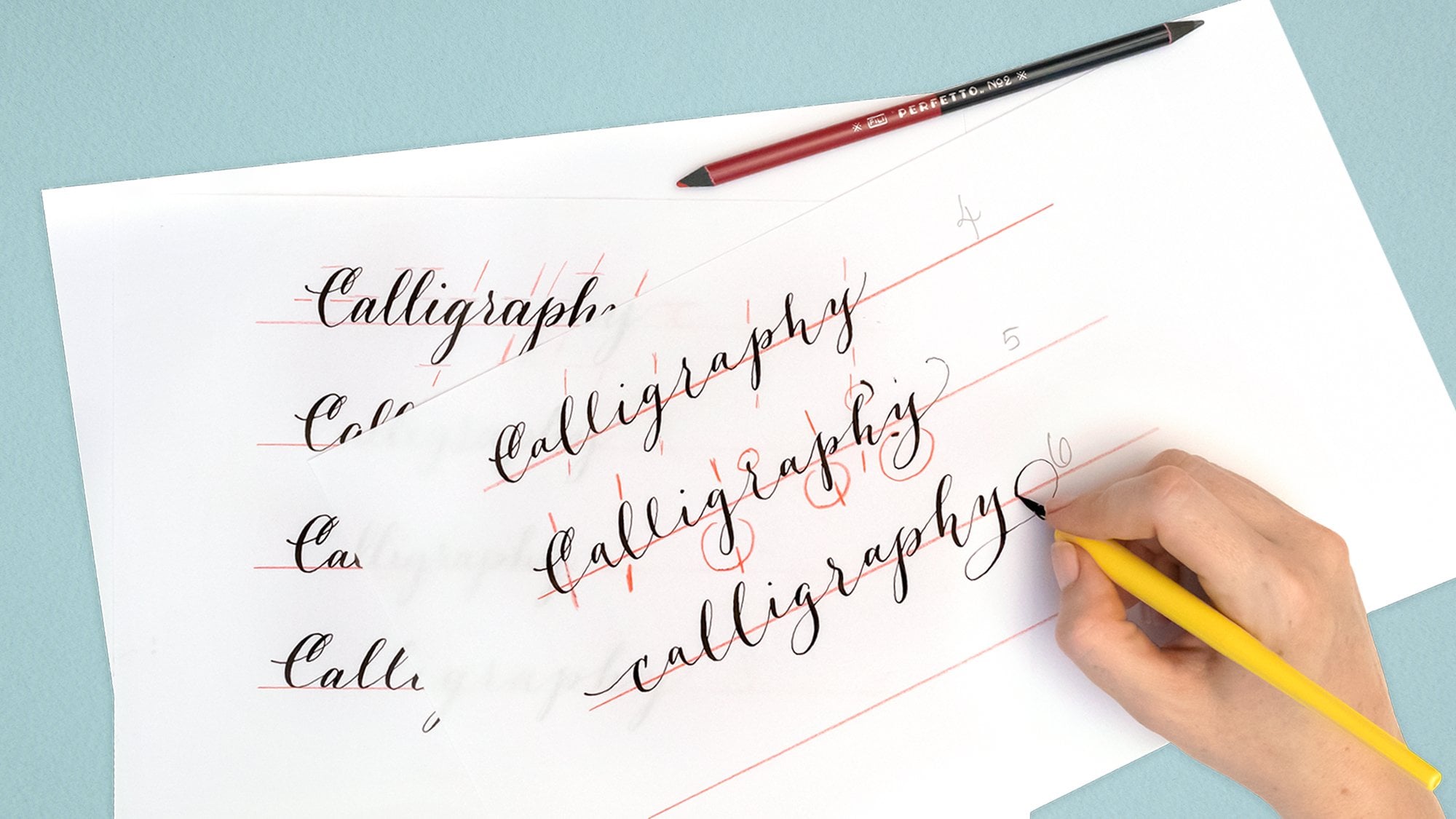
3. Choosing Your Quote and Practice Lettering: Hey, welcome back in this lesson. You're going to choose your quote and you're going to practice it now. I provided you with a liner, but that might not work for you. So let's start back at the very beginning and which is a clean sheet of paper. And use a pencil and ruler to create a baseline. Now, if you're more comfortable working with the waistline as well, pencil that in and try a quote. If you choose to use the liner that I provided for you, then just slide it underneath your practice paper and see. This is why I really like this paper because it's translucent and then just use, um, removable tape to adhere it to the liner. Now it doesn't matter which way you tell the paper. It will be just fine and secure. Now, if you're lucky and you have a light table, I have one built into my drafting table. You can see the lines much more easily, but if you don't have a light table, simply ensure that you have three or four sheets of white paper underneath your liner and that will help. The Heiner showed through your practice paper for your first attempt. It's best to stick. Quotes that are no longer than the length of your standard shade of paper may be about 10 inches or 250 millimeters long. If you quote a shorter, you could easily repeat it now if you want to, you can alter the practice liner that I gave you by just taking your pencil and ruler and drawing an extra line. The length of your quote will determine the diameter of a circle. So the longer your quote, the bigger your circle is going to be. Now. If your circle is really small, it can be more challenging to make it look good. But like I said before, you can always repeat a short quote, a phrase, and you can always had a little embellishment between words and phrases. In fact, that's a good idea, and it might give you a little wiggle room. Later, on another tip, I'd recommend you letter straight up and down. Don't put any slope on your letters. I know that if you're doing a Talic, you're going to want to put a five degree forward slope on it. But for this project, keep it up right. It will make your life a lot easier at the end. Another recommendation. Don't bounce your letters along the baseline. It will give you a cleaner circle in the end and probably help you make your lettering fit better. Something you should be aware of is that most of the lettering video clips in this class or spit up to 2 to 3 times the normal speed. Otherwise, it's like watching grass grow. Once you've lettered your quote once, do it again underneath, and once you finish that, do it again underneath. You'll probably start to notice a difference between the first time you did it and the last time you did it in terms of the length of the line of laddering with the last line. What's happening is that you settled into your normal comfortable rhythm, and you could do it a few more times if you want. After all, we're lettering people, so we don't mind repeating the same thing over and over. What you're ultimately going to need is consistency. You're going to need to be able to letter that quote a number of times, always at the same with, so that your line of lettering falls perfectly into your circle at the end. Now that you have your rhythm, it's no time to stop. So let's keep on going and I'll meet you in the next lesson where we will draw out our circle. See there.
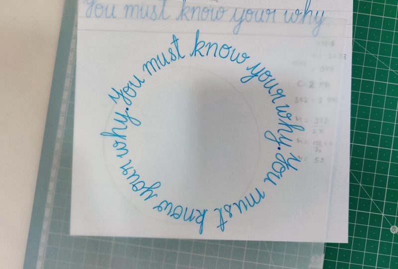
4. Calculating and Drawing Your Circle: uh, welcome back to lettering in a circle. In this lesson, we will make our template so that we can turn our line of lettering into a circle. Now that you're confident with your consistency, the first thing to do is measure the length of your quote in millimeters. Write it down. This quote is 162 millimeters. Yes, I wrote meters. Sorry. Well, you have the ruler out marked the halfway line along your quote. So that's 81 millimeters for this class in your first time lettering in a circle. We're going to double the length of the number you just measured. If you're quotas less than 250 millimeters long, it would be helpful to double it for this quote, then the length is 162 millimeters in doubling. It is 324 millimeters, and that's what will go with for the length of the quote. Now we do some meth. Hold tight. It'll be over soon. You need to be quite accurate with your measurements because being off can lead to disappointment. Don't worry if you don't do it perfectly the first time. Here's the math part. The equation for measuring the circumference of a circle is C equals two pi r, where c is the circumference pious 3.14 in R is the radius. We already have the circumference. It's the baseline of our quote, and we doubled that for this particular project. We need the radius, so we're going to rearrange the equation. So our is the important thing, and we get our IK will see over two pi. The Onley thing you really need to remember is our equals C over 6.28 where the radius is the baseline, divided by 6.28 So will plug the numbers in the equation and use a calculator. And for this quotation, the magic number, which is the radius, is 52 millimeters. Write that down somewhere so you can use it again from the calculator will go to the ruler and compass and set the compass to the radius measurement of 52 millimeters. Create a small mark in the center of your paper, set your compass, point to the center and draw your circle. If you wish, you can add the waistline. If you're adding that waistline just make sure that you draw from the center point you marked earlier to give you a little additional guidance. When your laddering pretend the circle is oclock and market at noon and six and three and nine. The circle you just made can be a liner template, or you can let her write on it and erase the lines later. I chose to make it a template in case I want to repeat the circle were almost ready to go. In summary, we've calculated our template by measuring our lettering and using are equals baseline over 6.28 to calculate the radius. And we've used the compass to make her circle template. Now you're ready to let her in a circle. See you in the next lesson.
5. Lettering Your Project and Variations: uh, welcome back to lettering in a circle in her last lesson will finally complete her mission and letter in a circle. Decide which words you want across the top of the circle as it will be read like I did in this Merry Christmas artwork that I turned into a rubber stamp. In this case, I wanted the phrase to start at about 10 o'clock. Rotate your templates of the mark you made at noon is now at approximately 10 o'clock and attach the paper you'll be lettering on now. Rotate that so the starting point is back at the top. Begin lettering. Rotate your page constantly. You must pretend that the circle is made up of lots and lots of little flat baselines rather than a curve blind, and you are making your letters straight up and down from that tiny flat baseline that's super important. Keep your linear version in front or beside you so you can constantly refer to it. It's really helpful to monitor your progress. Remember how we made sure we were lettering straight up and down? This is why it's much easier than analyzing what slope you need for each letter on an ever changing baseline. You don't want your letters to TIPO to control. When you get to the first quarter circle mark, check back with your linear lettering and see how you're doing for distance. If you're taking too much space, condensed the lettering in the next quarter circle. If you're not getting as faras, you should widen the space between your letters a bit. Try to keep the same spacing as in your original linear laddering. Sometimes it's hard. There's a natural inclination, and I certainly have that inclination to compress the letters at the baseline because we always start the letters at the top when we know all about that. But we aren't noticing how close we are to the letter we just made. When we get to the bottom, slow down and don't forget to pretend the curve of the circle is a straight line. Under each letter you make, I can't impress that enough. Sometimes you have to stop and wait for the ink to dry. It ruins your rhythm, unfortunately, but there's no getting around it. If you've added a little embellishment between words or phrases, you can enlarge or shrink that to help with your spacing, or you can leave it out altogether. No one will ever know you're finished. How did you do? It might not work out the first time. If not, check your measurements, especially if you're way off. Check the size of your letters. Are they almost the same asleep linear version? If it didn't work out, try again. You can even treat this is a test for a final copy and use. It is the liner for the final version. If this is a test version, now is a good time to design. An ad flourishes so they fall perfectly Now here's what can happen if you're not paying attention now. What if you want to have your words facing out? If your circle is big enough, that can work just fine. If not, your letters can look deformed. Even if they aren't. The top of the letters can be very close in the bottom, splayed a senders can look too close together to. But maybe that's fun. Look for you and that's OK. You can also mix and match like I did in the Merry Christmas circle. The same basic technique goes for lettering on an ark break up the Ark into a series of small baselines to ensure your letter slope remains consistent and not out of control. What if you're wanting to work in the opposite direction like you want your letters to fit inside a certain size circle? You will have to do the reverse calculation, and you might be shocked at how small your lettering will have to be If you need to work this way, you know the radius and you can there for calculate the circumference by plugging the numbers into the equation. Lettering around geometric shapes like a square or a rectangle, is pretty straightforward, but it could be a little bit awkward if you have to break up a word. And that's when those little embellishments can come in really handy. Lettering in an oval is a bit more challenging. I'll let you look up the math for that one December rise. We've lettered are quoting a circle paying attention to where we started the circle we've watched where are quote lands at each quarter circle, and we've also cheered when we returned perfectly to the starting point, with or without an embellishment, and we've added flourishes at the end. So join me in the next lesson for a complete review and details for your class project. See there uh,
6. Thank You and Your Project!: Uh, well, that completes our course lettering in a circle. Thanks for joining me. Now it's your turn. Your project will be two. Letter a quote or phrase and turn it into a circle using the techniques we have discussed. So you'll practice your lettering using whatever style you're comfortable with to achieve your natural rhythm. You'll measure your line of lettering and use the calculations to determine the radius of the circle. Then follow up by drawing the circle with your compass and finally lettering in a circle, all the while watching. For those pitfalls we talked about, you can download the practice liner and a practice template in the class resources by clicking on the projects and resources below this video On the right, you see the links to the downloads. Now these downloads are for the project I did, and to give you a reference for starting your own lettering in a circle project. But you will almost certainly need to make your own liner and template. So go have some fun and make some circles and share them. Please use the hashtag lettering in a circle and please tag me. I'm at quite fire design visit my profile and click on the follow button so we can keep up to date and please share your projects below. I can't wait to see what you make. I'm Suzanne, and I'd like to thank you again for joining me. And I look forward to seeing you in another class soon. Happy creating.
 Suzanne Cannon, Lettering Artist, Bookbinder & Designer