Transcripts
1. Introduction: Handwriting can add
personality and a human touch, and I love bringing that into the digital space
through my photos. Hi, I'm Ab C. I'm a multidisciplinary artist,
author, and educator. I've been documenting
my creative journey on social media
for over a decade, and I love telling
stories through images by adding a little bit of personality through
hand lettering. Welcome to my class. Letter
your photos in Procreate. In this class, I'll show you
how to add hand lettering to your photos using the
Procreate app on the iPad. We'll transform a photo into a more expressive piece by adding a hand lettering
word or phrase. Guide you through my
creative process and share with you some tips on
how to make it your own. This class is best
for anyone who has a basic understanding
of the Procreate app. Whether you're
preserving a moment, sharing a memory, or simply looking to give your
photos a creative touch. I hope this class invites you to experiment with your
handwriting. Let's get started.
2. Your Project: For our class project, we'll add more personality to a photo by lettering
a word or a phrase. In the Projects
and Resources tab, I will share the main photo we'll be using for this project, as well as a fonstyle cheat
sheet for your reference. We'll be doing three
different font styles, and I encourage you
to try all of them so you can experiment
and have fun. But if you only want to try one, that's also totally fine. Of course, after you
work on your projects, I'd love to see it
so I can provide some feedback and offer
more suggestions. When you're ready to
upload your class project, head to Projects and Resources and click on the
Submit Project button. First, you'll upload a cover image that
you'll be using for the project as long as supplementary photos or
videos if you have them. Then add a title with your additional photos or
videos if you have them, and then hit Publish. I'm looking forward to seeing some of your projects
after the class.
3. Tools and Materials: Before we start,
we're going to be a little bit digital
for this class. You're going to be
needing an iPad, an Apple Pencil, and the
Procreate app downloaded. Personally, my setup is
a bit more portable. I use an iPad Mini, an Apple Pencil Pro, and of course, I have
the latest version of Procreate on my iPad. You can use whatever
you have on hand, make sure that the Procreate app is available because that's going to be the main app that we'll be using
throughout this class. The pencil, also make sure it's compatible with the
iPad that you have. So for my iPad mini, it's the Apple Pencil Pro. It just looks cute with this
pencil situation over here, but it's really an Apple pencil. And the pencil brush that we're using is actually in
the Procreate app, so we don't need to
download anything new. It's called the six B pencil. It's my personal favorite. It's the one I've been using
for all of my projects. So make sure to
have that, as well. And last but not the
least, this is optional, but I'd like to have a MT
screen protector for my iPad. That way when I'm
drawing on my iPad, it's not too smooth
and has that paper feel that I usually look for
when it comes to drawing. Once you have all
of those set up, let's head to the drawing board, and let's set up our
canvas on Procreate.
4. Setting Up: Okay, so let me
quickly show you how I usually set this
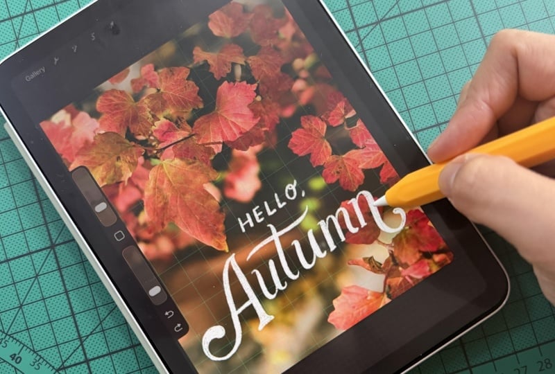
up with Procreate. I'm going to open
the Procreate app. I'm going to click
the plus sign here. This is where you can
start a new Canvas. I usually have a bunch
of different sizes here, but today we're going to be
focusing on 1080 by 13 50, which is the usual
size for social media, for Instagram, and it gives
me this nice portrait format. Now you have this specific layer which is going to
be the first layer. From here, I want you to open the photo that we're going to
be using for this project. So I'm going to click
on the wrench here, and from the wrench
actions insert a photo so this is the photo that we're
going to be using. I actually formatted it
already to fit the exact size. From here, I like
to set up a grid. So the grid is a drawing guide, and you can find it as well. Here on the action stab, I'm going to click on Canvas. From Canvas, there is this
button here for drawing guide. You just tap it. And
the drawing guide is basically a grid. You can't see it,
so we're going to edit it according
to our preference. So here you have a bunch of
colors, and from the colors, you can either use a white one or a yellow
one or green one. I'm going to be using
a green one for this. Usually, it's like
green or turquoise, and you can even edit the size. So we're going to
make it a little bigger so it can
fit our letters. And then you can also
edit the opacity. That way, you're able to see it, and don't worry about
it being big or thick. We'll be able to remove this later on as we continue
with the project. Right now, it's
just nice to have this grid so you don't feel as lost when it comes to
tackling your photo, where to put the text,
and where to put the letter phrase that we're going to be doing
for today's project. Mostly using the color white. So on the color stab, I'm just going to
head to the white as part of the gradient. And for the brush, we're going to head to the
brush tool here. I usually just go
from the library. You go to sketching, and you
will find the six B pencil. This is the one I use 99%
of the time I am Procreate. Personally, I just love how you can use it as it has
this sketchy effect. Another property that I want
you to look at that you can tailor fit to your preference is when you go to
the second tab here, there is this function
called streamline. So the more streamlined it is, the more you don't have
to control the stroke. And I think it's
great, but personally, I like to keep it not too streamline because then
it's easier for me to control it and pretend that it's like doodling on a
notebook, for example. But having a little bit of streamline is
definitely helpful. At this point, I also want
you to sort of, like, figure out the size of the
brush you want to use. This depends on
your handwriting. You know, do some strokes. If you're not ready to head
into full on drawing mode, you can always
remove this layer. Add another one and do
some warm ups and kind of figure out where you want to write and where
you want to draw. So yeah, once we have the photo and then we have
the drawing guides, I'm just going to
add another layer, and this is where we're
going to be drawing. So I'll see you in
the next lesson, and let's start with
the first font style.
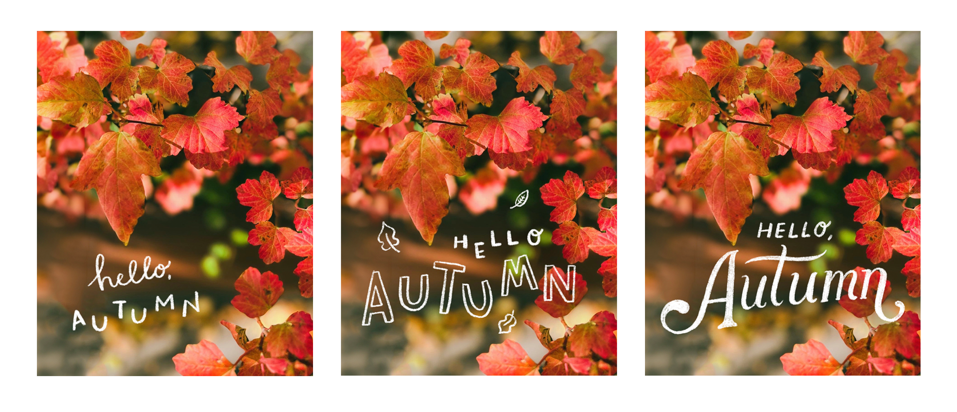
5. Font 1: Handwriting: So for the first fontstyle, we're going to be doing
handwriting fontstyle. I think this is the
easiest way you can get to doodle or letter on your photos. From the photo
that we have here, I specifically picked it because there's a lot of space
where you can draw. And one thing that I like to look at when it comes
to choosing which photos to use is that there's enough space for you
to write things on. So for example, here,
we have this kind of autumnal situation where
all the leaves are kind of enveloping this
more right corner of the image and then a
little bit on the upper left. And then here, it's
completely blank. It's a lot of,
like, blurry areas, which is the perfect
location to add your text. That is presently a rule of thumb I like having
because from there, I don't have to think too much. I'm like, Okay, this is
where I can start doodling. So with the first layer, we don't want to go on
final and just immediately, you know, be like, Okay, we're going to draw
and that's it. So I want you to think of what you would like
to write here. I'm going to be very
specific and write autumn. So I was like, Okay, maybe we could do something
like a hello autumn. So with your handwriting, I always like just keeping everything in a certain
width or height. That's why I also
kept this grid size. So just write autumn
in your handwriting. This is step one. And then
we're going to write Hello. I wanted to do this in script. So something like this,
little comma there. And obviously, it's
not proportionate. We're going to use
this arrow tool here, and then you can always
adjust as you see fit. So honestly, this itself
is already pretty good. But what I like to do is I like to alternate
the letter heights. You can see here.
It's like AUTUMN. You can kind of, like,
play it out a little bit. I'll show you more techniques
on that in the next lesson. But if this is your draft, which is usually
what I like to do, now that I have, like,
this placement, I'm like, Okay, I think placing
it here would be nice. I usually lower the opacity
of this particular layer, so you can still see
it, but not 100%. It acts as my guide so that
when I do my next layer, which is ideally
my final artwork, it's a bit easier for
me to figure out, okay, the placement would be
kind of in this format. So what I want to do is
add a little variety. So I'm going to
elongate the loop here for the H and also, these are things that are a bit more intuitive that you can kind of play around once you
look at your photo. I also like the habit since
my iPad is pretty small. I like to zoom in and out and
make sure that I like it. I don't like it. And then
for the word autumn, I'm going to alternate
the heights. And you don't have to write
everything in a straight way. It can be kind of diagonal, a little bit more playful. I love this format of switching the heights just because
it doesn't do much, but it does enough to showcase
a little bit of variety, which is what we like in
regards to the photo as well, because we have this photo, but then we also have this text, and we want to play
around with both aspects. So you have this over here. You can always resize them. I like to rotate it a little
bit and tweak as I see fit. I'm going to remove the
initial layer that we had. And then, you know, if you
want to edit some more stuff, I'm going to remove
the drawing guide so I can see it a
little clearer. Okay. I kind of want
it a little smaller. And usually for this
layer, you have, like, a little bit of the
brush tool going on. But if you want to make
it a little darker, one tip I always do is
I duplicate the layer. So you're just going to move your pencil to the left
and then click Duplicate. So it's now a little bit darker. You can always adjust the
opacity of this as well. So it has a little bit
more sketchy effect, but not too light. So this is the big change
that you're seeing here. So yeah, this is one
way I like doing it with my handwriting
because it's very simple. And also, you can also
always switch out the size. You can make autumn
a little bit bigger. I figured with having
this specific area, it was just subtle enough that
if you zoom out like this, pretending it's like on
Instagram, you're like, Okay, I can still
see the leaves, but then I can also still read. And one thing that I want
you to take note of when you are doing lettering or writing on photos is make
sure that it's readable, because that's really what
you need to take note of. And that's the purpose of
lettering on your photos. So having that is pretty
much like the best way that you know that your artwork is successful in a sense
that people can read it. So this is the first
fontyle. It's handwriting. Feel free to experiment, but we have this as a basic
as this is going to be like the easiest way to integrate it into your
lettering journey.
6. Font 2: Block: Next up. Let's add a little bit more character to our photos with some
block lettering. I also want to show some ways
that you can kind of doodle and add a little bit more
embellishment with your photo. So on this new
layer for this one, if I feel like I want to go beyond and write
over the leaf here, I'll show you a
technique on how we can make that possible
and still readable. So we'll start with
some block letters. I still adopt the same
technique of switching out the sizes and also making some experiments
with the height. I think this helps create dimension when it
comes to your images, and it also gives a little
bit more character. Also, one thing I want
you to keep in mind when you're working on these is it
doesn't have to be perfect. It's what makes your work
so personal and expressive. So there's no rhyme or reason. I just like kind of putting the T a little bit
more to the left. And then maybe the next letter would be a little bit
more on the right here. And since this is digital, you'll know what
we can do, right? If you want to switch
things or resize them, you can simply click
this button over here, and then the arrow tool. So then you can transform it. You can move it up,
you can move it down. You can do a 180. And it's just pretty flexible, which is what I love
about Procreate. It's such a game changer, especially if you
love drawing and you want to do it in the
digital context. G to add our letter M here, letter. I know we're going
towards the end, so, of course, I
have to resize this. One thing you will
also figure out with the size of your
iPad is whether or not you'll be resizing your
canvas as much as you can, or you're just more used
to just one specific way. I find that if I'm
using my iPad mini, since it's portable, it's great. But also, I do run the risk of always kind of zooming in and, like, working towards the end. So we now have
everything sort of like the whole way here,
which is also fine. If you think about it, I'm going to move this
a little bit around. I'm going to resize this. And I still want to
add the word hello. So that's what we're
going to do over here. I'm thinking here
would be a good area. It's not a long word,
and I'm going to adapt the same lettering
from my handwriting. So then it's like a
little bit in print. Hello, autumn. Okay, that's too big.
Let's resize it. Also, if you want
to erase something, head to the eraser tool. My personal favorite is the airbrushing category because it just erases things
in one sweep like this. And, of course, if
you want to undo, just do two taps
of your fingers, two fingers and your back. So let's connect them
a little bit more. It feels a little
bit far away. Yeah. With the playing of the
heights as well here, you can see that because I
did like a height variation, I can also do that
with the letters here, and then they sort of become
cohesive in that sense. Okay, now we have
something going on. I do feel like this part is a little bit empty
and also this part. So we're going to mimic the
leaves, the autumn leaves. I mean, we don't have to
draw this complicated one, but I like to just
start with a stem like sgo and then do some
little leaves like this. Can also go add some here. Can also add more
of these. Why not? And just a little one
at the bottom here. I think that would be nice. It doesn't do much,
but I feel like it complements the entire image, so it doesn't feel
separate from it. So it has that connection
of, like, Oh, yeah, this is an autumn
photo with leaves, and then we have
little leaf doodles. You can also always resize
them as you see fit and see whether it's good or how
many leaves do you need. But, yeah, so this is one way
to do your block letters. I personally love this format, especially for basically
anything that I do, one technique I want to show you is we're going to
duplicate this layer, so it's a bit darker. And now, what we're going
to do is this part, while it's still readable, we do want to enhance it a little bit to create
some kind of shadow, and there's no specific
shadow tool on Procreate, so I like to create my
own version of shadows. And to do that, I'm going to create a new layer
on top of the photo. And then we're going
to go to the black or actually like the brown. And we're going to use
the airbrush brush tool. I usually use the
soft blend one. And here on the left hand side, we have the opacity
at the bottom left, and then this is the size. So for the size, I try to just feel it out. Again, if you don't like what it looks like you can
always delete it. Opacity. The goal is to not make it so obvious
that we have a shadow, but still enough to be like, Okay, I can read it
a little bit more. Okay. Sometimes it
also doesn't show. I'll just try using a black one. Okay. Now you can see it. It's a bit subtle, but
because it's very dark, we're going to
lower the opacity. We don't have to do
the entire letter, you know, we just have to, like, kind of tighten those
parts with a little bit of If you don't notice it,
you're like, Where is it? You can always remove
the layer and see. It's also a bit tricky
to figure it out. You kind of get used to it, the more you do it there. Okay, I think there is a little
bit here. Add more here. But, again, we're
not so challenged, especially with this
particular image because a lot of it is already
pretty much easy to read. But here's the subtle
change, you can see here. Yeah. I illuminates
the lettering even more, and it
adds this, like, kind of subtle
shadow that we want, especially for this kind of work where you
really need to read it. So this is the block letter
version of Hello Autumn.
7. Font 3: Vintage: Okay, I definitely am
saving the best for, and it is a little
bit more complicated. This particular font style. I call it vintage. So when I started doing hand lettering more
than a decade ago, this is one of the font
styles I personally developed because I
just love the mix of a serif font and something a little bit more retro and
vintage script inspired. Now, that sounds a
little too loose, but let me show you what I mean. So when we start with a serif, it has something like this.
These are the serifs. Apart from this
particular font style, I like to add a
little bit of script. So how I do my script
is, for example, if this is the serif A, this is how I would
do my script A. And the vintage script
that I created, which you'll see in
the resource file is kind of a combination
of these two. So with this style
in this style, I usually adapt this curve
from the script, like so. And then I close it up with a little bit of serif. So
it kind of looks like this. I think the main
inspiration of this is kind of like wedding invites, but also old signages, like typography signages,
like hand lettering signages. It's fully customizable. I just created it
because I personally loved using it back in the
day for my lettering pieces. So this is mostly how we're going to approach this
particular phone style. But since we're only
going to Letter Autumn, we only need the
capital letter A, which is what I showed here, and the rest will
be in lowercase. So in lowercase, it's
nothing too fancy. Let's say we have the
letter U like this. I'm usually
converting this serif into a little bit of this
curve here, so it's like this. Which is kind of similar
to the script, right? If you write incursive for
the letter t like this, but it could be also
as rigid as you want. I'm not putting
any rules to this. You can also do it like
this, which I think is a good combination of both
the serif and the script. So we can definitely adapt this. What I love about this format is that you can exaggerate
your swashes. So with the A earlier, you
can have it like this. You can also elongate it. You can also twirl
it around like this. One thing I sometimes
like to add is this round thing here, which is called
the ball terminal, I think it adds a little bit
of pizzas to your lettering, and it's a little step, but I think it
really establishes something different, you
know, with the A here. So, now that we have that, let's try to warm up for
our vintage font style. I'm going to start
with a new layer. Okay, definitely overlook that. And then we have N here. So, one thing I also like to do with lettering
on Procreate is I don't have to make
all my words the same fun. We're using autumn as, like, the main word and the main visual for the
lettering aspect of the photo. And so hello kind of comes
in as like a sub like, it's like hierarchy wise, it's kind of second to the
main word, which is autumn. So that's also why I am using
a smaller size font and a more I would say
basic fontstyle compared to the more decorative fontstyle that we have here, which is very distinct now
that you're looking at it. I would move this a
little bit more here. And one thing I also want
you to pay attention to with regards to this kind of font
style is it's very flexible. So I'm looking at it now, and this has a capital letter, and then everything
else is lowercase. And there seems to be this
space here and space here. So what you can do is actually
extend this line of the T. So I'm going to do it a little bit like this instead
of the one we have here. Always erase that. I think
it connects everything more. And with that, I also would consider maybe making the
A a little bit bigger. And it could be here, but since we're sort
of touching the leaf, I want to put it a
little bit down. And remember, you can
always rotate things, so I'm going to rotate this. We also have this swash over
here on the left hand side, and I think in order
to have it balanced, I would also consider having a little bit of swash
on the right hand side. So I'm gonna close
it up like this. Definitely I want to add in the ball terminal I
mentioned earlier, so it's something like this. A not shortcut way of doing this is you would
actually do a ball. That's why it's called
a ball terminal, so you have a small circle here, and then you can kind of slowly connect it to your stroke. Same goes for here. Yeah. And then we're going to slowly add in the
serifs and the stroke. So I'm going to add
a little bit here. And a little bit here for the U. Just because there are two US here doesn't mean we have to make both of them exactly the same. That's a
beauty of lettering. You don't have to make
them look identical. It could be complimentary, but also enough to
inform you that we have the same letter
kind of going on here. Now we have this rough draft. I'm going to lower the
opacity and use it as my guide for my
final lettering. One thing I wanted to
share when it comes to using Pcate is it's a little
bit of a learning curve, especially if you're
used to drawing by hand, the pressure that you use to add in your strokes, like
what I'm doing here. I would say it's a little
bit of an adjustment. I struggled when I
started as well, and I think on average, I do put a little
bit of pressure. I just don't, put it in so deep because I don't
want my tablet to break. But the purpose of also, like, doing drafts
and doing, like, tracing templates
like these is so you're not so focused on
having to make it perfect. You can always delete the
layers, add the layers. I'm always like waiting to make sure I get the
exact stroke right. But also, it's a
reminder, you know, you don't have to do one full
stroke at the same time. I can slowly work my way around it and be patient with myself. So I'm going to thicken
this part a little bit, just enough to make it
a little more bold, especially since the size of this particular
word is bigger. Color that in. And then here Kana keep the
serif on that. This is a very distinct serif. You can see the serif
and the script sort of combining together in
this particular letter. This is probably a
very well known fact, but I love lettering A because it's also A for
Abbey, and personally, I love the characteristic
of the letters, and then we'll slowly get
into the lowercase letters. For the pencil tool, it doesn't really
act as a brush, but the more pressure you
see what I'm doing here. The more pressure I
put on the pencil, and then the lighter it
is when you lift it up. It sort of becomes thinner. So I think use that
to your advantage because that way
you don't have to keep coloring things in. And if you look at it in a way, this kind of also feels like a little bit of brush lettering. So I'm just putting
the pressure here, and then I'm lifting
when I go up. But you can so, of course, just do it the
traditional way, which is like, I'll do a stroke here,
then slowly add as I go. Let's go with the. And you can always go back. Remember that. Feel like I'm running out of space
with the end here. So I'll just finish this up and resize the word autumn
because it kind of goes to the end another thing I
want you to think about is kind of have an invisible
border for your lettering. I just personally don't like it going super close to
the edge like this. So what we're going to do is
using the transform tool. I'm just going to
resize the word autumn, not the word hello because hello is doing fine over there. Resize it, move it a little bit. This is where the
grid comes in handy. We have a little
bit of space here, and then also a little
bit of space there. I think it's enough to draw that boundary and have that invisible border
still show up. At this in. See what it looks like without the tracing lines. Okay, I'm gonna, darken it. And same as earlier,
I'm going to slowly add in some shadows
because we are hitting some parts of
the image where we have these leaves just enough to
create a shadow, like so. Again, this is a learning curve in a sense that the more
subtle your shadow is, the better it will become because you don't
want it to be like, Yeah, there's a full shadow
that we're seeing over here. So actually, if I
do remove that, you can see it, but it's not so obvious when
you zoom it out. You can also just adjust
the opacity, you know, if you don't want it
to be so obvious, I think this one is
more than enough. So yeah, the format thing is a little bit
different for this one. I feel like everything is
more towards the center, and it's totally up to you. You know, you can also consider adding this particular Artwork. Here, if that's the case, then you can also add a
little bit of text here or like a photo
diary and so and so. I just merge the layers. You don't have to,
but obviously, you will eventually do that. So exporting the image, I usually just click
the wrench tool here, and then you go to share. And then there are so many
different ways to export this. You have the Procreate file. You also have the PSD file for Photoshop if you want
to edit the layers. JPEG, PNG TV. I personally just export
it to JPEG and send it to my computer via Airdrop
in case I want to print it, or I transfer it to my phone, and that's where I upload it. In the next lesson,
I'm going to show you the different ways that
you can share your work. So I hope you enjoy paw style number three
with the vintage style.
8. Ideas and Inspiration: Once you finish your projects, here are a few ways to use and
share what you've created. Of course, you can share it
on Instagram as it's fully formatted for social
media and sharing. But another thing I like to
do is print out this artwork. You can put it in a
frame, a photo frame, put it up your wall, especially if it's the time
of year where it's autumnal. I like to format it in ASIC size or whichever
size your frame has. Make sure to have
that in format so that everything
fits in the frame. Another thing I love to do is if you love
journaling like me, I also suggest printing it
out on a photo printer. So, for example, an
IstaxPhoto printer or a cannon photo printer that can be able to print it
in a smaller format. I love being able to see
something like this, like this photo printed in
several different sizes. You'll see the effect
of how it permeates throughout your work and
through the things that you do. Let me know which one you try, and I'm looking forward
to see that as well.
9. Final Thoughts: You've made it to the
end of this class. Thank you so much for
spending your time with me, and I hope you enjoyed
lettering your photos together. Now that I've shared my process with you on hand lettering, I definitely encourage you
to experiment and try out different phone styles
using your own photos to add more personality and make them a little
more expressive. Make sure to submit
your project to the project gallery so I can see them and offer feedback as well. Please consider leaving a review for this class if
you enjoyed it, and it'll offer me
some suggestions on how I can develop more
classes in this format. And if you're looking for
more ideas and inspiration, I have some classes
on journaling that you can check
out on Skillshare. Thank you so much and
always be creating. Bye.
 Abbey Sy, Artist, Author & Educator