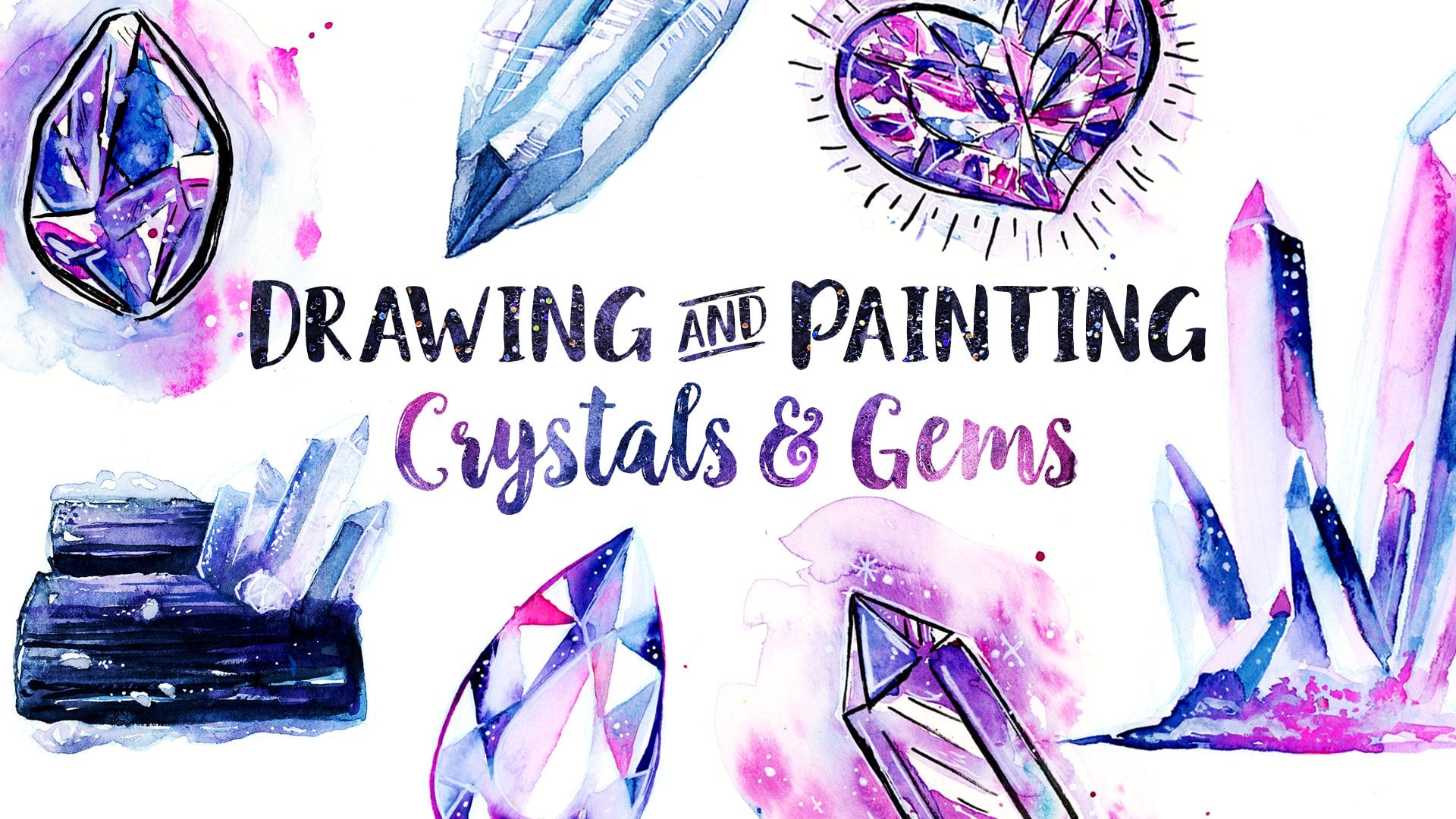
Transcripts
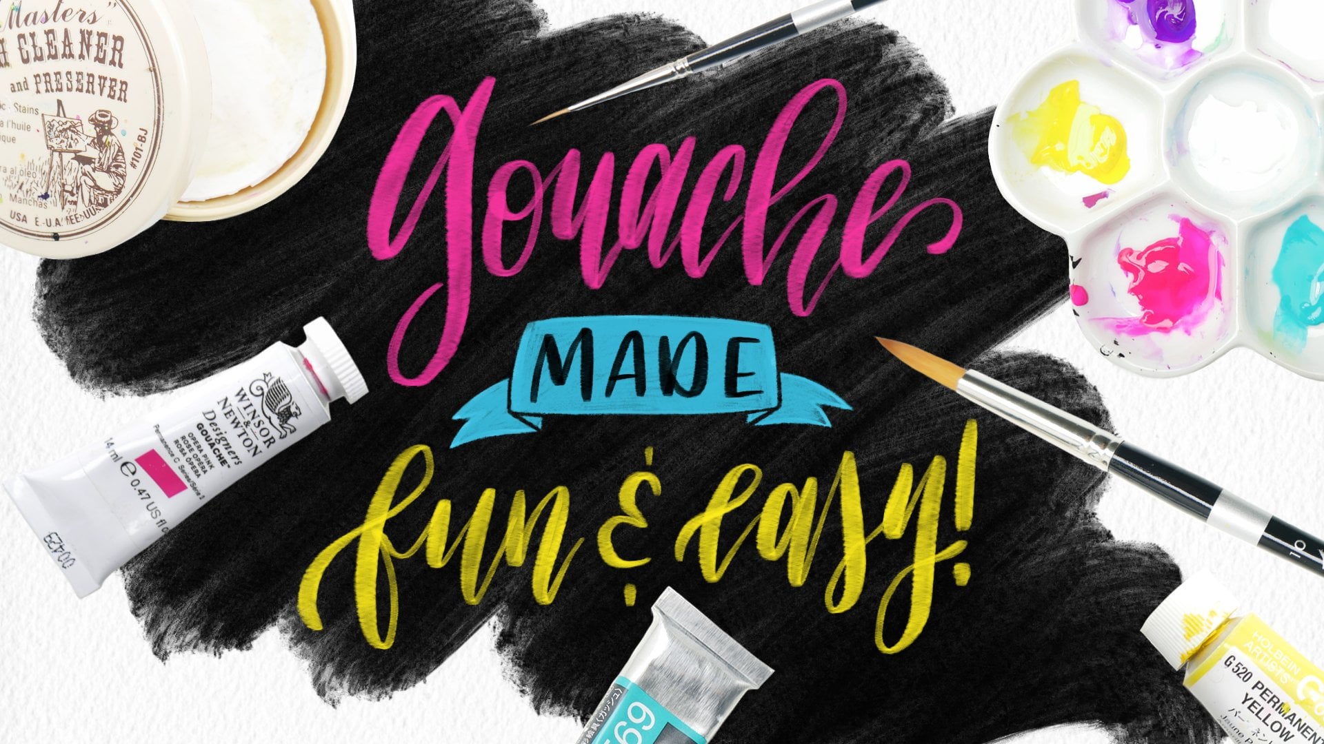
1. Trailer: [MUSIC] Gouache, how
beautiful you are with your bright and juicy
colors and creamy layers. You are just so fun to mix
and blend and play with. It wasn't always like this. I come from a
watercolor background. At first I found gouache
very frustrating. But by learning a few
simple techniques and playing with
the medium a lot, I learned how to paint loosely with it and how to do it easy. In this class,
we're going to have so much fun painting some
juicy gouache fruits. We're going to paint these
very simple subjects, but by painting them, we're going to play with a
lot of things like value, contrast, color, and
light and style. You're going to get better
at creating art overall. I'm going to show you
everything you need to know from supplies to get started, to gouache basics refresher, how to play with color, the basics, how light
and shadow works, and how we can use that
information to add shadows and highlights
from our imagination. Trust me, it's not as
complicated as you think. We'll even dive into
how to increase contrast for the
most juicy look. Lastly, we'll touch on how to make small changes
in how we paint, and how those small
change will make very different results
for some play with style. Then we'll take everything we learned and we're
going to paint five step-by-step fruits
that you can follow along with for a super
juicy and vibrant look. The paintings done in this
class may look complex, but they're surprisingly
easy to achieve. It's just a couple
of simple techniques and practice, but fun practice. You'll also walk away with some valuable skills that will help level up your other art. No matter what style or
medium you create in, you'll not only trust
your intuition more, but you'll also
learn how to wing it without fear and pain
from your imagination. Gouache is so forgiving
with mistakes, so it's very fun to layer it and just to paint with freedom. Are you ready for
super fun and for the adventure that will
help you level up your art? Me too. Pick up your
brush and let's play.
2. Basics Refresher: Welcome to the class. Let's start the class
by quickly going over some important concepts that
we should keep in mind. But if you're a complete
beginner to gouache, I recommend you take my beginner gouache class that covers all the basic basics. But if you just
need a refresher, this is the lesson for you. Let's start with opacity and
the water to paint ratio. If you watered down gouache, it will look and behave
a lot like watercolor. It will be transparent. Notice that as I add more paint, the color becomes
deeper and more opaque, but the transparency
is still there. It's not really opaque opaque. If you want a
completely opaque look like when we layer it, it's important to only
add a few drops of water, almost working with
straight paint. This also depends on
the brand you use, some are more watery naturally, and so don't need
any water at all, and some are a little
thicker and need a little bit more
water to be workable. This is why it's
important to get familiar with the gouache
you have and test out your supplies and learn
the right water to paint ratio for the results
that you want. But don't worry
about it too much, if you get it wrong, you can always paint
over any mistakes. We're going for a loose
look in this class anyway, and I just want
you to be playful, so these are things to keep in mind, but
they're not rules. Now, let's go over
some layering tips. Make sure your previous
layer is fully dry before adding the next one, if you want crisp edges, especially when adding white
highlights at the end. Also remember that gouache
reactivates with water, so be sure not to use
too much water on subsequent layers if you don't want to disturb
the paint below. But this feature also
lets us blend out colors with a wet
brush at anytime or you can have wet paint
and let the colors mix together and get a more
of a painted look at anytime. I call this the oil paint look. If you work with a wet brush
with wet paint below it, or if you want it again, it'll also give a nice
oil painting look. It's fun, loose, and beautiful, but do keep in mind if you want to add a very different color, the other colors
will blend within. Sometimes that
means muddy colors or the color won't be
as pure as you want it. If you want to add a
lighter color, especially, or a very bright color, be sure to let the
previous layers dry. This takes some practice
in getting used to, and you'll get better at
judging it as you paint. But working wet on wet
with your gouache, which is what I do a lot, is great for making
subtle gradients in general. You'll
see me do that. I want you to keep in mind
that if you make any mistakes, there's no worries
because we can always let the paint dry and then put something brand
new on top of it. Another thing to
keep in mind when layering is you can
always start with a light watercolor type
wash by using a lot of water and then build up your paint thickness
as you layer. I find this makes it easier
since less paint is used, the layers aren't as
thick and it works like an under painting with the white of the page being covered. If we get some fun textures
on the first layer, we can leave some of
them for extra fun on subsequent layers by
painting around them. You could even do a
watercolor background completely if you like. I love this is practice,and this class is
perfect for getting that practice time in with your paints and
mastering the medium. Again, we are painting loose, so don't worry too much
about it and have fun. Now, let's go over
some more fun tips.
3. Playing With Color: Next, let's talk about color. You don't need to use the
same exact colors that I do. I want you to feel free
to play with your colors. You can use similar ones
or do your own thing. Of course, a lemon is yellow and a watermelon
is pink and green, but they don't have to
be the same exact colors that I used to look good. The important thing
to pay attention to is the value changes. Notice when I lighten
or darken a color instead of focusing on
mixing the same exact color. Also, you'll notice
that I like to mix similar colors all the time so I pick out a
couple of colors. I try not to add too many
new ones, and if I do, I try to incorporate
the ones I already used previously in
my newer colors. It's just something I like to do and it keeps it more cohesive. Another thing you can definitely play with is backgrounds. See what kind of colors
you want to use and how you paint the background so you can just change it completely. I highly recommend you use a
scrap piece of paper like I will to test out your colors before you put them
down the page. This really helps
you to make sure that you're making
the right judgment. You can always paint over a
color that you don't like, if you don't like it, so
don't worry too much. This is how I teach
all my classes and it's because
the only way you'll get good at picking
your own colors and mixing is by doing. Don't be intimidated
and just try it. There's just some simple things that you'll learn just by doing. For example, if you mix
white into a color, it will make it
lighter, but also less vibrant and more pastel. It's not always the best option. If you mix this
complimentary color, which just means the opposite
color on the color wheel, it will mute it more. If you mix a lot of the
complimentary color into it, it'll actually make a
really nice brown or black. If you mix a similar color, it will make a blend
between the two. If you want a color
that's a mix between two colors and it's two
different kinds of green or a yellow and a green or blue blue and a green,
something like that, just similar colors
on the color wheel, colors that touch, I'll just
make a mix between the two. Very easy. I mix my colors intuitively and wing
it most of the time. If you're interested in doing some fun exercises and learning the basics
of color theory, I have a super short class on watercolor that you can take, but the principles in this class can be used with any medium. You can also always pick your colors out ahead
of time and even do a small thumbnail painting to test out how
they look together. This is completely optional, but I recommend it if you
don't think you'll get good results from winging it and are not comfortable with it, or if you're doing
an important project and mistakes aren't an option. You can learn a lot by painting tiny paintings
and they actually can look really good, and by
trying out different combos, you'll see what works
and what doesn't. You'll get better at
having color intuition. We also have this color
inspiration board on Pinterest you can check out, but color inspiration
is all around you from the beautiful sunset or flowers
or to other people's art. Keep your eyes peeled
and have fun with it. You're going to build
your visual vocabulary the more you pay attention
to these things. Don't be scared of looking bad because you can always
completely repaint any color that you want
to change by painting over it or you can
try again completely. No worries, just play
and just practice. Now, let's get into
some final tips.
4. Some Fun Tips: My next tips will help you to make sure that your
paintings look their best. They're pretty easy
and practical. The first is to
squint your eyes. I know it sounds silly but
when you squint your eyes, you can see contrast and
you can see value changes. When you squint your eyes, you automatically group
together lights and darks and your painting becomes easier to judge with light and shadow. This takes practice,
but with time, you'll be able to see where more highlights or shadows are needed and if certain areas just don't look
right or believable. We'll talk more
about contrast and value and light and shadow
in the next lessons. The next thing you
can do is take a picture of your
painting with your phone. Seeing your painting
small helps you to judge if anything
looks off or bad. Another tip is to flip
your painting and this will help you
to see if your overall shape looks good. I recommend you flip your painting right when you start with the shapes that you can tweak it if it needs to be tweaked but I won't
be doing that in this class because I love
the charm of wonky art. Another tip is to use a pencil to sketch this shape
before you start. This will help you pick
a shape you really like to center it on
the page properly. I won't be doing this because I'll be painting
straight on the page but I want you to know that if you don't feel comfortable
with doing that, just use a pencil. You don't have to do what I do. It's just a personal preference, which way you prefer better. Another tip is to let
your painting free by walking away from it. I know this is hard
but gouache can be reworked at anytime with layers or water for blending,
so you can walk away and come back to the
next day with fresh eyes. I do this a lot in my art and there's so
many times where I think something looks good and I walk away and I'm like, "Wait, that doesn't look that good." Especially if I feel like
I've been staring at something for too long I
just can't tell anymore. Usually when you
come back to it, you'll be able to
tell if something needs fixing or you're done. My last tip is to not worry
about making mistakes. If you're always thinking about mistakes and are
afraid to make them, you'll just keep
making them and you won't get into the flow state. The flow state is what
every creative strives for. It's a place where
time stands still. You're in the present moment, there's joy and you feel
like you can do it all day. It's that magic spot. You don't have to think
about what you're doing, every brushstroke
feels effortless and goes to the next one without you having
to think about it. This comes from understanding a medium to the point of
knowing what you're doing, which just means mastering
the basics but also from letting go of fear and
judgment and just painting. The great thing about gouache is you can
paint over anything you don't like and
if you don't like a piece that you
make, guess what? You learned a ton making it
and you can also try again. It's a great medium to get
into the flow state with. In fact, I had to redo my
paintings a couple of times because I wanted the pieces to look the best for this class. Here are some of my field
recordings but it's okay, I learned a lot from each one and I did better
when I tried again. Don't be scared of failures
or mistakes, no big deal. Painting is hard and it
takes lots of practice but the practice can be more fun if you don't care about results. This is something I had
to learn over time. Silence your inner critic
by reminding him that we're just having fun and
guess what will happen? Your results will be better,
you'll have more fun, you'll enjoy the process and
you'll be in the flow state. So no fear, just play. I hope this class
helps you to loosen up and to trust your
intuition when you paint. Now, let's learn a little
bit about light and shadow.
5. Light & Shadow: Let's talk light and shadow. Some some you may know
me as a rule breaker because I like to just
wing it and have fun. I'm not that different
when it comes to making up lighting scenarios. I like to make up my own, and they aren't super realistic. All I care about is if
they look good or not. This is definitely a
different way to make art. Some art teachers will
disagree with me, but I believe as artists, we have the creative
freedom to play and add our own
twist to reality. It is good to be aware of some basic rules of
light, but guess what? It's complicated. It takes a lot of study
to understand it fully. But we're painting
simple subjects, and we can get away
with winging it, and it's going to
be a lot of fun, and nobody will
call us out on it because it will look good. My method of making a plate is all about knowing some basics, and then playing with that
information to the extreme. I am just stylizing it, and I'm just making it my own. Let's study some lighting
scenarios to learn some basics. Don't worry, this is
not that complicated. I'm just going to do the
complete basics of basics, 3D spear, but as a lemon. Let's look at it with a direct
light source from the top. Let's go over some terminology. We have the highlight, or you can call the
specular reflection, which is just a fancy way
of saying the white part. Usually it is white, but in some things that
there is no white highlight. But we always add this in art because it makes
the most contrast, and just makes it
look really good. Notice how around the
highlight, it's also lighter. This is also part
of the highlight, and sometimes it's
just a lighter color, like I said, without the white. This is just from the
light bouncing off the object directly and
making the lightest part. It's always facing the light. Sometimes it's at an angle
depending on where we view it. Mid-tone is the base
color of our lemon. If we paint our lemon
cartoony with just one color, it would be this mid-tone color. Is the color in-between
the highlight in a shadow. Then we have the core shadow, which is just the
shadow on the lemon. Then we have this area
that is much lighter, this is called reflected light. The light is being reflected
from the white table, and is hitting the
bottom of the lemon. It makes a nice little
highlight in the dark part. Realistically this color is not as bright as the
other lighter parts, but you'll see me
use this concept as an excuse to add white
at the edges of shadows, and just go crazy with it. Next we have the cast shadow, which we will not
use in this class, but it's still good
to know and you can always use it if you want to. Notice how hard the
edges are because the light source is a
direct light source. It's just like your shadow
would look like when it's nice and sunny outside
with no clouds in the sky. Now, don't worry about
memorizing these words. Just notice what happens when I change lighting scenarios. Just observe. For example, but here, I didn't change the light, but I'm looking at the
object from the top, and notice how there's
much more mid-tone color. Notice how a smaller
reflected light is now, because we just see
the edge of that area. Now, let's look at
it at an angle. Notice how similar it
is, the first example, because we're doing
really the same angle, the light is coming
from the top. Now, I changed the light
source to be from an angle. Which is how I usually like to do my light in my compositions, either from top-right or
top-left for more interest. Notice how we still have
all the same elements, but they just shift
with the light. Pay attention to how
our highlights and shadows follow the
form of the lemon, this circle around it
because it's spherical. We also have this one area
that is darker than the rest because light is having a hard time reaching
it back here. Where light cannot go
somewhere, it's dark. Also notice how the shadow
is at an angle now. One more thing to
notice about shadows is if you do choose
to illustrate them, that is not a solid color, as it's closer to
the light source, notice how yellow and
light the shadow is. That's because, you guessed it, the light is bouncing off
the body of the lemon and hitting the table
where the shadow is. More light is getting in because of how close it is
to the light source. But it gets darker
as we go back more and further away from the light. This is getting complicated for you, don't worry about it. Just let your subconscious
absorb this information. One more concept to
make sure to remember is if something is
blocking the light, it will be in shadow. Just like the shadow
of the lemon, if you ever illustrate people, you'll see this with the neck
being in partial shadow, because the head is
blocking the light. Here are a couple
more places to notice where the light is being blocked
by features of the face. When something blocks the light, it creates a shadow. This is what makes drawing
people realistically so hard, because there's so many
different types of forms or shapes on the face. But don't worry,
we're just painting simple fruits in this class. Back to our lemon,
here is from the top. Very similar as you can see, and the reflected light makes a nice halo around
the dark parts. Now let's look at
diffused light. This is different from direct
light because the light is going through something
that scatters it around. Like the sun being
covered by a cloud. Similarly, here I
have my studio lights which are covered in white
fabric that diffuse the light. Here we have only one
of my studio lights on, and the light source is
coming from the top-right, like I showed previously. But notice how the
value changes, which just means how
dark or light the colors are much more gradual. There is less contrast,
it's more soft. Notice how the highlights
aren't as bright, and the shadow is
blurry and less dark. If I turn on two studio lights, so the top run and
the right one, look at how the value changes
get even more similar. It's like we're turning
down the contrast, also at how tiny the shadows became because the light
is reaching more places. Now, I turn on all three
of my studio lights and the lemon has
become quite boring. This sliding scenario is
great for lessening shadows, and making everything look nice and beautiful when I paint. But the shadows on my
lemon are super small, and there's barely any contrast, and there's no major highlight. This makes my subject
not interesting. Also notice how we don't have a light source
in front of it, so it is darker in the
middle but only slightly. This blend look is why I don't like diffused lights
from my fruits. Diffused light is great for making perfect and
even lighting, especially portrait photography, to take away those
harsh shadows. But in this we want contrast. We are going to
imagine direct light instead of diffused
lights on our fruits. We're going to exaggerate it
even more to make it cool. Just to summarize everything. Pick a mid-tone for your fruit, which is just like the
basic color of our fruit. Then pick where the
light is coming from, and make a highlight
in that direction. You can do just a white dot, or you can do a lighter area and white to make it more 3D. You'll also see me do a
bunch of sparkles here. Then you also just need to
add a shadow which is darker, and of course reflected light, which is my excuse for
adding even more highlights. If you want to, you can add a cast shadow as well,
that's up to you. One more thing to
keep in mind is flat planes behave
differently from spears. Look at the avocado pit here, is behaving just like the lemon. But the flat part is almost
the same color everywhere because it's all facing the
same way towards the light. We just have the shadow
coming from the pit. This is boring to me, and it's why I like to exaggerate
things and make it up, because I just want to make it look even better than real life. Take a look at my finished
avocado painting. This is not realistic. Look at the fleshy part having
so many different values. But look how good it looks, it just pops off the page. One more effect that's fun
to use is colored light. Here I have the
same magenta color that I will use on my avocado
painting for the background. You can see how it
reflects into the avocado. Basing a technique I
love to use on reality, when you take things from
reality and make it your own, you actually will make
things look better. Check out the bits of magenta I added into the avocado here. You can always add
in some random color if you think it looks good, but I mostly like to
just add bits of color from the background color, because backgrounds also reflect onto your fruit and
change its color. But really, it also helps
unify the piece more when you use similar colors in different parts
in your piece. It's not really that
much about realism. Light doesn't have
to be complicated. Knowing the formula for what makes things look
shining interesting, is what gives us the creative
liberty to just wing it. I hope this gave you a
better understanding of light and shadow, and don't worry about it
too much if it didn't. Just know that you can
play and exaggerate, and make your paintings
look better than reality if you just base
them off real life, and then just do your own thing. Now, let's talk more about
upping the contrast.
6. Upping the Contrast: Now let's dive deeper into contrast and why it's so
important for this class. Let's first look into
what contrast is. Contrast is defined
as difference. When we put opposite
elements together, like light versus dark, we are creating contrast. That's what I'm mostly
doing in this class. But it can also refer to
large versus small shapes, or no texture versus texture. Any elements that are
just different from each other being together
makes contrasts. When we put opposite
elements together, they make each other
more interesting, and they make your
artwork pop more. For example, if I have a black and white
painting and then I make one area have color, that area will really pop out at you because of the contrast. Or if I take a colorful painting and make one area
black and white, now that area will pop out at you because of the contrast, because that one area is
different from the other parts. The differences make
it interesting. Notice how if we make the
whole image black and white, it doesn't have the same effect because there's no
differences in there. The idea is to use different elements in
art to create interests. In this class, we're going
for juicy fruit look. This is best achieved by playing
with contrast and value. Value just means how
light or dark a color is. Don't confuse it with color, which is not value, but every color has a value. Take a look at how this rainbow looks when I make
it black and white, the lightness and darkness
of each color is value. Two different colors can
have the same value. How do we see value
in colored images? It just takes practice. I think the best way
to be able to tell how much value changes are in your piece is, you guessed it, the tip I've already gave
by squinting your eyes. When you squint your eyes, values get grouped
together and this makes it easier to see how
much contrast we have. Let me show you what I mean by contrast one more
time with value. If I have this image and I
make it just black and white, you can see it has a
normal contrast range. That means that the
different values in this image aren't that
crazy difference. We just have mid-tones a little bit darker and
a little bit lighter, and just some highlights. But if I up the
contrast on this image, you can see what happens is the value changes become
more and more grant. We have more darker darks
and more lighter lights. If I lower the contrast, it becomes a low
contrast image which just means all the
values are very similar. There isn't that many
darks or that many lights, and as you can
see, it gets lost. For the juicy fruit look, we want the high contrast image. Let's take a look
at this avocado. We will be painting this
together in the future, and I want you to see what happens when I make
it black and white. Look at all that
beautiful contrast. It's making it really pop off the page and it feels juicy. But if I lower the contrast, look at how it's becoming
more and more dull. But maybe you like this
look, it's up to you. Let's also look at it in color. If I lower the
contrast in color, you can see that it's also
becoming more and more dull and it looks less
juicy and vibrant. If I increase the
contrast of it and color, it really pops out at you. But you can go too far. With juicy fruit, we want to have a
nice value range. We want to have a
nice darker dark, and then we use pure white
to make everything pop more. That's what you will
see me do a lot when we paint in
the future lessons. I'm constantly
increasing contrast until I'm happy with my fruit. But I do have a
small warning about this that I don't
think looks good. Try not to use colors
that are just way too dark because it takes
away from the realism. That's why I rarely mix
black into my colors. I just try to darken
them up and keep the vibrancy of the colors. I'll show you what
I mean later on. But I never had a
problem with adding liberal highlights
with pure white. I don't want my pieces
to be too dark unless an area requires it like
the skin of the avocado. But even then, I wouldn't
make it pitch black, I just mix a green and a blue. But here, for example, I used a dark color for the
background of the banana, and this made it really pop. But even here, I'm not really using black, just
the blue and green. It just makes it more
interesting when you use color. These are just my
personal preferences. What you do is up to you. Now let's look at
an example of how I paint for more contrast. Here, I am doing
a simple sphere. I always like to start
with a light wash, and then layer on top of that. Now I'm going to go in
with a darker color to define my shadows. I know the light is
coming from the top left, so I'm just going to blend
it out on the opposite side. I blended out the shadow with a lighter blue as I got
closer to the light, and this so far it looks
like a classical sphere. Not too much contrast
but realistic. Let's see what happens
when we take realism out of the window and we just
keep adding contrast. I let it dry and I
define more darks, and I even put some
more closer to the way the light is even
if it's not realistic, just for more contrast. When a very light color is just next to a very dark
one, it grades. You got it contrasts and that's what makes it pop even more. The biggest thing to make
your fruit look juicy and vibrant is adding
highlights with white. Look how different it made it look just with a small touch. Just by darkening my darks
and adding pure white, the whole piece has become so much more interesting
to look at. Now it looks like a marble, which means it's still
pretty realistic, but we're just making
it look really shiny and reflective. Now let's use that artistic
freedom to increase contrast even more by adding white where there would
be reflected light. We are using realism with a
twist since it's realistic, but it would not be that
bright in real life. I add even more white in the darker area and little
dots all around the highlight. At this point, it looks super magical all because
of contrast in play. I keep squinting my
eyes like always and I see that I need to darken this area right
here, and I do so. But look at this, if I just add a simple shape at the top, it's now a blueberry. We've been painting a
fruit this whole time. Now I go back and use
the colors I already used to continue playing
with what I painted. I like to use the
same colors over and over again and just
mix them together. I throw realism out the window
and just keep increasing contrast but adding highlights
and shadows all around. Doesn't it look so juicy? When I do this, I keep
squinting my eyes a lot and see where shadows or highlights would look good. It just take some practice
and trusting your intuition. But don't worry, you
can copy me exactly in the future pieces until you get the hang of it, and
then try it yourself. I continued increasing
contrast by adding a contrasted
background as well. The yellow pops off the page and it looks nice with the blue. I can also throw in some of my background color into
the berry for more fun. I usually do this and
I think it just adds that nice little highlight
and pop of color. There are no rules set in stone so I encourage you to
experiment when you paint. By introducing a third color, I increased the
contrast even more. By leaving the leaves
outline and not filled in, it adds even more interests
in contrast because it has a cartoony and whimsical look versus the realism
of the blueberry. Of course, you don't
want to overdo it, but you will eventually
learn when to stop if you have a
tendency to overdo it. Don't worry about it too much, it took me years and
years to figure this out. This is the gist of my process. I'm not really using any reference image because I
think it's more fun to make it up and imagine
the light source, especially since the fruits
are so simple to make and they're just simple shapes. I encourage you to really
play and, of course, you can use references
if you want to, but if you do, just add
contrast to make it really pop by using lots of
highlights and darker shadows. You don't have to
follow the reference exactly, do your own thing. I hope that explained
contrast for you and how to play with values. Don't worry if any of these
concepts seem complicated, you'll see me use them a
lot in the future pieces, and I think you'll learn just
by watching and by doing. It's okay if you don't
understand it all completely, it's in your subconscious
mind and you will get better understanding
it as you paint. It's now time to move
on to the next lesson. Let's dive into
playing with style.
7. Playing With Style: Style, the thing everyone
wonders how to find. This class is no
exception with you being able to tweak
the fruits into your own style or
experiment with lots of different styles until you find the one that works for you. Style is something that comes
with time and the only way to get there is to try lots
of different things in play. Let's look at an example
of how easily one can tweak how they paint fruits
and change their style. Here, I'm going to paint a
papaya in various styles. It always starts with
observation, but how you tweak, and how you do things will give you a completely
different look. Let's see what I mean by that. Let's start with realism. When you paint realistically, you're trying to
copy a reference to the best of your ability. You are trying to
make it look like it does in the photo
or in real life. Usually, you start with
the base colors and then add highlights and
shadows like always, but the transitions are
more gradual between colors and painterly like
they are in real life. The strokes are also less noticeable and less
loose and more precise. You achieve this look by
observing your subject very carefully and this is where squinting your eyes
comes into play a lot. But this time looking
at your reference, because you want to see where
the value changes are and copy them exactly instead
of making them up. We're not going to be as
liberal with highlights here or shadows so the high contrast
look is not utilized here, we are going for reality
instead of exaggeration. This is the most time-consuming
style that I'm showing, but some people really
enjoy painting like this, and if you do too,
that's wonderful. You just need
patience and you need good observation skills which
just come with practice. This next style is super
cartoony and loose. It's the opposite of
the one I just showed. It's more playful and whimsical. We are not careful with our strokes and we
play with the reality. Notice how even the shape
was tweaked to be more fun. I also enjoy playing with
the seeds by outlining some of them and varying the scale which is
not realistic at all, but it's inspired by reality. Liberal highlights
and shadows are added as well and at randomly, and look how drastically
the look is changed if we just add some
dark outlines. The style you'll see
in this class is a mix between realism
and this style, leaning more to this one,
the more playful one. Notice right now how you feel
about each illustration. Which one looks better to you? Which one looks right to you?
Which one do you like more? This is a great indicator of the style that you prefer more. But of course, there's
different variables and you can really tweak each style
to do your own thing. It can be realistic and just
a touch playful are super playful and just
to touch realistic or anything in-between. This next style is super
loose and it's low contrast, and it's washy and fun. In fact, notice how I
don't add any highlights and just leave the white
of the page in some parts. I use the gouache more like watercolor and this
gives it a fun look of having fun textures
and being light in color and fun blending. I only gave it a
really faint outline this time so this is
more of a 2D style. We're not doing a lot of
shading and as you can see, it's just really
loose and playful and the shape is very playful. This can be really fun to do, especially if you'd like to do patterns and it's
also very easy to do. This style isn't for everyone, but it can be really fun. Now, this next one is a mix between realism and looseness, but the twist is that we're
using this boxy brush, which is just a flat brush. It forces us to have fun
with thicker strokes. We're going for an oil
painting feel so I am using more paint here
just to blend it out more. I'm blending right on the page, but I'm also trying to
be realistic and this creates this nice and
loose realistic feeling. But we still see all
the looseness and it just looks really
cool, doesn't it? Notice that even though my
brushstrokes are loose, it still has order to it. When I painted this, I was
trying to be realistic, but I didn't overthink it
and I kept the looseness, I was just doing whatever at the same time and that's
how I got this cool look. I especially love how I added the highlights to the seeds. I just did it
really loosely with the tip of the
edge of the brush. If you want to replicate
it with a bigger painting, just use a flat brush and choose a size you feel is
right for your piece. If you choose a bigger
brush on smaller paper, you'll have less control
and more looseness, but it will also
be harder to do. But this is a really cool look to achieve and I've
seen some artists do this really well with oil paintings and
acrylic paintings, and you can definitely do this. Just follow the class with a flat brush if you want to try it and make sure
it's a little bit bigger so it forces
you to be more loose. This next look is done
with flat colors. We're going to use flat
colors overlapping to add dimension like a vector or
logo on graphic design. It's a cartoony look. First I put down
the base layers of colors and then I build
up on top of them. Sometimes I do this
with other paintings. You'll see me do this
with the avocado. It's just easier to have
base layers of color. But then as I add shadows, so notice how in the
skin I use these lines, make it look a liney look. I don't know how to say it, but you can see this
is just a flat color, but the way I'm painting it, it makes it look gradual so
it's like a fake gradient. Then I use the
random shape to add a darker part inside
the papaya as well. The highlights are also
made up of shapes and these highlights
that are made of shapes are something
I like to use a lot. I think it makes it really pop and it makes it
look really cool. This style doesn't have the
blending of the other styles. Instead, we are utilizing
only flat shapes of color, but this style can be
super fun to look at. If you like it, give it a shot. These are the five styles
that came to mind for me, but I want you to
just be aware of how making small changes will
influence your style. There is an infinite number of ways to stylize your
fruits or any other art you create so be sure to play with style and find what
you enjoy doing the most. Find how to paint your cuties in the way
that is uniquely you. I can't wait to see
your unique style, but it's okay if you just want
to follow me exactly too. Copying is a wonderful
learning tool especially if you're
a beginner or if you're new to gouache. I encourage you to copy,
but if you're comfortable, I encourage you to try doing your own thing because it
will be more rewarding. But either way, it
doesn't matter, just have fun with it. We're almost ready
to start painting, but first, let's
go over supplies.
8. Supplies: Let's go over all the
supplies needed for this class and some
optional ones as well. First off, you will
need gouache paint. Now, I will say that if
you have acrylic paint, you can also follow
along with this class. It just won't reactivate
with water and some of the watercolor washy layers
won't look exactly the same, but it's just fine to use. Another medium you can
use is acrylic gouache, which is just gouache that doesn't reactive
with water as well, but otherwise it behaves
just like gouache. So any gouache paint
you have is fine. This is the one that
I will be using. It's great because all the
colors are so easy to get to and they stay wet
in this container as long as I seal it properly. If you have this gouache
and your paint dries out, just add water to each pan, let it sit, and use
a toothpick for each color to just mix
it and reconstitute it. I've had to do this one time for all my colors and it's
just like new now. But you can also use
tubes if you have them, anything you have is just fine. Don't try to mimic what this paint set does by
adding it to a palette. This one is sealed so that
the paint doesn't dry out, because if your paint dries out, it will be hard to reactivate
a normal palette and they will be too thin for the thick layers we are
using in this class. It'll be more like
watercolor feel. If you're using tubes, just take what you need as you go along for each painting. You can use a plain
ceramic plate to mix your colors on to have
more space for mixing. I will be using a cute
little ceramic flower, but if you have less colors
and need to mix more, a plate is probably
the better option. As for paint brands, I go over some good brands and such
in my gouache basics class, but just use what you have or get whatever is
offered in your area. Cheaper gouache is harder to
layer and is not as vibrant, but it's still good to use, especially for a loose
class like this. I wouldn't consider the
gouache that I'm using, which is Himi paints, which are pretty
great, but I wouldn't consider them to be
artist great gouache. They are definitely more
like student great gouache, but I still love them. Don't worry about it too much, just get whatever you can. You will also need
a brush or two. I will be using just one. This is just a cheap
size 6 round brush with synthetic bristles. I find that the cheaper
synthetic brushes are great for gouache because they don't hold too much water and
keep their form. When shopping for a brush, just pull on it
lightly and see if any bristles come out to
make sure that they don't. [LAUGHTER] See how
[inaudible] it is? If it comes back in its
shape easily and holds its shape well and
it's pretty strong, that's a good thing, but you
don't want the straw brush. It should be just
like these really thin bristles that
are like hair. Just make sure it keeps
its form and they're is soft and otherwise, it can be as cheap
as you want it. I honestly prefer the
cheaper kind for gouache. If you have those fancy
watercolor brushes that are made from real fur
or mimic real fur, I wouldn't really use those, they're a little too soft. You need something that
holds the form better for this painting since we are going to be
using thicker paint. I'll be using just one
size 6 round brush, but if you want, you can use a smaller
one for detail as well. Maybe a size 2 or 0, but it's not needed and
I encourage you to try mastering using one brush because you can do
anything with one brush, just use the tip of
it for small strokes. Another thing you
will need is paper. I'll be using Canson
XL watercolor paper. It's 140 pound, which is great, especially if you will use more water on the first layers. But with gouache,
we can get away with using slightly
thinner paper. Just try to get
watercolor paper for the best results because
it will prevent warping. If your paper is less
than a 140 pound weight, then use less water and
more gouache paint even on your first layer and
backgrounds to prevent warping. Some other essentials are
two water containers. One to clean your brush initially and get
the most color off and the second to
make sure it's clean so you don't contaminate
your colors. But hey, who am I to talk? I always contaminate my colors, but it's good if you
don't, [LAUGHTER] so try not to make the
same mistakes I do. You'll also need some scrap
paper to test your colors, maybe backs of failed paintings, or if you cut your own paper, you can also use the
scraps from that. I use a paper cutter to cut
my paper to the size I want. We can also use
scissors and a ruler, or just by the size you want, but I recommend you paint
on smaller paper like I do, so that you won't spend
forever on your paintings and instead can do a
couple in one sitting. If you work smaller,
you'll also use less paint and it takes away that feeling
of perfectionism. When you work smaller,
you can be more loose and not so concerned
with the detail. Another thing that's needed is some cloth or paper
towel to soak up excess water from
your brush or to make sure your brush is clean
before picking up color. The last thing is
a palette knife. Now you don't need to go buy something, you
can even just use a little plastic knife you get from restaurants if you like. The reason I use a
palette knife is just to protect my paints
from contamination. I like to pick up a color
with it and then add it to my palette and then wipe it
off on my damp paper towel. This way, I can always
pick up more color without contaminating
with the new color. This is an optional tool, but I find it helps me a lot if I don't want
to clean my brush. For example, if I'm mixing a similar color that's
already on my brush, or if my brush has a color that I'm going to
continue using, that's very different as well. It's just nice to
be able to pick up color whenever you want. Another thing that's optional
is a little spray bottle filled with water to keep your paints moist
on your palette. I find this helps the
paint to stay nice and moist if I paint for
long periods of time. You can also use Saran wrap to close up
your colors and keep them moist longer
if you're going to continue painting
tomorrow, for example. Just spray it with
a good amount of water and then cover
it while without any air coming in and your paints should be
usable the next day. One more thing that's optional is masking tape or washi tape. You will see me tape down all my paintings
because it helps to keep it from warping,
and even cooler is a nice little white border we get when we
take the tape off. When you paint very loose
backgrounds like I will, it adds a nice contrast of
crisp and clean white outline. It makes it look
more professional. But you don't need this, it's just something
I like to do. You might also want to use
a sketching pencil if you want to sketch out your
shapes before starting, go ahead and do so. You won't see me do that, but nothing is stopping you and don't worry about
your pencils being too dark since you'll be painting over it
anyway with gouache and gouache is opaque. Just do whatever you
feel comfortable with. If you need more brushes,
go ahead and use that, if you want to work bigger,
go ahead and do that. Anything I say is not
written in stone, just use whatever you have
and whatever you like to do. That's it for all that we need. Now, get out your
supplies and let's start painting with a
cutie little lemon.
9. Lemon: Let's start with a lemon. Do keep in mind that
if you need to, you can pause this video
at any time and that you can paint this in
your own style and use my directions as
loose guidelines. You may also choose to
watch the whole lesson one time and then watch it again as you paint if that
makes it easier. Just feel free to
do your own thing. Let's study the lemon. You can look up
references if it's easier but I had a lemon lying around, so let's examine it. We have a spherical shape and
then this area comes out. It does so on both sides, but mostly on this one. I will add it to the top and bottom for more
interests in my piece. We also have this fun texture of little dots I'll incorporate. Lemons are pretty
straightforward, but I also wanted to add leaves which I don't
have in real life, so I just googled lemons with leaves and I get a pretty good idea of
what they look like. As you can see here, lemons can also be more oval in shape and
some of these do have ridges on the top and the bottom like I will
do it in my lemon. Painting from
real-life is great, but if you want to get more ideas of
different positions or lighting scenarios, or just different
details in your fruits, you can always google them. I love Google, it's
my best friend and seeing a reference from many different angles and
really understanding a subject. To start, I'm going to use
this nice lemony yellow color diluted in water to create
a wash of a lemon shape. If you don't have this kind of
yellow, any yellow is fine. If you dilute it, it should be lighter or you can
mix a little bit of white into it to
make it even lighter and more of the pastel color. I left more space on the top because I wanted to
add loose leaves. Notice how it's just
a longer oval with a little triangle on
the top and below. I picked up some orangey yellow and mixed it with the color I already have and I'm painting right on
the page with it. I'm starting to
define the shadows. As you can see, I
pick the light source to be the top-left corner. Usually, as I paint,
you will see me mix new colors into already
used colors for more consistency and
for the colors to just blend into each other and
have better transitions. Pick up some brown for the stem. If you painted on your
scrap piece of paper and then put it next to your colors that you already
have on the page, you can see if they look good
together before committing. You will see me do this a lot to make sure the colors look right. Paint in a small stem. You can make it
longer or shorter, or you can make it a
different color like green, for example,
if you want to. Just use the tip of your
brush for a thinner line. I'm mixing the colors
for the leaves. Feel free to make them
any color that you like. I went for a darker greenish
blue mixed with more blue. To make the leaves, I
used the natural shape of the round brush by starting
with the tip and then adding more pressure to make my stroke thicker and then tapering off the pressure which
just means lightening the pressure until I'm painting
with just the tip again. You can practice doing
this on a scrap piece of paper first if you've
never done this before. It just takes practice. I always do this when I paint leaves and it's
just so fun to do. I'm going to do the same
thing and I did it twice for a thicker leaf and
you can always add onto your leaves as much as you wanted to make them thicker. Another option is to just paint the outline of the leaf
and then fill it in. If you're not comfortable
with this method, I like to use both. Notice how sometimes
I just do an outline with just the tip of my
brush and don't fill it in. I like this look of alternating outlines
with filled-in shapes, it makes a nice
contrast because we're using different elements
that are together. Notice how I alternate by making big leaves where at
the top of the stem, and then as we go down
the page, they get smaller and smaller the
further they go away. Playing with scale is also
a fun way to increase contrast and make
your composition more interesting and realistic. As you can see, I'm
just playing here, but I'm also going slowly
and seeing what looks good. I'm trying to keep
the composition nice. This just comes with practice and with being able to
judge your own work, but don't worry
about it too much. If you messed a leaf
up, you can always wait for it to dry and
then paint over it, so don't be scared
of that either. Because I have years
of experience of overworking a piece
or overdoing it, I know when to
stop, which is now. Your leaves don't have to
end up exactly like mine, but you can always pause and
copy me exactly if you like. The lemon's initial
layer is dry, so I'm going to go
back in and define it. Be sure to clean your brush
thoroughly and test it on your paper towel to
make sure it's clean because you are picking up
a very different color. I want to darken the
shadows for more contrast, so this time I'm using
this yellow ocher. If you don't have this color and want to make similar color, just mix a little brown into
your base yellow color. I'm still thinking of it as a sphere and I'm
defining it with a layer similar to the other one we did
following the shape. It just wasn't dark enough before I'm adding the contrast, I also add little details here and there to make it
more interesting. Just imagine where the light would hit it and
what would be in shadow and remember to squint your eyes to see if
things look right. Use what you've learned in the light and shadow lesson and especially since we
did look at a lemon. I pick up the lemony
yellow we used earlier and I'm
mixing it right on the page for a painterly
look and to smooth out the lines in the
shadow towards the middle. When you're working
with wet paint on the page with a wet
brush with paint on it, I call this wet-on-wet and it makes this beautiful
oil painting effect. Always try to mix
any added color with the previously used colors
for things to blend better. I keep adding the lemony yellow especially where I
want it to be the lightest and continue smoothing out the ocher and lightening it. I just thought it was
a little too dark. Notice how I'm following
the shape of the lemon and making the highlight the
same shape as the outline. I decided to be
bold and throw in some reddish brown
into the shadow. Realistically shadows
are actually cooler and warmer colors are usually the mid-tone or things
that are highlighted. But this is our artwork and
we can do whatever we want. I'm picking up the
color I already used in the shadow and blending it with the new brown right on the page. Since we're on the first layer
that isn't watered down, we can add water at the stage for it to
blend more and make cool textures, which I do to help everything
come together. Notice how loose I
was in painting all this and how I've blended
right on the page. Just have fun with your lemon. If you don't like something, just let it dry and paint
over it with a thicker layer. I want to add more detail, but first I'm going
to let this layer dry so that it has crisp
edges when I do. Let's start on the
background as it dries. I really like the pink color and I test it out
by putting it next to the other colors I already used and I think it's adorable. You can do the background
any way you like or even keep it white,
it's up to you. I wanted to keep it loose and
I wanted a watercolor feel. I'm using a lot of water and
I'm picking up more paint in certain parts and adding
more water and others. This creates a nice
texture and a fun look. Notice how I'm not careful
with filling in all the white and I'm using
quick brushstrokes. Also notice that I'm leaving white space around the
subject to make it pop more and you'll see
me do this with all future fruits because
I love this look, and I'll define it more
with white afterwards. We're being loose
and quick here. I think seeing the
brushstrokes and having them all in different directions
with different speeds makes the whole background
more interesting to look at than if it was
just a one plain color. But you can do one plain
color if you like, just go more slowly
with it and make sure the consistency of the paint
is the same everywhere. I also pick up some of the yellow we already
used and splatter it right on the page by just tapping the
brush on my finger. Make sure your brush
is loaded with color and water
for this to work. You can also use different size brushes for
different effects. If you use a smaller one,
the dots are tinier, and if you use a bigger
brush, the dots are bigger. The parts where the
background is still wet, it bleeds out and makes a
fun effect and texture. You can splatter anytime in
any piece for a fun look. If you don't want
dots somewhere, just cover up that area with a small piece of paper towel
first and then splatter. Just makes sure your paint is dry underneath the
paper towel first. I want to start
adding highlights, so I'm picking up the
base yellow color I already used and then
adding a white to it. I test that by color and
wanted a little bit lighter, so I'm mixing some
more white and then add in some highlights. I try to use very little water for a nice thick consistency of paint that doesn't disturb or reactivate the previous layers. Notice how I follow the
shape of my fruit and I add one more dot
below the longer shape. As you can see, just
by adding highlights, the whole piece pops
off the page now. I continue adding highlights, so at this stage,
be sure to squint your eyes to see where
it would look good. Just use your best judgment. I do this part intuitively, but just be careful not to
overdo it with the highlights because you really can't and that's a lesson I
learned a lot of times, but you can always
paint over them if it doesn't look
good for some reason. I'm going to use the same
super light yellow color to add some details
to the leaves. They aren't fully
dry everywhere, so when I paint in my
lines, it picks up some of the blue in some parts and
I really like this look. I think it looks
really loose and fun. If you want to wait till the
leaves are completely dry, it will make a nice
and opaque color without picking up the blue. Just make sure your
paint is nice and thick. I add a line in all the leaves with just the tip of the brush, and this gives them
more dimension. Ask yourself, how can
I increase contrast? A neat trick is to outline
your fruit, especially since we have a light fruit
with a light background. Remember that we want
more value changes, and if very different values touch, it makes
the most contrast. Just keep in mind that when
you outline something, it does tend to make it more cartoony,
but I like this look. If you don't and you want
to increase contrast, you can make your background darker to make the
lemon really pop. This time I'm using the
reddish brown mix with yellow ocher and adding
in a nice outline. I don't let it touch
all the way and I use some line variation which
just means the line is thinner in some parts
and thicker in others. You vary your line just by pressing down more for
a thicker line, and then lifting off
for a thinner line. I just add so much
more cork to it. I want to add some more texture inside the lemon with
this darker color, but I need to let my paint
fully dry first or also blend out because I
want those crisp edges. Notice how as it dries, the lighter highlights
become darker. Gouache tends to shift when
it dries with lighter colors becoming darker and darker
colors becoming lighter. This is not a big deal and
it's completely normal, unless you're using acrylic gouache, then it won't do that. Once it's dry, add in
little dots with the tip of the brush to add
the texture that's naturally found on lemon skin. I also add in some
simple strokes to darken the shadows
a little bit more. A little bit goes a long
way in increasing contrast. Let's add in the
final highlights to increase contrast even more. This time, we're using
pure white without any water for the deepest white, but if your paint
is very thick, it's okay to use a couple
of drops of water. Just try to make it as thick as possible, but still workable. Add the highlights
wherever you like, but the most obvious
highlights should be right where the
light source is hitting it, so the top left. Notice how I also put it on
the opposite side for some reflected light and just
little touches here and there. I also decided to add some
detail to the leaves with simple lines to make it more textured and
interesting to look at. This simple touch
made them so pretty. Squint your eyes
and see if anything else would benefit
from more highlights. I add some more near
the main highlight in a slightly darker
color and then pick up your white to add
more at the edges near the outlines to increase
the contrast some more. Finally, it feels done to me. Here, I decided to use the previously used
blue from the leaves to add little dots
here and there, in the background as well. This is definitely
my style and what I like to do so you
don't have to do this, but it adds more
flow to the piece, in my opinion, and
more interests. Just be sure to space them
apart and vary their size is a little bit like so unless
you want a polka dot feel. Be careful not to overdo it, but if you do, just let
them dry and paint over the extra dots with
the same color you used for the background. As the paint dried, I noticed it wasn't as white as I want
to be in some parts, so for finishing touch, I just added in some more white
to make it lighter. Guess what, guys? It's done. I love how this turned out. Notice how removing
the washi tape made super crisp edges that made it look even
more professional. I hope you enjoyed painting
your lemon as much as I did and this is the simplest
fruit will be doing. I used less layers and less details and I will
in the other pieces, but simplicity can also be fun
and you can still be loose with it and we're still using
the same basic principles. Let's move on and get a little
wild with the eggplant.
10. Eggplant: Now let's do an eggplant, which is surprisingly a fruit. I didn't have an
eggplant is setting, but I have Google. I looked up the word eggplant. As you can see, they come in
various shapes and sizes. It's up to me what
kind of paint. I like the look of a smaller
purple one with a curve. Also I noticed how shiny
they are, and that the leaves connecting it have
a particular shape to them. You can always do a quick study sketch of
your chosen fruit before starting to understand your subject better if you like. This is great advice
for any illustration. Overall, it's a
very simple fruit with a very simple shape. To start, pick your base color and make your eggplant shape. You can make your shape
longer or thinner, or more like a little
sphere, it's up to you. I think having the slight
curve adds more interest. I use a lot of water
since we're on the first layer and this
makes a nice watercolor look, and I pick my light source to be from the top right this time. I tried to darken the area behind it and kept the
area hit by light, lighter by using more water. You can also take this
as an opportunity to play with color by mixing
right on the page. I love doing this
with playing with more paint and water and
using random brushstrokes, it's a very watercolor
you type field. I use some magenta and blue. If any of the original
layer shows through, it would look pretty cool. But I usually cover
everything up since I love to over
layer with gouache. But you can be more careful than me and leave some
of it's showing, especially in the
highlighted areas. While I wait for that to dry, let's start on the background. I wanted a nice
pastel color so I mix some white into the
blue I used earlier. If I just used water, it wouldn't be as light. If you ever want
to pass that look, be sure to mix white into
any color you choose. I'm very quick and very loose
with making the background. This one is similar to
the last one we did. I just loved the
loose painterly feel. I mix up some more
paint, and a slightly darker so it makes them
more fun value changes. I'm trying to have fun and play with it and create texture. Notice how I don't touch
the eggplant everywhere and instead leave some
of the white of the page to make it pop more. You can be more careful than
me make it a perfect outline but usually I go back in with
white to make it perfect. The background is very loose again, but like I said before, you can make your solid or you can leave it out or
do whatever you like. Now I can be done here, but I wanted to have
more variations, so I mix some white into my
paint, and use it to lighten sub-parts and just make
slight color differences. I think this looks nice, but it's a personal preference. It's just do what
feels right for you. Notice how loose and random
I am with where I paint. It's mostly intuitive. Don't overthink it
and work quickly. If you don't like
something that you do, you can always just
paint over it. Even if you don't
like the color, you can completely change
it by just letting it dry and painting another color
on top with thicker paint. Now let's let the
background dry or use a hairdryer or heat gun
to speed up the process. Let's add the stem, mix a color that you like. Remember that you can
test out your colors on a scrap piece of paper before putting them down on the page. I mix blue with green and add
a bit of white in the end. This makes a nice aqua color, one of my favorites, but don't be scared to play
and do your own thing. Then just paint in simple
lines for the stem and a little curved
leaf shape around the eggplant top like we
saw in the references. I'm just mimicking them, but I'm making them a
little bit prettier. You can do outlines
and then fill them in, or just painting the whole shape using the natural
shape of your brush, like I showed in
the last lesson, with the lemon leaves. Make sure your paint is nice and thick with little
water since we are painting over the
dark purple color and we don't want
it to show through. Mine show through just a
little bit and it's okay. I think it makes it looks
nice and adds more charm. Now remember that I want
the light to hit it here. Let's start adding shadows
with that in mind. I mix some purple and
magenta and dark blue to make a nice dark
color for the shadow. I love to vary my colors
throughout the piece, instead of just adding
white or black, I tried to make variations. Since we're doing a darker
color over a lighter color, I don't have to worry
about being super thick, but if I was painting a lighter
color over a darker one, I would have to make
sure the paint is thick. That's just how gouache works. I imagine the way
the shadows would look and follow the
shape of the eggplant. Notice how I outlined around
the leaf shapes as well since they're also blocking the light on the body
of the eggplant. Also, notice how I added
a nice dark line to the side with a light is
coming from for more contrast, even though it's not
super realistic. I also didn't touch the
lines all the way on the bottom right of the
eggplant for more variation. I don't like everything being super complete and perfect, I like it when it's
a little bit messy. Now I picked up a
lighter purple. If you don't have one, just mix some white into your purple and add
a little bit of pink or magenta to make it
warmer if you so desire. I mix the lighter purple with
the shadow color, and I'm painting while the other paint is still wet right next to it, blending it out and
making a nice gradient or subtle transition
between colors. I'm lightening the
color as we go in. I also do this
around the leaves. Then I take more of
the lighter purple and mix it with the color I
used for the background, so very light blue
to lighten it more. I painted right next
to my last layer. As you can see, I'm doing the
oil painterly feel by just working with wet
paint on wet paint. I'm just adding more colors and just blend them
right on the page. I also add a little bit on the right side to start
unifying everything. Notice how I try to
follow the shape with all my highlights
and shadows. This makes it look more real. I also add a little bit
more at the edges of the darker side to make it have more contrast and
reflected light. Then I go back in and smooth out my transition between
the new color and the previous ones. Notice how subtle the
transition is, and how this has an oil or
acrylic painting feel since we're painting
on wet paint with wet paint and we're just
blending it right on the page. I love this look and you'll
see me do this a lot. It's great for you when you
want subtle fun transitions. I think I took away too much of the shadow at this
stage, but that's okay. I'm going to add it back in, in the later layer. We're just building
up and we're going to change our mind a lot,
that's just fine. Now I want to start
defining the highlights. I pick up some light pink, which you can get just by
mixing white into your pink. If you don't have
pink, you mix white, into magenta, and if
you don't have magenta, you can do so with red, but it will be more
of a reddish pink. Just be sure your
paint is nice and thick with little or no water so that your layer doesn't react to the previous layers and
is nice and opaque. I'm being playful at
this stage, and I'm squinting my eyes a lot to
see where to add highlights. Notice how I add little
bits everywhere. This is just my trademark style. I made the highlight
too close to leaf here, so I just paint over it with the darker color to
undo that mistake. I'm mixed our white into my bluish light color and I
add even more highlights. Another trick for
a fun look is just to continue adding and layering. This style is a little different from the lemon in
the last lesson. We are doing more layers, more colors, more depth, more craziness I would say, but also more fun. Whether you like the simple
style more or this one, which is more intuitive
and whimsical, it doesn't matter it's up
to you which one you do. But I personally like this one more because it's
more fun to paint it. Notice how I'm adding
dots and lines. This is how I usually do it. Also notice that the
biggest highlight is where the light hits it and it follows the shape
of the eggplant. I make the highlights
even bigger and decide to add some
light pink to it, loosely painting next to it
so that the colors blend. I wanted to spice
up the colors more. I also picked up some
magenta and throw it into the Pink and place
it around the piece. Look how loose and playful I'm. I keep squinting my eyes to see where I can put
it to look good. But I'm not overthinking
it at this stage, and I just keep layering because if I don't
like something, I can just paint over it. This is the gist of
my process is pretty chaotic and that's
what gives you that super cool look at the end. Don't think about it, just vary your colors and
values and keep adding. Squint your eyes to
see where you should add things and if
things look right. If I stop here, it
looks pretty cool too. It's up to you when you
want to stop your painting. I just get lost in the process
so I just kept adding. Here, I blended out
some of the colors with a nice thick
stroke of purple. Notice how I keep
mixing the colors I already have on my palette
to keep it all cohesive. When I add a new
color, I'm mixing two previous ones, and then I continue mix from
that new color. I like to be choosy
with adding new colors, and when I do, I mix it
with previous colors. Now I squint my eyes and I
can see any lot more shading. I take some darker
blue and dark and the left side with loose
strokes to define it more. I also add some to the middle planning
on layering over it. But you know what,
the plant looks pretty cool here
too if I stopped, you can see there are so
many stopping moments. Notice how I'm not
using just purple for the whole piece or just
blue or just pink, I'm using a lot of colors that touch each other
on the color wheel. They're very similar, and then
add in more depth and fun. I highly recommend you
print out a color wheel and put it on your wall and you can see which colors touch. But really it's just
about similar colors. They usually do look good
together and it matches, and it makes it just
more interesting. I also wanted to make my highlighted areas a
little bit more blended out, so I use the little paint and lots of water to just
blend out the edges. You can reactivate the paint at anytime with just water in any area that is completely dry and with a
slightly wet brush, just blend it out. I love to do this too
soft and hard edges. Now let's let the body of the eggplant dry and
let's work on the stem. Notice that the contrast
at the stem being flat, which just means
it's just one color, and the eggplant
painted with lots of colors and dimension is nice. I like this contrast, so you could leave it
like this if you like. But I wanted it to
be all dimensional, so I darken the paint
I already had on my palette from the stem
with a nice dark green, and then I go in
and add shading, imagining what it
would look like with my chosen light source. It's okay if I'm not a
100 per cent accurate, no one's going to call me out on it as long as it looks good. Just keep it simple when you do this and if you're not sure, just guess or do what
looks good to you. Usually if you do it wrong, it'll look a little off and
you'll be able to fix it. But I picked up some
white and bright green and mix it into the base
color for highlights. Notice how simple I kept them
a little goes a long way, just do bits at a time and
squint your eyes as you go, making sure it looks good. You could also add some
yellow to the highlights if you like to make it
even more interesting. I also added some to the edge to make it
have more contrast. When doing this, just
to find the form. I also took this color and add it in one part
of the eggplant, just one part for a nice
variation of a color highlight. Even if it's unrealistic. Sometimes I like to just put
pops of color somewhere, and it looks fun. Now it's time to go
back to the eggplant, but be careful if
you see shininess, that means it's still
wet so either wait for your paint to dry or use
a hairdryer or heat gun. Remember if it's shiny, it's wet, if it
becomes mud, it's dry. Now let's do the most
magical finishing touch and the most fun
part, white highlights. When adding white
highlights, like always, I try not to add any water to the paint and take it
straight out of the pan with just slightly wet brush so that it's as opaque as possible. But if your paint is thicker
and a little bit of water. Don't be scared to overdo it at this stage because you can
paint over any mistakes. But at the same time, don't put them everywhere
[LAUGHTER] because they will lose their magic if
their overdone, trust me. I added one big one and a
tiny one, the light hits it, and then of course
at all the edges to make it feel more shiny, even just with this much, it makes it look so good. Little dots here and there
as well add to the magic. That's just my style. You don't have to do this
if you don't want to. Same thing with the stem area, mostly at the edges
and little dots too. I continue to add
them here and there, I squint my eyes to see where
you could use it the most. Like always the highlights
really make it pop, and I just think they just make the whole piece so magical. Once I'm done, I want to add some more darkness to
the area in shadow, so add a bit and
even under the stem. You can always go to any
area you like and tweak it. Just squint your eyes
and see what needs work. I also outline the
stem and leaves with the darker color
to increase contrast. Then I picked up white again and add some subtle dots here and there for sparkling magical
feel in the background. You can also do polka dots or stripes or anything you like. I also outline the
whole eggplant on the outside in white and some parts to make it pop
more from the background. You will see me do this with every fruit, I just
love this look. As a finishing touch, I wanted
to increase contrast in the stem and leaf so I pick
up a super bright green, and I add it just a little
bit to add more highlights. I also add a tiny bit into the body of the eggplant
for more interest. The screen is like almost neon, so it really makes it pop. If you don't like
bright colors as much as I do, you
don't have to do this. It's up to you. You can
even use very muted colors, I mean, colors just so personal. But I feel like the small
touch of bright green really makes it feel
vibrant and alive. I wasn't completely
satisfied with the leaves, so I smooth out
some of the edges and define them a
little bit more. I'm done. Of course, being done a subjective, feel free to play more, or you could have
stopped earlier, it's all up to you. The result is so
fun and whimsical, and this is why I love layering
non-stop and playing with lots of different colors and
values, and just having fun. This is also why I like to
throw realism out the window. My goal is to make my subject
more interesting than the one in reality and just
make it more fun to look at. I hope you have
fun painting that. Now let's paint a
quirky and fun banana.
11. Banana: Now it's time to paint
the cutey banana. Keep in mind it's made
out of flat planes, so it will be a
bit different from the spherical
shapes we just did. Remember how flat planes can
look a little bit boring, even with strong light on them. We will have to really play, and make it our own to make
it more interesting. Here I study the
shapes of the banana. It has a nice curve
to it and it's divided by many flat
planes at touch. It also has a stem and a
little brown spot at the end. Don't mind it being brown, I will make it yellow
and you can look up a reference to see
what it looks like. We can make it
yellow-green, or green, whatever you like, or you can
paint in the brown spots. It could even look fun
with a nice texture. If you Google a banana, you can see it in different
lighting scenarios. Usually one side
faces the light, so it's very bright, like here, it's
coming from the top, and then as the
banana turns away, the planes get darker and
darker set the bottom. The same principles
of lighter being used as in the sphere is
just a little bit different. I actually found a
reference that looked a lot like what I
wanted to paint it as. This one has the light coming
more towards the middle, and you can see it makes this
nice streak of highlights. This reference will
be important to keep in mind when we
play with highlights. Just find a reference you like, and then of course, you can stylize it, exaggerate it to the
extreme. Let's start. I'm using the lemony
yellow to make the shape starting with the stem
and then curving it out. The stem is just a
straight line and then we're just doing a
curve right out of it. Notice how I'm just
going to paint this whole shape with the tip and then I'm going
to fill it in. The lower half is almost
looking like a half-moon. The shape isn't fully realistic. It doesn't look
like the banana I showed, it was more lawn, it was more straight, but I thought this
would look better. You can always tweak your shapes of anything you draw or paint. As long as you keep
most of the features, it will still be recognizable. This is called stylizing, and it's actually how things have their own personal style. But if this shape looks hard or it's not exactly
what you want, just use a light
colored pencil to sketch out the shape
you want before painting to make sure you get a shape that you like, and
feel comfortable with. If you start with
paint like I do, and you don't like
the shape you make, you can always paint
over it or paint out of it to make it bigger
if you don't like it. Here, I wanted to mix
a nice brownish color to start defining
the stem and tip, and yes, I wanted to make the stem brownish
from our contrast, even though it's
normally yellow. You can also do a grassy green
for an unripe banana look, or any color that you like. Pink bananas aren't realistic, but not many other things
look like bananas, so it still would
be recognizable. I was trying to mix
the perfect color, but I kept testing it and
it just was too dark, so I lightened it,
but then I ended up lighting it too
much as you'll see, but I just add it to
the stem and the tip. Sometimes when I painted in, it doesn't look great, but
I'm like, that's fine, I'll just paint over it and the new colors will
blend together, so it'll look really nice. Here I mix the warmer
dark brown with some yellow and darken the
colors I just put down. Notice how because the
paint was still wet, the colors blended into each
other and it looks nice. Next I'll outline the
banana and outline where the ridges or where the
flat planes touch as well. I don't always
outline my fruits, but I think when it's a
light color like this, it makes it a lot easier
to see detail and it makes it pop more
by adding contrast. Notice how my lines don't touch everywhere for a more fun look. When you outline, make sure to draw in the ridges following the shape of the banana for the most realism,
just like I did. Now I mix a darker, yellowish, orange color and I'm
starting to add shadows. We are building contrast. Notice how the banana
feels cartoony, and unidimensional since we have no gradients yet and everything
has done a flat color. This can also be a fun look
if this is your style. You can just do cartoony fruits. I mean, anything you do is
cute as long as you enjoy it. Now I go back to the lemony
yellow and lighten it even more, and smooth out
some of those hard edges. This time the light is
coming from the right side. So I just imagine what
it would look like, and add light and shadows
to make it believable. I just squint my
eyes a lot during this process like always to make sure everything
looks right. As you can see with every fruit, I'm pretty much doing
the same thing, and really my techniques changes depending on where the light
source is coming from. If it's hard for you to
imagine a light source, just use a reference photo with a strong light source
in the reference. Then you can tweak
it as you go and exaggerate it and make it
different as you paint. But you can always start with
the normal reference photo with a strong light source. I add in some white to lemony
yellow to start adding highlights, and lighten up this
area to increase contrast. I'm also smoothing
out the edges more, and now we have a nice gradient, which is just a nice and soft
transition between colors. I continue to just
squint my eyes and I define the shapes
and add contrast. Notice how it already
looks pretty good, but I want to
continue defining it and increasing
contrast even more. But notice how we got to this really good look really quickly. It really doesn't take much. Just have your base
color, add your shadows, and add your highlights
and sometimes outlines. It doesn't matter
what order you do these things in just as long
as all of them are done. This time I mix a
slightly darker color and I'm going to add in more
shadows at the top, to the left, and below. I'm just defining the shape
and I'm darkening my shadows. I added a little
bit too much shadow right here and that's okay. I'm just going to pick up that
lighter base color again, and I'm just going
to smooth it out here by blending it out. Notice that I am working
with wet on wet paint. This is what is causing
everything to blend so well and give that oil paint
look. I do this a lot. It's just beautiful.
You can also achieve this look if
your layers are dry, just reactivate them
with more water. Unless you're using
acrylic wash, then it won't work and you'll just have to do a new layer on top and then work wet
on wet with that layer. Now I'm going in with pure
white and adding highlights. This is one of my
favorites steps. Remember to barely have any water on your brush
with the thickest paint. I follow the shape
of the forum and also add some to the edges and the shadowy side for a reflected
light and more contrast. This looks a little too
orange and beigey to me. I lost a lot of the
yellow at this point. I'm going to add that
back in by painting it near the shadows and
lightening them. If you ever make any mistake, just paint over it while
still wet if the colors are similar or you can wait for
it to dry if they're not. Either way, it's just okay. Now let's let that dry before we add the
finishing touches, and in the meantime, we
can do the background. Since our banana is
so light in value, I want to add contrast by painting in a darker background. You can do any color you like, but I wanted to do a
greenish blue one. I started loosely painting with this greenish
color, and I'm just loosely painting and
then like always, but at this point I thought
it wasn't dark enough, so I introduced a new color, which is the super dark blue, and I just put them in
some areas and blend them out and then
I just mix them together right on the page. I continued alternating
those two colors and since they're
similar enough, they look good together
when they get blended out. It just add a little
bit of interest. You can always use very
similar colors and just vary them slightly
for a fun look. Notice how like always, I left a white outline
around the banana, and since the background
is so dark this time, it's even more prominent, also having that gap between the dark outline and then the white and then
the dark background, it really adds more contrast. Once I feel like the
background looks good, I mix a nice dark color by just using the background
color with the brown. This makes a nice dark
color that matches with the colors I already used
throughout the piece. I continue increasing contrast inside the banana with it, so add it to the
stem and the tip. I also darken the
outlines in some areas, just not too much
or it'll feel too cartoony and won't
be as effective. I love to make outlines
have different colors. It just makes it look nice. We're just doing subtle
touches here and there. Next I wanted to add some
texture to the background. I did so by pressing
my brush down with this darker
color all around. I definitely increased contrast even more and added
some interest. Notice how I just did
little dots here and there. I didn't do the whole
background in this color. I just used it to increase contrast and add the texture
which adds more interest. Now that our banana is dry, let's define it some more and make some lemony
yellow with white, and look how I went in with bold strokes to add highlights. I love using bold strokes
for things like this. But if you don't,
you can always take your time and just do little bit of time and see how it looks. I also added some small
lines here and there around the edges and the outlines to
increase contrast further. At this stage, I'm
squinting my eyes a lot to decide what to do next and what needs more paint or definition. I darken the mid tone color
with a little blue from the background and smooth out the edges of the
highlights with it. This makes a nice green tint since blue and
yellow make green, and that's fun because bananas naturally
have green in them, and it also makes it more cohesive with the
background color. I always try to incorporate even a little bit of the
background color into my piece. Now it's time to
make things really pop with some pure light. Pick up the paint,
make sure it's thick, make sure you don't have too
much water on your brush, and add little lines
and dots all around, starting with the top and
then into the banana itself. You can squint your eyes at this point if you're not
sure where to put it, that's what I was doing
here, but otherwise, just have fun with it, and
don't overthink it too much. If you overdo it,
just paint over it. I also use the white
to outline the banana more and separate it from
the background like always. This increases contrast
even more and makes it pop. Just be sure your paint is
nice and thick when you do this so you don't
reactivate previous layers, like I did a little
here in some parts, but it's okay since I'm being loose, and I'm not
a perfectionist. If you want it to be perfect, just be more careful
and take your time. Then I decided to add some
more bold strokes of light. I'm going to do this at an angle to make it more interesting. A little higher on the right
side and lower on the left, like we saw in the
Google images earlier. I think I'm happy
with my banana, but you take your time and stop when it feels
right for you. Or you could have
even stopped earlier. It's your art, so do
what feels right to you. Now let's finish the background. I like the texture that I
added with the darker color, and I thought I
wanted more of that, so I just added more of it. Then I refine some of
the dark areas since I painted over them with the
lighter colors just a little. But then I thought
that's a little too dark in some parts, so I refine them
some more by adding a lighter color back
in just a little bit. As you can see, I change my
mind a lot and play with it. Just do what looks right to you. Next, I mix some lemon yellow with some white
to make it more opaque, and let's add a funky
pattern in the background. I'm using the same
color that is in the banana for more unity, and my banana has little too
much space in the bottom. This will also help it feel more balanced if I add
something there. Here I'm making the star
shapes using simple lines. Make sure your paint is nice and thick, and your
background is dry for opaque stars and dots or whatever pattern
you want to add. If the previous layer streaks through a little, that's okay. Just paint a second
layer once it's dry. Mine did too, but I
didn't mind it that much. I think it adds to the cork. As you can see, you can be
super liberal with a das. Just make sure to
vary their positions, group them together,
and vary their sizes. As you can see, I randomly put the stars around the piece, and I just did what felt
right and vary their scale. I decided to throw in some of the lemony yellow
into the banana. I think some of it was lost
with too many highlights. I'll just continue
refining the colors a little bit and putting on
the finishing touches here. Also, I thought one of the stars show too much
of the background color, so I just did a second layer
over it and now it's opaque. Once I feel like it's
enough, it's done. This painting very much
has a nice feel to it. I love the results,
and I hope you do too. When we remove the masking tape, it looks even cooler
with the sharp edges. Remember, you decide when
you're done and you can paint over anything you
don't like or try again. We learn with every
piece we make, so just do it your
way and have fun with it and just do
what feels right. You'll get better at
painting with gouache, with every painting you do. Now let's do a
super cute avocado.
12. Avocado: Let's do my favorite fruit. I know it doesn't
seem like a fruit, but the avocado,
which is a fruit. Avocados are pretty simple. They have a nice dark
brown spherical pit, a darken textured skin and the coloring
on the green flesh inside changes from a
light greenish yellow to a dark one at the edges. We also have this
little woody stem at the tip, and notice the
overall shape of the outline. It's a little bit wonky, so we can play
with it as long as we keep in mind that it's mostly thinner at the top, and thicker and rounded
out on the bottom. Also where we touch the stem, it dips in a little bit. When painting this fruit, you will see me change
my mind a lot and layer and layer and
darken and lighten. I think that's what gives it
this finished look charm. Don't be afraid to over-layer
or paint too much. You can always paint over
anything you don't like. This fruit is the best
example so far of how I like to paint with lots of
play and trial and error. Just paint intuitively,
and have fun. To me, there is
no mistakes here, is just more and more layers and sometimes little
pits show through, if I paint over
something I don't like, and that adds to the charm. Use what I do as a
loose guideline. Instead of following
everything I do exactly, try to just get into the
flow of it, and get an idea of how I paint and then fill it out yourself and trust yourself, you'll be surprised
with the results. Let's start. Pick
up a nice green that you can use for
your base color. It does not have to be perfect, just any color since we'll
mostly paint over it. Unless you don't want
to paint over it, then maybe pick a
lighter color like the one that's the
majority of the avocado. Now start making the outline
shape of your avocado. Remember there is a
small indentation at the top where the stem is, and it rounds out to be much
thicker towards the bottom. I didn't really
like my first trial of my shape. Guess what? I just continued refining it
and painted out, and made it a little bit taller since I left too much space at
the top of the page. Try to center your fruit
as best as you can. If it's hard for you, just sketch it out before you start. Since this is our first layer, nothing is stopping
you from playing until you find the
perfect shape. Once you're happy with it, fill it in using more water and less paint for a thin
watercolor-type layer. I thought my base color was
too dark, but no problem. I picked up some white
and a bright light green and painted within
to lighten the colors. This adds a nice color variation and I'm not going
to paint the edges, get to keep that area dark
like in the reference. I also wanted to plan
out where the pit is and so I outlined
a teardrop shape, which is how I saw some avocados having their pit from memory. I used white this time so that I don't need to
pick up more color, and if I don't like it, I can easily change
it at any stage. I'm just marking where it is. I continue lightening
with white but also picked up some yellow
for more warmth, and it adds some more realism since real avocados do have this
yellow-greenish hue to them, but it also makes it
warmer and more fun. Notice how since the
first layer was wet and I continued adding more color
on it and smoothing it out, it gave this oil painting
effect that we love so much. Also, notice how I made
some areas more white and some more yellow at random
to add more interest. Just pick up the
colors you like, and paint right on the
page and blend it out. The more you blend
out your painting and smooth it out, the
nicer it'll look. Try to avoid touching the darker edges for
more realism or you can add in a darker color at the edges if you don't
have darker edges. Just make sure to keep that nice tidbit of information that we got
from the reference. When you feel like you're
done with the flesh and we'll come back to
it, don't worry about it, mix a nice and dark
color to add the skin, which barely shows,
but we will make it show more to up the
contrast a lot. Here, I mix a nice dark blue and green and make sure
to test my color. One is super dark, so I use less water
and more paint, and add a nice outline to
the whole avocado. Make sure to just use the tip of your brush to keep it thin. You can choose one
side and make it a little bit thicker like I
did here with the right side. It makes it look like it's
a little bit at an angle. Whichever side you
put more on the side, it will look like it's facing
in the opposite direction. This is not complicated, it's just an outline. Once you're done with
that, pick a nice warm brown and
paint in your pit. I made it a little bit bigger than I initially
sketched out. Just do what looks good to you. Nothing is stopping
you from making a super small or big or even
upside-down heart shape if you like, anything
you want to do. Make sure you have
a good amount of paint and a little water for a thicker consistency so the
grain does not show through. But it's okay if it does, we're going to keep painting over it any way, and I love having
colors mix and mingle. It creates more unity and looseness if they show
through each other. Notice now that we have
these flat base layers and this is really good way to start your paintings if
you're doing fruit. You just put down the main
colors, you let it dry, and then you go back
in, and you can define and add
highlights and shadows. I did it this time because I want to layer more instead of painting everything in one shot while the paint is still wet. Let's let that dry and
start on our background. I want a magenta background, but do whatever color
you enjoy the most. You can do a teal or a super
light green or even yellow. They'll all look good
so it's up to you. I painted in loosely like always being quick with my strokes,
and keeping it fun. I played with the
water to paint ratio this time, and I rounded out the corners and kept it wonky in some parts
of the edges. It's going to have
a nice contrast to the sharp edges made
from the masking tape. Notice how I didn't touch
the avocado and a lot of places and I left the white of the outline like I always do. But this is your background, so just paint it
any way you like. You can do stripes,
you can even do a rainbow, whatever you like. But this is the same technique
I showed you before. I'm just being really quick with my brush, and it's making
beautiful textures. Once I'm done, I add
in a simple stem with the brown I already
used for the pit. It's good to use the same colors when you can for more unity. Now I picked up some
yellow and the bright green and mixed them so I
can start adding highlights. This time the light is
coming from the top-left, but I will play with
it to the extreme, especially in the fleshy part, which should be evenly lit like you saw in the
light in shadow lesson. But we don't want that, we want super fun contrast. We're going to throw realism out the window and just have fun. I lightened the whole left side with a couple of brushstrokes. You don't have to
make yours so big, but I enjoy the layered look. I tried to be bold
with my strokes, and then continue
adding more as I go. I also add some small lines to the edges on the other side, and I'm starting
to build contrast. I love to add little
dots too for more magic. Now I'm going to mix a nice dark green to start adding shadows. Make sure to test your
colors like I did, and have your green match the
green you already put down. I outlined the pit with it and darken the whole right
side and bottom. I'm using bold strokes again. Now, remember that
the pit will make a cast shadow opposite
of the light source. I paint that in here
to the bottom right, and I darken the
color even more, using the brown I already
have and I'll add more green in and define
the shadow even more. Notice how loose I am with this, but later on I will actually
paint over the top part completely and let in the rest because I do think it was
a little bit too dark. Maybe make sure your colors aren't as dark as
mine right here. But this is a good example of layering and
changing your mind. You can always paint
over things like I do. I continued building shadows and darken the edges with
green and next I picked up some white and make the highlights even
brighter and add more dots. Like always, make
sure to pick up some pure white for the
most opaque white. I also add some white to the
shadowy side and it blends with the colors I already put down because they're still wet. I squint my eyes and I decide
to mute the white with some yellow and add some to the highlights since it's
a little too bright. Then I lighten the right side since it's a little too dark. Just squinting your
eyes will show you what needs what and
where, and why. It'll help you to figure out
the values you feel right. There's no wrong
way of doing this. We're just building up layers. Just do your best. On the bottom here notice I made a mistake. I painted over the skin. I'm going to go
back in with a dark skin color and just redefine it. You can do this at any time
and you can wait for it to completely dry for it to be
completely opaque as well. I also darken the right side of the stem and the pit
with the same color. Small touches make a big
difference and then I decided to add more bright
green throughout the piece. This is when I start to lighten the shadows but notice how I will leave little bits of
darkness to show through. This adds a lot of texture. Now let's define the pit. I'm going to do something a
little bit different here. I'm going to pick
up some magenta from the background
and mix with water. It's a lighter wash and I'm going to put that
lighter wash on top of a thicker gouache and
I realized when I do this, acts like watercolor
in a future layer. You don't want to use
too much water because you'll reactivate
the previous layers. But I'm not making it super opaque so that the previous
layer does show through. This makes a really fun
texture, as you can see. Remember how colored
light reflects and also light bounces
around in general, this is actually
pretty realistic. The brown showing
through actually makes it look even
better and just looks good and helps
unify everything when I add the background
color into the piece. Now pick up a highlight
color for the pit. For me, it's this
nice yellow ocher and I throw that in on the
side facing the light. Notice how loose my strokes are, like always, and random. I like to do one big dot
and the smaller one. I also add in some reflected
light to the opposite edge, and then I add a little
bit to the stem. I squint my eyes and it looks a little too bright in the shadow, I muted the colors
with a darker green. Now, look at this, our avocado is starting to come alive. Now let's pick up
some pure white again and make
everything pop out. Make sure not to
use any water or very little for a super
thick paint like always. Notice how I'm putting lines and lines all around the piece, but I'm putting more on the
left side since the light is in that direction
and I'm adding it to the edges on the right side to increase contrast
and to give that reflective light
look even if it's not realistic with
a flat surface. Just do this until it
feels like it's done. Now let's add it to the pit. I'm doing two shapes and a dot below and look how
good it makes it look. I also add a little to the other side and
to the stem as well. Now, when you do this make sure all of the previous layers are dry so that you do
put down a pure white. I continue eyeballing and make the left side even lighter. Then I mix a nice green with the previously used
color and white, and lighten some areas that appeared a little
too dark for me. I realize this by just
squinting my eyes. Notice how throughout this
piece when I mix colors, I try not to introduce
too many new ones and I usually just use whatever
is on the palette already. This really helps with that
feeling of realism and for the colors to have
slight variations. Here's an example of why you shouldn't be scared
to change your mind. This top part was bothering me. It just look wrong, so I painted over it completely. Sometimes your paint also
looks different once it dries and it just
doesn't look right, so don't be scared
anytime to make changes. Next, I picked up some pure white and I'm going to outline the whole piece for a
fun effect like always. I already had an outline by
just painting around it, but I wanted to make it
more even and bigger. Make sure to use straight paint for the most whiteness
and opacity, it's just a simple outline. Then I squint my
eyes and decide to add just a few more
highlights in some parts. Not realistic, but it
looks so juicy and good. I also add little dots inside
the pit for more magic. Just be careful not to
overdo highlights at this point because you don't
want it to lose their magic. I also let in some of my white highlights by adding
a second layer of whites and sometimes I pick up paint by accident or reactivate
a previous layer, or maybe my previous layer
just wasn't dry enough. Look how alive and juicy the white
highlights made it feel. Now, let's finish
off the background with some simple sparkles. Just paint two lines
intersecting and then make a diamond in the middle by
connecting these corners. Or you can also draw a circle
instead for a fun look, or you can leave
them as crossing lines or put two more
lines in-between. I always like to add little
dots around it and I do so here as well,
like the banana. This definitely
gives a magical feel of sparkles or stars. If I had to do just one kind of background, this would be it. I just feel like it's so cute. Be sure to vary the scale for more fun and feel free to
do what you like the most. You could do outlines of
flowers or maybe little hearts. Backgrounds can be so much fun, so just do what you like. I finish off the piece
by adding even more dots around the background and you can be done now if you want to, but I usually layer a
lot when I do this, so I continue refining. It's so hard to stop. I didn't like how
when I painted in the white it painted over
the skin in some parts, so I added back in and I use a lighter color on the
side that faces the light. I also define the
shadow here more with a slightly different
green and then go back in with super bright green and yellow to
add more highlights. Notice how I do simple
lines and dots. It really makes everything pop. It finally feels done, but I could honestly keep going. It's so hard to
really just stop, but I'm going to do
it, I'm going to stop. Just be patient
with your painting and if you need to
do more layers, if you want to change
how something looks, just paint over and keep going. Just do what feels
right until it feels done even if that means that you were
done earlier than me. Without the washi tape, the result is so magical. This is definitely
my favorite fruit so far and it's how I
usually like to paint. I just changed my mind a lot. It's chaotic and intuitive, and I squint my eyes
a lot and reevaluate my choices as I go
for the best results. There's no wrong
way of doing this. Just do what's fun for you, and I hope you enjoy
painting this fruity cutey. Now let's move on
to the next one, which is even more detailed,
a juicy watermelon.
13. Watermelon: It's time to paint our last
juicy fruit, the watermelon. Let's first look at a slice. I cut it in the shape that
I'm going to paint it. Now let's look at the colors. We have this dark green
going into white on the bottom and of course there are seeds inside the watermelon, but I will make mine
black based on what most watermelons have
for most contrast, it also has this
nice subtle texture that I will exaggerate. The most important thing
is the wedge shape, and I will show you how to
make it realistic in 3D. I didn't cut mine perfectly, but I can use trusty Google
to see what it looks like perfect and I will base my
shape off these references. You can go through
Google to pick any shape that you
like the most, but I thought having this nice 3D look will give us more play
with the shading. Here you can also see the darker seeds that I was talking about. This is what watermelon
usually look like and it's their
trademark feature, so I don't want to
leave that out. Let's start painting. You can sketch out your
shape first if you like. Pick a nice pink color if
you're going to paint with me, and start with the
triangle shape and notice how I'm
putting it more towards the right side of the paper
since we will make it look like it's facing to right and the left side
will stick out. Make sure to use a curved
line on the bottom, like a bottom of a sphere,
just more gradual. Now, draw a line that's
slanted in and then follow the other line as
you go down and end it where the curve would
end if it continued. Finish it off by
just connecting it. Next, pick up a green
to sketch with, and we'll continue the shape
on the left and the bottom. We're just drawing the same exact shapes that we just did. We're just continuing
them to make it lower. If something is not even, just refine it since this
is the sketching phase. I actually decided that I
want my slice to be thicker, so I just extended everything out on the left side, like so. Just make your shape
exactly as you want it to be and don't worry
about changing your mind. I do that a lot. We
are going to layer, so you don't have to get
it perfect the first time. If this is hard for you, just start with a pencil sketch, whatever makes you
more comfortable. But just don't overthink things. I filled in the shape
like always with a light wash by just using water with our paint and I'm starting with
the front side. This time I'm going
to have my light be super unrealistic and I just want to concentrate
on contrast and play. I won't have one direct
light source that's exact. I'll wing it and
you'll see me do that. But I do want the
right side to be the one that's facing
the light in general, and the left will be in
shadow for more dimension. I use the watercolor wet and wet technique to play
and add some texture. With this one, I make
sure to let some of that texture show
through and not paint over everything for a
fun watercolor/gouache look. I plan on doing that
with the other ones, but I got a little carried
away with layering. If you want to do this, just be mindful of it and
make sure to pick an area that's going to
show through depending on value your base color is. Here, it's very light, so part of my highlights
will have this texture. Next, I pick up
some magenta and do a light wash of the
plane on the left. Like I said before, we
want this left side to be darker for more
realism and dimension. I'm using more paint
and less water. Next, I mix some yellow with
white and a touch of green to mimic the light greenish
yellow color in the rind. I painted in and notice how
I painted all the way to the bottom and then smooth out the edges with a wet brush. Next, I picked up the
magenta I just used to make the transition
more textured and fun. Notice how by adding the color while the
previous layer is still wet blended the two
and made it so quirky. This is almost like what I would do with watercolor when
I'm painting loose. I use a lot of the same
techniques in gouache. Now I pick up a darker
green and make sure to test it to make sure
it looks right. I'm defining the bottom
of the watermelon. Look how this greatly increased contrast made it prettier. You can go even
darker if you like, and you can also make your
lines thicker if you like. Now I mix the whitish
yellow green color with the darker green
I just used and I'm using it to paint a
transition between the two colors to make it
look more dimensional. If you ever want to make a smooth transition
between two colors, just mix them together
on your palette equally, and then paint in between them. Now let's let that
area dry and go back into the fleshy part and
define the outlines. I'm going to use the
same magenta as before. By adding outlines,
we're going to increase contrast and it helps it
to feel more defined. If you want that
slightly cartoony look, always add outlines. But if you do want
complete realism, try to avoid outlines. I personally love the
in-between look of using both. I also wanted to add some
texture and shading, so I use the natural shape of the brush to make loose strokes. When I said the light
source is not realistic, this is what I meant. I'm just going to play with
value all around and make huge transitions
between light and dark for more
shininess and play, just painting what
looks good to me. The only thing I was
realistic with is the face being lighter and
the side being darker. I also picked up
some light pink. If you don't have this color, just mix whatever
color you used for your watermelon with white and added some of that
lighter color in the same fashion of being
loose with the brush. Here, I'm squinting my eyes a lot and adding
what feels right. Notice the slanted shape
I made up of light lines. It makes it feel so dimensional. This is what we did
with the banana. It is a cartoony thing I picked up from
anime-styled hair. I know this sounds random, but I think it looks
really nice in a lot of illustrations. For reference, this is what
I mean by anime-styled hair. Notice how the highlights are super bright and got an angle. As you can see, you can get inspired from
anything around you and use it in a completely
different medium and subject matter. Now I want to use
the magenta again, but I need it to get a little
darker for more contrast. But since the color that
you see on the pen is as dark as it can get and
I'd use it quite thickly, I have to darken this
color to make it darker. I add in a similar
color that is darker, in this case, ruby red. You can also use
purple if you like. If you would have added black, it would make it very dull. That's not my style, but you can do that too
if that's your style. Notice how the color
is much darker and at the same time
it's still vibrant. You can do this with any color. Just squint your eyes as the
value changes the colors on your palette and pick a
similar color that is darker. In this way, you can darken it but make sure to
keep its vibrancy. Also, you'll vary the color, which is always fun. I rarely use black unless I'm darkening a brown like
I will with the seeds. Notice how I use
the darker color to define lots of areas, especially the left side, but even within the fleshy part, just sparingly and
mostly at the edges. Now I want to add some seeds, so I mix black and brown to
make a super dark brown, but my layer is still shiny, so that means it's wet. I dry it with my heat gun. You can also use a hairdryer or just wait for it to dry and now gently with the tip of
the brush, add in some seeds. You have to let it dry first because the color
we're adding is very different and we want
the definition of the edges. The shape is just a triangle
with a rounded bottom, like a mini watermelon,
just thinner. I outline them first
and then fill them in. I'm only adding four seeds, but you can do as little as
two or three if you like. I actually recommend three more, but I wouldn't add
more than four, it'd be a little too busy, unless you want to do tiny ones and make a little pattern. This is just one of those
things I learned with experience with what looks good and what doesn't look good. Notice how the seeds
are also randomly spaced and rotated
for more interest. You can also make some
of them lighter as if they are inside
the watermelon, but I didn't want
to be that fancy. Now, let's add some highlights. Pick up some pure
white and paint it in-between the
transitions of the rind, the fleshy part,
but not everywhere, just like little dots and lines here and there to
add some interest. This made it feel more shiny. Of course, like always, we are trying to
increase contrast. But my white blended out with the color that was
already there, so it wasn't a pure
white and that's okay. I'll just add a second
layer in a little bit. Next, I picked up some of that green color that I
already used on the bottom of the rind and I darkened the left side to make
it more realistic, since I want this whole
site to be in shadow. This is where squinting
your eyes comes in handy. It didn't look right
when I did so. I also added more texture with
it by adding little dots. Look how a tiny little detail made a world of a difference. I think it just made
it look more alive. Now I went back in and
picked up white with no water and redefined the
white that blended out, but mostly use lines this time. It's all just intuitive. You can use lines or
dots or just find your own way of doing
things, maybe blobs. Don't overthink it
and do what you like. Now I'm going to go in
with a pure white and add highlights all around
like I always do. Notice how I take
my time and mostly do at the edges and
then add little dots. I'm just doing what I always
do with the other pieces. I'm very careful not to
overdo it like always. I just add one and
then like squint my eyes and then add
the next one where it feels like it's
[inaudible] and then squint my eyes and just carefully continue adding white until I feel happy with it. Add bits of white
here and there, wherever it feels right. Now the seeds also need white to truly pop
and feel shiny. You can add one or two
dots in each one and be sure to add white around them
to make them pop as well. Just two things; make sure
your seeds are fully dry before adding white dots
because if they're not, they'll turn gray and don't outline them all the way around, just randomly in some
parts for more realism. I didn't like how
these two turned out, so I just painted over them with the same color I used before. I let them dry and then
I re-did the highlights. If I make a mistake,
I just paint over it. I also picked up some
magenta and added some dark outlines to the
seeds with it on the sides. I don't have the white. Like I said before, I'm not
realistic with the light. I was just doing
everything at random, but it still looks really nice. This makes them feel solid and like they're inside
the watermelon. While I have this
color on my brush, I define the left side
a little bit more. If you look at the
watermelon now, you could say it's done. In fact, we're watching
the video back, it could have been
done for a while now. I want you to know that you
have the freedom to stop whenever you want to or make it extra detailed like I did here. It's up to you.
It's just hard to stop when you're in the
zone and having fun. Now I'm just going to
add finishing touches by squinting my
eyes and playing. I add a few more highlights. I also thought this part of the watermelon was too bright. Since the layer below is very thin gouache
like watercolor, and I am using a darker color, I just use a lot
of water to make another watercolor type layer which keeps the texture underneath and
makes more texture. I love the transparency
that gouache can make and layering it like
watercolor is also always fun. Now it's time to
add the background. I use the light yellowish
green color from the bottom of the
watermelon to add stripes. But I wasn't happy
with the color, so I tweaked it a little bit by mixing more colors,
mostly yellow. But I still use similar colors to what's already in the piece. You can make yours any
color that you like. Yellow would look good, or aqua, or even a
very light pink. I ended up free handing these. But if you want to
make them perfect, lightly sketch it out
with a ruler first me, just make sure
your paint is dry. If the ruler touches wet paint, it'll smear, but if the
paint is dry, it'll be fine. You can also do a solid
color if you like, or polka dots, or
super thin lines, or watercolory wash
with splatter, or just leave it white or
add a simple cast shadow. Like I always say,
you can do whatever your heart desires and whatever
is the most fun for you. I enjoyed the fun look of
the lines not being perfect. I kept messing
them up and I just painted over them and
made them thicker on one side and then
made sure the other side was even and just made it fun. They're not all the same size either and I think that
added to the quark. I try not to touch
the watermelon while I'm painting the
background like always, since I like leaving the
white outline and I also use more water as I went
higher for a lighter wash. It went from dark to light
but not that much lighter. That's it for the background. I think it gives it
a nice summer feel. It makes me think of
towels at the beach and it doesn't take away the
attention from the watermelon. This next part is
completely optional because I like how the
watermelon looks now too. You can stop here if you like. I just wanted to increase
contrast even more. I picked up more white and added more highlights loosely and
intuitively around the piece. I thought it would look
cool on the left side, but I think I went a little
too far away from realism. I didn't really look good, it just took away from the
magic of the highlights. Yeah, it's toosy, but this
is so unrealistic that your brain doesn't like how it looks, if that makes sense. We are wired to know
if things look right. You'll see me decide to paint
over this once it dries. I added a nice white
outline to the watermelon, like always, to make sure it stands out from the background. I thought I could
salvage the left side with more highlights, but I thought I'd
just look too busy. I went in with a darker color and painted
over all the highlights. Notice how it took me a second to figure out that it
just didn't look good. I kept trying to make it
work, but it just didn't. Sometimes you'll
do that in art and that's okay and
that's how you learn. Don't be scared to
change your mind and redo any area you want to. In the meantime, I
used a darker color to increase contrast, by adding little dots everywhere and darkening the dark parts. Then I realized I need to
darken the left side even more. I mix some purple into my reddish magenta color to
make an even darker color. This definitely helped
to up the contrast. It added a lot more interest to the colors in the watermelon. It also made a nice shadow
color without using black, so it only dealt did a tiny bit. Notice how I loosely painted over the left side
and left some of the previously used colors
too to not let it look flat. I'm not going to let
it just be one color. I also added a small touch of the dark color on the right for a little bit more contrast. I squinted my eyes
and realized I need to darken the rind and the left side and then added more contrast on the
right with it as well. When doing this, I'm just using my best possible judgment. I'm constantly layering
and increasing contrast. Then I lightened
the colors and made the transition between
the colors down here more gradual and then added more textures
with the dots. Then I picked up darker
green and defined the bottom part more to
increase contrast even more. It was getting a little
bit lost before, especially since I added
the dark purple into the fleshy part and
up the value changes. I had to do the same down
here and now it really pops. You can also make it
thicker if you like, but I decided not to. I also had a tiny little
mistake right here and I fixed it just
by painting over it. At this stage I thought, wait, the left side is
a little too dark now. Again, I changed
my mind and I took some light pink and
I painted over it. I didn't paint over
everything, but most of it. As you can see, I've
changed my mind a lot with this guy
and I really played. There's just so much
detail and contrast. I made a lot of decisions
just by constantly squinting my eyes and
using my best judgment. It's not something I
really think about. But if it's your first
time painting like this, you will need to think a lot and learn to trust your intuition. Just like any other skill, it takes practice and
time to get good at it. You have to learn
also how to let go. I love how this
watermelon turned out. It was so much fun to
layer with and play with, and I hope you enjoy it too. Now, let's finish off the class.
14. End: You finished the class. You deserve a party
and a medal for being super awesome
playing with your paints. I hope you enjoyed playing with gouache and I hope
that you learned that it's all about filling it
out and being creative and playful and just doing what you like and not caring
about results. The more you paint,
the better you get, and you're going to paint more, if you allow yourself
to paint more by not being so
critical of yourself. Learn to quiet that inner
critic voice and just have fun. I want to encourage you to share what you made in the
project gallery, whether you did one
fruit or all of them. It's always fun to share
your work and get feedback, but it's okay if
you want to keep it a secret in your sketchbook too. But either way, why
don't you check out the project gallery
and get inspired by the other students
art and give them maybe a nice message
to make their day? I also encourage you guys to give these techniques a try with your own favorite
fruit and build on the techniques and find your favorite way of
painting in gouache. I recommend doing cherries or a strawberry or a pomegranate
for some fun juiciness, just play and have
fun with what you do. You'll get better
and better at using gouache, listening
to your intuition, the more you paint. That's the end of this class. I have tons more
you can check out, as of this moment,
24 other ones. The ones I recommend
that tie into this class are Let's Play, which is all by
intuitive painting and letting go of perfectionism. You Can Draw Anything, which teaches the
basics of drawing anything you want using
three simple steps. Watercolor Sweets, which is like this class, but in watercolor with
lots of tasty treats. It's super fun and there's
a lot more classes, so be sure to check
them all out to see if there's anything
that interests you. I also recently made a cutie
book that you can check out. It's all about
drawing cute animals. You can also keep
in touch by joining the newsletter or
follow me on Instagram. I just want to say, thank
you guys so much for painting with me and I
hope you had a blast. Just keep creating, keep growing on your creative
journey, and have fun. Never stop learning and
never stop growing. I'll see you in the next class.
 Yasmina Creates, Artist & Creativity Cheerleader