Transcripts
1. Trailer: Painting magical crystals and gems seems hard, right? Well, I've done all the hard work for you and have made it as simple as can be. This class has nine worksheets that break down the drawing process of crystals and gems into simple steps. I will also explain how light interacts with crystals and gems, and how you can fake realistic lighting and make the illusion of shiny gems with simple methods. I have also made a Pinterest board to inspire your work and to make the choosing of what to draw and paint simple. I will also guide you through four lessons that show different styles, mediums, and techniques for painting beautiful gems and crystals. From more whimsical ink and watercolor cuties to super shiny, semi-realistic without a reference beauties. There will also be a lesson on a fun technique for painting loosely in gouache and how to paint rainbow clear and black crystals. So grab your wands, I mean, brushes, and let's make some magical crystals and gems.
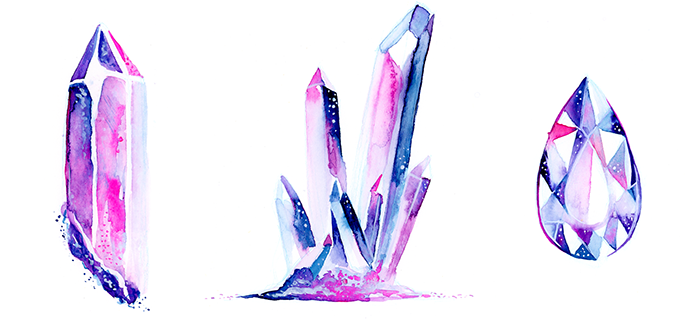
2. Drawing Crystals: Drawing crystals can be simple because they are geometric and composed of straight lines. If you have taken my You Can Draw Anything class, then you know that all drawing is just observation and interpretation of what we see into simple shapes and lines, so let's look at an example of what I mean. Here's a photo of a crystallite. It's super easy to draw because it is composed of only straight lines. Let's see how I break it down quickly. I start by observing the general shape, and getting the proportions down, that's step 1. Now you can start refining. If you find it hard to draw straight lines, you can use a ruler, just draw in all the edges of the crystal and pay attention to where they bend, and in what angles. The beauty of this is it doesn't have to be perfect to look convincing. Once step 2 is done, you can add details for step 3. I would only mark the details like where the values change drastically if you're planning on being more realistic, and if you want to include textures and you're going to be using watercolor, you can just use a white medium on top when you're done painting or more dark colors, so you don't have to mark it. Usually step 3 is done with whatever medium you're going to do, so you can always add more detail when you do watercolor. Well, we're done and that was easy. Well, what if it's a more complex crystal like this beauty? The process is the same. I start by drawing in the shapes that make it up, all I'm worried about in step 1 is correct proportions, which is the most important thing, and knowing where things go, the next start refining the shapes and drawing the bigger details, and then I can use a combination of a ruler for the straight edges and freehand the organic parts to crystals and add in details that I want to include, and we're done. My point is, no matter how complex the crystal just observe the general shape and proportions, then refine and then add detail. Have made a Pinterest board full of inspiring imagery for you to get started, but don't feel like you have to draw everything exactly as it is. You can exclude things, move things around, and even incorporate two references into one image, but if all this seems hard, and you're new to drawing or you just want to jump straight into painting, don't worry, I made five worksheets exclusively for you. These worksheets break down the drawing of numerous crystals into simple steps that don't look daunting if you do one at a time, you can find them in the Your Project section of the class. To get there, you must be logged in and on the website, not in the app, and just go below the video of the class and click on "Your Project". The links the worksheets are on the right. Don't feel constrained to what the worksheets tell you to do, you can always make your crystals less detailed or more complex, just play around with it. Now let's learn about drawing gems.
3. Drawing Gems: Gems are a lot more complex than crystals. Observation is key to drawing anything, but drying gems could take hours. Look at how much detail and different shapes are within. This task might be hard for anyone that isn't a professional artists to do, not to worry. I thought it through and have made worksheets just for this occasion. I broke down the process of drawing gems into simple steps. Some of the gems are super easy to do and some are more complex. My advice is to use a ruler or something straight, to try to do it as precise and symmetrical as you can or you can make it wonky on purpose to make it more playful, you'll see me do this in future lessons. But I want you guys to realize that it's all a trick and an illusion. Look at this diamond illustration. At first glance it looks normal. But when you look closer, you can see that it's just a bunch of scattered shapes and it's random. It's not a realistic gem. My point is, don't worry so much about your illustrations being perfect and if your style is more loose, you can still draw gems. So head on over to the Your Project section of the class and download your worksheets. Now let's learn about how to shade our gems and crystals to make them realistic, but easily.
4. How They React to Light: Drawing gems and crystals isn't so hard, because of the worksheets. But what about shading them? I know this can seem daunting. But don't worry, I already did the hard work of research and observation for you, and I will break it down into simple steps. But first, I want you to see real examples to get a better understanding of how light interacts with our shiny friends, and it will help you to understand my simplification of the process better. The first thing to remember is that the shiniest gems and crystals are transparent, which just means you can see through them like the glass used in windows. These are the types that I'll mostly illustrating in this class. Of course, there are all types of crystals out there, some which aren't transparent at all, but fully opaque, which just means you can't see through them, like this lapis lazuli. Notice how light interacted with it. You can tell that the source of light is from the top right because the highlight, and the left side is darker because it's in less side. This is how light behaves on an opaque object, but when something is transparent like this raindrop, magic happens. Notice how the lightest part of it is on the bottom right, but this makes no sense, because our light source is from the top left, as you can see from the shadow. When something is transparent, our rules of shading are backwards. The direct highlight, if it exists, is still on the same side as the light source, but that side is darker and the opposite side collects light. Here's a black and white example that shows this well. This might confuse you a little, but don't worry so much about why this happens, Just know that it does. Even this crystal has the same effect. Notice that the side that is supposed to be in shadow is the brightest part of the crystal. That sometimes a part of a crystal is transparent, a different part of it is opaque, and that will give us different results. The part that is mostly opaque will not gather as much light like you can see here. It's very bright at the top, but once it drops down to the part that isn't see through, it becomes darker. The contrast between light and dark is what makes things look shiny. In this example, the lightning is more subdued and diffused, which makes the crystal look more bland. Notice how the light still gathered at the bottom, but there isn't as big of a contrast. This one has a stronger and more direct light source and it looks much shinier with a direct highlight, mid-tones and shadows. This is the most extreme example. Our darkest dark is black and our lightest light is white. This has the most contrast, and because of that, it's the shiniest. How much contrasts you want to have is up to you, it really takes practice to learn how to play around with values. In my first class in watercolor, there was a 3D sphere exercise. That means you use one color to make a 3D sphere. This just shows that you can get a good value range while just using one color in watercolor. I recommend you try it out for practice if you love working with watercolors, and if you find making different values hard. Another fun trick is to squint your eyes. This really helps you to see subtle value changes in your reference. The other thing to keep in mind is some crystals don't have a lot of value changes are not very shiny. Like this aggregate is gorgeous, but it's the pattern inside of it that makes it beautiful, not intense value changes or highlights. If you like these crystals, go ahead and paint them. But in this class, I wanted to focus on how to make things shiny. The next lesson I'm going to show you how I would go about shading different crystals and gems. Just remember that shading them is complicated, and nobody expects you to be an expert to do it perfectly. This means it's okay to make mistakes or to you and just do it your way, no matter how quote on quote and correct that is. It doesn't really matter, nobody's going to call you out on it or judge you, because chances are, they won't notice. I personally like to just play around with having lights next to darks, and not really caring about my results being super accurate. But my cell is more whimsical, if you're different and one imperialistic, I recommend to you always use references as guides. But getting all that out of the way, there isn't easy approach to shading crystals without references, and doing a pretty accurately. So let's see what that is in the next two lessons.
5. Rendering Light the Simple Way: All right. We have a couple of shapes, and I've already picked out the light sources. We're going to have a mid-tone, which is the background, and then we have a highlight, which is not complete white. This is complete white. This is our highlight. This is for really direct light and, just so you know, to make a light pop. Then we have our shadow, which is also not a complete black, but we do have complete black just in case we want to make something even darker, just to increase our contrast. But usually, we're going to work with these two. I'm grabbing some white and I'm just going to put it down here, because light is going through this and it is pooling down here, so this is the lightest part of the crystal. We can also add a little bit of shadow at the top to make the contrast pop even more. Now I can get my white, and this is the highlight that is on the same side as the light source. So here's the dark part, because we're opposite, like the rain drops. This is the dark part, this is the light part, and then we have a beautiful highlight here, the lightest highlight. It's going to make it look really dimensional. You can use it on a lot of different shapes. I could do a little circle here, and then a bigger one coming out, or I could just do one line or there's a lot of different ways of doing it. I could even add just a little bit down here if I want to. Just a little. Look at that. It looks already dimensional. Now, we can also maybe get our black and just outline it a little. It just makes it pop even more. That could be it, we could be done right here. That was really easy to do, really quick, and it looks real. Now, our light source this time is coming from this side. So what we want to do is think of the light going through and coming on this side. This is more complicated because we have more shapes. But just be simple about it. I'm going straight lines instead of circular here because it's an oval. It's the lightest down here. A fun thing to do is to gradient out your highlights. You'll see later, this technique use, in jewels. This is going to be a direct highlight, so I'm going to leave that for now, and this will be darker. Don't forget, we're going to have a white highlight here, so it's going to really pop with the contrast between the two dark planes. Down here too, it's more opaque, usually, so let's just make it a little darker. Now let's get our pure white, and we have a beautiful white highlight here. So these are what really makes it pop. This one right here, this one right here. This is what makes it look really, really shiny, especially with the dark surrounding, you can see it's darker around it and it's dark around it right here. If it was white and then a light one here, it wouldn't look shiny at all, and that's what we're trying to avoid. You really could say this is done, but I want to show you guys how you can make things pop a little more. I'm not going to think about the rules of light or how realistic things are. I'm just going to think about contrast and make it bigger. Because no one's going to call you out on not making it perfect and not making it super realistic, because people don't memorize how crystals work and how every lighting situation looks like. This is supposed to be light, but what if I make this dark? What does that look like? Look at that, that looks even more dimensional. Then I can also add little white highlights at the edges. Another thing that you could do is add little dots. So I'm going with the parts that are dark and I'm just adding little dots. This is something I love to do with gel pen on watercolor. You could do this also in gouache and any medium, really, just add white on top. It's good to scatter them randomly because if they're too uniform, it's going to look like a popular pattern and you don't want that. Another thing you could do is add a little bit of texture, little dots, there's a lot of things you could do. The dots didn't really work here really well, so I'm just going to get rid of those. So you can really play with this, I could maybe add a lighter gradient on top here. When you're doing watercolor, you're going to have to decide all these things before you start. Maybe it's a good idea to do a pencil sketch first and decide where are going to be the lights and darks, or you could use a reference, which is always easier. So now let's do this gem. This is going to be our direct highlight, and then the light goes through it and it ends up on this side. This is a little more complicated, again, because we have these planes and they reflect off each other at some time. Well, they are see-through and you'll see the other side, and there is usually something there, but this is flat, so this is fine. But other gems, you'll see how I do it. It's actually really simple how I do it, but they are really complicated, that's why I simplify. Once I have that down, we can start doing the darks again. See, it's very simple, just light is the opposite direction, dark is the opposite direction. Now we can add our direct highlight. So it's the whole thing. Another thing you could do is instead of just making the whole thing white, you could just do lines like this, or you could make it gradient out as well, that works as well. Gradients work really well to make things look subtle. Because we have dark surrounding the white, it looks really good. If this doesn't look shiny enough for you, you could, like I said before, I play around with it and do it your way. So let's take our dark and put a dark right here, even though it's not really, really correct. It could be, because there could be something here making a shadow or something, but my point is you have to make it look good, and to do that, sometimes you have to play around with the rules of light. But it doesn't matter if your illustration style is just playful. So yeah, just make your darks darker or your lights lighter if you want to make things even shinier. Like I said before, sometimes it is good to add little straight-line highlights. This is me just playing around, I'm not even being realistic anymore. I'm just doing whatever I feel like. Right here, I could even get the edges put little a bit of light. There we go, so this is our gem. If you add little circles, it will look even better. But that works really well with the gel pen and watercolor. Now let's try something a little more complicated.
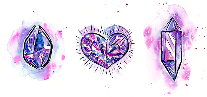
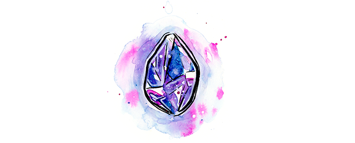
6. Lighting Crystal Clusters & Gems: All right, these two are a little more complex of shapes. There's a lot going on here, light is bouncing off and reflecting and maybe this is more pictures. It's making a shadow here, and same thing with here, light is very crazy inside of gem because it's just bouncing off everywhere, you would notice a lot of pictures of gems it's dark, light, dark, light, dark, light, and it doesn't seem like it's coming from a straight source. It's actually the most beautiful and shiny gems, that's what they look like, and I'll show you guys how to do both of these easily right now. So I don't have a reference, I just made this up in my head. So how do I do this? I pick a light source, so lets say it's coming from here and it's going through and it's ending up here, so this part's going to be pretty light. So same thing here light is coming, it's pulling down below. A direct highlight, it's going to be, let's say this one and maybe right here. If you have a couple of crystals like this, make sure to pick the direct highlight in a similar direction. They're not to be exactly the same face and planes, but very similar. We can also make this one a direct highlight right here. But notice how when I stood them right next to each other, same plane, it doesn't pop anymore, so it's better to make it gradient out. Like I said earlier, just don't think about it too much, just imagine going through, it's going through here. This side is going to be, let's say this is in shadow, the bottom part of this will be light, but the top part is in shadow because it's going right through it. Same thing here, the top part is in shadow. We're just inverting our lights and darks. You can see how it's starting to form. Now, this part is usually opaque, so light is coming from here. So this will be light, but then this part of it will be dark. Let's say this is a crystal, but it's over something opaque so it could be making it darker. But like I said earlier, don't be afraid to make it look good, like whatever that means to you. So let's say I want to make this really light, I'm trying to up the contrast. I'm just seeing what looks good now, does not be of materialistic, like I said before, we're just trying and make really shiny, good-looking gems. We have white here because light is hitting it. Let's say this is going to be direct light, these probably are not, but they will be white on this side. Don't forget, you can always put a light source on the back of this gem and it could come from both sides, but then it's going to be light on both sides, and it's not going to look as good contrasted. If you put a lot of light on something, is just going to wash it out. So maybe I want to make it really white on the bottom to make it look like it's glowing from within, that usually makes things look like magical. So we're just making it glow from within. Notice how I'm starting to just draw on the right side of this plane, for example. I'm just making it look like its own plane. I'm really just playing around with what I want it to look like. Maybe you make this darker, make your darks darker, your lights lighter for more contrast, and for it to look shinier, that's easier to do even with watercolor it just means you have to use more concentrated paint in your dark areas. So this is black and white, but when doing this in color, it's the same thing. You just have to make your paint less concentrated, more concentrated, and some colors are darker than others, like blue is very dark. If I was going to do a pink, blue, purple gem, I would make the darkest parts blue and purple, and then the pink parts a bit lighter parts, that works really well usually. Now, there's some reflected light here, so yes, we leave a little highlight on the bottom. We could even exaggerate that a little. Reflected light just means light is coming here and it's being reflected everywhere, sometimes it bounces off at the edges. All right. So now, maybe I want to make it white at the edges too, maybe I want to add some texture like we did in the other example. It's a lot simpler now to just add in detail. This is usually the white gel pen or gouache or whatever, very easy to do, gives a huge effect, and the little dots too also work really well. There's a lot of ways to do highlights like this. This is how you do it if you want to wing it. If you want to be a realistic use a reference because it's complicated, crystals are very complex, you can't just learn how to do it in one day, it takes a lot of practice to get good at drawing something and to understand how lighting works and that one thing. So be sure to use a reference, if you want to be super realistic, but if you're like me, and you don't care this one to look good and you just want to be whimsical and fun and loose, then you're good to go with doing this. You can't really tell it's not realistic, can you? For this kind of gem, there's a really simple technique, you'll be surprised how simple this is, I call it the random technique. We're just going to randomly fill in each little thing with a color. Another thing you could do is instead of just filling the whole thing in one color, you can take a portion of it like let's say take half of this and fill in that apart with a color. The other part will be some other color. That makes it look even better because gems have a backside to them, and all these lines are always reflecting and they go through, you can see through them, so there could be a line right here, there could be like a line right here or right here or whatever, but you can see through them and that makes them even more shiny and crazy if you have more detail like that. But you don't have to do that, you can just do each one. Also, don't forget you can gradient them out, like right here, I'll make it dark and then I make it lighter. Our gradients make it really good, and water color very easy to achieve, you just use more paint on one side and more water on the other side and they'll just blend out naturally and make gouache too. If you want to really shine, don't forget to put the darkest parts next to the lightest parts. So when you're putting in your darkest darks and your lightest lights, don't put too many of them in, just pick a couple of spots and do that because you don't want to overdo it. Now, let's say I'm done with putting in my colors, now, the last thing to do is to add highlights. So what you do is you go to the edges and you add highlights in random parts. You don't outline everything, but you outline some parts, you just do it randomly, you pick whatever you want. There are just outlines of the general shapes, especially parts where it's dark and dark, you have to put highlight between those two, it's going to make it look much better and we're done. This gem looks pretty shiny to me. The only thing is you see these places that are mid tones, I didn't put anything in, they make it look flat, that's why I like using the gradients, and you can just fix that by just getting a little darker colors, so maybe our dark, but very gently putting it on. But my point is, when you color, make sure to think of everything as a gradient. A gradient just means you go from dark to light, and then to white, that's all it means. It just means not one solid color, it goes from color or from, it could be from color to color, or it can be from value to value, which is what I'm talking about here, from dark to light. But sometimes in watercolor, even if you're doing color to color same value, it's going to look really good. All right, so that's it for this lesson. I hope you guys understand what I'm talking about, but if you don't and if you find it difficult, don't worry about it too much, just remember two things; the first thing is that most important thing is darks and lights. The contrast that happens between darks and lights when they're standing next to each other, is what makes things look really shiny, and that's what we're trying to do with these gemstones. See this one, for example, doesn't have that much contrast, there's no direct highlight right here, if I put it here, it would be even shinier. Also, doesn't look as shiny as say this one where it's white and then almost black here. Just remember that. Remember to make things shiny, just put a dark next to a light. Another thing to remember is that when light goes through a transparent object, it goes through it and pulls on the other side, so where we think it's shadow, it's light, and where we think it's light, it's shadow. Just a direct highlight right here, which gives it a huge contrast because of shadow below it, this will makes it look shiny. So just remember, light go through, other side light, this side dark, and then direct highlight and it'll look good no matter what you do, and you care a little things like lines and circles and whatever, and you will see how I do it in the next few examples. So just watch the whole class and you'll get a really good idea of how to do it and you'll see how sometimes I really don't care about lightning, I'm just going to play with it, and you guys can do the same, so don't worry about it too much.
7. Semi-Realistic Style in Watercolor: Now let's start painting. In this lesson, we will paint some realistic crystals with watercolor, which are just gorgeous. This is not an introduction to watercolor, so if you're brand new to it, I recommend you to take my quick watercolor basics class first and then come back to this class to practice your skills. Supplies you're going to need for this class are watercolors, watercolor brushes. I'll be using a size 4 and a double zero round brush, but that all depends on your paper size. You will also need watercolor paper that's at least 140 pounds. I recommend Canson XL paper for the price and this is what I will use throughout the class. Two water containers, one is for dirty water and one is for clean, paper towels, a pencil and eraser, and you might want a ruler to make your lines straight if you find it hard to do so in freehand. Last but not least, some white. I recommend the Uni-Ball Signo broad point gel pen, but you could also use whitewash, white acrylic, opaque white, or white ink with a brush. There are so many different ways of doing this, but it really helps to have some white you can put on top of your watercolors for fine details and highlights. If instead you would like to be more traditional and work with only masking fluid, you can do so as well and you will see me use it in this class. Let's start. The first and second crystals are based on the crystals in the worksheet, but I added my own style to them. The gem is exactly as it is shown on the worksheet. For the first example, I want to show you how you can incorporate masking fluid in your paintings. I don't use it often enough, but it's very valuable to use in watercolor. To use masking fluid, make sure you're using an old brush, dip it in some dish soap, and then apply masking fluid to the areas you want to remain white. Then you let it dry, and then you can paint on top as you know it normally. Once your paint is dry, you can gently rub off the masking fluid with your fingers and then paint within. With crystals, it might be fun to put it where your edges are. Another benefit to it is a pencil marks beneath the masking fluid can be erased once it's removed. I painted over the lines and I picked the middle shift of the direct highlights so I painted over it too. Now we wait for it to dry and we can start painting. In this instance, I decided the light is coming from the top left. So like we talked about in the shading videos, I'm just going to do the opposite of what I normally would. If this crystal is transparent, in the first plane, I paint light is going straight through it since it's facing the light source. So it's dark. I use lots of pigment on the bottom to keep it dark, but then I clean my brush and add simple water on top to make it slightly fade out into a nice gradient. It really helps you playful with your colors in your illustrations. In this case, I'm using analogous colors, which would just means colors next to each other on the color wheel. This usually works really well to make beautiful and harmonious compositions that are full of life, yet simple and subdued. I start my painting with light blue and then I add pink below it and let them blend on the page. Now this plane will also be dark since it's facing the light source. So continue dropping in lots of paint and it will naturally spread and blend on the page since water is present. For the second plane, I use a lighter color just by using more water and less paint and fill in the shape. This is further from the light source, so it'll be lighter. Then I use a paper towel to pick up the pink closer to the right side and I even dab a little on the first plane. This gives it a nice settle texture and makes it lighter. For the last plane, I use almost all water and very little paint. This is where all the light is gathering since it's in the opposite direction from the light source. Then I use a paper towel to pick a paint on the bottom to make it even lighter and almost white. I really love using paper towels to give a subtle gradient texture, but this technique only works if your paint is still wet. Or you could rewrite your paint like we did it with the watermelon in the suits class and then pick it up to make highlights even after your paint is dry. Now the bottom part of it is opaque, which means light can go through it and it's facing away from the light source. So we would treat this like any other opaque object and make it dark. I paint it in with a darker purple. Now for the second plane on top, light is still going through it so I use dark purple, but I wanted to be a little lighter. So what I do is paint one line with lots of pigment or paint, and then I clean my brush and with clean water fill in the rest of the plane. This pulls the paint outward and makes a slight gradient. For the last plane, I use very little paint and lots of water to make a light color. This is the lightest from the top planes because it's opposite of the light source. Now we're going to let this dry. For the second crystal, let's switch up the light source. Now, it's coming from the top right. Don't get confused or overwhelmed with all the crystals in scenario. We're just going to paint one plane and one thing at a time and we'll do our best. So I start out by picking the right plan of the biggest crystal. Since light is going through it, it will be dark. I start with purple, which is pretty dark, and then I finish off with blue, which is also a dark pigment. I drop in more dark colors into the paint while it's still wet and then I clean my brush and gently pull color down since it does get lighter the lower we go, because light pulls there. Notice this light gradient that I created and that you can indeed see some purple at the top. This light color variations are really fun and easy to make, that are all a dimension to your piece. That's why I really love mixing on the page with a wet-on-wet technique. Now let's paint the right side of the crystal next to it dark and drop in more concentrated color on top to make it darker. With a wet brush, I pull color from the two crystals into the bottom part to make the transition softer. Then I pull this light color into the crystals just to wet those areas so when I drop paint in, it's soft. I start dropping paint in, putting the darkest parts on top. Notice how it blends beautifully without me doing anything special. As we go more to the left, I'm going to make it lighter. I'm concentrating on the bigger crystal now. I make sure to make it lighter and for it to blend out to almost white as it goes lower. Also be sure to use dark values right next to our highlight to make the contrast bigger so that it looks shinier. The left parts of the plane will also be dark because light is going through them to the bottom, and the right side will have the direct highlight. Notice how I'm not adding color, but pulling it with plain water onto the lightest parts of the crystal, the left side. When you use a wet brush next to almost dry paint, it will tend to make beautiful effects because the paint will bleed into the water. Watercolor will always follow the water. Next I form the rest of the dark right sides, making sure to use a concentrated blue for the highest contrast. Then I paint in the bottom part of the crystal, which is opaque. This sends the shadows around the left and the highlights on the right. Because it's not see-through, light will act like it normally does. To make it more beautiful, I let it fade from dark blue to purple to pink. Using analagous colors next to each other, it makes a beautiful transition. The way I did it, it's a transition in value and color, which is more powerful. I also use the tip of my brush to make little dots on the crystal and at the edges to give it a stylistic touch and some texture. Notice how loose my brushstrokes are. Now let's let this dry. Now as you remember from the shading lesson, gems are very easy to shape. We're just going to use the random technique that I showed you by putting different values and colors in every little shape. You can even cut the shapes in half and add different colors in those, if you want it to be even more detailed. Notice how I'm letting the colors blend on the page, and I'm letting some of them fade out. Also, I let light colors touch dark ones. They're not fully dry and it makes this light bleed into light one, which makes a beautiful gradient. Another fun thing to do to make your gem pop is to add a slight outline with a dark color, but not everywhere, unless you want a cartoony look. I do so slightly on the left and right and I continue filling it in. You can also leave little specks of white when painting if you want small highlights and you don't have a gel pen. I recommend you do this with all your gems and crystals, if you don't have one. Just remember, you cannot use watercolor to add white. That's why you have to get another medium or you have to be very mindful. For the finishing touch, I paint through the middle by painting with water and pulling paint out. This gives an extra sparkle and makes it dimensional. Now let's go back to our first crystal. I gently rub off the masking fluid with my fingers, and now we're going to refine our crystal with a second layer. I start by making the darks dark in the top left side of the plane. This part is the closest to the light, so it will be the darkest, and I do it with blue because it's a dark valued color. If I use pink, for example, or yellow, it wouldn't make this big of a contrast and will look less interesting. All your colors have certain value ranges as well, like orange and yellow cannot get very dark, but blue and purple can almost look black. I also darken the top-right side, which is next to the highlight to make it pop more. Next I start adding textures, since this is an imperfect crystal and will have some fun inclusions. I draw many straight lines and then do the same on the bottom. But I don't like how rough it looks, so I just use plain water to smooth it out and blend it out gradually. Then while it's still wet, I add some bright pink paint and little dots for more texture and form our color. Add more dark blue into the left sides since it's still wet. I also slightly darken the top part of the right plane by painting a straight line with lots of pigment, then using wire to spread it out. I also darken the bottom part with more blue, but I use loose brush strokes this time for a slight texture and add some dots on the outside of it for another stylistic touch. We are done for now. I darkened some of the darks, I forgot to include the middle crystal. While that's drying, I'm going to finish the gem with a gel pen. You can use whatever white media you have, and my favorite for the tiny details like this is a gel pen. To finish the gem, I do two things. Firstly, I draw white lines between random parts of the gem. Notice how I don't do it everywhere, but very selectively. Also the same thing with little dots that are randomly spaced. I put them on the darkest parts because it'll send out the most there, but not everywhere. We will learn with practice how not to overdo this effect. Just be patient with yourself and stop yourself if it looks done. Now our gem is complete. For the crystal cluster, I'm using white quash and a small brush to add the highlights. Quash is fun because you can do a little to make transparent white and you can paint large areas and do it with line variation. Make sure not to use your fancy watercolor brushes when painting with quash, but instead dedicate cheap brushes for it. I do the same thing as I did with the gem, but more subtle. I paint little dots in random places and I paint in small lines at where planes touch, but not everywhere. I also add some white on the bottom part of the crystal to make it look more dimensional. For the last crystal, I also you quash, but this time more diluted and with very loose brush strokes. This makes it look more like a texture or an inclusion than a sparkle, but it makes it more interesting as well. We're done. This technique is simple to do and so much fun and the results are gorgeous. If you don't want to paint from a reference and want to make super shiny crystals, give it a try and get creative with the things like color, texture and style. Do it your way or copy me if you find it too hard. Now let's do a more fun and playful technique, utilizing ink and watercolor.
8. Magical Cartoony Style in Ink & Watercolor: This lesson is going to be more loose and fun and we'll utilize ink and watercolor together, which is my favorite way to illustrate. But I encourage you to play around and find your own unique way of painting the crystals, because I will do them in my style. Everyone has their own unique style. For this lesson, you will need everything we talked about in the previous lessons plus ink. This can be anything from a simple micron pen to a brush pen to ink in a bottle with a brush, that's up to you. You could even use colored ink markers, but be sure that they are waterproof. You can do a quick waterproof task by drawing a line with whatever tools you have, letting them dry fully, and then painting with water on top of them to see which are waterproof. If you want to use ink on top of your watercolor paintings, then it doesn't matter if it's waterproof, just be sure not to add any water after using. Let's jump in. The first sketch is based on one of the worksheets, the second gem is the same as the worksheet, but I did it imperfectly to give it a fun feel. The last sketch is also based on the basic and then providing the worksheet, with my personal touches. For the first example, I outlined it in brush and ink. This is really fun to do because you can get a lot of line variation with very little effort. Notice I don't let all my lines close perfectly for a little bit of style and I also draw in a couple of thin lines next to each other to give it a texture. The second one is done with the micron pen. I don't draw out every little detail and leave some out for a more quirky look. Notice how there is no line variation. This is not my favorite way to work, but might be yours. For the third example, I use a disposable zebra brush pen which is my favorite brush pen at the moment, and that is very similar to a brush and ink but portable. The only problem is it's hard to get super tiny strokes like I did in the first illustration. I add a bunch of lines over some of the planes, maybe there'll be highlights, I'm just being playful. Now I can easily erase the pencil marks, which is why I love using ink and watercolor. If you paint over pencil marks with watercolor, you can't erase them afterwards. So be sure to always sketch lightly when you're using watercolor on its own. But when you work with ink and watercolor and use ink first, you don't have to worry about it. I start with my number four brush and loosely fill in random parts of the crystal. This is just like the random technique we use in gems. Use random colors, let them bleed. But be sure to leave white areas, that's very important. Notice how I painted outside the lines. This could look very cool on its own. But I want to show you guys my favorite way of doing this, which is to pull color out of the illustration with plain water to make a beautiful background. If you look at my work, you will see that I love to do this technique. The pigment is drawn to the water and will naturally bleed into it. Then I gently pick a color to it that I already used and I gently add a splatter by tapping a loaded brush on my finger. Since a lot of water's present, the paint will do its own beautiful thing. Now I will leave that to dry, I can start working on the heart. I will also be using the random technique here. Notice how I'm not trying to stay in the lines and I'm staying loose and fun. I can drop more dark color into certain parts to make the contrast bigger, and I can add plain water to let some parts bleed into others for lighter values. While the paint is still wet, I take a clean and slightly wet brush and smooth out the edges to make it look more dimensional and darker. I don't do this all the way around just like we did in the gem in the previous lesson with the outline, and then I add a dark blue splatter and leave it to dry. Notice how random and loose the brush strokes are, but there is a noticeable value difference between the darks and lights which makes it feel like it's sparkling, just like the wear diamond illustration I showed you guys as an example in the shading lesson. Now, for the last crystal we're going to start by using plain water to paint out the planes we want to paint first. Then I can drop coloring and let it blend on the page. Wet on wet technique can be really fun to do if you're painting loose. Color really spreads out and mixes in an unpredictable manner when you do this. Remember, the more water the less control you have. I use my brush to paint in-between the lines in the middle to make highlights and the color goes there because it follows water. Then I use a slight color to paint out slightly away from the edges and start painting in the background. That is how we have some white around the crystal where I painted the edges, and this can make it look like it's glowing, give some more contrast. Notice again how it's not everywhere. Next, I add more paint and splatter and we go back to the heart. The paint is not fully dry, so I can pull it out into the background and I do so. This time I follow the shape more. Now let your paintings dry naturally or you can use a hairdryer, set on low to speed up the process. Now it's time to up the contrast by darkening our darks. I start with the double terminated crystal and I think of which areas would benefit from the most darkness to increase the contrast. Notice how on the left one, I make a gradient by using paint on one side and water on the other. On the bottom one, I paint around the lines to make it look shiny. We'll leave it to dry and for the first crystal, I pick random parts that I want to darken and loosely paint them in. I do the same with the heart and even use the color to slightly outline it. I darken the double terminated crystal even more and add more detail in the heart using loose dots. But I don't like how that looks so I'll use a simple paper towel to pick it up and easily erase it. I also think I made the crystal on the right too dark, so I dab at it with paper towel to make it a little lighter. The paint is still wet and I'm going to do something a little more experimental. I take white ink and splatter it over my illustrations. Notice how it blends out into the parts that are still wet and the parts that are dry get little specks of white that make it look shiny. This gives it a magical and ethereal look. Next, I use white ink to outline the first crystal and to add little highlight lines within. It is blending with the paint which makes some of the highlights transparent and blended out. I don't like how the outline around the crystal looks, so while it's still wet, I use some water to make it go out further which dilutes it and gives it a subtle glow. Back to the heart, I use a gel pen to outline it within and outside. Not all around, but selectively. I also add little lines within in random parts and I do it loosely. Little dots are added in the background to make it feel like it's glowing. I also use the white gel pen on that last crystal. This time, I use it for highlights within and short quick strokes next to the lines I drew earlier with ink. I also had little dots to the background in random areas, randomly sized and spaced. I also outline the first crystal and the last one and then I add little stars by crossing lines to the last one and the heart. It's easy to overdo this effect so only do a couple and make them all different. I get a little more experimental with the heart by scribbling with the gel pen in the background, then I use my brush pen to outline it by varying the strokes and adding short lines all around, alternating their lengths. I also draw some lines within to up the contrast a little more. To finish the first crystal, I outline the highlight to give it a cool effect. In the last crystal, I fix up some of the lines that I accidentally used gel pen over it with ink. I hope this lesson helped you understand how being experimental and loose can really pay off. Using things like ink and white gel pen can help you up the contrast on your illustrations and make them extra shiny very easily. Call it a watercolor hack if you will, I think the results are super playful and fun and this can be done in many different ways. Try doing it in your style and try to use as many different techniques as you can and even make up your own. If you come up with something cool, share it. If you want to learn more about using ink and watercolor together, you can check out my previous class that I already made on the topic. Okay, now let's do quick and loose squashed crystals.
9. Loose Style in Gouache: Okay, so when working with gouache, there are few things you have to keep in mind. First off, be sure to use cheap brushes, like the ones you find in brush packs that are like $2 because using gouache would ruin your nice watercolor brushes over time. Next thing to keep in mind is that once gouache is dry, it's unusable. You have to get a freshman tube every time you use it. Here, I tried re-wetting some dry white gouache and as you can see, it didn't work very well. Another thing to keep in mind when working with gouache, once gouache is dry in your illustration, if you add water on top, you'll reactivate the previous layer and it will smear. But you can easily layer it as long as you use it at the right consistency and not use too much water. This is something that takes getting used to, but it's not too hard. So that's it. Now let's start painting. For this lesson, all you'll need is gouache, toothbrushes, a mixing tray and paper. You can use a watercolor paper or black paper like I use in this lesson. Gouache doesn't use as much water as watercolors, the paper weight doesn't have to be high. Now what I'm about to show you is how I like to paint with gouache, which is a style I developed. Most people use gouache as flat colors and layer it, it's very popularly used in patterns. I like to just blend it on the page and this gives it a cool feel like oil paint or acrylic paint, and it's really easy to do and fun. Now I'm sketching directly with gouache on the page. You can easily paint over gouache and layer it so don't be afraid of making mistakes. This sketch is based off the diamond in the worksheet, but I made it more playful and perfect to make it more stylized and fun. Now I just start adding color. I'm using the random technique, but notice how loose I am with it. I just layer and get a feel for what I like and what I don't. I also mix colors directly on the page for fun effect. With gouache, what you see is what you will get once it's dry, in terms of gradients and such. It will not mix on it's own like watercolor, but will instead be more messy, but dark colors will dry lighter and light colors darker. I continue layering, adding colors randomly for the most contrast, and I stay messy and loose. I outline it in varying colors and add little white dots around it. I like how this looks but doesn't feel complete. I did the same thing I did for the jump heart in the ink and watercolor lesson, and paint loose lines around it to make it look shiny. Notice how messy the front top part of it is, this is exactly how it will dry and I love this effect. Just paint a smooth jumps on because I love how they catch the light. I start by painting an X shape and I add slight color variations to make it slight gradient. You can blend slight gradients in gouache, it just takes practice. The light source is coming from the top left side. The top left will be dark and the bottom right will be light. This is how gouache is traditionally used by first painting the base layer and then adding on and building up. I start by adding a darker color to a darker side. Notice how I'm not touching the edge. I want that light outline. I keep blending colors right on the pages from using acrylic paint and add yellow to make the bottom right lighter. I paint out a fun little shape that's even lighter on top, messily mixed with some white in the middle and put a dark outline on the right and a light one on the left to increase contrast. This is all layered, I'm not too worried about anything and it gives me more room to experiment because if I don't like something, I can simply paint over it. I continue playing with color and then I grab white and make a beautiful direct highlight facing the light source. I also outline the right side in white. Next I start adding little white dots and little yellow dots to make it more fun and then even green dots. I loosely paint over some of the dots on the left to make it darker and I play around with the outline and make it bigger. I continue playing with the details in the contrast and add big and small dots on our jump to make it look shiny. Then I loosely paint over some of the highlights and it feels complete. I added some highlights with the white gel paint on both of the gems off camera. But you get the point, gouache is very fun to use loosely and without fear of mistakes because you can keep refining until you're happy with it by adding more layers. At first, it's a hard to master medium like watercolor. So y [inaudible] be patient and just have fun with it. Do your own thing and you'll naturally discover new techniques and your favorite way of working with it. If you do have gouache I recommend getting some black paper to work on because it's super fun and it makes a huge contrast. Now for the last lesson, I'm going to show you how to paint a rainbow crystal or a knot ball, a clear crystal or quartz and a black crystal or a terminally. This will be a more realistic lesson, but it's really for you to learn how light interacts with these types of crystals, and you'll see that it's all done with just simple steps and layers.
10. Painting Rainbow, Clear, & Black Crystals in Watercolor: In this last watercolor lesson, we're going to paint these three beauties. I made this lesson because it was requested by my students on Instagram. I think it will really help you to understand how to illustrate lights and darks in crystals and how to work with different colored and transparent or opaque crystals. The supplies for this lesson are identical to the supplies in the first one, except l'll also use a little gouache in the opal. Let's begin. The opal can be any rounded shape, so I sketch out a half-moon. I sketch out the quartz in a random style and the tourmaline is fun, but I decide to add many quartz crystals to make it more interesting and to give it contrast. The first thing we need to do is apply masking fluid to the opal. Opals are very shiny and have little rainbows within. This means they have lots of highlights, which are the rainbows. The contrast is the actual color of the opal, which is usually much darker. I make lots of random shapes to mimic its organic nature. When you do this, you can make it more sparse to make it less insane. The places we put masking fluid will be bright colors and everywhere else will be a darker shadow. Now, let's start on the quartz. With something as transparent, it's not fully white. Very rarely is anything super white in nature, it may be snow or a piece of paper, but crystals are only super white where they have direct highlights, unless you put them in a strong light with a white background. But when painting something clear or white, you just have to pay attention to the details and the shadows. The white of the paper is already present on the page. I'm just painting the parts that aren't white, which is a lot. Really, practice observing white things and notice how not white they really are. Another thing to notice is how I'm not going to be using any gray or black, but instead blue and purple. I don't like using black in watercolor because it tends to look bland. When painting shadows on white, I always settle on a muted blue or purple. It just looks better. Also notice that shadows in real-life aren't gray, not really. There's always a little color in your shadows. If you look really closely at clouds, you will see blue and purple in the shadows. What I'm doing here is putting down the base color and defining my darks and lights in the first layer. Notice the texture, I don't miss simple parallel lines. This is my first layer, so you should keep it light because in watercolor, we work from light to dark. If you put down too much color, simply clean your brush and dry it and then you can pick up the excess water and paint with a thirsty brush. This is similar to the paper towel technique, but the results are more smooth and blended. Now that I painted in the basic shadows, I'm going to let it dry and then I will define the plains. But notice how most of the pure white is gone. Now, the opal is a black opal, so I need to darken it. I use brown and dark blue and let it blend. The contrast between light and dark is what makes things look shiny, so it's important to make this layer dark enough, especially since our highlight will have color. Now for the black crystal, when something is black, it's not pure black. It still has shadows and highlights. We start by painting our first layer of black and the light source will be from the top left this time. I use masking fluid within to preserve some white minerals inside it because tourmaline has little white mineral inclusions which up the contrasts, making it more interesting. Notice how when I'm painting it in, I'm keeping little white lines and specks in random areas. This is also a texture of tourmaline and it makes it much more interesting. Like I said earlier, I don't believe in using pure black. You will notice I blend lots of colors, but it still has the illusion of being dark or black. I drop in more dark purple in painting the initial shadows of the crystal. Now, the first initial layer which is the base color is done. I'm moving back to the quartz. I'm defining the shadows on the plains within that round by adding more detail and layering color to make it darker. Looking at this, you might think the crystal looks blue, but if you look at the finished result, remember that watercolor dries lighter. It does look like it's clear at first glance. Another trick that I use was making shadows of the other side of that crystal or within because it's a three-dimensional object. When something is clear you can see through it, which makes it appear really transparent. It's really simple to paint something clear in watercolor, just paint in the shadows and if there's something behind it, be sure to include it. Now back to the tourmaline, I start adding more shading and the bottom right will be the darkest because it is farthest away from the light, so I darken it with dark blue. I'm thinking about is a 3D objects, so the part on top is actually more inside. I put a shadow there as well. I'm painting parallel line texture that helped me to fade out the shadows as to go to the left side and also gives it a trademark texture, also leaving white specks and lines in its darkest parts make it look really shiny interesting. Now, back to the opal. I gently rub off the masking fluid and paint inside the specks with my brightest colors that are trademark opal colors. Some I dilute more with water to make it look shinier. The colors are neon green, yellow, hot pink, and turquoise blue. Notice, how I didn't make the background dark enough so it doesn't look shiny. The colors don't pop enough because there isn't a big enough of a value difference or contrast. I start by going to the background and darkening it. I use dark blue and brown on my colors and let it dry. Now, my black crystal is almost done. I finished defining the crystal cluster and the almost white minerals on top and below it. Notice how the mineral is below our darkened edges, I use blue and purple to paint the shadows with all the whites in this painting. Now, I'm going in with a gel pen and adding subtle highlights on the quartz crystal to make it look more dimensional. Notice how in this example, I didn't put on any strong highlights or pure white and it still looks transparent. I want to show you guys that even with very little white, it still looks like it's clear. If you think trying something transparent is complicated, just observe a transparent object for a longer period of time and you will see that it is not purely white and it is composed of lots of shadows. I use a gel pen to add little glimmers to tourmaline by drawing little dots next to each other. This looks extremely shiny because of the huge contrast, but in the quartz, the highlights are more subtle because the contrast isn't that big. I'm not too happy with how dark how my opal is, so I add one more layer. This time I had pink in it, which isn't very dark, but it will make it more playful and interesting. Then with a gel pen, I add highlights all around using curved lines to make it look shiny and then small glitter within. You can say this is done, but let's say you messed up and you made it too dark in some parts and there wasn't enough highlights. I can't fix that with watercolor alone, but this is easily fixed with gouache and this is why I like to use the mediums together. You can easily use gouache on the top layer of watercolor to correct mistakes. Just be sure you're done with using watercolor because if you use it again on top, the water will react to eat the gouache and make a big mess. So that's it. We just painted a crazy rainbow opal, a clear quartz, and a black tourmaline crystal. I hope watching me do it made it clearer for you on how to go about painting different gems and crystals. I hope you are more confident in trying out your own different ways in painting your own favorite gems and crystals.
11. Your Assignment: The class is done and your assignment is to paint at least one crystal or a gem in whatever style and medium you like. If you make more than one, share them all. If you copy me exactly, that's okay too. Copying is a big part of the learning process, I used to copy my favorite artists when I was starting out. Just never share your work and say that you made it if you copied somebody else. But you guys copying me in this class, that's fine, you have my permission. But if you're a more experienced artist and you want to challenge yourself by painting something I didn't, utilizing some of the new techniques that you learned from this class, I would love to see it. You could also wing it and make up your own crystals as well, or you could use references and tweak it or whatever else you want to do. This is your art, this is your style, do it your way. There are no wrong ways of doing art. I am so excited to see what you guys make. If you have any questions, leave them in the community section of the class and I'll answer them as soon as I can. If you guys want to learn more from me, you can took on my other classes and thousands of other classes on Skillshare. If you find this class valuable, maybe write a review to help other students decide if they should take it. I'm so excited and happy to be part of this art adventure with you, and I'm so happy to share my knowledge, and I am so happy you find it valuable. You guys are the best, and I'll see you in the next class.
 Yasmina Creates, Artist & Creativity Cheerleader