Transcripts
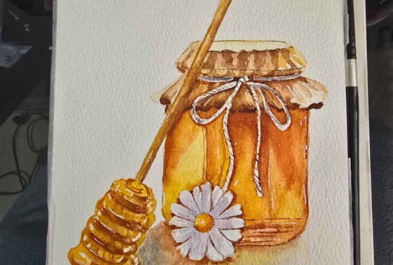
1. Introduction: Hi everyone. My name is Nia and today
I'll be taking you through today's class where I'll be
painting a Rustic Honey Jar. A few months ago, I posted
a class on how honey bee, and I thought that this
will make a nice pairing if you'd like to hang and display your
paintings that home. This painting is
a combination of two reference images that I
found and combined together. And of course I'll be adding some finishing touches as well. With this set though, even
though the composition may look a bit simpler than my
usual food illustration, I will still
classify this if for intermediate students
as I will still be adding some very
small details. So it would require
you to still have really good brush control
and brush load experience. But if you're a beginner and you'd like to
give this a go. I'd still welcome you
to try because I will be taking you through
the steps slowly, one-by-one for each elements. As you can see from
the class playlist. After this introduction,
I'll be taking you through the supplies that I will
be easy for its painting. After that, I will show you
the reference images and the combination of those
two reference images that I compiled together. Then I'll take you through
my sketching process. But like usual, if you would like to jump
straight into painting, I'll also have the outline
available for you guys to download Projects
and Resources section where you can print it
out at home and trace it onto your watercolor paper it has for the painting portion, like usual, I'll be
breaking it down into separate lessons
for each elements, for each item in
the subject matter. So it'll be much easier
for you guys sit digest before we start if you've
never taken any of my classes. Firstly, welcome. But I would also like to make a disclaimer that
I'll be cutting parts of the painting if my hand is either inactive or
off the camera. And I will also be
speeding through parts. If I'm eating very slowly, I just find that
this makes the flow a little bit better and easier to digest since the progress
will be much more smoother. So if you're going to
paint along to my classes, I would recommend
for you to watch either the class or the lessons
prior to painting along. You know what I'm going to be
covering and those lessons. And you also understand
the pacing a bit more. And once you're ready
to paint along for you to pause in between each step. So you can paint at your own pace without
feeling of being rushed. So with that said, if
this sounds like a class, you'd be interested in trying, please join me and let's begin.
2. Supplies: This lesson I'm
going to go through the supplies that I'll be using so you can
have yours ready. Firstly, this is the paper
that I'm going to be using, this Strathmore
five-hundred hot pressed and it's 300 GSM in
terms of the thickness. And I've cut this down
into 5 cm by 7 cm. If you're new to
painting and you feel like you need to
swatch your colors. I would recommend for you to use the exact same paper that
you're using to paint. Just use a scrap paper that
you've already used before. By using the exact same paper, the paint is going to react the exact same way as when
you put it on your painting. As for the brushes, I'm only
going to be using these to. The larger one is
by George urine. And this is a size six
round synthetic brush. It's not necessary to use the
exact same brand as this. This is just a cheap
synthetic brush that I can easily get a hold
of in my country. A more well-known brand internationally would
be Lyra and reefs. I've also used them before, but the sizing might be
a little bit different, so please adjust the size of
your brush to your painting. As for the second brush, this is my Winsor
and Newton scepter, golden number to size zero. I find that this has
slightly software bristles. But just like
before, you can use any small brush that you
have on hand as well. Next, you will need a palette. This palette is very
old, as you can see. This is tinted a
little bit yellow, but it was originally white, and this is just cheap
plastic palette from deisel. You can also use
porcelain pallets, but makes sure you use a
light colored palettes so it doesn't interfere too much with the paint
that you're mixing. And these are the
colors that I'm going to be using for
this whole painting. But I'll go through them
one-by-one later on. Next, I have my Jar
and clean water. You can also use
two jars for this. One Jar is to clean your brush and the other one
is to reactivate your paint. Personally, I just
like using one and I just changed the water
whenever I need to, but I don't really
do it that often. Next, you'll need to shoot. This is very important because this thing as what helps you control the
load on your brush. Whenever you have
very heavy load, you can always take the
excess off with tissue. So the flow of the paint from your bristles to the papers
much more controllable. For this painting. I'll also be using
my masking fluid. This is by the brand Maurice. This is just what
I have access to, but you can also use the usual masking fluid
that you have. However, if you don't have
access to Masking Fluid, you can also paint around the
areas that we're going to mask off as not too
complicated to do that, but it will take a bit
more effort and time. This one just happened to have a small applicator which I like. But you can of course apply
it however you're used to. So those are the
painting supplies. Next, I'm going to go over
the drawing supplies. Of course, I'll be using
my eraser and my pencil. This pencil is my favorite mechanical
pencil by Pentel sharp. Let's, and I like to use either HB or to be in
terms of the eraser. I'd like to use boxy. This is my favorite brand
because it erases very easily. If you want to cut your paper
into the same size as mine, you'll need a ruler
and scissors as well. Lastly, this is optional, but I like to always have a hairdryer right
next to me when I'm painting in case I need to dry off a section
really quickly. Okay, so next I'm going
to go through the colors. Firstly, this is
sepia by Holbein, yellow ocher by Holbein, Chinese white by Holbein Quinn, read by Daniel Smith, new gamboge by Daniel Smith, Quincy Anna by Daniel Smith, Hansa yellow light
by Daniel Smith, and ultramarine
finest by Srilanka. I leave less off all of
the supplies together in case you want to screenshot this and get everything ready.
3. References: This painting is a combination of two images that I found. This is the first image. The first thing that
caught my attention was how the light hits the Jar and also how cute
the lid is with a bow. And I also like the
Reflections on the glass Jar, which is quite clean and
simple enough to paint, but also has a slight glu. Before painting this, I
already know that I want to include a honey Dipper
next to the Jar. So I looked for another
reference image. And I really liked the length and the design of the
honey Dipper here. So I'm going to include it in. And I also feel like the flower
would be acute admission. Personally, I would just use
the two references as is. But this time I decided to combine the two pictures
together also to figure out how I want the
cast shadow to fall under the Jar
and honey Dipper. This is the combined picture
that I've edited together. And as a final touch
for the painting, I'm also going to add honey dripping over the honey Dipper, which I just paint from
imagination later on. And of course, I'll
leave these two images, as well as the
combined picture over at my projects and
resources section for you guys to download
4. Sketching and Masking: Before I start to paint, I'm going to show you how
I sketch out the outline. However, if you would like to jump straight into painting, you can download the outline
from the Projects and Resources section and trace it onto your watercolor paper. I've prepared two
outlines for you guys to download in the Projects
and Resources section. The first one is basically what I'm going to
draw in this lesson, but with a bit more detail on the honey Dipper
as I've also drawn the thin layer of honey
around the Dipper that I'm going to somewhat
freehand as I paint. Whereas on the
second one I'll be including the details
such as the folds, which you might want to use as reference when you're painting. Or you can also pick and choose details you want to
trace onto your outline. But anyway, let's get
back to the drawing. When I sketch, of course, I want the reference image right next to me or right
in front of me, so I can always
refer back to it. And I always like to
begin by sketching very loosely and very lightly. As you can see, I'm holding
my pencil very far back. So I'm making full use of my arm movement and I'm not focusing too much pressure
at the tip of my pencil. This way I can draw
more loosely to just get the overall
composition on my paper, making sure that I am making full use of the frame
that I have on my paper. When you draw loosely like this, forces you to look at
the whole composition instead of just one
tiny little area. And it also takes a shorter amount of time so
you can erase and adjust the placement if
you need to without having wasted too
much time and effort. Most of all, when
you draw lightly, it's easier to erase and there's less chance of as damaging
the watercolor paper. So at this point,
after placing down all the elements that
I've simplified, I'm repositioning and resizing
certain elements like the height of the Jar and erasing the wrong
lines along the way. Once I'm satisfied here, I want to draw more accurately. Here I'm taking my
ruler to draw out the very long straight
Handle for the honey Dipper. And as you can see, I also draw a rectangle around the round
part of the honey Dipper. So I can draw an oval
with a flat top and bottom within the rectangle to help myself
visualize the angle. I'm also going to use
the same trick to draw the top part off the handle so the angles of the
lines and curves stays consistent
from the bottom-up. Now here comes the tricky
part off the drawing. This does take some practice because of the round
geometric shapes, but I'll draw a larger version
to show you guys a little bit more clearly and hopefully you can
understand it more. But basically what
I want to draw out our round four to five
disks with rounded edges, a bit of space in between. And for the top and
the bottom to be smaller than the middle
part of the honey Dipper? Yes, it does sound
a bit confusing, but once you understand
how to break it down, It's not too difficult. And the hardest thing is probably getting the
angle correctly, which is why the
rectangle around the oval will be very beneficial and helpful
to this sketch. And when we paint it later on, since there's going to be
honey dripping over it, it doesn't need to be as
accurate as you might think. Let me draw it out again and
a larger version this time. As you can see, I'm starting out with the rectangle and I'm finding the middle
point for the Handle. Once I'm done, I'm going
to draw out the oval within the rectangle and I realized that it
was a bit too long, so I just cut down
the bottom bit here, as you can see, the oval as flat at the top and the bottom, since the disk will
be flat from here, to draw out each
desk one-by-one. Since there's space in
between each of these disks, as much easier to draw a full oval over
the previous disk. This way we get a
better visualization of the curve of
each of those disk, which has the face more
or less, the same angle, might be a little
bit difficult for you guys see with
the scratchy lines. So here I'm going to draw a cleaner version
and slightly larger one without drawing the oval
over the previous disk. But yeah, I'm just going
to continue on until I reach the bottom is
very important to get the position of the oval correctly at the beginning
because we use that as guide to figure out the width or the circumference of
each of those disks. Once I'm done drawing
up the honey Dipper, I'm going to add a
little blob of honey which is tripping under
the honey Dipper. And you can make this any
shape you would like to. Once I'm done with
a honey Dipper, I'm going to move on to the Jar And for this, it's quite simple. I'm just going to
draw two lines in the middle to figure out
a division of the Jar. And I also want to make
sure that the bottom is slightly angled
following those lines. And for the edges of lid, I make sure that it looks kinda freely and also slightly angled instead of making
curved lines because it is paper in terms of the
material instead of fabric. So those lines has to be quite angled to
depict the folds. Once I'm done with the edges, I then follow it up
with a line which is directed to the
center of the lid. I'm also going to
do more or less the same for the top
part of the lip. But since there's angle, I'm going to follow those
angle for the lines, but they're more or less going to face the center of the lip. Again, you can also use the
reference image to have some ideas of where some
of those polled should be. Next, I'm going to draw the Tie. It doesn't really matter where you want the both the fall. But the main thing that I took away from the reference image here is how the N-nought
is being tight. And which part of the
string is in front of one or the other
within the not. So this way it just
looks more believable. Lastly, for the flower, I like to allocate
the space by drawing out a circle or a slight oval. If you want the flower to
be on a bit of an angle, then I erased the
Jar that's within the circle so I can add
on the details before, during other petals, I
want to make sure I find the center point which I've indicated by drawing a circle. Then I'm going to draw
each petal one-by-one, making sure that they're all
facing the center radially, which means they're
in the correct angle. So after drawing
out the top petals, I'm going to fill in the
space with more petals, which I like to play around with the
placement a bit more. So some are hiding behind the ones which I
dropped earlier, while some I write in
between the previous petals. After that, I just wanted
to clean up the lines. I'm also going to indicate a bit of an outline for the
cast shadow later on. And also fix up some of
the folds for the lid. And fairly happy
with the outline. So next, I'm going to mask the areas that I'm going
to leave out white, which is basically
just the bow here. If you don't have
a masking fluid, you can just leave out the
negative space as you paint, but it will take a bit more
time for you to paint. Or you can also use white gouache didn't
just paint over it. Here. I'm just going to
mask out the thin lines. I accidentally left out the
right side of the string, which I'm going to
mask before I paint. When I realized that. After that, I also want to mask the highlights for the honey Dipper or the honey is
coating the honey Dipper. I didn't realize this earlier. So you can see that I've
already painted the Honey Jar, which is completely fine. It just takes a bit more time if you mosque in-between
rather than just mask it altogether and leave the masking fluid to
dry at the same time. This is basically the
highlights of the honey, which I'm just going to indicate them by creating curved lines. Mostly on the left side. I'm also going to add
a bit of highlights for the Drip or
the blob of honey. And then I also realized
that I want a little bit off light to come from the
back or the right side. So I'm just going
to mask a tiny bit of each of those disks on
the right-hand side as well.
5. Honey Jar (Base Colour): Let's begin to paint. I'm going to tackle this each section at a time in
terms of the angle of the Jar. Here I'm starting with the
left side and I'm just using a very thin consistency
mix of new gamboge with mostly Quinn
sienna and the ratio. And I'm just going to
cover this whole section. After this, I'm going to
add a darker tone right under the handle of
the honey Dipper. For this, I'm going to
add more Quincy Anna in the mixture and also
a bit of sepia. I'm using a medium consistency right under the honey Dipper. Then I lighten the consistency by adding a bit more water. And I'm just going to spread this downwards creating
a slight diagonal line. And I also try to blend it with the previous color that I've already
painted earlier. After blending it though, I find that the color
was a bit too light, so I ended up adding a bit more while the surface is still
wet for the top part, I added more Quincy Yana, and the bottom part, I mixed Quincy I now
with a bit of sepia. I'm also going to add a bit off the mixture right behind the flower petal while the
surface is still damp. I still want to work
on the left side, but I feel like it's quite wet. So I'm going to move on
to the middle section. I'm going to use the same
mix for the light color, which is a mix of quinn
sienna and a bit of new gamboge and a
light consistency. I'm using this color to
paint around one-third or even a quarter
of the top part. Then as I get to the bottom, I added more new gamboge
in the mixture and I follow it up using a
medium consistency. I'm also going to
use what's left on my brush to spread it on the left side because the paint has settled a little bit more. After that, I'm basically
going to continue this for the rest of
the middle section. I'm going to stop using the
Quincy and a mixture around the same length and downwards as I did for
the previous section. Then I continue it down with
a bit more new gamboge. And I'm using a slightly
thicker consistency. But as I reach the bottom, I'm going to use
hansa yellow light. So there's a gradual gradation going from the darkest
value to the lightest. For the right-hand side, I'm
going to do the same thing, which is use the Quincy and
a max width new gamboge. And as they get
towards the bottom, I added more new gamboge and the ratio without the
hansa yellow light. I'm also going to use the
same mixture to paint behind the flower pedal
on the left-hand side. Here, I use hansa yellow light, and as it gets worse,
the right-hand side, I added more new gamboge. I also added the
same mixture for the right panel on the
bottom-left corner
6. Glass Jar Detail and Reflections: Next I'm going to
work on the details and Reflections
off the glass Jar. I'm starting with
the right panel and I'm going to draw
this two angled lines closing off the section with Quincy Yana and using
the same color, I felt in a bit off
the bottom space. And then following this up with a bit more new gamboge and back to Quincy Anna again,
for the very top. While the surface is still damp, I'm going to use a slightly
thicker consistency of Quinn's sienna and add
it to the outline. After that, I'm going to use
a very thin consistency of quinn sienna and close
off a triangular section. I'm going to move
to the middle panel starting with the
left-hand side, I wet the surface using
clean water and I use a mix of new gamboge and Quinn sienna to paint
a triangular section. Here. I'm just going
to wet the rest of the middle panel using clean water to dump
in the surface. Then I use the same mixture in the medium consistency to continue onwards to
the right-hand side. For the right coronary though, I added more Quincy piano
into the mixture and use a slightly
thicker consistency so the color is a bit more rich. And I'm going to
drag the color a bit lower using the same color. I'm going to paint
in between each of the flower petals to create an interaction between
those two items. Then if the surface
is already dry, eyes soften the edges
using a clean damp brush. Now moving to the left panel, I'm using a mix of
sepia and Quincy Anna in the medium consistency to
paint in the diagonal line. I'm also going to use
the same mixture to paint the left side
of the right panel. What I'm doing is basically a reflection of the
surrounding areas. So in terms of the shape, I just follow the
reference image. I'm also going to add
a line on the left, as well as on the
right-hand side following the curves
of the string. After that, I feel like I
need to build the value as well as the saturation
for the top section. So here I'm using a mix of
new gamboge and Quinn sienna. And for the top part, I added more Quincy Anna. Here I'm going back to the
shapes that I painted earlier, softening the edges using
a clean damp brush. Now moving on to
the right panel, I'm basically going to enhance whatever I've
already painted earlier. I used when sienna and
new gamboge to repaint this shape and use more new gamboge for
the middle section. For the bottom here, I
use the same mix but in a much thinner consistency using the same orange
mix from earlier, I'm going to outline details
to the bottom of the Jar. I'm using the reference
image loosely here, and also making things up at the same time to create
some abstract lines. As you might already notice, the left panel is the most
muted in terms of colors. So I'm going to continue
this on by adding a bit more CPN to the mixtures that I already have
on my palette, which is from new gamboge
and Quincy piano. And I'm going to add and enhance some of the details that I've already
painted earlier. I don't want the colors
to different though. So the main color
mixture is still Quincy, ulna and new gamboge with
only a tiny bit of sepia. On the right-hand side
of the left panel. I added more new gamboge to paint one extra
strip offline. Anything consistency. From here, I'm just going to enhance the colors
for their that I've already placed down to
increase the saturation. Mostly adding more new gamboge for the middle
section of the Jar. And as it gets
worse, the bottom, I'm going to add more of
the hansa yellow light. I'm also going to glaze a bit of ambush for the
left panel as well. Next, I'm going to
add more detail to the bottom of the Jar. And I'm going to use a
mix of Quincy, Anna, and CPR and a
medium consistency, realigning the areas
that I've already painted earlier and also adding on some thinner lines to paint the thinner
lines of it's easier. You can also switch
your smaller brush. After increasing the
saturation of the yellows. Now, I'm going to move
on to the top part, which has more Quincy
Anna in the ratio. Here I'm using a medium to thick consistency to
repaint the top part and also repaint some
of the shapes and lines that I already painted
earlier for the details. And as I continue downwards, I'm going to add more
new gamboge again to create a softer transition
between the colors. Lastly, I'm also going to add a line definition to
the edge of the Jar using a darker brown from the orange mix with added sepia. I'm also going to use
the same color to add finer line details for
the bottom of the Jar
7. Lid Wrapper (Top and Sides): This lesson, I'm going to paint the top part of the lid
as well as the left side. As you can see, I've
added yellow ocher onto my palette and I'm
going to use a mix of yellow ocher with sepia to
lend the top section or the top face of the lid using a thin to
medium consistency. And I'm going to use
a clean damp brush to pull the paint downwards
filling the rest of the area. This is where I
realized I haven't lost the right side off
the string Tie. I'm just going to mask that
area and wait for it to dry. Meanwhile, I'm going to
paint the left section of the lid for the base color. I'm going to use yellow ocher with sepia
as the main colors. And then to brighten
the color slightly, I'm also going to add a
little bit of Quincy Hannah, I'm starting with a thin
consistency to paint the base color for the
left side of the lip. Here I'm adding a bit
more sepia to add some line details to the
folds off the paper. Then using a slightly
thinner consistency to paint some shadows in
between those lines. You can also switch to your small brush to
paint these areas. Since we're painting
on small sections, I realized that the
outlines a bit dirty here, so I'm just going
to erase it and realign to meet and the outline to make it a
bit clearer for myself. If you're using the
traceable outline though, you probably want me to do this. And here I'm just
painting the base color using the same polar
mixture from earlier. I've realized I've missed
a bit of the Jar here, so I'm using a thick
consistency of the mixture that
I already had on my pellets from the Jar. And I'm painting this using a dry brush load to make
sure I get all the corners. After that, I want
to make sure that the color is completely dry. Then I went back to the same mixture as
the base color with added sepia to paint the bottom side of the paper
as well as the line details. Here I'm going to use the
Base Colour mixture to add a bit of shadow on the right-hand side
of the paper fold. And I'm going to layer
on a bit more CPL for the paper underneath to darken the value
of the shadow. I'm going to leave the
slides for now and move on to the larger area
on the right-hand side, the main color that
I'm going to use is basically the same
as the base color, which is from yellow ocher, CPR, and Quincy Hannah. What I'm doing here is using
a medium consistency to line the top area and sectioning out the lines or the
folds of the paper, adding random angles
to the edges. So there's a clear definition to separate the face of the lid. After that, I'm following
this up with a clean, damp brush to spread
the color downwards. But as I get to the
right-hand side, I also want to
leave out a bit of white negative space following
the reference image. I'm going to use
the same color and thinner consistency this time to paint the bottom section. I'm going to wait
for this to dry. And I switch to my smaller brush using the
same color mixture as before. And here I'm using a
medium consistency and painting small shapes
for the area of the faults. The full-time, the
reference images actually simpler than
what I'm painting, but because I'm painting
on a larger scale, I'd set it to add a bit
more detail and I'm just making things up as I go. Every section that I'm making, I like to leave out a bit of white negative space
in between as line. And I also like to add a little bit of a
thicker consistency around the edges to
depict more depth to the folds or
wrinkles to the paper. So after sectioning
out those areas, I'm going back in with a
slightly thicker consistency of the same mix before
making things up as I go. But I'm also trying to picture
the wrinkles in my head. I like to add a bit more of the darker value
around the edges. And sometimes I like to soften the blend using a
clean, damp brush. I personally like
the deep folds on the right-hand side off the
lid from the reference image. So I tried to make
something similar here, or you can also create
your own shapes. For the downloadable outline, I'm going to try to outline these details that I just
painted as much as I can. And hopefully it can make a
bit more sense to you guys. And even if you're not
using the actual outline, you can still use it as
somewhat of a reference. Next, I'm going to work
on the bottom section. I'm still using the
same color here. On the right-hand side,
I left out a bit of white negative space to act as highlights
for those folds. Here I'm going back in with a slightly thicker
consistency to enhance the depth of
some of the folds. Then for the left-hand side, I'd like to paint
the bottom section using a light to medium
consistency while leaving white negative space in-between the top section
and the bottom section. Then I'm going to use a
hairdryer to make sure the surface is completely dry before adding
on the details. For the color, I'm using
the same mixture as before, which is a mix of yellow ocher, CPR and Quinn sienna. As you can see, I've mixed up a thick consistency
on my palette, and I also added more CPR
on the right-hand side, so I have easy access for slightly darker value
when I need them. I also switched my small
brush here so I can paint on those tiny areas enhancing the faults that I
painted earlier. I basically created a sort of wavy lines at the bottom of the areas that I've
already painted. And lastly, I'm using
the same color in a very thin consistency
to add a bit of texture for the top
face of the lid
8. Lid Wrapper (Bottom): Next I'm going to paint the
bottom cover off the lid. And for this I'm using
the exact same color in a very thin consistency
for the base color. And I also switched
to my large brush so I can cover larger areas. For the left-hand side, I'm covering the whole area. But as they get
towards the right, since I want a bit of light
to come from this side, I'm going to leave out a bit
of white negative space. So I'm only covering parts of the areas that I've
drawn out for the cover. After that, I'm going to
move back to the left side. After the base color
is completely dry. I'm going to use the
same color but in a slightly thicker
consistency to paint a bit off
the full details. Just like the top
part of the lid, I like to leave out a bit of highlights as the base color. And since I've already drawn
out some of the detail of the frills for the
bottom of the cover, I'm just following the edges or the lines of the frills upwards, leaving out some white
negative space where I feel like the paper is protruding upwards and
it's hitting the light. For now I'm going to leave out the right-hand side and
move on to the shadows at the bottom of the cover using a mix of sepia
and Quinn sienna. I'm placing this darker color in a thick consistency where I feel I'd be able to see the
bottom side off the paper. I'm also going to use this
opportunity to clean out some of the edges using
just Quinn sienna. After that, I'm going
to work on the details of the faults as well as the wrinkles and
the paper again, I'm using the same
mix as before. I'm not changing any of them
mixtures is just CPR Quinn, sienna, and yellow ocher. I'm adding even
darker values on top of the areas that
I've already painted. Mostly on the angled lines
enhancing the false and also some which are slightly angled horizontal lines to
depict a bit of wrinkles. Something that you can make up from imagination by yourself. Or you can also use the
reference image to get some ideas for
those full details. As I'm adding on more
layers and details, I'm painting less and less. I'm also adding smaller details. So you can still see the previous layers that have
already painted underneath. I'm going to add
one final layer. And this time I'm going to
focus on the darkest values for the deepest folds
and the darker shadows, especially near the string Tie. And as for the color,
I'm using a medium to thick consistency
with more Quincy, Anna and CPI in the ratio
9. Honey Dipper Handle: Let's move on to paint
the honey Dipper. In this lesson, I'm
going to start by painting the Handle
for the base color. I'm going to use a
thin consistency of yellow ocher mixed with a
little bit off the color. So I already have on my palette, which has a bit of
Quincy, Anna, and CPR. But the dominant color
is still yellow ocher. I'm just covering the whole
area of the Handle using a very thin consistency and
until I get an even coverage. While the surface is
still a bit damp, I'm going to follow it up
using the same mixture, a thick consistency this time. I also switched
to my small brush because I'm going to paint on a smaller area which is just the right hand
side of the Handle. And I want this color to reach
around the halfway point. After that, I'm going to
keep building on the layers. This time, I'm going
to add a bit more CPR. And when sienna into
the yellow ocher. And again, I'm going to paint the right-hand side
and I'm sticking right to the edge because I still want the previous
layer to show through. As you can see, the edges
are not that clean. That's because I'm
painting on damp surface, which is what I
want and because I want the edges to
be a bit blurry. So I'm just going to keep
building on the darker value. This time I added even
more CPR and Quinn sienna into the mixture and I am using
a very thick consistency. And I tried to make
this line quite thin compared to the rest of the
life that I painted earlier. After that, I'm going to
follow it up using a clean, damp brush to soften the edges. Next, I'm going to paint
the top part of the Handle. I'm starting with the same
Base Colour as before, with yellow ocher being
the dominant color. And again, I'm going to just
evenly coat the base color. I don't want this to
puddle up though, which is why I took off some of the water because I felt like it was a little bit too wet. So here I'm using a lighter load to
cover the whole space. The surface is
still evenly damp. I'm going to use a
thicker consistency of the same color on
the right-hand side. I'm also going to
cover a bit of the top as well as the bottom-left side. I feel like my paint
is spreading too fast. So here I'm using a dry brush to pick
up some excess paint. I'm going to leave
that area to dry and move on to the bottom
part of the Handle again. This time I'm just using the same mixture
as the base color, which has mostly yellow
ocher in the mixture. And I'm using a dry brush to paint on some wooden texture. I'd like to create
diagonal curved lines following the curvature
of the Handle and also some vertical lines to depict the grain very
lightly. And suddenly. I want the top bar to
be slightly darker, so I added a bit more paint, but still a very
light consistency. I also want to clean
up the edges here, so I'm using a slightly
thicker consistency, making sure that there's a clean separation
between those two areas. After that, I'm
going to move on to the top part of
the Handle again, adding on a bit more detail, I'm using the same mixture of yellow ocher with
a bit of sepia and Quinn sienna and a
light consistency to paint at the right-hand side. And I also soften the edges
using a clean damp brush. Then I'm going to
use the same mixture and a light consistency and a dry brush load to paint
on the green of the word. Lastly, I'm going to enhance the texture for the darker
area of this Handle. And for that I just added a
bit more sepia and Quincy, Anna and to the mixture. And then I soften the edges
using a clean damp brush
10. Honey Dipper and Drip: Now moving on to the bottom
part of the honey Dipper, I'm going to use the
same Base Colour as I did for the Handle, which mostly consist
of yellow ocher with a touch of Quincy,
Anna and sepia. I'm just going to paint this
on the sides of a disk. As for the top part or
the areas in between, I'm going to use
the honey color, which consist mostly of new
gamboge with a bit of Quincy. And now I'm also going to use the same color
to paint and clean the edges. Even though I've covered most of the area using my masking fluid, I want to make sure
that the edges are clean later on after
I've taken them off. Next, I'm going to
use the yellow ocher mixed with a bit of Quincy, Anna and CPR to lend Top and
bottom edges of the discs. Here. I also want to add a bit more off the color
around the edges. So the middle section
as the lightest area. Thanks. I'm going to add a little bit of the wood grain texture
on the side of the. So here I'm using the
same Base Colour mixture and I'm using a dry
brush load to paint on some curved lines following the curvature or the cross
contour line off those edges. After this, I
decided to switch to my small brush to add a bit more definition
to those textures. Next I'm going to
add the honey color again and between those disks. And this time I'm going
to add a bit more. When sienna into
the new gamboge, I'm going to place the
color on the sides, leaving the middle section
with the Base Colour. As for the top disk, I want a bit of honey sticking to that part as well
as the handles. So I'm adding
something curved lines to add a bit of
the honey texture. After that, I'm going
to continue on to paint the top and
bottom as well as the Sides between the disk while leaving the center
as the base color. I'm also going to
add a little bit of this color underneath
a honey Dipper. As for the area that
we've left earlier, I'm going to add a
bit of new gamboge. Next, I'm going to move on to the sides of the disks again. This time I'm using a
mix of new gamboge with a touch of Quinn's sienna
and a little bit of sepia. And I'm going to paint this on the left side and the
right side of those disks, leaving the middle section the lightest area in terms
of the application, I tried to follow
the curvature of the cross contour lines
of those curved sides. Now moving back to the
honey in between those. So again, I'm using a
mix of Quincy and now with a little bit of
sepia for darker value. And I'm going to paint the left side and the
right side again. Since this is quite a dark value compared to the previous stairs, I also tried to make my lines or the areas that I'm
painting a bit finer. As per the honey Drip,
I'm going to first use a medium to light
consistency of hansa yellow. Then I'm going to follow this up with a bit of new gamboge. I'm going to try to cover
the base using this color. Then while surface is
still slightly damp, I'm going to follow this up using a mix of Quincy
Anna with a touch off new gamboge paint underneath those trips to give the
thick texture of the honey. After that, I'm just going to dry it off with a hairdryer, then take off the masking fluid. After taking off
the masking fluid, you can see that there's
a lot of whitespace now. I don't want the
highlights to be that big. So I'm going to be painting
over most of those areas, again, following up using the colors that I've
already used earlier. So here I'm using
a mix of Quincy I know with a little bit
of sepia for the Sides. And I'm just making stuff
up since these are also somewhat Reflections
from whatever is surrounding the honey. I'm going to follow it up or
with the new gamboge with a touch of quinn sienna for
the color of the honey. And as you can see, I'm using my small brush here
so I can still paint around those
highlights while still leaving a bit off the
white negative space. I feel like I have most of the
form and the details down, but now I want to increase the saturation as well
as the darker values. I'm going back in
with a mix of sepia and Quincy Anna to paint the sides in between
the honey Dipper. And I'm also going to use
this color to paint some of the Sides of the disks. And also at the bottom
where the honey stripping. Now for the center, I'm
also going to increase the saturation of the
yellow part of the honey. So I'm just using new
gamboge and I'm going to use the same Quinn sienna
and CPM mixture again in a dry brush load
and a medium consistency. To repeat some of
the wooden textures. Next, I'm going to enhance
the color of the honey Drip. For this, I'm going to
use a mix of new gamboge with a bit of Quincy Anna
to create an orangey color. And I'm just going
to paint around the curves that I've
already painted earlier to make the blob off the
Honey look cubed and plump. I'm also going to cover parts
of the white highlights using mostly new gamboge
with a touch of Quincy Anna. And lastly, I'm going to enhance more off the darker values. And this time I'm adding a bit more sepia into
the Quinn's sienna. And I'm going to
paint this around the bottom part of
the honey Drip. And I'm also going to use a
really thin consistency and a dry brush load to paint some of the
wood grain textures. I feel like some of the
textures are a bit too rough, so I'm just going to soften it. Well, glazing of bits, often new gamboge this way
it will also look like the Sides off the honey Dipper is covered by a
thin layer of honey
11. Flower: This lesson I'm
going to be painting the flower and I'm moving to a different side off
my palette since I'm no longer using
the honey mixture. I'm going to start out by
painting the flower petals. For this, I'm going to create a neutral pinkish brown
color from a mix of sepia, ultramarine finest, and a bit of Quinn's sienna and white. Since I want the color to
be very light and subtle, I need this to be in a
very light consistency, which means adding a lot
of water. By adding white. This will help thicken the paint slightly and it becomes
a bit easier to control. The colors are
really subtle here, but hopefully you
can see that I tried to paint the inner part of the petals closer
to the center with like consistency
of that mix. Then I'm going to
go back in with a slightly thicker
consistency to paint the areas closer to the center of
the flower petals. And also use this thicker
consistency to separate some of the petals which
are overlapping each other. For the petals which
are at the back, I tried to use the slightly thicker
consistency to cover more off the area. So the petals in front
are a bit lighter, especially for the right-hand
side of the flower. After adding on the
darker values of I feel like some of
the edges needs to be. I just use a clean, damp
brush to soften those edges. And if some areas
are a bit too dark, I'm also going to take off the
excess paint using tissue. I feel like the
central for flower that I've thrown out
as a bit crooked. So here I'm extending some of the flower petals downwards and using the thicker consistency to create more of
a circular center. And I'm just going to
leave that to dry. Meanwhile, I'm going to use a slightly thicker consistency
to the find those petals. After adding the
thicker consistency, I'm also going to
use this opportunity to paint on the texture
of the flower petals. Here I switched to my
small brush again and I'm using a light too
dry brush load using a medium consistency of
the color mixture to paint on lines following the
direction of the petals. I tried to make the
lines slightly curved following the shape of
each petal as well. This way, I'll give more of an organic shape to
each of those petals. And it's also much easier for you to rotate the
painting so you don't have to move or direct your wrist and
awkward positions. Since I paints at the texture
with a dry brush load, everything should
be completely dry. If not, make sure to dry
it with a hairdryer first. Because after that I'm going
to be painting the center. I'm going to use the
yellow honey color, which is from a mix of
new gamboge with touch of queens sienna to make sure that the color is nice and bright. Then I'm going to use a mix of sepia and Quinn sienna
to paint in the Sides. I started with a thin
consistency on a dry brush load of two daughter bit of textures on the bottom right-hand side. And I'm going to
follow this by using a thicker consistency and
apply it in the same manner. Since I feel like there's a huge jump between
these values. I decided to some of the edges
with a clean, damp brush. But I'm just going to
do a little bit of this because I still want
to keep the texture. Lastly, I'm going
to take some of the honey color using
my small brush. This is mostly from a mix
of new gamboge and Quincy, Anna and I'm just going
to clear out and clean the edges as well as the tight corners in
between the petals. When you're cleaning
uptight. I just like this. Make sure you're using a really light brush
load or a dry brush load to make sure that your brush
comes to a very fine point. This way you can make
really fine details
12. String Tie: Let's move on to the next
element in this lesson, I'm going to be
painting string Tie, and I'm going to begin by
taking off the masking fluid to reveal the
area of the string Tie. After the area is clean, I'm going to start
by mixing the color. For this. I'm going
to use a gray mixture from ultramarine finest
with a bit of sepia. I'm also going to add
a touch of Queen read to give it a little bit
of warmth to this gray. Firstly, I'm using a
medium death inconsistency with my small brush to outline
the Detail off the boat. So I know specifically where the NADH is
going to be placed, as well as which string is in front and which
ones are behind. Next, I'm going to use a very thin consistency
of the same gray. You can also add
a bit of white to this if you need to thicken it. And I'm going to just create a really light wash in
certain areas of the string. I'm just making
things up as I go and trying to picture which
areas will be in shadow. So on the left part here
I feel like the knots as protruding a bit more
forward and then the bot, so I darken the left side of the boat and on
the left side here, I accidentally
smudge a bit off my masking fluid so it covered
a bit more than I wanted to. So here I'm just cleaning
out the edges using the color of the paper
from Quinn, sienna, and sepia to make sure that the string is as thin
as I want it to be. Next, I'm going to
add a bit of detail for the texture of the string. For this, I'm using the same
polarise a string as before. And I'm just creating diagonal lines very
suddenly in certain areas, I'm not going to cover every
single part of the string. I'm also using my
large brush here because I find this
easier to paint, lighter with a bit more
water with my large brush. But later on, I'm
going to switch to my smaller brush in order
to get finer lines. Here. I'm just going
to keep adding on the diagonal lines, as
I mentioned before, you don't have to cover every single space
for the string. But if you would like to, you can also do that. You just have to make sure that the color is light and
subtle enough though, those textures doesn't
overpower the whole painting. Here, I'm cleaning
up the edges again, and I'm also adding a bit of subtle shadow to give a bit
more form to the string, instead of looking
completely flat. After this, I'm going to use
a mix of sepia and Quincy. And now which is the dark
value of the paper lid cover, I'm going to add some around
the middle part of the lid. So it looks like
part of the paper is covering the edges
of the string. And this will just give
a better interaction between the two items
and the composition. By the way, I know that some of the details that I'm adding now are very thin or subtle. Of course, this
depends on your style, but for me I find that this gives more of a polished finish, which is what I'm going for.
13. Cast Shadow: Finally, we're going to
paint the last element, which is the cast shadow. To bring this whole
painting together, I'm going to start by
using the warm gray color, which is from mix of sepia, ultramarine finest and
a bit off Quinn red. And I'm going to use a medium to thin consistency of this to paint the border around the
area of the cast shadow, which you can have a look
at the reference image. It's a bit hard to get a light consistencies
straight on paper. You can also use a
medium consistency for a small area and then soften the blend
using a clean, damp brush. This way you can add a bit more water while
the paint's already on the paper and spread it out
so the color becomes lighter. This is basically what
I'm doing with mine. And I'm also going to
use this opportunity to spread a bit of water
towards the inside, leaving a small area still
blank with dry paper. Then I'm going to
follow this up while the surface is
still wet by mixing the gray color into
the honey color which has a bit of new gamboge
and Quincy and up, what I'm trying to do is to slowly create a transition from the more muted outer section to a slight glow of the
reflection from the Honey Jar. So here I'm in both
of the two colors. And as I slowly reach
the middle section here, I'm going to add the
orangey honey color, which is from a mix off
new gamboge and Quincy. And only I'm going
to place a bit of a color near the flower or
the edges of the flower, then I'm going to
soften everything using a clean,
damp brush just to make sure I'm creating the soft transition between
those colors for now. It helps to move the color around with a clean, dry brush. And if you need to
soften certain edges, you can just use a
clean damp brush. So once everything
is spread out here, everything looks fairly smooth. So wild surface is still damp. I'm going to enhance some of those colors again,
under the honey Drip, I also use mixture
of new gamboge and Quinn sienna and a light
to medium consistency. And of course I soften the edges using a
clean, damp brush. Here I'm going to first
enhance the warm grace, especially behind or under the honey Dipper and also behind some of the
flower petals. I'm going to do this
layer by layer. So I'm still using elected
medium consistency. And I'm going to switch
between the colors after painting on those grace, I'm going to add to
the saturation of the glow right under the Jar. For this, I added
more new gamboge and a bit more off the new
gamboge with Quincy Anna, directly under the Jar, as well as between some
of the flower petals near the Jar to darken the shadows
behind the flower petals. I also decided to add a mix off when sienna with
a bit of sepia. And here I'm just going to.it while the surface is still wet, so it's just going to
bloom out naturally. After this, I'm going to add some shadows for the
interaction between the items. So here I'm starting
with the petals. I'm adding a bit off the grayish color to paint
in-between the petal. This is just to introduce a slightly different hue
for a bit more depth. And I'm only going to do
this for some of the petals. Next, I'm going to create
more of an interaction between the handle of the
honey Dipper and the Jar. So here I'm using a mix of new gamboge with a bit
of Quinn's sienna to just add on to the diagonal line that
I painted for the Jar. I'm also going to use
the same color to paint behind the petals
directly on the Jar. As you can see, I'm slowly going back and forth to
the cast shadow. This is because sometimes
I need a little bit of time for the paper to dry. And once I feel the
paper is dry enough or it's in the dampness
that I'm looking for. I'm going to slowly build
on the darker values here. I'm adding more of the shadows for the area
surrounding the globe. And this will enhance
the contrast between the muted color and
the saturated yellow. And of course, I'm going to
soften the edges again using a clean damp brush to give it a smoother
transition and finish
14. Final Adjustments: This painting is basically
done, but like usual, I like to make some
final Adjustments, cleaning or enhancing edges. I'm also going to increase the saturation for the
center of the flower and separate the Shadow and the bottom of
the Jar. But more. Of course, the final
Adjustments stage will greatly depend on the stage of
your current painting. You can make more
adjustments or even none at all depending on how you'd
like to finish up your work. But that's basically
it for mine. I'm just going to make some
final touches and that's it.
15. Closing and Class Project: Congratulations for
completing this class. For the class project, I would love for you to paint along. You have the option of either drawing your own
outline or you can also use the traceable
online that you can download in the Projects
and Resources section. And of course, you
are free to make any customizations
along the way. In fact, that's really funny. Actually see, once you're
done with your projects, please don't forget to post
it in the project section. So we can, I have a big
collection of all your paintings combined together
where you can share with other students
as well as myself. And we can help look at the different styles and
approaches you guys have. This painting which is always really interesting
for me to look at. If you guys enjoyed this
class and you would like to see more of works by
me or more tutorials. I do have a YouTube
channel nianiani, where I post weekly
watercolor tutorials or are these things? And if you would
like to see more, I buy me can also follow me on my Instagram at IG
underscore Nia. And yet, it would also be
really helpful if you guys can leave a review if you guys have enjoyed or didn't
enjoy this class. So I can have the feedback
and it'll also help boost this class to be shared with more people
on the platform. So if you guys are still here, thank you so much for sticking writes the end of this class. All the best for your paintings. I would love to see your works posted in
the project section. And I'll see you guys next time. Bye.
 Nianiani, Watercolorist and Graphic Designer