Transcripts
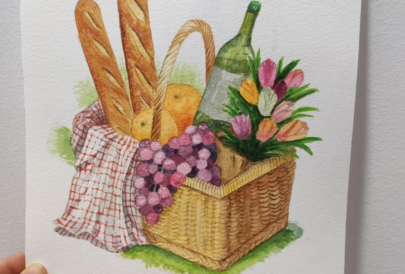
1. Introduction: Hi everyone. My name is Na, and today I'll be guiding
you through this class, where I'll be painting an
intricate picnic basket. I tried something different
when I was painting this, which is to take
breaks in between. This can be a short
snack break, or a walk, or even a little
bit of stretches, especially for my hands, just to refresh my eyes. In general, I felt
like by doing this, it made me a bit more
relaxed as I tackle on each item a better concentration
and mental clarity. Just because I felt less rushed. This inspired me to share
the process with you, especially for those
of you who I know have really hectic
and busy schedules, whether it be taking
care of your family, school, or even work. And I just find that this is a better way of managing time. I've divided this class into
eight painting sessions. This excludes this
current introduction, the supplies, and also my
ideation and sketching process. Each session took me around 30 to 45 minutes
to complete in real time. If you do have a very
hectic and busy schedule, I would recommend for
you to take this a day at means eight dates in total, which is how I've
set this class. Or if you do have more
time in a specific day, you can take a few
painting sessions according to the slot
of time that you have. But I would still recommend for you to take the
breaks in between each item just so you feel the difference
when it comes down to tackling the painting. As you can see, the painting itself is very detailed
and intricate. I would gauge the levels to be for intermediate to
advanced students, I'd recommend for you to understand things like
paint consistencies, brush control, and
especially brush load. Since we will be painting on very tiny areas and trying to create lots
of different textures with the can also enlarge
your outline to make it easier for you to
paint since you have a larger space for you to
spread the paint around. This might sound intimidating, but I assure you that I'll be taking you through
the steps one by one, just like in my usual classes. But this time the brakes
will also help get rid of that intimidation as we tackle each item one by
one, day by day. Just treat it as
its own painting. I just feel like
this will get rid of the overwhelming feeling of getting too much
information all at once. It helps you to be in this more relaxed
mental state as you're tackling maybe
challenging painting. Even if you're new
with water color and might be interested
in trying this class. I'll still welcome
you as I'll be trying my best to guide
you through every step. As I mentioned earlier, I'll be showing you
my ideation process when I was tackling
this painting. You do have the
option of creating your own composition,
but like usual, I'll also have the traceable
outline for you guys to download in the projects and resources section before
we start painting. Just as a little disclaimer, if you've never taken
any of my classes, I do speed parts of the painting
or make cuts in between. If my hand is either
inactive or off the camera. I would recommend for
you to either watch the class or some lessons
prior to painting along. Just so you know of this class and speed
that I take to paint. I understand that everyone
paints in different speeds. I would recommend for you
when you're ready to paint, a law to pause in
between each step. This way you don't
feel rushed as you're painting and you can
enjoy the process more. If this sounds
like something you guys might be interested in, let's begin this class.
2. Supplies: In this lesson, I'm
going to go over the supplies I'll be using
to complete this painting. For the paper I'll be using
Strathmore 500 hot press, and this is 300 GSM. Originally, The size of
my paper is actually a combination of these two which I've cut down for the painting. The measurement of my paper
is actually 7 " by 7.1 ", but you can round it off and
make seven by seven instead. As for the rest of the
paper that I've cut off, I'm going to use
this as my scrap. It's best to use the
same type of paper. If you're going to swatch
for your painting, the paint will
react the same way. And of course, in order
for you to cut your paper, you'll also need ruler. And you can use scissors
or stanley knife. For the brushes,
I'll be using two. Both of them are round
synthetic brushes. The large one is by George
Jorn in the series G 1010, and this is a size six. As for the smaller brush, this is by Arti Media with a
series 2700 and size zero. I know that these brands will sound unfamiliar to most of you. That's because I bought them in Indonesia where I
currently reside, And these brushes are the ones which I could easily
get here at that time. These are just ordinary
round synthetic brushes, though You can use
more popular brands like Reefs or Lyra for
synthetic brushes, which I've also used before, and they basically
react the same way. You'll also need a palette. You can use a porcelain
or a plastic palette. Mine is just a cheap
plastic palette from, so I use it so much that the color is now yellow when
it was originally white. But I would recommend for you guys to use a
light colored palette. When you're mixing
up your colors, you can see what it looks like. As for the colors, these
are the ones that I'm going to be using for
the whole painting, but I'll go through them
in detail later on. You also need tissue or a paper towel right next
to you as you paint. This is a must, as this will help you control the
load on your brush, which helps to avoid
puddles as you're painting. I'll also be using a
clean jar for my water. You can use two to clean
your brush and the other one to re, wet the paint. But personally, I just use one and I just keep on
changing the water. It's completely
up to you though, how you want to approach this. Now, onto the sketching portion, I'll be using my pentel, sharp lit mechanical pencil, and the lead is two. I like to use either two
B or HB for the eraser. I have my favorite
eraser here by box. You can also use the needable eraser if you would like to. We're going to create
your own composition. I would recommend for you
to use a sketchbook or any scrap paper for you to sketch your ideation
and your process. Or if you want to get
straight to painting, you can also download the outline from the Projects
and resources section. You can download this
and trace it onto your watercolor paper so you
can paint straight away. This is optional, but
I always like to have a hair dryer next
to me as I paint, in case I need to dry off
a certain area quickly. Now I'm going to go through
all the colors I'll be using. Firstly, this is
Chinese white by Holbein Yellow ocher by Holbine. Cpa by Holbein Indigo by Schminker Hooker
Screen by Cotman. He's a yellow medium
by Daniel Smith. Titanium gold ocher by Scher Quiana by Daniel Smith and Quin Red by Daniel Smith. Here's a list of
all the supplies that I mentioned earlier. You can take a screenshot of this to prepare before
we start painting.
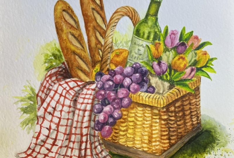
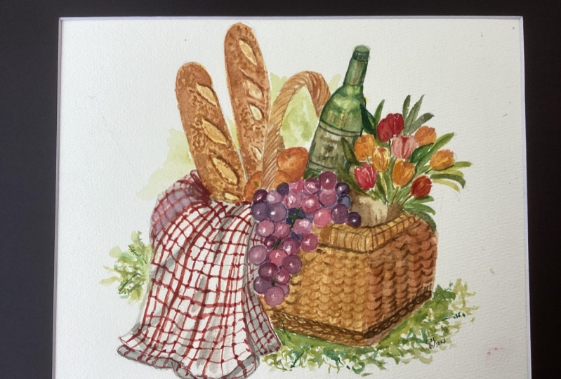
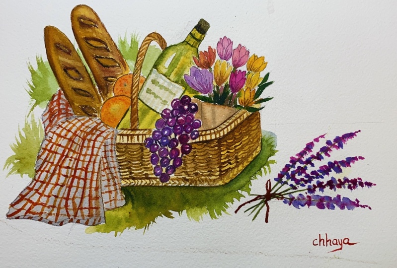
3. Ideation: Before I start to paint, let me just quickly go over the ideation process with you. I wanted to paint something
to do with a picnic. Initially, I wanted to
paint a picnic spread. These were the
images that caught my attention when I was
looking through Pinterest, and I really love the idea of having something colorful
with many elements. You can download these images that I've collected together as my reference in the projects
and resources section, but if you want, you
can also look through more pictures for more inspiration
for your own painting. Just like any other ideas, I by doing really
loose messy sketches, just to get the ideas out
of my head and think about what items I wanted to
include at the stage. I'm not even thinking about the complexity or the
steps of the lesson. I'm just putting down
ideas really quickly on paper to get a better
visualization for the composition. Since I wanted to
include a few items, it's easy for the
painting to look messy. After sketching these out, I want to see what
composition might work. I find that because I want to definitely
include baguettes. I can follow this up into a diagonal composition
where our eyes is directed to the rest of the
items from the line of the beget to the
basket or the spread. Initially, I like the
idea of including jam, croissants, cakes, maybe even a cheese board,
and things like that. I listed all of
the items and drew a slightly neater version of those sketches
that I've done here. I really like the first
one that I drew out here. I especially like the placement as I feel it's very
natural and loose. But after drawing out
all the elements, I realized that this would
be a little bit difficult to draw since there are a lot of overlapping
items and objects. Perspective, size, and things like that
would be an issue. Especially for some of you who might be new and want
to give this a go. I tried to simplify it
into the one bottom here. I tried to include similar
elements but less objects, but I later decided to just do a filled picnic basket instead
of a basket and a spread. I came up with third idea. I feel like this composition
has the main elements. As long as I include the
items with many colors, the composition will still
look dynamic enough. I also noted the colors
that I'm thinking of, including for the items, to make sure that there are enough hues to be included
as for the basket. For this one, I sketched
out an oval basket. But then I realized
later to make the perspective look more
interesting and dynamic, the oval basket is actually
a bit more tricky to make, especially at a larger scale, as I tried to draw a
larger scale and it was quite difficult for me
to figure out the spacing. I already knew I
wanted to include the blanket or the cloth
next to the basket, so I'm just including
it in the sketch. But anyway, for the oval basket, when I'm thinking
of an oval basket, this is generally the image
that I'm thinking of. I find that the
perspective would be quite boring because
it's just flat. Whereas, if we draw out
a rectangular basket, it's much easier as
we're usually more accustomed to drawing
all those angles in different perspectives. Let me just try to the
oval basket for you in case any of you would like to include this in
your composition. Generally, I find
that this is more of an interesting perspective
as to a flat one, where we're just looking
at the basket frontal on, which is basically
the perspective of the oval basket that
I drew out here earlier. If you want to make
your oval basket have better perspective, it might be a bit difficult
to draw it out freehand, as the curves might be a bit hard to visualize as two angles. If this is something you want to try to make for your
own composition, you can try to draw out a
rectangular cube or prism. Then draw out the oval basket. Within it, you can
fit the top oval, top face of the prism. Where the front
might be a bit wider than the curves at
the back though, I've simplified the
composition of fair bit. This is still a lot of
elements to draw out. If you're like me and you have issues with spacing
and things like that, I actually like to draw out
the frame of the paper around my messy sketch just to see
what aspect ratio fits best. Sometimes I like
to also do this to figure out which sketchbook
I want to paint with. This is more or less square, but I find that it's
probably a bit better if I leave a little room for
the top and the bottom.
4. Sketching the outline: From the previous sketch. I was quite happy with all
the items that I've included. So I'm not going to
change much here. But the size, since this is going to be the
full size of the painting, if however you want to
include different items, I would suggest for you to draw out a small version just so you get an idea of the spacing before drawing out
the actual outline. Since if you erase too much, there's a chance of damaging the watercolor paper since the original frame of my
paper is quite lengthy. Before I sketched out anything, I just lined on the top loosely with my pencil to indicate
the top of the frame. But I'm not going to
cut it out just yet in case I need to make
adjustments with the spacing. This makes it much
easier for me to roughly measure
the spacing here. I just sketched out the
basket first in the middle, and I try to make sure that
I'm happy with the angle of how much the top of
the basket is showing, but as you can see, the lines are still very loose. And I'm just trying to quickly divide up the space
at this point. Once I'm happy with the opening, I then loosely sketch out
the rest of the items. As you can see, I'm
just drawing out silhouettes of the items
like the coquette, the flower, and the bottle. Then I draw out the
placement off the handle so I know how to place the
rest of the items around it. With this said, I also
want to make sure that the placement of the handle is right in the
middle of the basket. The weight distribution
makes sense, since I want the grapes
to drape over the basket. I first drew out the
silhouette of how I want them to drape before drawing
the single circles. I'm also doing the same
thing with the flowers. In the beginning, I thought
I was going to drape over some flowers since I wasn't sure what type of flowers I
wanted to include yet. This is why you only see the silhouette going over
the basket at first. This is also why it's
best to not draw out the details because
this leaves more room for you to play with the overall
composition beforehand without wasting too much time. Since I've placed
out the items that I included in my
initial sketch here, I realized that there's
actually a bit of space left between the baguettes
and the wine bottle. Initially, I had ideas
of putting muffins, strawberries or maybe
a jar of jam or honey, but I decided to
just add a couple of rod oranges since it's very
easy and simple to paint. This is also because
I know the rest of the elements here will
take a while to paint. With this set though,
of course it's okay for you guys, include
different items. If you want to draw out
something a bit more challenging from here on, I feel quite happy with how
the baskets being filled. What I'm going to do is to
slowly clean out the outline. I'm not going to talk much over this because I feel
like this is more of a visual part of
the lesson where you guys can see how I
clean out my outline. If at this point you're not happy with part of the spacing, I definitely recommend for
you to sort it out first. But once you're at this stage, I tend to look at the items like the blanket where
it's easy to clean. And I like to erase per small section and then redrawing
a cleaner line on top. However, if there are
very minor adjustments on the already clean lines, I would suggest for
you to draw out the correct placement
of the line, then erasing, because
there's a chance of drawing the correction line on the same wrong place by not
erasing the wrong line, you can use the wrong lines
as guideline instead, I personally like to
clean out the lines of the larger and easier shapes. Then as we get to the areas
where it either requires more detail or if it's something that's a bit harder to draw
like the bottle for me, you might see that I'm making
quite a lot of cuts here, but that's only when my
hand isn't moving much. But I edited this in a way for you guys to see the full
process of doing this. Hopefully the process
looks a bit more realistic and attainable
for you guys to do as well. When I was drawing
out the grapes, the things that I
was thinking about were how they're
going to flow or drape over the basket as well as which circles would be
in front of one another. You want to make sure that
the way they overlap makes The wine bottle is probably
the trickiest for me. I start by simplifying
the shapes. I first drew out a
rectangle and I tried to follow up with a
smaller rectangle which is also a bit more
lengthy on top. And I tried to make
these two rectangles face or have the
exact same angle, try to also connect below
the neck of the bottle, Put them on a slight
diagonal angle and then slowly softening the edges to
make it look more rounded. By the way, guys,
after I painted this, I realized that the size
of the wine bottle is way too small in comparison
to the rest of the items. If you're drawing this, I would recommend for you
to enlarge the bottle. Instead, I'm going to
show you how large it is when I realize after
I finished painting it. If you guys don't
want to go through the drawing process and get straight to painting, of course. I will also have the outline available for you guys to download in the projects
and resources section. Since we're looking at
the basket from the top, I do want to make sure
that there's a layer for the top rim of the basket so there's a bit of thickness to
the material of the basket. I decided I wasn't
going to drape the flowers over the
basket much here. I started by fixing the lines for the rim
of the basket here. I also started by loosely
drawing out the tulips. This is like the first step I took to draw the
basic composition. Because here I was trying to visualize how the tulips
are being placed. Later, I'm actually
going to erase this. This was just to
help me visually. Once I figure out how the tulips are going
to be distributed, I then erase it. I started by simplifying the shape of the tulips
by creating egg shapes. I want them to mostly diagonally to the top right or where the bouquet is facing. But I also want to play with
how they overlap each other and try to also make the
angle very slightly. Once I have most of
the tulips down, I'm going to decorate the rest of the bouquet
with the leaves. Keep in mind that at this point, I haven't realized that the
bottle is a bit too small, kept on going since I've drawn out everything
in the composition. I also decided to cut
the end of the paper which I'm going to use
for my scrap paint later. Here, I'm just going
to show you in detail how I drew
out the tulips, since the tulips were
quite small here, I started out by
making egg shapes. I tried to make them face, mostly in the same direction, but I still try to play with
the angle very slightly. Then as for the petals, I'm going to try to make them
rotate ever so slightly. Some of them might be showing three petals with
one at the back, or you can see two and
another two behind. Between all those petals inside are basically
the same thing, which are a bit smaller, and the petals are
not opened yet. To add a bit more depth, sometimes I like to slightly open up the
center of the flower. I can also darken
the middle so you can actually see a little
bit of that opening. After I filmed my first attempt and failed because the
bottle was too small, I decided to draw
out another outline. I just traced over what I initially drew for
the first composition, and I just enlarged the bottle. I also enlarged the
tulips very slightly. Please don't make
the same mistake as I did if you're drawing out your outline or you can also download the outline and trace it over your
watercolor paper. Now, once you finish
your outline, whether it's from the traceable or if you draw out your own, I like to prep it by raising and making
those lines lighter so it doesn't show through the paint for the lighter areas. To do this, you can
use a needable eraser, but for me, my
eraser works fine. I like to basically tap on the outline
to make it lighter. If I accidentally
erase too much, then I would just re draw
it very lightly again.
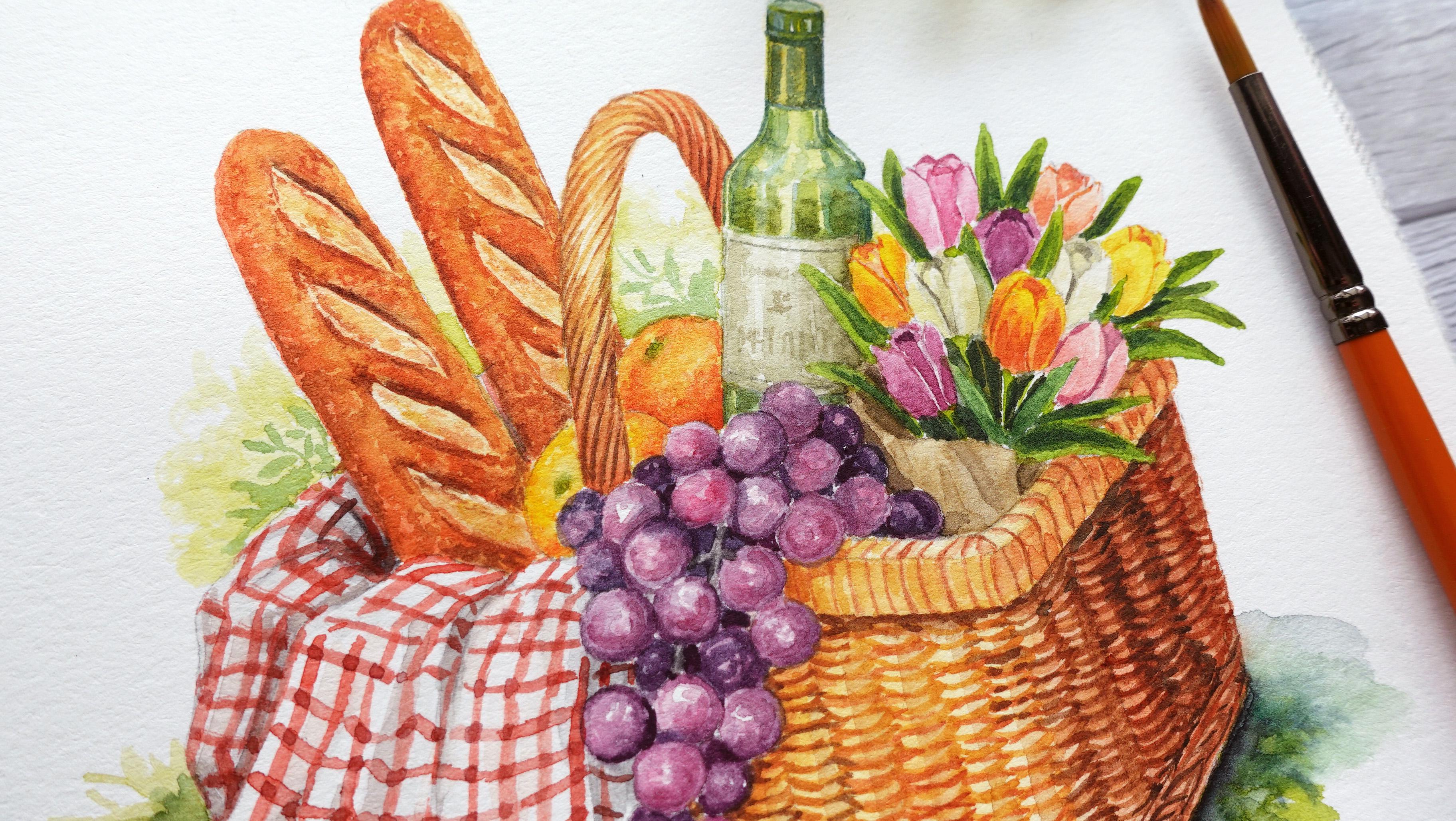
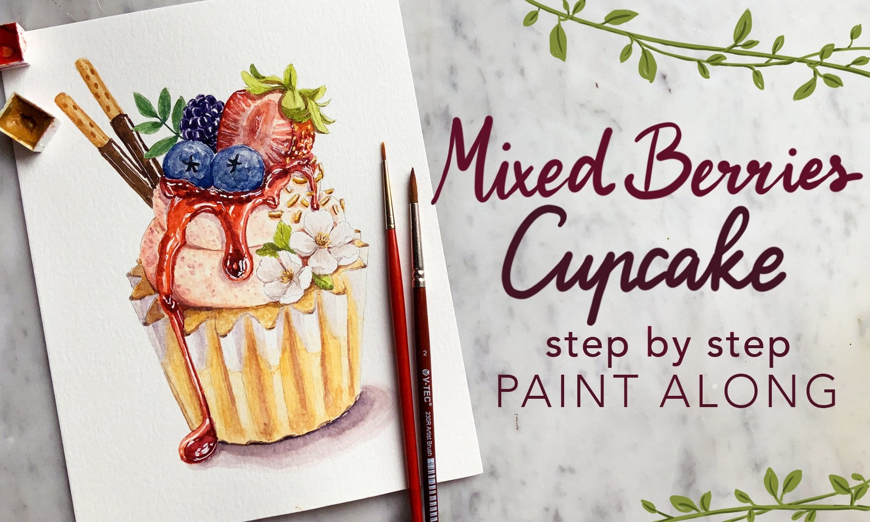
5. Day 1: Baguette Base Color: We're going to start
by painting the gets. The colors I'm going to be
using are yellow ochre, titanium gold ochre,
quincena, and Pia. We're going to start by
painting the base color. I'm going to be using a mix of yellow ochre and
titanium gold ochre. I'm going to add a lot
of water here because I want a really thin consistency and I'm going to use
a heavy brush load so I can paint most of the get. You can actually
paint the whole thing using the base color, but the surface will just
be a little bit more damp. After I fill in the space, I felt like the left
side is drying up. I added a little bit of water just to redampen
that surface. Next, I'm going to add
quincena to the previous mix. And I'm going to place this on the left side
of the baguette. As you can see, that
area that I just re dampen is more wet compared
to the other places, which is why the paint is
traveling really quickly. But that's okay
because I can just clean my brush here
and take off the water with my tissue and use this dry brush to
absorb the extra paint. I'm still going to work on the damp surface and
I'm using the same mix, but this has more of the yellow ochre and titanium
gold ochre in the mix. And I'm just going to paint diagonal S's
while leaving out some negative space
as the cuts off the baguette on the
right hand side. I tried to close all of the negative shapes if the
paint is traveling too fast, just like before, I
can just use a clean, dry brush to pick up
the excess wet paint. That's it for the base color. I'm going to do the same
thing on the right hand side. I'm starting with a mix of yellow ochre and titanium
gold ocher here. This time I'm using
a lighter load, but I can take a
little bit more water to spread the paint
while it's still wet. This time I'm also going
to paint the whole. But get instead,
just so you can see. But because I use the
lighter load and the surface almost dry by the time I
put the next color mixture, which is the same mix
with added quincena, you can see that the
paint won't travel as fast to have better control
of the transition. I then use a clean, dry brush to soften the blend
between the two colors. You can also make
a little variation with the colors here at the top, I used the same mix as before, but there's a little
bit more quincena in the ratio compared to
the baguette on the left. And as I get towards them, I'm going to use
the lighter mix. My brush load here
was a bit too heavy, so you can see how
the paint reacts. It just spreads really quickly. Again, when this happens, I'm just going to use a clean, dry brush to take the excess
paint off, just like before.
6. Day 1: Baguette Details: Let's move on to paint the
details of the baguette. I'm going to move back to the
first baguette on the left. By now, the base color should
be completely dry here. I'm just redefining
the negative shapes using the yellow mix, which is from yellow ochre
and aitium gold ochre. But this has more titanium
gold ochre in the mix. I'm going to follow this up by adding a bit of quincena to the edges of the
negative shapes as this area will be a little bit more
cooked than the sides. By the way, this is the
reference image that I used and this is going to be available in the downloadable
section as well. It's really handy to have it right next to you
as your painting, you get ideas of where to place certain colors
within the baguette. As the surface is still
a little bit damp, I just keep on adding more
of the darker colors. This time I added CPA to the
mix and I'm placing this at the top part of the
negative shape and this will just act as a
little bit of shadow. There's a little bit
of separation between the height of the baguette
cuts and the crust. Next here I want to build
the texture of the crust, making it look a
bit more crunchy. I'm using the previous
yellow ochre and titanium gold ochre mix here. I'm just using the
tip of my brush to.it around and create
an uneven texture. I'm placing this on the right side where the lighter
area of the baguette is. On the left side, I'm going
to use the darker mix which has a of quincena
as well as CPA. Since the two values that I just painted are very different, I'm going to use the
same mixture without the CPA in between to
create a mid tone. And this will make
the transition between colors a
bit more gradual. I'm also going to do this with the darker tones that I
initially placed beforehand, especially close to
the negative shapes. This will just add
a bit more texture, especially around the
edges of those cuts. By doing this dotting motion, sometimes I leave out a bit of negative space by accident. But those negative shapes
actually help to create the crusty looking texture after adding on the
previous textures. Now the shadow
that I painted for the top part of the cuts
look a little bit dull here. I'm just repainting
it over using a mix of Quinciana and CPA. At the bottom, I did
the dotting motion, again, using more
quinciana in the mix. Because we are creating
small textures on a small surface, it helps to always use a
medium to a light brush load. Your paint doesn't puddle up. However, if you find it a
bit difficult to control, you can also use a smaller brush sometimes I like to
also.in some darker tones, on the lighter areas, this will make a
more natural texture where certain areas are evenly. But please don't do too
much of this or else your whole baguette might
look paint as reference. I'm looking at the
most left baguette. As you can see, the
middle is a little bit more cooked or baked than
the sides of the baguette, which is why I'm adding the
darker tones in those areas. There's a lot of going
back and forth here. The darker tones of the CPA looks dull compared to the
new textures that I added. I accentuated the darker areas. Again, I feel like I'm quite happy with
the colors for now. I'm going to move on to paint
the cuts of the Boguette, which as you can see from
the reference image, has a little bit of a
char around the center, whereas on the edges
it's quite light. Here, I'm using a mix of titanium gold ochre and yellow ochre to paint
in those areas. And I'm using a very
light consistency and a really light brush load. And I like to use the
tip of my brush or use the side of my brush
directed as the cuts. I'm still going back to the thicker crusts
though for the painting, you can always go back and forth whenever you feel
the need to increase saturation or increase the
value in certain areas, which is what I'm doing
here because I'm also waiting for the detail
of the cuts to dry off. Once I feel like the lighter
areas are more or less dry, I'm going to use the same
mix with added quincena. I'm just using the
very tip of my brush. I'm barely putting
in any pressure and I'm placing this around certain areas of the
edges to suggest some cracks to the texture
which will be in shadow. Hopefully, you can see
how the tip of my brush is very sharp and I'm
barely touching the paper. If it's hard to get this
type of control though, you can always switch
and use a smaller brush. I feel like at this point
I've pretty much covered the technique of how to paint the details
of the paquette. The things that you need to pay attention to is the type of textures values according to those certain areas that
I separated before. But you can also do this by looking at the reference image. At this point I'm just
going to accentuate more of the finer details of the
texture, saturation and value. Just as the final note, when I'm adding the
really fine details here, I would much prefer to
use a dry brush load to avoid things like the puddles that I painted at the
bottom of the baguette. I'm going to basically do the exact same thing
for the next baguette. I'm starting with the
yellowish brown mix to separate the individual
cuts or the negative shapes. And I'm just using a medium
to light consistency. I forgot to draw it out before, but on the right hand side, next to the handle, I feel like there's going to be a bit of a buggete
showing through, so I just added a
bit of that color. On the left side, I use all
of the colors mixed together. And I'm just going to create the texture straight away by
using the dotting motion, while the surface of the previous color is
still a bit damp. As you can see, I'm jumping
around between the steps, But it doesn't really matter because what we're
looking for is a similar outcome instead
of the techniques, whereas the techniques just
to support the final outcome. But many people
have different ways of tackling things, it
doesn't really matter. The steps itself
are actually very flexible and you can tackle this however
you would like to. In fact, it's also nice to have a little bit of variation
between the colors. Not every object
looks homogeneous, but something that's a
little bit more natural. Let me just go over the main
things that I'm looking for. In order to finish
up this paquette, I want to create
the uneven texture of the crust to make
it look crunchy. This is achieved by doing
the dotting motion in different values and
colors in specific areas. You also need to
know where to place the right values in between
the cuts off the baguettes. I like it to be a little
bit more baked along with the left side where you can see a bit of the bottom
part of the baguette. For the top part of the cuts, I'm going to add a darker value. This will create
a bit of a shadow for the bevel area
and this will give the impression that there's a higher surface for the
crust than the cut area. Now onto the texture of the
toasted area of the cuts, I'm going to use the mix of titanium gold ochre
and yellow ochre. And I apply the paint using the tip of my brush
or the side of my brush while I'm angling it according to the
direction of those cuts. This is done in a dry brush load and a very light
consistency of the mix. This way, the texture
will become a bit more uneven since the
paint is quite dry. Just like before, I left out light areas around the
edges of the cuts. After this, I'm going to follow it up with
the darker values to add some cracks and extra
texture to those cuts. That's it for the steps.
I'm just going to keep going back and forth,
layering the textures, values and saturation slowly in the assigned spaces
that I mentioned before. Until I like the
look of the Buetts, I'm going to keep demonstrating
my painting though, so you don't miss my process. You can also go back to the previous baguette to make
adjustments along the way. The important thing is that you notice what
I'm working on. Take mental notes as
I'm demonstrating, whether it be texture or because of the values or
depth that I'm trying to add on to the painting this way for the rest
of the demonstration. You can be more aware even when I'm not
verbally explaining.
7. Day 2: Grapes Base Colour: Welcome to day too, where we're going to be
painting the grapes. And here are the
colors I'm going to be using for the grapes. I'm going to use two colors, which are quin, red and indigo. As for some of the
stems peaking through, I'm only going to
use Hooker screen. Before we start, I'm
going to show you the reference image to simplify. I'm basically going to divide
this into three sections. The first one being the grapes, which are going to be in front. And this will have a lot
of quin red in the ratio, since it's the lightest area. Following this up, I'm
going to mix a bit more indigo in the ratio to create
somewhat of a mid tone. As I get to the darkest areas, which are the grapes
further back, I'm just going to keep
adding indigo in the ratio. This is how I'm going to
create the different values. There are parts of the outline which is still a bit too dark, so I'm just going
to erase parts of it by tapping with my eraser. Then I'm going to begin by painting the lightest
area of the grapes, which are the ones in front. For this, I'm just going to use a mix of indigo and
quin red of course, but this will have a lot
of quin red in the ratio. You can see that I barely
have any indigo here. In fact, I'm still
adding more quin red. The color is mostly pinkish. And I'm just going to show you what it looks like on a
scrap piece of paper. You can try to play around using different ratios until you understand how to
mix the colors. On the left is quin
red by itself, and here on the right
I'm using indigo. You can play around
with the ratio to create different
tones in between. After getting the
tone that I like, I'm going to use a very
light consistency. In fact, I took a
bit off the mixture and put it on a clean
palette at the bottom, and I added more water to it. If I'm going to
pick up more color, I'm just going to use that
tiny spot at the bottom. I also switched my small
brush here so it's much easier to control painting
on the really tiny circles. What I'm trying to
do is basically color in some of
the grapes which are obviously in front and it's not overlapping
any other grapes. But while I'm painting, I
also want to leave out a bit of highlights by leaving
out some negative space. And for the highlights to follow the invisible contour lines, which follows the roundness
of each of those or shapes. I like to vary the shape of the high lights so it
doesn't have to be perfect. In fact, I like to make
several small spots. As you can see, I'm
starting to run out of paint and what
I'm going to do is take a bit of pigment
from the pet on top and I'm going to put it at the bottom so I can
add more water. And keep using the really
light consistency paint for areas of the grades which I feel would be slightly darker. I would then use a bit
more indigo in the ratio. I'm just using the colors that I already have
on my palette here, and I also added a
lot of water into it. The consistency is
still very light. It's just slightly
darker in value. As I get towards darker areas, I would slowly add more
indigo again here. As you can see, the values
getting darker and darker. But I'm still using
a light consistency for this grape. I
added a lot of indigo. As you can see, the
color becomes more of a bluish purple since there's a little bit of
the stem showing through. I'm going to leave the area of the stem
and paint around it. I feel like I've established the darkest and the
lightest areas. I'm going to paint the
rest of the grapes and use different ratios
according to how I see fit. As I mentioned
before, the more in shadow or the further
back the grapes are, I'm going to just keep adding
more indigo in the ratio. But for some of the grapes which might not be that far back, but I want it to be darker. I can also use a slightly thicker consistency in order to get a darker value, but for the hue to still
be a bit more pinkish, instead of it being
too indigo and blue for some areas at the back. It doesn't really matter if you leave out the highlights or not, since we can still build up a slightly darker high light as we layer on the
darker values later. For the gray here on the right, I feel like this would still
catch a little bit of light, but it is still in shadow. Instead of using
a lot of indigo, I went for a midtone, which looks more like a purple, and use a thicker
consistency instead.
8. Day 2: Grapes Details: In this lesson,
I'm going to start layering on the details
little by little. I'm starting out with
the most definite spots, which are the darkest spots. For this, I just use the same mixture but in
a thicker consistency. But at the bottom, along with the ones that
I'm painting now where I didn't leave out any negative space
from the first layer, I'm going to leave out
the negative space. Here you can see parts of the base color
showing through as highlights. This time it doesn't
lose the round form. In terms of the color mixtures, I'm basically using the
same concept as before. For the darkest areas, I
would just add more indigo. For the lighter areas, I would
use quin red in the ratio. But this time I am working with a slightly thicker consistency as we build on the details. If I want to leave out a large
area for the highlights, like what I'm doing here
and the edges looks rough, I can use a clean, damp brush to soften those edges to create
a smoother transition. Hopefully you can see a bit more in terms of my application. I try to not put so much
pressure on my brush, instead I try to use
the tip of my brush and wiggle my brush around
to create uneven edges. If the edges look a
little bit too sharp, I'm then going to soften it
using a clean, damp brush. This is something that
I'm going to keep doing for the rest
of the grapes. I personally like to work
on the darker values first. As you can see, I'm slowly
adding more and more indigo. And I'm painting just
around the edges to create more contrast in the values. Once I've painted a few
of the darker areas, that's when I will
start painting on the lighter parts of the
grapes which are in front. This is to help me figure
out the balance and how far I can take the lighter
parts of the grapes. And this is to prevent myself from overworking
those lighter areas. Just as an example here, as I'm adding or
layering on more detail, I'm actually using a
very light consistency. Still, it doesn't become too dark and while the
surface is still wet, I try to use a slightly thicker consistency
of a darker color. And just paint around
the edges while leaving most of the lighter areas
still with the base color. When I was painting the grapes, I just studied the
reference image and figured out what to do or what I want to do when it
comes to the painting, since the position of the
grapes are quite different. However, if it does help to have the reference
in front of, you, can go ahead and download it or print it so you can
have it right next to you as you paint for
the lighter grapes. You might notice
that I like to paint a round circle surrounding
the grape itself. Or sometimes I
like to just paint one side following the
curvature of the circle, leaving the left side
with the base color or a lighter base color. This will really help enhance the three dimensional
form that I'm looking for for
the lighter areas. Compared to the
darker areas though, I am using a lighter
consistency. I don't overwork and
accidentally make those lighter areas
too dark for me. I find it much easier to
paint the darker side of the light grapes and then
follow it up using a clean, damp brush and pull whatever color is left to
just soften the blend. This helps distribute the
paint a little bit thinner. I feel like you can
start to see more of the three dimensional
form at this point, but I'm going to keep slowly
layering on more paint, enhance the form further. Here you'll see me painting a dark outline behind some
of the grapes which are in front because I felt like the shapes were fusing together. This is to separate
those shapes. I'm also going to start
being more brief, darker, and thicker for the darkest
parts of the grapes. Once I've placed
the darker values, I feel like I have
a better baseline for the rest of the values. This is why I like to add the details of the
darkest grapes. First I can adjust the rest of the grapes and figure out the rest of the
values in between. Here, I'm also being a
bit more brave to use a darker value or a thicker consistency for
the lighter grapes as well. As I mentioned before, I like to do this by
outlining the edge. And then I try to soften the transition using
a clean, damp brush. This way the middle or the
tip of the grape which is receiving the most light stays lighter compared
to the edges, since I want the light to mostly come from
the left hand side. This is why I outline the
right hand side of the grapes, but then I use a slightly
thinner consistency for the left side
of the outline. And then softening it
with a clean, damp brush. And I'm going to keep doing this for the rest of the grapes. Hopefully you guys can see that the grapes look a
bit more plump now. So now it's time to play
a bit with the hue. I'm going to add more
of a pinkish tone to the grapes by glazing them
with a bit of quin red, which will create a nice
variation in color. I tend to like to do this
for the grapes which are in front and for the
grapes at the bottom. And I'm using a light
to medium consistency, placing this still following the curvature of the
grapes on one side, then dragging the rest
of the light pigment, using a clean, damp brush
for a softer distribution. At this point, I'm quite
happy with the form, but I feel like the values
still need more work, so I'm going to darken
some of the grapes, especially for the midtones. As you can see, everything
is about visual balance, which is why I like
to go back and forth after adding
layer by layer. This will greatly depend
between painting to painting, as we might have used different
values in certain areas. Don't be scared of using
your own intuition. Or you can also refer back to the reference image if you
feel like it'll be of use. Or you can also look for
different references which you might feel is better
suited for this composition. Lastly, I'm just going to paint the stem using a mix of Hookers green and a touch of quin
red and a light consistency. That's it for today's
painting session.
9. Day 3: Tulip Flower Base: Welcome to the third day. Here are the colors I'm going
to be using for the tulips, I'm going to use yellow ochre, CPA, Chinese white, Indigo Quinn red has a yellow
medium and Hooker's Green. Before we begin to paint, I'm just going to show
you the reference image. This is the reference image
that I use personally. I just used it as
a color guide to see what kind of variations of colors
there are for the tulips. Here's also another one with
the soft pink that I like. I'm not actually going to have this right in front
of me at all times, but it's something for me
to keep in mind as I'm painting for the first flower, I'm going to create a
creamy off white color. For this, I used a mix
of yellow ochre hands, a yellow medium, and a tiny
bit of Hooker's green. As you can see, I also
used a lot of water here. It just looks like tinted
water and I'm going to use a very thin consistency to place it all over
the first tulip for the next one on the left. I'm just going to use
handsy yellow medium. I made sure that my palette is quite clean so the color is not contaminated After I
place a really thin layer, I'm going to follow this
up by adding a little bit of quin red to the
handsy yellow medium. And I'm going to place this very lightly at the
bottom of the petal, as well as the petals inside. For the next one, I'm
going to create a pink by using a mix of quin
red and Chinese white. Again, I'm going to use
a very thin consistency and paint it all over the tulip. Since I am painting the
tulip side by side, I am using a very
light brush load. This means that the paint is not puddling up and it
dries quite fast. However, to make sure
you can also use a hair dryer after finishing up the base color for each of
the tulips at the bottom, I'm going to use a slightly
thicker consistency. There's a slight gradient
going from darker to lighter. For the next one, I want the tulip to have
a salmon color. I mixed up a light pink again, but this time I
added a little bit of handsy yellow medium, just like the
previous pink tulip. I use a thicker
consistency at the bottom. And then I use the clean, damp brush to drag the
rest of the paint upwards. So there's a slight
gradient going from darker to lighter
as I get to the top. For the next one, I just added
more handsy yellow medium to the previous mix and this
will create an orange color. Then I'm going to
follow this up using a thicker consistency of handsy yellow to
paint the top part. There's a slight
gradient going from hands yellow to the
orange mix at the bottom. Since I want the bottom to
be a little bit more orange, I decided to add more quin red. Just mix the color
straight on the paper. I'm applying this between
each of the petal underneath, and also for the petals inside. For the next one, I'm just going to make it
completely yellow. I just use a medium consistency of hands, a yellow medium. Moving on to the next
one, I'm going to create a pinkish burgundy color. I'm going to use a mix
of quin red and indigo, with quin red being
the dominant color. Again, I'm going to
use a thin consistency of this and just cover the
whole area of the tulip, basically the colors that
I'm going to include. I'm just going to
make repeats of these colors and use the mixtures that I already
have on my palette. I'm going to make one
additional color. I used the salmon mix and
I added it to the hands yellow that I already
had on my palette to create the peachy tone. As for the last one,
I'm going to use the off white color that I
use for the first tulip.
10. Day 3: Tulip Flower Details: In this lesson, I'm going
to be adding the details. This is generally to
increase the saturation as well as add a bit of
gradient to the petals. I first just painted strokes in a medium consistency at
the bottom of the petals. This includes the one
between the petals outside. And then I use a clean, damp brush to pull it upwards while leaving a little bit
of the base color still peeking through
around the edges. Here, I'm doing
something similar to the second burgundy color, but this time for the tip. Since we can see a little bit of the petals opening inside, I decided to use a really thick
consistency of the color. So it's very dark and it looks like a slight opening
between those petals. I'm also going to use a slightly darker consistency at the bottom of the petals. And then I'm going to soften
the edges using a clean, damp brush for a
slight gradient. Moving on to the
off white tulip, I decided to add a little
bit of handsy yellow and a bit of yellow ochre
into the previous mixture. I'm going to place the same way as I did with the
burgundy tulip. Basically, I'm placing
it at the bottom of the petals and then softening the blend as I get to the top, while leaving a little bit of the edges with the base
colors showing through, so it's a bit lighter. I'm also going to
do the same thing for the second off white tulip. Considering this is
a very light color, you won't be able to
see much contrast here. I added a little
bit of indigo into the off white mixture to
create a grayish color. And I used this to paint
more of the shadows and also outline some of the
petals next for the G color. Since the color of my palette was very light inconsistency, I just added more quin red
hands yellow and Chinese white to create the Pch color again and use the
thicker consistency. This time to paint
on the details. One, I still had the
peachy color left on my brush and I
added more quin red and Chinese white to create a thicker consistency
for the details. Since the value is
still quite light, I decided to add some of the burgundy mix into the peach mixture to
create the outlines. Since I already knew I want to increase the value in
between the petals. This time I just added a lot of quin red into the
previous pink mixture, which is just from quin
red and Chinese white. I just use a thicker
consistency to paint the details as
well as outline a little bit off the edges
using mostly quin red for the details of the yellow tulip. Instead of using orange, I decided to add a bit of
yellow ochre into the mix. I'm going to add on the details. I didn't want this yellow one to also turn peachy by
adding a bit of quin red. Instead, I look
for another route to create a darker
value of yellow. Since I ended up liking
the bright yellow tulip, I decided to glaze over a medium consistency of hands yellow to the one
on the left here. Just to make the
yellow much stronger, I still want the bottom
to be slightly orange. I used a little bit of quin
red to add to the bottom end, mix the colors on paper. After that, I'm
going to finish off by using a darker version of the tulip color to
paint the shadow for that little bit of
opening for the tulips.
11. Day 3: Tulip Leaves and Paper Wrapping: In this lesson I'm going
to be painting the leaves, the wrapping as well as the
extra details for the tulips. I started out by mixing this really light yellow green from has the yellow
medium and Hooker screen. I'm going to use a
thick consistency of this to paint the
stems for the leaves. I'm going to use a
slightly darker version by adding more Hooker
screen in the ratio. I'm just going to use a medium consistency to paint the base color
of all of the leaves. If there are any
overlapping leaves, I would try to use a
slightly different value or a different tone of green. And this will just help separate
the leaves a little bit. For the area in between
the stems and the leaves, I'm going to use
a dark green mix. I'm going to use the
previous mix and add a bit of CPA to
create a darker value. Since the previous mix was a
bit too light inconsistency, I decided to also add
more Hookers green then using a thinner
consistency of the same color. I'm going to use this to paint
slightly darker values on the leaves by leaving
out a little bit of the base color on the side. And this will just create the illusion that the leaf
is slightly folded in. We're looking at some of
the leaves from the side for extra texture to the leaves. I decided to add more Hookers
green in the previous mix. I use a very light load
on my brush to paint streaks following
the direction of each leaves to indicate
a little bit of green. However, if the
lines are a bit too defined and the
edges are too sharp, I'm just going to use a clean, damp brush to
soften those edges. Now that I've painted the
darker values of the leaves, I feel like I need to
define the tulips again. Here I'm going to
use a darker version of each of the tulip
color. As an example. Here I'm using the
orange mix and I'm going to use this to outline the individual petals
for the tulips. Since those lines are very thin, I would recommend for
you to use a dry brush. As you can see, the
load on my brush is so dry that I can flatten
the tip of my brush. And I like to rotate my brush
around in order for me to find the thinnest tip to create those really
fine outlines. I'm going to paint
the paper wrapping. For this, I'm going to use a
mix of yellow ochre and CPA. And I'm going to
first use a medium to thin consistency to paint the whole area as
the base color. I'm also going to
add the same color for this area in
between the leaves, as I feel the wrapping
would show through. While the surface
of the base color is still a little bit damp, I'm going to use a darker
version of the same color, which has more CPA in the ratio, but I'm still using a
light to medium load for parts of the folds
and the darker areas. After that, I'm going to dry it off with a hair dryer just to make the process
quicker so I can paint the details on the
dry surface here. I'm just using CPA in a medium consistency to
paint in the shadows, for the inside part of the
wrapping as well as the folds. By using the previous mixture
in a thin consistency for the darkest areas around the wrapping words hidden
behind the grapes. I'm just going to use
CPA to darken that area. This was a bit too light,
so I'm going to use a slightly thicker
consistency after that, I also want to increase the
values for the darker greens. Here I used a mix of Fucerscreen
with CPA and Indigo. I'm also going to
add the dark green to increase the value at the bottom of
the leaves where it's really close to the tulip. That's basically it for the
third day of this painting. If you would like to continue straight away to
the next lessons, I would definitely
recommend for you to take a break first for
your eyes and just to have a walk around so we have a refreshed mind to
tackle the next object.
12. Day 4: Wine Bottle: Welcome to the fourth
day where we'll be painting the wine
bottle for the bottle. The colors are CPA,
yellow, ochre, indigo as a yellow medium,
and Hooker's green. I personally didn't
use a reference image when I was painting the bottle. However, I found this reference, which might be useful
for you guys to use as indication to the placement
of the darker values. The color for this bottle, however, is a bit darker. Mine is going to be lighter. So let me just show
you the process here. I'm cleaning out my
hands of yellow since as contaminated with
a lot of colors. But what I'm trying
to do is to create a really light yellow
green color with hands yellow and a touch off
hookers green in the mix. I'm going to add a
lot of water to this until it becomes a
really light color. I still feel like
that's a bit too dark, so I added more water. Which comes to this
really light color, this is going to be the
base of the bottle. I'm basically going to
place it all around the bottle area while leaving the lid as well as the label. And I also want to
leave out a bit of white negative space following the curvature of the
bottle for the highlights. Just like any part
of the painting, I would recommend for you to use a light load on your brush. The area doesn't puddle
up with wet paint. If you're using my outline, don't forget to also paint under the label,
behind the grapes. For the bottom part, I use a slightly thicker consistency. Since I want this area
to be slightly darker, while the surface is
still a touch damp, I'm going to work
on the details. I added a bit more hooker screen into the mix and using
a dry brush load, I'm using the tip of my brush to line the edge of the bottle. Then I'm going to
go back in with a slightly lighter
consistency to paint a lighter green
next to the line. This is to help soften
the blend and also create a little bit of a
thickness to the glass. And I'm also going to do
this on the right hand side, I added a bit more hooker screen to create a slightly
darker value. And I'm going to
realign the edge. I added another line
which has a bit of negative space in between the line that I previously made. This will also help with the
thickness on the other side. I'm going to do the same thing by creating another
outline while leaving a little bit
of negative space from the base color
to show through here, I decided to slowly
build up the value. The surface was still slightly damp and I'm just going to add a little bit more of the darker value with more
Hooker screen in the mix. After that, I'm going
to start adding more detail to the mid
part of the bottle. For this, I am still
using the same. This time it has more
handsy yellow medium. As you can see, the color is a bit lighter in value and
it's a bit more yellow. It is very light though. I'm going to keep
building this up by adding a little bit
of a darker value, green to darken it further. I also added a touch of
dug in the previous mix. At this point I'm just making things up for the
details of the bottle. I'm basically just following the curvature of the neck and
the shoulder of the bottle, trying to make those
areas slightly darker. I also darken the outline or the outer part of the bottle. As for the center, I like to add lines following the
cross contour line of the shape of the
bottle using more of a yellowish green but in a
slightly thicker consistency. I also tried to
leave out a bit of the base color still peeking
through in certain areas. You can also use a darker
value for the middle, But I tried to use a
lighter consistency instead of a darker one. So the sides or the edges
still looks darker than the center on the
right hand side where the bottle covered
by a bit of the tulips. I tried to make the
value a bit darker there and also
behind the grapes. At this point, I wasn't
really sure what color I wanted the capsule or
the foil for the lid. I just started by using this really light yellow green in a really thin consistency. And I also painted the lid or
the closure along with it. Then while I wait for it's dry, I'm going to paint an
outline to the bottle using a really dark value from X
of Indigo and Hooker screen. I'm going to paint
this on both sides, right at the outer edges. I'm also going to outline
under the capsule or the lid. This is just to separate
it from the bottle. Under the closure, I used a thicker consistency
of the same mix. With added yellow, I used
the thick consistency, yellow, that I already
had on my palette to paint the sides
of the capsule. Then I'm going to go back in with the color of the bottle, which is the yellow green, to outline the sides and also
add a bit of line detail. After doing this though, I thought that the colors
were a bit too similar. I ended up adding a medium to thick consistency
of yellow ochre and painted for the yellowish
area while still leaving the middle as highlight. I feel I like the color
separation more this way the capsule
looks more golden. As for the lid or the closure, I'm going to use a dark green. I used the mix of indigo
and Hookers green. I started with a
medium consistency and a really light brush load so I can control the
flow of the color. I basically painted the
base color while leaving out some lines for the
highlight of the lid. For the top, I just use a really thin consistency
of the exact same color, but I want the top to be
much lighter in value. Looking at this, I realized the capsule and the lid
looks very different. I'm going to glaze
over the same color for the lid on the capsule. Because it has the color
from the yellow ochre, the color becomes more of a golden green
color, which I like. I'm going to do the same
thing for the lid as well. I basically glazed over the
yellow ochre for the lid while still leaving out some white negative
space from earlier. And I'm going to enhance
the form by using the dark green mix that I
already had on my palette. I also switched
to my small brush this time because I feel like the lines need to be even
lighter and thinner. I'm going to place most of the darker values on
the right hand side. And I'm also going
to use this color to outline some of the features, to redefine the edges.
13. Day 4: Wine Label: Next, I'm going to paint the
label for the wine bottle. I'm going to create a creamy
or neutral grayish brown. I just picked up the colors that I already had
on my palette, especially the mix of
Hookers, green and indigo. And I also mixed in some
yellow ochre and Pia. If you realize, this color is actually very similar
to the white tulips. But anyway, I used
quite a heavy load and a very light
consistency to paint all over the label
as the base color. After that, I'm going
to quickly dry it with a hair dryer so I can paint
on top on a dry base. Next, I switched
to my small brush and I use a dark
version of this color. So I added more of
the Hooker screen and the indigo mix to the
previous mix for the base. And use a medium to thin
consistency to outline the edge. Then I'm going to switch to my large brush again to pick up a really light consistency of the base color and paint on
some lines for the detail. I basically try to
follow what I've already painted on the bottle just
to follow it through. Of course, I try to darken
the right hand side. The value stays consistent with the rest of the bottle that
we've already painted, especially when this area is
hidden behind the two lips. For the darker value, I
basically use the same mix with added and indigo and
also a bit of CPA. To keep the color
nice and neutral. I try to make sure that there's a gradual change in value. The right hand side
stays in the darkest. I try to lighten the
consistency as I get towards the center of
the bottle after this, since the surface is still wet, I can also add on more of the darker value
to enhance it on the right hand side using
the same dark mix from CPA, yellow ochre, Indigo
and Hooker screen, I created lines as the
label using my small brush. As you can see, I'm using
a really dry brush load. The tip comes to a very
fine point since I can flatten it and use
the sharpest tip following the direction
of that line. As you guys know, when
watercolor paint dries, the color is always lighter. Here, I decided to
increase the contrast in value again for the label. And you'll see me
going back and forth in every painting to
do this until I'm satisfied with contrast
in value as well as the saturation of color
While painting the bottle, I felt like the
shape of the tulip on the right hand
side looks odd. I decided to add the
same color as the label. Just round off the side of the tulip and
also pull some of the green downwards to darken it and reshape
the silhouette. Next, I'm going to use a
mid tone of the base color, which is slightly darker
than the base here. I'm trying to suggest some writing and
logo for the label. As you can see, I'm
just making squiggles, but I tried to constrict
the place in a way that I can suggest that the top
has a small writing, the middle is a random
shape of a logo, and the bottom has larger
writing because it's taller. Because the value is just
enough for our eyes to adjust, I feel like we can
make the conclusion of what those shapes
are supposed to be even when they're not real letters
because this is Cal object. I also want to darken the
left hand side just very slightly but I still want the right hand side to
be the darkest in value. I'm also going to use a light consistency of
the mix between Hookers, green and indigo to paint at the bottom of the label to
separate it from the bottle. Next, I use the previous
mixture from Hookers green, indigo, and Hansi yellow as what I've already
had on my palette. And use a very thin
consistency to paint in the filling of the bottle
or the wine in the bottle. And I'm just going to paint
it in between the highlights. When I'm painting the wine, I want to make sure that is horizontally level
to the placement of the basket because it is liquid after all and
it always lays flat. After that, I'm
just going to make final adjustments to enhance the cylindrical
form of the bottle.
14. Day 5: Picnic Blanket Folds: Today we're going to be
painting the picnic blanket. And here are the colors,
hence the yellow medium. Yellow ochre, quincena
indigo, and quin red. In this lesson, I'm going to be painting the folds
of the blanket. I'm going to create
a neutral gray color by using a mix of indigo, quincena quin, red
and yellow ochre. I'm mixing up a lot here. I'm going to stop until I create a color
that's almost black. And then I'm going to add
a lot of water so I can control the consistency
as well as the value. I knew that the darkest part was going to be
the corner behind the baguettes I just painted
using a medium consistency. Then I added a lot of water for a heavier load on my brush so I can spread the color across the bottom fold as
well as the folds on the side using a slightly
lighter consistency. The paint that I
applied was quite thin, it dried quite quickly. Here, I'm just going to layer
on a little bit more of the folds using a slightly
thicker consistency. Actually just making
things up along the way. I just look at the edges of the fabric and try
to follow through with darker values to suggest the deeper folds at the bottom. Here, I also indicated
a little bit of cast shadow from the
top part of the fabric. Since the base is practically
supposed to be white, I am very careful with the load and the
consistency on my brush. I prefer to work in really
light layers and adding details along the way by
layering on more light layers. This way I don't
accidentally create a base that's too dark to work
with on the left hand side, since this area is behind the main area of the
blanket, I've left white. I'm just going to
cover the whole area using a light
consistency of the gray. While I wait for the
left side to dry, I'm going to paint some
folds to the main area. I'm just looking at the shape
here and I feel like there are two main areas
for this white part. I'm just going to indicate it really lightly with the gray. Since I haven't really
made up my mind, I'm going to go back to
the left side where it's a bit darker and make
the smaller folds since I feel like the light source would
come from the sun. Since this is after
all picnic basket, which would more likely
be placed outside, I want to make sure that
the blanket on the side of the basket is slightly
lighter than the top. I feel like a bit of
the blanket would show through between
the tubicettes. I made sure to paint
that area too. Now, going back to the
main area of the blanket, as you can see, I'm working with a really light consistency. And just like before, I tried to look
for the main folds before adding the smaller ones. After I've indicated the folds, just like the folded
blanket on the left, I want the side to be darker than the top face
of the blanket, so I'm going to a really
light consistency on most of the area. I'm going to be really
careful and use such a light consistency that it almost looks
like tinted water. Once I feel like I
have a better grasp of how the folds
are going to look, I'm just going to
enhance the values. I'm still not going to do
too much of this since I'm going to go over it again after painting
on the pattern. Because we're still
going to lose a bit of detail after painting
on the pattern. Don't forget to also add
shadows behind other objects. As for mind, behind the baguette and also
behind the grapes. To make sure that even when we're painting them separately, they're all still
interacting with each other. To give some thickness
to the blanket, I'm going to lightly outline the edges of the blanket
so there's a level. When you feel like you're done with the details of the folds, make sure that
this is completely dry before adding on
the pattern on top.
15. Day 5: Picnic Blanket Pattern: In this lesson, I'm going to be painting the pattern
for the blanket. Personally, I want
the picnic blanket to have red checkers, which is the really
traditional picnic look. But you can also make yours
with different designs. You can make a floral design or something really simplistic with just a couple of stripes
at the edge of the blanket. Since I want mine to
have red checkers, I'm going to create
primary red which is more like vermilion from a mix of quin red and hens,
a yellow medium. Since I'm going to be covering the whole blanket
with this color, I made sure to mix a
lot on my palette. I don't have to keep
mixing my colors, the red stays more
or less consistent. In this lesson, I'm
going to be showing you every single line that I
paint without skipping. What I'm trying to
do is basically to follow the folds that I
created for the base color. I feel like by doing this,
the horizontal lines and the vertical lines will really help enhance the volume or the
folds of the blanket. Notice that I like to
break up the lines following the folds to
create a sharp edge. I feel like by stopping
at the different angles, it helps our eyes to take
a small break and for our hand to also not
be put in weird, uncomfortable positions
when we're just trying to create this
really long line. I'm not too worried about
connecting every single line. As you can see, some of
the edges are a bit messy. I'm not looking for it
to be perfectly uniform. However, if this bothers you, you can always net in the
lines if you would like. In terms of the consistency, I'm just using the paint
straight out of the palette. However, if it's drying up, then I would add a
little bit of water. This is technically just
a medium consistency. I know that at the
moment it looks faded, But I actually like how
it looks once the color crosses over each other when I paint the horizontal
lines later. So I'm just going
to keep doing this until I cover the whole blanket for the stripes at the bottom. I decided to darken it by adding a little bit of the gray from the
base color to the red along the beveled edges. I'm going to add a
small horizontal line to connect it to those stripes. I'm also going to use the dark red for the
lines behind the buckets. After painting all of
these vertical lines, you'll realize that the
details we painted earlier for the folds are disappearing since they were quite
light to begin with. Before adding on the
horizontal lines, I'm going to try to enhance those folds again using the gray that I still
have on my palette. The reason I'm doing this now, instead of after I paint
and the horizontal lines, is because there
might be a chance for the red to smudge if you
both the red too much, the more red you
have on the surface, the more chance for the red to smudge all over the gray areas. I'm not going to add too much, I'm just going to add
on the main shadows. Once I feel like there's a bit of form that
I can start to see, I'm going to continue on to paint and the horizontal lines. For the horizontal lines, I started by painting the darker areas using
the dark red mix. This is for the area
behind the baguette, the fault on the right
and also at the bottom. Just like the vertical
stripes before. For the horizontal lines, I'm still trying to
follow the folds or the cross contour lines of
how the blanket is placed. For the horizontal stripes
on the main areas, I'm just using the exact
same red mix as before. If it's a bit hard for you to divide up the space
for the line. Sometimes it's also
easier to just do a small section at a time and then continue it
down horizontally. Once I've covered
the whole blanket with the checkered pattern, I'm going to use the
dark red mix and painted over the lines of
the shadow areas to enhance the value
of those shadows. Lastly, to enhance
the checkered effect, I'm going to use a
medium consistency of the dark red to paint squares where each line
crosses each other, so those look darker than
the rest of the lines. I also switched to
my smaller brush for this because I find it
much easier to flatten the tip of my smaller brush because the bristles are
very short and small. It also holds water, which means there's less chance of the paint flowing too fast, creating a puddle again. I'm going to apply this
all over the blanket and thus it for today's
painting session. I hope you guys found the repetition relaxing
for this one.
16. Day 6: Basket Handle: Welcome to another
year of painting. Today we're going to be painting the basket handle
and the oranges. I'm starting with a basket
handle so it's easier to paint the textured edges since this is positioned in front
of the oranges. And here are the
colors, quincena, titanium gold, ochre,
yellow ochre, and CPA. Here's the reference image
that I use for the handle. I personally like the twist and also the value
shown on this photo. So if you're using the same
outline as what I'm using, please have this reference right next to you
as your painting. I'm going to start by painting the base color using
titanium gold ocher. And I'm going to use a light medium consistency
to cover most of the area, but I'm going to leave
out a tiny bit of white negative space
as you can see from the reference image where the high light off the handle is. Since I am painting
a larger area, I use quite a heavy load
so I can spread the paint evenly while the
surface is still damp. I'm going to use a little bit of quincena to paint
in the bottom. And this is just to darken a off the bottom area which
is covered by the grapes. And I'm also going to do this for the back side of the handle, which is clearly shown
in the reference image. Since the lighter
color was drying up, I use the clean, damp brush to soften the edge to
make a better blend. Then I'm going to
go back in with a slightly thicker
consistency and slowly build the contrast
of the base color. This is something
that I'm going to do for both sides of the handle. After this, I'm going
to start painting the pattern of the
natural fibers. I do want to make sure
that the base color is more or less dry to
paint on the lines, I'm going to add yellow ochre to the paint that I already
had on my palette. This has a little, the titanium
gold ocher and Quinciana, I'm using a light to
medium consistency with my small brush in
a dry brush load so I can create
really thin lines. This is when I paid a
lot of attention to the reference image
because this helps me figure out where
to place those lines, or at least the
bigger picture of how the fibers twist
around the handle. As I get closer to
the lighter area, I also use less quinciana
in the mixture. The fibers or the
shadow of the fibers in between also reflect the
value of the base color. Since I want the handle to
twisted cylindrical form, I want to make sure that the
sides are also a bit darker. I'm going to go back in with a mixture that has
more quincena. I'm going to paint this
on the sides of some of the lines that I've
already painted since. The right hand side of the
handle is the darkest area. I'm going to use mostly
Quinciana in the ratio to paint those lines just like the previous lines
that I've darkened. I'm going to do the
same for this part of the handle as well for
the darker values. I just added a CPA
to the Quinciana. This is also where I start
thinking about the edges. Each of those fibers has
its own cylindrical form. I do want to make
sure that those lines are somewhat connected with really subtle separate curves. This is just something that
I'm going to go back to as I'm slowly enhancing the
overall form as well. As you can see from
the reference image, the bottom part of
the left side of the handle is a little
bit darker here. I'm also enhancing it
with a darker mixture, following up the overall
cylindrical form of the handle. I'm going to just
glaze over a bit of titanium gold ochre and
yellow ochre on the side. Then I'm going to darken
those pattern or the fibers again using the dark brown
from quincena and PA, generally in a cylindrical form, there's an area where the
highlight is very prominent. Here I'm going to paint on the darker lines surrounding
the main area of the highlights to enhance
the shadow around it which then will the
highlight and the form. This is where I start paying attention to the curved edges. Again, as you can see, the curves are not very curved. It's actually very subtle, almost like a line, but it just has a slight curve at the edge. I feel that it's barely visible because those rounded
corners are somewhat uneven, it gives more of a natural
look for those edges. I decided to use the
darkest brown mix, which has Quinciana and sepia. After this, I'm going to
keep going back and forth to glaze over some
of those areas and darken it very slowly using a thin consistency of either the yellow brown
or the darker brown. But you'll notice
that after glazing, you will lose a bit of
detail of the lines. That's something that
I'm going to go back and forth to until I find
the right balance.
17. Day 6: Oranges: Next, I'm going to
paint the oranges. And here are the colors. Yellow, ochre, quincena,
wicker screen, hazy yellow medium, and
quin red for the oranges. I thought it's simple enough to paint without a reference, so let me just go
straight into it. I'm going to use a mix of handsy yellow medium with
quin red to create an orange. But I want the first mixture to have more handsy
yellow medium. In the ratio, the color turns to be more
of a deep yellow. Instead, I'm going to use a light medium consistency to cover the base color
of the first orange. For the one behind,
I use the ratio, which has a little
bit more quin red. Since I want this orange
to be slightly darker, I wanted the top part to be
lighter than the bottom. So I decided to take off a
little bit of paint with tissue for the ends of the orange where the
stems used to be. I'm going to use a thick
consistency of hands yellow, medium with a bit
of Hooker screen to create this yellow green color. I'm placing it with
my small brush. While I wait for
that area to dry, I'm going to go back in with the same mixture that I
already had on my palette. This time it's a little bit more orangy than the base color. As you can see, I'm
just creating dots, using the tip of my brush to create the uneven
texture of the orange. And I'm going to be
very careful around the green area so the
paint doesn't bleed out. Just like the other objects. I want the bottom part to interact with
the other objects. I want those areas to
slightly be darker. I'm going to do the same thing for the orange at the back. By creating the texture, I first use the
mostly yellow color. Then I'm going to build up the darker oranges with more
quin red in the ratio. But since I want to meet
the color slightly, I'm going to add a
little bit of quin sana, as well as yellow ochre. As I'm applying the paint, I'm still doing the
dotting motion. And I'm going to slowly
build it up layer by layer. And while doing this,
I try to increase the consistency to slowly
build up the contrast. I'm also going to
add a little bit of a darker value near the
green part of the orange, just for a little variation
in the shape to make it look like it's suck
down in that area. I feel like the form
is fairly clear. Now all I need to do is enhance the values for the shadows. And for this I just a medium to thick consistency of quincena
for the darkest areas, especially at the bottom
of the orange where it's hidden behind the bottle
of wine and the grapes. Lastly, I'm also going
to add a little bit of a darker value next to the
green part of the orange. And for this, I used a mix
of handsy yellow Hookers, green, and a bit of quincena.
18. Day 7: Rim and Basket Base: Today we're going to be
painting the basket. I'm going to start out by
painting the basket rim. And the base color here are
the colors I'll be using. Indigo, pa, quincena, titanium gold
ochre, and yellow ochre. I'm going to start with
the top part of the rim. For this, I'm going to use
a really light consistency of titanium gold ochre
and yellow ochre. I want to darken the area
right under the tulip. For this, I started out by using a thick consistency
of yellow ochre, but then I decided to darken it further by using a little bit of CPA side face of the rim. I'm going to use the
same mixture which is from yellow ochre and
titanium gold ocher, but I'm going to use
a thicker consistency so the color is more saturated. And it's also slightly
darker in value, since I want most of the light to come from the left hand side, I'm going to use a slightly
thicker consistency for the right side of the rim. After I've equally
distributed the color, I decided to darken it further by adding a little
bit of Quinciana. I'm also going to
darken the left side of the rim behind the grapes. Now that I can
start to see a bit of form from the values
that I've placed, I want to make sure that
it's completely dry. So I'm just going to use
the hair dryer before I paint on the lines for
the fiber of the rim. For those details, I'm
going to start by using a dark brown from
Quinciana and sepia. And here I'm using a
really dry brush load so the tip of my brush
can be flattened out. And I'm going to use the really thin side
to create really thin, delicate lines following
the direction of the grain. This means for the
larger sides of the rim, I'm going to create
vertical lines. For the upper side,
I'm going to direct the lines diagonally towards
the inside of a basket. I'm going to enhance the
values further here. I'm using the dark brown
mix from Quinciana and Pia and I'm going to place it right under the tulips
for the top side, I want it to be slightly darker. As for the side phase, I like to use the same color, but I'm going to paint it
following the vertical grains. For the lighter left side, I'm going to use a
mix of quincena with yellow ochre and
titanium gold ochre to paint the rim
behind the grapes. And then I use the
clean dam brush to drag the paint further. After that, I'm just going
to enhance the lines again, since I feel like by
glazing over the top, I have lost a little bit
of detail of the edges. And those are
basically the steps. I'm just going to keep
doing this layer by layer until I get the right
balance that I'm looking for. Next, I'm going to be painting the base color for the
rest of the basket. For this I'm going to use
a medium consistency of the yellow brown mix and this is from titanium gold
ochre and yellow ochre. I'm also using quite a
heavy brush load so I can spread the color all throughout the left
face of the basket, behind the grapes
and the blanket. I'm going to use a
thicker consistency of the same color just
to indicate where I'd like to place the
darker values later on. For the right side,
I'm also going to use a darker color for this. I use the same mix
with a little bit of CPA and a lot of Quin Siena. And I'm going to cover the whole right face of the basket. While the surface is
still a little bit damp, I'm going to create a
darker brown color using the same mix with added
indigo CPA and quincena. I'm going to place this
color right under the rim. Under the rim for the
left side of the basket. I first use the base color of the right face of the basket. Then while the
surface is still wet, I added a bit of the darker
brown right under the rim. And this will just create a really subtle gradation that I'm going to follow this up by using the brown with mostly quinciena for the shadows behind the grapes
and the blanket. That's basically it. I'm
just going to dry it off completely before I paint on the texture and
the next lesson.
19. Day 7: Rim and Basket Texture: In this lesson, I'm going to be painting the textures
for the basket. I'm going to first start by painting the
pattern off the track. At the bottom of the basket, I'm using the midtone brown mix, which has all the
colors except for indigo and the ratio
has mostly Quinciana. I'm actually just
going to draw on the pattern I first lined, where the track is going
to end in that small area. I'm going to paint on what
looked like braid pattern. Of course, since I'm
painting on thin lines, I'm using a dry brush load. On the right hand side,
I use the same mixture, but this one has a bit of
indigo for a darker brown. And I'm going to
do the same thing. There should be a
little bit of space in between the lines and the braids at the
top and the bottom. In this area, I'm
going to paint on diagonal lines using
the same colors. Once I'm done with
a braid pattern, I'm going to enhance
the darker value of the cast shadow from the grapes and the
blanket by using a mix of the yellow brown with
a bit more quincena. After that, I want to make sure that everything's
completely dry. Next, I'm going to paint on the woven pattern
of the basket. For this I use the
thick consistency of yellow ochre with a
little bit of Quinciana. What I'm trying to do is to create horizontal curved lines, leaving a bit of space in between and placing
them vertically. Once I've done a section, I'm going to continue on
to the area next to it. Ideally, I want this to be
aligned with each other, but I was still trying
to freehand it. However, towards the end, I did actually draw out lines with pencil
to help as guide. The curved lines
are not as wonky. If you already know that the
lines are going to be wonky, please use your pencil to create the
guidelines beforehand. On the right hand side, because the angle is different, I'm going to follow the
angle of the basket itself. As for the color, because
the base is darker in value, I'm also going to use
the darker brown mix. I just basically
added CPA to it. However, if you want the brown
to be a bit more vibrant, you can also add more quincena. Notice as I'm painting on the curved lines next to the one that I've
already painted, I tried to paint it
underneath the lines, off the edge of those curves. This is basically how they connect with each
other at this point. This is also when I realized
that it was much harder to draw the curved
lines on an angle. I decided to draw on the guideline really
lightly using pencil. By the way, I hope that
the change in color and the light too much
of a bother to you. It was really hard for me to edit this since I filmed this. Well, at the moment, it's
still a rainy season, it was a really cloudy
day when I filmed this and the temperature of
my camera kept changing. I tried to edit it
as much as I can, but some areas I feel like I
can't really do too much of. Hopefully it's not too much
of a bother for you guys as I'm painting the
curved lines to the grapes and the background of the base color is a
bit darker in value. I also want to re, outline some of those
curved lines using the darker browns to help
enhance the darker areas. Once I've covered the
whole surface area of the basket with the
weaving pattern, you can see that
it looks weird and it just looks like an
overlay of texture. I'm going to make this blend
in a little bit more with the basket by adding
on the details for the values of each
individual curves. Here I'm closing up the ends of each of those curves
using a dark brown. And this will give the illusion that the fibers
are woven into each other. As the ends of those
fibers are in shadow, I'm doing this
mostly on one end, which is on the right hand side, since I feel the light will
be coming from the left. However, if there are parts of the curves which are a
little bit too thick, I'm also going to close it down even if it's on the
left hand side. I like to also glaze
using the base color, which has mostly quincena. I'm going to do this on
one side of the curve. This is something that
I'm going to go back to to fix the overall value. Later on, you'll notice
that sometimes I like to also run the darker brown to straighten the top part
of the curve slightly. I feel like this will give
more of an edge to each of those curves since
they're not supposed to be completely curved lines. Instead they're supposed
to be somewhat angled. But considering it's a little bit more
difficult to paint, this is how I've decided to simplify it by
making the curves. Doing this will also
add the illusion of the weave texture of
the basket as this is more or less the negative
shapes that will be left after separating
those curve lines with the darker values. After adding on the darker
values With a lot of CPA, I feel like I've desaturated
the basket here. I'm trying to bring the
saturation up by using yellow ochre mixed with a
little bit of quincena. Since I'm using quite
a light mixture, I'm going to place this on the left hand side or the
lighter areas of the curves. Now that you have
the basic idea, I'm also going to apply this to the left side or the face of the basket that is facing us. Since the surface
is much lighter, I'm also going to lighten
the darker brown. For this, I mostly the same colors that I already
have on my palette, but it has less CPA. The colors are also much
brighter and more saturated. Of course, on the
left hand side where the basket is slightly hidden behind the grapes
and the blanket, I am going to darken those lines that I
mentioned earlier. So here I'm back using the colors that I use for the
right side of the basket. When I'm painting on
the details like this, I personally like to
jump from place to place and sometimes I don't
even cover a certain area. I feel like by jumping
place to place and slightly playing with the values or the tone of the brown, I feel like it helps the
painting to look more natural. As for the woven
areas under the rim, since the rim is
protruding outwards, this area will be in shadows. So I'm going to cover most of those curved lines using
the darker browns, I feel like the texture
is getting there. But at the same time, those curved lines
look a little bit too individual and a bit
too glaring for my liking. So I'm going to make them
look a little bit more uniform and also add
to the value and form of the texture by glazing
the right side of each of those section using the browns according to the value
of the base color. As for the actual
mixtures themselves, I think I've pretty much
mentioned them all. Most of the colors are mixed
into each other already. It's all about balancing
the values and saturation by playing
with the ratio. After adding on those glazes, I decided to dry everything off. And I'm going to enhance
some of the curved lines if some of them have disappeared or blended too much
into the background. I realized all this time, I've left out the foot
track off the basket. I'm going to similarly, but I'm not going to put in
as much effort and detail since the rest already suggest
the texture of the basket. Anyway, here I'm just glazing on the color according to the
value, just like before. If parts of the lines
have disappeared into the background as I've
glazed the color on top, I'm just going to
add more onto it. The main thing that
I want to do is actually to separate
the two patterns of the weaving itself from the main basket and the
bottom of the basket. To separate those two areas, I like to actually just add a darker value on top
of the foot track. That's pretty much
it for the basket. The next couple of
lessons will be for the simple grass texture below the basket along with
the simple background. I'm also going to do
the finishing touches, which doesn't really
take too long, depending on the state
of your painting. If you do have time today
to finish off the painting, you can join me in the
next couple of lessons, or you can also
continue tomorrow. If you wish to continue though, I would recommend for you to take a short break
for your eyes and hands since we've been focusing a lot on those tiny
little textures.
20. Day 8: Grass Base and Background: Welcome to the last
painting session. I'm going to be making the green ery surrounding the basket as well
as the background. As for the colors, I'm going
to be using yellow ocher, CPA, Indigo, Hooker screen, and hands, a yellow medium. I'm going to start by creating
a light green from hands, yellow, medium,
and Hooker screen. I'm going to use a medium to thin consistency to start painting the grassy area
underneath the basket. Since we've already
painted the basket, we can't really make
tall grass that is going over the basket this time. I'm just going to suggest the texture through the edges of what we're painting here. I try to make grass textures facing in different directions. What I mean by grass textures is for my brush strokes to be thinner as it gets to the edge
or the ends of my flicks. I also try to pair this
up with some leaf shapes. Since we're painting
this in one go, this is just going to
create uneven edges. I'm working a section
at a time and while the surface is
still a little bit damp, I'm going to add the darker
green from added hookers, green and indigo right
underneath the basket and the blanket for the
right hand side. I'm of course going to
use a darker green. I'm using the same
dark green mix which has a bit more Hookers,
green and indigo. As for the application is
more or less the same. But this time I
want the flicks of the brush strokes to be
directed at the basket side. Just like before,
I'm going to pair the grassy texture to some
leaf textures as well, but the surface is still wet. I'm going to add on
an even darker green, which has more hookers,
green and indigo. And I'm going to place it
right beneath the basket, especially at the further end. Since the surface is
still fairly damp, there's only so much
value we can add to this. I'm going to work
layer by layer until I reach the value that I'm
looking for at the back here. I want the color to be muted in comparison to the yellow
green in the foreground. I decided to just use indigo by itself as I get
towards the back. As I'm layering on more paint, on a more D or a
slightly damp surface, I'm going to actually layer
on the texture as well. There are several layers of the uneven edges which will
still add depth to this, even though it's laid flat. For the even darker values
right under the basket, I'm going to use a mix
of CPA and Indigo. I feel like I've placed enough
details for the moment. On the right hand
side, I'm going to move back to the left hand side. While I wait for that to dry, I'm using a fairly dark
green mix to paint right under the blanket
as well as the basket. While doing this,
I'm also layering on the textures Before I
layer on anything else. On the right hand side,
I do want to make sure this is completely
dry so I can keep adding the
darker values without the color bleeding out after placing the
really dark color. I'm going to follow
this up with a bit of hook that I'm going
to somewhat mix since I'm dragging the hookers
green from that dark mixture Earlier you'll notice me smudging the backside
of the basket. I don't want that part
to have a lot of detail. I ended up just smudging it. Next, I'm going to
create a different tone of green by mixing what I have on my pet with a bit of yellow ocher to make
more of a muted tone. I'm going to paint the
left side of the blanket just to give the edges a little bit more of an
interesting texture. I'm creating more or less a similar texture for the edges, but as you can see, this time I'm flicking it a
little bit higher. I'm also going to mix this
up with some leafy textures. I'd like to also vary the value while the surface is
still a little bit damp, I use a thicker consistency
of the same mix. Next, I'm going to paint the greeneries for the background. This time I'm going to use the same mix with
added Hooker screen, so it's a little bit
more green than before. This time I'm also
going to create a slightly different
texture for the edges. I wanted to look
like a fluffy bush. I'm also going to add a
little bit behind the bigett, I used to really
thin consistency. To start, even if
the edges are sharp, it still looks really subtle
and a little bit blurry. And while the surface
is still damp, I'm going to add a
thicker consistency of the same color and add it to the bottom part
of the background. After adding on
the darker values, I felt like it was
a bit too dark overall and the surface looks a bit too
even for my liking, I ended up taking off some
of the paint using tissue. Then I'm going to
go back in with the same color with
more Hooker screen in the ratio and I'm going to paint on some small and
really light leaves.
21. Day 8: Final Adjustments: For the final adjustments. This will greatly depend on
the stage of your painting. You might not even need to adjust anything
else at this point. For me, I feel like the grapes needs some
further definition. I feel like it lost the form and I want
to make it rounder. I used a mix of quin red and indigo to paint a little
bit of a curved line or even an unfinished circle
that I'm going to smudge while leaving the center as well as the edge
with the base color. I'm quite happy with
the darker values. The form that's lacking here, I feel is from the
lighter grapes, I'm just doing them for those. And for some grapes I like to add more quin
red in the ratio. So there's a bit more
variation where some of the color has more pinkish tone for the bottom part
of the baguette where the crumbs
are quite light. I decided to darken it since it's closer
to the bottom using a mix of titanium gold ochre has a yellow and yellow ochre. Another thing that
I want to add on is the gradient of the orange
tulip that is facing us. For that, I just
added Quinn red to the previous color mixture to create a deep
orange, even almost. I'm just placing the
light consistency using my small brush for
the bottom of that tulip. Lastly, I feel like the wet
patch gives off a messy look. So I'm going to clear
it up by adding a layer of the texture and
also smoothing out the edges. That's pretty much it for mine, but you can keep on
going if you still feel like you need to
fix any other areas.
22. Closing & Class Project: Congratulations for
completing this class. I hope you guys enjoyed watching the process for
the class project. If you haven't made it already, you can make your own
customized picnic basket with your own items that maybe as your favorite
to bring in a picnic. Or you can also use the outline that I've provided
for you to download in the projects and
resources section and follow the painting process as I guide you
through this class. Once you're done
with your projects, please don't forget
to post it in the project section where you can share it with me
and other students. I'll be really happy to answer questions and also give feedback if you ask for it to see what you guys
create with this one. If you guys enjoy what you see here and you would like to
see more tutorials by me, you can follow me on my
Youtube channel where I post weekly art tutorials
on my channel Anani. If you would like to
see more art by me, you can also follow me
on my Instagram at IG, underscore Anani if you
guys are still here, I would like to thank
you so much for sticking right to the
end of this class. I can't wait to
see your projects. Best of luck and I'll see
you in the next class. I
 Nianiani, Watercolorist and Graphic Designer