Transcripts
1. Hello Welcome..!: Dusk and eventual nightfall is such a gift we always
take for granted. There is something so
comforting about the night, especially those
midnight drives. No matter who you are, what troubles you
had in the day. Once the blanket of
the darkness toxin, you can forget it all
even if it is for awhile. Hello, I'm so Greta, watercolor, artist and teacher. Today, I'm going to
teach you how to paint a very quiet and simple
watercolor night scene. We will start by selecting
the appropriate colors, and then we will move on to painting the sky
foreground, cottage. And finally, finishing up with Chris
and beautiful details. I will be right here guiding you step-by-step
throughout the process. And this class is perfect for intermediate to
advanced level artist. And if you're a beginner and are familiar with wet-on-wet
and riveting techniques. You're welcome to join as well. So see you in class.
2. Art Supplies: To begin by discussing
the art supplies, first, I'm going to talk
about the brushes, and this is hockey brush number
ten from Silver Atelier. I have used this brush for wetting the paper and
riveting as well. Other two brushes are
from silver black velvet. The bigger one is number 14, and the smaller
one is number six. The bigger brush I have used to paint most of the landscape, and the smaller one, I have used only to
paint the small details and something sharp
like pine trees. If you guys have seen any
of my previous classes, you would know I
only use Fabriano, a 100% cotton 300 GSM paper. I usually buy the papers
in roles and I've got them up into what are
the sizes that I want. Today's landscape is
in square format. You can see I have
cut the paper, this A4 paper into two halves. One is square, the other one is a small patch of
paper I used to, I used it for swatching
of the colors. Drawback of this Fabriano paper is that it dries
up very quickly. So I have adapted
to paint faster. And if you guys have
Arches paper or a Kansan, you can use those as well, but makes sure the papers are
a 100% cotton and 300 GSM. About this acrylic
board from Amazon, and it's not glass. And I use it to stick my paper. And the masking tape. A glass jar, and of course,
a watercolor palette. Well, to mention
about the tissues. Coming to the colors, I
have used two brands, Sennelier and white knight. And there is a
special color palette curated for this class project, which will be in the next video. See you there.
4. Class Project Part 1 - Prepping & Sketching: Wrapping the paper
for this class is going to be a bit different. First, flip your
paper on your board. Here. I'm going to tape the
paper only on the edges. This is one of my ways of keeping the paper
wet for a long time. For this class project, we're going to need for the paper to stay wet
for a little while. So, you know, to
work on the sky. So I'm opting for this method. And I'm going to
suggest you guys to tape your paper
in this way as well. Because that's going
to make things easier. When we get to the next video. I don't have a
double-sided tape, so I'm just using my
normal tape that I have. But if you have that, you can use that as well. You're done with the
tape, stick your paper to the board. That's it. A very simple way to
get amazing results. Now, let's move on to sketching. Sketching is very
brief and simple. I do have my trial painting
here for a reference. First, we're going
to draw a line here about a five centimeters from
the bottom of the paper. Later we're going to draw another line on the
left diagonally. Make sure to leave a
little bit of gap between that main line and the one
that we're going to draw now. Leaning towards the right, I'm going to now sketch
a cute little cabin. Make sure the cabin is not
in the middle of the paper. It should be towards the right. With the walls, the roof, and later the dose. That sketch a very small cabin besides the big one that
we have just sketched. And this one should be towards the right
side of the paper. Now the pine trees
in the background. I'm not gonna go
into detail here. We can directly paying them. The interesting.
And the final part of the sketching is these poles. There are three of them, and I'm using my
ruler just in case, you know, to get
the straight lines. The middle one is the
shortest of all three poles, and the last one is the tallest. Sketching the poles, we are done with the entire sketch as well. Just in case if you guys want
to sketch at your own pace, there is of the sketch, finance sketch down below
in the Resources tab. You can go ahead and check the
image out of the sketches. Simple. Now let's begin with the fun part that is painting. We're gonna get
started with the sky. In the next video we're
going to see you guys did
5. Class Project Part 2 - Sky: Let's get started with this guy. And I'm gonna be wetting
the paper with clean water. And for this I'm using
my hockey brush. Make sure you do not read the cottage area,
just the background. Before we get started
with this guy, I would like to talk about
the wetness of the paper. It should not be dripping wet and it should not be damped. Ada, when you hold your board, agonist the light, you
should see the reflection. Just like my paper here. You can see the reflection on
the paper of those windows. And that's the pattern parameter that we're
going to go with. Taking my silver black
velvet number 14 brush. And I'm gonna be taking
the Naples yellow fast. Just add the color
generously onto the paper. It should be Naples yellow
guy is not primary yellow, or else it will give
you green color. We have talked about this
in a color palette section. After Naples, yellow, I'm
gonna go with orange. Just add orange all
over the place. We're gonna be covering it
up with blue color later. So do not worry. As you can see, I
haven't sketched anything here for the sky area. It's because I want
to go with the flow. Literally vile
painting the clouds. I want to I want the clouds to form
themselves on my paper. My adding orange color, make sure you add on the right side of
the cortex as well. Because we're not going to be painting any blue color there. That's where the sun is setting. So it's important that it
should be in orange color. That's why you are seeing orange on only one side of the cottage and
not that aside. Now, let's take blue color. And it's time to form
the shape of the clouds. Since this is right
off to the sunset, the orange colors should be very scarcely spread
out into the sky. So my first step is to add
blue color around the orange. So it's been awhile. I think the paper has
starting to dry now. So I have to work faster
with the blue color. That's why you are seeing my brush move a little
faster than before. Just like I have painted very
freely with orange color. I'm doing the same with
blue color as well. I'm not following any
sketch or anything. I'm just adding the
blue color around the orange and to the
edges of the paper. But make sure you
leave just a hint of orange in-between
the blue to show that the landscape is after sunset or just
before the nightfall. Removing all the
extra water from my brush using a tissue paper. And with that damp brush, I am softening the edges of the blue color point. We're going to just go with the flow and see wherever the adjustments
that we have to make, we're going to go on make
them because the paper is already very close to drying up and I'm not going
to be adding any more paint, but the sky is still
light in color. So what we're gonna do now is that we're going to keep
this for complete drying. And we'll come back
and revert the paper. Add one more layer of
blue color to make the sky even more
darker in color. Just removing all
the extra water and paint around the edges. It helps to prevent
the backflow of this water and paint
into the landscape. We don't want that. Does
some extra orange paint that has flown into
the foreground area. I'm going to remove
it using a little bit of water and the tissue paper. And I'm going to keep
this for drying now. And I will see you guys after the paper has
completely dried up. Use your hand and see if the
paper has completely dried. And only if you
sense the dryness, you can proceed with riveting. For riveting, I'm gonna
be taking my hockey brush and very gently I'm
adding the water. Make sure you're not pressing the brush against the paper. And we have already talked about the ideal wetness of the paper. If you see there
is a lot of water, you can just enough. Flip your board and the
water will just extra water will just drip into
repository or table. Here can clean it up. And if your paper is damp, you may want to add a
little bit more water. You can still see the reflection of my windows on the paper and that is the perfect
wetness you're going to need. And now I'm gonna be
taking a blue color. I'm gonna be adding
the blue color generously onto the paper now, while making sure the orange
part is still visible, even just a little bit
of it because it's easy for the pain to just spread into
that orange color because the paper is wet. So keep that in mind. Now going to be removing all the extra water from my
brush using a tissue paper. And I'm gonna be making
my brush very tan. There are a lot of hard
edges here on the paper. I'm going to be softening
them using this term, brush. The right side of
the cortex should be an orange color like
I've mentioned before. But the color that is, I'm seeing here is
quite light in color. So I'm gonna be adding
one more layer of orange. Now with my silver black velvet number six brush
the smaller one, I'm gonna be adding a few
lines using blue color. This, we are done with this guy. In the next video,
we're going to paint the background pines. And that's the interesting part. So see you there.
6. Class Project Part 3 - Background Pines: Now let's start with
the background binds. And I'm gonna be keeping
my reference very nearby. And I'm taking my silver
black velvet number six brush for this, the smaller one. And I'm gonna be
taking indigo color. Let's get started. Can see all the pine trees
in the background are completely
different in size. So do not paint them in a, in a uniform structure. Make one larger and other
smaller, and so on. Now the thing to remember
here is to not paint the pines over the truth of
the bigger cottage here. And I have talked
about the sunset, the orange clouds that I want to be highlighted on the right
side of the cartilage. So I'm only painting one large pine tree
here. After that. The pine trees will be
very small in size. Just along the horizon line. From here onwards, the pine tree should
be smaller in size and orange color in
the background should be visible to not paint over it. You don't have to paint the pine trees till
the edge of the paper. Because we're going
to have to still paint the pine trees here
at the diagonal line. Remember, once you are done with the pines, you can keep the
paper for drawing. And in the next video, we're going to paint
the foreground, which is even more interesting than
painting these spines. So I'm gonna see you there.
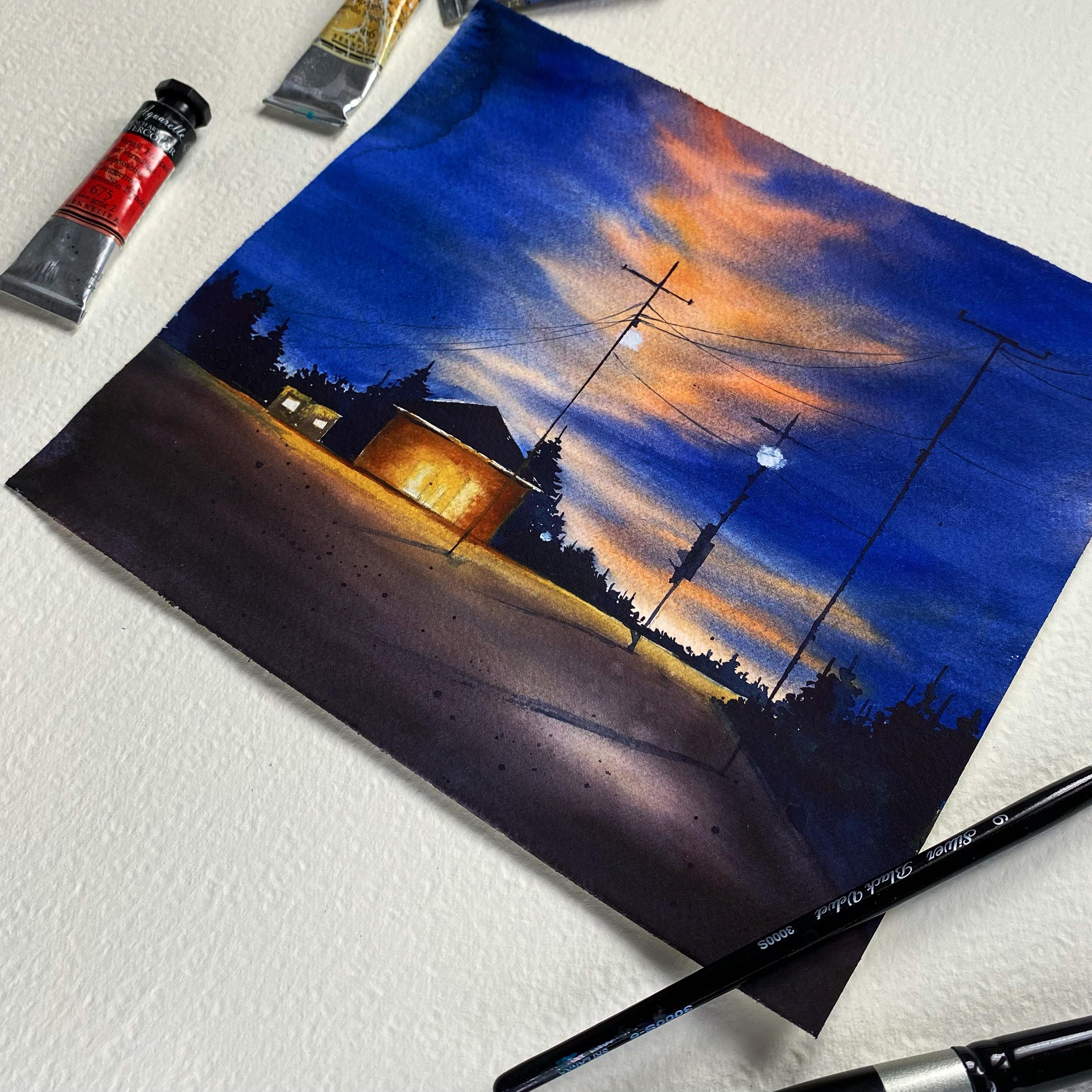
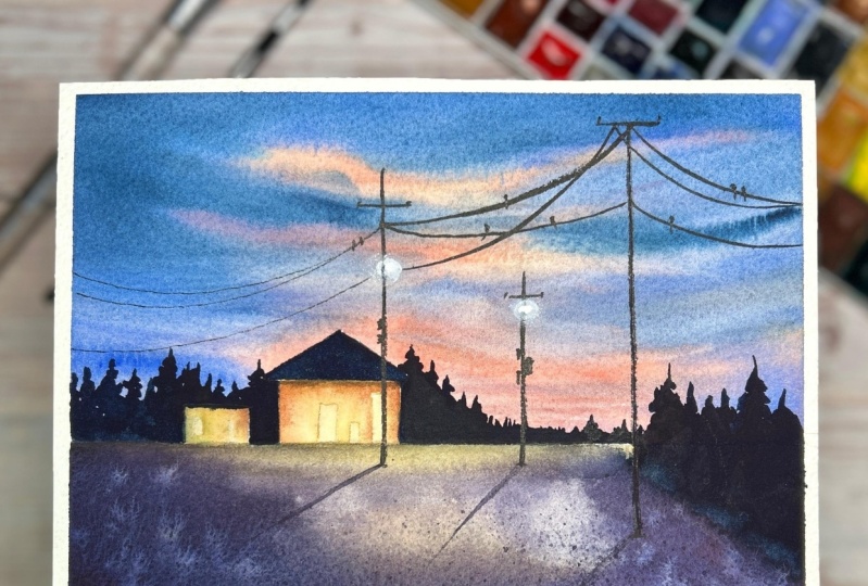
7. Class Project Part 4 - Foreground: Step is to make sure the
pine trees have a dried-up. And the second step is to
wet the foreground area using I'm using my silver
black velvet number 14 brush. And later I have picked
up my hacky brush. Now it's very convenient to wet the paper with a flat brush. Remove any extra water? No, by flipping your board. Let's start from light
color to the dark. And the light color
here is Naples yellow. And add this color very
generously onto the wet paper. It's such a nice
color to portray the brightness of the
night scene in watercolor. So if you have Naples
yellow, please use it. If you don't have, you can use Indian yellow
color as well. And now I'm mixing French
vermilion red color with French ultramarine That is blue color and just a
little bit of indigo. And I have this
dark purple color. Three places that I'm not adding this dark purple color
on the foreground. There are three places
where I'm not going to be painting the dark purple
on the foreground. The first is along
the horizon line. Do not add purple
color over there. The glow or the light from the Cortes will
be falling over there, so it should not look dark. And the second is beyond the diagonal line that
we have sketched before. There'll be pine
trees over there. So there is no point in adding dark purple. The last days. That small circle just at the
bottom right of the paper. I want to portray light, light falling from one
of those street light. So for you guys to better understand what
I'm talking about, I have added the final picture
on the top of the screen. I also want to let you
guys know that this is not the final layer
for the foreground. We're gonna be adding
one more layer of the shadow purple in
one of our later video. The foreground that
we are painting now is wet-on-wet technique. So this guy was also
wet-on-wet technique. The cartilage that we're going to paint in the next video, and the pine trees in the background are
wet on dry technique. I just wanted to
let you guys know. Tequila always dries a
couple of shades lighter. That's why even
though you're seeing the shadow purple in
a very dark shade, it will dry up in
really light color. That's why we're
going to have to paint watercolor in layers. So I think I'm going to stop
painting the foreground now. Just for a little more detail. I'm going to take a wet
brush and I'm going to splash the water
on the foreground. You're not to give
that extra detail. I'm going to keep my
Paypal for drying. And in the next video, we're going to paint
the cartilage.
8. Class Project Part 5 - Cottage: Alright, the foreground
has dried up. Now let's start with the best part of
this class project, painting the cartilage. I'm starting with Naples, yellow and slowly darken the edges with
burnt sienna color. Do not paint anything
over the doors. They should be light in
lightest color possible. The Naples yellow is still wet. You're going to have to
add burnt sienna around it so that the color
will spread organically. Whatever the color
is around the doors. Let's just drag it very gently. Do not overdo it. The dose and a
window in the middle should look lighter in color. The shadow of the roof
is falling over here. So I'm just going to add a
line using burnt sienna color. Small line, the
horizon line as well. Using burnt sienna. Not to differentiate between the cortex and the light
that is falling on the road. Let's repeat the same process
of adding Naples yellow, and later adding burnt sienna to this small cabin right here. It doesn't have the
roof. By the way. Let's paint the
roof of this Cortez and I'm using indigo color. I hope you enjoyed painting
this very glowy cartilage. So in the next video, we're going to
paint the binder on the left side of the paper. You know that diagonal
line we have drawn. So I'm gonna see you guys there.
9. Class Project Part 6 - Foreground Pines: Let's get started on
painting the pines here. I'm using only indigo
color for this. And my silver black velvet number six brush
the smaller one. The spine should be larger than the ones
in the background. But also make sure to paint
them in different height, like we have painted the
pines behind the cottage. Random sizes. Use a depth to the painting. This video is not only
about painting the pines, we're going to also
have to revert and repaint the foreground to make it look a
little bit darker, like I have mentioned in
one of our previous videos. From the edge of
those pine trees, I'm going to just drag
the paint down with me and I'm using my syllabus, alright, number 14, brush, as well as the hockey brush
to wet the foreground. Obviously the hockey
brush is wet. Let's mix the shadow color. I have used a French
vermilion red color, French ultramarine blue
color, and indigo. Make sure to leave that
white space as it is. And paint around it using
the dark shadow color. And also do not paint
anything over there. The Naples yellow where we have painted just below
the horizon line. With the damp brush. I'm going to adjust the
paint a little bit later. With a wet brush. I'm going to splatter some
water onto the foreground. This is the detail that
we have already done in one of our previous
video called foreground. So I'm just repeating that. Lets it, I'm gonna
see you guys in the next video where we're
going to paint the details.
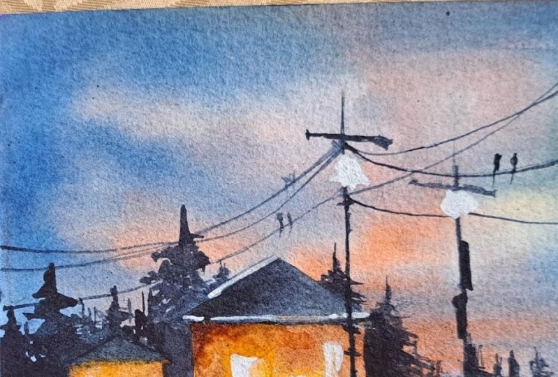
10. Class Project Part 7 - Details: We are finally at the
end of the class. Add details at the last, but it's what makes
our brachial painting. So let's get started by adding these poles first and later. I will tell you what is the most important
part of this video. You can see I'm using a ruler here because I
don't ask my hands, they are very shaky. And I'm using indigo color. And I'm using my silver
black velvet number six, press the smaller one
to paint the balls. Second poll here is the
smallest of all the three. Okay, to add these random
details that you'll see me. No paint on this bolts. This is the biggest pole and it almost touches
the edge of the paper. Or I would say this is the most difficult part for
me because like I said, my hands are really
shaky and it's very difficult for me to paint
these wires on these balls. But I hope you guys paint
these wires perfectly. Use a synthetic brush
if you have one, because compared
to natural brush, the synthetic brush we'll have, we'll give you more
control on the paint flow and managed to paint this. Why successfully somehow. Now I'm going to move on to
paint tiny little birds on these wires using the same brush and the same paint, indigo. I told you guys that. I will tell you what is the most important
part of this video, or should I say, the whole
landscape? It's this one. The painting of shadows
of these polls. You can see how much
difference of this shadow mix. You know, compare the
before and after. You will know. The shadow that we are painting
here is of that poll. So you guys know the shadow will always be a shade lighter
than its subject. So the poll is in indigo color, so I'm using dark purple color, which is already on our
palate to paint the shadows. The next thing to paint is the light bulbs on those polls. I'm gonna be painting
only two of them. And for that, I'm gonna
be taking white color. Now we're going to
splatter some indigo paint on the foreground just to add a little bit of
depth to the landscape. And with that, we are done
with today's class project. I hope you guys had fun. And I'm going to see you in the next video where I'll share a little bit about what
we have learned today. So see you there.
11. Final Thoughts : Let me share a few thoughts
about this class project. This is a night scene. And we have learned so much. Even though we have
only one class project. We have started with the sky. And there we have learned about the right mix of colors to use ultramarine blue and
Naples yellow instead of primary yellow to a
wide green color. And we have learned how
to mix shadow color, the dark purple color. There are a few
important techniques that we have practiced here. The wet-on-wet and
riveting techniques. And how to get this
glowy effect using the right colors and
importance of the shadows. So all of these
things that you can use to paint your
own night scene. Hope you enjoyed painting this class project
with me today, and I'm waiting to see all of your projects in the
project section below. And if you're on Instagram, please tag me if
you paint this so I can share your works. So yeah, see you
in my next class. Thank you so much for watching.
 Sukrutha Jagirdhar, Watercolor Artist I Creative Entrepreneur