Transcripts
1. Introduction: [MUSIC] Hi, I'm Alana and I'm an artist and
illustrator from Toronto, Canada, and a top teacher
here on Skillshare. My brain can be a real *******. I set out to paint something and during every step
of the process, it chimes in with
great advice like, you are a rotten painter. You'll never be good enough. You better make this line
perfect or everyone will see your fault. It's great. It makes it hard to show up the pain when you feel like
you have to be perfect. When every brushstroke
feels like a mistake when you have to be in complete control so
that you don't slip up and show everyone
your imperfect self. The process isn't joyful and your paintings end
up stiff and sad. To build a more joyful
painting practice, I had to find a way to quiet that critical inner
voice and let myself get loose and play. I want to share that
process with you. Together, we're going to
paint one goofy, glorious, expressive little bird in
a loose and lively style. We'll learn to show up with
more joy and less judgment. Together we'll study
birds and sketch them, paint a gloriously
messy under-painting, practice making
marks to stay loose, and then bring it all together
in a fancy finished fowl. Along the way, we'll practice being present in the moment, letting go of the results, and being kind to ourselves
to make showing up to paint something you
actually look forward to. This class is for anyone with a judgy brain that just will not shut up and let you paint. If you are ready to let loose, then let's get started. [MUSIC]
2. Your Project: [MUSIC] In this video, we'll cover what you need
to do for your project. In this class, we'll be creating one simple painting of a
bird in gouache together. You're welcome to paint
along with me using the same reference
photo or to choose another reference
while following along to create something that
is uniquely your own. I've included a page of
reference photos for you to use in the project
section of the class. This class will be broken down step-by-step so that
you can paint along. The steps will include; Number 1, an overview
of your materials, where we'll look
at the supplies we need with a focus on brushes so that we can break
down how to make marks that are varied
and interesting. Number 2, sketching, where we'll do a few quick
bird studies before we jump into creating a sketch
for our final project. Three, underpainting. We'll mix colors and lay
down loose layers to figure out where our colors will
go and begin our painting. Four, mark-making factors. We'll hop over to a scrap
piece of paper to test out some marks and play
without any pressure. This will give our
underpainting time to dry. Then Number 5, we'll finish our painting with marks, texture, and details. Only then will we engage that judging part of
our brain to give us the insights we can use
in our next painting. Next video, we'll explore the materials you'll
need for this class.
3. Materials: [MUSIC] In this video, we'll cover
the materials you need to complete your class project as well as a few other materials
you may want to explore. We'll begin by sketching and for that I'll just use a
page in my sketchbook, colorized pencil or just a regular colored
pencil and an eraser, but also work on loose paper. Then we'll move on to
painting and that will require something to hold water or with paint like a jar, something to hold
your paints like a ceramic palette or palette
paper and something to dry our brushes and clean
extra paint from the bristles like a
piece of paper towel. You may also want something that makes consistent
lines like a pen, a pencil, or a marker. These can be great
for details or for getting your scribble
on when you feel stuck. I love colored pencils and
posca pens for this purpose. I'll also be using a clip to hold down the pages
of my sketchbook. But if you're working
on loose paper you may want a sheet tape or another delicate surface
tape to hold down your page and prevent it
from getting all wiggly. Then of course
you'll need gouache. I'm a big fan of
acrylic gouache. I prefer holding or
Turner Japanese brand acrylic gouache because
it is so high-quality, bright and suits how
I like to paint. I also love golden, silver, matte acrylics which
are not technically gouache but behave
nearly identical. They come in this beautiful
Payne's gray color that I am obsessed with. You could also use traditional gouache to complete
this class which is flat, matte and opaque just like
acrylic gouache but doesn't have the acrylic binder that
would make it waterproof. This can add a little
extra complexity to layering your paint. You just want to make
sure you're not adding too much water but
it can give you great new and
interesting textures. We'll also need
brushes to complete this class but we'll cover
that in the next video since brushes can have a big
impact on the textures and marks you can make
while you are painting. Let's head there now.
4. Brushes: [MUSIC] In this video, we'll
cover brushes. What I recommend is the
different marks and textures we can get
from different brushes. First off, I like synthetic watercolor
brushes when working with gouache, especially
acrylic gouache. Since acrylic gouache
is acrylic based, it can't be reactivated when wet and it can gunk
up your brushes. This can be especially
devastating with expensive natural fibers. Synthetic fibers can stand up to a bit more scrubbing and they are generally more affordable, which is why I recommend them. My favorite brushes are
the Escoda Tame brushes, although I love the more affordable Princeton
Glacier brushes as well. Now that we know the brands, it's so worth it to take
a moment to look at different brushes
shapes since they can affect the type and variety
of marks you can make. Round. Round brushes are my most commonly
used brush type. They have a pointed tip and long, closely arranged bristles. They are great for
creating smooth lines in areas of color. You can make a variety of different strokes sizes
based on the amount of pressure you use and
the size of the brush. Working with larger
brushes will give your lines more variations
since there will be more variation between
the thickest strokes and the thinnest strokes that
particular brush can make. Next, flat brushes. Flat brushes have
these straight row of bristles that
are roughly even. They are great for filling
big areas of color smoothly or for painting
more geometric shapes. A bright brush is another flat brush
with shorter bristles. Great for impasto effects with thicker paints but not ideal for working with gouache
where we generally want flat areas with paint. Filbert. A filbert brush is a flat brush with a domed end. Filbert provide great coverage and are especially suited to organic shapes like petals and feathers because of the soft round edge
of each brushstroke. They're one of my absolute
favorite brushes, especially for painting birds. Fan brush. Just like
the name suggests, fan brushes are wide,
fan-shaped brushes. They look very artisty, but they are generally more of a special effect brush
used to create texture. They can create gorgeous fine
lines and loose textures. But I just got one
for this class, so I haven't incorporated
it into my practice yet. Rigger, script or liner brushes. Rigger, script, and
liner brushes are long bristles brushes
that are either flat, round or sometimes angled. The long bristles
correct any shakiness in your hand to create
smooth, long marks. They are excellent for wonderfully smooth
expressive lines. When we are looking at
texture and mark-making, we would be remiss not
to mention that you are not confined to brushes, you can paint with all
unconventional materials. Dried grasses, sticks,
scraps of paper, old gift cards, palette knives, or my personal
favorite, my fingers. They can all offer
opportunities for new and interesting
textures that will make your painting more
dynamic and interesting. Just remember that gouache
and acrylic gouache aren't suited to three-dimensional
texture effects. It will crack. Ensure you're working
in thin layers. Now that we have general
understanding of our brushes, let's study birds and then
move on to sketching them. [MUSIC]
5. Studying: [MUSIC] In this video, we'll take a minute
to study birds, before we jump into sketching
them in the next video. First off, what is studying? It's not reading
textbooks or flashcards, or at least not in this context. As an artist,
studying is an act of observing a subject closely, in order to understand
it more deeply. Studying can involve
sketching or painting, but it can also just
involve looking. In our day-to-day lives, we rarely observe something
closely enough to draw it. Instead, our eyes
look at a bird and our brain fills that in
with a simplified version. It helps us function
in a chaotic world, full of different stimuli, but it doesn't help
us translate drawings and paintings onto
paper, so we study. How do we study? We grab a reference
photo or a few, and we take some
time to look closely at all the parts that
make up our subject. We look for details
that make it unique, details that don't
behave how we expect, and anything else that
catches our fancying. Having a detailed mental map of our subject helps us add
interesting details, even when we aren't trying to paint or draw realistically. What should we pay
attention to on a bird? Birds have beaks and wings, heads, necks, bodies, legs and feet, and then little tail feathers. Those are the
necessary ingredients. When we vary them, we can create every different
bird under the sun. When we pay close attention
to the smallest details, that's how we can differentiate
one bird from another. Feel free to take
some time and study the reference photos I've
provided for the class. In the next video, we'll do a few quick
sketching exercises to get loose and
get comfortable, before we jump into creating the sketch for our
finished project. [MUSIC]
6. Sketching: In this video, we'll do a few quick
sketching exercises before we jump into the sketch
for our finished project. [MUSIC] I have a pencil, an eraser, my sketchbook to draw in, and a little kitchen timer. But you can just follow
along with this video. I've also got my page of reference photos
which I'm going to use as the basis
for my sketches. We're going to begin with
one one-minute sketch, followed by two
two-minute sketches, and then we'll finish with a five-minute sketch
for our project. You're welcome to sketch the
same bird each time to gain a deeper understanding of
that particular bird or to sketch different birds with
each exercise like I do to gain a broader
understanding of how bird bodies are put together. Doing quick sketches
can feel scary. Your perfectionist brain may
immediately jump in with, "I can't make
something good in one minute," and that's fine. You don't have to
make anything good. In these quick sketches, we're just looking to get
down as much information as possible about this
particular bird, that's it. No more pressure than that, and you can draw it as
many times as you want. With that, let's jump into
our first one-minute sketch. I'll be sketching a
fancy little duck. Are you ready? Let's go. As I sketch, I'm focusing
on just getting down the shapes of his
body and holding my pencil very loosely. To be honest, it's hard to hold this tiny pencil tightly
because it's so small. Immediately you'll start
to see that a minute is actually longer than
you would think. One minute gives you
a lot of time to get down the general
shape of your bird, so long as you don't get too
bogged down in the details. I'd advise not spending too
long on things like the beak, the eyes, or particular
little feathers on your particular bird. If you do find yourself getting caught up in these details, just jump to a different
part of your sketch. This is also your
friendly reminder that this doesn't
have to be perfect. If you look at my sketch, that beak is not at the
same angle as the photo, but that is okay. Because first of all, this is just practice
and second of all, if I were going
to paint on this, [NOISE] I could
tweak it as I go. Just going to mess
with it for one more a second because I
can't help myself. But you can already
see that this is a pretty solid sketch for
literally just one minute. If I were to sketch
this duck again, would I make his beak point
a little bit more downward, would I give him a bigger head? Yes. Yes, I would. But that's okay. Those are things that you learn through doing these
one-minute sketches. Not a reason to beat
yourself up after them. With that, let's try
a two-minute sketch. I'm going to sketch
this little quail. I'm also going to use the
same page in my sketchbook. That way, it feels
like practice. Ready, set, and [LAUGHTER] go. I focus on the shape of his
head and his body first, especially because he's got this weird blobby head
and a weird blobby body. Also I can't help myself from drawing his funny little
head feather as well. He's actually got a
very simple shape similar to a penguin,
if you look at him. His wings are tucked
in at his sides. So there's not a lot of differentiation
between his wings and his body, but
his wings are there. He's also got these
short squat feet holding them up with regular
little bird feet. His tail feathers are
somewhere behind there. After doing a one-minute sketch, you might find that when you're doing a two-minute sketch, you actually finish early. That's a great opportunity
to go back and start adding smaller details that
you probably wouldn't focus on in a one-minute sketch. That could be like little
ruffles of feathers, more refined sketching
for details on the face, and just cleaner, nicer lines. Feel free to pause
at any point as well and just look at your subject. Often, what makes a sketch better isn't what
you're doing on the page, it's actually the time you
take to look at your subject, to really truly observe
what is going on. How does the head
connect to the body? How do the body
and feet connect? Where are the wings
in that blobby shape? Where is his beak
attached to his head? Where does his eye sit? All of those things can really
bring your sketch to life. [NOISE] Just like that, we've already finished
our second sketch. Those are two pretty
recognizable birds, despite the fact that
they are very loose. Next up, I'm going to try sketching this bird
with his wings splayed out because it can add a little bit
of extra complexity. That being said,
you don't need to do anything else but observe closely and draw what you
see. Let's get started. [NOISE] Just like in our
previous two sketches, we're going to begin
with the head and body. Those are the easiest shapes to really pay attention
to when we get started. The head is a little
oval pointing upwards, and the body is a long oval that points downwards
towards the tail feathers. At any point where I can see something that connects
and is easy to sketch, I'll just scribble it
in like I did with the tail feathers there and
how I do with the beaks. I'm not spending a lot of time fleshing at the detail of
that beak to begin with, but I just want to see what
direction it's pointing. Also, don't worry if your sketch overlaps other sketches you've
already done. That's fine. It makes your page in
your sketchbook or your flat piece of paper
that you're working on look very dynamic. When you reach these
wing feathers, you may feel tempted
to pause and carefully draw each individual feather
and I beg you, please don't. If you want to paint in a
loose and lively style, you can't start it on a
foundation of rigid lines. It's not going to be a fun time, and it also will take your whole two minutes
or maybe more. Instead, just give the hint of the directionality
of those feathers. I'm continuing to add
details and refine my lines as I work my way
through this two-minute sketch. One of the points
that always interest me when I'm painting
or drawing birds with their wings laid out is how those wings connect
to the body and how the shapes of the wings differ from side to
side of this bird. Because he's not sitting
straight on, he is angled. So one wing is a different
shape than the other. I'm also fleshing out his tail feathers
and then looking for any other final
details that I can add in these last 10 seconds. I think, frankly, I'm done and now [NOISE]
you're done too. I love seeing all
these sketches side by side because even I can see how much more confident
my lines got from that first one-minute sketch to my third two-minute sketch. That's the value of
exercises like this. They get us warmed up in
a very low-pressure way, and then we are
ready to jump into a more final finished piece that might feel like it
has a bit more pressure. We'll feel ready to go. I hope you feel ready to go
because next we're going to jump in to the sketch for
our final finished painting. I'm going to give you five
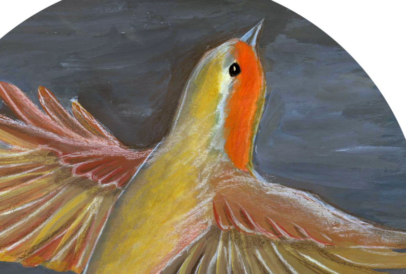
minutes for this one. I've decided to sketch this transcendent little
green heron because I love his splayed out wings and I love his weird shaped
head and neck. I thought it would be a fun
challenge. So let's go. [NOISE] For this final
finished project piece, I'm sketching across this
full page in my sketchbook. I'm holding my pencil
incredibly loosely. I'm actually holding it
even by its side right now so that I don't get
too bogged up in details. This also helps me get more fluid lines to create
the shapes of my bird. I started with his head, his neck, his beak,
and his body, the same way we have along
through this whole process, and then I'm going to
flesh out the wings. As I work my way through the different parts of
this painting and paying keen attention to the way that different things
attach to each other, where on the body do
the wings connect? Where on the body does
the neck connect? Where on the bird's neck
does his head connect? Getting these connections right is more important than getting the shapes entirely
perfect because we will be painting
over this later. We can refine things as we go. Just because we
have more time in this five-minute sketch doesn't mean we need to get
bogged down in details. You'll notice I'm still
sketching these feathers in a really loose and light hand. Now, this bird does have layers of
feathers on his wings, so I'm paying keen
attention to that because that will be a lot more helpful
as I enter my painting. You'll often hear
artists give advice to new artists about
creating crisp, clean, confident lines as
you enter your sketch. For me, that's just
never really worked. The way that I work is
I start really softly. I actually love that about
using these colored pencils. It creates such a
soft undersketch, if you will, that I can
add more detail to later. The confidence comes with
additional layers of my sketch. As you can see here, I'm starting to refine those
lines with darker lines. Now if you don't want to see your lines in your
final painting, you may want to continue
working with a light hand. For me, I love being able to see the artist's hand even at
the end of a painting. I don't mind if my
lines show through, especially because they'll be in this beautiful red color rather than a gray graphite color. Seeing those lines of your
sketch show through also adds more looseness and more expressiveness
to your painting. It tells a story of the piece. It is definitely not a
failure if that happens. The other advantage is we're
working with gouache here. It's an opaque medium. If there are lines that
you think, "I hate that, that does not look good, that makes me uncomfortable,"
that's perfectly fine. You can paint over it with
a nice opaque layer of paint and no one will
be any the wiser. You'll notice in this
five-minute sketch, I'm spending a lot
more time on the beak. For me, I find that
that is a part of this sketch that really makes the bird look
like the bird it is. It will also be more of a focal point in my
finished painting, so I don't mind
spending more time to get it right and make
it look like that bird. I'm also just
spending some time to refine the shape
of these things. It's such an expressive swoop
that this green heron has, so I want to make
sure that it's right. Now that I have the
upper wing pretty done, I'm going to go through and add just slightly more detail to this lower wing since it has this double layer of
feathers as well. Again, you'll notice I'm not sketching precise,
perfect little feathers. I'm just giving myself an idea of where those feathers
will be and where I can lay down my brushstrokes during the painting
phase of this process. At every step of this, it's important to note that your sketch doesn't have to
look like what you're seeing. You're painting a green heron, you're not painting
that photograph. It may also be worth
noting that if, like me, you've just left a dot
for your bird's eye, he may end up looking
like a cartoon character. That doesn't mean
you haven't created a very serious sketch that will turn into a very serious
beautiful painting, it just means that when you leave a dot for an animal's eye, they end up looking a bit goofy. That's fine. Nothing
to worry about. All the beautiful
detail will emerge as we begin to paint this piece. Now we are in the final seconds of
this five-minute sketch. I don't have a lot
more detail I need to add and hopefully,
you don't either. With that, [NOISE]
now we are ready to move on to our underpainting. I'm so excited. I'll meet you in the next video.
7. Underpainting: In this video, we will
add paint to our sketch. A first base layer, commonly known as
an underpainting. The first thing I do when I'm beginning my underpainting is to decide on some of the
colors I want to use. I don't have to stick
with this plan, but it gives me somewhere
to get started. What I'm looking for as I
begin this underpainting is the mid tones of all the
area of my painting. I can add shadows and
highlights later. For the back of
this heron I like this color here and I think that the warmer color
above it could work as well. I'm just going to go
through and grab the colors from my palette to match
those colors that I liked. So I have to manage a
enormous mixing chart. Don't make one this big, I don't advise it. In order to find which colors make up
these colors that I like. A mixing chart can
be super handy to mix precise colors quickly. I share the process to
make one in my class, Acrylic wash adventures
getting started. But you don't have to
mix colors to have a perfectly wonderful
underpainting. You can just use colors
straight from the tube. This might make your painting of a bird slightly less realistic, but I bet it's going to make
it a lot more expressive. It may also be worth
noting that you don't have to choose realistic
colors at all. I just really love the
colors of this heron, so I want to stick
pretty closely to the palette in the photo. My plan is to use the burnt
sienna and raw umber mixed with the pale lime to mix both the color of
the heron's back, that deep muddy brown and
the color of his head, that warmer redder tone. By using that same pale lime
with both of those colors, it's going to make my color
palette more cohesive, even though they're
different colors. Now I think I have nearly all the colors I need
to begin my underpainting. I also I'm going to choose
a color for my background. Now if this course wasn't specifically focusing
on acrylic gouache, I probably would just grab some fluid acrylics because they're wonderfully translucent, I have a lovely green that
I really like but I want to focus on showing
you the effects you can get with acrylic gouache. Now, I'm checking my color chart again to see if there's a
color I think would work. But I think I'm just going to go with that wonderful
from the tube, green to make my life easy. Now, with all of the colors I'll use in my underpainting decided, I can get down to the messy, joyful work of painting. Anytime I'm painting something, I'm always going to start
with the background because it is the most low pressure
thing to paint I find. I'm just going to put down a nice brush stroke
layer of this green. I generally water down my paint to a mix of 50 percent paint and 50 percent water
because I find that makes my paint
the most manageable. Depending on the
particular paint you're using and the brand, and how opaque you want
your base layer of paint, feel free to add more or
less water as you so desire. People will often
advise you against adding too much
water to acrylic, but frankly, I have not found an upper limit to how
much water I can add. I'm currently using a size
6 eskoda theme brush, and I'll use that for
the entire background. It's big enough,
but it's not huge, which means I will get
a hand of brushstrokes. You'll also see that I am not
trying to lay down a flat, smooth, beautiful area of color. Sometimes I'll even use two
paints for my background's interchangeably just
smashing paint here and there to create
interesting textures. This adds a ton of dimension
to your finished painting. Frankly, it's just really fun. When you try to
create a very smooth, perfect, even layer of paint, especially right at the
beginning of your painting, it can make every brushstroke
that sneaks through feel like a failure. This way, every
brushstroke is a success and they add a lot of
life to this painting. In the background of
the original photo, it's a reflection of trees, which would have a ton of different tones and
textures anyhow. The one thing I am trying to do is to ensure
that I'm not getting too much paint over
the areas of my bird. A little overlap is fine, but I want to make sure
that the colors I will lay down for my bird
come across clearly. Anytime I have an area
of color like green, and another color
overlapping it, that underneath color is
going to show through. That's part of the
reason that we do an underpainting in
the first place. Because all of this texture and color is going
to peek through, no matter what we add on top. Now, as I continue to
paint this background, it could be time to go
into a bit more depth. But what the purpose of
an underpainting is? After all, we could just paint our painting in
one single layer, laying down each color precisely where we want
it and adding detail. The advantage of an
underpainting is that it creates a base layer of color and texture that ties the
painting together. On top of that, it gives
you the opportunity to fine tune colors and textures, composition and contrast
before you focus on details. If you are a
perfectionist like I am, it can be very easy to
start painting and want to really dig into the
most complicated part, the part you're most
worried about messing up. Something like the eye, or the beak, or a particular
part of the wing. Somewhere with a lot of detail. But the problem is,
when you start on the most detailed part
of your painting, first of all, it makes
everything else look wonky because nothing
else is filled in. Second of all, it
creates a lot of pressure because
once you have that, you have to make everything
else coordinate with that very detailed bit of
painting you've already done and it also means that if later on in your composition
you realize that the eye, or the beak, or whatever detailed piece
that you've already done is slightly off-center
or needs to be moved, then the most detailed thing is going to have to
be done over anyway. I like to leave all of
the details to the end. If I do find myself
starting to be drawn to painting the most detailed
parts of the painting, I'll often just
remind myself that my goal right now isn't to
make a finished painting, it's just to cover this
whole page in paint. You'll notice that I've moved on to painting
around areas that are a bit more detailed or like a bit looser
like the feathers. In those cases, I just could try to create a defined line around
whatever I'm painting. It doesn't matter if it's
precise because I don't mind if little bits of the paper show through in my finished painting. I also don't mind if a
little bit of the green shows through on my
feathers or anything else, because it'll make
it look like some of the feathers have a little bit of translucency or transparency, and we'll make it much
more interesting. I'm also noticing that the way that my brushstrokes
are forming down here near the bottom of the painting,
they're a bit darker. Likely, I'll go
over this area with an extra layer of paint to add some weight
to the bottom of my painting and to
just make it look a little bit less chaotic. Now, I'm nearly
done my background, I'm just going to go around and clean up any areas where
I think it's too light by adding a little bit
more paint and make the edges of my page just a
little bit more consistent. There's nothing wrong with
some jagged brushstrokes, but I just like a smooth line
to the edges of my page. If you're using a binder clip like I'm to hold
down your pages, you may also just want
to move it to the side so that you don't end up with a funny gap where your clip was. Just makes sure wherever
you're moving it doesn't have wet paint because
you don't want to smudge your painting,
if you can help it. But if you do, it just
adds more character. Now that I'm done my background, I just rinse off my brush to get all of this green pigment
out of the bristles, especially if you're
using acrylic wash, this is important so
that it doesn't kick on your bristles and make your
brush really hard to use. Now I'm going to move on to
painting back of my bird. I'm mixing together raw
umber and pale lime. Just like with my background, I'm going to add water to this concoction in order to make it a more manageable paint. I might even add
water as I'm painting to create more variation
between different areas. You'll see in the
original reference photo that there are areas on his wings that are
quite dark and areas on his back that
are a little lighter. Now, I'm just focusing on the
mid-tone colors right now, not the darkest blacks, not the whitest whites. But even still, it's great
to add variations in color to give unexpected
moments within the painting. You'll also see that I grabbed
a scrap piece of paper here to test whether
my color is bright. Now when I'm working
with acrylic wash, there's actually not a ton of color shift between
wet and dry paint, but you can still be helpful to get some of that
paint on paper in a low-pressure way so that
you don't have to worry about it when you set your
brush down in the color, just doesn't feel right. I'm covering his back because that's where these
brown ton feathers are, or at least the top of his back, and I'm blending it
into the wings as well. Now the wings are a lot darker, I'll add more layers
to that area later. But to start, this is a great underpainting
for these wings. You'll notice as I
use my brush more, it has less pigment on it and sometimes I even add water to blend out the edges of a
certain area of color. This can make the
transitions between colors smoother and just helps to add highlights and other
interesting details. As we begin to paint
our actual bird, I'm keeping that
spirit of studying alive as we work our way
through this painting. I want to keenly observe where different colors
are on this bird, not just where I
assume they'll be. What I'm noticing is there's
actually some of this brown on this forefront wing here, so I'm blending it
out and adding water. Again, I can add
more detail later, and I will, but I think
this is a great beginning. I'm also noticing that
there's a little bit of this brown along the edge
of this heron's neck. What a great detail to notice? I think we're done with
this color now and we'll move on to our next color. Even though we're still pretty early on in our underpainting, this may be the point
at which you begin to question every choice
you've made so far. Under paintings are ugly. They're supposed to be ugly. They're not going to show entirely in their
finished painting. You're going to add
a ton of detail and you can refine so much of this. This is a great moment to
stop and remind yourself that this is a
painting in progress, not a finished thing. You can't fail at something
that isn't done yet. I'm just testing this color again on a scrap piece of paper to make sure
it's what I want. Now I'm just adding a little bit more water to get the consistency of
paint that I want. Now, add it to my head
and neck of the heron. Now the one thing here is that, this is a unique area
so far because we are blending two different
areas of color. I like to do this
with more water than I would usually use and I smash things with my
fingers anywhere it looks like there's too
harsh of a line of paint. The other thing to
remember, again, this is a painting in progress
and just an underpainting. We're going to add more
layers on top of this. If your areas of
transition aren't quite as crisp as you'd like them to be or as smooth as
you'd like them to be, that's fine, we'll refine them more in future layers
of the painting. I also just paint right
over the eye here. Eyes especially are
something that I tend to move around a lot as I'm
working on a painting, so I'm not too worried about the placement that I had
in my initial sketch. I'm also keenly observing to see any other areas of my painting
with this color pops up. By using the same
colors throughout to add different little
textural interesting bits, again, it makes our painting
a bit more cohesive. Now, I'm going to move on to the final color for
this under painting. I'm using an ash
blue and an ivory, mixed together in order to get different variations
for the feathers, and this is where I'm
going to be the loosest. Just like with my
previous colors, I add some water, mix my paints together, and then I'm going to test that my color is the color that I have envisioned on a
scrap piece of paper. As you can tell, I use these scrap piece
of paper for ages, so you don't need a new
one for each painting. They can become their own gorgeous abstract piece
in their own right. Now for these feathers, I'm just going to start by
making really loose marks. You'll notice on the
feathers in the painting, there's a lot of variation
between light and dark. Right now, I'm just really working with
the lightest color. Later when I come in
with a darker color, that will define
the feathers more. Right now, I just want
to make sure that my brushstrokes are working with the direction that the feathers will lay in the
finished painting. I'm also trying to
create a lot of variation in tones
for this area, because there is
so much variation in the reference photo. I'm adding a lot of water and
working incredibly loosely. Normally, when I'm
doing detailed feathers I'll use my filbert brush because I really
liked the shape. But right now because I'm just working on
the underpainting, I'm just using a regular
sticks round brush. Generally, to get
a lot of variation in our paintings and
make things interesting, you probably don't want to use the same brush the whole time. But when you're working your
way through under painting, it's fine to just stick
with what you start with. I'm also focusing here
on the back of my bird. I noticed that there are
two layers of feathers. One, that I think is his back, and the other batch
of feathers that I think are really
his tail feathers. They are darker because
they are in shadow, they lie underneath the
higher-level feathers above them. I'm varying the tone
between these two, based on the amount of
water that I'm using. You'll notice that, in this particular area
that I'm painting, and in this particular
color, the wings, the back, I'm leaving
a lot more of the page peeking through than I've done in any other area
of the painting. That's because, first of all, I know I'm going to be adding a ton of detail here
with darker colors, so I think that that
will make it incredibly dynamic and secondly, because I really want to hint at the shape of the
feathers to give myself something to work with as
I move into details later. I find working so loosely over the feathers in my
underpainting really helps me ensure that I keep
that looseness in my final finished painting as
I move into adding detail. Because I already have
this chaotic base, I can't get too precious with each individual brushstroke as I transition into the final
stages of my painting. I'm just going to add a
little bit more water to my paint and then continue to fill in the rest of these
areas of feathers. On the wings there are actually a few layers of feathers that we can
see in our reference, so I just want to hint at
them in this underpainting. Lots of loose brushstrokes. I'm even holding my brush in a really loose way so that
I can't get too precious. I'm not gripping it really
tightly close to the ferrule, I'm holding it more loosely
by the end of the brush. That way, I get a lot less
control over what I'm doing. It can be a great
way to loosen up. With that, I think we are officially almost finished
with this underpainting. I'm just going to clean off my brush to protect
its bristles and then we'll move on to a
mark-making exercise while our underpainting dries
8. Mark-Making: [MUSIC] Before we jump into making marks on our
fine, feathered friends, let's take a brief break to experiment with some
of the marks we can make on a scrap piece of
paper or in our sketchbooks. You may be tempted
to skip this step and go right on painting
your final project, but I would kindly implore
you not to, and here's why. Number 1, stepping away gives us a break from
looking at our art. We're going to look at
something else for awhile. The creative process
can sometimes give us tunnel vision that
blinds us to the parts of our paintings that
are magical or the parts that aren't working
as well as they could be. Stepping away and coming back and change your
perspective on a piece. We can come back to
our painting with fresh eyes that will help us
see new possibilities that we may not have been able
to see otherwise. Number 2, stepping away to experiment also lets us
play without pressure. When we step away from our
painting to make marks in a sketchbook or on a
scrap piece of paper, it takes the pressure
off to make them good. Whatever that means. You can just try things out
without any of the fear. I do this all the time during my process on a scrap piece of paper to check whether
the marks I'm planning on making give the
effect that I want, and just to play to see what
possibilities are available. Since we're doing
this as part of a structured class
on mark-making, I'd encourage you to let
yourself dig into this part. There's no rash, that
underpainting will still be patiently waiting whenever
you come back to it. Let's go. Let's play. [MUSIC] Up until this point the class has been in real-time. What you see me paint is
exactly how quickly I painted. But for this lesson,
I'm actually going to speed things up
a bit because I actually played with mark-making
for quite a long time. I'd encourage you
to do the same, but you don't need to watch
my whole process because the point is for you to
dig into your own process. I'm going to start
by just putting a few rectangles on this
page in my sketchbook. Again, you could also use just a scrap piece
of watercolor paper. You don't have to have any
rigid shapes on your page, this just helps me break
up the space so that I make sure I'm trying a
bunch of different things. I'm going to take
different elements from my painting and recreate
them here in a way that I can play and try
new things so that I'll feel more confident when I
come back to my final project. Once I have all my
rectangles drawn, I'll begin to paint
just really loosely, a few different elements
of my painting. The things I want to focus on
are the span of the wings, the back of my bird, where those feathers
transition between colors, and also his neck. These are three areas that are quite different
and where I think I can try out a lot of
different possibilities. I've used exactly the same
colors that I used in my underpainting to create
these little swatches. Now I will begin to
make marks on top. Just like I did when I was
making my underpainting, I start with color. I'm going to try a few
different variations of color in order to get
the effects I want. First to start off, I think this Payne's gray
could be really good. I also think this
Japanesque blue black could work quite well. I'm going to try
them both to see how they behave when combined
with my underpainted layer. I used to just experiment
on my paintings, and well, that is absolutely a perfectly acceptable
way to work. I found it really stressful. When I would put unpredictable
marks on my paintings, having no idea what
they would do, I would end up getting
very tight trying to fix perceived mistakes that
I thought I was making. Now instead, I hop over to a scrap piece of
paper and I can try out the things that I'm
planning to do to see if they actually do what I
think that they will do. This point I'm switching
over to my filbert brush because I love the type of
marks it makes for feathers. I'm going to start on
my first rectangle. I'm layering color
to try and create the effect of feathers that
I see in the painting. Already, I can tell
that these marks are actually closer together and more opaque than I think I want, I'm not getting
enough contrast in values for what I would like. I'm going to go in and
add another layer of feathers here like I see on the wing in my reference photo, but I'm not very competent in this experiment that
I've tried here. I would likely go back
in with a white pen or a Posca pen later to add more definition to this
experiment that I've tried. We'll see if that makes
it come to life again. But for now, I'm going to
move on to my next rectangle. I don't like to work on
just a single experiment at a time because it makes me
too focused on one thing. I like to hop around in order to keep loose and to keep
present in the process. For this experiment,
I've switched over to a Size 0 round brush. I really like the small
and more expressive lines I can make with this brush. I'm trying to create
more definition in the feathers with a
lighter pale gray color. Already I do like this
effect a lot more than I liked what was happening
in my first experiment. But now that, that first
experiment is dry, I'm going back in with additional
layers to see if I can tweak it to make it into something that I'm
more excited about. Right now I'm using
the blue black from the Turner Japanesque
Klein to add a little bit more excitement. Then while that dries,
I'll hop back over to my second experiment
and add some more of the ash blue to see if I can create more definition
in these feathers. I'm also adding in some of the Payne's gray to
create more depth. These mark-making
experiments are less about strategy
or trying to find the right answer and
more about being open to the possibility of
what if; what if I try this? What happens when I do this? How could I do
things differently? Feel free to grab whatever
supplies excite you even if they're acrylic wash.
For me, for example, I just grabbed the Posca
pen and did a fun scribble because I thought
it could create some interesting texture on
the wings, and I do like that. It's made me realize
that I think what I'm missing is a scribble. I'm going to grab my
trusty colored pencil to add some scribbled lines
to create more definition. When you're working in a
loose expressive style, sometimes switching tools can be just the ticket to
get you to loosen up. When I'm using a brush, I can create really gorgeous
brush-stroke effects, but I can't just scribble. Sometimes the best
way to be expressive is just to grab the
best tool for the job, for the type of marks
you want to make, whether that's a brush, a
pen, or a colored pencil. Now I'm trying to use
this white gel pen that I have in order to make
some scribbles on top of my first wing experiment, but it's just not cooperating. It's actually quite
an old gel pen and there's a good chance
that it's dried out. I'm going to have to pivot
and try something else, and that is where my trusty Posca pen
comes in, old reliable. Already the second I start
using this Posca pen, I can see that I like
this a lot better. The contrast between
that deep Payne's gray and the white
is quite magical. I love the expressive
lines I can get and dots, something that it's a little bit harder to make with a brush. I'm going to use
the same principle and add some white gouache to my second panel to see how that interacts with
what I already have down. [MUSIC] I don't love the big
brush that I was using, so I've switched
to my smaller size 0 brush to see what kind of
expressive lines I can make. One thing I love about
using white gouache as opposed to a Posca pen
is the variation in color I can get as the pigment increases or
decreases on my brush. Well, I use most
gouache at a ratio of 50 percent paint to
50 percent water. I do tend to use white gouache with the
barest amount of water possible so that I can get really juicy,
expressive strokes. Now, I'm just going
to add some of the green that I used
to the background because one of the
things I'm realizing is that in my painting, there will be the
background that can play another element in me
defining my feathers. I'm just going to
add that in now. That adds such
wonderful definition to my feathers and makes
my brushstrokes look even more dynamic. One thing I love is
looking at the differences between these three experiments. They all have a lot
of the same elements, but used in different ways. I'm so glad I took this
time to experiment as well because if I went
with my first instincts, I probably would've used the
techniques I used in panel 1 to create my feathers when I move back to
my finished project. But number 2 is really
speaking to me right now. Now that I have a good idea about what I want to
do with my wings, I'm going to move on
to the back of my bird and experiment in this area the same way I did
with my wings. I'm starting by adding
an additional layer of the brown paint that I used when I was painting the
bird in the first place, and I'm adding some marks
using my fingers with that quite opaque white
gouache to create a gradation in the
areas of color. Looks like I'm in the mood for finger-painting
because I'm adding a little bit more darkness and contrast here with
a darker shade with my fingers as well. I love the kind of
marks that it makes. It is really fun. Now, I'm going to switch
over to my size 0 brush to add some details to the
feathers at the bottom. As we discussed in
our underpainting, there's actually two layers of feathers here where the back of this bird fades into
his tail feathers. I do like the smaller marks
I'm making with this brush to add some contrast in terms
of the types of strokes. For the next box, I want to try something a
lot looser and lighter, so I'm coming in
first with my pencil. Now, I'm going to use the opaque white gouache
to create variation and a blending effect between those darker feathers and
the brown area of the back. Already this feels
pretty magical to me and has a better balance
with the wings, I think. Now, I'm hopping over
to the third panel in this row because I
think at this point, I'm actually pretty loose. I'm not working in a tight way. I'm not getting bogged
down by details. I'm letting myself truly be present and
enjoy the process, and that always
feels really great. Here, I'm using my Posca pen
to add a scribble texture. I'm not sure if it
works as well as the second panel,
but that's okay. I'm also adding in some of that Payne's gray to see
if I can create contrast between
the lower layers of feathers and I'm smudging it, you guess it, with
modern fingers. I used to distrust it when
things came easily to me, like that second panel that
just flew right out at me and it's my
favorite right now. But what I found over time
is that that inclination towards things that are hard or actually better is my
perfection as I'm talking. It's actually quite a lot more difficult to let
something be simple, to see those simple
lines on the page and just leave them be. Now, I'm moving on to the last series of experiments I'm doing in this
mark-making exercise, the neck of my bird. This is just an area
where I see a lot of texture and wanted to play around before I commit to making marks on
my final project. Here, I've added some
of the brown color from the bird's back and some sepia color to
the top of his head. Now, I'm fussing around
with colored pencils. I love the texture that
colored pencils can make for a really small
feathers on a bird, so I'm playing around with that to see what effects I can get. I've scribbled into wet paint, I've created some marks
across the base of the neck, and now I've added a
little bit of white to see how that lays down
because there is just a bit of light along
the edge of his neck. I'm also adding my green
background in so that I can see how this bit of neck
contrasts with the background I've painted for
my final project. I'm also going to add some
scribbles with my Posca pen. I truly love Posca pens for the wonderful way
that you can just quickly add opaque white lines. They are waterproof,
which makes them wonderful to combine
with acrylic gouache. Here, I've again scribbled into that wet Posca paint to add
more layers of texture. Now, I'm going to move on to
the second box on this row. I'm adding some of
the burnt sienna, I believe, to see how it layers and whether it gets
the effects that I want. This time, I want
to experiment with my size 0 brush and more defined marks on the neck to
mimic this Heron's feathers. As soon as I put brush to paper, I realize I don't really like this as much as
my first attempt. But the advantages, this is just an experiment
on a piece of paper. It's not a finished painting. I don't need to correct this. I don't need to do much
of anything about it. It's fine just the way it is, even if it's not what
I was looking to do. In this case, I'm going to
try to add more definition to the feathers along the
neck with darker colors of gouache instead of
colored pencil this time to see how the texture differs and whether
I like the effect. This time, I'm also going to add a little bit of
the colored pencil to his fancy little Heron's cap to see if the texture
of that works well. Man, do I like that effect? That's definitely going to be showing up in my final painting. Yes, please. But the additions I've made
of the Payne's gray color and paint to his neck and the back
of his neck, I don't like. This time, I'm trying
just scribble texture all over to start as a
base layer of texture. I want to see how this will contrast with the
background so I'm just bringing in my background a little bit closer to the neck. I'm making a third
attempt now to create the texture of the
feathers on this Heron's neck. I started with a
crisp white outline, then I'll dry it and continue to add more layers in gouache. I still don't think I
like this as much as my first attempt at capturing these feathers for this
Heron's neck, and that's okay. Sometimes you just get it
right on the very first try. With that, I think I've experimented all I
need to experiment. I'll just clean off my brush and then reflect on what I've done. I don't like my
first set of wings, but the second and third
both have the elements that I think I'm going to
steal in my finished painting, especially those scribbled
colored pencil lines and the expressive brush strokes
that define my feathers. As we move towards the bird's back and his tail feathers,
I love that second example, but I will steal some of
the texture from the third. As we move toward the next
that I experimented on, I love the white that I did
on the third example and that scribbled little cap
in the second one. Now, I'm ready to return
to my final project. In the next video,
we'll add marks, details to bring
our final project to life. I'll see you there.
9. Finishing Your Painting: In this video, we'll take the mark-making techniques we've covered and put them to work, adding detail and texture to our bird friends to create
a finished painting. As we enter into this final
stage of the painting, I just want to remind you
that we can plan all we want, but a painting calls us to
be present in the moment. Unexpected things will happen both for the better
and for the worse. When we're present, we can observe these
challenges and beds of magic as they come up
and respond as needed. Whether a mark you
make turns out even more magically than you planned or you smash some part of your
painting with your hand. That's all just
part of the process and none of it is a failure. With that in mind,
let's start painting. I'm going to begin on the
back of my bird because, in my mark-making experiments, that's for I felt most competent with the
techniques that I tried out. I might as well start
with a quick wing. I'm going to add some
loose pencil lines to hint at the feathers. I am holding my pencil in a stupid way to ensure that
I don't get too tight, especially at this early
stage of the painting. I'm going to add
a second layer of this scribbled texture
underneath of this, where this heroin's
tail feathers are. But I'm going to leave
less white space between my marks to create a
darker area of color. I'll add one final scribble and then I'll move on
to adding paint. I'm going to begin with this white gouache
in order to create more variation between
the gray and brown areas on this heroin's back. I'm using the paint in a very opaque way so that it will cover the paint beneath it. I'm using my filbert
brush for this because I like the
marks that it makes, but I'm also softening
those marks with my fingers to blend the paint more thoroughly into
layers beneath it. In general, when I'm adding final finishing details
to my underpaintings, I like to start
with bigger areas before I move on to the smaller
and more detailed areas. Things like this bird's
feeds, his eyes, his beak will come later
on in the process. Males would be a good
time to note that the places where you
spend the most time in your painting are usually the places that are going
to draw the most attention. If at any point you feel like you've made a
mistake or you don't particularly like what
you've done. That's okay. Fix it in the simplest, quickest way possible
and move on. You don't need to perfect it. You just need to put a switch of paint
there and keep going. Because if you spend
a long time adding layers and layers of paint
to correct a mistake, it's going to draw your viewers'
eye right to that spot. It's also a great
way to practice being present in your painting. Because when you get fixated on one tiny detail
and try to correct it, you can lose sight of
the rest of what's going on across the whole
body of your painting. Now that I have a lot of gorgeous texture on
the back of my bird, I am just using the
same white gouache to begin to flesh out my
feathers across my painting. I noticed in my reference
photos some areas of feathers are a little bit brighter, so I'm using bigger switches in those areas to create
a highlighted effect. Just because we came in
with an underpainting, also doesn't mean that this finished final detail layer is actually just one
single layer of paint. We can continue to layer paint until we get the
effects that we want. In this case, I'm
adding a layer of white to create some contrast at
the end of the feathers. I'll come in with
more lights and darks as I continue
through this painting. As I work my way
through the painting, I try and use as much of a single color as
I can at a time. That's why I'm jumping
around the painting to all of the different
areas where I think that this white gouache is needed because acrylic gouache can't be reactivated with water. Once it's dry, it's dry. I don't like to waste paint, so hopping around my
painting can help me use up spare paint that
might otherwise go to waste. It also helps me step
outside of what I'm doing. I'm not getting too focused
or too bogged down on any single part of my painting. Anytime I'm working on
an area that is slightly more detailed where I may
need to refine shapes, I might just pick up my reference photo to
get a closer look. One thing you'll notice is that the reference photos I've
provided and most of the reference photos that
I use aren't super large. One of the ways to avoid getting bogged
down in details is just not to have the details available to you in
the first place. By looking at the reference
photo that is quite small, I can see all of
the detail I need in order to make my bird look the way that I
want him to look. But I can't get too
bogged down in whether his eye isn't exactly
the perfect place or the placement of each
individual feather because I just don't have that
information available to me. I have to be present in my
painting to see what is working and what isn't in
order to make decisions, rather than relying on
a reference photo to tell me where each
brushstroke should be. I'm adding a few dots and marks to the wings just to add some contrast and the
effect of feathers. But there will be
additional layers on top of this as I move
through my painting. Using marks like this
is a great way to add interest and looseness
to your paintings. I'll just rinse my brush so
that all that gouache doesn't dry on it and come in to make
some marks on the wings. I want them to mirror the style of the tail feathers and
the back of the bird. I'm just making it loose marks that are vaguely like feathers. I'm trying not to be too
detailed about it or even too focused on making the marks match what I painted earlier
in my underpainting. Having the marks be loose
and lively and the paint underneath be loose and lively really adds life to
my finished painting. I'm using a mixture of feather shapes and
just straight lines. Now, I'll move on
to the top wing. I really love having access to a mark-making tool like this when I'm painting
with gouache. It's just something that really helps me loosen up because I can make looser marks than
I could make with a brush. When I'm trying to draw
lines with a brush because the variable pressure
can create variable marks. I end up being very tight, trying to get consistent lines. Using a pencil, a Posca pen
or some sort of marker can be a great way to maintain
that looseness and liveliness throughout all of
the steps of your painting. Now that I have a
lots of scribbling marks all over my painting
and the bird's wings, I'm going to come in
with my Payne's Gray to begin adding some darker
values to this painting. I don't know why it comes
in this funny little pot. I don't feel comfortable
painting out of it because I'm worried all
my paint will dry out. I just use a brush to transfer some of the paint
into my palette. As I go to make a mark
with my filbert brush, I realized I actually
think I want to start adding texture to the top
part of the wings first. I've grabbed some dark
sepia-colored hate. I'm going to begin with actually some quite opaque paint to add some dry brushing effects
to the top of these wings, where the feathers are darker. By using less water
and the dryer brush, I can easily get these dry
brushing effects because the water doesn't spread the paint around in the
same way that it would. Because I have this
underpainting underneath, what shows through the
dry brush texture is the paint that I've
placed underneath of it. You get a lot more
variation in color. Part of being present
in a painting is actually allowing yourself
to follow your whims. Just because I had
mixed out the paint for the wings doesn't mean
that I had to go there. I could switch to working on
these areas of contrast at the top of the wings
if that's what felt most right for
me in this moment. Following your joy, following
your level of comfort, following what feels easiest or what you know how to
do but suddenly has awakened in the painting
and feels clear is a perfectly acceptable way to move forward through
your painting. I've added a small bit
of contrast next to the bird's body because I see
that in my reference photo. Now what feels most right to
me to work on is actually the bird's neck because
that's the part that is ugliest right now and is
making me feel the judgiest. Sometimes it's
that easy to quiet the judgy part of our brain
to just lean into it and say, all right, that part of the painting that
you think is ugly, I can work on that
now, we can fix that. But sometimes it can be a bit harder to quiet
that judgy voice. Painting is the time for
joy and playfulness, not a time for being judgy. You're judging brain can do its thing when
we're done painting. There's even a whole video
about it in this class, but we don't need to worry about judging our painting
a minute before that. This goes back to the idea of being present
in your painting. You cannot be in the moment responding to your painting and all the possibilities
it holds while judging what you create
at the same time. It's actually not even possible. They use different
parts of your brain. Until your painting is done, it can't be good or bad. It's just in progress. If your judging brain does
start to get very loud, just think it and let it know that you'll be
ready and willing to listen to its
constructive criticism when you're done painting, not a moment sooner. If your judgy brain
is saying mean, awful things that aren't
constructive at all, well, then we're just going
to pause a moment. We're going to take
a very deep breath, in through our nose and
out through our mouth. We are going to tell that voice, "I know you are
trying to protect me, but I love me and those things you are
saying are not helpful, or true, or kind to
say to someone I love. So you are not invited back until you have something
helpful or kind to say," and then you can
just slam the door on that rude voice and get back to painting because we still
have a lot of painting to do. I'm still working my way
through the neck of this bird, adding dry brush effects, which is actually frankly
quite strange to me. I don't normally use this much dry brushing
in a painting, but when it works, it works. You just have to follow your
gut as you are painting. As we reach this point, I think it's time to add this
heron's fancy little cap. I'm going to use
the techniques I use in our mark-making exercise. So I'm just going to start with a glorious little scribble. This also ties the
heron's cap well into the other areas of my
painting where I've used this color pencil
to create marks. While I'm here, I'm
going to create a soft dot just to mark
out where the eye will be. Obviously, that's not what
it's going to look like. Now, I'm finally
going to move on to adding this Payne's
gray to the wings. I'm using my filbert
brush because I like the round brush
strokes it makes, and I've added some water to
this matte acrylic paint in order to get more
variation in color and let some of my
underpainting peek through. I'm focusing on looking for the areas of contrast
in my reference photo. From what I can see, the area near the
bird's body has darker areas of contrast because there's a
shadow from his body, and as we get further down the wing, there's
less contrast. So I'm using more water on
my brush in those areas. I'm using my pencil marks
as somewhat of a guide, but I'm also staying loose. Mark-making like this
is actually one of my absolute favorite parts of painting where I
can put just thick, juicy lines wherever I please. I can get my scribble on
and I can really dig into the childish joy of my
materials on paper. What brings you joy
while you're painting, and how can you incorporate
more of it into your process? How can you add those parts in, even if the painting doesn't
necessarily call for them? Finding pockets of
joy in the process is just as important as whatever ends up on
your finished painting. Another thing to consider is what makes painting
difficult for you? Where do you find yourself
getting fussy and judgy, and how can you limit
that in your process? For me, when I'm doing very
fine lines with a brush, I know I'm going to get fussy. My neck will start to hurt, I'll crane over the desk, and it will just be
a awful process. So I avoid doing that. Now I'm moving on to adding a few marks with my
white Posca pen, like we practiced in the
mark-making exercise. As always, I like
to just test out my marks on a scrap
piece of paper first to make sure that my pen
is working properly and that it's doing exactly what
I think it will be doing. I'm adding these marks
to the transitional area between the white and the
brown on the back of my bird, just to soften those
areas of color. Now I will move on to adding a bit more detail to
my heron's little cap. I've just filled in
with just a little bit of that Payne's gray
matte acrylic paint. Now that nearly every
part of my painting is covered in luscious
layers of pigment, I will move on to adding
detail to my heron's face. This is one of the
things I leave to last because it's so dependent on everything else that
I've painted around it. Just like every other
part of the painting, this heron's face doesn't have to be completed
all at once. I'm just going to
start by trying to find the right levels
of contrast and the right colors for certain
areas of his face and beak. I'm drawing color down from his fancy little head
and pulling some of that darkness into the
crease where his beak begins and where there
are shadows on his beak. I'll probably add
additional colors later, but who the heck knows? Now I'm nearly finished
this painting. There's a lot of
texture and detail over most of the area of my page. I'm just going to continue correcting the contrast
in different areas, adding small details,
refining his face, and painting his beaks. I'll also clean up that bit of white paint that I
smudge on my background. It's not an issue. It's
just part of the process. Just like that, I'm finished painting and
I hope that you are too. Only now can we move on
to the judging part of our process in the next
video. I'll see you there.
10. Judging: [MUSIC] You've finished your
beautiful painting. I'm so proud of you. Let's take a minute to
celebrate ourselves for doing, not the outcome, not whether
we like our painting. Showing up to do
something vulnerable is hard and you did it. You rock. Feel free to set your painting aside or on
your wall and triumph, or hop on the route
of Skillshare and post your painting for
the whole class to see. That can be the end of it. But if you want to improve
your painting practice, there's also one more
step that you can do, reflecting on what
worked and what didn't. Not beat yourself up, just so that you can adjust
course in your next painting. When we pause to reflect
after we finish painting, we give the critical
voice in our heads a chance to express itself in a healthy way that
doesn't interfere with our joy or ability to create. It means that the painting
part can be all fun, because we set aside the
judging bit for later. The most important part
to judging your paintings is to really focus in on
the parts that you love, so you could repeat them. For example, I love these little feets because
they are so simple, and I love how all of this expressive texture and
scribble worked on his back. I also love the sweep of his wings and the way
that the layered paint, sketch and scribbles combine
in the final painting. What I don't love as
much is the background. I just think that that
green is maybe a bit too bold and I'll probably
change it digitally. The other thing that doesn't
sit quite right with me was actually the texture
on his upper back. But after I finish filming, I just added some
extra scribbles and I liked that part a bit more now. When you're reflecting
on your work, remember to be kind
and constructive. Focus on the things
that you want to repeat or want to avoid in
future paintings, and avoid judgments
about your work. Not whether it's good
or bad or whether you're a good or bad artist, focus on the things that
you can do something about. Whether you like
your art or not, it doesn't say anything
about you as a person. With those reflections done, I've taught all I had to teach. In the next video,
I just want to thank you for being here. [MUSIC]
11. Thank You!: [MUSIC] Thank you so much
for taking my class. It's been such a joy
painting together, playing, and exploring
our creativity. Together we learned
about brushes and the marks they can make. Studied birds and sketched them, created an underpainting, played with marks, and
brought all of that together to create a
beautiful finished painting. Three cheers for you. If you want to hear
about my future classes or my own Skillshare projects, you can follow me
here on Skillshare by clicking the follow
button in my profile. If you're posting your
work to Instagram, you can tag me
@alannacartierillustration or use the hashtag
alannateachers. You can also follow me at alannacartierillustration
to keep up with my illustration journey
or pitches to drop into my DM to chat
about gouache. If you want updates about
classes in progress or to support my teeny
tiny small business, you can also sign up for my newsletter at
alannacartier.com. I'll be so grateful if you could leave a
review for this class. I read every single one and I keep the nice ones in
a little document on my computer to give
me pep talks when I feel like a talent was hacked, and your critical reviews
help me bring you better, stronger, more joyful classes, jam packed with the things
that you want to learn. Thank you again so much. I am so grateful for you and can't wait to see the
beautiful things you create. [MUSIC]
 Alanna Cartier, Artist, illustrator