Transcripts
1. Introduction: [MUSIC] Hi, I'm Elana and I'm artist and illustrator
from Toronto, Canada, a top teacher here on Skillshare and I
hoard art supplies. It's a bit of a problem; watercolors, pastels, inks, markers, you name it, and I've got it. But until recently, a lot of those supplies just sat
in my drawer unused. I was too afraid to get started. I had to find a way to create a safe space where I felt
free to make a mess, make mistakes, and
try new things. Where I could have fun and
play without any pressure. That started with acrylic wash. The joy I felt painting
with acrylic wash made my mixed media experiments
feel a little bit safer. It's bright, bold, and opaque it up to cover
up any mistakes I made. It was the security
blanket I needed that gave me the confidence
to try new things. I want to share this approach
to mixed media with you. It's an approach
based in curiosity, observation, and nurturing
your creative spirit. In this class, we will embark on seven different mixed
media adventures. Each focus on a different
material and its properties. We'll follow prompts to uncover all the secrets of
each new media, and apply what we've learned
to a quick small project. This is not a class about
advanced techniques, but rather about observation and responding to what we see. This class is for anyone who has hesitated with that new pen, pencil or tube of paint. Or if you're just looking for a fun and messy mixed
media adventure, you'll come away with
some groovy new skills and a whole new outlook toward
your creative practice. Let's take a moment to take those beautiful
jars, bottles, pens, and pencils out
of their drawers, and let's get started.
2. Project: In this video, we'll cover what your project will entail and how to approach it. In this class, you are invited to create at least one mixed media painting in the subject matter of your choice. I'll be painting simple sunflowers and daisies. I encourage you to pick a different subject if that's what tickles your fancy. Look for a subject that is simple in shape, but that has layers of color, details, and interesting textures so that you can play with combining different materials. Some great ideas can include; cats, butterflies, fish, birds, foliage from your house plants, vegetables, or even what you eat for breakfast. This class is less about what you paint and more about how you approach painting it. There are two guiding principles of this class. To understand your materials and how they can be combined, and to learn how to create from a place of comfort and curiosity rather than anxiety and discomfort. I believe that great things can be made from within our comfort zone. For this reason, we'll begin the class by going through a list of prompts that we can use to understand the materials we're working with. Before we jump into seven lessons broken down by materials and their properties, each with an individual small project, the seven lessons of the class will include; one, acrylic ink, fluid acrylic, and heavy-bodied acrylic paint. Two, watercolor and traditional gouache. Three, pencils and colored pencils. Four, soft pastels and pan pastels. Five, crayons and oil pastels. Six, fine liners ink, and pens. Then finally, number 7, water-based and alcohol-based markers. Feel free to hop around the class to whichever materials interest you. You can complete a project for each lesson or create one piece combining all the materials that you want. Up next, we'll cover the materials you need to get started.
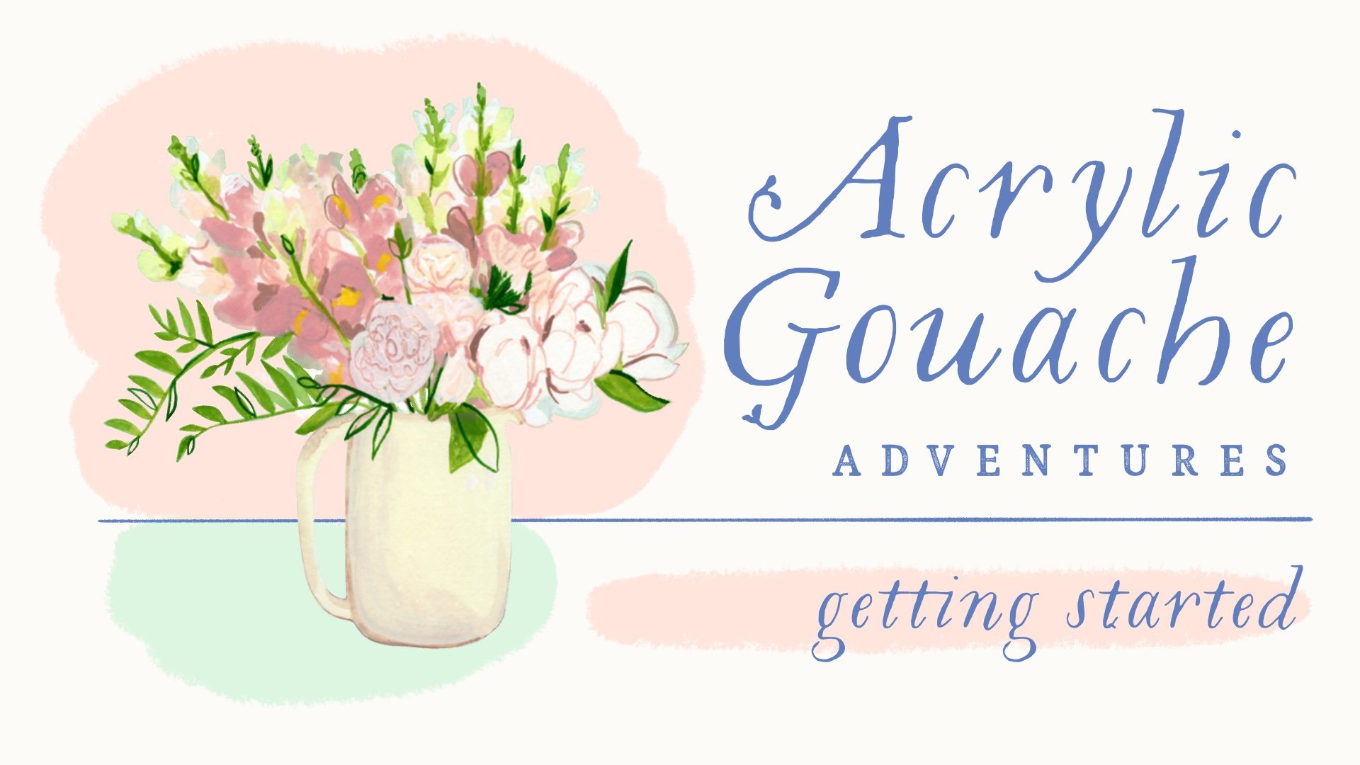
3. Materials: Usually, this is the part of the class where I go over every material I'll be using, but this time I'm doing things a bit differently. Each section of this class will focus on a different mix media material and how it can be combined with acrylic gouache. I'll give a brief overview of the materials before each lesson, but you can also find a comprehensive list of all the materials I've used in the resource guide that you can find in the project section. While I will be using a lot of different supplies throughout the class, there are also a few basic materials I'll be using consistently along the way. First off, acrylic gouache, because it's the cornerstone of my mixed media approach, I'll be using it in each lesson. I prefer Holbein bean Turner brand acrylic gouache because they are bright, highly pigmented, and a joy to paint with. If you want more information about brands of acrylic gouache, check out my introductory course, Acrylic Gouache Adventures, getting started. I'll also be using watercolor or mixed media paper so that it'll hold up to all the different mediums we'll be using, as well as watercolor brushes. I'll be using round or flat brushes, as well as maybe a few filbert that I recently picked up, a jar of water, and something to hold my paint. Now, that we've covered the basic materials for this class, let's jump into a quick discussion of the dairy scale, which is a useful tool to understand the viscosity up paint and other materials.
4. Dairy Scale: In this video, we'll cover what the dairy scale is and how it can help us in our mixed media practice. The dairy scale is a guide to the viscosity or thickness of different mediums. Based on the viscosity or thickness of different milk-based products. It's a way of explaining how thick or thin a particular medium is. From watercolor and ink that are used with the consistency of water, to heavy bodied acrylic, that's more like ice cream. When you're approaching a new medium, the dairy scale can offer helpful insights about the thickness or thinness of the materials you are working with and provides clues as to how you can layer those mediums effectively. While the dairy scale is not perfect, it offers a useful framework that we'll be using throughout the class. Now that we understand the dairy scale and how we can apply it to our art practice, let's move on to the prompts we'll be using throughout the class, to get to know the unique properties of our materials.
5. Prompts: In this video, we will cover what these mysterious prompts are, where you can find them, and how they'll support the approach to mix media where you're using in this class. Let's begin with what are these prompts? The point of this class is to impart a nourishing approach to mix media that is rooted in observation. The prompts are a series of questions we can ask ourselves as we play with our materials to guide those observations in order to understand our materials and how they'll interact with other materials. The prompts I've included will encourage you to observe and react to what you are seeing in a low-pressure environment so that when a material behaves in a way that you don't expect, you can get curious. You can screenshot these prompts right here, or hop on over to the project resource tab where you will find the class resource guide, which includes our prompts, an illustration of the dairy scale, reference images, and even recommendations for further learning. Now let's look at how we will apply the prompts. Each section of the class will consist of a lesson where we will briefly introduce the material we'll be working with. Get that material on paper, engage with our prompts and get curious about how that particular material behaves, also a project. We will take those observations and that sense of curiosity into an actual painting focusing on the process of getting our materials on paper over the final finished product. The reason we'll be applying these prompts to a lesson in a project is to instill that reflex towards curiosity first on something that does not feel very important, this scrap piece of paper and then on a real painting. Our impulse to create something good could easily override our powers of observation. Now that we're comfortable with our prompts, let's jump in to our very first lesson. Acrylic paints.
6. Lesson Introduction: Before we jump into our first lesson, I just wanted to take a moment to explain what our lessons will be comprised of. We'll begin each lesson by creating a rectangle that will be our safe space on a piece of paper, or a scrap piece of paper. We'll label that rectangle with what we'll be doing. In this case, I'm playing with acrylic gouache. Once our rectangle is labeled, we'll jump into making areas of color, and then we'll jump to making marks on our page, all the while asking ourselves our prompt questions, in order to observe our materials closely, and uncover all of that material's secrets. As we're doing that, we'll remember that this doesn't have to be queued. We're just learning about our materials. We'll take all of the observations we've gained into our project for that lesson. Now, let's jump in to lesson 1.
7. Lesson 1: Acrylics: Hello, and welcome to our very first lesson, where we'll be discussing different types of acrylic paints. High-flow acrylics, acrylic inks, fluid acrylics, acrylic wash, and heavy-bodied acrylic paints are all close cousins. They are all pigment bound with acrylic polymer. The difference lies in the viscosity of the paint. This is where our dairy scale will come in most handy to categorize these paints and understand how we can layer them, because they are all a little bit plasticky, so they will fill up the tooth of your page. When combining mediums, you'll want to use the mediums that are closer to water underneath the thicker mediums so that they won't slip and slide and pool in strange ways. Here, we've started with high-flow acrylic paints. They're quite watery, even though the paint looks a little bit thick. You can also spray it with water to make it move around, quite like watercolor. Then we move to acrylic ink, which is about at the mark level on our dairy scale. Then, from there, we move on to fluid acrylics. This is one of my favorites because they dry crazy fast and they're creamy in texture, although you can water them down. They sure do pack a punch of pigment. Moving from there is acrylic wash, the foundation of this class. I wanted to include it here so you can see how it compares to other types of acrylic paint. Then finally, we move on to heavy-bodied acrylics. They are thick as heck. You can actually use them in three-dimensional ways to create sculptural, textural effects in your paintings. When you move to a medium like heavy-bodied acrylic, you may want to consider switching to a firmer boar hairstyle brush, because that brush will absorb less water and give you more control over sculptural effects while you're painting. I'd also add a friendly reminder that the quality of paint that you buy will affect the amount of pigment and type of polymer in that paint. As you can see here, the comparison between this $2 bottle of Crafters acrylic and this $20 bottle of Golden Artist quality. Fluid acrylic is quite striking. There's just a lot less pigment in that $2 tube of paint. That doesn't mean that you can't use it, but if you are finding it frustrating, that your colors look washed out, it might be because of the paint that you're using. The other thing to note is that while most acrylics are shiny, they can also be matte, like acrylic wash, or this flat matte acrylic from Golden. Now, let's jump into experimenting. I've already created my safe space and labeled it playing with acrylics. I'll start by creating areas of color in the different acrylic paints that I have, starting with high-flow acrylic, acrylic ink, fluid acrylic, and heavy-bodied acrylics. I switched to a boar hairbrush for the heavy-bodied acrylics just to see what textural effects it can create, and there are some very yummy brushstrokes in there, but I also wanted to try out a synthetic brush so I can compare the effects I get with these different tools. This will help me with all of my mixed media paintings to really understand what effects I can create. I'm also going to use some of this so flat matte acrylic, and it paints gray to compare it to the other paints I've already used so that I can engage their opacity and just see how these materials all work together. I'll just create another area of color. This is the point at which I'm going to start playing with a few of the other prompts. In this case, how does this material behave if I add more water? I'm particularly interested in the high-flow acrylics, fluid acrylics, because I know that they can flow really wonderfully when you add water to them, and you can already see the dramatic effect. I just want to make sure that the high-flow acrylic is part of the party. Frankly, it doesn't flow quite as impressively as the fluid acrylic, which is a bit of a surprise to me, but that's okay. That's why we're doing these experiments, so that we can observe our materials rather than assuming we know what they'll do. As we wait for our areas of color to dry, let's make some marks. Fluid acrylic is actually going to work a whole lot like acrylic wash in mark-making. It's going to make clean, precise lines, but it is quite translucent. As you layer your paint, you'll be able to see the lines you've made underneath through the paint on top, especially if you let it dry into clean layers. This can be an absolutely great way to add shadows because there are some translucency in it. Making shadows with an opaque medium can be more difficult because you have to mix a very precise color, whereas with a translucent medium, you can rely on a little bit of the color underneath peeking through. I'm just continuing to make more marks to understand this medium a little bit better and the effects it can create. Now, I'm just going to make sure that the areas of color I've created are dry so we can test that they're waterproof and play around a little bit more. Now generally, acrylic paint dries crazy fast, but I have used a lot of water in some of these areas. I just want to make sure they're perfectly dry. If I mess around with an area before it's perfectly dry, it can leave a weird white patch like this where the pigment hasn't really appeared to the page, but you can definitely see that all of these are very waterproof. From these experiments, we can see that acrylic paint has translucency that is really yummy. It can flow well with water, create great shadows, and can get some very yummy textures, especially when we change our tools or brushes. Now that we have a thorough understanding of how to get started with acrylics, let's jump into our very first project.
8. Project 1: Acrylics: Hello and welcome to our first project. While we won't do this for every lesson, I wanted to start off by covering how I sketch my simple flowers. I start off in Procreate because that's where I find it easiest. But you can use these techniques whether you're working on paper or on your iPad. While this canvas is the same size as the paper I'll be using, I also like to use a drawing guide so I can see the scale of my flower. I start by drawing a circle, and if I hold it, I can create a perfect circle. If you're using pen and paper, you can just use something from your desk that is circular to do the same thing. I can use the arrow to select my circle to move it around, and then I'll create a new layer to create another circle. That's really the basic shape of any of these circular flowers, just two circles. Align them up and that way I can use the larger circle as the guide for all of my petals. I can increase or decrease the size of that center depending on the flower I'll be drawing, whether it's a big middle flower, like a sunflower, or something with a teeny-tiny middle, like a cosmos. This is the point at which we want to start to keenly look at our reference photo. What shape are the petals? How much did they overlap? Do they have a sharp point at the end, or are they more rounded or squared? These are the things we want to pay attention to, to make our flower look like the flower we see before us. In the case of this gerbera daisy that I'm sketching, the petals are rounded at the end. They lay in two separate layers and there's a roughly bit near the center of the flower. The other thing to consider as you're sketching your flower is that flowers, while they seem like perfect, beautiful creations of nature, they're not. They're full of beautiful imperfections. As you're sketching, embrace that. Your flower doesn't need to look perfect. Some petals will overlap more than others, some petals will come out of a wonky angle. As you're painting, you can either correct these kooky bits about your flower or you can leave them and it can become part of your own personal style. Now, I just need to add the roughly bits at the center of my flower and the second layer of petals, and then I'll be ready to transfer the sketch to watercolor paper and get started on my project. I like to tape my watercolor paper down in that way. First of all, I don't move it out of the frame of the camera where I'm trying to film, and second of all, it makes it so that my paper doesn't warp or wiggle as I am trying to paint. If you're going to be painting a background, taping down your image can also help give you crisp, clean edges, but I won't be using a background on this one. I'm also going to grab a piece of scrap paper to leave next to my painting. I do this anytime I'm painting, and I use that piece of scrap paper to test out any colors or textures or anything really that I'm uncertain of. I'll leave it here, so I don't lose it. Now, I'll begin to look for the right colors to create this gerbera daisy. I'm thinking that I could use my heavy-bodied acrylic paint to create texture at the center of the flower, and I could use my fluid acrylic in order to create shadows and shading because it's translucent. Because I'll be using both of those paints on top of my acrylic wash, I'll begin by painting a base layer in acrylic wash, starting with the center of the flower and then moving on to the petals. I always dilute my acrylic gouache to 50 percent paint and 50 percent water for the maximum amount of workability. Just ignore that dangling cut hair on my brush. Unfortunately, Penelope's hairs get everywhere, and if I was doing something detailed, I probably would've cleaned it off, but I'm not. Now, I'm going to turn my mind to the colors I'll use for the petals. This is where I grab my trusty swatches. I use them for everything. I'm going to do a variety of different tones that I'll mix as I go. For each color that I mix, I'll paint a few petals at random so that it looks like they're equally dispersed around the flower to give this flower tone and dimension. Now, that I have a base layer of color over the whole area of the flower's petals, I'm going to start to work on that textured area of teeny-tiny petals near the center of the flower. I'll be using heavy body acrylic because I think that the viscosity of a heavy body paint could work really well to add texture to the flower. I started using this titanium Mars pale color, but I'm worried that it's going to blend in too much with the petals of the flower. So I switched over to this buff color instead, which I think will allow for more contrast. I'm also going to switch to this filbert style brush, the rounded shape of the bristles is actually perfectly suited to making these tiny short petals. I'm going to use as little water as I possibly can in order to make really expressionistic brush-stroke marks that will mirror the petals on this particular flower. I'm creating thick, juicy, and rather opaque brush strokes. Then I'll layer with whites and browns from the middle to create the layered effect of the petals. When you're working on an area of your flower that feels really complex like this, just remember that it doesn't have to capture every teeny-tiny little petal. This area of texture can be captured with bigger brush strokes or a linework or any other way that you feel like capturing it. A painting is your interpretation of what you're seeing and doesn't have to reflect what you actually see in front of you. At this point, I also want to remind you that we're observing right now. For me, I thought that I could create really crisp areas of color with this acrylic paint and I'm finding that it's ending up a little bit more dry brushy than I had intended. That's okay, that's just a creative problem I'm going to have to solve as I continue to make my way through this. How can I add more texture and dimension and shadow into this area so that it reflects the flower that I want the paint? One thing I know from the experiment we did with our acrylics is that acrylic paint dries very quickly, it's waterproof, and I can paint on top of it with acrylic wash. Those are things I'll be considering as I plan how I'll solve this creative problem. The next thing I'm going to do is to use some white paint to add some highlights to that roughly petally section near the center of my flower. One of the magic things about working with acrylic paints, and especially an opaque medium like acrylic wash, is that you can keep painting things layer upon layer upon layer until they feel right. Sometimes when I'm trying to make layers of texture like this, that's also when I'll grab for a Posca pen or one of my Molotow paint markers. They are paint-based markers, so just paint that is thin like acrylic ink inside of a marker. They can get clogged, but they can create beautiful, opaque, precise line work. I always like to test things out on my scrap paper before I put them onto my painting, especially with a paint marker like this that can clog. These paint marker has help me add the scribbled effects I like that can be difficult with a brush because a paint marker has a consistent linewidth and can be held just like a pen. Now, I'll move into creating shadows with this fluid acrylic. I'm going to create shadows in the center of the flower in that petalled area and then I'll start in on my petals. I'm using the fluid acrylic with quite a lot of water to maximize the translucency, so I can get really soft shadows. Now that we have the shadows on our petals, let's start adding some highlights. You'll notice that in the reference photo, most of the foreground petals have light tips of a paler color. I'm trying to emulate that, but I'm also not going to make quite so much detail mostly because I'm using acrylic paint that's quite thick and it's not really the ideal medium to be creating really fine lines that are very opaque. Since I want to stick with using primarily acrylic gouache and acrylic paints for this lesson, I'm going to interpret the highlights in the way that I choose. Also, because I want to keep this painting having a similar small palette, I'm using the same top that I used in the center of the flower to create the highlights on the edges of the petals. Now, strictly speaking, a lighter pink would probably have been the right color if I was going for a more realistic interpretation of this flower, but I am an artist and I'm free to interpret the colors anyway I choose. As I'm adding highlights to the petals, I'm also adding small bits of detail to the center of the flower because I'm still not quite happy with it. My goal at this point in the process of painting is to really observe my painting closely. At this point, there's enough information on the page that I don't even necessarily need to check in with my reference photo very often. I'm looking at my painting to see where light would hit the flower that I've created on the page and where the shadows would lie. Let's speed things up event so you can see how these further refinements progress. It may also be worth noting that while you're painting, some of the highlights or shadows you may add, may feel like they don't have a huge visual impact, but the reality is that they do, even when you're not sure that they are having a big pop, small variations in light and shadow can make your painting a whole lot more dynamic. Now, I'm going in and adding more translucent fluid acrylic to create the shadows at the center of the flower to make it feel like that center bit stands out. I'm also adding a bit more detail with this Posca pen to define the center of the flower. That being said, I think it needs, yes, a bit more contrast just like that. I'm going to add a bit more of the pinky color as well, just to make the center of this flower pop. It really is the focal point since it's the area of the flower with the highest contrast. I'm always going to go through and soften those highlights, shadows that I create using my fingers, and maybe even a few more layers of highlights as well. When you're painting, sometimes it can feel disappointing not to get your center of your flower looking absolutely perfect on the first pass over, but the reality is that that's not the point, building up these layers of color and texture will actually give your piece a whole lot more dimension in the long run. Just a few final brushstrokes to polish up all the little areas that I see that need light and shadows and then I'll be finished. Although I can always go back in and add a little extra paint if I see something that needs work. A painting is only finished when you decide it is. Now, I'm going to undertake this painting and we'll move on to lesson number 2, where we'll cover watercolor and traditional gouache.
9. Lesson 2: Watercolour and Traditional Gouache: Hello and welcome to our 2nd Lesson. This time we'll be covering watercolor and traditional gouache. While acrylics are bound with acrylic polymer, watercolor and traditional gouache are bound with gum arabic, which gives them the ability to reactivate with water, which is why you can dry out wet watercolor into pans like this. Well, traditional gouache is very similar to acrylic gouache. It's flat, matte, opaque, and predictable. Watercolor is a much less predictable medium because of the way it flows, granulates, and shifts color between wet and dry. Watercolor can also be dye based or pigment based. Dye based watercolors will generally be a lot more vibrant, but they won't get those fun watercolor effects of granulation. They'll also be significantly less lightfast in general because dies aren't as lightfast as pigments. Now that we have a basic understanding of what watercolor and traditional gouache are, let's jump into our props to really explore this medium. I've got my safe space ready to go, and it's labeled, Playing with Watercolor and Traditional Gouache. Just like in our first lesson, I'm going to begin by making some areas of color. First with traditional gouache and then with watercolors, so we can really see how these mediums behave. As soon as I switched over to watercolor, you can immediately see the difference in translucency between the watercolor and the gouache. That's the magic of watercolor. You can even control the value of your watercolor by how much water you add. Can also see that I'm using my watercolors out of this dried palette. These are actually all just liquid watercolors that I've dried out on my own to make them more portable. That's another pro of watercolor. They travel well. You'll notice as I mix my areas of color in watercolor, I'm actually trying to connect them because I know watercolor blends pretty well. I want to see how these different pigments blend into each other so I can get a better idea of how it works. Now while I wait for those areas to dry, I'm going to make some marks. First two with gouache, which tends to be a bit chalky, and crisp, and precise. There's not a lot of differentiation in value between each of the marks because the paint itself is opaque. But as we move into making marks with watercolor will see a lot more variation in tone and that's because of the way that the pigment move throughout the paint in watercolor and because of its translucency. Because of this, you can also add little spots of color along your lines in watercolor, and they'll blend together to make very cool effects. When you're working with watercolor, you can also work in a way that's called wet on wet. Because watercolor is the consistency of water, it disperses really freely in water. If you wet your page before adding your pigment, it can create really cool effects. Now you can do this with gouache, but it doesn't really transfer as readily throughout the water because the pigment itself is quite a lot thicker. You'll see when you do it with watercolor, you get quite beautiful little blooms. But that will also depend on the specific brand and color of watercolor that you're using. Because different pigments will behave differently. You can move it around by shifting your page as well because the pigment is so movable, when its suspended in water like this because of its viscosity. Just be on the lookout that you don't have too much water on your page, otherwise you could end up with quite a hot mess. Now that my area of gouache is dry, I want to show you one of the unique things about working with watercolor and traditional gouache, and that is that they reanimate with water even on your page. You can use that to blend areas of color. Although you'll have to keep in mind that, that area that's blended may end up drawing a little bit differently than the main area of your area of color, and you can also use water to lift out pigment even after it's dried. This can be problematic if you're trying to layer things, but can also create very cool textural effects within your paintings. It will work on both watercolors and traditional gouache. Watercolor and traditional gouache can also be blended completely yet for really because they have the same binder. Traditional gouache is just basically a more opaque version of watercolor, so feel free to play with combining these different mediums. The one thing I would advise though, is to pay attention to how much water you are using. While you can't control the value of watercolor and traditional gouache to an extent by the amount of water you have in comparison to pigment, that doesn't mean that your page has to be sopping wet. It's a mistake that's pretty easy to make when you're just getting started. But the risk is when your page is sopping wet that if you try and dry it, if you shift it slightly, it's going to end up a soupy mess. For example, let's check this mess out. I just wanted to see how these materials would flow the little spritz of water, another spritz. You can see things are starting to get a little bit messy. One thing to consider is that when you use this much water, your page will start to warp and also all your colors will start to blend together. You'll lose that differentiation between the different tones you've built up. Also the water will flow for really along your page and if you try and do something crazy, like blow it dry, it's going to push all of that pigment around and you'll lose any of the details you've created, which can certainly be frustrating. It's something to pay attention to. The other thing I would note is that when you use too much water like this, it tends to create this situation where your watercolor dries with all the pigment pushed toward the edges, you can see a really crisp outline and that's not what we want now, is it? Now that we've finished this experiment, let's observe. What do we think that watercolor would be wonderful at? For me it's the beautiful granulation and graduation of color. I'm probably going to use it in such a way that I'm using more than one color mix together. While also being cognizant of the amount of water that I'll use. Because watercolor is also at a water level on the MOOC scale, I'll be using it underneath acrylic gouache because it won't behave quite as well on top. Now that we're finished this experiment, let's move on to our 2nd Project.
10. Project 2: Watercolour and Traditional Gouache: Here we are in project number 2, where we will be creating a painting using watercolor or traditional gouache. In this case, probably watercolor because I'll also be using acrylic wash. The flower I've chosen to paint will be a zinnia. Something that could be quite complex to paint if I were using just watercolor, but having the option to switch to an opaque medium like acrylic wash will make it so much easier. I'll begin by wetting each of the little wells color that I want to use in order to reactivate the dried watercolor. Then I'll start to mix a color. While my reference photo is incredibly bright, I want to do something a bit more muted because it's more true to my style. I'm mixing this red and also I'll mix in some brown too. Because there is a significant color shift with watercolor, it can be helpful to test some of your color on a scrap piece of paper to see how it dries. But that is not what I did. I decided to just jump right in. Any creative problems that came up were things I was pretty sure I could figure out. The unique qualities of watercolor that I'm looking to highlight in this painting are its translucency and granulation. I will be mixing colors random between my two paints as I fill in these petals. I'm looking to create blooms and little unpredictable areas of color wherever I can. I'm not trying to make them consistent. Now I'll proceed to fill in all of my petals. As you can see, we've built up a whole lot of layers using just two colors of watercolor and varying amounts of water. That's the magic of watercolor. Because it's translucent, you can create so much depth just by layering or combining even a small number of colors. Now that some portions of this painting are dry, you can also see the way in which watercolor shifts color quite considerably once it's dry. The paint looks a lot more vibrant as you lay it down on the page, but can shift quite dramatically as it dries out. Now that I have a base layer on most of my petals with watercolor, I'm going to start looking how I can add more depth to this painting using acrylic gouache because it layers so wonderfully and because it's opaque, but I'm not quite sure which color I'll be using. It's at this moment that I'll start to use my color chart in order to see what colors I think might work. I'll be testing each color on my scrap piece of paper because it's hard to see how they'll combine until you see them on paper. This color is not quite right, since the colors in my watercolor portion of this painting have dried a little bit more brown than maybe I had anticipated. This bright fuchsia color will probably fight with my artwork more than it will compliment it. Because I'm not sure if this color is quite right, I'm testing it a few times just to see if different viscosities of paint, whether there's more paint or less paint, really affect whether this color will work with my painting. Because acrylic gouache is opaque, I'll have less flexibility about the amount of variation I can get in my colors as I'm painting. Because acrylic gouache doesn't shift colors from wet to dry, I can get a clear idea of how these colors will work together just by testing it out. I don't have to wait for it to dry to see whether the color is complementary to what I've already painted. I'm trying out a different more peachy color now, but I'm also not sure if it's going to work. One thing I can say is that if you're worried when you're working with something like acrylic wash that can't be reanimated about wasting paint when you're mixing colors. Don't be. Anytime you're creating art, it can be very easy to fall into that concern with wasting your materials because they are precious, they're not cheap. They come from all over the world. They are in very fancy bottles and tubes. But the reality is, is that art supplies are meant to be used. If with something like acrylic wash, you have extra paint in your palette and you don't want it to go to waste. You can do what I do and have a separate sketchbook where you use that extra paints to create backdrops or blobs that you can add textures or patterns or paintings on top of later. It can be a great way to free yourself from that concern of wasting your materials. Because the reality is, is that that's not really a healthy place to create from. It makes your resources feel scarce and puts you in a mindset where you're afraid to try new things. Being an artist is really all about trying new things. Like in this case, I'm going to try a new color because I don't think this peach is working either. To truly create the contrasts that I want to create in this piece, I think I'm going to have to reach for a darker color. In this case, I'm going with something true to the original inspiration photo for this piece. A rose violet that is wonderfully bright and also a bit translucent. I can let a lot of the watercolor beneath that show through. Now that we've added more depth and dimension to all of our petals, I am going to fill in the center of our flower. I'm using the same brown I use to mix the color for the petals, for the center of this flower to keep it cohesive. Now zinnias have a lot of funky texture in the middle of their flowers. But I think I'm going to try to simplify that texture considerably so that the petals can remain the focal point of this piece. I think if I add too much detail to the center of the flower, it will take away from the petals. First, I'm going to add a little bit more contrast to the center of the flower, because right now I'm not sure it's quite dark enough to stand out. I'm filling in with a sepia color to really make the center of the flower pop and does it pop. I'm certainly at the point of this painting now where I have to let the painting speak for itself. The one thing I'm noticing right now is that there are not quite enough highlights on my petals. As soon as I have the shape, the center of my flower just right, I'm going to go in and add a few more highlights and a pale pink color just to make those petals stand out, to make some of the petals feel like they're coming forward in this luxurious, roughly flower that we're trying to paint. Paying keen attention to contrast is always a way to elevate your work. Making sure that you have enough shadows and highlights to give your painting depth. This is true whether you're trying to paint realistically, or whether you're abstracting your subject or painting in a less realistic manner. If value is something that intimidates you, you can get a better handle on it first by working in a monochrome for a while so that the only color decision you have to make is light or dark. Or if you're working with a complex, colorful palette, you can take a moment and just snap a picture of what you're painting on your camera. Switch it over to grayscale, it will immediately show you what the values are in your work separate from the colors. Sometimes I'll even test two swatches of paint on my paper. Then take a photo to make sure that there's enough contrast between two different colors I might be thinking of using. The other thing that might be worth noting here is that I am using a pale pink for highlights, not a white. Sometimes when we use a pure white to create highlights on our art, it can make a really harsh transition and make your image look less realistic and also a little bit washed out. Using a more saturated color that you draw from your piece can create highlights that feel more at home on your subject. Only use white at the areas that are absolutely the brightest. Now that I have some highlights that feel good, I'm going to go back to the center of the flower. I've decided, I'm just going to simplify it by doing some very simple dots. This will give an idea of those complex little flowers that sit at the center of zinnia without adding too much visual information. It also has a really fun folk art element that I am digging. It connects to all the stripes that I've used on the petals of this flower, making it feel almost like a patchwork. Sometimes what happens when I'm using a small brush is that it will drop a big chunk of water because I haven't cleaned all the drops off of my brush. This is more harmful when using a small brush and trying to create details. But you can easily blend out that blob of water and then you can easily paint over it because acrylic wash is an opaque medium. I'm just going to wait for that area to dry so I can fix that. In the meantime, I'm going to add a little bit more contrast to a few areas of this painting. I'm just using the brown I used for the center along with that rose violet to create a slightly darker tone so that I can have a little bit more depth. At this point, I'm nearly to the end of this painting. I'm just continuing to fuss with any little area that I think can use work, adding texture, depth, or detail. But that's all there is to it. Just looking for the parts that still feel a little bit off and seeing what I can do about it. There's no fantastic rocket science to this part of the process. It's just really closely observing your painting and paying attention. I'm also going to fix this little smoosh at the middle of my flower by painting over that area with some of the dark brown paint. I'll re-add my dots as soon as it's dried. This is the other real part of acrylic wash because it's less watery than watercolor, you can blow dry it without any issues. Whereas with watercolor, blow dryer can push your pigment around and generally counteract the beautiful gradations of color that you've created. Now, I think this piece might just be finished. With that, we'll move on to our next lesson, where we'll explore the wonderful world of pencils.
11. Lesson 3: Pencils: Welcome to lesson number 3, pencils. Maybe this is a medium that doesn't scare you, but doesn't impress you much either. After all, most of us have been using pencils to jot down thoughts since we were itty, bitty. But pencils can come in a lot of different varieties for a lot of different effects. We'll look at two broad categories of pencils. Graphite pencils like you might sketch with, and colored pencils that may be bound with wax, oil, or even watercolor. Graphite pencils come in varying degrees of hardness, which will affect the darkness of your strokes, the amount of pressure you need to apply, and how much they will smudge. H pencils are harder, HB pencils are medium, and B are the softest. The more your pencil smudges, the more likely that loose pigment on your page will tint your paint if you paint over it. Moving on to colored pencils, hardness, and pigment will vary by brands. Hobby level pencils will have a lot of binder compared to pigment, which will mute the colors you see on your page. Whereas artist quality pencils will have a lot less binder and will be more vibrant and will probably require less pressure to get beautiful colors. If your pencil is very waxy, you may not be able to layer gouache on top either. So this is something to keep in mind. The other thing to consider is that while most pencils are water resistant, at least, you'll want to keep your eye out for the paintbrush symbol on your pencils. Cross all brands, this will indicate that the pencil will activate with water, which is fun but very problematic if you want to paint on top. Now that we have a foundation, let's play with our prompts. Just like in the previous experiments, we'll start by making areas of color. Now the unique thing about this is that we're using a pencil, not a brush. So making areas of color will be a little bit different. First, you'll notice that the area of color I create depends on the angle at which I hold the pencil. You can see the marks on the page, even as I layer the pencil over top of it. One defining characteristic of colored pencils and other hard mediums like this is that you can't mix colors except for on the page layering a colored pencils. Pencil like this Koh-I-Noor magic pencil is really fun to use because the lead is actually multiple different colors and that creates a whole bunch of dimension on the page. Now let's make some marks with a graphite pencil. In the same way you'll see that the way that I hold the pencil is how the marks come out. I can also use techniques like hatching to create areas of color that have a little bit more texture to them. I'm going to continue creating areas of color and a few of my other pencils. The first thing you might notice is Elena, you have too many pencils, and to that I say, ''Of course I do.'' I freaking love pencils. But you may also notice that you can create areas of color quite easily, although it takes a little bit longer than when you're using a paintbrush. If you're looking to fill big areas of color quickly, colored pencils or pencils in general, may not be for you. Now we don't have to wait for our pencils to dry, but I do want to explore what happens when you add water to these different pencils. Now this first pencil is actually a watercolor pencil and you can see that by adding water, you eliminate all of the marks and lines altogether. Whereas the second pencil can't be reactivated with water and nothing happens. You'll find that different pencils have various different reactions. Most of the colored pencils are waxy or oil-based, so they don't reactivate unless they're specifically watercolor pencils. As we move into the graphite pencils, you'll start to notice that the loose pigment from those pencils will lift up as you add water. It's not significant, but you will notice it, especially if you're putting paint on top of these graphite pencils, things may look a little bit grayed out. This is part of the reason that a lot of artists will use colored pencils to sketch on their watercolor paper because the pigment is less likely to bleed into your work, and even if it does, a colorful color will be a lot more complimentary to your work than a graphite gray. Other thing to note is that when you're working with watercolor pencils like this guy here, you can also draw into wet areas for a fun fact. In this case, you can see that the pencil itself has left a little bit of the linework behind with it. You can also just sketch into it, which will give you a softer pencil line with less of that gritty texture you associate with pencils. Now, let's try making some marks. This is a 5H pencil, which is very hard. That hardness will mean that you'll have to use more pressure to get pigment on the page and you won't be able to create dark areas of color. In opposition, this is a 6B pencil, which is very soft and can create dark areas with almost no effort. The other thing I love about pencils is that you can create marks with a similar thickness quite easily, which makes techniques like hatching very effective. Or you can create little circles or other marks that add texture to your work. The other thing I love to do with pencils is a nice old scribble. Change my grip, which makes the pencil unpredictable and so fluid. I really love doing this and it's not something that you can easily do with the brush. Now that we've finished most of our experiments, I have a much better understanding of where I want to use pencils in my mixed media work. Let's take that with us as we jump into our next project.
12. Project 3: Pencils: Hi, and welcome to project number 3, where we'll be covering pencils, one of my all-time favorite mediums. Well, you can use some colored pencils underneath acrylic gouache. My preference is to use them on top of acrylic gouache because they add a really yummy texture. I'm going to start this painting by getting down a base layer of paint. This painting also comes with its own unique challenges because I'll be painting this white flower. It's a type of daisy that frankly I don't know the name of, but that's okay. When you're trying to create pale white petals on a pale white sheet of paper, it can be helpful to incorporate other colors in order to add depth and dimension to that flower. Also, pale white flowers aren't all white. You'll see that they still have a ton of shading and highlights. There are areas that are darker and areas that are brighter. Now, I'm going to move on to starting the yellow center of my flower. I want this to be really flat and opaque, so it'll contrast with the colored pencil that I am going to put on top of it. One thing you may notice, this point in the process is that acrylic gouache does tend to fill up the tooth of the paper, especially if you're working on a smoother paper like I am, but don't even worry about that. I've got a little trick up my sleeve that I'll show you when we get to that part of the process. You'll notice that I am using a fairly small brush for this part of the process, and that's because that is just my preference. Feel free to use a bigger brush to fill in bigger areas of color as you wish. Using a bigger brush can also be an incredible way to add more looseness to your work because you have less control when you have a bigger brush that you're working with. As soon as we filled in the center of the flower, I'll continue this under painting by beginning to paint the petals of this flower. I'm planning to use a variety of pale colors to make my petals really pop. I also want this to feel a bit magical because I love the shape of those petals. I'm using a pale peach, a pale purple, a pale blue, and a gray as well. That's more neutral in order to ground out the piece. I'll also leave some of the petals white and outline them in colored pencil to really create more depth. Because acrylic gouache doesn't reactivate with water and can dry out, I normally wouldn't mix a whole bunch of colors all at once. I normally mix things one at a time but in this case, I want to be able to make sure that all of these different colors feel balanced around the outside of my flower. To do that, I'm going to be painting more than one color at once, just keeping an eye on the composition. I'm also adding a little bit more water than I would usually use because I want there to be some transparency in these colors and I want to make sure that they are very soft pastel. Now, let's start painting our petals. Now that have a base layer of color down, I'm going to whip out my favorite secret weapon and it's clear gesso. A lot of times when we're painting with acrylic gouache, it can fill up the tooth of the page and make it hard to use a harder medium like colored pencils on top and get crisp, bright pigmenty color. I use clear gesso over areas of color and anywhere where I want really nice, crisp pencil lines. Because the gesso adds some of the tooth back to my paper, I don't have to use as much pressure to get a nice amount of pigment out of my colored pencils. That means I don't end up carving into my page and leaving waxy pale lines behind. Clear gesso is a medium that's generally used, prep canvases or wood panels for painting on. The other thing I love about working with clear gesso is that it actually creates more tooth for my page when I'm working with acrylic gouache as well. Sometimes if you've built up a lot of layers of color, you can get a plasticky finish that makes your paint move around in a weird way. Gesso can work like a reset button that gives your paper back it's tooth and lets your paint sit exactly where you want it to. The other thing worth noting is that gesso can have a slight sheen to it, but I find it's not shiny enough to really detract from the matte beauty of acrylic gouache. Gesso can dry quite quickly so I like to reapply to make sure that I have a thick even layer that will pick up the pigment from my colored pencils. I usually just apply until I've used up all the gesso I've squeezed out. That way I don't waste any. You'll also want to make very sure that this area is 100 percent dry before you try to use other mediums on top like colored pencils or even further layers of gouache. The gesso can only work as a barrier if it is perfectly dry. At this point, I'm starting to choose different colored pencils to begin adding more details to this daisy. I have a few colored pencils in different values of warm gray and that is where I will start. When I'm working with colored pencils especially, I tend to test my paper a lot. The color of the actual pencil often has very little to do with the color of the pigment that's going to come out of that pencil, so it's best to test before jumping on to your painting. Especially when I'm dealing with value, I want to make sure that I've got that right. I want these petals look as if they're pale, white petals, not something darker. I'm just going to sharpen my pencils in order to ensure that I'm going to get crisp lines, but maybe don't do this over top of your paper because you might get little pencil crumbs on your paper. That's not what we want. Now I'll begin to make some linework using my colored pencils to form petals. I'm using the lightest color of warm gray I own, in this case warm gray number 1 so that it'll look most like a pale petal color. I'm overlapping these petals with the petals that I've already painted in order to make my flower looks like it's lush and full of petals. The other thing that we can observe as I'm working with this colored pencil is how quickly and effortlessly it makes linework. Because I love colored pencils so much, there was a long period of time where I thought of colored pencils as cheating. Like I would switch to them because they were easier and that somehow made my painting less valid. But if there's one thing I want you to take away from this mixed media class is that there's no such thing as cheating. That's part of the joy of mixed media, is that you can always reach for the right tool for the job. If you're looking to make something with a lot of texture you can reach for pencils, but if you're looking for flat color, you can reach for gouache. If you want granulation, you can reach for watercolor or portability. Each material has its own skill set. You can use that to your advantage to make art more quickly or to just make art in a way that feels more joyful to you. Now that I'm finished with the petals, I'm going to move on to adding detail to the center of the flower. It's one of my favorite parts of this particular flower that it has so much beautiful texture. I'm just testing pencils to find the exact right shade to start adding details. Then I'll sharpen my pencil so that I can make crisp marks on the page. While we were playing with our pencils during our lesson, one of the things that I found a particular interest was the way in which you can get clean, precise marks when you're working with a colored pencil. Because of that, I'm going to try and make a variety of hatches and circles to recreate the textural details at the center of this flower. Because of that, I'm going to have to sharpen my pencil a lot. I need to make sure that these softer pencils remain sharp so I can create crisp lines. I'm also using a variety of color in order to create depth. I'm using a lighter color to create the marks where I think that the light would hit this particular flower and a darker color, where I think that the shadows would land. With those last few pencil marks, I think we're done. Now that we've finished this particular project, we can move on to lesson number 4, where we'll cover PanPastels and soft pastels.
13. Lesson 4: Soft Pastels: Hello, and welcome to Lesson number 4. We're more than halfway through the class now. We'll be covering soft pastels in this lesson. Pastels are a very cool medium. They are the closest you can get to using pure pigments, since most soft pastels are just pigment with a minimal clay binder. That's why when you're working with pastels, it's actually referred to as painting, not drawing. They range widely in hardness from the softest that will even cover your hands when you pick up those pastels, to the hardest that can create finer marks and details. Pastels can come in small blocks or nuggets as well as pencils or pens. Now that we have a basic understanding of this medium, let's jump into our experiments. We'll begin, like we've began all of our experiments, by creating areas of color. I'm using this Jackson's handmade soft pastel in this fluorescent pink, which immediately comes off on my hands with even the lightest touch. Which is why when I'm using it on the paper, I'm using a very light touch to spread the pigment. If I press too hard, it's going to leave a tone of dust on the page. I can also change the grip and use the side of the pastel to create marks as well. Areas of color. You'll see that you can see a lot of the tooth of the page and that's just because of the nature of this particular pencil I'm using. In comparison, these pastel pencils from Conte are a lot harder, it can give you more fine marks and details. Next step, PanPastels. These ones come with all sorts of funny little makeup tools that you can use to spread out the pastels. You can also blend them well with those tools or your hands. I'm always going to use my hands to blend things because it makes a delightful mess. The next pastel I'm going to use is this harder pastel from Prismacolor. You'll see that it creates finer details and doesn't blend quite as easily as that Jackson one at the top there and that's the difference between hard pastels and soft pastels. Soft pastels are so soft and smooth that you can blend out almost all marks altogether. Whereas a harder pastel is going to leave some marks on the tooth of the page even as you blend it out. You can also use pastels to create different types of marks, like these scumbling marks I made with the edge of the pastel. The other thing to note when you're working with pastels is that you can't mix colors just like with pencils. All of your mixing has to occur on the page. You can do this by overlapping your pencils or by using their smudginess to blend them together. Now these two colors may not have made the smoothest blend, but you get the point. You can blend on your page with pastels. When you're just getting started, it's probably valuable to note that you don't want to blend very dark and very light colors together. It will be a lot harder. Starting with mid-range colors makes it a lot more forgiving. Now I'm trying out this Schmincke pastel. It's probably the softest pastel I own. They are quite a lot more expensive than those square pastels you see below and you can see how readily the pigment transfers even just to my hands. They're very, very soft. You can create some finer marks, but it's not going to be the easiest with the soft pastels. That being said, blending them out into smooth areas of color is so easy. Now I'm going to take a minute to make some room here so that we can test how these pastels behave if we combine them with water. Now, a lot like a graphite pencil, pastels don't really activate with water. What really happens is that the water combines with the loose pigment on the page and becomes more mobile. This effect will be more pronounced on softer pastels. You can get rid of almost all of the marks and create these very ethereal, cloudy effects with the pastels. With a harder pastel like this yellow ocher, some marks will be left behind because the pigment is pushed more firmly into the page. You can see this again with the Conte pencils that we used. Most of the marks are left behind and some of the loose pigment moves when we add water. The defining characteristic of these pastels is their smudginess. I just want to play a little bit more with how I can move them around on the page to create different effects. Like for this line, for example, I can smash it in the direction that line goes just to create some softness, which, man, would be beautiful for a landscape. You can also use the smudginess of the pastels mixed with a paper to mask out portions of the page to create crisp lines just by blending the pastel over the edge of the page. This is one way you can get past the fact that pastels really aren't the most ideal with fine lines and details. You can use a paper template to create a more crisp line. Now that we have a more thorough understanding of how we can use these pastels to their best effect, let's move on to our fourth project.
14. Project 4: Soft Pastels: Hello and welcome to our fourth project. In this project, we'll be working with soft pastels and I'll be painting a sunflower. I thought that the gritty texture of soft pastels could be really incredible to create all the texture at the center of a sunflower. I wanted to play with shading. Because we discovered in our experiments that passed out leaves a ton of loose pigment on your paper, I'm going to start by creating an underpainting because I don't think that acrylic wash will work very well on top of pastels. I love the warm, pale color of the sunflower in the reference image that I've chosen. I'm mixing a little bit of coral with a pale Naples yellow in order to get closer to that tone. But I don't want to overdo it. I'm also using just a plain old burnt umber for the center of the sunflower. I love that it's a bit translucent and that it's dark enough that the pastels will really pop on top of it. That's another wonderful thing about pastels, is that because they are just pigment and clay binder, they're quite opaque. Once I finished filling in the center of the sunflower, I'll start working on the petals in that yellow color that I've mixed. Just like in previous projects, I will use varying amounts of water to create different tones so the petals look three-dimensional and buried. Now that we're done painting all the petals and the center of our flower, we can get to work with our pastels to create highlights and shadows, and texture in the middle of the flower. Now full disclosure when you're trying to create shading with pastels, it's best to start with a mid-range color and work darker or lighter as needed. But I actually have zero mid-range colors, especially in my PanPastels. I'm not sure why? But when I purchase these PanPastels, I ordered only dark earth tones, which is not really the palette that I use in my work. But we're going to give it a solid effort. I'm also really intrigued by these funny makeup tools that come with the PanPastels. I want to see how I can use these shapes to add shading. Now you can immediately see that this is quite dark. One of the advantages of pastels is that there are pigment-based medium and I can erase them to some extent with an eraser. I can also smudge them to soften them. I'm trying to keenly observe my subject, as well as my painting itself in order to determine where these shadows will be. I'm also trying to follow the shape of the petals, even though I'm using this unpredictable, unwieldy tool. If I were trying to create a sunflower that looked very realistic in pastel and gouache, I would probably need a lot more colors because I'd want to have a range of colors that I can blend out to create areas of color in graduations, to create tone and shadow. But that's not what I'm doing here because I have such a limited palette of one small cheap set of pastels and just dark earthy colors in the PanPastels. I am just playing to see how can I create effects that I like that evoke a sunflower. As I'm using this funny unwieldy tool to create shading and shadows, you'll see that I'm often making marks that are not quite where I intend them to be. That's actually why I'm using this tool. I want to let go of control a bit to see what effects I can create. Often when we're working on a real painting, even if it's a low-pressure painting that we're not creating for a client or giving to a friend, we can get into our own heads and be too afraid to make mistakes. By reaching for a tool that almost makes mistakes inevitable, I can let go of that feeling of perfectionism and find a lot more joy in my work. That can also be the joy of reaching for these mixed media materials in the first place. I'm pretty comfortable with gouache. When I'm just using gouache, I can end up in a very perfectionistic place because I know the results I can get and I know how to get them. But when I switch to a material like pastels that I'm a lot less comfortable with, it can open up a whole new realm of exploration and observation. Because I need to be keenly aware of what I'm doing at every moment. I can't take anything for granted. It also leaves me with so many opportunities to practice my skills for creative problem-solving. I know how I can solve problems when I'm working with acrylic gouache or colored pencils, which are my safe place. But I don't necessarily know how to solve certain creative problems when I'm working with a material like pastels. Especially in this case, shading. I could have just done this in gouache using a watery gouache. But finding a new way to solve this creative problem of adding shading and dimension to my petals is a lot more interesting. Now I'm moving on using those same techniques on the center of the flower. I absolutely love the texture of the center of a sunflower. It has so much interesting texture. I'm using this PanPastel and just my bare finger to try and mirror those textures. I'm also using more of these funny's spongy tools that came with my PanPastels to see what textures I can create. I think that these are such a fun challenge. It may also be worth noting that all of my little tools from my pen pastels are absolutely disgusting, these can be washed just in water and a little bit of soap if you need it, but I have not done that. Speaking of keeping things tidy, it may also be worth noting that when you're working with something like chalky soft pastels, you may want to keep a spare rag next to you as you're working to clean off your fingers because those soft pastels will transfer to your fingers and can make a mess of your work if you're trying to smudge things around. I'm now adding a earthier green because I only have dark earth colors to my composition to try and add more depth to the center of this sunflower. I'm also going to use my scrap piece of paper to see if I can use some of these other colors to create shadows for the sunflower. Now, I tested this brown on my scrap paper and it looked great, but there's not quite enough contrast between that brown and the brown I've used to paint the center of my flower. I'm testing out a black as well, but I'm worried that that is going to be too harsh. I'm afraid to use it. I'm going to look for other solutions in order to add contrast to the center of my sunflower. Learning to trust those creative instincts is integral to making the art that you want to make because you don't want to feel like you're pushing yourself off a ledge with nowhere to land. In this case, I'm going to try and use the side of this pale orange pastel, by snapping a piece off in order to get a bit more texture in the middle of my flower. Instead of shading in a heavy way with an area of color like I did with the other ones. I'm actually trying to create light marks here that will add extra visual interest to my flower. Because I know that this is a harder pastel, I know that even if I smudge out these lines, some of the marks will remain on the page. Now, I think the center of this flower still needs a bit more detail, so that's when I'm going to come back in with acrylic wash. There's not a lot of loose pigment on my page, I've been quite careful. I think that by adding some extra texture to the center of the flower, it will make things come together a little bit more. I'm going to create a series of dots around the edges of that middle of the sunflower; dots are a recurring motif in my work. I love how they make everything look, and so that's what I'm going to use. Although I'm mixing some of this color with the pale peach next to it to make a slightly softer color. I think that this will work better with the reference image that I have and the overall effect I want to create. Right now I'm using quite a big brush to make these dots, but I'm using quite a small amount of pressure so that only that just tippy top of the brush is making contact with the page. In opposition with my watercolor project, this time, I'm trying to make unpredictable dots that overlap to create the textures of a sunflower. I'm not looking for something precise. I'm also using a mix of the pink that I just mixed and the yellow that I used to create the petals of my flower to draw those petals into the center. Now, this paint that I'm using is quite translucent. I know that as it dries, it will be less opaque on top of this deep brown color. Because I'm working with acrylic wash that's quite viscous, I can use my handy dandy blow dryer to speed up the process because I'm impatient. Now that everything is perfectly dry, I can keep adding more layers of color. Now, I think I'm going to go through with that original brown I used for the middle of my flower to add some additional shading and texture. Now, I'm just going to add some additional detail to the petals as well. Now, it's just a process of adding few final details to this painting. Just keenly observing what I see before me and assessing what I think the painting needs to feel finished. In this case, it's a few more shadows of my darkest color here, as well as a few more lines and details on some of the petals to make this flower feel balanced. You'll notice that I use some of that darker yellow ocher on some of my petals, as well as some of that original yellow than a mixed for the petals themselves. Now, I'm just going to add one final bit of detail to that middle of my flower because I can't help myself, and then I think I will call this painting finished. Now, we'll move on to our next project, where we'll cover oil pastels and crayons.
15. Lesson 5: Crayons and Oil Pastels: Welcome to lesson number 5, where we're looking at oil pastels and crayons. It may feel funny to look at oil pastels and crayons together. To me, oil pastels feel very fancy and professional. Crayons make me think of kindergarten coloring books. But the truth is, they have a lot in common. Oil pastels are just none drying oil, wax, and pigment, and the crayons, they just keep the oil. They're just made of pigment and wax. The amount of pigment will depend on the quality of your materials, from cheap crayons to fancier artist quality supplies. Now, let's jump into our experiments to see how these materials behave. I'll begin by making areas of color just like we have in every other experiments. In this case, I'm going to stick with the same color families so we can compare the quality between the cheaper crayons, the artist quality crayons, the cheaper pastels, and the artist quality oil pastels. The first thing you may notice looking through these areas of color is that the cheaper quality materials both in crayons and oil pastels have a lot more whitespace inside of them, and that is the binder that holds those particular pastels together. More expensive artists quality materials will have less binder and more pigment. Now, I'm moving on to adding water at each of these areas of color just to see how they behave. Now, you might think that wax crayons would be resistant to water, and that's where you'd be wrong. You can see that the pigment immediately starts to activate as soon as you add water. Now as we move on to these crayons, I just want to note, these are actually fully a water-soluble. They're meant to reactivate with water. You'll see that the color is actually quite smooth and pretty when you add water, it can be a great way to add softness to your crayon pieces. In comparison, the cheaper quality crayons that aren't meant to be water-soluble don't really reactivate so much as the pigment moves around on the page. This is another way you can really pinpoint how much pigment is in these different materials versus how much binder. That's where all the whitespace comes from. The colorless binder that holds the pigments together. Now we'll move on to adding water to our oil pastels to see how they behave. Now, you would be right if you had assumed that this is not going to reactivate them, that non drying oil actually makes it so that the pigments don't reactivate with water. Now, I would advise against using water on top of your oil pastels, but only because, especially with a high-quality oil pastel that's quite juicy, you're going to actually pick up some of that pastel on your brush. As you can see with the purple here, I'm not reactivating the paint. I've actually just got some of that very creamy pastel on my brush and I'm going to have to wash my brush to get it out. Now, this is a great moment to point out that this is the reason you're going to want to use crayons and oil pastels on top of acrylic wash in general. Now let's move on to making some marks. Now I really love these giant oil pastels you can get from sceneries. They are crazy expensive. You'll want to make sure you're getting oil pastels, not their oil sticks, which are totally different thing. But they can create really beautiful naive marks, and are great if you're working big. But these same pastels also come into smaller, more manageable size that will give you easier ways to make fine lines and details. That being said, fine lines and details are not really the strength of oil pastels. When you reach for something like oil pastels, you're probably looking to be loose, and gestural, and maybe a bit more naive in the way that you work. The other magic thing that you get when working with oil pastels and crayons is texture to the max. Every line has a ton of texture and areas of color to as well. When you're working with crayons, if you do find that you need a finer tip on your crayon because you've worn it down. You can just sharpen it like you would a pencil. Although maybe not on top of your work. Just like with a pencil, this will give you the ability to make more fine lines and details, keeping in mind that a crayon is going to wear down quite quickly. It will not maintain that fine point for long. Just like with pencils, the direction of your strokes and how you hold your pastel or crayon are also going to affect how much texture you can get. Making circular marks or hatching marks can all create different types of textures, as well as the amount of pressure you apply. The other thing I love to do with crayons is layer them. Because they do have some translucency, you can layer them over top of each other. They're very creamy and this can create different variations in tone. The other thing I want to draw attention to as we focus on oil pastels is the way in which oil pastels can be blended. Now they're thick and creamy and oil pastels in particular will never dry out. They are made with a non drying oil. You can use your finger or any other tool meant to smudge and spread pigment on the page. But you'll want to make sure you're using different fingers for different colors. You'll also want to make sure if you're smudging colors like this in order to blend them, that they are very close together. Oil pastel doesn't spread in quite the same way that soft pastel does. Now that we have a more thorough understanding of this material, let's move on to our very next project.
16. Project 5: Crayons and Oil Pastels: Here we are at the beginning of another project. This time we'll be covering oil pastels and crayons and a mystery flower that I don't know the name of because the website where I got it just called it red and yellow flower. I absolutely love the texture on the petals of this flower, the way that they overlap, and the gorgeous texture in the center of the flower. Those are the things I'll be focusing on as I paint this flower. As we discovered in our lesson, oil pastels and crayons are best used on top of acrylic wash. We'll begin like we begin most of our projects by creating an underpainting that we can add these different materials on top of. Now that we have a base layer of paint down, I just want to go through and add some highlights to the petals. Because it won't be very easy to paint on top of crayons, I want to make sure as much of the painting as possible is finished before I jump into that part of the painting. In our reference photo, the petals of this flower have a bunch of subtle highlights along the edges of the petals, as well as in the center petals of the flower. I'm just observing closely to see where I think these highlights would be. Anytime I'm adding highlights with white in acrylic wash, I'm using it in a very opaque way. I'm adding literally only the minimum amount of water that I need to make it spread on the page and no more than that, so not my usual consistency of one part paint to one part water. This ensures that the paint will be opaque and will create bold painterly highlights. I'm also using these highlights to separate those foreground petals from the petals that are further to the back of the flower. I think this will add a lot of visual interest. Now, I'm also just going in with a bit of yellow to add more detail. As I keenly observe, I can see that right near the center of the flower isn't quite so bright. There's a shadow that's set off on the petals from that flower's middle so I want my painting to reflect that. Now while I wait for that area to dry, I'm going to start testing out different crayons to see which will be the exact right color for the red markings on these petals. Just like with colored pencils, the outside wrapper of your crayon, rare really reflects the actual color that that crayon will appear on paper. In this case, my plan was to use my fancier neo-color crayon in order to create these marks. But what I'm realizing is that the increased whitespace in the Crayola crayons from the extra binder actually mimics the patterns on the petals of my flower more than I could have hoped. This is why it's important to test things out and to keenly observe your materials. Because sometimes when you enter a painting, you might have a particular idea about the tools or the techniques you want to use to get certain effects. But if you're not paying keen attention, you may miss other opportunities to get the effects you want in an easier way or to get effects you couldn't possibly have even thought of yet. I think I'll use these brown crayons and maybe the top crayons as well to also add detail to the center of my flower. But first, let's start our petals. I'm going to use a really light pressure in order to try to get as fine marks as I can with this clumsy crayon. Now that we have a layer of crayon over almost all of our painting, I just want to add some more contrast to those roughly petals near the center of the flower. I'm using a yellow ocher here because I want it to seem a bit darker and I'm going to use some linework with my brush to add something that feels a bit more precise when I have so much that feels out-of-control and scribbly. The yellow ocher that I'm using is an opaque paint and I'm using it slightly more watery so I can get these crisp lines without a lot of dry brushing or difficulty. I'm using a size-zero brush here so that I can get very fine lines consistently without a lot of difficulty as well. I'm not trying to outline the actual petals that I sketched initially. Rather, I'm just trying to create overlapping petal shapes that add interest. I'm also going to use this color to add some texture to the center of my flower. Just adding a little bit of a grid in the middle of that flower has already made it pop so much more. Now I'm just going to proceed through the rest of my painting with this same ogre color to add more shadows to give the petals a little bit more definition. This part of a painting is always about fine-tuning the shadows and highlights within this particular piece. In this case, there's an additional challenge because I'm working with a flower that is very bright yellow. Creating shadows in yellow can be quite difficult because you can't just use black with yellow in order to darken the color. Because when you mix black and yellow, it has a tendency to turn a bit green because most blacks that you're going to buy are actually a very deep blue. That's why I'm using this ogre color instead to create shadows. It's not quite the same color as the shadows on my reference image, but that's okay because this is my painting and I get to make the rules. As I'm making these shadows, I'm particularly focusing on the areas in between my largest petals because that's where there is the most shadow in my reference photo, that's where it's darkest because it's in the background of the painting. Now that I've finished adding shadows, I'm going to go through with some highlights as well, especially in the center of the flower, in order to make it pop. I'm using a very thick paint here again with just the bare minimum amount of water to ensure that it is opaque to create crisp highlights. Just like in all of our other paintings, this part of the painting is really just about closely observing. Where do I think I need more contrast or more texture or a little bit more detail to make the composition feel balanced? Trust your eyes. Whatever looks most wrong is where you can focus. I'm just alternating shadow and highlight, paying only attention to my final painting at this point. My reference photo has gone out the window. Anywhere I can add a little bit of extra detail is all right by me. But I think I might just be finished. Now that we've finished this painting, we can move on to our next lesson on pens and ink.
17. Lesson 6: Pen and Ink: Welcome to our penultimate lesson, inks and pens. Ink is made from a combination of soot and water, often combined with lockers to make it waterproof. It can come in a bottle or in a pen. Pens themselves also come in a lot of different varieties. They can have ball points, felt tips, or even brushed tips to mimic using a brush. There are also drawing inks and other color inks that can be made of dyes, most commonly, or pigments. These will generally be waterproof and quite glossy. Now that we have the basic understanding of pens and inks, let's jump into experimenting. I'm going to begin experimenting with my favorite black ink. This is a Sumi ink. I can't read anything on the bottle, but I have put a link to it in the class resource guide. If you love it, that's where you'll find it. It is an incredibly deep dark ink. I'll begin here, just like I've begun every other lesson, by making areas of color. Can really tell you so much about the material you're working with. Here we can see just how deep and dark that ink is. Usually when I'm using this ink, I water it down considerably. I think it works really magically to make shadows. You can see the granulation that occurs as soon as you add more water. That being said, there is a considerable color shift with ink from wet to dry. As this ink dries, a lot of that granulation you see will disappear and it will become a smoother surface and generally a lighter surface as well. Next up I'll try my Higgins eternal ink. This is actually the first thing I ever tried. I quite love it, but I also hate the container it comes in because it has this little piece of paper that rests on top of the jar, which makes it incredibly hard to open it without getting little speckles of ink all over everything on your desk. Just a fair warning. It is a little bit more of a blue toned ink than the Sumi ink. Working with these inks is also a great time to try out a different tool. In this case, it's a nip pen. These actually start at only a few dollars, they're quite affordable and they make you feel like an old timey writer, which is very fun. They're great at creating unpredictable lines of varying widths if you can get them to work. Sometimes they can be a bit fidgety, especially if you don't clean yours off like I don't want to do. You can use this nip pen for literally anything you can use a regular pen for. But it does create some precarity because they are unpredictable and can drop blocks of ink and make wider lines. Which is why I prefer to do mark making with a brush. I just feel a little bit more in control when I'm using a brush. Next, I'll move on to this Winsor and Newton drawing ink. Now this is the first ink we'll be using that's actually dye based as opposed to a black ink made out of soot. You can immediately see that it's super translucent and not nearly as dark as as those other inks. I absolutely love this ink. I think you can build up really beautiful layers of color, especially when you let it dry and build up multiple layers. Because it is shiny and bound with lacquer, it does fill up the tooth of the page. You won't find it very easy to sketch on top of this ink with pencil or a thin medium like watercolor. Now that we've made some areas of color with our bottled ink, let's start playing with some pens. As you can see, pens really can create a whole variety of different effects depending on the pen you're using, depending on the color of that pen, whether it is waterproof and the type of nib that particular pen has. The one wonderful thing about pen is that they can create a consistent effect. As soon as you pick up that pen, you know exactly what you're going to get. Now, let's start adding some water to these different inks to see whether or not they're waterproof and how they behave. One important thing to note is that anytime you're adding water to a medium to check whether it's waterproof, you need to ensure that you've given that medium enough time to dry and cure. Sometimes materials can dry very quickly, but other times they'll take a little time. Just as we discussed, this Winsor and Newton drawing ink is waterproof, but as we move into this flare pen, you can see how it bleeds in a very cool way as soon as you add water. There's actually an artist, Mike Lowery who uses this effect in his paintings. Most of these other pens here are waterproof. Now that we understand how to use our pens, let's jump in to our next project.
18. Project 6: Pen and Ink: Hello and welcome to our project on pens and ink. In this project, I'll be painting a cosmos, one of my favorite flowers both in animal crossing and in real life. I love all the beautiful fine lines that make up the shading on each petal. I thought that that can be done very well with a felt pen because I can get consistent clean lines. But I'm going to start with, you guessed it, an underpainting of acrylic gouache to lay down some areas of color. Just like I did in my colored pencil lesson, I'm actually going to use a variety of different pale colors. Just because frankly, I absolutely love the effect and I want to see how I can incorporate this effect with pens and with some opaque gouache to create shadows and highlights. One advantage of this cosmos flower is that it only has a few very big petals, so it's a lot easier to fill in areas of color. When you're working with a lot of small detailed areas of color, it can take a lot longer to paint because you have to be a lot more precise. You'll notice as I'm painting this area of color that I'm actually using my gouache in quite a watery way. It's not very opaque. I'm doing this in order to get variations in the amount of value between different petals. Because there aren't a lot of petals on this flower, I'm actually going to just paint one petal in each of the colors I'll be using. That is pale blue, pale peach, and a pale purple. The other petals I'll fill in with a gray acrylic gouache or some ink to see the difference between the textures in those two mediums. I'm going to fill in this last petal with ink, just to see the different effect I can get. As you can see, I've watered it down considerably so that it won't be too dark. Also deliberately adding some areas where the ink can pool and granulate to see what effects I can get. Now that I have my whole flower painted, I'm just going to take a second to test the pen I'm planning to use it to create fine lines and details, just to make sure it will work on top of the textures of paint that I've used and that it's the right color to complement my flower, and it is. Now I'm going to move on to creating highlights on my petals before I begin adding fine lines and details, especially while I wait for all of this ink to dry. Be careful not to smudge anything all over your painting like I just did. But even if you do, it's totally easy to either paint over that area, lift it up with water if it's a water-soluble medium, or to just erase it, if it's something powdery on your page. It's no harm, no foul if you smudge things a little bit. Now, let's move on to adding these highlights. Since each petal is painted in a very pale color, the highlights can feel like maybe they aren't having a huge visual impact. But the reality is that even subtle shifts in color can help add a lot of detail to your painting. In fact, it's those subtle shifts in color that are going to help your painting stand out most. I'm just adding highlights to the edge of each petal because that's where I see in my reference photo that the light is hitting these petals most strikingly. I may go back in later, after I've added my pen to add a few more subtle highlights. But for now, my plan is to finish my under painting by painting in the center of my flower in a lovely yellow. I'm using less water for this yellow than I did on my petals because I want it to be mostly opaque, just like the center of a flower would be. Once this area is dry, I will go over it with pen, just like I'm planning to do with the petals to add texture and detail. I considered adding more lines with my gel pen, but I don't think it's dark enough that it will show up. I'm just going to move on to making some lines in details with this 0.01 size copic, waterproof, fine liner. It has a felt tip which can sometimes clog if you're using it on top of acrylic gouache. But I find if that's the case, I just literally put it in some water, let it dry out, and then I can get back to work. I used to have this mistaken belief that when I'm doing hatching to create shadows in pen, that I had to know precisely where each line should be and they all had to be very risp and proper. But what I've learned is that for me, I like my lines a little bit looser and a little bit messier. So as I'm creating hatching marks, I'm not moving very slowly to create exactly the right precise lines. I'm moving very quickly so that each line will have a lot of movement and will be very fluid. One thing you may also notice is that I tend to grip my pens as if I'm holding on for dear life, and this means that most of the movement I get is coming from my wrist. It makes my lines a little bit wobbly and that's something that I've just embraced as part of my style. But if you're looking for a more fluid movement, smoother lines, it can be worthwhile to examine how you're holding your pen and how you're holding your arm as you work. If more of your movement is coming from your elbow or even as far up as your shoulder, you'll be able to create a lot smoother lines when you're working with a pen like this, especially because the lines are so dark and show every little wiggle quite dramatically. Every line I'm making is meant to represent a shadow that I see on my reference photo on the petals of these flowers. The darker areas are shadows. That is why I'm keenly paying attention to as I work. Which areas of my reference photo are darkest? I'm not trying to mimic exactly what I see, but I am trying to pay attention to the way in which these particular petals work. When I'm working with a pen like this, the closeness of my lines or whatever marks I'm using is what will determine the areas that look darkest. I'm not filling in any areas to create areas of color. Instead, I'm using the closeness of the lines in the way our eye perceives those areas as darker in order to create areas that feel a little bit more dramatically dark. As I am working my way around the flower, I'm focusing both on the center of the flower, where the petals meet the middle, where there are shadows, as well as at the ends of the petals, where the petals begin to ruffle and also create shadows. Now as I move on to working on my last petal, I considered leaving this one blank without any lines because I love the texture of the ink. But I'm worried that it doesn't quite look as detailed as the other petals and it stands out in a way that I don't like. So I'm going to add a few lines so that this petal feels consistent with the other petals of my flower. Now that we've completed our petals, I am going to move on to the center of the flower. I'm actually just using some of this water down ink to create more depth in the middle of this flower, since it does have a lot of texture and three-dimensionality to it. It looks like what I've painted there is quite dark, but it's worthwhile to consider that this particular ink is going to shift considerably in color between wet and dry. Because I'm just using small areas and I don't have to worry about the pigment moving around, I'm just going to blast it with my blow dryer to speed up that process. You can already see how much lighter this is than it looked when I first painted those areas. Now I'm going to move in with this ballpoint pen to create a ton of texture in the center of my flower. I'm just going to use small dots in a stippling effect to create a ton of texture. I'm not being very precise, and I am remembering that where I concentrate the most dots is going to be the area that appears darkest. Now I'm at the point where I must begin to keenly observe what I've painted so far to keep an eye out for all the different tweaks I can make to make it really come alive. First, what I'm doing is adding a few more highlights throughout my petals in order to make the highlights pop just as much as the shadows do currently. I'm using the same, very opaque gouache in order to create these highlights. I'm not relying on my reference photo as much as I'm relying on the painting in front of me because the reference photo I've been using isn't an exact replica of what I painted. So if I use that as the reason to put highlights in certain places, I may end up with some highlights that look totally out of place. When I rely on the actual shading and shadows, I've created as a reference point for my painting. It is a much better way to work. Once I've finished correcting my highlights, I think I'll also go into the center of the flower with a lighter dark brown pen to add another layer of stippling to create a little bit more texture. Stippling like this can be wonderfully meditative. I'm just going to add a few more shadows, I think. I just want to make sure that the contrast is just right. As soon as I'm done that, I think I can call this project finished. Now we'll move on to our next lesson, where we'll cover water-based and alcohol-based markers.
19. Lesson 7: Markers: Now, welcome to our final lesson, markers. In this lesson, we won't be covering paint markers, which are basically just acrylic paint, or Sharpies, which are just big felt ink pens. Instead, we'll be focusing on alcohol-based markers like Copics, or water-based markers like Tombows. They are both translucent, dye-based mediums, so they are not opaque, and are likely best used under heavy mediums like acrylic wash. Alcohol markers are softer and have a distinct smell, whereas water-based markers like Tombows tend to be a little bit harsher and more vibrant, and they can also be reactivated with water. Now that we have a basic understanding of these materials, let's jump into our final experiments. One thing to note about all of these markers I'll be using is that they have dual tips, a brush pen at one end, and a chisel tip at the other, in this case, or on the Tombows, a brush tip at one end, and then a bullet tip at the other end. One end can create unpredictable lines, and the other one creates consistent lines. Now that we've got that out of the way, let's start by creating some areas of color. Now that we're done making our areas of color, let's make a few marks as well. I'm going to use the bullet tip on this Tombow to see the mono line that it creates and compare that with the marks I can create with the brush pen at the other end of this marker. When you're using the brush pen, it can create a lot of variation in your strokes depending on the amount of pressure you use. When it comes to mark-making and areas of color, these markers are both excellent. They're vibrant, quick to use, easy, and marvelously portable. The trouble is that sometimes the alcohol markers in particular can bleed through your page even when you're using a heavy watercolor paper. The other issue is because all of these markers are dye-based, they have the potential to leach into an acrylic paint if you're painting on top of it, just because of the way that the acrylic binder works. This can mean that whether you're working beneath or on top of acrylic-based paints with these markers, it can cause a few issues. But if you're willing to experiment, it's more than possible. Now, I just want to experiment using this water-based marker, like paint, out of the palette. Because it is a water-based, dye-based medium, it's totally possible to just paint with it. You'll see that it is a lot softer than using it as a marker. The color is more muted. You can also do the same thing with alcohol-based markers. With the caveat that this is not the most efficient way to do this. You can actually just buy refills for Copic markers that have the alcohol-based ink in them, so you could use that to paint with, or airbrush. It can create a beautiful, soft, cloud-like effect. Now, I'm just going to check whether my areas of color are dry. Just like with any wet medium, you want to make sure they're dry before adding water to check if it's waterproof and see the effects you can get. The Copic markers will feel cool to the touch as they're drying. If there's no temperature change, you can tell that they're dry. You can immediately tell that when I add water to this water-based marker, it reactivates. On the other hand, the Copic alcohol-based markers do not. The one caveat I would give is that if you're trying to reactivate your markers with water like this, you're probably going to end up with a really harsh outline. The pigment will rush to the edges of that wet area. If you're looking to use your marker as wet, you're probably better off using them from a palette like I did here. Now that we have a thorough understanding of various materials, let's jump into our very last project.
20. Project 7: Markers: Hello and welcome to our very last project where we'll be using markers to paint what I'm pretty sure is an Aster. I'm in love with its soft purple petals and the texture at the center of the flower. Those are the things I want to prioritize as I'm painting this flower. Unlike with most other mediums because I'm using alcohol markers for this painting, I'm actually going to create my underpainting with alcohol markers. I test my colors on the side on my test piece of paper before I apply them to my work. The one wonderfully cool thing I love about working with alcohol markers is that they bloom after you lay them on the page because of the way that they soak into the paper especially when you're using a more absorbent watercolor paper like this. I'll fill in the center of my flower with my favorite yellow and then move on to the petals. You may have already noticed one of the most striking and exciting features about working with markers in general, they are crazy fast. You're not mixing colors, you have a brush attached. You can make big areas of color really easily and they're so vibrant. Even as I start filling in these petals with the alcohol markers, I'm starting to realize that they aren't really as crisp as I wanted to be. My initial plan of when I saw this flower, it was to use a water based markers that are a little bit more streaky which is a quality I really want to play with, but unfortunately I just didn't have the colors I wanted to use for those markers so I switched over to the alcohol markers instead. I love the softness of the alcohol markers, but they don't quite give me the crisp outlines that I wanted to on these narrow little petals but that's okay. It's something that I'm just going to continue to play with as I move through this painting. Just because the material doesn't behave in a way that you expect, anticipate, or want, it doesn't mean that your painting is a failure. It's just an opportunity to continue to observe closely and to play with your materials because you can find out so much when you have to solve creative problems on the fly. I'm leaving some of the petals that I sketched empty and I will fill them in with gouache as well because I want to create some variation in color between some of the petals. This is a great moment to reflect on how much longer things take when you're not using markers because I'm about to paint in those petals in gouache. First, I have to squeeze the paint out of the tube, add water, mix it to a consistency and only then do I begin painting. I could've been done by now if this was markers, but I wouldn't get the same texture or variation in color. The other advantage of working with a medium like gouache is that I can mix new colors. In this case I didn't have to, but if I wanted to create a more complimentary color or something that was closer to my markers, I could easily do that even if I didn't have a huge number of tubes of paint. I'm also varying the amount of water I'm using each of these petals based on the amount of water on my brush to create a little bit more variation between the colors. You can easily contrast this with that of the markers where even though there are different areas of softness and darkness within the pigment that I got from the markers, it's still mostly uniform in color. There's not as much change. I'm just going to finish up painting the last few petals in this Turner Japanesque Acrylic Gouache before I move on to adding highlights. For that purpose, I will be using opaque acrylic gouache again. I can't use markers for this because markers are translucent. Even if there was such a strange thing as a water based or alcohol paste white marker, it would not be very helpful because it wouldn't have any opaque pigment in it. In fact, you can get clear markers, but they're just used for blending colors together. Now I'm going to proceed just like I usually do when I'm doing highlights using an opaque titanium white paint from whole bean with absolutely the bare minimum amount of water that I can manage. The one interesting thing about combining something like these alcohol markers or the water-based markers event from Tombow with acrylic gouache is that because they are super pigmented and dye-based, they don't really seal up in the same way that let's say an acrylic gouache does. There is a risk when you're painting on top of these markers with acrylic gouache that those dye-based colors can lead through into your gouache. This is an effect I particularly hate, and I don't find that it particularly compromises the quality of your acrylic paint, but it is something to keep an eye out for. What I tend to do is I will create a highlight and then once it's dried, I just go back to check that it is exactly the color that I want it to be. I may need to go back and add additional layers of paint just to make sure that the highlight is truly coming through. I'm going to continue painting these highlights until I have a glorious spark of light on every petal. Now that I have all those highlights this sorted out, I'm going to begin adding a bit more detail to the center of my flower. I'm using a complementary yellow color to add a little bit more texture to the center of this flower. Just adding small dots of color to mimic the texture of the flower that we can see in our reference photo. To my mind, there's nothing better than a few well-placed little dots to create some magical texture especially for the center of a flower. There's not a lot of contrast between the color I'm using and the color at the center of the flower, but those subtle differences can have a large impact. I'm also going to go back in with my brown marker just to add a little bit more contrast to the center of the flower, because there is quite a lot of darkness below the bright yellow spots of light when I look at my reference photo. I'm going to go back in with my marker as well to add a few more layers of pigment to create a bit more contrast and a shadow effect at the edge of some of the petals to make them stand out. Anytime I'm using my alcohol-based marker or even my water-based markers on top of acrylic gouache, I just want to keep my senses peeled because I don't want to gunk up the tip of my marker with the acrylic gouache. I want to make sure I'm painting on top of areas that are perfectly dry. We've now reached the point that we inevitably reach in all of our paintings when we can throw a reference photo out the window and start to really closely observe what we've already created to try and solve any of the problems that already exist before us. How can I add more contrast? How can I add more texture? How can I pinpoint where the highlights would be and make sure that they pop? I'm just following my guts, I'm looking for the parts of my painting that feel the most off. In this case, one of the things that feels the most off is still the center of my flower. I think it needs a little, something more. In this case, maybe a little bit more yellow overlapping the petals to give it the messy beautiful feel that it has in the reference photo. I'm just going to dry that off and then I will continue adding more layers of color. Since my other yellow had dried out, I'm just going to squeeze out of it more. I'm using this mostly opaque just like I use my white when I'm doing highlights, and then I'm also going to add some highlights to really make the center of this flower pop. Whenever I'm working with small dots like this I find it really helpful to blow dry, because the little dots can actually take a surprising amount of time to dry because they are really just little blobs of paint. Blow drying them ensures that they are perfectly dry and I won't drag my wrist through them later smashing my whole painting. Just adding some more white highlights here to really make the center of this flower pop, because the texture of the middle of this flower it was one of my absolute favorite things. Once I just add a few more highlights here and there, then I think maybe this painting is finished. That's it. We've completed all seven of our projects covering how to observe our materials and create in a way that really takes off the pressure whether we are on a scrap piece of paper or a real finished painting. I can't wait to see what you create. Up next, I just have a quick thank you to you for participating in this class and watching along with me. I'm so grateful for you.
21. Thank You!: Thank you so much for joining me on this mixed media adventure. By now, you should have a thorough understanding of how to combine a lot of different materials and perhaps a little bit more confidence that you can take with you into each new painting. If you have any questions about what we've covered or something I've missed, feel free to ask them in the discussion section of this class. I'll be popping by there all the time and I'll do my best to get you the answers you need. If you're posting your work to Instagram, tag me @allanacartierillustration, or use the hashtag allana teaches. If you want to keep up my illustration journey, or just hang out and chat about all things mix media, you can find me on Instagram @allanacartierillustration. If you want to keep up with what is new with me, you can sign up for my newsletter at Allanacartier.com. I'd also be so grateful if you could leave a review for this class. Your kind words and keen criticisms help me pinpoint the content that is most helpful for you so that I can bring you the classes that you want to watch. Thank you again. I can't wait to see the beautiful things you create.
 Alanna Cartier, Artist, illustrator