Transcripts
1. Welcome to the Course: Hello, I'm SeselZing. I'm the founder of
trade central.in, and I share technical analysis on my blog,
elliotwavestrading.com. I have been trading stocks in cryptocurrencies for
last five years. It took me a long
time before I got to a stage where I
stopped losing money. And then some more
time afterwards to start making
money consistently. Through this course, I want to share the knowledge that I've acquired over the years to help you become
a great trader. I will also cover the
common mistakes people make while trading so you don't
repeat the same mistakes. I'm thrilled to welcome you to this comprehensive course
on technical analysis. Whether you are a seasoned
trader or just starting out, the insights you will
gain here are designed to enhance your trading
skills and financial acumen. Technical analysis is
a powerful tool used by traders and investors
worldwide to evaluate securities by analyzing
statistics gathered from trading activity such as
price movement and volume. Unlike fundamental analysis,
which looks at company data, financial records, and
economic indicators, technical analysis focuses on the study of price charts and trading patterns to predict future price movements
based on historical data, and that's exactly what
we will be diving into. We will start with the basics, understanding the
core principles and the why behind
technical analysis. From there, we will explore the various forms of
technical analysis. We are talking about
deciphering price action, identifying key chart patterns, employing technical
indicators, and even delving into the intriguing
real of wave analysis. But it's not just
about the charts, we will also delve into
the psychology of trading, uncovering the mindset of
successful traders and learning how emotions can
impact your trading decisions. Risk management will also be a cornerstone of our journey. I will guide you through setting up protective
measures to preserve your capital and mastering
the art of risk and reward. And what's your course on
trading without strategies? We will cover both intraday
and swing trading strategies, giving you a tool kit
to tackle the markets. No matter your preferred
trading style. This course is meticulously crafted into bite size videos, each averaging around
five to 7 minutes, perfect for learning at
your own pace and schedule. Plus, you will get
access to case studies, live trading examples, and a treasure trove of resources to further your trading journey. Together, we will build
not just your knowledge, but also your confidence to
face the markets head on. Let's get started and chart the course to
your trading success.
2. Log Vs Arithmetic Scales: Hello. I hope you
have gone through the previous section and have created a free
TadingVew account. If not, you can pause this
video and create it now. Also if you want to use some other charting software of your liking, you
can also do that. In this session, we are going to change when setting
in the charts, which we are going to use
throughout this course. The setting I'm talking about is log and arithmetic scales. Once you log into
your tdingVe account, you will come to this screen, go to products and super charts, and you will have
this chart open. Um, so now if you click on the bottom right,
there's a gear icon. You click on that, it
shows few settings. So out of which there is these two settings,
regular and logarithmic. Regular is the arithmetic
setting I'm talking about, and then we have the
log setting here. So what do these settings mean? When we say regular setting
or arithmetic setting, it essentially means we are
talking in absolute numbers. So for example, if
I'm saying about this move from this
bottom to this top, let's say, this is around
165 and this is around 190. I would say this is a $25 move. But when I do the
same in log scale, I would say in terms
of percentage, not in absolute numbers. That is the essential
difference, but how does it
change the charts? Let me try to show you. Right now, you have regular selected,
which is arithmetic. I change it to log and you can see that there was a minor
shift to the values here. Let me try it again.
Yeah, you can see that. I think Apple is a high
value or high price stock, so we can probably go to
something which is not as high. This particular stock is $1.5. Now if I change from
regular to log, you can see there's
a significant change on the vertical axis. Why does this happen?
Why does it matter? So let's go to the
drawing board. Now we have chart is represented in
something like this. We have the time axis here and then we have
the price excess here. Let me give some What happens bottom my
writing, it's not very good. Now when we are talking
about arithmetic scale, let's say the stock move 10-20. Then at some point
of time later, the stock moved 20-30. When you are looking at a
chart in arithmetic scale, the size of this
move, these two moves will be same because you are
talking in absolute numbers. This is a ten point move and
this is also ten point move. But when you are talking
about logarithmic charts, what happens is let me
do the same thing here. Now, let's say the
stock move 10-20. Now since log scale
uses percentage, we would say this stock was ten points or $10
and move to $20, so it is 100% move, isn't it? Now, if the same stock
moves similar to 20 to 30, this bar or this move will be bit smaller compared to
this one, original one. Why? Because 10-20, it was 100% move, but 20-30, it is
just a 50% move. Because the price was
20 and it moved to 30, which is just ten points for
a 20 point or a $20 stock. That's a difference.
That's why you see when we change from regular
to log or vice versa, you see there's a shift in the vertical axis and the
shift is due to this fact. Why is it important? It is important because when we
are talking about trading, investing or comparing stocks, we prefer to do it in
terms of percentage. You cannot compare a high stock, high value stock like Apple
with a low value stock like Sundial that we saw in terms
of absolute numbers, right? Also when you are talking about moves in any kind of security, right, it's easier
to explain them in terms of percentage rather
than absolute numbers. Also in my experience, I have noticed that when
you are using log scale, and when you are
drawing trend lines or identifying price patterns, it's easier to do it or those price patterns
align better with log scale compared
to arithmetic scale. For that reason, we are going to stick with log scale
during this course, and I also suggest you to use log scale unless you have a very good reason to
use arithmetic scale. That's all for this
session. Thank you.
3. Evaluation Methods: Hello. Here we are
with a big question. What are the different methods available using which we
can evaluate a security? We obviously have
technical analysis, which we are going to study in more detail in this course. Then we have
fundamental analysis, which also we are
going to briefly cover in one of the sessions. Then there are some other
methods which we are going to take a look at it
in this session. So these methods include
quantitative analysis. Quantitative analysis
is essentially a form of technical
analysis where we apply mathematical and
statistical models to understand prices
for security and try to predict its
future price movement. Then we have sentiment
analysis where we try to understand a
market sentiment or a stock or a security sentiment by trying to analyze
the buzz in news, social media, industry or
the company grape wine. Then we have thematic investing. Thematic investing is
essentially we try to identify the emerging or new trends which are very promising
as an example, renewable energy, electric
cars, artificial intelligence. We have events, news
driven strategies where we try to capture the price movements caused by specific news events
like earnings, regulatory changes,
political events, merger and acquistion,
et cetera. We have value investing. Value investing is essentially a type of fundamental
analysis strategy where We try to identify securities which are currently trading below their
intrinsic value. So we try to identify such
stocks and invest in them. In fact, um, Warren Buffet uses the same strategy to
identify stocks for investment. Then we have
contrarian investing. In contrarian investing,
people try to identify um, securities against
the prevailing trend. For example, if something
is going very bullish, then they become bearish on it. Then if something is going
the other way around bearish, then they become bullish on it. It's basically the take a stand against the prevailing trend and um do trading or
investing accordingly. There are some other
methods as well, but these are the
important ones and other methods like investing momentum investing
and those are, again parts of
technical analysis we are going to cover in
this course. Thank you.
4. Fundamental Analysis: Hello. In this section, we are going to briefly talk
about fundamental analysis. How does typically apply to
stocks, cryptos, and FOX. Talking about stocks,
we typically look at financial records of a company when we are doing fundamental
analysis of a company. So for financial records, we are talking about
balance sheet, cash flow, income statements. We look at the
company management, how solid is the
team, and what are the team involved in any fraudulent
activities in the past. We look at the industry health. How are the industry prospects? How are the current
economic conditions for the industry to
grow or not grow? We also look at the
economic indicators, which are inflation,
interest rates, other macroeconomic, um, uh, factors, which might impact the company or the
sector as a whole. We also look at the
valuation metrics like price to earning
ratio, price to book, price to earnings to growth ratios to understand where the company stands
in terms of valuation. Is it overvalued? Is it undervalued, compared
to its peer, compared to the sector
as a whole and try to understand whether there is
a scope for growth or not? We also look at other things like whether the
company has any debt? Do they have any
significant debt and this could be really a bad news if the interest
rates are rising. So we have to consider
these things. And then there might
be many other factors which could be macroeconomic, social, governance,
competition related, even supply chain related depending on the sector
the company operates in. Talking about cryptocurrencies, we need to look
at certain things like whether there
is a utility for a particular crypto that
we are trying to analyze, whether there is a v use case. What is a team which is behind this particular
cryptocurrency? Do they have any
positive experience in past or this is
their first rodeo. We need to understand all
these things before we can decide to trade or invest in a cryptocurrency from a
fundamental perspective. We also need to look
at the toconomics. Toconomics in talking in terms
of cryptocurrency sense is essentially understanding the total supply of
the cryptogarncy, how tokens new tokons
are issued or minted, stained and how these factors affect the growth and
scarcity of the cryptoburncy. We also need to look at the market adoption of
the cryptocurrency, whether there is any
positive user growth, whether there is any adoption
in terms of its utility, and then we have to look
at the regulations, whether the
cryptocurrency complies with the existing
regulations and laws, and whether any changes in the regulation would impact
positively or negatively, uh, the underlying
cryptocurrency. There could be other factors
as well like security, competitive
landscape, et cetera. Coming to ForEx,
we need to look at economic indicators like GDP, interest rate,
inflation, unemployment, industrial production data for both the countries in
a given currency pair, let's say we are
talking about USD JPY, then we need to look at this
data for both the countries, and we have to keep an eye on the central bank policies for any change in quantitative
easing, interest rates. Then we also need to look out for any geopolitical
events like wars or unrest civil unrest or any such thing
happening Similarly, we have to also understand the economic stability in the currenti in these countries with respect
to each other. Then interest rates,
as we already covered, interest rate differentials
in both these countries. There are other such factors,
mostly macroeconomic, whether before we can
evaluate and make opinion about whether
it's favorable to buy, let's say, USD JPY or sell it. I hope with this you get some understanding of how typically fundamental
analysis is done. The fundamental analysis
is not really the topic, which is related to this course, but we thought
it's still useful. So you have some basic
understanding of it before we get into technical
analysis. Thank you.
5. What is Technical Analysis: Hello. In this section, we are going to learn
some thritical aspects of technical analysis. What is technical analysis? How does it work and
why does it work? We'll start with what exactly
is technical analysis? The technical analysis
is a study of historical price
and volume data of securities to predict
future price moments. It's a simple
definition, isn't it? We basically look at
what the price is doing, what the volume is going
in a given security, and using that information, we try to predict what
might happen next. Unlike fundamental analysis, where we need to look at
so much of information, companies are securities,
financial records, economic conditions,
geopolitical situation, political situation, and
so many other factors. In technical analysis, we just need to look at
price and volume, and that helps us understand
what might happen next. But how does it happen? There
are three principles of technical analysis which try to explain how and why
technical analysis works. The first principle is
price discounts everything. What does this mean? When we say price
discounts everything, it essentially means that
at any given point of time, the price of a security reflects all the available
information about it. Any factor that could affect
the security price, be it, economic, political,
geopolitical, historical, or any other factors. Whatever factors are there
affecting your price, the current price of
a security already factors in all that available information
and reflects it. But at any given point of time, the price has everything, all the information there
is to know about it. This is also known as efficient market hypothesis.
So how does it help? When that you know, the price already has factored in all
the available information. You don't need to look
at any other data. You don't have to go and look at company's
financial record, economic conditions or macroeconomic conditions
or anything else. You just look at
the price action and that should be enough to help us understand
what it might do next. The next principle is
price moves in trends. When we say price
moves in trends, it essentially mean that
market prices are not random. They move in some
predictable trends and the trend could
be an upward trend where price might keep moving in upside and there
could be a downtrend, where the price could
keep going down, and there could be
sideways patterns as well. Sideways trend as well, essentially, where
the price moves in, something like a range
where price go and the upper range come back to the lower range and then
keeps on going like that. If we can figure out or if we
can identify these trends, it becomes predictable to identify it helps us make an educated guess about what the price
might do next. So that's the second principle, and then we have another principle which says history tends to repeat itself. When we say history
tends to repeat itself, it essentially mean that
the market action or the price action repeats
certain patterns, and that happens because the price at any given
point of time or in any given time frame reflects the psychology and behavior
of the market participants. When I say market participants, market participants are banks, funds, all kinds of funds, and retailers, retail
traders like us. So what we are thinking at
any given point of time and what kind of action we take depending on what we interpret
from a given condition. Um, the market charts create
certain patterns which are repeatable
because essentially market prices are reflection
of human emotions. Spray or it could be fear, it could be greed,
it could be hope. These are the core emotions which don't change
over a period of time. As humans, we tend to repeat same things and over
a period of time. We keep on doing the same
thing given similar situation, and that's what market
price reflects and that's how those repeatable and predictable patterns
are created. Using these patterns, we
can make an educated guess again that after the pattern is found, what
might happen next. Now that we know what is technical analysis
and how does it work? We need to learn how to apply or use technical
analysis practically. For that, we are going
to take a look at some technical
Manass techniques. The first technique
is chart types. There are a lot of different charts available
for technical analysis. The most popular are
candlestick, Hakanashi. There is Ranco Kag and few
other type of charts as well. We are going to study
candlestick and Hakanahi as part of this course. Then we have to understand different
kind of chart patterns. You might have heard
about head and shoulders, double double bottom,
ascending triangle, descending triangle,
wedges, flags, and so on. We are going to take a look at all these patterns,
how they are formed, and how to understand
what the prize might do next once these
patterns are formed. We are going to study in detail with practical
examples in this cut. And then finally,
we have indicators. Indicators are nothing but
derivatives of volume data. So we apply some
mathematical rules, mathematical formulas on the
raw price and volume data and come up with some
refined statics, statistics, and
metrics, which might help us understand
what the price is doing and what
it might be next. Some common example of
these indicators are RSI, NCD, moving averages,
stochastic, and many others. We are going to take a look at some of these the
most important ones. I hope after this session, you have some critical
understanding of technical analysis, and now that we have covered most of the
critical aspects, we are going to dive into
the practical stuff, which is much more exciting.
See you in the next session.
6. Concept of Trends: Hello. In this session, we are going to
talk about trends. You may have heard trend
is your friend and trend has a lot of significance when it comes to
technical analysis. Staying with trends
usually rewards you. What exactly is a trend and
how do we identify them? Trend in a stock market or
any other security market, it a cryptocurrency, fx, commodities, refers to
the general direction in which the price of
a stock is moving. The direction could be
upward, downward or sideways. How do we define upward, downward or a sideway direction? So here we can see the
price is in an uptrend. Now, the price usually does
not move in a straight line, which makes it a bit difficult to identify the
trends correctly. But price moves in something
called waves or swings. You can see this is one swing. Price moved up, made a high, moved down, made a
low, then again, moved up, made another high, move down, made another low. So the first thing
that we need to do is to identify these highs
and lows correctly. So we mark or name the highs swing highs and lows
swing lows, right? Once we have identified swing highs and swing
low in a prize movement, we need to look for
certain things. Here we can observe that this high is lower than this new high or this newer high is higher than
the previous high. And also, this new swing low is higher than the
previous swing low. When the current
highs and lows or current swing highs
and swing lows are higher than both of them, previous highs and lows, we say the price is an uptrend. So this is also known as making higher highs
and higher lows. When we say higher
highs, so this high, this one is a higher
high than this one, this low is a higher
low than this low. We are making higher
highs and higher lows. Once we are making higher
highs and higher lows, we are essentially
in an uptrend. Similarly, when we talk
about downward trend, the first thing we
have to do is to identify swing
highs, swing lows. Here is another swing
load, another swing high. Once we have done that, we need to see what kind of
pattern they are making. In this case, you can see that the price has
made a lower high, lower swing high compared
to the previous high. Similarly, the swing low, the current swing low
or the new swing low is also lower compared to
the previous swing. When both high and low. Swing high and swing
low are lower than the previous previous swing
high and previous swing low. We say the price is
moving in a downtrend. In this case, we say that the price is making
lower highs and lower lows, LH LL, lower high, lower lows, and that essentially reflects
a downward trend. So with that, we come to
the last kind of trend, which is sideways trend. In sideway trends, it's difficult to
identify what's going on, there is no clear up trend. I have created a very
clean sideway trend, but in actual real
world scenario, you may not find these kind
of clean setup for sideways. But one thing happens is that price typically
moves within a range. We have swing hygien
swing lows here as well. But Price makes a high, comes to a low, and
then reverses from it, goes up, goes in
the same region of the previous high and comes back and then keeps
on moving like this. Sometimes these moves
could even be like this. They may not be
exactly like this. It may not go to a down, it may go here
slightly up then down. But essentially the price
will stay in some range. It will not make consistent higher highs and higher lows or lower
highs and lows. When this happens, we say that the price is moving
in a sideways trend. Now that we have seen
different trends, we also need to understand
very important concept, which is change in the trends. How do we identify a
trend is changing? Now in this case, you can
see the price has been making lower highs
and lower lows. This lobe and this low, the new low is lower than
the previous low and then this new low is also lower
than the previous low. Same for the highs. All
the highs are lower. We can say that
the price has been moving into a downward trend
at this point of time. Here, the price
made a swing high. But it did not make another low. If it continued like this, then we would have said
that the price is still making lower highs and lower lows, but that
did not happen. I made a higher low. From this, this is a higher low. This is a lower high, but
this is a higher low. Now something is happening
after making this higher low, it made a higher high. Then it made a
high or low again. Now this is how we can say that now the
formation is broken, the downward
formation is broken, and a new trend has started, which is an uptrend
in this case. But one important thing to understand here is
when trends change, it does not mean a reversal. When I say in this
particular case, we saw that there
was a downward trend which turned into
an upward trend. But it's not
necessary that again, it will always reverse. It could also may have
been something like. So at the time of changing, it could have basically may have stayed somewhere like this
in some kind of range. So it could have changed from downward to
sideways as well. It's not necessary
that from downtrend, we will get uptrend or from
uptrend, we get downtrend. There would be intermittent
sideway trends as well. So it could be any
kind of trend change. That's all for this session. In the next session,
we are going to see some real examples using
real charts for upward, downward and sideways
and also we'll try to see trend
changing conditions.
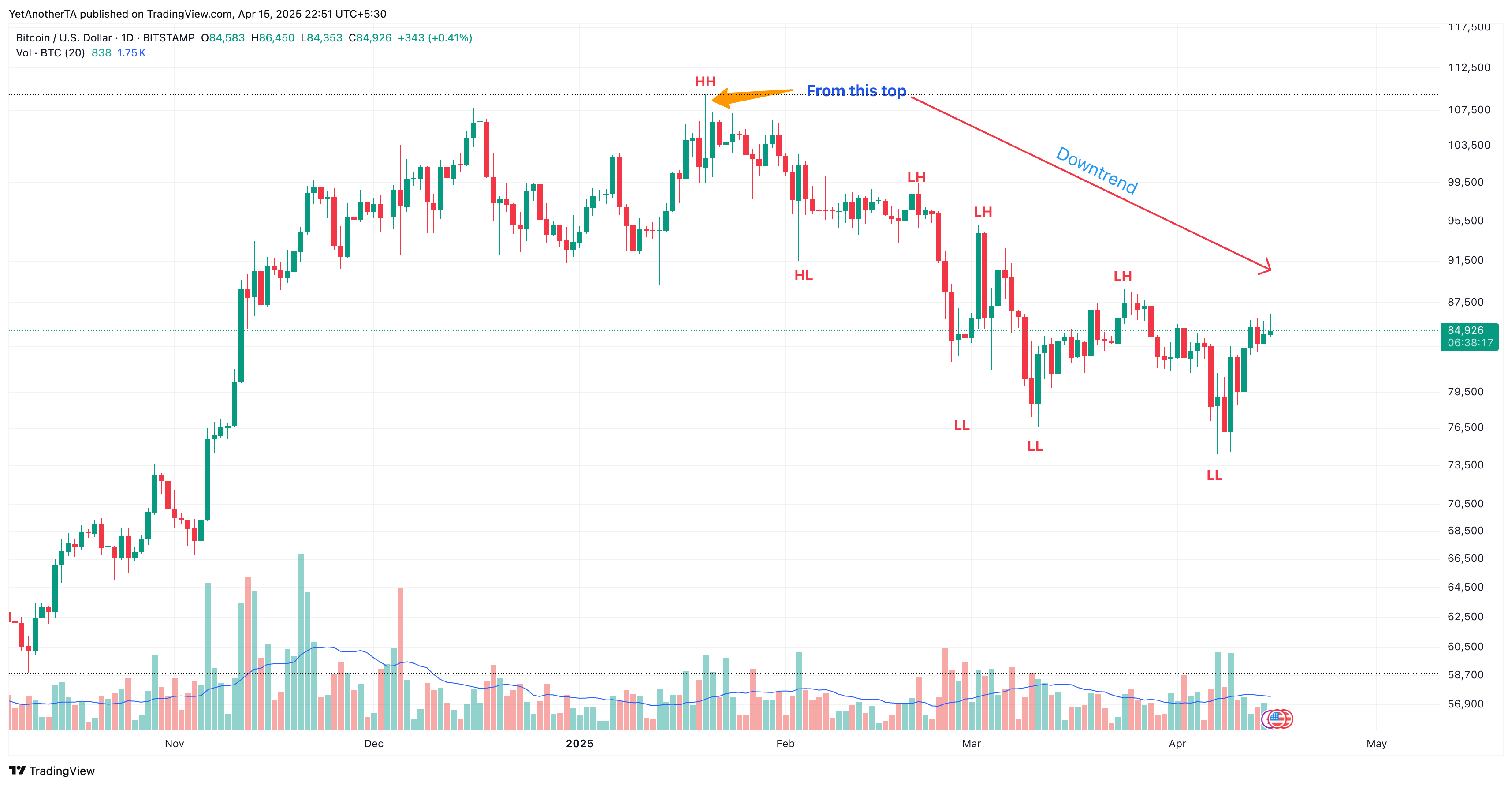
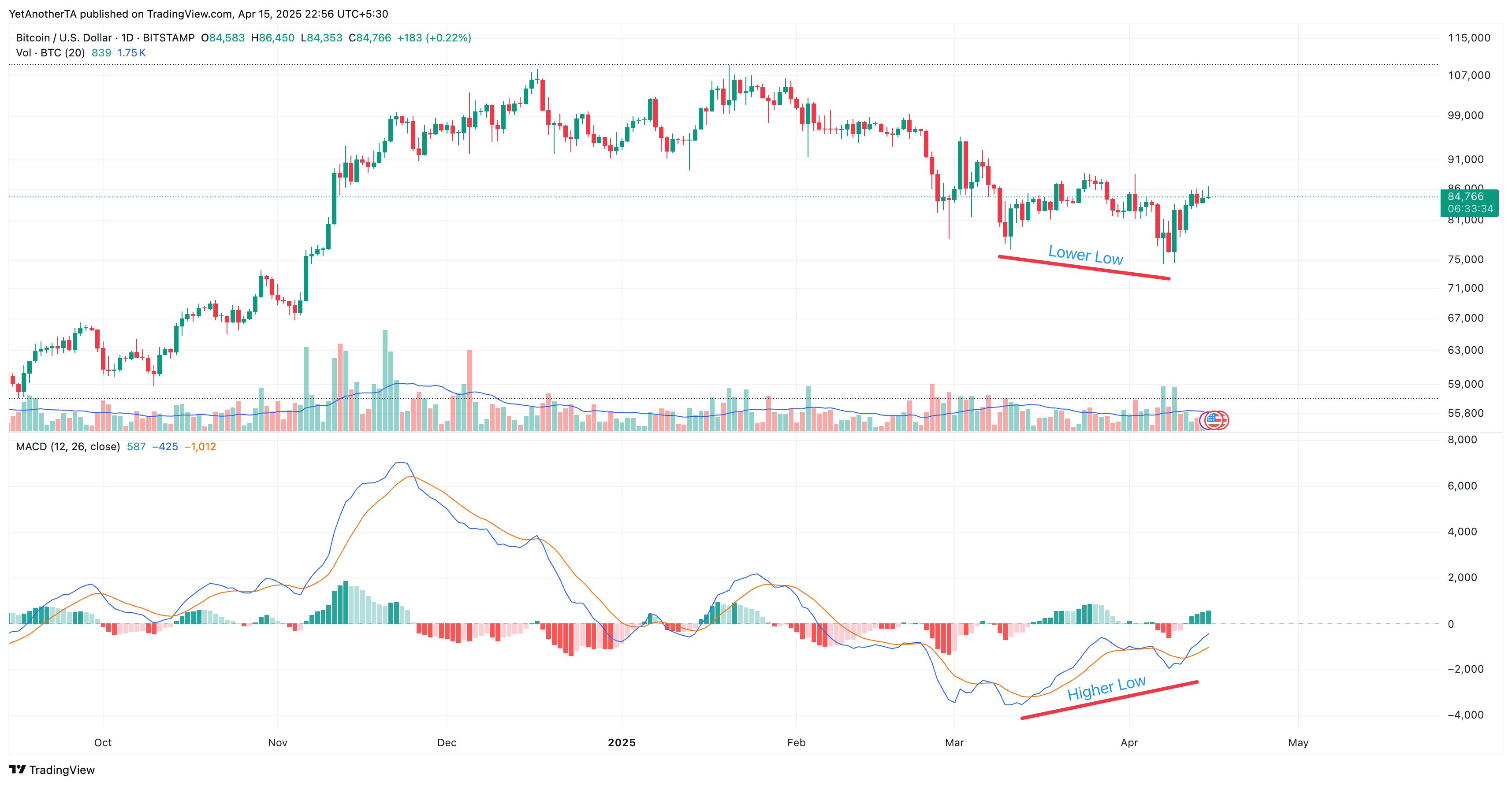
7. Identifying Trends - Examples: Hello. In this session, we are going to
look at some real charts and we'll try to apply the knowledge for identifying trends using things that we learned in the
previous session. So here I have the
Bitcoin chart open. So Bitcoin is currently
trading at $37,525. And first thing we are
going to do is we'll try to identify the swing
highs and swing loves. Let me select highlighter. Now, here at the bottom, I can see this is a swing love. Then this could be
another swing low. This could be another swing low this as well, this as well. You could even consider
this if you want to. But in the bigger picture,
I think it makes sense. I think it is still making
a swing high. Is it. Let me try to mark
the swing highs now. We'll color them differently. We'll make them red. This is a swing high. This
is a swing high. Now, if we see it is consistently making higher
highs and higher lows. Here, you might feel like this is not a higher
high, but it actually is. If we try to zoom in, we can see that this low is at a higher
position than this low. Bitcoin has been making higher highs and
higher lows, right? But if I'm looking
at, let's say, this particular
section in isolation, then it might feel
like the bitcoin is in a downtrend, right? Because I'm not looking
at the bigger picture. But now when I looking
the whole thing, I can see that the bitcoin
is in up similarly, just before this
uptrend started, Bitcoin was in downtrend. We can try to again
identify the lows here. This is a low low, this is another low.
This is another low. Then we will try to highlight the swing highs Here we can see it was
consistently making during this time frame
during this duration, it was making lower lows
consistently and lower highs. We could say that
the bitcoin was in downtrend during this and we could figure out where
exactly the trend change using the principles we learned. Here we can see till
this point of time it has been making lower
highs and lower lows. But at this point,
you can see it stopped making lower low
than it made a higher high. And after making this
higher high, it made sorry, after making this higher low, it made a higher high, and then it continued like that. So at this point of time, when it stopped
making lower lows, we knew that the trend
might change from here. It could either be uptrend or it could be sideways, right? Similarly, we can try the same thing in any
kind of security. Let me open GB V USD for X. Now that we have
seen this pattern in one of the chart in Bitcoin, you should be able
to figure out, you should be able
to see clearly that this currency pair has also been making lower lows
and lower highs consistently. We can see that this
is a downtrend. There are phases
in between where it did not make a
lower low directly, where it stuck in small
range and then it continued making a lower low
and then because it did not break
the previous high. At this point of time, even though it did not make a lower low but after in
the next sing it made a lower high and then it
continued with a downtrend. Similarly, here I think it's a bit interesting phase
slightly from this bottom, I think we can still
see some higher highs and higher lows being made. But in this particular range, we can see this is a sideway. There were no higher highs
or lower lows being made. The zone was more or
less same and the price was stuck here for some time
before it started moving up. Yeah. This is how we apply the trend
identifying information, and this is just one of the method we use for
identifying trends. There are other methods as well, which we are going to
study in the next session.
8. Trendlines: Hello. In this session, we are going to learn
about trend lines. Trend lines are one of the most important aspect
of technical analysis. B just the trend lines or even if you are trying to
draw any chart patterns, you would need to
learn how to draw trend lines. Let's get into it. In first place, why do
we need trend lines? We use trend lines
to identify trend, we use them to identify
trend changes. We can even use them to determine trend
entries and exits. We're going to look at all
these things in charge. And how do you
draw a trend line? For drawing a trend line, just like any other line,
we need two points. In this case for
drawing a trend line, we need two major swing points. If you remember in
our last session, we learned about swing
highs and swing loose. These swing points would be either swing
highs or swing lows. We use swing swing highs when we are drawing a
downward trend line. We use swing lows if you
are drawing up trend line. How do we do it? We are
going to see in a minute. We also need to adjust our trend lines after we
draw them depending on whether those trend lines still are valid ones or
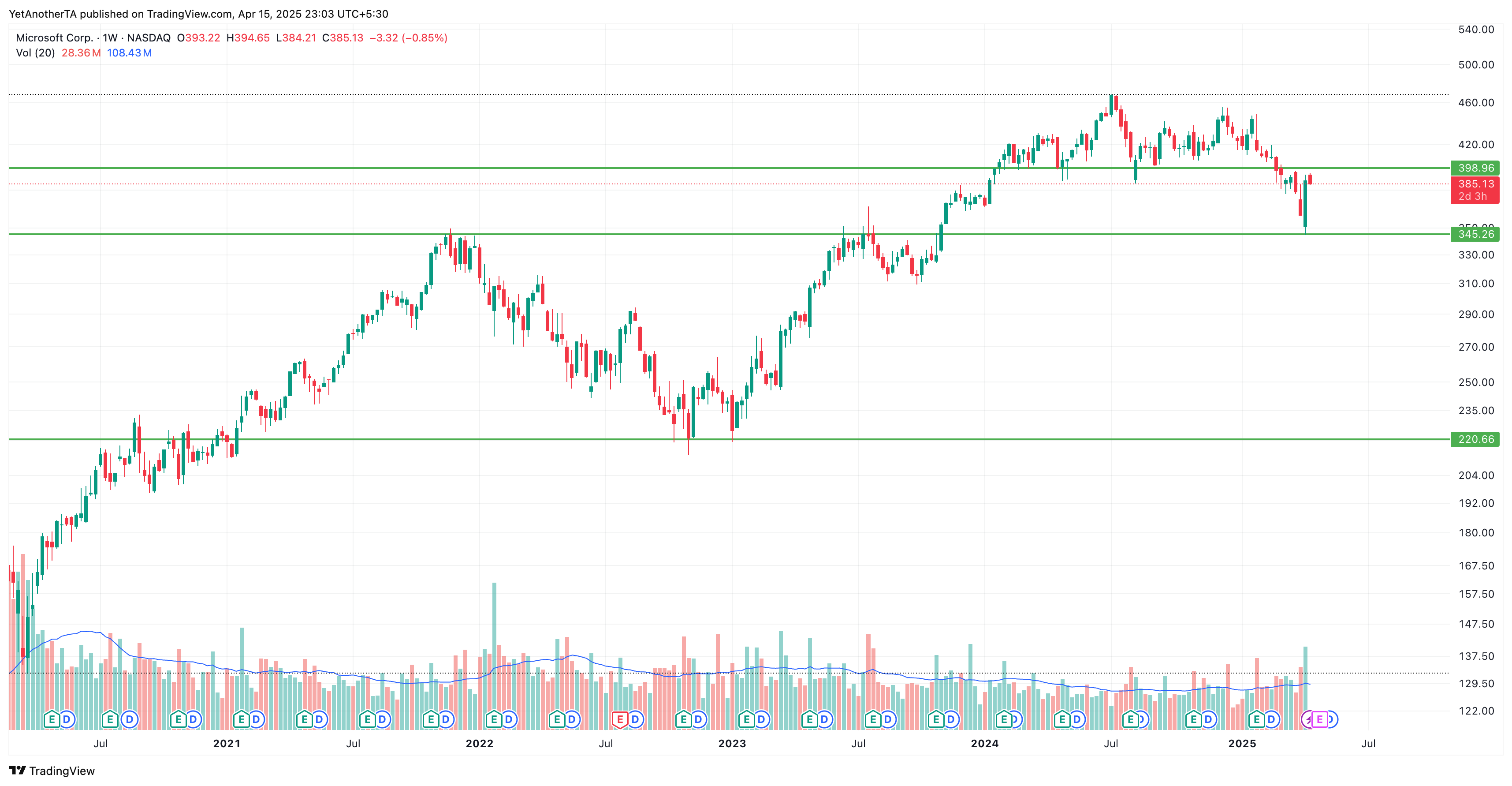
there is any diversion. Here I have Microsoft
chart open. So as we saw, we first need to figure out swing highs minimum of two swing highs or sewing
lows to draw trend line. So here if we just look at this section because here you
can see some kind of trend. You can even pick this one, but this would be
probably easier to explain because this
is a shorter one. So we first need to see,
this is a swing high. This is another swing high, this, this as well. Then we have swing lows here. We have a swing low here, we
have another sing low here. Using these swing
highs and lows, we will choose a drawing tool, ten line tool in
trailing view and then we will join two
of the swing highs. This is a down trend,
so we will be using swing highs and then
we can try to extend it and we can see this 123.3,
this is a fourth point. Ida is to make trend line touch as many points as possible
and as cleanly as possible. There is something
which we can do. We can go to chart type here and we can
choose line chart. Then we can try to align the tips of all the
major swing highs in this case. We could do this. When we initially draw it, it will be something like this. But then we saw that this move went above it,
but it again came back. Even if you go by higher highs and higher lows or lower
highs and lower low theory, you can see that it's still making lower highs
and lower lows. We will adjust a trend line
so that it touches this one. This is what I meant
when I said we need to keep adjusting
our trend lines. Now we have made the trend line look like this and now we
can go back to candles. So here you can see
we have one, two, three touchpoints and once
the price broke above this, trend changed and trend turned from downward to
upward movement. It doesn't necessarily
have to be down to up. It could also have been
sideways movement from here. Using trend lines, we can identify the trends and
trend changes like this. As long as the price remains
below this trend line, we say this isn't downtrend, when the price brokes out above the trend
line decisively, we say probably the trend
is going to change now. Now that the trend has changed, we can start drawing
up trend line. Here we can see
this is a swing lo. This is another lo.
This is another one. This also probably
then these two hair. Then we have a swing high
this or maybe this, this. Now we know that we have some swing highs in
swing lows here, so we'll try to connect
them using a trend line. Initially, we will draw this trend line
from these points. Because these are two
major swing lows here. But if you extend it, we can see that the next set of swing highn swing lows diverged quite a bit
from this trend line. We can redraw this
strand line from this point. Do
something like this. To make it look better, we will go to line chart more and adjust these
points can join this. Now, go back to candle.
We can see this. Now we have one touchpoint, another touchpoint, and
the price kept moving up. This time I will open a
it Indian 50 50 index. So here, another
thing I think which I did not mention previously is when you are planning
to draw trend lines, you have to zoom in the chart sufficiently Zoom out the chart sufficiently so that you
look at the bigger picture. For example, if I have the
chart, this much zoomed in. I may just see that
this is an uptrend. But if I just zoom out and
look at this whole thing, then I may get a player picture
that what was happening? Is in the larger picture? Are we still in an
uptrend or downtrend? Right. So now let's try to
draw trend lines in this one. Here again, we can see that
we have a swing low here, we have another one here, possibly this two,
and then similarly, we have swing high
here, swing high here. Essentially, if you see we are making higher
rise and higher low, so we know that we
are in uptrend. We will draw this trend line. Now we can see that we are
in the up trend, right? So we mentioned that we can use trend lines to identify trends, trend changes, and also
for entries and exits. So now if the price comes
again here a third time, then we know this might
be a good idea to go long or buy here if the price does
not break the trend line. So that's how we can
identify entries. And if the trend line breaks, the price breaks the trend line, we know that, if
we are in a trade, then this is probably a
good idea to exit here. A? Let me also try to show you something
very interesting. So here you can see there was a very big
move down, right? The market crashed here. So this is March 2022, this is due to COVID, right? So now using trend lines, we could have figured
this out easily. I mean, if you take
these two loads, you could have drawn a
trend line like this. And we know that this
trend line broke here. Right? If you are in a trade, after this red candle formed, we knew that something
is happening. If you were in trade,
we could have exited here and if you exited
at this point of time, it would have saved you from
this much downside movement. The same thing can be done and
identified in all markets, be it bitcoin or let
me open SNP 500. When SMP 500, I think this is the zone where
the COVID happened. If you draw a trend
line from this slope. A. You can use line
to draw it correctly. Now we align this
point and this point, go back to candles. Now we can see this
trend line broke here. When this trend line broke, again, if you are in a trade, we could have exited this trait and it would have saved us
from this much down low. To summarize, we can use
trend lines to identify trends to identify trend changes and even identify did
entries and exits. To draw upward
sloping trend line, we need to connect, major swing loads
for drawing downward trending downward
sloping trend line, we have to connect swing highs and we have to keep adjusting trend lines
as and when needed. You may find initially
that it's very subjective and there
are no clear rules. But as you will keep practicing drawing trend
lines, you will get a hang up. That's all for this session. Don't worry if you are still not comfortable with the idea of drawing trend
lines correctly, we will keep drawing a lot of trend lines during this course, and I assure you you will get a hang of it by
end of the course.
9. Understanding Timeframes: Hello. In this session, we are going to talk
about time frames. What are time frames? If you open trading view
and open any chart, you would notice some time
durations mentioned here, five minute, 15 minutes, 30 minute, 1 hour, day, week. If you will open this drop down, you can see, there are
a lot many options. Second section, then
minute section, you have different
values for hours. These are essentially
time frames. Now when you think about it, Time frames are essentially
different lenses through which we try to look at the markets because each time frame provides us a
different perspective. Coming back to the
same question, what exactly is the time frame? I have the five minute
chart open here. When I say five minute chart, it essentially means it takes 5 minutes for one candle or this 1 bar to
form completely. Each bar or each candle on this chart represents
the five minute duration. So if I'm seeing, let's say, these one, two, three, four, five, six, seven, eight, nine, ten, then essentially
means I'm looking at 50 minutes of
data, then into five. Now if I explain this, I will go to 1 second chart. Now here you can
see every 1 second, there is a candle being formed. Right? So this is
essentially a time frame. Now, understanding
the significance of time frame is very important. And before we do
that, let's jump on to understanding something
called trading styles. In financial markets, we
have different kind of traders and all traders have
their own trading styles. We are going to just take a look at trading styles
because that has a very deep relationship
with time frames. So one of these trading
style is known as scalping. Scalping is considered the
most dangerous form of trading because these kind of trade last hardly from few
seconds to few minutes. People are trying to capture very short term moves when they are trying
to scalp the market. Then the next form of
trading style is intraday, which is much more
common where people are trying to enter into a trade and which lasts for typically minutes to
some hours sometimes. But these trades are typically opened and
closed on the same day. The third form of trading
style is swing trading. Swing trading, people enter into trades with an intention to stay in the trade for days to weeks. If you remember we studied about swing size and swing lows. Swing trading has
got its name from those swings where in
the swing trading, people are trying to
capture one full swing. Depending on which
direction a trend is. That's where the swing
trading got its name. And these traits typically
last, as I said, for sometimes just
a couple of days and it could actually
last for one, two, or three, four weeks, depending on how strong
or weak the trend is. And, um, another form of popular trading style
is positional trading, which is a much longer
term trading style in which people are trying to capture the
larger or long term trends, which could last from weeks to months and
sometimes even years. So these trades might last from this much
time frame, right? So each trader have
their own style, and many other trader typically do one of these
kind of training and some experienced traders might even do multiple kind of they might even do intra
day and they might also be involved in
swing in position. Now that you have some idea
about the trading styles, we can see how these
trading styles are connected with time frames. So now we saw that there are four forms of popular
treading styles. When you're scalping,
majority of the people use 1 minute or three
minute time frames because they are
trying to capture very short term moves, right? So they need to
kind of enter and identify the moves very quickly and enter into a
very short period of time, they don't need to
look at very large or longer time period because their intention is
to capture smaller moves. For intraday, the
commonly used time frames or the popular time frames are typically 5 minutes
and 15 minutes. For swing trading,
people use 1 hour, four hour, and sometimes
even the time frame. For positional trading,
people use one day, one week, one month,
kind of time frame. They can even use quarterly time frame, three
month timeframe. So it's not necessary that
these are the only time frame. People can change it. People can tweet them as
for their own convenience, but these are some of the popular time frame
people typically use. And it's not just one
time frame people use. They use a combination
of time frames, right? Which leads us to another topic called multiple
time frame analysis, which we are going to
study in the next session.
10. Multi timeframe Analysis: Hello. In this section, we are going to discuss a very important technique
used in trading, which is called multi
time frame analysis. When you think about
trading and after going through the different
time frames that we saw in the
previous section, you may feel that it's
probably a good idea to pick a time frame as per your
trading style like 5 minutes, 1 hour or a daily time
frame and stick with it. But that will be a bad idea. Remember what I said in
the time frame section, time frames are different
lenses through which we try to look at a market and each lens or each time frame provides us a
different perspective. Let me go to a chart
to make it more clear. Now I have this five
minute chart open. When I look at this chart, it may look like it's
making higher highs and higher lows and I can even draw trend line from this
low to this point. I might be tempted to buy this
particular security here. But if I look at a
higher time frame, let's say, I go to 30 minutes, then I see it is actually making lower lows in
a bigger time frame, and I could even draw trend
line from these swing highs. Now if you see the price seemed to be going down after
touching this trend line. Now if I go back to five minute, I might be tempted to sell it. It might look like
a very good idea because there has
been one touchpoint, two touchpoint, and this
is a third touchpoint, and I see a big red
bar here, right? So now, see how the perspective
completely changed. If I'm just looking
at five minute, I have a different perspective. But if I'm looking at
the bigger picture, it gives me more clarity on
what is actually happening. This is essentially
the importance or significance of time frames. So how do we use
them practically? Eight. When we are trading, we typically use two
time frames at least. One is called the
entry time frame. Entry time frame is essentially the primary timeframe
in which you trade. For example, if I'm
intraday trader, I might want to use 5
minutes or 15 minutes as my entry time frame because I'll be using that time frame for all the entries
and exits, right? Then I will be using another
time frame which would be of a higher duration, typically, just to get a big
picture of what's going on. Because I don't
want to be caught up in the wrong
side of the trend. I have to figure out
what is a larger trend. Then in my entry time frame, I would want to stick with that longer term trend rather
than going against it. Okay. But now that
poses a question. Okay, so I now know that I
need to use two time frame, one short and one long. But how do I decide what would
be the bigger time frame? If I have, let's say, five minute as my
entry time frame, what should be the
reference time frame? Should it be 1 hour? Should it be one day or one week or maybe
one month, right? So on this, there is a very popular
technician, Alexander Elder, who did a lot of study
on this and he came up with a concept of four to six factor for
the larger time frame. As per his analysis, he came to the conclusion that the reference time
frame should be a factor of four to six
of the entry time frame. Basically, reference time
frame should be four to six times higher than your
entry time frame. If I use five minute as
my entry time frame, then I should be probably using, 25 minutes or 30 minutes as
my reference time frame. Similarly, if I'm using 1
hour as my entry time frame, then I should be
using four hour, five hour or six hour as
my reference time frame. Now this is all theoretical, but practically speaking, there are a lot of popular combinations
people typically use. What are these combination? So when it comes to scalping, people use 1 minute as their entry time
frame and five minute as the reference time frame. It could again be like 3
minutes and 15 minutes as well. So these are some of
the popular combination and not necessarily
only ones, right? You may want to tweak them, and there is no such
rule that you have to stick with these
specific time frame. As per your treading style
and as per your comfort, you can always change them and make the different
timeframes work for you. Coming to intraday, um, you can use 5 minutes as your entry time frame and 30 minutes as your
reference time frame. If you are using a bigger
time frame for intraday, 15 minute, you can use 1 hour, which is a factor of four
times 15 minutes into four, that is 60 minutes,
1 hour time frame. Similarly, if you are
planning to do swing trading, then these are some
popular combination 1 hour is your entry time frame and four hour for one day would be your uh
reference time frame. This is more applicable in the stock markets because
in stock markets, typically, the working hours are typically from 6
hours to 8 hours, right? So the factor of four to six or six to eight
is also acceptable. We can make it work.
But when it comes to cryptos and four X,
those markets are open. 24 hours. The swing trading, a lot of people use four hour as their entitframe and one day, which is 24 hours, which is a factor of 66
into four, 24 hours. In crypto and forex,
people tend to use four hour as their entitframe and one day as their
recurrence time frame. For positional, people may want to use one day as their
entry time frame, entry time frame, and one week as their reference time frame, which is a factor of five,
they may also want to use one week as their entry
time frame and one month, which is a factor of 4.5 roughly as their
reference time frame. Now that you know how to use multiple time frame combinations for multiple time
frame analysis, we are getting more
and more close to start looking at more
practical aspects of trading. See you
in the next section.
11. Type of Charts: Hello. In this section, we are going to
quickly take a look at all the different kind of charts that are available
in training you. So we have candlestick
charts, bar charts, HakanoshiRnko, Kagi
point and figure range, line area, step line. You might be overwhelmed number of chart types that
are available, but we don't need to
study all of them. We are only going to focus on candleystic charts, bar charts, and haikanashi because
these three are the most commonly used chart
types and as you will see, you can obviously look
at, explore other charts, but you don't really
need to if you are really comfortable
using candlestick bar and hi kanahi charts. Let me quickly also show you on tiding you how do
these charts look like? Right now, you can see this is a candlestick chart.
Candles hart. This is how a bar
chart looks like. I will change it to HakanasheT is how Hikanashi looks like. It is similar to candles with some minor differences
that we are going to discuss in more detail in
the forthcoming sessions. Feel free to explore other
kind of charts on reading you. And do let me know in the Q&A section in case you have any questions
about those. But for this course, we are going to stick
primarily with bars, candles and Hakanash. See
you in the next session.
12. Candlestick Chart: Welcome back. In this section, we are going to learn
about candlestick charts, and to make sense of
candlestick charts, we first need to understand
the anatomy of a candle, how a candle is formed, and what information a
candle conveys to us. So now you can see we
have two candles here, one green, another one red. These are typical
candles that form, but they may not look
exactly like this. These candles are
created to make sure you understand all the
different components of the candle correctly. And once you do that, even if the candle
formation is different, you will be able to make
sense of that candle. Let's begin with the candle on the left, which is
a green candle. If you remember, during the
time frames we discussed that each candle represent
the duration of the selected time frame. If this candle, we are seeing in a five
minute time frame, this means this candle was formed over a period
of 5 minutes. So now you see the highest
point of this candle. That is a high
highest price which was touched during this
five minute duration. It could be like
one day duration, one day or it could be one
week or it could be anything, but just for the sake of
understanding this part, let's use 5 minutes, right? So assuming this is a
five minute candle, this was the highest price that was touched
during that 5 minutes. Same for the lowest
during this fit this was the lowest price that was
touched by this security. Here is an interesting part. Depending on whether
we are looking at a green candle
or a red candle, we have to identify open
and lose accordingly. If you are looking
at a green candle, that means the open of the candle was
lower than the close. The close was higher.
Basically, price close at a higher value, then it becomes a green candle. What exactly is open? When this candle started forming after the previous candle was completed, this is
where the price was. This is at the open essentially. Then price closed
when this five minute elapsed and the next
candle was about to form, this was where the
price was at the close. Moving on to the red candle. Highs and low remain the same. This was the highest point or highest price that was touched
in the given duration, let's say five
minute and this was the lowest price that was touched during this
duration of five minute. As for the open and close, they will be opposite in
case of a red candle. In red candle, open is
higher than the close. That means when the
candle formation was done at that time, price close at a
lower value than it opened and that results
in a red color candle. And this thick portion
of the candle, that is called the
body of the candle. These lines that you see on top and bottom part
of the candles, these are known as
shadow or wick. It's not necessary that each
candle will have a shadow. Some candles may just
be something like this. Some candles may look like this, where there is no shadow or some candles could
also be where we only have a shadow at the bottom and no
shadow at the top. Conversely, we can also have candles which look like this. We can have also candles which have uneven kind of shadow, a small shadow at the bottom,
or bigger one at the top. We can also have candles which have bigger shadows
and very small body. We're going to look at
all these candles in detail once we start getting into candlestic
chart patterns. We will go to Trading view
now and have a look at a candlestick chart
to understand the concept that
we discussed here. So here you can see, I have a candlestick chart open. I will go to five minute
chart, zoom it a bit. Now, I can see that this is a green candle and you can see there is a small
wick at the top and a bigger wig at the bottom. This highest point
of this candle, this one, this is the
high of this candle. Similarly, this point, the
lowest point of this candle, this is high, and this is
the body of the candle. Since this is a green candle, we can assume that
this was open price, and this is a closed price. The closed price was higher. If you look at the red candle, we know that close was
lower than the open, right? So this will be the close, and this will be the open. Highs and low remain the same. So essentially, when we are
talking about a red candle, it essentially means the price closed lower than where it was. And when we are looking
at a green candle, it means price closed higher than where it was when
the candle started forming. So now, if you think about it, this five minute candle
or any time frame candle tells us a story, right? And that story is a fight
between bulls and bears. So if you take this
candle as an example, this big green candle, this is where price
opened, right? And then wolves kept on pushing
the price higher higher. But during this time, sometime during this formation time, at some point, B
took control briefly and took the price down
to this low level. But bulls again came with
more strength and kept taking the price higher and they touched at some
point of time this high, finally closing this candle
at this closed price. I as you will see, in the coming sessions, it's very important
to be able to read the price action using
these scandals because they can give us very valuable clues about what's going
on in the market, and what price might do next.
13. Bar Chart: Hello. In this section, we are going to briefly
cover bar charts, and to understand bar charts, we have to take a look at how bars look like
and how do they form. Here we have 2 bars. On the left, we have green
candle and on the right, we have the red candle. If you will notice, they have the small outgrowth
coming out of the candle in both the candles. This outgrowth or
these small handles, they tell us about the open and close of this candle or of this
bar in this case. Highs and lows remain the same
as we have in the candles. The highest point of this bar is the high and the lowest point of this bar is the lowest price, the open and close are represented by
these small handles. Now, here is
important difference between candles and bar. In candles, we have no way
of identifying what is open or what is a close without knowing the
color of the candle. If the candle is a green candle, we know that the clothes will
be higher than the open. If it is a red candle, then we will know that the clothes will be
lower than the open. But bars, they help you
identify this information, open and close information without even knowing the
color of the candle. This left side outgrowth. This represents the open of a bar and the right
side outgrowth represents the close of the bar. Here we can see the open was lower than the close or
close of this candle, close of this bar was
higher than the open. That's why it's a green bar. Similarly, if we talk
about the red candle, highs and lows remain the same. This is the highest point and
this is the lowest point or the lowest price attained by this bar within
the given time frame, date, 5 minutes, ten
minute or whatever. Then we have the open close. As we said, open is
on the left side. In this case, this is the open on the left side and the close in the right side. Here we can see the close
was lower than the open, which resulted in a red candle. Right? This is the
important difference. Without even knowing the color, we can figure out whether
this is a candle, which resulted in a closed
price higher than the open, or if this is a candle, which resulted in a closed
price lower than the open. And this is not
possible in candles. Rest of the things
remain the same. The area between open and close, this is the body of the candle and the area above and below, the open and close, in
this case, this or this. These are the shadows or wicks, as we have in the candle. Similar to candles,
it's not necessary that each bar will have a wick or
not or the shadow or not. Some bar could be
something like open here, close here. There is no upper. The highest point of this bar is same as. Let me draw it again. Highest part of this
bar is same as close. The left side, open,
right side, close. Right? Now, we'll switch
to thrilling and we'll quickly have a look at some
real charts with bars. So here we have this chart. It is currently in candles. I will switch it to bar chart. So now you can see there
is one big red bar. On the left side,
we have the open, the side, we have the close. So we know that the close
was lower than the open. That's why it is
a red bar, right? And there is no lower shadow
or wick in this case. If you look at this candle, it has a very small
upper shadow and a longer a lower shadow. It is a green candle. Why? Because the open is this left side is
lower than the close. Close was higher than the open, right? Same for this candle. This candle, if you see,
it has no upper shadow. So highest point
of this candle or this bar is same as the closes, and there is a very little, very small wick at the bottom. So this is almost the
open was very close to the lowest point
of this candle. Right? So now, if you see
bar chart and candle chart, both of them convey
same information to us, bar chart could be
preferred by some, and candlesticks are
preferred by others. So both of them can
be used for trading, and both of them can be used to arrive at the
same conclusion, and both of them can
help us understand the price action in more
or less the same way. So which one is used depends on personal
preference, mostly. Which one you like. So I would
suggest for this session, we will not for this
session for this course, mostly we'll stick
with candlesticks, because as you would see, they would help us understand
the candlestick patterns in a more clear way
because bar charts may take some getting used to, and candlesticks are
much more visually clear or even the
original, uh, patterns. They have been derived
from candlesticks only. Bar chart is something
that came up later. So we'll stick with
candlesticks first. And once you
understand how to read candles and bars and also understand the
candlestick patterns, then it's your choice, whichever you want to continue
using, you can use that.
14. Heikin Ashi (HA) Chart: Hello. In this section, we are going to take a
look at Hakanashi charts. Right now, I have this
chart open in candles. Take a couple of seconds to observe this chart
and the price action, which is the highs
and lows being made and the color
of the candles. Now I'm going to switch it to Hai kanashi. Did you
see any difference? If you were observing closely, you might have felt that
the price action or the price movement was a bit uneven when we were
looking at the candles. For example, if you
take this stretch from here to here, right? It looks pretty smooth when we are looking it in Hakanashi. If I go back to
candles, you can see, there are some green and red, then red, green, then green and, you know, it looks like
a bit choppy here. But if I go back to Hakanashi the price
action is more smooth, and that's exactly the utility
Hikinashi candles bring. So they can help you
identify the trends in a more easy way by smoothing
out the price action. But how does Hakanashi
smooth out the price action? It does so by averaging
out the candle prices. Et me switch to
the presentation. In Haikenashi, we calculate all the prices for
a given candle. Be close, open, high or
low using these formulas. We calculate the closed price of a aikenahi candle by
summing up open zero. Zero basically means
the current candle or the current time frame for which the candle
is being formed, the current five minute or
current hour or current day. Open of the current period
plus high plus low, plus close, divide it by four. That's how the closed price
is arrived at similarly, open price is arrived at by summing open and close of the previous candle
of the prior period, dividing it by two. So as I was saying, this
is essentially kind of averaging out the current and the previous candles values to smooth out the price action. And coming to high it takes
the current candles high, the current candles open, and the current candle close, the highest of the maximum
or the highest in this case, the maximum of these three, whichever is the
maximum will become the high of the Hakanahi candle. For low, it takes the low
of the current candle. Kana open of the current candle. Hakanasi open is the
calculated Hakanasi open, not the actual candle open. And I can actually close and it picks the lowest or the
minimum of these three, two, calculate the
low of the candle. Now you don't really have
to remember all this. You don't have to worry
about these formulas because trading view or any other charting application
that you are going to use, that will calculate it for
you and show it accordingly. This is only for
theoretical purpose so you know how the price
action actually looks better or smoother when you are using
Hakanahi candles. Now we're going to
quickly take a look at different patterns that we observe while viewing
Hakanasi charts. Since Hikanashi you
will find that there are three major patterns. First one is a trend
continuation pattern. When it is green, you will find that there
is a upper wick, but there is no bottom wick and the price keeps
on moving higher. Similarly, on the opposite side, when the prices are moving down, you will find red candles
which have lower wicks, lower shadows, but
no higher shadow and price keeps on moving down. Till this kind of candy
formations are being made, we know the trend is continuing. Then the second pattern is where you have
a week on the top, a week at the bottom,
be it red or green, and then we have a
sizable body as well. I signifies that
the trend is now weakening when weeks
are being formed on both side of the candles and there is a sizable body present. And the final kind of pattern is when you have very large wigs on both side of the body and a
very small body in between. This signifies that
the reversal is near and the price might reverse from this point
after this point. Let's switch to treading view and take a look at all
these three patterns. So now, first we spoke about the continuation
type candles. So when it is a green candle
or the green or the uptrend, we see that we said that
there is no lower shadows. As you still see, in
all these candles, there is no lower shadow till this point and there
is a upper shadow. That basically
means that trend is healthy and the trend
will likely continue. Now, here you can see there's a small wick
in this candle. This qualifies as
a second type of pattern which says the trend is possibly weakening
at this point. And then here we have
the third candle, which has a very small body, and then both upper
and lower wicks. Now after this form, and then you can see
even this candle has a small, very small. I I zoom out this chart a bit, you will be able to see
that this candle also have a small wick at the bottom. All these candle formation the significant signifies
that the trend is possibly weakening and then we
have another trend weakening or weakening
tread candle after this, the pattern reversed
or the price reversed. Let's take a look at another
case where the price reversed from down to up, so we can see here, the price was in downtrend as you can see,
these candles are all. They show strong
except this one. Here is a minor weight
but rest of the candles, they don't have
any upper shadow. And only bottom shadow, which signify a
healthy downtrend. So till this point,
everything was fine. And then we got a candle, which had both upper
and lower wicks. So which is a pattern that shows that the trend
is possibly weakening. And after that, we saw that green candle form without
any lower shadow, right? So it's not necessary that
every time you will get a reversal candle and only after that reversal will happen. And these things
are not absolute. They will help you figure
out the bigger picture, and you may have to consider
a lot of other things before you can take decisive action on what you are supposed to do. So now when you take a
look at Akanah you might feel that after a candle,
I got a green candle, I think I should start selling or I should be shot
on this particular security. Or if I get a green candle, then I should probably go along. But you will notice that even kanashi after this
averaging out the prices, it doesn't really work
even in these cases. You've got some green move
and then red here as well. We don't really use
Akanashi candles for taking entries
and exits and traits. We use them to identify the
trend continuation part. During this part, I will stay in my trade if I am long or I
have bought the security. When this starts forming,
I will be cautious. The red candle starts forming, I'll be cautious about it and will manage my
trade accordingly. I don't use or you should also not use Hakanashi
to determine the entries and exits because
this could again be very choppy even with Hakanashi and that's not
really a good idea. Use Hakanashi only to confirm the current trend and stay or add to your positions as
we are going to see later on, but not for making
entries and exits. Here is another important
thing about HakanashiKds. On the right side, if you see it shows two
different prices. First is 375.19, which is the
Hakanashi calculated price. And then there is
another price 374.51, which is the actual
price at this point. If you remember, we use some formulas for calculating
the current open, high, low close
price in Hikanashe. That's the reason it shows
two different prices. If I go to any chart, bar, candles or any other chart, it will just show
me the actual price of a given security at
any given point of time. This is another reason why
a lot of people don't use Haikanashi for entries
and exit because it doesn't tell you
the actual price. It always tells you the calculated price
based on those formulas. So this is another
important thing which you should be aware of
the OHLC prices. OHLC basically means open, high, low and closed prices shown
in HR or icon C charts is not same as the actual OHLC prices because they are derived prices
or the calculated prices. So once again, use Hakanashi charts only for
confirmation of the trend, whether it's uptrend, and
it is continuing or not, or whether it's a downtrend, is it continuing or not? Or are you seeing any signs of reversal or
weakening of trends? Do not use Hakanashi for taking fresh traits
or new traits just based on the colors or the reversals or the trend
continuation signals that you see in Hakanashi.
15. Candlestick Patterns: Hello. Now that we have studied about different
kind of charts, we are going to come
back to candlesticks, and we are going to study some common patterns which
are very useful in identifying trends and also reversals using
just candlesticks. So for this session, we are going to study some
patterns listed here. So these patterns
are doge Hammer, hanging man, inverted hammer, shooting star,
Bullish engulfing, Barish engulfing, Hami,
also known as inside bar, morning star, and evening star.
16. Candlestick Pattern - Doji & Variations: So this is how our
typical doji looks like. As you can see, the doji has long wigs and a very small body. For a candlestick to be a doge, there are two conditions that
candlestick should match. So the first condition
is open and close of the candle should be
at almost same price. As you can see, this
is a green candle, which means the
close of this candle is a bit higher than
the open, right? In this case, but
open and close, if you see there is not
much difference, right? The price difference
is very little, so hence the body is very, very small and same thing can happen for a red
candle also, but in this case, the open is higher than the close or close
is lower than the open. But the color of
Dji does not really make much of a difference as
long as it looks like this. The second condition
is there can be a upper shadow or a
lower shadow or both. Now, if you remember, in
the candlestick session, I said that each candlestick
tells you a story. By studying these patterns, we are trying to
understand that story. What does a doji tells you? What story the Dji
hides in itself? We're just going to look at it. Let me switch to
your drawing board. This is how A Doge looks like. Say it is a green doge, but
it doesn't really matter. It could have been a red doge
as long as the Doge meets a condition that it has long wicks and it
is a small body. Let's assume this is
a five minute candle. Based on this formation, can we deduct what actually happened during this 5 minutes? Definitely, we can try to write. This is the open and this is the close because the close is higher than the close
as it's a green candle. It might have opened
somewhere like this. It might have been a
formation like this. If let's say these
are 1 minute candle. We are breaking down this five minute candle into
a series of 1 minute candle, there would be five candles. We're just trying to
understand what happened during this 5 minutes and how this candle got a formation like this
or a Doge formation. Maybe the price open here as that is a five
minute candle open, and the bulls took the price
a little bit higher, right? And then the candle, 1
minute candle closed. And next candle, price will open typically at the close of the
previous candle, right? So during that time, bulls try to take the
price a little bit higher, maybe to the high of
this candle, right? This one, this high. And after that, let's
say, the beers took over. And at the close of this candle, beer started pushing the price down. There could be a we also. Basically, the price
went higher than but bulls came in and they took the price a bit little bit
up. Wha happened later? This is the close, this is where the next
candle likely opened and Bears pushed the
price to the bottom. Or at the low of this. Maybe there is a week
or maybe there is not. Then what happened? The final
candle This is the close, this is where the
candle will open and the bulls started to
taking control and they closed the price
somewhere like this. If you will notice, the high of this
five minute candle and all this happened between the high and
low of this candle, all this price
action, initially, the bulls to control
took the price higher, and then the beers to control,
took the price lower. Then bulls again came in and tried to take the price
up. All this happened. But if you will
notice the open and the close or this was pretty
much at the same place. That essentially means,
there were bulls, there were bears and it all
resulted in some indecision. It's not necessary that the prize action
unfolded like this. It could have happened
in a different way also. But the point is during this
duration, in this case, 5 minutes, there were points
where bulls were in control, then there were points where
beers were in control, but at the end of it or end of this duration or a
five minute in this case, there was a indecision. Neither wolves nor
beers could take the price up or down
respectively, right? So this is what a Doge
reflects indecision. Typically, after an
indecision case, price moves one way
or other, right? It could be a reversal or
it could be a continuation. Let's look at some charts. So here, can you
notice some dogs? I can see one here.
This one, right? I can also see here. You see the price was in a downtrend,
and then a Doge form. In fact, there are two
dogees for back to back. One is red, one is green. As I said, the color
doesn't really matter. At this point, we could
say there was no decision, clear decision who
is in control, bulls or bears and
then reversal happens. Price this was the
original move, and then after Doge form,
this is what happened. And then when the price went up, here you can see there's
a doge form here as well. But after this, the
continuation happened, the bulls kept on taking
the price higher, but soon, another doge form, this one, there is another doge
after that two dogies form back to back and
then price reversed. Doge basically tells you that
it's time to be cautious and pay attention
to the price action after a doji has been formed. There can be some
variations of Dji as well. So here you can see three
prominent Dji variations. So first one is gravestone Dji, which looks like a gravestone, and the other one
is a dragonfly Dji, and the third one
is a spinning top. So now if you look at
the gravestone doji, you can see that during the formation of this
particular candle, Buls tried to take the
price up and it took the price to this level, the high of the candle. But beers took
control and they took the price down where the
price actually opened. Now you can see it essentially means that bears are dominating
the bulls in this case, because even though bulls
took the price to this level, bears eventually took the price down at the same
level, price open. And close is always more
important than the open. It is said in technical
analysis that amateurs open the candle and professionals
close the candle. You always have to pay
attention to the close value of a candle or a bar or whatever type of
chart you're looking at. And we are going to emphasize
the same point over and over again that you have to pay more
attention to the closes. Now naturally, when a
gravestone Dji forms, it has wearsh implications. The opposite is true
for dragonfly Doge, where you can see the
price open somewhere here, and then during this
candle duration, Beers managed to price to take the price down at this low, but wolves came back
with more force, and they took the price again, back up where the price opened. So lower wicks or lower
shadows means buying pressure, and upper wicks or
longer upper shadows means bearish or
selling pressure. Third kind of variation
is known as spinning top. Spinning top is
pretty similar to how traditional or
typical doge looks like. Only difference is
the body is slightly bigger than what you
see in a typical doge. And the implications
are same as Doge that spinning top reflects indecision in the market
between bulls and bears. So here you can see
there's a long way upside. So there is bearish pressure, and there is a
long way downside, so there is bullish pressure. But open and low are, like, quite close, not as close
as in a typical doge, but still they are
kind of, you know, close enough to show that
there is indecision. Now, we will look at some
charts quickly to see all these variations. Okay. So now I have this chart
and here I can see. This is a gravestone
doji, right? So there is a very small wick, but these small negligible
kind of wicks are permissible, though we should definitely give more weightage when there is no wick at all, absolutely, at the bottom when we are
looking at a gravestone doge, but it's still a valid, gravestone or a doge formation. So once this form as we saw that upper wicks means
bearish pressure, right? So selling pressure
came in after this can candle form and there
was some selling happen. Now if you see after
this happened, then this candle form, which could qualify
as a sparing top, it has upper wick, long upper wick, long, lower wick and a body. This is not really a
very good spinning top, but it did work nonetheless. Same thing can
happen here as well. Here also you can see
another spinning top form, which is after which the price reversed after
the formation occured. Let's look for
dragonfly as well. Here also, you can see
another doge formation. After there was a
downtrend, Doge formed, and then price kind of reversed, you can see a lot of small
doge formations here. Here is another Doge. Yeah. So here, can you
see this dragonfly emoji? No Emoji, sorry, Dragonfly Doge. Okay, so there was this downtrend
spinning top form here. Price reversed for a bit. Then another doge form, and the price came back down. And then this
dragonfly Doge form, after which price went up. So now it's not that these
formation always work, right? There are a lot of other
factors to be considered, and the primary factors for
these candlestic patterns to work where exactly
these formation happen, these Dji formation or any other candistic
formation happen. And we are going to look at support resistances
incoming sessions, and that's when these patterns
would make more sense.
17. Candlestick Pattern - Marubozu: In this session, we will look at another very important
candlestick pattern, which is Mubozu Marubozu candles are very easy to spot because they have very long body and they hardly have any wicks even if the
wigs are there, they are very little
or almost negligible. And for a candle to be a valid Mavozu they need
to have a long body first, second, for bullish Mavozu
candles or green candles, the open and the
lobe should be same. Here you can see this
candle open here. And after that, the price
kept on rising and there was no selling seen
from the point of open. So there is no
lower wick at all. That means price open here
and consistently keep going up and candle close near
the high or at the high. And if you look at this candle, here also open is same as low the candle opened here and
price kept on going high. There was a little selling
pressure scene due to which the price closed a
little below the high, but this is insignificant. When we are looking
at green candles or green Mabusu candles, we should pay attention
that they should not have any lower wicks. Even if the wick is there,
it is hardly visible. Coming to the red Maui candles, they are also same qualities. They are very long candles, easy to spot, and
they opened here, this particular candle opened here and you can
see after opening, the price kept on going
down and there was not even single point where
the price could be pushed higher and that's
why there is no wick. The price opened here
and kept going down directly. Same thing here. So in this case, also
the price open here, and then it kept going down. So there was a little
buying pressure seen here due to which
this wig formed and the price closed at this place a little
above the loop, right? So these are Mavosu candles. And when these form, they communicate that, um, the trend is very strong. If it is a green candle, that means there is a lot of buying pressure
and the price might go up. If it is a red Mabozo
that means there is a lot of selling pressure and
the prices might go down. Now we'll quickly look at charts to see these candles in action. Here can you spot Amara vozu. I can see a few this
one, here you can see, there is no lower wick, strong long body, and a very little upper
wick, which is okay. It should be so small that
it's not easily visible. After this form, you can see
the prices kept going up. Here you can see another
MabozuGreen Mabozu which is a good body and no lower wick very minor
little upper wick. Very little selling pressure
see prices kept going up. Coming to red M here we can
see this is nearly perfect, very little wick shown. If you will notice you can see, there is a very little
small wick at the bottom and negligible or dot
wick visible at the top. After this form, you can see the price reversed or the
prices started going down. So that's how these candles work and you need to spot them, and you can spot
them very easily because they are
long bodied candle. This is also a long
bodied bodied candle, but this is not a
maraboso because this is a clear wick which is not something
acceptable in a Ma boozoo. So this is not a marabozooT
is also a long candle, but again, it has a clear wick
which is clearly visible. This is not a Mabozo, right? So you have to look at candles
which have almost zero to negligible wick and
have uh long bodies.
18. Candlestick Pattern - Hammer & Hanging Man: Hello. In this session, we are going to take a look at hammer and hanging mean
candlestick formations. Both of them look exactly the same as you're going to see, but both of them have completely
different implications. Right now, we are looking
at a hammer formation, and we have two candles which look exactly the same
except the color. In hammer, color does
not really matter, but green candles
are more reliable. For a hammer to be
a valid formation, these are the conditions. The first one Price must have been in a
downtrend before hammer. Price must have been falling before we encounter
a hammer formation. Size of wick should be at least twice the
size of the body. This is the size of the body. The size of this
wick or the shadow, it has to be at least
two times of the body. The longer the wick, the more reliable the hammer
formation would be. The third condition is there should not be any upper wick. Here, you should not have
any or even if it is there, it should be very negligible, very small minimal wick. Most important thing
is that hammers form after a down trend.
It's very important. You see a hammer formation in the context of where
exactly hammer has form. Now let's move on
to hanging man. Here we have hanging
man formation, but you might feel
that you are looking at exactly the same thing,
what you saw in Hammer. Which is true, the formation
is exactly the same. The conditions are
exactly the same. Only difference being
that in hammer, we expect that the
prices should have been falling before a hammer
formation is encountered. But in case of hanging man, we expect that prices should
have been in an uptrend when hammer or a hanging man is encountered and it has
bears implications. We are going to look at charts
to see how does it work? I have this Bitcoin
chart open here. Now, if you see this candle, you could say it's a hammer, it's a hanging man. But the prices have been in an uptrend before this
formation was encountered. This becomes a
hanging man or a gem. After this hanging man
formation was encountered, the prices reversed went down. In the same chart, we can also see
another formation. Or you could again
say that this could be a hammer or this
could be a hanging man. But if you look at it in
the context that the prices have been falling before
this encountered, it becomes a hammer. After that, you can
see that the price is reversed and it downtrend
changed to a uptrend. That's the most important thing. You have to look at these
formations always in context. If the prices are
in a downtrend, when this formation
is encountered, then it's a hammer. If the prices are in an uptrend before this
formation is encountered, it becomes a hanging
mat as simple as that.
19. Candlestick Pattern - Inverted Hammer & Shooting Star: In this session, we
are going to look at inverted hammer and shooting
star candlestick patterns. Since we have studied
hammer and hanging Man, these will be very easy to
understand because these are inverted hammer and
shooting star shooting star are just opposite of hammer and, um hanging man. Now, as you can see from the
shape of this formation, it is just the opposite of
the hammer pattern and this could form in any of the
candles like red or green. The color of the candle
does not really matter. But since it is a
bullish pattern, a green candle will be
slightly more reliable. For a valid inverted hammer to form, these are
the conditions. Prices should have
been in a downtrend, just like hammer for
inverted hammer also, the price should have
been in a downtrend before this formation
is encountered. Size of whip should be at
least twice of size of body, which is same as in case
of hammer and hanging man. The size of the body, this should be at least sorry, the size of the wick should be at least two times
of size of body, there should not be
any lower wick or a very negligible
or very small wick. So once these conditions meet, we can say it's inverted hammer. Just to reiterate,
it's very important that we look at
inverted hammer and shooting star along
with hanging man and hammer in the context of whether we are currently in a
downtrend or an uptrend. Hammer and inverted hammer both form after there
has been a downtrend. So now move on to shooting star. Shooting star is exactly
the same formation as inverted hammer,
as you can see, the color of the candle
does not matter, but shooting star is
a bearish pattern, which is why the red
candle will have slightly more reliability
compared to the green candle. The only difference between
inverted hammer and shooting star is the prices should have been in an uptrend before this
formation is encountered. Once this happens, it's likely
that prices may go down, but we have to wait for the confirmation and see that prices have
started going down. The conditions are same exactly, and the most important part, the shooting start
forms an uptrend. Now we are going
to quickly look at the charts to some
example patterns. Okay. Here in this chart, we can see here we
have a shooting star. Again, you could say that it's a shooting star, it's
a invited hammer. But since it was encountered
after an uptrend, we will say, this
is a shooting star, and here you can see
another shooting star. There are two shooting
stars and after that, you can see the price reversed. Here also you can see
another shooting star, but this is not really shooting star because the prices have been in a downtrend. This one will be treated
as inverted hammer. The price is reversed briefly
but continue to fall down. Now here you can see we encountered the same formation and since the prices have
been in a downtrend, this will be an inverted hammer. After that, you can see
the price is reversed. Here you will see a
interesting thing. After the price has
moved up for some time, a hanging man, sorry, this is not a valid hanging
man and the reason being the body and the wig
sizes do not comply. The wig has to be two times
at least of the body. But here you can see
we have a hanging man, which is valid
because the body is clearly at least twice
the size of the wig. After that, the price reversed. It is a hanging
man, not a hammer because the prices
are in a uptrend. Here again, you can
see inverted hammer because the prices
are in a downtrend, we came across inverted hammer and the price is
reversion moved up. These patterns are very
frequent and uh you have to look at
them in the context whether we are in a
downtrend or an uptrend. But all four of these patterns, shooting star, inverted hammer, hammer, and hanging man. Once you look at some charts, you can easily understand
and as I said earlier, you don't have to
remember these names. You just need to
see the formation. These formation are
very easy to identify this and if you will see you can see Dragonfly
Doge also here, you will find all kinds of patterns that we
have studied so far, Doge dragonfly, gravestone,
shooting stars. And once you start putting
everything in context, you will see that
more often than not, these patterns work beautifully. And when we combine them with
support and resistances, which would be the next session after candleistic patterns, you will be able to
more accurately, um, decide whether the trend will continue or there are good chances of
trend might reverse.
20. Candlestick Pattern - Bullish and Bearish Engulfings: Mm hm. So far we have been looking into
single candlestic patterns like Doge hammers, shooting star, hanging man. Going forward, we
are going to look at some important multi
candlestick patterns. Right now, we have
bullish engulfing here, which is a two
candlestick pattern. So englfing pattern,
what happens? We have a first candle, which is a red candle
and the second candle, which is a green candle
and a green candles body. So when we say body, we are talking
about this region. The body of the green
candle completely engulfs or overlaps the
red colour candle body. When this happens, we say
it is a bullish engulfing. Now there are a few
other conditions we should also hold true. The security that
we are looking at, the stock or crypto or whatever, it should have been in a downtrend before we come
across this formation. Another thing is this red candle could be of any
kind of red candle. It doesn't have to
look like this. It could be simply a doge. As long as the body
of this red candle is completely covered by
the green candle's body, it's still a valid
bullish engulfing signal. And since we are expecting
that there should be a downward trend
before this happens, this is essentially
a reversal pattern, bullish reversal pattern. Barish engulfing is exactly the opposite
of bullish engulfing. It is also a two
candlestick pattern where the first candle is a green candle and the second
candle is a red candle. This is a bearish
reversal pattern, which means the stock
should have been in uptrend before this
formation occurs, and after this, reversal
is expected to happen. So for this formation
to hold true, what condition is,
it should be y. An uptrend before this
formation occurs. Second, the body
of the red candle, this portion should completely engulf or overlap the
green candle's body. Same condition. This should
be just a green candle. It doesn't have to
exactly look like this. This could be
gravestone, dragonfly, or this could be normal Doge or this could be something
like a hammer, doesn't really matter
as long as it's a green candle and the
body of this candle, green candle is completely
overlapped by this red candle. So these are the
engulfing patterns, and now we're going to look at some real charts to see
how these patterns work. Now we are looking
at this chart and here we can see this
region, if you notice, we have these two candle, one red candle followed by the green candle and the prices
have been in a downtrend, and the green body completely overlaps the red candles
body in this case. This is a valid engulfing. These two candles form a
valid engulfing pattern. As you can see,
after this happened, the price is reversed. In the same chart,
we can see there is this small doge
cream candle doge, after which a large
bodied spinning top form, red color spinning
top and a body of this spinning top candle
completely overlapped. The green colors,
candle body, right? So this also forms
a valid engulfing, which is a bearish kind
of engulfing pattern. After this, the trend reverse and previous trend
was uptrend, right? So this is how
engulfing signal works. If you look at YouTube
videos and other literature, you will notice that there
is discussion or like, some people say that for engulfing to happen,
the engulfing candle, the second candle should
completely engulf, including the highs and lows
of the previous candle, which doesn't have to be true in all cases as per
the definition, as long as the body of the
previous candle is engulfed or overlapped by the engulfing or the second
candle, it is true. Don't get confused. Just focus
on the body if the body of the engulfing candle overlaps
or engulfs the first candle and uh the
context is correct, in this case, the previous
trend was down and this formation occurred and
then reversal is expected. Similarly, in this case, the previous trend was up trend, this formation occurred and with the red candle as a second
candle and then trend reverse. This is how engloping works.
21. Candlestick Pattern - Harami / Inside Bar: Hello. In this session, we are going to take a look at another two candleisti
pattern which is Hami, also known as inside bar. Let's start with bullishiami. Bullishiami, if you will notice, it's opposite of what an
engulfing looks like. In this, we have two candles and the first candle is a red candle and the second
candle is a green candle. And the first candle,
in this case, completely engulfs the body of the second candle
or the green candle. The body of the first candle, red candle engulfs the body of the second or green candle, then it becomes a foolish ami. Another important thing
to notice here is the stock or the security should be in a downtrend when this
pattern is encountered. And since this is a
reversal pattern, after this formation occurs, it is expected that the price
might reverse from here. Here is one difference
between Hami and inside bars, though both look essentially
similar, very similar. But in case of hami we use
the engulfing of the bodies. We say that the body
of the first candle should engulf the body
of the second candy. But when we say inside bars, we say the highs and lows
of the first candle should completely engulf or overlap the highs and lows of
the second candle. For all practical purposes, I would suggest you treat
them both as same and you use highs and lows instead
of the body engulfing, especially for Hami cases. Let's move on to the beer Shami in Berri Shiami we
have the same pattern. First candle is a large candle. Second candle is a small candle. First candle is a green
candle whose body completely engulfed the second
or the red candle's body. So if you go by inside bar, the highs and lows
of the first candle completely engulf the second
candles, highs and lows. And since this is a
bearish reversal pattern, the security should be in an uptrend when this
formation occurs, and after this, it is expected
the price might reverse. Let's look at Hami and inside
bars in action in a chart. Now in this chart, you can see these two candles. First candle is a
big red candle. Sorry, it's a big
green candle and the second candle
is a red candle. The body and highs and
lows both completely engulfs the body and highs and
lows of the second candle. This becomes a bearish rami. We also need to look at whether the previous trend was up trend because it's a
bearish reversal trend. This is true in this case. After that, you can say the
price reversed and went down. Now here at the
bottom, you can see, we have a big red candle followed by a
smaller green candle and the body of the red candle, which is the first
candle of the pattern, completely engulfs the
body of the second candle. If you go by inside
bar definition, the highs and lows
of the first candle completely engulfed
green candle. After that, you can
see the price reversed and for bullish Hami
to be a valid pattern, the previous trend
should be a down trend, which was the case and
after that, price moved up. Here you can see. Again, we came across a bearish Hirami pattern. First candle is a cream candle which completely engulfs
the second candle, which is the red candle. After that, price is reversed. The previous trend was uptrend. And here also, we
can see another case where the first candle in the pattern is a
large red candle. Second candle is a
smaller green candle, which is completely engfed
by the first candle or the red candle and the prices were going down and
once this happened, the price started going up. Now, here's a interesting thing. Now you might also
say that this is also a valid bullish rami
pattern because the body of this green candle is completely engfed by this
red candle, which is true. If you see it in fact worked
as well and after this, the price is reversed
but it does not meet the criteria of inside
bar because the highs and lows of this candle
are not completely engulfed or overlap
by this first candle. I would suggest that you avoid trading these kind of setups and stick with the highs
and lows in case of Hami rather than the body. That's all for this session. In the next session,
we are going to look at couple of three
candlestick patterns. So far, we have only looked at single and two candlestick
patterns, SO in that session.
22. Candlestick Pattern - Morning Star & Evening Star: In this session, we are
going to take a look at morning star
and evening star, both of which are three
candlestick patterns and both of them
are very powerful. They may not occur
very frequently, but when they do, often
they work as expected. So let's start
with morning star. So as you can see here, this is how a morning star
formation looks like. It's a three candle formation. First candle is a
large red candle. Second candle is
typically a doji, but it could also be a hammer or a doge variation like spinning
top or hammer variation, inverted hammer, or
even gravestone doji. The third candle
is a green candle, which has to close above at least half of the
first red candles body. For example, in this case, the 50% of this body will
be somewhere around this. This green candle has
to close above this. When this happens along with
all these three conditions, then we say a morning star has formed and it's a bullish
reversal pattern, which means the security
should have been in a downtrend before
this formation occurs once this
formation occurs, we expect the prices
might reverse from here. To reiterate, here
are the conditions, the downtrend should be there before this
formation occur. First candle should
be a long red candle. Second candle could be a
doge hammer or a variation. Third candle should be a green
candle which closes above at least half the body of first red candle
in the formation. As I said, this
is a 50% roughly, then it has to close above this. When this happens, a
morning star is formed. We will take a look
at evening star as well and then we will
go to the charts. This is the evening star
which looks inverted form of morning star and evening star is a bearish
reversal pattern, which means before
this formation occurs, the security should
be in an uptrend. This formation
occurs and then we expect the prices might
reverse from here. This also is a three
candalystic pattern. First candle in this pattern should be a large green candle. Second candle is
typically a doge, but could also be a hanging man. If you remember, this
is what hanging man looks like when this
forms during an uptrend. It could also be
a shooting star, so it could be a
hanging man or it could be shooting star as well. This is how a shooting
star looks like inverted hammer when this
forms during an uptrend. Herd candle should be a
red candle, this one, which closes below at
least half the body of first green candle
in the formation. This is the first
candle. Let's say this is around 50%
or half of it. This red candle should close at least 50%
of its body size. When this happens, we say
an evening star is formed, and chances are that the prices
might reverse from here. Now let's go and look at the charge to see these
patterns in action. So here we have if you
notice this section, First candle is a red candle. Second candle is a doge. Third candle is a green candle, which has closed above 50%
or half the body size, and the previous
trend was down trend, then this formation
occurred after which prizes reverse from here. This is how a morning typical
morning star looks like. Let's look at evening star now. In this chart, if you notice
candles these three candles. First candle is a green candle. Second candle is a shooting star with a very small weight
which is negligible. This could still
be considered as a valid shooting star pattern third candle
is a red candle, which closes below 50% or half of the body of the first
candle in the formation. This is a valid
evening star pattern. Also, most importantly,
the prices were in an uptrend before
this occurred and after this, you can see the prices
they was from here. Now, in the same chart, we can see another evening star formation,
which occurred here. The first candle
is a green candle. Second candle is a doge. You could also call
it spinning top because body is slightly
bigger than a typical Doge. The third candle is a red
candle which closed well below 50% of the first candles body. After this happened, prices went down briefly before
this pattern occurred, the prices were up. This is how these patterns play out in the coming session, we are going to see
how all these patterns work with better accuracy when we combine them with
support and resistances.
23. Candlestick Pattern - Ending Notes: Hi. I hope you had as much fun learning candlestick
patterns as much as I had while
creating these videos. Now that you have some understanding of these
candlestick patterns, you might be tempted to jump to charts and
start reading them. With an impression that
now I understand how the candlestick work and I'm
ready to take on traits. But avoid the temptation
because there is still so much we need to
cover as you will see, these patterns work sometimes, they don't work sometimes, we need to focus on under what scenarios
they work better, and we'll be focusing on that in the sessions which we
are going to do next. Hold your horse
courses and stay with me for some more
time and then we'll get to how we can use these candlestic patterns
to our advantage. Also, you might come
across numerous other, uh, candlestic patterns
like dark cloud, piercing signals,
three white soldiers, three dark crows
and many others. Don't worry about them. Whatever signals we have
studied so far in this course, they are more than sufficient and once you understand
the anatomy of candles, how they form, and what
does a wick represent, what kind of buying and selling pressure you are
observing in a candle, once you understand
these concepts, then I don't think
you need to worry about all those names or all
those candlestick patterns. And finally, if you
are using a paid plan, the premium plan on trading, then there is a trick
which you can use, especially when you are new. So you go to indicators
and in the indicators, go to technicals and
then select patterns, the last tab, and there you
can see candlestick patterns. They have all the
individual patterns, whatever you will find. You can enable them one by one, which interest you or you
can enable all of them. It will automatically
plot these patterns. It will indicate that
this pattern has formed. For example, you can see B E, which is a bearish engulfing, it's in red, and
here is another B, which is a bullish engulfing. You can see the signal. The red candle
completely engulfs the body of the previous
candle and after that price went down and the
previous trend was up and then you have this BE bullish engulfing previous
trend was sideways, not exactly, but in terms of
lower lows and lower highs, I think it was still downward and after this formation
price reversed. Then it will identify
dogs for you. You can use it to identify and test your knowledge
that you are able to identify the
patterns correctly. The only issue is, this is available only in premium plan, so you may have to upgrade, but you don't really have
to upgrade just for this, you should be able to still identify most of the patterns
just by looking at them. But if you already have a plan or you plan to upgrade
in near future, then this is one feature
available in treating view, which you can definitely use. And, uh, one more thing. Here is one book which I used when I was learning candlestick. This book is by Bal Krishna
Sadika and this book covers most of the candlestick pattern that we have studied apart from a few others in
a very detailed manner. It also explains, from, um, psychology perspective why
these candlestick formations occur and why do these work. This is a good book.
If you want to learn more about candlestick
and dive deeper into it, I strongly recommend
if you're interested to learn more about candlestick
than buy this book, and you can probably
find a PDF version of this book also
online or on Kindle. So anything would be fine. I mean, whatever works for you. With that, I think we can close the candlestick
section and we'll move on to support
and resistance next, followed by chart patterns and technical indicators. See
you in the next section.
24. Interpreting Volume: Welcome back. In this session, we are going to cover another
very important aspect of technical analysis
that is volume. What exactly is volume? Volume is nothing but the
total number of shares or contracts that have been traded in a security in a
given time frame. If I switch to the charts, I am currently in
weekly time frame. This is the current candle
that is being formed, which represents
the current week. At the bottom, you
can see some bars. These are the volume bars. These bars tell us for a given candle or
given time frame, how many shares or
contracts we created. We say contract when we are talking about
options or futures. But let's stick with
simple numbers in this case because we are not
talking about options here. I I hover my mouse on the current candle
on the left side here, I can see it shows
the volume number. So for current week,
this number is around 151.784 thousand bitcoins have
been traded in this week. If I hover on the
previous candle, I can see the number
was slightly less, 126.83 thousand bitcoins
were traded in this week. This information is
available on trading view, and it is enabled by default, but if it is not there,
you can go to indicators. And search for volume. You will find it
under technicals, volume and you can
just click on it, it will add the volume
information to your chart. This is how we can see
both rise and volume. Now going back to
your presentation, how does volume
information help us? What is the significance of it? Volume essentially
provides us with the insight into the strength
behind price movements. As an example, if there is a very high volume and
the price is moving up, we know that a lot of
people are buying. When a lot of people are buying, then chances are the price
might keep going up. Similarly, if the volume is very high and the
prices are going down, we know that a lot of people
are trying to sell here. Chances are, the price
might keep going down. So essentially,
volume provides us with the information on strength of the current
or ongoing move. If um, the volumes
are low or average, we know that there
is no strength and nothing much significant is happening in the
market right now. So this is how we associate
price with volume. If the price is going up, volumes are also going up, then we can deduct that
there is a lot of a lot of strong buying interest
in the market and the price can
continue to go up. If the price is going down
and volumes are high, then we might be
able to say that, there are a lot of people who
are selling volume is high, this trend or discount trend might continue for something. And when price is going
up and volume is down, that means, price is going up, but not a lot of
people are buying, so maybe this trend is weak, or this trend will not
last for long time. Similarly, if the prices are
going down, volumes are low, that would mean similarly
that it's a weak downtrend, and we have to be cautious, there might be a reversal happening if the
volumes are low. So this is how volume helps us understand
the current movements, price movements and provides us an additional insight into what might be happening or what might happen along with all the other information
that we might have from studying the
charts and candlesticks. Here are some of the
applications or use cases where volume
is very helpful. First one is trend conformation. Volumes can help
us identify as you were discussing
whether a given trend or the current trend
might continue or not. If the current trend is
supported by the volume, be it uptrend or downtrend, chances are it might continue. Another important
application of volume is understanding of
phenomena of volume climax. A lot of time what happens once a security has been in a trend, be it uptrend or a downtrend. There is a large move with
a huge spike in volume, and this could result in exhaustion of the current
move and reverse it. This typically happens because of the heightened emotions
in the market because everybody is trying to join the ongoing trend and the people who have been
in the trend from long, they start booking profits, and that results in the trend exhausting
or losing its steam. Third application is understanding breakouts
and breakdowns and identifying whether there is a possibility
of a breakout or a breakdown working or resulting in a fake
breakout or a breakdown. When a breakout happens, along with very good volume, breakout essentially means price is coming out of a zone or
price is breaking out of, let's say, a trend line and then the move is
supported by volume. There is a large volume
along with that, then there are good chances that a breakout might work.
Same for breakdown. Now we'll go to
charge and we will try to see all these
three applications. Here I have the weekly
chart of Btuinopen. Here you can see there
is a strong up move and you can also see the volumes
are supporting the move. Volumes are also increasing then volume started declining and
that's when the move ended. Volumes can help you understand when a
trend might continue and when a trend
might lose steams or reverse or even go
to sideways situation. This is how you can use
volumes to confirm a trend. Second thing, we talked about
the volume climax scenario. So when a stock has been, security has been in any trend, and then there is a large spike along with a spike in volume. Here you can see there
is this large spike. In volumes and
also in the price. At this point of
time, prices reverse. This point of time,
downtrend exhausted, or this was the selling climax and then prices
reversed from here. Here also, you can see,
there was a large move this one and then there was a
corresponding spike in volumes. After that, the move reversed. Same thing can be visible here. This is actually the COVID fall and there was a large
spike in price and then associated accompanied by the large movement
in the volume. After that, price is reversed. Here also you can see
the same phenomena. There is a large uh, movement in volume and
then pies reverse. If you will zoom out this chart, you can associate that most
of these spikes in volumes can be associated with either
some peaks or bottoms. Here, for example,
this one is a bottom. This one, let me
try to this one. This one. Here is this one. Then the ones we saw, this one, I have to
select it every time. I forget. Yeah.
Basically, the point is using these volume spikes, you can get a hint that a reversal or a
change is possibly coming. The third application was understanding the
breakouts and breakdowns. So here, I have a chart where
I have drawn a trend line. If you remember
drawing trend lines, we switch to line chart, we connect the swing
lows or swing highs. In this case, swing lows,
we have connected them, move back to the candles and the price is kept
bouncing from this one time, second time, third time, fourth time, then again,
quickly fifth time. Now, this is the candle which resulted in the breakdown
of this trend line. And if you see this candle was accompanied with
a large volume bar. If you see, these are
the average volume, but this bar which broke down from this trend
line had high volume, and then the prices kind
of continued to go down. So since this move was
accompanied with volume, we could be, you know, more sure about what
the chances are, this might actually continue. In the same chart, I have drawn a trend line here in the same way connecting
these sewing highs. You can see there
is a lower highs and lower lows being made. Then the price came up strongly
towards the trend line. You can see there was
a very good volume and there were large bars. But the bars which hit the
trend line or breaking out, it did not really
have a lot of volume. This part, the volume
here corresponding or compared to
these volume bars, it was pretty low. Also you can see there
was spike at the top, which results which
represents selling pressure. So combining this volume
information along with the candlestick formations and after this candle, we
got a shooting star. So this should give us some
information that, okay, this breakout may not work and the prices might fall from here, and this is what happened. This is how volume actually
works as an indicator or as an additional
signal to support our hypothesis about what
might happen in the market. So let's go back to
the presentation. Here are some important
things about volume, which we will see as we
go along in the course. First thing is uptrends usually do not occur
without good volume. Uptrends typically require very good volume
for breakouts and if there is no volume during breakouts or for
continuation of uptrend, the chances are this might not continue or might breakout
might not happen. Downtrends can occur and continue without
significant volume. So Think of it like if you're climbing a
hill or climbing stairs, it requires more strength. But when you are going
down or climbing down a hill or going down the steps, it requires lesser energy. The same is true in the market. It requires a lot of strength
for the market to go up. When I say strength, it
requires a lot of volume, a lot of people
coming in and making buying and buying the
security, take the prices up. But for taking the prices down, it does not require
a lot of strength. Same for breakouts
and breakdowns. Breakouts would almost
require strong volume, but breakdowns can occur with
average volumes as well. So these are some practical
things we will see and you will learn as you continue to work
with technical analysis. And third, important thing is, volume should always be used as an additional
conformation and not as a primary input for
buying or selling decisions. As an example, you see a
lot of volume suddenly. Um, in any direction, um, you should not
base your decision for buying or selling a
security just based on volume. You should use some other ways like chart patterns or
candlestick patterns, and then use volume as a supporting evidence that whether what you thought
might happen or not. Do not use volume as a standalone indicator for
making any kind of decision. Volume is a very good, um, supportive or supportive
added evidence, but it should never be used to take buying and selling
this year directly.
25. Support and Resistance: Hello. In this section, we are going to take a look
at a very interesting concept in technical analysis that
is support and resistances. You might have seen
in charts that the price moves in swings, waves or whatever you
want to call them. There are some areas where price sometimes reaps
in a predictable way. As an example, in this case, if I draw a horizontal line, let's say from this zone, so we can see that when the
price came to this point, it reversed, came down, went up, broke this line, and
when it went up, it came down and took support around the same zone,
which was here. The same thing can happen
in different ways. You can also have something like the price is trading in a range
and price keeps going up. And when it goes to a
certain point, it reverses. Similarly, when it goes down
to a point, it reverses. You will find that when
looking at charts, there are areas or zones where price behaves
in a predictable way, not always, but many a times. For example, if a
price comes down and reverses from a point and then it does the same from
around the same region, we say that this
is a support zone. Support zone are also known as demand zones.
Why demand zones? Because when price
comes to these points, the demand of a particular
security increases and people start buying it, which takes the price higher. The reason could be
fundamental or technical. Fundamental because
a fundamental trader might feel that at this price, the security is available at a reasonable price and
it's a good place to buy. And whenever the price comes
back to the same zone, they may have the same thought process and they may buy again. Similarly, a technical analysis, inspired trader might see that the price reverse from
this particular point. When it comes here again, there is a good chance
it will reverse. That might be the reason for the technical trader
to buy it here. But the point is once you
can identify these zones, it will help you in your
trading and ntifying the zones from where price might take
support and reverse or go up. Similarly, on the upside, there are areas where price
reverse to the downside. In fact, this is one such area, then this is second such area, and these areas from where prices reverses to
the downside from up. These are known as resistances. And resistances are also
known as supply zones. Which is essentially the
opposite of demand zones. Why supply zone? Because people start selling when price
goes to these levels. Again, the fundamental trader
might think at this point, the security is expensive, though they may start selling and a technical
trader might feel that previously or
in past the price reversed from this zone, so I will sell
again at this zone. And that's how when a lot of people are
thinking in the same way, it becomes a self
fulfilling prophecy. That's how these resistances
and supports work. We are going to take
a look at charge, but there is one more thing
we need to understand. So if you look at
this particular, let me remove this
part for clarity. Okay. Now if you look at this particular example
that we have here, now you can see this area, this area was a resistance because the price was below it. Price hit this zone,
reverse from here, and then at some point of
time it broke above it. This is essentially what
we can call a breakout. Breakout from this line, when a resistance is broken, in future, it starts behaving as a support, which
you can see here. Earlier at this point of time, it was a resistance and
once it was broken, it acted as a support when the price came
back to this level. Similarly, in a downtrend, assume this was
the support level and at this point it was broken. Chances are once this ran price and comes
back to this level, it might become a
resistance in this case. Support and resistance
switch roles when they are broken, right? So just to revise what
we have seen so far, let's recap it quickly and
then we'll go to the charts. Support, also known as a
demand zone is a region where chances of a price
reversing from down to up high. At support zones, price comes and reverses
back to the upside. On the contrary, resistances, also known as supply
zones is a region where chances of a price reversing
from up to down are high. Simple, right? There are some important points which
we also talked about. When a support is
decisively broken, it starts acting
as a resistance. When a resistance is
decisively broken, it starts acting as a support. Another important point is, some people prefer to use highs and lows for
drawing support and resistances while some
people prefer close values. This is something
which we are going to see when we are
looking at the charts. Also, remember that support and resistances are
not exact values. If you draw a line at let's say 100 and you expect
that exactly at 100, the price will react or reverse
or something like that. It doesn't happen that way. Price support and price
resistances are typically areas or zones that 100
actually reversal might happen, but it might happen from 99
or it might happen from 101. It depends basically.
You just need to look at these supports and
resistances as areas, not at exact values. Now let's head to charge. Now here, I have Bitcoin
chart open, daily chart. Now, if you look at this chart, you can see there are some zones even this, they are nearly
around the same area. What we can do, we can take the horizontal
line and draw it here. Now you can see this is one
point then 2.3 0.4 point. This is something
similar to a trend line. We need to draw support and resistances in such a
way that they cover as many points as possible for drawing a support
or a resistance, we need to have at least
two points exactly, again, same as trend lines. So you cannot draw like, you know, support is tens
with just one point inside. For example, if I want
to draw it just here, it probably may
not be a good idea because this is only a
single place, right? But I can definitely try to
draw something like this, which covers, 1.2 0.3 0.4 point. Again, as I said, we need not look at these things as, um, single lines or exact points, but these are
considered as an area. It would be probably better
if I use something like this which touches
all these points. I know that this area covers
all these four points. This is basically
a resistance zone. Now if I scroll down the
chart in the future, I can see that this was
our support area and here you can see that price took support here after
age was falling. Then finally, there was
a breakdown from here. But the price was stayed here in this zone
for quite some time. Now when we have this line
and prices falling here, you know that this area something might happen
the price might stop. Or for example, if you're
shot on the market, this is probably a good area
for you to cover your shot. Again, if we go further back, you can see the
price broke down and then this area became a resistance because from
here, it was a support. Now this will act
as a resistance. Price again, went to this point, reversed from there, went again to this point,
reversed from here. Again, as I said, you should not treat this as an exact point
but an area or a zone. You can see there was some
enough fluctuations here, but the price
reversed from here. Then eventually
there was a brick. This is how supports
and resistances work. Even if I extend this
resistance area to this level, you can see after
coming to this region, the price reverse from here, I have here another
chart opened up, Amazon, so here again, I think you might have noticed that if I draw
something like this, it can have this one point, two point is three point. On the upside also I can draw this resistance because I have at least these two
points one and this two. Now if I go in future, you can see that around
this support line, there was a reversal happened
once and then twice again. Then finally, there
was a breakdown and once a price reversed
after the breakdown, this support line
acted as a resistance. From here, price
went down again. If I just go again, you can see that price came back to
the same level and again, reverse from the same level. Then there was some
fluctuations after coming to the same zone and then
the price went up, came back, this
became a support now. Price took support
here and then went up. That's how support
and resistances are very helpful once you draw them correctly in
identifying the zones where price might reverse
or price might take support or price might
halt at some point of time to decide some good
entry and exit levels in your trades. I
26. Drawing Support and Resistances Correctly: Mm. Video, I'm going to show you how to draw support and
resistances correctly. If you remember, I mentioned in the slides in the
previous video that some people prefer
to use highs and lows and some prefer
closed values. I prefer close values,
but it's up to you. You can go with any of these
and just make sure that whatever approach
you decide using highs and lows or close,
just stick with it. Now I have a 50 50
index chart open here, and when I look at this chart I can see some areas which are around same
zone like this and this. And then this. I will take the horizontal tool in trading view and
we try to join. Now if you see when
I'm drawing support, I take the closed
value of the bar. In this case, there's
only 1 bar in this area. Then can see that this
joins this point. Earlier this was a resistance, price was moving up,
it reversed from here, then there was a breakout. Then once the breakout happened, price came back to this
price and this zone, which act as a
support in this case. I can also draw this and this. In these two points when
I'm drawing support, I will use the close
of the lower candle. In this case, this low
is lower than this. In fact, there is no low nearby, so I can write like this. Now, you can see that it's
not even touching it. It doesn't really
have to touch it. As I said, these zones are not exact, there
are some areas. If you prefer, you can also
use something rectangle. To draw this instead
of using a trend line. Then you can stretch
it for future use. That way, I think this is
actually a better approach using area tool rather
than using a single line. Now if you see while I have drawn this
on the bottom side, I have taken the close of
this and on the upside, I've taken the close
of this swing point, the lowest close off
this swing point, and here the lowest close
off this swing point. That defined my area.
If I'm using lows, for example, because this is
a support we will use lows. If you're drawing resistances, we will be working with highs. If I'm using lows, I would probably stretch
this to the low of this and then maybe I will pull this
area down to the low of this. This is probably how my support will look like if I'm using let's say
highs and lows. Either of those is fine.
Basically, the idea is just to get that ntify
some area around which the price might reverse or price might take support or
might stop for for a while. For example, in this case,
this was a resistance. Here you can see this is
a minor swing, but here, price stopped for a while before it broke out of this right. So that's how we can draw
supports and resistances. You can take any chart
and you will find some areas where
there are points, where price reacts in
a predictable way. Now in future, okay now if
you look at this here also, we have two swings here, but they are not really
at the same level. So we cannot draw
exact horizontal line. But what we can do now, if you can see, I have these two swing highs
for the swing highs, I've taken the close
of this swing. And then for this swing,
I have taken again, the highest close of this swing, both cases high highest close of this swing and highest
close of this wing. That's how I draw
resistance if I'm working with let's say ici
instead of close, since it is a resistance, I could do something like this. I of this swing, highest high of this thing and highest i of this swing.
This will become. Now if I stretch it
here, in future, if the price is coming down, then I know that there is a good probability that the price might take
support in this area. If I have shot, let's
say this index here, this might be a good place
for me to exit my shot. Also, if I'm planning
to go along, when the price comes here, I know there is a chance this is a support because the
price book broken out of this resistance and
now it at support, then this might be a good
place for me to buy. That's how we can, uh, draw resistances
and support. Let me take another chart. This is a stock
chart, Microsoft, here we can see
that this area and this area have a common
zone. I draw it here. Now, if you can see, I
have drawn and place this line here because this
is the lowest close in this. How to entify the lowest
close in an easier way, you can also use a line chart. That way you will not
have any confusion. You know, this is the
lowest close because line chart only shows
the close values. It doesn't show high
highs and lows. Armus have drawn this. I'll go back to Candle
and see that there is there is you know, Confluence, so basically prizes coming or meeting this
line in both these places. This is a good line,
good support now. If I go here, look here, I can see another zone. So if I draw it again, again, if you'll see, I have
taken the lowest close. So close of this green
is above this line. This green also is
above the line. This is the lowest close because I'm drawing
a support line, and this also touches
this swing low. And if you see here also, you can see the
price hesitated at this line before and took a break and then
before it moved up, right? So these are the line. I may also be tempted to draw a support here based on this. But remember what I said, we need to have at
least two swings like trend lines for drawing a valid
support or resistance, we need to have at
least two points. This one is not really a valid resistance
or a support line. That's how we draw this. But if you have any doubts, you can always ask me a
question in the Q&A section. Let's solve for this with you.
27. Introduction to Chart Patterns and Indicators: Hi. Now that we have learned the fundamentals
of technical analysis, it's time for us to move
on to the new section, which is applying this technical analysis
for trading purpose. In this section, we are going to learn about price action. Price action is nothing but understanding what the
price is doing and this is what we typically do using candlestic chart
patterns that we have seen. We also combine it
along with ten lines a resistances and
volume analysis. So bits and pieces of which
we have already seen, and then we will move on to chart patterns and finally
technical indicators. As part of chart patterns, we are going to look
at reversal patterns, chart patterns which end up reversing our existing
trend like head and shoulders, rounding tops and bottoms, wedges, and we are also going to look at consolidation and
continuation patterns, triangles, flag spans,
box, and range. As for indicators, we
are going to look at trend following indicators
like moving averages, MACD, momentum oscilators
RSI, rate of change, and other important
technical indicators like Ballinger vans, VWAP, and pivot points. With this, now let's get ready to start
with this section.
28. [Reversal Patterns] Head and Shoulders: Hi. In this video, we are going to
take a look at head and shoulders reversal pattern. So before we look at
head and shoulders, what exactly is a
reversal pattern? Assume price is an
uptrend, it's going up, and then a certain
pattern occurs, which makes the price reverse. So price starts going down
from that point of time. Similarly, there could
be a down trend, and then a certain
pattern is encountered, which makes a price, reverse or start or make the price start going
up from that point of time. So these are reversal patterns. So most important of these reversal patterns
is head and shoulders. Head and shoulders in
larger time frames, they like weekly, daily, monthly, they typically
form during the tops. So let's assume the
price is in an uptrend, and at some point of
time, it creates a swing. Price starts going down
and from some point, some level starts going back up. This time, it creates
a bigger swing. Price comes back around the same level and then starts
creating another swing, which is smaller than the
previous or the middle swing. So now, if I connect these bottoms swing lose then this is what a typical head and shoulder
pattern looks like. So on the left, this left swing
is left shoulder, the middle or the biggest swing, that is your head,
the right swing, that is right shoulder. So this is called head and
shoulder but also HNS pattern. And this black line which
connects these swing lows, this is called neck line. All right? So for
drawing neckline, the rule is you should always connect the left part
of the head, this one, with the right part
of the head first, and then extend it towards
right and left shoulder. Let's say if we have
something like this, we should not try to draw the line from here
to here directly. We should try to connect
the left part of the head with the right
part of the head first and then extend it on the left
and then on the right. That's how we spot and draw neckline or a
head and shoulder pagon. Now, what you are seeing here, this is kind of
an ideal scenario where you have a perfect
horizontal neckline, and then kind of, you know,
nicely formed left shoulder, right shoulder and head. But typically, when you
will notice in the charts, you'll rarely find such
kind of perfect formations. So charts, you may find
something like, you know, this is a left shoulder and then there is some movement
which ends up creating this thing and there is a very small right shoulder. Something like
this, you can also have a very small left shoulder, a bigger head, and
then a shoulder. Basically, they need not be
symmetric, apart from this, you can also have
formations where the neck line may
not be horizontal, but rather upward slanting. Similarly, you can also
have formations like this. Where the neckline is
downward slanting. So when you are trying to identify head and
shoulder patterns, you need to consider
all these cases. The most important part is it should have three
clear formations, three clear swings, right, left, right, and the middle
one, which is your head. That is the most important part, and you should be
able to clearly connect this left part of the
head with the right part. And when you extend this line towards the shoulders or
the left and right swings, it should connect
all these points. So once this happens,
we can say that, okay, a har shoulder pattern
has been formed. And, um, also, another important thing is
when you are seeing this, the price strand
should have been up previous to this formation. Let's look at some charts to see some real head and
shoulder patterns. As I said, head and
shoulder patterns, when you're looking at higher time frames like weekly monthly, you will spot them
during the tops. I have the weekly chart
open of Bitcoin here and you can Observe, if you will zone this part, you can see in this top, we have a hen
shoulder formation. This looks like a left shoulder. This looks like a head. This looks like a
right shoulder. When I connect this and this left and right part of the
heads and extend this, I have a he shoulder
pattern which looks like. This, right? So let me try to scroll and see if we can
spot some more in the tops, this top, no, this top, no, no. I have another
chart open of apple he let me zoom out and
let's observe the tops. I see, let's see if we can
find any head and shoulders. Here, I think we will
observe closely, you can see Uh, this is a left head,
left shoulder, sorry, this is the head,
and this is the right. I connect. Then I will have
my any shoulder pattern. I think if I go to daily, it might be more easily visible. Yeah. So now I think it's
more clearly visible. We have a clear
left shoulder head, and they are small
right shoulder. I said, they will never be
perfect, rarely be perfect. So you need to keep
an eye out and make sure that you are able
to identify them correctly. And you can see the
previous trend is uptrend, and then we have this formation. The so now, you might ask, how do we draw this
neckline correctly? So drawing a neckline
is same as drawing a trend line or drawing
support or resistance. Only differences, it's
more like a trend line because this neckline may
not be horizontal always. So first, you have to connect the left part
of the shoulder, left bottom not left bottom of the head
with a right bottom, right side, bottom of the head. Once you have done that, you can extend this line on both sides. Here and then here. So I'm using closed
values as I do in trend lines and
support and resistance, but you can also use
the lows of this. So this low, you can
connect this low with this and then extend
it on the both sides. So either of them is fine, or you can use whatever
works for you. And also, like, you
know, there will be times where you might
find that, in this case, there is only one,
there could be multiple shoulders on the right or maybe on the left also. So that is also a valid, head and shoulder patterns. So it's not like it has to be perfect and
it has to look like, you know, textbook
kind of pattern. So this formation, once
you start looking at the charts and observe the price reversal
trends and patterns, you will be able to
identify, okay, yeah, this is probably a valid, even though this may
not look like an exact, uh something like this, like, clear left shoulder, head, and this kind of pattern. I should also highlight
another important thing when you are evaluating head
and shoulder patterns, and that is the volume. So when the left
shoulder starts forming, the volume should
be relatively high, as you can see this, right? But when the price comes down
and head starts forming, which is a bigger swing, the volume should be
lower than what it was when the left
shoulder started forming. So basically, volume
should go down, even though the
price is going up. So this is essentially
called a divergence. So price is going up in
head from left shoulder to, but the volume is going down, which essentially depicts
that the strength of this trend is waning
or slowing down. So that's a good
indication. When you combine this pattern
along with volume, that will give you
more confidence that, even though the price moved higher than the left shoulder. But the volume is not that many people are buying ARU
Pi at these high prices. So that will give you
more confidence that, okay, this might
actually work out. Finally, the most
important part. So now that you have identified a Haden shoulder pattern,
how do you trade it? So for trading a head and shoulder
pattern, it's very easy. What we do is we
use the price tool. If you're using trading view, you can use any
other similar tool. Price range, we measure the height of the head
from the neck line. So this comes about thy 5%, and we take it to the neck line where the head and shoulder
pattern has broken down. So this gives us an
approximate target. So now you can see if
I just take it here, this 25%, you can see it exactly met the target,
this particular pattern. So but note that this is not something which works. Always. First of all, the pattern
may not work at all. I price might actually
reverse from here. So you always need to, you know, do risk management
and trade management. So these are topics we're going to cover in later section. But for now, you need to understand that this is what
the target should look like, but ideally, we should
kind of, you know, be a bit more conservative
in our targets, and we should probably take
a smaller target when we are trading it because there is a chance that it might
not do a full target. So now if I go with the previous den shoulders
in the bitcoin chart, I need to draw the trend
line again, neck line. I connect these
two, then extend it here and here. I will
do the same thing. I will measure the height of
this head till neck line, it comes to about 49, 50% roughly, and I measure the 50% down from the neck line where
it is broken down. Here also you can see
49, something like this. In fact, here the target
was exceeded slightly. But again, as I said,
we should be a bit more conservative with our
targets and trade accordingly. Our price target
defined accordingly.
29. [Reversal Patterns] Inverse/Bottom Head and Shoulders: In this video, we are
going to take a look at inverse head and
shoulder pattern. Inverse head and
shoulder pattern is exactly the opposite
of head and shoulders. Assume the price is in downturn
and then at some point, it makes a swing
to certain level, starts going back down again, makes a bigger swing, comes back to around same level and goes on to create
another swing. When we connect, these lows of the heads and extend
them on the right and left, we end up with inverse
head and shoulder tart. Obviously, it's a
reversal pattern, so price trend has
been down before, we expect that after this
move price will go up. This is your left shoulder, this is your right shoulder,
and this is your head. And in terms of volume, as I mentioned in the previous video when we were looking at
head and shoulders, we expect that the volume should keep decreasing
as the hen shoulder formation is done when it
is straight or this one. In this case, the volume
should keep going down. But in case of inverse
head and shoulder pattern, since it ends up reversing the price to the upside
which require more volume, the volume pattern should be should keep getting
much bigger and bigger. So for example,
if the volume was this much and the formation
of this left shoulder, on the head formation, it
should probably be more and on the standard shoulder formation should be even more. So the volume should go up as the head and shoulder form the inverse head and
shoulder formation occurs. So that's the only
difference other than that, it's just a mirror image of
head and shoulder pattern. Let's take a look at
some charts quickly. I have the Bitcoin
chart open here again. As I said, head and shoulder
formation occurs at the tops and inverse head
shoulder patterns typically occurs at the bottoms. Here is one bottom, and I can
see a ad in shoulder here. If I draw the neck line, I think it will
probably be more clear. So here, this is the head. This is the left shoulder. This is the right shoulder. I think if I again
go to daily chart, it will probably
look more clear. Now, can you see this
is the left shoulder. This is the head, and then there is smaller. I said, there can be
multiple shoulders. In this case, you can
see two shoulders, and these kind of formation
can actually confuse traders. For example, at this point, it might look like that, uh probably this thing has
broken down and on the upside, but the price came down again, I did another dip, in fact, a much bigger dip than the previous swing and
then it started going up. If I do the same thing, let me go back to weekly chart, it'll be easier to
draw and sizing part. If I check the size of
this, it's around 54%. If I put it at the level
from where it broke out, you can see the target has been met and the price
is still moving up. Here I have reliance chart
in 1 hour time frame. And here you can see the
price has been in a downturn. And then it form head
and shoulder hair. So this is the biggest
swing, this is the head. If I connect the left side of the head with the
right side and extend it, then you get to see
the left shoulder. Here you can see there are
multiple left shoulders, too, and then there is a right shoulder head
and right shoulder, and then after that, the price moved up. If I do the sizing of
head, comes around 5%. This is hourly charts, hence the targets are smaller, and you can see the
target was met and the price kept on moving higher. Also, I want to
show you something more important that here, you can see that as the
price is moving up, the volume levels are
also increasing here. You can see the volumes
are increasing here, here, here, as the price
tries to break out from this. So that's how we can look for inverse adam shoulders in charts and trade them profitably.
30. [Reversal Patterns] Rounding Tops and Bottoms: And In this video, we are going to discuss
rounding tops and bottoms. So rounding tops and bottoms are very infrequent and they are reliable only when they occur in larger time frames like
weekly, monthly, quarterly. And these are very
good indicators of long term reversals
and for identifying, long term investment opportunities
like rounding bottoms. So, let's get started. So I assume that
price is an uptrend. And then over a long
period of time, some kind of price
action occurs, which is like
rounding in nature. There is no clear pattern. Slowly, it ends up being
something like this, right? And it essentially ends in
reversing this uptrend, long term uptrend to downtrend. So there is no clear pattern or something like
head and shoulders where we can easily identify. Only thing is, these things
happen over a long period of time, and initially, we will see higher highs
and higher lows and then platens and then slowly, we'll start seeing lower
highs and lower lows. So that's the pattern
we need to look for, and they have a rounding shape. So we should be
able able to draw a curvy line around
this to kind of, you know, visualize
it correctly. And bottoms are just
opposite of that. So the price is in downtrend, and then at some point, the downtrend slows down and
there is a lot of, you know, fluctuations in the price and slowly price start
turning around. So the whole
formation looks like arca rounding bottom itself,
as the name suggests. So we are going to take
a look at some charts. But as I said, these are
very infrequent and I had actually some difficulty
finding out these examples. So let's switch to the charts. So here, I have
Tata Steel chart. It's a daily chart, but the longer time frame is
preferable. Daily is also fine. So now here you can see the price was in uptrend
from this point and then started slowing down and slowly it kind of started
making this kind of curve. So I can actually try to
use something like Rc tool, which helps us visualize
these things in a better way. We can adjust in such a way that maximum number of
points are being touched. Here also can do
something like this. Now we can see that in
this car or rounding top, we have most of the
points covered. Then afterwards, what happened, the price reversed and
you can do it like this, you can do it like
this, whatever works. And then it went down. The trend changed, even
though it was not really a very sustainable downtrend, but we did see that
some kind of downside. Rounding tops, we need not look for them because even if you are looking for
a long term thing, we will look for higher side or the upside, not the downside. These still could be some
trading opportunities, but rounding bottoms are more
practical and more useful. So this is how we can
look for rounding tops. Now let's move to the
rounding bottoms, which are much more useful. Now, this is a monthly
chart of MMTC. And here you can see the stock has been in a downtrend
from the beginning. And then after this sharp fall, it started slowing down, and it was still making
lower lows till this point. And then it started
making a higher bottom. And then this price
has taken up, taken out all the
previous highs. And if I try to do
the same thing, I try to do care, it will help visualizing
it in a much better way. I can see that, it looks
like we went down, jumped from this, came
here, jumped from here. Now, this will help us identify that now the reversal is near
and how do you play this? So for rounding
tops and bottoms, there's no guideline as such, but we can play it using
standard technical analysis. So what we can do is we can
draw support line here. Resistance essentially because
the price was down below. I am drawing this support
line using the highest close, and it also touches
all these points one, two, three, four, five. Its a valid resistance line. Now if you see that
this has been broken on a closing basis and the
volume is also good. Now I can measure this part from this line
to the lowest part. So I am taking the close
instead of the low. So this comes around 80%. So now if I put it here
at the resistance, so we can expect a move of
this size around 80% move. So which will be like 348. It is currently at 84. Please remember this is not a recommendation for
this particular stock. I'm just trying to
explain how rounding tops and bottoms work and how do we measure the potential target. So here I have another example of a rounding
bottom in a daily chart, where I have already
drawn this arc. Here you can see it
touching most of the points and it hasn't
still broken out. But the foundation of this
itself says that there is a likelihood that the stop will keep moving up
from this point. But obviously, we
should not assume always and we need
to look for signs to ensure that it has
indeed broken out before we take a position that's all about rounding
tops and bottoms.
31. [Reversal Patterns] Wedges: In this video, we are going
to take a look at wedges, which is another important
reversal pattern. So there are two types
of wedges, rising wedge, which has bearish implications, and then another one
is falling wedge, which has bullish implications. So how do these wedges look
like? This is a rising wage. In case of rising wage, what happens is before
this formation occurs, we are in an uptrend, like this. Then at some point of time, price reverses comes back down. And then goes back up again. This happens two times, three times, sometimes
even four times like this. The result is the whole
pattern ends up looking like a contraction where the moves or the swing highs and
lows are contracting. As you can see, this
is forming a triangle, but this has a rising slow. It's not like a
triangle like this. It's not a triangle like this, it is a triangle which has a rising slope,
something like this. That's the reason it is known or it is called
a rising wedge. Once this wedge
formation occurs, chances are once this lower
trend line is broken, the price will reverse and
it will go down from here. We are going to take a look
at this in action in charts, but this is how it looks like. Now, there are some
variations of it, which also we will
look before that. Let's take a look at
falling wedge as well. Here we have a falling wedge, which is an opposite
pattern of rising wedge. We have a triangle which
has a falling slope. Before this formation,
we are typically in a downtranT one and then at
this point at some point, the price reverses
goes back up and then this contraction
pattern occurs. So these swings highs and lows, they are forming
a contraction and uh once this upper
ten line is broken, the chances are prices
will move up from here. This is how wedges
are look like. These are perfect
illustrations, but in reality, they might be a bit hard to identify and it might
take some time for you to understand how do these form and how to identify
them in charts. Before we go to charts, let me also show you
some variations. So what we saw is
something like this, We have these swing highs
and they are forming a contraction pattern and then this price goes
down from here. Now, in a perfect pattern, all these swing highs
and swing lows, they align perfectly
with these strand lines, but that's not how it works. Many a times you will find that you have a
pattern like this. Where some of the swings
like typically the last one in case of a
rising wedge goes above this trend line and
then comes back down. It can also happen that this last swing high, it may not even touch this line. There can be number
of these moves one, two, three, four,
but very commonly, we get five moves, which can be identified
as typically as A, B, C, D, and E. Same here. A, B, C, D, and E. After E move is done, typically the price moves down
after breaking a ten line. Same happens in case
of falling wedge. In case of a falling
wage price comes down, goes up, goes down, and start forming this
contracting swing patterns. This is again a
perfect pattern where all these swing highs and lows are aligning
with the trend line. But again, sometimes
this may also happen. Then the last one or
even the second one, it depends, there
is no set rule, but overall pattern
need to look like this. This swing low could actually go down below the train
line and then move up. Similarly, sometimes this could also be where the swing low is, doesn't even touch
the train line. It could just do this
and go from here. These are some of
the variations of it and similar to rising wedge, we can identify these
things swings as ABCD E. ABCD is typically the
most common number of swings like
these five swings. But sometimes there can
be more swings as well. But when you see this, you should be able to understand that even if this
is not the final pattern, this some rising or falling wedge in this
case is forming. Once this breaks
out, then we say, it is now materializing. Let's take a look
at some charts now. I have bitcoin chart here. As you can see, it's a D chart. Here at this top, wedges formation was done. Here we can mark
this as A, B, C, D, and here you can
see the E did not go till the upper end line and just from here
itself, it went down. After that, the price
reversed and kept going down. In the same chart, if I go back, we can see a falling wedge. What we saw earlier
was a rising wedge which had bear simplications, and the falling wedge
has bully implications. Now, here the price
fell to this point. Which we can probably mark as A, then this was B, then C, D, and then
E and from there, the price reverse
and start going up. So let's take a look
at another chart. Here it's a sho Clel
it's a weekly chart, and here you can see
the wedges formation, rising wedge is actually
forming right now. Here, the reason why I wanted to show you this
is because here you would see a variation where
you can't easily identify A, A, this could be A. Basically, you can see
now this whole thing is essentially the starting
phase of the wedge. You can mark this point as a or this A doesn't
really matter. What matters is the
form of this pattern, which is essentially the same. We have swings, his
slowly going up, but contracting
at the same time. Now after this is done, we could say this is A, B, C, D, E, and now if this breaks
the trend line, then we would assume that good chances that price will go down from
this point of time. Let's take a look at
some more charts. Here we have Netflix Di chart. Here you can see a
rising wedge formation. Once the trend line broke, the price briefly went down. It did not really
completely reverse. After going down a
bit, it reversed. So um, the reason I chose
this chart is to show that all the patterns that we have seen
head and shoulders, rounding tops,
bottoms, even wedges. None of the pattern
works 100% of the time. Sometimes they work as expected, sometimes they work partially, like in this case, and
sometimes they fail miserably. So once you see a pattern, you should not assume that this pattern has
formed now it's going to work 100%. It never happens. You always have to manage
your risk accordingly, which we are going to cover
in one of the latest actions. For now, so you can see this is a rising wedge
pattern and then it broke down and price went
down a bit and then reverse it's a partial thing. It's not a fully um
it did not basically the price did not fully reverse and kept going down from here. So now take a look
at currency pair. This is pound USD, and here you can see, we have a falling wedge
formation in place. Price went down to this point. Went up, went down, touched the upper line,
came back down again, and then it broke out of this. You could say this
is A, B, C, D, and E did not fully came back till down and
from here itself, the pattern broke out
and worked as expected. Uh, lastly, I would also show the same
thing in a commodity chart. We have covered stocks, crypto currency pair for X, and then lastly we are looking at silver, which is a commodity. I wanted to make you understand that all
the chart patterns, they work across asset classes. It's not like the pattern one like hide and shoulder
will work only in stocks or wedges will work only in crypto. There is
nothing like that. These formations, they are common across all kind
of asset classes, and you can apply
them everywhere. So here, you can see
this is a falling wedge, and this is a bit
different because we cannot identify the
five points here, A, B, C, D, E, but there are multiple
swing highs and lows. As I was mentioning earlier
when I was showing you, this slides, that there could be multiple swings,
multiple touch points. This is one such example. But eventually, the
pattern is same, and once it broke out pattern, the prices kept
going up from there. This is wedges for you.
Another important thing, I think, which we
need to discuss is, how do you trade them? Or how do you set a target once the pattern has broken out? If we take, let's say, rising wage, Let's say this is the pattern. Now, how much down we can
expect this asset to go. What we do is we
measure the size from the first formation
and the second point, first swing to second
swing. I height. Let's say this height is 20 points or let's say 5% in terms of
percentage, whatever it is. Once this pattern breaks down, we expect this to do 20 points
or 5% of the stock price. That's how we measure
the target for a rising wedge. Let
me show you a chart. I go to sing this
one did not work, but let's do this. I'm going to take a price tool. If you use highs and lows, you can use this pattern
size from highs and lows, but I use closed prices, so I will take it as
per my closed prices. As per my estimation, the height of this
first point and second point is 15%,
roughly 45 points. So once it broke down from
the point of breakdown, my target should
have been this 258, but it was not achieved and
it reversed before that. But if I go and look at some
other I think here we have. Let me try to do the same thing. I will measure this the height, first point to second point. Then once it broke down, I would expect this
to go to this point, which I did eventually. I even went down further. Similarly, in case of a falling wedge like this,
we do the same thing. We take the height between
first point, A and B, second point, and
whatever is the height, that is a target for this. In this case, you can
see it worked out beautifully. Let's
also see this. This is silver. Here I take the
price tooling view, I measure from close to close price between the first
and second point. And then we do the
measurement here, you can see the price actually went to this target
and beyond that. That's how we can identify targets for wedges and
how to treat them.
32. [Consolidation & Continuation Patterns] Triangles: Mm hm. In this video, we are going to take
a look at triangles, which is probably
the most commonly occurring pattern in charts. There can be different
type of triangles. We are going to take a
look at all of them. What exactly is a triangle? When we say triangle, it essentially means that two lines are converging
towards a point. Now, these two lines could
converge in different ways. One could be horizontal, one could be slanting this way and both could be slanting. A right? And it could be even wedges essentially are
a type of triangle itself. Triangles are either
consolidation or continuation formations. What exactly is a consolidation? Consolidation is what happens
when a price has moved in one direction and then it takes a break and it stays in that
in small zone somewhere, goes sideways and typically
form some kind of pattern. And once the pattern breaks, then the price could
either reverse from there or could continue in
the previous direction. For example, if the price was moving like this
and then this zone, something like price stays in this zone for some time and
form some kind of pattern. After this
consolidation is over, price could either go down reverse or could keep moving up. This phenomena like this pattern occurring of this pattern, where price stays in
a zone for some time, that is known as consolidation. We say price is consolidating. Or continuation formation. Continuation is a
polyt of reversal. In case of continuation price
is moving in one direction, let's say, upside and
some pattern occur, let's say, some
triangle pattern occurs and then price continues
in the upside direction. We say that after this pattern, the price is continued in
the original direction or if the price was
moving downward and then some kind of pattern occurs and then price continues moving
down after that formation, this is also a continuation so triangles are either
consolidation or a continuation pattern. Depending on pattern
and position of the triangle where it formed
into uptrend or downtrend, we try to determine if it is a consolidation or
it's a continuation. But essentially,
even continuations are kind of consolidation. So you don't need to
get it, confused. So you just um, remember that triangles are
essentially consolidations, and we typically,
try to see where in which direction
breakout breakout or breakdown is occurring before
we take a position in it. Sometimes it could be continuation sometimes
it could be reversal. Sometimes it could
be like, you know, we may not be able
to determine unless till the breakout has
actually happened. So, um, here are the
common type of triangles, ascending triangles,
which are bullish, descending triangles, which are bearish, symmetric triangle, which we don't know
whether they will turn out to be bullish or bearish till a breakout
or breakdown occurs. So I'll show you those things. We also have some irregular
shapes where, you know, we just know that
true trend lines are converging towards a point so it looks like a triangle, but there may not be
a proper name for it, it could be a regular shape. Talking about the
ascending triangle, this is how an ascending
triangle looks. In case of ascending
triangle, as you can see, we are able to draw a nearly perfectly or even horizontal trend line
using the swing highs, in this case, these highs. Then using the swing lows, we can draw another line the difference is the swing
lows are slightly moving up, even though the swing highs stays at the top around
at the same level. Once this formation occurs, it is an ascending triangle
and the likelihood that this would break out on the
top sides are very high. You can think of it
this way that you know, here, at this point, there are a lot of sellers and buyers are trying
to take the positions, take this price of the
given security above this. So they push the prices higher, but the sellers sell it,
and then buyers try again, sellers are again selling it, and this keeps happening. But every time buyers are getting more and
more aggressive. The swings we are getting basically higher highs
in the lower swings. That basically means
more and more buyers are coming to push
the price forward and eventually sellers give in and the price
breaks out on the top. This is an ascending triangle. Descending is the opposite
of ascending triangle. Here, we should be able to draw a nearly
horizontal line using the swing lows and swing highs
basically are declining. If we connect the tops
of the swing yes, we can draw a descending line and eventually this
formation occurs. This also can be explained in the same way that at this point, there are a lot of buyers. So whenever the price
come to this point, buyers are pushing the price up and then at some point,
sellers are selling it, then this keeps happening a
few times, but every time, sellers are increasing and they are not allowing the price to go back up from
the first swing. Swings keep coming down, that means more and more
sellers are coming in and eventually buyers give in
and the price breaks down. This is how descending
triangle works. And then we have something
called symmetric triangle. In symmetric triangle, both the trend lines,
as you can see, are nearly at the same angle and price is
consolidating between it. We don't know in which direction the price will break on the upside
or on the downside. We have to wait and see till the actual breakout
on the upside has happened or the breakdown on the downside has happened. Once it is done, then we can take a position plan to take a position in that
particular scenario. So here I have Bitcoin
Daily chart open. So as you can see here, here if we connect
these swing loads, this one is two and swing highs, this one, and this two, we can draw these two
trend lines which gives us a descending triangle essentially because this line is largely horizontal and these swing lows are
slowly declining. Then we can see that this breakdown occurred
and the price went down. This is essentially
the same pattern. Which we discussed, swing
lows keep getting lower, but lower line remains most largely horizontal
and at some point of time, these buyers give in
and sellers take over. The price keeps going down. In the same chart, here we can
see an ascending triangle. So if I connect these
swing highs one, two, three, and these
swing lows one and two. Remember for drawing
a trend line and drawing a trendline for
any pattern hidden shoulders, wedges, triangles,
or anything else, we need minimum of two points. So once you connect them, you can see that this is
largely a horizontal line, and this is landing above
with all swing lows. Making higher highs, this one and then this
is a higher high. At this point of
time it broke out on the upside and the
price kept moving up. In the same chart, we can
find a lot of triangles. In fact, as I said, triangles are one of the most commonly
occurring patterns, you would be able to find triangles in any
chart and frequently. Now again, this is a descending descending
triangle formation because this line is
largely horizontal and these swing highs are declining slowly and then this breakdown occurred
and the price went down. Here, this is more like a symmetric triangle because both lines are slanting
and in this case, we don't know where exactly the breakout will occur
or breakdown will occur. Price here you can see
the price went in a very, very narrow zone
here and there was no clear breakout or
breakdown until very late, even after the prices
have moved out of the triangle and then
after that only, the prices kept moving up. So this is an example
of symmetric triangle. Here you can see this
is a wedgesh formation. This looks like a wedge because both the lines are
slanting upwards, so this could be
called a rising wedge. But if you remember, rising
wedge is a reversal pattern. Prices are moving
up and that span this pattern occurs and then
price reverses from there. But in this case, the prices
are moving down earlier. This is not technically
a rising wedge. This is what I mentioned
that some irregular pattern. You could call it a wedge, but this is not really
a reversal pattern. Here, we will wait and see in which direction breakout or breakdown
is occurring. In this case, the
breakdown occurred at the lower trend line and
the price kept going down. Here is another one. This again, looks like a falling wedge. These two examples
I included just for clarity's sake so that
even wedges are triangle. But falling wedge, that
again is a reversal pattern. If you remember,
prices are falling as an example and then this
pattern starts forming. And then prices
reverse from there. But in this case, this ended up being a
continuation pattern. Prices were moving up
and this consolidation occurred and then price
continued moving up. It is not essentially
technically falling wedge because
the prices were not falling before this
formation occurred. This is another triangle essentially a breakout occurred on the top and price
kept moving up. And here I have Euro USD open. Here you can see at this top, this is a descending
triangle because this bottom trend
line is largely horizontal when I connect
these swing loads, and this is declining or
lower swing highs formations. Once I connect these things, I can draw this and
then you can see the breakdown occurred and the
price went down from this. Do I have any more examples? No. I guess, this gives
you enough information. So I suggest you to sign up for trading Ve free account
if you have not already, if you already have one grade. And whatever patterns
we have studied so far, like triangles, wedges,
head and shoulders, you try to identify
those patterns and in all time frames because
these patterns do not occur, let's say, only in
weekly or daily, they occur in all time frames, even in 5 minutes charge,
15 minutes, 1 hour. So you can do this exercise. I will really help you in
recognizing the patterns. A
33. [Consolidation & Continuation Patterns] Flags: In this video, we are going
to take a look at flags, which is another important and commonly occurring pattern. So flags are essentially trend continuation formations and they form during strong
uptrends and down trends. Flag consultations, they offer a good opportunity
in case we missed the initial uptrend
or downtrend. They keep providing us opportunity if the
trend is strong, enter at a later stage as well. Flags are typically of two
types, bullish and bearish. This is what a Bullish
flags looks like. You are in an uptrend and
before this assume there was some consolidation
from this price broke out and this trend came here, another consolidation
started and then price broke out from this. This is how it looks. And here you can
see there are like, you know, we have
shown one, two, three touchpoint.
It's not necessary. Sometimes there could be
just two touchpoints. And as you remember, for drawing a trend line
for any pattern or, in fact, just a pure trend line, we need at least
minimum of two points. So there have to be
two points at least. But it's not necessary
that there will be only two point or three
point or four point. There can be a number of points, and consolidation could go on, you know, for a much longer
period if it has to. So this is a bullish flag. Sorry. Yeah. Opposite of
that is a bearish flag. Price is down trend from
some consolidation, price breaks down, price
comes down and then this flag formation occurs and eventually price breaks out. If the price breaks
out downtrend, then the price keeps
on moving down. This is how a bearish flag looks like once we have
identified a flag, bearish or bullish,
we also need to know what to do with it and how to take advantage
of the formation. To do that, we need to
understand how do we measure the target for the move once
this formation has occurred. For that, what we typically
do is we take the price, uh, when the move started, let's say we are looking
at a bullish flag, se move started here. Maybe there was some
consolidation or maybe some downtrend
here or whatever it is. So this move started from
here and then we take the um, size of this move to
the highest point of this bullish flag and this
will be our potential target, we place this target from the bottommost part of the bullish flag
formation from there, the same size would
be our target. And opposite is the same
opposite is true for the Bears flag where from
the point the move started, we take this point in this case, and the bottommost part, this one, we take this size, and then we put the same size here at the highest point in the
Bears flag and from there, we can get the
potential target move. This we are going to take
a look at the real charts, and I think that
will be more clear. So this is a target and then so far we have seen a lot of different
patterns like triangles, wedges, flags now, pennants. Pennants are also
flags or triangles, when instead of a parallel flag, we get a pointed flag, we call it a pennant,
not much different. It's important that you understand all these patterns
are some consolidations, you don't need to
get confused with the nomenclature and remembering
all these names flag, pen and wedge bullish,
wedge, rising wedge. You just need to focus
on the price action. Once you understand
this price action and you have spent enough
time reading charts, you will be able to
see that this is some consolidation and
after this consultation, there could be a
uptrend continuation or a downtrend continuation
or a reversal or focus on the price
action part and not just these formations or the name remembering the names
of these formations. Okay, now that we have seen
some theory of the flags, let's move on to the charts. So here I have the gold spot
chart open, Daily chart. So here we can see
a flag formation, the price has been
in a downtrend. It's making lower highs and
lower loans, as you can see. And then at this point of time, it started making this
flag formation, right? And then it eventually broke
down from this formation. So now, how do we
take advantage of it by taking the potential
size of this formation? So now we can see that this trend this move started
from this point, right? So I will take the close
value let me remove this. Now, if I take the size of
this to the lowest point or the lowest close of this
and then I take the size, I take it from the
highest point. This is my potential target once the price broke down here. If I took an entry
here, Zoom in my trade, short entry here, then they
should have been my target. As you can see the
target was met. In fact, target went slightly the price went even below the target and
then it reversed. So this should have
been a good trade. Let me look at
Bitcoin chart now. This is also a daily chart. Here you can see the price
has been an uptrend, and then this flag
formation occurred. After that, the price broke out. Again, we will do
the measurement. So here you might
be confused like, you have to take size
from here or here. So I typically try to be
conservative about my targets, so I take the smallest possible move in
this case, this one. This itself is a one complete
move from here to here. I take the size of this, even this comes about
25%, which is not small, and I take this from the
lowest part of this flag, which is in this case. Now, it comes around this. When the price broke
out, I would have expected this to go at
least till this point, but it went even more
than this point. So this uptrend lasted
for quite some time. And then here you can see
another flag formation. Now, you can see that this
flag is a bit expanded. It's not like, you know,
parallel completely parallel. So this is what I was saying
that you don't need to pay too much attention to the exact formations
or the nomenclature, the naming of these patterns. You have to look
for consolidation. If it is an uptrend and then consolidation
occurs in this form, then, um, you should know that there is a good chance it might continue on the upside. So now once it broke
out from this, you can see the price
kept on moving up. In this case, if I
take the measurement, I could possibly this will be too small to take a
meaningful tread. I could take its size
from here or even here. Maybe let me take it
from here and see if this was 125% move. I put in the lowest part or
the lowest close of this. In this case, you can see the
price target was not met, even though the price
went to kind of, you know, um, very close
to the target level. That's the reason I
was saying that we should be always
very conservative. Even if let's say the target, and I'm not talking about flags, it could be any pattern, right? So once we take a target, so let's say the
target is 50 points. So we should not really
plan for 50 points capturing the exact one because um technical analysis
is not science. It does not work in exact way. So you should be conservative. You have to, you know,
maybe, you know, reduce ten to 20% depending on your comfort zone and kind
of, you know, accordingly. So maybe it's 50 point should
is your technical target, then maybe you should only
aim for maybe 40 points, 45 points, something like that. That might work better for you. So now from here, you can see the
downtrend started and then uptrend
resume for some time, then again, this plaque
formation occurred. In this case, also, if you have to measure the size, you will take the again,
I can take it from here. This is what I would prefer. But you can also
take it from here. If you want to be
more aggressive, I would take it from
here and we'll go to the highest point and then we'll move this target
to the lowest point. Here you can see the target
easily achieved in this case. And even if probably
if they took this from this lowest point, I don't know whether
it was done or not. No, it was not.
That's the reason I think we should always
be conservative about, coming up with the targets. So now here the
down trend resumed and here you can see in this downtrend, this
is another flag. Now, you could argue that this is some expanded formation. This could also be
called a triangle. So yeah, that's why
again, like I said, do not pay too much attention to the naming of these things, pay attention to
the consolidations. And in a downtrend, this kind of
consolidation means that it's a possibly a trend
continuation pad. Here again, if I measure
the potential target size, I will probably
take it from here. Because this move this move then take it from
here or even here, it was easily met if I could possibly taken even a
bigger target in this case, and that would have
worked as well. Okay, so I guess that's enough and when there
is a strong trend, you will um, keep finding these flag
formations, frequently. These formations give us good opportunity to enter
because for example, if I did not get to
enter here in this case, I can actually get in
here in this downtrend. Now you can also see here also, you can see this was another kind of this is also a flag pattern at a
much bigger level. Now, I noticed this
and in this case, in this case, I would have taken a target from this point. This is a much bigger and
then if I take it here, I can see that the
target was easily met. Flag formations occur frequently when the trend is strong, be downtrend up trend and we have to take
advantage of it.
34. [Consolidation & Continuation Patterns] Box/Range: Box or range formation is also a commonly
occurring pattern, which you can find in
most of the charts across stocks, cryptos,
forex, commodities. And boxes and ranges
are typically long consolidations and breakout and breakdowns from
these consolidations can provide good
trading opportunity. Typically, the longer the range in terms of time,
the better the move. So if we can find a good range in let's say
weekly or monthly charts, you can expect that a
very good move could happen once a breakout or breakdown has
happened from that. So in the context of boxes, I would like to mention
about Nicholas Davis, who was a professional dancer
and a self taught investor. We came up with
Darvas box theory where he used the same principle of stocks trading in
a tight range before breaking out and then
forming another range. So he has described his trading strategy
in his popular book, How I made $2 million
in stock market. So I, um highly recommend that you read this book
in PDF in paperback or whatever format you can
find on Kindle because this would give you a
good understanding of trend following and momentum. So this video is not
about Darvas box theory, but I think this is relevant, so you might want to
take a look at this. Now, coming back to
range formations, you can see that ranges are typically formed
when price kind of, you know, goes to
level, comes back, and then goes back again
to the previous level. And then it kind of
keeps, you know, going to and fro within a well defined range,
right, like this. And if you imagine, you can imagine, some
kind of box around this. And that's where the box comes, you know, when we say
range or a box, right? So now after this
range has formed, there could be a breakout
or could be a breakdown. We don't know, so
we have to wait and see where the price
action occurs and, you know, what kind of
clue we are getting depending on that we
can take a position. So now that we have a box
formation or a range formation, how do we measure how much move we can get once there is a
breakout or a breakdown? So in case of these ranges, we typically take the height or the size of the range
itself, in this case, this one. So this is the height
or size of this range. So now if a breakout occurs from this
range on the upside, so the same height or the size would be our
potential target. And if there's a breakdown occurring where the price
breaks below this range, then the same size this one, we can take as a target
on the town side. So that's how we can measure the potential target if there is a breakout or a
breakdown from a range. So, yeah, I mean, this
is the same thing like, don't get confused
with Darvas box theory because that's a trading method, well defined trading
method, you know, based on trend following
where there was Nicholas Darvas used
52 week high stocks with good fundamentals, and then, you know, started tracking them
at how they are moving. And as soon as there is
a box consolidation, he will take there is a breakout from a
box consolidation, he will take a position
and he will start trailing his stops price has moved from
that box to the next box, next consolidation, and then
he will keep on trailing it until the price breaks
down or hits his stop. So to learn more about it, I have added a link in the resources which
you can refer to. But this video is primarily
meant for range formations. So now that we have
learned about range, let's go to the charts and see. So here. So here I have
a Google Di chart. So now here you can see the
price has been uptrend here, and then it has formed a base
which looks like kind of, you know, a rectangular shape. And then after this
consultation occurred, the price broke
out, took support again on this box or
range and then moved up. And then it formed
another range here. Which is kind of, you know, a rectangular shape because there are multiple
touch points here, one, two, three, on the upside, also, one, two, three, four. And then same thing happened. The price broke
out from this box, and then it formed
another consolidation, and then eventually price
broke out from this. So, in fact, this is somewhat similar to how the Darvas
box theory also works, but there is some difference in the stock selection
method and everything. Now, here is Nvidia. So here you can see
this box formation occurred where you got to
touch point on the upside, two touch point on
the bottom side, and then price was
in the uptrend, and after this consolidation, price kept on moving
up after the breakout. So here you can see, the target of this range was easily achieved,
in this case. In fact, the price
kept on moving. So I also have a
Bitcoin example here, which is a pretty
recent one, December. There was a breakout
from no December around October, yeah. So you can see this kind of
box formation occurred and this range and then price broke out from this
and kept on moving up. And in this case, also, you can see the target was
easily achieved. Yeah, that's about
range formations and how do we take advantage of
these formations in trading.
35. [Consolidation & Continuation Patterns] Cup & Handle: Hi. In this video, we're going to study
a very interesting pattern called cup and handle. So as you can see here, it is called cup and handle
because the shape of it is like a cup and then
there is a small handle. This handle is typically
in shape of a zigzag, which you can also call a flag. That looks like essentially
a cup and handle. How do you measure the
target for cup and handle? For measuring a target of
a cup and handle pattern, we take the height
or size of the cup. So this is the height
from the neck line. This is what our
potential target will be if there is a breakout. That's how we
measure the target. There are a few other important
things which we need to be aware of while working
with cup and handles. Cup should ideally have
a nice round bottom. Wider formations usually
provide more reliable signal. When we say nice round bottom, essentially should look
like a cup and it should not too zigzaggy and uneven. And wider formation
usually provide more reliable signal it
essentially means a cup which has taken a lot of time to form is more reliable than a cup which has taken
probably shorter time. Wider formations usually
provide better signals. Another thing is we should
avoid cups with V shape. A cup which is form something like sharp down and
then sharp move up something which looks like a V. Such cups, we should avoid. We should also avoid
cups which are too deep, like it is pretty
deep correction before the cup
formation has occurred. We should also avoid
such deep cups. And handle should be roughly half or less
of the cup size. For example, if this is our cup, handle should not be
much deeper or more deeper than roughly
half of the cup size. So once our cup and handle formation meets
all these criterias, we have a fair chance that
it might work is expected. Now that we have
seen the theory, let's jump onto the charts. Here I have NVDA, Dili chart, and here you can see the
stock has been in an uptrend, so it's a trend continuation. Then we have a nice
cup formation here. And then we have a
handle formation, which is roughly half
the size of the cup. And you can see as I was
saying that this handle formation typically occurs in a zigzag or a flag
kind of formation. So which is why this looks like, you know, the whole
thing looks like a handle of this cup. And then after the breakout
has happened from this, it has moved up. Uh, like this. For measuring the size, we will take the price
measurement tool and we will take
the height of this. It is about 11%. From the breakout
point if I do it here, we can see the target was easily achieved and the price kept on moving up
even after that. As you're going to
study more indicators, more information, you would
study about moving averages. In moves like this, we don't have to
exit here and we can trail the move
using moving averages. We are going to cover that in
technical indicators soon. So now let's take a
look at another one. This is in bitcoin, and here you can see it
as a nice long formation. It's not very
smooth kind of cup, but it has a long formation
and it qualifies as a cup. It has two touch point here, and here on this neckline, and then there's a small handle, which again, looks like a flag. Then there's a breakout and
then the prices moved up. And for this, if we
do the measurement, this is the most
bottom part of it. This movie is about 30%
projection and from this point, as you can see, this
target was achieved and the price kept moving
up even after that. That's cap and handles.
36. Introduction to Technical Indicators: Hi. Now that we have
covered the price action, candlestick patterns,
chart patterns, let's move on to
technical indicators. So what are technical
indicators? Technical indicators are
essentially derivatives of price and volume data and
open interest data also. Open interest, we
are not going to cover because that's part
of futures and options, which is not in the
scope of this course. Coming back to
technical indicators, technical indicators are
mathematical calculations based on historical
price and volume data. They are used to forecast future price moments and identify potential
trading opportunities. Technical indicators help
traders analyze market trends, conform trade signals, and
manage their risk effectively. So we have different type
of technical indicators. We have trend
following indicators, then we have oscillators. We have momentum indicators, and then we have volume
based indicators. So we are going to take a
look at all of them briefly, and then we will dive into individual indicators
along with chart. Okay, so moving on with
trend following indicators. Trend following indicators help traders identify
the direction of the prevailing trend and
potential entry and exit points. Examples of trend following indicators are moving averages, trend lines, trend lines
we have already covered. So in this section, we are only going to talk about
moving averages. Then we have oscillators. Oscillators measure the speed and magnitude of the
price movements. They help identify overbought and oversold conditions
in the market. So basically, when
we say overbought, it means that there has
been a lot of buying, and now it is exhausting
and selling might come. And when we say oversold, it means there has been
a lot of selling and selling might exhaust at this point of time and
some buying may come. So basically, these are
signs reversal signals. So there are a lot
of oscillators, and some of the popular ones
are relative strength index, also known as RSI,
and then stochastic. There are many others,
but in this course, we are only going to stick
with some primary indicators. NN, we have momentum indicators. Momentum indicators
measure the rate of change in price movements. They help traders identify the strength and direction
of the price momentum. Examples of momentum indicators are moving average
convergence divergence, popularly known as MGD
and rate of change ROC. Finally, we have volume
based indicators. They help us analyze
trading volume to confirm the strength
of price strengths and identify
potential reversals. So if you remember,
in the volume video, we mentioned that volume is a very important
metric to identify the strength of
trend and whether there are enough buyers
to take the price higher. So volume based indicator
analyze all the data and help us make more
informed decisions. So some of the examples of
volume based indicators are V we volume weighted average price and OBV on balance volume. It's important to note that
most of these indicators, they are derived from
price and volume data, hence they are
lagging in nature. Basically, most of the indicator follow what the price is doing. They do not give you
any advanced signal of price, what price might do. You have to keep this in mind. So you have to always give more weightage to price action. When I say price action, we mean candlestick
patterns, chart patterns, support resistances,
trend lines, whatever we have seen so far. So you have to give more weightage to
those things because they give you a more real time picture of
what might happen. There could be a breakout,
there could be a breakdown or the price might remain
in range or, you know, and then use these indicators to confirm your thesis that hypothesis that we
are in uptrend, there might be a
breakout or we are in down trend and
after consolidation, there might be a
downtrend resumption. So use these indicators to confirm that alongside
price action. Price action should be your
primary um information for making a trading decision. Now that we have covered some theory about different
type of indicators, let's move on to some of these individually in
depth, stay tuned.
37. Moving Averages (Part 1): In this video, we are
going to discuss about probably the most important and most widely used
technical indicator called moving averages. Moving averages are essentially trend
following indicators, and as you can guess
from the names, they are nothing but the average of the price for a given period. If we say 20 period
moving average, it is nothing but average of the last 20 period or
when I say period, it depends on the time frame. If I'm using a five
minute time frame, it means average value of 20 candles on a
five minute chart. For this, we typically
use a closed value. Moving averages help readers identify the direction
of the prevailing trend, filter out noise in the market, and generate buy
or sell signals. There are different kind of
moving averages available, which are typically used in stock markets and
other asset classes. The most common and
most widely used are simple moving average and
exponential moving average. Then there are weighted
moving average, smooth moving average, and
there are many others. But most of the time, most of the traders
typically either use SMI, simple moving average or EMA,
exponential moving average. What's the difference
in these two? Simple moving average is
your regular average. If I say, give me an average
for a period of ten, that basically I'm
saying that I want to average the last ten close values
of a given time frame. It could be day,
it could be week, it could be hourly, 5 minutes, 15 minutes
or whatever period. When you take a average
of the given period, N in this case, then that becomes your
simple moving average. Readers often use the SMA to identify the trend direction. When the price is
above that SMA, it is assumed that we
are in an uptrend, and when the price is
below the given SMA, we assume that the current
trend is downward. Let me try to lot this
simple moving average. Here we have a
Bitcoin daily chart. I will go to indicators, type SMA and you can see we
have moving average simple. I added to the chart. By default, it has given
me a nine period SMA, as you can see in the settings. Period length is nine. It essentially
means it is taking the average for
the last nine days because this is a daily chart. Close values of the
previous nine days and it plots them on the chart. Here you can see this moving
average is plotted for you. That's the reason you
don't need to worry about how any technical
indicator is calculated. You might want to just know
it for information purpose, but you don't really
have to worry about knowing the details of how it is calculated as long as
you understand how it works and what
exactly it calculates. This is your simple
moving average. The next one is exponential
moving average, EMI. It is a type of moving
average that places greater weight on the
more recent data points. For example, if I'm taking the same nine period moving average, in simple moving average, we are simply taking a sum of the last nine values and
dividing it by given period. But in case of EMA, we also give a weight
or a smoothing factor. That is applied in a way that it gives more weightage
to the more recent data. And the reason for doing that is exponential moving average, they have become
more responsive to the changes and
more responsive to the changes that
have occurred in the more recent time frame. Traders often use EMA for shorter term analysis and for
generating trading signals. EMA react more quickly
to price changes because we are giving more weightage to more
recent data points. Hence it is useful
for identifying short term trend reversals or
even entry and exit points. For calculating EMA,
we use this formula, close minus previous EMA multiplied by a
smoothing factor. This smoothing factor, we
use this formula where smoothing factor is
calculated as two divided by N plus one where N
is avoid given period. If I'm using let's
say nine day period, then it would be the value of N will be nine in that case. Then we add the previous
EMA value to it. For the first period, there
will not be any previous. For first period or
for initial period, we use the SMA for
the given period. That's how EM is calculated. Again, you don't really have to remember this or understand, uh, know that EMA is different from SMA in a way that it gives more weightage to
more recent data. Hence, it's more responsive to recent price changes and
because of that reason, it works better for
smaller time frames. Here are some commonly used
moving average periods, be it SMA or EMA doesn't matter. These are some of
the most commonly used moving average
periods, nine and ten. As you can see the
default was nine when we've just
plotted the chart. A lot of people use ten and that could be ten day
moving for nine day, nine week, ten week, it depends basically on what
kind of trading you do. If you do intraday trading, you might be using five minute, 15 minute chart,
even hourly charge. If you are into swing trading, you might be using hourly chart, four hour chart, daily charge. And if you are into positional
trading for longer period, you might be using
daily, weekly, monthly kind of charge. It depends basically what kind
of training you are doing. But these periods are probably the most
common ones then 20, 21 period, 40, 50
period, 100 period. And then 200 period, 200 period is probably the most
widely used MA, which is used to understand the long term trend
of a given security. So 200 period is very important because a lot
of people are watching it, be it the retail traders or
even large institutions. Everybody watches that 200
period, it could be 200 day, 200 week when a price
closes above a 200 period. It is assumed the price might be changing trend
from down trend to uptrend and stays
above 200 period, it is assumed that the
price is an uptrend, and when the price
crosses below 200 period, it is said that the price now is crossing from
uptrend to downtrend, and if it stays
below 200 period, then it is said that the price is currently in a downtrend. Apart from these fixed periods, a lot of people also rely
on Fibonacci periods. Fibonacci series,
if you are aware, is one, one, two, three, five, eight, 13. Fibonacci series has a lot of importance in breeding
and also in nature. And as we will see later, um, a lot of people prefer
Fibonacci periods, uh, eight, 13, 21, 55, 89. It depends and it's not necessary that you have to
use any of these periods. You can use any of the period that you like and you feel that
it's working for you. It could be let's say 15 period. It could be maybe 45 period. It could be any
period, essentially. So it's not like you
have to stick with them. But these are important, the reasoning because
a lot of people use these things when a lot of people are using
the same periods, that means a lot of people
are deciding whether to enter exit or remain in a trade based
on these moving averages. You might want to stay
with the majority. That is the benefit of knowing the commonly
used period and using them. Now that we have seen how these moving averages
are calculated, how do we use them or how do we apply them
in our training? One of the main
reasons for using moving averages is to identify or understand
primary trend. If I move on to the
chart and let's say I use make it
length 200 period. Now you can see it has
lotted a 200 period. In this case, 200 day
simple moving average. Now if the price is above
200 day moving average, and we can assume that the price seemed to be
currently in an uptrend. As you can see, the price once crossed above it kept going up. Here it went down,
but did not go down. A lot and crossed again and now also it's
holding above this. By looking at this,
here you can see, once the price crossed
below 200 moving average, it stayed down for a
lot of time and kept on going down till it crossed
above 200 moving period. That's how you can use
moving averages too. Understand the primary trend. Right now, for example, if you ask me now, based
on moving average, what is the current trend? It looks bullish or it looks up. Let me also do one more thing. Let me also add EMA
of the same period, 200 Let me also change the color to red so it's more easy to differentiate. Now you can see both are
200 period moving averages, but EMA, as you can see in the red one, it is responding more
quickly to these changes. It's a bit faster than your small your simple
moving average. So it's again depends on your personality and
your trading style, which of these you want
to use or you want to use probably both of
them, it's up to you. There is no hard and fast
rule that you should only use SMA or you should only use
EMA. It depends on you. So a lot of people prefer to stick with simple moving
average because it takes its time and it gives lesser
fake signals because it's, you know, slow to turn. But even fast moving average, it's quick to respond
and sometimes it could give you signals
which are very quick, but again, turns against you. So each has their own
advantage and disadvantage, so it's up to you,
how you want to use. Going back to the presentation, um, second application
is filtering noise. If I'm using, let me
disable both these things. If I'm just looking
at this chart, on its own, without
any indicator. Then here you can see too many prices going up coming
down, green bar red bars. In this region, I could
feel that there is a very strong red bar here and with volume,
lot of volume. I might feel that maybe I should the trend
is now changing. But basically what I'm trying to say is a
lot of noise here. But if I plot a
moving average here, I can see that yeah even though this has all happened,
there is so much of noise, but the trend still remains up the price came down
a bit and then kept moving up as long as the price stayed above this
moving average. That's how you can use moving averages to
filter out the noise. Third, moving averages often act as dynamic support and resistance in
trending markets. This is important that this happens in trending
markets and could be up and down when the market is
sideways or very slow to move then these support and resistance may
not work that well. Now let me show you
so here you can see price broke below this thing and it tried to
cross this moving average, but it could not cross
here it came back down. This basically moving average
here offered resistance. Then you can see, again,
it tried to cross it. Here again, it acted
as a resistance. The price came down, but
then the third attempt, it broke above it and
then kept on moving. Now if you let me use a
smaller period moving average to show you how this behaves in
a trending market. Here you can see,
now you can see that this is a clear uptrend here and once this uptrend started, it has taken support on
this here, one point, here, here, here, here, I broke down a bit here, but again, kept on moving. Then it finally broke down. This moving average acted as support from here
to here, right? This could be a good way of trailing when
you are in a trade. That till this moving
average is not broken, you might want to
stay in that trade. So that's how similar way in a downtrend this would
act as a resistance. Here you see here you
can see a downtrend. Now this moving average
acted as a resistance here, then here it was breached
for a brief period, but then again, the
downturn continued. Finally, it was breached more decisively multiple times and then price reversed from there. That's how we can use moving averages for identifying dynamic supporting
the restance zones. Another important application of moving averages is to generate
buy and sell signals. One common way of doing
it is MA crossover. For MA crossover, we use
two moving averages. One of them is fast and when fast essentially mean a
smaller period time frame, smaller period moving average, and then a slow moving average, which is a longer
period moving average. Let me go to the chart. Now I already have 20
period SMA apply to this, let me also add, let's say, 50 period. These are some random
moving averages I'm taking. I will change the color
of this to say green so now you can see there are a lot of crossovers between these two
moving averages. For example, here at this point, when the 20 period crossed
above the 50 period, basically the fast
moving average crossed above the slow moving period, I could probably enter in
this and the price from here, it kept on moving up. Then there was a crossover
here, the price went down. This will be my entry and
this will be my exit. Here again, crossover
and then here, I exit. This is very basic strategy. I do not recommend you using anything now
similar to this, but a lot of people use it
in a longer time frame, but I would not advise
you to just make your decisions based on um
moving average crossovers. Here also you can see
the crossover and work decently price went from
here to this point, uh that's how you use it. In particular, there are, um two moving
average crossovers, 50 period, and 200
crossovers which hold special
significance in trading. And when these are applied, let me change this
50 we already have, let me change at 22 200. Now, when at 50 period moving average crosses below
200 day moving average, it is called death crossover because it is assumed that now the given asset or
security might be going in a wear phase or a downtrend. As you can see here,
once this happened, the price remained
here for some time, but eventually went
down quite a bit. And then there was
a crossover of 50 above 200 and then flies went up for some time before it gave a false signal here briefly and then we again
got a golden crossover. When the 50 moving average
crosses above 200, we call it a golden
crossover and when 50 moving average crosses
below 200 moving average, we call it a death crossover. That's how you can
also use moving average to generate some
buy and sell signals.
38. Moving Averages (Part 2): Now that we have seen some of the applications of
moving averages, let's also take a
look at some of the problems which comes
along with moving average. So as I was showing you, moving averages work great
in trending markets, but they will start
producing whipsaw signals like crossovers and then cross unders and likewise and slow in sideways and
slow moving markets. Hence knowing when to rely on moving averages and when to ignore them is
very, very important. You have to rely on
moving averages, primarily when you
know that there is a strong uptrend
or downtrend, then that's a time when
they work really best. When the market is
flattish sideways, you should avoid relying
on moving averages. Secondly, they lack
the price action and hence produce
delayed signals. Since moving average are essentially average of
the previous values, previous 20 or 50 or whatever. It's always a lagging
at indicator. It will only give you
what price is doing. It will only tell you
what the price is doing based on the
historical data. So many times, what happens is the signals it produce.
They are very late. By the time you see a price crossing
above moving average, let's say, a lot of
move has already come. In the price that you have missed because you have been waiting for price to go above, let's say, moving average
or below moving average. So you will get many of times late entries and same
thing might happen for exits. When price if you
are in long trade, the price has already fallen a lot before it goes
below moving average. So whatever profits if
at all you are making, those are already
gone, most of them. You will get late entries
and late exits if you're relying too much on
moving averages. And finally, moving averages do not help you in any way to
predict future price moves. So they do not have any kind
of prediction capabilities. Some of the other indicators, even though they are
lagging indicators, but they could still give you some kind of
forecasting capabilities, but moving averages,
they do not do that. Now that we have seen, uh, some things about
moving average, let's also cover some
practical aspects of using moving
averages in trading. Now different assets. Different assets
they may respond differently to
different periods, and also to type of moving average exponential
or simple moving average. You should not stick to let's say if you're
using let's say ten different or 20
different assets, maybe you're using cryptos, maybe you are also using stocks, trading stocks and
forex and everything. Cryptos, by nature,
they are more volatile. A specific kind moving average might work
well for crypto, but the same moving
average may not work. That well for stocks because stocks are relatively
less volatile. Not all of them, but
most of them, right? As an example, for
more volatile acids, we should prefer smaller periods and EMAs because
EMAs are quicker to respond to volatile moves and get timely signals for
less volatile acids, you should stick
with higher period. When I say higher period does not mean ten times
higher period. It could be as simple as
for more volatile acids, you might be using,
let's say, nine, ten period and uh um, less volatile acid you might be using 20 period,
21 period kind of. Then another thing is
slope of a moving average, it provides a lot of clues about the strengthening
or diminishing. When the moving
averages go flat, I mean, let me show
you in a chart. So here in this zone, you can see this 200
period moving average, but this is a very large period. That's why even despite
this being flat, there has been a lot
of activity here. But you can see during
when this first flat, there were a lot of all
signals like price, there was a cross under here, then above here,
then again, here. These signals are
whipsaw signals. When you see a moving
average going flat, you should avoid
relying on moving average signals because that means there is no clear trend. You should always
use that slope. Now you can see that there
is a slope nice slope here, downward slope in this 200
period moving average, and the stock has moved nicely. So here we can see there
is a positive slope and then stock moved up
fairly not very well, but it was okay and then continued moving up despite
this fake crossover here. Slope provide a lot of clues, so you should always
pay attention to the slope of moving averages. Um, you can also use multiple
moving averages, one short, medium term, and
another longer term to validate current trend instead of relying
on just one MA. For example, we say that, when the price is above 200
MA, we are in an uptrend. Instead of just
doing it, you can also use two moving averages, just like in this case,
we are using 50 and this. When the price is
above both of them, then you should be bullish. As soon as the price
goes below any of these, you say that trend
might be changing. Right now, if you're using
only 200 moving average, you will exit when the
price goes below here. But if you are using
two moving averages, you will exit here
itself because you saw that the trend is probably
diminishing here. This is the way you can make moving averages more
effective by sticking with, you know, two moving average. For example, here in this case, we are using both of them. Do we know that
trend is downward. But as soon as the price goes below both of them,
here, in this case, you can take an
entry and stay in this trade till it goes
above any one of them. Here it came above this. From here to here, you
would have got a nice move. And then you will not go long here because this
trend is still down. You will only take short short
rates here in this case. When the price crossed below, this 50 moving average, you could again take a position. In this case, it may not
have worked that well, but you get the idea. Using two moving averages
is probably better than using one moving
average for conformations. And, uh, finally, avoid using sorely moving averages for generating buy
and sell signals, combine them with either price action or other indicators. That's the same thing
as I was saying earlier that using moving
averages on their own may not work well most of the time because
they work only well in trending markets
and markets are typically trending only 30%, 40% of the time,
maybe less than that. Russo of time, the
markets are mostly sideways and moving
very, very slow. So you should not use
them even though you can, if you want to by using
crossovers and all those things, but you should still not use moving averages for
generating bi sell signals always give attention to the price action and combine moving average
along with that. If it confirms that, what
you were thinking is also being shown in the moving average, then
definitely go with it. That's all for moving average. I know it's been a long session, but there was no other way we could have made it shorter because it's very important. See you in the next session.
39. Moving Average Convergence Divergence (MACD): Hi. In this video, we are going to discuss MGD, which happens to be my
favorite indicator. MGD stands for moving average,
convergence divergence. It's a momentum indicator which also happens to be
an oscillator that measures the strength and
direction of a trend based on convergence and divergence
of moving averages. Too many words
don't get confused. When we say convergence and divergence of moving averages, it simply means MGD is
essentially nothing but a difference between
two moving averages. We're going to see
how we calculate MGD. We'll come to that
and before that, we need to understand
why MGD is so useful. That's because MGD helps trader identify potential
trend reversals, confirm trend strength, and even generate buy
and sell signals. What are the components of MGD? MacD essentially has
three components. First one is the MGD line. MGD line, as I said, is calculated by
subtracting two EMAs, longer term EMA, and
a shorter term EMA. Longer term EMA is 26 period EMA and shorter term
EMA is 12 period EMA. These are the default
settings, you can change them, but I've seen that most of the time people don't
tweak these settings. Second component is signal line. Signal line is a nine
period EMA of the Magdine. Signal line is nothing but a nine period average or
exponential moving average of the Magdine. Basically, what this
does is it smooths out the Magdline and helps us generate trading signals,
buy and sell signals. Third component is histogram. Histogram is a
difference between the MGD line and
the signal line. Positive histogram value
indicates bullish momentum, while negative values
indicate bearish momentum. Now that we have seen the
different components, let's see them in action. I will go to the chart. I have SNP 500 open. I will go to indicators,
search for MGD. Can see moving average,
convergence divergence. And to the chart.
Now the indicator is added at the bottom. Eight. Let me span this section
so you can see it clearly. Now here you see two lines, blue one, orange one, and then we have this histogram, a plot of difference
between these two lines. I said earlier in
the video that we use MGD for generating
buy and sell signals for confirming
the trend strength and also for
forecasting reversals. Let's start with generation
of treading signals. Now, we say a bio
signal is generated. When the blue line, the MGD line crosses
the signal line, the orange one and this
should happen when the value of both these
lines is less than zero. Basically, this is a zero line, the center line, you
can see here, zero. When this crossover
happens below zero line, we say a biosignal is generated when the MGD line crosses below the signal line, we say a cell signal is generated when that happens
above the zero line. I explain it, let me
use the vertical line. Here you can say the
crossover happened here. And then the cell
signal occurred here. After this, there was
a whipsaw signal, but this is not a
valid by signal because this has occurred
above zero line. We say signal, a valid by
signal should happen below zero line and a
valid cell signal should occur above
zero line, right? You can see that here
the bio signal was generated and then here
we got the cell signal. Here you can see the S&P
move nicely till this point. Let's look at some more signals. Here we can see. We
got at this point, we got a crossover, and then we got a cell signal. Here. So in this period
also, the price moved up. And as you can see here as
well, the same thing occurred. Signal occurred here and we
got the cell signal somewhere here in this time also,
the price moved up. After this cell signal came, you can see the price went down. Here the cell signal came, the price did not go down, but it would have worked as
an exit signal for us if you are taking a trade from
here to based on MGD. This is how we use MGD
to generate aid signals. Now, what is the
use of histogram? Histogram is a difference
between signal line and the MGDiline as the value
of histogram increases, it shows that the trend
is strengthening. Here you can see the
smaller bars initially and the dark green bars and they
are increasing in size. That basically
shows the strength of the move is increasing. Then we still have
some green bars here, but they are reducing in size, that basically means now the
trend is diminishing slowly. When it has gone below zero, we say that now the
momentum is gone. The bullish momentum
is over now. So that's how we interpret this thing on the
downside, same thing, as the downtrend
momentum increases, the value keeps increasing
in the negative zone. It keeps as you can see, these are dark red bars. Till this point momentum
was increasing, then momentum started
diminishing a bit. It increased further
again till we finally got a bullish crossover. That's how we interpret MGD and use it for
generating trading signals. I have also seen some
people use it in a way where they use this
this crossover as a long signal and stay
in the trade till MAGDi has crossed back below the zero line instead of
exiting at this point of time. So this would
sometimes work pretty well when the trend
is really strong, but sometimes it could actually, you end up, you could end up losing
whatever profits you made. Like for example, in this case, if you exited here, you would have entered here
roughly and exited here. Basically, you can
see that, you know, whatever you made, it was
all gone in this move. But same thing if you entered here and did not exit here on this cross under
and stayed in this till the Magine cross
below zero at this point. Here you can see this
was a large move, even though you took this
negative a bit of loss here, but even then the overall, this was still a quite
profitable trade. This thing might work pretty well when there's
a strong trend, but in regular days
and regular market, exiting when you get a crossover
might make more sense. We have seen how we can use MGD for generating bi
and cell signal and also how we can confirm the strength of the trend by
looking at the histogram. You can also interpret
it in this way that when these two lines, MD signal lines
they're expanding, they're basically
diverging from each other, then the trend is strong
and as soon as they start contracting or converging, the trend is basically
slowing down. That's where it
got its name from moving average
convergence divergence. When they expand or increase
their difference trend is increasing or improving and
when they start converging, the different start reducing the trend is basically
slowing down. Now, how do we calculate MGD? For calculating MG, we have this formula EMI
short minus EMA long. EMA short is a 12 period EMA. EMA long is a 26 period EMA. This gives us our MGD. And then we calculate signal, which is nothing
but a nine period average or exponential
average of MGD, this value that we have
calculated earlier. And then finally histogram is the difference between
the MGD and signal line. You don't really
have to remember it, the chart does it for you,
does all the calculation, but you need to
understand how it works. Here are the applications of MGD confirming the trend
strength that we have seen, which we can do using histogram, generating bien cell signals
that also we have seen. When a crossover of MGD happens over signal
line below zero, it's a bias signal, sorry
when MGD signal crosses below the signal line and when that happens above zero
line, that is a cell signal. And the lastly and one of the most important
application of MGD is its ability to forecast potential reverses using a
concept called divergence. What exactly is a divergence? We say divergence occurs when the price in the MGD indicator, they move in
opposite directions. Bullish divergence
occurs when the price makes lower lows
while the MGD makes higher lows that
indicates there is a possibility of
bullish reversal. That we're going to
see in the chart that will make it more clear. Then bearish divergence occurs when the price
makes higher highs, but the MGB makes lower highs indicating its point of
potential bearish reversal. Let's go back to chart
and see how it works. So let me remove these lines. Let me find some
divergences here. Now, here you can see,
we use the trend line. This is a higher high. The price has made
a higher high. But if I look at MGD
for the same period, MGD has not made a higher high. In fact, if you see closely, it has made a lower high. Right. When this
happens and when this crossover happens of
MGD below signal line, that might be an indication that the trend is possibly
reversing from here. That's why MGD is so
important because it even despite being
a lagging indicator, it can forecast
what might happen. As you can see, after this, the price went down,
price reverse from there. This is a bearish divergence. Price made a higher high, but MGD made a lower high. Let's look for some more
divergences so it's clear. Here also you can see
Price made a higher high. Sorry. But MGD has not
really made a higher high. It is around at the same level. This is also a divergence when MGD is not doing
exactly what price is doing. It's slightly negative. This lower high, this
is a lower high. If you will put a line here, you can see it's a lower high. After that, you can see the price reversed
from this point. This is again a
bearish divergence. Now here you can see
bullish divergence. Here, you can see this is a
price has made a low or low. But for the same period, MGD made a higher low. After this divergence happened
on the bullish crossover, you can see the price went up. The price reversed from
this downtrend to uptrend. This is a very
important feature of MGD using which we can forecast I assume that if we are
shot SNP 500 at some point, then after seeing
this divergence, we should be alert
and when we get a crossover and we see
signs of reversal, we should exit the trade. That's how we use
divergences and divergence is a feature
not specific to MGD. It occurs in most of the oscillators as we are
going to see even in RSI. Let's also take a look
at another chart. I have Tesla daily
chart open here. Here you can see the
and cell signals have worked here beautifully. When we got a crossover here, the price started moving up, kept on moving till we got a bearish or exit
signal somewhere here. And in this signal here also, you can see here signal we got the signal
quite late in the move. I started here, but we
got a crossover here. There was not much to
make here and it would have been possibly losing trade or maybe a
break even trade. But here, this one, if you see, we got a timely signal here, and this was a long move and we would have got
an exit somewhere here. So this was a nice move, right? Same thing here. You can you got this
nice buy signal here, and then if you
stayed in this trade, you would have exit
somewhere here. But despite seeing all this, I would still advise not to depend on any single
indicator just like moving average for taking your
buying and sell decisions. You should be doing
multiple things. You should be looking
at the price action most importantly and then combine the price action along with these indicators, one or more of these indicators to make buy and sell decisions. That's all for MGD.
In the next session, we are going to look at SI.
40. Relative Strength Index (RSI): In this video, we are going
to take a look at RSI, which is one of the most
widely used indicators along with moving
averages and MGD. RSI or relative
strength Index is a momentum oscillator that measures the speed and
change of price movements. It compares the magnitude of recent gains and losses
over a specified period to assess whether security
is overbought or oversold. We'll discuss what exactly is overbought or
oversold shortly. RSI helps trader identify
potential trend reversals, confirm trend strength, and
generate bio cell signals. If Remember, MGD also did
exactly these three things. RSA also does the same but
slightly in a different way. First, we will see how
RSI is calculated. RSI is calculated using the average gains and average losses over
a specified period. By default, this period is 14. You can obviously change
it if you need to, but 14 is a default
and that is again, most widely used period
for working with RSI. The formula involves dividing
the average gains by the average loss and converting the result
into a value 0-70. So this is the formula, RSI is equal to 100
-100/1 plus RS, where RS is the
relative strength, which is calculated by dividing average gains by average
losses in the given period. You can think of it this
way that if the period is ten days or given
time frame, like, 10 hours or ten weeks or
whatever, in that period, how many periods were
positive or gain price, and how many periods
lost or in red, basically, where the
prices went down. We take this average and
then using this formula, we convert it into a value
between sorry, 0200. The higher the value,
the higher the momentum or the strength on the
upside, the lower the value, the lower the momentum or, you know, weakness in
the given security. So how do we interpret
these RSI values? First, RSI value above 70, it is typically
considered overbought. Ob suggesting that the security may be due for a
pullback or reversal. When we say overbought,
it essentially means that there has
been a lot of buying, a lot of gains recently, and there is a chance a pullback or even a reversal
might come here. Conversely, a RSI value below
30 is considered oversold, indicating that prices might reverse on the upside
from these levels. As we are going
to see overbought and oversold signals
do not work always. They work in
specific conditions. So we should not rely on
RSI for generating buy or sell signals using
overbought and oversold conditions under
normal circumstances. Second thing or second way of interpreting RSI
is using divergence, which is pretty similar
to what we saw in MGD. When the prices are
making higher highs, but RSI is making lower highs, that means there is
a B divergence and when the prices are
making lower lows, but RSI is making higher lows, then that's a
bullish divergence. We are going to see
again this in charts, so you don't need to remember. Third way of interpreting RSI is if the value of RSI
sustains above 50, then that's considered bullish. If the value of RSI
sustains below 50, then it's considered bearish. The first interpretation, that is the one which is
typically used to generate bin cell signals, but as I said, we should not rely
on RSI to generate reliable by in cell signals using overbought and
oversold conditions, always. Divergence is for identifying potential reversal levels and sustain RSI values
above or below 50. Are used to confirm the
strength in the trend. Application of RSI, which is the same thing
that we just saw. We can use it for confirming
a trend strength. We can use it for generating
B and cell signal and we can use it to identify
potential reverses. Divergence is similar to MGD. Generating Ben cell signals, it uses overbought
and oversold signals, whereas we saw in MGD, we used crossovers below
zero and cross unders above zero for the same for confirming trends
strength in RSI, we use RSI values above 50. If they sustain above
it, we say, Okay, the trend is sustaining and
the uptrend is sustaining, and if the RSI values
stay below 50, then we say it's a
downtrend sustaining. Whereas in MACD, we used
histograms for the same. Here are a couple of things
which we should be aware of. During strong trends,
overbought and oversold readings or signals
do not work as expected. So when there is a strong trend, price can stay in overbought zone for a
long period of time. If you're expecting
that now the price is overbought region
and it should reverse, it may not happen
till that momentum or that strength in the asset
or the security lasts. Similarly, when there's
a strong downward trend, the price can stay in oversold
region for a long time, if you're expecting
that now the price is an oversold region is should reverse from here,
it may not happen. In the trending
market, overbought and oversold reading do not work and you should not rely on RSI to generate
reliable signals. Having said that, RSI
overbought and oversold signals work really well in sideways
or ranging conditions. Sideways or ranging conditions where markets are
moving slowly and from one specific point and then coming back to some
levels some Scott of support, then going back to the
previous resistance. If you remember box scenario
or the range scenario. In those conditions, RSI overbought and oversold
signals work really well. Now that we have seen
the theory part, let's jump onto the charge
to see it in action. Here, I have 50 50 index. I'll go to indicator,
IRSIRlative strength index, and now it is added
to the chart. Let me expand it. Here you can see,
there are three lines. The above line is at 70. Middle line is at 50 and the
bottom line is at 30 levels. RSI value above 70 are
considered over bought readings, RSI value below 30 are
considered over sold readings. Here if you see price RSI value came below 30 then
from this point, you can see, let me yeah. Price went up slightly, RSA value again came below 30 in the oversold region and from there, you
got a reversal. Then price went in the
overbought region, they stayed there for some time, and then when the RSI
value came below 70, you know, prices moved
down but after some time, it did not happen immediately. Here you can see again the price went in the overbought region and then we got a
good reversal from. And here you can see, we got
a reversal, but the price, but the RSI did not
even go to 30 levels. I kind of turned even
before touching 30 zone. Sometimes it'll work,
sometimes it will not work, and I do not recommend using RSI overbought and oversold signals for buying and selling. Especially when you see that markets are trending in
this kind of scenario, markets there is a strong trend. Second thing we discussed about RSI is identifying the strength. For example, here we can
see the price stayed above 50 during this period
of time during this period, we got a very good trend
momentum in the security. When the price came below 50, there was a pause in that move. That's how we can also identify the strength of
the trend using RSI values. Finally, we will look
for divergences, which is probably the most
useful way of using RSI. H. So do we see any
divergences here? Yeah. I think we can
see something here. There you can see
price made far high, but RSI made a lower high. After this, you can see
the prices reversed. This is a bearish divergence. Now here we can see the prices
made a lower low, sorry. Yeah. But during the same time, RSI may fire log. After this, you can see the
prizes reverse from here. This is a bullish divergence. It's similar to
what we saw in MGD, and it works pretty
well for both RSI and MD, divergences. I strongly suggest
that if you are using RSI or MD for trading, then the most important
aspect of using them is, um noticing or observing these divergences and relying on potential reversal levels. That's all for RSI, see
you in the next session.
41. Rate of Change (ROC): Hello. In this video, we are going to talk about
rate of change indicator known as ROC and also
as momentum indicator. It measures a percentage change in price over a
specified period. Period could be anything
which we can define, it could be ten, it could be 14, and period is essentially a bar in a
given time frame, right? ROC helps trader identify the speed and direction
of price moments. It helps us identify
potential trend reversals, confirm the trend strength, and anticipate price momentum
changes. How does it work? Let's first check how
we can calculate ROC. As I said, it essentially is a change in the price movements
in terms of percentage. For calculating ROC, we subtract
the price N periods ago, N could be anything
from the current price, divide by the period ago price and multiply by 100 to
convert it into a percentage. So essentially, if
you think about it, the higher the value, the higher the change from the previous value,
the bigger the number. And as the number increases, that basically means the
momentum is increasing. Similarly, the lower
the number or maybe the negative value
essentially mean the price changes
is a negative and, you know, the price
is going down. So once we have calculated
ROC, how do we interpret it? A positive RSC value indicates
upward price momentum, while a negative ROC value indicates downward
price momentum. The magnitude of the ROC value reflects the strength
of the momentum. As I said, the higher the value, it means the price
is going up quickly. In a way, you can also say that ROC measures the
slope of the change. If it is the slope is
very steep on the upside, the momentum is very strong, and if the slope or the ROC value is steep
on the downside, that means the downward
momentum is strong. ROC can confirm the strength
of an existing trend. Basically, when the value
of ROC is above zero, it essentially mean
the trend is likely upward and when the value
of ROC is below zero, that basically means the
trend is on the downside and rising value will confirm the strength of that,
uptrend or downtrend. Third way of interpreting
ROC is divergence, and that works pretty similar to how we saw in MCD and RSI. Using ROC also, we can identify potential reversal
levels using a divergence. Applications of ROC confirming the trend strength and ntifying the potential reversal
using divergence. There are a couple of practical tips as well.
We'll come to that. But first, let's
jump to the charts. Here I have daily
chart of Apple open. To add ROC indicator, I will go to indicators,
type in ROC, rate of change, click on it. And now you can see that the ROC indicator is direct
to the chart. So here, the default
value is nine. We can change it to anything. I will use the value of 14. So now the changes
have been applied. Here you can see the ROC
has a scale of values. The middle line is zero and above values are positive and below values
are negative values. ROC can be used to confirm
the strength of the trend. So here you can see
the slope of this. I mean, when the
prices when the slope is very steep going up, you can see the
move on the upside, right? Same thing here. And wherever you can see
the slope is very steep, you can see the
momentum is rising. And when the value
as long as the value of the ROC is above zero from here to
let's say this point, you can say the price
has been an uptrend. Once the value switches
to below zero, then the trend changes and
it becomes a bearish thing. That's how we can
use ROC to gauge the strength of the
trend and also whether the trend is bullish or bearish. The last thing was divergences. Here, let's try to
find some divergences. Here we can see the price
made a higher high, but for the same period, ROC made a lower high. That's a bears divergence. After that, we can see after this divergence was made,
the price went down. Here itself, you can find
that the price made a low or low but ROC made a high or low. That's a bullish divergence. After this happened, you can see the price reversed and went up. So that's how we can
use ROC along with McDan RSI to find potential reversal
levels using divergence. Now let's go back to the slides. So here are a couple of tips. ROC can also be used to determine oversold and
overbought levels, though RSI works better, definitely. So how
do we do that? Because we don't have any
predefined levels for ROC. So for doing it,
usually what we do is you have a Di chart, you just zoom out the chart and identify the highest
and lowest levels where price F and mark them. So, in this case, these
two levels are high. Similarly, I can mark
them here and here. So and this would vary basically from
security to security. For let's say for Apple, it might be different values for Bitcoin, it
might be different. If you're trading like Euro USD or some other stock
or a commodity, that levels might be different. So after you have
ntified these levels, you know that once the price reaches these levels,
you have to be cautious. So this could be a
overbought reading. So here, you know, after
this level was reached, it did not reverse actually, but there was a pause here. So if you were long
hair, you could have possibly kind of exited
your price to kind of, you know, because it could have been a deeper reversal as well. And here you can see
there was a pause. Similarly, when this happened, in this case, it did not
immediately, you know, reverse. There was a divergence
first. The price made a higher high ROC made a lower high and then
only prices reverse. But this level will
give you kind of, you know, early hint that, okay, at this point, maybe, you know, I
have to be cautious. Similarly, you can
see this level, the line we have drawn here. At these levels, price
reversed from here, then the price came around
this level, then again, we need to be cautious, and prices actually
reversed slightly, not slightly, actually, the
trend reversed for some time. And so this is how
basically we can, you know, use ROC for identifying over sold and overbought
levels as well. Though, again, I mean, this is kind of a bit ineffective compared to RSI because it requires some work. You have to manually, you know, identify these levels for
each security differently. And whereas RSI does it
for you automatically for all of the
different securities. Another thing is you can
also use RSI, sorry, ROC to generate buy and sell signals by applying
a moving average to the ROC for
smoothing the signal. So now, let me remove
these lines first. So we have ROC here. What I will do is I will go to this option and this
indicator and I will add indicator
strategy on ROC. Essentially, what
I'm doing is I'm applying indicator
on an indicator. We already have an
indicator ROC here, on top of it, I'm applying
a simple moving average. Simple moving average of, let's say, let's
keep it nine itself, let change the color to
red to differentiate. Now, what this SMA is doing, it's basically nothing but nine period moving average
of this ROC value. At this point, the value
of this moving average is the average of last
nine values of ROC. So now you can see
these two lines. And here, when the ROC crosses
above the moving average, that could be used
as a buy signal, and then you can see
price moved up slightly. Similarly, when the
ROC crosses below, the average, you could treat it as an exit from long
or a cell signal. So here also, you can see
this was pretty good signal. After this crossed over, then you got a very good move. Yeah. But again, I
won't recommend using ROC to generate buy and
sell signal, by all means, use it to confirm
the trend and use it along with other
indicators to confirm, you know, your hypothesis about whether it's a bully scenario or a beer scenario or a signal. Don't use ROC on its own to generate buy and cell signals,
though it might work. But if you have to
use any indicator for generating buy
and sell signals, then in my experience, MCD works best, but even
then I don't use MacD alone. I always use MACD along
with the price action.
42. VWAP: In this video, we are
going to talk about VWAP, volume weighted average
price indicator, which is very useful
for intra trading. VWAP is a trading
indicator that calculates average price a security has traded at throughout the day. Weighted by volume.
That's important. It's commonly used by traders
and investor to assess the average price paid by
all market participants. For price action, volume is an important component
along with price. And this indicator combines
both of them into one, and that's why it's
very, very important, and it gives us a very
useful insight about where the current price
is with respect to the overall volume being traded. We were perhaps a
traders to identify potential buying or
selling opportunities by comparing the
current price to the average price over
a specified time frame, considering volume
as a key factor. This is how we calculate VWAP. VWAP is nothing but sum of price multiplied by value for all the bars in
the given period. For example, if we
are into intra day five minute chart and
the current bar is, let's say, 20th bar of the day. So I will be 20 here, and N will be the total
number of bars in a given day. That's
how we calculate. Basically, if you see VWAP is
summation of or addition of price multiplied by
value for all the bars divided by the overall volume
for the given session. That's how we arrive at VWAP. Now that we know
how to calculate, how do we use it in
a more simple way. When the current
price is above VWAP, it may indicate a
bullish sentiment, suggesting that the
security is treading above the average price paid by
the market participants. Conversely, when the current
price is below VWAP, it may indicate BR sentiment. VP can confirm the
intraday trend direction. So more often than not, VWAP is used in
intraday trading. So when the current
price is above VAP, it may indicate bullish momentum
in an intraday session, while the price below VAP may suggest bearish momentum
in intraday session. VWAP can also act as a dynamic support and
resistance levels. Similar to what we saw
in moving averages, VAP also acts as strong intraday support
and resistance level. Raders often observe how price
interacts with VWAP during the trading day with VWAP acting as a reference point for
assessing market sentiment. As I mentioned
earlier, primarily, VWAP is used in intra trading as a confirmation for
bullish or bearish bias. There are different
ways in which VWAP is applied to trading. So first, use is
VWAP as a benchmark. Traders typically
institutional traders, they often use VWAP as a benchmark for assessing the performance of their trades. A trade executed below
VWAP may be considered a good buy and a trade executed above VWAP may be
considered a good sell. So you might be
confused here that why a buy trade below
VWAP is considered good. That's because when a buy
trade is made below VWAP, that essentially
means it was made at the lowest possible price
or at a very low price. So the trader managed to
buy the price below VWAP, that essentially mean the
trader managed to buy the security at a price lower than what most of the market participants
were willing to pay. So that person, that trader
got the better price, and the opposite is true for selling way is VWAP
reversion to mean. Mean reversion traders
use deviations from VWAP as a signal for
potential reversals. When price moves
significantly away from VWAP, traders anticipate a return to VWAP, providing
trading opportunities. Mean reversion is nothing but when you think about
moving averages, right? Sometimes price
will move very far away from moving average
when the trend is strong. But eventually it
will come back to touch the moving average. Same thing happens
with VWAP as well. When the price is stretched, are too much beyond VWAP, then at some point of
time, you know that okay, the price cannot stay because that's abnormal for
price to stay away from. VWAP, which is the volume weighted average
price for so long and the prices should come back near or maybe even
back to the VAB. So that is called mean reversion of the price is stretched away, people will sell
and wait for price to come down if the
price is on the upside, if the price is too much
away on the downside, then they will buy hoping that the price will
move near the VAB. Third way to use VP in
trading is breakout trading. Breakout traders look for
instances when the price breaks above or below VAP
it's significant volume. That might signal a potential trend continuation
or a reversal. Now that we have covered theory, let's go to the chart
and see VWAP in action. I have NVDA five minute chart. We'll go to indicators, VA So now VWAP is aid. VWAP has these bands as well, upper and lower band, but
can ignore it for now. We can just focus on this
blue line which is the VWAP. So now, here you can see the price opened
above WAP, sorry, closed above EAP and it has stayed above VWAP
throughout the day, throughout the session, right? And in the next session, price opened closed above
VWAP briefly, but it came back below and then stayed below
VP throughout the day. And when it came near, this is what I was talking
about mean reversion. When the price has stretched
too far away from the VWAP, it tries to go back to the Vb. And here VAP acted as
a good resistance. You can see here, then again, here, this level. These two times price came to
VP but reversed from here. So here the VB acted
as a resistance. In the next session, it was kind of a whipsaw day
where the price kept moving below and
then above VWAP, and then it broke down below
and then stayed below. And here you can see
after breaking down, the price went above to touch
it or test the VAP again, where it acted as a resistance, and then price came back below. In the next session also
on the price break above. So this is essentially
a breakout trade. Like here also, you can see the breakout trading
when the price breaks above or below, then you take a trade in the
direction of the breakout. Here, it will be a cell trade. In this case, there
will be a by trade. But nothing works 100% of the time in as per
technical analysis. So you have to look
at multiple factors, and you have to
make a piece with the fact that whatever you do, how much technical
Assis you apply, there will be times
when it will not work. So for example, if you took a breakout trade here when
the price closed above, and the volumes were
okay, not too bad. But the price came back and
closed below it, right? It happened a few times, and then the price did
not really go anywhere. It remained in a sideway trend. So here next day, the price opened around VWAP and then remained below
VAR for some time, then broke out above. So this could have been
a good breakout trade. And then you can see, again, the same thing that
since the price has moved too far from VWAP, on the signs of reversal, like this big red candle, we could have taken a mean
reversion tread here, hoping that the price will come back and touch
VAP, which it did. Eight. So next day,
again, similar thing, but here, this is again a whipsaw day went
down, price went up. This is another good example of nothing works 100% of time. So this day if you took
any breakout rates or you were waiting to it to
confirm the direction, it wouldn't really have
worked much because for this initial day it was like whipsaw then it remained
bearish for some time, then kind again kept
moving around were. So that's how you
can use VWAP for intraday trading and try
to figure out the trend can do breakout rates and also use it as a dynamic
support in resistance.
43. Bollinger Bands: So far, the technical
indicators that we have seen, they either follow the
price determined trend, help us identify oversold
over bought levels or identify momentum
in a given security. But here is another
indicator, ballinger bands, which helps us measure
something very different, and that is volatility. Bollinger bands is a popular technical NASS tool
that consists of a simple moving average and two standard deviations lotted
above and below the SMA. Bollinger band is
used to measure volatility and identify
potential trend reversal. In case you are wondering what standard deviations are,
we will come to that. Bollinger bands help traders identify overbought and
oversold conditions, spot potential trend reverses, and gauge market volatility. What exactly is
standard deviation? Standard deviation
measures the dispersion of data points from the mean. It indicates how much the values deviate
from the average. The graph below you are seeing, this is known as normal
distribution bell curve. The significance of this is, here we have Mu, which is your mean,
consider average. We have average value here, let's say 20 period average. Then we have Sigma, which is our standard deviation. Now, the mean value or the average value if we subtract and add one
Sigma on both sides, then we will know that 68.26% of the values fall
within one standard deviation. One standard deviation is
essentially adding and subtracting one standard
deviation to the average value. This is one standard deviation. 68.26% of time in terms of security price will
remain within this range. And if we use standard
deviation two, which means we are adding
two standard deviation, and then we are subtracting two
standard deviation from the average value, essentially this part, then 95.44% of the values will
fall within this range. That's an important metric. That's what Bollinger
Bands helps us with in figuring out
what are the chances the value or the price of the given security will
remain in what region. It plots a band using this standard deviation
and the moving average. This is the upper van and this is the lower van and this
is two standard deviation, by default, you can change it, but by default, this is. The price will remain 95%, 95.4% of the time
within this range. In case it is not
clear, don't worry. When you will see Bolinger vans, you will have better
understanding of how it works. So how do we calculate
ballinger bands? Barner band has
three components, upper nd, middle band,
and the lower nd. Middle band is nothing but a 20 period moving
average by default, which you can change,
configure it. By default, it is 20 period. Then upper band is
your MB middle band, which is nothing but
your moving average, plus K into standard deviation. K is by default two. SMA plus two standard
deviation is the upper band and SMA minus two standard deviation
is your lower band. How do we interpret
ballinger band? As I was saying, prices tend to stay within the
bands most of the time. Since we are using two
standard deviation, 95.44% of the time, prices will remain
within these bands and deviations outside a band may signal potential
trading opportunities. When the price deviate
from that band, we know that something
is happening. It could be a breakout,
it could be a reversal. When prices touch or
exceed the upper band, it may indicate
overbought conditions, suggesting that the security is trading at a relatively
high price level. Conversely, when the prices touch or fall below
the lower man, it may indicate
oversold condition. Volatility contraction,
indicated by narrowing bands often precedes periods of volatility expansion, indicated by widening bands. This is something
which we are going to see and this is probably one of the most important
feature of Bolinger band. Bollinger band helps us
track the volatility in a given security and when the volatility is less
for a long period of time, we expect that the
volatility will expand. That means a large
move might come. These things can be tracked using Bolinger
nds very easily. Traders use ballinger
bands to anticipate potential breakout or
breakdown moves when bands contract or
expand significantly. Some traders use ballinger bands as a mean reversion indicator, looking for prices
to revert back to the middle band after touching or exceeding
the outer bands. This is similar to overbought
and oversold levels. From those levels,
we expect that the price will revert
back to the mean, which is a 20 period moving
average in this case. Based on what we
have seen so far, here are some of
the applications of ballinger bands,
reversal trading. Readers look for price to reverse direction after
touching or exceeding the outer bands entering position in the opposite
direction of the initial move. This is, again, same thing as overbought oversold
or mean reversion. Second is breakout trading. Traders anticipate potential breakout or
breakdown moves when the price exceed the
upper or lower band. Entering positions in the
direction of the breakout. You might feel that reversal and breakout conditions
seem similar because in both the
things we are saying that when the price goes above
upper band or lower band, we look for mean reversion, and when this same
thing happens, we look for breakout as well. How do we differentiate when it will be a breakout, when
it will be a reversal? We'll come to that once we will see these things
in the charts. Finally, confirmation
with other indicators. Readers often use
ballinger bands in conjunction with other
technical indicators such as volume analysis or
momentum oscilators to confirm signals and
enhance trading strategies. This is something common
across all the indicators. You should use multiple
indicator indicators to confirm your trading signals. Now that we have
seen the theory, we will look at the charts. Here I have Bitcoin daily chart. We'll go to indicators
for BB Bollinger bands. Now you can see,
we have the boll Bollinger and plotted
on the chart, and it has three lines. Above, the top one
is the upper nd, the bottom one is
the lower band, and the middle one is the 20 period, simple
moving average. Let me go to the settings. Here we can see
the default length for the averages or
the middle nd is 20, and we are using
simple moving average. You can also use EMA, smooth moving average,
weighted moving average, and others, but the
default is SMA, and we can also configure
the standard deviation. By default, we use two
standard deviation. If you want to use
three, we can do that. We want to use one,
we can do that, we want to use some other
value, we can also do that. We will go with the
default settings. Now, as we said, that 95% of the time
price will remain within the bands statistically. Whenever the price goes
above or below the band, then we know it
could be a breakout, the 5% scenario, or it could be a opportunity to do
a mean reversal. So another important thing is we talked about volatility,
contract extension. Here you can see the
bands have tightened, the binds have here, the band have widened, but here the bands
have contracted. Think of it like a spring. When you compress a string, you can compress a string
a spring for some time, but then once you leave it, it will expand violently, something similar
happens when there's a volatility contraction
in price of any security. Here you can see the
volatility was reduced, the price kept moving
in a narrow range, and once the price broke above, the volunteer band, the
price kept moving up. This is a breakout opportunity. Similarly, here also,
you can see the bands contracted and then there was a breakout and the
price kept moving up. Here also bands contracted. The breakout occurred,
but the breakout did not work as expected. Here again, you can see
there was mild contraction, but the breakout still worked. So the longer the contraction period and the narrower
the contraction, we can expect the, you know, bigger the move when
after such a contraction. Like, in this case,
you can see this was a narrow very narrow
contraction and the move was very violent or very large. The single bar was
around 7% bar, right? And if we were paying
attention to this, um this bar broke below
the lower an which gave us an indication that there could be a breakout
occurring and we could have, um, made some money
treading this bar. Now we'll come to another thing. We also said that we could use Bollinger Band for
mean reversion rates. Now, here you can see the bands have already widened and then the price broke above this band. Now we know that since there was no not much
contraction here, the prices or the band
was already widened. This could be a mean
reversion opportunity, not a breakout opportunity. So this is how we need
to differentiate. In this case, it did
not really work well, the price went
sideways rather than coming down directly
to the mean. But this is how we differentiate
as a rule of thumb, when there is a
contraction like this, this was a very
narrow contraction and we got a good breakout. When after a contraction, you get a price closing above or below the
upper and lower band. That should be a
breakout opportunity. But if the bands are already wide and when then
that scenario, the price in this case, price closed above this, but the wide the bands are wide, this was a mean
reversion opportunity. Here you can see after this, the price came back to this. This is how you're going
to differentiate when to do a breakout trade and when to do a mean
reversion trade. Here again, this is a
narrow band and then it broke down and then the
price kept moving down. Son bands are wide. You have to look for mean
reversion opportunities on, you know, when the price closes above or below the upper
or lower nd respectively. And when the bands
are very tight, narrow, there's a
volatility contraction, then you have to look
for breakout rates. I hope that make
things clear and how you can use ballinger
bands to your advantage.
44. Pivot Points: Mm hm. In this video, we are going to talk
about pivot points. Pivot points are
popular technical analysis tool used to identify potential support and
resistance levels based on the previous
day price action. Pivot points help
traders identify key price levels that may influence future
price movements, aiding in decision
making for entry, exit, and stop loss orders. Since pivot points are essentially support
and resistance levels, you can use them
to take positions, start new trades like
trade at a support, go along at support or sell at resistance or
do range trading. There are different
type of pivot points available in most of
the charting softwares. Standard pivot points consists of the pivot point along with support and resistance levels calculated based on the
previous d's price action. Then we have Fibonacci
pivot points. Fibonacci pivot points
Fibonacci retracement levels to calculate support
and resistance levels, providing additional
reference points for traders. We briefly talked about
Fibonacci pivot levels in one of the videos earlier. We're going to cover Fibonacci more in detail when
we come to Ait waves. For now, you can just
understand that there are different types of pivot points available and Fibonacci
is one of them. Then we have Camarla
pivot points. This is a different formula to calculate support and
resistance levels, focusing on intraetrading
and tight ranges. So how do you calculate
these pivot points? This calculation that
you see in this slide, this is for standard
pivot points. Pivot point is calculated
as an average of the high, low closing prices from
the previous trading. And then we calculate support
and resistance level using different formulas
as shown here. The standard pivot
point is calculated as high plus low plus close value of the previous trading
day divided by three. Then we use this pivots value for calculating different
support and resistance levels, as one, two multiplied by pivot point minus
high and so on. We can have multiple these. We have shown S one
is two as three, but there can be multiple
support and resistance levels. How do we use or
interpret pivot points? Pivot points act as support
when the price is above the pivot point and they act as resistance when the price
is below the pivot point. Breakouts above resistance
or below support may signal potential trend continuation or reversals, providing
trading opportunity. Application of pivot points, we can use pivot points
for doing range trading. Traders may buy near
support and sell near resistance anticipating
price reversals at pivot point levels. They can do breakout
trading when a support or senesslevel
or pivot level breaks on upside or downside. When confirmation, traders also use pivot point to confirm the prevailing
trend direction and adjust their trading
strategies accordingly. Price below pivot is considered bearish and above pivot
is considered bullish. Now that we have taken
a look at theory, let's go to charts. So here I have intraday
15 minute chart of EuroST open. Go to indicators. Here you can see
pivot point standard. Now you can see
there are a bunch of support and resistance
levels added to this chart. Let me try to show
you the settings. Here, in a type, you can see the traditional, which is what we just saw. The formulas for. This is a traditional one and
then we have Ivanaci, Woody, classic DM, camarla. If you want to understand
which one to use, I would suggest that
it would depend on what kind of
securities you trade. For example, if you
want to trade cryptos, then you have to apply
these different kind of wts on the securities
that you often trade. For example, if
you trade Bitcoin, you apply these
different kind of pivots and see which one works better on pivot point
which pivot point type, you are seeing that
supports and resistances are being held
respected by the price. Depending on you can find out the best fit and
then start using it. I usually stick with the traditional one
for most of whatever I trade and I don't use most of the support
and resistance level. I only use the
pivot level just to identify direction of the trend. For example, in my case, I only use Pivot. If the price is above pivot, I will only look for bullish
traits, bullish setups, and if the price is
below pivot point, I will only look
for bearish setups. But that's depends on you
can definitely use these. Let me reenab them and show
them how they might work. This is today's session. Here you can see the price went to pivot level and
reverse from there. I acted as a resistance. Then price again went
touched and then came back third time again,
same thing happened. Four also briefly breached
the pivot, then came back. Finally, it broke
out and you will notice that when it broke out above the pivot, there
was huge volume. When breakouts happen with huge volume, you have
to pay attention. And when this breakout happened, the price went up and then
it found the RON resistance, and it did not
really breach RON. That's how you can use
these pivot levels as, you know, support and resistance one level is breached the
next one comes into play. This one is breached the
next one comes into play. That's how you can
do range reading, breakout reading
using pivot points. Let's take a look
at another day. Here, the price
has been hovering between pivot and rwn
and it briefly touched, not really, but almost here
it touched the pivot point, went nearly RV came
back from there. Same thing happened
again, took support at the pivot and then it
breached this pivot level. Again, the volumes
were good during the breach and when it broke, S one come came into picture. S one acted as a support
prize briefly um, stayed around this level, did not really go
down immediately and then you kept hovering around
this level only most rhodi. Here you can see the prices
were between pivot and S one, S one broke here
and once it broke, S two was your target
and the target was met. When S two broke, S three should have
been your target. S three target was also
achieved from ST the price reversed went back to S two level and then S two to S one. This is how basically
these levels work. If you are mostly doing
intraday trading, these levels could help
you figure out where to initiate a long
or short position and where to cover
your position. That's how these
pivot points work, and I hope you found
this session useful.
45. Introduction to Elliot Waves: Hello. In this section, we are going to talk
about Elliott waves, which is an advanced form
of technical analysis. If done correctly,
it could provide much more reliable
results compared to other forms of technical
analysis that we have seen. Having said that, it's
not very straightforward. It could get very
tricky and it's easy to get confused with
the wave counts. What I've covered in this course is a crash course of Ait waves. With that, let's get started. Elliott waves were formulated
by Ralph Nelson Elliott in 1930 and are
based on the concept that market price
movements follow repetitive pattern of five
waves in the direction of the main trend followed by three corrective waves
in the opposite direction. His theory is based on the
idea that market psychology drives price action in
recognizable wave patterns. His reasoning was that the market behavior or rather the behavior of
the market participants is predictable and
that reflects in the waves in forms of
waves in the charts. So this is how Elliot wave
structure looks like. If the primary trend is upside, there would be a move in
five waves, one, two, three, four, five, in the
primary direction that is the uptrend
in this case, followed by a three wave move, A, B, and C in the
counter trend direction. That's how a typical it
wave structure looks like. There are certain rules
which have to be met when we are looking at or identifying
elite waves in a chart. The first rule is wave two never retraces more
than 100% of wave one. Essentially, the low
of wave two should never come close to the low or the starting
point of wave one. The second rule is wave four never enters the price
territory of wave one. This essentially means
that the low of wave four never coincides with
the high of wave one. Wave one territory and wave four territory should coincide.
They should never meet. Third and the most
important role is wave three cannot be the shortest of the
three impulse waves. We will cover what
exactly is impulse wave. But for now, just understand that wave three cannot be the shortest of the three waves which moves in the
trend direction. In the trend direction,
if you look at this, wave one is moving in
the trend direction, wave two is a counter trend. Wave three is in that
trend direction, wave four is a counter trend, and wave five is in
the trend direction. We have one, three
and five waves moving in the trend direction. Out of these three waves, wave three can never
be the shortest. That means wave three
cannot be shorter than both wave one
and wave five. Here we can see those rules. Wave two can never
retrace beyond wave one. As you can see, wave two is a counter trend move in opposite direction
of wave one and Wave two should never go down as much as the
starting point of wave. Second is wave four cannot
enter wave territory. As I was saying, the low of this wave four
should never come in the zone of this
is the wave zone. Wave four should never
come into this zone. The third point is wave three. This is your wave three and this is the height
of wave three. It cannot be the shortest. Wave three will never be shorter than both wave
one and wave five. It can be shorter
than one of them, but not both of them. Typically, wave three is usually the largest
of the three. It's not a rule, but this
is what generally happens. Let's jump to the charts and see how these waves
actually look like. Here I have an hourly
chart open of S&P 500, and this is the current chart. Now here you can see If we take this as a reference
point for counting waves, we always have to
take a reference point and we usually take more recent uh high
or recent low. In this case, I'm
taking this low as a reference
point for counting. Here you can see
this is all green. This is wave one, then we have red counter trend move,
which is wave two, then we have another up
move which is wave three, and then we have a down move, red war, wave four, and then we have an upmove so this essentially becomes one, two, three, four, five. This is your up move. Now, once this five way move up is over, we are in a counter trend move, which is A, B, C. Here this is all
red till this point. This is A, and then
we have a green bar, this is B, and then we can see the C seems to be starting. So this will be A,
this will be B, and this might be C. As
we will see later on, this crection is
very difficult to predict how it will evolve, and there are many
different forms of this ABC collection. But overall, we can see that the primary trends
seem to be up in this case, with five waves up and then a three waves down seem to
be evolving in this case. This is how we try to look at
charge and identify waves. We also need to see whether these five wave moves follow the three rules
that we talked about. The first rule was
wave two in this case, this is your wave two
should never retrace beyond the starting of wave one. It has not reached anywhere near the starting of wave
one, the first rule is fine. Second rule was wave four should never come in the tri
territory of wave one. This is the high of wave one and the wave four low is
much higher above it. It's this rule also holds true. We can also put a line around this horizontal line just to see that they do not
coincide on the same line. This is the wave one
high and as you can see, wave four low is very
much higher above. The third rule was the wave
three cannot be shortest. So we can measure the
height of all these waves. This is your wave one, which is 72 points and we can measure wave three from
the bottom of wave two. This is 74 points, so this is greater. We will also measure the height of or the size of wave five. This is 43 points, right? We can see because
it was 74 points, wave one was 72 points and
wave five is 43 points. Wave three is in fact the largest of three,
not the shortest. All the three rules also
satisfy in this case.
46. Law of Fractals: In this video, we are
going to understand an important aspect of it waves, which is law fractals. Before we can understand
law fractals, we need to understand
different kind of waves. We have two different
waves in it waves. The first one is motive waves and the second one
is corrective waves. Motive waves are in
the direction of the primary tend and they
are five wave structures. For example, if the
primary trend is up, then it will form
one, two, three, four, five wave
structure on the upside. In that structure, wave
one, three, and five, which are in direction
of the primary trend, those are motive waves. Similarly, in ABC
counter trend move, waves A and C are
motive waves within ABC collection because when
ABC collection is occurring, the primary trend is
downward and wave A and C occur in the same
direction as a primary trend, which is downward, in that case. Corrective was corrective waves are the counter trend moves. For example, in one,
two, three, four, five move on upside or downside, wave two and four are counter trend moves
or corrective moves. Similarly, in the
ABC correction, wave B is corrective wave. Let me go to a drawing volt so we can
understand it more clearly. So let's say the primary trend
is on the upside, right? So in that case, we
get a move like this. So where this is wave one, this is wave two, wave three, this is wave four, and
this is wave five. So now, the primary
trend is on the upside. Wave, this one, wave three, this one, and wave five, this one, they're
all in the upside. These are all motive waves. Now, similarly, when ABC
correction is happening, let me use a different color. This is A, this is
your B, and this is C. When ABC correction
is happening, then in this case, primary trend is
on the downside. A and C, they are also in
the primary trend direction. A and C are motive waves here. On the contrary, when the primary trend is
up, in this case, when this five wave up
formation is occurring, wave and wave four, they are in the opposite
direction of the primary trend. We are talking about this
trend, This uptrend. Talking about this uptrend, wave two and wave four are in the opposite direction
of the primary trend, hence these are
corrective waves. When we talk about
EBC correction, A and C are in the
primary trend direction which is downward in this case, and B on the upside, which is a counter trend move. This one is also a
corrective wave. This can also be seen
when the primary trend, let's say, is on the downside. We have a five structure forming like this
where we have one, two, P wave four, wave five, followed
by ABC correction, which is A, C. In this case, when this
block is occurring, this trend is occurring, then the primary trend
is on the downside. Wave one is on the downside, wave three is the downside, wave five is on the downside. One, three and five are
always motive waves. One, three, five. Similarly, when this ABC
correction is happening, now the trench changed
to upside from downside and A and C are in
the prime trend direction, which is the upside, A and C. These are
always motive waves. And on the other side, wave two, wave four, they are in the counter trend on the upside in this
downward trend and downside in
this upward trend. Wave two, four, and B, these are corrective waves. Is that clear? Now, let's go
back to the presentation. Now that we have some clarity about motive waves
and collective waves, we will look at law fractals. As per law fractals, smaller wave patterns are repeated within
larger wave patterns. As an example, wave one of
a motive wave itself is a five wave structure of a smaller degree in a
smaller time frame. Similarly, wave two, which is a corrective wave is found with a smaller degree
three wave structure. If I go back to ring board, what we are saying is if
we are saying this is our primary trend on the upside and there's a five wave structure,
then wave one. Wave one itself is form of five wave structure and wave two is also form with a three wave structure
which are visible, if you will, zoom in
to a lower time frame. In higher time
frame, let's say in hourly timeframe we can see
one, two, three, four, five, but if you will probably go to 30 minutes or maybe 15 minutes, we can see that this structure
will look like this. Five, three, five, three, five. This is one, two,
three, four, five. Basically, these
larger waves are subdivided into smaller waves. Same thing happens
for collective waves. Motive waves will be
five wave structures, collective waves will be
three wave structures. B is a corrective wave. In this case, this
is three waves. A is a motive wave, it's a five wave, C is a motive
wave, it is a five wave. So here we can see the same
thing that earlier we saw that this is one more,
two, three, four, five, and A, B, and C. But when you will drill down to a lower
degree time frame, you can see that each of these
move also is made up from a motive wave is made up
of a smaller mot wave, corrective wave is made up of a smaller corrective
wave and so on. That is your law of flactans. Based on this, we have
some cycles defined, which were defined
by Arn Elliott. And these cycles are like
this grant super cycle, which is a multi
sanctuary um cycle where you are probably
looking at um, you know, yearly or five year or ten
year chart time frame, supercycle, which is a multi
decade of 40 to 70 years. And then we have
a cycle which is one year to several years and we can keep drilling down and
until we get down to minutes. So from practical purpose, this essentially means that Ait waves works
across time frames. I'll work in five
minute, ten minute, 15 minute, 1 hour, daily, weekly,
monthly, and so on. And more importantly, you can try to identify the
internal structure of a move to better understand that whether the wave
counting you are doing, whether you're counting one, two, three, four, five, or ABC, whether those are internal, they're correct based
on the internal structure of those waves. For example, there might
be five wave up move. You'll expect that one, three, and five should be made
up from five wave each. But when you will go to a lower time frame and
you might find that, okay, this is not five
wave internal structure, it's a three wave structure. That means your counting is probably wrong, what
you're thinking of, you know, primary
move on the upside, it might actually be a
corrective move as a whole. Those things we are
going to see in this presentation later on. But for now, two things
you have to understand. First thing, At waves works across different time
frames as per the law of fractals and we can use
this law of fractal to identify whether we have counted the waves
correctly or not. Here I have daily chart
of Nifty index open, 50 50, and here we will see
the fractals in action. Now, this is a single up move and this is a
counter trend move. If I have to understand
what kind of move, is it a primary move in
the upside direction, which should be a
five wave structure or is it a corrective structure? From daily time frame I can go to let's say
hourly time frame. Before I do that,
let me also mark these levels so that we can correctly I use bar chart when I'm doing working
with allied waves. It helps me visualize the
waves in a better way. It's up to you whatever
you want to use. Now if I drill down to this, I can see this is one wave, then this is ABC
correction, which is two. And then this is three,
this whole thing, this is four, and then
you have a fifth wave up. I can see that this
one single wave is actually made up
of five wave up. If I have to mark them, I can use this tool, do something like one, two, three, four, and five. Now I know that this is a move with a five wave
structure on the upside. That's how we can see and understand how the internal structure of a wave looks like, and those structures are helpful
when we are working with waves and specifically trying
to use them for training.
47. Motive Waves: Mm hm. In previous video, we took a brief look at motive waves while
studying law fractals. In this video, we are going to take a deeper look
into motive waves. Motive waves are
essentially waves in direction of the primary trend and are typically
five wave structure. There are three different
type of motive waves. First is impulse. Second
is leading diagonal. Third is ending diagonal. Let's take a look
at impulse first. Impulse waves are the
motive waves that follow the primary
rules of iot waves. Wave to in this case, this is wave two cannot go beyond 100%
retracement of wave one. Wave two cannot go
below wave one. Second, wave one and
four cannot overlap. This is wave one.
This is way four. They cannot overlap. One has to be lower than four. These two levels cannot be at the same cannot
overlap essentially. Wave three cannot be shortest.
This is your wave three. This cannot be the
shortest wave. Typically speaking, wave three is usually the largest wave, but does not hold true always, but it is guaranteed that
wave three cannot be the shortest wave when we are
looking at a primary trend. Another thing with impulse
is one of the waves could extend or subdivide. For example, if you take this five wave rise, this is one, says two, this is,
four, five fifth. In this, you can see we
have within wave three, we can see five
wave subdivision, which is essentially
a fractal thing. But many times this
is clearly visible. Within the primary timeframe that you are looking
it waves at. In this case, what happens
is when we say five waves, it is a primary trend
up, but in this case, you will have one, two, three, four, five, six, seven, eight, nine, four waves
are added into this. It is possible, sorry, that these motive waves could
have five legs like this, could have nine legs like
this could also have 13 legs. We keep adding plus four. Two to the count, how it could become
13 from nine. For example, in this case, this itself is a
five wave moti wave This third wave could
also subdivide into five. Now it will give us nine
plus the four legs extra. You keep adding four to the previous one and it will still
remain a valid wave. Five, nine, 13, 17, 21. E. Let's also quickly
take a look at a chart to see
impulse in action. Here I have PCL stock chart
open, weekly time frame. Here you can see this is
the most significant low in this and from this
most significant low, we can see a five wave rise. In form of if we zoom in, you can see wave one, two, three, four, five. Here you can see
the wave three was actually subdivided or extended. Within wave three,
we can see one, two, three, four, five. Here you can have nine legs, it was followed by
AVC collection, AVC, and then the
move continued above. So from any significant low, if you see a five wave rise, it gives us a possibility
that trend might be changing. Similarly, if you see a five wave down from
a significant top, then it could mean
the trend could be changing to downward
side as well. Next type of motive wave
is leading diagonal. Leading diagonals typically
have a wedgish structure, sometimes strangled as well, and leading diagonals
always occurred in either wave one
or wave A of ABC. They have a wedges
shape, as I said, waves one and four may
overlap, in this case. Here you have a one, two, three, four, here you can
see this is wave one, this is wave four and
they have overlapped. In case of our leading diagonal, one and four can overlap, though it is not
necessary always. Division or the subdivision
of the wave looks like five, one, two, three, four,
five, three down, five up, three down, five up, five, three, five, three, five, or
it could also be 33333. A. This is how leading
diagnos typically form. What's most important thing is, they always form in
either wave one of 12345 or wave A of ABC. Essentially, we say leading diagonal because it essentially means that it's a
leading indicator of a new wave or new
trend starting. It could be a one,
two, three, four, five, it could be a ABC. Now let's take a look at a chart to see leading
diagonal in action. Here I have Nifty weekly chart open and you can see
this was the COVID fall. After this fall completed, we saw this rise in form
of a leading diagonal. Here you can see in wave
one, this is one, two, three, this is down, this is one, two, three, again, this is down, one, two, three. You might say this is not
a three wave structure. I'm in a weekly chart right now. If I drill down to daily, I would be able to see
the three wave structure. Even here you can see
that this wave down, then this was a higher up
and then this is down. You don't always have to look at waves exactly in
terms of green and red. Sometimes you can
also visually make out that okay this is how
the structure looks like. Here also, if you
will drill down, you will see that this is
a corrective structure. This fourth it's not
a motive structure. Here, after this form and then it was followed
by ABC collection, this was a very good indicator
that after this fall, COVID we are probably starting the higher
leg or new leg up. The trend is
reversing from here. The last type of motive
wave is ending diagonal. Ending diagonal they occur either in wave five
or wave C. Now, if you will notice the leaning diagonal occur in
wave one or wave A, which is essentially start
of a new trend or a new leg, ending diagonal occur at the ending waves like
wave five of one, two, three, four, five
or wave C of ABC. They indicate a trend
is now ending and, uh, the counter
trend will start. So in terms of structure, they look very similar to, um, leading diagonals or they have a wedge shape,
triangular shape, but they occur in
fifth or C waves. That is the main
difference. Here again, wave one and four can overlap
though it's not necessary. In terms of the structure, internal structure
of these waves, you can have five,
three, five, three, five, or you can have three, three, three, three, three. That's ending diangal for you. Let's also take a look
at it in the charts. So here I have uroUSD
open weekly chart again, here you can see this is some degree of one,
two, three, four, five waves and here the
fifth wave actually formed in shape of a
triangle, this right? And after this ended, so this is the
ending diangle for you and when this ended, the fifth wave ended, correction started in form of which
looks like ABC to me, right? That's how we can understand the wave structures
and what's happening, what waves are starting, what waves are ending, using leading and
ending dangles. Again, you might ask that it does not look like
333 structure to me. Here, this one is definitely three and this one is
also three, pay four. These one, two, three, four, five, six, seven,
this is seven legs. In motive waves I said, you could have
five, nine, 13, 17. Similarly, in corrective waves, you can have three, seven, 11. You can keep adding four legs to collective waves three
ABC and that would still remain a valid collective
wave 33 plus 47. You add four more legs. It will be 711, 15 are collective and five, nine, 13, 17, and so
on are motive waves. You can also look at it in a higher time frame and then
you would be able to see. This is a three wave
down structure, 3333. That's how we can
identify in digans.
48. Corrective Waves: In this video, we are going to discuss about corrective waves. If you remember, we said in one, two, three, four,
five, wave move, wave one, three, and five are motive waves and wave two and wave four are
corrective waves. Similarly, when we
say ABC correction, so this is wave A, this is wave B, and this
is wave C. In this case, wave A and C are motive
waves and wave B. This one, this is
a corrective wave. Essentially, corrective
wave is a wave which goes against prevailing or
the current trend. Corrective waves is probably one of the most
difficult aspect of working with allit
waves because you never know how these corrective
waves would evolve, and this is what actually
makes working with it waves or counting it
waves very, very difficult. So with that, let's get
into collective waves. There are five primary to
type of corrective moves. First is zag zig zag is the most common kind of correction or
corrective wave. It's a three wave
structure labeled as A, B, and C. Internals of A BCR, A is five waves,
B is three waves, and C is again, five waves. A and C are essentially
impulses or diagonals, so in this case, C could be a ending diagonal, A could be a leading diagonal or A or C could be impulse
or any of those things. B would be typically three wave or any other
corrective structure. Let's take a look at a zig
zag correction in charts. Here I have a monthly chart
open for a stark remine. Here we can see a
five wave up move. So one, two, three, four, five, which is followed
by ABC correction, A, B, and C. Here, if you see after the fifth wave, we had a zigzag correction. This is your A, this is
your B, and this is your C. Here you can clearly see
C is five wave structure. If you will drill down
into smaller time frames, we can also see that this will also be internally a
five wave structure, whereas B would be a
three wave structure. This is how we can identify zigzag zigzags typically have a slanting nature in this case, the five waves are
up followed by, uh, three waves down. So in this case, it
looks like this. But if, um, it was a five
wave down structure, then ABC wave would
look like this. Basically, they are
always kind of, you know, have a slanting
kind of presence, like this. Second type of corrective
structure is called flat. Flat is a three wave
correction, like A, B, and C. Subdivision of wave
C is impulse or a diagonal. C is typically five waves, not typically, it's
always five waves. It could be a diagonal
leading diagonal. Uh Sorry, it would be an ending diagonal or
it would be an impulse, whereas A and B is of any
kind of corrective structure. When I say any kind of
corrective structure, it means it A could
itself be a zigzag, B also could be a zig zag
or A could be a flat, B could be a flat or A or B could be also double
or triple zigzag. Flats could further be subdivided
into three variations, regular flat, expanded
flat or running flat. So before this, if you remember, in the last video when we were discussing about, um, zigzag, I was saying that zig zags typically have this
slanting nature, where they are slanting
towards down or towards up. Was flats are flat kind
of corrections like this. You could draw a flat channel horizontal
channel around them. For example, if it
is a five wave up, the flat correction would
look something like this. Was the zig zag would
be something like this where C is typically
always much lower than B. In this case, in case of flat, B and C R and even A and B are they are more a flattish structure
around same levels. Here also you can
see regular flat, we have A is equal to or at least 90% of wave and B and C are typically
equal to each other. It's a very flat
structure, regular flat. In case of expanded flat, as you can see, this is
expanding structure. If I draw some lines, you can see this is
expanding structure. In this case, wave
V is larger than wave A and it goes beyond
the origin of wave A. A, this is the
origin point of A. You can see wave V cross
it or went beyond it, and wave C is bigger than wave and goes beyond
the origin of wave. This is the origin of wave V, as you can see, wave
C went beyond it. It's easier to identify this expanding flat
structures finally, we have running flat. Running flat wave B is
longer than wave A, but wave C is
shorter than wave B. I expanded flat, we saw that wave B is
bigger than wave A, which is similar in this case, but wave C is not
bigger than wave, it is shorter than wave V, it ends before the
origin of wave B. In this case, it
ends before this. That's how these
flats are formed. You don't really
have to get confused with these three
different variations. Just remember that whereas
zigzag codection looks like this where C is below B
typically and in flat, we have A V C around same level. I could actually B
could go a little above or below it and C little
above or below A point. Essentially, when you
look at a flat structure, you can draw a nearly
horizontal channel around it. Whereas if you are
looking at a zigzag, the channel would be slanting because the structure itself is landing like this or if it
is this kind of structure, then it will look
upward slanting. That's a difference. Both
are ABC collections, but they have a different slant. Don't get confused. Just
remember that if it is a 335 flat or 535, they are basically
both corrections. They just look different
slightly and have a slightly different
internal um structure. Let's quickly take a look at a couple of examples
of flat in charts. So here is a four hour
chart of stocks and Gobin. Here you can see this is
Mtwave followed by A, B, here you can see, you can draw nearly parallel
channel around this, right? So this is essentially
technically speaking, this is a running flat because C is slightly shorter than B, but it doesn't really
make a difference. So it could very
well be called as a regular flat because
the difference in B and C is very, very little. You could call it a
running flat or it could call it regular flat. Important thing is you
identify it correctly as a corrective structure because after a corrective structure, next impulse could start, you can see this move
started and it kept on moving up right after this after this
structure was complete. Let's take a look
at another example. So here we have a Nifty index daily chart
open and from this low, you can see how
impulse is developing. I could say one, two, three, then this structure, four and then five or five seems to be subdividing
in this case, where five itself
is one, two, three, four, and this whole thing is four and five is developing. But here, if you
notice the wave four, wave four is a three
wave structure, but here you can see, wave B is bigger than wave A and wave C is
bigger than wave B. If I draw it like this, you can see C goes
below the origin of B goes above this
basically this point. Essentially, it looks
like expanding structure. Third type of corrective
structure is triangle. Strangles are sideways
movements with low volatility and
decrease volume activity. They are a consolidation. Subdivision of triangle
waves is 33333. It has five legs, which
are marked as A, B, CD, E. And triangles could be in
any shape like it could be a symmetric tangles descending,
any triangular structure. That's trangular collection and these collection typically
occur in wave four of one, two, three, four, five
move or wave B of AVC. It could also occur in X
waves of WXY and WY X Z. Let's take a look at an
example of triangle. Here I have Bitcoin
four hour chart open. From this low point here, we can count one, two, three, four, five. Here you can see this
long consolidation is in a triangular shape, which is wave four essentially, it evolved as a triangle and the fifth Five move advance was followed by ABC collection, which, if you will,
B goes beyond the origin of A and C goes
beyond the origin of B. This essentially is
expanded flat collection. But here we are talking about triangle, let's focus on that. Here you will see
this is a four hour, you may not be able to see all
the three waves internals, but you can still
see some of them. After this three, we have
one this down, then one, then let me mark them. This is your A, then this is followed
by one, two, three, B, then this is C, this is here you
can see, one, two, three structure, D, and then
here you can see again, one, two, three, E structure. That formed your triangular. If you go to lower
degree time frames, then you would be
able to identify the internal structures
for these waves as well. But here you can see this
is three waves clearly. This is also three waves and this movie is also three wave
and same thing we can find for if you drill down into
um for these two legs. That strangles for you. With that, let's move on to the other corrective
structures which are known as complex
corrections. The next corrective structure
is called double zig zag or WXY correction. It is essentially a combination of two different
corrective legs. Here you can see this is W and X X is a
connecting structure. It's a connecting leg for two different kind
of collective waves, and then Y different is a correction in itself ABC
correction here this is a, three and five, this is a flat. W and Y legs are
typically zig zag flat, double zigzag, or
triple zigzag of smaller degree and X could
be any corrective structure. Essentially, W and Y could be of any kind of corrective
structure except triangles, whereas X could be anything
including triangles. That's important thing.
Now, if you look at it, double zig zag is essentially a correction
within a correction. If I had, let's say, one, two, three, four, five, and after this was formed,
I might feel that, my ABC is complete after this, and then the next
leg will start, but that's not the case. After three legs,
correction continues and this evolves in a
complex correction, W, and then we have X, and then we have another
leg of correction. And when we will look at zag, we will see after X after Y, there is another
X and then there is another leg, which is. Let's take a look
at triple zag also. Triple zigzag is an extension
to WX Y, double zag. Here you have your WX Y, and then we have
another X followed by another collective
structure, Z. Again, like, WX Y, W and Y could be of any kind of corrective structure
other than triangles. Similarly, Z also could be
anything other than triangle, and then X could be any kind of collective structure including
triangles in this case. So these kind of corrections sometimes in larger time
frames can last for, like, you know, years, uh, and it can really
test test your patients. And, so that's what kind of makes it very
difficult to trade, these kind of
corrective structures. In fact, trading any kind of collective structure
is difficult and not really recommended when working with the lid waves, but it tells you that, um, this is a time where a
consolidation is occurring, and you should probably
stay away and wait for the right moment and wait
till the point where you see a clear
five wave rise or five waves down depending on in what direction your collective structure
has been evolving. Now, let's take a look at triple zigzag and
double zigzag in action. So here I have SPX SNP
500 monthly chart open. Here you can see from
this 2020 COVID laws, we had a five wave rise. Wave, wave two, wave three internally
has five wave structure. This is an extension as we
discussed in motor waves. This is wave three, followed
by four and then five. This was followed by a
collective pattern, right now, this structure had at a
high level five legs, one, two, three, four, and five, which we marked as W, X, Y, X and Z. Now if you will drill
down deeper into it, we will be able to see how this complex correction
WX y XZ evolved. This is monthly time frame. We'll switch to
weekly time frame. Here you can see W itself
is three wave structure. One, two, three, which looks
like an ABC followed by X, which was three wave structure, and then Y again, was a three wave structure. Then we had another X, which again turned out to
be three wave structure. One you can see, there's a small ABC
within this within this wave B of ABC. Then wave Z evolve in what
looks like a five wave down. But if you look at the
internals in daily, we will realize that this is
not really a motive wave. This is seven waves actually, and this is also seven
waves this cannot be a motive or primary trend. This is still a corrective
structure indeed. If I go down to daily time
frame, this is the last leg. The last leg, you
can see we have one, two, three, four,
five, six, seven. This is a seven leg structure. If you remember I said
three, seven, 11, 15, they are corrective
structure, five, nine, 13, 17, 21, they are
motive structures. This is a corrective
move followed by X. Again, internally, this
is a W. This is X, and then we had one, two, three, four, five, six, seven, another seven leg structure, which is smaller Y and
then followed by X. Then finally, we
had Z structure. This z itself, if you see is a corrective structure, W X YXZ. This is one, two, three, four, five leg structure. That's how these
corrective structures form and we have to drill down and count the waves to
ensure our view is correct, how we are counting the waves and these corrective structures
could continue forever, as you can see, this one leg itself is internally
a complex correction. So till you actually see a five wave rise in this
case after this correction, until that point, you are not expected to take any action. So a WXY essentially a subset
of XY, XZ, triple zigzag. Hence I'm not covering it
specifically separately, but a WX correction, if
you're looking at it, it would look like this
let me go to the weekly. Three, in this case, three and three till this point. After this, another
motive structure or a different
trend would start. If the corrective
structure ends at WX Y.
49. EW Guidelines: Mm hmm. For this video, I have uploaded a PDF document
which lists down the rules and regulations for different
waves for motive waves, impulse rules, and you
can see the guidelines. Remember that rules are the
criteria that have to be met for being a legit
impulse in this case, but guidelines are non
essential criteria. Those are based on
observations and those are something which have been observed over a long
period of time, things that tend to happen
more often than not. Guidelines are just
indicators of what might be happening based on
historical observations, whereas rules are the
essential requirements or essential criteria
for a given, in this case,
impulse to be true. This document has rules and
guidelines for impulse, similarly for diagonals,
corrective waves, zigzag, flat, contracting triangles,
barrier triangle, expanding triangles,
combinations are essentially
complex corrections. Since this is a introduction
course to Ait waves, it will not be possible
to get into each and every of these
rules and guidelines. Primary rules we have
already covered. But in this video, I'm also
going to talk about a few of the practical guidelines that I have found very useful while
working with Ait waves. First of the guideline is
the equality principle, which says that two of the waves in five motive sequence
tend to be equal in size. In a motive sequence
one, two, three, four, five, more often than not, two of the waves are equal. For example, wave one
and wave five I have seen are more
likely to be equal. Sometimes wave one and
wave three are equal, sometimes wave three
and five are equal. Here are a couple of
more common scenarios if wave three is extended. Extended essentially
means that you can see the internal divisions of wave three clearly in
your primary time frame. Wave one is likely to
be equal to wave five. Other observation is, if
there is no extension, all three motive
waves can be equal. Let's quickly go to the
chart and see this. This is the Bitcoin
four hour chart. We already saw this in
the previous video. Here you can see the
size of wave one is 6,600 points, almost 13%, and then wave three
is also similar, almost 13% in size, whereas wave five is a
bit smaller around 12%. So in this case, in this
five wave sequence, we can see that two of
the waves are equal. And this is something
which you will find, you know, you know, often while working
with it waves that two of the waves are equal, and this gives you
a target criteria. For example, if you
know the wave one was, let's say 100 point in size, then if you're planning
to trade Wave three, then you know that wave three also could be
equal to hundred points, so you can set your
targets accordingly. Second principle is
alternation principle, which says if wave two is a
sharp or quick correction, then wave four is likely to be slow and sideways correction. It would be most likely a
flat triangle or combination. Zigzag corrections are
typically quick corrections. ABC they happen very fast. The fall, if it was
a five wave rise, then the fall in ABC is typically a quick and if it
was a five wave decline, then the rise in ABC is
also relatively quick, but flat triangles and
combination they take time. Also if wave two is
smaller correction, then wave four is likely to have a deeper correction
and vice versa. Similarly, if wave two
is a deeper correction, which is more often
the case that wave two has a deeper
correction and then wave four is likely to have a less deeper correction. If we go back to the same chart, here you can see wave two
was a very small correction. Or very quick
correction as well, and whereas wave three
took a lot of time. When we saw that the
wave two was quick and wave one high was taken
out by wave three, we know that when
wave four starts, it could take time, it
could be very slow. That's how these
principles could help us. Moving on, Another common
thing which has been observed while working with wave
is that often impulse and zig zag are contained within a well defined
trend channel. By defining by drawing
a trend channel, we can estimate the
next target level. So what does this
mean? Me. Here I have a quarterly chart of ONJC. Here you can see
from this bottom, there was a five wave rise, which is essentially
a larger degree wave one and then wave two form. Now if we connect the laws
of wave one and wave two, we have a channel in place. Now we can estimate that wave three could reach this point. Right now it's at 283. If I'm rereading this in long term because this
is a quarterly chart, I would estimate that this might be reach or touch this line
somewhere around this area. That would be my
potential target. Similarly, when wave three is
over and wave four starts, I would expect that wave
four correction would likely hit this bottom
line of this channel. That's how we can also try to estimate the size of waves
based on these trend channels. These trend channels may not
work in all the scenarios, but very often you
would be able to especially when
you are looking at higher time frames like monthly, even weekly quarterly charts, you will be able to
see these patterns. Another important guideline is the depth of the correction. The corrections, it
could be ABC, WX Y, a triple zig zag tend to retrace up to the fourth
wave of previous move. If we have, let's say, one, two, three, four, five,
this is our fourth. When this correction happens, it could be ABC, it could
be any kind of correction. Let's discussion, let's
say it's ABC correction. This depth of this correction, could be around this wave four. More often than
not, this has been found that this correction typically re trace up to the
wave four of previous move. Let's go to a chart. Here I have a Di chart
of gold and here you can see here we have
this wave one wave two. I have marked the
internals of these waves. This wave one is one,
two, three, four, five, then this is ABC correction. This is ABC, then we had another ABC and
then followed by another ABC. This becomes a
complex correction. This is a W XY naught, uh, ABC. This is a W XY
correction complex, which is a double
zig zag essentially? Now if you notice, this was the level of fourth
wave when this decline. And if you notice the
depth of this correction, it was around this same level. In this case, this correction retraced around the
levels of wave four. Wave four could give you a potential target for
the correction levels. We also have other mechanisms to identify collection levels, how much collection
or wave could retrace that we are going
to see in the next lecture, but wave four also work very well often as a
potential target. So that's all for this session. See you in the next one.
50. Fibonacci Retracements & Extensions: In this video, we are
going to learn about another important
aspect of Elite waves, which is Vbnacci extension
and retracements. What exactly is Fibonacci? If you are from
mathematics background, you might be familiar
with bonacci sequence. Leonardo Fibonacci was a
13th century mathematician who discovered the
Hibernaci sequence. In this sequence, we take zero. And one as the
first two numbers, and then we keep adding
the previous two numbers. The next number will be
one and zero will be one. Next number will be one and one, two, Next number will be some of these two,
which will be three, next will be some of these
three, which will be five, next will be some of these two, which will be eight, and so on. This is what Ebonacci sequences. Now, why do we do this? What do we get out of
this? The important thing here is when you
divide these numbers, a number in this sequence
with the previous number. For example, if you
divide 89 by 55, or you divide 55 by 34 or 34 by 21 or the
other way around, if you divide 13 by 21. We get some fixed ratios. So it doesn't matter how
big this sequence gets. These ratios, there
are some fixed ratios that you encounter, one of the most common ratio
that you get is 1.618, which is also known
as golden ratio. As an example, if
you divide 89 by 55, this is when you get this. You will also get
this by dividing some other consecutive
numbers in this sequence. So before talking about
the significance of Fibonacci sequence in reading
or technical analysis, you need to know that
Fibonacci sequence has a lot of
significance in nature, in architecture, and as we'll see in financial
markets as well. If you look at this slide, this is a way of visualizing the Fibonacci sequence
and the ratios. If you notice the
most inner block, this is one, then you
draw this, which is two, then you take this both
and then draw this, this becomes three,
and then you do this, it becomes five, five, three, eight, 85, you get 13. These ratios can be visually represented
using this spiral. Now if you see this light, you can see that this ratio is very common in architecture. Here's an image of Taj Mahal and you can see
that this has been built to perfection as
per the Fibonacci ratios. The same thing, the same
ratios are applied here. If you see any tree
and its branches, they also follow the
Fibonacci pattern. You have this stem which is one, then it divides into two, and one of them divides into further two
branches and so on. If you keep adding
or keep seeing the number of branches
at each level, you will find that they follow
the Fibonacci sequence. It's not just trees, your own body shape of your ear, that also follows the
Fibonacci sequence and not just a ear, you will see here the whole
dimension of your face, your nose, your chin, your head, everything follows
the Fibonacci sequence. And in this image, you
can see even the storms, they also follow the
Fibonacci sequence, and this one shows our Milky
Way galaxy, which again, follows the size of it follows
the Fibonacci sequence. On the extreme bottom, you can see, it's
a flower petal. So the seed and these petals, the way they grow,
they also grow in a Fibonacci sequence manner. So Fibonacci sequence, as you
can see, it's everywhere. Everywhere you look around,
you'll find it everywhere. And, uh, that's how I guess, um, Fibonacci realized that this could be applied
to other respects in life and then it became a popular mathematical concept. Coming back to Elliott waves, we use Fibonacci for identifying the retracement and extension
levels of the waves. What exactly is a retracement? Fibonacci retracement denotes a corrective phase
within the market, commonly referred to as
a counter trend move. As an example, if I have
wave one, then wave two. This is a replacement
of wave one, even if there is
a wave three and then there will be some
sort of connection, which is wave four. This again, the retracement down in wave four is
your retracement. Which is anticipated to
conclude a specific support or stance zone indicated by
significant Fibonacci levels. Subsequently, the market is anticipated to reverse
direction and continue its primary n trajectory from
those retracement levels. Next is Fibonacci extension. Tensions signify the
market's continuation along the primary trend
into zones characterized by support and resistance at crucial fibonacci levels where traders gauge their
target profits. Traders utilize
Fibonacci extension to ascertain their
desired profit targets. Again, if you take wave one, we get a retracement
in wave two, then how large
wave three will be the extension of
wave three that we can try to identify
using Fibonacci levels. That is your extension. Now what are these Fibonacci levels? Here you can see some of the most common Fibonacci
ratios or levels. On the left, we have
the retracement levels. On the right, we have
the extension levels. Retracement levels are meant for identifying the
correction levels and extension levels are for identifying the
continuation levels or the target levels of the next wave in the
primary direction. The most common retracement
levels are 23.6%. 38.2%, 50%, 61.8%, 76.4%, 100% 100% is essentially
means the wave retraced exactly to the same
level where it started. These two are the same level. 23.6 will be somewhere here, 38 will be somewhere here. These are some approximations, 50 would be somewhere here, 61 will be here, 76 point
here, maybe somewhere here. These are all the levels to
which this move can retrace. On the extension side, the minimum extension we
typically expect is 100%, which is same as
the previous move, then it could extend to 123.6%, 161.8%, this is a golden ratio. And, um, many times
wave three is typically 1.618%
times of wave one. For example, if wave 100 points, chances are wave three will be 161 points roughly 1.618 times. Then 200%, which is twice the size of the previous wave in the
primary direction, then 261.8. Then you will also
finds at times u wave could be 323.6%
of the previous sphere. So in this in my experience, on extension side,
100% is very common. 161.8% is more common compared to these
two are more common compared to other
extension levels. On retracement sides, 23.6% also happens, but
more often than not, these three work more
than 50% of the time, 38.2%, 50%, at least in my
observation, I might be wrong. But from what I've seen, more than 50% of the time, these three levels hold very well on the
retracement side. Now that we know some of the common retracement
and extension levels, how do they relate to it waves? Fibonacci ratios are useful to measure a waves move within
a Ait wave structure. For example, in an impulse wave, wave two is typically 50%, 61.8%, 76.4% or
85.4% of wave one. Wave two will typically retrace more than 50% of wave one. That's what you
have to understand. Wave two wave two are
typically deeper. They typically
retrace 50% or more. Wave three is typically 161.8% as I was
saying of wave one. This is very common that
wave three would typically extend to this level this
many times of wave one. Wave four correction is typically shallow
compared to wave two. Wave four correction is
typically 14.6, 23.6, 38.2. In my experience, I have
seen um, these two, sometimes even this
level work very well for wave two and for wave four, 23.6 or 38.2% levels
work very well. Wave five is typically inverse 1.236 to 1.68% of wave four. Wave five, the size of wave
five is typically 1.23 62, 1.618 times of wave four. Wave five could also
be equal to wave one, or it could be 61.8% of
wave one plus three. The total of one plus three and 61.8% of that would
be the size of. These three are
some common targets or predictions levels
for wave five. If you remember I
mentioned about a rules and guidelines
document PDF, which is attached in
the previous video. So it has all these guidelines. So you can go through a
document and identify, but the most common ones
are already listed here. Traders can use this information to determine the points of entry in profit targets when
trading using Ait waves. Now quickly, let's take a
look at some of the charts to see these replacement levels and extension levels in action. Here, I have the gold
Daily chart open. So if you are in trading view, you go to this option and then you will find waive retracement
option here is selected. If you want to see
the retracement of any leg, in this case, I want to see the
retracement level of this wave one down. I will click at the
lowest point or the origin of wave to the
topmost point, which is here. And click. It will give me all the different
levels for retracement. First one, you can see 23.6%, second is 38.2%,
third iszero 0.5%, 50%, then we have 61.8%. Now you can see in this case, wave to retract almost
exactly around 38.2%. If I want to see the
retracement of wave three in wave fort, then I will select
the origin of wave three to the topmost point of
wave three, which is here. And then I click here, I can see these levels
and here again, we can see that fourth
wave in this case, moved again around 38.2% levels. This much for the retracement. Let's also take a look
at some other charts. So here, I have a monthly
chart of SNP 500. If you can see this
was a five wave move and then it reraised
to 50% levels, almost around the same thing. When we say these levels, it does not mean that price will retrace exactly to these levels, but these levels
work as guidelines that it might come
around this level. And here also, you can see
the 50% level is 35 11, but the exact low that was
made was 305-30-4901, right? I will not be exact, but it will give you an
indication that, okay, this could be a good point, and this is where you can start looking for reversal signs. Okay. Let's take a
look at another one. From this bottom, we can see a five wave rise and then this
one we raise in wave two. This was wave one,
this is wave two, and this was a
deeper retracement, which retraced up to 78.6%. Right? That's how we
can anticipate that, um, this was a good retracement when it retraced
here, the 61.8%. At this point of time, it would have been, a decent
assumption that okay, maybe the retracement is over
because it has already done 61.8% and now the
up move will begin, but that did not happen. Then there was a corrective
rise and then followed by another wave down in
wave in leg C of ABC. And we should raise up to 78.6%. We always have to anticipate
and see the price action to understand what
is happening here and what are the chances of
reversal or a continuation. And based on that, we have
to trade accordingly.
51. Trading Elliott Waves: Now that we have some basic
understanding of allot waves, we can take a look at
some practical things to understand how we can
apply allot waves to trade. So first thing is wedges. Wedges are typically leading or ending diagonals in
terms of ellitwaves. When you combine wedges along with diagonals
or Elite waves, you would have chances
of higher success rate. So if you remember, from our previous sessions, rising wedge is bearish, falling wedge is bullish, we already know these
things and then we see that a wedge is form, then we can also try to
look whether this wedge is part of wave one or wave five or wave
A or wave Ct waves, we will have greater chances
of success because we are combining two forms of
technical analysis. Whenever you see wedge, you also try to see
whether this wedge, if it is, let's say, a falling wedge and maybe that wedge falling wedge is an ending diagonal
of a falling one, two, three, four, five
wave and after that, a correction might
start on the upside. Similarly, when you
see a rising wedge, you can also try to see
in the chart whether this rising wedge could be
part of wave of a rising one, two, three, four,
five, as an example. We said wave five This
is a ending diagonal, A, B, C, D, E. When
you see a wedge, you can also see whether
this could be part of basically five wave move
leading diagonal and ending digal could
also mean wave A and C. When you will do this, you will have a better
target or a higher target, bigger target when you're
working without it waves. Similarly, whenever
you see a triangle, you can also try to fit
in the triangle and see that whether this
triangle could be wave four or wave X or wave B of Elliott wave within
the current price action. If that you will
have more clarity about what might be
the next outcome. Triangle always occurs
in a position prior to the final wave in the pattern
of one larger degree. Wave four in an impulse, one, two, three, four,
five, one, two, three, four, five, one way
before the ending, this could be a triangle. Similarly, wave B in ABC
if it is, let's say, ABC, B actually could take
a triangular form or it could even be X wave
in double triple zigzags. I think most oscillators, including RSI and MD, you can also use other oscillators
Tkastic as an example. They all will show
divergence with wave three and wave
five highs and lows, because wave fifth
is the ending wave. After that trend changes. Wave five is typically
higher than wave three, if it is a rising
five wave pattern, and wave five will be lower
than wave three if it is a downward five wave pattern. So when you will combine your wave analysis
with oscillators, you will see typically that wave three and five will show
negative divergence, which is an indication of
potential trend change. If you go to a chart, So here, I have this gold chart, which we have seen
earlier as well. So here you can see, we have a five wave decline is wave one, wave two, wave three, four, and wave five, right? Internals are also marked here. So now if you see three and
five, this is a lower loop. But here in MGB, you can see it is
making a higher high. Basically, it confirms
that this wave five is now ending and we might be
reversing the trend from here. Similarly, whenever you will see wave three and wave five, you might also notice
that this divergence. This divergence
itself you can use independently as a
standalone indication. But if you combine it
along with it waves, you will have higher chances
of success. Moving on. If you're having
difficulty counting waves for a leg, it's
likely corrective. A lot of time it
will happen that you are trying to count
waves in a chart, but you are getting stuck, you're not getting any
clear view pattern. So you're not able to count, let's say five or
even three sometimes, you will have sometimes seven, nine, any any kind of number of legs and
they're all overlapping. It's very difficult to figure
out what's going on here. Anybody you run into
such scenarios, that basically means that price action
that you're currently looking at is very likely it's
a corrective price action. It's not a motive or
impulse price action. That will help you skip that part and you can
take that whole thing as a whole as a corrective part, and then you can start looking at what might happen once
that part is over. Motive waves are
typically more clear. It's easier to count them. Another thing is large gap ups and gap downs are
typically impulse waves. Sharp large moves are also typically impulse waves
or part of impulse waves. If I go back to this chart, this is a hourly
chart of S&P 500. Here you can see,
there is a gap here. So now we can count one, two, three, four, five. You can see this gap
was part of wave one, which is a impulse
with wave two, then again, this gap
was part of wave three, which is impulse, and then five. Even before this thing
happened, you can see, there was a gap down
here and this was part of wave A, A is a motive wave. B is collective,
is a motive wave, n this gap down is
part of motive wave. Gap ups, gap downs, large moves, sudden moves. They are typically
even here also, you can see that this is also ABC correction after this one, two, three, four, five, got an ABC and this C is
also a motive wave within the ABC correction and this gap also confirms it
that this is a impulse move. Next thing is about
how do you actually start using Elite
waves to any chart? If you want to start counting
Elite waves in any chart, you have to take
most recent swing high or swing low depending
on your time frame. For example, if you're looking
at a daily time frame, then in the Daily timeframe, you have to find the
most recent or most significant swing high or swing low and you have
to start counting waves from there to understand
what's going on. As an example, I have
this NVDA chart open, which is hourly chart and
this is a recent one. So here, if I zoom out, you can see that this is the
most significant swing loop and this is the most significant swing high or maybe this one. But I am more interested in more recent price action
because 1 hour is a swing time frame or
even intraday time frame. Here I can see, I can count
one, two, three, four. This seems to be a
five wave structure and then followed by
this three wave down, then one up and
then again, down. This whole thing
is this looks like a complex correction
because this is ABC, which essentially does not
end here and after that, another leg and then
there is another leg. This is WX Y, complex correction, double zag. Then I can apply the retracement to this and see how much
retracement has happened. Now when I apply this, I see that after this five wave rise, um, there has been a
retracement of 61.8%, which is good, very reasonable
retracement from this, there's a good chance it might continue another five way move
up after this correction. Now here, if I see it
seemed to have one, two, three, four, five, five legs which looks a
wedge to me and wedges, if you remember, diagonals
when it comes to elit waves. After a collection,
what do you expect? After a collection, I expect that the five wave will start. This could be a
leading diagonal, leading diagonal of next
one, two, three, four, five. This could be wave
one essentially. Then once this is done,
what I expect is, there would be a
collection in wave two and then there will be a wave
wave up then four and five. This is what I roughly expect. What I'll do here, if
I have to trade this, I would Get a rough
retracement idea that how much this
thing can retrace? Now, this one, two, three, four, five is over and
it is retracing, it has done nearly 38.2. But if you remember, I said
wave twos are 50% or more. Once it has done this
much retracement, 50%, then I will start looking for reversal signs
of reversal here, and then once I see that
it might be reversing, then I would probably
take an entry in this. Again, this is all
our assumption based on what seemed
to be going on here, we might be wrong
and after this, it might actually fall
down. We don't know. It's not like our analysis like it alli waves or any other technical
assts will be true. So it's more like based on
historical data, what we see. Based on those assumption we go and sometimes they will work,
sometimes they may not. So we always have to
keep that thing in mind and that's where our
risk management and stop losses come into
picture that we are going to cover in um later parts. For now, it looks like a
leading diagonal to me. I will wait for wave two here, and then I would try to participate in Wave three,
move on the upside. That's how you
look at any chart. It could be even a
five minute chart. It could be if you want to
take more longer term outlook, you can go to a quarterly chart, even a chart monthly chart, and then form a view. The way I use AD waves mostly is I form a view based on the current wave
counts that okay now, how does the outlook looks like? Is it a bullish outlook or is it a bearish outlook given
the current wave count? You can use it to form a longer term view or
even a shorter term view. Or you can also trade the wave. You can do both the
things. I primarily use Alts for forming a view. As an example, I will
show you a chart that I use on a daily basis
or a regular basis. This is 50 50 index. Here, after this significant
low during the COVID times, we started forming
this five wave rise, and then we had a one and it tras into two ABC
collection here. Then what we are doing in wave three we seem to
be extending wave one, two are done, three
seem to be done, four seem to be forming. Then after this, I know there
will be a fifth leg here. So I am going with
this assumption. Right now, every candle here
represents three months of time frame and I know for
next couple of months, next three months might
remain on the bearish side, there might be
selling pressure in the markets because
this current candle is once this is done, then I would assume
that okay now the market might be reversing and it will be
completing wave three. Another thing here is we
talked about retracements, I would use a retracement
and extension. In this case, I will
use a extension tool, FibonakiEtension tool and
I will measure the size of wave one and then see
how much Wave two has retraced it does retrace
till this point. It gives me that if wave three is going to
be equal to wave one, then it would give me a
target of around 26,330. Right now we are at 22,147. This is what I
expect that this is where wave three might go. But if you remember, wave three could be 1.6
time and if that happens, I could be looking at
a target of 33,359. Right. So these are basically that's how
we use retracement, extensions and waves to form, view or even trade. So in a more immediate thing, I see that we are forming a bear candle
on a quarterly chart. So next couple of months, three months might
remain on the bear side. And so I will be
looking to probably shot if I'm doing interlarades, or if I'm just investor,
long on investor, I will just try to avoid taking any long entries till
this thing is complete. Finally, when you are in doubt, while trying to count, try to look at a
higher time frame. Higher timeframe might give you more clarity about
on the wave counts. But if you still don't
get much clarity, then you can avoid that
chart because At waves, even though they reflect
the psychology of the people who are the
market participants, how they are reacting to
different price movements. So often what happens when
you're looking at a chart, maybe there is not enough
participation of the people, so there is not
enough liquidity. The chart patterns may not be forming or giving you
a very clear insight. Aidavs like any other forms
of technical analysis works where the stocks
are very liquid, like, a lot of participation from the people, there
is a lot of volume. So stocks or commodities or any other security where
participation is less, they may not give you
very clear picture. If you feel that some chart, you are not at all able to count anything you can
simply avoid that from it perspective and
move on to any other chart. I guess with that, we can end Elliot wave module and feel free to reach out to me in case you have
any questions about it. I understand this is a very complex subject
to begin with, but it takes time, and once you start to
get a hang of it slowly, you will be more
comfortable trading the waves or forming views. But initially, I'm here
for your help, um, do shoot me and message using the QN board in case you
are stuck. Thank you.
52. Trading Psychology: In this section, we are going to talk about reading psychology. This is probably one of the most important topic
in this whole course. I request you to pay
attention to what I'm going to convey
in this module of reading psychology
and not ignore it as some theory which you might
feel that is not useful. So with that, let's dive
into reading psychology. First question is
why do you need to discuss about
treading psychology? Understanding tiding
psychology is crucial for success
in financial markets. It involves managing
your emotions, controlling impulses, and
maintaining discipline. In fact, you might have
seen that a lot of traders, in fact, more than 90% of the traders end
up losing money. And trading psychology,
having the right mindset, not having the right mindset is exactly the reason why all
those traders lose money. Technical analysis itself
is not very difficult. It's pure mathematics. It's a game of probability. So if you understand
that, you can make money. But despite that, a lot
of people lose money because they fail to
control their emotions. They fail to control
their impulses and maintain the discipline
which is needed in trading. Emotions such as
fear and greed can significantly impact
your trading decisions. So when I say fear, I might have taken a trade. Let's say I have bought a stock. And tomorrow morning I'm
watching news and I see that there are some geopolitical events or
maybe, like, you know, there are some industry
specific news, which says that
it's not good for the industry to which the stock belongs to or maybe
there is some news which is not good for
the stock itself. And so I get afraid. I'm fearful. And as soon
as the market opens, I sell that stock, right? I sell it despite my
trading setup being intact and my stock has not given me any kind of
exit or a stop loss. I exit just because of fear. And then I realize
that whatever, decision I took
was a mistake and the stock kept moving
up in the day. And if I stayed in the trade, I might have made money. That's one of the example, and we are going to see more. And similarly, greed can also significantly impact
your trading decisions. So, greed is easier
to explain, probably. When you when we see
that everybody on the Twitter is
saying that markets are going up, it's
a bullish market. Everybody's buying. And even if my setup or my
trading strategy is not giving me
any clear signal, just because
everybody is buying, I will also buy because I
don't want to miss out. And I don't want to be the
one who realize that I did not participate in this
bullish really, right? So because of greed, you take some decisions which you might regret later because they
are not planned decisions. Same thing goes
for fear as well. Hence, managing these emotions is essential for rational
decision making. Till you get a full control
or complete control, complete control is
something which is like, you know, almost impossible. I still make a lot of mistakes. These are these mistakes,
which I'm going to discuss in this despite being trading for
many years now. And in fact, there are
hardly any traders, even, like, people
who have been trading for decades who do not
make these mistakes. The only thing you
can do is you can try to control them as
much as possible. Traders need to cultivate emotional resilience and
maintain a balanced mindset. Apart from these emotions, there are some other biases
like confirmation bias, recency bias, anchoring bias, and obviously over
confidence as well. So when I say confirmation bias, what happens is, as a trader, we always try to seek
information which confirms our theory or our
hypothesis that, okay, this stock is going to go up or this stock is
going to go down. So we tend to ignore information
which contradicts it. So once we make a decision
or a view that okay, this stock will go up now. I will only seek information
which confirms my view, and I will ignore
everything that says, which this is not true, and it could go down. So that's how we fall into a
trap of confirmation bias. So we get selective in what we want to hear and
what we want to ignore. And because of that, we end
up making wrong decisions. Recency bias is something like, as an example, let's say, I have been making money for
three days or five days in a row by shorting the market. So I feel that the
market is going down and I've been making
money for the last five days. So on the sixth day, also,
I try to shot the market just because I've been making money by shorting the market, and the market goes up
that day and I lose money. So even though
there were signals maybe on sixth day that market
is not going further down, I ignored them because of my recency bias because I
have been making money, so that recency bias has been there in my mindset and I have been unable
to come out of it. So because of such things, uh, again, we tend to make wrong
decisions and we lose money. Anchoring bias is
something where we get stuck with one of a reference or one
of our hypothesis that, let's say, as a trader, I did some technical
analysis and I assume that, okay, this stock, let's say, Tesla will go up,
should go up from here. All the technical
indicators are indicating that it should only go
up, I cannot go down now. And then I buy it and I wait
for it to keep going up. But in next few days, I see that the stock
is going down. And I start losing money, right? But I am still believing or I'm sticking with my initial technical
analysis that no, no, no, E might be
just a pullback and it will go up because my technical
analysis is correct. So we tend to stick to our initial thought
process when we make a trade and we ignore what is actually
going on in the market. And because of that, we tend to make wrong decisions
and we lose money. Overconfidence is
an obvious issue in trading as it is in
other aspects of life. So when you get overconfident, maybe you have
been making money, like, you know, for
last five days, last ten days, and you know that you have probably
figured out the market, and, you know, 11, 12 day,
also you'll make money. Markets are not predictable. So they could do anything
on any given day. So you might have a lot of confidence on your
technical analysis skills, but it will rarely
happen that market will confirm what you have
been thinking all along. There will be times
you will lose money, so you have to always
keep your confidence in check and stick with what you are seeing on the screen
rather than believing in your own theories or believing in what you
think should happen. Recognizing and
overcoming these biases is crucial for making
objective decisions. So as it's evident that
we have to understand that all these issues exist
and we have to work on them. We have to work
on eliminating or reducing these things
as much as possible. So here are some examples
of all these biases and fear and greed emotions. So one of the common
thing which you have to deal with as a trader is fear of missing out for so as I
was saying previously that, on a given day, markets
are going up, right? Everybody is buying.
And let's say, I've been following
on a strategy. And that strategy has not
given me any buy signal. But still, since
everybody's buying, everybody on Twitter
is saying that, Okay, buy this stock,
buy that stock, buy this index, or buy this
commodity or buy this crypto. And I don't want to miss
out. And so basically, I just kind of go
with the flow and I ignore my setup and everything
and just go and buy it. Only to realize that I was too late to participate
in whatever was going on. And as soon as I bought, the market started falling
and I end up losing money. So point is you have to
stick with your strategy, your own system trading setup
instead of just trying to follow what everybody
is doing and you have to come out of this
for more emotion. Other common issue in
trading is revenge trading. So what happens is,
I start my day, let's say, and I take
first trade, I lose money. I take second trade,
I again lose money. Till then I think
everything is fine. I've been following my
setup and everything. And I take third trade, and I again lose money. That time I see that, okay, I am down for X amount
of money for this day, and I'm not really able to
come to terms with that, and I want to bring my day's PNL profit and loss to break even
or maybe in positive. So I keep on going despite seeing that today my
strategy is not working. Three trades have
back to back failed, but I have uh, been overcome with
this emotion that, no, I have to break even, I have to, you know, cover up these losses. So I keep on taking more trades, and I end up losing more money
because on that given day, maybe it's not my
day, maybe it's not favorable to the strategy
that I've been trading. And typically, when people do revenge
trading, they lose money. Other thing is over
trading, impulsive trading. Over trading, is, like, you know, sometimes
what happens is, like, we have been markets
open and you wait that, okay, something will happen strategy
will give you a signal, and it's not happening, and you get frustrated,
you get bored, and impulsively, you just
take you just look at, you know, price action
and you feel okay now, this is going to work
and I will take a trade. And that's how you
kind of, you know, start taking unnecessary
or unplanned trade, which are impulsive
in nature and does not really have been planned or does not have been followed Esper or trading plan
or trading strategy. So that's when you end up over trading or taking
unnecessary trades or doing impulsive trading. You have to overcome
that, you know, getting bored, feeling or maybe, like, you know, not you
have to be patient and, you know, trade only when your system gives
you a signal that, Okay, yeah, this is a buy signal or this is a short signal, and I have to now follow this. Another issue, which
is very serious in nature is extending stop losses. So let's say I bought a stock at 100 rupees or $100, right? And I have set up initial
stop loss of 80 rupees. Now the stock starts falling. But I have that
anchoring bias that my technical analysis,
my view is right. This stock is going to go up. And the stock has fallen to 80, and I should be out of the
trade at this point of time because that
was my exit level. But I still hope that no, I have taken 20% loss. I cannot, you know, get out of this and I have
to stay in this trade. I have to make sure that I
start recovering these losses, and I make money on this trade. So I extended stop loss. I bring it below to, let's say, 75 or even 70. And then what happens, the price keeps going down and it hits that 70 level also. And now I think, no, no, now the stop is too big. I mean, now the loss is too big. It's 30% now and I cannot get out now and it'll be
too big too big of a loss. I have to now stay
and basically what should have been a
trade turns into a long term investment and you're stuck
with it and it could actually take years
before it gets to a break even stage because if something that
has fallen that much, chances of that going up in near future are
very, very in. You have to always, um, follow or respect your stop
losses your risk management. We are going to talk more
about risk management in, um, future sessions. But for now, I think, um,
when you are taking a trade, always make sure that you have a stop loss at which you get out when the trade starts going against you and you have
to always respect it. You should never
try to extend it hoping that this
trade will work. Hope is generally speaking
a positive emotion, but when it comes to trading, hope could be your
biggest enemy. Remember that. So I
53. Emotional Discipline: In the last video, we saw how emotions like fear, creed, hope, over confidence, and other
biases can result in disastrous trading
decisions which will eventually result
in loss of money. Now that we know
these issues exist, how do we overcome these issues? For overcoming these issues, you have to develop the right mindset for being
emotionally disciplined. Discipline is vital for
consistent training success. Without it, doesn't
matter how good you are at technical analysis or even fundamental analysis
for that matter. If you are not disciplined, you will not make money. And how do you develop
right mindset or emotional discipline for
training? There are a few steps. These are not the only steps, but these are the must
steps which you should follow diligently to ensure
that over a period of time, you get to a stage where you are in control of your emotions
most of the time and you minimize the
errors that occur due to lack of emotional discipline or by giving into emotions. The first step is adhering
to your trading plan. You need to develop a trading plan before
you start trading, and we are going to discuss in more details how
our trading plan should look like
in the next video. But in short, a trading plan
is essentially a blueprint for how your trading activity will look like or how your
trades will look like. As part of this trading plan, you typically have a goal. You have a time
horizon and you have a well defined
trading strategy that you are going to follow along with some risk management rules. Once you have defined
this trading plan, you have to ensure that you strictly follow
the trading plan. Second step is
analyzing your traits. Once you take some traits, it could be end of day. If you're a swing trader, you could do it every
week or every month. You have to regularly
analyze the traits, all the traits that you take. Analyzing your
traits will help you understand what is working, what is not working, what kind of mistakes you are making. And once you can identify those
areas, the problem areas, you can work on them and
over a period of time, you can measure and
track whether you are making those
mistakes less or you are continuing to
make those mistakes. Analyzing your traits is a very important step in
your trading journey. Third is exercising patients. We talked about giving in to
our emotions for example, if I'm not seeing any opportunity for a
long period of time, I will start over trading
or I will take um, impulsive treats, which would most likely result
in loss of money. If you will follow the advice of the most successful
traders that we have seen, they all say that money
is made while sitting. Money is not made when you are acting a lot or
you are in action. Once you are into trade, you have to be patient
and you have to wait til you get an exit or
your target is hit, or if you're not
getting an opportunity, just wait for the
right opportunity instead of just jumping onto whatever you can
trade by being impatient. Exercising patience is very, very important to maintain
your emotional discipline. And then avoiding emotional reactions to
market fluctuations. This is essentially kind of, you know, fear and formo. So fluctuations can
cause fear in you, you are long, um, security and sudden fluctuation
can kind of, you know, make you lose your confidence in your trade and you come out
of it only to realize that, okay, this was a temporary
fluctuation, for example. Or maybe markets are rising very sharply one day and you decide
it's very strong trend is developing and I will
also be part of a trend and you just buy
something because markets seem to be
going up even though your system or your trading plan does not give you a
signal to do that. You have to avoid these kind of emotional reactions to
market fluctuations. These fluctuations will happen
very regularly every day. You have to make
sure you don't give in to these kind reaction and you strictly follow what
your trading plan is, what your trading strategy is, you just follow your system. These are some of the
steps you have to follow and ensure
that you work on improving these areas
every single day to get better at being
emotionally disciplined.
54. Trading Plan: In the last video on
emotional discipline, I said, you have to adhere to a trading plan to be
emotional discipline. What exactly is a trading
plan? How do you create one? Trading plan is a
comprehensive document that outlines a trader's approach to trading in financial markets. It typically involves
the following things. First thing is the
goal. When you create a trading plan, you
have to define a goal. What is your
expectation from this? Why you are doing
it? As an example, I might want to
trade for a living. If I am trading for a living, I would have some realistic
expectations that I need to make X amount of money in terms of
absolute or percentage, too, which is sufficient
for me to live comfortably. Or I could have a goal to generate some um,
passive income. By doing trading part time. I could have any expectation
and depending on that, I would define my goals. Next thing I will
do is I will define the horizon I want to trade. I want to trade positionally where my
time frame could vary from weeks to months or
even longer at times, or I want to do a
swing trading where my time horizon could be one to two days
to one to two weeks, or I want to do intra trades, I want to open positions
and close them on the same. Then you have to define your trading strategy
and rules clearly. So when exactly I'm going to enter into a trade and
what are my exit points? At what point I will
book my profits, at what point I will take
my loss and say that, okay, this is a losing trade
and I will get out of it. I also have to define
risk management rules. This will help you
minimize or control your losses so that you have enough capital
to continue trading. In risk management, you
define your risk appetite, how much risk you
are ready to take, you define your position
sizing, stop losses. We are going to discuss
all these things in detail when we are going to cover risk management module. Finally, you also have to have a plan for
reviewing your trades, which will help you
track your performance, and you can understand
what's going right, what's working, what's not
working, depending on that, you can tweak your
trading strategy, rules, your time horizon or whatever, depending on what
you are observing. Here is a sample trading plan that you can take
as a reference. This is a very basic one, don't go by this as it is. This is just to
give you an idea of how a simple trading
plan could look like. In this trading plan, the goal is to generate part
time income from trading with an aim of generating 15% gain on
the account annually. Time horizon chosen is swing, so it's a 1 hour time frame. It could be four
hour or it could be daily depending on what kind of strategy you are following. In this example plan, I have taken 1 hour
time frame and the strategy and rules are it's a trend
following strategy, and it's a long only system, so I will not be taking any short trades as
part of this system. I will only be
taking long trades. Entry rules are whenever MD, there is a MGD crossover
below zero line, I will go along, or I will
go along essentially mean, I will buy and where I will
exit when I'm in profit, I will exit when the price closes below 21
exponential moving average or my target profit
of 123 risk reward is met. What exactly is one
is 23 risk reward? It basically means if I'm risking one rupee or $1 as
a stop loss on my trade, I want to make minimum of three rupees
or $3 on that trade. I'm risking one rupee for
a gain of three rupees. So when this criteria is met or when the price
closes below 21 EMA, I exit from the trade. What is my exit
stop loss exit is? I'm going to set my stop
loss below previous swing low as my trade goes
in my direction, I will keep trailing the stop losses below
the next swing low. Once I have defined this system, I'm supposed to follow
these rules strictly. I will only take a trade when these conditions
meet and I am going to respect these exit targets. It's a profit target
or is it a stop loss? Whenever any of these
conditions hit, I will simply exit irrespective of what I feel or what my
emotions tell me to do. If it is losing trade, I'm going to cut off the
trade at my stop loss point. If it is a trade which
is making money, I'm going to take my profit
at my defined risk reward. Once you have this
strategy and rules, the next thing I also have to think about is
risk management. As part of risk
management, I'm going to define rule that
I'm not going to risk more than 1% of my trading capital
on a single trade. For example, if my capital is let's say $100,000
or 100,000 rupees, then I'm not going to risk
more than 1,000 on one trade. Why I am doing this,
I'm doing this to make sure I have
enough capital left, even if I lose multiple times. For example, there could be
losses when you are trading, there could be a
series of losses. You could have losses in five, sometimes even ten
consecutive trades. If I am risking more, let's say, 10% of my capital and I have ten successive
losing trades, then I will lose
my whole account. So I cannot do that. So to
ensure I limit my losses, I define that my risk per
trade is 1% of my capital. So your capital could
be 10,000, not 100,000. So depending on that, you
have to define this thing. And for new traders, highly recommend
that you do not risk more than 1% of your
capital on a single trade. And then I have
another second system to prevent further losses. I will stop trading for the day if loss exceeds
3% of the capital. So for example, I may get three
or five signals in a day, right, as per my system. I take all of those trades
and I lose three of them. That means if I
lose three of them, I have lost 3% of my
capital on those trades. That means I will
stop trading now and I'm not going to start a
new position for this day. That will ensure that
this is kind of a um, second layer of
protection, this rule. So first rule protects me, give me an initial protection
on a per trade basis. Second rule give me another layer of protection
on my account level. This will ensure that
I'm not going to lose more than 3%
on any given day. This could be actually given in a week as well, depending
on your time frame. Even in swing time
frame, you could say, if you have lost 3%
of your account, you are not going to take
any new trade in that week. So it's up to you how
you want to tweak it. The point is you have to have these risk management well defined risk management rules in your system in your trading
plan to ensure you are left with enough capital even when times are
going against you, the trades are
going against you. Finally, I need to have a
review mechanism for my traits. I need to have a system where
I can record all my trades, and then I can analyze so that I can analyze those traits and see what's working,
what's not working, what mistakes I'm making, so I can stop or minimize
doing those things. That's how your training
plan looks like, and you can add any more
things to it if you want, but these are some of the minimal things
you need to have it. Once you have a well
defined training plan, you have to stick to it and make sure you follow it to the T.
55. Trading Journal: Along with a solid trading plan, you also need to record and analyze your traits
in a trading journal. That will help you understand
how you are doing. It will help you understand
your performance. It will help you understand
the mistakes you are making. I will help you
understand the things you are doing right and you
can do probably better. So essentially, it will
help you measure um, how you are doing and improve
it over a period of time. Typically, a trading
journal looks like this, where you record all
these information, like time of trade, when that trade was
done, at what time, what date, security asset, what was the stock or a crypto or commodity or a
forex payer that you traded? What was the strategy
that you employed? Then you also should attach or use a chart
of it screenshot, which depicts shows that
where exactly you entered, what was your thought process for taking the trade and where you exited as well. What
was the entry price? What was the exit price? And you can also
describe the reason of da apart from selecting
the strategy. If you think strategy itself
is sufficient, that's fine. But if you want to
add some more inputs, you should add those things. Idea is to capture as much detail about your thought process when
you are taking a trade. It'll help you understand what was going through your
mind when you enter this trade and it
will help you get better by learning from what you did right or
what you did wrong. Finally, in a journal, you should also have
an option to record your review comments after
the trade has completed. Trade could have been
a winning trade, it could have been
a losing trade. It could have been a break even trade or something in Bitfin. But once the trade is completed, you should review what went
right with that trade, what went wrong with the trade, whether you think it
was a good trade, whether you think it was
probably a bad entry, or you basically need to do
that analysis and you have to enter that analysis
in that section. Now you can do this trading
journal in notebook as well, you can just write on
paper and record them, but that would be
very inconvenient to maintain and analyze. There are a lot of trading journal online trading journals available that you
can use for this. In fact, I built a trading journal for
my own personal use, trade Central for my
own trading purpose, but once a few friends asked me to use them,
I made it public. Now a lot of people use this. It's still free to
use. You can also use. Trades central dot M
and once you log in, you will see some stats about your trading.
This is a demo account. Today's net pL, how much
money you made or lost today. Profit profit factor essentially is a metric which tells
you whether you are making money or losing
money for calculating profit factor with
some profits of all the trades that we have
done and we divide by sum of all the losses that we lost. So if the profit factor is one, that basically means you
have not made any money, you have not lost any money. So to make money, the profit factor has
to be greater than one. This is also very
mediocre profit factor. It's a demo account, as I said. Idally it should be
as high as possible. Um, if it is greater than two
or three, it's wonderful. Basically, your idea should be to improve your strategies, your entries and exits so that you can
improve this number. Then it shows other
things like what is the average winner amount. By on average in this account is demo account, you make $900. Average loser is $400, $425. Total amount of money
that is made or lost is 33 k and $84 is average return on trade after averaging out all
the profits and losses, on average, you make
this much money. And what was the largest gain?
What is a win percentage? Win percentages when
you take 100 traits, how many of them end up
making money for you? In this case, it shows
that 38% of them made money and 62% of
the trades lost money. But despite this, this
account is profitable. For adding a journal,
you have to go here. Here you can select a
portfolio if you are trading different accounts
or different kind of let's say you are
also trading crypto, you are trading commodities, or you are trading stocks, you can create different
portfolios for them and you can specify
the same here. Then what is a strategy
that you are using? Here I can see four strategies. You can add strategies and portfolio details
in this section. To learn more about this, I will share a link, how to use this
application in detail. So YouTube videos you can
watch and understand. For this video, I
will stick to just adding a journal entry because that's what we are
trying to understand here. After selecting the strategy, you have to specify
the date and time, when exactly did you
take this trade? You select a date and
then what was the time? What is the security
that you are trading? It could be index, stock. Is it a intraday trade?
You have to specify that. Is it a long trade
or a short trade? Long trade essentially
mean you are buying something short is you are
basically selling something, you are essentially
doing a short trade. Then you have to specify
the entry point. Let's say I say that
it is a long trade, entry is at 100, it could
be 100 to piece $100. Stop loss, let's say, is at 95 and my target
is let's say 110. I'm risking five rupees. Or $5 to make $10. Hundred, my stop is 95, but my target is 110. I will automatically calculate the risk reward for
you of this trade, and let's say the
quantity is 100. Here you have to provide a reason why you are
taking this trade, what's going through your mind. You have selected the strategy
great if you have selected a strategy and the strategies
is very well defined. You don't need to
enter much here, but if you think there are some additional inputs you should mention, then
you should do it. Then you can add a link
to this trade here. For example, if you're using trading view and let's say
I create a trade here, which shows my entry and
something in my exit point. Let's say this is a
trade. This is where I entered and this is my stop
loss and this was my target. This is some random entry. I'm just trying to show
you. In trading view, you have an option to copy link. You can copy link and
you can add it here. This link will look something like this when you will open it. This will show you
the exact chart when you traded that thing. You can go back
to this chart and understand whether you
made a sound decision by entering this trade
or were there any information in this chart that you probably missed and which you could have
used to improve your trading in general or improve your
entry or your exit. Or if you don't want to do this, you can also take a
screenshot of the chart. So you can also
take a screenshot using your Windows
or Mac or Linux, whatever you are
using screenshot, or they also have an option in trading you to
download this image. You can download this image and you can upload it here, chart. Finally, you have to provide
the exit price here. And then what was
your exit reason? Did you exit because
a target was met or did it because stop loss was hit or was it a trailing which got hit or was
it a strategy timeout? So Strategy timeout is
essentially something. When you create a strategy, you may have a time
based timeout. For example, if within an hour, let's say if it's
intraday strategy or if it is sing strategy, you say within a week, if neither your stop loss
nor your target gets it, you will simply exit the trail. It could be time based
timeout or it could also be a condition based timeout. For example, if the price closes above or below a
specific indicator, let's say, if the
price closes below 20 day moving average or 20 hour moving
average, I will exit. You can have those
timeouts as well. So that's what
strategy timeout is. Manual exit, it could
be due to any reason. For example, you
are in a trade and then let's say you were long some stock and the next day results came of that stock and they were very bad and you knew the stock is
now going to fall, um, and you see those
things happening, so you can simply exit even though there was none of
the criteria was met, no target, no stop loss, no trailing SL, no
strategy timeout. You manually decide
to exit manually. It's just a rough example, but there could be reasons, uh where you may have to manually exit without any
proper strategy reason. And then Auto square of intraday is basically most
of the brokers have an option to cut off your trade at specific time of day if
it is a intraday trade. If you forget to close your intraday
positions on your own, the broker will
automatically close them. That's for that and if
it is something else, most of the times you will end
up selecting these things, but this is just an option
given here just in case. And what was the exit
time? I'll calculate. Once you have entered
all this information, it will calculate the profit
and loss point for you. And if you have
configured your broker, it will also calculate
the broker fee and it will give you the final
profit or loss amount. Once everything is
done, then you have to enter your analysis
of the trade. Analysis of the trade in the
sense like what went right, what went wrong with this trade, and what was good, what was bad. And then we also have an option in this case
to select some tags. These tags also could be some good things that we
did or some bad things or mistakes that we made exited too early or it was a
perfect exit as planned, or maybe it was a late entry. You can also select these tags. These tags will
help you understand the mistakes you are making or the right things
you are doing. Finally, the status,
is it a active trade? Is it the completed trade? Is it the planned trade
or it was canceled? These are the different
options that you can use to create
a journal entry. Let me show you some
existing entries here. I have a couple of entries here. It shows the strategy
and this was exit price, PL points, PL amount, target exit reason was target
was met risk reward was 3.6 and there is a chart image. This is how this
trade looked like. You entry was here and
then exit was here, trade reason as per strategy. Trade analysis in this case, nothing is entered because
probably the trade was very simple and it worked as per the strategy,
nothing much to do. And whatever tax you selected. So those you can analyze here. Here, I can see green ones are the positive things and red
ones are the negative things. I can see that maximum
number of mistakes that I'm making did not follow
the strategy correctly, and late entry is
another big issue. It has happened two times that I entered too
late in a trade, and then over trading
is also there, exited too early is also there, perfect exit is also there. These things will help you understand what kind
of mistakes you are making more often and
then you can work on them. There are a bunch of other
things that you can use to analyze your trades and
improve your trading game. So coming back to
trading journal, doesn't matter if you're a new trader or an existing trader. If you are not journaling your
traits, you should do it. Use anything out
there, any software, paid free or use a
paper if you need to. But you should definitely
be recording your trades. It will immensely help you improve your trading
performance.
56. Final Thoughts Trading Psychology: Now that we have seen
that trading psychology plays a huge role in
trading success or failure and how you can work on your
emotional discipline and improve your trading by learning to manage
your emotions well. Here are some final
thoughts that I have, which I would like to
share with you before we close trading
psychology section. First thing is, you have to
set very realistic goals. A lot of people get
into trading with some very unrealistic goals like I will double my money in a month or I will double
my money in three months they see a lot of this kind of information like misleading
information being spread on social media that people
are making thousands times within a month on cryptos
and stuff like that. Maybe some people are
doing, but that's luck, that's not a skill
that you can acquire. Trading is a very, very
hard skill to acquire. It takes time, and even then if you expect it
to double your money or triple your money within a few weeks or months
or even years, it may or may not happen. You have to take it as
seriously as you take any other job and you
have to be very realistic about what's achievable
and what's not. So do not set very unrealistic
goals within one year, I will become rich with
X amount of capital. So don't do that. You have to get realistic. You have to work
on your trading, test your strategies, figure out how much money
you have been able to make. And what are the problem areas. Based on that, you come up with some realistic number that okay this is possible
and this is not. Before you have tried
anything in trading, do not set any goals at all. You do it for some
time, you paper trade, you back test your strategies
with some real money, but with very little
capital just to get your hands dirty to
see how it works. And then once you have
had that experience, then set a very
realistic goal of what I could do now with what
I've learned so far. Second thing is, focus on the
process, not the outcome. So as I said earlier as well, once you have come up with a solid trading plan
that you think is a very reasonable
trading plan and should work based on some
back tested data. You have to follow
that system and you should not worry about
the outcome too much. There will be days
where your system is losing money and it
could be three days, five days, losing
streaks could be there. But you should not give up on that system if you have
tested your system properly and you are
confident that this works, then you have to just
follow your system and if it is becoming too difficult and take a
break for some time, but do not change the process unless you are confident that this system is not
working for you and that confidence should not come by trading the system for a
week or even for a month. You have to test your system for a considerable amount of time before you can say this
is working or not working. It should not be impulsive or decision coming
out of frustration. Just follow on the
process if you believe your trading
strategy is good, your trading plan is good, there will be times you
might lose money, as I said, in a sequence for many days, but you should not give up just because it has
happened once or twice. Um, these streaks has happened once or twice,
trust your system. If you have back tested it thoroughly, just believe in it. Another important thing
is you have to focus on reading your strategy
or treading your system, not your profit and loss. What does this mean? A lot
of time, what happens is, let's say I'm doing
intra trading, and in first two
trades, I lost money. Now, I tend to focus on my profit and loss that my account is now
down by let's say 2%, 3% or 5%, whatever amount. Now my focus is that I have
to recover that amount. Now I'm not thinking about following my
strategy and system. I'm just thinking about
how I can recover. That is basically a diversion from your process or from
your system or strategy. At these times, it's very often it happens
with a lot of traders that they forget about the system and they
just try to take some random takes that okay I have to recover
my money somehow, I have to get back to zero or I have to get back to green. Then you divert from the stratagean system and
you lose a ruse money. Never let profit and
loss for a given day or for a given period be the guide of your
trading activity. Your trading should always be done as per
your trading plan, it should not get influenced
by your profit and loss for a given day or a given period or by any kind of
market fluctuations. Just trust your
system, stay with it, if you know that this system has made money by back
testing it in years, then it will make money very
likely for you if you stay with it without um
getting diverted. Another thing is manager risk strictly follows
stop loss orders. If you remember, I mentioned about hope in one of
the slides earlier, where I said that people
keep hoping that, maybe even when the stock has come down or the security that
I'm trading has come down, it would still go up. I keep hoping that and I keep
extending my stop losses. Never do that.
Whatever stop loss you initially thought
of, just respect it. If it is hit, just get out of the trade without
any second thought. Cutting off your losses is
the most important thing. Protecting your capital is the most important thing
that you can do as a trader. As a trader, making
money secondary, protecting your capital
is the first thing. Always remember that and always respect your
stop loss orders. I whatever you are trading, it comes to the stop loss point, simply accept it and
without any emotions, cut off your trade and move
on to the next opportunity. Then you have to
review your traits regularly to identify and avoid previous
emotional mistakes. This is where trading
journal would help you. This point we have
covered in detail, but I would like to reiterate.
This is very important. Reviewing your traits regularly, keep an eye on what
mistakes you are repeating and how you can
minimize those mistakes. Finally, these things are more process related
and there are a few things which are directly related to your health, right? You have to make sure
you are physically fit. You are active physically. Don't keep sitting in front of screen from
morning to evening, just looking at the
charts, take breaks, take frequent breaks, and make sure that you do
some kind of exercise, you hit the gym,
you go for running, you do cycling, you do
swimming, whatever activity. If you are healthy,
your mind will be fresh and you will tend
to make less mistakes. You can also do deep breathing
exercises, meditation. You can read about those things. A lot of people have
mentioned a lot of traders have mentioned that they feel calmer after doing naam or deep breathing exercises or doing meditation every day. These things can also
help you stay calm and make sure that you remain in control
of your emotions. Apart from this, anything
else that you feel could help you just do that there is no formula that
works for everyone. Here are just a few things you must do, and apart from this, if you can think of anything
else that might help you get better at controlling your emotions,
definitely, do that. And with these things, let me close this section
and in the next module, we are going to talk
about risk management.
57. Fundamentals of Risk Management: Welcome to Risk
Management module. In this module, we
are going to learn about various kinds
of risk associated with trading and what we can
do to mitigate those risk so we can preserve the capital and be
long term profitable. So with that, let's get started. So what exactly is
risk management? Risk management is a
process of identifying, assessing and mitigating potential risks
associated with trading. Risk management is
essential to preserve trading capital and to
be long term profitable. Before we get into the
details of risk management, let's go through an example. Let's say we have three
different traders, John, Jane, and Jack. All of them have the
same initial capital of hundred K and all of them use or all of them
take the same traits. They use the exact
same strategy. They also use the same
risk and reward ratio, which is, which
is one is to two. One is essentially mean risk
reward means that they are risking $1 for making dollars. So essentially, their stop loss is $1 and their target is $2. We are going to learn more about stop losses in
detail in this module, so don't worry if you
are not clear about it. But the point is, you have to understand that all these three people or at
least three traders, they have the same capital
and they do everything same with the only difference
of risk management. John risks 5% on
every trade he takes. That is his risk
management rule. Shane risks only 1% on
every trade she takes. Jack, he does not have any
risk management rules. He goes all in. So whenever he says in
or sees an opportunity, he simply takes a trade and
waits for it to work out for. So everything being same, other than risk management, let's see how it works
out for these traders. On the right most side here, you can see this is how trades went when they started taking trades because all of them are taking same traits using
the same strategy. This is how these
traits worked out for them. This is the first trade. So first, second,
third, four, five, six, seven, eight, nine, ten, 11, 12, 13, 14. In total, they
took 14 trades and the losing trades are
marked in red as L and the winning trades are
marked in green with W. Here you can see how
their capital changed. With all these trades. F five trades were
losing trades. Let's see how it
worked out for John. John started with the
initial capital of 100 K. First trading trade
was a losing one, so he lost 5% of the capital because he was risking
5% for a target of 10%. So after first trade, his capital is 95, second was also losing trade. I went down 90, third was also a losing trade. It went further down to 85 and then it continued
till five trades. After five trades, John's
capital was $75,000. Then there was a couple
of winning trades. So after 75,000, next it was winning trade
in which he made 10,000, which is 10% of the
account capital. So that became 85 um, and then the next one was
also again a winning trade. So that became 95. And then we had a losing trade, so the capital further
went down to 90,000. Then there were three
winning trades. Jack John's account,
sorry, went to 100 k, then next we 110 k
and then further to 120 k. Here you can see
the account came in green. And then there were a couple
of losing trades after 120 K then became 115 and then hundred ten last trade of the
winning trade and then John ended this series of trades in green with 120 k in account, which is a 20% gain
on the account. So this is a very
simplistic case, and we are assuming these
traders continue to use the same risk in terms of percentage on the capital on their
initial capital. They are not changing
their risk as per the dynamic capital. Like, for example, here
the capital became 95 K. So if John wanted, he should have taken
trade by risking 5% of 95,000 instead of 5% of the
initial hundred thousand. This is just to explain to you how this risk
management works out, so I've keep it simple, but you can change it and tweak it and see the results.
How do they look? Now let's move on to Jane. Jane had the same
traits, only difference, she was risking 1% of the
account on every trade. So initial five trades
were losing trades, one, two, three, four, five, so she lost 5,000, her account was 95,000 after this string
of losing trades. Then two winning trades
in every winning trade, she made $2,000, 2%. Net seven then teen 99, then there was a losing
trade it became 98, and then there was a series
of three winning trades. So account went 200 hundred 204. And then two losing trades, 13, 102, and finally, a
winning trade, 104. So here you can see Jane made a total of 4% on the account
after this series of trades. Now, Jack did not have any
risk management rules. So he took the
trade and hope that trade would work out for him. He went all in the first trade and the trade went against him, obviously, and he lost the whole capital
and he did not have any capital left
to trade further. Now you can see why risk
management is important. And if you are thinking that I'm exaggerating this check
scenario, I'm not. This is what happens to a lot of traders every single day, a lot of new traders
every single day. They get into market and they take a trade hoping that
their trade would work. So they take a
position and stay in the trade it either makes
money or they're kind of, you know, completely
out of the account. In some cases, they end
up exiting the trade, but by then, it's
typically very late and they have lost majority
of their capital. So don't be Jack. You need to have a risk
management practice in place. So be either John
or be either Jane. But here also, I want to
show you some difference. Now you might feel that John was risking a little
bit more and he ended up making more
on his account in the same time by
taking same number of trades because John made 20% and Jane only made
4% on the account. Surfacially, it looks like
John is doing better. But assume instead of
these five losing traits, what if there were seven or
ten losing trads initially? Because it can happen.
I will happen. So even with these five trades, John's capital went 100-75 k, which is 25% drawdown. John lost 25% of his capital
in initial five trades. After losing this
much money, $25,000, a lot of people will not have the courage to take
the six trade itself. They may want to say
they will say that, maybe trading is not for me, they will stop it and they
will never do trading. Right? Or they will probably
lose their emotional balance after losing this much money and they will start
making mistakes. Maybe they will not follow
their risk management, maybe they will not
follow their strategy. They will be driven by the emotions of recovering
all the lost money, and in the process, they will
lose more and more money. So are you the kind
of trader who is okay if you lose 25%
of your capital? If you are, maybe you can go with higher risk
like John did, even though I don't recommend risking something like 5%
of your capital on a trade, even though he came up winning after this
series of trade, 20% on his account. Now let's take the case of Jane. She was risking very little 1% even when the first
five trates went down, she was just down 5%
on the total account. 5% down is much more manageable and it will keep you and your emotions in check. So you will likely not fall
into the trap of any kind of, you know, emotional issues as we saw in the
trading psychology, and you're likely
to continue with your plan because you have not really lost a lot of money, you've just lost 5% on your account and then
you continue taking this and at the end of
this, you still made money. I agree it's not
as much as John, but making 4% on an account, assuming these were
intraday or swing traits. Let's say these
traits were done, 14 traits were done in
a period of 30 days. In 30 days, 4% is
not at all bad. 4% gain on an
account in a month, let's say, is not at all bad. So you need to have
realistic expectations, and Jane is likely to be more successful because
she will not lose her emotional balance
because she is not having wild changes in her account because of the tight risk management
practices she is following. And once again, don't beat Jack. You have to have some kind of risk management
practices in place.
58. Risks, Tolerance & Mitigation: In this video, we
are going to discuss about the various risks
involved in trading, understanding your
risk tolerance, and how you can mitigate
the risks involved. Here are some of the prominent
risk involved in trading. The first is market volatility. So markets are
volatile by nature, and there could
be large moves on any given day on either side of the markets like up
or down, you know. And because of
these large moves, it's possible that you can
lose a large amount of money if you have not
placed a stop loss order. So if you are not
limiting your losses, you are just into a
position hoping that, okay, I will exit when it
gets to predetermined level. Basically, the stop
is in your head, but it's not in the system. And there is a volatile move, you can lose a lot of money. Other risk is unexpected
news and events. These events and news
could be political, could be geopolitical wars, what is going on with Iran and Israel and
Ukraine and Russia. It could be a pandemic
like COVID happen, and it could be industry
specific news which might impact the trade
that you have taken. So any kind of
unexpected news and these kind of news can cause
sudden market movement, which could be very
sharp and very large. And again, such kind of moves are enough to take out
the whole accounts. Like, you know, you can lose your whole account
if you are not protected against your trade. And then we have
economic conditions, new data releases, economic
conditions keep changing. It may not be your own
country's economic condition. It could be a major
economies condition, or it could be a
global macro factor. These kind of news these kind of changes in the economy
and release of any new data, these things also can
impact the markets and they also can cause
unexpected moves in the market. You might be hoping that the
markets are going to go up, everything is stable, but
some new data comes in, which is not so good
for the economy, and then the markets
suddenly turn and going against your data
against your assessment. So these things keep
happening all the time. Then obviously, risk, one of the major risk is
poor trading decisions. Maybe your strategy
itself is not very sound. It has not been tested enough to prove that it is a
profitable strategy. It could be a bad strategy or you could be using
very high leverage. Leverage is essentially a money
that broker can give you, so you can trade on a higher amount than what
you have in your account. We are going to cover
leverage separately, but using high
leverage and having a bad strategy or
any other kind of wrong poor trading decisions can also cause risk to
your trading accounts. Another important thing
is risk tolerance. So if you remember, in
the previous video, we were reviewing three traders, John, Jane, and Jack. So we had John, who was risking 5%, and at the end, he made more money, gained
20% on the account, right? So John was a very
aggressive trader. He was willing to take more
risk to make more money. Then we had Jane. Who was risking very less and also making
reasonable amount of money, not as high as John. You have to understand
your own personality. You have to understand what kind of risk you are willing to take. Are you okay with taking
the risk that John took? In that example, John's account at one point of
time went 25% down. Art, would you be okay if you
were in position of John? Are you willing to take that
risk to make more money, or you would be more
comfortable trading like Jane where your
risk tolerance is low, you are willing to
take less risk, and you are willing to kind of accept lesser gains on account. So you could have an aggressive
trader mindset like John, or you could have a conservative trading mindset like Jane, or you could have
something in between. So you have to figure out
your risk tolerance, and, you know, accordingly,
you have to define your risk
management rules. Different traders
can have different financial goals and
trading experience. Depending on that, they will have different risk tolerance. As a trader, it's important
to identify your tolerance for risk and define your risk management
routes accordingly, as I was saying. As an example, again,
the same thing, a conservative trader
with a low risk tolerance like Jane will prioritize
capital preservation and a more aggressive
trader with a higher risk tolerance like John will seek higher returns at the expense of
increased risk exposure. You have to figure out what
kind of trader you are, what kind of risk you are willing to take
depending on that, you can define your
risk management rules and trade accordingly. So what are different
ways in which we can manage the risk
or mitigate the risks? The first and foremost
is using stop loss. So when you use a stop loss, you place order in the system. W as soon as you take
an entry in a trade, you also create an order
order in the system, which gets executed when the security that
you are trading goes down to a predefined level. Basically, you have
a predefined risk. If the stock or crypto or for x, whatever you are trading, if it goes to a predefined level, you simply exit the trade and you take whatever
predetermined loss, um that you had defined as
perio risk management rules, it could be 1%, 2%, or even 5%, whatever. Uh. Second is position sizing. Now we have been
saying that you should not risk more than 1% on a single trade or 2% on a
single trade on your account. But how do you calculate? How do you determine what
position I need to build? How much stocks or how
many cryptos I need to buy exactly so that when the trade does not
go as per my assessment, I lose only this much. So position sizing
helps you there. It helps you understand, it helps you calculate what's the exact
quantity that you should buy as per your risk
management rules so that your risk is
predefined 1%, 2%. Then there is diversification. Diversification is
primarily meant for long term rates like
investments where you try to mitigate your risk by diversifying
your investment or not investing in one specific kind of asset, let's say, cryptos. You are also
investing in stocks. You are also investing in gold. You are also investing
in let's say bonds. So you are diversifying
your um investments. Even if you are just
trading, let's say, stocks, you are not investing in a specific industry
within you are um investing in
different kind of industries so that even if there is something goes wrong with
one particular industry, other industries are still going to balance
out your portfolio. So diversification is
another way and finally, you need to strive for
a healthy win rate or a healthy risk reward. Win rate and risk reward are
not exactly risk management, but they are very
much relevant to risk management and
having a healthy win rate and a healthy risk reward can help you be more
profitable in longer run. Let's switch to the
drawing board to understand these concepts
I covered win rate, briefly when we are talking
about trading journals. Let's say you win three
out of ten rates, that gives you a
win rate of 30%. If you win five
out of ten rates, that gives you winning
rate of 50% pretty simple. Now coming to risk reward,
When we are trading, we usually have a risk
reward in our mind that if I'm risking $100 on my
trade on a given trade, I should be making
at least, let's say, 150 or maybe 200 or maybe
even more, maybe 300. If I'm risking $100, I'm expecting at least
I would make this much. If you take the first example, our risk reward is
hundred divided by 150, which is one is to 1.5. I'm risking $1 to
make 1.5 dollar. If I take the second one, it gives me a risk reward
of one is two, two. I'm risking $1 to
make $2 in this case, my risk reward is one is two, three, I'm risking
$1 to make $3. Clear. Now, we need
to understand how these two things win rate and risk reward go hand in hand. Now, a lot of new traders, when they get into trading, they think that
they have to win, let's say, 80%,
90% of the trades, or they even think
that it is possible to consistently do this
much this high win rate, which is very, very
rare in trading. So markets are like random. I mean, if you are speaking technically, they
could be random. So technical analysis can help you identify some patterns which have happened in history, and they repeat more
often than not. So that's how we rely on them, but still it's a
game of probability. So when I say probability, it's as good as 50%. 50% of the time, you make money, 50% of the time, you will lose money if you do the same
thing over and over again. So now if your winner rate on average is let's say just
50%, how do you make money? Because you're losing 50% of the time and you are
winning just 50% of time. If my risk reward is one is 21. Basically, if I'm risking $1 to make $1 and
my win rate is 50%, then I will not make money in the long run because 50%
of the time I'm losing $1, 50% of the time I'm
making $1, all in all, I'm a loser and I also have to pay brokerage
fees and everything. Even with one is 21 ratio, it's not $0 that I will make, I will be in negative, so first thing to understand
is our risk reward has to be at the bare minimum
one is to one, which, again, is typically followed by very experienced traders who have been trading for
years and who know that, okay, this one is two win
is good enough because their win rate is very high. So they can afford this thing. But new traders, they
should not think of trading anything below one is
to two or even higher, something like one is 23. So now, let's say, if you are having
a win rate of 50%. Well, let's say, since
you are a new trader, let's say you have
a win rate of 40%, even lower than that, and you are trading with a
risk reward of one is to two. And then you do some
trades, let's say, first is losing,
second is winning, third is losing, fourth is
losing, fifth is winning. And you have a capital
of, let's say, 100. I mean, let's keep it simple. So basically, and you are
risking 1% per trade, that means your target is 2%. But this is your stop loss, and this is your target. So now, your capital is 100, first is losing, you are at 99. Second trade is winning trade. You make 2%, which
is one not one, and then you lose one,
you get back to 100, then you get to 99, then you again make one not one. Now, if you see here, even though your winning
rate was just 40%, but your risk reward
was one is to two. Even with 40% win rate, you are at break even. You did not lose money. Where you had three
losing trades and only two winning trades. Instead of this, let's say
if your risk reward was one is 23 and the same winning percentage, what
would have happened? First losing trade 99, second winning
trade, one not two, we are adding 3% to it, then a losing
trade, one not one, and then another
losing trade, one red, and then another
winning trade, 3%. Even with 40%, you made 3% on your capital if your
risk reward ratio is high. All in all I'm trying to say is if your risk reward
ratio is high, then even with lower win rates, you can make money. But ideally we should
strive to improve both. We should strive to improve our win rate to make it
as high as possible, and we should also
strive to look for better opportunities
in market which give us higher risk
to reward ratio. So that will improve our probability to be profitable in the
market in the long run. So that's the importance of
win rate and risk reward. And with that, let me
close this session.
59. Order Types: Before we go to stop losses, let's understand what are the different type
of orders that are available by the
brokers when you trade. So first is a market order. Market order is an order which is executed instantly
at the current price. For example, you
are buying Bitcoin, bitcoin is available at let's
say $65,000 or $65,050. And when you execute it, whatever the current price
is, it will execute there. It's a guaranteed execution, but it does not guarantee the price that you
see on the screen. When you are executing, will be the price
that you will get. I will give you the
best available price regardless of the
level of liquidity or the presence of other
orders in the market. So market order essentially
gets executed instantly at whatever price is available right now and it's a
guaranteed execution. The second order is limit order. Limit orders are
precision orders which are executed at a certain level
or a certain price point. When you are placing
a buy limit order, we have to place it below
the current market price. The current market price,
let's say, is 100. Then you cannot place a buy order above current
market price above 100. You have to place it below
the current market price, whereas the sell order limits are placed above
the market price. Reason for this is
when I'm buying, I would try to buy at as
less price as possible. And when I'm selling, I
would like to sell it at as high price as possible. So when I place limit
order, let's say at 99, I am guaranteed
that my order will not be executed at a
price higher than 99. It will be executed at 99 only. And if I'm selling it,
let's say at one not one, I know that it will be executed one not one at one not one only. So they give you precision. They give you control,
which is what you need when you're working
with risk management. So you can be sure about the exact amount that
you are risking. But the issue with
limit orders is they are not guaranteed
to be executed. They will get
executed if there is a matching order against it. Otherwise, they may not
get executed at all. That's a trade off. You
get the precision here, but you do not get the guarantee which
you get in the market. In market orders, you get
the guarantee of execution, but you don't get a precision of the exact price point
at which you are trying to buy or sell.
That's a difference. Then you have stop loss orders, then you have a stop loss order which is executed at market. This is exactly
the same thing as a market order except it's
used for stop losses. When we are using
SL market order, it is guaranteed to get
executed above or below, whatever the price if my stop
loss is for a buy order, that means my order
will get executed at a price same or below my SEL, but it's guaranteed execution. For example, if I
bought a stock at $100 and my stop loss at 99. My market order
will get executed 100% when the price goes to 99, but it might get executed at 99, it might get executed at 98.5 or it might even
get executed at 98. That's a risk. That is called slippage because you may not get the exact buying order against your sell order at
the same price level, that's a risk, but you are guaranteed that your stop
loss will be triggered. And then you have
SL limit orders, which again, it's a stop loss order, but
it's a limit order. It gives you the precision. The exact price
point, for example, if I want my stop loss
to get executed at 99, it will ensure that it will get executed at 99 or it
will not get executed. But that's a issue that there is no guarantee it
will get executed. I may happen that this is a sharp price move and
the price goes below 99, it goes to 98 97 and that means you are now losing
more than you plan to lose. That's the reason um, stop losses should typically be placed using a market order, even though there
is a risk that you might not get the exact price, but at least you are guaranteed that they will get executed. And the limit orders, you are not guaranteed
the execution, but you are guaranteed the precision that if this
order will get executed, it will get executed
at the same price. Again, it's a trade off,
but I recommend that you use a market order when you are using
it as a stop loss. Ors. Finally, we also
have trailing orders. Trailing orders are essentially
used to lock the profits. For example, I take a trade $100 with a stop loss at 99
and my target profit is, let's say, one or $2. Now I can add a trailing
stop loss order, which will keep moving up as the price moves in my direction or price
moves up in this case. I could say that trail my stop
loss with one percentage. If the price goes 100-101, my stop loss is
also moved 99-100. Why price goes 101-102, my stop loss is
also moved 100-101. We are trailing the
stop loss that way we are locking our profits. We are ensuring that even if the price goes down from
the current levels, our stop loss has moved up, so we will still might make some money or we
lose less money. Trilling orders can
be very beneficial and some brokers provide some
brokers do not provide it, so you have to check
with their broker whether they have a facility. If they have, you should use it and you can use
it as a percentage. You can also use
it as a number of points or if you are
trading ForEx as PIPs, 100 PIPs or 200 PIPs. You can also do that depending on whether it's
available at your broker.
60. Stop Loss: In this session, we are
going to take a look at how we can set stop
losses for our trades. Before that, just
an overview again, stop loss orders are predetermined
price levels at which traders exit losing positions
to limit potential losses. As we discussed in
the previous session, stop loss orders should be executed ideally at a
market price instead of limit orders because
limit orders may not be guaranteed execution. If there's a very
sharp price movement, your order may not get hit
and you might actually be in bigger loss
than you expected. Now there are a few
different methods based on which you
can determine how to define a stop
loss for a trade. Here are a few common examples or common methods
which you can use. So the first way to determine a stop loss is as perio
trading strategy. So if you're
following a strategy, the strategy itself
should have a built in stop loss mechanism so that you're using
which you can identify. Typically, when you're
using a strategy, it could be indicator based, or it could be based on
something like moving average, SMA or EMA or a pivot point. Let's take a look at
example of charts. So here I have
Bitcoin 1 hour chart. Now I can see a pattern here. I'm using closed values
for drawing this ren line. Let's say I only trade patterns. Now this is a triangle,
ascending triangle. You could also call it a wedge, but what's important is, I'm going to rely on in which direction
there's a breakout. Breakout is on the upside. I would be potentially
looking for a long trade or a bi trade. Let's say after this breakout, I enter somewhere here. Now it's logical for me to place my stop loss somewhere below this or maybe
even below this low. This is how I can determine
if I'm trading something like a pattern or if my mechanism or my
strategy is trend based, so I could also do something like I could add
a moving average. It could be a simple
moving average or it could be let's say 20 day or
20 hour in this case, if I'm in a long trade, and if the price goes below, closes below a moving average, whatever I'm using, then
I will exit the trade. In this case, my stop loss
will be defined by, this. And when I enter a position, let's say I enter a position, assume the same, um, trade. In that case, the same
breakout trade, this candle. Then my initial
stop loss will be below this candle because this is also below
this moving average. In this case, I will exit
somewhere here because this is when the price closed
below the moving average. Like moving averages,
you can also use pivot points for
the same purpose. The other type of stop loss is volatility based stop loss, which is done using ATR or
average two range indicator. Let's go to the chart again. ATR essentially tells you how much volatility is
there in a given security. You can add your stop above or below that
known volatility level. I have our chart of NVDA open. Now, you go to the indicator
for ATR average true range. By default, the ATR
that will be added or any indicator that is added will be of
same time frame. The Jart is of 1 hour. ETR also will be of 1 hour. But we want to seeing daily
range of the volatility. If you are trading
let's say intra day, let me also change it to column, so it's easier to visualize. Now, this is a 14 period range. I can change this 14 period
because a lot of people also use smaller range
or very recent range, let's say for three days only. If I'm using
something like three, that gives me a number of 49 80, as you can see here, 49 89, It is about a $50
range, Volatit range. Now, let's say I'm looking at this chart and
I see there are multiple dogs forming and I wait for a breakout
on either side. If there is a close
above these doge highs, I might consider
going long or if D's next candle or the
candles after this closes below the lows
of these dodges, I might consider going short. Given that trend looks downward, let's say the
candle, this candle closes below the
low and I go short. Now if I take a short position, let's say somewhere here, then from my entry position, I will take this ATR, which is 50 points
and set my stop loss, something like this and
target Bajon whatever. I think wherever
this stock could go. So this is how you can set a ATR based or volatility
based stop loss. If you are trading
for a longer term, you could even use a
multiple of the same ATR. So you could want to use three times of
the ATR if you are, let's say, into a
positional trade, or even five times of ATR. Basically, you are giving
more space for a stock to move to ensure it doesn't get hit because
of market fluctuations. The third type of stop losses, which are commonly used is
based on a market structure. Market structure is nothing
but your price action. How the market is moving and it could be the swing
low swing highs and support resistances. Let's go back to charts. Let me remove ETR. Let's use the same chart. I can potentially draw
a support somewhere here or maybe here. I can see 1.2 point, and this is almost,
almost here, right? So now, if I'm taking a shot trade here somewhere here
just like we took, I could or I may want to
have my stop loss above this resistance level
because this is a resistance because the
price is below this, so it becomes a resistance. But this may not be
a very good idea, but this is I'm just giving an example because when we are usually using support
and resistances, we should try to
take a position as close to these supports
and resistances, so we have a good risk reward. Essentially, we stop
loss is small, smaller. In this case, the stop
loss will be very large. But just think of
this as an example, and if you look in
terms of swings, let's say, if I'm
shorting because I see that trend is down and we have lower lows and lower
highs are being made here. So let's say here is a support as long as
the price is above it. I'm waiting that since
there's a trend is downside, there's a possibility
this support might break. I'm waiting for this
support to break. Once this is broken by this candle and this
low is also broken, I would enter
somewhere here and I will use this swing high as
my stop loss in this case, and then I will have something like one issue two
or whatever it is, and then I wait for
my trade to playout. You can use swing
highs and swing lows. This is an example
of a short trade. Let's say, let's
take this example, where we have high low and this is where we have made
another swing high. And then swing low.
When this swing high is taken somewhere here, then this swing low, the most recent swing low, I will use it as my stop loss, and then I will trade
this accordingly. In this case, you can
see that apples reverse and trade did not
work in my favor. But this is how you can set the stop losses
using swing lows or swing highs and supports
and resistances. That's all for stop losses. We'll discuss about position
sizing in the next session.
61. Position Sizing: In this session, we are going to learn what is
position sizing and how we can use it to effectively control
and manage our risk. Position sizing
is the process of determining the appropriate
amount of capital to allocate to each trade based on risk
management parameters. As an example, if
a trader wants to risk 2% of the
capital per trade, then the trader needs to
calculate what quantity of the underlying security
he or she should buy or sell so that if trade
goes against the trader, he or she should not lose
more than 2% of the capital. In previous session, we learned about how to define stop loss. We need to know the stop loss before we can calculate
position size. The formula for position size is your capital multiplied by
risk per trade in percentage, divided by your
stop loss amount. As an example, if
your capital is 50,000 and the amount
of risk you want to allocate for each trade is 2% and your stop loss
amount is $1.25, 1.25 whatever currency use. How do we calculate
the stop loss amount by subtracting stop loss
from the entry price? So once we have
these three numbers, capital, your risk, and your stop loss, we
can calculate this. For this example, this
comes around 800. If you're buying a stock, if you have a capital of 50,000 and you want to risk
2% of the capital, then on this trade with
a stop loss of 1.25, you should buy 800 stocks. All right. So let's look
at a practical example. So here, let's take the example of the same rate that we saw. So here we are trading the trend lower lows
and lower highs, and here we calculate the calculated stop loss
above this swing high, which comes around 39.25, right? For this example,
let's say our capital is 100,000 and we are willing to risk 1% of
our capital on this trade. In this case, the stop losses, 38.25 or was it
309-30-9309 0.25. In this case, the quantity that we should buy
or our position size should be 100,000
multiplied by 1%, that is 0.0 1/39 0.25
comes to 1000/39 0.25. It would roughly come around 25. So if you buy this quantity, as per your risk
management rules, your risk would be limited to thousand or 1%
of your account. If we go to this
trade and here if we see the trade does not go in your direction and
your stop loss is hit, the maximum you are
going to lose is 1,000, which is 1% of your capital. So that's why position
sizing is very, very important and every
trade that you take, make sure you calculate the position and
trade accordingly. Do not go with some
random quantity based on your available capital. Always risk a predefined numbers per risk management rules, and you will thank
me for it later. For simplifying
this calculation, I have created Excel
sheet for you. Which I have uploaded to the course as well in the same session, you
can download and use it. So here, let's say your
capital is 20,000, and you want to list 2% on every trade and your
entry price, let's say, is 254 and your stop
loss price is 252, then you should buy 200 stock or 200 cryptod whatever you
are planning to buy or sell. So that's how you can calculate the position
sizing using this sheet. And you can also calculate it easily by simply if you
know your risk on trade, if your risk is, let's say, um, 1,000 per trade. You know that this is a
typical risk that you take. It could be X percentage of your account, and in this case, you know that this
is your stop loss, simply just tours division, get the number and buy or sell that quantity
as per your trade. So that's all
position sizing for you. See you in
the next session.
62. A Note on Leverage: In this session, we are going to discuss about
leverage or margin, which is one of the main
reason why a lot of new traders lose
every single penny they have in their trading
account very quickly. What exactly is leverage? Leverage refers to the
ability to control a larger position in the market with a smaller
amount of capital, which is typically achieved
through borrowing funds from broker to amplify
trading potential. What it essentially means is, let's say you have a
trading capital of 10,000. Broker can offer you ten times
of your trading capital, even 20 times of your
trading capital, so you can buy a
larger quantity. So brokers offer from two X
to 200 X, some even more. I have seen 400 500 X as well, especially in four
X and cryptomrket, and some even higher leverage. As an example on a
TenX leverage account, reader can trade 100,000 worth of securities with
just 10,000 capital, which is essentially TX. If it was 20 X, then you could have traded worth 200,000 worth of securities
with just 10,000 capital. What are the advantages and
disadvantages of leverage? One obvious advantage is
increased trading power. You control higher capital with actually having very
little capital in your account. For example, if you take
stocks like Google NVDA, NVIDIA is trading
about $800 right now. If you have, let's say, a capital of 5,000, then you will be hardly able
to buy five stocks of it, which will not really mean much. But if your broker is giving
you let's say TenX leverage, your 5,000 becomes 50,000. Now at 50,000, uh, capital, you can buy 50 or
more of NVDA stocks, right? So that basically it
enhances your trading power. Second, advantages,
capital efficiency. Even with a small capital, you can efficiently manage multiple trades, like
if you have, let's say, the same example, $5,000, if you are just
trading with 5,000, you might be able to just
maintain one or two positions. But if you have let's say
five x or tx leverage, you can even control or manage five to ten positions because your capital becomes
that many times? These are some of
the advantages. And coming to
disadvantages or cons, magnified losses is the
most important one, whereas you have access to higher trading capital
using leverage, your losses also will
be that much bigger. We are going to see
it in an example and another disadvantages margin
calls and over exposure, which essentially mean risk of losing more than your
capital in the account. Let's take an
example of leverage. Let's say your capital is, let's keep it simple thousand
and your broker gives you margin ten X, also 100 X. You can choose whatever margin you want to apply
on your account. Then you are looking at
charts and you see a stock, which is, let's say, $100 and you are
interested in buying it. With your original
capital of thousand, you can only buy ten stocks. But with TenX margin, you can buy 100 of them. You use the TenX leverage
and you buy 100 stocks. Now you get into the position. This is your chart, and
let's say you enter here, which is the net price, and from here, the
stock goes to 99. That's a one point move. Now your one point move
is $100 worth of move. So when the stock goes 100-99, your quantity is 100, you lose in one point
hundred dollars. At this point of time,
you are down by $100, which is 10% of your
original capital. With just a one point move. Now, let's say it goes to 98, which is two point
at this point, you are down 200 points, which is 20% of your capital, you are down in this, whereas if you are just trading with your
original capital, you would have been 2%
down at this stage, which is much more manageable, which is in fact a
decent risk management if your stop was 98, at 2% risk was okay, you
could have exited here. But if you did not have
let's say stop loss and the stop keeps going
down, what will happen? When the stock goes to 90, your account is zero. This is with tx. Let's say you went with
hundredx leverage. When you went with
hundred ex Leverage, you're able to buy
thousand quantity, it's $100 stock and you have capital available of
100000100000/100, you are able to buy 1,000
stocks with hundredex leverage. Now, same example. When the price goes 100-99, just one point move and
your quantity is 1,000 now. That basically mean in
just a one point move, you lose your entire capital. Minus or sorry, you are
zero at this point, and if it goes two points down, then you are hundred
dollar in negative. This is called over exposure. You are in negative account. This is when you will
get a margin call when your account goes below
zero and you would be expected to deposit
$1,000 as soon as possible to continue this trade. That's how you can see how
quickly with just minor moves, if you are over leveraged, you are using leverage
to a high extent, how this can work against
you very quickly. And you might get lucky
actually and trade could go in your direction and you might actually make
a lot of money. But the probability is 50 50. I mean, on any given
day, it's 50 50, right? As a trader, your first job
is to preserve your capital. Making money is secondary. If you do not have capital left, you will not be able to trade
tomorrow. What's the point? You have to avoid the temptation of seeing
these high numbers ten X, 20 X, 100 X leverage and assuming that we're
using that much leverage, I can make a lot of money
with just a small capital. Very likely what will happen is you will lose whatever
little capital you have within minutes hours or whatever time, maybe
in a day or two. That's what happens
to a lot of traders. Avoid this temptation, avoid using leverage
as a new trader. H Leverage works very well for large funds and even
big traders experienced traders who already
have a lot of capital in accounts running hundreds of thousands
or millions of dollars. They also take little leverage, like five x NX leverage, not very high leverage, to control they are
bigger position. But they know what
they are doing. Right. So I would strongly suggest even if your
broker is offering, you leverage high leverage, avoid that temptation and first of all, spend initial one, two years, a couple of years with your own trading capital, use it without any leverage,
get better at trading. And once you are
very comfortable, you have been consistently
making money. At that point of time, you can probably
think about taking maybe two leverage or
five x leverage kind of thing just to
see how it works. But till you are able to trade, profitably avoid using leverage.
63. Backtesting: Welcome to the trading
strategy section. Now that we have covered
almost everything that you need to know about
technical analysis for trading profitably, let's move to
trading strategies. But before we get into
trading strategies, there is one thing we
need to still learn, and that is back testing. What exactly is back testing? Back testing is a process of testing a trading strategy using historical market data to evaluate its performance
and profitability. It involves simulating traits and analyzing the results to assess how the strategy would have performed in past
market conditions. Essentially, what we do is we take historical data, past data, and then we apply our
trading strategy on that past data and see how the strategy
performed in past. If the strategy was profitable, then we might use it if the strategy was not making
money, we will discard it. Why testing? BC testing
allows readers to objectively assess
the viability of trading strategies before
risking their real capital. Before you trade any strategy, you might find a lot of
trading strategies on YouTube and people will
claim that these are 80% profitable, 90% profitable. Do not do that, do not use those strategy
using your real money. If you are really
interested in any strategy, B test it yourself first because the video from where
you are using that strategy, they may have back
tested that strategy on a specific instrument
like maybe bitcoin, but you may want to
trade it on, let's say, NIFTI or SPX 500 or
maybe some Fox pair. Each strategy behaves differently
for different assets. If a strategy works, let's say, 50% of the time for one
asset does not mean it will give you the same result
for some different asset. Even within stocks
or within cryptos, a strategy might
work for Bitcoin but may not work that well
for let's say Theium. Similarly, a strategy
might work for stock, let's say, Tesla, but it
may not work for Google. You have to be test every
strategy separately, independently for whatever
asset that you are trying to trade before you actually risk
your real capital. Back testing help traders
gain insight into the strengths and weaknesses
of their trading strategy, identify areas for improvement and refine their
trading approach. Some strategies you
might see that in some particular years or
particular let's say quarters, the trading strategy
worked really well, but in some quarters
or some years, it did not work so well. You can try to identify what
could have been the reason. For example, if you
have been trading, let's say commodities,
there in commodities, there is a seasonal effect. For some quarters like
let's say during rains, some agricultural
commodities might do well. And during other times,
they may not do so well. This is just a
hypothetical example. I'm just trying to explain that. So if you can do that analysis, then you know that when to use what strategy and when to
avoid using some strategy. So using this B testing, you can get this kind of data and which will be very useful. By back testing, traders can validate their trading ideas, build confidence in
their strategies, and make more informed
decisions when reading live. That's the whole
purpose of BC testing. I would again say it's very
important that you back test a strategy and not
just for a few months. If you are really serious
about trading a strategy, then go for years of data. So how do we back
test the strategy? There are different ways. The first way is
obviously manual. In manual method, we take
the chart that chart of whatever security
that we want to trade or that we
want to back test. And then, um, for let's
say for last three years or five years or whatever time period that we want to
test that strategy for, we go to that point in time. Let's say we want to test our strategy from start of 2022. We go to that point of
time and then in chart, we try to see that where all the strategy
triggered the signal, it could be biosignal
cell signal, and we keep on marking those
signals and we record them in some sort of excel
sheet or somewhere. Once we have done this for
all the complete period, then we analyze the data. Let me show you an Excel sheet. Here is one sheet
that I created long back where I was back testing this data
for from five years. I back tested this strategy, and you can see that
I have recorded every single trade
when it happened. What was the direction a long period, rather
short period, and how much points that
trade made sessions basically meant how many days it took for this
trade to complete. Zero means same
date was completed, four means four days, eight
means eight days and so on. And I also wrote some
observations here, which might help me
optimize my strategy, um, and then here is the
consolidated results for 2018, how many trades were done, how many were winning trades, how many were losing trades? What was the winning percentage? What how many points
I eventually made? And then you can see
that this strategy actually worked for
all five years. It made some points, right? And this was all done
on a single lot. If I bought a single lot, then this is what I would
have it would have happened. So this is how you have to manually record everything if you want to go this
way and analyze it. Second way is automated. In automated back testing, there are a lot of
tools available out there which will help you create strategies and back
test them, you can use them. Even on trading view,
if you want to do it, you can do it using scripting. Trading view supports
pine language, which is a creation of
their own and you can write some code for back testing a strategy and
it'll give you the results. You can also do the same
thing using Python, if you are familiar
with programming. There are a lot of
libraries available for technical analysis and for B
testing, you can use them. Then we have Monte
Carlo simulation. Monte Carlo simulation
involves generating multiple random scenarios
based on historical data. I'll take your
historical data as input and it will create a lot
of random scenarios, a lot of different scenarios. Then you can apply your strategy on all
those different scenarios to see how it behaves for all
those different scenarios. It helps you identify
in what scenarios, it works well, what scenario
it may not work so well. Depending on that, you can
control your risk management. For example, if you know that in certain scenarios or maybe
during a certain time period, as I was saying about
commodity example, that if for some quarter
it may not work well. For those scenarios,
you may want to trade with half of your quantity or you might want to change
your position sizing, so you are not treading
with your full quantity. That's how you can do this. There are some other
methods as well. But for this course, we are going to just stick to
either manual or automated. In automated, we are
going to use rely on treading you Pine script.
64. Day Trading Strategy: ITR: Let's get started with our
first intraday strategy, what I call ITR. ITR stands for intraday
trend reversal. Trading timeframe for this
strategy is 15 minute. You can also try it on different time frames like
5 minutes ten minute, but I use it on 15 minute time frame because it is a 15 minute time frame, it's more suitable for Forex and crypto as those markets are
over 24 hours in a day. If you will trade this
strategy on stocks, stock markets are typically
open six to 8 hours, so you will hardly have
maximum 30 candles available for trading
this, not more than that. But if you are trading
ForEx and crypto, you will have plenty of
candles to work with. Now, using this strategy, you can take both long
and short trades. And for long trade, this is how the setup looks like we have a doji in between. On the left, we have
another candle, low of which is higher
than the low of this doji. On the right side, we
have another candle, low of which is also higher
than the low of doji and high of both the left
and right candles are higher than doji is high. Another thing is
the right candle, it has closed above
the high of this Dji. Once we have this kind of setup, we can look for long trade. If you remember this
also looks like a morning star
candleystic pattern. Once you see this setup, you can take an entry
or you can plan to take an entry when the high
of both these candles, the higher high
is, in this case, the left candle high because this is at a higher position. So when the price
goes above this high, let's say this
high is at 100 and the price goes 100.5 or
100.05 or 100 point even one. Anything above this, that's when you can enter this trade. On the short side, we have a similar setup where we
have a dog in between. The high of both right
and left candles is lower than the high of Dji and the low of
both the candle, right and left candle
is lower than that of Dji is low and
the right candle, it closes below the low of Dji. Once you have this setup, you have to wait when
the price goes below, whichever is the lower in
right and left candle. So in this case, this
is a lower point. So assume that this
is again let's say 100 and as soon as the
price goes below 100, let's say 99.95 99.9, you can enter into
this short rate. So that's the setup
you need to look for to reiterate,
here are the rules. These are long rules for buying. Middle candle should
be a dodge variation. Low of both left and right candle should be
higher and dog is low. Of both left and high candle should be higher than the high, right candle should close above the high of two th entry will be whenever the higher left
right candles is broken, we take an entry
there as an example, left candle high is 110.5 and
right candle high is 111. 111 is higher as soon
as 111 is broken. On the upside, let's say 111.05, 111.1, we take an entry. Stop loss should be
below the low of Dog. If Dog is low is, let's say, one not nine, then SL could be
anything below it, one not 8.95, one not 8.9. Target in this case should be twice the size of our stop loss. That is a risk reward
of one is to two. I stop loss is two points, target should be at
least four points. Similarly, we have
the rules for short. Middle candle should
be Doge variation. Low of both left and right
candles should be lower than Dji high of both left
and right candle should be lower than Dog's high. Right candle should close
below the low of Dji entry would be on break of lower of the right or left candles low. Whichever is lower, we will wait for that to be broken on a downside and we'll
take an entry. Stop loss would be
above the high of Dji. If Dji is high is one
not nine, let's say, then SL would be one not 9.05
0.1 or anything above it. Target should be twice
the size of loss. Uh, if stop loss is two points, then target should
be four points. With that, let's
jump to the charts. Here I have 15 minute
chart of Euro USD open. If you look at this chart, from the left, you can
find a setup here. Here we have a doji in middle, which is a dragonfly doji and we have left
and right candle, high of both left and right
candle is high above is high, higher than the high of Dji. Low of both left
and right candle is higher than the low of doji and the right candle has closed above the high
of this Dji candle. Now what we can do, we will look for
break of the high of this right candle because right candles high is higher
than the left candles high. High of right
candle is 1.0 8561. I could go for 1.0 8562 or
anything higher than that. Let me remove this box, and my stop loss will be below, dog the dog low in this
case is 1.08 490 anything below 1.49 008489 is also fine, and then my target would be
two times of my stop loss. Now you can see this
trade worked as expected. Now in the same chart, we can also see the short set
If you focus on this area, here you can see we have
a doji in the middle, left and right candle, left and right candles have a lower
than the low of Toji. Both of these candles have highs lower than
the high of Doji and the right candle
has closed below the low of Dog this
gives us the setup. Now we will wait for the lower of these
two right left candle. The lower, I think is this one. So I'm just putting it
approximately here. As soon as this low is broken, and our stop loss
goes above this doji and our target would be twice, can see cravat ratio, two, and then you can see this
trait worked as expected. Now, you might say, or you might have observed that here you have another
setup, isn't it? Another long setup,
which we have ignored. This we have ignored for a
reason. I'll come to that. But yes, this also is a setup
as per our trading rules. We have a doji and then
right and left candles. This is a good long
setup because the highs of boda candles are
above the high of Dji lows of Bodhi candle is
higher than the low of Dji, right candle has closed
above the high of Dji. This is a setup, yes. But if you took this trade, let's say we just place
it above the high here somewhere and our stop loss goes below this low of TG, and our target would
be one is two, two, this is almost
one issue two. But now if you see this
trade did not work. Obviously, we did not
know this in advance, but this trade, we can filter
out based on one condition. Let me go back to
the presentation. Here are some improvements in this strategy that we can do. First is combining
the strategy with support and resistance would immensely improve the outcome. If you look for long
setups at support, they will give you a
higher probability trade. Similarly, if you
would look for short, near resistances, it
would again give you a higher probability
trading opportunity. Irrespective of this particular trading strategy or any other, you should always look
to buy at or near support and sell at
or near resistance, never try to buy
near resistance, never try to sell near support because very likely that trade
would backfire. Second ways to improve the
accuracy of this strategy, is to add a moving average
as a trend filter. You will only take
long trades if the prices are above
that moving average, or if the prices are
below the moving average, then you would only
take short trades. I tested this with 40 period
EMA on Fox and stocks, but 40 period EMA
does not work on crypto because cryptos
are more volatile, so you would
probably have to use a higher period MA if you want
to use this trend filter. You can also tweak
this period as per your own observations
when you are back testing this, um, strategy. Third point is, you should avoid trading this particular setup if any of the left or right
candles are too large. Now, if you go
back to the chart, we can see that in this setup, we have fairly small candles in setup in our signal candles. Even on this setup, we had relatively
smaller candles. But in this setup, we have relatively
large larger candles. That's the reason we ignored, we should ignore this trait. Reason being, when the candles
these candles are large. That basically
means some part of this move is already
covered by the candles, by the signal candles itself. I may not really
have enough runway left for this trait to complete as per our expectation to give us a risk reward
ratio of one is 22. It still went to one is
21 or probably higher. If I just bring it down, you can see it went up to 1.4, which is not bad, but it
did not meet the criteria because these candle actually covered some of
the move already. That's the reason whenever we see long candles,
relatively long candle, we should try to avoid
these scenarios. Hope it makes sense. Going back to the presentation,
there is one more thing. If you want to trade
more conservatively, you can exit from a trade if you see reversal formation
in opposite direction. Normally, as per this strategy, we have a predefined stop exit and predefined
target profit exit. But let's say you
took this trade, which we said that
we should avoid, you still want to be aggressive here in taking this trade, and what you can do in this case is when this trade was going on, you can see that this
reversal setup is formed. This is a long trade and this is a short setup formed here. As soon as the low of this left and right
candle was broken on the downside,
let's say this level. You could have exited at this level and you
could have still made a little money on this trade and instead of waiting till
your stop loss getting hit. That's something which
you can always do. Even in this trade, if
the reversal formation formed during any time of
this thing, you can do that. This tweak can help you protect some of the
profits that are already available to
you rather than giving everything away because intraday moves can be very volatile. Lastly, if you want to trade this strategy or any strategy that we are going to discuss, you have to back test it. This strategy is a
bit difficult to automate because there are some observation based rules
like these large candle, relatively large candles and
the exact Doge formations. We can still automate it, but it's a strategy which you can probably better
back test manually. I would advise you
if you want to try this strategy on any
particular instrument, then you back test this
strategy for at least a year, it's an inter day strategy, at least test it for one year on that particular instrument. For example, you
want to trade NIFT, you want to trade SPX 500, you want to trade some crypto
or four X or whatever. Bac test it at least
for one year manually. I mean, in this case, in trading you can
go to, let's say, if I want to back test this
for let's say 2023 January. First, I can go through
that time frame. It's a 15 minutes,
so I don't know whether that much data
is available in my plan. Yeah, no. The maximum I can access is July
which is also fine. It would still be at least roughly nine to
ten months of data. I will start looking for those patterns and I
will start trading them, creating traits as
we did something like I'm just showing you this is not really
a proper setup, but you will create
trades like this wherever you will
see this setup I think this could be a setup
where even though this is not a very good Dji but I'm just giving you example of
how you can br test this. So this would have worked. You can record that
how many trades were there on what
date you took, how many points you
made on each trade, and then you will
come to a number that whether this strategy is working for you or
not working for you. All right. Without B testing, do not trade this strategy. That's all for this
one. And let's move on to the next strategy
in our next session.
65. Day Trading Strategy: OHLV: Et's take a look at our
second introduced strategy that I call OHLV. OHLV stands for open
high low with VWAP. Trading timeframe
for this strategy is five minute or you can also trade it
down 15 minute chart. Now what does open high
and open loop means? On the left side,
if you see here is a chart which opened at
this price at this level, and from there, the
stock kept going up. There is no WIC on
the downside at all. The price at which the stock opened is also
the day's lowest point. From there, only
buying was seen. That represents strength. We look for this
setup to go long. On the right side, you
see just opposite thing where you can see the price
open here and from there, the stock kept falling,
kept going down. There is no upper side
week which basically means that there was no
buying strength seen. The open price was never breached on the
upside and open price remains the pay high this essentially
represents weakness. We look for this
setup to go short. Now, your question might be, how do you know which stocks or which crypto or whatever
security that you are trading have this setup because
you may have to go through dozens of stocks
till you find this. For this, you can use trading views stock
screener, click here. And here you can create different kind of filters for the stocks you
are interested in. I have created a filter for open equal to low Relicon filters, I can see I have a
condition open equal, low, uh this is Indian
stock exchange. You can filter it for other
stock exchanges as well. You can change to any market of the world that is
supported by trading view. You can also add
some other filter criteria like in this case, I'm only interested
in stocks which have average sty day volume
of 1 million or more. Stocks which are trading at a relative volume
more than one. Basically, it means
that they are trading at a volume higher than
their normal range, and I'm only interested in stocks which are more than 100. But most important condition
here is open equal to low. Once I have this, I
will see there are two stocks here which open
today with this criteria. I click on this I can see today is 24th apparel on
recording of this day. Here I can see this
is a stock which open and open and low
prices same here. Similarly, I can also create a filter for open equal to high, only change will
be instead of low, I can do equal to
high and I will see all the stocks which
have this condition. Going back to the presentation, now you know how to identify socks which are forming
this kind of setup. Next thing you have
to do is you have to understand the rules
for this strategy. This strategy can be traded on both long and short sides so you can buy and
you can also sell. Here are the rules for long
days open should be days low. First five minute candle
should close above VWR. How do we add VWR? Let me go back to chart. Indicator VA volume
weighted average price. It shows these bands also
we don't need these bands. I'm removing these
bands and will also make the Vbline more
prominent in black and older. So now we have VAP
added to this. Price should go below
VA during the day. However, it should remain
above the days low. Wait till price comes back above VWAP and closes above it. Let's take a look at this strategy in a white board
to get some more clarity. So let's say this is our stock which opened at this
price and after this, this also remains the days
low and the stock goes up and it comes down. Let me also draw the VWAP line. Let's say the VWAP looks
something like this. And then the stock goes below the VWAP and reverses
from here goes above it. So now, in this case, we have to wait for this setup where we
have open low setup, price went above
VWAP then came back down and went below VAR
created a swing here, and then went up again. Important thing here is
when this swing is created, this low should not breach
the low of this first candle. It should be higher than this. Now as soon as this
candle closes above VWAP, let's say this high is at 100. We enter above it, let's say 100.1 price, we enter here and our stop
loss will be below this low. If this low was let's say 98, we will stop loss could be, let's say 97.9 and our target
would be two times of this. We entered it 102 point SL, then we'll have roughly
four point target. That's how the setup looks
like for OL or open low. Trade with essentially
a long trade. We have to look for
this way setup, price opens, goes below VWAP, comes above VWAP again
and that's when we enter. It's important the price has
to once go below VWAP and then come up again and that's when we enter
into that trade. Entry is the break
of high candle that close above VP as we saw, SL is below the swing low which
forms when the price went below AP and target will
be the twice of the size, which is the risk reward
of one is to two. On the short side, the
conditions are just opposite. So the candle opens here. This is days high, and this is also days open. After this, the stock
goes down, then goes up. Let me draw VA VARs look something like
this in this case. Then the stock goes above VWAP
stays there for some time. And then crosses
below, VP again. Again, we have this
wave kind of setup. Important thing again
here is this swing high should not breach
the day's high, which is also the open, I should remain below it. And when the low of this candle, which is closed below VWAP, this breaks, let's say this is let's say again
100 or simplicity. When price goes below
100 in the next candle, let's say at 100, sorry, it's 99 point let's say nine or
something by this candle. That's when we enter into
this rate or top loss will be here above this high and our target would
be somewhere here, which will be two times of
this SL to entry point. This will be two x, this is whatever this amount is. That's how this open
high setup works. Here are the rules.
They is open day high, first five minute candle
should close below VWAP, price should go above
VAP during the day. I should remain
below the days high. Wait till price comes below VWAP again and closes below it. Break of low of candle that close below VWAP is our entry. SL should be above
the swing high which form when price went above VWAP, target should be twice the size of our stop loss with the
risk ivadoFsh to two. As an example, if
SL is two points, target should be four points. Now let's jump to the chart
to see this in action. Here I have India Woods
real estate chart open of this stock, five minute chart, and
this is 23rd April. Here you can see
the stock opened on this candle and
this became the low of the day and price
never went below it and stock stayed
above the for some time, then it went below it, created a minor swing, and then it went above it again. So if we zoom it, we would have originally planned to enter when this candle, which closed above VAP, its high was broken, but it was not broken till
this point of time. So we could have
waited the high of this candle is 137.25, we would have looked
to enter around 137.3 and our stop loss would have been the
low of this swing, which is about 1:36
0.25 below this, and our target would
be one is two, two. Here we can see the price went above this and target was met, and in fact, the price
went much beyond that. For the open high setup, we can see this is another stock in fee infoss
of today's 24th apparel. This had the open high setup. And then you can see
price went below VWAP, then it went above VWAP, it closed below it. We would have planned to take a trade when
this low was broken. But this was not broken
by the next candle. It was broken by the
candle after it. This low is 47 40. We would enter at 47 35 or lower and this high was 40, 40, 60. Stop loss we would be
something like 40, 40, 65 or higher y. And our target would
be one is two. Now, after our entry, you can see that the
price again went up, but it did not luckily
breach the high of this. That's why we need to keep the stop loss little
above the high. In this case, high was 60 and we kept our stop loss at 65. This is how this
trade worked out. Then you can see the
price kept going down, the weakness was there
and the other trade, you can see the
stock kept moving up when we had a
open look setup. So this is a strategy. Here are a few things
which you can use to improve the performance
of this strategy. When you are tiding with stocks, you should use the long
strategy which is open, equal to low only when the market in general
is showing strength. Do not use a long strategy
when the markets are down. For example, if you are
trading Nifty or SPX 500, if they are down then don't look for stocks with
this kind of setup. If the markets are up, then only use this strategy. Similarly, if when markets
are down in general, they are in red,
then you look for open equal to high strategy
that is a short strategy. Trade as per the general
direction of the market, avoid trading against
the market trend. So if the markets are up and
you are looking to shot, then it might backfire. So stay with that trend, and it would improve the chances of your trade
working out in your favor. Lastly, you can use this strategy on both five
minute and 15 minute chart, but you would likely get better risk reward
with 5 minutes because five minute candles are smaller compared to 15
minutes in general. Once again, do not use this strategy
without BC testing it. If you want to use
this strategy, B test this strategy
for your own market. I use this strategy
primarily on Indian stocks. It works well, but that does not mean it will
work on all the markets. You have to BC test it,
get some confidence, and confirmation that this strategy works most of the time, at least 50% of the time. Since the risk reward
is one issue two, even if this strategy works
one out of two times, you'll still make some money. That's all for this strategy.
66. Swing Trading Strategy: MacTF: Here is another swing
strategy that I call McTF. MACTF is a momentum based
swing strategy that also uses multi timeframe MA or filtering the
trend direction. Essentially, what it means is we determine a
trend direction whether the market direction is up or down, and
depending on that, we only take long trade
if the trend is up and we only take short trades if the trend is down
and for entries, we use MGD indicator, which is a momentum oscillator. It helps us identify when
is the momentum and what is the right time to
enter for exiting, we use EMA of 34 period. Reading time frame for this
strategy is 1 hour and indicators use RIs MD and
the custom moving average. Let's go to the chart
and to the setup. Before that, you will find a script attached
in this session. Please download it and open it in any texter
of your choice. It will look
something like this. Copy the content
of this and go to TradingView reading view open fine editor
from the bottom menu, click on open new strategy, remove the content
that is there, paste the content that we
just copied and save it, give a name to it,
except the default one. Once it is saved, click
on, add to chart. Now the strategy has been
added to the chart and we can see that we have the
trend filter EMS added. When the price is above this, we are only going to
take long trades, when the price is below this, we are only going to
take short rates. Now the second thing we have to do is go to the indicator, search for MGD moving average
convergence divergence, add the indicator to the chart, and now we are ready
with the setup. Let's go back to the
presentation to see the rules. So here are the rules
for going along. First, there are two
valid entry rules. We can use any of them. First one is MGD crosses above zero line and trend
filter is in bimode. Bimode is exactly the same as we saw in the previous
swing strategy, MTF MA. When the fast moving average is above the slow
moving average, we are in bimode and when
the fast moving average is below the slow moving
average, we are in cell mode. Trend filter should be in bimode and MGD crosses
above zero line, Let's go to the
chart and see this. Here you can see MGD line, the blue line, orange
one is the signal line, blue one is the Mcdine. McDine has crossed above zero. This is zero line,
as you can see here, and this is where we go long and also we can see
the fast moving average, the red one is above
the slow blue one. This is our entry and
second valid entries when price closes above 34 EMA
and MGD is above the signal, so here below the indicator, the blue line is the MGD line, orange one is the signal line. We have to find a scenario
where the price closed above. This is the crossover scenario. Here we can see here
the price closed above 34 AA and MGD is above signal line and
also we are in by moodeFast EMA is above
the slow moving average. Here we got the entry. For exit, we use any of
these two conditions, whichever is occurs first, price closes below 34 EMA. If you go to the same trade, here we took the
entry and here price closed below 34 EMS on the
next candle, we will exit. Or we will also exit if
MGD crosses below zero. In this case, here the MGD
line crossed below zero, but we have already exited
in this previous candle. But if there was no exit here, then we would have
exited after this. This script already marks all the scenarios that we
discussed for long and short. Now here in all this period, you can see that um, fast moving average is above, we will only be
taking long traces. There will not be
any short rates, and for short rates, we will have to go
here you can see here the red line came below the blue line and here you can see
some short rates. You go to the presentation
and see the rules for short, which are just opposite
of long we take entry, short entry when any of these one or two
condition is true, MGD crosses below zero line
and trend filter is in cell mode or flies
close below 34 AMA, Magdline is less than
signal below signal, and trend filter
is in cell mode. Let's take the same treat. Here, this signal was generated because the MGD line
crossed below zero. Let's look at the other second
scenario if we can find. Here we can see the price
close below 30 4:00 A.M. The orange line on this candle and short
signal was generated, and the fast MA is below. The slow MA also MGD line is
lower than the signal line. All three conditions were met and hence this signal
was generated. For exit, any of
these two conditions, price closes above 30 4:00 A.M. Here you can see the price, the green candle
closed above and the next candle generated
close entry for shop or MGD crosses above zero. So as an example, here the MACD is
crossing above zero. If there was open trade, it would have generated um, closing signal for that short. But since the trade was
already closed here, um, we did not have to worry about this particular.
This is a strategy. Now, let's take a look at
the back testing part. We will click on
Strategy tester. This is NVIaF this strategy, you can see, we have a profit
factor of higher than two. Percentage profitable
trates, 33.2%. In the long run, this is
a profitable strategy with a decent profit factor. You can try it on other stocks also and see how it
works. Let's say, Tesla. On Tesla, it gives
a profit factor of 1.8 and percentage
profitability, 35%. I use this strategy on FT Index. 50 50, where it gives a
profit vector of around 1.9. Um, before you use
this strategy, make sure you back test it
using this script, and, uh, this strategy has a much higher profit factor compared to the other trend following strategy
that we saw MTF MI. But before you use it,
make sure you back test it on the instrument
that you want to trade, and if the results or the profit factor or percentage profitability is not very high, look for something else. Do not assume that since this strategy works on some
stocks or some instruments, it'll work on others as well. Make sure you test, B test it, and you can even
annually back test this on certain instruments to just take a look at charts, scroll through it and
see how this talk is behaving with respect to
this particular strategy. If you feel that this
strategy looks promising and even the pine script generated testing
results are promising, then definitely go for it.
67. Swing Trading Strategy: MTFMA: Here is the first swing
strategy that I call MTF MA. MTF MA is a trend following
strategy that uses moving averages to determine the prevailing trend
entries and exits. MTF MA stands for multi
time frame moving averages. Training time frame
for this strategy is 1 hour and the EMS I have used
for this are eight and 13, since it's a multi
time frame strategy and multi time frame
moving average, sorry. I use 1 hour, one day and one week's moving averages of eight period
and 13 period respectively, and then take an
average out of it to calculate the final multi
time frame moving average. For this, I have developed a custom script that I'm
going to share with you. You can find it in
the same session. You can download it. And
once you have download, you can open that
into any text writer. I will look something like this. Copy this code. Go to Trading View and at the bottom, you will see fine editor. Once the ter is open, click on open and then at
the bottom menu templates, you can find new
strategy. Click on that. When you have new strategy, delete everything that
is already there and paste the code that I have
provided and save it. I'll ask you to give a name, just save the default. Once this strategy is saved, you have to click
on head to chart. Now the strategy is
added to the chart. This strategy, as I said, uses two moving averages. The red one is a eight
period moving average, which is a multi time
frame moving average. Blue one is a 13
period moving average. That is, again, the multi
time frame moving average, and the orange one, it's a plain 34
period EMA of 1 hour. Let's go back to the
presentation now. Now we have all these things and these are the components
of this strategy, eight period moving average, that we call fast
moving average, 13 period moving average, we call slow moving average. When fast moving average is higher than slow
moving average, essentially when eight period
MA is above 13 period MA, we say it's a B mode and
when fast MA is below slow MA or eight
period moving average is lower than 13
period moving average, we say it's in cell mode. So now with this understanding, we can get into the rules
for long and short. So here are the rules
for long setup. Any of these two
conditions should be true. So first condition is for entry, fast MA crosses above slow MA. So when this red line
crosses above the blue line, that's a bi signal. So in I guess here
it happened here. The red line crossed
above the blue line, the fast MA crossed
above the slow MA, that is a bisignalT should happen on
candle closing basis. What this means is,
you have to wait till the current
candle has closed and the new candle has
started to verify that in the previous candle close,
there is a crossover. You don't need to manually do it because this code
will do it for you. I will show you the signal that when you have to go
along and when you have to exit long close entry
long, another new long. But for understanding purpose, you need to know that when
we say closing basis, you have to wait
for the candle to close to confirm that the signal has been generated and only on the next candle, you
have to ting the tread. So that is the first condition. Second condition is
not second condition, any of these conditions
is a valid long entry. Second entry is B mode. Basically, when we say buy mode, fast MA is above slow MA and
price closes above 34 EMA. When these two
conditions happen, we can take a trade let's
take an example of this. Here you can see the fast MA, red line is above the blue, that is a slow MA and the price closed above 34 A, which
is the orange line. Then we take an entry here. So that's the example
of second entry. When any of these
condition is true, we take an entry and exit is when fast MA
crosses below slow MA, the opposite of what
we saw in the entry, when the fast MA or the red
line goes below, blue line, we have to wait for the
candle to close when that is happening to ensure that it is really happening because
sometimes what happens, temporary price might go below and then it'll
go back up again. We have to wait for
the candle closing and then only we have to exit. Second exit is price
closes below 34 EMA. As soon as the price
closes below 34 EMA, we exit from the trail. Let's say in this
trade we entered here, and here you can see
the price closed at EMA and we exited
on the next candle. We waited for this candle to close and once this
candle closed, we exit this candle. These are the long rules. Short rules are just
opposite of it. When fast MI closses below
slow moving average, then we enter or we can also enter when we
are in cell mode. Cell mode is fast moving
averages slow moving average, and price close below 34 EMA, opposite of long and for
the exit rules are again, just opposite of long. When fast MI crosses
above slow MI or when the price closes above
34 EM, we can exit. So that's a strategy for you. Now, when you click
on strategy tester, you can see that this is a profitable strategy because I have written it as a strategy, it does the back
test and it has done B test where it has
taken 905 traits. Out of its 36.8%
were profitable. The profit factor
of this strategy is 1.8 higher than that. And basically, this means that
when profit factor is one, that basically means that we are neither making
money nor losing money. So to make money,
the profit factor has to be greater than one, and the higher the profit
factor, the better it is. So in this case, we have
profit factor of um, 1.8, which means we make 1.8, points for every
one point we lose. That's what it means. And you can also go to list of traits and see all the traits
here, what happened. The red ones are the losing
ones, the black ones. I'll show you the entry exit and how much time it took
and all those things. You can also see the
performance summary here. You want to know more details
like average losing trade, how much is it, average
winning trade, how much is it? And how many bars are there
on average in a winning trade and how many bars are there in a losing
trade, stuff like that. Overall, this is a
profitable strategy, but this strategy, I use on NIFT index, and it works here, but that does not mean it'll
work everywhere. That's where I said the Bg testing has to be done for the
specific instrument. If you plan to use
this strategy, you have to apply it to, let's say you want to use it
on S&P 500. Go to the chart. Open the strategy tested.
I need to reload. You can see the strategy
is still profitable, but the profit factor has
gone down from 1.8 to 1.3. I would not recommend using a strategy with a
profit factor below 1.5, maybe SNP 500 is not a very
good candidate for this. You can try it out
on other things. Maybe on some stocks. And see how this strategy works. On this NVDA stock, we can see that this strategy has a decent profit
factor of 1.7. The percentage profitability
is around 30%, which is not as high
as we saw in NFT, but still the strategy will
make money in the long run. Depending on what exactly
you want to trade, you have to apply this thing on that
particular instrument, make sure that the strategy is profitable and a percentage
number which you are comfortable with 30% basically means three trades out of
ten are winning trades. Seven trades are losing ones. But since the profit
factor is high, that basically means the
risk reward is good for this strategy when the long
long or short rates work. They give you good money
and the money it makes when the winning
trades is much higher compared to the money it
loses on the losing trade. So depending on
that, which index or stock or crypto or currency
pays you want to use, you have to test it
on that and then only use this strategy when
you are in a comfortable. I would again say that
you should not use it if the profit factor is
less than 1.5, in fact, and you should in
fact look for, um, some uh instruments which give you if something gives
you even more than two, uh profit factor of two or
higher, that's even better. And this is a trend
following system. I would also like to add
that currency pairs or FX. Basically, they are slow
moving instruments. So trend following will not
really work on Fox pairs. This strategy is probably not
a very good fit for that. This strategy would
work better on indexes, stocks, stock indexes,
and, um even cryptos.
68. Intraday Tips: A couple of things I
wanted to share with you about intraday trading, which are not specific to the strategies that
we have discussed, and they are relevant to any strategy that you are using as long as you
are doing it intraday. So the first thing is,
you should look for booking partially or half of the amount as soon as your trade reaches
one is to one profit, and then you should
move your SL from original position to your entry price for the remaining amount. What does this mean? If we take the same trait that
we were discussing for ITR strategy here. Let's take this
setup and our entry somewhere here, stop loss below. An hour target was two
times of stop loss. Now, in this trade, everything went
fine as expected, but intraday trading could be very volatile and it doesn't take markets to turn
against you very quickly. So for example, let's say
if your target was here, and you can see how quickly in two candles it went against you, despite it was probably
about to meet your target. So what you can do when you
are trading on intraday, so now your stop loss
here is 0.00 0078. But this instrument
that we're using. It shows you the open profit. The open pill, right? So as soon as your open pal
or your current profit goes, which is equal to stop loss, it doesn't have to
be exact one is 21. So when you feel that,
okay, almost like, whatever stop you had, that much amount has been made. Let's say at this place, you sell half the quantity. Let's say your quantity,
original quantity was 100. So you sell 50 here, and for the remaining 50, you move the stop from this
position to your entry price, your entry price was
this price, right? So that way, you will be able
to protect your profits, even though this trade worked and you would
have made much more, but you have to think
conservatively, you might have heard about
slow and steady winsoras. So your profits might be less, but you will make profit more with more probability if you will follow this system. As it will protect
the profits which you have already made, if
there was a candle, this candle was
bigger, let's say, you would have lost everything, even though you were in
green for some time. So this method helps you book some profits and further helps you protect
against any wild move. So even if some big move comes, you don't have to wait till
your original stop loss, and you exit at your entry price for
the remaining amount. So that's the first thing. Second thing, you should use ATR bands or some
kind of ETR indicator, which tells you what is the daily average range
for a given security. So this is needed because if
you are entering in a trade, when the daily range
is already exhausted, for example, a stock, let's say, move $4
in a day, right? And the stock has
already gone up $4, and that's when you
get your signal. But the range is $4. It's very unlikely, even
though the setup is there, your signal is there that the
stock will go another $4. Or another whatever
your target is, right? So you have to use some kind of indicator that will help you understand what is the
current daily range on both upside and the downside and only trade if your trade
fits within that range. As an example, let me
go back to the chart. Go to indicators, search for
ATROn you search for this, you will find this indicator, daily average two range
overlay by stake at risk. Click on this. And here you can see it will
create two bands, upper band in red and
the lower band in green. It will tell you
the current range, current daily average range for this particular instrument
in this case, Euro USD. So in most probability, it will not go beyond
on the upside, this line and on the downside, it will not go below this. It does not mean it
will never happen. I will happen at times, but more often than not, in
this case, this happened? But more often than not because trading is all
about probability, so we have to increase the probability in our favor
to whatever extent possible. So now if I am taking this trait same
tread, in this case, I think it was fine because
if my entry was here, and my Target was here. This is well within the range. But if my target was
here above this, then I shouldn't
have taken this. As an example, let me
show you another chart. So this is the second
strategy that we saw VWAP and open low. Here, this stock
has open low setup, the stock went above came down below and did not
go up here again. This is where it
went. Our entry as perour setup would
have been on break of this high stop loss here. Now target would have
been two times of this. But now, if you see the target is much beyond the daily
range of this stock, and it did not really go
beyond this range, right? So this range actually
helped us taking a trade which would have
gone against us, right? So this range will really help you use this indicator if you are doing intraday
trading, and, uh, take a trade only
when your targets, be it on the long side
or on the short side are well within this range if
the targets are beyond it, do not go for those trades. Also, I have seen a lot
of people what they do is they try to reduce the target
by reducing their stop. So they will go very aggressive and they will move their stop to whatever possible
they thing like, after just below
the entry candle. So now, if I can have this cla wad of
two to two around here. And sometimes if you are lucky, it could actually come here, but don't do this because
by reducing your stop, you are risking your
trade because chances are with such a
aggressive stop loss, it would likely go
against you very quickly. So these two small things
will help you improve your intraday
winning probability. So use things, that's
all for this video.
 Shishir Singh, Trading Coach/Mentor, Certified Technical Analyst