Transcripts
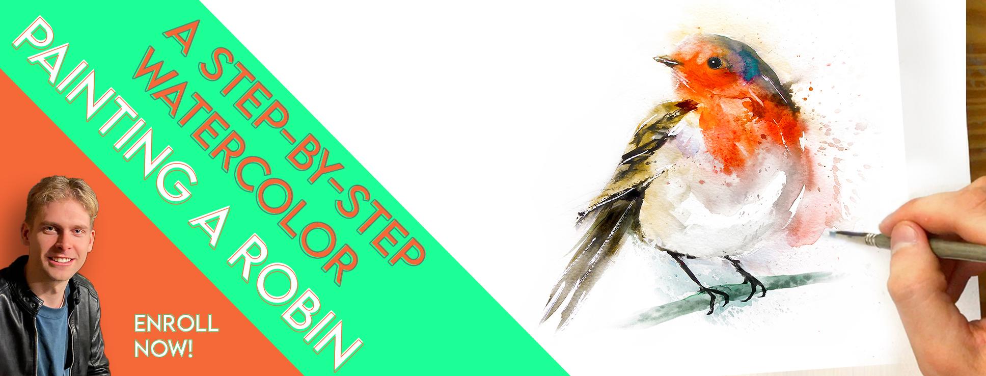
1. Welcome To The Class!: Hello everyone. My name is Will Elliston and welcome
to my Skillshare class. Just like you, I had
always wanted to learn how to create
beautiful paintings. But when I started, I had no
idea what supplies I needed, how to mix colors, or even how to start a painting. In today's class,
I'll be taking you through my process
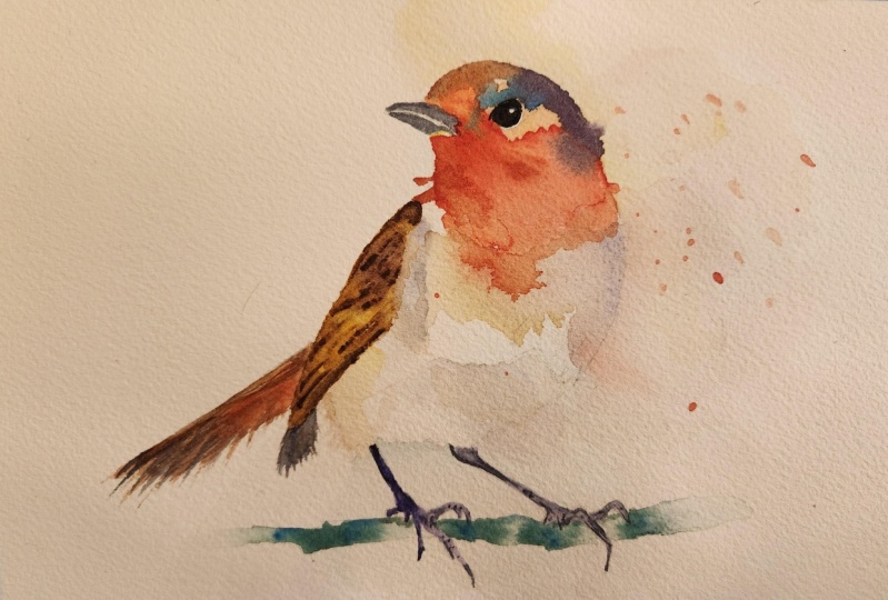
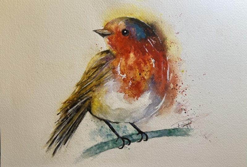
of painting a Robin. Whether you already
have some experience or you're completely
new to watercolor, I'll guide you step-by-step, sharing tips and
tricks along the way. Join me whilst we explore a
variety of modern techniques. I've been a professional
watercolor artist for many years now, exploring many different
subjects from wildlife and portraits to city scapes
and countryside scenes. I've taken part in many
worldwide exhibitions and been lucky enough to win awards from well-respected
organizations such as Winsor & Newton, The International
Watercolor Society, the Masters of
Watercolor Alliance, and the SAA Artist
of the Year Award. I also have collectors that buy my paintings around the world. Watercolor can be
intimidating for beginners. My aim is to allow
you to relax and have fun learning this
medium step-by-step. Hopefully, by the end, you'll surprise yourself
with a nice painting. If this class feels too
intimidating or too simple, please check my
other classes as I have them available
across all levels. My approach to watercolor
starts off loose and expressive with no fear
of making mistakes. Because we're just
creating exciting textures for the underlayer. Then as the painting goes on, we'll add more details, bringing the painting to
life and making it pop. I try to simplify
complicated subjects into easier shapes that
encourage playfulness. Robins, like many birds, are great subjects to paint. They have lots of energy
which is perfect for learning watercolor because it allows for expressive and
loose brush marks. They also have lovely red and orange tones that if done right, can really make
your painting pop. The techniques I'll go
through in this class can be used with any bird or any
subject for that matter. You're welcome to
use this approach with any reference you have. When you enroll in my class, I'll give you the
photo reference I used for this painting, as well as a
high-resolution image of my painting to
use as a guide. Today's focus is about painting rather than drawing
so I have included templates you can
use to help you sketch out the drawing
before you paint. I'll also include
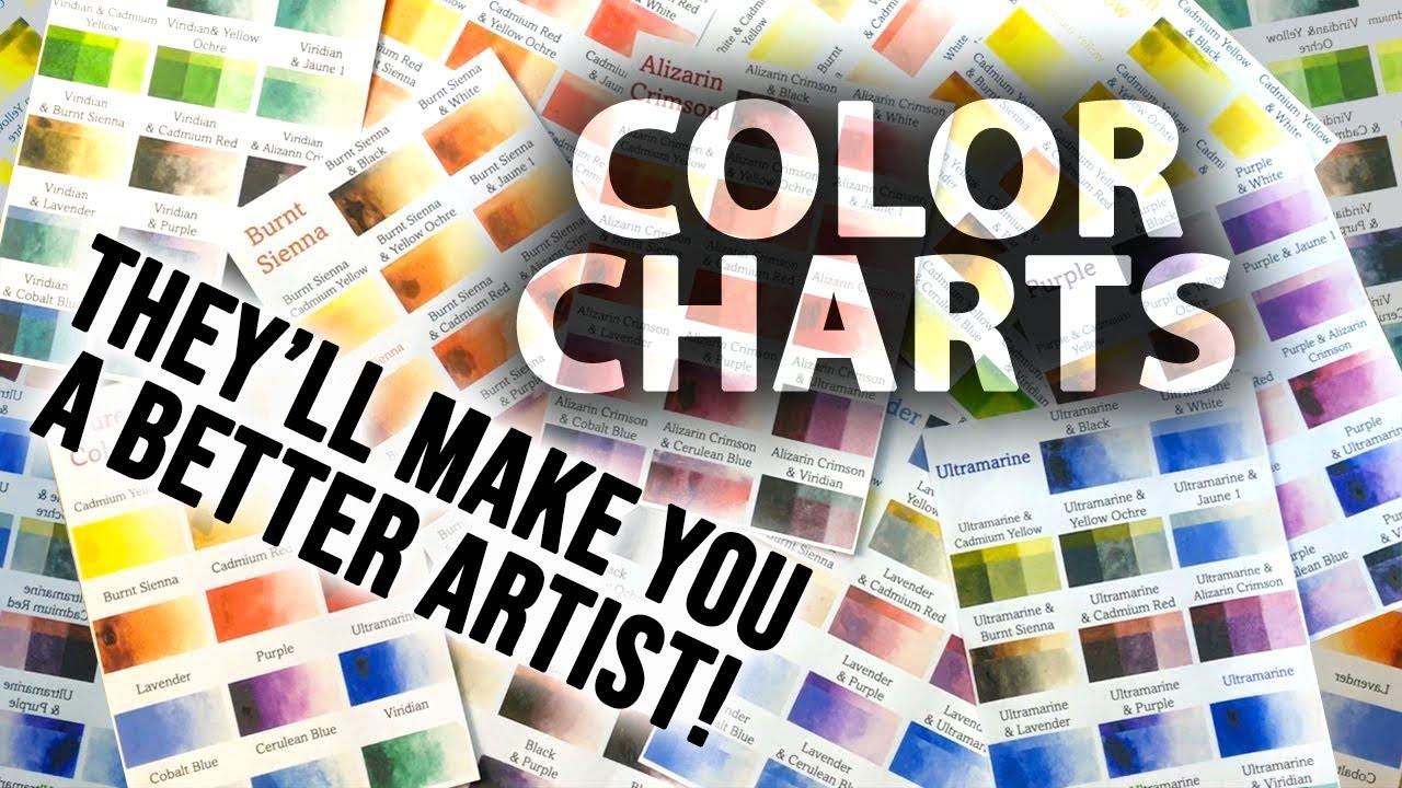
my color charts, which are an invaluable tool when it comes to choosing
and mixing colors. Throughout this class, I'll be sharing plenty of
tips and tricks. I'll show you how
to use mistakes to your own advantage taking the stress out of the
painting and having fun. I'll explain which
supplies I'll be using so you can
follow along exactly. I'll also cover how to choose
and mix harmonious colors. I'll be splitting
everything up into short videos so it's
easier to take in. You can also pause at any moment if you want
to take more time. If you have any questions, you can post them in the
discussion thread down below. I'll be sure to read and respond to everything
you guys post. Don't forget to follow me on Skillshare by clicking the
"Follow" button at the top. This means you'll
be the first to know when I launch a new class, post giveaways, or just have an interesting announcement
to share with my students. You can also follow me on Instagram to see
my latest works. If you'd like to
learn the process of painting a Robin
from beginning to end all Whilst having fun exploring modern
watercolor techniques, please click "Enroll,"
as I'd love to have you in my class.
Now, let's begin.
2. Your Class Project: First of all, thank you so much for enrolling
in my class. I really do appreciate it. As seen in the
introduction video, today we're going to
be painting a robin. Using an easygoing approach, we'll try to capture the essence and bring it to life on paper. It's such a great
subject for painting because robins have so
much energy and spirit. It gives us the opportunity to practice many important
aspects of watercolor, such as using different
brushstrokes and textures, choosing harmonious
colors, and using negative space to give
the painting depth. The style we're
painting in today doesn't rely on a heavily
detailed drawing, which means there's less
stress and it gives us more freedom to express and
explore new techniques. This means you'll learn more and end up with a
better painting. You can choose to paint as loose or as realistic
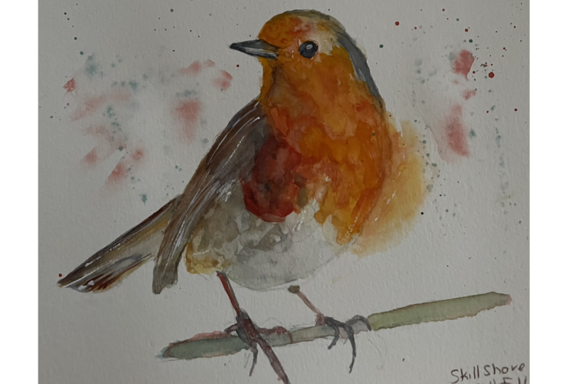
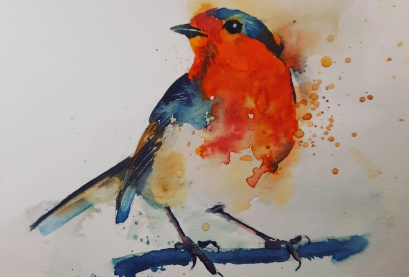
as you want, depending on your level. You're welcome to copy
my drawing and follow it exact or experiment
with your own. I will put my painting in
the resource section so you can use it as a reference
throughout the process. You can also find
the reference photo that I'm going to use in
the resource section. I use photos as a guide. However, I do deviate and
stray from the reference. When I think of all the
different watercolor effects I can take advantage of. There is also a
template you can use to trace and transfer
it onto your paper. Don't feel guilty
about tracing when using it as a guide for
learning how to paint. It's important to have the
under drawing correct, so that it doesn't
inhibit your ability to practice and learn the
watercolor medium itself. Whichever way you
use this class, it would be great
to see the outcome and the paintings you
create in this class. I'd love to give you feedback
so please take a photo afterwards and share it in
the student project gallery. You can find the gallery under the same project
and resources tab. On the right, you'll
see a green button that says Create Project, tap that. Once you're there, you'll
have the option to upload a cover photo and a title and
write a little description. I would love to hear about your process and what you
learned along the way. Once your project is uploaded, it will appear in the
student's project gallery. You can view other
projects here. And I'd highly encourage you to like and comment on
each other's work. We put so much time and effort into creating our paintings. Why not share it with
the world and help support each other
along the way? Now that you have a good
idea of this class, let's get stuck into it, starting with the equipment
and materials I'll be using.
3. Materials & Supplies: Let's go over the materials and supplies you'll need
to follow along. We'll start with
the colors I use, and like most of the materials
we'll be using today, it's a lot to do
with preference. I have 12 stable colors in my palette that I
fill up from tubes. They are cadmium yellow, yellow ocher, burnt sienna, cadmium red, alizarin crimson, ultramarine blue, cobalt
blue, cerulean blue, lavender, purple, viridian,
black or neutral tint. At the end of the painting, I often use white gouache
for tiny highlights. I don't use any
particular brand. These colors you can
get from any brand. Although I personally
use Daniel Smith, Winsor and Newton,
or Holbein paints. Let's move on to brushes. To keep things simple, I'll only be using a small
selection of brushes. First is this mop brush. Mop brushes are good for broad brushstrokes and filling in larger areas or washes, but they also have a tip
for some smaller details. They are one of my
favorite types of brushes. Next is this Escoda Perla brush. I use various sizes, but for this painting, I'll use size 8. These brushes allow for
more precision because they have a finer tip and
last quite a long time. For even more precision, when painting final touches
or highlights for example, I use a synthetic size 0 brush. All brands have them and
they're super cheap. This here is a sword
brush or a rigger brush. It's quite long, but thin. It's only used for
very small details, much like the size 0 brushes, but it holds more
water and pigment, saving time and
effort refilling. The only drawback is it's more difficult to control
as it's more flimsy. That's it for brushes. You're, of course, welcome to use
your own favorites as well. On to paper. The better
quality your paper is, the easier it will be to paint. Cheap paper crinkles easily
and is very unforgiving, not allowing you to
rework mistakes. Good quality paper, however, such as cotton based paper, not only allows you to rework mistakes over multiple times, but because the pigment
reacts much better on it, the chances of
mistakes are a lot lower and you'll more likely
create better paintings. I use Arches because it's what's available
in my local art shop. Next, here are various materials that will come in very handy. A water spray is
absolutely essential. By using this, it
gives you more time to paint the areas you
want before it dries. Also, it allows you to
reactivate the paint if you want to add smooth lines
or remove some paint. Lastly, masking tape. This, of course, is just
to hold the paper down, still onto the surface to stop it sliding around
whilst painting. That's everything you need
to know to paint along.
4. Sketching It Out: Before you can
start the drawing, you've got to think about where you're going to place it, and that its dead central. So I'm going to look
at the whole image, mark the top of where
I want to figure out, mark the bottom, and the top, obviously, where the top of the head is and the lowest point is where the branches and the
bottom of the tail. Then you start with
the biggest shape, which is basically the body. I'm going to draw it as a
circle to keep it simple, then the head comes around like an extension of that drawing. Very light, to begin with
so that I can rub out my mistakes, which
there will be. Everyone makes mistakes, it's just about how you
correct them or overcome them. That's the good thing
about watercolor is really, it's all about mistakes, so happy I extent this working
with the unpredictability. The best watercolor artists
are just people who know how to adapt with whatever
it throws at him, learning by the nature of it rather than fully
controlling it. The beak there. Well,
the tail, link it up. I'm drawing, adding
different sections before I can apply the paint. We're just drawing
directly from the image. Let's do a few splashes out
there and where it's white. I'm going to have to add a
bit of an extra space in the background to
show off that white. I'll do a few splashes here too, tail point out there. Now that I've mapped out the broad shapes with
light pencil markings, now I'm going to in,
do a few more details. Still keeping it light. The good thing about robins is, all these painting robins
have so much character. Each robin has its
own character, so when it comes to
drawing or painting them, it doesn't matter if
your exact or realistic because it'll just seem like you're drawing a
different personality. Draw the eye, draw
a perfect circle. Mostly I always draw the
eyes completely back, paint the eyes completely back the watercolor and then I do a dot of white
for highlights. It's a nice little trick, that's it, a bit of realism. Of course I've included a template of this that
you can easily transfer onto your paper by tracing or if you've got a
large enough screen, you can hold your watercolor
paper up to it and draw over it because this class is more about
painting the drawing. Drawing you can learn over time. It's more about
intuition and practice, so don't feel guilty about
sketching or tracing rather the image because that's what we're
learning about today. If your drawing is incorrect, it can inhibit your ability to learn the watercolor medium. Then once you're more
comfortable with painting, then you can draw
without tracing. That's where the
legs will start. Again, it's going to be all
white around this area. I need to add a few
bits on the edges. even if they're not
there in the photo, just to make it a bit clearer. Now the branches, a good compositional
tool just to have a little single branch there where it fades off at the edge. I didn't want anything too
attention seeking as it will take the attention
away from the main bird. Claws. It might seem quite
light, pencil markings here, but I'm trying to
keep it that way because when it comes to painting I don't want to see
any pencil markings at all, so I'll rub them all out
once I finish painting and just leave the
pigment shading. If I draw too hard, it will be difficult to rub out. So that's pretty much it. Now we'll move on to
the painting stage.
5. Expressive Underlayer: Just before we start painting, I wanted to show you what I use to prop up the painting
board and give it a bit of an angle is just a rolling pin wrapped around an
old kitchen cloth. What that means is I can move it closer if I
want more of an angle so the water runs
down or I can take it away completely so it's flat. Just useful and easy to do and gives your painting
a bit more control. To start the painting, we're going to look at
the lightest parts, which is the underbelly
here and I'm going to use a mop brush just to
put in some light colors. Because we can always go
on top with dark colors, but we can't go back over
dark colors with light. Just to get into play for me, I'm just going to
do a few splatters. I'm even going to use
my water spray just to keep things loose because we don't want to have
a tight mind about this. We want to be free and have a bit of a
relaxed, fun attitude. Now it's going to
have a plain gray, any gray and then choose whatever color we
want to influence it. But I don't think
I'm going to go quite a bit of yellow
on this palette here. That's what I'm
going to [inaudible] bit of warmth and just keep
them going back and forth between warm colors like
red or orange or yellow, and cool colors like
blue like this one here. Very light at this stage so
I'm just adding colors and then adding a brush
with pure water. Let me get full in that. Because then when they mix
together, that's been, they make exciting brush marks. Exciting effects. I think this branch is
going to be a green, so I'm going to get a
bit of green here and start influencing
that area there. With green. You flip it, I think this can be
quite difficult. But if you've got
a tissue around, then you can quickly [NOISE] brush them away from areas you don't want them to be. [NOISE] For the time being. I don't like clean air, so good. Pull that out with pure water. Then I'm going to get
this yellow ocher and make it slightly gray. And on my palette,
you can see I've got black there and
yellow ocher there. I'm gradually going to
mix the two together. I'm starting off with
this pure yellow ocher, then adding another one, but with a bit more black. There's a little bit, but that's enough for
the time being. Because I know which bits are
going to be darker later. Again, I'm doing this quite spontaneously impulsively
without having a real plan. I'm just going with the flow. I can only really
give instruction when it comes to
that moment in time. There might be a few
contradictions depending, depending on how I decide
to change, what I do. You have to be open to change
because of watercolor, of course, changes a lot. You don't have a choice
about it sometimes. Getting some cobalt blue
mixing it in at the top there. I quite like that. You have to have a
lot of faith because sometimes you have to create weird textures like this that
aren't related to anything. Only for it to work
out in the end. Burnt sienna. Subtle beginning is
quite expressive. You can write one
right way about this. I can do it
completely different, 20 different times and it
will never look the same. I could try to make
it look the same, but it won't, because that's
the nature of watercolor. That's the exciting
thing about it. So many options. Yellow ocher here. Yellow ocher mixed with burnt
sienna actually. Splatter is a good way
to blend mixed colors in because it's
got an even spray. I don't want that, so I'm going to pull it out. Do that, piece in their food while knowing that I'm going to
leave it white. I'm going to stay true to that. A few more clickers here that you can just
clean off quickly. [NOISE] Flick is going up
that far. Quite colorful. Even though these colors don't exist in the actual painting, I'm putting them in here because that's what watercolor is about. Experimenting with
different colors. Also come in with white gouache or white watercolor later. We can go a bit darker here knowing that we
can bring them back out. Now we're going to wet this area here and a little bit of orange, red, and yellow top of here. It should burst
out into the area. The water should naturally
guide it outwards and you don't have to do much with that few splatters of pigment there. Then a bit more green there. Just adding that left a little gap there
which I didn't intend to do. That's okay. There as well. Green and red
are complimentary colors. If you ever get an opportunity to put them next to each other, it's a good idea because
when they merge, they crack create
lovely visual effects. That's red and green. Then blue and
orange is the same. We're going to do that up here. In a minute, we're
going to do orange and merge it with green. [inaudible] purple and
yellow go well together. That's another
complimentary color. Now I'm going to wet
this area again because I want a bit of a background
there, a yellow background. But by wetting the area first, we won't get any harsh lines. It'll be soft lines and it'll flow out into
the background. We've wetted the area
there even though it's difficult to see,
we've done that. We're going to add a bit
of yellow right here. Should again bleed
out naturally. Don't have to do much with that. It's a good little exercises for different effects that
you can use anywhere. You might not get it
right the first time, but it allows your
mind to work out the timescales with
how watercolor dries and what you can do with it, how far you can take it. Little bit by little bit, you'll have a better
idea and it'll be intuition rather than knowledge, rather than consciously
thinking about it. That's what you want really, you want it to be intuition, automatic so you can just paint freely and express
what you want to do.
6. Painting The Mid-Tones: I'm going to be
quite bold here with some orange. I need
to be careful. This is the boldest part, so I've got cadmium red here. I'm going to land on
quite thick actually. Go straight over the eye because we'll paint that black later. We don't need to
worry about that. Lovely vivid color. Cadmium red. I say cadmium red because that's just a
general term for it. The tube that I'm using is actually called pyrrole orange. But I've got that in my
cadmium red section there. Paint brands have hundreds
of different colors, but they all can be mixed
with just a few other colors. That's why I include my
color chart so you can see that in the
resource section. That's my area filled out quite thickly. Not much water just
filling the area out. A few dry brush marks there. A bit thicker there actually. That's the realistic we'll go. Now we're going to go over
that with a bit more yellow, bright yellow, cadmium yellow. This is a wetter brush so that we can start activating
what we just put down. You actually don't want your
painting to be perfect. It's okay to have some mess. It's that mess in watercolor that creates nice
texture that affects. Bit more right here. More yellow, just going back between red and
yellow one more time. Trying not to contaminate
the red and yellow yet, because that will
make it less vibrant. We'll wet this area
here actually, so it blends
slightly into there. Slightly and I'm going
to move that back a bit so that it doesn't
roll down so quickly. Move to a smaller brush because I'm going to add
some splatters about that. I only want them to be small
splatters. Here we go. These small little scattered
out a bit of definition. Got to take [inaudible] clean that up with some plain water and add a bit more pigment
to make that work. There we go. [NOISE] I can
clean these marks here. Cadmium red again. Cadmium red with a bit of alizarin crimson,
some darker red. Going to be very careful now and do a few
flickers of this dark red. Back to the orange, mixing
a bit more yellow into it just to bleed out here. [NOISE] To do that, I'm just going to wet it
again and then add this. It should find its way out. If splashes of pure
water then do some nice. As it dries, it will
create some nice effects. I think I'm going to add
a little bit of blue. Ultramarine blue
light is right there. Some purple just a little bit so that it can come down here. Some yellow here. [inaudible]. Do that again.
7. Using Complementary Colours: We're going to introduce
quite a weird color here, I think a greenish, turquoise, blue because green goes well with red and blue
goes well with orange. Together, It will create
a nice little effect. I used cerulean blue, then we enter this blue. It's a bit too watery, so I'm going to get a tissue and just
suck some of it out. When they mix together,
they'll get darker. We do want it to be
a bit darker there so you can get on with that now. That's [inaudible]
crimson, burnt sienna, and a bit of black to
bring it down a bit. Bring that down, quite bold. I want that to be a bit. It's a bit too colorful. It's already color there, and if I made this too colorful, it won't look as vibrant
where I want it to be. So if I gray it down
by adding pure black, it'll really make
the rest of it pop. That's the thing, If you
want colorful paintings, you ironically have to add gray to contrast that vibrancy. If you want to make that
color pop, you can, of course, make the whole color
of the painting colorful. I still think it should
be a bit grayer, so whatever color it
is, do the opposite. You should look at the
color charts for that. If you want to make a gray, instead of adding black, add the opposite color. If you don't know what that is, look at the color charts I included in the
resource section. You'll see what colors make gray depending on what
they're mixed with. It's coming off a bit
too strong there, I'm just some to
get some of that out just a bit. Likewise, there. Just a bit more orange there. Smaller brushes, the
more difficult it is to flick so when
it comes to flicking, use a slightly bigger brush. There's a lot of
cleaning my brush because when you want
pure, vivid colors, you have to make
sure none of it's mixed in with another color that might contaminate it and make it less vibrant,
[BACKGROUND] A bit more green up here. I rarely clean my palette
because those lovely grays, they get picked up on the sides. I always pick them up and
drop them in like that. We'll leave that
for that section. Now, you can see as we're adding more bolder colors there, down here, it's
becoming less obvious.
8. Painting The Wings: Now I'm going to
add the wings here. To do that, again, I'm going to start with
light colors, yellow ocher. Then leave the darkest
ones for last. [NOISE] Because it's yellow, I'm going to introduce
a bit of purple again because it sits opposite. Just by doing that, it
creates a nice effect. Instead of adding
black for a shadow, like I was saying
before, add purple. Just makes it so much
more interesting. Purple because, like I
said, it sits opposite. Didn't mean to do that,
that's another mistake. That's okay. I picked up too much orange when it
was meant to be yellow. Goes back to this. Once I've chosen my colors, I usually stick with
them because it keeps the rest of the
painting harmonized. If you just randomly brought a new color
into the picture, it would look quite odd, it wouldn't fit well. I'm using this burnt sienna
I got form down here. [NOISE] Then once it
reaches the edge here, I'm going to make it
[NOISE] less saturated. [NOISE] For that,
I will use gray. I think a bit there, and
then mixing them together. Mix them on the paper
rather than on the palette. We're coming to the end of
the stage, the second stage. We've done the lightest phase. Then, we're coming
towards the end of mid stage, middle tones. Then we'll go into the dark, pure black pigment, which will bring the
painting to a close. Even though I'm using a rubber today as today's demonstration, the same principle, the same process can
be used with anything. [NOISE] There's different
effects that you use. [NOISE] They could be quite specific to
certain paintings, but the concept of starting light then going to the mid colors and then
going to the dark colors. That's mainly the same
with each painting. Soften this edge a bit. I will bring in a bit more
yellow there. Looks too red. [NOISE] Now I'm just going
to paint the branch green, I'm just going to wet it
first with pure water. [NOISE] Then dab it a bit. Go in with some green. [NOISE] Then once it's all wet, it just paints itself. Just tapping that
[NOISE] blue pigment. You can help guide it
by moving it around. But as it reaches the edges, it should fade out by itself. [NOISE] Then of course, you can define the curve a bit better at the top there
and at the bottom. Add a bit of blue. A bit darker there. Add more so I can just fade out. [NOISE] Tap. As it starts drawing, you can get different effects. If it's too wet, it just
blurs out completely. But as it's just at the
stage before it dries, you can add strokes that
just slowly bleed out. As they dry, they
leave nice textures. [NOISE] I use the
hairdryer to speed up the drying process, but it's not completely dry. I don't want it to be
completely dry yet. I'm just going to
add some little dots here to help with make it
seem like it's curved. That should be enough. Add a bit more blue here. Also [NOISE] make
that a bit darker, that top. Needs accentury thing.
9. Painting The Dark Tones: Now I'm going to work
from left to right, adding a bit more
dark brush strokes there using a fine brush. Quick stroke there
with a dry brush. I'd say you do dry
brush to flip quickly. That makes it quite dynamic
as well. Dry brush masks the top here. Make
that one so black. A bit of a warm glow to it just to signify the end of the wing and
the top of the head. The bottom of the head
with my fingerprint, my thumb to just
wave the tissue. These markings just literary, not very detailed, but it's obvious that it's
meant to be a wing. Implying it rather than
stating is overdoing it. We'll come back into this later just to merge
these lines in. The paint is really thick. Pigment, really thick, and then you can reactivate
it later with water. That's how you can get
some nice effects. That's very thick paint here. It makes it bold and confident. Because it's not wet yet
with the rest of the paper, you have a bit more control. Then when it comes to later on, we're wetting the paper. You can choose your own pace. How much you should wet it. It'll be a bit clearer
when we get to do it when we get to that stage. We're at that stage now, so I'm going to go back
to a larger brush. Just with water, I'm going to go over some of
these lines to reactivate it, create some interesting marks. For having such a bold paint
and then reactivating it, the water flows in
its own majestic way. If it's not doing enough, then you can start dabbing. But to begin with, let it do its own thing. Yellow ocher. At this stage, not only are we adding
the final details, but we're correcting mistakes or making small
little improvements that are quite unique
to the painting itself. For you, there might be different
issues you have to fix. But through practice and
trying different paintings, your knowledge will
expand and you'll know what to do depending on
what your problem is. We're going to do it. Flicker
black up this direction. A few more flicks there. Trying to go out like that. Looks like it could be too much. If you've got a
tissue in the end, you can pull them out and they'll dry much lighter
than when they're wet. We can add water. Pure water. Now, touching the paper there. It's dry enough.
Now I'm going to paint the legs and claws. It's also again with
very thick pigment. Only where it's pure
black and painting. Then the gray areas can be merged later
once we've finished. All of these things
can't be seen in the painting and the photo. The photo is just a guide. I already have the
idea I wanted my head. That's where it's useful to
watch someone else paint, because the interpretation of the photo can be
different depending on which artist does
it and the effects that he uses techniques. We got cerulean blue and
we merge them a bit. It's actually too wet and
then I'm going to let it dry. Wipe these out of it.
They're not dry yet. I'm even going to flip
some pure water onto here. Wait a few seconds,
and then rub. Subtle difference,
but it has added a bit more spice and
aliveness to it. I'll do the same now when
that dries to the beak. Making sure that I'm not putting my hand on any of the wet bits. A little bit of white
there that can come out to that orange, can merge it into that. Now, I'm going to paint
the eye solid black. Takes a lot of
concentration from this because even though it was a
small part of the painting, it's arguably the
most important part. Now, I can go back to fit because it's dried enough now to start
messing around there. I used this lavender
from Holbein paints. A bit more yellow
at the top here. But yes, very careful
doing it after you've already painted
something. Get one shot. That should be fine. Go
back up to the beak. Now I'm going to do something
which is quite important, which is have a
little break without looking at it and come back
to it with a fresh eye. I know we've got a few
things more or things to do with highlights and such. But the highlights is the
very last stage though. Before we do anything drastic, we need to think about
what else we can do.
10. Adding Highlights: I've just dried
off and I'm going to flick some pure
water right here. Going to get a clean
tissue and just rub. [NOISE] You move to splatters there. There we go. Now I think we're ready
to add some highlights. My work straight from the tube. Get a nice clean
point. There we go. You don't need to
cover the whole of it, just little points just to distinguish
where that edge is. Let's continue a little dab, but not in the center, but not on the top, off center, that will do just fine. Few white strokes
there's quite powerful. Very messy before,
but just by adding a few simple white lines there, defining where the edge
is really makes it pop. Add there, it's meant
to be clean edge. Getting to the other side. I've been mentally
preparing myself for most difficult
part of the painting, that is optional and that is to put a little ring. Actually, I'll do that. I was going to put a little ring of highlights around
the eye here, but I think I'm just going
to soften that edge a bit. Reactivating it, and
then bringing it out makes it a bit more 3D. Use a brush to pop it. Tissue. That's a bit better. I want a little
bit lighter here, so I'm going to dab it, activate it and then pull
away with the brush. Going back in to do that a little tiny ring that's barely noticeable
around the eye. If you don't believe you can do it with enough of finesse, then practice before you do
it on the actual painting. Few white dabs. Now I'm going to brush away. I'm going to add a few more
flickers of green there. I'm going to use a tissue to make sure I
don't splash above anymore. Greeny blue. Let me get small ones. Then a bit of pure water just
to abstract them out a bit. Now I'm going to dry it off, clean up some of the lines, rub away the pencil markings, and I'll sum up the class.
11. Final Thoughts: Welcome back. Now the
painting is finished. Let's have a
close-up look at it. I hope you have your own
painting to look at as well. I hope you enjoyed
painting this robin and learned new
techniques along the way. If there are any techniques or subjects that you'd like
me to cover in the future, don't hesitate to
leave a comment. If you don't feel like sharing
your painting project, please let me know how it
went in the discussion area. Some parts of this painting
were quite intricate, like the highlights in the
eyes and some parts were quite loose and open for interpretation
like the red chest. Watercolor is an
elusive medium that can have a mind of its own
and in that respect, it can often be
frustrating to work with. But the key to painting well, it's not so much to fully
control the medium, but to manipulate it in a
way that allows it to do its own thing and to form its own unique,
captivating textures. Sometimes it works,
sometimes it doesn't. Even the best masters make mistakes and create paintings
they're not happy with. What's important is that
you actually gave it a go. The goal, ultimately, at this learning stage is just
about having a bit of fun, exploring the possibilities
of this exciting medium. It can be easy to
feel a bit stressed during the painting if
it gets challenging. But remaining
positive and keeping faith really helps in the end. If you'd like feedback on your painting, I'd
love to give it. Or if you'd like any advice
related to watercolor, please share your painting in the student projects
gallery down below and I'll be
sure to respond. If you prefer, you can
share it on Instagram. Tag me @willelliston as
I would love to see it. Skillshare also loves
seeing my students' work. Tag them as well at Skillshare. After all the effort
we put into it, why not show it off? Remember, please click
the follow button up top so you can follow
me on Skillshare. This means you'll get
a notification as soon as I publish my
next class or have important announcements like
free giveaways or sharing some of my best student artwork uploaded to the project gallery. Thank you so much for joining
me in this class today. Please leave a comment down below in the discussion area, if you have any questions or comments about today's class. I hope you've learned
a lot and are inspired to paint more in
this wonderful medium. See you next time. Bye for now.
 Will Elliston, Award-Winning Watercolour Artist