Transcripts
1. Introduction: Hi. Hello, and welcome to Learn to paint
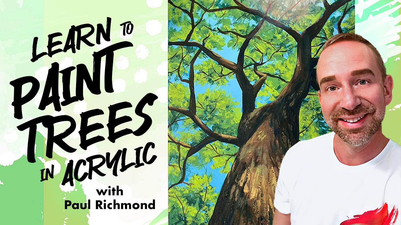
trees in Acrylic. I'm Paul Richmond, and I am so excited to welcome you
to this course where we will be going step by step from a blank canvas to a
finished acrylic painting. One of the biggest
benefits for me of going to art school was being surrounded by so many
talented artists and getting to see
how they worked. And it was fascinating because we could all be
painting the same thing, but every single artist approached it a
little differently. I think there is a
tremendous value in seeing how other
artists work, how they tackle that
subject matter. Not that you have to follow
along and do everything I do. Not that I'm saying my way is the right way
or the only way. There are so many
different approaches. But my hope is that by
painting along with me, you will pick up on some tips and tricks that will help you in your own
painting process. In this course, we'll be using just the primary colors,
red, blue, yellow, and also white and black
so that I can show you how to mix everything you need
just from that basic set. Are brand new to painting. This is a great course for you because we are
literally going to start from scratch and go
through the entire process. But also, if you're a more experienced painter and
you're just looking to refresh your skills or
maybe pick up some new ideas, this is also a great course
for you. Basically everyone. I've been painting
my whole life. I started taking lessons from an instructor when
I was 4-years-old. I've just always known this
is what I wanted to do. I was very fortunate to
get to go to art school, study my passion and really
make it into my career. I've had the privilege
of displaying my art all around the world. I've even been commissioned by some celebrities like Troy
Sevan and Dolly Parton. But my favorite
thing to do is to teach and share my love
of art with other people. Are you ready to get
started? Let's go.
2. Project: The project that we'll
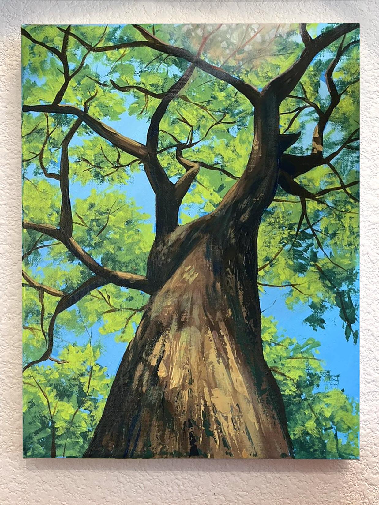
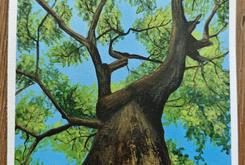
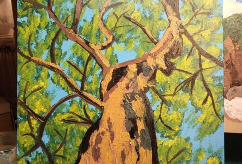
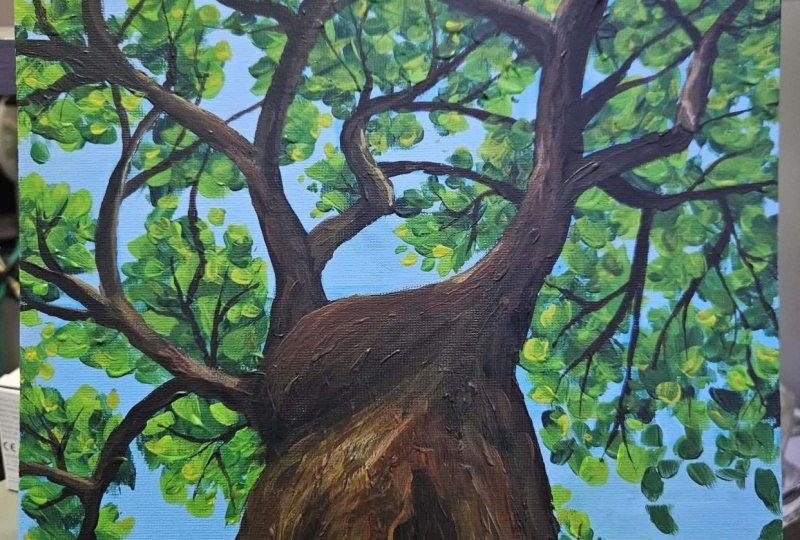
be creating together is this acrylic painting of a tree. I'm using a nine
by 12 inch canvas. You can use whatever
size you want, and we will literally be
going from start to finish. So a blank white canvas
is all you need, and then by the end, you will have a beautiful masterpiece. Along the way, we'll be learning about a variety of topics, including how
perspective changes when you're looking
up at a subject. How to create a strong
sense of composition, mixing rich natural colors from just a few basic primaries, building layers of light and shadow to create depth and using expressive brushwork and
even the palette knife to capture atmosphere
and texture. All right. Let's do this.
3. Materials: You're welcome to use
any painting materials that you would like
for this project, but let me share with
you what I'll be using. I have a nine inch
by 12 inch canvas, a basic set of acrylic paints, including white, black,
and the primary colors, red, blue, and yellow. Assortment of inexpensive
paintbrushes of various sizes, a palette knife
for mixing colors, palette paper to put paint on, a cup of water, and
some paper towels, and the reference photo, which I'm providing for you. And that's it. So go
gather your supplies, and let's get started.
4. Painting the Blue Sky Background: Hi, everyone, and welcome to earn to paint trees and Acrylic. I'm Paul Richmond, and
I am really looking forward to going through this
painting process with you. In this lesson, we're going
to start out by painting the blue sky background.
So let's do it. My first step is to look at
the reference over here, and I'm going to kind of cover the whole canvas with
just the sky color, and then I'll start building
up other things from there. So I'm going to use some of my primary blue and some white. And let's see I I
need all of that. So if you've never used
a palette knife before, it's really good for
mixing your paint. You just scoop a
little bit of one, scoop a little of the other. I always start with
a small amount of the blue first because
it's not going to take a lot to darken it. So try and get, you know, a color that looks right to me. You can make it whatever
shade of blue you want. If you're trying to match
the color in a reference, sometimes I'll put
a little paint on the knife and then
hold it right in front of that area of the photo
to see if it looks close. It does. I think I'm
pretty happy with that. The sky in the photo is just a little bit has just
a touch of red in it. I don't know if you
can see that or not. But it just takes a little
bit of the edge off of it. We don't want to make it
purple. I mean, I'm talking, like, just a drop of red. It'll be a subtle difference, but it will help. Now, the other thing I see
when I look at that photo is that there's
this little area at the top where the sun
is making a glare. And so the sky actually gets a little bit lighter as
it approaches that part. So I'm going to take
a little bit of that color that I just mixed and add some more white to it
so I can make that part. Okay. Now, let's paint. I'm gonna use my biggest
brush because we're just covering the
canvas. Get some water. Get water a little closer. I like to wet it down
a little bit so that that will help it
to cover better. Thins it out a little bit, too, so it'll dry faster also since this is just our base coat. So I'm painting the darker blue probably along the I would say the bottom,
two thirds of it. Then I'll switch over
to the lighter blue. And you can just make it blend in with the darker blue
by using your brush. As long as the two
colors are wet, you can make acrylic
paint blend. Once one of them dries, then that's when you kind of get that hard edge when you try and put another
color next to it. So you just have to
go back and add a little bit more of
that color to it too. But I kind of use these
criss crossy brush strokes that makes it blend
pretty nicely. Camouflage is the direction of the strokes a
little bit, too. So if you want that, if you want a little
bit of a smoother look, you don't want it to
look really brush stroky then that's one way
to accomplish that. But I also sometimes really like texture and like
for it to look really brushy and to see the
direction of the strokes. So see what happens. Okay. Then I'm just going to go ahead and go back over
this bottom part again with a little bit more
of the darker blue to fill it in where it
looks a little too thin. I don't want to
have to worry about trying to remix the color later. Look at that. I
gorgeous blue canvas. We could just say it's done. All right. It's hard to tell in the photo
when you first look at it because you really
those sections are broken up by
all those branches, so it kind of looks like it's just the same
blue everywhere. But if you look at the very bottom of the photo and then you look all the
way up to the top, you can see there's a pretty strong difference
between the two. That's one of the That's one of my favorite
things about painting, especially like painting
something, you know, when you're using a
reference like this, is that it really makes
you stop and look so much closer at things
than you normally would. I, you know, would just normally
think, Well, sky's blue. But when you're painting it, you have to ask other questions. What shade of blue? How
dark? How light is it? Just makes you slow down
and appreciate things a little more. Great job. Alright, we are off and running. Now, in our next lesson, we're gonna start sketching out the tree. I'll see you then?
5. Sketching the Trunk: Hi, everyone, and
welcome back to earn to paint trees and Acrylic. I'm Paul Richmond,
and in this lesson, we're going to
start sketching out the tree. Let's get started. Okay, so next, I
kind of want to have an idea of where at least
the main branches are. So actually, what I will do is just use the colors
that I have out here. I'll just make a slightly
darker sky color. So I'm just mixing a
little bit more of the blue in with my sky. And I'll use that to just
draw some lines for the tree. You can use whatever color you want. It really
doesn't matter. But this will all
get covered up. This is just kind of a sketch. This is just another way
of sketching with paint, rather than with a pencil. So I'm going to use this
little bit smaller brush. But it's still, you know,
got some width to it. I think it's maybe a half inch. Because I like drawing
with these kind. So now the main thing to
notice if you want to have that feeling of looking
up at the tree, that perspective, the
way that you achieve that is by remembering
that things get smaller, the farther away
from you they get. So even though we know that this tree trunk is
actually probably about the same size
here as it is here, maybe it narrows a little bit. But the way that we see it is a really dramatic enlargement, and that helps us
understand the perspective. So I'm going to start by just
figuring out where I want the trunk to be at the
bottom of the canvas. I'm just going to make some
little marks for that first. So I'm going to put mine here. And again, however you like to draw, if
you're more of like, I just want to get
in there and draw some squiggly lines and do
it that way, go for it. I'm kind of mapping it
out because I want to especially if there's
people watching who haven't done
a lot of drawing, I want to give you
sort of an easy way in to orienting yourself. It can be a little
overwhelming when you're looking at an empty canvas. So another thing I'll do is
I'll look at my reference, and I'll try to
figure out, you know, maybe where's the halfway point? I'm even going to put some
little dots here on it. So that's about halfway
on the vertical side. And this is about
halfway horizontal. So what you're doing is kind of creating an implied
grid for yourself. So if we do the same thing here, there's the vertical. Is the horizontal. Then you can figure
out where you want to end that part
of the tree trunk, which is a little bit
below the halfway point. So I'm going to go to
the halfway point, then come down a little bit, and that's about
where I'm going to have the tree start
to branch off. And I'm going to make it about
let's see. At like that. The lines don't need to be
too straight or too perfect, remember, 'cause it
is a tree trunk. Actually, if it's a little has
a little bit of character, that'll be better. Alright. Then I'm going to work
on this big branch that comes up this direction, and it always helps me to
have an idea of where I'm going instead of
just being aimless. So I'm going to look at
where this branch ends up, which is all the way up
in that top right corner. So I'm going to make a
little mark up there. That tells me where
I'm headed with it. And then I know that it's going to swing over
this way a little bit. And then it basically goes
vertical and then diagonal, and then it kind of bends
again a little bit more there. But the main the main lines are vertical and then
angle to the right. So I'm gonna go up and then
over. And then like that. Don't get too hung
up on making it exact because it doesn't matter. It's a tree. It can grow
anyway it wants to. Alright. And then just like
with the trunk, the branches will also get smaller as they get
farther away from us. And that's also just
something that branches do. I mean, they do get smaller as they move away from the tree. So we've got this little
piece that comes out here. Gonna make the branch about
that thick and then come up. I'm not going to
worry about any of the things branching
off of it yet, getting the main the
main branch first. And that's kind of a good thing
to think about, actually, because when it comes to drawing something
that's more complex, it can be easy to get distracted by all the
little things, you know? And I'm guilty of that, too. I'll see all those
interesting little branches and leaves and all the shapes, and I'll want to start
working on all that. But if you don't get a
sense of the overall first, the bigger pieces that really affect the layout of things, then you can easily get lost
in the weeds or the leaves, whatever you're painting and
lose sight of the whole. Alright, so now this branch comes over and it
looks like it's about halfway between
there and there. So about a quarter of the way down is where that one ends up, and it goes up and
over and over. Bens. You know, just get a little whiter
as it comes down. Got like that.
Gorgeous. Awesome work. Okay, we're not quite done with the sketching yet,
in our next lesson, we're gonna move on to the
branches. I'll see you then?
6. Sketching the Branches: Okay. Hi, and welcome back to Learn to paint
trees and acrylic. I'm Paul Richmond,
and in this lesson, we're going to continue
sketching out the tree moving on up to the branches.
So let's get started. Alright, now, I'm just going to quickly sketch in a few
of the other branches. And the main reason I'm doing
this right now is because I want to have a sense of
where to put the leaves. So we're gonna there's one
that comes off from over here, and then it ends up about here. I'm not even going to
draw the two sides. I'm just going to use
my brush and paint the whole branch
because that's quicker. And you can put the
branches anywhere you want. Branches are when you're
drawing or painting a tree, branches are like wonderful
little design elements that you can adjust. If you want to have the viewers eyes moving around
in a particular way, you just put some
branches to lead them. Look at the picker one here. This one comes down like this. I'm still not doing
the super tiny ones. I'm just getting the
main the main ones. I like this one here
that kind of starts off, but then it's like, nope,
change mine, going back. Okay. Then we've got
this little knob there. All right. Well, that branch got all messed up,
but that's okay. Um, Oh, this big one here that goes about
toward the center. And gonna do this one. That's just about
enough, I think. Smile. Yeah. That gives me a
good sense of where the main the main branches are. Enough to start laying in
some leaves and then we'll come back and really
paint the branches. Alright. If you haven't used
acrylic before, you want to make sure
and clean out your brush really well in between colors, especially if you
might not be using that brush again for a while, because the paint
will dry on there. So just swirl it
around really good. In the water and then dry
it off on a paper towel, get all the water out of there and kind of shape it back
the way it's supposed to be. And then it'll be good
and ready for next time. Otherwise, the paint will dry
and the brush will harden, and then it's not gonna
be too fun to work with. Although those kinds
of crusty brushes are good for some things, they still have their purpose. Alright. Are we ready
for some more fun? So, since I'm mixing my green, I've already got most of the colors I need
for that because green is blue and yellow and white
when we want to lighten it. So I'm just going to add
some yellow to my palette. And if you look at that photo, the leaves, there's a range
of values in those leaves. There's areas where
they're pretty dark. When I say values,
that just means the light and dark in the image. So there's areas where
it's pretty dark. And then there's areas
where it's almost pure yellow where the sunlight
is really hitting it. So I'm going to mix a
few different shades, and I'm just going
to take the colors that I had here that I was already working with and add some yellow to them and
see what that gives us. Okay. That's not bad. I want to get the
darkest green first, so I'm actually
going to add some more of the dark blue into that. 'Cause if you look, that's
a pretty dark green. Now, what's happening, though, is by adding all of that blue, it's making my green
turn very cool. And the green in the
reference is warmer. So I'm actually going to add a little bit of red, not much, but just a little bit of red, and that will help
counteract the green a bit. Red doesn't get to
play a big role today. It's just we're just adding little touches
of it to help us out. And I'm going to add
some more yellow also. Color mixing is a
whole other aspect of painting that you could
just spend forever on. And it's really, I
think, a lot of fun, but it can be frustrating, too, if you're trying for something specific and you're
not getting it, and you just have to
keep looking at what you have and then holding it up to what you're trying to get
and seeing what it needs. So my color feels a little too, like, right out of the
Creola box right now. So I'm going to add
a little bit of black to my palette also. And throw a little of that in
there and see what happens. There we go. That's
what it needed. That kind of neutralizes
it a little and just makes the color feel a little
bit more complex. Okay, I like that green. Give me a little more red. This is where I
can get obsessive, so I'm going to stop myself. And then I'm going to take this lighter one and mix some
yellow in with that, and we'll get our
highlight color. Use lots of yellow. Just a touch of red
and that one too. Okay. I'm actually going to just put out some
more pure yellow also because I think it might be nice to even just hit a few of the areas with just some yellow, maybe mixed with, like,
a little bit of white, for those areas where we want real strong highlights.
There we go. So see how I have before
I even started painting, I have three different shades
here that will help me to get the effects of light
and dark on the leaves. Now, some artists would
rather just mix one shade and then have some white
and maybe some black on their palette and sort of mix with their brush
as they go, too. That's completely valid also. But I like to for
me, it makes it easier to just mix
it before I start. So I know I like the
colors. Good to go. Beautiful job. Okay,
this is coming along, and now it's time to
start pining on the tree. And the next lesson, we're
going to be laying in some dark tones for the
leaves. I'll see you then.
7. Dark Tones on the Leaves: Hi, everyone, and
welcome back to Learn to paint trees in acrylic. I'm Paul Richmond,
and in this lesson, we're going to start laying in some dark tones for the
leaves. Let's get painting. Alright, I'm going to
use my big brush again because I don't want to get
too fussy with the leaves. I want to just kind
of paint them on and let the brush do
most of the work. So I'm going to
start with the dark and I'm going to start down
here in this bottom corner and see how I'm just kind
of using the brush in all these different directions so it builds up a
little texture. I'm not trying to
make it super smooth. Holding the brush in different ways gives
you different shapes. So take advantage of that. Anything that makes your life easier, I think is a good thing. You could also do leaves
with a palette knife, too, if you want a
thicker painting. I think I'm going
to save that for the trunk for right
now, anyway, we'll see. So I'm going to go through
and do all the dark first, wherever I see big clumps. I'm not totally I want to preserve some of
the sky, though. So kind of keep an eye on where
you see the biggest areas of blue and make sure you
leave some for yourself. Doesn't have to be in
the exact same places. And the leaves tend to be kind of thicker
clumps as they, you know, move in towards the tree, and then as you get out
towards the very tip, then they just get a
little more sparse and you see more sky showing
through them. So this is a fun way time to just experiment with
how you hold the brush, how much paint you
put on the brush. So you see when I first started, I was using a lot of paint. And then up here, it's a little more of a dry
brush kind of look where it's you see more of
that blue showing through it. I think the main thing is
just keep trying new stuff. Because when you're
doing something that's a bit
repetitive like this, there's a temptation to just kind of do the same thing
over and over and over again, but then you end up with
a very sad, boring tree. Nobody wants that. No, I just accidentally had a little of the lighter color on my brush, and that's okay, too. You can actually put
more than one color on your brush at the same time. That can give you some
interesting effects. But I want to be I want to build up from dark
to light mostly, so I'm not going to
do that on this one, but if you get other colors
in there, it's okay. And if you end up covering up too much of your sky and you want bring more of it
out, you definitely can. You can just mix up that sky color again
and go right on top of the leaves and paint more negative spaces. That's
what those are called. When you're painting something, the positive space
is the subject and the negative is the space
around it or behind it. And you always want
to be thinking about the balance of the positive and the negative
space in your artwork, because that's a really
helpful compositional tool. It helps you to actually think about your work more abstractly. So instead of just looking
at it and thinking, I'm painting leaves and
branches and trees right now, if you get that out of
your head and you think, I'm painting positive
and negative space, and what kinds of
shapes do those make, that's a really helpful way to just go a little deeper with it. There's a lot that
realistic painting and abstract painting
actually have in common. I think that painters who are painting something
representational, like a tree can really learn
a lot from abstract art because it's great if you can make something if you can paint a tree and make it
look like a tree, but how does it
work as a painting? Do you know, does
it move your eye? Does it have interesting colors and textures and all of
the things that you would talk about if it was an abstract painting
and you weren't busy talking about what it was, you know, like, Oh, that's
a tree or that's whatever. If you take away the subject, there's still a
lot to talk about. And actually, that's usually
what's more interesting. Okay, getting some
more leaves there. I'm going to come back at the end and do that
glow at the top, so don't worry about
that right now. Just put the leaves up there, and then we'll do something
called a glaze over top of it to make it glow. That'll be fun. Don't be afraid to
let the leaves go right inside of the tree, too. I should have said that sooner. But it's better to do that
than to try and avoid it, and then you end up you know, looking like there's a halo around the trunk
or the branches, the brown will completely
cover up the green. So we're just going behind some of those
branches right now. You're not painting on
top of them, really. You're just going behind them. And when I'm painting
a landscape, I usually do like to start in the back and work
my way forward. So like we did today,
starting with the sky and then laying in where
the leaves go, and then we'll do the trunk
and the branches, lots. Alright that feels pretty
good to me for my darks. Great job. This is coming along. And our next lesson,
it's time to move on to the mid tones for the
leaves. I'll see you then.
8. Midtones on the Leaves: Hi. Hi, and welcome back to Learn to paint
trees and Acrylic. I'm Paul Richmond,
and in this lesson, we are going to be painting
the mid tones of the leaves. So let's get to work. I'm going to go ahead and move
on to my middle color now. And I'm looking. You don't just want to cover it everywhere. You want to sort of
leave the dark more prominent in the areas where it looks more prominent
in the reference. You can squint your eyes
when you look at it. That's something
that I do a lot, and it really helps me to not focus on the
details so much. So I see there's a lot
of light over here. So I'm going to start there. And the dark green is still wet, so that's really nice because then it doesn't just look like I'm layering or laying
this lighter color on top, but I'm actually
kind of it's able to blend in a
little bit with it. And I'm adding some. I'm letting it go out past where the dark ended
in some spots. See how just doing
that little bit, it starts to feel so
much more dimensional already because light and shadow is sort of the main tool for giving anything in a
painting a sense of volume. If you can show how the
light is hitting it, then we start to understand
the shape better and the planes of it,
the structure of it. It goes from being a flat
form to having dimension. How are your trees coming? Are they looking beautiful? Yeah. With painting like this, acrylic painting,
and oil painting, it's really all about the
layers, even watercolor, in a little different way, but I mean, you layer
watercolor too. But I think that, you know, with more opaque
paint like this, it's really cool to
just be able to, like, go on top of a dark and add a light and pull
out that highlight. You're never stuck
with anything. Whatever you start
with can completely change by the time you get
to the end of the painting. And that's that's very freeing
and makes it very fun. Acrylic paint does dry. I mean, normally, I paint with oils and so
you have forever. Well, not forever, but
you have a long time. But with acrylic, it
will dry on your palett. So usually it will last if you're actively
working with the paint, you know, and moving it around, it'll last a couple of hours. It might start to get
a shell on the top, but you can push scrape
that aside and keep going. But if you have a squirt bottle or spray bottle and puts
just some water in it, you can just kind of
miss your palette, and that will keep
it wet longer. They also sell this
special palette for acrylic painters that has
a sponge underneath it. So it's a tray, and then underneath then
there's palette paper, but then underneath
the palette paper is this big sponge that is the
same size as the whole tray. And so you wet the
sponge before you start, and then that keeps the
paint alive longer. In fact, you can put the lid
on the tray and come back to it the next day and still
work with those colos. But what I've started doing,
I hate wasting paint, and, you know, you never know exactly how much you're gonna
need when you start out. So at the end of a
painting session, if I don't have another canvas to put it on or don't have
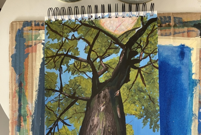
another use for it, I bought this big sketchbook
that has heavy paper in it, and I've just started taking my extra paint
and smearing it on the pages in the
sketchbook and making a little abstract paintings, and then I'll come back
to those pages and maybe draw on them or write on
them or do different things. And it's really fun because then I don't feel like
I'm wasting the paint. I end up with this kind
of chaotic, you know, base that I can, you know, work on later
in my sketchbook. So nothing ever gets wasted if you find
something to do with it, or if you just have an extra
canvas that you can throw your paint on
whatever's leftover at the end of the day, do that. Okay. You know, looking at a reference
and trying to figure out where is the light
actually coming from that does help you to know, you know, where to
put those shapes. It's not always when
you're painting leaves, it's not always
incredibly obvious because the leaves can go in so many different directions. So, you know, I'll have there's a clump up here that
looks pretty dark, which is not what I
would expect since that's toward the top
where the light source is. But things don't
always happen in a way that feels like how
you would make it up. So that's a good thing, though, of looking
at a reference. If you just paint what you see and don't overthink
it, it'll feel right. Light does really unusual
interesting things sometimes. It creeps around and gets into little areas where
you wouldn't expect it to. Awesome job. Okay.
Let's keep going. And the next lesson we
are going to be doing you guessed it the
highlights on the leaves. Maybe you guessed it. I
don't know. I'll see then.
9. Highlights on the Leaves: Hello, and welcome back to Learn to paint trees in acrylic. I'm Paul Richmond,
and in this lesson, we are going to be painting
the highlights on the leaves. Let's get to it. Now
I'm going to go in with my super light
color. This will be fun. I might actually go down to
a little bit smaller brush because the areas where I'm going to use that are
a little bit smaller. I don't want to cover up
everything I just did. So I'm gonna go with this
half inch one again. Okay. You might not need much water. By the time you get to
the more yellowy color, yellows tend to be a
little bit thinner, so it's already going to
be kind of runny anyway, and it won't cover too well
if you get it too wet. Oh, yeah, I love.
Look at how just getting those little
bits of the light in certain areas comes to life. If you do happen to have any
old dried out rusty brushes, they're great for making
leaves like this. You don't even have to work
as hard to get the shapes to feel different because the bristles are all going
in different directions, and it's gonna look
different anyway. So save those brushes
when you do forget to clean them out at
the end of the day because they are still
good for some stuff. I used to only work with really
cheap brushes like this. And I still do a lot of that because they work just
as well, honestly. But an artist, a local artist
gave me a ton of brushes. I mean, just, like, hundreds of brushes 'cause he's
not doing oil anymore. And they're really nice,
like, expensive brushes. And I was almost afraid
to use them because I'm so messy and hard
on my materials. But so I've just started
being really good now about cleaning out
my supplies I feel like, Well, he gave them to me, so I've got to
take care of them. It's a lot of pressure. All right, so just getting in these last little bits
of highlights here, and then we'll move on to
the trunk and the branches. I love the way that it
looks when you start to get the enough light in there that it really feels
like it's starting to flow. Up here, I see more dark, so I'm not going to do too much. A little over here. If you're painting on
a canvas like I am, you can even sort of take advantage of the
texture of the canvas. That can give you some nice
leafy texture if you just put a little bit of paint on your brush and
kind of dry brush it. It won't cover solid. I'll leave lots of
little cracks and crevices from just
the canvas texture. So use all of that
to your advantage. If you don't like painting
on canvas, though, you can paint acrylic on
well, just about anything. You can do it on heavy paper. Like watercolor paper is really good for acrylic painting. You can paint on wood,
like masonite panels. Just if you prime them
with gesso first, they take the paint really well. If you want no texture at all. That's a really good way to go. Or you can even
take a canvas like this and before you
start painting, put a few extra coats
of gesso on it, and then sand that and you'll get a really
smooth surface. The gesso is just kind of like another layer of acrylic
paint, basically. And if you put a few
coats of that on there, it builds up to
where it completely camouflages the canvas
the weave of the canvas. And it does feel
different when you paint on a smooth surface
compared to this. It's worth trying to
see if you like it. There's also different kinds of canvas, too, most of the time, especially if it's a
more inexpensive canvas, it's probably cotton, which
is totally fine, works great. But if you want a really smooth, kind of almost,
like, I don't know, silky feeling to the canvas
where the paint just, like, glides across so smoothly. I know I'm really selling
this here for some reason. Belgian linen canvases
are wonderful to work on. They just have they also have just a very different
feel to them. A little more expensive,
but you can use old sheets. You can stretch them
over. You can actually buy just the wooden stretcher
frames, if you want, like what's on the
back of your canvas, and you can put those
together and then stretch whatever
you want over it. Or you can just take the sheet and use a staple gun and
staple it up to the wall. And then once your painting
is dry completely, you can take it off and even
roll it up to store it, and it'll be completely fine. And if you're painting on fabric and you
actually want to maybe it has a pattern on it or a color
or something and you want to incorporate that, clear go. So it's the same stuff that is normally white that you
would prime the canvas with, but it's clear, so it'll
preserve what's on there, and then you can still
paint on top of it. That's also good
for collage, too. If you want to
collage a bunch of stuff onto the canvas
before you start, clear so is good for that. I'm just going back with a
small brush now and doing a few little more precise kind of dots and shapes because I wanted a couple of things that I just see some where
the light is so strong that it just makes those little
clumps of leaves kind of have their own little
kind of graphic shape, especially down here
at closer to us, little bolder, little
more contrast. Great job. Okay, let's
move on to the trunk. In our next lesson,
we're going to be doing some color mixing
and we're going to start laying in some tones on the trunk of the
tree. See you then?
10. Starting the Trunk: Hi. Hi and welcome back to Learn to paint
trees and Acrylic. I'm Paul Richmond,
and in this lesson, we're going to be doing
some color mixing, and we're going to
start laying in the dark tones on the
trunk of the tree. So let's get started. So I'm going to use red. To mix brown, it's going to be There's different
ways you can do it, but I'm going to use
red, yellow, and black. We'll see how that does. I'll
start with a lot of red. Get over there. And a
little bit of black. Quite a bit of yellow, because red and yellow make orange, and brown is kind of
like dark orange. That's one way to
think about it. Yeah, see, look at that. Worked. Yay. I did
not lie to you. So there's a good dark. I'm going to do the
same thing, like I did with the leaf colors. I'm gonna mix a few
shades before I start, and then I'll be good to go. So I've got my dark. I'm gonna do a middle color now. More red. Some more paint. A little bit of black,
and then I'm going to add some white to make
it a lighter color. Let's see what that gives us. Oh, yeah, that's
good. That's a good. There's a lot of warm tones
where the light is hitting. It becomes very yellowish,
yellowish orange. So when you're mixing colors, like we were talking
about earlier, you start you get something, and then you kind of compare
it and you look to see, well, which direction
does it need to go? And a couple of things
you can ask yourself, does it need to be
darker or lighter? We've talked about that. Does it need to just be a
totally different color? Like, if you're trying
to mix, you know, purple and it looks green, obviously, something went awry. Looking at the temperature of the color because
every color can have different degrees
of feeling more warm or feeling more cool
depending on how much of, you know, each
component is in it. So if you think about
purple, for example, purple can feel really warm. If it has a lot of red in it, it can kind of move
towards, like, you know, magentas kind of color. Or it can feel very cool
if it has more blue in it. I can feel more like, you know, a nighttime kind of
sky type of feel. So every color has
different temperatures, so it's just something else to think about when you're mixing. What temperature do I want that? Now, you might have
just seen as I was mixing this lighter brown, it went a little green on me, which can happen
sometimes because the black has a
lot of blue in it, and the blue mixed with the
yellow will turn green. So you just mix the
opposite of green in it. The opposite of green is red, and that will kill the green, and then it brings
it back to brown. So learning a little bit
about color can help you if you're trying to get if you're trying
to mix certain things, knowing what to add to make it go more toward something or
more away from something. Alright, those look good to me. I'm going to start
with my big brush. I do want to do some
palette knife texture, too, but I like to just kind
of get it covered first. And I'm going to block in basically where I
see the darks first. I'm going to use my
darkest color that I mixed here and just very quickly get those
dark areas covered. And I might even grab some black and do some
mixing right on the canvas because
the dark brown that I mixed isn't quite as dark as I want it to
be in some areas. And letting the colors kind of mix on the canvas
and not necessarily blending them all together
perfectly will give you some nice texture
to start to give that feeling of the bark. A lot of people when they're
starting out painting, are afraid to use
bigger brushes, especially on a smaller
canvas like this. So I'll see them students
in my class just trying to paint everything with these
tiny little you know, detail brushes, and that actually makes it harder
sometimes, I think. You can what you
can accomplish with one big sweeping brush
stroke with a larger brush, you have to do, you know, ten or 20 strokes
with the small ones, and it's harder to get any kind of fluidity
and, you know, motion, movement with the brush stroke when
you're doing it that way. So don't be afraid
to use the big ones. Great job. Okay, in
our next lesson, we are going to continue
painting the tree, moving on up into defining some of the branches.
I'll see then?
11. Painting the Trunk and Branches: Hi, and welcome back to earn
to paint trees and Acrylic. I'm Paul Richmond,
and in this lesson, we are going to be
continuing to paint the tree and define the
branches. So let's get to work. Now, when I get to
the smaller branches, I will go down to
smaller brushes, though. Just use whatever's
going to help you with the thing
you're painting. Which seems obvious.
But I know even myself, I will sometimes just get in the habit of I'll
start with one brush and then just keep using
that cause maybe I just don't want to stop long enough
to pick up another one. So I have to remind myself
of this stuff, too. The other thing I always have to remind myself of and
I never want to do nobody ever wants
to do is to take a break and just back away from your painting
and look at it. If we weren't on, you know, a time limit here, I would be doing that right now. But it is really helpful
at the end of the session. You definitely should
prop it up and step away and see how it
looks from a distance, and it is going to look
totally different to you. When you're right up on it and you've been working
on it a long time, you start to lose a bit of
perspective with your piece. It can you start
seeing, you know, kind of what you want it to be or what you're imagining
instead of what's really there. Sometimes you'll get back
away from it and you'll look at it and you'll
really like it a lot more. And then you'll know that
you're on the right track. Sometimes you back away from it and you're like, Oh, my gosh, how did I miss that horrible
thing that I just did? So either way gives
you some perspective. Taking a photo of your
painting and looking at it on your phone is
another way to do that, or looking at it reflected
in a mirror is a good trick. I do that one a lot because it disorients you enough to where you feel like you're
seeing it with fresh eyes. When I'm working from
a reference like this, sometimes what I'll do,
especially if I'm starting to just get too hung up
on something or you know, especially if it's
like a portrait or a figure and I'm just thinking too much about what it is instead of looking
at the shapes, I will turn my canvas
and the reference upside down because then it does because both
are still oriented, you know, to match each
other, so you can still keep going and match the shapes
that you're seeing. That does help me to
do that sometimes. That's the good stuff that you get out of classes, I think, then you can really
take that and use it and it helps you in your
own with whatever you do. Alright, now I'm going
to use a smaller brush and get some of those
smaller branches. When I'm painting
branches, I like a brush that I can
pretty much just take one stroke and get the size and shape of
the branch that I want. And it's almost like
writing in calligraphy, just the amount of pressure you put on the brush
and then lifting up so that you get the
thicker to thinner lines. See that? If you have a nice little delicate
brush like this, it's great for that. I like these slant brushes too. They're great for
anything with line. If you're trying to paint the branches and
it's just feeling too like the paint's
too dry or it's not like gliding along and giving
you the line that you want, then you probably need to add a little bit more
water to your brush. Just dip it in the
water before you start and then get the paint. You might want to wipe a
little bits water off, so it's not too runny. But I usually just will
dip my brush in the water, wipe it a little bit
on the paper towel, and then get the paint, and that seems to work really well. So finding the right amount of water makes a big
difference with acrylic, it is a bit more
plasticky than oil paint. That's probably the
biggest difference besides the drying time. It just has a little bit more of that hard kind of
shell edge to it, especially when
it starts to dry. So keep it wet if you want
it to glide on your canvas. I like painting branches. I think I think anything with wine I enjoy feels
like I'm drawing. Now, some of these
branches do have those little bits of
light hitting them, but I'm just going to get
the dark on there first, and then I'll go back
and do the highlights, kind of like we did
with the leaves. Remember, they do not have to go exactly where they
are in the picture, Let your branches grow wherever they want or wherever you
feel like it needs it. Awesome job. Okay,
in our next lesson, we are going to be adding even more branches and more
detail. I'll see you then.
12. Painting Branch Details: Hi. Hi and welcome back to Learn to paint
trees and acrylic. I'm Paul Richmond,
and in this lesson, we're going to be adding
some more branches and doing some more detail work in the branches. So
let's get to it. Sometimes branches
will disappear into a clump of leaves
and then show up again a little bit later too. That will help to make it
feel a little more integrated than if it's all just
continuous lines. So, you know, maybe do a branch, let it kind of trail off, and then maybe you see it again a little bit
over here, over here. They don't all have
to be perfectly connected, in other words, and, like, you know, perfect spider web of lines. They can kind of break
off and show up again. M. Okay, look at how this is
starting to really come to life now with all these little
branches. I love that. That's just, like,
such a nice touch. And you can even just take
your little brush like this and just make little
just to kind of, like, lay it there flat on the canvas and get these little
tiny lines, too, just to create one more one more even
more distant tiny type of branch that shows up. Okay. I'm very excited to paint
the trunk of the tree, but I'm going to do all
these branches first. This would also
be something that could be good to do
with a paint pen. If you've ever used
Posca markers, they're just acrylic
paint loaded into a pin, and they're great for
doing liny things. So if you got the right color, you can go in and draw
the branches with that. Okay, then I do see some over here that are probably coming
from another tree. I need to put that into, give a little bit of
background to our scene. Okay, that's feeling
pretty good to me. It seems like almost
every artist, we always appreciate everybody else's style and, you know, the individuality of
their work and seeing the way different artists see the world and the marks
they make and stuff. But then when it comes
to our own work, it's always like we
always have a harder time appreciating the things
that make our work unique, the specific kinds of
marks that we make. We always, I think, compare our work to
other artists and think it should look like
somebody else's. We judge ourself, but then we
see everybody else's work, and we think, Oh, wow, I love that they did this,
you know, unusual thing. But then if we did that
same thing, we'd think, Oh, that looks that's a mistake. It's very strange. All right. Fantastic.
This is coming along. It's starting to shape up
and look like a tree, right? In the next lesson, we are
going to be blocking in the rest of the tree
trunk. I'll see you then.
13. Blocking in Tree Trunk: Hi, and welcome back to earn
to paint trees in acrylic. I'm Paul Richmond,
and in this lesson, we're going to be blocking in the rest of the tree
trunk. Let's get to it. I'm going to move on and do some the rest of the trunk now. Just block it in, at least, get the colors blocked in. I always kind of use that expression blocking it in because I think it
takes the pressure off. When you're painting,
it can feel like you have to make everything look perfect
on the first go, and that's usually
not how it works. So just think of it as covering
the canvas or blocking it in or whatever you
have to call it in order to not stress
out about it. Because, honestly, you
cannot even really judge, especially the colors in a painting or the values or
anything that's relational. You can't judge it until the
whole canvas is covered. I mean, look how different this trunk is looking just now that I'm even getting some of
this middle color on there. It completely changes. And that's because
color is so relative. It looks one way when
it's next to one color, and then it looks totally different when it's in
a different context. So I always just consider the first pass
of a painting to be free for all most likely everything's
going to change unless, you know, something
is there that I really love and surprised by. But basically, get it on
there, don't judge it. Don't worry if it doesn't
look good. Just keep going. I've just noticed that especially with a lot of people when they're first starting out, they judge their
work so harshly, especially at a way too early of a stage for that and kind of get almost like they
just can't even move forward because they hate their
painting so much already, but they haven't even
given it a chance. So just cover the canvas. That's all we're doing. Now, as I'm painting
this tree trunk, I'm looking closer at the photo, and there are a lot of the
browns that I've mixed, and I see them in there. But I also see other
colors in the tree trunk, too, and we'll layer
some of those in. Also, I see some greens. In there, especially
in the highlights, some warm greenish tones. And then in the shadows, I see some dark blues, and it's interesting and also makes a lot of sense that
those are the colors that are showing up because another interesting
thing about color is that it's very reflective. So even though your brain will
say a tree trunk is brown, when you look at a
real tree trunk, it's going to also be reflecting whatever colors are in the
environment around it. So the environment around this tree has a lot
of greens and blues. That's what's
showing up you know, mixed with the
brown in the trunk. And it's subtle. You might
not even see it at first. You have to look closely. That's a big part of painting
is learning how to see, learning how to slow
down and really look at something and see beyond just what you think
you know about it and appreciating all of those subtle things and then
putting them in the painting so that you get to help the
viewer to see those two. I'm just coming up
and hitting a few of these bigger branches with this middle color where I
see some light hitting. Okay. So now I've got
my tree mostly covered. I want to come back with
my white color now. When I squint my eyes and
look at the reference, the lightest patch
is right here. So I'm going to go
ahead and block that in while it's still
wet, and that way, it'll kind of blend
with the middle value and see how it just
starts to feel like, Oh, look at that light hitting
that tree right there. And because that
creates more contrast, contrast is just, you know, when you have two extremes
of anything side by side, when we have strong light
against strong dark, it tends to come forward. In the painting. So when you are painting
something like this, where you have that dramatic
sense of perspective, and you want, obviously, this part down here
that I'm painting now is closer to us
than anything else. So getting those extreme value contrasts happening there
will just help with that. See how just putting
that little bit on there kind of pulls that
chunk forward. Don't feel like you have to
overly blend everything. Sometimes just
laying a brush strug down and leaving it works better than going in and
mushing everything to death. It doesn't all have to be, like, a perfectly blended smoothie. Leaving a little bit of an edge and more
chunky brush strokes, especially with something
like this that has a lot of texture will make that
texture more believable. But even when you're painting
something that is smoother, well, I keep kind of
going back to this, but like painting a figure, I will always start
out with chunkier, blocky kinds of brush strokes because that makes me think more about the structure of it. If you try and just blend it
all too much right up front, then you lose that form, and it just becomes very it just feels a little
too, like, wishy washy. It doesn't have any
substance to it. Doing some dry
brushy things too. Just trying to think of all different kinds
of ways that I can make the sorts of textures
that I want on here. Getting those little patches of
light that hit the branches. I'll come back with
a smaller brush and do that on some of the
smaller branches, too. Great job. All right. In the next lesson, one
of my favorite things, we are going to be
adding some texture to the painting with the palette knife.
I'll see you then.
14. Palette Knife Texture: Hello, and welcome back to earn to paint trees in Acrylic. I'm Paul Richmond,
and in this lesson, we are going to
be adding texture with the palette
knife. Let's do it. If you've never painted
with a palette knife, I highly recommend you try it at least once. It's
not for everyone. Um, some people hate it. Melissa, for example, Which is why I love doing
it when we teach together. But you take your knife, and I like for a small
painting like this, I like these narrow knives
that are kind of pointy. But I have a whole bunch of
different palette knives, you know, in my collection that work well for different things. On a big canvas,
I'll even use, like, squeegee type things, anything
you can move paint around. But for a small canvas,
you're gonna want a little bit smaller
knife, most likely. And then you just
take your cut loader. And scoop a little bit of it
up, kind of put it in it, maybe letting it go more
along one edge like that. And then wherever you
want some extra texture, you just put that on
and kind of drag. What I like about it is it gives you this little
it's kind of more, I guess, a more organic
mark, less controlled. When you paint with a brush, you know, usually the paint, it's gonna go where you
move the brush, obviously. But when you're painting
with the knife, I never know exactly what
it's gonna look like. And I like that sometimes, especially for
painting something like this where you want that really rough look. And you can go as thick
as you want with it. I'm not going to go
super thick on this one. I want it to still kind of match the look of the rest
of the painting. But some of my paintings where I go really heavy with texture, the paint can, you know, be in globs on the canvas. I love that. It's fun. We'll probably do something
like that at some point, too. But even just dragging it along, it just kind of
scuffs it up a bit, makes it feel a little
less contrived. I like that. This is also a good chance to start working in some
of the other colors. So I want to start
with the greens. I'm just going to take some
of this dark green that I had already mixed
up for the leaves. I'm going to mix a little
of the brown in with it so that it won't
feel too out of place. That'll be a great
color to just come in. I'm looking at the reference to see where I see a lot of green, and it's mostly in the shadows. This darker green shows up. So I'll layer some of that in. I still feels natural. It doesn't feel out of place. You can really have fun with
color when you're painting. If you have the values
right or, you know, if you have the
arrangement of light and dark in the middle tones, where they need to be to
create the form that you want, you can really push color. You can use very exaggerated
even invented colors. And it will still feel very believable because the value
is what creates the form, and the color is just kind
of like a fun little extra. And I enjoy doing
that in some of my more expressive
paintings just really, you know, using every
color I can think of. If I was going for that
approach with this tree, I might start incorporating
more like purples and other cool tones
in the shadows and then yellows and oranges
in the highlights, and it would give it a really interesting
dynamic feeling. It's fun to play
with that. Don't be afraid of using
unexpected colors. Now I'm going in
with some dark blue. I took some of the blue
and mixed it with black, and I'm just going to go
into the shadows with that. Look at that. That
gives it a nice sharp, crisp shadow feel. I'm having way too
much fun here. That's perspective. That's a really fun thing to play with in a
painting because I just think it's so
cool that you can take a flat canvas and make it
suddenly feel like it has, you know, it's opening
up so much space. And it's mostly just
because of the angling of the lines and then also the
use of the lights and darks. And everything is
affected by perspective, not just things with, you know, straight lines, but, you know, even when you draw people or if you're drawing
animals or anything, they will look very
different depending on your perspective and how, you know, if you're
looking up at them, if you're looking down at them, if you're looking straight on. So it's good to think about it with something like this first. Perspective all has to do with the relationship of what you're seeing with the horizon line. So if you can imagine
where the horizon line is, which is the line where the
ground touches the sky, in this one, the
horizon line is down here below the frame
of the canvas. And everything above the horizon line
we're looking up at, anything that falls below the horizon line from our vantage point means
we're looking down at it. So all of those lines would
go in a different direction. So no matter where you are, whether you can see
the horizon or not, even if you're
drawing or painting something that's indoors, the relationship of that
thing to the horizon is what creates the sense of
perspective that you see. When you draw like in
one point perspective, and you're drawing
everything you draw those vanishing points, everything goes back to a line, a dot on the horizon line. Have you done that before?
So it's that idea. Everything that is below the horizon line is we're
looking down at it, and those lines are
all going, you know, up to get to the horizon. And then everything that
is above the horizon, the lines have to angle down. So that's why our
perspective looks different, it could be the same object, but depending how high or low it is, looks different to us. Perspective is very interesting
and can get complicated, but really all you truly need
to know in order to paint convincingly is things
get smaller as they get farther away and
draw what you see, not what you know, sometimes
the size of things will be very unexpected because of how perspective
is affecting them. Great job. In our next lesson, which is the final one, we're going to be adding the lens flare and some other finishing
touches. I'll see you then.
15. Finishing Touches: Hello, and welcome back to Learn to paint
trees and acrylic. I'm Paul Richmond, and
this is our final lesson. I can't believe
we're already here. This has been so much fun, but we're not quite
finished yet. We still have a few
finishing touches to do, including the lens
flare and glow and just some of those
little things that are just gonna make
the painting pop. So, you ready? Let's go. Okay, doing some more of these little patchy
areas of light. I really like I really like that kind of
dappled light look. So I want to just come in
and especially kind of up in here in the more distant
parts, you still see it. You still get that
little dappled kind of patches of light. I don't just want it to
be a one brushstroke. I want it to feel more
like the light is actually falling across the
texture of that tree. A few more little
touches of light, and then I want to do that glaze up at the top
to give us the glow. Got to make sure we
save time for that. See how I'm just going
back over some of these smaller branches now
with my lightest color, and I'm using a small brush. I'm just letting little
touches of light. Hit them. Okay. Alright. I might come back and do a
little more if there's time, but I'm going to
jump up here and do that glow now because
that's going to be fun. So when I look at that,
I see it almost has kind of a pinkish quality to
it, which is interesting. Not what I would expect.
But I'm going to do it. So pink is red and white. I'm going to use mostly white
we want it to be light. Plus, red is a strong color, and it doesn't
take much of it to really start to make an impact. And it is a warm light. So this pink is
feeling a little too, like, cotton candy
compared to that. So I'm going to put a
little yellow in it, also. Not too much or
it'll turn orange, but we're more like peach, but just enough to
warm it up smidge. There. That's looking
better. Okay. So a glaze, when
you are painting is basically painting with more
water to thin out the paint, and that allows whatever
is underneath it to show. So we're not trying to paint or cover up what we've painted. We're just trying to
shift it in some way. So I have a lot of
water on my brush. You could pad it with a paper towel a little bit to
get the area to dry first. Otherwise, it will mix
with what's there and mixing pink with green. Since they're opposite colors, it'll just turn muddy and gross. But if you do it as a
glaze, it'll be beautiful. I'm just going to go right over top of that whole section. If your paint's too thick, just dip your brush in the water and add more water to it, and then I'm going
to dry my brush off and then come
around the edges and just kind of softly work it in 'cause I want it to overlap
the branches there, too. The branches are
also affected by it. Just kind of working
in what's there. And then the color
gets pretty saturated, so I'm going to actually take a little bit more of the red and a little bit more of
the yellow and mix it in. So that is going to go a little more kind
of orangish red, but mixing it with
the pink because right along the outer part of that kind of glow
is where you do see some stronger warm colors. So I'm still going to glaze it. I'm adding more water. But I want to come in now and do another glaze
right into that. See how it just pushes that
color a little stronger. And then I'll go back
to my original one I want to even lighten
this part up more. To make something feel
like it's glowing, there has to be kind
of a transition. It can't just be a light
blob and then normal. You have to kind of
have the lightest part in the middle and then it blends into something else
that's usually a little bit more
saturated with color. And then it transitions
to the natural color. Now, I'm even going to go back
in and paint more solidly, a couple of those branches
with the reddish orange really make them feel like
they are just being lit up. And I'm also gonna hit the edge of the branches that are a little bit
outside of the glow. I'm just gonna let them pick
up a little of that color, too so that it doesn't
feel too isolated. Just kind of let
the colors move. Sure the tree a little bit. There we go. Maybe
even over here. Then there's a couple
areas where we see some negative spaces
in the leaves up there because it's so bright, I'm going to use just white
with a touch of that pink. I'm just going to go in and
carve out some openings. So I'm actually painting the sky on top of
the leaves up there, but I'm doing it in this kind of whitish pink color because that's what color it looks like in that spot
where the glow is. So this is definitely an example of painting
what you see. I would never think to just
start painting pink leaves, you know, on a tree
with green leaves. But look at the
effect that it gives. It really does start to make
it feel like it's glowing. So painting what
you see does help. And removing the
mental labels that you have for things and not just thinking
I'm painting a tree. That's actually the biggest
thing that helps me. If I haven't been thinking about this as a tree
the whole time. I'm just looking at the shapes and painting the
shapes and colors. And then, hopefully,
if I do that, at the end, it'll be a tree. Alright. Now, I want to get a little bit one
last touch here. Want to just get a little bit of my lighter green and glaze that into some of
the lighter parts. There we go. Glazing is a nice way to just kind of add in another
little hint of colors to see. So I don't lose any
of that texture that I created or the shapes. It just kind of
enhances it a bit. And you'd get some nice, like relationships
and harmony of color. When colors starts moving
through the painting, that's called the color harmony. It's not just a local color, like green leaves, brown trunk, blue sky, but everything feels
like it starts to kind of, you know, play with each
other. We want to share. So the blue sky is
letting a little of the blue come down and
be part of the tree, and the greens doing the same. A few more spots with
some real beautiful blue. And then I think I'm
going to be done. Great job. You did it. We've made it all the way to
the end of this painting. I hope that you had as much
fun as I did and I hope that you picked up
some tips and tricks, some pro tips along the
way that you'll be able to pack into your toolcase and use on your own
work in the future. Thank you so much for being
a part of this course and I hope that you'll come back and make some more art
with me again soon.
16. Closing Thoughts: Well, this has been a
blast. You are awesome. Congratulations on
finishing your painting. Thank you for
hanging in there and listening to me Yammer
on for all this time. I hope that it's been helpful. I hope that I've shared
some insights that you'll be able to use
in your future art. And just remember that
there are no rules. In art. You can pick and
choose what's helpful to you and ignore the rest and also
adapt it in your own way. It's never my intention
with these classes to say, This is how you're
supposed to paint, this is the right way to paint because there's
no such thing. But it is very helpful to see how other artists
approach things, and it's a lot of
fun for me to get to share my process with you. So thank you so much. If you enjoy this class, I hope that you'll
leave us a review and also come back and take
some more of my courses. I have so many available
already and more in the works. Feel free to send me
comments too and share your work and let me know what
else you'd like to learn? What do you want to paint
next? Chat with me. I love hearing from you. Thank you again.
Happy art making, everyone, and I'll
see you next time.