Transcripts
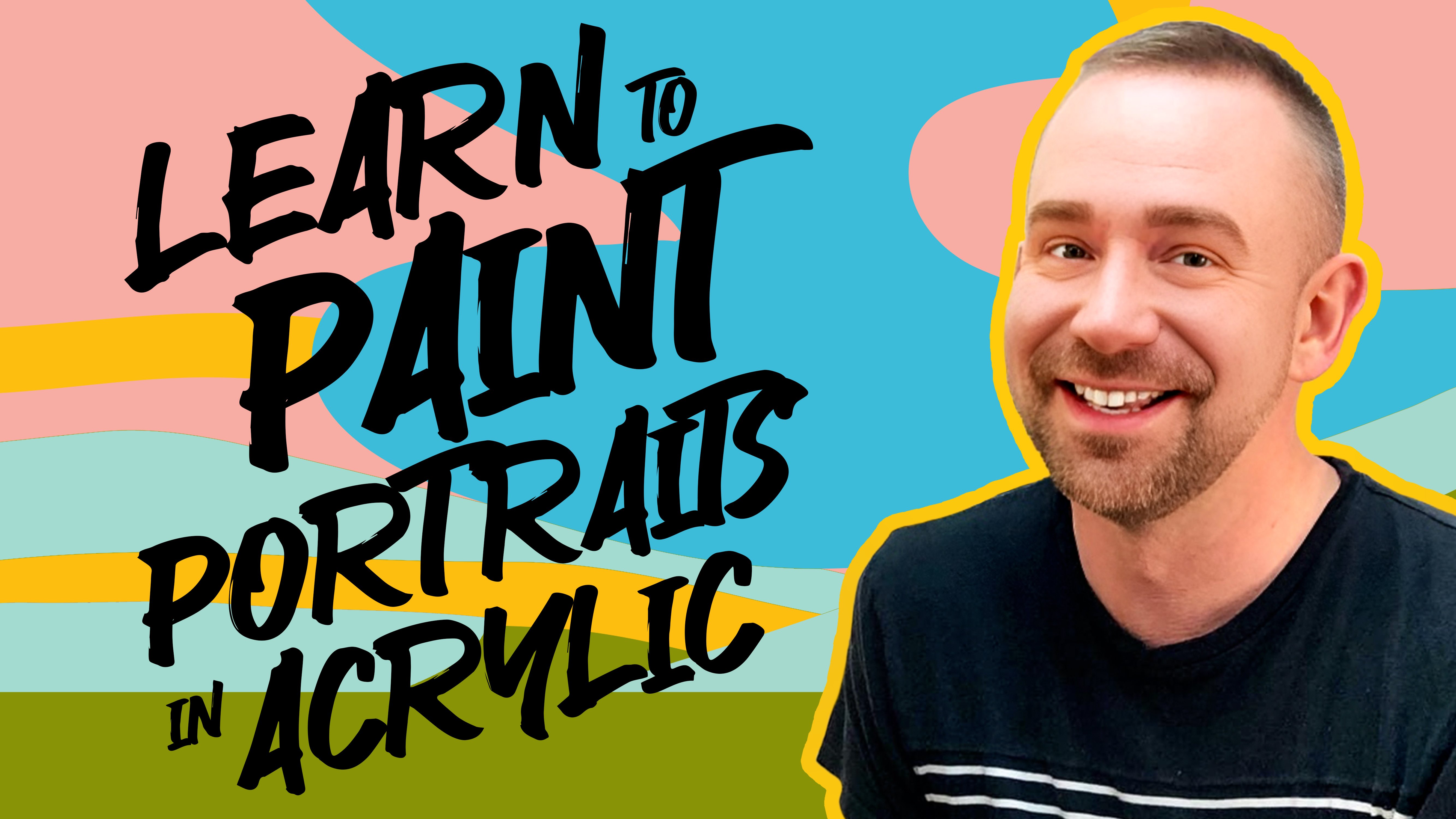
1. Introduction: Be a little sloppy. Oh, I don't know. Hi everyone, and welcome to how to Paint Landscapes.
Two different ways. I'm Paul, and I'm Melissa, and we each have very different approaches
to how we paint. So we thought it would
be cool to tackle two paintings in this course,
two different scenes. We'll both be using
acrylic paint and we'll show you how we
each would approach them. My approach is a little
bit more traditional, I will say it's a little
bit more straightforward. It involves a lot of
blending smooth painting. You're going to end up
with a smooth surface that transitions gradually
from one color to the next. It's a more realistic
approach, I would say. My approach is not realistic 'cause I don't live in reality. Yeah. I mean, who wants to live in reality?
I'm with you, Paul. When it's my turn then, we are going to be painting
with more texture, more imaginative color, and using the palette
knife mostly. We'll do a little bit with
the brush too, at the end. So you'll get a chance to try two very different
ways of painting. One more traditional and one probably more fun and
experimental, right? Yeah, and crazy. One of
the things that Melissa and I really value when we teach classes together is making
sure that everybody watching knows that there
are no rules in art. You can do anything you want. We want to share
what we know and some of our techniques
and you know, concepts that we've learned. But it's really all
about just giving you the tools to be able to
make those decisions for yourself and find your own voice and your
own style as an artist. And not one way is better
than any other way. And Paul and I both
believe that you can approach something
very differently, end up with a great
result in the end. And so we're going
to show you two different ways to approach a landscape and
hope that you can take away something
that works for you. Maybe a little bit of each. Maybe your style is a
combination of everything. Wow, wouldn't that
be interesting? Melissa? A little of
you, a little of me. What would that look like? I have no idea that baby
would be very strange. It is absolutely not
necessary to have any artistic experience
to take this course. If you are a true beginner, this will be a
great introduction to the medium of acrylic paint. And we will walk
you step by step, blank canvas, all
the way through to two finished paintings. But also if you do
have some experience, but you're just
looking for a chance to get back to the basics. This course is
also good for you, so basically everyone, Yeah, maybe you're used to working in one style and you want
to try something new, something a little
bit different, and see if it works for you. I think that's always a
good experiment whether you're starting out
never painted before, or you've been painting
all your life. I always like trying something
new and so does Paul. Absolutely. My name is Melissa Form, and I've been creating art
as long as I can remember. I met Paul in college and we started
working on murals together. We owned a mural company
for a while and traveled all over the place
doing different murals. And then I started working
as an illustrator for a large greeting
card company that grew into my role
as an art director. So I lead a group of
illustrators in hand lettering artists and creating
greeting cards every day. I also create
paintings for myself outside of my day to day job. Those are more realistic. I have us a real take on realism and I like to weave a lot of
storytelling within my work. I've shown in galleries across the United States
and across the world. How do I follow that? I am Paul, All right. I'm going
to try and top it. I'll just have to
make up some stuff. I'm Paul Richmond.
I am a painter. I live in California and after painting
urals with Melissa, then I went on to do a
lot of illustration work. I've illustrated the covers
for over 400 novels, and I also am a fine artist and display my work in galleries
around the world as well. And also love, love,
love, teaching art. We have so much fun doing
these classes together. I work with students one
on one in group classes. And I just think that there's
so much to be gained by everybody when artists come together and learn
from each other. So it's really exciting that
we get to do these classes. I'm so glad you are
joining us for this one. I love making your own artwork. And there's just something to be said about sitting down and focusing on your own piece
and making it beautiful. But there's something
we love even more about sharing our skills and our experience with
other people and showing them that they can
also learn to love art. Making everyone is an artist. That is our motto, and we would love for you to share your creations with us
at the end of the course. Let us see what you made. Because every artist
is different. Everybody's interpretation
of these paintings will be completely different. I'm ready. I'm excited. Do
you want to get started? I ready, Paul? Let's do it. Alright, let's go.
2. Projects: Let's go into a little
bit more detail about what we're actually going to be making
in this course. We have two different paintings
planned for you Today, I'm going to take my
approach to painting and Paul is going to take his
approach to painting. In my painting, you're
in a night scene with a moon and some mountains. And you're going to learn a little bit about
the foreground, the middle ground
and the background. Creating also creating value that creates
interesting illusions of depth and the difference. Warm colors and cool colors. We're going to be using acrylic, and I have this on
watercolor paper. You could also paint on canvas if that's more suited
to your liking. And then when it is my turn, we are going to go
out into the desert and I'll be showing you a little bit more
expressive technique, how to apply the paint
with the palette knife. Interestingly, we
will still start in a very similar way as Melissa's painting by
laying in an underpainting, figuring out where
everything goes, covering the canvas with
a thin layer of paint. But then we're going
to veer off on a different road by taking
the palette knife and starting to really build up thick layers of juicy
paint on surface. So my approach is a little
bit more about texture, but it still reinforces a lot of what Melissa is going to
be teaching us as well. As far as, you know,
creating depth, working with lighting,
understanding, kind of like atmospheric
perspective, and all of those
kinds of good things. So you'll get two chances, two different styles and
it's going to be a bust. It sounds amazing. We are amazing.
Melissa, how do we even stand ourselves sometimes, Paul? I'm not sure. All right. Well, let's go. I'm ready. All right. Come on.
3. Materials: Let's go over the materials that you will need for this course. Now, you do not have to have
the exact same stuff as us. In fact, you can even work with a different medium
if you want to. But we'll show you what we're using and you can
take it from there. First, you will need some paint. We are using acrylic paint. It's a basic set. It has the primary
colors, white and black. My set here has green also. That's optional because
you can also mix that. You're also going to
need some brushes. So I have a couple
different brushes here. I have a larger flat brush, which I think is really helpful
for painting backgrounds. I have a smaller flat brush, which is good for
more detailed areas. And then some smaller
pointed brushes, a couple different sizes
will be helpful for you. And then you will need at
least one palette knife or you can use several. You use this also for Melissa section to mix the
paint but then when it's my turn
you'll actually be painting with the knife. If you only have one, I would
suggest getting one that's kind of the standard shade size. Nothing too big because
were the canvas at that I'm working on is small, so a smaller knife
will be able to get into some of those tight
areas a little better. I also have some palette paper, so you're going to
need something to put your paint on and
mix your paint. This is really helpful because
as you mix your paint, you can just throw it
away after you're done. You might also use
a paper plate. You can also take a piece
of wax paper and just tape it down on your surface
wherever you're working. A couple of different
options there as far as a pet and you'll need
something to paint on. Melissa and I are each doing this a little bit differently. I'm using stretched canvases. You'll need enough to
make two painting. I use two different
canvases and then Melissa used watercolor
paper in a tablet. Either way works or whatever, you can really paint with
acrylic on anything. So whatever you have
that you can paint on, you'll just need
enough to do two. And then you'll probably need a cup of water and
some paper towels. And I think that's about it. All right. Gather
all your materials and let's get started.
4. Lesson 1: Hi everybody. Welcome to how to paint landscapes.
Two different ways. I get to start things off today. So Paul, are you ready
to get painting? Oh, since you're in
charge, I just get to sit back and relax for
this first part, right? No, no, no. I am gonna
put you to work. Alright, that sounds good. I'm ready. Let's do it. We're going to start with
an underpainting today. Get some paint on that canvas or that paper so we
can get rolling. What do you think? Let's roll. All right. Let's do it.
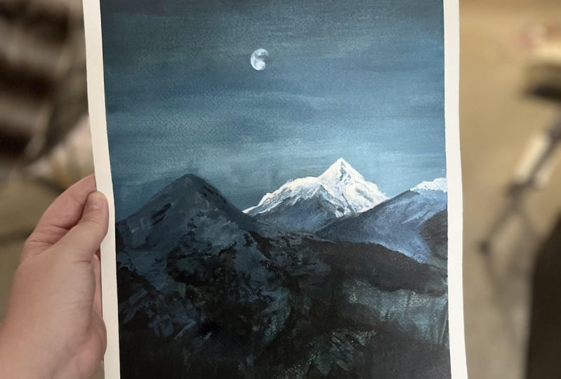
All right everybody. We are going to start
out by painting this lovely night landscape with the little moon
in the mountains. I just love that little glowy
mountain in the background. That's why Paul and
I chose this photo. We thought it was beautiful. It is, yes. It's quite a lovely
little scene. We're going to keep it
simple for this first one. We're going to go more of
a classic way of painting. I'm going to start
with an underpainting that has more blue tones in it. Since we have so much
blue in this image, I just have three colors
out on my palette. I started with a white, have a titanium white, I have a primary blue, and I have a Mars black. I have those on my pet. Feel free to start putting
those colors out for yourself. I have three brushes
here to get started. I have a large flat brush, it's like a one in 34 in
I'm 34 inch flat brush. I have a pointed
round brush and I have a smaller flat brush
and a little bit of water. First I got it all.
I'm ready to go. She has got it going on. Yeah. So far so good.
Right. Okay. So what I like to do when I
do an underpainting, I'm using acrylic today. I'm going to add a little bit of water to my blue
and I'm going to do a washy layer To get started, I'm going to mix a little bit
of black in with my blue, just to tone it down
a little bit because this blue is very saturated. You can do a little
bit of white too, if you feel like the blue
is going to be too dark, going for a mid tone of the color of the sky near the horizon line
in the background. I'm just going to start laying
some color on my paper. And I'm working on
watercolor paper today. You can work on
watercolor paper, you can work on a canvas. You can whatever type of material you would
like that works for you. Acrylic can go on most anything. You probably want something with a little bit of texture to it just because I think the paint sticks to
it a little bit better. I'm just laying my color
all in the background here. Just using some
horizontal strokes to spread it across my paper, some more paint as
I run out here. If you'll notice the sky gets a little bit lighter towards
the horizon and then starts getting at the blues get a little darker as they
go into the mountains. I'm going to keep the sky a little bit towards the top and then
get a little bit darker as I go down
towards the mountains. You are just planning ahead, thinking on my feet here. The nice thing about
acrylic is you can just do as many layers as you
need until it looks. So there's no pressure? No rush. Yes. Paul and I will go
through these pretty quickly, so if you feel like
you want to go back and watch things again or watch it through once and then start painting,
that's totally okay. Mm hm. Paul. Paul doesn't let me do that, but I wish
that I could do that. I have to keep Melissa
moving or else we spend 6 hours just
painting her landscaping. We would never even
get to mine would. I'm keeping my eye on the clock. Yes. Paul is my time
keeper. For sure. Yes. Once I get involved
in things, it's over. P does not have quite as
much of an attention. I mix a little bit more
black and with my blue. I'm taking that across
the bottom here. And this is just a
quick underpainting, so this can be very sketchy. I'm just adding colors where I see them in the photo reference. I'm going to take this darker, blackish blue up towards the middle of that mountain
in the foreground. One thing to pay attention
to when you're painting a landscape is what's
in the middle ground? What's in the foreground and
what's in the background. Your foreground is obviously
going to be in the front. Your middle ground
is going to be just behind your foreground. The main object
in your image and then the background
behind everything else. One thing that really
helps in creating depth is showing that overlap
and where things in the foreground come out in front of things in the middle
ground or the background. That sounds like
a pro tip to me. Melissa, that is your pro tip. Always pay attention
to your middle ground, foreground and background. It's very helpful when painting a landscape because you're really like creating the
illusion of depth on, on a flat surface. Mm hmm. Yeah, I'm only really paying attention to my blue tones as I'm doing
this under painting. And this will just
help me establish some of those darker areas. And then as I go through
the rest of the painting, I will paint some of the
warmer, lighter tones later. I'm just making a
blueprint for myself. Literally blue can't help
yourself with that little. You'd appreciate that one, Paul. Oh, yes. But just something
to work with later as I continue to go
through this painting. It's all about just like
the building blocks. You're not trying to make
it look perfect right away. Each lay the foundation and
then work up from there. Mm hmm. Yeah. Just
doing something very quick just to give myself something to work with later.
Something to build on. Like Paul is saying, acrylic is all about building up in layers. I am creating my first
layer foundations. Something about doing it without worrying about all
the different colors. That helps a lot to just
thinking about lights and darks. Yeah, I'm not even worrying about the lights at this point. I'm just establishing some of
the dark areas build later. It gets very dark
towards the bottom, so if you want to add some more black down there, you can. Those trees definitely
make it dark. Maybe just make an
indication of where it gets the darkest and your image. You can use that
as a guide later. I'm just doing
this very quickly. Just a rough sketch and paint, just to give you an idea
of where things fall. You can always draw
it with pencil too, if you're more comfortable
doing it that way. But something that's
simple, like this, it's nice to just jump in with paint to do
whatever works for you. Yep, yep. Do what feels most comfortable for you.
Anything will work. Lots of different approaches can make a beautiful painting. That's something that Paul and I believe very strongly because we both have
different ways of working. Yeah. Which you will
get to experience. Yes. You're in the right place if you're interested in that. Ye I don't think that you could
really be more different, two of both Somehow it works. Yep. Okay. So I just have a rough indication
of where my mountains are, where the darkest darks are
and some color in the sky. Great job everybody. We got some paint on that
canvas or that paper, and so we got a good start. Next thing we're
going to do is we're going to start painting the sky. So we're going to go on
with some thicker paint. We're going to get some
darker blue on there. We're going to learn a little
bit about blending Paul. What do you think you're
ready to get going? I am so ready. Let's go. Alright, see you then.
5. Lesson 2: Hey everybody,
welcome back to how to paint landscapes
two different ways. Today we're going to get
started painting that Sky Paul. What do you think you want
to learn a little bit about how to blend acrylic? I do teach me Melissa. Okay, I will do my best. Here we go. Great, here we are. We have our sketch or
under painting done, so we're going to start
painting the background. So painting that sky, I'm just going to worry about the blue
of the sky at this point. I'm going to go back
and add the moon later. As a final detail, I have a color mixed here that I'm going to use for
most of the sky. It's a medium blue. I mix a little bit of the primary blue with
the black and the white. I'm going to use that for
most of the sky here. It does get a little bit
lighter at the bottom and a little bit
darker at the top. But I'm going to
start just by laying this color in here. Okay. It's so much better
painting on top of paint, The painting on top of
the boy paper or canvas, it makes a big difference. It flows a lot better and
it covers a lot better. Yep. It is nice to have
that foundation under solid opaque paint because it just makes a big difference. It looks so much, Yeah. As blending and my sky is getting a little bit
lighter as it goes down. I'm just mixing a little
bit of white into part of the color that I already
mixed on my palette. I'm just blending
that as I go down. I'll just use a
little bit more of that light color as I get
closer to the mountains. I just tell me about
your blending technique. How do you do it? Melissa. Because if you've ever seen Melissa's
artwork, you know, she is like an expert blender. Oh goodness, no pressure. What are your secrets? My secret is usually
what I'm blending. I work with oil,
it's a lot easier. That doesn't help us. No, that
is not going to help you. Feel is a little bit trickier. But what I do is I always blending from
wet paint to wet paint. That means is I will
have wet paint on my canvas or on my paper and I will work more
wet paint into it. I'm using my brush to slowly blend one
color into the next. I'm doing that with long
horizontal strokes, especially with
the sky, because I want it to be a very even blend. If the area that I have just painted on my paper ends
with a certain color, I'll make sure it's still wet when I'm putting another
color next to it. I just slowly work
the two colors together with my brush strokes. If you're having trouble
getting two colors to blend, you can mix a little
bit of water in there and that will make
it a little bit easier. You do want wet
paint onto wet paint because dry on a
dry, it won't blend. You'll get a dry
brush technique, which is a different way
of painting an acrylic. And it's not a bad
thing, it just gives you a different
look. It has more texture. Yeah, The Melissa technique, you really can't tell where one color stops and
the next one starts. It just becomes the next color. Yeah. Which is what I aim for. It can take a while
to achieve that. In acrylic, sometimes
sometimes you have to do several layers
before you get that look. Well, there you have it folks. Now you have experienced
the ultimate pro tip. Pro tip for today when blending, Always make sure you're doing
wet paint onto wet paint. It will make your
life so much easier. And that means you have to paint fast because acrylic
dries quickly. You do? Yes. Which
is usually why do a couple of different layers because I am not a fast painter. If an area does dry before
you're ready to blend into it, you just put that
color back again. Hm. It is a little bit easier
to start with the color underneath so that
we'll make blending a little bit easier now that we have the blue underneath the other blow that we're painting
on top of it, it will make it harder
to tell where one blends into the other because you do have that foundation that you're working on top of. It helps unify everything. Yeah, I love that little glow that's now showing up
behind the mountains. It Yeah. Just enough to make it feel like there's
light in the sky. So one other tip while
you're blending is Don't worry about what goes in front of the sky now
that we're blending it. Don't worry about
what is around. Whatever you're blending blend right over top of it
because it's going to be a lot easier to get the two colors to
blend into each other. If you're not being careful to paint
around certain things. Yes. Otherwise you end up with weird like halo looking
brush strokes. Yeah. You'll end up with a weird
shape or it'll be easy to tell where one went into the next.
It won't look as smooth. Yeah. You want to paint each
layer of the landscape as if nothing is in front of it
because that's how exists. We're seeing it with
the other stuff, but in reality that stuff, it's not affecting
what's behind it. Okay. All right, I got
my sky in there, so the next thing I'm
going to do is actually paint some of this dark
color at the bottom. Normally, you
wouldn't go from the background to the foreground. You'd paint the
middle ground first. But I want to make
sure I'm getting my darkest darks in here and
I can build on top of those. I'm just taking some of my
straight black and going back in at the bottom and adding another layer of black that I can
build on top of. It's taken all around? Yeah. I love to jump around. When I'm doing a painting,
I don't stick in one spot. I like to do a little
bit of each and it just helps me
build it up slowly. Hm, I think that's
smart because then you get thinking about the whole instead of getting too
caught up in little details. Yeah, I like to think
about the shapes instead of thinking
about one in painting, I'm just looking at the
different color shifts. I'm looking at the different
shapes that are made and how I can best get those
shapes to come to life. Yeah. Yeah, that's a major tip. Theories, just focus on shapes, not what you think a mountain
looks like or yes, the sky. It's going to be
really helpful for you in the long run if you
just look at the shapes, especially as you're paying these trees and they
don't even look like trees in this
reference photo rates, they just look like shapes. I mean, you really
can't focus on them as trees and you start thinking
about them as trees. You might start paying them as trees and they're not
going to look right. Yes. These are not like
any generic tree shape. It's just weird texture really? Yeah, I'm just using that
same big brush and I am just looking at where the darkest darks lie in
that mountain in the front. And I'm just putting
some of those in there that I
can build on later as I start adding more of my blue tones and building up from that
background to the foreground. It's cool because in
a very short time like I know there's still
a lot more to go here, but it already starts to have a sense of
atmosphere to it. Hm. And as we start putting some of those
lighter tones in here, it will definitely come to
life we have some more depth. Okay. All right. I think that's it
for this lesson. You cool. A great job. Everybody in those skies
are looking beautiful. Nice job blending and
playing with acrylic. So the next thing we're
going to worry about is those middle ground
mountains And getting those in there, Paul. Sound like a plan? I'm ready. Let's go
into the mountains. Okay, off we go.
6. Lesson 3: Hi everybody, Welcome back to how to paint a landscape,
two different ways. Today we're going to
work on some mountains. Paul, you ready to go on
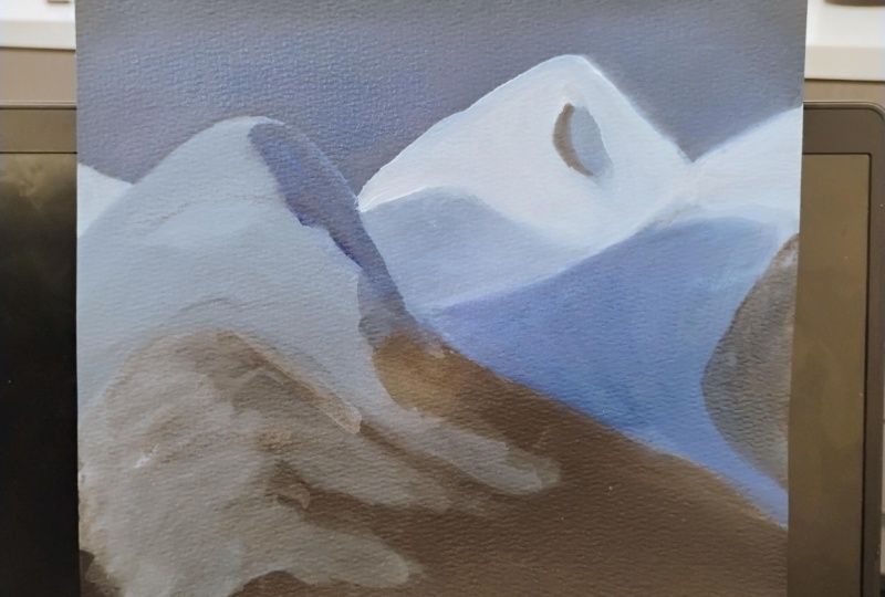
an adventure? Oh always. Okay, let's go hiking. All right, so we are back in the mountains and for this lesson we're going to
focus on these mountains. In the middle ground, we have the one to the back and that's the one
with the lighter color on it, and then the one next to it
just to the right of it. So we're going to
focus on those today. I'm going to take a
slightly smaller brush than what I have
been working in. This is a number 12. It's a flat brush.
It's probably like, I don't know, four inch. I already have some of my background color
mixed together. That was a little bit
of my primary blue, a little bit my black and
a little bit of my white. Still have some of
that left. I'm going to use that for the
rest of my painting. A good tip when you're
painting anything is to carry a color throughout
the whole composition. And that will help everything
feel unified and feel harmonious and it
won't feel like anything is foreign
to anything else. You can do that through
reflected color. You can do that through the dominant color
however you use it. I would just use a
little bit of it. Okay, I have some of the color that I used in my background. I'm seeing that color
mostly in this mountain just to the right of the
one that is very bright. I'm going to start at the
base of that mountain. Just start putting some
of that color in there. As the color shifts and gets a little bit lighter
towards the top, I'm going to be mixing a little bit of the
white with that color. The thing I want to do with
this mountain is make sure it stands out from the
mountain in the foreground. I just want to make
sure it's lighter in value than that mountain. Something to pay
attention to if you lose, are starting to get very
dark is just lighten them a little bit just so it stands out from the
mountain in front of it. And that will help create
some depth and some overlap. Value is really one
of the best ways to make things distinct. Mm hmm. And when we say value, by the way, we're
just talking about the different lights and darks. Mm hmm. Image. The thing I love about
these flat brushes is you can cover a lot
of distance quickly. You can also make a lot
of different shapes with a flat brush that you can't necessarily with a round brush. Yeah. That I think makes life
a little bit easier. I'm a fan of that. Let the
brush do the work for you. Yeah, the right
brush for the job. You don't want a brush
that's too small either, especially for a middle ground. The middle ground in your image is going to have less detail than the foreground. So you don't want to
use a tiny brush for this area because
it's going to come off as more detailed
than you want it to be. That's something I see a lot of beginning artists
making that mistake of wanting to use too small
of a brush too soon. And you end up just with all these little
labored brush strokes that lose track of what
they're you've trying to form. Yeah. Any detail like that is going to
draw your eye to it. The first thing you want
your eye to be drawn to is the foreground
and your image. The more detail you add, even with brush strokes
and things which doesn't always read as detailed subject matter or
detailed images, but it will catch
your eye because it looks like it has
more detail in it. Yeah, I'm just paying attention to where
things get lighter, where things get darker, and just building this
mountain up slowly getting very light towards the top
where the sun is hitting it. We're just having a little
nature adventure together. Melissa? Yes, we're going on a journey. I'm such a such a nature boy. Yes, that is Paul. I'm basically allergic
to everything outside. Paula, I knew never went
outside until he was like 26. What You can actually
go out this door. Yeah. He was terrified. He was
terrified of all animals too? Oh, yes. He was allergic to all of them. No. Look how far I've come. I live in California. I go hiking. I go to the beach. I really can't believe that
you actually go hiking, but you can say
that you do. I do. I have photos to preach. I will show you. We should do a class sometime
like on the trail. On the trail. Oh my goodness. That sounds like
something in nature. You Oh, yeah. That's just what I was
thinking. Okay. As I get to the top of the mountain, in the furthest back, the one with the light
and the sun hitting it, I'm going to use white and
just worry about the value at this point because the color
is getting a lot warmer. But I'm going to go
ahead and add some of that warmer color as I get further in the painting and just worry about the
value at this point. Makes sense. Also,
if you try and do the yellow tones while
the blue is still wet, they will mix with
each other and you'll end up with green
tipped mountain. That's not going to be pretty, So you do have to be
a little strategic. Sometimes when you're
going from warm to cool, figure out you know how to do
it so that you don't end up with the colors mixing in a way that's not what
you're going for. Yeah. And the nice thing about acrylic is it does
dry really quickly, so it shouldn't be
too much of a hassle. Hm. And if you're impatient, like me, get a hair
dryer and just, you know, make it
dry really fast. Yeah. What we're doing
in between videos here, so that you can keep going. Yes. Behind the scenes
magic going on? Yes, y. Look out Pixar. Yeah. Literally, me with
a hair dryer at my desk. Hey, we're doing pretty good. We're filming in two
different states. And I know, right, hanging out right
in the same room. Yeah, we've gotten this far. Yes, no stopping us now. Okay. Then there definitely are some areas where the blue
is a little bit lighter, mixing that as I go, still using that color that
I used for the sky. I'm just using my brush strokes to form the different
shapes of the mountain. Yeah. Think about like
you're carving it almost. What direction does each brush stroke go to help
make that mountain? She Yeah, definitely.
Mountains are definitely, you can carve it with your brush or if you're
using a pellet knife, however your painting, definitely something where
you can carve those shapes. The shapes are almost look like brush
strokes on their own. They feel very sculptural. It's actually a good good thing to paint when you're
just starting. Mm hm. Yeah. Because you don't need to do a lot of
blending on a mountain. It's really a better to
keep it a little patchier. Mm hm. And you can almost
drag the brush across the surface and create something that looks
believable as a mountain. Yeah, I like doing it
with palette knife too, and making it really thick
and feel very rocky. Hm, yeah, we'll get to practice something a little more textural in our next
painting exercise. Yes, I've got my line up of palette knives
ready, ready to go. I'm liking this
better now that I'm getting those light tones in. That makes a big difference. It does make a big
difference, yeah. It definitely adds depth. That adds some interest. You might need to
build up the whites a little bit because
going over that blue, it's going to be a
little bit difficult to get to stand out as
much as you want it to. This might be an area where you do a couple layers
and that's okay. Okay, so I think
we're going to end this lesson there and we will
see you in the next one. Alright, great job everybody. We got some mountains in there. We ventured into
our middle ground and now we're going to look
forward to the foreground. I guess that makes sense, right? Sure. You're in charge. You can say anything you want. Alright. Sounds
perfect. Let's go. Okay.
7. Lesson 4: All right, everybody,
welcome back to how to paint landscapes
two different ways. Today we're going to be focusing on that mountain
in the foreground. Getting lots of fun detail
in there. Paul, you ready? I like fun detail. Let's go. Me too. It's my favorite.
Let's get started. Okay, so here we go. We're working on the mountain in the foreground this time. So I have a similar brush
that used last time, it's still that
number 12 flat brush. I also have a rounded
brush with me, it's a number ten, I might use that for some
of the details. So the first thing I'm going to do is think about the color at the top of the mountain
where it's in the snow. Even though it is snow, I know it's a snow
capped mountain, It does not look white. It looks very dark blue, Almost the same tone as the sky. I have actually toned down the blue from the
sky a little bit. I've added a little
bit more white, a little bit more black, and a touch of red just to give it a little bit
of a purple tone. Look at you, seeing all
the subtle little notes. I feel like we're wine
tasting and you're like, I have to take the subtle
notes of red in this. Yes. Honestly, that's
what color is. It can be very subtle. Yeah. You just see
a touch of it. People always say
that they taste all of these things
in a wine and like, well, whatever it
tastes like wine to me. But I do see it with color. I think it's wine. You get used to it. You learn to recognize all of these
things after a while. And it's the same with color. The more you explore it, the more you start mixing color, the more
you play with it, the easier it will be to see all the different tones and variations and shifts in color. I'm just starting at the top, getting a little
bit lighter towards the top and then defining
darker towards the bottom. And then just working on creating some of
those shapes that I'm seeing where the
dark hit the lights. I think it's fun to
just paint it almost. I mean, it really is very
abstract when you look at it. You can't make out distinct
tree shapes or anything. Just get into the abstraction of it and shapes and colors
and things like that. Don't worry about it. Think about the different
angles you're seeing. The different sides
of this mountain, obviously it has a
side that's coming out closest to you
and then a side that's just turning
back a bit and it's getting a little bit darker
as it turns away from you. Think about carving out
those different shapes and how you would create
those different shapes with color and value. I think the lighting is one of the things
that makes this image so interesting because you have that strong sunlight hitting
the background mountains. The foreground is in shadow, creates a lot of depth. Yeah, so I'm just working on the different areas of the mountain towards the top, and then as it goes down
towards the bottom, carving out some of those
shapes with my brush. And try different techniques with your brush as
as you're working, making different shapes,
different marks. This will work differently depending on what
you're painting. Try things, Experiment with different ways of pushing the brush down
towards the paper, moving it across the paper. See what different
marks you can make to create the shapes
that you're looking at. This really, I think, go ahead. This really is an exercise where you're creating shapes
and you're just creating marks and you're
using those as a way of creating something that looks like it's something else. You're really painting specific shapes or
specific objects. You're really just painting shifts in color and
shifts in value. Mm hm. And the viewer completes in their own mind
when they look at it. Mm hmm. I was just going to
say if you're not sure what kinds of marks to make or how to move your brush, just really look at the shaping that you see in the photo. And it's not about
trying to paint every little thing exactly
as it is because that Is not necessary. It's more, but you can get ideas for
different kinds of shapes and types of textures by zeroing in on a particular spot on the reference while you're
painting and just really looking closely at it and
trying to mimic some of those shapes and
textures that you see. Depending on what
you're painting on, what surface you're
actually painting on, you will get different
marks with your brush. If you're painting on canvas, you might get something slightly
different than you would if you're dragging your brush
across a piece of paper. Yeah. And it's really not a bad thing to experiment and
just try things, especially with acrylic because you could always paint over it. Yeah. Oh yeah. This is a perfect time
to experiment. Mm hmm. Well, there's a lot going on
in that mountain, actually. Is there? A lot of shades. So if we were to stay
here and paint all of those shapes based on
exactly what we're seeing, it would take us a very long time. Trust me, I've done it. You kind of want
to now, don't you? I don't. I'm actually having fun
creating the shapes with my brush and just
kind of making good. It's almost like a visual
shorthand where your brain will create the image from
the marks that you're making. So it's kind of fun actually. Mm hm. Wow, I never thought
I would see this day. Melissa Melissa gets loose
and crazy, money Y, right? Then once you've created those shapes in your lighter color, you can always go back in
with your darker color. So take your black and
refine some of those shapes. So you can go in with this
pointed brush and some of those shapes back in to make sure you're
not losing some of those interesting areas
where it gets darker. Yeah, just always pushing
and pulling the values, the colors, so everything feel. If you feel like you're
getting too tight and you're worried about making the
shapes too specific, try holding your
closer to the end, so at the end of the handle. And that will force you to
be a little bit looser. I'm loving it. You're creating
all these shapes, but you're also paying
attention to where the mountain is
turning and where it's going back in space where
those shapes are changing. Where you're seeing one
side of the mountain versus the other side of the
mountain. What angle it's at. You can you can think about
all that at once, right? No proble, no problem. Piece of cake. Yeah, you'll get used to it. It's all part of just looking at reference or looking
at what you're painting, if you're painting
from life and just understanding where
those value shifts are and what the
value shifts mean. So where something's
going back in space or where it's
coming out at you. Yeah, it actually sounds
harder than it is because it's being intuitive
once you get into it. Yeah, it sounds like a lot. It's really just about looking and paying attention
to what you're looking at. That is what I really like about doing landscape art in
particular is it gives you a chance to
look at the scene a little closer and
appreciate it and see things that you
might have missed. Yeah. Okay. So I think that's
it for this round. Awesome job everybody. This is looking great. We got that mountain
established, we've got our foreground, our middle ground,
and our background. Now the next thing we
have to worry about is those finishing details
for my absolute favorite. Are you ready for
this? Of course. Okay, we will see you then.
8. Lesson 5: All right everybody, we are back for how to paint
landscapes. Two different ways. We are ready to get started
on our finishing details, those final things that are just pulling
everything together. Paul, ready to finish this up? Let's pull it together. Let's pull it
together. Like we've never pulled it together before. Okay. So here we are our
final trip to the mountains. All right. Me, I'm ready. I have my backpack. Oh, it is ready. Okay.
So the first thing we're going to start with is
getting that moon in there, because I think that will
make a big difference. I'm just going to start
with a little bit of white and make a few indications as to
where I think this moon should go and how big
I think it should be. Then most of the light on the moon is on
the left hand side. So I'm going to start on the left hand side and get
some of the white in there. I'm excited to paint the moon. Yeah, the men's
always fun to paint. I like painting moons.
A nice soft glow on it. So you probably need to mix a few different
whites and blues. So feel free to use that
background color again. You mean it's not just like a perfectly solid white circle? It is. No, no. You want a little b? My
plan, I don't think it was. You definitely want
a little bit of variation to make
it look realistic. See, I'm going to make a few different tones as
I'm going here, just paying attention to where the darkest darks are
and the lightest lights, just in comparison
to what's around it. Obviously, the moon is going
to be brighter than the sky, but there are different
tones in there. I'm just using a
similar technique with the blending that
I used in the sky, but on a smaller scale. With a smaller brush, obviously, I'm using a size
five round brush that comes to a nice point, I can get some detail. Your favorite thing? Yes, yes, I love the detail when I can
finally get it in there, just using small strokes and blending one color
into the next. I love the way it looks now
that the moon's showing up. Mm hmm. Yeah. It makes
a big difference. The sky was feeling just
a little too empty. Yeah. It needed something for sure. Now, maybe it needs fireworks. Fireworks for sure. You pick the fireworks.
That would be fun. Always have to take
it up another. Yeah. You live in your
own little world. You might as well
make it yours, Paul, at the end, when I
show you my painting, it's going to look nothing
at all of the reference. That's okay. That's
your artistic license. Feel free to use it. I certainly do. It might take a little
while to build up the different tones and build up the white to look like
it's shining in the sky. If you are nervous about or just going in and
not drawing this, just going straight in with
paint and not sketching it, feel free to sketch it out first if you're worried about
painting a circle, which can get a little
intimidating if you're not used to it can trace something that's small
and if that helps trace a dime or whatever you
have, that will help. It definitely fades
into the sky. On the right hand
side, you probably want to blend it
into that sky color. Once you have your, we
will start on adding some of the warm tones
into our mountains. I'm excited for that too. Yes, this is a fun less. Yes, this is the fun line. I'm going to take
a lot of white. I put out some primary yellow
and some primary red on my palette that I'm
going to use for these warmer tones
in these mountains. On the right, I'm going to mix
in a little bit of yellow. And I'm just going to gently touch my brush to those colors, because I do not want
to bring in a lot, I want it to be a very soft. Orange, yellowy tone. You don't want neon orange? I don't. But I mean, you might. That's fine. But I'm trying
to rein it in in the. Okay. Okay. Going for natural first
time for everything. We'll get to go crazy
on the next painting. Oh good, good. Paul will get his chance and I get to make you go crazy
on a painting now. That is what I'm excited. Well, let's not get
too excited here. Melissa, if you ever
know Melissa, go crazy. We don't answer that, folks. It's about to happen. Get ready. We are going to let loose. We're going to use
our palette knife. We're gonna be all
kinds of crazy colors. It'll be amazing. Alright Paul, let's finish this from first. You hate so excited. Oh, you don't want your
last lesson to just be a big commercializable thing? Inspired how great Paul's
lesson is going to be. Yeah. If you're bored
right now, don't worry. Just wait. Just hang
on. Teach something. Just fast forward. Yeah, we're basically done. Oh goodness. All right. So I have my light
orangy color and then I'm going to mix
it in a little bit more of the red to
get a soft pink. Because there are
definitely areas where it starts moving into the shadows
and it gets more pink. So I'm going to add
some of that in here. Always paying attention to where the brighter areas are and
where the darker areas are, where the color seems to shift. There's a lot of subtle
shifts in there, actually, that I just thought
it all looked golden. But there's pink, there's
all those different things. It gets a little bit
purple in some areas where that blue starts to
mix with the warmer tones. So we're just going to add in some of these
warmer tones as we go. Just paying attention to all
those different shifts then. Don't forget the mountain on the right has some
pink tones too, So we're going to add a
little bit of a detail there. This is bringing it to life. Yeah. That mountain should
really start popping out from the background and all of
the other surroundings. Yes. That makes you want to like learn how to
yodel for some reason. Look, oh my goodness we should
we practice that now? Yes. To turn everyone. That's our
next class on skillshare. Yes. Let me learn it first. And then yodel with Paul. He will have to learn
how yodel first. So it might take
us a little while, but yeah, don't worry, it won't take long. No problem. How hard how hard can it be you're offending all of the professional
yodelers out there? Can you be as I was just going to ask,
is that a professional? I said it and then I
had to question it. If you are a professional
yodel, let us know. I mean, it's an art form, so I guess if we can
be professional, they can be professional. Sure. Yeah. Why not? All right. So I'm just working on building in some of those more purple tones. As things get closer to the bottom and the mountain
gets more into shadow, just work on building up your warm tones and those mountains will
really come to life. They certainly are. All right, so that's it for
our trip to the mountains. We will see you,
we'll see you in the desert. All right everybody. Awesome job. We have
completed one painting, so you are done with
half the course. Now, I have to warn you, Paul is about to take over. Yeah. All day Howard is going to go rushing to my
head. I can't wait. Oh, things are about to get messy and he is
going to love it. Get ready, everyone. I'll see you there.
See you soon.
9. Lesson 6: Hi everyone and welcome back
to how to paint landscapes two different ways and it's
time for the second way. So we are starting
a new painting today and I'm in charge
this time, so get ready. Melissa, I'm nervous,
Paul. All right. Let's go do it. All
right. It's my turn now. The moment I've been waiting for it, I
don't know about you. I am going to lead you on a
little desert expedition for the next few lessons and also go into a little bit more
of a textural approach. Melissa is going to be
following my lead now. We're going to make Melissa do some palette knife painting,
which will be really fun. Yes, Melissa. Yes, he
really enjoys this. I love your enthusiasm. But we're starting it
in a very similar way. I like doing an
underpainting too, just like Melissa had
you do in the last one. I, on my palette put out
primary red, primary blue. And I'm just going to take some of each and mix them together because I want to
make a purple color to use for my underpainting. You can use any color you
want for an underpainting. This photo has a lot of
warms and cool tones in it. You can't really go wrong. But I do like having to fight against the underpainting a
little bit myself. There's a lot of greens and yellows and warmer
tones in this. I think using a cooler color, like a purple will be nice. And it will work well
in the shadows too. Are you going to s
how to play there? All right. Just oh,
purple's pretty. That really is the
plan, honestly. Yes, I know that. You don't tell them. I'm sorry. Giving away your secrets here. Are you going for a more
reddish purple pole or a more bluish purple?
Do you have a purple? Mine's more bluish. Bluish. Please feel free to do
whatever you would like. Okay. And I'm thinning it
down a lot with water. And I'm just going to start
by covering the whole canvas, just a quick base coat and then we will kind of
sketch it out with paint. We do a little bit of value just to figure out where we
want our darkest darks. And then we'll start painting it more textually with
the palette knife. Which is going to be
super fun, I promise. Now you of course, are welcome to paint it
however you want. If you're someone
other than Melissa, that was the last, I have
no choice, apparently. But if you enjoyed the more
smooth blended look of the last painting
and want to try that again on this subject
matter, that is okay too. But we wanted to show you that there are a lot of
different ways to do everything and we are about as different as you can get in terms of how
we approach painting. It makes us a good peer
for showing you that. Yeah. Pretty much how
we approach everything. Yeah. All of life. Yes. We are. The inyang here, the dolly
and Elvira, we like to say. Right? Exactly. But
wait, I want to be both. You get to be the dollar.
I get to be a high. Okay. All right. I guess
that works. All right. So I just have my canvas covered because
it is pretty wet. I am going to take a
paper towel and just kind of rub it in so that it picks up a lot of that extra water. I just like to activate the surface just like
last time you saw how it really makes a difference to paint
on top of paint. That's what we're doing,
we're just getting rid of that dry white surface. It does let you start
with the mid tone two, which is a lot easier, I think, than starting with something
so high key with the light. Yes, you can work both directions towards shadows and toward the highlights. Okay. Now I'm just going
to use that same color, a little bit smaller brush. I'm using like a little
slant brush here to sketch in the important
parts of the scene. You don't need to
sketch everything, especially the way we're
going to be painting it. I like to start landscapes often by trying to figure
out where the horizon is. It's not halfway, it's a
little above half way, you can see not quite
like three quarters but just pick a spot. Let's not overthink this.
Yeah, it's really up to you just lightly sketch where I do not have
much paint on my brush. I'm just getting a little
bit and it's still watery, so that makes it easy to set. But if you prefer
drawing with a pencil, that's totally fine
to whatever you want. Then I'm going to come
up here and sketch in the mountain shapes. You can also, here's
a pro tip for you. See getting that
covered. Melissa? I know to keep reminding me,
you don't have to remind me. Just pointing out the fact
that I remember, boy we know. You have to let me
share the wisdom. If you when you're
drawing the mountain, look at the negative
space which is the sky and you can
draw that as a shape. Also, don't just draw the stuff, but draw the space
around the stuff. Don't just draw the stuff. That is your pro tip from Paul. It's why pure genius. That's what at least I
remembered to give them one. Okay. Not trying to
like single you out. No, no, no. You
wouldn't do that. Okay. Now that we've resolved
that half weeks half weeks, I am going to sketch
in the cactus. I'm starting up here where it breaks through the mountains, then I'll just work my way down. It goes about to here. This is something
that can help you as your sketching is to
just give yourself a little marks or guides on the canvas so you know
where you're going. It helps to orient you
as you're drawing. You know you're heading in the right direction
with that line. That sound like
another pro tip ball. You're just full of,
I'm full of them. Something I knew that would go. If you do make a mistake, if you make a line that you
don't like, that is okay. Just wipe it right off with a paper towel. Make a new one. Yeah. It really
is just a sketch, so feel free to redraw things, go back over things. Yeah, The lines don't need
to be perfect either. I mean, it's all going
to be covered up. It is really just giving yourself some anchor
points as you're painting. Hm. Okay. And let me get the
bottom of that little cactus. Okay. And now I'm squinting my eyes because that helps me to focus on just the overall and
not so much on the details. And I want to figure out where that kind of really
light patch of grass is. I think that's kind of
an important shape. So we're going to go, goes right down here to the
bottom of the cactus shadow. Everything below that is
kind of in shadow over here. And then there's that some plants back here and
some other little. I'm being very scribbly here. If you're wanting to paint more loose and expressively like I'm going to be
doing with this painting, having a very loose sketch is actually very helpful
because you don't feel too locked into anything if you want to be
more photo realistic. Sometimes having a more
detailed sketch is helpful for. Yeah, definitely. Okay, I have just about
got this sketched in and that's going to
do it for this lesson, and then when we come
back, the fun begins. Can't wait. Great job. Okay, you have it all sketched out and now we are
ready to have fun. In our next lesson, we are
going to start painting with the palette knife and lay in
the sky and the mountains. You ready for that?
Melissa? I think so. Polly, hold my hands.
All right, let's go.
10. Lesson 7: Hi everyone and
welcome back to how to paint landscapes
two different ways. And today we are painting
our desert scene, the sky, and the mountains
using the palette knife. You ready for that, Melissa? I think so. Paul. I am
lost in the desert. Okay, we'll find my way. We will come rescue. Okay, great. Follow me. Let's go. I'm with you. Okay, let's jump right in. So if you are following
the Paul method, I am painting with
palette knife today. I have a few different
knives because I like having different sizes and shapes to get into
different parts. If you have different
palette knives, go ahead and pull them all out. If you just have one, you can do it all with that to you or anything really that has
a hard straight edge. People do this with old
credit cards, library cards. You can use anything really to spread paint around spatulas. Get creative, but
I like to start, usually landscapes in the
background and work my way up. I'm going to start with the sky. You can see on my palette. I added some more colors. I already had the
red and the blue. I added black. This is the purple that I
mixed up in the last lesson. Then I added primary
yellow and then I also had a green in my acrylic
kit. I put that out. If you don't have that in yours, just mix some of
the blue and yellow together and then white. You'll also notice
that I probably have a little bit bigger piles of paint than what
Melissa was using. Because I use a lot
more paint for this. It takes a lot more for sure. Yes. I'm going to mix
the sky color first. I'm going to use blue and white to start with and we'll see
what that looks like. Okay, not bad, but
a little bright. I might just add a
touch of red to it. We don't want to go purple, but just to take the edge
off a little bit lighter. One of the things that's nice about doing palette
knife painting is you can actually do a lot
of mixing on the canvas, so you don't need to
do a ton of prep. But I'm going to make two
different shades here just so I can have a couple different
colors to work together. I have my main blue. I pulled some of it aside, and I'm adding some white to it to make a little
bit lighter version because the sky gets lighter as it goes down
toward the horizon. All right, now we are ready
to paint. Let's do this. I am just scooping up some
of the paint on the knife. Here's your pro tip for
palette knife painting. When you scoop up the paint, do it with the knife
on its side and let the paint gather along
one edge of the knife. That's a nice way to start
and then lead with that edge. I'm going to just put that
edge down and drag it. Put it down and drag it. You want to overlap one
mark with the next. You can go whatever
direction you want. Try moving it around. Try going side to
side, up and down. The goal is not
to smooth it out. You want things to look lumpy
and bumpy and textured, Very different
than the last one. How are you holding
up with that? Melissa? I don't
have enough paint, so I'm using a brush. Listen to this excuse. Do we believe her?
I don't. Fine. I will use it in certain areas but I have to do the base
coat with a brush because I just don't see Well, if you really actually
I will say that Pal knife is
actually much harder on paper because it can
scratch your paper. So I'm going to lay down some paint first and then I can build on top
with Palknifekay. We're going to hold you to that. Okay, I got so into it. I just palette knife
painted my table. That can happen. It's all right. Just like before,
Melissa was saying, don't be afraid to just
paint right into stuff. Same rule applies here. You don't want your palette
knife marks to look like they're trying to avoid
or wrap around things. I'm just pulling that sky color right down into the mountains. And then when we
paint the mountains, we'll push them right
back on top of the sky. Again, it's good to work
from back to front using this technique because you can just overlap things
in the right order. You see how I'm just
blending from my dark blue to my light with the knife. By pulling one color
into the other, you don't get the
really smooth blender or gradient like what. We had in Melissa's painting. It's a lot more implied, you see the two distinct colors, but then you just optically blend them when you look at it. I like it already.
Look at that texture. I feel like I can breathe now. Can be crazy. Oh my goodness. All right, so that's a
good start on my sky. Just like with any
other crylic painting, we can go back in and do
more on top of that later. But let's keep going now. I'm going to mix up
a mountain color. Actually, if you still have
the color that you use, that purple color that we mixed, I think that would be a good
base for those mountains. Definitely. I'm
just going to add some white to lighten
it a little bit. You could add a
little yellow too, to tone it down a little bit. If it's too purple,
yes, that works, because yellow is the opposite
or complement of purple. Whenever you want to
tone down a color, you add a little
of the opposite. Okay, I'm going to warm it
up with a little red too, because mine got a
little too cool there. That's looking motainy. I'm going to take some of that and lighten it a
bit with some white. I have a couple
different versions. We'll put those mountains
in there. There we go. That's good. Mountains are really fun to do with
the palette knife because they're
supposed to look, you know, rough and textured and have all kinds of different
angles and things. It's really fun to
just go for it. Yeah. All right. I'm going to
use my smaller well, what do I want? I'm going to start with
the smaller one that I get the edge laid in. There are actually two
different layers of mountains. There's the distant
ones on the right and then the ones that
overlap them on the left. I'm going to start with the
ones on the right using my lighter color
that I mixed and just start carving
those mountains. It really is almost like you're making a little sculpture. You can make it raise in the areas where you
want it to feel more, three D. And you can also
press harder and smush it in if you want to
go into a section, I'm going to pull a little
bit of the sky color into it. Also because especially
towards the bottom, the mountain gets a
little bit lighter, a little bit cooler, It's
picking up that sky color. When you're painting
a landscape, if you want things to recede using the sky color is
a good way to do that. You almost at carving it when
you have the palette knife. Yeah. Depending how
thick the paint is, it can end up
really looking like a little relief
sculpture. It's cool. All right. Now I'm just going to quickly lay in this mountain. I'm not going to do a
lot of the detail yet, we're just going to
get it in there. I'm using my darker
tone mostly for that. Actually, let me upgrade
to a larger knife to you. You can see how when you
paint with the knife, you have a lot less control. That's why Melissa
doesn't like it. But it can also be really fun. Because I think the real art to it is knowing you've
made a mark that's cool and leaving it is sometimes with the strokes and
marks that you make, you want to just
put something down, not overwork it, not try to overly blend or
mush things together. You just want to let it be, you can always layer more on top of the areas where
it's not working, but it's just about letting
the paint do its thing. Okay. That will do it for our. I missed one little
mountain over here. Don't want to forget
you little buddy. Sure. Bob Ross moment here. Yes, a little. As did paints mountains with
a Palett knife. Which yeah. Yes. That's we are
keeping the spirit alive. Yeah. Mm hmm. Okay. All right. I'll do
it for this lesson. Beautiful job. Look at
this coming together. I'm so excited about this painting and I
really can't wait for the next step because
we are going to lay in all of the grass. You ready for that?
Melissa, Let's do some grass, Paul. Okay.
11. Lesson 8: Hi everyone and
welcome back to how to paint landscapes
two different ways. In this lesson, we are continuing our desert
scene painting. The grass. You ready
to paint some grass? I am ready, Polly.
Let's do this. All right, let's go.
Okay, I still have all of those colors
on my palette, so I'm going to work with those. Start into the grass and some
of the plants and things. I'm going to mix up a few different greens
and yellow colors. Just so I have something that's close to what I
see in the image. I'm using my green that
came out of a tube. You can use that, or you can mix a green
with blue and yellow. And I'm going to warm
it up with more yellow. And then I'm going to neutralize it a little bit by adding
a little red to it, not too much, or
it'll turn brown. But if you do just a little, it'll take that real
bright factory green edge a little more even sorted down just a little,
just a smidge. I'm not a big fan usually
of toning things down but all sometimes in
landscapes it's necessary. Yeah. Everything can't be the star. We can reserve our
brightest easiest colors for the cat is. Which is definitely the
focal point of this one. Yes. All right. So I have
a nice dark now. I'm going to take some of that, add some white to it. I just like to have a
couple shades when I start. And then I'll mix
more colors as I go. But it's just nice to have a few different things on my palette that I know I can grab. I'm putting a little
more red into also, more yellow color mixing
is always an experiment. You just have to keep going. So you get something you like, Y hope for the best. If you don't get what you want, keep throwing more
colors in there. Throwing more colors
in until you have the most massive
pile of paint over. All right, that was
really helpful advice. Should we call that our
pro tip for the day? I think we can do
better than that. All right, I'm mixing
up also that yellowy, creamy color in the grass. I put some yellow and red
and white and a little black to neutralize it. It's looking a little too green. Somehow, I grab a little green
on my knife. That's okay. A little red in there. Exactly. Okay. And I think that's a good enough lawyers
to start with. We'll mix more as needed. As we go, I'm putting
out some more white. It's always good to
have on the palette. All right, let's start
palette knives up. Oh goodness. All right, taking my darker green and I'm going
to start back here in the distance with that row of little trees that overlap
the distant mountain. Just lay those in and I'm
letting the paint just be super thick clumpy that we'll
give it that tree texture. We're going for clumpy. Clumpy is in try not to make your tree line
even all the way across. You want to have some variety
there taller in some spots, shorter in others, I'm
overlapping the cactus, not worrying about that for now. Then there's a
little bit more of that over here on
the right side. I'm going to put that into we see that the
light is coming from the back in the right. I'm going to go ahead and
just do a little bit of a highlight on the top right
side of that tree line. Just a little bit of light
come through and hit those because I see
that in the reference. Light source and the way that the light moves
through the image, just like in the last painting, does a lot to help convey
the overall scene. Yeah, I really think that's KeyNS painting is just
understanding that area of light in the center and how much impact that has
on the overall image. Yes, paying attention to
light source is a biggie. That will be our pro
tip. How about that? There we go. That's better. When you're working
on a landscape, really study and
figure out where the light is coming from and how it's affecting
things in the image. All right, so now
I'm just blocking in this mustardy color for the grass and I'm just letting the texture
be really rough. You see, I'm using the knife a little differently
than I was before. Just grabbing little bits of
other colors too as I go. Like if it's okay
if a little purple, a little blue gets in there. Just like with the last painting when Melissa was talking about moving colors through the scene. That is even easier to do, I think with the
palette knife because sometimes it just
happens by accident. Anyway, if you have it on your knife,
it'll show up there. I think it also
just adds a lot of really interesting
touches to it. So don't just use one color. Grab a little bit
of whatever you have out there and let
it mix throughout. Be a little sloppy. Oh, your favorite,
right? I don't know. Melissa wants all of her dessert grasses to grow in perfect rows. Yes, I do. All right. I'm just coming
over here now on the side of this bush putting
that same color down. And then I'll go back
in and do the bush getting all the grass in first. And then we'll go
back and do that and see where it starts to
get really dark over here. I'm getting the lights down first and then I'll go back in and pull out those darks
throughout the shadows. Really think about the texture of the grass as you're doing it. This is all about texture
of this technique. And just move your knife so that it's dragging
the paint and creating those textures that feel like the desert grasses. You know, in my vast
experience of feeling desert grasses most well, I mean, you have more
experience than I do living in California
versus Ohio. So it is true. Yes. I can't
comment about that one. Wow. For once get used to it going to save
her at this moment. I know the one time, I won't it you with
a sarcastic comment. Wow, okay. Write
this down everyone. The first time. How many of these classes
have we've been doing now? I think that is the first. Okay, let's see here. All this yellow in oh,
look at that texture. It's so crazy already. I love it sometimes too, when you already
have paint on there. If you just take another
color and go on top and just do these
little Dabi type marks, the colors will just start mixing together right
on the painting and it becomes really complex
and weird. Interesting. You probably don't even have to mix it on your
palette that well. Right. It's better if
it's not mixed as well. Yeah, let it mix right
on the painting, then you'll just get more
interesting stuff going on. I'm coming in now
and doing some of the dark shadowy parts
of those grasses, like right over here to
the right of the cactus. There's little sections where we see it's almost like the dark
purple of the mountains, but even darker with
a little black mixed into it and there's dark greens, there's all kinds of colors. Actually, using some
purple in those areas is a good idea because
that will help it look more like it's in shadow a little bit cooler
than some of the other areas. This one definitely, just
like the last painting, has a really nice mixture
of warm and cool tones, but it's a little less
extreme than the last. The last painting was
just like blue to orange. That's, this has
more neutrals in it, but it really is still the warm and cool contrast that makes it feel like the
light is moving through it. Mm hm. Now, I just started putting that
little plant in there, and if it gets too heavy, just take some more
of your mustard yellow color and go back into it and make some little
spots like that, and it'll open it
up and feel like negative spaces in the plant. You can basically carve out those openings even
after you've painted it. This guy comes all
the way up here. All right, after I
finish this little part, we are going to stop
for this lesson and then we'll pick it up next time. Fantastic work. All right, this painting is looking good, but we still have
some more work to do. In our next lesson, we'll finish the
grass in the plants, Basically everything
except for the big cactus. You ready for that,
Melissa? I'm ready. Polly, I got some work to do. Okay, You can do it. I'll
see you here. See you soon.
12. Lesson 9: Hi everyone, and welcome back
to how to Paint Landscapes. Two different ways are almost finished with
the second approach, but we still have a little
more work to do today. We are going to finish up the grass and also
all of the plants. Everything basically in
the background except for that big cat who is
the star of the show. So, are you ready to do some more background work, Melissa? I am ready to be
in the background. Paul, always, aren't
you? Yes, I am. All right, let's go do it. Continuing on now,
just with getting the grasses and
plants and all of this interesting texture and we'll save the big
cactus for less. I'm using the same palette that I was in the
previous lesson. Let's just jump
right back into it. All right, so in the foreground now it gets quite a bit darker. There are greens. I see purples and blues. I am going to take a minute and mix myself up another purple. I just like having that
on my palette so I can grab it even to just mix
in with other colors. You do love purple? I do. I might make a darker version of it
by adding some black to you. Because there are
some pretty dark shadows down there
at the bottom. Yes, for sure. All right. Let's get into this. All right, Starting with green. I think over here on
this side lay in some of these big plant things, Mr. Nature. Yep, stick with me, I'll teach you all about it. One thing you can
do is to go even more extreme with the
texture in the foreground. If you want to
really make things come forward, that's one option. You don't have to
do it that way, but you can create a bit of a sense of depth
with these paintings by pushing that also the contrast, putting some of that real light highlight right into the dark. You see how everything
is super wet and mushy, But as long as you don't
smear it around too much, you can still get all
of those colors in. I think that's really the goal. You don't need to wait for
things to dry necessarily. You just lay one color right on top of the next
and just keep going. It's very messy, out of control. Melissa is not happy right now. Yes, we're going to have to just show your painting at the ends because, whoa, oh no, plenty paintings can definitely go through
major awkward phases. So don't be discouraged if your painting is looking
a little crazy right now. Yeah, mine is a
permanent awkward stage Awkward is in a course? Is in. I'm bringing
it back. Yes. All right. Just oh, I love this thick texture. It's like icing a cake. It is. It's a lot. All right. It gets very cool over here in this
bottom right corner. Very blue purple. So I'm throwing a lot
more of those kind of colors on the sage when you're doing an area here's pro tip that has a lot of different layers like
how it's dark in the recesses of
this bottom corner. But then there's plants, grasses, and things that are sticking up and catching
a little bit of light. I like to get the
dark laid in f then you just take your knife with a little bit lighter color
and go over top like this. Just skim it and let that
lighter color just catch on a few places and see how you get that really nice
organic spottiness. And it feels like that
you've got some highlights, some areas that are sticking
up a little bit more. You can create so much of a
sense of this way so easily. I'm really selling them on it. Melissa, you are? Yes you are Paul. We're going to take
a poll at the end. Which technique do
you like better? Do I get to vote? No, I didn't think so. Beauty is, and you
may find that you'd prefer Melissa's method
and that's okay. It will not hurt my feelings, but it's good to try
different things. See what the same medium can do using different tools
and techniques in. You might find that you like something that you didn't
think you would like. Yeah, I also think it
just gives you more of an appreciation to when you look at art and you see all
the different techniques, if you've tried them
yourself and you have a little bit of a
connection to it. That way you can look at a painting and imagine
how it was made. I think artists really
appreciate art in a way that's so different from how
anybody else looks at it. Because we're
imagining the process, trying to, trying to figure
out how something was made, I think is part of the amazement
of looking at artwork. Yeah, sometimes it's
very hard to tell. All right, I have a good base
for all of the grass now. I just want to go in and make
those little distant cacti. They're very purple also, but they go a little bit warmer. In the highlights, I'm
going to make my purple. I'm going to just use my tiny little palette
knife and block those in. We've got one right
here, of course. You don't have to put yours in exactly the same place
that it is in the image. You can place them
wherever you want. They are cool little
shapes back there. They are. I like how
different they all are. Like this one little
tiny squat thing and then there's the
tall, skinny ones. I like that there's variety making them pretty thick so that they feel
like they are just sticking out on top of
those grasses back there. I remember everything's wet, so you have to really have a light touch when you lay
the pain on top of it. So it'll just sit there on top of the wet pain and not
mix with it too much. If that is too difficult
though and you want to use a hair dryer
and dry what's there, you certainly can do that too. But I like the wet on wet. Just makes it more
messy and crazy. Paul, when you're using
the pellet knife, are there techniques
that you use to make sure you have more depth? Because I know it can create a similar texture all over H, that can be distracting
if you have something in the back background versus
something in the foreground. Is there a technique
that you use? Yeah, I think that just like when you're painting
in a more traditional way, you want to always think about the perspective
and the depth and treat things that are in the background differently than you treat things
in the foreground. That goes with texture too, Making the texture
more extreme in front is one thing you can do. Then you are going to create
some really beautiful, interesting textures in places as you go along with
this first coat. But you're also going to make
some that are not so great. That's okay, because
as a final step, what I like to do is you
can either use the knife or you can use a brush and you can push
back certain areas. You can tone it down. You can do glazes or washes over top to settle down an
area that's maybe being a little bit too much. Yeah, Change colors that
way if you need to. You're not stuck with what
you do on this first pass. I guess just like
any other painting, you can just go back into it and keep adjusting
until you like it. If you go through the first pass and you feel like
it doesn't have as much depth and
you need to push and pull some things, you
can still do that. Oh yeah, just making a little highlights on the
right side of my cacti here. And then we will be
done with this part. Gorgeous, pump, awesome work. This is coming together
and in our next lesson, we finally get to
paint the big cactus. I can't wait you excited
to paint the cactus? Melissa. I am Polly. It's time for this
cactus. This turn. It deserves its
moment in the sun. Alright, I'll see you there.
13. Lesson 10: Hi everyone and
welcome back to how to paint landscapes
two different ways. In this lesson, it is finally time to paint the giant cactus. So let's get some green
paint and get started. You ready, Melissa?
I am ready, Polly. It's time has come Al
right. Let's do it. It's cactus time. Are you excited for
cactus time? Melissa? Oh my yes. That was the sound of
excitement right there if I've ever heard it. All right. So I need to mix up a good darker green because I
have used up a lot of that. I put out my green from the
tube and I'm just going to add a little bit of red to tone it down again,
like we did before. We'll use these other
colors too that I have. The yellows and the purples. We'll just use
everything in there. Yeah, there's a lot going
on in that cactus there. Sure is. Our goal for this lesson is to get everything
on this canvas covered. Then we'll have one more
to make it all look good. No pressure. All right, let's start. I'm going to start with the dark color and then come back and pull out
some of the lighter tones, like the little ridges
with the lighter tones. But for no, let's just
get that cactus in there. So I'm going to go
all the way from the top going really thick with my paint so that
it just jumps off the page right in our face. That's a nice thought, isn't it? Big old cactus
jumping right at you. I'm dragging the paint down vertically because
I'm liking how that is just naturally making these little ridges
like stripes. Yeah, let it do the
work for you. Right. Always looks a little more like a pickle right
now, but we'll get there. Well, I mean, they
are pickle like, um, it's all good. Oh yeah, this is going to be so. Okay, so then everything
converges right here. Just move your knife in the
direction that you want your textures to go. All right, then we've got this bottom piece that
just goes right down. We can always cover it back up again with more
plants and stuff, so don't worry about that. You can see mine definitely needs a little love
in that department. Okay, It's on there does
not look spectacular yet, but we are on our way. I am going to jump over to the highlights right now that we see along the right side. And I'm going to use my really
light yellow cream color that we've made for the grasses. I'm going to make it really
thick along the edge of the knife and just come
right into that wet paint. And just lay it in there, put it pull up, you get that nice high light
along that side. What I love is that if I
was doing it with a brush, it would just look
like a big line, like a brush stroke line. But if you do it with a knife, it just has this natural, organic look because each little spot is
so unpredictable. Oh yeah, you can
see there's also like a little sliver of one on the ridge
right next to it, so I'm just going to
come in right beside it and just do a thinner one
like that in a few spots. There we go. All right, and then same thing
over on the right side, it's already looking
very C to see. Okay, going all the
way up around the top. This is a great example of what we were
talking about earlier, about using that light source to really help things pop out. Look at the difference it makes once you get that
highlight on there. Okay, there's also some. Reddish orange things happening in that high light
area on the cactus. And I need to put out
a little more red, I actually used it all up. Let me mix up an orange
color with red and yellow. I'm just going to come
in with that and go right into the same little
highlight spots and just let that ski skim the surface and catch
in a few places to it. Also just breaks it
up a little bit, makes it feel less like solid. We even see a little bit of light that's wrapping
around on the shadow side. See just a little
tinge of that orange showing up in a few
spots. Do you see that? There you go, gorgeous. All right. Now I want to
come into the inside of the cactus and use some
of the lighter colors, make those different sections
stand out a little more. I'm mixing up I have
a really light green, but I'm making an in between. I'm taking some of my dark
and some of the light, I think that'll be a
good place to start. I'm looking to see where
I see those sections. The lightest one
spot that's jumping out at me is right here
on the little arm. I'm going to come in
and start by making those right beside it. Make another one is
your cactus pop in. Melissa. Um, it's
doing something. I bet it is. So gorgeous. This is what she likes to do. She will say, oh, it's
terrible and then she'll show it and it'll be like
20 times better than mine. Ya. Yeah. Just listen to her. I remember when you did that at bowling
and I was furious. I think it was darts. You probably did
it with that too. You have a history of this. This is not just
a one time thing. Like she always will say,
oh, I'm terrible at that. And then she'll just kill
everyone at whatever it is. It's really fun for all of us. Yeah. So I don't
have any friends. All right, and then
let's do some of these right over here to you. Remember, imperfection
is kind of the goal. Don't want it to
look too controlled. Contrived, just let that natural organic
texture take over. This just gives you another way to experience what
acrylic paint can do. Totally different
circumstances, feels so different painting this
way than the way we just did. The cool thing is
you also don't have to just choose one or the other. You can incorporate elements of both techniques when you work. Okay. And then lastly, just going to pull out a few of the little ridges down here on the bottom part that gorgeous. It's really light right here. So I'm going to
light mats, right? It's good to just keep
looking back to see what little subtle nuance
things you can bring out. Things that you wouldn't
necessarily think of if you were just
making up the scene. Even when you're painting in a really loose, expressive way. It's nice to try and bring
out certain things like that, makes it feel more believable. H there's also little bits of
the purple that I see along the inside of each of the little ridges where you see almost like a line
in the cactus. I'm going to pull some
of that also in there, Just randomly and sporadically, we're relying on the
viewer to already have a baseline knowledge of
what a cactus looks like, so they can do some
of the work for us just giving them
a suggestion of it. Okay, that is going to
do it for this lesson. And then next time we
will finish this up. Gorgeous. This painting
is so, so close. But we need one more lesson
to finish it up and do all of those important
finishing touches to make this landscape shine. So you ready to do some
finishing touches? Melissa? I'm ready, Paul. This is the best part. Okay,
I'll see you. See you soon.
14. Lesson 11: Hi everyone and
welcome back to how to Paint Landscapes
Two different ways. It is time we are here. We've reached the
end of the road. We are going to finish
up our second landscape and add all of those finishing touches
that will bring it to life. Are you ready to do some
finishing touches, Melissa? I'm ready. Let's
pull it together. I'll try. Let's go. Okay. Time to finish this up. Now that we have everything
covered and there's a lot of texture on the canvas, I am going to go
back in and just do some extra touches
with a paint brush. For now, I may use
the knife again to we'll just see what happens. This stage of the
process might look very different for each artist. I want you to just
take a minute and look at your painting and compare it to the
reference and see what else you might want
to try and bring out. I'm just scanning each section and just going back in and
doing those little touch ups. The first thing that I see, I'm going to jump back here to the background with the
mountains to bring out just a few of the little
ridges and make it feel a little bit less
like a giant purple blog. I'm going to take some of my purple with some
of my yellowy color, put a little red in it. Just trying to mix up
like a light neutral, warm tones,
neutralish, warm tone. Like a warm gray. Yeah, Yeah, exactly. I'll just go right on top of the mountains and just paint. It's almost just like
a little bit of light catching along the edge there, but I really like
the way that looks. So I'm going to just
paint that in with my brush and add some more
depth to the background. Because you have
your foreground, middle ground in
your background. But then within each
of those sections, you can break it up further and have areas that feel
closer and farther away. Now, some palette knife purists would not appreciate
this approach. They would say everything should be done with a palette knife. I am not like that. I
think you should use whatever tools you want. Are there pallet knife
purists? Oh, oh yes. Melissa. Oh, really. Wow, I had no idea. People can get very
intense about many things. Yeah, yeah. They like to make rules around
certain things. Yeah. I mean, if
that works for you, that's fine I guess. But I just want to do
whatever is going to make the painting look
good personally. Right. That's kind of limit
yourself, you know. Yeah. To me that's at least
when you're learning. Oh yeah. For sure. Because you want to
try out everything. Okay. I'm like that. All right. Now, another thing that's
bothering me are my distance. They need a something. One thing I notice is that
just like the big one, there's an orangish reddish cast to some of the highlights. I'm going to put that in, I'm going to exaggerate
it a little too. I'm going to use some really
bright red and a few spots, because when you're painting in already exaggerated
technique like this, it's fun to
exaggerate the color. Also just make
everything a little extra, A little extra, really. Pop Smith. Let's see. Yeah. Oh yeah, I like that little touch of
red. That's what it needed. Then I'm going to just paint some little grassy lines up over top of some
of those distant cacti in the bottom so that they don't just look like they're
floating back there. Plant them in the
ground a little better. Everything on my canvas
is still wet by the way. Which is fine. I like
working that way. But if that is annoying for you, take a minute and
dry, dry it off. I'm very impatient. I think
that's why I just learned to deal with it,
paint on wet paint. I don't want to stop long
enough to do anything about it. You know, that's looking good. Just creating some
different layers in the ground too, in the grass. And you can go in and paint as we move into the foreground. Maybe make some more
grassy strokes. It's not like you're
painting every blade, but you're just giving
it the impression of that texture, some texture. Grass like texture exactly. If you just do it a little bit, people can fill in the rest. They can understand that the rest of that
area is similar. I would focus the majority
of it toward the front. Because when you're painting a field or grass or
anything like that, you see more detail up close. As it moves into the distance, it becomes color shifts. If you this is coming together, it's going to be gorgeous. It's going to take a little
while to dry, right? That's okay. Definitely dry quicker than when I
think this way in oil. Yes. Okay. Now, I want to go back to the big cat because I just want to adjust the
shaping of it a little bit, have the overall shape close, but it just feels a little
too perfect on this side. See how it is like a line. When I look at the actual image, it's a lot more subtly nuanced. There's areas where it goes in, like this, areas
where it sticks out. Just pull the background color in where you want to
narrow the cactus, then you can paint
more green outward. Also in areas if
you want that to, just if yours look like mine, anyhow, make it just a
little bit more irregular. I think that it's just
a natural tendency when you're painting to want to just smooth things out and make them look really
nice and perfect. But that is usually not
what things in nature actually look like they do. In my nature, Paul. Melissa's nature is a whole different experience,
straight lines everywhere. Melissa's nature looks like
a video game from the '90s. Everything's all like pixel art. In a little, there we go,
that's feeling better. I'm even creating
some new lines on the interior of the cactus to go along with the
shaping that I'm making. Then down here at the base, I'm going to just
carry over some of this plant texture and let
it overlap the cactus, it sets it back down into the ground
instead of looking like it's Maybe pull out a few
more little highlights. This is just play time. Like I think the clean up
touch up phase is really fun because you just do
little subtle things and it makes a big impact. Pulls it all together. Yes. Oh, hi there. Little look
at you, You are beautiful. Just giving it a
little pep talk, affirmations.
Everybody needs them. Acts Pride Month. Yes, that's doing it. Okay. Just because I'm just
pushing the highlights a little bit even more
exaggerated than the photo. It helps give it some
life here. Okay. That is just about it, I think. Let me take one
last look and make sure that nothing
is jumping out. Yeah, there it is, beautiful. Whoo, congratulations.
You finished. Now you have two
gorgeous landscapes that did not exist
in the world before. So congratulations, I hope
you enjoy painting with us. Melissa, you did a
fabulous job as always. I tried my best. Polly, your
paintings are gorgeous. Oh, thank you. Hi
everyone. Bye everybody.
15. Closing Thoughts: Thank you everybody so much for joining us
during this class. We've had a great time, Paul. So much fun painting with you. I enjoy getting to
do things my way, and I'm sure you enjoy getting
to do things your way. We do like our own ways, but it's also fun to share and
learn from each other too. And I also really love seeing what everybody else out there in the world does
with these projects. So I hope that you'll
take a minute and share your P with us. Every artist is different, every style is different. Don't try to compare
yourself to other people. Just appreciate what you
made and let us see it. Yes, we would love to see it. But really, that's the
best part of all of this, sharing our skills and
knowledge with you, but getting to see what
you do with them and what you create and what
you're able to make. It's so exciting for us. So please share with us we'd
love to see what you've made and we'd love for you to come back and
take more classes. Us, Paul and I always have new ideas and we always
have new things coming. So please be sure to check back. Absolutely. If you
enjoy this chorus, leave us a review. And also you can
subscribe in that way. You will not miss a single
moment of Melissa and me teasing each other while we make art.
It's the best, right? Yes, but the best part is
you coming and joining us. So we would love
to have you back. We love seeing
everything you do. And we just love to take
the time to share things with you and see how you're doing. Just
hear what you think. It's really our hope that all of these lessons will
give you some tools, some tricks, some skills
that you can take and adapt, incorporate into your
own artistic practice. And do whatever you
want to do with it. As we always say, there
are no rules in art. We just make some suggestions. We share some knowledge
that we have. But at the end of the day, you're the artist, so take the information and do
whatever you want with it. All right, Melissa? Well,
it's been a blast and I can't wait until next time. Me too, Polly. And we can't wait to share our
next class with you. So please come back. You'd
love to see you again. Bye bye everybody.
 Paul Richmond, Everyone is an artist.