Transcripts
1. Introduction: Hello and welcome to Learn
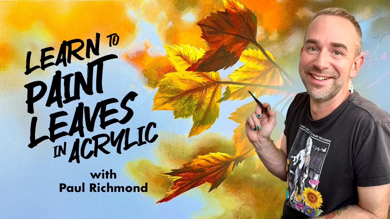
to paint leaves in acrylic. I'm Paul Richmond,
and I am so excited to invite you to join
me for this painting where we will go
step by step from a buoyant canvas to a
completed acrylic painting. Along the way, I'll be
sharing some of my tips and tricks for getting
the image sketched, mixing the colors, layering them, creating
different textures. We're going to have a
lot of fun together. Ever since art school, I have always loved the opportunity to get to be around
other artists and see how they
approach their work. I think you can learn a lot from seeing someone
else's approach. And that's how I like
to think of this class. Nothing that I share with you is a rule that you
have to follow. Every artist is different. Everybody sees the
world differently. But I will be sharing how I
approach this subject matter, and I hope that you'll pick up on some things that
you'll be able to take with you and use in
your future work as well, in your own unique way. This course, I'll be using just simple inexpensive
brushes and a basic set of acrylic paint with just
the primary colors, red, blue and yellow
and white and black. And that's so that I
can show you how to mix everything else
just from that set. If you're new to painting,
this is a great chorus for you because we'll
be going step by step. From the beginning
of the painting all the way through to the end and covering a lot of
foundational painting skills. But also, if you're
a more advanced artist and you're
just looking to refresh some of your techniques or learn some new
ideas and approaches, this is also a great
course for you. I've been painting
my whole life. It's always been my primary
way of expressing myself. And sharing how I see the world. I've had some incredible
opportunities to display my art all
around the world. I do a lot of large
scale murals. I've done the cover
illustrations for over 400 published novels, and I've even done
some commissions for celebrities like Troy
Saban and Dolly Parton. But there is absolutely nothing that I love more than
getting to hang out with you and paint together
and share my love of art with people all over
because I really do, truly believe that
everyone is an artist. So you ready to get started? I know I am. Let's do it.
2. Project: A. Let's take a look at the project we'll
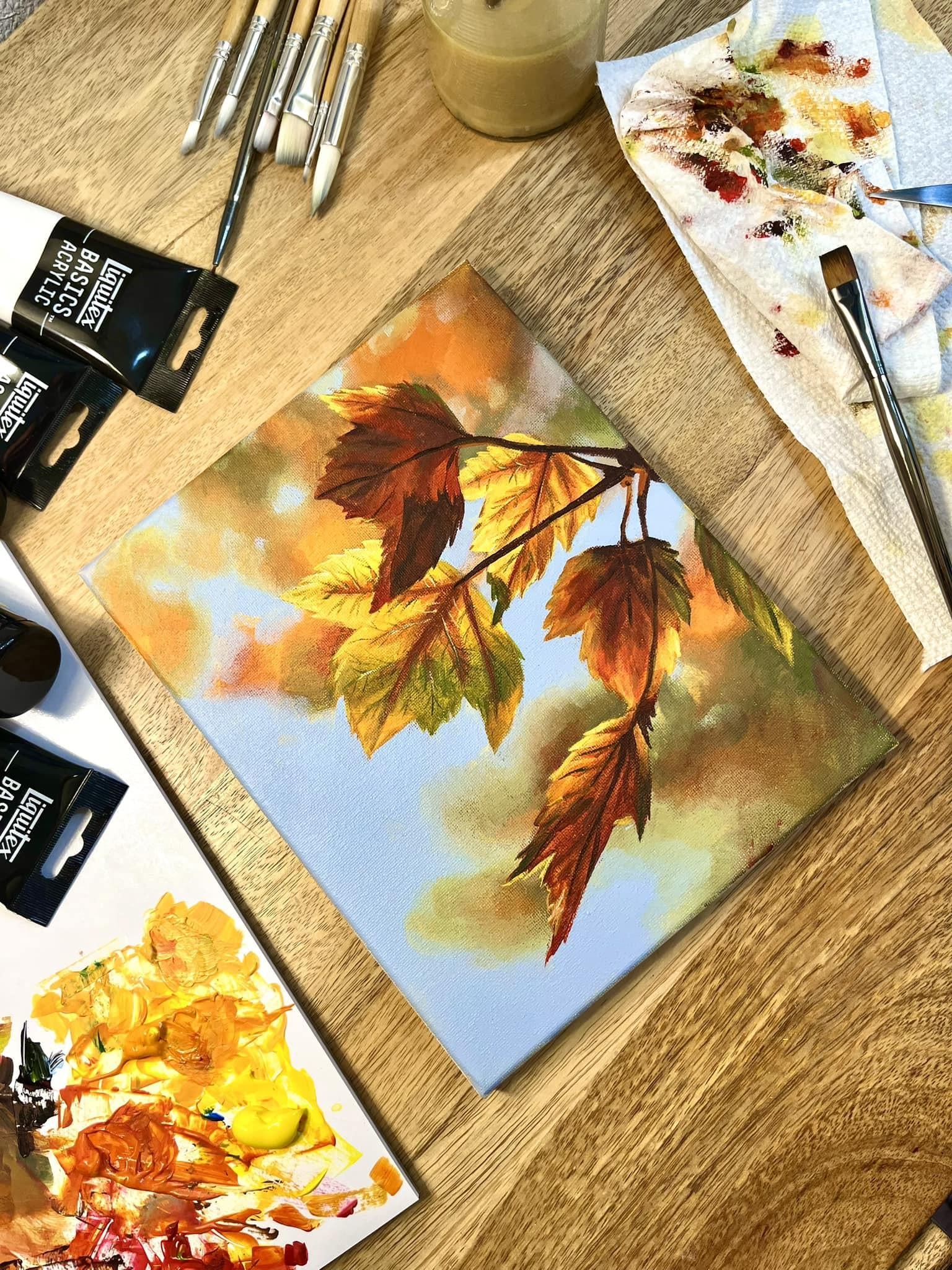
be creating together. It's this detailed acrylic
painting of leaves. I'm going to start you out with a blank canvas and we'll
go over all of the steps, including sketching out the
image, mixing the colors, building layers of light, shadow and texture
to create dimension, and using brushwork
to suggest veins, edges, and the organic
energy of natural foliage. You'll be amazed at how much your confidence with
acrylic painting will grow from the start to finish of this course.
So let's do this.
3. Materials: Okay, let's go
over the materials that we'll need
for this project. I'm going to list out
everything that I'll be using. You don't have to use all
of the same things as me, feel free to put
your own spin on it. I'll be using a nine
inch by 12 inch canvas, a basic set of acrylic paint with white, black, primary red, primary blue, and
primary yellow, a set of inexpensive
paintbrushes with various sizes, a palette knife for
mixing the paint, palette paper for putting
the paint out on. You can also use wax paper, paper plate, whatever you
have handy, a cup of water. Paper towels or rags and the reference photo,
which I provided. So go gather everything up, then I'll meet you
back here so we can get started
on this painting.
4. Mixing Colors and Base Coat: Hello, and welcome to earn
to paint leaves in acrylic. I'm Paul Richmond,
and in this lesson, we're going to start mixing
the colors and putting a base coat on the
canvas. So let's do it. Instead of covering
the canvas with blue, I'm actually going to do it
with a warmer color first. And the reason is because the blue would be harder
to cover with the yellow, but it will be really
easy to go back in and paint the blue over top of that. So it's kind of
thinking about, like, the layering of the
paint and knowing that we only have a limited
time to work on this. So being a little
strategic about it. But, you know, like I
said, you don't have to do what I'm doing. You
can do anything you want. But for my base coat, I'm
going to put out some yellow and little white. Maybe just a little
bit of red, too. This way, it'll go
ahead and just give an overall warmth to the whole canvas and it'll be
easier to bring out some of those warm tones
that we want later. Okay. That works for me. I'm just going to paint
my whole canvas with that and I'm going to thin it down
a little bit with water. I've got just a
cup of water here, I have a few different brushes. This is my biggest one.
I think it's an inch, three quarters of an inch. But use whatever you've got
and get your canvas covered. Uh, All right. I'm painting it kind of thin, so I'm dipping my brush
in the water each time. And that is just because
I want it to dry quickly. Somehow, that
doesn't sound right. You add water to make it dryer. I know. That does seem
counterintuitive, doesn't it? But it works. It
thins the paint, and otherwise, the thicker the paint is
usually the longer it takes. Okay. So there's our
base very bright. It would be really
easy to bring out all those warm tones of
the leaves with that. Oh, I'm just realizing. So actually, I think
I have the photo upside down compared to
what I sent you guys. Well, I guess you could
turn it either way, huh? Turn it whatever way you want, but I'm going to turn it so it matches the way it
originally was. Okay. So now, here we go. When I am working on
a painting like this, I just sketch it with the paint. Some people prefer drawing with a pencil and being
a little more precise, and that's completely fine, too. You can do whatever
you need to do. But also, because of
the subject matter, it doesn't have to be super precise. It doesn't
really matter. So what I'm going to do is
just put out a little bit of black and mix myself up a color that I can
use for sketching. I want to make kind
of a brownish color because that'll blend in nicely. So I'm putting out some
black and some red. If you have a tube of brown, you could just use that or whatever color you
want to draw with, but I'm going to use red,
a little bit of black, and then I'll mix some of
that yellow in with it, and that should give me a
pretty good brownish color. There we go. A little bit green. Do you know why that is? Why? Because your black must
have a lot of blue in it, and that's mixing with the
yellow and turning green. To. So in order to fix that, you just need more
red, 'cause the red is the opposite of green,
and that'll kill the green. Okay, yeah, that's it. Thank goodness I got
something out of all those color theory
classes I took. I took them so you
didn't have to. They were kind of torture, but they come in
handy, occasionally. Great job. Okay, in our next lesson, we are going to start sketching out these leaves.
I'll see you then.
5. Sketching the Leaves: Hi, and welcome back to earn
to paint leaves and acrylic. I'm Paul Richmond,
and in this lesson, we are going to start
sketching out the leaves. So let's do it. So what I like to do is
on my reference photo, I'll just make a little dot
on the side where it's about the halfway point
each on each side. And that way, I can look at
it and imagine a grid there. You could actually,
you know, draw a grid. You could make as many
lines as you want. And sometimes I do that if I'm painting something that
has to be more precise. But doing it this way is
enough for me for this one, because I can just kind of
imagine where those lines are, and then I'll do the
same thing on my canvas, and it helps me to just make sure things are landing about
where they're supposed to. Just a nice kind of
quick visual check. You know, I this
leaf to the left or the right of that dot or
where does this one start? Anything to give you a
few little anchor points so it's easier to map
your way through it. And then I'm just going to
get a brush for sketching. I'm going to use this one. And oh, for some of
the main shapes first. I think I'll start with
the little branch. That makes sense to me. And that starts right above the halfway point on this side. So I'll just kind of
make a little mark to let myself know about where
I want that one to start. And then it comes up.
And it's almost like it's pointing right
toward that dot up here, but it stops maybe
about halfway. So about like that. You can also just
totally free form it, too, if you don't want
to even, you know, think about any kind of a grid and let it fill the canvas, however, however it does. You can change the
shapes of the leaves and the branches if you want to make the composition a
little more your own. Nothing wrong with
that. All right. Now since I went ahead
and did that one, I'm going to draw that leaf now, and then that will
help me to know where the next one goes. So I know this starts here, and the top of that part of the leaf comes just a little to the right of there,
so maybe there. We just kind of do. I'm not drawing all the
little zig zaggies. I'm just gonna make
the basic shape of it. Swings to the right first. Then up. Like that. Down. Okay. I'm going to go ahead and
continue this wine now. It goes over just past the halfway point. It like that. Okay. And then let me go I kind of like to
know where I'm headed. So this last point is to the left of the
vertical halfway, a little above the one or the
horizontal. So about right. Here. It's also just past this one. So looking at the relationships between what you've
already drawn helps too. So if I draw a straight
line up from that tip, it's just a little bit
further to the left. So about there is good. Like I said, at the beginning, it really doesn't matter too much with this one,
but, you know, trying to get it close will help when you're
painting because there are a lot of things happening here that have to do with
the relationships of one leaf to the other like that shadow that we see here and the shadow that's
cast across this one and just the way
sort of this shadow, the way they're
interacting with each other is because
of the position. So looking at those things
now will make it a little easier for you later. Okay. Okay. That's enough for
that leaf. All right. So this next little stem is still above that
halfway point. And it's about halfway
between here and here. So about right. Here is where we're headed. So now I'm going to
start on this next leaf, and this first part's easy. It just comes right up there. And we've got I'm actually
going to jump ahead and do the go all the
way to the end here. So I'm going to continue
this line over. And it dips down below
my halfway point. And it's I would say,
I'm not great at math. So it's less than one fourth. Go dips down a little
and then has a little more of a diagonal
end here at the end. Now, using this method of doing the little dots is it works, but only if your canvas is the same or similar
proportions to the photo. And actually, this
photo is a little bit taller and skinnier
than my canvas. So my image is going to be
squished just a little bit, but I don't think it'll matter. But if you're doing a
portrait or something, it would be important
that you have the exact same proportions if you're using a grid
kind of a method. People don't tend to like
their faces to be squished. Awesome job. Okay,
in our next lesson, we're just gonna keep on going, sketching out more leaves.
I'll see you then.
6. Continue Sketching Leaves: Hi. Hello, and welcome back to Learn to paint
leaves and acrylic. I'm Paul Richmond,
and in this lesson, we are still sketching out
more leaves. So let's do it. Alright. That comes to
about the quarter, Mark. And then comes back in, and it's really close
to the point. This one. Okay, let me come out this way. All right. Now, this one. Let's say about right here. It's a little bit to the left of the halfway dots and not
too far below there. Maybe down just to smidge. That looks wet. And you're never stuck
with what you draw. If you make a line and
you don't like it, you think it's not
in the right place. You just take a brush
with just water on it. I'll just show you here this
line's not that important. As long as the
paint's still wet, you can just lift it up and then just dry
it with a paper towel. So or if it has already dried. Just draw another
one next to it, a little darker or something, 'cause nobody draws everything
perfectly the first time, except for Melissa, but, you know, she's not
here at the moment, so we can talk about her. She sends her love, though, I talked to her yesterday. Okay. Now just
connecting this one. Okay. And I'm going to go ahead and do
this stem next. It comes down to about
fourth of the way up and a little to the left
of fourth of the way in here. So about here and here. Right there. It kind of
curves a little bit. L. Okay. Then this leaf, the end point of it is about a fourth of the way
in just a little ways up. Plan. Okay. And this one is just a little to the
right of the halfway, and just a little bit above where this ends.
So B right here. And then this point is just a little bit to
the right of this one. So just a little bit
over and looks like it's a little below
the quarter mark. So if that's
quarter, maybe here. Okay. Finish finish it
off with this sign. I'm not going to draw
all of the, you know, complicated interior stuff yet because we need to
paint that first. Otherwise, we'll
just be drawing it and then covering it
up and redrawing it. So it wait on that. All right, we're
almost there. So now, using all of the lines
that we've already drawn makes it a lot easier to kind
of place this other stuff. So I'm actually going to start this leaf from the
tip since I can see where it intersects here,
kind of work backwards. And I'm also looking at the shape of the
negative space here. So it comes up and then about
here's where that happens. That little point. Down here, it comes right out
from the very end of the stem and goes far back, I'd say about to here. Hmm. Now, I'm going to draw the stem. It's not like that. So it's really tight close
to the stem up here, and then it just
kind of broadens out a little bit
as it moves away. There's that. Okay. Now, this one. So this one, the tip of it overlaps this leaf just a little bit,
right about here. And I'm looking at
this triangle shape of negative space, so
I'm going to draw that. That's another good
drawing tip is to just draw the shapes of
the negative spaces. The negative space
is the background. So I'm going to
do that here too. I'm looking at that blue shape and just kind of drawing that. One of the benefits of drawing the negative spaces is that it makes you
stop thinking about what it is you're drawing
and really just looking at the shapes because as long as you're thinking
I'm drawing a leaf, your brain is really
trying hard to draw whatever it thinks
a leaf looks like, which may not have
anything to do with what's actually here in this
particular reference. So trying to think about it more abstractly
and really just look at the shapes and looking at those negative spaces
helps me to do that a lot. I use that with drawing
all kinds of stuff. And the breakup of
the negative spaces, the way that the negative spaces have a variety of
sizes here, you have, you know, big open areas and then some
really tight areas, and they're all
different shapes. That's a good design. If we were composing
this ourselves, that would be
something to aim for. It makes it feel very natural. If everything is the same, then it feels very static
and kind of posed. But this feels like, you know, something that you
would see in nature, which obviously it is. Okay. Just connecting
you back up there. And then there's a little stem. Right there. Go ahead and draw the center.
A little vein there. Great work. Okay,
and the next lesson, we're going to finish our sketch and mix some more
colors. I'll see you the
7. Finish Sketching Leaves and Mix Colors: Hello, and welcome back to earn to paint leaves in acrylic. I'm Paul Richmond,
and in this lesson, we are going to
finish sketching out the leaves and mix
some more colors. So let's get to work. Okay, and there's
one more that's just hiding right off
to the side here. And I do like that.
I think it's good. That's another good
compositional thing having something go off the edge gives
the feeling that the scene continues beyond
the edge of the canvas. And it's not always something that we think about
doing when we're making up a
composition ourselves. So this is just a good
reminder of that, that you want to make
the viewer feel like they're just seeing a small
part of something, usually. I mean, unless you're doing
something that's more um symmetrical and
kind of controlled. All right. And the
bottom of that is just a little bit above where
the tip of this is. So I'll come over from
there and then go up a bit, and that's how I
know where to stop. Okay. And that is plenty
of drawing for that one. All right. I go to clear some
space on my palette here. Might need that brown later, so I'm just going to
move it out of the way. Okay. So what we're going to do now or what I'm
going to do now anyway, is start with the blurry leaf
colors in the background, and then we'll go
right into the sky, and then we'll finish up by
doing the leaves in front. So normally when I
paint a landscape, I always like to, you know, I guess you would call
this a landscape. I don't know. There's landscape elements
because there's a background. I like to start with what's
far away and work forward. So normally, for me,
that is the sky. But again, I don't want to cover all those orange
areas with blue, then we'll just be
fighting against that blue to get the
orange to pop again. So that's why I'm doing it
a little bit in reverse. So I'm actually going to paint those blurry orange brown hint of green colors and then blend it right
into the blue sky. I'm going to mix all of
those colors up ahead of time so that I can do it
all at once while it's wet. When you're painting
with acrylic, everything kind of
needs to be wet at the same time if
you want it to blend. So I'm going to put out
some blue Actually, I'm just gonna put out
everything 'cause we're gonna need it all. So white. Gonna go ahead and give
myself a little more yellow, even though we might
be okay there for now. And red. Okay. I'm going to
start by mixing up the sky color,
so I'll have it. And it's mostly white with
a little bit of blue. And I'm going to mix a
little bit of red into it also to tone it down a bit that blue my
blue is very bright, brighter than brighter
than the blue here. I'm toning mine down a little bit closer to the picture because
one of the things I actually like about this is how having a little bit
more neutral sky, it does make the colors the warm colors pop
a little bit more. So thinking about how
you balance things in balance color in a painting, if everything is the same
degree of intensity, then it all just kind
of becomes the same. Feel nothing really stands out. So I like the balance here. I'm going to I'm even putting
a little of the brown into the sky color just to tone it
down a little bit further. It's getting closer. I even
put just a touch black. When you're trying to match a color or at least get close, I like to just put
it on my knife and then hold it right over top
of what I'm trying to match. So you can see how there's still more pink in this than in mine. So that means I'm going to just go ahead and do a
little more red. There we go. This is why five people can say they're thinking
about the color blue, and all five people can be
picturing something totally different because there are 1 million different
versions of every color. And when you're doing any kind of commercial
art for someone, you have to get really
specific with them when they tell you they want
something in a certain color. If they say I want
that painted blue. I'm gonna be showing them options. Which blue do you mean? What blue do you want? All right, so then we've
got some darker warm tones. We probably will actually use that brown a little
bit in the background. So I'm going to mix an
orange for back there, too. So orange is just
red and yellow. The yellow the yellow is
not as powerful as the red, so you will probably need
more yellow, less red. Here we go. Okay. Now, it's very bright, which will use that intensity
in some places, maybe more in the foreground. So I'll save a little of that. But for the background, I'm actually going to
take a little of the sky blue that I mixed
and add that into it. Blue is the opposite of orange, so that will tone
it down a little. Whenever you add the opposite
or the complimentary color, it takes it a little bit
more toward neutral, takes the edge off of the color. See how it just made that
orange a little less intense if you compare
it to the original. Okay. So that's really I see
that color back there a lot. I also see one that's
a little bit more red. So we'll make another version. In fact what I might
do is just take some of that and add a little more red to it. Make my life easier. And then, lastly, there's kind
of a brownish green color. So that is going to be blue
and yellow to make green. And then to neutralize it, you add the opposite red. So I'm going for this
kind of a color, so I still need some
more red in there. Maybe a little
black to darken it. There we go. Alright. So,
I think we're good here. I've got my sky color. I've got a couple
different oranges. I have a dark olive
kind of green, and I'm going to use my
brown that I made before for the lines and start
on that background. Great job. Okay, and
our next lesson, it's time to start blocking in some warm colors for the
background. I'll see you then.
8. Blocking in Background: Hello, and welcome back to earn to paint
leaves and acrylic. I'm Paul Richmond,
and in this lesson, we are going to
start blocking in some warm colors for the
background. So let's do it. Alright, I'm using
kind of a big brush because I don't want to get too fussy with the background. We've got plenty to get
fussy with on the leaves. And I'll just start,
where do I want to start? I'm going to do I'm gonna do everything leaf related first, at least the background
part, and then the sky last because I
don't want to paint blue somewhere and then decide I want to
put a leaf there. So let's go ahead. I'm going to grab
this bright orange and I see some of that up here, so I'm going to start with that. The main thing is use
big brush strokes, and if you want it to be blurry, you're going to just grab
one color after the next and just work them into each other
while both colors are wet. And it doesn't matter. You can jump from one color to the next. How do you know if you have
enough pigment on there to cover To cover the Well, you can tell when
you paint it if it looks too thin, if it feels, you know, transparent, you might have to go back
in and do another coat, and it doesn't mean that
you've done something wrong. Oranges and yellows are just
very transparent colors. So sometimes they just need, you know, another layer. I'm still. But it does help that
we put that yellow down first because even if
the paint is a little thin, it doesn't feel unpainted
because there's already something else
there showing through. And just paint right into your leaves that
won't hurt anything. It's better than being real cautious and trying
to paint, you know, carefully around everything
that can sometimes end up you end up with brushstrokes
that look like they're sort of making a halo around stuff. There are some parts
over here where a little bit of blue shows up, but I'm going to do
that last to you. This can look very brushy. I wouldn't try to necessarily hide your brush
strokes too carefully. You know, it's a
painting. It's okay for it to look like a painting. Anywhere where it
maybe feels too thin, you can just go back
and add some more. If you want to
make the color pop a little more in some parts, you can even while it's
still a little wet, you can go ahead and put a
little more color in there. You've been grabbing
some of that yellow that I used for my base coat and just using that to make a few little highlights
here and there, too. When you're painting
and everything's wet and it's all just kind
of working, you know, one color working into the next, you can just do a lot of
mixing right on your canvas. You don't have to mix
every different value and color on the palette. If you want to lighten a spot, just grab something lighter
and brush it right in. Don't judge your
painting too much yet, because right now it feels very strange with the
absence of that blue. Everything looks very yellow
and it feels, you know, way too warm and just
kind of tricky to judge. So I always tell people, you have to get the whole thing covered with a base coat before you get too
critical of it. Then you can start
really looking for where it needs some work. Okay. That's looking
pretty good. And then this is
mostly all blue, then I'm going to get home
all the way down here now. I do kind of crisscrossi
brush strokes. That's just my way. You don't need to do that,
but I like it because it kind of camouflages
them a little bit. So if all your brush strokes are going the same direction, sometimes they really
start to be noticeable, which also is not a bad thing. That could be a style thing, like Van Gogh, that
was kind of his trick. But if you want to
camouflage them, going different
directions does help. Okay. Really bright little
spot back here. I like that. Okay. Beautiful job. Okay. And the next lesson, it's time for us to start ainting the sky.
I'll see you then.
9. Painting the Sky: Hello, and welcome back to Learn to paint
leaves and acrylic. I'm Paul Richmond,
and in this lesson, we are going to be painting
the sky. Let's go. So, I may come back and do a little bit more in
some of those areas, but first, I want to go ahead and get the
blue on there now. So I have kind of
all the warm tones pretty much at least blocked
in in the background, so let me get I'm gonna use
another brush so that it doesn't mix any of those orange
colors in with the blue. I want that blue to really
stay kind of purer. Well, maybe that was gonna
get a different brush. The good. Okay. Yeah, I'll look at that. Now, this is where
it's really going to start to start to come together, getting rid of some of that
bright yellow back there. See how easy it is to cover
that up with the blue? If we were doing the reverse and putting yellow on
top of the blue, it would probably
take us three coats or more to really cover it. So this is good in a pinch if
you're trying to work fast, and it's the kind of trick that plain air
painters would use. Plain air painters are the ones who are painting out in
nature and, you know, working directly from life, and they don't have time to sit and wait and let things dry or, you know, come back and
do another layer later. They have to make it
all work right there. So those are some of the
kinds of things they do, thinking about the
way the paints, different colors interact
with each other, being a little more strategic. And they're also
more likely to use a very limited palette
like this, too, just because you don't want to have to be walking
hiking out in, you know, field
somewhere carrying 1 million tubes of paint. Now, if your warm colors
are still a little wet, you should be able to
just brush it right in. If not, you can
maybe even just kind of add some water to your brush, and that might be enough to get it to kind of
make that blend for you. If not, though, just add
some more of the oranges and browns and reactivate
it and blend it in. See how I'm getting a nice
soft blurred look there. That's kind of what you
want if you're going for the same feeling as the photo. Having the background
be really blurry and nondescript will make the leaves in front feel very
sharp and in focus. Okay. Come up here. Right here, my background
colors did dry. I'll show you I'm just picking up a little more orange and I'm using a different brush so I don't mess up my blue brush, but just working
it backwards now, adding some more orange
and then blending it in to the blue. I still get that soft effect. You have to really think about that kind of
stuff when you're working in acrylic
because it dries so fast. I usually paint in oils myself, and I don't have
to worry about it. I'll stay wet for
a while longer. But if you know how
to make it work, you can get the same
look with acrylic. Wait. In kind of has the feeling of, like, an impressionist
painting at this point, where it's just
about the colors and the movement of light and
not about any details. A Okay. Come up here, do these little spots. Sometimes you can even just do the finger blending approach. There's nothing wrong with that. A little finger painting.
It's always good. I was watching this show today
while I was having lunch. I always like to watch
videos of artists on YouTube while I'm eating
just to see different, you know, ways different
artists paint different things. And there's so much on there. If you ever just want
some inspiration, go on YouTube and
just search for artist painting, whatever
it is you want to see. There's somebody out there
who made a video doing it. But I stumbled across this reality show but
it's filmed in Greece. And it's a reality
show for artists, and they're all in this room. And it's just like
any reality show, you know, there's a host, it's like, Okay, today's
challenges, you have to do this. And then all the artists,
and they're all painters. So then they all, like, scramble to, you know, paint whatever whatever
the challenges for that. And they had some
really It's called um, outstanding artist is
the name of the show. And if you just search for that on YouTube, you can find it. And you know, the
paintings were really interesting and they
had some cool ideas. So I was impressed, but also it just
really stressed me out because they
were all, you know, worried if they
were going to get, you know, voted off and, like, they're scoping out
what each other was painting and trying
to, you know, compare. And I was just
like, This is kind of not what art is about for me. But I did like seeing, you know, them all working and how
talented they were and stuff. But it made me think
maybe I need to try harder to stress
you guys out more. It did seem to work. They got
some really good results. Great job. Okay, and our
next lesson it's time to finish painting the
background. I'll see you then?
10. Finishing the Background: Hello, and welcome back to Learn to Paint
eaves and acrylic. I'm Paul Richmond,
and in this lesson, we are going to be finishing up the background. So
let's get to work. Anywhere you end up with
a kind of a hard edge, if you want it to
look more blended, you can just go right
back into it and layer a little bit more
color and just work it in, soften the edge, see
if you can get it to really go back in space
by blurring it out. A a Okay. A little more sky
coming in up here. I like those little
areas where you can just kind of pop in little touches
of sky peeking through. I think there's something really I kind of gives
it a little sparkle, and you just get the sense of light coming
through the leaves. So like I like adding those in. And I think it's cool that
you can have an area that's all painted in
already as leaves, and then you can paint
sky on top of that, but it feels like the
sky is behind it. Finish. Uh, Just kind of touching up my sky
in a few spots. Sometimes when the paint dries, it will contract a little
bit and leave little gaps. So a lot of that's why having
a base coat helps too, because then at least
there's something there, so it might not
matter, but where I want the sky to
look really blue, I'm just making sure that
it's covered really well. Okay. I think that's
good enough for now. Once we get everything painted, we can look again and see if it works or if
it needs anything. But we're still in the
cover of the canvas phase, so let's keep moving. Great job. Okay, and
our next lesson, it's time to start mixing colors for the leaves.
I'll see you then.
11. Mixing the Leaf Colors: Hello and welcome back to Learn to paint
leaves and acrylic. I'm Paul Richmond,
and in this lesson, we are going to be mixing
the colors for the leaves. So let's do it. So the
next thing we're going to do is block in the
colors of the leaves. And I call it blocking in
because in this first pass, we're not going to necessarily be painting every little detail, but kind of more so looking
at the big picture, squinting my eyes and looking to see where do I see
big areas of dark? Where do I see big
sections of light? So we'll kind of get the
leaves blocked in first, and then we'll go back and hit them with all the
details that we can. I'm going to mix. There's
a lot of this kind of dark brownish red color that I see on a
lot of the leaves, especially in the shadows. So I've got my red. Gonna put a little brown in
it and just a touch of black. Let's see what that gives us. Okay. Well, that
looks pretty good. I do like that. I
see that in there. But we also need a version
of that that's darker. So I'll do it again.
Take some more red. So just take all the red
that I have for now. A little more brown. Maybe a
little more black this time. There's a good dark dark color. So kind of like Jackie. My black is on the blue side. So that's why mixing it with red and brown kind of balances that out because they're
both warm colors, so it ends up on the
warmish side still. That'll be good for the stems, just some of those
darker details. Okay. And I've still got my yellow that I
used for my base coat. If it's started to dry, sometimes it might just
be an outer shell that's dry and you can kind of
poke through it with the knife and still
get to wet paint. But if not, you
can just mix more. And then I need to put
out some more red because I need to mix some lighter
oranges, you know. Might as well go ahead and
get some more yellow too. Okay. So remember, the red's more powerful
than the yellow, so I'm using a little bit of
red and a lot of yellow to start with and look at how it's already still turning pretty
orange just from then. In fact, that's really nice. It's a nice color. I see that in there a lot, so we'll use that. Then I do want to mix one that is a little more toward red. So we'll go a little
stronger with the red here. We get a nice bright orange. So when you want things to
come forward in a painting, going a little bit more saturated with the color
is one way to do that, especially if you
have a little bit more toned down colors
in the background. The really bright colors will feel like they
are closer to us. Okay. And let's see
what else do we need? Oh, I need to mix more green, too, because I'm just about out. So just a little bit
of blue, at of yellow. Then touch of red
to tone it down, neutralize it 'cause red's
the opposite of green. Okay. That's good for some
of the lighter parts. And then I'm just going
to take a little bit of that and add some black
to it to darken it. Make a darker greenish color because I see that in
some of the veins. I'm going to put out
some more yellow now, so I'll have it on my palette because I might
even just want to grab a little bit of that by itself for some accents
here and there. But I think that's pretty
good range to start with. So I have my reddish, my kind of brownish red color. It's kind of like a rusty color, then a really dark red brown. I have a few different
oranges yellows, and a couple greens. Awesome work. Okay,
and our next lesson. It's time to start walking in the leaves. I'll see you bin.
12. Blocking in the Leaves: Hello, and welcome
back to earn to paint leaves and acrylic.
I'm Paul Richmond. In this lesson, we are going to be blocking in the leaves. I can't wait. Let's go. Now we're gonna paint. So I'm not going too
small with my brush yet. I'm going to go with the size. That'll be good for
I can fit it into those shapes and still get some, you know, distinction where
shadows and things are. So I'm going to start up here on the top one work my way down, and that one has a lot of the dark and when
you're blocking in, you're just kind of getting
the big chunks of color. So we're not trying to be too detailed or perfect with it. This red is also very thin, so don't be it's
gonna probably take another coat to
really look finished. Okay, I'm just gonna grab. Still have some of that red, but I'm also mixing it with a little bit
of the darker one, so I can do this
shadow here now, see how this whole kind of middle section is a bit darker. You can even grab some
of this brown, too. Look at the reference, you
know, paint what you see. You don't have to
match me brushstroke for brushstroke or anything. I'm just kind of looking
at it and trying to get the main the main kind of
sections of color blocked in. You don't need to
blend it perfectly. I think sometimes if we try
to overly blend it too soon, then it loses a little bit of
the sense of the structure. So it's okay to see edges and to not have it
be perfectly blended. Okay. And then this very top part of that leaf is catching the light, so we'll switch and do that. Well, there's some greens
and other colors in there, but I'm not getting
too fussy just yet, just getting the main stuff. So now I gonna come up here, grab some of this
brighter color. So orange. Do that part. There's some brighter
yellow too on the tips, but we'll come back, do that in a bit. Okay. Over here, there's a really interesting shadow
coming through. I'm not sure from
where. I don't know if it's I might be from
this leaf behind it, and maybe it's kind
of being back lit, so we're getting a shadow. It's kind of almost
like we're seeing through the leaf to the shadow. I'm not sure. Don't
need to know, really. Just paint what you see and then it doesn't really matter. That's interesting. It's not something I
would necessarily think of putting if I was
just making this up. So I like that about it. Okay. And I'll go ahead and do the
stem too with that dark. I'm not going to
do all the stuff inside the leaf yet
because I still want to do a little bit more
detail work first. But I will get the stem. Okay. Okay. Many people when they are
first learning to paint, get really frustrated if it doesn't look perfect right away. And so I always just try and emphasize that it
really is a process, and we're just, you know, getting some paint on there, and then we'll just keep refining it until we
get it how we want. Not going to judge it too
early. You know, this leaf. Is it's starting to look leafy, but it still needs some love. That's okay. We will come back. But for now, we're
going to move on. So this next one this top
portion is pretty light. In fact, lighter than
the backgrounds. That's a good thing to
think about actually, when you're painting is
what's the relationship of the color that you're
painting to what's around it? Is it lighter than, you know, the area that's
right next to it, or is it darker? That
can really help. Just like when we were
drawing and we were comparing the
placement of things. This is just, like,
another variation of that idea using what's around something to help make
that thing more accurate. Thinking about the
relationships. Okay. Yay. Great job.
It's coming along. And in our next lesson, we're going to continue walking
in the leaves. See then?
13. Continue Blocking in the Leaves: Hi, and welcome back to earn
to paint leaves in acrylic. I'm Paul Richmond,
and in this lesson, we are going to keep walking in the colors for the leaves.
So let's get started. So right around the center here, it starts to get a little
darker, a little redder. I'll go ahead and put
all the yellow tones on first and then I'll come back do the greens
because there's a big section in
here where there's sort of a greenish shadow. With each thing you paint, just look is it darker
than the background? Is it lighter than
the background? Sometimes it shifts. It might be lighter in one
area and darker in another. I can really help. Sometimes we think something is
supposed to be light. But then when you
start actually looking at how it relates to
what's around us, it might surprise you and be darker than you
expect or lighter. Color can really play
tricks on you that way. Alright. Now, I'm going to put some of this
green in there. And it goes all the
way up to about here. It's also pretty thin because it's got a lot of yellow in it, so I need another coat
to really look gray, but got to start somewhere. Mm hmm. Okay. There we go. Okay. I still needs, of course, some love, but
that's a good start. Just do a little bit more of the reddish color in the middle here so that can
get another pass. Grab the wrong thing.
Not want you yet. That's right. We'll
just roll with it. Okay. Getting our leaves in there. I go to do this one next, and that one's pretty
light overall, except for that little
dark shadow on the end, and then the shadows
around the veiny parts. So let me go ahead and do
the white color first. And I'm using my
brush to just start to create a little
bit more of that kind of textured edge where it's got this little lots
of little spiky sheeps. I love this color combination. I love these yellows
and reds with those blues and then that touch of the green here and there. It's really a great combo. A lot of color schemes
that we see in fashion and in art are inspired by
color combos in nature. Yeah. Am. I'm gonna go ahead and do a little bit more reddish
color here toward the middle. Blend it in a little
bit to the yellow. Majority of it is red, and then just a little bit of, a little bit of
brown, a little bit of tiniest little bit of black. Uh, a, h. Great work. Okay. And the next lesson, we're going to finish
locking in the leaves.
14. Finish Blocking in the Leaves: Hello and welcome back to Learn to paint
leaves in acrylic. I'm Paul Richmond,
and in this lesson, we're going to finish blocking in the leaves. So
let's get to work. Yeah, I'm just doing
this leaf here now that's kind of
mostly in shadow. It's just, like, so
interesting to me how these leaves
are so different. Each one has just got, like, such a different combination and arrangement of colors on it. It makes it fun to paint
because it's not repetitive. A after we get through this blocking in phase, then I'm going to go
back, just take it one leaf at a time with a
little bit smaller brush, just trying to bring
out any little details that I think are interesting and want to bring into
focus a little more. Then the final step will
be doing all the lines, the little veiny things. Which always makes me think
of Deb because I love her line work and her artwork. That's one of especially
her pencil drawings, but in her paintings, too, she just has such a
beautiful way with line. And I love when she does leaves and trees and things
because she just, like, really gets into all the line the lineer aspects of them. Okay. This last one down
here is pretty dark all over except
for that very top part. Go and get that in first. Mm hmm. There's a Georgia O'Keefe
painting of leaves that was in the
Columbus Museum of Art that I always saw when I went there when I
was growing up, and it had very similar colour
scheme to this painting, but much more in her, you know, Georgia O'Keefe style as far as the brushstrokes
and everything, but it makes me think of
that when I'm painting this. I love that painting. It definitely had that deep red and yellow and blue combo. O. Believe the mess I'm
making over here. That's, that's all. Goes with the territory of
being an artist, I think. Must be a great artist. I think so. The bigger the
mess, the greater the artist. Okay, let's see here. That's why I had to move my
studio out of the house. I was too messy.
I joined I mean, I have my studio here. That's where I'm at now,
but I have I joined a co op studio where I go and paint my big messy
things 'cause it's really nice to be able to
just throw paint around. I need that for my
process. I like it. I'll make a big mess and then have chaos
all over the place and then try to bring out some kind of
imagery from the chaos. I need that chaotic
step though first. It really helps me with my work. If I'm just looking
at a white canvas, I have no idea what
to do with it. But if it's a messy, crazy canvas, then
we can go somewhere. Okay. This last one over here
is pretty dark green. It gets a little lighter
towards the bottom, which is what makes
it stand out against the darker background there. So this leaf that I'm
painting right now is a really good example
of one that shifts. See how at the top, it's
darker than the background. At the bottom, it's lighter. Okay. Before I go in and do the
rest of the stems with dark, there's a few spots
where there's some real bright orange
hitting the stem. So I want to get that in first. It'd be harder to paint
that on top of the brown. Beautiful job. Okay,
in our next lesson. It's time to start painting the stems and adding
some details. See
15. Refining the Leaves: Hello, and welcome back to Learn to paint
leaves and acrylic. I'm Paul Richmond,
and in this lesson, we're going to continue refining the leaves.
So let's get to work. Also, I just really like the detail stage of the painting like this
part where you just get to go back and choose
which of the little, you know, accents you
want to bring out. Obviously, you can't
paint everything, not in this time frame, but you kind of choose what speaks to you and I enjoy that. I like seeing those little finishing touches come together. Are you satisfying? Okay. So little rainy shapes. Kind of branch out from the main one getting
thinner and thinner, just like branches on a
tree, same kind of thing. They are a nice little touch. You really see them the most
in these yellowish areas. Just going back in with a little more orange around them, too, because I see that just kind
of has this build up of that orange and reddish color
as it gets toward the vein. There's even a few
that are really light. A. And I have a really hard time
drawing thin lines, even with the smallest
paint brush I can find. It still comes out, you know, about a quarter inch
thick, but thick. Do you So I'm using, like, these little, like, kind of slant brushes
or the or flat brushes, and I think there's a few
tricks for thin lines. One is not having much
paint on your brush at all. I kind of just have enough. You can sort of see I'm
doing some right now. It's just, like, on the
very tip of the brush. And then I dip my brush in water each time I get paint
because without the water, it's not going to
the paint won't glide along and make
a nice line for you. I just builds up and it's too, like, chunky and plasticy. So having very little
paint lots of water, and then just a very,
very light touch. You most of the brush is not even touching the
canvas here as I'm doing it. It's just like the very
tip of it that is. Okay. Okay. Then just going
to work some orange in. Just kind of adds a nice
little shadow effect. And I've thinned it
down with some water just to make it almost
like a glaze or a wash. I just helps pull everything
together a little bit. Beautiful job. It's coming
along. We're getting close. In our next lesson,
we're going to be adding some highlights.
I'll see you.
16. Adding Highlights: Hello, and welcome back to earn to paint
leaves and acrylic. I'm Paul Richmond.
And in this lesson, we are going to be
adding highlights. So let's go. See a few
little spots on the tips, some of these parts of the leaf where it just gets
a little darker. I kind of like that. That's
a little unexpected detail. Um, Then I want to pop out some of the
highlights on that one. Really make the edge. Contrast the background. There we go. I love
those spots where you just get that really nice bright yellow that shows up. Feel that warm white hitting. A little bit of a
rim lighting effect happening here
where there's just, like, a sliver of
light along the edge. I go even brighter up here now. Just getting really
into these highlights. Just kind of work it in with your orange or red
or whatever color. Bring out a little more
of the vein in this one. I jump around, you see. Be working on one
leaf and then I'll see something somewhere else. I move over there and do that. Otherwise, I might forget. So that's mainly why. And actually, while
I'm up there, I also remember there's
little touch of green on the edge here that
I wanted to bring out. I love that green going
into the red like that. A little bit of it up here too. Those are the kind of
things that make it really worth going back and just
taking a closer look. It's not to paint every detail. It's to just look and see which ones are important to you. I think that's what if you're
doing a painting that is any kind of degree of realism, the details that
you choose to focus on and bring out are
what make it your own. You can have different realist painters paint the same thing, and they would all
feel realistic. But they would also
all feel different. That's kind of where the style comes from. What do you see? Are you drawn to little tiny, you know, accent details? Do you like big bold the big
bold shapes and shadows? Do you want to bring that out
more? What speaks to you? Okay. I come back down. Do the leaf I was supposed
to be working on. Do some little ans. Okay. And there's a few
light ones in there too. I like that. I like little
unexpected touches. I think it's just from where the light is hitting the
edges of some of those. So it's a nice
detail to bring out. Okay. Now, this one is
pretty in shadow, so there's not a lot
of sharp details, but we can still come
back in and just pull out a few little things that we see to kind of polish it off too. I'm going to intensify the orange because it
dried kind of thin, so hit that edge again. And then kind of
working my way up to the yellows that I see in a
few areas like right here, it's really bright again. If you even grab a little white. Sometimes if the yellow
doesn't is too transparent, it's not popping as much. You can put a little
bit of white with it. Don't want to do too much
or it'll make it too. I'll lose the, you know, intensity, get too chalky, but a little bit of
white can just help to make it stand out. Okay. Getting a little
yellower up here. Not quite as bright
as down here, though, but there's just a
few few touches. I'm kind of working it
into the redder tones. I like those I like just having a few little spots
of that bright red. I can't even pull that out.
I keep coming back up here. I'm going to bring out that red up here a little more, too. It's not a bad thing to
jump around, though. It's not just because
I'm very ADHD. It's also because
when you do that, you get a little
bit more movement of color throughout the piece. You don't end up just
putting, you know, all of one color in one spot, but you kind of make
it all work together. A little more harmonious
would be a way to describe that when
you have the colors kind of moving
through your piece. Okay. I was looking good. It is softer. Like I said, doesn't have as many sharp
details as the others. And that's a good
thing. You don't want them all to look the same, and they shouldn't
all be in focus. This leaf is farther
back than this one. So that could be part
of why the camera did not pick it up in quite the same degree of
detail as the others. But it also mimics the way our
eye perceives things, too. We can't focus on
everything at once. So when you create that
hierarchy in a painting, you're helping the viewer understand what
they're focusing on. What is the focal point? Great job. We are so close. We only have one more
lesson left where we'll be adding all of
our finishing touches. I'll see you then.
17. Finishing Touches: Hello, and welcome back to Learn to peat leaves in acrylic. I'm Paul Richmond,
and in this lawsuit, we're going to be adding the finishing touches and completing this peeving.
So let's do it. No come up to machine. And more Dirk. Wine here. Get all those little
green veins in. In the leaf itself,
it has some dark green on the tip and
also down under here. A Okay. I'm going to layer in some orange around those
to blend them in a little. We shadow effects. And then let's do some
high laming on this one. Okay. And also we have a
little bit of that kind of edge lighting or rim lighting again happening here and
a little bit up here too. Nice. That's such a
nice little accent. A lot of red that's
showing up here. Okay. And get this dark
shape right here. That's actually the
end of this leaf. It comes like that. I was reading that as somehow
being a part of the stem. Interesting. No, it's not. See, that's exactly
what I was saying. The more you look at things. The more you see. So that actually blends right
up into that leaf. That's cool. And then on the other side of
it, it's white. Okay. A lot of times with
painting something like this where the object is
really sharp and in focus, a good finishing
touch is to just go back around and make
sure that all the edges look the way that you
want them to doesn't need any little touch ups or cleaned. The sleeves very and all kind of blurry and
out of the way. So I'm not gonna do
much to that one, but just bring out a few
little color accents. It does pick up a little
bit of red in places. So that'll help it to
feel more part of things. Don't want you to totally miss
out on the feel left out. Filling in filling in some gaps in the background
where the paint drawn in. Okay. Sometimes I catch
myself just fiddling with things because I don't want to be done
because I'm having fun. That's okay, but at
a certain point, you do have to pull the plug. You don't want to overwork it. Okay. We're about at that point. Co. I'm just going to work a little
of that redder tone into a few spots in the
background where I see it really helping to make
things pop right there. Here. Just doing it with a glaze, so just mostly water. It's a nice way to just kind of, again, work those
colors throughout. I didn't have that color
when I did the background, so just kind of helps pull it all together to throw a little of it back
in there now to you. Let some go off the canvas here. Alright, my friends, I think. You have a painting. Awesome job. I have had so much fun making this
painting with you. I hope that you are proud of what you've created
and that you've learned a lot along the way that will be helpful for
you in your future work. Thank you, so much
for painting with me.
18. Closing Thoughts: Well, you did it. Here we are at the very end
of this course. I'm so proud of you
for hanging in there, going through all
of those steps. And I hope that
you've made something that you feel really good about. Maybe it'll even hang on your wall or someone
else's wall. And mostly, I hope that you've picked
up a lot of tips and tricks that you'll be
able to carry with you into your future
work and add to your tool belt and use in your
own unique, creative ways. I would love to see
your paintings. Please share them with me. Leave me your feedback
about the course, and I definitely
hope that you'll come back and make some
more art with me soon. I have bunch of other
courses already available, and I'm filming
more all the time. So if there's something
in particular that you would like to learn
about, let me know. I'm open to your ideas. I absolutely love the
opportunity to connect with so many artists
through this platform. I think it's really inspiring. It's wonderful to see people learning and growing
and trying new things, and it's an honor to be a part of that creative
process for you. Thank you so much. Happy
art making, everyone. And I'll see you next
time. What do I.
 Paul Richmond, Everyone is an artist.