Transcripts
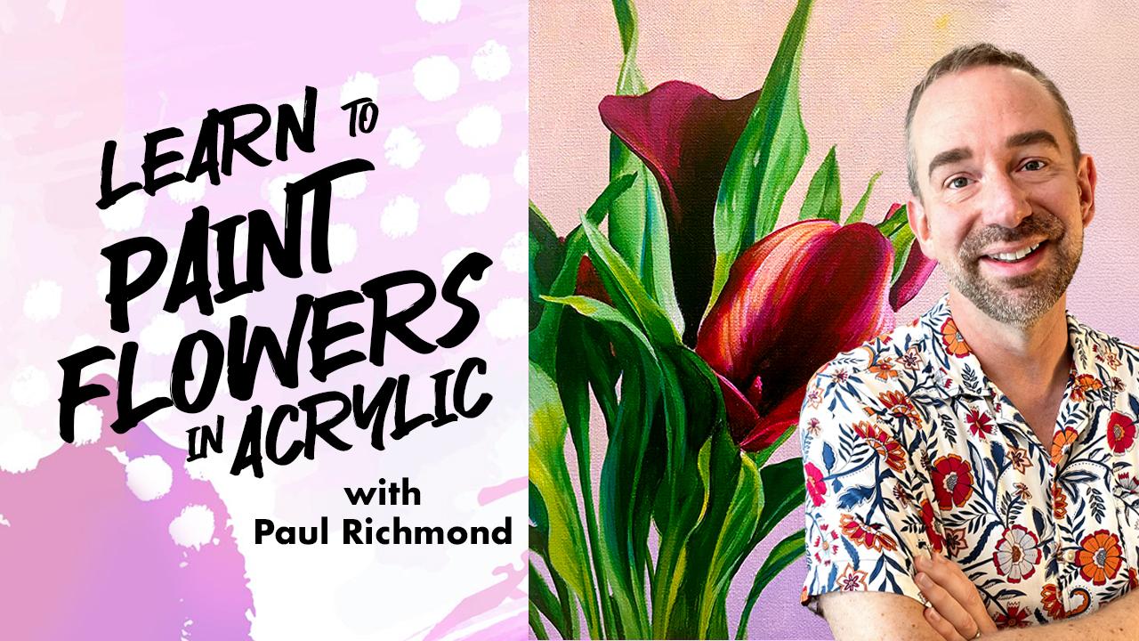
1. Introduction: Hello and welcome to Learn
to paint flowers in acrylic. I'm Paul Richmond, and I am so excited to have you join
me for this course where we are going to go from a blank canvas to a beautiful
floral acrylic painting. One of the things that
made a big impression on me in art school was seeing how whole bunch of artists could be
painting the same thing, and they would all approach it in a slightly different way. Seeing how each artist interpreted the subject matter
and how they approached working with the
materials inspired me and gave me a lot of
ideas to try on my own. And that's where I
really developed my philosophy as a teacher. I don't believe in saying,
these are the steps. You have to do it exactly
the same way as me. Because there are
no rules in art. So in this course, we will
be painting together, but I encourage you to
try your own ideas, put your own spin on it, and use whatever tips and tricks you pick up
for me along the way. I will be working
with just a basic set of acrylic paints, including the
primary colors, red, blue and yellow and
black and white. And that's it, because I like
to show you how to mix all of the other colors that you'll need from just that basic set. Have other colors that you
want to use, go for it. This is a great course for beginning artists to
learn the fundamentals. We will be going from
start to finish, so you will see every step along the way and you can work
right along with me. But it's also a great course. If you are more experienced
artist and you're just looking to
refresh your skills, maybe learn some new ideas, or try a different approach. So basically, it's
for everybody. I've been painting and drawing and making art my whole life. When I was a little kid,
it's all I wanted to do. And thankfully, my parents found an artist in our community
named Linda Regula, who took me under her
wing and started teaching me painting when I
was just 4-years-old. Ever since then, I knew that was what I wanted
to do with my life. And I've been very fortunate
to have wonderful teachers and friends along the way that
have inspired me so much. I've had the opportunity
to share my artwork. In galleries, painting murals, even creating commissions
for some celebrities, including Troy Sevan
and Dolly Parton. But my absolute
favorite thing to do is share my love of
art with others, and that's exactly what I'll
be doing in this course. So are you ready to get started?
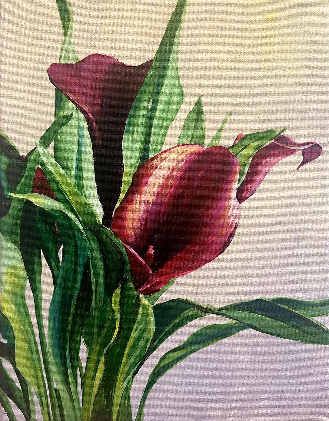
2. Project: Let's take a closer
look at the painting that we'll be making
together in this course. Throughout the 14 bite size
lessons in this course, I'll be guiding you
through the steps to create this beautiful
floral painting. You'll discover how to mix and layer vibrant acrylic colors, build depth and dimension
with brushwork and texture, capture the natural
beauty of petals, leaves, and light, and
bring your own style. To the canvas. So
whether you're brand new to painting or looking
to refresh your skills, this course will help you
gain confidence, have fun, and finish with a
stunning painting that you will be proud to
display. Let's do this.
3. Materials: You're welcome to
work with whatever materials you would like. Here is what I'll be using. A nine inch by 12 inch
canvas, acrylic paint, white, black, primary red, primary blue, and
primary yellow. An assortment of inexpensive paint brushes in
different sizes, a palette knife for
mixing the paint, palette paper to
put the paint on, a cup of water, paper towels, and the reference photo,
which I've provided. So go gather all your materials, and let's start
painting some flowers.
4. Mixing Colors and Base Coat: Hello, and welcome to Learn
to paint flowers in acrylic. I'm Paul Richmond,
and in this lesson, we're going to be taking a
look at the reference photo and putting a base
coat on the canvas. So let's get started. I usually like to start from
background to foreground. And so the background
in this one, you might look at it
and think it's white. But actually, it
does have color, and it has more than one color. So when I look at it, I see it's a very light. It's kind of off
white background. But do you notice
how it goes from a warmer tone up here to
a cooler tone down here? It's very subtle, but this part of the background
has a little more blue in it. Up here has just a
little bit more yellow. So we're going to start out
by just covering the canvas, get some paint on there, and
get that background laid in. So I'm going to put
out a bunch of white. And I'm going to put a
little bit of black. And Yellow. Don't need too much yet. I try not to put out
more acrylic than I will need for each step
because acrylic does tend to dry
kind of quickly. First, I'm going
to take my white, and I'm going to put a little
black with it and just get a nice light gray that kind of looks like the
same value as the background. So that's getting there.
You don't need much black. A little bit will go
a long way when you are trying to get a
really light color. Now the black that I'm using this basic acrylic black kind of has a little
bit of blue in it. So this already is kind
of like the cooler color. But I am going to put
out a little blue to just cool it down even a
little more for that part. Okay, so now I've
got my light gray, so I'm going to divide
that into two sections. One of them is going to be the cool and one's going
to be the warm. So we'll do the cool first. I'm just going to put a
little blue in there with it. Okay. See how that just gives it a little
tinge of coolness. You're not wanting
it to look like baby blue or bright blue
or anything, just a hint. Okay. And then in this one, I'm going to put a
little bit of yellow. And then just the
tiniest bit of red. And the reason why
I'm doing the red is because since that gray
is already kind of cool, it's got a blue quality to it, when I mix in just
the yellow by itself, it will turn green, blue
and yellow make green. But red is the
opposite of green, so that will help
to kill the green, and then we'll get
a nice warm gray. There we go. Beautiful. I didn't use all my white
at first because I wanted to be able to lighten these if I felt like they needed it. So I'm going to do the test
where I put a little bit of the color on the
palette knife and then hold it over
top of the painting. It still has a little bit more green in it than
that background, so I'm going to put a
little more red in mine. Okay. Value wise, I think
we are pretty good. I might put just a
little bit of white. Get a little more red
and yellow. Okay. Color is something you can get so obsessive
about if you want, but since we have a time limit, I am not going to spend 2 hours mixing the
background color. Alright. So now, this is a
good job for a big brush. So I'm just using
this guy right here. And I'm going to
use some water with my paint because that
makes it spread better, and it will also
make it dry faster, and we don't want to be painting on wet background
the whole time. So I'm starting up
here in the warm part and just kind of doing
crisscrossi strokes, just getting the canvas covered. This is a nice, relaxing
way to start a painting, and it gets rid of
the white canvas, which makes me happy. I do not like painting
on a white canvas. I'd like to have
something going on, even if it's just
real subtle color. One of these times, we're going
to do a painting, though, where we use just kind of like a really crazy color on
the canvas to start with, something that
actually contrasts the image instead of just going right for the
true colors of it, because that can be fun,
too, but not today. We have too many
leaves and flowers to paint. So I'm going to go down. It looks like maybe
about two thirds of the way down is when it sort of transitions
to that cooler tone. One thing that's sort
of interesting about color is how different it looks, depending what is next to it. So right now, when you
look at my canvas and you see just the white and then
this color that I'm adding, it sort of feels like this color that I'm painting
might be too dark because, you know, it's so much
darker than the white. But just remember that. And when we get a little
farther in the painting and we get some of those darker
colors of the leaves on there, you'll see that this will
look almost white again. It's just so interesting how its color is so relative
and it changes. Our perception of it changes depending on what's around it. So now, when you're read
to mix in the next color, grab it on the same brush and just kind of work
the brush strokes right into the first ones. And if you like I said, I like to do these
crisscrossi strokes. Different artists make
different kinds of marks, though, so you make whatever
kind of mark you want. And then you just
kind of go up into the warm tone until you can't tell where the edge is
between the two colors. They'll just kind of
start to mix together. If you're first color dries before you get to
the second color, then it's not going
to work as well. You'll you'll see the edge no matter how high up you paint. So you might just have to go back and add a
little bit more of the warm tone and
paint that back down into the wet cool tone. So the thing with acrylic,
it does dry fast. So whenever you want to blend, both sides need to be wet still. Okay, almost got it. Thanks. Awesome job, everyone. Okay. In our next lesson, we are going to start mixing the colors for the leaves.
I'll see you then.
5. Mixing Colors for the Leaves: Hi, and welcome back to Learn to paint
flowers and acrylic. I'm Paul Richmond,
and in this lesson, we're going to start mixing
the colors for the leaves. Let's do it. Looking
at those leaves, there are obviously
some different shades of green going on there. There's some cooler parts where the green mixture
has more blue in it, and then there are areas
where it is warmer. So that means it has more
yellow, like we said earlier, mixing green is combination
of blue and yellow. So let's just start
by mixing a kind of a good middle of the road green. So I'm going to do pretty equal
parts of blue and yellow. The blue is probably going to
be a little more powerful, so it'll probably look a little bit cooler,
but we'll see. Actually, no, that's very
kind of right in the middle. That's just like a nice
Nice, true green. Okay. Gonna put out a little
more blue and yellow, 'cause there's nothing worse
than getting halfway through painting something
and then running out of the color that
you need for it. So I tend to mix big piles of paint while I am working
so that that doesn't happen. Can be a little wasteful
sometimes, but, you know, I'd rather that than run out. Okay. There. Bigger pio. All right. So there's a couple
different things going on. There are value shifts. So we have dark
areas, light areas, and then temperature shifts, cool areas in warm areas. And if you notice, the cooler colors tend to
be in the darker parts, and the warmer colors tend
to be in the lighter parts. That's not true all the time, though, like, look at that
little leaf right there. That's a very light leaf, but it's on the cooler side. It has more blue in it. So we're going to have to mix
some of everything. And I like to premix colors when I'm painting something
like this so that I'm not just trying
to mix as I go, but other artists like
to just kind of have one color and then a
bunch of other options on the palette and just
kind of grab things with their brush and mix
while they're painting. So again, that's just, like, a personal
preference thing. You can do it
however you want to. So what I want to do is to get the different
values of green first. So from dark to light. And then I can pull those into separate piles and
warm them and cool them. So I've got my basic green. I'm going to take a
little bit of it over here and add some white
to it to lighten it. I can already see I'm
going to need more. So I'm just gonna do that now. Put more blue and yellow
and then even more white. There we go. And I think we need to do
one more step lighter, so I'm going to take
a little bit of that and add even more white. Okay. And then last thing, I'm going to go ahead and mix
up a little bit more still. A little more blue and
a little more yellow. And to that one, I'm going to add some black so that I can get that nice dark
color shadow tone. Okay. So I've got a nice
range of greens there, pretty much all the
different shades that I see from the really light
to the really dark. And let's go ahead. I'm trying to
decide, do I want to mix the different temperatures? You know what I actually
think we'll do? Keep it a little simpler. Let's paint it just with these, and then we'll use glazes to adjust the temperature to
warm it up in some parts, cool it down and other parts. Keep it simple.
I'm a fan of that. Plus, if we mix a ton
of colors right now, then they might dry it before we need them, and that
would not be fun. Great job. Okay, and our
next lesson is time to start sketching the
leaves. I'll see you then.
6. Sketching the Leaves: Hello, and welcome back to Learn to paint
flowers and acrylic. In this lesson, we are going to start sketching in the leaves. So let's get started. I'm gonna still use my big brush because right now we're
just kind of sketching. And I want to start by figuring out where some of
the main shapes go. Now, the beauty of painting
something like this, if you get a leaf and it's
in a different spot on your canvas than in the
photo, it does not matter. And you could actually really
do that intentionally, too, if you want to add
leaves or take some out or move them in
different directions, you know, that is
the fun of painting. You get to kind of
personalize it. But for now, I'm
just going to start with this kind of lighter green, and I've got some
water on my brush, and I just want to be able
to lightly kind of sketch, and I'm going to
just do some lines for where I see some
of the main leaves. First, though, I'm
actually going to do a little mark on the center
of each side of the canvas. So here, here, here, and here. And the reason that I do
that is because it lets me create this kind of,
like, imaginary grid. It divides the canvas
into four quadrants, and then I can do the same
thing to my reference photo. And that helps me to just place things in roughly
the right spot. You could be really, you know, technical and
actually draw grids, and as long as your canvas is proportional to the picture, you can make it, you know, have as many squares as you want and really get things precise. But that's not
necessary for this, and it just kind of would make it less fun, so I'm
not going to do that. But anyhow, so I see, I'm going to start with
this leaf right here, and it starts a little
bit to the right of that uh center
marking on the top, and it comes down to about the halfway point
a little bit to the left, so roughly here. I'll just go ahead and sketch in the shape that I want
it to be roughly. Something like that. We have a leaf. We're off and running. Let's do some more. I kind of like looking at
where things hit the edge. That gives me a
nice way into it. So I'm going to come over here. This one is little bit to
the left of a quarter in. So if this is about a quarter, that means this one
starts about here, and it comes down about
as far as this one does. Something like
that. And that one has a nice little twist in it. Do you see that? The center
line stays the same. So that's what I've drawn. But then the outer
edge starts over here, comes up, and then
twists around to this side and goes up like that. That's how you get that twist. And then the right side just starts coming out of
that little lip of that one. Again, doesn't have
to be precise. Don't stress about that,
but it is nice to have some variety like that
to be able to draw them so that they feel like
they're twisting and turning. I think that's one of the
beautiful things about this reference is there's
a lot of movement to it. And if you make all
the leaves the same, then it won't have
that same feeling. So it's good to kind of study it and pick
up on things like that. Okay, what next? I'm going to come over here now about quarter of the way up, we have one that goes from
here to about let's see. About here. By the way, if you draw
a line that's a mistake, it really doesn't
matter because you're going to be covering
over stuff anyway, but I'll just show you
one thing you can do, let's say I made
that, and then I realized, Oh, that's a mistake. I don't like that.
You can just get a clean brush and
put some water on it and scrub over top of it. And as long as it's still,
you know, pretty fresh, it'll come up, and
then you can just pad it with the paper towel. And it shouldn't lift up
the background as long as it's had enough
time to start drawing. So don't be afraid of mistakes. You can always fix them. Or you might like them.
You might be like, Hey, maybe I do want
to leave there. Okay. So this one, it kind of has a little lip
that comes up and overlaps, and then we see the
other side like that. A little smaller.
Something like that. I use my little eraser technique to get rid of that one
line I didn't want. Okay. And then let's keep going. You don't have to draw this in the same order the
same way I am either. Feel free to do it
however it feels right to you. Alright. Okay. So next, I'm
going to do this one. Comes up overlaps. Then goes down right
beside that one. Okay, so this has we see a
big section on that side, a little bit on this side. Then it twists. We get and
the sides basically swap. So this line crosses over
and becomes the bottom. This line crosses over. And it was too far. Becomes the top. You can see how in the photo, it kind of comes really
close to being right along the same edge as
that other leaf behind it. So when you're drawing
things like this, it's good to pay attention to the relationships
between the parts. When you are, you know, these things are not
there in isolation. There's a connection that is happening between
all of them. And you can look at the shapes of the negative
spaces or the openings. Between the leaves and actually
look at those as shapes, and that can be a way
to really help you kind of place stuff too. Now, one thing I'm
going to do to prevent this from getting
too confusing with all the lines is wherever
there is a leaf, I'm just going to
do a really thin, very watered down fill of paint, so I know what is a leaf
and what is the background. Almost kind of like
it's a watercolor. Gets something on
there, makes them feel a little more solid. Once you're pretty
happy with, you know, the ones that you've drawn, you can do that, too, if you want. Just get some green on there. Okay. Clean up this
a little better. Most likely, we'll
have to go back and do some painting in the
background again at the very end, anyway, so don't
worry if you get if you mess up your
background, right. Great work. Okay,
and our next lesson, we have some more
sketching to do, including some more leaves and the flowers.
I'll see you then.
7. Sketching Leaves and Flowers: Hi. Hello. Hello, and welcome back to Learn to
paint flowers and acrylic. I'm Paul Richmond,
and in this lesson, we are going to continue
sketching our image, including some more leaves
and the flowers. Let's do it. So the ones that I've
drawn so far are the ones that I think
are the most kind of clear because they are
separated from the group. Over here, it becomes sort
of a cluster of leaves. So, you know, we can study that and we can draw it
to the best of our ability, but it's also okay
to just kind of paint it very painterly
and let some of that, you know, who knows what's
really happening in there. So we'll look at
the shapes of it, but we're not going to obsess over it, if that
makes any sense. So let's see here. How do we want to do
this? We've gotten this. Actually, what I'd
like to do next is kind of figure out where
the flowers are going. So I might even I'm
going to switch and just use a little
red on my brush. You can use whatever
color it doesn't matter. All right, so this is that. This is that. So right below where that
twist is where we get this corner comes up like that comes down. Comes up again. Then it
comes down into here. And all of this just
will become dark inside. So this is all flour, basically. So I'll just go ahead and do
the same thing with that. I'll just kind of block it in. And it's okay that we see that leaf through
there right now. We'll paint it more solidly. Part of the reason why I am
drawing the flowers now is because why bother painting the leaves behind them beautifully if they're going
to be covered up anyway. So it just kind of
gives us an idea of what parts of the canvas we really don't
need to care about. This one starts right about the bottom of this
leaf comes up a little bit. And how far over would
you say it goes? It goes past the
halfway point for sure, not all the way to
three quarters, so it's a little
bit in from there. When I'm drawing, I
try not to get too hung up on all the
little details at first. I just look for the
big shapes and I look for where the farthest
edges seem to be. Alright, now this comes down. That flower ends, I would say, about one quarter of the way up. So pretty much like,
right over from this. It's right in here.
So, kind of like that. We went over a little
too for a while. That's thanks. Okay,
so there's that one. That's definitely
the focal point of the image because
it's the biggest sheep, and it's kind of
right in the middle. We have an area out here
that's called Cow Lily Valley. You kind of hike through this, you know, wildernessy area, and then you get to you
climb down these stairs, and you're down in this
little valley area, and it's just all cowlies. They were all white.
My friend and I went there recently,
but it was really cool. They were gigantic, and
there were so many of them. Alright, so that's about
where that one goes. I might lower it a bit, though, 'cause look how
close it is to this. And on mine, there's
a lot more space. Let's make that a
little bit bigger. So that's another
example of just looking for relationships
between things. Where how much space is there? Should there be
between, you know, what I'm drawing now and
what I've already drawn. You can't really compare against stuff you
haven't drawn yet, but if you have a few things established like those leaves, then you can kind of
use those as a basis for everything else
and just make this, work with that, and then make the next thing
work with that, and it should all work
together in theory. Okay. I'm gonna go
back to green now. Okay. I think. Alright, so a few
main ones that I see, there's this big curved line right here that kind of comes up a little bit above there. So about to here. So
I'm going to draw that. That feels like
an important one. And there's another
one right beside it. That only goes to about there. Okay. So I've just drawn
a few lines where I see kind of some of
the bigger leaves. And I'm just mostly
going to kind of fill in that whole
section now with green, but leaving some of the
negative spaces that I see. So starting over here, we've got this one that comes
all the way up to that. So I'm just going to
fill that all in, and it goes all the way over. This is all green in here. So is that. Okay, then we do have a little
opening here. So I'll make this stem. Gonna fill all that in. Sort it out later with details. Don't stress about it now. Okay. Then we've got this one. That's a big leaf. This is sort of the
time when you get to just study it a bit
while you're laying the foundation for some of these leaves and you
kind of just figure out the parts that are important and what's
really going on, what leaf is where, where what's in front of what? You might not see it
all yet on your canvas. That's right. But
you're just kind of exploring, studying it. Don't get don't become
afraid of complexity. You know, it's just
like a little puzzle we have to sort out as we go. And it doesn't need to all be
captured right away, Oever. You know, you get to decide how detailed you want it to be. But I just say that because I see a lot
of people when they're starting out painting really doing okay with something that's pretty clear and obvious, but then when something
gets a little more complex, it's like your head
just wants to explode, and so you just kind
of either avoid it or just do it very quickly and
sloppily to kind of move on. And you don't need
to be afraid of it. Just look at the shapes, look at the basic shapes, look at the positive
and negative spaces, and just try to capture
what you're seeing in a very loose way at first. No need for a lot of detail. Beautiful. Okay. In
our next lesson, we are going to be finishing up with the sketching.
See you then?
8. Finishing the Rough Sketch: Hello, and welcome back to earn to paint
flowers and acrylic. I'm Paul Richmond,
and in this lesson, we are going to be finishing up the rough sketch
for our painting. So let's get to it. To me, this is what's
really fun about painting is it lets
you have an excuse to slow down and really look at something and study it and
see what it's all about. Not just like, Oh,
there's a flower, but, you know, what
are the shapes? What are the colors? What
all is really going on? It's pretty amazing. I had a student in my class last night who was doing a painting
of a a bumblebee, like, a really large
painting of a bumblebee. And so she had the photo
reference blown up really big. And it was unbelievable all
the details on that bee. Like, it looked like like like this magnificent,
like, alien creature. But normally, to our eyes, it would just be this
little annoying speck buzzing through the air. But it was like looking
at it up close. I was like a creature from a sci fi movie or something.
It was unbelievable. And I just thought,
Wow, I would never have really seen this if someone
wasn't painting it. It was nice to appreciate things that you never
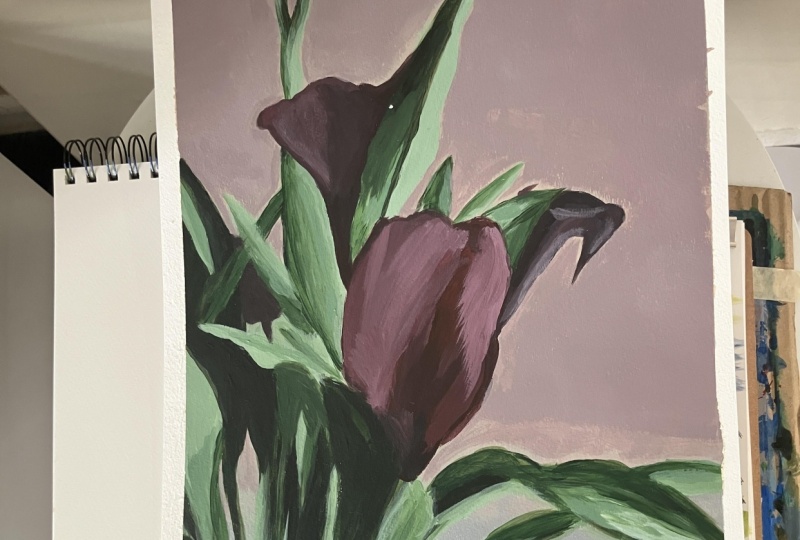
really think about. Alright, so that's starting
to feel pretty okay. And pretty okay is the
goal for a base coat. We're not going for beautiful. We're just going for
reasonably close. Alright. This comes
up and over here. Do you all see
there's a little one hiding in the negative
space right in there. There's a little
flower in this spot. So I'm leaving some room. I'll put that in 'cause I like that. I think
that's kind of fun. I did not notice that when I
first looked at the photo. That usually happens when
I'm painting anything. Once I get into it, I see things that I
didn't know were there. Alright, I'm going
to go ahead and put that little flower in
now so I don't forget. So it's basically
here, a little bit. And here. Oh, and there's a little opening right here where
it shows up too. I'll just paint it right
on top of the green. Okay, just a few more. I'm gonna do I'm gonna
adjust the shape of this leaf because mine just kind of curves in
a very generic way, but I'm looking
at the reference, and I like the way that
it actually kind of comes out to a little bit of
a point and then goes back. Noticing some of those
kinds of things are great just gives character
to what you're painting. And we'll do these
last few leaves, and then I'll do that
last flower to you. So there's one coming
up right here, just a little triangle. I'm looking at where it intersects the flower that tells me where to
start and stop it. And then the top of it is
kind of right by this point. Okay. There's a little one, but
I'm gonna wait I want to get the big one in first,
and then I'll go back. That's another tip for drawing. Anything. Focus on
the bigger shapes first because they have more
they're more important. And then they also give you more kind of anchors for
all the little fussy things. If you get too caught up in all the little fussy
things too soon, then you can lose sight of the big picture and just
kind of get lost in it. Okay. That's an
interesting shape. Try not to just default to drawing what you
think a leaf looks like. It's hard to do we all have
a mental image of a leaf, and we just kind of
probably want to make that kindergarten shaped leaf that we've drawn
1 million times. But pretty much none
of these leaves maybe with the exception of that one, actually
look like that. So I think that's
another really fun thing about painting is you just kind of it gives you an excuse to get rid of
those mental labels. We love as a species. We love labeling and
categorizing things. But the problem with
that is pretty soon, all you see when you look
at something is the label. You see a tree and your brain
just says, That's a tree, and you don't really notice how interesting it is
or how beautiful it is because you've
already just put it into this box that says, I'm a tree. But imagine if you
were looking at the tree and you didn't know
what a tree was called, and you were just taking it in and seeing how beautiful it was, that's what I think
art lets you do. That's why I like it. The more you can
separate yourself from thinking about what it is, the more you'll actually be
able to capture how it looks. Can I note about this last
little flower in the air? I love all the elegant
lines in this image. There's just like,
there's a lot of long, fluid flowing kinds of lines. It's it has very different
characteristics than, like, the tree that we painted or other things that have more
geometric straight lines. This is all very curvy
and flowy, right? And look at how that goes almost to the edge, but
not all the way. And I like that. That creates
a little bit of tension, so I'm going to make
mine do that, too. That little bump. Okay. There is one little leaf that I see in this
top left corner, but I don't like that. I'm not gonna put it. You
can put that if you want. I'm making the
executive decision to leave that out. That's mine. Great job. Okay, and
our next lesson, it's time to do some painting, and we're gonna start
with the dark values on the leaves.
I'll see you then.
9. Dark Values on the Leaves: He. Hello, and welcome back to Learn to paint
flowers and acrylic. I'm Paul Richmond,
and in this lesson, it's time to start painting. We are going to begin with the
dark values on the leaves. So let's get painting. Alright, so now
what I'm gonna do? I'm still using a big brush, and that's something I want
to remind you of is that the size of your
brush is really going to determine the level of
detail that you are painting. And I don't like to get
too detailed too soon. A lot of beginning painters
want to jump right to a really tiny detail
brush because that feels like you'll be able to
control it better and actually I find that
the opposite happens, people get so, like, just fussy with it and you
kind of just lose control. So I'm going to I tend to start with bigger
brushes and then work my way to smaller ones throughout the course
of the painting. By the time I'm at the very
end and I might want to do a few little tiny
details or accents, then that's when
I would use that. But for now, I'm sticking
with the same brush. And I want to start
going through and just finding where I see some of the darkest
values first, because we already have
a nice middle value, middle to light
value on the leaves. So jumping to the darkest is going to give me that
more immediate sense of where the contrast is
where the deep shadows. A. So I'm going to use my almost black and then this green and just kind of block
in some of those. And you'll notice
what happens when you start doing that
is that it actually lets you start defining
some of those leaves, the overlap between them
a little bit better. So right now I'm just looking
at this little section and I see that it gets really
dark back in here. So I'm going to go ahead
and put that on there. When I'm working in acrylic, I like to get I like to kind of build up from dark to light. When I'm doing watercolor, I do the opposite because you
are relying on the white of the paper in a watercolor
painting to provide the light. So if you cover it
all up and lose it, it's, you know, gone. But with acrylic, you can paint white right on top
and bring it back. So now I'm kind of wanting
it to transition here from the really dark
to the sort of dark. I should should put
numbers on these. No, that's to paint by number. So I'm doing the same thing like we did with the background. I put the darkest one first, and then I just blend it into the next color while
they're both still wet, and you can get
some really nice, beautiful, you know,
transitions happening. And I'll even jump down
to this one so that I can blend it into a highlight while I go. Like that. This comes all the way down. Just really study that photo. I would say more than, you know, copying, like every
stroke I'm doing here, kind of take in what I'm
showing if you if you want, and then really, like, study the photo for
yourself and kind of use this as a chance to start
navigating your way through it. Alright. Then I'm
going to jump up here because the other side of that leaf gets pretty dark. Come back. It's a little later.
Then we have Dark again. I don't even try to understand why necessarily, you know, like, I'm not sure why this weird little round
dark shape is here. Actually, I think
I do kind of know. You see that little
dark splotch? I'm doing the opposite of
what I just told you to do. But you see that
little dark splotch? I think that is the
shadow of the flower that's behind it because
that leaf is being back lit. So that little blob is actually the flower we're
seeing through the leaf. So that's kind of interesting. Never noticed that. Either. And, you know, you can
also just even kind of look at this for inspiration, but create shapes and create patterns and do things in a little bit more of
an imaginative way, if that's how you prefer to
paint or more stylized way. I think that, you know, some artists would
like to be really detailed and really
study and try and paint as accurately as they
can what they're seeing. But I also think it's just as
valid and great to look at this and just go for more
of the essence of it and paint more loose and put
your own spin on it. So do what feels right to you. Okay. I'm going to do this
shadow now on this leaf. Just kind of working
my way through, not getting overwhelmed by the abundance of
leaves that are there. I'm just taking it
one leaf at a time, studying what I'm seeing
happening with that one and then working my
way on to the next one. If you do it like that, you'll get through all of
them eventually. Um I think it's really cool to notice the way that the
shadows fall on the leaves. It's not always in a
really predictable way. There are shapes of shadow and light that I wouldn't have necessarily imagined if I
was just making this up. But you end up getting so many areas where one leaf is overlapping another and it's
overlapping another, and a flower petal is, you know, coming in and
blocking the light. So you get these weird
little, you know, sections where you might
expect it to be dark or light, and then it ends up
being the opposite. And so I think that's kind of a fun thing
about this, too. Like this leaf here, the way it's super light right there, and then the whole top
half of it is dark. It's because there's something
blocking that light. It's probably one of the other
leaves, maybe the flower. It looks to me like the light
is kind of wrapping around. So you don't really
have to overthink it. Just look at what
paint what you see. If you like painting
more expressively, it's fun to do leaves and things like that with
a palette knife, too, or just with really thick
paint on your brush, make it have some texture. That's one way that I like to paint sometimes. Okay. Continuing on with the darks. I'll come back and do more
variation in the light areas, but I want to get all the
darks blocked in first. So this one it's pretty
dark all the way through. When you're painting, experiment with how much water
you add to your brush. I dip my brush in the water a lot because I like for the
paint to be a little fluid, but you just need to find
the right combination. If you have too much water, then it just becomes too
thin and too transparent. It doesn't really
work, you know, the way I want it to either. But if I don't use enough water, then the paint feels
kind of stiff, plasticky, doesn't
really like to blend. So just kind of dip it
in there a little bit. You can always dip
it in the water, and then sometimes
I'll just, like, wipe it on a paper
towel a little bit and then paint so that I don't have big amounts
of water just a little. Okay. We're getting somewhere. See how just putting those darks in it makes the overlap
start to happen. Great work. Okay,
in our next lesson, we're going to continue adding some dark shadows to the
leaves. I'll see you then.
10. Shadows on the Leaves: Hi, and welcome back to earn to paint flowers and acrylic. I'm Paul Richmond,
and in this lesson, we are going to be painting some more dark shadows on
the leaves. Let's do it. Continuing on this side, there's another dark little dark one peeking out right here. You know, it comes
down like that. It's a little bit lighter
color blended in. And last swim over here. Some of those bigger, simpler
shapes that we started with the whole part was just kind of the
same shade of green. Now you go into it and you
start breaking it up and looking for a little bit
smaller shapes and sections. And it's kind of like
you just keep working your way in to the amount
of detail that you want. There's no right
or wrong amount, you can keep it as loose as you want or as
tight as you want, but it's good to kind
of be consistent. Okay. Moving on. Next big section of dark
is right over in here. Just blocking in the
shape that I see. I'm looking at this
shape right here. It's not even the whole leaf. It's just that right side of it. And then it starts to get a little bit lighter
towards the bottom. I like all these little
gradations that happen. An artist who was really
good at capturing that the sense of that
was Georgia O'Keefe. Do you ever see some of
her paintings of leaves? And she really even
kind of exaggerates those transitions and
gradients of color. But they really capture that
movement and dimensionality. Okay. Then let's see. Where
else does it get dark? It gets really dark
on this side of the that up to here.
Then it flips. I'm very glad that we did
not mix up a bunch of warm and cool shades because I think it's enough
to think about just getting the lights and
darks where they need to be. Then we'll come back and
deal with color later. It's a very classical kind
of approach to painting. A lot of the great
masters would do the whole painting just
in one color first, different shades of light
and dark, but one color. So maybe brown and
just have, you know, just like we did
with the green from white to the darkest brown, and they'd paint the whole
thing and then go back and start layering in
the color because it is so much to think
about all at once. But if you get the
values working, you can really have
fun with color. I'll hold together,
even if the color isn't exactly what
you're seeing, or if you want to be
really expressive and imaginative with color, as long as the values are working, it'll still make sense. Okay. I love these big fluid
shapes like that where you can just take your
brush and let it swoosh. These slant brushes
are really good for that because they can just
kind of get down in there, and then you can turn and
twist them almost like you're writing in
calligraphy or something. I'm a big fan of letting the
brush do most of the work. It dark shadow here in between. This is fun, very relaxing. Just spending some time
looking at some plants. Sad thing is, I enjoyed this more than going
and looking at the real ones when we
went to alily Valley. I'd rather be sitting
here inside painting. I don't know what
that says about me. It was nice to go, though. I did enjoy it, but
I guess I'm just an indoor boy. Okay. Well, let's see. I'm still just sticking kind of
towards the upper part. I haven't gotten into
the really light yet. Well, I'll kind of come back
and hit it with those next. Want to get through all the
dark and middle tones first. Okay. We t now. Let's see. We've got that. Okay, this one gets kind
of dark. Oh, let's see. There's a little stem hiding
back there, put you in. And this gets dark. A little twist. It can get overwhelming when you start looking at a complex area and seeing a lot of
different shades kind of all in one spot. So one thing that
helps is to just look for what's the main
value that's there. You know, this is overall
kind of a darker section, but it's not as dark
as the one next to it. So I like to just kind of
go in and get that first, and then you can come
back and add in more of the complexity
if you want to. Always just try
and work your way from big picture to small. Awesome. Okay, and
our next lesson, we're going to finish with the dark values on the
leaves. I'll see you then.
11. Darkest Values on the Leaves: Hi, and welcome back to Learn to Paint
flowers and acrylic. I'm Paul Richmond,
and in this lesson, we are going to finish painting the dark
values on the leaves. So let's get to work. It really makes you feel like you're kind of carving
it out sometimes. You just work your brush in
and you're thinking about the direction that
that piece is moving, and you move your
brush the same way. It's like you're a sculptor, just carving that little piece. And thinking about it like
that really does help because then you're not just
thinking about a flat shape. You're really thinking
about the volume of it, and that will come
across in the painting. Okay. This area, it's all
leaf. There we go. Just pull that stem
out a little bit. Okay. We are getting somewhere. Somewhere. Somewhere
good, I think. Alright. Next up, another dark section. Okay. Look in there. And the right side
of that just has a few little dark shadows. Kind of soften the edges
as I go too so that I am not left with any really sharp lines where
I don't want them. Okay. Now, let's get
the edge of this guy. So it's almost like you get
to define the light edges of the leaves by the shadows
next to them on the leaf, you know, behind
them or beside them. You kind of using one leaf to define the edge of the other. Okay. And this comes over here, flips on us. Like that. So then the left
side on this part is lighter and the
right side is, Doctor. Okay. Got a little
bit on this guy. I like to squint my eyes a
lot while I'm painting, too, because it helps
get rid of some of the unnecessary details
and helps me prioritize what is kind of essential to the value
structure of the image. So if you're painting an area
and you feel overwhelmed, squint and whatever you
still see when you're squinting is important
enough to paint, then everything
else is optional. It's not going to make or
break it, in other words, but the areas with
the most contrast, you'll still see them
when you're squinting, and that just helps
to prioritize. Okay. There's not a lot
of dark on these up here, but there's a few little spots. So at the very top of this
one where it flips around, it gets a little darker. And where it goes back behind the flower,
there's a shadow. Okay, this one has some
darkness along this edge. Then it gets pretty dark right here where it
goes behind the flower. See how the nice big
brush just lets me kind of glide glide
along and make a whole leaf with one stroke or a whole part of a
leaf with one stroke. You don't have to be real fussy, like you would
with a tiny brush. Okay, let me have a little
bit of darkness here. Let's see. This one has a few
little touches of dark too. Okay. Yay, great job. Okay, and our next lesson, it's time to start adding some highlights to the
leaves. I'll see you then.
12. Highlights on the Leaves: Hello. Hi and welcome back to Learn to paint
flowers and acrylic. I'm Paul Richmond,
and in this lesson, we're going to start painting highlights on the leaves.
So let's get to work. So we have all the
shadows kind of established now on the leaves. So now I'm gonna jump down to my lighter colors
and just go back through and pull out any little highlights that I want to make sure and emphasize. So I'm gonna come all the way
back over here to where I started and get
some of those in. Everything is probably
pretty dry by this point, but that's okay because it's not the light is not that much lighter than
what was already there, so you can kind of
just work it in, make it feel like it's blending. And if you need to
add more of the middle shades back to blend
it into, you can do that too. In fact, I am going to do
that right here because I see an area where I want
to get a little darker. Then I can just work
it right into what I just painted. Okay. And while that's still wet, I'm going to just grab
even some pure white because it will mix with the light green
that's on there and it won't look pure white. It will become just a really nice light
light light green. That's really only for
just where you see those brightest highlight parts. A little piece right here. I love going in and popping
in highlights on things because I think it
just makes that's when you really start
to see the depth. You've gotten all
the shadows in, so those kind of lay back. And then you start in with
the highlights and it makes those areas jump forward. You get that just
really fun push and pull of light and shadow. Okay. This one gets pretty
light up towards the top. That way continues
down along the edge, so I can kind of sharpen up that edge with the highlights. And then blend it down. As you're going back through, do you see any parts that just feel like the paint dried and it didn't cover as
well as you wanted or you want to smooth it
out or refine anything, it's a good time to just kind of do that while you
still have these colors. Sometimes paint will look one way while it's
wet and then it dries and maybe it expands
or it contracts a little, and there might be
some little gaps where the canvas shows, you just go back
and fill those in. I think when you're
painting something that is very fluid like this has a lot of organic movement
and lines and shapes. It really does help to
capture that spirit of it to move your brush in that way to make longer kind of flowing
movements with the brush. You kind of just want your brush to feel the way you're
moving the brush, you want it to feel like
what you're painting. If it was something with a
lot of rough choppy texture, then you'd be doing a lot more
your little choppy marks. But this just kind
of helps you to connect with it in
a different way. So look at those lines and shapes and try and match the feeling of it with
your brush movement. Okay, a few more little
highlights down here. It's a fun painting.
I'm enjoying this. Could definitely spend a long time on it
if you wanted to. But we'll, too, we'll get
the essence of it down. Nice little pop of
light down here. Great job. Okay, and
our next lesson, we have some more highlights
to paint. I'll see you then.
13. More Highlights on the Leaves: Hello. Hello, and welcome back to earn to paint
flowers and acrylic. I'm Paul Richmond,
and in this lesson, we are going to pick up
where we left off and continue painting highlights on the leaves. So let's do it. I think that, you know, the flowers in this
photo are beautiful, but I think that the leaves really are the star of the show. At least for me, I love all the different
shapes and tones in them. I think the flowers are gonna go pretty fast after we've
done all of this. Okay get this little bit of light on the edge of this leaf. I like doing just
like a little flick of the wrist and there, but instant highlight doesn't have to be any harder than that. When you want things to
feel dimensional and have lots of shifts and lots of edges and lights hitting
it in different ways, you don't want to
necessarily overly blend it. It's okay to have some
edges that are left, you know, a little
bit more obvious. Everything doesn't have
to be a perfect blend. It's nice to see some
of the structure. Okay. A little bit more
back here. And you? Okay, now I'm gonna
move up here. It the highlights
on this leaf in. You can always kind of
reshape things as you go, like I just did with the
little end of that one, if it's if you have one leaf
that's going into an area where you don't want it, Okay. And what's got you? Nice and light up here. And then just like
I did down below, I'm going to go back
with some white, a little bit of water, too, so it doesn't end up too chalky, but just push the highlights a little farther in a few spots where it looks really light. Okay. And then look how
it gets really light right here where that leaf
is kind of twisting around. That's a really great, a
really great spot showing the waviness of it because
it's just really light in that one little area where
it's kind of twisting around. And then it blends
up into the darker that leaf has a
few little white, splotchy things on it, so I'm gonna put
those in there too. That just gives it
a little character. Really light sided Okay. Let's. And Okay. Last little highlight right there. Beautiful. Awesome job. Okay,
in our next lesson, it's time to start
mixing some colours for the flowers and painting
them. I'll see you then.
14. Color Mixing and Starting Flowers: So Hello, and welcome back to earn to
paint flowers and acrylic. I'm Paul Richmond,
and in this lesson, we are going to start
mixing some colors and painting the flowers.
So let's get to it. So now we're gonna
let the leaves dry. We'll come back at
the very end and do some glazing on them to get some warm and cool
tones in there, but I want to paint
the flowers now. If you're still
working on the leaves, don't rush yourself. Go as long as you
need to on those, and you can always come back and watch the flower part later. So I'm going to put a
little more red out. And my white is kind
of starting to dry, plus it's got some other
colors mixed into it, so I'm going to put out
some more white too. Okay. And so I'm going to mix the
range of colors that I see on those flowers all
the way from the really dark to the really light. So let's start with my red. Do it over here, so we have a little more room
to work. Okay. And I'm going to put the
tiniest little bit of blue in with the red because
it does go that direction. It's not at all an orangy red. It's almost like more magenta or has even a little bit
of a purple cast to it. So putting a little bit of blue will head it
in that direction. I always start by just putting tiny little bits because it's a lot easier to add more than if you put too
much and regret it. Okay. That's feeling
pretty good. We might go even
cooler in the shadow, but that seems like a good base. So then I'm just
going to take some of that, pull it over here, and add some white to
it so we can start to get the lighter tone. I'm going to do
that one more time because there are some areas
that get really light. Okay. And then, let's see. I'm actually going to just I don't want to use
up all of that, so I'm gonna mix a
little bit more and then add a little black
to it for the dark part. And the black, like we said, it has some blue in it. So see how that's making
it even more purple, which is really what we want. That's how it looks
in there. I might even add a little
bit more blue to it, too, just to really
emphasize that. Okay, so that, to me, looks like a nice
range of values to capture those flowers. So let's clean off my brush. If you have any
green left on there, you want to make sure and swish it around in the water
and get all that off or else it will
turn your red to mud. Nobody wants muddy flour. Okay. And just like with the leaves, I'm going to start by
laying in the darks. So there's one petal here. And we have that
little highlight. Then we have another line
that comes up like that. And then it gets dark
underneath here, too. So I'm gonna start with that. I'm going to work on
this section first, so we'll go really
nice and dark in here. Have some little
dried crusty thing on my canvas. Get off of it. Okay. And then we're going
to do this dark. That kind of pulls
all the way up. I'm adding a little more water, 'cause I want that really
nice fluid movement of the strokes, there we go. It starts to blend
with the next shade. There's a lot of kind of linear texture
happening on the petal. A lot of lines that are
following the movement of it. So I'm not overly blending. I want my I'm using my brush to very intentionally
make those same kind of directional lines because
that really helps the flower to feel like
it is more dimensional. Okay, this comes up this way. So I'm just like before, I'm just kind of starting on
the dark end of the scale. I've got my darkest and then my second darkest and
getting those in first, then I'll backtrack
and do the highlights. But already, look at
how that flower is really starting to pop. There's a little bit
of darkness over here. One thing I do when I'm
painting into an area, and I know I'm going to
be coming back later and adding more maybe
highlights in that part, and the paint might dry
before I come back to it. I like to make sure that
the edge that's heading in towards the lighter value doesn't end on too
sharp of a stroke. See how I just kind of brush
that out a little bit, and it'll make it easier when I come back
with the next layer. I'm not going to be
trying to fight to camouflage a really sharp
edge that I don't want there. Thinking about edges
is it's very helpful. It's a lot to think
about because you're already thinking
about a lot of other stuff, but it does does
make a difference. Okay. Great job. Okay, next lesson, we are just going to continue painting flowers.
I'll see you then?
15. Painting the Flowers: Hello. Hello and welcome back to Learn to paint
flowers and acrylic. I'm Paul Richmond,
and in this lesson, we have some more flowers
to paint. Let's do it. Alright, I'm gonna
go ahead and finish this flower instead of doing
the darks on all of them. So I'm gonna go down to
my next lightest color now and start working that in. In that way, the
flower is still wet, so it makes it even easier to
blend those highlights in. You can always go back
and get more darks, too, just like I'm doing
right now if you need them. Let me go down a size and brush
here so I can get some of those little little
sections a bit easier. Plus, after you have been
using a brush for a while, especially if it's
a cheaper brush and you're working with acrylic, it will become less soft and a little bit
harder to work with. So this is we've been
going for a while now, so it's a good time to
just grab a new one, and you'll kind of be
surprised at how nice it is to work with after
you've been fighting with the other one for a while. I get in that habit a
lot when I'm painting, and I'll just pick up one
brush and kind of use it all day because I don't want to stop long enough to
get another one. But we're also at the stage of the painting
where it is good to start going down in
size a little bit, if you want to get a little more detailed and precise
with some things. Okay. Now jumping over here, there's some more
highlight hitting the sun. Got to make sure this focal point flower looks extra good. This is the one that's standing up right in front and saying, Look at me, which is what I would be doing
if I was a flower. So I relate. And sometimes when you have
a lot of paint on an area, you can just kind of get
some water on your brush. If you want to maybe
blend it a little more, just go back in with just
water and kind of work the colors together
a little bit. Okay. I'm gonna get a super
small brush now, 'cause I want to get that nice little sliver
of light right here. There's a little bit
of light hitting this. And then I'm gonna jump down to my lightest color and
throw that in there. You just go right on top
of what's already there. Just kind of keep
building it up until you get it the value you want. So Okay. Beautiful. Alright.
Now, the other flowers, they're gonna go
a little faster. This one has a lot of dark. It's pretty much all dark
all up through here. Get a nice clean edge here separating the
flower from that leaf. Sometimes you want a soft edge, sometimes you want a sharp edge. This is a good place
for a sharp edge. Get down into this little spots. Okay. Put a little bit
of it up here. Here. You see how the flowers
that are farther back, you don't see nearly
the amount of detail on them as you
do the front one. So you still get some
directional marks, so I'm still moving my brush
the way that I see it. But I'm not trying to paint details that aren't
there, you know, just having less
detail on things in the background
actually helps add depth to your piece as well. It's not a cop out. Actually. It's like
when you're looking at something and you're focusing on something maybe that's,
like, right in front of you, everything that is behind
that or farther away gets a little bit
more blurry because you're not focusing
in on that as much. And if you do that
in a painting, it will help the viewer know
what they are focusing on. Beautiful work. Okay, in our next lesson,
we're getting close. We're going to finish painting the flowers and do some glazing. I'll see you then.
16. Painting and Glazing the Flowers: Hello, and welcome back to earn to paint
flowers in acrylic. I'm Paul Richmond,
and in this lesson, we are going to finish
painting the flowers and do some glazing. So let's do it. Can I make this edge
nice and crisp. And come back in with a little touch of
highlights sparingly. Okay. This little guy that's hiding over
here will get you in. If I'm this flower, then
this flower is my husband. Okay. One more little flower
to go. Start with May dark. Get that blocked in. Sure. Like that nice, pointy tip. It's kind of like a nice
little directional. It's like an arrow, really. That's telling the
viewer, don't leave. Come back. Keep looking. It's a good compositional
thing to kind of use lines and shapes to help lead your viewer's eye
around the peas. You kind of create a visual roadmap for them showing them
where to look next. It's not being bossy. It's actually a nice thing to do so they don't
get lost in the? Okay. And that small brush. I'll do a few little highlights. Those can also just kind
of help smooth it out a little bit. Okay. I am going to take
another 5 minutes or so and do some glazing of some worms and cools
into this because I think that's gonna
be a really fun part. Okay. So when you glaze, it's glazing is basically like
painting with watercolor. You're using mostly water. You're not covering
up what's there. You're just kind of
tinting it a little bit. You're just taking it in a slightly different
direction color wise. So I've got yellow on my
palette, and I've got blue. So we've got our warms
and cools covered. I'm just going to take a
little bit of this yellow, maybe put a little bit
of my green in with it so it's not going to be
too shockingly crazy, but it's so watered down that we're going to see the
other colors through it. So now I'm just looking
to see where do I feel like there is the
strongest amount of warm tones. So I see it definitely here. And you see how because my paint is so thin down with water, you don't lose any of the details that
you painted before. They're all still there. You're
just kind of telling it, Hey, warm up a little bit. Alright. See some over here. Maybe I will just use
some of the pure yellow. This is one of my
favorite last steps. Especially for an
acrylic painting. So I will admit I am more of an oil painter
than an acrylic painter. But you can get the same
effects with both mediums. The reason I like oil is just that it's a little
easier to blend. But with acrylics, if you
take advantage of glazing, that's where you can
get these really nice subtle effects of blending that will feel just like an oil painting that's
been really rendered. You build up a lot
more subtle shifts with this glazing technique. And then we'll do
the same thing with some blue also in
the areas where we want maybe the shadows
to feel extra cool. Let's see a little
bit of light here. Whenever the paint
starts to be too thick, or you feel like it's
not really, you know, that glaze or that wash anymore, just add some more water. Oh, I forgot one little sum. Gonna just paint
you in right now. And somewhere along the way, I smudge the edge
of that flower, so I'm just going to fix
that too while I'm up here. Just make you a little bigger. I'm going to tighten
up this edge as well. Okay, now back to glazing. So let me get some blue
now and we're going to do the same thing in the shadows. Really thin it down. And then look to see where does the green feel the coolest? Where does it feel? Where do
you really sense that blue? I see some right in there. See, isn't that awesome? It's like the subtle
little shift that happens. But it makes a big difference. Great job. Okay, and our
next and final lesson, we're going to finish the
peming. I'll see you then.
17. Finishing the Painting: Hello, and welcome back to Learn to paint
flowers and acrylic. I'm Paul Richmond,
and in this lesson, we're going to be finishing
the painting. So let's do it. Glazing is just also
a really nice way to make the painting
feel more cohesive, because if you have
colors all over that are very different
like red and green, you don't get more
different than that. But if you go through and glaze some colors that move
through everything, then it helps to unify it
and make the image feel more harmonious instead of the
colors feeling so isolated. So I'm even going to do a little glazing onto the flowers, but I'm saving them for
last because I want to let them dry as
much as I can first. And if you glaze an area
and you get too much, and it starts to the color looks not like what you wanted, you can just pad it up
with a paper towel. Okay. I go to do a little
bit in the flowers now. I'm going to start
with this seems pretty consistent throughout this image that the shadows are cooler, the highlights are warmer. So it's not always the case. It depends on the
type of lighting. Sometimes natural light
coming in through a window can actually be more blue, which is unexpected, Eh Paul? Yeah. So when I'm I've got my paint water
down pretty well, but whenever I lift it up,
it's like a little bead. Banner. Like a little bead
hanging on your brush? Yeah. And it's like a drip on
the painting, even though. Oh, I see. So it
might be too wet. You might want to pad it a little bit on your
paper towel before you go to the canvas if
it's, like, dripping. That tells me there's
too much water. You have to find the
right balance there. You'd want a lot of water, but it shouldn't be it
shouldn't be dripping. Well, it didn't drip, but
when I lifted up the brush, it left a bead of water. Oh, okay. Yeah, still
too much too much water. But you can also, like, pat that with a paper
towel, too, if you need to. Okay. Or just take a dry brush and
kind of spread it around. Is there a lot of
color in that bead, or is it pretty watery? Uh it's pretty watery. Okay. Yeah. I soaked it
up with the paper towel. I'm going a little heavier back in here because
I want to let that shadow part
get nice and dark. So this part I wouldn't even really call a glaze
what I'm doing. I'm just doing a second coat, but I am mixing blue
in with it because I want that shadow
to get really cool when it goes deep down in
towards the bottom there. One big part of taking any
kind of a painting class is watching somebody do something and then trying to do it yourself and
then wondering, why isn't mine doing
what his is doing? Like, it usually just means there's some kind
of difference in the, you know, ratio of whatever
it is you're using. So in that case, it
sounded too wet, but it's not that you're doing something wrong or you're
not capable of doing it. You just have to find
that missing piece. Okay, you know, I want to put
a little I'm just going to clean brush because
I don't want to brush that has any blue on it, and I want to put
a little bit of the yellow into the highlights
of the flour to you. Maybe put a mix a
little pink with it. And then that should be it. It's very subtle.
And when it dries, it'll probably be
even a little more subtle than how it looks
when you first put it on, but it does make a difference, and it does enhance
the sense of light. And then I'm going to come
back and just pull out a few more little highlights
now that that yellow is wet. Sometimes I like doing a glaze and then painting
into it a little more opaquely because
that glaze color will mix with what
I'm putting on. And if I just want to bring out, maybe make something
a little stronger, it's a good time to do that. It's a touch that This is one of the magic
parts, I think, because it's not something
that people would necessarily think to do if
you're painting a pink flower. Why would you paint
yellow into it? But it really just gives it
that little extra touch. And then the very last thing
I'm going to have to do and maybe if you have more
self control than me, you might have to do this step, but I have to do a few
little touch ups on my background because
I got some smudges. Plus, I also need
to paint out where I did those little tick
marks for the grid. So that's my true final step. Let's see if I still have
enough of my gray color. So this is the bluer one. But if I mix a little pink
with it, that would be good. The final steps of a painting
are always when you are. You're kind of
eager to finish it, but also it's kind of
the most important part because it's those last. Those last things
you do that seem to always just make the
biggest difference. Now when you're doing background touch ups like what I'm doing, there's a good chance
that the color if you have to remix the color, which I did, there's
a good chance it will dry a little different
than what's there. And the reason is because
acrylic paint tends to dry a little bit darker than how it
looks when it's wet. So if you're doing something
like what I'm doing, it really doesn't matter
because the background doesn't have to be
perfectly solid. In fact, I kind of like it
to look a little brushy, but just kind of go
into it knowing that, and so you may want to
as you're painting, kind of end the section
on a very loose, kind of brushy edge and not create real sharp lines up there because
they might show, even if it looks
like you've matched the color perfectly when
you're painting it. But I actually like a background
that isn't real flat, so giving it a little
brushy texture, to me, it's a nice touch. Makes it feel like
there's something back there maybe besides just a wall, and it's so far away,
it's really out of focus. Glaze a little more yellow up
here to warm that up again. Yeah. Nice. Got one more
little tick mark to cover. Alright, I think that
does it for my painting. To. Great job. You did it. Now you have
completed the course and finished a beautiful
floral masterpiece. And I hope along the
way you have picked up some tips and tricks that will help you out in your
future paintings. Thank you, so much for
spending this time with me, and I hope you'll come back
and paint with me again soon.
18. Closing Thoughts: Congratulations. You made it all the way to the
end of this course, and I hope that you
love your painting. I'm sure it is beautiful, and I would love to see it. So share it with me. I love
seeing your work and knowing that there are so many
artists out there in the world painting
along with me. It makes me really happy. And I hope that I've
been able to share some insights and tips that have been helpful
throughout this process. But always remember, there
is no right or wrong in art. Your painting isn't supposed to look like mine and it's
not supposed to look like any of the other
artists out there because you see the world
in your own way. And I think a big part of
becoming an artist and learning to embrace our inner artists is also learning to embrace
the way that we see, the way that we paint. Be proud of what you've created. And this is just the beginning. I have so many other courses, and I would love to have you come back and
paint with me again. Also, please leave me a review and let me know
what you thought, and also tell me what
you would like to learn next because I am filming
new classes all the time. Until then, happy
painting, everyone.
 Paul Richmond, Everyone is an artist.