Transcripts
1. Welcome To The Class!: [MUSIC] Hello
everyone. My name is Will Elliston and welcome
to this Skillshare class. In today's class,
I'll be guiding you through my process of
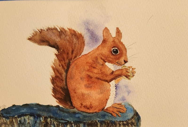
painting a red squirrel. Whether you're a
complete beginner to watercolor or already
have some experience, I'll guide you step-by-step, sharing tips and
tricks along the way. Join me whilst we explore a variety of
expressive techniques. I've been a professional
watercolor artist for many years now, exploring many
different subjects, from wildlife and portraits to cityscapes and
countryside scenes. I've taken part in many
worldwide exhibitions and been lucky enough to win awards from well-respected
organizations such as Winsor and Newton, the International
Watercolor Society, the Masters of
Watercolor Alliance and the SAA artist
of the year award. I also have collectors that buy my paintings around the world. Watercolor can be
intimidating for beginners so my aim is to allow you to relax and have fun learning this
medium step-by-step. Hopefully, by the end, you'll surprise yourself
with a nice painting. If this class feels too
intimidating or too simple, please check my other
classes as I have them available
across all levels. My approach to
watercolor starts off loose and expressive
with no fear of making mistakes
because we're just creating exciting textures
for the underlayer. Then as the painting goes on, we'll add more details, bringing the painting to
life and making it pop. I tried to simplify
complicated subjects into easier shapes that
encourages playfulness. Squirrels, like a
lot of wildlife, are great subjects to paint. They have lots of energy, which is perfect for learning
watercolor because it allows for expressive
and loose brush marks. They also have lovely red and orange tones that if done right, can really make
your painting pop. When you enroll in my class, I'll give you the
high resolution image of my painting to
use as a guide. Today's focus is about
painting rather than drawing. I have included
templates you can use to help you sketch out the
drawing before you paint. I'll also include
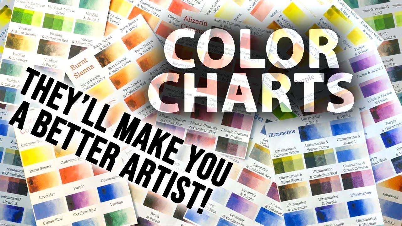
my color charts, which are an
invaluable tool when it comes to choosing
and mixing colors. Throughout this class, I'll be sharing plenty of
tips and tricks. I'll show you how to use
mistakes to your own advantage, taking the stress out of
painting and having fun. I'll explain which
supplies I'll be using so you can
follow along exactly. I'll also cover how to choose
and mix harmonious colors. I'll be splitting
everything up into short videos so it's
easier to take in. You can also pause at any moment if you
undertake more time. If you have any questions, you can post them in the
discussion thread down below. I'll be sure to read and respond to everything
you guys post. Don't forget to follow me on Skillshare by clicking the
''Follow'' button at the top. This means you'll
be the first to know when I launch a new class, post giveaways, or just have an interesting announcement
to share with my students. You can also follow me on Instagram to see
my latest works. If you'd like to create your
own expressive work of art, all whilst learning fun and exciting watercolor techniques, please click ''Enroll'' as I'd love to have
you in my class. Now let's begin.
2. Your Class Project: First of all, thank you so much for enrolling
in my class. I really do appreciate it. As seen in the
introduction video, today we're going to
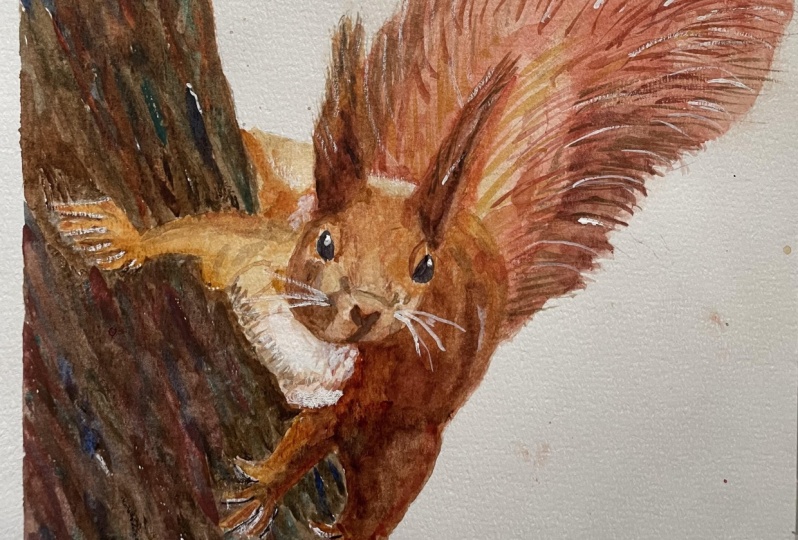
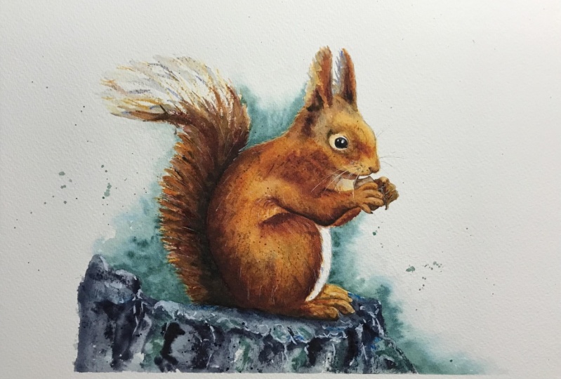
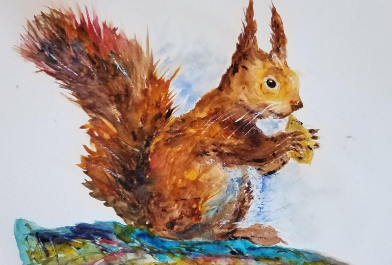
paint a squirrel. Using an easy going approach, we'll try to capture the essence and bring it to life on paper. It's such a great
subject to paint from because girls have so
much energy and spirit. It gives us the opportunity to practice many important
aspects of watercolor, such as using different kinds of brushstrokes and textures, choosing harmonious
colors, and using negative space to give
a painting depth. You're welcome to copy my
drawing and follow it exact, or experiment with your own. I will put my painting in
the resource section so you can use it as a reference
throughout the process. There's also a template
you can use to trace and transfer
it onto your paper. Don't feel guilty
about tracing when using it as a guide for
learning how to paint. It's important to have the
under drawing correct, so that it doesn't
inhibit your ability to practice and learn the
watercolor medium itself. Whichever way you
use this class, it would be great
to see the outcome and the paintings you
create in this class. I'd love to give you feedback. Please take a photo
afterwards and share it in the student
project gallery. You can find the gallery under the same project
and resources tab. On the right, you'll
see a green button that says Create
Project. Tap that. Once you're there, you'll
have the option to upload a cover photo and a title and
write a little description. I would love to hear about your process and what you
learned along the way. Once your project is uploaded, it will appear in the
student's project gallery. You can view other
projects here, and I'd highly encourage you to like and comment on
each other's work. We put so much time and effort into creating our paintings, why not share it with
the world and help support each other
along the way? Now that you have a good idea
of what's in this class, let's get stuck into it. Starting with the equipment
and materials I'll be using.
3. Materials & Supplies: Let's go over the materials and supplies you'll need
to follow along. We'll start with
the colors I use. Unlike most of the materials
we'll be using today, there's a lot to do
with preference. I have 12 stable colors in my palette that I
fill up from tubes. They are cadmium yellow, yellow ocher, burnt sienna, cadmium red, alizarin crimson, ultramarine blue, cobalt
blue, cerulean blue, lavender, purple, viridian,
black, or neutral tint. At the end of the
painting, I often use white gouache for
tiny highlights. I don't use any
particular brand. These colors you can
get from any brand. Although I personally
use Daniel Smith, Winsor and Newton
or Holbein paints. Let's move on to brushes. To keep things simple,
in this painting, I'm only going to use a
small selection of brushes. The first is this mop brush. Mop brushes are good for broad brushstrokes and filling
in larger areas or washes. But they also have a tip
for some smaller details. They are one of my
favorite types of brushes. Next is this,
Escoda Perla brush. I use various sizes, but for this painting, I'll use size 8. These brushes allow for
more precision because they have a finer tip and
last quite a long time. For even more precision when painting final touches
or highlights, for example, I use a
synthetic size 0 brush. All brands have them and
they're super cheap. This here is a solid
brush or a rigger brush. It's quite long but thin. It's only used for
very small details, much like the size 0 brushes, but it holds more
water and pigment, saving time and
effort refilling. The only drawback is it's more difficult to control
as it's more flimsy. That's it for brushes. You're of course welcome to use your
own favorites as well. Onto paper. The better
quality your paper is, the easier it will be to paint. Cheap paper crinkles easily
and is very unforgiving, not allowing you to
rework mistakes. Good-quality paper, however,
such as cotton base paper, not only allows you to rework mistakes over multiple times, but because the pigment
reacts much better on it, the chances of
mistakes are a lot lower and you're more likely
create better paintings. I use arches because it's what's available
in my local art shop. Next, some various materials that will
come in very useful. A water spray is
absolutely essential. By using this, it
gives you more time to paint the areas you
want before it dries. Also, it allows you to
reactivate the paint if you want to add smooth
lines or remove some paint. Lastly, masking tape,
and this of course, will just hold the
paper still onto the surface and it will create a nice clean border
at the bottom. That's everything you
need to paint along. Let's start the drawing.
4. Drawing The Composition: Like usual with a sketch, I start off with
this 4B pencil doing smooth light circles to map out the composition marking
the top of the paper. Don't want it to go higher than that for the sake of variety of decided to paint on a smaller
piece of paper today. Because I know a lot of
you tend to paint smaller. For the sake of demonstration, I thought I should show
you how I go about that. I hold the pencil like
this rather than this at this stage because can get a nice fluid
circular motions and you can press very
softly without indenting the paper because
there will be mistakes. It's easier to rub out
when you draw softer. It's going to be a
little branch here or a log this squirrel
is perched on and I also find this
grip really enables you to create curves which are really good for coming
up with a composition. If you hold it like
that, it's quite difficult to be so fluid. You don't have to paint the
smaller if you don't usually. I just know that some of you do, so I just wanted to
demonstrate how I go about it. Stem switching grip to this we have holding the pencil because I want to put in
some sharper lines now. I need to move a bit I think [NOISE] about their course. There's lots of fur here, so the line won't be defined when it comes to
the paint later. Roughly putting in
his fingers there, just thinking it's a
basic shape rather than the actual
specific details. As always, while I'm sketching, I'm thinking about where
I'll place the paint, where the dark areas are. I think now [NOISE]
it's basically done. I'm just going to
go back and forth, rubbing out these dirty lines, creating a nice outline [NOISE] to make it easier to
see when it comes to paint. [NOISE] So I'll see you back when it comes
to the painting stage.
5. Starting With Thick Paint: The first thing as always when trying to paint
expressive watercolor, what I'll look for are
the darkest darks. I start off with black
because it's just a shortcut. During the middle
of the painting, I'll mix my other colors to make more interesting dark colors. But just for the sake
of it at the beginning, I'm just going to
use pure black, because it's just stress
free and it's easy to do. You can see on the
reference image or the painting that
I'm going to try and put on the corner of the screen, that this area is the darkest. I'm not filling the whole area, just an adequate amount. Just so that later on you
can see how it blends out. Then it's a bit more black and
maybe here where it joins. Because I like bold paintings, I like adding more
pigment than necessary, because we can always
brush it away later. Now, I'm going to
clean the brush. Then I'm going to
get my burnt sienna, which is again, pure pigment. This is even thicker, drier than the tube because
it's been out for awhile. That's okay, I like it thick. Few drops here where it's dark. I can see that it's a bit
dark here where the knee, if that's what it's
called on a squirrel, where the knee meets the elbow. Don't worry if it's
too thick again, we will use this pigment
to paint the rest of it. We'll drag it out,
we'll draw it out. It's a useful
technique to learn, or to be acquainted with, because that's how you
create a lot of unity, and harmony in the painting, is by mixing the pigment
around the different sections. If you get in the habit of using the paint that's
all ready on the paper, it's a good mindset to have. That's what this
process encourages. Now, on the reference
image that I'm looking at, the tail is white on
a dark background. But I think I'm going
to change that, just for the sake of
it being a lot easier to keep it dark. Dark [inaudible] eye
and over the top too, and there's a little bit
of a highlighted ring that I'm going to leave white, around the eye there, so I'm going to paint around it. Let me try and explain my full process while
going through this. First of all, I look at the light areas and
the dark areas. Then once I figured out which
areas are light and dark, then I think about which
color I'm going to use. First of all it's light
and dark then its color. Even though color might be the first thing
that you notice when you look at the painting, it's actually the tonal areas that you've got to
think about first, when it actually
comes to painting it. Then after you've
thought about color, so first of all it's
color, then its tone. Then after that, it's texture, whether you want
sharp hard lines, or you want smooth gradients. There's a whole range
of textures you can do depending on your style. Those are the three main things. I'd say tonal, color, and texture. It's your interpretations
of those, your experimentations that can really make you
unique as an artist. You could follow this exact same method that I'm doing now. Your result won't be
the same depending on your choice of color, where you think the
tone should be darker, it's not always
going to be the same depending on who's looking at it and your preferences. I'm trying to keep it simple for the time being and we're
only using a small brush. This is a small piece of paper. Maybe if we're painting
a larger piece of paper, I'd to use this brush. [NOISE] Spotted a bit
that I've missed. Whilst we're at it
maybe we can even fill in the branch or tree
trunk that he's on. I think I'm going to use
this turquoise blue. See I haven't even really
touched mixed any colors yet. I've just been going
direct from my palette, because I mixed the
colors on the paper. At this stage at least. Then at the bottom here can
be really dark, may be even a bit black. I'll put a little bit
of masking tape here, because I want that
to be a clean edge. But that doesn't
really matter up here, because I'm not going to have it so dark there. It looks quite weird at
this moment, at this stage. It looks like it's not
a watercolor painting. It looks like a acrylic
painting or something, because it's just so thick. Then I'm going to
move to some blue. Maybe not that kind
of blue there, just this cobalt blue. Still haven't really
added any water yet. I'm using this thick pigment
straight from the tube. Then shall I have a little bit of green in there
or maybe purple. I'm going to use this lavender. I could use white, but just
to bring out the tone of it, make it a bit lighter, but still it's thick, it's just lighter. A few lines of these
blue because this blue, when it mixes I think it's going to
look quite attractive. A bit of a trial and error. But I think as it
blends together, because blue and brown
are complementary colors, I think the effect
will be quite nice. That's the stage done.
6. Painting The Tail: No, I think I'm
going to start on the left-hand side
and move across. I think you're going to have a little bit
of a gray tail here. We just use a bit of
black this as a base, but I always think black
is a bit of a dead color. I'm going to liven it up
by adding something else to it, maybe this blue. A bit of blue on
this side and then maybe we can even add
a bit of a red brown. A bit more blue, a small purple. Purply gray on that side
and then bluish gray there. While we're at it,
I can start to mix a bit of orange for
the main body color. That's cadmium red then so I don't pollute the
rest of the color. I'm going to clean my
brush and then pick out some yellow ocher
and cadmium yellow, a bit more cadmium
yellow, I think. Because cadmium red is much
stronger than cadmium yellow, so you need a lot more
yellow to make it equal. That's a good place to start. Now I'm going to
clean my brush again. I'm just going to
take a little bit of this blue pigment, very lightly just so that I'm going to fill
this out with water. The pigment is just to show me where I've added
the water at this stage. If this dries, it
wouldn't be that visible but that's not important. It's just to show me where there is water and
where I've left gaps. Now, I'm going to
add just drop in few splashes of this orange and mix it around with a
pigment that was already there. Then you can make judgment
calls at this stage, you can be like, I think this is a bit too red. I'm going to, I've already have yellow ocher here so let's mix on this yellow
ocher and drop that in. We're going to cover this area
using the tip of my brush. I'm going to need
to tilt it a bit because I'm not too
happy with that. I'm going to use water
here to draw the water, draw the pigment
out and down here. Not too happy with that color, I'm going to use
that pigment here, I'm going to add this
grayish purple here. Flick a bit of water. Get this burnt sienna and blend it in. I want it to be darker,
even more darker so really this is a very
strong pigment there.
7. Painting The Body: I think we can even
bring it over here. Collecting pigments from this
pool that's been created. Reactivating all
that pigment again. I'm going to mix some
blue with this purple , and just drop it in. If you're very brave you
can just do a few taps. Pick up that pigment, can always clean it off
later with a brush. I'll show you how to
do that at the end. Now you can use salt. It's very hit-or-miss
salt for textures. More than not, I end up
regretting adding salt. I'm not actually going
to add salt today. Start waking up this
pigment as well. This really quite dry this
pigments that's okay. We can just rub it around a bit. Three more splats of water. I went over a line here that I want to preserve the white. I'm just going to use this
tissue to rub it out. Just be careful not
to cross that line. There we go. Now that's
all wet and fully melting. Use a bit of dry brush. Here. [NOISE] Then I'm going to mix some more purple because I
like that purple effect. I think I'm going to do
another few splats here. [NOISE] Want to be too
overenthusiastic there. So again, using a tissue
just to clean them up. Can also use this. Here we go. Well, it's fairly wet. Trying to get the color right. Add this more yellow.
That's yellow ocher. There we go. While
it's still wet, I'm going to add this pigment
a little amount in there. If we time it right, we can have a nice little few lines here. Come up here with
some blue, actually. Well, blue, and then it mixes
with the orange to create a grayish purple. [NOISE] A few more splats.
8. Negative Painting: Actually this could
be a good time to do this negative shape
of wetting the paper here. Then I think a little
bit of blue here. It can fade out. More blue. Now we can actually agitate
it to get it to crossover. If I can do a few
splatters. There we go. A bit darker down here. When we add the
eyes it really pop. Because this all looks
very messy at this stage, and maybe it will end messy. But I'm just putting faith into watercolor
to do its thing. Start painting these hands. Can be a bit fiddly these
hands, but that's okay. I'm not going to paint
them super realistic. Just filling them out
roughly just so that it looks roughly like
they're fingers. I think that's fine
for the time being. Get a few textures
coming off here. I'm draining some
of the water here. It keeps on pouring out. More splats. I don't
think I'm going to dry it just to get
a [inaudible] I'll just paint these feet
before I dry it actually. I'll paint these feet
roughly, sketch them out, implying feet, because obviously that's where the feet go, so you don't have to be
super realistic with them. They can dry out then I'll have a review of it
and see what it needs next.
9. Reactivating The Paint: It's dry and I can see
what needs to be done now. There's a few thick
blobs of pigment. I first of all, just want to reactivate because
they're just a bit too thick maybe this black as well. Even though this
is a light area, it's a bit too light. It's bit too harsh. Maybe we can have a bit of
blue just to balance it out. I'm going to make a
nasty brown color to paint this slightly
different orange or you can even get some nice thick pigment
that we used there. While disturbing that pigment we can use it over here as well. In the reference image, that
isn't that obvious anyway, so we don't need to
make it that obvious. Then I'm going to
take this purply blue and indicates of fur here. I'm going to go very strong
and negatively paint further and pick my bigger
brush now actually. Light this area a bit further
and a few spots that will dissolve and we can add
that little gap here too. Now I'm using this purple, purply blue color
as a shadow color.
10. Painting The Ground: Now I'm going to start
this background. Again, with this purply blue hope to maybe green. Again, I'm just
going to corvette. Go back to my small brush, really agitate this
pigment we put on before. We're going to get my black, get this burnt sienna. I just want it to
bleed down into it. I'm going to introduce
a new brush. This Chinese calligraphy brush. Mix up the darkish red. Will it start bringing it out. Using this green to
gray it down a bit. Let's name the pigment.
Just slide off my brush. Clean my brush into
a few more splatters to create a really strong
texture down here. I really wanted to mix together. Then again with the
black, I'm going to come very thickly here. Clean the brush again,
and splat again. Now I'm going to dry this. I'll start splatting water
whilst I'm drying it. You can see what effect
it starts to achieve.
11. Rubbing Off Paint For Details: Now, it's still
looks very messy, even though I'd say we're
closing in on the painting now. We're getting quite
close to the finish. There's just a few
small things that can really hold it
together and transform it. I'm just adding a
few slight detail, so I'm going to just
get pure water and is clean water just on my brush. I'm just going to pick
out a few highlights on these wet log. It's difficult to see where the water is when
it's at this stage, but you can always take
your time with it. Then we're going
to quickly rub it, then you can see where you are. Add a few more tips to those, maybe see the vertical
lines going down here. We're implying detail rather than actually
drawing the detail. We're creating textures
that look like details, even though they're not. Now, we could do
the same up here, but I think I'm
going to change to this calligraphy brush
and let's fan it open, get some water on it. I'm just going to try and add some swirls to add to
the sense of movement. It's very easy to overdo this, I'm just looking at the hairline
for the reference image. Good thing about
this is if you're not happy with the mark, you can just dry it before
you start rubbing away. Then I got to do a similar
thing up here with the tail. Another good way to
fan it out is just to hold it on its edge
like that and bent it. Wait a few seconds, getting a clean
part of the tissue, and then I'm going to pull back in because I don't want
to create a smudge. Other sections with
thicker pigment, you have to wait a bit longer. You can see, it just
implies some nice details. We haven't even done the eyes, the eyes will
really make it pop. See I'm not happy
with that mark, so I'm not going to touch that. Asking me to, maybe there. Can use the reflection of the light to see
where the water is. I'm starting to get
over-excited with this and I'm trying to be aware, I'm not going too far because you can't bring
it back, you can't undo. I'm not happy with that either, so I'm going to have to
wait for that bit to dry before I try that again. While we wait for that to
dry, I'll just take off the tape because I think
we've finished down here. I just want to reveal
the nice border. Up here, I can actually kill
two birds with one stone by fanning out and getting rid of the
splatters on the paper. That's a bit better.
Then because it's curve, practicing the movement
before I commit to the paper. That's okay. [inaudible]. I'll do, I think.
12. Fine Details: [BACKGROUND] Do a few
whiskers like that, maybe. Talking about whiskers, we can add some
whiskers right here. Eye whiskers. Not too
happy with these whiskers, I think that they're a bit
too strong, that's okay. I can show you how
to deal with that. You just rub it with water. Now, I can do a few
individual strands here for the whiskers. A little ring that's
highlighted before the eye, rub that out. What else? Clean up some of
those lines there, or rather the
opposite of clean up, mess up some of
those lines there. Agitate them a bit, they're
a bit too attention-seeking. Too much contrast going on. Too many sharp edges that
need softening it up. Going to give those
whiskers a second attempt. I brush these turns
to make it a chisel. Even though it's a small
brush, you can make even thinner by rubbing
it on its side. Now I'm going to paint
the eye with pure black. You want it to be a pure black, but at the same time you
don't want it to be so runny, so thick that it is
shiny, so to speak. I think I made it a bit too
light around that curve, so I feel like I need
to edit it back in there. Maybe that's okay.
13. Doing The Highlights: Going to get my white pigment, my white gouache, add a few pure white highlights. Just a few. Poking out some of these spikes to make the fur seem that
much more pointy. Redefine this edge here a bit. Now, the most important
part of the painting, the thing that you need to
take your time on the most and prepare before you put paint to paper and that is painting the
highlights on the eye. I'm going to move this
palette away just so I got a better hand position. You can do just a single dot, slightly off-center at the top. Then a tiny miniscule dot
right next to it like that. Very subtle, but it adds
this sharpness to it. Maybe I can add a bit more black here is the tip of
the nose there. Now we're just
honing it together, honing the painting together, taking it as far as you think it needs to be, to call it done. Then, as you can see, there's a few splats here
that I'm not too keen about. I'm just going to use my
brush. Can be any brush. I can use this one. I'm just going to go over it. Use a tissue just to
bring them all out. Depending on how good your
paper is you might have to be careful of how much you rub and bring up the
texture of the paper. For the time being, I think
we can call that done.
14. Final Thoughts: Welcome back. Now the
painting is finished. [MUSIC] Let's have a
close up look at it. I hope you have a painting of your own to look at as well. I hope you enjoyed
painting this girl and learned new
techniques along the way. Some parts of this painting
were quite intricate, like the highlights in the eyes. But a lot of it was made up of expressive brush strokes and allowed for watercolor
to do its own thing. Learning the
techniques and how to manipulate the median is the first step in
learning to paint. After learning the how, the most important
step is learning when and why to use
the techniques. It's then that you
start developing your own unique style and take your paintings
to the next level. If you would like feedback on your painting, I'd
love to give it. Or if you'd like any advice
related to watercolor, please share your painting in the student projects
gallery down below and I'll be
sure to respond. If you prefer, you can
share it on Instagram. Tag me @willeliston as
I would love to see it. Skillshare also loves
seeing my students work, so tag them as well @skillshare. After all the effort
we put into it, why not show it off? Remember, please click
the follow button up top so you can follow
me on Skillshare. This means you'll get
a notification as soon as I published
my next class or have important announcements like
free giveaways or sharing some of my best student artwork uploaded to the project gallery. Thank you so much again for joining me in this class today. Please leave a comment below in the class discussion section if you have any questions or comments about today's class. If you have any subject, wildlife or scene you'd
like me to do a class on, by all means, let
me know about it in the discussion
section as well. If you found this class useful, I'd really appreciate
getting your feedback on it. I hope you've learnt a lot
and inspired to paint more in this glorious medium until
next time, bye for now.
 Will Elliston, Award-Winning Watercolour Artist