Transcripts
1. Welcome To The Class!: Hello, everyone. My name is
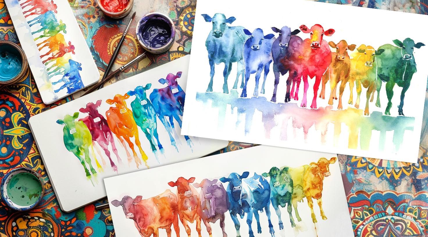
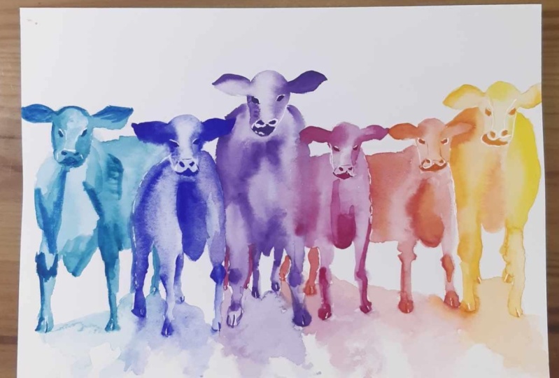
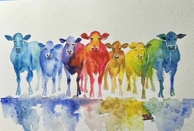
Will Elliston, and welcome. In this class, I'll be showing you how to paint colorful cows. This is a great exercise for
beginners or anyone really, because there's really no right or wrong way to go about it. It's just a good opportunity to have fun whilst
learning watercolor. There are just so many different directions you can take it. I've planned out a simple
step by step approach, which you can use
as a complete guide whilst you explore what's possible in this
marvelous medium. It's a technique that will
guarantee unique results. I've been a professional
artist for many years, exploring lots of
different subjects, from wildlife and portraits to cityscapes and
countryside scenes. I've always been entranced by the possibilities of watercolor. But when I started, I had no idea where to begin
or how to improve. I didn't know what
supplies I needed, how to create the
effects I wanted, or which colors to mix. Now I've taken part in many
worldwide exhibitions, been featured in magazines, and been lucky enough to win awards from well
respected organizations, such as the International
Watercolor Society, the Masters of
Watercolor Alliance, Windsor and Newton, and the SAA. Watercolor can be overwhelming
for those starting out, which is why my goal is
to help you feel relaxed and enjoy this medium in
a step by step manner. Today, I'll be guiding you
through a complete painting, demonstrating a variety
of techniques and explaining how I use all
my supplies and materials. Whether you're just starting out or already have some experience, you'll be able to
follow along at your own pace and improve
your watercolor skills. If this class is too challenging
or too easy for you, I have a variety of classes available at different
skill levels. I like to start off with a free expressive
approach with no fear of making mistakes as we create exciting textures
for the underlayer. As the painting progresses, we'll add more details to bring it to life and
make it stand out. I strive to simplify
complex subjects into easier shapes that
encourage playfulness. Throughout this class, I'll be sharing plenty of
tips and tricks. I'll show you how to turn
mistakes into opportunities, taking the stress out of
painting in order to have fun. I'll also provide you with
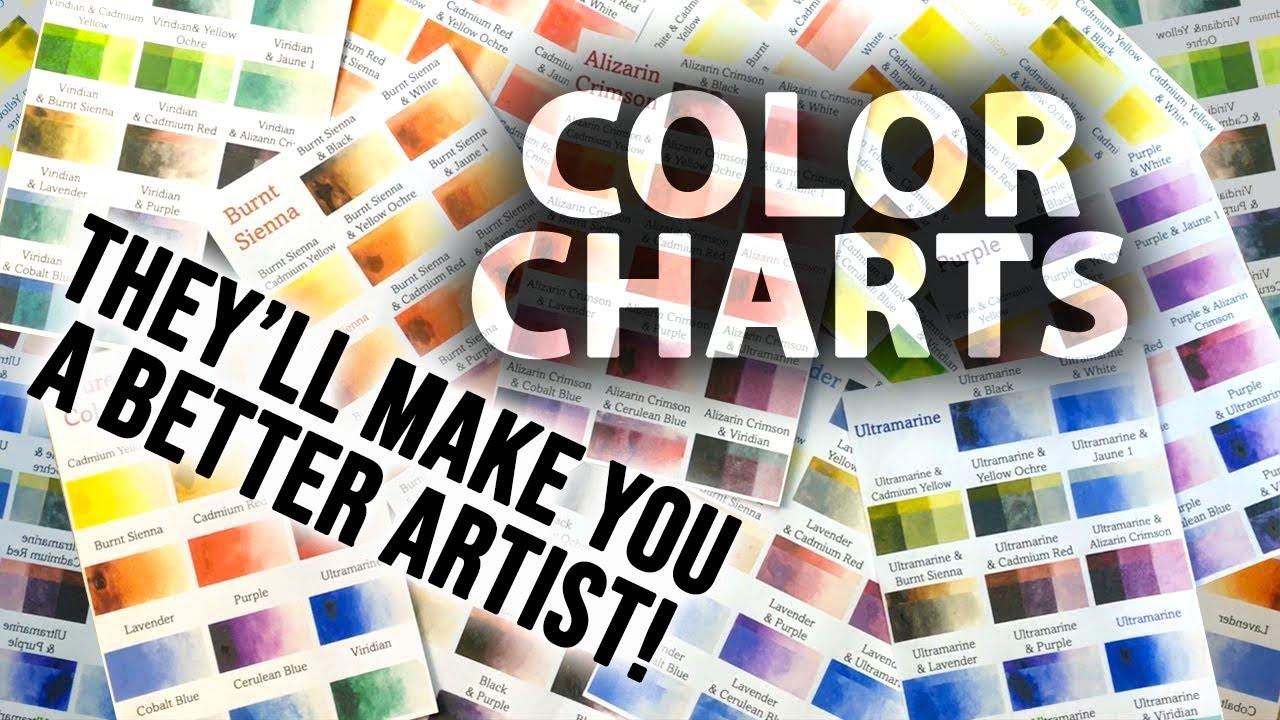
my watercolor mixing charts, which are an invaluable tool when it comes to choosing
and mixing colors. If you have any questions, you can post them in the
discussion thread down below. I'll be sure to read and respond
to every think you post. Don't forget to follow
me on Skillshare by clicking the Follow
button at the top. This means you'll be the
first to know when I launch a new class
or post giveaways. You can also follow me on Instagram at Will Elliston
to see my latest works. So let's get started
with learning fun and exciting
watercolor techniques and how we can use them to
paint your own colorful cows.
2. Your Project: Before we get into the project, let me thank you so much
for joining the class. I deeply appreciate it. Today, we're going
to learn about an exercise I return
to very frequently. Whenever I want to
experiment with a new technique or explore
new color combinations, I use this exercise. We're painting cows today
as it's a subject open to many interpretations
and to allow us to channel our playfulness and experiments through a safe, easy to follow method. They're quick to draw and are very adaptable to
different techniques. So it's not so much about
the cows themselves, but the opportunity they give to express the water color
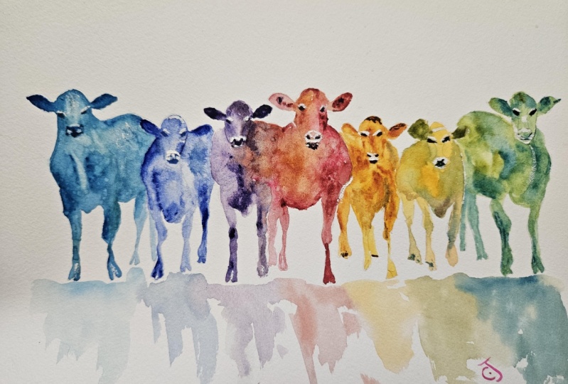
in a liberating way. In the resource section, I've added a high
resolution image of my finished painting
to help guide you. You're welcome to
follow my painting exactly or experiment with
your own composition. As we're going to be focusing on the painting aspect
of watercolor, I've provided templates
you can use to help transfer or trace the
sketch before you paint. It's fine to trace when using it as a guide for
learning how to paint. It's important to
have the underdrawing correct so that you can relax and have fun learning the watercolor
medium itself. Whichever direction
you take this class, it would be great
to see your results and the paintings you
create through it. I love giving my
students feedback. So please take a photo
afterwards and share it in the student project gallery under the project
and Resource tab. I'm always intrigued to
see how many students have different approaches and how they progress with each class. I'd love to hear
about your process and what you learned
along the way, or if you had any difficulties. I strongly recommend
that you take a look at each other's work in the
student project gallery. It's so inspiring to see
each other's work and extremely comforting to get the support of your
fellow students. So don't forget to like and
comment on each other's work.
3. Materials & Supplies: Before we start the painting, let's go over all the
materials and supplies I use. Having the right materials can greatly impact the
outcome of your artwork. So I'll go over all the supplies I use for
this class and beyond. They're very useful to
have at your disposal, and we'll make it easier
for you to follow along. L et's start with the
paints themselves. And like most of the materials
we'll be using today, it's a lot to do
with preference. I have 12 stable colors in my palette that I
fill up from tubes. They are cadmium
yellow, yellow cha, burnt sienna, Cadmium
red, Alizarin crimson, ultramarine blue, cobalt blue, cerliu blue, lavender,
purple, Vidu black. And at the end of the painting, I often use white guash
for tiny highlights. I don't use any
particular brand. These colors you can
get from any brand. Although I personally
use Daniel Smith, Windsor Newton, or
Holbein paints. So let's move on to brushes. The brush I use the most is
a synthetic round brush like this escoda Purl brush
or this Van Gogh brush. They're very versatile, because
not only can you use them for detailed work
with their fine tip. But as they can hold
a lot of water, they are good for
washes, as well. They're also quite affordable, so I have quite a few
in different sizes. Next are the mop brushes. Mop brushes are good for
broad brush strokes, filling in large areas and creating smooth
transitions or washes. They also have a nice tip that can be used for smaller details. But for really small details, highlights or anything
that needs more precision, I use a synthetic
size zero brush. All brands have them and
they're super cheap. Another useful brush to have is a Chinese calligraphy brush. They tend to have long bristles
and a very pointy tip. They're perfect for
adding texture or creating dynamic lines
in your paintings. You can even fan them
out like this to achieve fur or feather
textures as well. And that's it for
brushes onto paper. The better quality
of your paper, the easier it will be to paint. Cheap paper crinkles easily
and is very unforgiving, not allowing you to
rework mistakes. It's harder to create
appealing effects and apply useful techniques
like rubbing away pigment. Good quality paper, however, such as cotton based paper, Not only allows you to rework
mistakes multiple times, but because the pigment
reacts much better on it, the chances of mistakes
are a lot lower, and you'll be more likely
to create better paintings. I use arches paper because that's what's available
in my local art shop. A water spray is
absolutely essential. By using this, it
gives you more time to paint the areas you
want before it dries. It also allows you to
reactivate the paint if you want to add a smooth
line or remove some paint. I also have an old
rag or t shirt, which I used to clean my brush. Cleaning off the paint
before diving it in the water will make the
water last a lot longer. It's always useful to
have a tissue at hand whilst painting to
lift off excess paint. Also, you never know
when an unwanted splash or drip might occur that
needs wiping away quickly. I also have a water dropper
to keep the paints wet. When you paint, it's
important to have them a similar consistency to what
they're like in the tubes. This way, it's easier to
pick up sufficient pigment. A hair dryer is useful
to have for speeding up the drying time and controlling the dampness of the paper. And lastly, masking tape. And this, of course, is just to hold the paper down still onto the surface to stop it sliding
around whilst painting. Also, if you plan on
painting to the edge, it'll allow you to create
a very crisp clean border. And that's everything
you need to paint along. I encourage you to experiment and find out what
works best for you. Now, let's get ready
to start the painting.
4. How to Sketch It Out: For the drawing, I'll try and break it down as
simple as possible. But you can also use the tracing template I put
in the resource section. So if you want to do the drawing yourself, You can
use any pencil. I use this thick lead pencil because it has a nice
soft lead in the red. I can just do these
little soft circles just to map out the composition, starting in the center
and working my way out. You can see I just did
a circle to begin with, then I'm just doing
very basic lines, keeping it nice and free. You can pause the video
whenever you want to make sure you're
doing it step by step. Then I just repeat the same
step with the next one. This time I'm starting
with the head. I do like a soft lead
like this because it really allows you to
be free and expressive, and you can see the way
I'm holding the pencil. I'm not being rigid. I'm just
allowing it to be loose at this stage because
I want to be able to rub out these pencil
lines at any moment. I start off with something
that's expressive like this, and I'm going to have these
cows at different levels. The one in the middle will
probably be the tallest one, then the one next to it
a bit lower and then the other one in between and
just keep them a bit varied. And they've all got
slight variations. The imperfections in the shape
makes them quite unique. And that's the fun thing
about this exercise. There's no pressure
to have it realistic. We're trying to be
expressive and free. And it's your choice how
realistic you want to be, or it really depends on
your drawing skills. You don't have to have good
drawing skills for this. It's just about having
fun with the materials, the pencil, and then
the paint later on. So this one on the end, the cow. It's a bit more on the side, so I'm going to be very
expressive with these feet. I'm not being accurate
at all. I'm showing you how loose you can be, suggesting legs rather than
accurately drawing them. And this section here
is all one line. I like using one line quite a lot because it just
connects everything. Of course, I have
to lift my pencil off when moving to
the other side, this left side of the painting. And basically, what
I'm doing now is a mirror image of
the other side. And you can see how
my pencil flows. It's got a kind of
a rhythm to it, both visually and movement wise. I'm I'm doing slow
in some parts, and when I flick
the pencil across, I'm usually doing
curves or circles. I want there to have a
feeling of fluidity in it rather than precision. So I start of the head, just doing a little
squashed circle. And then I kind
of in the middle, I do like an hour glass kind of figure for where the
eyes reach the nose. So you can start off figuring
out your composition, but just by doing the main
circle where the body is. And then once you've done the
main circle for the body, you can just pop a head on
the top, then the ears, and then add more
details from that. So we're always thinking of the bigger picture first,
the bigger shapes, and then working
slightly smaller details into those ending with
the very fine details. So once we've done this, then we'll start adding the eyes. The eyes should
be the last thing because they're the
very fine details. Sometimes if you
draw too detailed, it actually limits you in
the process of painting because you're trying to it
makes you feel too rigid. Now I've swapped to
my fine pencil here, my fine lead, and this means I can go into
those small details. Now, I can be a bit more
particular with them. But like I'm saying, I don't
want to be too particular. By keeping the pencil work
expressive and ambiguous, it allows us to have more
fun with the brush later on. If we stick to the
rules too much, it'll be a bit too bland. The most important
thing is to have a clear outline or a
silhouette of these images. Because as long as the
shapes are fairly accurate, then what's inside the
shapes can be very abstract. You can see a lot of these
cows blend into each other. I'm doing subtle little
markings to differentiate them. But other than that,
it's quite abstract. So you can go as far as you
want with the detail work. For me, I think this
is just about it. I'm going to scan
it in and turn it into a reference for you
to trace if you want to.
5. Starting The Painting: I'm going to say this a lot
throughout the painting, but this is a good
opportunity to explore all types of
brushes and materials and anything you
want to have freedom expressing something
without feeling pressure. I'm using this synthetic
brush for this painting, and if you're a
complete beginner, it's probably the best choice. It's a synthetic brush. This one's a size
seven, I believe. Every heart store has one
of these general brushes. They're not expensive at all. So as long as it has a fine tip, then it should do the job. Now, same goes with colors. You can use whatever
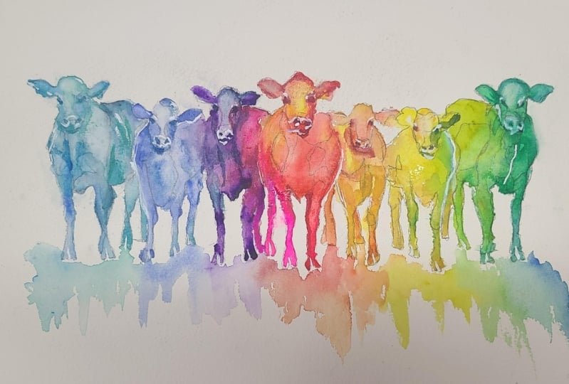
colors you want. I'm experimenting with a kind of rainbow effect with
this painting, and I'm starting from
left mixing a blue. A Serlian brew, with a
tad of green in there, a bit of ridian green. And I'm starting off with thick
pigment, not super thick, but on the thicker
end of pigments. It's not diluted. So you can see when I'm
putting it on the paper, it's not washing
about full of water. And that's the kind
of consistency I'm looking for at this stage. And you can see on my palette, it's not pooling with water. So it's a kind of consistency where it's holding
itself together, but it's not pasty, so to speak. And I'm just filling in the darkest areas or the darker areas for the time being with this thick pigment. You can see with
this consistency, you can also create dry
brush marks like this. I'm adding a bit more green
because on this side, I want it to be a turquoisy blue and green and blue make
that nice turquoise color. Not being too precious at all, because what I'm planning
to do is go over this again and interact with these
colors with a second wash. So now I'm getting
my brush and adding a bit more water to it
and pure water this is. And I'm going back to where we painted and just agitating it. Because it's when you mix
pure water with thick pigment already on the paper that it combines and it
does its magic. This is one of the most
exciting and fun things to explore about watercolor. The thing that makes
it truly unique and what really makes it stand out. Even though this is
a simple exercise that has small margin for error, we can really learn about
it and we'll take what we learn and apply them to more
complex projects later on. With this exercise, we're discovering what
watercolor can do and what takes time and practice is learning how to
take what it can do and then how to control it ourselves or at
least manipulate it, knowing when to use it and when to be more
controlled with it. One thing that really helps is to have the pigments in
your palette very moist. You don't want them
to be hard and dried out because then you miss out on all that pigment that you can apply
thickly on the paper. If it's too dry in your palette, it would take too long to activate and pick
up with your brush. And that's really where
the magic comes from. Seeing those pigments
and particles interact with the water and dry out in certain unique ways. Of course, there are countless
ways to use watercolor, and that's what makes it so special is that ever is unique. Everyone has their unique style and ambitions for what they
want to do with watercolor. But generally speaking, having the pigment thick is
the best way to go about it. So what I tend to do is I don't have the pans in
my pant completely full. When I started painting, I can just apply what I need
directly from the tube, and I try and keep the paint that same consistency
that it is from the tube. It might mean I have to spray
it every now and again with a water sprayer or drop
pure water from my brush. But that's what I try to do. I paint quite frequently, so every day, I just top it up with water to make
sure it doesn't dry out, and I use toothpicks if it dries unevenly just
to mix it about in So now I've basically
filled out that area, and you can see
it's a silhouette with different areas of
tone and texture going on. And I'm going back with a
blue and just dabbing in, letting pigment fall off my
brush into the wet areas. So now I'm using a bit of
a wet on wet technique.
6. The Turquoise Cow: We started off using
wet on dry technique. The wet obviously being the pigment and the
dry being the paper. And now we're doing wet on wet. We call it that for
obvious reasons, but it's just a term
that's simple to use, but thinking about it
in a bigger picture. There's multiple endless
different degrees from wet to dry, and depending on when you apply that pigment affects
how it's going to look. If it's very, very wet, then it's all going to spill out and fill up that
area completely. If it's dry, it will only go where the brush
stroke takes it. And depending where you
are on that spectrum, you can achieve
different results, and this is a perfect
opportunity to practice how those different degrees of wetnesses affect
the brush strokes and where you want
the pigment to go. So for example, on the
head of this first cow, you can see I've applied some darker pigment where
the sides of the heads are, or the side of the head,
where the eyes are, and That was still wet
paper because it's soft, but it wasn't
completely saturated, so it still kept a
bit of its form. It's not completely washing out. Something I try and
mention in each class is to have my final painting, my demonstration painting
that's included in the resource section at your side or at least
on another window so that you can refer to it throughout watching this
video and throughout your painting process
so that you can see what I'm trying to ach because
sometimes with watercolor, when you think of
the end in mind, you're painting
things that don't look like they make
sense in the moment. Especially with
watercolor, where we're painting in multiple
different layers. You can pause the video and see what I paint for a first layer and what I might
paint for a second layer. So I did start off with blue, and I incorporated
green into it, and now I'm adding
even more green. So as we move along
through each of the cows, I'll be gradually changing the color so that when we come to the
last cow on the right, it will be green again. I'll be green coming
from the other way. So this is green coming
from the blue direction. On the other side, it will be green coming from the
yellow direction. So I'm just considering
what to do next, whether this cow is good enough and whether we
should move on to the next. I think what I'm
going to do is dry it out completely using my hair dryer because
I don't want it to blend so strongly
with the next cow. It's useful to have a
hair dryer right by your side so that you
can use it whenever. And as it's drying, I'm
just going to flick pure water Because when it's on the point of being
dry but not quite there, when it's damp and
you flick water, the pure water pushes the pigment and it creates
a lovely little effect. Whilst it's drying, we can think about what we're
going to do next. I think before we move
on to the next cow, I might actually
incorporate a bit more blue because I want there
to be a smooth transition. So I think I'm going to
actually use a bit of color from the next cow
and connect it a bit. The next cow will
be blue as well, but not so green, more of a purple blue because we're working
our way towards red, so We use Serlian
blue for this cow, and the next color
would be ultramarine, which is slightly warmer
blue than the cerlian.
7. The Blue Cow: So I'm going to
clean my brush and pick up this cobalt blue, actually, I think
we're going to go for. And just painting the
ear of the next cow. We had to make sure the paper
was completely dry because this ear has to have a sharp
silhouette against it. I'm mixing a bit of
ultra marine blue into this cobalt blue. I'm using the very
tip of my brush, holding the brush
almost perpendicular to the paper so that
I can get the tip of that brush and being careful to paint the side of the body, not going over the
head quite yet. Repeating basically
the same step as we did for the first cow, starting with thicker pigment, and then we'll come
back with a more saturated, diluted
paint afterwards. I apologize for my hand covering what I'm
painting at the moment. I need the tip of the brush, and it means holding it upright. I've experimented with
different camera angles, but it just is too confusing
seeing it from upside down. So it is unfortunate, but at least you can see
the way I hold my brush and the kind of angle and
position that I'm using it. So I'm trying to find the
balance between being careful with my lines
and being expressive. I'm not actually overthinking where I'm applying the brush. I'm going to go over it
again a bit later with some water and wash it all out. But I'm just having
fun taking my time just thinking about where
I want to put them, which edges I want to leave white and where I want
to fill in the water later. That's what I'm
doing now, adding a bit more water to my brush, and going back over
like the other cow, we can see where
we add the water, it spills out, and we allow the watercolor
to do its thing. We guide it and then allow it. Now the next cow will be purple. So we're starting to incorporate a bit of purple onto the
right hand side of it. With both of these cows so far, the pigments that
we have used have a lot of particles in
them, thicker particles. So Cobalt blue has
very thick particles, and you can often t at the end of a painting when you wash
out your water bucket or water container that the
sediment from the blue has sunk to the bottom each time you clean off your brush. And same with the viridian
green on the green cow there. It has heavier pigments, and it's these
differences in pigments. And it might take a bit of time to work out the difference
in these pigments, but it's these differences of
pigments that affect how it look when you interact multiple pigments together
and multiple colors. Because they all dry
differently and some of the heavier pigments might
dry below the other pigments, and that's what creates
that lead effect, that luminescent eereal effect. Because the paper that
I use is cold press, which means there's a bit of tf, a bit of texture to it. When the water runs through all those crevices of the paper, some of the pigments get
trapped and they don't flow. I like that because that's what allows us to create the texture. Hot breast paper is
completely smooth. There's no tooth. So I find it actually
more difficult to control because there's just literally nowhere for the pigment to stop. So it just does what
it wants to do. So I'm drying this one
out now completely. So this one actually
didn't take that long. We spent more time painting out the thicker pigment
and adding the water, just took a few seconds
on top of that. Again, we can use
this drying time to take a look and see what
changes we might want to do. I think actually where the
green and blue cow connect, I'm going to reactivate
it with pure water and soften some of that edge
because it's not blending. I want there to be some
kind of seamless blend. So I'm going to take my brush, get a bit of water on there, and just agitate it in that little area where it
meets and soften the edge.
8. The Purple Cow: So now we're going to move
further along the color wheel and in between blue
and red is purple. So I'm going to mix
my own purple here, even though I have
it in my palette. I just want to show you, I use sin crimson and
ultra marine blue. And you can choose how purple
you want it to look whether you want to edge towards the blue or
edge towards the red. At the moment, it's quite blue. My purple is quite a blue tone. For these next couple of cows, I'm going to actually
paint them together, connecting them in the middle. But we'll start off with the
thick pigment as we always do. Starting with the ears. And you'll find that even though we're painting
quite abstract and loose, that I can work out what
we're trying to paint. When people look
at the painting, we can understand what it is. We don't need to actually
directly put the details. We can often imply details, and a lot of the best
paintings do that. They give the
illusion of detail, but when you look up close, they're just very well
placed brush strokes. This purple here, this ultramarn mixed
with sarin crimson, is a very dark pigment actually
when it's not diluted, because they're both
transparent pigments. By transparent, that means
that the particles are very, very fine and because
they're fine, the light gets absorbed by them rather than
reflected by them, because they're so
condensed and concentrated. Even though it looks very
dark, or almost black, we'll see when we
add water to this, it will brighten up
as it gets diluted. This is why the color charts I include in my
resource sections for every class is very valuable because I have every color
that's on my palette, and those are the only
colors I actually use. And you can see the nature of those pigments and how they interact with each other and how some of them are darker and how
some of them are lighter. Not only do I show how
they mix together, but I show what they look like at different consistencies. Now I'm actually
incorporating a bit of green in there or a bit of turquoise, rather, that's slightly diluted, and you can see how it interacts with that
thick apigment. I don't need any more of this
purple for the time being, so I'm just taking what I
mixed and actually putting it back in my purple pan. Rolling it out and squeezing
it back into there. I have 14 colors in my palette, and I'm pretty much
going to use all of them today because we're painting
the full color spectrum, and apart from maybe the
top three on the right, which are the cos, I'm going to be
using all of them. Fe might seem like
a, but actually, These are the only colors you'll ever need to paint
anything that you want because they cover the
whole of the rainbow, and you might go
to an art shop and see hundreds of different
tubes and colors available. But actually, those can all be mixed with these 14 colors. You can see I'm trying to
incorporate red into this, even a bit of
yellow, right there.
9. My Palette: So, yes, I have 14 colors, and you can see, again, in my color charts, the
full potential of them. You can see that by mixing them at different
consistencies, they can achieve any color
you'd actually want. And I'm not too precious
about my palette either. The colors that I have in
there are quite generalized. And what I mean
by that is, take, for example, the bium yellow. I'm not just sticking
to one bum yellow. I have a tube of Windsor and Newton,
Daniel Smith, Holbein, and I just top it
up with whatever, as long as it fits within that kind of cabium
yellow range. I just fill it up. Same
with the yellow ocher, the bium red, the cobalt blue. You can Again, go to
an art shop and see ten different variations
of cobalt blue or ultra marine blue
or burnt sienna. And as long as it falls under that kind of category,
then that's what I use. I'm not that specific with
the pigments that I use, as long as it fits under that
section in the color wheel. So now I've painted the
left side of this cow. I'm going to go in a bit
stronger with the red now. And we're going to have quite
a strong transition from this bluish purple to a
vibrant red on the other side. So I'm interacting quite strongly with the
pigment that's there. And dragging it out. Because I'm using quite
a powerful pigment, all I need to do is dab it, and the water will spread
it out into that section. There are some colors that don't fit under a
certain category, and I don't have in my palette, for example, opera
pink is a color that I only use on very rare occasions because it doesn't
show up in paintings. So I have that in
a separate tube, and I just dab a bit of that directly from the
tube onto my brush, and I'm applying it now. Sometimes I just can't
resist when I'm in an art shop and I see all
those paints available. I just want to
experiment with them. And this pink is one
of those colors. I bought it without knowing what I'd use it for. But here we are. And this is a perfect exercise
for that kind of thing for experimenting with
pigments that you haven't yet used or don't
know what to use with. You just want to
see what it can do, what potential it has, and what its strengths
and weaknesses are. Pink is quite an odd color because it's in the red family, but it has a purple
influence into it. That's why I'm placing it in
between purple and red here. But I wouldn't say it is purple, if you were to mix
red with purple, it certainly wouldn't
be this vibrant. It's an artificial color. It's a unique color. But I like it because
it's almost fluorescent. It's a synthetic color, which does mean that over time, if it's put to put in too
much direct sunlight, it will fade over time. So if you're looking to preserve the vibrancy of it over a very long
period of time, it has to be covered. But we don't need to
worry about that with this exercise because
That's all it is. It's really just meant to be an exercise to have fun with. We don't want to add
pressure to ourselves. We're not trying to
make a masterpiece. We're not putting
that weight on us. We're just trying to have fun. And that should be the same mentality for
every painting you do. The whole point of us doing this is really
because we enjoy it. We have a passion, and we have an excitement
about painting. And that is really the goal to keep that
excitement to have fun.
10. The Red Cow: And really, it's by tapping into that playful energy that creates the fun
exciting paintings. No good art has been created from a place without passion. Even if the theme of the painting is quite
dark, for example, Picasso's Gernka has
a very dark theme, a dark message, but he still used and conjured up his passion to express
what he wanted to. And whilst we're
talking about Picasso, we can bring up one
of his famous quotes, which is every
child is an artist. The problem is how to remain
an artist once we grow up. I really like the
statement because it encourages us to open up our freedom and our expression and our
sense of imagination. To maintain a kind of openness to our
artistic expression. And it kind of implies that we all have this innate
creativity within us. But as we grow into adults, our own limitations almost
stop us from fully letting go and allowing that passion and pure essence to flow out. Children paint for
the pure joy of it. And it's a good mentality to simply enjoy the
pursuit of painting and be quite content with the
act itself of doing it and the journey rather
than the end result. Because at the end of the day, we are painting for ourselves, and it's actually for art, it's good to be self indulgent with this and to get expressive, to have pure freedom and no pressures from anyone
else's judgments. Of course, once we've
painted our painting, it's lovely to put it
out there in the world and share it and get feedback. And because that affects
our vision as well. But when we're doing
the act itself, we should try and close our mind to what other
people might think. This is your time to
have fun just for you, and you want to explore this
medium for your own sake. In fact, when it
comes to painting, being selfish is
extremely liberating. Of course, it's not actually
about being selfish. It's just the idea that gets
you into that flow state, the exciting state of I can do whatever I want, that
unlimited mentality. It releases you
from any pressures. Getting back to
the painting now, I'm just going to clean my brush and flick pure water onto this section because the wash and transition was too smooth, and I wanted to add a bit more texture and
excitement into there. And I want to create
even more texture. So as it's drying
with the hair dryer, I'm actually going to
flick more water and dab pure water from my brush
even so that when it dries, it creates these
uneven markings. And you can really push this
for as long as you want. As soon as it's close to drying, you can wet more sections, and that evenness creates a build up of edges as it dries, and you can see that it just looks a
bit more ethereal now. Bit more exciting than
a bland smooth edge. So we're all unique people with different styles
of painting and different ambitions
with how we want to paint and what we
interpret as good art. And sometimes it's
difficult for us to figure out how to express what
we want to express. We can be influenced
by other artists, but that doesn't
necessarily mean that we want to paint
exactly like them. We just want to take
aspects of their style. And it's by being self indulgent that we find
our individuality. And it's understandably
uncomfortable because self indulgence is a negative thing to excessively be self interested in
other aspects of life. It has negative consequences. So it's ironic that it can
be such a powerful tool for creating authentic art
But at the same time, it's understandable
because art is, of course, introspection and an artist
conveys that introspection. So we as artists need to dalve deeply
into our experience and our emotions and
our perspectives to create this art that
has a unique voice, that's personal and genuine, and it resonates
with authenticity. But again, after all that, to loop round, the most important thing is
just to have fun. And now I'm drying
it off completely before we start the next cow.
11. The Golden Cow: So now we're taking
some yellow cha, moving towards the yellow
side of the palette. But in between red
and yellow as orange. Again, I'm pasting on
quite thick pigment here. The last two cows had
a smooth transition. I was quite ambiguous
with where they join. With this cow, I
think I'll have to be a bit more defined
with the edge. Of course, compositionally,
it makes sense because variety adds interest. You don't want everything
to be the same. It's good to balance it out. There's so many different
things you can vary. You can incorporate a
mix of different shapes. And sizes, you want large sizes, large brush strokes, and
small brush strokes. Often, larger
shapes can serve as focal points and
the smaller ones add detail and complexity. Likewise, with
colors, of course, in this, there's a lot
of variety with colors. That's one of the main
points of this exercise is to explore as many
colors as possible. But usually when painting
in a traditional sense, you have to maybe balance
your colors a bit more, use complimentary colors
and a limited palette. And closely related to colors
inside the same family are tones varying the lightness and darkness or your colors can
add depth and dimension. This, of course, helps define form and create a
sense of space. Variety is really
everything when it comes to compositions because
you think about it, there you realize how
much it's all connected. For example, you can have
variety and textures as well, using different
techniques. Wet on wet can produce soft
flowing textures while dry brush or dry techniques can create rough or
texture defects. You can see, we have a mixture of soft
edges and hard edges, especially with this cow, this red cow in the middle. On the left, we
have a soft edge, and on the right, we
have a hard edge. Of course, there's
so many things to think about when it comes to compositions that
it's impossible to think about them all at once, and no artist actually does
think about them consciously. It just takes time
to build them up, and by being aware of them,
they come intuitively. But a lot of things can help. So that's one of the most important things
about sketching really. By sketching your composition, you can identify where you might be able to
introduce variety, and you can plan it out in
your head before you begin. And of course, what we're
doing here helps too, experimenting, not being afraid to try new techniques
and combinations. By stepping outside
of your comfort zone, you're actually more likely to stumble across happy
accidents that achieve these
different variations. A lot of them are unintended. They just happen. Of course, we have to keep balance in mind. While variety is important, there has to be a balance of it. Too much variety can lead
to a chaotic composition. So we can be aware
of these variations, but we have to aim for a mix of a harmonious mix. A
12. The Yellow Cow: Continuing on with
the color scheme. That was a orange yellow, not a pure yellow. With this cow now, we're
going to try and have full vibrancy and even maybe start to incorporate a bit of green on
the other side. Cadmium yellow is the
color that I'm using. And it's a peculiar color because if you use
it too thickly, it actually loses its vibrancy. So you have to find
the sweet spot between the dilution of it. When it's used too thickly, the light doesn't reflect the whiteness of
the paper anymore. I'm going to start
to mix some green in there. Vidian green. Well, actually, it's the green that we actually originally mixed at the very beginning of the painting on
the other side. It's starting to become
full circle now. You can see with this green
how I've connected it to the yellow in a way in which there's a soft line there. This one is a bit more loose actually because
if you've noticed, I haven't preserved any of
the white of the paper. I've just gone straight
over the details on the face and on the leg here. Because I am planning to
come back at the end with white guash to bring
back some details. Also because the yellow
isn't a dark pigment anyway, so we don't have to
emphasize any of the shading or different
tones on the face. Now I'm getting water again on my brush and doing more splats and agitating that
yellow pigment to bring out the
vibrancy a bit more. Now, I think we can move
on to the last cow, which will be green. I'm going to add a bit more
yellow to that top pan. I don't like using green
for my main greens. I prefer to mix it myself
using blue and yellow. It's a more natural green. That's why I prefer it. But I think I will
incorporate some ridin into this cow as we go further to
the right hand side of it, because even though it's
a bit more artificial, we're not painting
realistically today. We're trying to experiment with all these
different colors. So
13. The Green Cow: Now we're going to go back
in with the thick pigment, starting with Vidu which
is a cooler of green, and I'm going to warm it
up a bit with the yellow. I'm just mixing more
green using bium yellow and that Vidu
and going on top. Again, I'm trying to get the tones the full
range of tones. I'm applying some
dark pigment here. Getting the tissue just
to clean it up a bit. I want there to be a
very sharp edge on the border of this right cow because it's the end
of the painting, so I want it to be parallel or at least be a
mirror on the other side. In fact, on the very
right hand edge, I'm going to incorporate
a bit of blue. So we do reach the full circle, the full spectrum of
colors in the end. It connects with the blue green we started at the beginning. Painting the silhouette
of this ear. And now we're going to
clean my brush and just do a few swirly lines just to connect the thicker pigment
with the wetter pigment. Tidy up this hoof a bit. Now I'm going to mix
another turquoisy green. But this time, it's hinting
more towards green than blue. Try to preserve the
white of the nose there? Then painting this ear on the other side a bit
more green than blue. Trying to be careful not to
connect it with the body, just the head, leaving
a bit of a gap. It's a bit too dark here, so I'm adding some
water to agitate the thick pigments to bring out the white
of the paper a bit. Agitated a bit more, I think. Few splats. Dropping pure water on there, quite a lot of it, actually. In fact, I can get
the hair dryer now, and like we did with
the middle two cows, I'm going to start
drying the paper, the paint whilst I gradually incrementally
splatter water on there. It's very saturated
at the moment, so I need to get it
close to drying. Now it's starting to
dry up quite a bit, so I can get my brush, fill it up with water, and just start adding a
few splats in there. Apologies for covering
up the action. But I can't have the
hair dryer at an angle otherwise the paint might
run off outside the lines, so I have to keep it upright. They can see how it's drying. It's creating a few interesting effects
because it's uneven. We even use my finger to
manipulate the paint. I don't mind that unevenness. Sometimes the goal is
to have smooth washes, nice and clean ones, but sometimes these dirty
ones are very exciting. They feel a bit more organic.
14. The Shadows: Now, these cows feel like
they're floating a bit. So what I'm going to do
is I'm going to paint some kind of reflection or
shadow underneath them, matching the colors that
they're painting in. So almost again, like
a rainbow effect, starting with that
greenish blue. But the trick is, we're painting this all in
one go this time, so I have to pre mix
all these colors. So that they're ready to go when the time is
needed for them. So first of all,
with pure water, I'm just wetting the area
where I'm planning to go, and then I insert the pigment. I'm just going up to the hooves, maybe leaving a little bit of a white gap between the hoof and the wash. Then incorporating
a little bit more green as we go across to match
that cow above. And now as we transition
into the next cow, we're going to put a bit
of cobalt blue into there. And because it's so wet, we don't actually have
to do much blending, the water will do that for us. Just a few dabs and the water
will help spread it out. See, I'm using the
side of my brush to do those vertical strokes. I think we've painted
all this painting so far using this
number nine brush. Starting to incorporate
some purple in there. Also notice that when I
use the side of my brush, it's more inclined
to have a bit of a brush effect because it's skipping over
the grain of the, of the paper, so it leaves
those little white gaps. I'm not adding the
pink in there, it's a bit too saturated. I would steal too much of the tension attention,
I think, so. For the red part I'm
keeping a bit subdued. Incorporating some yellow
ochre in there, some orange. These vertical lines are almost matching where the
legs of the cows are, but they're quite abstract. They're not meant to be perfect. Of course, the tone is much lighter than
the cows themselves. It's just something to ground the cows so they're
not floating in space. Incorporating the green now. That's a bit too
strong that green. I'm going to get some
water and some yellow and try and spread
it out a bit more. And then fishing it off with
that turquoise bluish green. Again, this is
another useful way to practice blending
without too much pressure. We don't have to have it clean. In fact, if it was clean, it would ruin a lot
of the excitement. Now, time to get the hair
and completely every. A.
15. Minimal Details: There's a little puddle
of wetness in the middle, so I'm just going to get a
tissue and just dab it dry, make sure it's completely dry. Also, I notice there's a few splats that have somehow made their
way out of the paper, so I'm just wetting it and have a tissue at hand
ready to clean it up. Okay. Now I'm going to
go back over these cows, just to add a few details
using dark pigment, just to suggest details. Nothing too time consuming. I'm using p, pure green pigment, for a bit of blue to match
the color of the cow. So that we have a full
tonal range going on. Trying to keep it very simple. For the eyes, I'm just
doing these diagonal dots, and then just looking at those pencil lines
that are very faint, just blocking out
some simple shapes. So that we can identify where the head begins
and the body starts. Few dry brush marks, too. When you have
pigment this thick, you can just quickly brush strokes on and create
those dry brush effects. We're now starting
out, dry brush marks were quite difficult to a. I had to do a lot of
experimentation. This is one of the
things that you can do to experiment and figure it out. The thicker the
pigment is, of course, the less water that's in there, so it's drier, so that's
why it's a dry brush mark. It sounds simple, but
for the longest time, I had pigments that were
too dry in my palette. They weren't moist enough. And that means I had to
add lots of water on my brush to revive
them, so to speak. Because I added that water, there was too much liquid on my brush so that I couldn't
achieve that dry brush mark. You can see in the top
right hand corner, I have a sponge there, and I use that to draw out liquid if there's too
much liquid on my brush, and I want to a a
dry brush mark. I just re my brush
onto that sponge, and it sucks out the liquid
to help me a that effect. So now I'm moving on
to azar and crimson, to create the dark details. Notice that I'm sticking
with the color scheme. I'm not putting red
on top of blue in this particular painting
or blue on top of red. I'm keeping it quite
close to the real tones. And see how just
a few brush marks explains what it is without having to put too many
details in there. Now, with these yellow ones, the pigments aren't dark enough to achieve the
full tonal range. So I'm having to incorporate
a bit of burnt sienna, which is a very dark pigment
to help get the tonal range. And that's often how
it is with watercolor. You create these
expressive underlays, and then you just
need a few well positioned details to
make sense of it all.
16. Adding Highlights: With this yellow yellow cow. I'm again using
the burnt sienna. But I think also as
there's green on it, we can incorporate
some dark greens onto that because of course, the yellow doesn't have the full tonal range like I
was saying before. We need to add some darker
hue to add those details. Mixing my own green by in some ultramarine
blue into that yellow. This is the most abstract
cow I've painted here, so it takes a bit of concentration
to make sense of it. I'm going to give
it a green ear. A sharp little
line there just to acknowledge that cow ends
and the next cow begins. Moving on to the last cow. Using a blue here
rather than green. Think that is pretty much
done with the dark pigaments. What I'm going to do is
wash my brush completely. Maybe fix that little tiny little insignificant
detail there. There's just these little
things every now and again that just catch your eye and they don't make
a big difference, but you just see them. I'm going to take some white. I have some already
in my palette, that's the perfect consistency, but you can just take it
directly from the tube, and now I'm going to go over and just accentuate
where the highlights are which is mainly
just the nose. And maybe some parts where the hoof touches
that reflection. And there's some
areas where I want to make it a bit obvious
where the edge of the cows are But trying not to go
overboard of it. Trying to use a bit of
self control because I don't want to make it
look like I've used white, I don't want it to
look quite natural. So I'm trying to be a
bit economical with it. Ideally in ideal world. When painting these washes, we could have left or preserved
the white of the paper. But the problem
with doing that is, it's too technical to allow these exciting
washes to happen. If we had to preserve
these whites, it would have inhibited us to create these
expressive washes. It's better to just
go full on with the expression in the
fun under layer stage, the expressive layer stage, and then come back with these
fine details afterwards. Some people are against
the use of white guash, but I say we can use any tool that helps us express
what we want to express.
17. Finishing The Painting: This is a strange
little cow here. I'm not sure what to do with it. The white is a bit too
strong on the nose, I think, so I'm going to have to
correct that in a bit. In fact, what I'm going to do is take a tissue and roll it up to a little bit of
a point and just da away that white
wash in the middle. So it's just the edges of
the nose that are white. Just finishing off this nose, put a line there just
for the sake of it. I'm not entirely happy with the nose, so I'm
just going to go back, I think a bit more of a
darker pigment that burns sienna again and just
emphasize the nostrils. There we go. And now I'm
just going to give the painting one final review, just to see if there's
anything obvious. If this was a more
ambitious painting, I'd put it away for a few
days and come back to it with a fresh eye because there's a lot of blind
spots when you've been absorbed for an hour
and a half painting. If you disconnect from it, you see it with a fresh eye
and things that you would be oblivious to suddenly glare out at you and you
know what to do. I'm just going back to
the hooves and just adding these little white lines just to emphasize those areas. And then you get to a point where you just can't see
what else can add to it. And I think I can
call that actually. Let's take the tape off
and review the painting.
18. Final Thoughts: Welcome back. So now the
painting is finished, let's have a close
up look at it. I hope you have a painting of your own to look at as well, and if not, you should
really give it a go. In this class, we took
the simple structure of cows and used it to explore different colors and
effects and water color. For a beginner, even the most basic subjects
can be tricky. So don't be disheartened
if you face challenges. This approach is exactly
for experimenting, trying new things and
pushing yourself, because even in failure, we learn new things. The goal, ultimately, at this learning stage
is really just to have fun exploring the possibilities of
this exciting medium. It can be easy to feel a bit stressed during a painting
if it gets challenging, but remaining positive and keeping faith really
helps in the end. Remember, watercolor painting is not just about technical skills, but also about expressing your creativity and
personal style. I encourage you to continue
exploring, experimenting, and pushing your
boundaries to create your own unique
watercolor masterpieces. As we come to the
end of this class, I hope you feel
more confident and comfortable with your
watercolor painting abilities. Practice is key when it comes
to improving your skills, so keep on painting
and experimenting. I want to express my gratitude for each and every one of you. Your passion for watercolor
painting is so inspiring, and I'm honored to
be your teacher. If you would like feedback on your painting, I'd
love to give it. So please share your
painting in the student project
gallery down below, and I'll be sure to respond. If you prefer, you can
share it on Instagram, tagging me at Williston, as I would love to see it. Skillshare also loves
seeing my students work, so tag them as well
at Skillshare. After putting so
much effort into it, why not share your creation? If you have any questions
or comments about today's class or want any specific advice
related to watercolor, please reach out to me in
the discussion section. You can also let me know about any subject wildlife or scene you'd like me
to do a class on. If you found this class useful, I'd really appreciate
getting your feedback on it. Reading your reviews
fills my heart with joy and helps me create the best
experience for my students. Lastly, please click
the follow button up top so you can follow
me on Skillshare. This means that you'll be
the first to know when I launch a new class
or post giveaways. I hope you learned a lot and are inspired to paint more in
this wonderful medium. See you next time
and happy painting.
 Will Elliston, Award-Winning Watercolour Artist