Transcripts
1. Introduction and Class Outline: Welcome to learning to draw digitally. My name is Shelley, and I'll be your instructor for this class. I just want to introduce myself. I am a graphic designer. I am an illustrator, more like a doodler. I license my artwork and I am a store owner. I own a wholesale company called I'm Inkpressed, and all the illustrations in this company are made by me. As you can see, this is my drawing style. I like to draw using basic shapes and I do like the black outline. I like anything that size down and sometimes a bit exaggerated. I like anything that's round and cute. That's pretty much my drawing style, and I'd like to share with you some of the steps on how to create that. In this class, we're going to be covering a moodboard. We're going to be using Adobe Illustrator. If you don't own a copy, don't worry. You can download a free trial for 30 days and then you can see if Illustrator is for you. We're going to create basic shapes. We're going to learn about a color palette, create a character from start to finish. We're going to create patterns. We're going to explore different fonts. We're going to learn about printing. In the end, we're going to discuss the class projects for you to share your methods with me. In the end, you're going to walk away learning how to create this exact same artwork that you can give to a child or you can give to someone young at heart. So join me.
2. Moodboard: We're now going to discuss mood boards. My go-to place for inspiration is definitely Pinterest. I love that you could search pretty much for anything and find a whole, wide array. If you search for dress, you're going to find a million dresses, if you search for the theme nautical, you're gonna find a million nautical things that come up, whether it's in housewares, whether it's in print, whether it' s just a beautiful photograph. I like the way Pinterest gathers all of this, and their keywords are very specific. Once you put in something, it just goes out and finds this whole, broad array of photographs that may be suited for you. I go to Pinterest and I create my mood board. In no way, shape, or form do I want you to think that you go into any of these sites and you are going to copy artwork. Creating a mood is basically gathering information so you can be inspired to then create your own. This way, if you just stare at a blank canvas, as I stated earlier, it's going to be much harder for you to get started, especially as a beginner artist. If you create your mood board and you keep it by you as you're creating, you'll be able to put together, quicker, your own ideas, and creativity will just flow. In Pinterest, you can search for basic drawings. That's what I did and I came up with quite a few. Basic drawings are just something that's not too fussy, not too detailed, and just using simple shapes. You can also search for basic shape drawings, and a lot of things came up for that, too. I also searched for Kawaii drawings. Kawaii drawings are my inspiration since I was a little girl. I collected Little Twin Star and Hello Kitty. Those types of drawings with those thick outlines is what attracts my attention. I like the clean look of them, I like that they're very whimsical and very happy. If you search for either one of these things, you'll be able to create a nice mood board that you'll be able to use for this class. Here's a drawing that I found. As you can see, the doughnut is definitely a basic shape. Then it just has a smaller circle right in front, and they punched it out. I'll show you how to do that in Illustrator. The cup here is also a very basic shape. It looks like it's some kind of rectangle that has been manipulated, and then there's a circle that's also been attached to it. Once you start to see drawings in this deconstructed manner, you'll be able to create your own. Here's another one that I absolutely love. I love it because of the feel of it, I like the color palette in it. As you can see, both the cloud and the frosting on the cupcake are just a grouping of circles that they've melded together. That's a tool that's in Illustrator that we'll be using for this class. But it's also a very simple way to create a secondary shape. Here's another one where you can see the sun here in this illustration, is also just the circle surrounded by a bunch of little circles that have been melded together. This one here, I can see in it the basic shapes they started off with, this artist did, but in the end, they manipulated in a certain way. It has more of a sketchy look, not so much of a rigid constructed look. This is also nice inspiration. I love the color palette. Here's another one using very basic shapes. I can see in it, also, all the shapes that they started off with. If you look at the toast, it definitely started off as a square at the bottom and then maybe two circles at the top that were joined and then manipulated a little in the middle. Once you start to see all these, you'll be able to create your own shape. It's not very hard to take to the Canvas. Once you learn the tools in Illustrator, you'll be able to go to the app board, start playing around with your basic shapes, and you'll see that you'll be able to bring a character to life in no time.
3. Facial Expressions: Another key point that I'd like you to create some inspiration from is facial expressions. Facial expressions is what's going to tie your characters mood in with its appearance. There's a lot of ways you can source some information on that. If you go to Pinterest also, you can just type in facial expressions or cartoon expressions, and you can see we can find tons of inspiration there. I found this cute illustration that shows you happy, hatred, worried, enjoyment, confused, and if you start to study the way the eyebrows coordinate with the mouth. For example, in sad, you can see that the eyebrows are arch down and so is the mouth. Once you start to pick up on little things like that, you'll be able to bring some expression to the face of your character. I found this cute illustration too, it's more in the lines of what we'll be drawing, it's more of a basic shape and you'll be able to see that some of them are just simple lines and circles in order to bring the facial expression to life. Here's another one that I found too, it's actually part of one long strip. You can see all about the eyes, how the expressions are, the mouths, see whether they're just half moons up or half moons down. You'll begin to get a sense of if you want your character to have some facial expression, you can use these as inspiration to come up with your own.
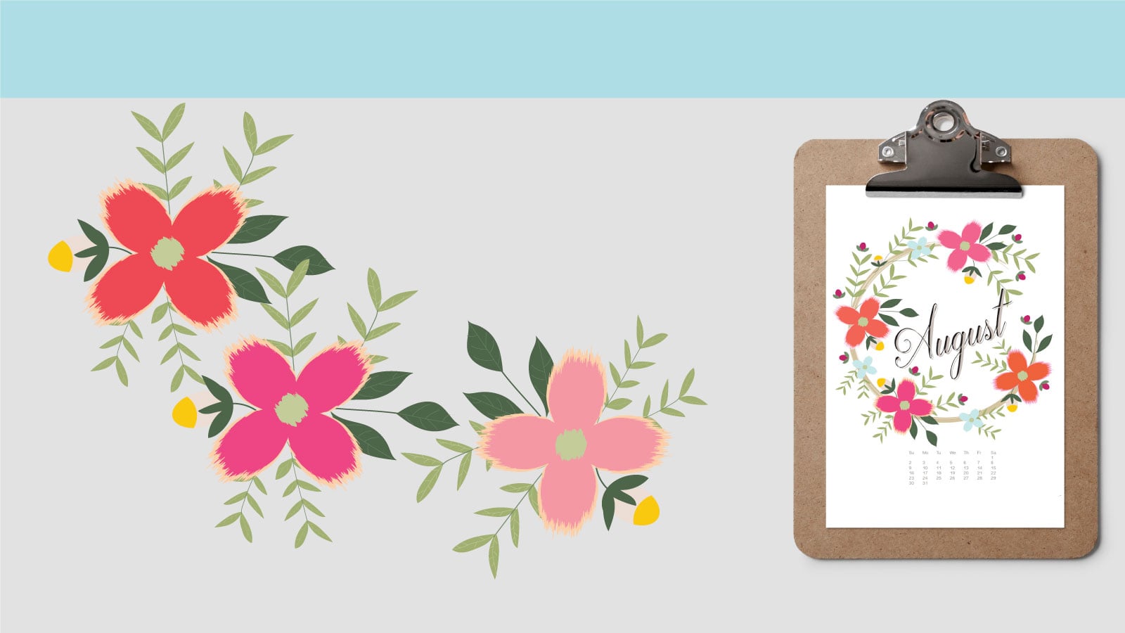
4. Color: Another thing we'd like us to explore is color mood boards. If you go to Pinterest or if you choose to google images you'll find, a lot of color inspiration. You can go into there and search for a specific color palette, or you can search for a specific color. So if you want pinks and navies, you can search in Pinterest for pink and navy color palette, and you'll be able to come up with a bunch of ideas on how these colors have been used, whether in floral arrangements or in other designs. So here's one that I found. I searched for springtime color and I found a lot of these palettes that are similar. I like these softer colors, and I do like that there is a purple orange in there, so that brings a little bit of a lighter, bolder color in there. I like that there's softness in the other ones and how they all compliment each other. So you'll see that in Pinterest you will find color palette already made like this, and we can bring these into Illustrator in order to create our own palette. Here's another one that I found under the same spring summer theme and it has the same, it has that minty color, it has the red color and I already have in mind that my character is going to be a girl. So these colors will complement my character beautifully. Here's another picture, it's not a color palette per say, but it's a wide array of colors that all work together, and I can use this photograph to create my color palette as well. Here's another one that I found super cute. The colors are a little bit bolder, but I like how they all look when they're together. So if I bring this into Illustrator, I'll be able to take up maybe the purple with that aqua color together, I may be able to use the combination of the orange with the purple on the upper left-hand corner, and I'll be able to create my own unique color palette as well. So once you draw inspiration of what colors you're looking for, you can narrow them down to just one or two color palettes, and then once we bring it into Illustrator, we really only need around six to eight colors the most. After that it starts to get overwhelming. So go out, find your color inspiration and meet me here.
5. Creating your final moodboard: So now that we've gone out and sourced for images for inspiration, we've looked at color palettes, we've studied some facial expression, we're not going to create a final mood board. So we've gone out and we've narrowed down, let's say you found 10-15 different images, we're going to narrow it down to just a few, just to give our mood of what images we're looking for. So as you can see, miner all these basic shapes, I like that, it's this software palette just going all in there and I like the facial expressions, I like the way this feels light and airy to me and this is the mood that I will be going for. As far as color pallets, you can narrow that down too, you may have found six to eight different ones, I searched for springtime color palette and I got so many and so many caught my eye. But this is really one that I really liked, then my facial expressions, I like that I can use this as a reference. Once I create my character and I put the facial expression, I may decide, well, no, it's a little happier than that or it's maybe it's just a bit more, I don't want it to have all that expression, so we can explore that as well. So now what I do with my mood board is I have all these pieces, I print them out and I keep them in front of me as reference. This way I know what mood I was going for, I know what color palette I was striving to get and I know what facial expressions I wanted to use as reference. So once you have all of that, we can then get to work. So in the next lesson, we're going to start off with illustrator, so fire up your computers and meet me there.
6. Artboard and Tools : Now we're going to get started. Once we open up Illustrator, you'll see that there's going to be several commands here on the top toolbar. We're going to go into "File" and click on "New" and that's going to bring us to a sub-menu. Here it's titled New Document. We're going to re-title this My Character. Then we're going to scroll down to here and you'll see there will be custom presets already in place here, so we're going to select letter. If you'd also like to work on a different project, let's say in a five by seven, you can go in here and type in the exact measurements that you'd like. For now we're going to leave it at letter. I just want to point out here too, that you can change the orientation for purposes of this wall art that we are creating. We are going to be printing it out in a letter-sized paper and trimming it to an eight by ten. But the orientation will be portrait. We can change it to landscape, and it'll automatically change the measurements in here. For now we'll just leave that at portrait. As far as the color modes go, CMYK is fine. If you were working on a web project, you'd select RGB, but for printing, we are gonna use CMYK. The raster effects we are going to leave at high at three ppi. For now, this is all that you'll need to know just to get started. Go ahead and click "OK". Once it's opened up, you'll see that our artboard now is in an eight-and-a-half by 11 format. Now we're just going to go over a few of our key tools that we're gonna be using for this class. If you go over here to the left-hand side, you're gonna see the Selection tool. The selection tool is what we'll use to pick on objects that are on the artboard. Then you'll scroll down and you'll see here the Pen tool. We'll be using that one to transform some of our objects. The Type tool is another tool that we'll be using as well to create our text. Then here you'll see I have the Ellipse tool. In any of these tools, when you hover over them, you'll see that there is a small white triangle to the bottom right-hand corner. If you select this, it'll give you a pop-up menu of other options. I can select Rectangle, Rounded Rectangle, Ellipse, the Polygon tool, the Star tool or the Flare tool and then you'll see it change in here. We're also going to be exploring the Pencil tool. The Eraser tool come in handy as well. If you go down here, you'll see the Eyedropper tool, and we're going to be using that to select our colors. This is our color picker. If you go to this side of the art board, you'll see that I have the Swatches palette open. These are all preset to my taste. These are most of the common tools that I like to use. But if when you fire up your illustrator, these are not here or any of these are not in place, you can always go to "Window", and then here you'll see everything that you can use and place on your board. These are all your options. We're going to be opening "Transform". We're going to use this to transform some of our objects. Transform you'll see that there's also other tabs like Align and Pathfinder that are associated with it. We will be leaving this open. We will be using that. We're also going to be using color. As you can see here in our color palette, in our color selector, this is the front color and this is the fill color, and this is the stroke color. If we select, let's say we want to make this yellow, the outline then is in black, as you can see here. Our fill color will be this one. Our stroke color will be this one, and you can select no stroke if you want as well. Then it'll just show a white square with a red line through it. We're also going to be using our Swatches palette. The Swatches palette comes pre-loaded with a lot of these colors, but I'm going to show you how to create your own unique color palette from the color palettes that you sourced out earlier. In here you'll see, if you quit these arrows, I can put this away if I'm not using them for now, and if I wanted to use, let's say this color, I can click on it and that will pop out. I like to put things away. It keeps my workspace a little clean and I can choose as I want. Later on, whatever tools I need to use, I'll just pop them out at once. This way I don't have all these distractions on my board. Follow me to the next lesson where we're going to start to explore our basic shapes.
7. Basic Shapes : Now we're going to begin by exploring our basic shapes. If you go here into this toolbar, we're going to go back to where we found the basic shapes. I'm going to click on here, and you'll see this pop out, and I'm going to select the rectangle tool. I'm going to go here and change my fill color to a color that you can see better. I'm going to take the stroke off. Now I'm going to just click and drag. If I drag long down, you'll get a longer track rectangle. If I go this way and click and drag to the right, I'll get a longer, wider rectangle. If I hold down "Shift" on my keyboard, and then click and drag, I'll get a perfectly proportioned square. Although this is a rectangle tool within it, it's also the square tool. Again, if I hold down "Shift" and I drag, it'll give me a perfectly proportioned square every time. The same thing goes with the ellipse tool. Let's select that one now. I'm going to change that color to red just so it'll look different, and I'm going to click and drag. Here I have a somewhat proportion circle. If I click and drag down, I can get an oval. I can click and drag to the right, I can get a sideways oval. If I hold down the "Shift" key and then drag, I will get a perfectly proportioned circle each time. Let's keep the circle for purposes of this demonstration. There is also the rounded rectangle tool. Once I drag that one out, you'll see it has rounded edges. Let's change the color of that just so you can see, it has these rounded edges. But here's a neat trick. If you're using Adobe Illustrator in one of its newer versions, they came up with this other option. As you can see, once I click on this square, I have these little squares that are outlining the entire object. If I hover over one of the corners, I get this two-sided arrow. If I click and drag, I can change the proportions of my square. If I pull on this center one, it's an up and down, it'll change the height of my square. If I hover over a corner and I get this arc with two double ended arrows, that will rotate my objects, as you can see. The newest tool that we have found in Illustrator is these circles within the shape. If I hover over it, you'll see there's a little arc that pops up. If I pull this down, it starts to round off my edges. I can pull it down all the way to a circle. It's similar to this shape. I can go back and expand it if I'd like, back into a rounded square. It's just a different option. You can either use this one or you can, with the existing shape you have, just alter it as well. Now we're going to go and we're going to explore a few more. We're going to use some compilation of a couple of these shapes to create secondary shapes. Now I'm going to go into here and select the ellipse tool. I'm going to click and drag, and now I have a circle. Do you remember that little Q-cloud that we found on my Pinterest search, I'm going to try to create a cloud. I saw that it was from just basic shapes. So it was just all circles put together. Now I clicked and dragged and I created this circle. I'm going to click and drag just over it. Sorry. I'm going to click and drag just over it, and create another circle. I'm going to put one here, and I'm going to add one here. I'll add one here. Maybe I even want a small one here. As you can see, I just created a Q little cloud. But as you can also see, these are all separate shapes. I want to create this into just one symbol shape, and meld all of these shapes together. While my selection tool is selected, I'm going to click here and drag down and let go. When I let go, all of the shapes are selected at once. I'm going to go into this pathfinder, and I'm going to select the first shape mode called unite. Click on that, and now I have just a solid symbol shape. I can do the same now to create a flower. I can click and drag while selecting the ellipse tool. I can click and drag right around here. I can click and drag another circle here. I could probably put another one here. Now using the selection tool, I can bring these closer together. If I want, I could have done it right on top of it. I can say, well, wait a minute, I want another petal. Let's just move this one over and now create another petal. I'm going to select my ellipse tool one more time, and maybe another petal leaves here. Then you can play around with it. In the selection tool, you can maybe move some of these in, and don't worry about this space in the center. We're going do the same thing. We'll click here, and we'll drag, that selects them all. We're going go to the pathfinder, shape mode, unite, and that will unite our petals together. We're now going to select a different color. Using the same ellipse tool, we're going to click and drag, and there is the center of our flower. You can reposition it as you like. We're now going to go and create the stem. We'll go to this line segment tool. Now the line segment tool, if you just drag it, It's like a wobbly line. It's very hard to get it straight, but the best way to work with it is to try and click your starting point, hold down the "Shift" and drag, and that will give you a perfectly straight line each time. Right now it has no color, so I'm going to select this, to make this a nice green. If I go up here, I can change the stroke of it because when I click away, you'll see it's just a very thin stem. I can select it and then go up here to stroke, and change that, maybe make that a little thicker. If stroke is not found up here on your toolbar, it's also here. You can go into stroke and change the weight of it here, or you can go into Window and select stroke, and open it up that way as well. As you can see, my stem is actually living in front of my petals, which is not really found in nature. We're going to select this, and we're going to send it to the back. We're going to go to object, transform. I'm sorry, object, arrange and then send to the back. That now brings it to the back. Now you have a flower. I also want to show you, everything is using basic shapes of the pre-made shapes that we find here. But you can also do some free transforming yourself. If we select the pencil tool here, I'm going to select a different green. If I go here now and I want to create a leaf, I can click, drag and then drag back down again, and that gives me a cute little leaf. If you're not comfortable with Free Transform, you could always stick just to your basic shapes and build them that way, but sometimes it's nice just to add a different flair, so you can do that as well. I just want to show you one more thing. Just while we're here in this flower, I want to show you that you can. I'm going to object ungroup it. I mean, I'm sorry, I'm going to group it, because right now they're are two separate elements, although we melted all of the petals together, this center is actually on its own. If I were to move this, the center will not be moving with it. I can select them both and go to object, group. If I then wanted to make a change, let's say the color of the petals, I can't do it while they're both selected because this is what will happen, it'll change them both at once. I'd have to select it again, hit "Object", "Ungroup". Now I can select just the petals, and change the color there. I want to show you another neat trick. If you select the petals, and just want to give it a little bit of a dimension, we can go into here, into stroke, and I'm going to click show options just because I want to see the other options. Now I'm going to click "Dashed Line." I'm going to select 5, 5, 5 as the gap. Then I'm going to go back to the swatches color palette, because I want to see it in a different color. As you can see, it added these tiny lines, dotted lines to the outside of my petal. I can go back into stroke and make it a little thicker, so you can see that as well. That's just a different way to give your artwork a little dimension. I can do it to the leaf as well. I can select it. I can go here into the stroke, it's set at three. I want that in a dashed line. If I find that that's way too spaced out, then I can go into here and change it from two to two to two, and that still makes a dash but not as dashed real road looking as the petals. There you go. That's just a couple of unique things that we can do. I also want to show you here in the cloud. We can select it, hit "Edit", "Copy", and we're going to hit "Edit", "Paste in Front", and then we're going to object, transform, scale. We're going to scale it just 90 percent, and click "Okay." You'll now see that there's a smaller cloud within that cloud. Let's change the color just so you can see that. There we go. If I select the inside cloud, I can go to stroke, I can add the same thing, change the weight to two, change it to a dashed line, two by two is fine, and now I have that. I can also select it, go back into my color and instead of a black line, I can make this a white line and that gives it a much softer look. There you have it, just by using basic shapes, I'm able to create secondary shapes. If you just let your imagination roll, you'll see that everything really starts with the basic shape that we can transform into a secondary shape. I'll see you in the next lesson.
8. Color Palette : We're now going to begin exploring our color palette. When we sourced out for our colors, we saved our images that we found. If you save one of them, the ones that you want or several one of them that you want to the desktop, you'll be able to access them and import them into Illustrator. So I'm going to go into File, Open to find my file that I downloaded, my picture and it's here, the one with the paint brush. I'm going to click Open, and here it is. It actually opened up in a different window. So it's selected and you can tell when it's selected, when those squares have been highlighted. So if I click away, you'll see it's not selected. If I click on it, now you'll see it's selected. I can go to Edit, Copy. Close this window. Here's my character, my character art board. I'm going to edit, paste, and it's going to paste it right here near my art board. I'm just going to move it to the side using the direct selection tool. I'm going to move it to the side. I just don't want it that big. I want to be able to scale it down. So I'm going to go to the corner here, hold down my Shift so I can scale it down proportionately. So now we're going to go to the art board and we're going to select any one of these shapes. I happen to have the Ellipse tool already open, so I'm going to select the ellipse and I'm going to create a series of shapes. They don't have to be perfect, they don't have to be the same size. One can be bigger, one can be smaller, it doesn't really matter. I just want to be able to create a color palette of six colors. That's what I want for my project, 6-8 colors is fine. So I can select two more and now we'll have eight. All of them are now blue. Now, I'm going to select the first one to add one of these unique colors to. So I'm going to select it, and we're going to go here to this Eyedropper tool and select that. You click Select Eyedropper and now you see a little eyedropper shows up. Now, because this is still selected, if I go here and pick up this color, it will add it to my circle here. I can then go back to the direct select tool, unclick it. I'd have to click my next one and repeat the process. Eyedropper tool and go to the next color that I want to select. Select the next one, Eyedropper tool. I like this yellow to be added. I'm going to then add this, I like this minty color. I'm going to go here and select maybe this peach. Then I actually like this color here. On the lighter side, maybe this darker blue. If I click around, you'll see because it's not an actual flat color, it'll give me different hues within there because it is a photograph, so you can just click around until you get the color that it is that you want. To me that's a little too similar to this one, no matter where I clicked and then it gets too dark. So maybe I'll just forgo one and not even use that one. I'll go to this one instead. Then for the last one, I'm going to go to this really light mint. There you have it. So now I have my color palette that I was inspired by this picture. So I'm going to select this, delete it, I no longer need that. I'm going to go to the corner here, click and drag to select them all. Here in my color palette, I'm going to go to this folder. So I'm going to select this folder. I'm going to name this My Character Palette. I'm going to click Okay. As you can see, it's from the selected artwork that it's going to create the color palette. So I'm going to click Okay, and it showed up here. So all of these colors are now represented here for me to select from. If by chance, when you do that, you don't see these folders here, you can go into here and click Show All Swatches, because sometimes this is minimized and all you'll get is up to here. Make sure this is dragged down enough so you can see everything that's represented in this box. But if even doing that you do not see any of these folders here after you did that step, you can go here, select Show All Swatches, and then it'll show up. So now you can see, for the purposes of what I'm doing here, I will not be using this primary color group swatch. I don't need that. I do sometimes like to leave these in here. You can delete all of these if you want. Usually you leave black and white just because you need that. If you select the first one and then quick Shift, and click on the last one, I won't be using any of these. So I can take that off, and there you have it. So this is my color palette that I'm going to be using for my character. It's quite simple. You can use just one or two photographs. You don't have to use everything that you sourced out. You can just select one or two of them, and within both of them, you may find your six or eight colors to select from. So for now, this is what I'm going to be using as my color palette. So in the next lesson, we're going to start creating our character.
9. Head: So now we're going to begin building our character. We're going to go here to the ellipse tool, and we're going to select it. Now, the shape of the head is really a matter of preference. I usually have characters that have a little bit of a football head, an oblong shape. If you prefer to have a perfectly round head, that's really all a matter of preference. I'm going to begin by dragging this shape into the desired shape of the head that I want. Right now I have the black selected. But if you go into here, into your swatches palette, you're going to see that there is a lot of preloaded swatches that are available to you. So you go down to open swatch library and I'm going to scroll down to where it says skin tones, and illustrated a pretty great job at putting together a wide variety of skin tones for you to select from. So we have from fair to a bit more medium complexion to a dark complexion. It's really a lot of beautiful, rich tones that you can select from. For purposes of my character, I'm just going to use this lighter tone just so I'm able to show you a contrast with other elements. So here I have the head. Now for now, don't worry about placement on your wall art. This is going to be your finished piece. You may find that this character is just a little too big. I find it easier to work and then scale it down. So don't worry about the size at this point. We're going to scale it down as we go. Now we're going to do the ears. We're going to select the ellipse again. For the ears, I don't want an odd shape, I want perfectly round the ears. So I am going to hold down Shift and I'm going to drag, just like that. Now for me that's a little too high and maybe a little too sticking out there. So I'm going to drag it down a little bit. That's perfect for me. Now, I want the ears to be the same exact size. You can either select and go to edit, copy and then edit, paste and it'll give you a second ear. Or you can select it and while you're holding down the option key, you can click on it and drag and that'll give you a second ear as well. Just want to pull this in a little bit and you can use your arrow keys on your keyboard to show me things, left and right as well. As I stated before, I like to work cleanly. When I select this, you'll see that it's three different circles. I'm going to actually unite them by going to pathfinder, shape modes, unite. Now I have a cute little head. This ear may be sticking out a little bit so I can do Control Z and move it in a little bit, that it's like my edit undo and then try it again. Perfect. Now I have the cutest little head. Now we're going to draw the hair and this is where there's a neat little trick hidden in Illustrator. I'm going to show you here on this palette where we're now currently drawing in normal. We're going to change that to, first we have to select the head, because what we want to do is draw inside. With the head selected, we're going to go into the last one to the right called draw inside. You'll see that you'll get these little dotted line brackets that pop up. I'm going to click anywhere on the art board so I deselect because I don't want to draw just anywhere. I'm not going to select the ellipse again, and what we're drawing is the hair. For purposes of my character, I want the hair to be black. But in the same skin tones, there are pretty auburn that you can select and see inner colors. You can select a yellow, you can select whatever color you feel that your character should have. I for purposes of my character, I want the hair to be black. Now I'm going to hover just above the head and Illustrator is telling me, look Shelley, this green line means this is the center of the head. That's exactly where I want to be positioned. Just by hovering over, the cross hairs will be at the center of the head here. I'm going to hold down Shift. Remember we have the ellipse tool selected here. I'm going to hold down Shift, and I'm going to click and drag to just above the ear and let go, and as you can see, that gave me half of a bang. I'm going to repeat the process, but this time I'm going to start on this side just to show you, and I'm going to click and drag here as well. Now, if I were drawing a boy, this is like a nice little part to the middle. If I don't like the way that's situated, I can always edit, undo and start all over again, or Command Z and start all over again. Let's say I wanted it actually in the center there, I'm going to shimmy this a little bit. I'm going to go there and with the direct selection tool, I can actually click and drag it as you can see. Now it's totally complete, our bangs. Now here's the one little quirk that I find in this drawing inside. If I now go back to my normal drawing, Illustrator is saying, all I see here is a head because we drew this within a shape. If I now said, I don't want the black, I really want my character to be a blonde color. I can't select this and add a color because it's going to add it to the head. That's all that Illustrator is actually identifying here. In order to make any changes, I have to go into my layers palette. You'll see here, that there's a mini little drawing represented here in layer 1 of my drawing. I'm going to click the arrow down and you'll see that there's a clipping mask, which is what we did when we drew inside. Then I'm going to actually select one of the circles because these are actually circles that we made. So I'm going to select here, first I have to select the character. Then I'm going to select this blue dot here next to one other circles. Now I'm able to change that. Let's say I want that to be blond. See, and the same thing will happen with the next one. I want that one to be blonde, and now I have a blonde character. It's very simple. It's just a little bit of a quirk that it doesn't allow me just to click and select it the way you want. I'm actually going to go back and repeat this one more time. I'm going to make my bangs black. I'm going to go back, change the other one to black, and there you have it. Now we're going to build the eyes. I decided that although I did all those facial expressions sourcing, I really want my eyes just to be black eyes and a simple mouth. So I'm going to hold and drag and just create a simple eye. I do want the eyes to be symmetrical. So I'm going to copy and edit, paste in front, and then I'm going to drag it, and there we go. Now we have eyes. Now for the mouth, there's several things that we can do. We can go here to where the line segment tool is and select the arc tool. We don't want the fill to be that we actually want the stroke to be somewhat of a rosy color. I'm going to pick and holding down Shift, I'm going to drag and that gives me a little mouth. I can go here and rotate it. I can position it and then I can drag if I want, just a little mouth, I don't know, I had to talk lower but a little mouth and that's pretty much it. It may be too fine of a line. I can go here to my stroke and make it a little bit darker. There you go, cute little character is well on its way. There you have it. That's the head. In the next lesson, we're going to move into the body.
10. Body: Now, we're going to start on the body. What we're first going to do is go here and pick out the Rectangle Tool. I'm going to just click and drag because I'm trying to figure out some type of shirt. Now my character is a girl, so I'm actually going to convert this into a blouse eventually, but I just really want to show you first a shirt. We have this, so I have that size, that's the size that I want, I may want to make it a little smaller, it all depends when I put the body together. I'm going to go grab the Ellipse Tool, and just put a small ellipse here for the cut-out of the shirt. I'm going to select both of these, and I'm going to go into Pathfinders, Shape Modes and this second one is called Minus Front, so I'm going to click on that, and that gives me a cut out for the shirt. Perfect. It is a little large, I want a little bit more rectangular in shape, so that'll be fine there. I'm actually going to send the shirt to the back, Object, Arrange, Send to the Back, because the head I want it to be ultimately what's in the front there. That's just a boy shirt as you can see. Now, you can see there's a little white part there that we actually want it to be flesh colored. I'm going to select the Ellipse Tool, and I'm just going to drag to where I know it'll cover that. I'm going to select the same color and I'm going to go Object, Arrange, Send to the Back, and this is like a little bit of a cheating method there, but I just want you to be able to, without getting too caught up in these different shapes and I don't want you to get too complex. But now as you can see, because it's the same skin tone as the head, it looks like a chin. I'm actually going to select it and make it a little bit of a darker color to just symbolize that it's like a shadow that the head is placing there. I can go into here and select one of these other ones, or I can stay within the same one and then click here for my Color Guide, and then go into a darker one of the same shade. That may be too dark. That may be too dark. That's just slightly darker. That may be too dark for me as well, so I can go here into Color and I can use the sliders and just select the exact hue that it is that I want for my character, just to have a little bit of a difference there. Perfect. Now, I'm going to go and build the pants. The pants, we can use the same thing, the Rectangle Tool. Let's go back into our colors. I'm going to select something else. I don't really have boy colors here, so I'm going to select the pants. I'm going to do Object, Arrange, Sent to the Back. Here is where we can use this Pen tool. I can actually click here in the center, and then click here, and it'll give me this triangle shape. I can now click here, and as you can see, it gave me like an upside down triangle. Now if I Edit, Copy, Edit, Paste in Front, I now have these two triangle shapes. This is one way of building legs, we can also just go with the standard two legs like this, so Edit, Copy, Edit, Paste in the Back. Now we have two legs, we can keep them almost completely together, just slightly apart. We'll arrange and send that to the back and these could be our legs. It'll all come together when we add shoes. We can go back here to the Ellipse tool, I'll give him some black shoes. I'm just going to click and drag to the end there. Those are his shoes. I'm going to Option click, give him a second pair of shoes, as you can see. Now I'm seeing, well, maybe this shirt is just a little too high, so I can make that a little shorter. There we go. You can also decide that maybe the legs are too wide, we can make the legs a little thinner, we can make the legs a little shorter. I mean, you really can just play around with this to your taste. Let's make these shoes a little smaller because if not he has clown feet. Perfect. This is our boy character, but I'm working on a girl, so I'm just going to start from scratch and I'm going to go back to build the dress. This is still a girl. It could be used for a boy, and it could be used for a girl, and we'll add other elements to make her more feminine. But I'm going to now go into the Rectangle Tool one more time and I'm going to select it and drag. Now, I'm going to go to the Pen tool and I'm going to select an Anchor Tool here, I can put one here and one here. Now, every time I drop an anchor point, and then I click here, it'll just delete itself to the next anchor point. See, I'm going to quick here, it deleted itself to the next anchor point. That's a pretty nice dress shape. I can try it again, I'll show you again one more time, a little slower, just so you can see. I'm going to click and drag the rectangle. That's more a little bit of a square actually. Center it. Then we're going to go to the Pen tool and I'm going to, right in the center here, add an anchor point. Select this first. I'm going to add an anchor point in the center here I'll add one to the midway point of these two and the midway point of those two. Now I'm going to click on this first one and it's going to trim itself to this one. Click, and this one we want to click. Now, we have our dress shape. It is a little skewed because I didn't use exact measurements, but that's okay. I don't like my drawings to be exact anyway. You can use rulers, under Windows, you can go into Rulers and select that, and then you'll get exact measurements. But for purposes of what we're doing today, we don't have to be that exact, it makes it all that more unique. We're going to do the cut-out here for the dress. I added the Ellipse tool, I'm going to go into Pathfinder, Shape Modes, Minus Front, and here's our dress shape. We're going to add this to the back. Center it a little bit. Like I said, we're going to cheat a little bit here, we're going to add a shape to here just to cover up, Object, Arrange, Send to the Back. We're going to make this into some darker than the flesh tone there a little bit just so we can create that shadow. Perfect. I actually want to make her dress just a little shorter. Perfect. Now, we're going to work on her legs. I'm going to pick a different color for that. These will be her legs, her pants actually. We're going to go back to the Pen Tool, we're going to add an anchor point there and then I'm going to click here and that'll give me that shape that I was looking for there. I can actually trim it even here on this side a little bit, and there you go. I'm going to Option click so I can create a copy of it. I can overlap it enough. I don't have to make two actual separate legs like that. Let's Object, Arrange, Send to the Back. There you go. Now I have a pair of pants. I can add an outline to it just so you can see. There we go. I can also show you one more method. If we do the rectangle tool, let's take off this stroke. Go back to the pen tool and then I'm going to click here and here and I really want to make this very small. Now, these could be her legs together, actually, can make it a little wider if I want. If I take my line segment tool and let's change the stroke on this. Let's make this color just a little dark on the spectrum there just so it'll show up against the pants and if I now click and drag, it's, actually, like a pair of pants. I'm going to send this object arrange sent to the back. Only using one tool, I managed to make one shape, I managed to make the set of legs. Now, I'm going to go and add her shoes. Her shoes are, actually, going to be, I'd like them to be in this. Let's see. We can do it in this blue color. Point and click and drag, just a pair of shoes, nothing fancy. Option quick enduring bring this down, center it. Perfect. So those are her shoes. Perfect. Now, we're going to add the arms. Now, arms can be really complex and when you're first starting off, arms can be a real problem. We can do arms like this, we can draw them this way where we're building the shape in this sense and then we'd have to build a second shape this way and we can join them here and it just gets really complex with arms until you've really mastered them. I can go here now with the pencil tool and just round them out a bit. Until you really get really comfortable with them, I don't want to just make you crazy about it, we're just going to use the Arc tool for purposes of this assignment. Let's click and drag. Our stroke color is going to be the same color as our skin tone that we selected and I'm just going to put this in position here and we're going to change the stroke. Pretty big but as thick as you want, it's really up to you, matter of preference, we can make them a little longer, I can turn it in a little bit here and then I'm going to object arrange sent to the back just so I can see because I'm not going to be drawing hands for purposes of this assignment I just want to be able to have the illusion of arms. Perfect. Don't worry about this up here because we're going to be adding a little sleeve cap there. I'm going to option quick and copy that arm and then we're going to go to object, transform, reflects and it's already preset on mine for 90 degrees, that's fine if it's not choose add 90 degrees to that and we're going to hit "Okay". I'm going to move that into place. We can tilt this one a little bit, they don't have to be perfectly the same. Perfect. Here we have our arms, I just want to move this one in a little bit, because I don't want that square bottom showing there, we're going to fix that with the sleeve cap in just a second. Perfect. Now, we could have built this with circles too. As you can see, these could have been just circles hidden back here the way we did the neck here, so it's really just a matter of preference. I just want to show you a couple of different ways to build this body. Now, I'm going to go and build some sleeve caps and I'm just going to click and drag. Our stroke is set really, really high because that's what we set at and I'm going to select the same colors, as the dress. Just going to turn it slightly here. I'm just going to turn it slightly just to get a more precise placement, I'm going to move it with the arrow keys. We just turned a little bit this way and we can use this to make the sleeves a little rounder. Remember, those circles that I showed you that are within here, we're just going to click on one of them, drag and that'll give us more of a rounded shape. that looks pretty good to me. I'm going to copy. I'll option click this and that could be one of the things that's very cumbersome sometimes if you really have to find a place where to click if needed starts to alter your shape. Just like that. You do always have the option of object. I mean, edit, copy, edit, paste in front and we're going to object transform reflect it because we're going to, actually, move it to the other side. Let's just use the arrow keys because sometimes it just doesn't want to play nice. Let's just drag along with the arrow keys. I just want you to get a sense of exactly how to manipulate the shapes and once you start seeing things through your own way and you'll say, "Well, I like this element, I don't like that element, this one works better for me, this is more a my style," then you'll be able to create your own unique pieces of clothing, your own unique hair. It'll just work perfectly for you. So that came out pretty good. I don't know about this line here it's bothering me, I think I want that to be white. that worked a little better. right now, I like the way she looks, I don't like her hair so we're going to add another element just so we can make her look a little bit more feminine and I'll show you that in the next lesson.
11. Design Elements : Now we're going to go ahead and add a couple of design elements. We're just going to do a little tweaking here and there to fine tune the character. I'm going to add a flower to her hair just to give her a little feminine touch. Just like we created the flower when we learned our basic shapes, I'm just going to do this real quick here. You can see, I think I want to use a much darker orange just for contrast there. So I'm going to use the sliders and make this just a little bit more orange. I'm going to click and drag my ellipse, click and drag, click and drag. That's pretty much a five petaled flower. I'm just going to zoom in so you guys can see what I'm working on here. That's pretty much what I'm looking for. You can make this one a little bigger and this one a little bigger. All right. That's a pretty good flower. I'm going to unite the shape. Let's zoom out again to where we have to go here, zoom in. Now we're going to pick our center for our shape. I'll click and drag there as well, select this yellow. I actually like that. We're going to group the object. If we have to ever move it, it's at least in one piece. There you go. I like her already. Now I'm going to give her some longer hair. Right now, it gives the illusion that she has maybe a ponytail in the back or a braid in the back. I'm just going to show you a couple of different options. Remember when we created the leaf, when we built our flower in our basic shapes lesson, we're going to do the same thing here to create a ponytail. If you go to the pencil tool, you just click and drag and draw it, and then select our fill. Then we're going to arrange it and send it to the back. That's a very pronounced ponytail, so we can try something that's not as extreme. We can go this way, and then this way. I'm going to send that to the back, I want to create that. See that is an option, edit, copy. Let's create one on the other side. Edit, paste in the front. Object transform, reflect. We hit "Enter" and we'll slide it over to the other side. There you go. Now she's got pigtails. I also have another option here. We could give her really long hair. We can start from here, go this way, object, arrange, sent to the back. That gives the illusion that she does have this long hair flowing in the back. I think what I'm really going to do for mine is, I want a braid that comes up the front here. Using the pencil line with the black as my fill, I'm going to just draw these rounded half circles. Then I'm going to bring a line straight up. I'll tell you why in just a second. Now I have like these scallops circles on this end. I can actually fix this if you go back, if there's anything you don't like, if you go over it again, the pencil tool is very forgiving. It'll let you make corrections just like that on a whim. I'm going to make the fill color black. Then I want this to be completely symmetrical. I'm going to select it, then I'm going to go to edit, copy, edit, paste in the front, and then object, transform, reflect. That's going to give me a second copy facing the other way. I'm just going to move it. There we go. I don't like the way this one turned out. It's too big. I wanted to be this perfect braid. So let's just make that a little smaller there and maybe this even little smaller there. Now we can do edit, copy, edit, paste in front, object, transform, reflect, hit "Okay," slide it over. Perfect. I like the way that looks. Now I'm going to select them both, unite them. There I have a nice little braid. I can actually go back with the pencil and give this some shape like this. Now she has a different shape to her braid. Perfect. Now let's just scale this a little bit because I don't want her to have this really super long braid. That's a long enough braid. It obviously has to be in the back, so I have to select everything here and then go object, arrange, send to the back. Now her braid is in the back. I'm just going to give her a little bow tie off her braid there. I'm going to click and drag my rectangle tool. That gives me a perfect square. I want something to be little on the brighter side. I'm going to choose yellow. Maybe I'll go with one of these blues. Yeah, that'll be better. Then I'm going to use the pencil to eliminate the one side. I just clicked on the one corner there. This is half of my bow. I'm going to option, click it or edit, copy, edit, paste, object, transform, reflect. That's going to give me a little bit of a bow. I can group them, unite my shapes, and put them here. Once it's here, you can scale it. You can give her, it doesn't have to be a big bow, it could be just a little bow, but it's just to add a different element. You can even drag it if you want it to be just a bigger bow, not a square. There you have it. In the next lesson, we are going to explore patterns.
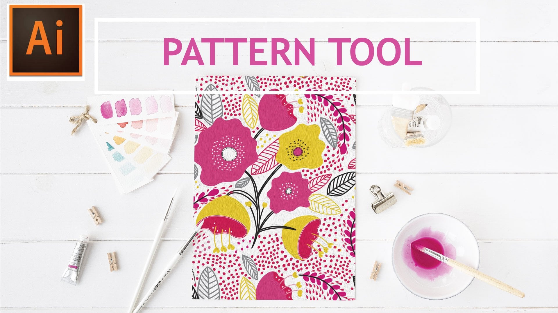
12. Patterns: Now we're going to explore patterns. I'll just teach you how to build simple patterns that we can apply to this project, and then from then on you can explore patterns on Pinterest or all over the web you can find tutorials on how to make patterns that'll be more intricate than what we'll be working on today. I'm going to start off with a simple pattern shape. In order to do that, Adobe recognizes that in these swatches palettes, it recognizes everything as a square. We have to build our pattern within this square, and that's really the easiest way to build the pattern for starters. I'm going to just go here off the art board for a minute and I'm going to hold it down while dragging and I'm going to create a perfect square. It doesn't matter what size, it just has to be a perfect square. Now that I have my square, my pattern has to fit within this. I'm going to make a pattern of this flower because I like the way it looks and it has that bubbly look. I'm going to position one right here in the corner, as you can see, it's now behind my square. I need my square to be behind it. I'm going to go to Object, Arrange, send to the back. There you have it. I'm going to take this flower and I'm going to actually make it just a little bit bigger there. Then I'm going to option click or object copy paste and I'm going to add another one here. You can guide that they're both equidistant if you line up the same space on the side here and the same space on the side here. Now that I have both of these selected, I know that this would be way too big for me to apply it to this dress. The flowers would just get lost. I'm going to grab the corner, and while holding Shift I'm going to just scale it down a bit. While you have it selected, you can go to Object, Transform, Scale and actually put in dimensions of 50 percent or 75 percent or 90 percent. For purposes of what we're doing, I'm just going to take now and add it to our swatches palette to create our pattern. I'm just going to select it all and I'm going to drag it in here, and as you can see it showed up right up here. New patterns swatch number 1. I'm going to click on the dress and instead of using this orange as my fill, I want this pattern to be my fill. There you have it. It's actually clashing with the bowl, so I think I'm going to change this background pattern to something else. I'm going to select this here again. Maybe I'll give it this light peach. I'll select them all, I'll drag it in and now I have a second swatch pattern. I'll click on the dress, I'll apply the pattern. Perfect. I think now it looks too much like the skin tone. As you can see, we can play around with this for a long time and we can try to figure out what it is exactly that we want to do. But this to me is the fun part, figuring out our colors, figuring out what works, what doesn't work. I think I'm going to make the background white. Now, let's apply. I like that. I actually think the pattern will be better suited if I make it a little bit smaller. There. I like that a lot. I'm going to apply the pattern to the sleeves as well. Perfect. She's coming right along. Now, I don't know if I like her tights the way they are or her pants, so I'm going to make her some striped pants. A striped pattern is very easy to make. I'm going to click and drag and then I'm going to copy and paste or option click and drag. Now, I have a second line here. I actually like those two colors together. Now, if I select them both, do you see how they're just off centered? If I select them both and I go to here align and I'm going to go to the center one, horizontal align center. It actually aligns them perfectly for me. I want the stripes to be just a little bit thinner for the pants. I think that may work, and if not we can play around and now the color when I made it thinner doesn't really look like there's enough contrast. Let's try to go with that color instead. Let's click and drag, and let's apply it to the pants. That actually came out pretty cute. I'm thinking that this blue needs to be a much sharper blue. Let's just add a little bit more pop there. Maybe a little bit more blue-green there. She's coming along nicely. As you can see, patterns are very simple. You just have to be able to click and drag into a square and your elements have to remain within there, the same exact way you can make polka dots. Let's just click and drag, let's change the color element in here. We're going to click and drag. We're going to position this to one corner. Option click, make a copy of it, position into that corner. I'm going to make this really small. Drag it into our palette and now let's see. The pants look funky in that too. I can make it even smaller and now she has a really detailed pattern for her pants. I like that one, but it clashes with the flowers, so I'm going to go back to the stripes. As you can see, patterns are not that difficult. It's just a matter of preference whether you like a bigger pattern or a smaller pattern, and you could just play around with this. Illustrator does have a built-in pattern maker. It does get a bit more complex and I can quickly show you how that works. If I take a circle in a solid color and I now make a copy of it and click here, and click here, and click here and let's say I click there. Now, I say, well Illustrator, I'd like you to make a pattern out of these shapes that I've come up with. So I have to go to Object, Pattern, Make. Instantly, illustrator is going to do this. It's going to put patterns in a grid, or it can go brick by brick, or it can go hex by column, or it can go brick by column. It really all depends and you'd have to really play around with it and that's something that in your spare time you can try to play around and learn the ins and outs of pattern-making this way. But like I said, you can just do it in the simpler way. As long as you contain it all in that square, you'll be able to create your pattern. Coming up next, we're going to discuss some text.
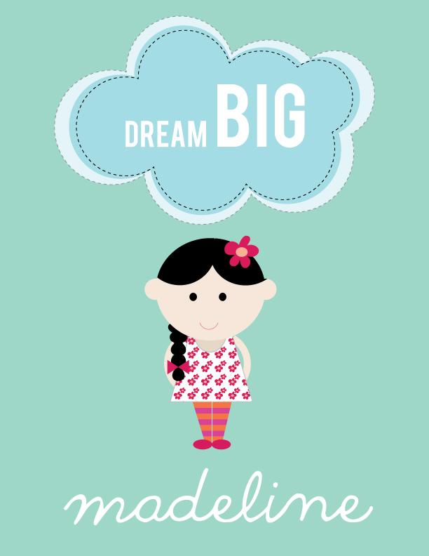
13. Text : We're now going to cover text. Text is the icing on the cake for anything having to do with your poster if you're going to add any inspiration quotes, if you're going to add a name, if you're going to personalize it in any way. I'm just going to show you a couple of quick ways that you can manipulate text to give it just a bit more flair and not just a regular right-to-left text that lays on a flat surface. To begin, we're going to go here to our left palette and we're going to select the type tool. Now, as you can see, there is a little triangle on that, which means there are other options there and I'm just going to run through them quickly. The type tool is our regular typing tool that you would use in a typewriter, you'd use in a computer. The area type tool is if you create a circle or a square, and then select this type tool, it would contain the type to just that shape. If you then go to the type on path tool, we're going to cover that and you'll see it'll just follow whatever path we draw. There's the vertical type tool that'll just draw from top to bottom. There's a vertical area type tool, which is the same as the area type tool here that we covered, but it'll just go top to bottom inner contains a square circle or whatever shape you choose. There's the vertical type on a type path tool which is similar to this, it's just headed in a different direction, and then there's the touch-type tool, which is new to illustrator, and we'll just cover that just a bit in this section. For starters, we're going to select our type tool. As you can see, we can just click anywhere here. It could be outside the art-board, doesn't really matter. I'm just going to type BIGDREAMS, and that maybe my inspiration quote for this poster that I'll be gifting to a child. Let's say, I'm going to say, well, I don't want dreams to be the same text, the same font as big, I want it to be different, I can then go in here and I can type in if I know the name of the font that I'm searching for or I can just scroll down through a list of fonts that I may or may not want to use for this. This Dreams, this one is a little too big. Now, I'm going to show you something. My illustrator defaulted to putting everything in caps. If you open up the character tool, the character selection here you can go down to window, and then type, and then you see characters selected. Once you have that open, you can see that this here is bolded out, it's selected, and it says all caps. I don't want dreams to be in all caps, so I'm going to deselect that. But that's a nice option if you typed and then you realize, well, I wanted it in all caps instead of just retyping it, you can just go back and select that, and that'll work. Now, you see I have two different font, I could have also typed these words separately, but because it's just two words that we're going to deal with in two different fonts, we don't have to do that. I think I like better for it to say dream big. Let's take off the big and put it here. Now, I'm going to go and change this font to that font that I had. Now, I just wanted to say dream big, I won't do that, dreambig I like how that looks, perfect. That can actually go right into my drawing, I'm actually going to select my character because now that we've worked on it at a larger scale so we can see detail, I want to be able to scale her down just a bit so now I can fit my text to my personalization onto the page. I'm going to group her for now, and then I'm going to transform scale. I'm going to scale her down about 80 percent. For now, that'll work, I'm just going to put here dreamBIG, and I'm going to actually type in MADELINE and that'll be the person that I'm gifting. Madeline is actually the name I'm going to use for mine. Now, you don't have to use the phrase that I used, I really want you to be inspired and go and look for some type of inspirational phrase to whoever you are gifting yours too or if you're just going to hang it in your office or you'll hang it in your workspace, it'll just be a nice reminder of what you accomplished. So feel free to go out and search for inspiration quotes, Pinterest is a great place to go out and find that as well. For purposes of what we're doing here, I'm just going to leave mine like this for now, and then I just want to show you something real quick. I'm going to go off the board here for a minute because I want to show you how to manipulate the font. Let's say I wanted Madeline to be in another shape. Now, I've typed in Madeline, and I'm going to go to type, create outlines, and what this means is this is no longer editable, this is now considered an object like any other object on this character here, it's an object, it's no longer type, I can't type, I can't add apostrophe S to the end, I can't change the font, I'm now committed to this font the way it looks. I can change the color as you can see, so what we can do when it's outlined is we'll be able to manipulate its shape. You're going to go to object, and then we'll go to texts Envelope Distort, and we'll go to this top selection which is Make With Warp. As you can see instantly, it changed the shape of it just by this pre-selected shape that was up here. I'm just going to run through a few of them, there's the arc which would fit really nicely just above her head there. If I wanted arc, and I want it below her head, I can just change the bend to head this way instead of that way. There's a lot of different tools here for you to manipulate the texts. Here's another one that I like, arch is just has a different more contained shape in there, there's bulge, then we have flag, and flags are really fun one, especially if you draw a race car, and then you need that banner or an airplane and you need the banner, flag is the perfect one for that. We have wave, which in this size font, you don't really notice it too much if we make it larger, you'd notice. Here's fish, that one is really cute too. There's just a million different options that you can use and by moving the sliders, you'll be able to select your own and make it unique. If you click "Okay" that's then committed to that shape, and then one last thing you would have to do because it's still not identifying it as a completed shape, we'd have to go to object, expand and click "Okay" and that will bring it back to all the points that we'd like on here. Now, I'm going to type this out again just so we could try something different I want to show you just another neat tool. Illustrator has come up with this touch-type tool, and you'll find that in your characters palette as well. This touch-type tool is brand new and the way we had to edit, create the outline of our type here in order to manipulate it. With this now, with this touch-type tool, you don't have to do that in order to make slight variations. Let's say while I have my name selected, I select the touch-type tool, and let's say I say, well, I'd like the M to be a little taller and I'd like the L to maybe drop down, I can do that as well, I can bring the L down, and it already knows that what the spacing is of this font, and how would like you to not distort the spacing of it. You can either really go whichever way you want or it'll try to maintain the best it can, the spacing of your font. That's another neat tool, it comes in very handy if you just want to change one thing and still manipulate the font and not have to outline it because that is a permanent change. As far as text, that's pretty much what we have for now. We can also type on a vertical, and I'll show you that just really quickly. The vertical type tool is just the same way, it will type it just on a vertical. If we select this type on a path tool, I'll show you quickly what happens. I'm going to take my pencil first, and I'm going to create the path. Let's say I wanted this path to go like this. I'm sorry, that didn't show up too well. Let's go here, not really working there for me too well, let's see. Let's use the brush type there we go. Let's say we created this path, and you can draw it with the pencil, you can draw it with the brush here, you can have a shape that's already existing, you can draw a circle, and then type around the circle. Now, I select my path that I want the type to follow and I click on "Type" on Path Tool. I'll click at the beginning here, and then I'm going to type, and as you can see, it'll just follow the shape of the type. Now, one thing to remember quickly, if I wanted that line that was there to stay there underlined, I'd have to create a copy of it because once you start typing on it, it just makes that line disappear or the circle disappears, so you always want to make a copy of it just in case you want to also use it as an underlying. That pretty much covers most of the basic text manipulation that we can use an illustrator, and it can make your drawing a bit more unique. You can add any type of font, any type of shape. I mean, really the sky is the limit when it comes to font. For my character here, I think it looks pretty good like that. This one here I may change into a different font, there we go. Now, it's a little too big, so I'll just shape it. That looks good to me, what I am going to do is create the cloud shapes,and we can see that in the next lesson.
14. Finishing Touches: We are now going to add some finishing touches to our drawing here. First, I'm going to draw some clouds because I think with the saying of dream, I think I'd like that to be enclosed in clouds. I'm going to select light mint for now. I'm just going to hold down, I'm going to select my Ellipse Tool here, and I'm going to hold down shift because I want them to be uniform, and I'm going to drag. Then I'm going to go over, drag another one, start here, drag another one. I'm going to need it to be a little long just by looking at my texts. I see that I'm going to have to put one there. Then I'll just start filling in some of these gaps here. Maybe smaller ones here. That's pretty much going to be my cloud for now. I'm going to, as you can remember, go to Pathfinder and go to Unite. I've now united this and I'm going to position this over my text. I'm going to send this to the back so we can see, so with object arrange, send to the back. As you can see, I just group my character here a bit. It's going to group her so she's not. Group. Just going to move her down a bit. MADELINE may need to be smaller as well, just so we can have space. Let's just move her down for now and we'll straighten everything out in just a minute. I just want to be able to fit this cloud and my texts together so it'll fit there. Now I can select them both. You can do that by either dragging, or by selecting option, and then clicking on both command both. Now that I've selected them both, I just want to bring them down just a bit, just so it's not the hero of my story. I want my character to be the hero of my story. I'm just going to toggle over what the arrow tools just to position it the best I can, and to me that looks good. I want my text to actually be white because I don't want it to be wooh overwhelming this blocking your face. I'd like the black of her hair, to be what really stands out because the characters qualities, and colors should be the hero of this story. I'm going to change this to a light color. A coral would be nice too. For now, let's leave it like that. Then I'm going to add a background. I'm going to select my rectangle tool. I'm going to start at this corner here. As you can see, as soon as I hover over it, it started to highlight that in green. I'm going to click, and drag all the way down to the bottom. Now it keeps this last color that I've selected. For me that was the salmon color. I'm just going to change that to some aqua. I'm going to now send that to the back because that is my background. That looks pretty good. I may want this a little lighter just because it doesn't really look like it's the correct color for me. You can do that in a number of ways. I have this selected as my color, but I can go here into this color guide, and you'll see that once it's selected here, it gives me different hues for the same exact color. I can go one lighter, or I can go three lighter as much as I want. But I think one lighter actually gives it the softness that I was looking for. Then MADELINE I also want in white. I'm going to select that, and that gives it a nice tone. But now looking at the entire picture, I see that I may want to change the color of her pants and shoes because it does conflict with my background and I love this color. This mint aqua color, so I want that to be my background color. Now I'll just have to adjust the color of her pants and her shoes. I'm going to ungroup her, and I'm going to just create another pattern for her pants. If you remember, let's go back to color. What we did was we created two lines. That one, and then I'm going to click and hit hold down option, and drag. Then made a copy of a second identical one. I want that just to be a couple of shades lighter than that. Now you can see if I zoom in, they're not really even and it's not going to make for a nice pattern. I'm just going to toggle down with my arrow keys. I'm going to select them both, and then go here to align, and to this horizontal line center. That brings them in together perfectly. I'll zoom out again. I'll go here to my color swatches palette. I'll select them both and drag. Now I'm going to change the color of her pants. Perfect. That gives you just a little bit more pop, and it's still about the character and less about the background. Most are going to select her shoes and I'm going to make those orange as well. See now, when I did that, as you can see, it blended into the bottom of her pants and now it looks like she has on boots. Maybe I'll change her shoes to black. That anchors the whole character down. As you can see, nothing's ever written in stone. We started off with one pattern, then we went on, and we went on this little journey, and we added a background, and we added clouds, and we manipulated our colors. But I still somewhat stayed within the color palette that I set out to do. I really like the way this turned out. We can add some bit of a detail to this cloud. I'm just going to go here to the stroke. We're going to select dashed line, and right now it's set for two points. The gap is two points, the dash is two points. I'll click away just to see how that looks. Well, that's not enough ohms. We can add a bit more weight to the stroke. That looks a little better, but I may want that to be in white because I don't want that to be sticking out that way. I think BIG needs to come down just a little. Perfect. If you want, you can go the extra mile and add that dashed line to MADELINE as well, or to the whatever name you've selected. I can select this orange may be, and go back here, and it'll give me the weight. That's just another option. In our next slide, I'm going to show you how to set everything up for print. Join me there.
15. Printing: Now, we're going to go ahead and set up our final drawing for printing. Now, you may be thinking, well, if we're going to frame an 8 by 10, then why did we draw this in an 8.5 by 11 and I did that in order for you to be able to create this on your own and print at home. So an 8 by 10, unless you have a more advanced printer, 8 by 10 would be very hard to print at home, you'd have to print on a standard letter size sheet and then trim to size. As you can see, we created this 8.5 by 11 and I just want to check now because I'm getting ready to print it at home. I want to check if all of this, once I trim it down to this 8 by 10 is going to fit. I'm going to select my rectangle tool, I'll double-click anywhere on the screen and I'm going to type in 8 by 10. Now it gave me an 8 by 10 rectangle shape, and I'm going to position it as best I can directly over my drawing. As you can see, it looks like I can move it down as much as I can but you have to remember depending on the printer, it will not print to the edge. So to be on the safe side, try to move it up as much as you can, and then we'll just have to trim down, or bring down or scale down our artwork to fit within this smaller square. I'm going to actually select it all it's the easiest way, and by holding Option and Shift, I'm going to click on the new square we created, and I'm going to click on the background layer, so now I only have our artworks selected. By holding down Shift to constrain our sizing, I'm going to go to these arrow keys on the corner and I'm going to with the mouse drag down just so I can scale proportionately. So that actually looks pretty good. I'm going to group this just for one final sizing, and I'm going to now select it all, and I'm going to hit my align tool just to make sure that everything is in the center of the page. So once you've done that, you can select this rectangle tool will no longer need that, and you can delete it. So this is now ready for printing. Now, there are other print on demand sites if you don't want to print this at home and you all want to maybe explore other types of mediums and products that you can print this on. To do that, we're going to go to File, Save As, my character final. I selected, I typed in and then I'm going to click Save. I had already saved on my desktop, but I'll just replace it. Now this is an important pop-up, when you're going through these print on-demand sites, if you leave this selected preserve illustrator editing capabilities, or even if you're sending this to a printer or anything like that, that means if you leave this selected that once you open it up in illustrator someone else does, they're able to edit it. So all of this work that you did creating all this beauty, they'll be able to go into this and personalize it for themselves. So I always uncheck that just to protect my artwork, it's best to always do that it doesn't change the quality of the PDF that you're sending for print, it just protects you, the artists. So I'm going to hit Save, and it's going to give you a warning that you won't be able to edit it after that. So what you can do is save it under a different name, you can save it as my character for printing instead of my character final. So you can go ahead and do that. Now what we're going to do is we're going to go into Zazzle. Zazzle is one of these print on demand sites, they allow you to upload your artwork into various products and bring your artwork in, and in that way you can load whatever it is that you want to print right directly into their website. So now we're going to go to Create, and for purposes of something simple, let's see, when you click on Create, you'll see that it shows you, you can do t-shirts, you can print on mugs, stickers. They can print your art poster for you if you don't have the capability of doing it at home, you can do postcards and greeting cards, invitations, postage, cases. I'm going to select cases, just because it's a pretty simple one to show you. Then I'm going to scroll down to this iPhone 6, let's say. Here you'll see that it gives me the option to add my image, right here. So I'm going to select Add Image, this is the character that I saved, so I'm going to drop that here. As you can see, it's showed up perfectly onto this iPhone, I'm going to actually just move it over a little bit, I want it centered. Okay. Perfect. Now, if I were to stretch this out in any way, I'd lose some of my detail. It may or may not wrap around the right way I want it to, so I'm just going to leave it the way it was. I'm going to scale this down again. Scale this one a bit more. I'm going to bring this here, and I actually liked the way that looks. I'm going to move it up a little bit more, because it does allow me to select a color, so I'm going to actually select this orange trim, and that's a nice way for me to balance the colors of my case. So as you can see, it happened to work out that our 8.5 by 11 format that we used to create it worked out for this, you may end up selecting something that needs more of a square. So if you select a T-shirt, it's really constrained to like a square design right in the front or a mug maybe also will be looking for a square, everything to fit in a square shape and our 8.5 by 11 is a bit more rectangular. So you would have to then go back to your art board and the same way we dragged out that 8 by 10 rectangle, you'd have to drag out a perfect square and then try to fit your design into that. Once you get to learn the different ways to manipulate the shape and the sizing, you'll be able to print anything in no time, you'll see it's really not that difficult. For purposes of this, you'd then be done, you'd add it to your cart and they'd ship you the final product. In the next enclosing, we're going to just go over our final steps to creating our project at home.
16. Closing: So now when closing, I just want to go over our class projects. I want you to be able to take all the elements that I showed you and create your own unique character. Just remember if you're looking to make a boy just alter the hair slightly, I really want to see you just be comfortable with this and just take it to creatively whatever level you'd feel you'd like to take it to. I just wanted to give you enough tools to do that so now you can go and branch off on your own. So you're going to be creating a character. I want to see some text added to your final project. I want to see if you manipulated or not. Just remember, that's also a style preference, so if you just like straight font, you can do that. If you just want a couple of outlines here in there, you can do that. I just want to see you either add an inspiration quote or a personalized name or both, or feel free to surprise me. I want to see a background and other elements to tie in with your characters, so your character is just not standing there all lonely by itself. I want you to find something to anchor it. Your eye just travels through the whole artwork and doesn't just focus on the one thing. But remember your character is the hero here, so don't try to overwhelm it with a lot of elements or two of the colors too bold, that'll take away from your character. Lastly, I want to see what you did with it all. You don't have to print it out and show me a picture of that, I just want to see if you created it on Zazu, you can do a screenshot and show me that. I just want to see in the real world what you're going to do with your final project. I want to be proud of everything that you do. I'm your cheerleader here, so I'm sure that you are going to do great things. Thank you so much for joining me in this class. I can't wait to see what you guys come up with, and this is going to be an awesome journey. Let's get started drawing.
 Shelley Seguinot, Illustrator and Surface Pattern Designer