Transcripts
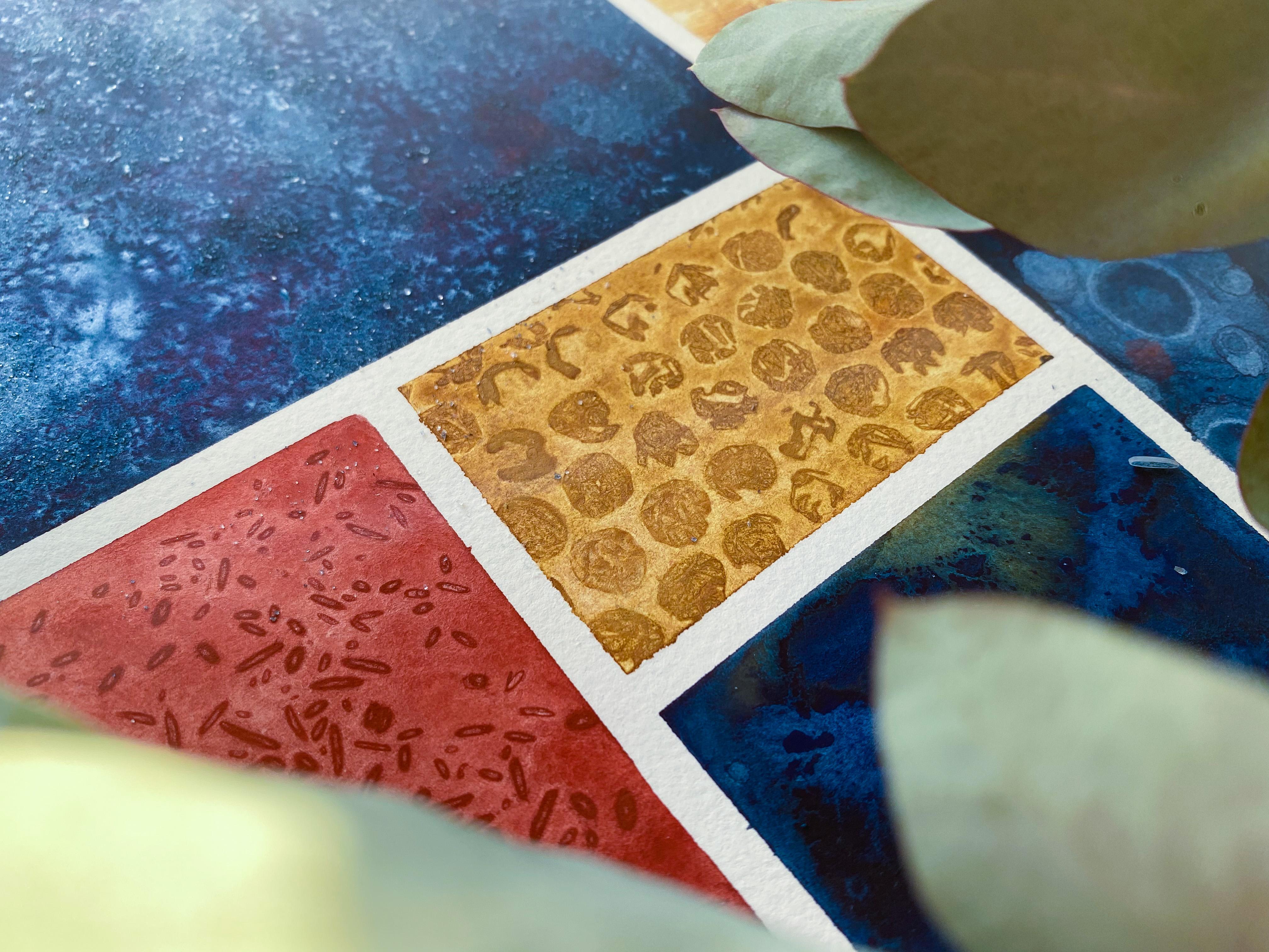
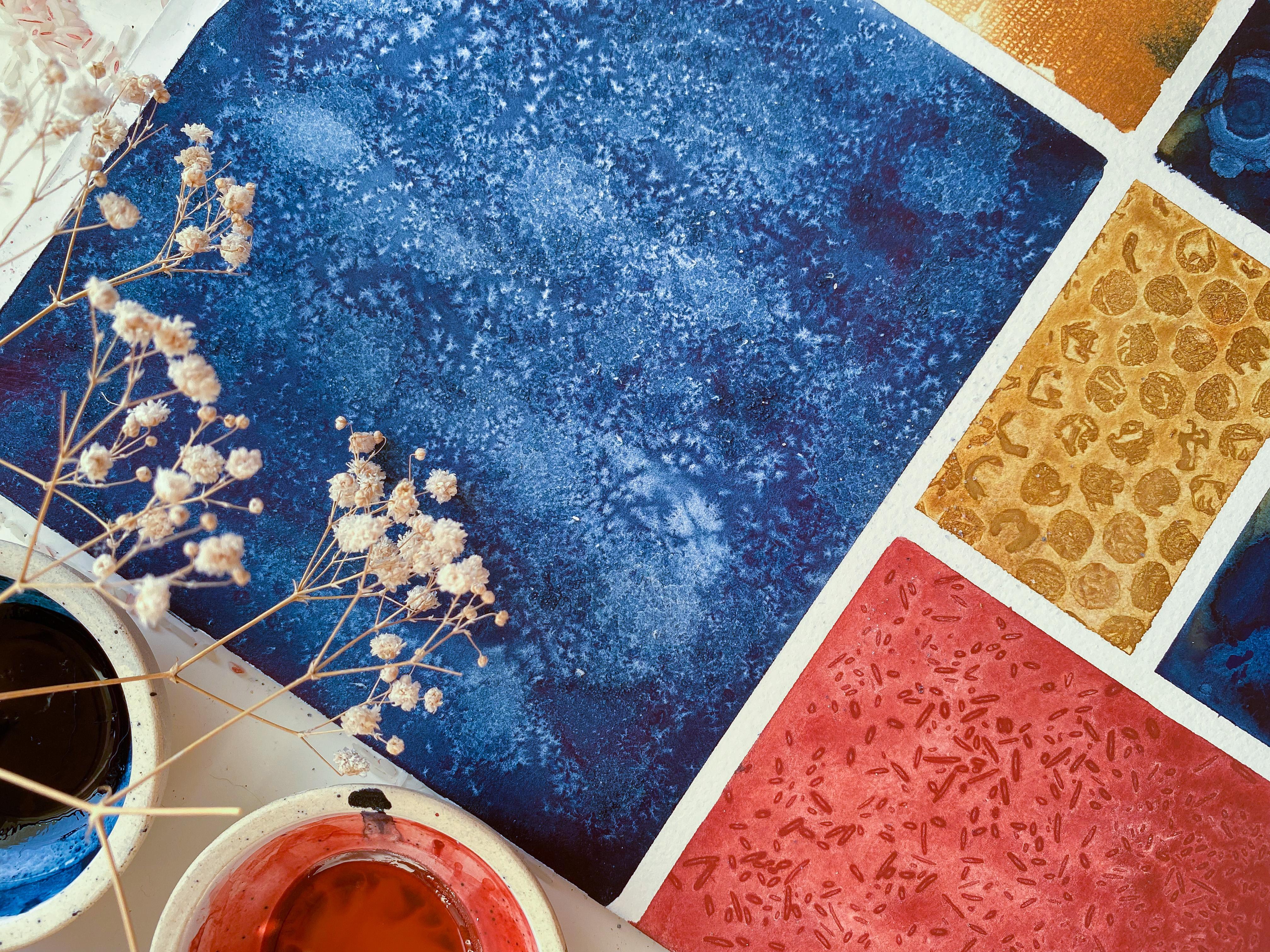
1. Introduction: Fun and easy watercolor textures, that is exactly what this class is about. Hi, I am Manushree, the artist and illustrator behind the Whimsical Creative. In my personal work, I love to paint loose florals and the medium of choice is watercolors. Now, watercolors are most popularly known for their soft, dreamlike characteristic that they lend to every painting or artwork. However, there is an equally bold and bright side to them, which is the textures that they are able to create with just simple household objects. In this class, we will be exploring this capability of watercolors. We'll be using a couple of household objects, which most likely you already have lying in your home, and if not, you can easily get them at any supermarket or grocery store. Throughout this class, I will be guiding you through nine different watercolor textures. This class is perfect even if you've not held the brush ever since school. This class is genuinely beginner friendly, and if you are an intermediate or advanced artist and looking to include some new techniques to spice up your existing artwork, then also this class is perfect. Now, the application of these textures that we'll be learning is quite broad. Simply, if you want to use them standalone, that's what we'll be doing in our final project. You can simply create a piece like the one here, and this can be framed, and it is such a beautiful statement piece that if you hang it on a wall in a room, it's just surely going to have to draw the attention. Now, the second use could be if you want to include these textures into your existing body of work, then it's going to lend a lot of depth and complexity to your artworks. Lastly, if you want to just do it for fun, you want to break out of a creative rut or block, then also this is a great activity. It's just so tactile and the act of using materials and watercolors and just truly taking a step back and just seeing the beauty that happens without our intervention. It's not so much intervention from our end, but it's how the watercolors and the materials react and create these beautiful textures, is just phenomenon. All right, so for this class, you just need couple of watercolors, two round brushes, and some household supplies, which will be listed in the description below. Yeah, let's get started and explore this enchanting world of watercolor textures.
2. About the Final Project: Before we dive into the class, I want us to take a moment and discuss a bit about our final project. Throughout the class, we will be learning about each texture in every single lesson. I'll be taking you through the entire process of creating that texture, then we will be discussing our observations and I'll also share lots of tips, and tricks just so that you are really confident in approaching these textures. Now, after having completed all these textures in each lesson, we'll move on to our final project. On our final project, you can either choose to follow the same template and the painting or the textures that I'm picking, or you can just feel free to get really creative and make your own template or extras that you would like to include, same goes with colors. Just to keep this class really simple and more focused towards the textures, I have narrowed down on my color palette. However, you don't have to do that if you want to create something which is surely bright with pop vibrant colors or maybe something which is soft with pastels, feel free to do that as well. In the final project, we will be taking everything step-by-step. I will be sharing my entire process on how we would plan before we begin creating our final art piece, which is the one right here. We will talk about which colors to choose for which sections, why are we choosing a certain type of layout, what textures are we choosing to compliment those color choices, and how to really execute the entire painting. Yeah. Everything is explained in real-time step by step. Feel free to pause it if you want to take more time and then you can resume back again. But I do recommend completing all the extra lessons before moving on to the final project. That way, you will be more confident in approaching that entire big B's. Alright. Yeah. That's going to be our final project and I cannot wait for us to start grading. Let's dive in and have a look at the supplies that we'll be needing for our charts today.
3. Supplies: Welcome back. Before we begin, let's have a quick look at all the supplies and materials that we'll be needing for our today's class. The first thing is, of course, our watercolors. Now, whenever personally, I think of textures, I'm always reminded of mountains, rocks, dirt, pebbles, etc. For the watercolors today, I'm going ahead and choosing three shades. These are all earth colors. We have indigo, which is from Sennelier. It's a gorgeous deep blue color. Next we have our yellow ocher, it is again from Daniel Smith. Lastly, we have a beautiful terracotta red, it's called venetian red. Again, this one is also by Daniel Smith. Now, don't feel restricted by this color choice. I went ahead with a very limited earth color palette. However, feel free to pick colors that you are most drawn to. It can be pestles, they can be muted colors or moody colors, anything works fine. All the techniques that we will be learning in this class can be applied to any color of your choice. So go ahead and pick out your favorite colors. I do recommend, however, choosing just 2-3 colors because the final piece that we'll be creating, it will already have a lot of character to it due to the different textures that we're using, hence, it would help if we go a little less on color, otherwise, there'll be too many things competing for attention. I'll be using three ceramic dishes like here and we'll be mixing our paints into it. This is just to ensure that we have enough amount of paint premixed and so we can go ahead with all our textures without having to worry about the paints running out or having to mix it again. If you don't have these ceramic pallets, you can always use plastic pallets or even if you have a metal tin, it usually has some sections you could premix little bit of yellow ocher, blue indigo, and venetian red. Don't worry, we'll get into the detail of how much paint to water ratio you require to create these in the next lesson. Next up we have our paper. For paper, you would want to use any watercolor paper that is at least 300 GSM and 100 percent cotton. If like me, however, you really want to push the potential of watercolors texture abilities, then in that case, you can go ahead and pick a paper, which is a little rough. Watercolor paper usually comes in cold-pressed, hot-pressed, and rough. The one that I've picked up here is a handmade watercolor paper and it has a rough surface to it. Moving on, let's have a quick look at all the materials that we'll be introducing to the watercolor to create our textures. First is salt. You can use any salt. I'm personally going to use rock salt for our textural exploration today, but feel free to use table salt or sea salt, whatever you have on hand would work amazingly well. Next, we have some rice. Again, feel free to use the kind of rice you have, it could be brown rice, white rice, doesn't really matter, it just needs to be rice. The next one is our medical swap or gauze. A medical gauze usually has a really interesting structure to it. That's what we'll be using. You don't need quite a lot of it, just a little bit would be more than enough. Next, you would want some twine or thread. For this one, though, you would want to use a little longer piece just so that we can experiment with multiple pieces and see the kind of textures they create. Moving on, we have bubble wrap as our next material. Again, you don't need quite a lot, you just need a little piece of it and that should be enough. Then we have our good old tissue paper. You need a little bit of tissue paper. Next, some cotton. Next, we have some cling film. Again, you don't need quite a lot of it, just a little bit would go a long way. Just be a little careful. I personally find very challenging to work with this because it has this tendency to really just get stuck to things. Then we have isopropyl alcohol. I'm going to be using 99 percent isopropyl alcohol or feel free to use rubbing alcohol, whatever you have on hand and it will work fine. Now comes water. Of course, we'll be using water for not only mixing with our paints, and of course using watercolor, but also for the textural purposes as well. I suggest having two jars of water, one which can have the paint water, and the other which we'll be using to create textures. Now onto the brushes. For our brushes, I recommend using two sizes. You can go ahead with a large size and a small size. I'm going to be using a size 10 and a size 0. Feel free to use any large brush that you have and a smaller size brush. Next, we need a pencil or a marker. Basically, you need these to mark the material that we are using for a particular texture, and then we have an additional supply. This is just for the sake of convenience. It's a simple dropper. You can use any sort of dropper you have and if you don't have it, that's also fine, you'll be able to work through the class without requiring one. That was all the materials that we'll be needing in our today's class. In the next lesson, I'm going to share how to set up our workspace for most success and how to premix our paints. Let's dive into it.
4. Preparing Paints: Before we get started, let's quickly have a look at what would be the paint to water ratio for our column mixes, and also how best to set up our workspace to ensure most amount of success, and efficiency. Moving on first about the paint to water mixes, I'm going to show you three different states. The first is this one, this is freshly mixed yellow ocher. You can see that it's still really wet and nice and my brush is able to move easily around. Now, what I can see is that it has started drying and when it happens, all you have to do is just take a couple of drops of water and add into the mix, give it a swirl. This will be good to go. We are going for this consistency here. I'm going to swatch this yellow ocher so you can have a look. Try to aim for this consistency with your mix as well. This is how we want the consistency to be. Now, let's see another state which is this one. Now, this was pre-mixed quite a while back and you can see that it is completely solidified. It's not moving at all. But because it's watercolors, we can easily reactivate it. Again, I'm going to add some drops of water to it. This time, of course, I'm going to use more water because this has considerably dried. Once again, I'm going to give it a nice swirl. You can always go back and add more water as need be. Right now, it's still difficult for my brush to move around in this bowl, so I'll just add a little bit more water to it. Let's add some more water. Now again, let's give it a nice mix. This is much better. My brush can easily flow around into our paint to water mix. Let's quickly swatch this. It's still a little thick, I would say. It can use a little bit more water. I'm just dipping my brush in water and seeing what that does. Let's add a couple more drops of water to this. This is the consistency we're looking for our blue. Now I'm going to show you a third state, which is there is no mixed color. How do we mix that? You want to squeeze out a generous amount of color onto your palette. Like so, this should be good to go. Then, as usual, we will be adding water to it. You may want to add a generous amount of water because this is the color we have taken straight out of the tube. There's no water in it. Then just start mixing the color. Give it a nice swirl. Yeah, this is ready. This is [inaudible] red. Let's swatch this as well. This is the consistency we're looking for. This is how the colors should look onto the paper when you swatch it as needed, you can choose to add some more water to them as they end up drying. That's pretty much it. Now let's have a quick look at our setup. I'm going to set this up as I will have the color of my choice on one end. This is where I'll have my paint to water mix. The other two colors can move out of the working area for a bit. Then whatever material we are using, I'm going to prop it up here. Let's remove these tubes as well. My paper will be here in the center, the brush, and the water right here. I can always just switch. I just need to moisten my brush, take some paint, into wash onto the paper, and then I can go ahead and pick my material, and introduce it to the wash of the color and just explore the textures they create. That's it. That's how I would suggest you set up your space. Now we're ready to get started with our first texture, which is going to be with salt. I'll see you in the next lesson.
5. Salt: In this lesson, we will be exploring the textures we can get if we introduce table salt or rock salt form to the wet wash of watercolor. Here I'm using rock salt or it's also called pink salt. You can use table salt or even sea salt. It should work fine. Before we begin, I'm going to check how my paint to water mixes. This looks pretty good. I'm going to take my brush and moisten it by dipping gently into the water and just swirling it around in the paint mix. This looks good to go. I might add a little bit of water. I'm going to add a few drops here. This looks good to go. Now before we begin creating the washer for our color, let's go ahead and first mention the material for this lesson, that is salt. I'm going to write salt, now let's create a rush. One thing we do remember is while creating these washers. I'm going to be following a specific technique, which is that I'll dipping my brush regularly on to the paint to mix until we reach almost halfway through. Once we are halfway through, I'm going to stop dipping my brush into the paint mix instead I'll start dipping into the water mix. This will give us two different values. You can see we have a darker value on top and then we have a lighter value at the bottom. The reason we're doing that is this way we can really observe how different materials create different textures with more pigment, less water and less pigment, more water. Now quickly while this is still wet, go ahead and drop salt. I have personally experienced that if you drop, salt in chunks, creates more interesting fixtures verses just dropping it sparsely. The textures we get from salt reminds me of textures in planets, like sky, sometimes even mountains and rocks. Once it's dry, you'll be able to remove the salt entirely by just using your fingers and brushing it off or tapping it gently. Either way, just make sure that you do that once everything is completely dry. Also, while you're scraping the salt off, you may notice that little bit of pigment might rub off onto your fingers and that's fine, that shouldn't be a problem. Now let's have a look how the texture peals once everything is dry, I have the practice space that I worked upon. Let's go ahead and discuss that while this one drys. You can see the texture we get here as we drop salt and it absorbs water. It's very interesting, intricate. One thing to note here is that this was the area which had most pigment and this had lesser pigment. You can see the texture is more prominent in the area which had more pigment as opposed to the less pigmented area. Another thing I want us to notice is whenever we drop salt in chunks. That gives a more clustered texture. Well it says when we just spring the lid the texture is quite minimal. These are my observations for the salt texture. I hope you find these observations in your explanation as well. If you'll come across something different, just make sure to drop it in the discussions below. I would love to know what your experience was and what all did you observe and notice. Let's move on to our next texture.
6. Thread: In this lesson, we will be exploring the textures we can get by using a thread and introducing it to our wet wash of watercolor. Before we begin, as usual, let's make a note of our material we're going to write here thread. Now we will be cutting this piece of thread depending on the size of paper you have, you'll have to take the measurements. Basically, the idea is I want the thread to go out and in and then again out of the paper then I lay it down under my wash. Measuring that, I'm going to quickly cut it up and if I look at it it's almost one and-a-half times of my paper. I'm just creating loops and then I'll cut them. Here is my thread all cut and ready to go. Now what I'm going to do is let's quickly create our wash of color. For this particular texture, I'll be using Venetian red. One thing to remember with the thread texture is you want to have a really dark pigmented wash of color. Because in my personal experience I have observed the more pigment there is onto our wash, the more interesting the textures are. If there is lack of pigment, meaning if it's a lighter value, then in that case the thread texture doesn't show up that well. You'll notice that almost for two-thirds of our paper I have went ahead and dipped my brush into the paint now for the rest of the one-third, I'm going ahead and dipping it into water simply because for this texture I wanted a more concentrated wash of color. While it's wet, let's quickly take our threads. I'm going to take them one by one, you can also choose to loop them like this and start placing them. It's crucial to make sure that everything is really wet so you may have to act a bit quickly and randomly by placing these threads, this one here. It's becoming a little challenging because you can see it's quite sunny and it has started drying. I just need to place one more and then we're done. This is how it looks, you can see all the threads are quite flat onto the piece of paper, and we'll have to let this sit for a while until it's completely dry and then we'll be removing our threads and seeing the texture they create.
7. Bubble Wrap: In this lesson, we will be exploring textures that we can get from bubble wrap. I have a piece of bubble wrap right here. I have cut it to size. Depending on the size of your paper, you can also choose to cut it in whichever size you feel most comfortable with. The reason why I chose this size is because I'll be placing this diagonally onto my paper, and thus it's slightly longer than my paper, probably about a quarter of an inch longer. For this texture, we'll be using yellow ocher as our watercolor. Let's quickly create the wash of our color. As always, I'm going to be creating our wash in the similar way, that is, we'll be going almost still 2/3 of the distance continuously dipping the brush back into the paint mix. As we reach towards the bottom 1/3, I'm only going to be dipping back into water. This wash looks great. Now while this is still wet, quickly take your bubble wrap and place it onto the paper. You can feel free to place it the way you want. I want to place it diagonal so I'm going to do that. Another important thing to remember is we're placing the bubble wrap the bubble side facing down onto the paper, so be mindful of that when you are trying to place it onto your wash. This is going to be it, feel free to press it down real nice. You can already see the texture that is being formed, and as we wait for it to dry, we'll be able to see the textures more defined and more clear. This is completely dry now and here's the moment of truth. Let's take off the bubble wrap. Let me just take a moment to pop couple of them, it is one of my guilty pleasures. Enough of this. Moving on to our texture, you can see that this is a very unique texture. For some reason, it always reminds me as if it's a lattice stacked with tiny gemstones. Lastly, I really want us to take a moment and observe how the creases in bubble wrap has actually made the pigment settle into such patterns. That is also very interesting, and if you were to use a granulating color, I feel this texture would be even more pronounced. Just so you can have a closer look, I'm going to share it here. You can really see how gorgeous the texture looks especially the pigment settling in. Now, this was one way of placing our bubble wrap, that is, we placed it diagonally. I hope you remember, we actually went ahead and placed it like this. However, I experimented with another strip of paper. For this particular one, I went ahead and created bubble wrap strips, about half an inch strips, and then I placed it onto the wet wash, leaving about quarter of an inch of the distance and you can see the texture we get because of that. I also experimented with our wash, so I had a darker color here and then I went to lighter, and then back again darker, and then again a little lighter. That also adds a lot of interest. I feel this would be such a cool background. Here is a more closer, look at that. This is all for our bubble wrap. That's your experiment. I'll see you in my next lesson with another material and one more interesting texture.
8. Alcohol: In this lesson, we will be exploring a unique texture using rubbing alcohol. Here I have a saucer or a dish and I'm going to just add some rubbing alcohol onto it. I'm using this rubbing alcohol. It's 99 percent isopropyl alcohol. You can use even 70 percent that should work fine. I'm just going to take some and drop it into our dish. That should be enough. Let's quickly mark on top of our paper that we're using alcohol to create this texture. For this particular texture, I'm using blue indigo. I have mine mixed here. It looks good to go. I'm going to straight away dive into creating our wash. For rubbing alcohol, I've observed if you want dramatic textures, then it's best to use a darker value of color. That's what I'm being mindful of. I'm going to be using two-third of my paper with a darker value. Then for the remaining one-third we'll go with the lighter value. Just like in the previous lessons, for the lighter value, I'm going to be dipping my brush into the water and not in our paint-to-water mix. Now you would want this to be evenly wet before you can start putting in rubbing alcohol. Make sure that the surface is wet when you're doing that. I'm going to take my size zero brush. I'm going to show you what happens when we go ahead with a brush. With the brush just gently start dabbing like this. Just dip it in rubbing alcohol and give it a gentle dab onto your forefinger of your non-dominant hand. This is what it should give you. There is another alternate method. You can use a dropper like this and have a more controlled look. You can go ahead and drop a huge drop wherever you feel you would want to have this rubbing alcohol react with watercolor. It's very important that the surface is wet while you are doing this because this area has become dry. You can see that it's not as dramatic as we see here when the surface was wet. Another one where you have to be a little quick. This was really wet. I dropped in here and then it overflowed, which is fine. It's going to make for a really interesting texture. Same I'm going to do towards this side. I think this is good to go. In the case of rubbing alcohol, this is going to dry really fast. The watercolor wash will dry relatively quickly, at least in my case, since I am in a sunny climate. However, depending on the climate that you're in, it's going to dry at its own pace. Rubbing alcohol would expedite this process. You would have observed that for all the other textures, we have to wait for a while, and then we can come back and see the kind of textures we're getting. But here you can see already the texture we get when we introduce rubbing alcohol to watercolors. This is one of the quickest textures that we have painted. Let's have a closer look. There are two observations that I am making. First is with regards to the material that we use to introduce rubbing alcohol onto the watercolor. Firstly, we used a size zero brush, and that gave us these tiny irregular circles. Then we went ahead and used a dropper. That's what gave us these circles. The largest of these have this area where there is a lot of concentrated pigment, it's more like concentric circles, so there's a halo of lighter value. Then in the center, we have this dark color concentrated. Within these two, you can observe that we have these larger circles, which we got by rubbing alcohol through a dropper. Then these smaller ones resulted from using a size zero brush and dabbing it onto our finger. Now, a distinctive difference that I can see is in the larger circles, it's more like a concentric or more circle sort of extra that is happening so we have the darker color in the center, and then we have a lighter halo of sorts on the outdoor circles. In the smaller ones though, these are quite irregular. I wouldn't say that these are circles. They are more irregular and organic. This reminds me of the overall texture and even reminds me of craters on moon. I think it would be really interesting to paint celestial objects with this kind of texture and look. Lastly, as we take a closer look, I want you to observe the difference between the texture that we get in the darker region and the lighter region. For sure, in the darker region, there's lot of contrast. This is very very prominent and it's coming out really nicely. Whereas in the lighter region you can see that it's quite subtle. If you really want the texture to be quite pronounced, I would suggest using or picking a darker color and also a darker value. However, if you want it to be a part of the background where it should be a little more subtle, then in that case, using a lighter value would make more sense. These were my observations. I hope you come at similar ones in your own experiment. If you come across something different, I would love to hear that. Make sure to drop it in the discussions below. I'll see you in the next lesson with another interesting texture.
9. Cling Film: For this lesson, we will be using cling film. One of the most challenging materials, in my opinion to work with. However, the results are absolutely worth it. But just be careful while you're handling it because it just gets stuck and gets sprinkled all of that very, very quickly. I'm just going to quickly mention our material of this lesson, which is cling film or cling wrap. For this extra, I have chosen Venetian red. Let's create a nice warship, Venetian red. Our cling film, again, you want to use a more pigmented saturated wash, rather than going for a lighter wash. What we'll do is for 2/3 of the way, it's going to be only paint. Then for 1/3 of the way we will be using water, and no additional paint. I'm pretty happy with how this looks. Now just take your clean film and just drop it onto the paper. While you're doing that, make sure that it crinkles a bit. We don't want it to remain completely flat without any texture. I'm going to allow it to crinkle, and then I'm going to part it down. Here you can see that it's not crinkled at all. We can fix that. Just lift it gently and then let it crinkle a bit and yeah, that's it. Then I'm going to really press it down there, and we leave it to dry. Once it's dry, I will come back and share my observations. Now this is completely dry. We can easily remove our cling film and let's see what do we get here. That is really interesting. This reminds me of mosaics for some reason. Can you just see how beautiful it looks? It created these gorgeous shapes. The thing to note about these shapes are, is how these shapes are pointed. Meaning they have a very specific angle at which they are created. It reminds me of mosaic pattern, that mosaic dried pattern, or terrazzos. Yes, that is also something that I am reminded of. Within these shapes also you can see that there is a very rich, nice texture, meaning we have areas of lighter values and darker values, all irregular and distributed across the entire. Now, next thing that I want us to discuss is the difference between how the pigment appears on the darker values versus the lighter values. You can see that on the lighter values, it is not at all impressive. It's almost nonexistence. This was supposed to be a shape, but it's barely visible. However, on the darker side, everything is very, very clear. Another point to note about this is making sure that you are using a darker color or a very pigmented wash. That's it for our cling wrap. Let's move on to our next texture.
10. Cotton: In this lesson, we will be experimenting with cotton balls. I've just taken some cotton and I've rolled them. Basically you just want to take a piece of cotton, for example, let me show you. If we tear this piece like so. You want to just roll it between your palms, and that's going to give us a tiny ball of cotton. That's what we'll be using for our extra. As usual, let's mention our material first. Here we are using cotton balls. For this lecture, I'm going to be using yellow ocher. Again, it's, I think, drying a bit or I think it's good to go. We can go ahead with it. Let's quickly create a wash with this color. Cotton ball, basically, you can go with any color of choice, you don't have to worry about whether the color is darker pigment or lighter pigment, but you can just pick any color of your choice and it's going to work fine. Now, cotton balls usually give us cloudy textures. That's what we'll be exploring. For the last swipe, I used water and then throughout I used just paint. Now you're going to take your balls of cotton and you'll just leave it onto the paper. You can give it a slight push just so that it is slowly nicely touching the paper. I'm going to add these in different areas. Now we have to wait for this to dry. Once it's dry, we can lift our cotton balls up and discuss the texture that we get. I'll see you in a moment to discuss my observations. Now, this is completely dry and we can remove the cotton, and it's the moment of truth. Are you excited? I am personally very excited. Let's start removing with this one. Wow, this is beautiful. Now, this one, and this. This one seems to be a little stuck. This is well. These are the kind of textures that we get when we use cotton with watercolor. We don't essentially have lot of control with these textures. But making sure that you experiment a couple of times, that would ensure that you have some amount of control. Think of it like you can steer it in a direction in which you want that extra tuple. For instance, here, for this one, we used different sizes of cotton balls. Some of them gave this sort of textures, which is a little dark Santo and it is surrounded by an irregular shape, whereas if you look at these three, they pretty much did not do much. My best guess is that by the time I have placed the cotton balls here, the paint was already too dry and there wasn't anything to absorb. That's probably why I'm getting this sort of texture. We can also cross-verify this by looking at the cotton balls. Let's just have a look at our cotton balls. Yes. For this texture, I used this ball because it's roughly the same shape. That's how I know that I use this one, and you can see that barely absorbed anything. That's precisely why this gave us, I don't know how to describe it, but yeah, this is pretty different than what we have gotten for the other three textures. Yeah, always make sure that the washer is really dry when you're placing your materials onto it. Now for the pigment observation, I feel that this would fair very well even if we are using a darker side or meaning a darker pigment, or we are using a lighter pigment. Either way, you'll get really interesting results with this method. That's all for our cotton ball method. Let's move on to our next texture.
11. Water: In this lesson, we are exploring the beautiful blooms or textures that we can get by using just plain on water. Let's begin by mentioning our material at the top for our sheet first. Since we are using water, we'll have to ensure that the paint is not too diluted, meaning if you want to get really strong blooms or textures, the best way forward is to go for a very dark value. You can see here that the mixture that we have here is a little too watery. I'm going to fix it by adding just a little bit of pigment to it. Here's my blue indigo. Let's go and drop a nice, generous drop of color. That should be enough and now let's give it a nice mix. This makes us going to be a little like sugar syrup. This is really good to go. You can have a closer look here how the paint is flowing. Let's create a wash. Even though we are going for a darker value, we do want to ensure that the wash is nice and wet so that we have enough time to introduce water and things have not started drying because with water there is one thing that you have to be mindful off. We don't want to introduce water when everything is really wet or too wet. You have to wait for that right time. That may take a little bit of trial and error to figure out that time. But a good way to know that the time is right is to introduce water is just by building your head and have a look at two sheet of our paper. If you're able to see a slight sheen, but no holes are forming at the ends of the paper, then it's a pretty good time to add some water to it. You can see here that there is a nice sheen, there are no holes forming and now I can go ahead and add some water to it. That's going to give us some really interesting texture. I'm going to give you another closer look here. You can see that there are no holes, but there's this nice sheen of water. This is how much we want the wash to be before we introduce our plain water. One more thing that is important to remember is that the water that you are introducing onto this force needs to be clean water. We cannot introduce dirty paint water, because that's going to give us the results we are going for. I'm introducing clean water in different areas. You can drop the current nimbly and just take a moment to really observe what's happening. If you feel that the water is a little too less you can always go back add little bit of water and just touch the tip of your brush right at the center. That's also going to pick up some pigment and it will disperse little bit of water as well. Once again, this area it look great to add some water. If you hover your brush onto the bowl of water, it will keeps spreading. I really love this, it's almost like a structure of snowflakes is being created. We are going to add one drop here. I feel that a little bit of water here would be really great. Sometimes if you really want to accentuate the centers, just slightly touch your brush on the center and that's going to leave a very nice and clean center which illuminates. Since this area is still really wet and not fitting as dramatic of textures like the ones we've gotten below. Another reason is the value here is too dark, meaning there's too much paint and that's why we're not getting this dramatic effect. There's a lot of balancing between the timing you have to identify when is the right time to add water and also the amount of pigment to water ratio that you should be using for this texture. I'm going to add a small, tiny drop here. Just a little bit. You can always go back to the area and add water. That's going to really push out to pigment toward the other the bright edges. Feel free to tweak around and experiment and just have fun, play with it. Now I'm going to let it dry. Once it's dry, I'll be back and hopefully, I'll be sharing my observations and hopefully you'll also be able to match them to your experiments as well. Here you can have a closer look and see how beautiful blooms are. These are the exact spots where we had dropped water and the center is really light and I rounded as the water pushed the pigment out, it has created this gorgeous web-like structure. These are also called colleague flowers or blooms, and I want you to observe these two. If you remember for these two, we actually went ahead and hovered our brush. Either we hovered our brush a little bit longer on the top or the went ahead and just let the tip of the brush touch on to this surface and then it pick on some color. So you can see that these centers are much more brighter than this one. Also, this looks more organic. Next, I want us to take a closer look at how the blue differs in terms of in the darker region and in the lighter region. If I were to hide the lighter region, you can clearly see that there's so much contrast in these blooms and they stand out quite a bit. Then if we observe the lighter region and hide the, let me turn the paper and hide our darker region. Here you can see that the contrast is a bit low, like in this area, the contrast is quite low. You cannot see those web structures as distinctively as we could see in the dark regions here. This water technique actually allows for a lot of room to play. Go ahead and experiment with not just the sizes of these blooms, but also the amount of water that you are adding. The timing, meaning how well is the wash and when are you introducing what a depending on that and probably change the colors a bit. Maybe if you use a granulating color, the results would differ a little bit. Feel free just to have fun. That's it for our next show with by using water, I will see you in the next lesson with another interesting texture.
12. Rice: Welcome to another lesson. In this lesson, we will be experimenting with rice. Let's quickly mark our materials for this texture, which is rice and I'm going to be using Venetian red for this texture. Let's quickly paint a wash with this color. For rice, I've personally observed whenever we are trying to create textures, it's best if we have more pigment and so we'll be creating 2/3 of the wash with heavily pigmented paint water mix and then we'll be moving on to just adding water to our brush and not dipping it into paint anymore. This is pretty good. Now, quickly, I'm going to start dropping in the rice. Feel free to drop it randomly. That's about it. Now I'm going to let it sit for a while until it dries and I'll be back and I'll share my observations with you. Our paper is dry and now we can remove this rice. So you just want to hold it either at an angle and just give it a tap and all the rice will fall. Now, you can also use your finger and just gently nudge them and they'll fall off. This particular area was still a bit wet, so I would suggest that you wait out and don't rush like me. Let's quickly observe the pattern that we receive by introducing rice onto the watercolor paper. It gives a good pattern both in the lighter value and the darker value and you can see wherever the rice was more concentrated, meaning we used more quantity of the rice, the pattern or texture here is more clustered and then very sparsely sprinkled it, the pattern tends to be more random and sporadic. I also wanted to discuss another variable with you, that is, the size of the rice that I have used. Now the rice that I have used for this texture happens to be pretty small. The grain size is quite small. Depending on the grain size of your rice, the texture would vary, and as for all other textures I feel, there are couple of variables involved. That is, how much water you're using, how much pigment you are using and then generally how fast that things are drying. But these things would actually give you slightly different results every time when you are trying to recreate each texture or experimenting and varying one factor a little. This is it for our rice texture. Moving on to our next lesson, and we'll explore another interesting texture.
13. Gauze: In this lesson, we will be exploring textures that we can get through a piece of gauze. I have got my gauze almost to the size of my paper. Feel free to do that. Now before we begin, I'm going to ask you to dug a little bit onto the gauze. Make sure to do that. The woods the same debit and not so much at the edges, because if you do it at the edges, then the threads might come up and the purpose would be lost. Why we're doing this is, if you wanted perfect lattice of the sorts, then skip this step. I want to have a little bit more variation than just these very structured tiny little squares, rectangles. We'll be doing that, so this is one pre-prep that we have to do for this texture. The next pre-pep is, you would want to have the paper laid before laying down the gauze. This is quite different than what we've been doing in our previous lessons. We go ahead and create a wash of the color first and then we introduce the material onto the wet wash. However, with gauze, it's going to be a little bit opposite. Let me just go ahead and create a wash of water and that's nothing. I'm just going to take some water and make sure that the entire paper is damp. You don't want it to be dripping wet, meaning you can see pools of water. We don't want that, we just want it to be lightly wet so that when we take the gauze and place it on the paper, it will lie flat. Let's create our wash of water. Now before we do that, let's quickly mention the material for this texture, which is gauze. Now for our next step, let's create a wash of water, so for that, what I'm doing is I'm just dipping my brush into the jar of water and we will be simply creating a nice wash of water. The water looks a little than it is coming out a little blue and that's because there's still some amount of integral left in my brush. But that would not affect our texture in any way, so I'm not bothered about it. Now you can see how much the paper is wet. It's likely wet. I do have pools here of water, so what I'm going to do is I'm going to take a dry brush. This brush is completely dry and I'm going to just touch here and roll it and it's going to pick up the extra water. Just touching the brush near the pool of water rolling it. That's going to pick up all the excess water. You can tap your brush on the paper towel and that way it'll soak in all the water. Now it's time to move on to the next step, which is placing our gauze on to this wash of water and gently tapping it down. You want to make sure that all the bits and pieces of the goals are completely in touch with the paper and because we went ahead and added water, this should not be something which should make a lot of effort and in some areas, if you see that the gauze is having some difficulty in laying flat, you can gently nudge it back in place with plenty of water. I'm pretty happy with how the gauze looks. Now, if you're happy with the texture you can see here on the gauze. We can go forward and introduce our color. Or if you want, you can even dug the gauze at certain ends and just rearrange it a bit, so I'm happy with how this looks. This bit is coming off of the paper, so I'm just going to add a little bit of water and it's going to go flat. Now let's bring our paint onto this and I just drop my paint like this and this is me directly taking my brush, dipping into the mix of paint and then coming back to our gauze. I'm going to alternate between adding little bit of more water to the paint mix and then going back because that's going to spread a little differently. There are a couple of variables with the gauze method and they are the kind of gauze that you are using. Some gauge have little larger size of these rectangles slash squares. That's going to give a different texture and then also the strength of the paint to water mix that you're using. That is going to alter the texture as well. I'm pretty happy with this and now, as always, we have to let this dry before we come back and remove the gauze and see the interesting texture it has created for us. I will see you in a moment and we'll discuss our observations regarding this texture. This is completely dry and now it's time. What time is it? It's showtime. Let's just remove our gauze and see what texture has it created for us. This is extremely satisfying. Lovely I just love how beautiful and unique this is. Time to share my observations so with this technique, or rather the gauze method, what I did was I tried a couple of different things. The first thing you might remember was, of course, we started with a wet wash of color and then we laid our gauze on top. Now, I left some areas intentionally which were not touching the paper and you can see that those areas are completely blank, meaning there is no texture there. The reason for that is the gauze was lifted and when I was applying paint, it did not go through onto these areas. Now, coming on to the values that are used. I used a variation of two values. One was the darker value, and you can have a look here. Let me give you a closer look, so this is a closer look and you can truly observe all the details here. On the darker value region, the gauze texture is a little more subtle. But on the areas where I used a lighter value, it's very prominent and you can clearly see how this looks and this is something we can observe throughout the pattern. You can see the same thing here. This is where we had darker values and this is where we had lighter values. In addition to that, on the areas where the gauze was lifted. That brings in disconnect, so you can see that the grades are forming and the lattice are forming. Then there is a pause, and then again it resumes. It's a very beautiful texture. I think I'm a huge fan of this gauze texture and I'm surely going to be using this in my work. Along with the water and salt extreme, probably those three are my favorites. Another thing that I want us to look at is to see how, because we follow them dubbed on the gauze. It has created these wavy textures or likeness and the reason for that was we went ahead and actually tweaked with the structure of gauze. I hope you remember we were dragging on to the center, so these are the areas which are now showing in our texture as well. You can by all means, go ahead and experiment with a gauze which has bigger size squares and that's going to give you a slightly different texture. There is a lot of room to play and I feel for this particular texture, you can go for any color you want. It would give you a good result because we can see that even if the color was really light here in the lighter value region, the texture is really shining through. I would however, recommend staring a little away from extremely dark values. Here we use yellow ocher and it's just naturally a lighter color. Even though we used a darker value of this color, we can still see a little bit of the texture right here. But if I had used indigo, perhaps that would not have been the case. Most likely, it could have just been a darker or area of color and the gauze wouldn't have had the opportunity to shoot through. That's it. I hope you have followed along all the lesson, I'll see you in the next lesson and as we begin creating our final project.
14. Final Project : Composition, Colors & Textures: Welcome to the final project. Well, I want to first take a moment to congratulate you that you've explored all the textures hopefully and now you're ready to document and create a final art piece rich with textures and colors and that is sure to add character to your space. Let's have a quick look at the textures that I personally will be exploring in the final project. You are free, however, to choose any materials that you want to [inaudible] from this selection, or you may want to add and do it. Feel free to explore and play. I will be using bubble wrap, some rock salt or pink salt, some rice. This time, in addition to the short grain rice, I went ahead with the longer grain rice as well so both of them are mixed here. Then I'll also be using rubbing alcohol and then we'll also be needing some gauze. Lastly, we will be needing some cling film. A couple of things I want you to consider when you're choosing the materials. First would be the size of the paper. The paper that I'm using today, it is actually a watercolor block. The reason why we have watercolor block here is because it's glued on all four sides. As you may remember, when we are playing with textures, we always want to use water generously in our washes. Having a paper block, meaning a paper glued on all four sides would offer me lot of control. Now, as you begin considering the materials that you want to use in your final project, take in to account couple of things. The first is the size of your paper. Today I'm using this large sheet of paper which is eleven-and-a-half by sixteen-and-a-half. On top of it, this also happens to be a watercolor block. What a watercolor block is basically this sheet of watercolor is glued on all the four sides. What it does is because we will be using water very generously for exploring our textures, this would ensure that my paper would not buckle or go. If you don't have a watercolor block, that's fine. You can always tape it down with some masking tape on all four sides and that's going to act similar to a watercolor block. The reason why I have picked this large paper is because I want the final art piece to be a statement piece in my workspace. I wanted to make sure that it's pretty large and it would look great when it gets framed. You can, by all means choose a smaller size. If you will choose a smaller size definitely you wouldn't probably need all these materials. You can create your final project with just three of these, two of these, totally up to you. Now, let me put these materials aside. You will notice that I have used a quarter-inch of masking tape and I've created this layout of sort. You can find a template for this layout in the project resources section. Feel free to take a print out of it depending on the size of paper you're using and just trace it onto your watercolor paper. Once you're done with that, I do recommend using a quarter-inch masking tape and just following along the template lines. What this will do is it will allow us to work on multiple regions without having to wait for the paint to dry because there is no risk of paint in this section running into that section, masking fluid, makes sure that everything stays in its own section. The next step that you want to do is decide on what colors you're going to use in each section. For me, let's have a look at what I've decided. I've decided to use Venetian red in this section. Then we have indigo, which we'll be using in this section. In this section we'll be using indigo, for this one it's going to be yellow ocher. Here, again, I'm going to be using indigo, for this one it's going to be yellow ocher and gauze. Coming on to this section, it's going to have Venetian red and cling film. Lastly, here we have, and then we have indigo here and we'll be using rice with it. Lastly, we have this small square, here I'll be using Venetian red and water. How I went about deciding this is I wanted the overall piece to have lot of contrast and complexity. I wanted this piece to have lot of contrast. Because of that, I made sure that there were no two sections which had the same color. If we look at this section, the section right next to it is all different colors. It's not indigo. This one does have indigo, but it's diagonally opposite so it's still going to be fine. That was one thing I considered while placing my color choices. After having decided which colors to place in what section, the next thing that I had to do was pick the textures I wanted to go with the colors. How I went about doing that is there were certain textures that I really liked and I felt that they'd do well in a larger area. The salt is one texture that I've chosen for the largest areas. We'll be using that. Then here again, for the second largest area, we have rubbing alcohol because I felt that would also look very interesting. Think of it in terms of how the entire piece would look and what parts would capture attention from afar. Then as you come near to the piece, these smaller sections would then bring in more detail. Keeping that in mind, I wanted to ensure that the larger sections has most striking or contrasting textures. Like for this one here, I'm going to be going ahead with cling film. Again, it's another large section that I'm filling with that. Then for my gauze, I'm going to be filling it with this strip. That's how this is going to look. Then these smaller sections, this will have water. Water usually I found works really well in smaller sections. I'll reserve this one for water and then this section for water. Then this, again we'll have some rice texture to it. Then lastly we have bubble wrap. I'm going to be using some bubble wrap here. This one again would have rice for the texture. This was my part process behind picking each color and texture for our final art piece. I hope this helps you when you are making decisions regarding this. Alternatively, you can choose not to think this much and just go with your gut or instinct. Just pick some colors, create your own template, and use textures as you feel like. Now for the setup, I have my colors all premixed here. I'm going to add a little bit of clean water onto the each mix, just so that it doesn't dry out. We have a beautiful sunny day here in Bangalore and I'm loving it, but that just means we will have to be even more quicker than how we usually are. I would recommend that you start with the top left corner. This will reduce your chances of putting your bump accidentally onto the red themed or section. We start from here, then we'll finish this, then we'll move on to this, then we'll come here, here, here, and then this. Let's start with the first texture. It's going to be Venetian red is going to be our color and we'll be using rice to explore it. I'm going to take a large brush for this entire exercise simply because the sections are really huge and I want something which can hold.
15. Final project : Rice, Water & Bubble Wrap: Not only a lot of paint but also a lot of water. I'm going to moisten my brush real quick. Take out the excess water by sliding it across the rim. Now you can also do that by dabbing it onto a tissue paper. Now I'm going to pick some Venetian red and then I'll also keep the rice right here. Let's start filling this section with Venetian red. You can already see everything drying, and that's because it's surprisingly very sunny today. It's been raining actually since the past I think two days. It was raining constantly for at least one day and then it was on and off for another. Having a sunny day is actually a sweet surprise, but not a great thing if you're working with watercolors, especially if you're working with textures because we do need everything nice and wet to introduce our materials. I'm just going to give this a nice mix, the short and long grain rice and then start quickly dropping it onto our red wash of color. I'm just being very random about it, I'm not giving it a lot of thought. Just being very generous with this. Now, all the extra rice that I have, I'm going to slowly remove it, carefully remove it, and put it back into our place or you can also choose to put them aside like this. Now we're going to let this rest and we can move on to our next texture, which is going to be indigo, and we are using water with it. Since it's a smaller section, I can go ahead with my smaller brush, I don't need the larger brush. Let's use the smaller brush. I'm just going to wet the paper a little because it's drying really quickly. Another thing I forgot to mention was the paper that I'm using for our project today is actually called press paper, as opposed to the rough extra handmade paper that we were using for all our individually extra explorations. Why I did that is because I wanted us to see the difference in texture that comes into play as we change the roughness of the paper. I figured that would give you a better idea in terms of deciding which paper you wanted to go for when you are doing this final project for yourself. Now, since it's drying very quickly, I can just take a clean brush and place a drop of water here and it's going to immediately start traveling. This is looking good and this one here. One can go on this side. Let's see. In here. Now it'll be just fine. I'm just barely touching my brush and immediately lifting it up. This area is really wet so I'm not going to mess around with this one because it's anyway not going to give me that texture. Now we can let it be and it's going to rest. Meanwhile, we can move forward with our next section which going to be yellow ocher and we're using bubble wrap for this one. Once again, I'm using the smaller brush because this is a small section and I'm going to remove this pencil write a little bit more. If it will add these two colors I wouldn't have been that concern, but since it's the yellow ocher, this would show through. Let's start. Now let's take our piece of bubble wrap and lay it on to this. Now since this is dry, I can go ahead and let the bubble wrap overlap onto this section it's not going to affect it. Let's just give it a nice tap. That's good. I wasn't a bit careful, so the yellow ocher has actually traveled across onto this blue indigo, but I'm really loving the green that they have created. This is one of those happy accidents, which is so common with watercolors. I'm just going to embrace it and be grateful that this happened. Moving on, we have our indigo and here we'll be using salt. Once again, I'm going to take the larger brush. Here is our indigo. I'm going to bring the salt also close to us. Let's pick some color. I have the sunlight also here, so we will have to be really quick because sunlight is going to expedite the process even further. Wish me luck. Hopefully, we'll be able to complete the entire wash and add some salt to it as well. It's drying. I can see that we're almost there. I'm just going to quickly start.
16. Final project : Salt, Alcohol & Gauze: While you're painting this make sure that you are painting the edges really nicely and well because that's going to ensure that we get crisp lines when we remove our masking tape, otherwise you won't get those crisp nice lines. It's pretty wet and I just have to go ahead now and add salt generously. I'm going to start dropping the salt. Once again big junks in certain areas and some more big chunks and then just sprinkling little bit to that. Now we can let it rest and move on to our next section. Before we do that, there is lot of salt now on to the other sections, so I'm just going to remove that. Our next section is again indigo. This is third section. Once again, we're going to be using a larger brush. Let me refill the rubbing alcohol. That dip would be to pick out rubbing alcohol in a bowl or a dish only when you're starting on to that particular section. Otherwise it's just going to evaporate and you're going to end up wasting it. I have my rubbing alcohol here, I have my small brush over here as well and since we'll be using this dropper too, all these are here. Let's get started with painting this section first. With rubbing alcohol, it's extremely important that everything is really nice and wet and you act super quickly. I know that I've been saying that for every texture, but trust me, for rubbing alcohol it is paramount, it is extremely important. Otherwise, what's going to happen is you're not going to get those nice textured [inaudible]. We are done with this and it's nice and wet. Now it's time to add our rubbing alcohol onto it. Let's just quickly do that. I'm going to take this tiny brush and start tapping. Then reserving some space for the larger circles, so I'm not going into those sections. Let's take our dropper and create that larger section. One drop here, quick one here. You can even go ahead and drop two drops and it's going to create a larger circle. I'm going to stop here. It's looking really beautiful. One can go a little overboard with this, so I'm just going to stop. Just going to sprinkle some tiny droplets where I'm seeing there's lot of dark color and no rubbing alcohol showing through. The reason for that is, there's a lot of water in these sections. I think this looks pretty cool. I'm going to stop here and let's move on to our next texture. We're just going to be gauze so that we'll be using the smaller brush and our yellow ocher color. Once again, let me just erase this a little bit more. I'm having my gauze handy right here. Let's create a clean wash of water on to this section and then we'll bring our gauze. I did drop off paint here but it's fine. Not too worried about them. Let's lay down our gauze on to this section and take your time with this process because you have to ensure that everything lies flat before we can bring in our color. If something's not laying flat, just a tiny bit of water and it should be straight. Now, let's go ahead and bring in yellow ocher. I'm going to be alternating between lighter and darker value a little. I'm dropping the concentrated pigment in certain areas. That's it. We're going to let it sit for a while and let's move on to the next section. Since there is a little bit of gauze over here, I'm going to actually move to these two sections first and hopefully by that time this will be dry, if not, I'll have to wait a little bit before I can move on to this one. We can move on to this particular section which is going to be indigo and we have to use dry rice as our extra creating material. Let's go with it. This is nice and wet. Let's bring our rice and start dropping it. Just removing the excess from the sides. This still looks a little wet, but let me see if I can fold this piece of gauze a little and probably we can still go ahead and work on this section. Looks like we can work on this section. Again, we'll be using red and cling film for this. Let me prepare my cling film first.
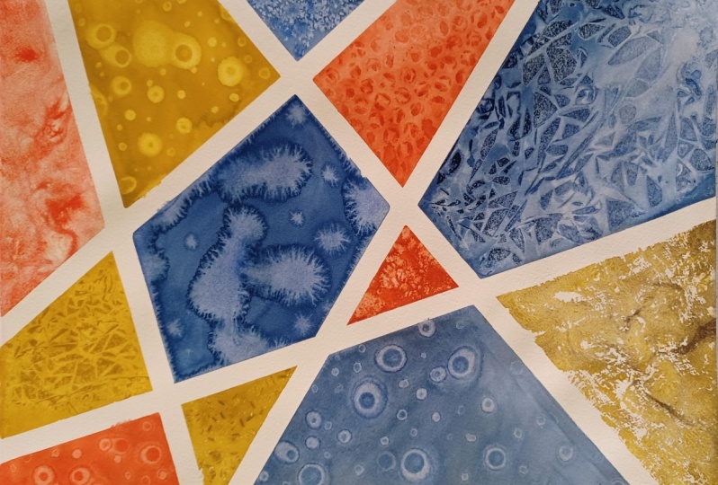
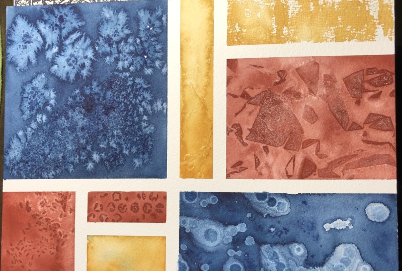
17. Final project : Cling Film & Final Touches: I have my clean film here. I'm going to put it on the side, over my coffee that is very professional. Let's go ahead and let's paint this section with Venetian red. I have some [inaudible] I just need a tissue paper. Let's paint this. Now we're going to take this piece of clean film. I'm just going to scrunch a little bit, but not too much. Let's place it on the this section and lay down. Now we're going to wait until everything is dry. For me [inaudible] almost all of these textures are dry. I have still little patches which are drying. But I'll see you in a moment when everything is dry and it's time for the final review. Of course, the satisfying masking tape peal as well. I'll see you in a moment. Everything looks really good and dry. I think now we're ready to remove these materials. For me this is one of the most therapeutic things removing or pulling off the masking tape. This is it, this is the final piece. I absolutely love it. I feel it's so amazing and I just cannot wait to frame it and put it on my studio wall. Discussing a little bit about the textures that we have received. You can see here for the rice, we have both longer and small green rice. I feel that actually calls for a really interesting texture rather than just having the smaller rice, having the bigger green rice actually creates more variety. Then salt as usual has turn out spectacular. I do wish I added or dropped more chunks of salt a little bit here. But nonetheless, it's looking so beautiful. Then we have our alcohol, which is again spectacular. It looks so pretty. The cling film has also come out really well. The rice here has come out really well on this top, first half and then for the bottom half, it doesn't show that well. Probably because the paint already started drying. I don't seem to remember if there was anything different here. But as with these textures, you will always get unexpected results. Of course, because we have explored each texture in a separate lesson. That does give you an idea about what to expect. However, be prepared that sometimes you may come across unexpected results like this one and I feel that's the beauty of the process. The water mass has also come out to really well. I mostly like this one. I don't know why, but this is so interesting. I just cannot begin to describe, but this looks so beautiful. The bubble wrap has also turned out really well. Lastly, our goals has come out exceptionally well. Before doing this piece, I did another one, which was this one and you can see, I did take a lot of learnings from this piece and made sure that this one came out a little bit dark. Or more closer to what I had in my mind. My learnings were the colors have to be a little darker. I felt that because I used a mop brush. Which is a brush like this. Since this is a mop brush, it tends to pick more water and that's why the colors look a little faded. Since I wanted a lot of contrast. I made sure that I picked a brush which would pick lot of pigment and less water. Even for the rice you can see because we used small rice, it's still a little repetitive. There isn't that much interest in comparison to how beautiful this looks. For textures as well I initially taught.
18. Final Project : Comparing & Contrasting: Probably having two to three materials for our textures would be great. But eventually, I realized it became very repetitive as my eyes moved around this piece, and I did not want that. But once again, here we went ahead and explored with more than three textures. I think we actually used five of our materials. Salt, rice, rubbing alcohol, water, bubble wrap, cling film, gauze. We actually used seven materials for this one. You can see here the contrast is missing even in terms of how I chose to place my colors, so this time I was more intentional about where I wanted what color so that it can give me most amount of contrast. Having prepared for everything and coming to this piece, I still feel that this soil texture did not come as good as I wanted. I was expecting it to be like this. I personally loved this. The reason why this has happened is probably because it had too much pigment and less water. There wasn't enough water for salt to absorb to give these sort of textures instead, because there was lot of pigment, it's still very dark and the texture is very minimum. But nonetheless, I'm happy with how the overall piece looks, so yeah, this is great. Now you may remember that I said that I'm using a cold press paper for our final piece because I wanted to compare and contrast how it differed from a rough textured paper. You can see these are both the results with salt. The only difference being water, and now let's see how that salt behave onto our rough textured paper. This was with the rough texture, I had another practice piece which I did with a different color. This is how it looks. These two are pretty similar. Of course, this is a little bit more textured because of the texture of the paper. These two are quite similar. I think the same thing happened. There was too much pigment and less water. Then in here, it was a more balanced mix of wash that I laid down. Now let's move on to the next comparison, which is going to be gauze. For our gauze, it came out like this onto the textured paper. Again, it has more texture because this paper itself has a very prominent teeth or texture to it. But yeah, I feel both the results are really beautiful and it totally depends on what you feel that day or for that particular project that you are working on, and so you can choose either of the papers and I feel the results are equally beautiful. Just for the sake of comparing, let's have a look at the cling film texture and I feel these two are by far the most similar, even though we have used different textured paper. The results are very similar, I don't think it matters much if you're using the cling film method, but they use it off textured paper or a cold press paper. Next is our bubble wrap texture, and for this one, I feel there is a significant difference. These bubbles are separated by these spaces which are around them and then we had rough textured paper. These bases itself had some amount of texture in it due to the nature of the paper. However, since it's a cold press paper which has a surface which is more promotes a finer grain. That is why there isn't much texture happening outside these circles so they tend to stand out really prominently as opposed to having them on a rough textured paper. Now we have our rubbing alcohol. For our rubbing alcohol, one thing that I can notice straight away is these cycles had very jagged edges. Again, due to how the paper is, it already had a texture and that's why these jagged edges formed, varying when we used a cold press paper, these circular edges are very uniform. There is very less jaggedness to them as we see here, and lastly, we have rice. For rice, I feel this is also more prominent on a cold press paper and because for this particular rice texture, we utilized two different cream sizes, one long and one short. You can see that the resulting texture has much more variety in comparison to the one where we only use our singular grain size. These are all my observations for the final project. As I told, I would probably want to redo the salt texture. I would also love to explore the water texture, the different kind of water texture that we created. I'll see you in the next section where I'll share a couple of more projects where you can utilize these textures.
19. Final Thoughts: We are finally done with our class. Congratulations on completing the class, and I'm pretty sure now you have a new set of skills and techniques in your toolkit with watercolors and textures. There are a couple of thoughts that I wanted to share regarding this class. One of them is for our final project, like you can see, we painted this one. However, you can also experiment with different sizes. Feel free to pick a size that is more convenient to you. Creating a frame-able art piece with these techniques is not the only way to really put them to use. Instead, I would encourage you to use different textures in your work. For instance, you can really use the soil texture by creating oceans and seascapes. Similarly, I feel I'm surely going to be experimenting a lot with the rice texture and the gauze texture. Even when you are creating some washes I feel the water texture also would add lot of dimension to that simple flat wash. Now, apart from creating this frame-able art piece, you could also choose to create a bookmark or a sketchbook page, or even for each lesson, instead of taking a separate piece of paper. You could take a chart paper and divide it into nine sections and explore each texture in that section. That way that could act as a catalog for you to refer back to in case you want to reproduce a particular texture. Now, you might have observed that is not so much control which we can have over the textures. The reason for that is a lot of it is just watercolors and the materials doing their thing. Of course, with practice, you can have a little bit of control. But I guess that's the beauty of the process that every time you experiment, the results would be somewhat surprising in one way or the other. Yeah, just explore a lot. Vary the quantity of the materials or the pigment and the wash, or the water ratio. All of those things, just feel free and have fun. All right, I really hope that you enjoyed this class. If you'd like to learn more from me, I have a couple of more classes here on Skillshare. To be exact. I think I have nine other classes on Skillshare. If you'd like to learn more about loose florals or maybe color theory, then just check out my profile page and take a pick, I hope you would like that class well. Before we conclude, please do leave me a review if you enjoyed this class, it helps me a lot and I would be super grateful for that and make sure to follow me on Instagram for more behind the scenes and I would say day-to-day updates. If you'd like to watch shorter tutorials, then I also happen to have a YouTube channel. You can follow me there as well. That's it. Thank you so much for joining me today. I hope you have a lovely day or night. Goodbye and talk to you soon. Happy creating.
 Manushree Mishra, Watercolour Artist