Transcripts
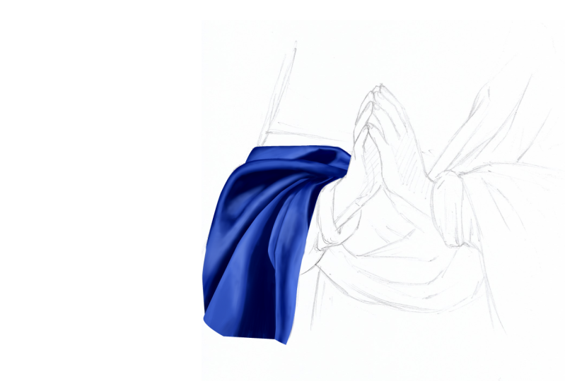
1. Presentation: in this project, we're going to learn how to paint them, blending for a shot using the most basic tools that come with the software. So it's more like learning a painting method that you can then use for every digital painting project we're going to replicate. A small portion off this ultra marine blue cloth from a very famous painting from Sassa for Rattle, which was an Italian Baroque painter, may be famous for producing sweet devotional images off the Virgin Mary and the Holy Family . This painting is called The Virgin in Prayer, and it's held in the National Gallery in London. This is a painting of exceptional beauty and quality. The vibrance of colors softness off the governments that their legacy off the virgins trades give this painting a very special solemnity the artist is best known for, so we're not going to make the drawing in this lesson. We're going to focus on painting and blending colors. I've got some other courses that I publish where I go through the drawing method, so if you're interested in learning out to draw, it might be worth watching them right. We have the drawing on the right and the reference picture on the left. First of all, we need to create the color palette that would be used to pay in this ultra marine blue cloth and in the next lesson, with good through a very specific extrapolation method.
2. Creating the Palette: I have a specific method in order to extrapolate the palate from an existing reference in a normally use illustrator. So if you have illustrated, you can do what I'm doing. Otherwise, you can download them from the resources. Or you can also directly peak five or six colors directly from the reference All you can even screen grab would take his neck shirt off the screen. So I launch Illustrator and opened the reference image. I just want to scale it down is it's too big. You can constrain the proportion off the artwork pressing shift, and that's Kelly down. Now you need to select the artwork and called the image trace window in the view image, trace that several presets you can use for our needs. We want to choose Low Fidelity Photo, which creates a limited band of colors, and it's idea for what we want to do. So when the process is done, you can see that the colors that reduced in numbers So now we want to export this picture, you can save it in any four month again. B J Peg PNG doesn't really matter. We're now back in for a shop. We can close these and we want to open the image that we created an illustrator. I just make it bigger as it's too small. And now I switched to the brush to pressing B. And if I pressed the all key with a brush selected is which is to the eyedropper, which allows me to pick the colors directly from the picture. Starting from the brightest color I can see on the reference I pain the first Swatch choosing around heart brush. Okay, for these, we need to set the opacity and flow at 100%. I've been the 1st 1 that I move on to the seconds watch. Now I can jump a few tones and get dark at color, making the feds watch than the fourth. And this one is the darkest is the fifth color, and I've in fact, colors are enough Now. I renamed the layer into palette, removed the image trays underneath the background, so we keep it there If we move again again. If you don't have illustrator, you can stream grab your screen and grab the colors out of it. Otherwise, you can download the color palettes in the next lesson. We're going to learn how to use the path tour, and if you don't like the path toward this, an alternative to it.
3. Understanding the Path Tool: in this lesson, we're going to learn how to use the path toe we create. A new document off about 1500 by 1500 picks is at 72 d p I. The PATH tour is deciding here. Basically, with this to selected, you can create path. So this is a puff. Many of you might be already familiar with this tool in the strait, also as the same functionality. So you create path with this tour, and then you can select and manipulate the path with this store with a black cow. Or you can select the path and move it. Why, With the white horror, you can select the individual points, forming the path and manipulate the handles so you can selectees so like that to delete a path you can press backspace or delete. If you click impress shift, you can create straight lines or 90 degrees or even 45 degrees path to see the path you can click on this icon here. Otherwise you can go window path. You have a working path here, and if you double click, you can save the path. As for layers, you can create pathway years and into each of them. You can draw some path, and there's which between the layers, so we don't need them. Now. If you want to create a curved path, you have to click and drug and then click and drug as you can see the kind of changes. If you drag the handles more, as we did before, we can now select the black Arrow and move a bit the path. Or, if you want to adjust, occur, you can select the white horror and then play around with the handles. If you press and hold, you can find some interesting two options. I never really used a free hand path to which I believe is not that used for this is quite useful at Anchor Point or which adds a point, and this one is to delete an anchor point. So if we select odd, we can aren't anchor points along the path. You can do the same with the curved path. We now switch to the delete anchor, pour into, and we can obviously delete points. If you delete days, it will go straight there as this is a linear path. Deleting along curves with create some problems so If you delete a point, you will probably need to readjust it Have with the white horror. This is the convert point which basic transforms air curve anchor point to linear. So as you can see, it kills the curvature and create a straight line between points. This function doesn't work on the linear path as being already linear. We go back a bit by pressing common alzette a few times we select now they're White Arrow. We can select one point and move it as we saw. You can move the handle now. If you press old, you can move. Only one handle keeping the other one still. Now we create a random shapes. Something like these can be any shape. You then select the black arrow, you select the path and then you click thes Aiken here days transformed the path into a selection. Once you have a selection, you can create a new layer and feel this selection with a chosen color so we can undo that . An alternative to free with color would be to select the path, choose a color you like, and then press these Aiken here and these feels the path with color and we do that. You now select a round brush said the size to about five pixels. We select the path, and then we pressed this hiking here and we go back. So let's make a quick example. With the puff selected, I create a new layer, choose one color, transformed the path into a selection and fill it with color. Now select the PATH tour. You can create a line. It can be anything you like, and then you close the path. Now we select the path, transform it again to a selection, create a new lawyer and she's a soft airbrush. Now we make the color lighter, and then we paint a little bit off the selection so the color is fading. At this point, we de select and create a clipping Musto by pressing common old G or control old G. We do that again. Create path, create selection, Choose this time a darker color Hi this election with common age and start painting and finally convert the layer into a clipping mask. Now, if we create a new document can be 1500 by 15. Under picks is but this demonstration we can create just two random shapes. So click and press shift to make the path straight and then click and dropped so we can make a curve and close the path Double click to save the path. And then we can have these other shape you click impress shift we do 45 degree, then go straight and closed the path Now with the white arrow. We just want to amend this Boeing using the keyboard. We have this shapes select both of them with a black arrow moving to the center s. Tell them up a bit. Now, if we select the path and create a selection with these now you select the other path and you click the same Aiken. But with the old key pressed, this window will pop up. And if you select odd, the first selection will be up to the 2nd 1 And we wouldn't do this. If you do the same as before, select the path press old and now you select subtract. You have this selection minus the 1st 1 Lastly, we go back, select the path, please. We're all pressed and this time we intersect the selections and you will get this kind of selection here. So now that we explored the path to functionalities, we are now ready to make the actual path for drawing in the next lesson.
4. Making the Paths: in this lesson, we're going to make the path for this drawing. What I want to do is displayed the club into several shapes so I can treat them individually. If you call the path to window, you can double click on the firm now, and this will save the path. No, I can create the second path and then close it now, the fad dizzily to turn up edge. If you're not used to do this method, you might think this is a bit confusing, but it will make sense later where we start painting, working relations and Palffy's will about understanding what is on top off the other. So what is going to be visible and what is going to be hidden behind and this last path? Now we are ready to paint.
5. Alternative to the Path Tool: If you don't like using the path to and you work with for the shop CC 2019 you can sort off skip the path creation, even though I believe learning this method is quite important. If you select the brush toe, you can see there's an option cause moving these basically wills move out the brush strokes , for example. In procreate, these functionalities course streamline. So if I do a pain stroke at 0% you can see that the line is a bit your regular. But if we set it to 25% you can see this is like delay and the stroke is more fluid, so we increase it to 75% and we can see that's even more delayed, resulting in a nice in line as well as 100%. So if we want to make an example on the actual drawing, we can create a new layer. We moved the drawing on top of the layer we just created with switched delay in mode to multiply, we select the empty layer. Now we can choose any color. This is just demonstration does have to be the blue that we created before. Now, if you press are you get this sort of sun dia. You can basically rotate the artwork without actually changing your impression. It's just a display thing. So if you press be used, which to the brush toe air within our brush selected, you basically followed the perimeter of the shape you want to pay, and you have to create close shapes, also called watertight. Now you can switch to the magic want. You have to be sure simple layers is unchecked, so you select inside a shape. Then you do select, modify, expand. And here you have to try. What's the best number? So you can try five, and that's fine. I can see that this election got begin is now over the perimeter. Now you want to feel this election, and you do edit Phil and make sure foreground color is selected and that's done. This is the first shape. Now you want to do these four or the remaining parts. If you press command or control, why creating a new layer? The layer would be created underneath the Karen layer and not above. You do the same thing as before. You do a water tight perimeter to reach to the magic warned. Guess election and then feel with blue and then you would carry on and do the same for each individual parts. Right In the next lesson, there's a very important demonstration off the painting process.
6. Painting Demonstration: in this painting demonstration. I'll show you the technique I use. I switched to the brush tour. You can press be otherwise and if you right click on the document, the brushes window appears. As I mentioned at the beginning off the course, we're going to use the most basic brush, which is the heart round. If you switch to text on Lee, you can select it. So this is the most basic brush and it gives you days. On top of that, you want to turn off all the options like pressure and shape dynamics. So it cannot be more basic than this. While you have the brush selected, the new pressed you'll key the process which is to the eyedropper, which gives you the possibility to pick the colors. The only extremely important option we're going to modify is Thea Pass ity and you can use disliked here. Oh, go by numbers. If we accepted to around 35% you have this kind of thing and we can undo that right? We start from the first color and we create something like these. Then we select the second color how we did the same by painting an area similar to the 1st 1 next to it, then using the all key with which to the eyedropper, and we select the further color than the fourth color. In terms of direction, you can see that I have a really would be more evident later on. I just want to move this one to the sent off the composition. Now I picked the fifth color, and I do the same and finally the darkest color. So now we have a rough version off the color palette above. It's pretty similar on Linux. Capacity changes if we now select the fifth color, we want to paint in the adjacent area where the two colors meat. But this time you can see that the strokes are much more irregular and short, so he's like tapping. Also, you want to create some noise. Some cows. Now you go back to the darkest color, and again you paint. You basically moved backwards, re selecting the colors and painting the middle. When the 1st 2 passes are done, you can also start picking the colors from the painting and also from the color palette. And then you can she knew, feeling the area are you can decrease the opacity of them or something around 15% and you continue with the same process, you can actually see their grade intense. Taking its shape. It's important to break the uniformity off the colors. You don't want something too polished and perfect, but something more dynamic, something that can recall a traditional painting, something lively and less digital. If that makes sense, so we continue with this process. At this point when you have to feeling the one you did, it's roughly down. You can duplicate the layer a few times. You can drug in the layer onto this Aiken here, or press command or control J. Now duplicated four times, you can see that the painting became or Paige. The colors are fuller, and it's similar to the color palette in terms of consistency. Now we can merge them together. You can select them with shift key, and then you can do merged layers or pressing command or control E. Now we switch to the brush tool again. We select a color around the area, and we keep brushing, setting down the opacity again so the changes will be minimal. We select the darkest color and we ease out the transition here and we basically once again do the same as we did before. We're not going to get a perfect blending now because there would be done later on. We just want to get something really accurate and I think this is enough. I'm quite glad with this. So in the next lesson we can apply this principle, this method to the actual club.
7. Painting: in this lesson. We're going to paint this piece off government before we start. I want to show you a very easy way to select layers without actually searching for them in the layers stuck on the right here. If you have many lay as it can get quite confusing toe. Identify them so I'm easier. Way to select them when you paint is too quickly is which to the move toe pressing V, and then you can either right click on a layer and select the top one or even easier. You can press command or control, and you left. Click on the layer you want to select, and you then press be to switch back to the brush toe. So if you see me moving a layer and then undo, that is because for me it's just easier to do that way. So I'm sure a lay a selected, but obviously that's my way, and you can clearly find your own. Another quite useful function that I use. All design is the clipping mask. If you have a layer with any shape inside, like this one here and you create another lay on top, you can create a clipping most by pressing command or control old G or do create clipping mask. You can see the honorable pointing down appeared next to the family, and this indicates that this layer would be only visible in relation to the shape below. So if I change color and then paint, you can see that this layer is visible only within the area off the bottom layer toe on clipping the mask, you compress again, command or control old G. And if you undo and you want to merge this clipping mask, you can press comment. E. You'll see that I used these old design, right? So we are now back to the cloth. We create a new layer. You cannot sign a color if you want. Then if we press a with reach to the path selection toe, we select a path and we transform it into a selection. Then we pick the second life sculler, impressed Shift F five, ensuring they set to the foreground color and press OK, and we feel the first shape. Now I want to rename the drawing layer into drawing movie on top of this stock and changed the mode into multiply. We can then lower the capacity off the layer by half, so he's not too distracting. Just want to move the palette in a better place. Now we create a new layer. We clipping mask it by pressing control. Old G cellar in our round, Brush said. The flow 200% and capacity it around 40%. We want to use a low opacity brush because we want to build up the tones by painting strokes or with strokes. We're going to start from the darkest part of this piece of government, and we want to define the area festival. Now we can reach the color and to find the brightest part. If you use the brackets, you can increase or decrease the brush size. Now is which to the path to pressing a select the adjacent path. Trust for me into a selection. Create a new layer. Select the feds watched this time, then feeling with color, then create another layer and clipping mask it. We now select the fourth swatch, and as before, we want to sketch out the shadows area so you can see there's a dark edge there. - Now I define that part where the clove creates a quite specific fault, and I switched to a lighter color so I can define some lighter shades. As you can see, it's quite lose at the moment. I'm not painting too many needles. I just want to block out the main shapes and identify the volumes. Now we select the other path, which was formed this into a selection. We create a new layer that we select the thirds watch. We feel the selection with the color. New lay again clipping must be control or G. We're now paying the lights first. Speech, color. Now I select this path. I create a new layer, transform it into a selection. Then I picked the fourth color and I feel this election. Then I clipping musket. Now I select the other path trust form again into a selection. Create a new layer, feel this election. Now I create new layer, are create another clipping mask and I select the fourth color. Can I start painting with this dark and blue? Now it's like this path that transform it into a selection, and I just realized the care. But it's not correct. Maybe I want to redo it, so I select the path tool and I create a new carve, transformed this into a selection and then basically delete what's inside the selection. So I've got a new shape. Now I can pick the dark blue and then paint again and trying to define the shape a little bit better. Then I can select the darkest blue we have as we can see in the referencing. It's quite dark blue, so we want to get the same level off darkness. So I make all of these area darker and also thes parts so I can get a selection from the layer in a high this election. So I can just paint inside the selection, which is not feasible. I can paint some darker tone on this name and then I was reached the lightest blue we have in our palate. So we want to play some lights now reduce the brush size using the brackets. Can I keep painting on this garment? And now I moved onto this piece. I want to define thes area better to paint straight away. And rather than using the path tour, I can't define the Shadow Ira. No, I can pick the color directly from the reference and apply the same color roughly on the same spots. Now I create a new layer, and I defined these areas a little bit more and now create a new layer. I want to use the path tool from these so we can keep it consistent. I transformed the path into a selection and then I feel selection with the blue color. Then I select the dark blue. Then I imagine a few layers together and then I paint these darker margin now, create the new Leia I clipping, mask it, and then I paint this dark area you can see on the reference there's a bit of a full there , which is quite dark. I can select the same kind of blue from the reference and then switch and paint some lights . Now we can go brighter or lighter, and we want to apply some lighter town. So we are slowly moving towards the highlights. Act on defined just the most illuminated part of the government. Reduce the brush size using the brackets. Now I want to are this color to my palette. So it's a reach 200% capacity, and then I aren't these six color which is the brightest. Then I can quickly fix this, and I think this could be enough for the first pass. In the next lesson is a blending demonstration.
8. Blending Demonstration: As for the painting in this planning demonstration, I show you the technique I use we want is which to the mixer brush tool. And we want to select a soft round brush, which is thesis. Now we want one Check this. Check these and then you have a few settings here. We want to take simple layers and then you can choose between this presets. Here, you can try them out and see how you feel. But for me, the best set things are this. Five, five, 89 100. With these settings, you will basically blend colors together rather than adding paint. So forget about this much in tow if you after a really good blending brush the mix of brush toe is the wall in your shoes. The only thing to keep in mind with this brush is that you don't want to pay along the edge along the perimeter as if you have simple layers on it. Would Semple that white background also so basically our problem cones about this brush. But for me, it really works well so we can undo that as well as for the brush to. You can use the Brock has to increase or decrease the brush size, and then you gently start blending. And as you did before, for the painting process, this is exactly the same. You gently blend here. They're blending horizontally, then vertically and then regularly, so you don't want to focus on to one spot on Lee. You don't want to. All the do any area in particular are you treat this era entirely, so it comes altogether. You also want to change the brush size. So, generally speaking, the most important thing is to different shape, the way you blend and paid and the fact that we have the capacity off the brush. Whitelaw is good as changes are minimal. Even if I'm using a Wacom tablet, I've got the pressure off. So the level of action off the brush is consistent throughout. Another thing about digital painting is that you don't want something too polished like a vector radiant, but you want to simulate a little bit what you would get with traditional mediums like oil paintings or acrylics. So, as you can see here is coming along nicely by you can still perceive a sort of transition, which is typical in some real paintings. Now again, you can increase the brush size and break the regularity of the shading. Right. So if I now take the selection toe, I make selection. I can invert the selection and also do command the control I and then delete what is outside. And I can select we command or control D. And here we have a quite nice and convincing blending in like before we're going to use this technique, this method to blend our cloth.
9. Blending: and now I'm going to blend what I've done. So if I using the mixer brush tool, as I just explained I used is very low set things because I want to be in full control off the level off blending. So it's not about getting a strong effect, but a very SAPTA one, so we can gradually achievers move surface that consistent rendering. You don't really need to use the same setting. Amusing. You can experiment yourself so it's best for you. Maybe you want something mawr evident or present, but my recommendation is to keep, you know, in terms of values again, you have more control. I just want to reduce the size of the reference picture, scaling it down with common tea or control T and holding shift to constrain the abortions. Now I can go back to blending when you paid. You want to follow the shape off the club as the colors. It's lively pool when you brush, so you might see that there are some directional strokes, and that's why you see me sometimes painting horizontally. That's because I want to break this directional floor if that makes ends because we using the symbol or layers function with the mixer brush toe is not really important, which lay choose because when these option is on the brushes kind of ignoring the layers and behaves. If there was just only one for this reason, you want to be away from the marching off your painting because if you paying along the edge, the brush, but also simple the white background and this is something that you don't want. So now I'm going to merge some layers again so extremely important at this point, and I keep brushing so you see, you can see can take a lot of time to get us move surface. But the thing is that we don't need to rush or necessarily find the quickest or the smartest way to do something, and this is a very important thing to keep in mind. For example, if we had pain, something like this traditionally would take much longer, we would have to wait for the pains to dry, or we will have to clean. The brush is at the end, and because we the digital tools, we don't have all of this. It doesn't necessarily mean that we have to go fast so the mix of brush to list the best to first mansion by far. To be honest, I always particularly struggle with this much, too, and I never really made it working properly. I'm totally satisfied with the result I get with the mixer brush tool. So if you are after a perf, it's mansion toe. I think that's the one. Now I can jump onto the other side. Life will know the shape of the cloth now , breaking the surface a little bit very gently. And now this fold here, basically the secrets to pass over and over, focusing on one spot that move away and then come back. I continue with this process. No, here. I realize here that I penned it outside so I can get selection out of the layer, pressing common or control on the farm. No layer. Invert the selection and erase what's outside. Now I can Myrdal, depending slayers. If you want to measure them down, you can select the top layer and press common or control e. Otherwise, you can select them with shift selected and again common e to merge them once they are match. I want to continue mixing the colors, especially along the lines when the different parts of the cloth made. So you want to fuse them together, you want to give some softer look. So I think this could be enough for the first pass, and I want to out deters and better than finding cloth.
10. Adding Details: in this lesson, we're going to better define the cloth, so that means that we're going to paint some additional details and then blend them out straight away. So I create a new layer switch back to the brush tool. I reduced the brush size using the brackets, and now I picked the darkest blue. And then I'm going to define this four things here also here and some shadows here now eyes which to the mix of brush tool and I blend colors together, so I disappoint him. From now on, it's all about speech in between the two brushes, the brush toe and the mixer brush toe, adding details and blend them in. Now the stock area. Now these ice, which again then I know with the brush capacity to something around 15%. And I want to make this area darker, actually, maybe some somewhere around 35% eyes which back to the mixer brush to longer to blend. What I've just painted is also by important not to blend the painting too much. We don't want to achieve a super polished surface that would look to digital like a vector radiant, but we want some color dynamism size, which to the brush toe. I just want to define this margin here and also here. Now I can pick one of the brightest blue we have available and is likely defined the highlight, as you can see in the reference also. Then we are this color in the lighter area off the cloth. Now is which, to the mixer brush toe. We blend in with the larger brush. - Now here quite gently. Nothing too drastic. As you can see, the perimeter of the cloth is not perfectly clean. This means that when I use the mixer brush, so I paint. It's likely on the outside, and I also brush the background. That's easy to fix. This is something I can do later on. I just now want to ease out this dark line. Now I create a new layer switch to the brush tool. I pick a dark blue from the shadow area and pains. I want to better define these area mixer brush tool again em. Let now we're going to up the highlights. Switch to the brush to I picked the brightest blue from the color palette, and I make it even brighter so I reduce the brush capacity to be around 17% and then I start painting with this new color. You only want to pay in the highlights where you see the brightest area on the reference picture and you don't want to overdo these as too much of it will make the painting look flat. Now we want to blend these new strokes with a mixer brush toe. We gently paint over them again. It is good not to polish the surface too much. I liked if either you still see some strokes and I think this is enough for this demonstration. I believe this level of defense this fine In the next lesson, we're going to do some color correction and adjust the contrast of the image.
11. Colour Correction: in this final lesson, we're going to at some contrast and color balance to the piece of cloth that we've done. Now we can adjust the levels if you press Calmund el control L the levels window appears otherwise you can do image adjustments levels so you can shift the meat. Turn arrow towards the left has been It's the white our and slightly moved to the right the black arrow. So you can see now that the cloth has called more contrast. Now we want to adjust the color balance so you press common. Be control. Be again. You can do image adjustments, color balance and then you shift the hour towards the blue. I can do the levels again and make the cloth a little bit brighter and thats done. And I can say that with this final step, this demonstration is now complete. You can obviously apply these principles where you learn so far to anything you want to paint in the next final video show you a couple of more trippers that I painted
12. Recap: and here we are at the end of thes lessons. During this course, we learned how to create the color palette in illustrator and how to use the path tooling for a shop. We also went through an alternative to the path tool. As I understand, that approach is not for everyone. Then I made a painting demonstration showing that even with the most basic brush by the heart round, we can get something very interesting and realistic if you want. Then we apply what we learn doing the painting demonstration to the actual painting. We then went through a blending demonstration using the mixer brush tool and again using the most basic brush, which is the soft round. There we blend our piece of garment getting anizers move painting surface. After that, we painted in some additional details and finally went through some color correction. Here are a couple of examples. Some Draper's that I painted. The Red Curtain on the right is from a very famous painted from Caravaggio Judith and often held at Palazzo Barberini in Rome. And the orange cloth is from the Tonda Dhoni, painted by Michelangelo held a dif itty gallery in Florence. I hope you guys enjoyed his course. Feel free to get in touch If you have any questions or you need any clarification Thank you very much for joining in. And I reassured the best Goodbye.
 Maurizio De Angelis, Scientific Illustrator and 3D Modeller