Transcripts
1. Intro: Hello everyone, welcome to this class. My name is Ashley and in these videos, I'm going to be talking about everything to do with getting started with oil paints. I'm going to be covering the very basics is perfect for complete beginners. But for those who already have some experience, you may come across one or two things which you'll find helpful as well. I'm going to be covering a lot of things, starting with setting up your own workspace or cover all the materials you'll need, including types of painting services, different paints and building your own color palettes. I'll talk about the varieties of brushes and all the different marks they make, along with creating different textures with painting mediums. I'll also teach a few basic oil painting techniques. And we'll have a few easy projects for you to follow along with. That will get you used to actually using oil paints. As I said, we are going to be covering a lot of material in this class. But at the end you will have all the tools and skills you'll need to be in painting. So heads the next video, and I'll see you all.
2. Benefits of using oils: Hello again. In this video, before I jump into getting started with oils, I briefly wanted to go over some of the differences between oils and the other mediums, especially focusing on acrylics as these two are often compared together. I actually started with using acrylics, but after I tried oils, I never really looked back and I'll explain why later in the video. I'll start off by saying that the two are actually very similar in terms of that application. And they both can achieve at very similar results. One of the main differences between the two is that oils tend to dry a lot slower than acrylics. For oils, it can take a couple of days to become touch dry, as opposed to a critic's which dry in a matter of minutes. And this isn't necessarily a good nor bad thing, as it entirely depends on how you like to work. For example, when using oils, you've got a much longer working period in which you can manipulate the colors and blends to how you'd liked it. For acrylics, that window is a lot narrower. So you've got to work very quickly and make those decisions faster. The plus side to it is that you can create layers a lot quicker and easier with acrylics because he didn't have to wait those couple of days for the paint to dry between layers. Other thing to bear in mind is that the drawing times also applies to your column mixes that you've got are on our palate. When using a critic's, you may find that the column mixes they dry before you can use them, which can be quite frustrating if you constantly have to remix your colors and try and find the right shades. Obviously this wouldn't apply to using oils. Now you can't actually get mediums that will change the drying times of both oil was Anna critics. So they are both quite versatile in this regard. Another big difference between the two would be in their consistency. And this is one of the main reasons why I decided to use oils, is little bit difficult to describe without trying them both out. But basically oils are a lot thicker than credits and they hold their shape quite nicely. Allowing for coin has blends. Because of this, I believe oils are better for creating textures and also for doing in past work. Again, as little bit difficult to describe. So if you're curious out, advise getting achieve of both trained and try them out to see which one you prefer. The last difference I mentioned is that when they dry, critics tend to have a rather matte finish. And the colors aren't quite as vibrant as an oil painting. I'm sure there are other differences, but those are some of the main ones. And on the whole, I would say that oils such as a little bit more versatile than acrylics. Bill that said, acrylics are definitely a lot less hassle and also cheaper to get started with. Although the professional quality acrylics are just as expensive as oils.
3. Setting up a workspace: Okay, so the first step in getting started with painting is to have your own workspace. Now for these classes, I'm gonna be working in my studio here. But I know a lot of people don't have access to a dedicated RStudio. So I'm going to be talking about how to set up a workspace in urine hand. Actually, when I first started I first began working in my bedroom, which I probably wouldn't advise because some of the materials we use are quite hemi. So it's probably not the healthiest option. I would say the best place for setting up would be somewhere that's a little out of the way and maybe in the corner of your living room or something like that. But the main thing that you are going to need is work surface that you don't mind getting messy. And that's also large enough to hold all your materials as well as your palate and easel. Now I've got a full size ISA, which is quite sturdy and can hold very large canvasses. But these are quite pricey and can take up a lot of space. To begin with. You may want to get a table top easel, which are a lot smaller, but also a lot cheaper. And you can actually use fairly large campuses with these as well. They will definitely hold 2016 inch canvas, which is perfect for when you're just starting out. The other thing I mentioned was a palette and there are many things you can use for a pilot. I've got this large wooden palette, which is great for mixing large quantities of paints and enables you to have many colors and mixes out at the same time. Which is quite convenient, especially for when you're painting a large works. I actually prefer putting the pallet on the table rather than holding it. So if you're the same, it would mean that it would take up a lot of space on the table. But you can't get smaller wooden pallets like this one if you prefer. Another popular option is to make your own palette out of glass. I've got this piece of glass from an old picture frame, and I just put a wooden NDF board behind it to give it a neutral background. And I also taped at the edges to make it safe. The last option are these disposable paper pallets, which come in like a book. And when you're done with it, you can just peel this off and throw it away, revealing another paper palette. They come with many sheets and the plus sign to it is that you don't have to clean up. But I personally prefer the feel of a proper, substantial palette. The last thing that you're going to need on your workspace, our containers and jhanas to keep all your paints and brushes. I've got this cardboard box which I used to keep all my oil paints. And then I've got these two jars to keep whom my brushes. I like to separate my brushes to try and keep things organized. I've got one jar where I keep all my larger brushes. And the other one is for all the smaller ones. So this is what my workspace is looking like so far. But a few other things you will want to make room for. A few rags and paper towels, some painting mediums, and also a couple of palette knives. So there you have it. That's how I would set up a studio. I'll talk about the individual materials in much greater detail in future videos. But hopefully this will give you an idea about all the things that you're going to need.
4. Painting surfaces: In this lesson, I want to talk about all the painting services that I use and what I believed to be the best for when you're just starting out. But before I jump in, I just want to mention that all the materials that I talk about throughout the whole course will be listed in the description box if you wanted to check any of the mammals. So I'd like to buy pre primed and stretched cotton and canvases from Winsor, Newton. And I like buying them because they come immediately ready to use. And I don't need to worry about preparing the surface with primus ingest those and that sort of thing. I can just get stuck straight lines painting. There are actually two main materials that counters are made out of. Those being cotton and linen. The main difference between them is that Lenin is more durable and therefore has better archival qualities. So obviously, most artists would prefer to buy linen, but that does make it more expensive as well. Now you can also get different thicknesses of stretches. And I personally like to get the thicker option as it feels a bit more robust and sturdy. And if I compare the two, you can see that there's a significant difference between the bits. As I said, I buy these from Windsor and Newton, and they are certainly not the best. There are a few problems with buying pre-stressed canvases. Sometimes the measurements are a little bit off, so you get some lengths which are longer than others. And often the stretcher bar made out of cheap word. So they do have a tendency to walk as well. And that's another reason why I like to buy the canvas with the thicker stretcher bar. That said they are by no means a path for the price. What I actually would recommend for starting out would be these cotton Canvas boards from Windsor and Newton. You can get these in a variety of sizes and they are ridiculously cheap. You can buy something like this for about two pounds, 50, which is just insane. They are a bit flexible and the probably won't get you in any galleries. But they are perfect for doing small studies and just generally getting used to working on Canvas. And I will be using these for all the demonstrations done in this class.
5. Paints and brands: Okay, so now let's talk about paints. And once again, there's quite a variety of types and brands that you can choose from. And they all have their own properties and characteristics. I actually haven't been to adventurous in experiments we will these types of paints. And I tend to stick with what I've always used, which are Windsor and Newton oil colors. I would say that these lies somewhere in the middle in terms of quality. And I say this because they are one of the most well-known brands. And I haven't ever run into serious problems using them. Having said that, sometimes when I first opened achieved the components of the paint's haven't been properly mixed. And that results in having quite a lot of oil collected at the top. It doesn't happen all the time, but it does mean that you've got to manually mix it yourself, which is a bit of a pain. Other than that, they are pretty good, but they do actually have to lines of regular paints. They have a cheaper version, which are these Winton oil paints, which are about three pounds for 37 milk cheap. That's if you buy them individually. And then they have a more professional version, which are these artist's oil paints, which sell for about six pounds. The main difference between the two is that the Wynton oil paints have less pigment. So lose this saturation a lot easier when mixed with other colors. To be honest, the difference is pretty minor, so I wouldn't worry too much about it. You can buy a set of ten paints for about 23 pounds. And this is actually the set that I got when I first started. There's other regular paints, but they do also make a fast-growing option, which are these Griffin alkyd oil paints. And these tend to dry in a matter of hours, as opposed to the regular ones rich, dry in a day or two. I don't actually use these too much myself, but they can be really useful if you like working quickly and using a lot of layers. I do believe that they are a little bit more expensive than the regular ones. Another option that we have are these water mixable oil paints. So you don't have to use a harsh chemicals. Once again, I've actually never used these myself, so I can't really comment on what they like to use. But if you are concerned about using harsh chemicals like Weisberg and turpentine, then this may be the option for you. So that's Windsor and Newton, a few other brands which are worth mentioning, our Taylor and Ronnie. And I believe this one to be one of the cheapest brands you can buy. I believe you can get 37 mill tube for about two pounds. But I do also have a professional line as well. Another Bryant which are actually happy used is royal line nickel. And these have a much oily consistency. So they take a little bit longer to become touch dry. I think it took about five days to a week. And compared to Winsor Newton, which drying about 24 hours. Another really popular professional brand is Gamblin. And once again, I'll never use these myself. But you can buy a tube for about ten pounds. So those are pretty expensive. So that's an overview of paints and some of the different brands. I will be talking in a lot more detail about the colors that I use and building your own palettes in a future video. So stay tuned for that, and I will see you in the next one.
6. Colour combinations: So in this hasn't, I'm going to be talking all about colors and the different color combinations that you can get. So you may have come across the term primary colors. And these are the base colors that all the other colors stem from. Those include red, yellow, and blue. So I'm gonna be using the color wheel as this is one of the best ways to demonstrate how will the colors interact with each other. So to show you, I'm going to first use ultramarine blue, cadmium yellow, pale, and million red. So I'm just gonna get a few out on the palette. I'm gonna start with blue at the top. Slot is one variation of the primary colors. And if we mix equal parts of these colors together, we're going to get the secondary colors. Say if we take an equal amount of yellow, blue, and red, we will get an orange. We can put that in the middle. And if we mix blue and red, we're going to get some kind of purple. Now here I think the warmth of the read is countering the coolness of the ultramarine blue. And so we're getting a rather dark purple sort of Color. And then if we mix an ultramarine blue with cadmium yellow pale, going to get a green. So those are our secondary colours. Now we can actually get the tertiary colors by mixing the primary colors once again into the secondary colors. So for example, if we take some, another bit of blue and add it to this green, just in one side. We are going to get a bluish green and we can put that in between these two colours. We can even blend them. So now we've got a bluish green on the other side if we want to get a yellowish green and just mix that in that side and put that in between here. This is now equal to yellow, green, and just do the same again for all the other colors. Okay, so now we've called the tertiary colors. So from these primary colors, these are all the variations that we can get with these. Now of course you get a different varieties. Primary colors. I'm gonna demonstrate the difference between these primary colours and a different set of a set. I'm going to be using Cerulean, Blue, quinacridone, magenta, and yellow ochre. And I'm just gonna do exactly the same thing as before. And so now you can clearly see the difference between the two color palettes. This one, you get a lot more muted sort of turns. But at the same time the color transitions are very nice and smooth. This and on the other hand, is a lot more vibrant. But some of the color mixes don't quite work as you would expect them to. For example, the reds going into the blues, it doesn't really make a purple. Kind of more makes muddy, brownish sort of color. So now you may be wondering, looking at these, how can we actually make brown or what, where does Brown come from? Well, there are a few combinations, as you can see here, we've kind of got them muddy brown. But one common way of making Brown is to mix two colors that are opposite each other on the color wheel. So for example, if you mix blue and orange, you're gonna get a pretty dark brown, as well as mixing red with green. And these are also known as complimentary opposites, and which I'll talk a bit more about later. But just to show you, so if I take this orange color, I'll just remixed this orange. Say if we use this orange here. And mix that with ultramarine blue. And just take some here, mix that in, they're going to get some kind of murky brown. So that's one shade of brown. Another way is, as I say, we can make, we can use green and red. So if I take some of this green color and mix that with some of the remaining red. May have put a bit too much. Again, we're gonna get some sort of a muddy brown. So I'm going to just try it with this pot. So if we take a purple, so I'll just mix a bit more blue. Blue in here, called a purple. And if I mix that with some, yet, again, we get some sort of money Brown. And basically we just mixing older varieties of colors together to get the variations of brown. So if I wanted to, I could make some of the median red and hit warm this brown up. Maybe a bit more ultramarine blue. Then I get a slightly warmer, slightly warm up around there. Now suddenly else I wanted to talk about the types of whites and the difference is between them. So I use two types of white. I've got titanium white, and then I've also got flake whites. The difference between them is that titanium white is a lot more opaque, then flake whites and you get other different transparent whites. So with this flake white, they'll say Zinc White and lead white. But they're all essentially just transparent whites. So I'm just going to show you the difference between them. So this is flake whites and this is titanium. So if I show you with connecting emergent, so I'm gonna take touch of quinacridone, magenta, put them in two places, so we've got even amounts. So I'm going to use flay quite m's gonna take a little bit. Little bit of flake white and mix it in here. So it has lights and bid, but it's still quite strong. And then if I take titanium line, same amount of titanium whites and mix it in here. You can see as tinted it a lot stronger. Sometimes put these down next to each other. So basically the tinting strength of titanium white because it is a pig, is a lot stronger then the transparent whites. And so it's a lot easier to get the subtle tonal varieties with flake white, then it would be fought with titanium. At the same time, you don't need to use as much titanium to get the same result with flake whites. The one thing about titanium white is that it does have a tendency to become quite chalky. The column xs PHI start mixing in more and more. We're going to start getting quite a chore key. Chalky consistency. However, that's not so much the case with flake white. So that's the main difference between the two whites. It's now I don't actually have a black in my palette at the moment, and I prefer to mix my blacks. So a good way of mixing, or blacks is, or rather a good way of mixing your dark colors. One way is to mix the two colors that are opposite on the colour wheel again, we will get a very dark tone. Another way, which is my favorite way, is to use a burnt umber and mix that with ultramarine blue. And this is a very popular color mixture and a lot of artists use it to get those really dark tones. So if we take some burnt umber and mix it with an equal amount of ultramarine blue. You can see we get a very dark mixture down here. And the warmth of the amber contrasting with the coolness of blue. The pre-image just destroy each other, resulting in this really dark mixture. T, you can get really dark tens that way. And the good thing about this is that you can alter how warm and how cool you want your color. So if you want your dark turned to be a little bit cooler, you can just add a touch more ultramarine blue to shift the ratio and you'll get a cooler black. And you can do the opposite with burn town, which had a bit more burnt umber, and mix it with the ultramarine blue and you'll get a warmer. A warmer black. So now just to go over a few of the color combinations. So I've already talked about complimentary opposites, which are two colors that are opposite each other on the color wheel. So blue and orange, red and green, and purple and yellow that all complimentary offsets. And what they do is that the contrast very strongly against each other, making each other standout, which is why they are called complimentary opposites. And also when you mix the two together, as I've already mentioned, you get a really dark mixture. As a result. I most commonly use this combination to accent the subject that I'm painting. So for example, if I'm painting a portraits which has got very warm, orangey, red flesh tones in there. My background might be some kind of a blue and that will enhance the oranges and reds, making them standouts. Now usually I don't go for a very strong blue because it would just be too jarring. They stand out way too much. So usually turn the blue down with titanium white and it will burn somebody to get a more muted Kind of Blue, which will then Ax, Ax and the colors rather than compete with them. Another combination that you have is triadic. And these are three colours are placed equally around the colour wheel. So for example, blue, red, and yellow. That's a triadic combination, as well as green, orange, and purple. Now these colors, again, the contrast very strongly with each other, creating a very sort of vibrance and punchy effect. It is best used when you choose one color as your main color and the other two as more muted accidents. And lastly, we have an analogous colour combination. And these are three colors that are spaced next to each other on the color wheel. So for example, we have yellow, a yellow, green, and a green. Or you could have a red, a red orange, and an orange. And the resulting effect is quite harmonious. And there isn't much tension between the colors you'll kind of fits within the same color scheme. So those are a few color combinations. Now obviously you can mix and match all the different types of primary colors to get, get the different variations. For example, you could use Freudian blew the million red and cadmium yellow pale, and you'll get a different color wheel. Then either of these two that we've got here. So this is why I like having quite a few varieties of the primary colors. Just because of all the variations and combinations that you can make, you can get quite a wide range of secondary and tertiary colors from them. So hopefully this has helped give you a bit better idea about how the colors interact with each other. And also a few different color combinations that you can utilize in urine workforce specific effects. So hopefully you found this helpful. In the next lesson, I'm going to be talking all about paints and building your own palettes. So head on over and I'll see you there.
7. Building your colour palette: So now that we've talked a bit about color in this video, I wanted to show you the palette that I use and also go over things to consider when you're building your own palate. So my partner has changed quite a lot over the years. As I mentioned in the paints video, I originally started with a ten color paint sets, but I've since added to that quite considerably. And I've also drop certain colors as well. I'm in the process of trying to find the combination of colors that will give me the widest range possible so that my paintings are not limited by the colors that I can mix. At the same time. I don't just want to go out and buy every single color available and Excel just be inefficient and also way too expensive. So I'm looking for about ten to 15 colors. That will give me the widest range. At the moment, I use about 15, which I use quite consistently. So if we think back to the column mixing video, we know that all colors that stem from the primary colors. So we are definitely going to want to include those in our pilots and you get 70 variety. So the question is, which ones? I'm going to start with reds. And there are three that I currently use, and the first one being the million red. And this is a very warm and bright red. And it's also pretty much the same thing as cadmium red. I've also got quinacridone magenta, which is deeper red, is quite cool and leans more towards the purple side. And lastly, I've got Alizarin crimson, which is another deep bread, but it is slightly warmer than, cannot connect Magenta. For blues, there are actually three I use again, I'll start with ultramarine blue, and this is quite a deep blue home. It's one of the purest blues you can bet I would argue that it's essential. I use it in just about everything. Another blue I used quite a bit is so Freudian blue. And this is quite a light blue. It does have tens of green in there. And I use it mainly for doing skies and water and that sort of thing. And lastly, I also use Thaler blue, which is quite deep blue again, and it also has tensor green in there. I use it a lot for mixing with cod and blue to get some really rich blue skies. And it also mix is really well with Firebird yellows to get highly saturated, lush greens, yellows. There are only two that I use. A nose are calving yet are pale and yellow ochre. Cutting Yellow Pale is very bright and vivid yellow. That is great for mixing with reddish browns and greens to get some very warm, saturated highlights. Yellow ochre is the first earthy color that I've introduced. And I use it an awful lot for painting things like wildlife. It's also great for contain extreme highlights that are very close to pure whites and to just give them a slightly warmish cast. That's the primary colors that I have. A couple other earthy tunes that I use are burnt umber and burnt sienna. Burnt umber is probably the color that I use the most, and I find it's present in just about everything, is fairly neutral with the slightly warmish cast and is grateful tending the saturation goes down and also giving colors as slyly Earth intents, burnt sienna I use less frequently and I imagine it be quite easy to mix this from the other colors I've mentioned. But I do use it for painting wildlife. And it's also really good for glazing warm reflective lights. The last colors that are used are a couple of green shades, and those are Sap Green and permanent green lights. I have these more for convenience. As I can probably mix them from the colors that I've already mentioned. But having them premade, it saves quite a lot of time because greens are very prominent colour in nature, so I used them quite a lot. Sap Green is another earthy tone and it's quite a warm green. Indexes really well with cutting the other pale for lighter one green and also mixes with ultramarine blue quite nicely floor. A cooler, darker green. Permanent green light is tonally lighter and also leans more towards the blue side, then Sap Green. Now I did originally have ivory black on the palate as well. But I've since transitioned away from having a black. And instead, I like to mix my blacks from other colors. And lastly, there is of course, whites. And I get through tons of this stuff. I actually have two, which are titanium white and flake white. Titanium white obviously being a more opaque whites. And it's a lot more powerful. And flake white is a lot more transparent, so you get a lot more delicate tones when you use flake whites. So that's my palette at the moment. Feel free to use this as well. But I would encourage you to look at other artists and see the combinations that they use and the effects that they get in their paintings. You may find that there are some combinations that you really like. And we'd like to include that into your own palettes. And this is also how I built mine. Just by looking at other artist's. One thing to bear in mind is that not all colors are the same price. Depending on how hard the pigment is to get. Colors can range up to 40 pounds for a 37-year-old tube. Which is just ridiculous. But that's how it is. All the colors that I've mentioned are around the standard price. So my advice would be it's got a couple of varieties of primary colors. You're going to want a few earthy terms as well, like burnt umber. And then of course you're going to want some kind of whites as well. You don't necessarily need both kinds. Just find which one works for you. I would argue that the secondary colors are not exactly necessary, but you may want to get some for convenience. So there you go. I hope you had a pretty good idea of how to pick the colors for your pilots. In the next lesson, I'm going to be talking all about brushes. So head on over and I will see you there.
8. Painting mediums: So in this lesson we're going to be talking all about mediums, going over what they do and when you should use them. So firstly, there are a couple of rules that we need to do to ensure that we use in the meetings correctly and to avoid running into problems later down the road. So rule number one is fat overline. And when talking about additive and mediums, as we are, they fall into two main categories, being solvents and wills. Things like turpentine and odorless mineral spirits are solvents and will help to thin the paints. Linseed oil, safflower oil and liquid are oils and will help to smooth the paints and help to increase the flow and consistency. Solvents are what you'd call lean medians and tend to dry very quickly. Oils, on the other hand, are fatty mediums and tend to take a lot longer to dry. All this room means is that you should always use your lean mediums first and then layer over the top with fattier medians and never the other way round. The reason for this is if you put a lien fast trying layer over the top of a layer which has no oil in it. You will end up with a layer that's still drying underneath a layer which has already dried and seals. This is a problem because as the paint is drying, it is constantly changing and moving on a molecular level. And this movement can cause the layer above it, which has already sealed to crack and possibly even flake off, which would be a disaster. Ball number two is thick or thin, and this folder has many similar reasons as the first rule. Basically, oil paint doesn't drive by evaporation like water-based paints, and instead it drives through curing or oxidization. This means that the thicker paints will take a lot longer to dry then thin paint. And so unless we follow this rule, we could end up with a similar scenario of a fast drying layer over the top of a slow drying layer, which again would be a problem. Rule number three is fast drying over slow drying. And obviously this is the common denominator with all these rules. But something else to bear in mind is that even different colors of paints have different drying times. The general rule of thumb is not earthly tones like amoebas, CNRS, and ochres dry faster than Joe colors like Fred's blues and greens. You can usually find the approximate trying times of each individual color on the paint manufacturers websites. I wouldn't worry too much about this last rule. And I've personally never run into any problems with it. Either I'm mixing the paints together, which will even out the drying times, or I'm applying the paints over an already dried layer. If you want to do though, you could add a touch of oil to these faster drying colors to try and even out the imbalance. So I avoid these rules by not using solvent based mediums in my painting, apart from my antenna in the canvas. But even this would still be following the rules anyway. And I'll be covering turning the canvas in a future video. Bond Hall, I tend to stick to using one type of medium and that is liquid original. And this is made from an alkyd resin, which is a substitute of oil based mediums. Liquid also helps to reduce the drying times. So I generally find that the layers will be touched dry in about one or two days. So by only using liquid and I'll be layering fatty layers over fatty layers. And I'll also be layering thin layers over thin layers. So no real problems that. So just to recap the main properties of liquid, it is a fatty medium which has a semi gloss finish. It speeds the trying times, smooths the consistency of the paints and helps to reduce the brushstrokes. I find it is great for doing things like glazing and is one of the most popular mediums for oil painters. Another medium that I use occasionally is a liquid and pass though. And this is great for creating textured surfaces. A lot of this properties are very similar to liquid original. Like it's a fatty medium and tries very quickly and is made from an al-Qaeda base. When I do use this, it will usually be at the end of the painting. But you can't steal layer over this with a thinner layer. The thicker layer just must be completely dry before you do so. And the glaze must also contain more oil in it to give it that extra bit of flexibility. So hopefully you understand a bit more about medians and how to structure your painting for longevity. Now these are guidelines more than rules. And as you become more familiar with the paints and mediums you use, you will understand more and more of what they're fully capable of. So I would advise you to just get a few millions and that will allow you to follow these rules and become really familiar with those.
9. Brushes and mark-making: Okay, so in this lesson I want to talk all about brushes. And I'm going to show you the types of brushes that I have and also show you what sort of marks or they make. So when thinking about buying brushes, There are three main properties, or you need to consider the first one being the shape of brush. And you got many sort of types and varieties of brushes around. And obviously, the shape will determine a sort of marks that they make. Secondly, you need to think about is the size of the brush. And again, brushes come in many different sizes. And often the size of the brush will also alter the sort of marks you can get as well. And the last thing that you need to think about is also the type of brush. And what I mean by this is and what material that have fibers are made out of. So there are two main types. The first one is a bristle brush. And generally these brushes are quite stiff and they maneuver the paint around quite dramatically. And the other one is synthetic. And these on the whole are a lot softer. And so are a lot more delicate in the sort of marks and they get. So I'm gonna show you the saw brushes that I use. And also again, show you what sort of marks that they make. So going to start with this flat head here. And this is one of the, probably one of the most standard brushes that I use. I find it's very versatile. And I use it in all sorts of subjects that I'm doing. So I'm just going to demonstrate the types of marks that you can get with it. So if I just go into some of this blue here, I'll just use a bit of LET Quinta help if flow. So you can make these really broad strokes with this brush. Very, very flat and straight, kind of very geometrical sort of marks. But notice the flat top of this brush, very sharp edges. And you can also use the blade of the brush to get pretty thin lines. So you can get pretty thin lines that way. Again, is not too thin, but it's certainly not bad. Another thing you can do with this, if you load the paint on the brush to get a nice chiseled points, you can just use the very corner of the brush and get these very tiny little dots. And this sort of technique is really good for doing things like leaves and foliage, that sort of thing. If you press a bit harder, you can get very Brandon marks, like flicking sort of motion. But I also find it's grateful blending between colors as well. So if I put some brown and next to it, and then wipe my brush clean, is pretty nice for blending two areas into each other. And all the best to collars to blend together, they become kind of like a black Yeah. Brush doesn't work quite nicely for yeah, blending two areas together. So that's the ivory flat head and obviously you get different sizes as well. And other type of flat head, which I've got is this classic long flats. And it's a little bit different to the other one. It doesn't quite have as chiseled appoint it's got more of the kind of a bristly sort of fibers in comparison to the, to the synthetic ivory. In terms of marks, it will still give a very similar sort of shape. But it won't be as, and the edges won't be as crisp as little bit harder to get a nice chiseled top than the synthetic ivory. If I tap it. Again, very random shapes. This could be good for doing like this and grass and things like that are similar but not quite the same. So those are the flat head brushes. The next brush I want to talk about is the fill, but that is another very standard brush on that a lot of artists use. The main difference between this is that the head is obviously rounded. This is a vessel filled, but let's just see what sold monks we can get with this. So you'll notice the rounded head. Then if I tap it, I actually do use this brush of lot for doing foliage. Because you do get these like pixel type marks in this kind of rounded shape at the top, which is great for like tree canopies and that sort of thing. So this is very useful for things like landscapes. It is quite stiff as well, so we'll move, move the paint around quite a lot. And then of course you've got larger versions as well like this one here. The classic fill that. More or less does the same thing on a large scale. Obviously, you can't give as much detail with this brush as the other one. But it's good for like blocking in the initial layers and that sort of thing. Or you're just using it for a very large painting as well. So those are the Hilbert's. The other brush which I use a bunch is this synthetic ivory dagger brush. And this is probably one of my favorite brushes just because of the versatility of the Mach three. So technically, use the bold side of the brush. You can see the chisel edge of the dagger. So you can see that shape is actually very similar to that of the, of the synthetic ivory flat. But with this, you can also get extremely thin lines because of the way this brush is tapered. So if I just draw a line underneath that, look how thin that is in comparison to the flat brush here. Not only that, you can also turn it upside down and use the longer edge first. And you can get these very tiny little textured marks. I do this a lot when I'm trying to rework a sudden area to maneuver the paint around a bit Mall. Just a tablet as well. You can get as very layered sort of facts. I can imagine using this for things like water to water reflections and that sort of thing. You can see how that will come in useful there. So this is a brush that I use a bunch and I use it for pretty much everything portrays landscapes and lot of hives. And I find that very useful. So the next brush is also a dike brush. Now this is obviously a larger version, but it's also, it's not quite the same as more of a bristle brush. It is those synthetic but the bristles are a lot stiffer. So you won't be able to get as fine marks. But again, the versatility is still there. So that's the broad side, the blade. Again, you can still get the pretty thin line just by holding it on its side. This using the very edge cancels. So do the other type of mocks, turning it on its head because it's a little bit stiff. Bristles are bit more splayed out. So you get a lot more random sort of marks. And the plate side, again, it's really good for building textured surfaces. Another brush that I uses bit more of a specific brush, and that is the fan brush it again in the bristles are quite stiff. But the shape of this brush makes it quite useful. I mainly use it for things like landscapes. Guess some paint here. So I don't really use it. Making broad strokes and that sort of thing. But I do use it a lot for just making sure it's little marks here. You can see the rounded tops that all of these marks are getting due to the shape of the brush. And a lot of the times I actually just use the corner and tap. That way you get much straighter Mark. And I use this a lot for doing, again, foliage, that distant grass, that sort of things. Basically creating these sort of pixelated textures. And the good thing about this brush is that it actually gets better as it ages. This is an example of a fan brush which I've had for a while. And you can see the here, how warm it is. And this is actually a very good thing. Because when using these, you really want to get those different. The idea is building up all these textures. So having this kind of broken sort of fan brush is really good. You can see all these different marks that I can get with this. This is really good for, again, grassy textures and that sort of thing. You can also get like these really fine lines with it. Like or spread out fairly randomly. So it's great for things like this. So a few of the other brushes on ones go over. These are the more detailed brushes. So this is a synthetic ivory pointed round. And again, it's what you use for sort of fine details and draw lines with it. Again, this one is actually pre-war. Usually they have a much more pointed tip. So I could probably do is getting another one of these. They don't last very long. I find usually any good for maybe three paintings. Because they do get worn out quite easily. But you can't draw lines with it and get a bit more than. And you can also use it for tapping to get a few, again, tiny details. Maybe for like tree foliage, like individual leaves that you wanna get something of this pretty good there menu, what I use those for, obviously, you can get a lot thinner lines when they are new and they do have the pointed edge. And another brush I want to show you is this rigor brush and is used like the appointed rounds. And the difference between them is that the hair fibers are longer. And this helps with getting homemaking longer mark you can load more and the brush so you can continue that mark for a longer period of time. Now i have actually trim this one as well. This is actually quite an old brush. And I've just cut with a pair of scissors, the Alto hair fibers. And so I've got a really thin brush here. And again, it's pretty much solely used for getting rarely fine lines. Things like this. And you can use it for things like painting individual grass blades or maybe highlighting a specific strip of bark on a tree. That's sort of things is pretty much the only thing that's really good for is useful for those very fine details can also make shorter marks. Again, maybe just highlighting piped water reflections. And I do use that brush quite a lot. And the last brush that I use occasionally is this mop brush. And again, this is a very large brush. I don't use it for that much. But its purpose is for blending areas together. So if you're working wet in wet, this brush, you'd, you'd, you'd make small circles. And it will diffuse the edges into each other without losing too much of the stroke. So if I, again example this brush, you just make small circles with it. And it will just pull the ends into each other. Just making small semi-circles is just pulling the Browns into the oranges. Kind of just diffusing edge. Something like this. So I didn't use this an awful lot, but it is really good for using when you're trying to blend skies and maybe diffuse the edges of the clouds into the police guy underneath those sore things, this brush is really useful. Okay, and one more thing I want to talk about as also the palette knife. And as you can see, I actually already did this Minkowski palette knife marks and the palate. But I realized that I didn't have my microphone on. So I'll do it again and show you sort of marks you can get with a palette knife. So on the whole, they used for creating textured sort of marks or like doing impasse did work. So just if I get a bit of paint on the underside, I'll just scraped down. And you can see the sort of broken marks that it can give you. You can work this in a little bit more and I scrape it. And you kinda get that sort of unbroken effects. You can also use it to get some thin lines. So if you spread the paint out and then cut across it, but the blade, and you'll end up with a nice roll of paint on the very edge of the palette knife. And if you just tap the corner, slide across, you can get some quite thin broken sort of marks. So again, this technique would be good for doing things like textured tree bark. Also using it for water lines. You can get quite thin ones. Kinda doing this highlighted ripples. Again, I don't actually use a parallel life too much in my work. I mainly use it for mixing colors together on the parrots. And as I find that it's easier to mix the colors completely together with the palette knife. More so then a brush and you can mix larger quantities of pain that way as well. Okay, so there you go. Again, there are so many different ways that you can use the brushes to get different sorts of marks. But hopefully this will give you a basic overview of different ways that you can use the brushes and show you what sort of marks that they all make span. You can go ahead and make your own decisions about what sort of brushes that you once. And I would encourage you to experiment as well. Again, there are so many varieties brushes which are made specifically for certain types of subjects that you're painting. For example, there's also this comb or brush which I've got. And this is posteriorly good for painting things like hair and firm and that sort of thing. Again, I don't actually use this one very much well at already. But that's just an example of the more specific brushes that you can experiment with. So I hope you found this useful. And I will see you in the next lesson.
10. Cleaning and maintenance: Okay, so now that we've got all the brushes dirty, I'm going to show you a good way in which you can clean and maintain your brushes for as long as possible. And brushes aren't cheap for the really good ones. So it definitely want to get the most out of them. So because we're using oil paints, we can't just use water to clean your brushes. We've got to use some kind of solvent. So I use this stuff. Why spirits? To clean your brushes? Again, it's, it's fairly cheap. But you can also use things like turpentine as well. Any sort of mineral spirit would be. Okay. So I've got these three jars here and they all have y spirit in them. And basically I have three of them because I like to recycle the wise spirit that I use. So this is my dirty spirit. This is my middle spirit, I suppose. And, and this is my clean spirits. So as these jars get mortality, I will just tip them into the one further down the line. So the clean spirit or becomes medium spirit and median spirit will become the dirty spirit. And that way, I am constantly recycling the spirit that I'm using. And also if you leave the spirit for awhile in the GI, you'll find that the dissolved oil paint will separate from the spirit. And then you'll be left with some nicely clean Weisberg on the top, which you can then pull out into another jar. And then you've got clean my spare ready to use again as well. And that is what I do with this data disparate. And I've also got this little container here, Scott, like sharing here's got a goes in there. And basically what I usually do is I pull the dirty spirit in this that'll contain a here and then put the brush in the, and the goals will help to get rid of all the excess paint on the brush. So I'm not pressing down on to exile, destroy the bristles, but I'm just making small strokes with the brush. Flexing the bristles in the way that that's supposed to go. Displaying those bristles outs to dislodge the oil paint on that. But again, never wanna press straight down. You only ever want to go. I'm splay the bristles in the way that the fibers will allow you to go on this is to maintain the shape. You don't want to destroy your brushes. So once you've got most of the excess off, I'll just white mostly spirit off on the side. You can do a test on your paper towel. So again, this is actually pretty good. It's fairly clean. But if it wasn't quite clean of Z, you go into the medium one pretty much do the same thing. Just flex the bristles, splay them out. Allowing the oil paint to dissolve into the spirit. Said you do the same thing here and then just go into the clean. And now you know that the brush is as clean as we can possibly get it. So you obviously, but we went using these brushes that much, just making very basic sort of marks. But you'll find that T, oil paint tends to collect in the very base of the brush. So it will be a lot more difficult to get the get all the paint out. So that is why if you make this sort of motion displaying the bristles out here, this will really help get into the very base of the brush without destroying the hair fibers. Then you get most of the spirit off. And also make sure you're doing this in well ventilated for him because the wind spirit, it is quite hot on the NYSE is quite F0 M0. So definitely this either outside or in a well ventilated room. Ok, so now even though the brush is fully clean, it may still have a tendency to become quite stiff. And a way to condition the brushes to prevent that from happening is if we just take some some kind of dish soap. Again, this is pretty much just say for washing dishes. And I'll just put a little bit in a clean container here and just work into the brush. Splaying those bristles, allowing the soap to get to every fiber. It's kinda wipe the excess off. So once it's fully loaded with the soap, you can leave that for a few hours. And then after we've left it will just use more water to wash it off. Again, making similar soldier strokes here. Just flexing those bristles to get it all out. And then make sure to dry it. And then you should have a nicely conditioned brush. Now you don't need to do this like every single painting session, but maybe just do every couple of weeks or so to keep them brushes nice and soft. Or if you're not going to be using them for a while, you may want to consider conditioning them. So there you go. That's how I clean my brushes. There's probably other ways that you can do it as well. This is just the way that I've found works for me. So yeah, hopefully that's helpful. And I will see you in the next lesson.
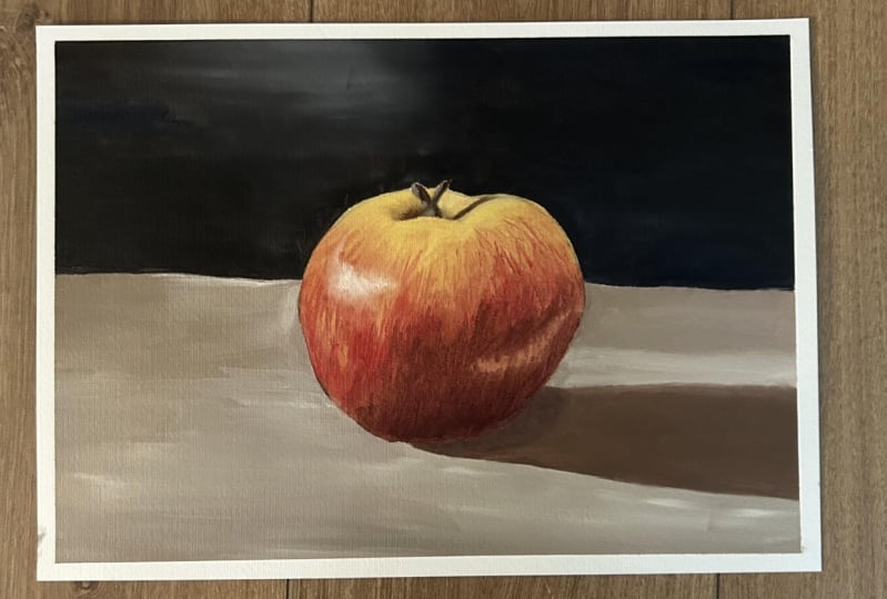
11. Toning and gridding: Okay, so this lesson is going to be on turning and gridding. And these are two methods that you do at the very start the painting. And I'll be explaining what they are, why you use them. And then I'll also demonstrate how to do them as well. So I'm going to start with turning as that would be the first step that you'd normally do. And to briefly explain what it is. Turning is a process where you apply a thin and even wash over the canvas with its sole purpose being to remove the white background. So why is this a good idea? Well, for one thing, you may be a little bit nervous about putting down a mark, worrying that you're gonna mess up this beautiful white surface. A good way around it would be to just deliberately mess at the surface from the starts. And then you won't feel that bad about putting down a mark in the wrong place. But that's a secondary reason. The main reason why we do this is if you think back to the lesson that I did about color, you may remember that pure white is at the very top of the tonal range. And because colours are always influenced by the other colors around them, every mark that we put on the canvas is going to look darker than it really is. This means that the lighter colors that we put down are not going to have the hearted effect because they're being compared to the stark white of the canvas. What we're doing by turning the canvas is bringing that background color from the very top back down to a midtone. And this set of Mommy do put down the lighter colors. They will actually still look quite light because they're now being compared to emit. At the same time, we don't want the washed V2 dark because we want our darker colors that we put down to actually look dark as well. Okay, so to do this, you're going to need some kind of paint thinner. I like to use why spirit? Because it's fairly cheap. And you're also going to need a rag. Clean jar. I know this looks this you put it is in fact a screen as I can get it. And then you're going to need a paint as well. And I like to use burnt umber because it is a fairly neutral, warm color that works well as a bass tone for most colours. Now when you're doing this is quite PMI. So definitely do this in a well ventilated room. Or you can even do this outside. But at the very least, make sure a window is open because it does get quite few MI Okay, so I'm gonna take some my spirit and pour a little bit into this jar. Again, the cameras is not very big so we don't need too much. Probably something like this is good enough. And then we're just gonna take some of the paints and put a little bit, little bit enhance, made it a little bit more than that. And then we need to mix all of this up. So a little trick that I like to use is I've got these few bolts and washes and I'm just gonna pull those in there. And what these are going to do is they're going to dislodge and scrape the bottom, collecting all of the whole of the paints. And hopefully it will get a nice Even covering. So once you are happy the pain has been thoroughly mixed. Then we're gonna use this old brush and paint over the entirety of the surface. And then once you're happy that you've completely covered the surface, will just take this rag and then wipe away the excess paint, just makes more circles. And you should be left with a nicely stained canvas that's ready to begin painting. So the next step is upgrading the campus. And this is a method that will help you draw a well proportioned initial sketch onto the canvas regardless of your drawing ability. The best thing about it is if used correctly, it can be a really good way to train your observational skills in dimension and proportion. So I've got this reference photo of an apple here. And this is what we are going to be using for creating up. I'm actually going to be using this in the next lesson as well. So this will tie into that as an initial step to the next project will be doing. Now you can either print this out so you've got a physical image, or you can do with I2 and just use the digital file on a laptop or tablet. So the first step would be to draw a grid onto the reference photo. And I'm going to demonstrate how to do this digitally. And this is only going to be using basic software that everyone has said, nothing to worry about there. But if you do have a physical image, this will in fact be even easier for you and you can still follow along. It will just be using a pencil and a ruler instead of a mouse and keyboard. Ok, so to draw a grid digitally on an image, the first thing we need to do is check that the image that we have has the same aspect ratio as the, as our canvas that we're using. So the aspect ratio of the canvas is five by seven. So what we're gonna do is just double-click on the image we want to use. This is a basic photo editor. Click Edit and creates edit. And then on this crop rotate option. We're going to just click down here. And we can see that the original is already five by seven. So that means that it is the same as the canvas, which is good. So when it's click off that. And then to actually draw the grid will begin to do is I'm going to right-click and open with Paint, 3D symbol. Scale this down a bit. And so it's making more manageable. You can see that the pixel dimensions at the bottom here. And this is very difficult to find, kinda do the mass to draw the grid. So we're gonna do is gonna click, resize, navigate to pixels, and then make it a more manageable. I'm dimensions. So this will maintain aspect ratio, make sure it is checked. So I'm just going to do 4,200. And then you can see the vertical is changed to 3 thousand as well. Click OK. And so now we have a much more manageable size to use. So to actually draw the grid while I'm going to do is divide it into quarters to begin with. So let's do the horizontal first. So you can see as I'm moving, the cursor will be getting the coordinates of where our cursor is in the bottom left corner, just about here. So this is going to tell us that we're in the right place. So we're on the line tab and make sure that the color is changed to white. And switch can navigate to about 2100, which is the halfway points. It doesn't match. If you'll wanna two pixels out, it wouldn't make much difference. So I'm going to click and hold it. And then to make sure the line is straight, just gonna press and hold the Shift key. And that will snap it to make sure that it's exactly straits. Then let go. And then we'll do the same for the Upon suny to have it again, say it would be 150 and do the same here. And then on the other side, the coordinate that would be three hundred and one hundred and fifty. So you could leave it as it is on the horizontal side, but I think that we are going to need a little bit more help. So I'm going to divide it in half again, divide these lines in the middle, and draw another line here. So the coordinate for this would be 10000575. Draw that down there. And the same on the other side, the coordinate would be 3,625. There we go. So I'm gonna leave that for the verticals. And then for the horizontal. And again, we're going to divide it into quarters. So half of 3 thousand is 1500. Hold the Shift key. I go. So divide it in half again and I'll be 750. And on the other side, it will be 2250. So there you go. We've divided it into quarters horizontally, and we've started dividing it into eighths vertically. We just haven't done the last two sides because there isn't much going on over there. So now that we've done it on the digital image, we now need to do on the canvas. So now that we've drawn the grid on the reference photo, we now need to draw an identical grid onto the canvas. So a few of the things that you're going to need for this first week, we'll need a brush. And I've called this ivory dagger here, and which is really good for drawing thin line SAS. Or we're going to use and we're going to need some kind of measuring tool. And I'll call this tape measure here, which I'll be using. Then we're going to need some kind of straight edge. I've got this stick hip and you could use a ruler just as well. And then we're going to need some paints. And I like to use Benson NBA because it is a very neutral color. And then lastly, we're going to need some painting medium to thin the paint to allow us to draw those really thin lines. So it's gonna get a little bit of paint on the pilots. We don't need too much that we'll do. And then we're going to need a tiny amount of medium. We don't want too much. So the grid that we've drawn on the reference for it say we've divided the, we've divided the horizontal width into eighths. So that's what we're going to do first. We know that the width is 14 inches. So we just need to divide that in half to begin with. And we'll just put a marks, are gonna put a market seven. Chasm, quite thin paints here, putting some medium in the paints. That video. So I'm going to put a mark at Southern and be a little bit more paints. Market seven, we're going to divide it in half again. So put a Mach 3.5. And then on the other side, mock at 10.5. Then we divide it the we divided these in half again. So we need one and y 1.75 for the mind. And the same for the other side, 1.75. Then we need to put identical marks on the bottom. So then with the straight edge, which is connect the dots. Again, this brush produces really thin lines just using the blade, drag and it across. So now we've got the horizontal width done. So we need to do the same on the vertical side, divide it in half, and then it's quarters as well. And so there you go. Now we've got identical grids on the canvas and reference. And so you should be able to see now how it can be a lot easier to draw like this. Because all we need to see is whether the lines of the apple intersects with the lines of the grid in each different section. So we're now working lot smaller area of where to judge wet put the lines. So now we can get stray into actually drawing the apple. Okay, so now let's begin actually drew in the apple. I can see that the center line is pretty much exactly in the center of the apple. And we're gonna put a mark. Just the key points where they intersect with the greater is quite high up. So I'm gonna put this first mark. And then the second mark is a little bit lower down in the sex angle about here. So at the bottom here, the line intersects just a little bit over halfway. So I'm going to put it about here. Just a little bit over. And then it comes all the way down. And crossover. Quite steep angle of alpha here. Ken announced to the other side. So as slaves quite way down is still above halfway of this line. So just a little bit, so I'm gonna put it right about here. It's actually quite a steep angle and is very much under halfway at the bottom here. Probably about another variable than party about three-quarters of the way down. And then intersects this line at about halfway. About that. This guy's a little bit underneath. It's not tolerating but underneath here. And then connects on to this one here. So before we connected a lot less just do the line for the wall and the floor. So it's just a, just a little bit above this line and then come very close to the edge. So I'll just draw a line here and a little bit higher up, still very low down. Just draw that line across. Sleeping. Okay. Now let's begin connecting all these up. Sort of important to look at the angles at which that curving. So this is quite round curve at the top. And the bottom, less service, more, more of a straight line with a subtle curve. And the top here it does bend down a bit before it connects backup, something along those lines. And this is Stossel quite straight. I can see this line and then has more of a shop curve at the end, maybe something like this. And again, this is a pretty sharp curve as well. Coming down here and all the way down here. And we just connect these up. And we go. And so for the stem of the apple, we can see another hot line. Still is pretty much on the center line. And now I'm looking at it. I can think of this line a bit wrong, a little bit higher up than something like that. So I'm gonna put a line. It is still above halfway, so let's put it out. He and doesn't go very far over, probably about, hey, just by a quarter of the way across. And then it's a gradual shadow from this points extending upward. So I'll just put a few monks that to indicate that we do have the shadow of the stork coming across. Again just over halfway. It ends about here. So I'm going to curve it because it's kind of follow the curvature of the apple. So I'll curve this line here, like this. And then let's actually draw the stem as well. So it goes over the top, across the line and over the top of the apple just pokes out. It's quite thick as well. And then we have like a leaf or something else coming on the side across like this. And I'm just gonna use a tip of the brush to draw the other side. And we get something like that. So now the only thing that left we need to draw is the shadow of the apple. So it's going to extend, will still follow the lines of the grid for this. So let's see. It comes very close to the edge of the apple. Very closely. It bottom line here. And again, but further down and a bit further down. But knowing they're halfway. And on the side, again is below halfway, probably about here. And then it does gradually raise up very subtly and levels out again on the halfway. So don't make it too high. Something like this. And this as well. It doesn't go anywhere near halfway this line. So maybe something like this and connect these lines up. So there you go. We have a pretty accurate drawer and novel subjects. So now what we need to do is wait for this to dry and then we can begin actually painting it.
12. Class Project | Creating Form Part 1: Okay, so we're going to be continuing from where we left off. And this is actually going to be the first class project I will be doing. You can find the reference photo and the gridded reference photo in the resources section for you to download. Now I'm going to be demonstrating how I would do this. But feel free to have a go at it yourself. Or you can always refer back to this if you get stuck or even follow along with me. So let's keep things simple. I'm going to be using a limited palettes. In C, I've got titanium white, familiar in red, ultramarine blue, cadmium yellow, pale, and burnt amber. So I've got the three primary colors are wide and also an earth tone. And also if you don't have many in red, you can use cadmium red just as well. And mostly going to be using liquid original as my medium, which is going to thin the paint and help it flow a little bit better. Okay, so to begin with, I'm going to be using this ivory flat head brush. It's a quarter inch brush which is slightly larger than the other one I have. Ans will help us cover the canvas pretty quickly. So as I said, we're going to be focusing on the form and dimension. So a big part of this is going to be creating a strong tonal contrast in the shadow area that we have on the right-hand side with the light area on the left side. So the first step is always the block in which is when we're going to put down the basic initial colors. So you can see a lot of red in here, as well as some yellow. So we're gonna take some million read to start with. And we will mix that with some ultramarine blue, turning it down and make it slightly orange. Touch of cadmium, yellow pale. Okay, so to help it fly, we'll just put a little bit of liquid in there. It's going to thin the paint out and make it easier to spread around. So this is quite dark, so we are going to be putting this on the bottom side. This can be where similar shadows are sometimes going to brush very roughly. Not going to be focusing on any details for the time being. But I also want to be putting on a rather thin layer of paints. I don't wanna go too thick to early on. And doing it this way will make it easier for us to layer over the top and with more detail. If you go too thick to early on, then we will just get a muddy mess. And we've already difficult to layer over. Some really spread this around, making as thin as possible. And I want to cover as much of this ground layer as possible. You want to have any of this beige color showing through. Okay, and as we move up around and start getting a little bit lighter and a little bit more saturated. So I'm going to be using a little bit more the million read and may even introduce a touch of titanium whites. Now I want to avoid this red becoming pink, which is a problem and mixing red with white. So to get the right vibrancy or intensity of this light or red color. The trick is going to be making all the other red colors a lot darker. Because really the red coming out of the tube is the most vibrant red that we can, that we can get. Can't really get any lighter or more saturated than this. So we're gonna just have to turn the other colors down for this to stand outs. Okay, and then moving further up again, and this time introducing more and more yellow. So it can be mixing this yellow in here. Some of the red but more liquid flow. And we're gonna start just putting this down into some of the roads. And I'm using the blade of the brush just pulling down into this read and it also picking up some of that red and putting it up a little bit higher. Again, a nice streaky sort of effect. And we can see this in the reference photo as well because these streaks of red coming up into this yellow side, up around the top HIG gets very yellow, might introduce a touch of titanium whiteness, yellow as well. So now we're getting quite light. It just going to put it all the way around on the other side as well, covering all of that ground layer. Ok, so we've still got yellow coming on the other side as well. But it's not quite as vibrant as this. So I'm going to introduce touch more burnt, ambitious, toning those colors down, turn in the yellow down, we're getting more of a muddy sort of yellow that may warm it up again with some familiar Red Touch Molich when wipe the excess off the brush. And then we'll just start putting this down into this color. Okay, so the apple is more or less blocked in. We can still see a bit more of this yellow color coming down and see it creeping over to this in the middle, and then up the side as well. So you can put this color in here, something others. And then I think we need to make these reds a little bit deeper in the shadow area. So I'm going to actually take some ultramarine blue and maybe some burnt umber is gonna give us already dark color. And then we can just put in a bit more. I read quite a bit more of a minium red. Okay? And then we will put this at the very base. This is the darkest color that we're going to use in the Apple. Bring this up into some of those yellows. And again, I'm pulling up using the blade of the brush, getting the streaky sort of mocks up into similar reds and yellows. It's just pulling the ends, creating these quite nice thin mocks. Getting a little bit more red, essentially is pure, familiar in red here. But it is mixing with some of the colors that we've already got down. So it's losing some of its intensity. Okay, I'm gonna wipe the brush clean. And then let's go back into some of this red. Make it a little bit lighter, maybe a touch more liquid. And I'm going to start by adding a few more streaks up into the yellows. I don't have much paint on the brush. So very thin layer. We want to also vary the angle. Notice how the sun's coming diagonally. These ones are more vertical. And then the ones on this list is following the curvature of this apple here. And so we're doing, but we also want to vary the length and the thickness of these marks. And then we can do the same with the yellows as well, bringing somebody's yellow streaks down into the reds. Maybe we can introduce just a touch of titanium widens this yellow, make it stand out a little bit more. We can also use thicker paint, so we can use less and less liquid. And thicker paint will stand out more against the colours underneath. If you remember back to the role, thick or thin or fat on Lean, using thicker paint here and it's standing out quite a bit against the colours underneath. We do want to be a little bit careful of this because we don't want to get so thick that it becomes impossible to work over. Rules do have a tendency to get very muddy. And if they do get a bit too thick, then you are very difficult to layer over those. Okay, so we're gonna do the same with the red. I'll just take some pure the million red. And again, I go to quite thickly on the brush. And we're just going to start layering over this. So very vibrant here, springing out some of his Reds. So this area I can see is the lightest, most saturated part. So this is where we're really going to emphasize these colors. That's why we're using them straight off the tree because that is the most saturated version of that color. I can see a few saturate the reds coming on this side, just underneath the highlighted region at the top. It's going to put a few brush clean like on a paper towel. And then I'm just going to graze over the surface and stop blending some of these areas into each other. Again, I'm not pressing very hot on the on the canvas. I don't want to lose all the definition we've created, but you just want to get some subtle blends between all these terms. Ok, so let's get a bit more white and put this into this cadmium yellow pale, going to get a very light color here. And this is just going to be for the very top, very top of this apple to being C equal to shattered here. But on the other side, on either side of it is, gets very, very bright. Just pull this down with using the corner of the brush. Just gonna diffuse that edge, blend that edge into some of the deeper colours underneath it. Okay, so let's work a little bit further down. So we're gonna start creating them. Rub this deep red. And we've got, again, we're using thicker paint here with stopped using liquid. And I'm just going to layer over these areas with this color. It's bringing that up into some of those reds is, is burnt on the, mixing in with the million read. You've also got some ultramarine blue in there, creating a very, very dark color. It's putting this at the very bottom. This is the darkest area that we can see. Okay, so that's re-establish this yellow color we can see coming down a little bit. So again, using thicker pane here, asking a layer in the center portion of it, some of this yellow area. So I'm not gonna brush and the whole mock, which is gonna put little dots. And then when the queen brushing, gonna spread that out into the surrounding areas. Just pulling those ends to diffuse those. We still want the color to be quite pronounced. Wanted to stand out against some of these reds and browns. Let's get a bit more of this darker color coming up on this side. Okay. So let's get them prepared more of this dark color. I'm going to put a bit more of this burns Amber. I'm going to actually put into some of these yellows are going to get kind of a murky dark brown. And I'm just gonna put this in the weather the stem is. And we can also use this for the shadow as well. So I'm going to whiten brush clean there. And then I'm going to start to pull these colors out into some of these lighter tones. Just really tapping and pulling the ends, letting that diffuse and blend with those colors. Okay, so now we're going to be working on the highlights a bit more. So you can see you've got this really intense glint of light coming on about here in the apple. So that is what we are going to be doing here, is we're going to take some titanium white, caught a lot of paint on the brush his prey thick. So I want this to not really blend with the colors underneath, but just sit over the top really intensely. So I'm gonna stop putting a few mocks. The tableau, this going to wipe the excess off the brush. Now, pulling the ends does blend slightly on the edges. But in the middle is very, very intense. Just using the corner of the brush is putting those ends down, following the curvature of the apple and extends a little way over as well. So you've got to use a bit more paints. That's layer over this. Okay, so once again, just working those edges, trying to get a bit of a smoother blend coming between these areas. Okay, so we're gonna leave that there. And moving back to the stem, we can actually plug this in, blocking the shadow anyway, we put a really dark shadow on the right-hand side. And again for this one as well, pretty Docker p. So once you blocked the Latin and a bit more will appear as well. Some say block that we now need a lighter color are lighter brown colors. I'm going to mix some white in with this mixture of burnt umber and cadmium yellow pale skin to get a very light brown here. And I'm just going to use this to highlight the other side of this stem.
13. Class Project | Creating Form Part 2: Okay, so I'm actually going to leave the Apple fan. I think it's looking pretty good right now. And just to help it really stand out, going to stop blocking in some of the dark tones in the, in the background. So I'm gonna take some ultramarine blue and burnt umber. This is gonna give us a ready dot town close to black. And I'm gonna mix that with some liquid original as well just to help it flow. And I'm just gonna stop brushing this along the bottom in this area. So not being too precious about this, just block an end, but I do want to make a nice crisp edge around this apple here. It's going to take it right to the base of the table, right to the base. And then get a nice crisp edge around the apple. Just using the blade of the brush and taken it all the way to the edge. This is when it's really helpful to have a relatively new brush. You got a nice chisel blade. It's really helpful if 1-1 crisp lines. Okay, and then this top little area here, I've left it blank because we do just want to get a little bit there. We can see some of the light reflecting off the wall. They're gonna put a little bit of titanium white into this mixture here with a bit more blue in there than Ben sandwiches giving it.
14. Scumbling And Glazing: In this lesson, we'll be going over stumbling and glazing. And these are two techniques that I use extensively in my work. So let's start with glazing. And this is a technique which allows you to shift the hue of an area while having little impact on the turn. And when I say tone, I mean how light or dark that area is. So as you can see here, I've got some spheres and random shapes. And I'm going to use a glaze to try and change the colors. Now the paint on the canvas is completely dry. And this is really important when we're doing glazes. We don't want the glaze to mix with the colors underneath. So it's vital that we make sure that this layer is fully dry before we do this. So glazing typically involves using a small amount of paint in some painting medium. So I'm going to be using these three colors here, which are the million red, burnt umber, and ultramarine blue. And then I'm going to be using liquid original here as my medium. So I'm going to change the first sphere and give it a bluish tint. So I'm going to take some ultramarine blue down the palette, and we'll mix that with some liquid. So I'm going to make this quite thin. So it's going to be a very transparent layer that I'm putting down here. Obviously, the thicker the paints, the more opaque is going to be. So I'm just going to brush over the entire surface with this color. Some spreading it out quite thinly. Reading moving that paints around. So they got completely covered this fear. And hopefully you can see that the, the shadows and highlights are still visible even with this paint over the top. So it hasn't really disturbed the turns, the shadows and the highlights. And I still come across, even though he's now got a bluish tint. And it'll be the same on this sphere here. Do exactly the same thing. Will take some, will use blue again, and the little holes will still be visible even after I've brushed over it. So that is how glazing works. And now I'm going to show you a few examples of when I've used glazing in other paintings that I've done. This one of a leopard, I had built up all the texture in the bark of the tree. But I felt that the shadows in the cracks between the strips of bark, they just weren't quite dark enough. And I didn't want to go over it and redo all that texture. So I mixed a really dark glaze using Bernstein burn ultramarine blue with a lot of luck when and I brushed that over the darker zones. And you can see that it's deepening all the terms while also keeping all the subtle tonal varieties as well. Another example is in the same painting, I wanted to increase the saturation of the colors in the Lapid. So I made a vibrant glazes using yellow ochre and another one with the million red and burnt sienna. And I brush this over certain areas. And you can see just how vibrant these areas are becoming. Now these were actually slightly thicker glazes, civil also more opaque. But as I was only using it in small areas, it didn't affect the overall tones that much. So now I'm going to go back to this apple study we did in the previous lesson. And use glazing to try and deepen some of the shadow colors. Feel free to follow along. It will definitely be good to practice and get used to doing this. Okay, so the color here is quite a dark red. So that is the color that I'm going to be using to try and deepen the term width. So I'm gonna take some burnt amber and ultramarine blue to get our very dark tone. And then I'm going to take some the million red to just turn this over to the red side of the spectrum. So we don't want a lot of paint here. And then I'm gonna take liquid original and just use this in the corner, making a very thin mixture. Okay, let's give this a go. And I'm just going to use this brush to just brush over this side. So I'm just trying to paint an even layer across the whole area. And hopefully you can see the turns that shifting standards get a little bit darker and a little bit richer as well. And hopefully you can see all of the different terms within this area. All of those are still here. We're not getting rid of those by painting over this. And we're just shifting everything slightly darker. Okay, so I think I'll leave it at that. So hopefully that will give you an example of a certain instance where you might use glazing. Because obviously it's better if we don't have to go over the whole area and put in all these textures. Again, it's just much easier for you to just glaze if the top keep all those different tones. And it's kind of bring everything down a level. And you can also do this with the shadow. We can just mix how dark turn again, burnt umber and ultramarine blue at some liquid to this tiny, tiny red here. Atom, liquid to that. When we can put this in the shadow just underneath. So one of the dangers when using glazes is that some painting mediums have a tendency to start yellowing over time, and some mediums are worse than others. So the rule is the more medium that you use, the stronger that the yellow teens will be. And for this reason, I never use glazing to try and highlighter color because lighter colors are more susceptible to yellowing then darker colors. This is actually where it's gambling comes in. This is my preferred way to lighten a color like glazing and involves using small amounts of paints and painting over a completely dry surface. The main difference here is that we're not going to be using any painting medium. Now scrambling is also known as dry brushing. And to do this, I like to use a stiffer bristle brush as it enables me to maneuver the paint around much better than a synthetic satellite before I'm going to demonstrate how stumbling works with the sphere. So I've got this bristle filled but brush which I'll be using. And I'm going to try and lighten this area of the sphere. So I'm going to mix colors quite similar. So I'll take some of the vermillion read, mix that with burnt umber, and then I will lighten that with I am titanium whites can get quite light. So I'm going to just take the x, a soft brush by brushing and across the pallet. And then with this color, I'm just going to make small circles. Just pushing the paints out quite thinly. It's going to diffuse those edges into the surrounding areas. So as you can see, it is still semi-transparent. We are getting the tunnel variations coming through because we're spreading out so thin. But this is a really good way of lightening the color. And the good thing about this technique is that we can also layer these mark sweeper down so we can just use more titanium white, just see pure titanium white. And we can layer over the top and just get incrementally lighter in the middle of this area. And we can just use thicker and thicker pains until we're happy with the level of lights that we've got. So that's one way I use gambling. Another way I use it is also to create a lot of texture. And I can do is by using, again, a very stiff bristle brush. I actually use this really old dagger brush which I've got. The bristles had been worn away quite a lot. So it's very, very stiff. And how I do this, I just take some let's just take some pure burn time and I'm going to work that into the bristles on this brush. And then let's just use this square as an example. I can describe over the top. And you can see all of this text style sheets, the broad stroke. But I've also changed the angle of which I use this brush to get different sorts of textures. So I'm just using the blade of the brush here. Or I can just use the tip. Spread that out. And I can also press with varying levels of strength. If I press very lightly, I'm gonna get very sparse marks, just a few dots here and there. Or if you want to press a little bit harder, I can get thicker and more marks, so loads of different textures you can get. So those are two ways that I use gambling. Again, here are a couple of examples of one of US gambling in actual paintings. You can see here that I'm lightening a few areas in the clouds, just making those highlights pulp a bit more. It can be a little tricky to get a smooth transition between the old and new layers. So I often mix a midtone and then use that to blend across the two layers. Going back to this Lapid painting, you can see that I'm using this old and stiff bristle dagger to build the texture of this tree bark. I'm just scraping the surface, altering the angle of the brush to get a variety of textured marks. So that's gambling and glazing. Hopefully you have a better idea of how and when to use these in your paintings.
15. Creating Depth: So we've talked about creating form and depth in a single object. And now we're gonna take that subject a bit further and create depth of field within the whole image. The aim is to give the impression that the viewer is looking through a window out onto a scene, rather than just looking at a flat 2D surface. So there are two main ways that we can achieve this. The first method is through scale and perspective. And I'm sure you will have a basic idea of what this is. The gist of it is that things get smaller the further into the distance that they are. A good mathematical way to demonstrate this is with a vanishing point and perspective lines. So you can see I've drawn a vanishing point here. And the vanishing point is usually located along the horizon in front of the viewer. And you can see I've got all these lines also converging towards this vanishing points. And these are gonna be the perspective lines. And you can have as many perspective lines as you want or as few, it doesn't really matter. But basically all the main lines in the image, again, to converge at this point. So this is best demonstrated with geometrical shapes. So I've drawn this box here. And as you can see, all of the sides are lining up with these perspective lines which will lead towards the vanishing points. And if I was to draw a line along this side, this will also lead to the vanishing point here. So all these lines would in fact be parallel. But because of the perspective, we wouldn't actually draw them like that. And we would draw them to converge at this vanishing points. Now I could take an exact copy of this box here and line up a little bit further back. So I've made it a bit smaller. And you can see that the sides all lining up with the perspective lines again. So now we're getting a sense that this box is slightly further away than this box here. And I can take that even further and make it even smaller again. And you can see that the sides are still lining up along the perspective lines. And now again, in the sense that this box is even further away from this box. So Stones get a real sense of depth within this image, with the horizon line being this horizontal line coming across here. Not emphasizes even further. I've also drawn a few of the box is on the other perspective lines. We've got this box here, and then I've drawn a smaller box here. So now again, the sense of this box is slightly further away then this box here. So basically the gist of it is that everything gets smaller as it recedes into the distance and all the lines are going to converge and vanishing point here. Now, you could substitute these boxes for trees or people, animals, it doesn't matter. Everything follows these rules. A good example of this is this painting that I did a while ago. You can see that the flowers here, even larger than the house, which is quite something. But it's because the flowers are extremely close to the viewer and the house is quiet a bit further away. You can also see some of the perspective lines along the sides of the house all leading to the vanishing points, which would be off the frame somewhere. So the second way that we can achieve depth of field is through color and tone. This is known as atmospheric perspective or aerial perspective. And the way it works is that the further away something is, the paler and less saturated the connoisseur. There was less tonal contrast in the distant areas and everything also takes on a bluish hue. This is basically due to their being more atmosphere between the viewer and the object. And it comes down to the same reason as why the sky is blue. Anyway, you can see in this photo that I've got here that we've kind of got four levels of depth. And this photo actually illustrates atmospheric perspective really well. This most distant mountain that you can see here. He's extremely pale and it's almost the same color as these clowns. You can still make out a few subtle tones between the shadows and highlights. But they are very subtle and quite difficult to make out. In the next year of depth outta we've got here, you can see that the terms have gotten a little bit darker and there is more tonal contrast between the shadows and highlights. We're also starting to get a few warmer colors showing in the highlights. You can see some here and also some here. They're almost got a slight green shade, but they've still got quite a bluish hue as well. In the nearest mountain that turns have gotten even darker. We can see the blues have called it much deeper shade coming through specially in the shadows. So it, you still have a lot of blue in all the shadows. But you can see that the greens have gotten a lot warmer compared to the other mountains. And we're also starting to see some details coming through as well. We start to pick out things like the individual trees which is helping this effect. And then in the foreground here you can see that the colors have gotten a lot stronger and there are a lot more saturated and the tonal contrast is again, a law stronger. There is no blue here and we see a lot of yellows and warmish greens coming through as well. And also the shadows, they've gotten a lot darker. They almost heading towards really dark black. So that's how atmospheric perspective works. And you can also see how the mountains and clouds are also getting smaller as they recede into the distance. So as Tom to see some of what we talked about before, the scale coming in here as well. So using Cl and atmospheric perspective together is going to create a lot of depth in your paintings. So that's it for this lesson. In the next one, we're going to be putting this into practice with another class project. So heads the next video and I'll see you there.
16. Class Project | Creating Depth | Blocking In Part 1: Okay, so welcome to this lesson. This is actually going to be the second class project will be doing. I've got this reference photo here, which I'll be using. And you'll find a link to this in the resources section for you to download as well. So I'm going to be focusing on what we talked about in the previous lesson, which was scale and perspective. Now I'm gonna be showing you how I would go about doing this. But if you're feeling confident, please feel free to have a go at it yourself. And then you can always refer back to this if you ever get stuck. And also I would love to see your interpretation of how you go about doing this. So please upload a photo of your work to the project gallery. I would love to see what you come up with. So firstly, let me go over the materials and I'll be using. So this is a 14 by ten inch canvas board. And you can see I've already turned it with a Burns humble wash. And I've already picked out a few colors that I'll be using. So I was going to start with a titanium white, burnt umber, ultramarine blue. And these three are pretty much standard. I use these in pretty much every single painting I do. But I'm also going to be using Thaler blue as well. And this is just the sky color, a bit more of a rich sort of tone. So another color I'm gonna be using is also connected in magenta. And although there isn't a lot of red in this image, that is gonna be really good for just tinting a few colors a bit warmer. And I can also see some reddish browns coming through along the water's edge. So that's why I'm using connected image answer. I'm going to be using both of the yellows I have, which are yellow ochre and cadmium, yellow pale. And then I'm also going to be using some greens as well. So I've got sap green here, and then I've also got permanent green lights. I may not be using so much of this, but we will definitely be using Sap Green quite a lot. And I'm also going to be using liquid original as my medium. So let me just get a few colors out on the pallets. Okay, so just to avoid confusion, this one at the top here is ultramarine and this down here is failing. You know, they look very similar and when viewed from a distance. So the first stage in every painting that I do is always doing an initial sketch. I'll just mapping out the basic shapes so I know where I'm going. So you could use the grid method for this. I'm not going to in this case because getting it down exactly the way I see it is not, is not that important, especially with doing landscapes. If something slightly out of place is not going to make much difference. What I'm focusing on here is the perspective and colors. So I'm just gonna draw this free hand. And to do this, I'm gonna take some burnt amber again and just take some thin it down with some liquid. And I'm using the ivory dagger brush. Brush I use most commonly for doing the initial sketch. And I'm just going to draw in the basic lines. So even though I haven't drawn a great, I'm still going to imagine a kind of grid here. So looking at the reference photo, seeing how close it is to halfway across the canvas, both vertically and horizontally. So I can see that this big mountain in the foreground here is coming very close to the top. It's well over halfway. It's a little bit over three quarters of the way and become this side I can put a line is gonna be roughly about here. Again, is, doesn't matter too much. If it's slightly analytes in terms of across the canvas, it's probably about the quarter mark were had initially drops off here. So maybe something like this. In terms of the base of the mountain. It kind of connects is just under halfway across the canvas, if we imagine half by you being of how he is going to come out about probably about at this point. So that's why I'm going to connect it onto a rocky sort of shapes hits connect down to here. And it does sloped downward a little bit, not too much. Just draw a line here. So that's a rocky outcrop. It's kinda bit more Painter. Okay. So now the mountains behind it, you can see as being obscured by the clouds a little bit, but it's just coming up to this point and just draw a line here and then it drops down. It's just under half way again, just drops down to this point. And then it's about here. And it kinda just follows a line, wavy line all the way across. Just drawing uneven line. Hey, again, it's not too important. In terms of the base walter line here. It's pretty much just above the line of this mountain here. So I'm going to draw a straight line is like when it doesn't extend all the way over so we can leave it there. And then we go to smaller or close amount in here. Maybe it comes up about here. Gonna raise this one a little bit. I think it was a little bit too small. And that will give relief for this one to be a little bit higher. Ok, so then we've got a few trees here. Just draw a few shapes here. And then we've got the outcrop, the bank derivative. I'm actually, I think I'm going to change this up a little bit so we can, okay, so we're gonna have the actually comes a lot closer to halfway than opcode. It will just shove everything forward here. So that's the outcrop, that tree. And I'm going to just draw the line. This is the bank. Connecting on here. But I'm actually going to change it up a little bit, so we'll call it coming all the way around here. I'm actually going to not make it quite as across and curve it around a bit closer. So if we have our water line here, the bank, then I'll just curve it up. Probably around. So this is our bank. If you areas just jutting out, few rocky areas as well. Kinda making this all very interesting here. Let me draw a few more trees at the top here. And then we can also just sculpt the mountain anthropic here. So vc by the shadow is here, the shadow that comes down here. And we've got another bank here. And we've got the quiet prominent shadow coming across it, pretty much straight down. And all of this. Isn't shadow hit number one at the top as well. Okay, and just like that, we've got our sketch. So now we can think about blocking in the initial colors. So I like to break my process down into blocking in refining and then detail. So the first step is blocking in. So I'm going to try and cover the entire canvas with the first layer of paints, just focusing on the main colors that we can see here. So I'd like to start with whatever is furthest away, especially when doing landscapes. So I'm going to start mixing a sky color. So for this is quite a pail and hazy sort of sky. So let's start with some fellow Blue and MozCast, some titanium white, maybe a touch of liquid as well. Let's just see what that gives us. A touch more white. It's a little bit dark. Okay, so that's looking a little bit too saturated. So let's mix in some ultramarine blue is not quite as large a blue as Scott, a little bit more red in it. I'm also going to just put a touch of quinacridone magenta in him. Quinacridone magenta is a very powerful Color and it will change the mixture quite dramatically. So we want to go in small increments so that we don't accidentally go overboard. Okay, so let's put a little bit more liquid in there and we'll just start painting the same. So I can see is a lot darker on the left-hand side. And as we transition over to right, it starts getting paler and peeler. And it will also get paler as we go down the canvas as well as it receives further into the distance. So I'm going to start here. This is where our darkest areas going to be. And of course we got these clouds as well. So I'm not going to paint too much into where the clouds are going to be. I'll just leave those blank for now. Just spreading as color around as far as it will go and then reloading. Okay, so we're running out of paint, so I'm going to remix this color as best I can. Now we can get a little bit paler as well. So I'm gonna, Stein's juicing a little bit more whites blending across these two zones. And I've just added a little bit more widely. As we get further and further over. This add more and more to continue to discuss. Quite light as it comes into the distance here. Okay, so now we can put in a few the clamps. So obviously the highlights of the clouds are going to be very close to pure bytes. I'm actually first going to be putting in the shadow side of the clouds. So I'm gonna mix a colorful, This is kind of more of a kind of a grayish, is quite warm as well, a warm, grave sort of color. So I'm gonna start with some magenta just a little bit. And it will mix with the blue left on the brush. And I'm also going to use some burnt umber as well. And match should give us a bit of a gray color, maybe a touch more ultramarine blue. And more connected him agenda. And then let's just lighten that with a touch of titanium whites. Maybe a touch more blue. Okay, and let's just see how this color goes. So i'm going to originally started with the darker side, which I can see just coming out here is where the talk is. The area is also a 100, a little bit of liquid to this mixture to help it flow. And then we've got a few sweeping shadows coming in here. Maybe you need a bit more of this mixture. So I'm going to take more pains. Again. I'm not going to block this in everywhere, just me, places where I see a few of those shadows coming through. It's going to be an awful lot of space that's not covered. Note a few streaks coming in a little bit. Okay, and so now let's get the highlight color. So I'm just going to take quite a bit of titanium whites and mix it into this call ahead. And then we can just streak in few of the highlights somewhat gonna worry about blending at the moment. Just kinda block it in that it will mix with the color's already the, which is fine. We just couldn't go out of the way to to mix them right now. Do a few clouds extending into this blue sky color. Again, they will mix together, but we can intensify the highlights spit later on when the paint has tried a little bit. A few of these clouds at the top here. Again, they just kind of come up here. You can just plug those in. And notice how my brushstroke is changed with these little clouds, these mole streaky sort of clouds. I'm using horizontal strokes to get that sort of effect. That longer, longer Mark. And let me call some round here as well. And then just putting in these streaky sort of mocks. Connecting them onto a man's gonna solve them that some of these edges just working over the edges, pulling the paints into each other without trying to destroy the initial brushstroke. Dispersing very lightly. Just to maneuver the paints around. And the same on this side. Just brushing over them very lively. Smoothing the edges outs. Creating those quite nice blends.
17. Class Project | Creating Depth | Blocking In Part 2: So I'm going to leave the sky there for this lab. And now we can move on to the next tier of depth, which is these distant mountains. Now again, because they're so far away, they do have a very pale and blue sort of cast. So we're going to be using a lot of ultramarine blue in this mixture. But that is hints of green as well. So we'll start with some sap green here. And let's mix that with lots of ultramarine blue lights in it with titanium lines. See what it gives us. So that's not too bad. Maybe a little bit more ultramarine blue. Just a document again. Let's get a little bit more lit Quinn out as well. Okay. And I'm just going to initially just kinda block at Olin. Just literally blockName with a solid color. We can link to refine it. The next stage is taking a ride up to the edge. Okay? So that's the first tier of depth. And later we can start to texture it a little bit more. But moving onto the next slide, we've got this other Hill which just comes up, slips off about here. So again, it's very subtle, but it is slightly darker. So we're gonna be using a little bit more ultramarine blue, maybe a touch more Sap Green. Just shifting that color ever so slightly. And again, we can just lock this in with that color. Ok, so that is that. And we've got the next tier of depth, which is these smaller mountains or hills at the bottom. So these are actually quite dark, but they've still got quite a bluish sort of look. So we're gonna be using a lot more ultramarine blue. Gonna pretty much get rid of all that white we used. And maybe a small amount of sap Green as well. And then the dark and even further, we can even add some buttons on the mass should really mixed with the ultramarine blue to black color. And they have dug into it a little bit too much. So I'll take some titanium white, just a small amount. And Latin ever-so-slightly. We can even makes it into this stuff here. That Molich Quinn. And again, I'm just going to block it in with this solid color. Just using the flat edge of the brush to get these nice crisp lines, taking it right out to the other mountain edge. And there we go. So we're already starting to get a sense of depth here between all these different mountains. Now this mountain is when we first start seeing quite a lot of green coming through the shadows, I've got a slight bluish cast. But on the whole, it's well-defined because isn't that much closer? It also even looks bigger than the more distant mountains, although I'd expect that in reality, this one is probably a lot taller than this one. Just due to the perspective that we're looking at it from. So I'm gonna pick this one a little bit more accurately than I did the others. And I'm going to split it between the shadows and the highlights. So I'm gonna start with the shadows again as we've already got a fatty top mixture here, I'm going to darken it yet again. So we'll take some more bad sunburn, ultramarine blue, then give it a little bit of sap green in there as well. Okay, so now I'm just going to the right hand side of these of this mountain. Just take net all the way to where I've drawn the shadow lines. Really blocking that in. And I can see the shadow of extending that further at the base. And we do get a few of the shadows extending into this highlighted area. Again, I'm not going to focus too much on knees. Let's put a few dots. Speak texture or this a bit later on. But just give the initial look, something along these lines. And now for the highlighted area, again, we've got the tree tops and then we've got the rocks shoving through as well. So let's focus on the tree tops at the moment. So let's take some sap green mix that with cadmium. Yellow pale against the first bit of yellow that we've introduced. And yellow doesn't travel well over distance, which is y. You very rarely see it in, when looking far out. Pretty much entirely reserved for the foreground or make ground. It does also have slightly earthy look, so maybe put some yellow ochre in there as well. And then a little bit of luck when okay. And with this, I'm just going to pretty much just tap it on. Not gonna make defining strokes with this. Just tap the paints on. We should start getting a few textures. Again, textures is not something that we're focusing on in this stage, but we can still start to put them in. Nonetheless. This won't be too picky about it. So I can also see a bit of this line to great extending into the shadow. He still had a bit of blue left on the brush, which I didn't realize. Let's get rid of that. You do want to try and get rid of as much of that brown canvas as possible. So it doesn't matter with smudging knees, shadows together with the highlights. So we're still going to create all that variation that we want. So that's perfectly fine. Maybe just a few more shadows and this area here, just go back and tap in a few. The stock atone. And now full the rocky areas that we can see coming through. I'm going to actually use this color that we'll call here. Just mix that with whatever was left on the brush. A rather lights sort of purpley green. And I'm just going to FUD shapes. Again is going to mix with the surrounding colors. But again, that's OK. So long as there's some definition, we can refine all those areas lights are on. Cash is going to put in a few more shadows, just pretty much covering all the remaining or as much of the remaining brown areas as possible. Will also build up the texture that again, just keeping with the brush. And I'm gonna leave that there as well. The next tier of depth moving forward is the water. So the water isn't actually clear reflection of the sky color that we've done. It's quite a bit darker. But at the same time. There are no definitive reflections being shown either. So we're gonna be using is lot more muted. So we're gonna be using a lot more ultramarine blue. We can still use these colors that we've got here. We will just modify them a little bit. And there's going to be quite a bit of burnt samba in that as well. Now again, we're going to be covering quite a bit of the canvas is. So we're probably going to need some more ultramarine blue mix that sunlit when. And I also may put in a little bit of quinacridone magenta as well, just to give it a slight purplish look. So this is quite Doc net by mixing in with the remaining lose. Okay, so now let's just use this color and see what we get. So I can see it is still darker on the left side where it is underneath this main mountain here. This is where the darkest parts are, and it does get quite light in the middle. So we'll start on the, as we've got a dark color, we'll start on the left. And the strokes I'm gonna be using for this are going to be very horizontal strokes because water is flaps. So these horizontal strips are going to help with that effect. Maybe we'll just use the broad side. Just to cover the canvas low bit quicker. Again, you want to cover as much of the base color as possible. Okay, and so moving a bit further over, and maybe we can start introducing a bit more titanium white and that gets a little bit lines, but we're gonna need a bit more of this color. So I'll put some more ultramarine blue buttons and quinacridone, magenta, and maybe just a touch of titanium winds. Seriously getting through a lot of this ultramarine blue at the moment. Okay, so now let's start putting in this lighter tone. Again, blending the two areas into each other. And we will take it all the way to this water line here. You can get quite a bit lighter as well. I'm going to. He's a bit mole titanium white and just mix in this corner. I've also added a touch more ultramarine blue. And just in the sense of we can start putting in this color. And I can also see quite a, a light zone just at the very base here. So I'm going to just draw a straight line. Again, just using the blade of the brush to get that nice chisel edge. Taken it right up until those mountains. Trying get this as straight as possible. Mix that into some of the stock of color. We can get a bit more of this just in certain parts, highlighting certain areas. Again, and we don't want to put this everywhere, I would kind of lose the effect. But just in one or two areas to stop aligns to name a few sirens, making it a little bit more interesting. All that dot ten coming back in the basis. And a bit more of a daunting right about here as well. And then we've actually got quite a nice blue coming through. Just this little tiny bit. Gs coming through here, we call it a little bit of a lush blue. So I can put that in with some a bit of failure, blue and some titanium white. Not too much, just a little bit. And the stop blending across the zones using the blade of the brush to get these kinda ripple sort of mocks. Pulling the ends into each other. Again, everything's got to be horizontal here. So one of the tricks to doing Walter. And lastly, pulling across just to blend the edges a bit Mall. I can also see we do have a bit of a highlights actually aligned to zone coming through on the right-hand side as well. So I'm just going to quickly put listen. Again. It's just on the right edge, so not that much. And then we've got a few just a ripple zones. Snake nano few areas. Wouldn't worry too much pop is actually properly leave that there. So that's the water blocked in the next stage. Just oops, I just wanted to get rid of that. Highlight.
18. Class Project | Creating Depth | Blocking In Part 3: Okay. So the next stage is the grassy zone on this right hand side, or maybe the, even the trees, we can maybe do the trees first. So the first thing I'm going to just mix a very dark time again. Take some buttons on the ultramarine blue. And this is probably the darkest weekends get. Maybe put a little bit of magenta in there as well. Just to woman up. And we're gonna just re-identify or redefine this area. This bank has been lost by water. So it was coming in here. It is very dark. So that's why we've used been unburned, ultramarine blue. Get a very club. We get a color very close to black. Sounds kinda work along this edge. Just putting in those dark attorneys first little bit of liquid in there. And as you work along. And they say we've got a few magazines in that. And we can even use this color, maybe add some sap green so it, but we can use this color to also block in the shadow sides of these trees as well. So just pretty much just printing a few marks in not focused on the shapes that much. Just wherever I feel that shadow could be. Just put that in. Again, we can cover this wafer with highlights so it doesn't matter too much if we go to file. And now we can do a few of the highlights. So the highlights are actually quite muted along the back, so quite earthy, not too bright. So we're gonna be using some yellow ochre and sand grain. A little bit of liquid there as well. Mix that in here. And then we can use this. I'm just going to tap along the edge over the top of this shadow color. And we should get a nice muted sort of highlights. We can just do this all the way along. And you want to keep the color's muted so that when we do put down the intense highlights, they're gonna show up. We're very nicely against all of this. If we make everything too bright than the Hamas just won't have the effect that we're looking for. And they won't have the, they wanna stand out because our eyes have already gotten used to the macro virus and the canvas is 1.5. The impacts. Okay, so that is the distant trees done. Next, I'm going to just put in a few greens for the Grosse is on the bank. Again, then not well, we've got one strip which is quite bright. But the others, they again will mutate more Sap Green. And we put a little bit of titanium, white and yellow, OK. And we can also use some burn time, but just to terminal down. So this is quite muted color again. And it's using the Quinn. And I'm just going to brush along the edge. This is actually still quite lights. It could maybe be talking a little bit. Can we just going to try and get a few variations in this band carrier? So again, I'm not following the reference photo too closely here. It's all very random, quiet in the distance. So the exact placement of all these mocks mountains that crucial. So I'm just going to be altering the color as I go, just adding a bit more yellow ochre or maybe even calving yet I pale. Or maybe even scanning it little bit Dhaka by adding some more Sap Green and ultramarine blue benetton NBA and that sort of thing. It's all just about the different varieties that you can get with this. And building up those varieties, what's gonna give it texture? So we're gonna give it that real school look. Okay, so let's get a bit of a lighter Zan coming. So we're gonna get some cutting yet a pale mix that with some sap green, just a touch of titanium white says predominantly Cadmium Yellow Pale. Whether the small amount of Sap Green and titanium white, we're gonna get a very yellowish warm highlights. And I'm just going to tap this along the top. And we don't want to put this everywhere, just in a few places. And it's also going to mix with what we've already caught underneath, which is going to tone it down even further. But I'm just gonna take a little bit further. Just add a touch mole, titanium white to it, and then layer that over the top and we should get nice little highlights along the banks. Maybe some cadmium yellow ochre, sorry. And we can start getting a few lines as ions coming in here. Just subtly manipulating these colors, pushing them into one another. Plus feels something is too strong, can always just go back to tone it down. And they also get a few, I'm luscious sort of greens maybe introduced some permanent green lights in that. We can get that coming right in here, just cutting across slash yada, yada. Somewhat more blue. These greens, again predominant just tapping because a good way of building upon texture. But again, you don't need to follow the reference photo too closely here. Just won a variety of all the shades. I have just accidentally got rid of the dark shadow. So I'm going to re-establish that with some burnt umber and ultramarine blue. Re-establish standard math. Okay, and so now as we move forward, the greens are gonna get a lot more lush. So we're going to be using a lot more blue in these mixtures, a bit less yellow ochre to kinda get cooler, lush green so we can take some sap green and ultramarine blue. You will just mimics that. And maybe even some of fellow blue as well. Mix that with a little bit of cadmium, yellow, pale, and also liquid. And now we can stop putting in the deeper greens as well. So again, we want to be predominantly putting down in Midtown here, not leave room to put in the shadows, as well as the highlights. And I'm more or less just kinda cover the entire surface width, this color. After remixing several times or think. Okay, so that is the midterm of the grass Done. And now I'm just going to also maybe put in a few of the shadows within the grasses as well. Again, we're going to be very loose here, just putting in largest, largest shapes, just making short strokes, just to indicate few variations within the grass here. Kind of see the more net's almost like lines. Few digits within the grass casting shadows. All of those and mostly try and covering all of the remaining caps in the paint. Well, Brown is sharing through and get rid of all of those courses, many of those as possible. Okay, so moving on, I'm just going to put in a few of these last touches. So. I can see along the edge here we've got a few browns. Are the MSB, some kind of Alley coming in all not water. So we're going to put those in. I've got some burnt umber. It's also take some yellow ochre as well, maybe a touch of the magenta. And using this, we will just extend into the Walter here. And I get this very earthy tone, maybe little bit lights here, we can darken it with some more burnt amber, maybe a touch of ultramarine blue. Also the last thing that we're gonna do, We haven't done these foreground trees coming on this bank here. So again, let's get a little bit more ultramarine blue. And let's mix a dark tone again. So we'll have some ultramarine blue and burnt umber. And with this, I'm going to draw a few lines for this tree. I'm going to have the tree coming over roughly of how here. Again, I'm just not going to worry too much about the individual lines. We will just put in a few to indicate this tree here. Just using the corner of this brush and the blade to kind of get vaguely thin lines. Can with that, let's also put in a few of the more prominent trees. I'm going to wipe the brush clean, get rid of all that dark tone. And then we can just go into this lighter yellow color, a permanent bit mole titanium whites to Watson and a little bit more. We'll also put it into this green color here. And then I'm going to mock in a few of the lighter shades of some of these trees right about here again, I'm just going to get the excess off the brush and just tap. It should show up quite nicely against the colours underneath most of the data bit Dhaka, that a few greens. And then the last thing we will just put in a few leaves. Fall this tree a little bit closer as well. And just tapping. Okay, so I'm gonna leave that there for the blocking. As you can see, we've already got a sense of scale and depth within the painting. And pretty much it's all laid out. You can make sense of what everything is. So I'm gonna leave that there were going to wait for it to dry and then we can begin layering. I've read with the levels of detail.
19. Class Project | Creating Depth | Refining Part 1: Okay, so welcome back. I spent a few days and the blocking layer is now completely dry. So now we can begin the refining layer. And this is the part where the whole process starts to slow down quite a bit. I'm going to start in pretty much the same way that I did before. I'm just working in zones coming from the furthest away and gradually working towards the foreground. The colors I have on a pallet are exactly the same as before again. So let's just jump straight in and start mixing some sky colors. So I'm going to try and get this guy color as close as I can to the color that we mix previously. So I will start again with a bit of Thaler Blue and mix that with titanium white. And then I'll also add in some ultramarine and small amounts of quinacridone magenta. Okay, so let's just add in some liquids, help the paint flow and see how this looks. Sort of start over here. And a lot is pretty close. It's a little bit too much on the warm side is closer to purple in the previous layer. So I'll just add in a little bit more Thaler blue. Now again, theta blue is another one of those powerful colors. So a small amount goes a long way. Bit darker, touch more titanium white. And that is pretty close. So I'm just going to work over all the blue sky areas. Just removing any the remaining brown color that will showing through. Just getting rid of that. Taken into the clouds. Just Breton this paint around as far as it will go. And we can get a little bit lighter as we start moving towards the right hand side. And also as we start working our way down, It's just gonna be adding small amounts of y to the mixture to gradually save this into a lighter tone. A Dhaka area with some of the remaining pain left on the brush and just spread it allowance and even the colors, you should be able to get rid of it. Okay, so thinking I'm going to try and make this area quite a lot lighter. That's really exaggerate. This area right here. We've gone quite light with this color. Block it in, and it will mix with the colors you've already called down. And then we just kinda gradually work it back towards some of the other terms. Okay, so I'm going to leave this guy and let's move on to doing the clouds. So again, I'm gonna mix a very similar color. We want some sort of the warmish gray, so let's get some burns on. And as you can see, I've switched down a brushy extra clouds are a little bit more detailed in the sky. So this smaller brush is gonna help you get a bit more control in the sort of locks I can get. So I'm going to add some magenta in here, and this also gets some ultramarine blue. So we're gonna get quite a dark mixture here. And then we'll just live to an old with some titanium white. So that's quite a dark grey. Let's get a little bit lighter and add some more titanium white. And we'll just make it a little bit more purple as well. Say more ultramarine blue and quinacridone magenta. So I'm just traveling across the pilot hey, trying to find the right sort of mixture. I think I may have just get a bit more liquid and see how this goes. So again, I'm going to be putting in the shadow side first. So let's just begin by reestablishing these areas. I'm not gonna make the pain too thick and try and keep as thin as possible. Don't want any sort of texture building up. So the thicker the paint gets, the more difficult it is to blend the colors kind of all becomes a kind of mud. Makes it very difficult to get smooth, blends them. It just makes it makes working on really difficult. So I think I may get a little bit darker. Ultramarine blue and Penn tamber. Put that here and then mix it into some of these colors. And it's a little bit more gray and less purple. Let's get some of that down here as well. I'm just putting this where I see the shadows. Again, I can always changes like an always lighten it. So it's better to go little bit over what you think, then under. And then I'm gonna get a little bit lighter, still, darker, sorry, little bit darker still. And I'm gonna put that variety about here. This gets a little bit. And then it extends quite Hawaii over SAN radii, spreading this paint around, creating quiet, thin layer. We're going to bring this all the way over. Okay, and I'm even gonna get lighter. And we'll get some of these tones into some of these clouds that are lifting up a little bit so that predominantly light, but they are still going to have some sort of turmoil definition in them. So having this light tone will act as a lighter shadow in these parts. Okay, so that would be the shadows at least for this area. And now I'm going to make a highlight. So we're gonna take some titanium white and I'll just put that there. And I'm gonna give it a slight warm tenants with a touch of yellow ochre. We don't want much of this, just a very tiny amount. So even that was probably too much. Let's get some more titanium white. Okay, and let's see what this does. So now I'm just gonna put it in the highlighted areas. So I think it's a little bit too yellow. So let's take some more titanium white and mix that in here. I'm gonna put a tiny amount of liquid in lab. And let's try again. So that is a much better color. Again. And we're gonna put this everywhere on. Quite a lot of paint on the brush here is I'm going to just put it in a select few areas and then we can blend the whole alphabet. Okay, so now let's, let's blend some of these spaces together. So just kind of work in the edges into the, into each other. Brushing over the edge. And we don't wanna lose the definition of the highlights. But at the same time we need it to blend softly into some of the shadows. And this is gonna give us all of the I'm a midtown of variations in, in-between, which is going to be helpful so that we don't have to actually paint them ourselves. And does the work for us. If we need to, we can always go back in with the shadows to reestablish some of those areas, get rid of them. Small increments, not using too much pains. Okay. So with most of that done, again to move on and sampling in a few of the wispy clouds in-between these areas. And also I can see some coming up here as well. So I'm not going to use this mixture and I'm instead going to just use the pure titanium white because I don't want the yellow in that mix with the blues and get kind of like a murky green. That's not what we want to tool. So I'm just going to use is going to mix with the blues again. And what we're trying to it as well defined as we can. So I'm just gonna put a few mocks and then work the edges into the blues around it. Something like this. And then we can just make a few more, a few up here. And then put a bit more wise than the middle just to thicken the white paint up to get a bit more defined. Gonna wipe the brush clean, and then stop pushing this one around. Okay, and let's just put a few mole just around these, in these gaps here. Some will tapping with this, just tapping it on. And then working that into the surface of bit mole is it's just going to defuse the edge is slightly making it a little bit more diffused. I'm just gonna put a lot of titanium white down here. And this is where the most prominent highlights is. So we can allow ourselves to use a bit more paints and cover this area. Ok, and just to soften the edges even further, I'm going to use this blender brush here, and this is very soft. And what I'm gonna do is just make small semi-circles. Only edges. That's just gonna pull the edges into each other, creating quite a nice blurred effect. So again, the brushes completely clean. It does have a tendency to drop lives has so I'm going to try and get as many of those hours I can. Pumps kinda make small semi-circles here. There is no paint on the brush. I'm just kinda pick up the pain that's already on the canvas. I'm pressing very, very lightly. Ok. And just like that, we've got nicely diffused edges. Now we can't work this a little bit more. If you want to. Maybe just put in a few sky colors and stop breaking up some of these clouds, sunlight just put a little pocket here and some of it's darker color. Okay, and let's use a little bit more of this white and we can layer over this now. And we might start being able to get some tears of depth in here. So these more harsh edges are going to nicely overlap some of the shadows. And we should start getting a layered effect from this. Now blended more and the bottom side. Okay, so moving on, let's move down to these more streaky sort of clouds in this area here. So let's remix a bit of thought wore mesh highlights. So we're gonna take majority titanium white and just a touch of yellow ochre. And with this, I'm going to use the blade of the brush and just make horizontal strokes all the way across. And again, it's not a smooth edge. At the top. It is a little bit bumpy and a bit diffused. So you don't wanna make it so uniform. Something along these lines and just pushing up, I'm randomly at the top with varying amounts. Just to kind of get that diffuse look and there is a cloud slightly above it which I'm just going to tap in. And you go, there wasn't much paint on the brush, so it is not very defined. And I'm just going to work these two areas into each other to continue to diffuse that edge. So as we go down, it gets a little bit duller, doesn't quite have the same level of vibrancy some than others. And then this area is predominantly highlighted. So I'm just going to more or less block that in some of this white. He go and then moving up, we got somebody's cloud streets. Again. I'm just tapping really working that into some of the blues. And then it's gonna lighten the shadow color even more. And we can start putting that in JS file here. So it's this very light purple, but it's still going to act as some kind of a shadow. So you want this area to be really burned out. So all the colors are going to be quite light. And then white. That's thick in this paints up here, make it stand out. Never goes. That's probably as good as we're gonna get it in this layer. Maybe in the next layer we can make that a little bit brighter. So I'm gonna put a few more streaks Now. A lot of these don't actually extend all the way to put a few, quite a few smaller ones here and they're just dotting about. So I'm very random. Hey, I'm not focusing on the reference photo very much at all. Just kinda pending random marks in random places. Centers get a bit at the Shadow Color and kind of work in the gap. So we want to try and soften all of these edges with the shadow color. So I don't have too much paint on the brush again. I'm using the shadow color to push into the highlights and ever-so-slightly psalm making small little circles with this brush. Just kind of pulling the edges into each other. And for the areas that are a bit darker, we can just go back in with some thicker paints, reapply the shadow, we should get a darker Mark. So I think that's still a little bit too purple, so I'm going to add some more ultramarine blue in here, just a small amount. And this is a much better color. So just put this in a few places and all too many. Now shows the case of working back and forth with the highlights. I'm gonna go back him with this highlight. And then reapply some of those intensive highlights.
20. Class Project | Creating Depth | Refining Part 2: So this does actually extend over the mountain back here. But first I want to start detailing this mountain a little bit. And then once that's dry, we can continue this cloud over the top and overlap it. So for now let's just start mixing a few colors for this distant mountain. So again, it is very distant. So there's not gonna be too much detail involved, but we do want some sort of tonal definition separating the main shadows from the rest of it. So there's a lot of blue in here, as we stated before. So let's take some ultramarine blue touch of burnt umber. And it's also got a touch of Sap Green as well. So we just can't want more of a dark, dark blue that's quite desaturated. So let's try this. So with this, again, there is not much detail, so I'm not going to be following the reference photo too closely, but I am just going to put a few marks here and there with this brush. Just wherever I think there would be a shadow. So the marks are very random here. Just kind of pushing the paint around, leaving gaps in between, allowing the broken marks that it's producing is not making a solid mark. The paints, I don't have much on the brush to Islam kind of leaving all these holes and gaps within the stroke. Letting that base layer show through. And that has really good. We want to keep that sort of thing. I'm just going to definitely help add the texture of this distant mountain. So I think it's good to put in a few dominant shapes. So you can see I've put a few, while, a couple lines in here. One of the more definitive shapes in this zone. And having one or two of those, I think, will help the overall look of the distant mountain. Then I can't see some very birds called Shadows along this right-hand side of this mountain. So I'm just going to put a few of those in. Okay, and then working with this color, and let's get a little bit more green. Just remixed the mixture but add a little bit more green. So you've got some more pain to work with. And just a touch lighter as well. So tiny amounts of titanium white. Okay, and now let's just start putting in working in the areas that we have left. So in all the spaces between the the gaps in the shadows, we can start putting this call. I do think it's a little bit too strong and with the green. So I'm going to add some more titanium white and turn it down with some more ultramarine blue and burnt amber. Okay, and let's see what this looks like. So it needs a bit more definition, touch more white. And I think that's a pretty good column. And add some more liquid will just help it take to the canvas a bit better. And it will just begin tilting. I'm using the corner of the brush and essentially just dotting this in random places. Doesn't matter if it overlaps some of the shadows. The very subtle marks, but all I want to do is kind of build an idea of something going on around here. So the precise placement is not that important. It's going to make a variety of this by adding some more green. And again, these are just tiny amounts making very minute changes to the overall color. And but hopefully the salsa varieties will help. I had a bit of interest to this area. So I am seeing quite dominant shape and the reference photo and see that this is quite a defined kind of crest of the hill. So we wanted to get a bit of a darker color or dark a shadow on the other side. So I've got some more Bunsen burner, ultramarine blue in the corner of this mixture. And I'm just going to define this edge a bit mole. And then hopefully the lighter green shade We've got just stand out a little bit more, identifying more of the shape of this mountain. So let's use this dark color and very exaggerate these vertical lines coming down. And then we can use that more titanium whites up era Think. And then exaggerate these mountains loops as well. So again, just happened with the corner of the brush, but more than verticals would have motion. So we've still got that randomness, but in a more defined shape. Then with this even lighter color, I'm just gonna tap in just one or two places. Maybe we've got an outcrop of rock that's just catching a little bit of lights. Again, it's very muted, but it will show up quite nicely, I think. Okay, so think that's looking pretty good. Let's move on to the other one now. The other one is actually a lot more hazy. This one is move very little definition that even though it's somewhat closer, which is a little bit puzzling. And but that's what it is. That's what we're gonna do, is I'm gonna take some ultramarine blue again, touch a burnt umber, Not that much and some titanium whites. Makes that inhibit puts but more liquid in there. And let's just go over and we just make it a little bit darker. So as a bit of a deeper blue. But there isn't much contrast within the hill. It's just gonna make a few vertical lines with this color. And you just get a little bit darker. And again, we do actually want to re-identify the top of the hill. We didn't want any sort of fuzzy edge here when it's quiet crisp against the skyline. So just using the blade of the brush, pushing up against the clouds should create nice solid edge. Then that's just bringing this color down in one or two areas. Again, it doesn't matter if we don't cover the whole area and we will still get some of that variety. Color variety within here will be subtle, which is exactly what we want. Maybe we can get a bit of a, a bit more definition or maybe just a little bit more interest by making this side just a little bit lighter, almost as if it's being haze that counts. Okay, so let's move on to the next tier of depth, which is this one here. Now this one actually gets quite dark, but it's definitely got a strong blue hue. So we're gonna take a lot more ultramarine blue. And let's use quite a bit of Sap Green as wireless makes this together. And we should keep quiet and nice. Bluish green. It's quite dark. Founded some liquid. Let's just see what color this is. So I think it's a little bit too green set has put a lot more blue in there. And let's see, well this is like a, quite like that. So we'll go with this color. And I'm just going to mark in. So we do get a quite nice green highlights along the top edge. So we want to leave space for flats. So I'm just going to work kind of just block in with this solid color. Again, it doesn't matter if we don't cover the whole area. Leaving some of the first color showing will help with that variety. But I'm gonna leave space for this highlight. Along the top. Okay, and so now let's put in some of the lighter zones within these areas. So let's quickly do that. So that's makes some light green, so it's still got quite a blueish cast. So stony use quite a bit of ultramarine blue. But it's going to have a lot more green and, and maybe even touch of titanium white just to lighten up a little bit. So that's looking like coin analyze color. So let's see how that works. So again, for these, because they're a little bit more and what? Because the hill is closer, we can see a bit more detail in this mountain. So sounds you identify a few tree canopies. And the tops of the trees. Just poking up is creating all these tiny little shadows on the other side. So we are going to be using just the corner of the brush here. And again just happening. So I think it needs to be a little lighter than that. So I'm gonna take a touch more titanium white, mix that in. And let's go with this. That's looking quite nice. So just the very corner of the brush and tapping. Initially, I'm just going to work on all along the top. Blend into the two seconds. And I'll just end first, block it out, and then I'll work the edges. I'll try finished. Okay, so let's just remake some of this shadow color, which is going to work that shadow back into some of the highlights that we've just put down. A little bit more green there. Okay, so just a few places in which I hadn't brought the shadow up high enough. Can I do that now? Again, just tapping. And I'm gonna, it's gonna begin working to areas into each other. Getting a little bit of a transition between the highlights and the shadow. Don't want to make it such a hard line. The heroes are going to be rounded, so we need that gradual transition here. And we can even create a slightly lighter highlight as well. Maybe just a touch of titanium, white and yellow ochre. That might have been a little bit too lights. Turn it down with some sap green. And then just in a few places, we establish the corner of the brush and then tap maybe a bit more liquid to help it, to help it flow. And then tap it just in a few places. Just to help give it a bit more lift. Again, we don't wanna put this everywhere. Just in a couple of places. And just to get a few even more subtle variants within the shadow area, I'm just going to take a bit of this highlight color, wipe the excess away on a paper towel, and then just very lightly tap into the shadow. And hopefully should just leave these tiny, tiny variants within this mixture. That should just barely stand out. How things get a little bit of detail in these shallow areas. So it doesn't look like just one monochrome color.
21. Class Project | Creating Depth | Refining Part 3: Okay, so moving on to the next tier of depth, we've got this mountain here in the foreground. So again, this is going to be a lot more defined. It's a lot more detail in here. And the colors are getting a lot more saturated. And those again, Dhaka as well. So to begin with, let's first put in the shadows and I'm gonna be using a slightly different technique here. And we're gonna be using a glazing technique to try and put in the shadows. So to do this, I'm going to be using this bristle filled but brush. But first, let's mix some colors. I'm gonna go back to the large flat Had brush to mix this. So again, must take some ultramarine blue and burnt umber. And let's take some sap green as well. And I'm gonna be adding quite a lot of liquid to lists. So I wanna make quite thin so you can get a glaze. And then with his filled with brush and just going to tap into this and then start tapping onto the canvas. This color is not actually too dark, so we can document again with some more burnt umber and ultramarine blue. Okay, so it's going to tap into this mixture and start tapping into this highlight color. And we will get all these tiny little dots in the lighter green areas that are going to act as some of the detailed shadows in these, in this forest. Again, we might have to get a little bit darker again. So some of the strongest shadows, especially towards the left hand side, whereas predominate in shadow. But for the most part, this will be good enough and just building up some of those textures in these areas. Okay, and now we this color which is just ultramarine blue and burns on. Let's go in and try and get some of the dark attains. Again, this is quite a bit thicker. This painted, so it should be a little bit more opaque. So I'm just tapping the brush, making any sort of stroke. Let's just leaving these pixelated kind of Marks and I'm leaving gaps in between my this tapping as well. Don't wanna cover everything. We want to leave some of the base color showing through. So what about creating the variety is a color here. I'm just gonna do this over the entire shadow area. Ok, so that is the shadow is done soon. I'm going to go back in and probably work on some of the rocks first and then we can overlap some of the rocks with these trees. So I'm going to switch back to the, the smaller ivory flat brush. And I'm going to use some of these cloud colors that we had. And I'm just going to alter these colors to make them a little bit more rock-like. So does take some more titanium white, and yellow hookah and a small amount of burnt amber as well. I'm just going to mix that in here. Hopefully it's got an earthy kind of yellow color space. And with this, I'm going to be trying to be as precise as I can with these marks. Just mark in the overall or the largest planes of rocks that I can see. So you've got quite a large one or large group of them at the very tip of this mountain here. Again, we're just going gonna make bold strokes. I can leave some gaps in between. They don't all have to connect. In fact, I don't want them to be such a solid color. So having gaps in between it will be good. I'm also going to create a variety, a deeper tone variety. And it's got more purple in it. And I can use that next to this. Maybe is put a little bit more Bernstein bring there as well. Maybe it touchable. How just a few more of these rocks just jetting out, just coming bit higher up cliff faces. And then as quite involved around here, it's going to make small little marks, not going to work them in that much. Just alternate between this and the darker color. Just get a little bit lighter threat to stand out against this shadow of the cloud, just at the tip. And a little bit more yellow ochre. As it works backwards. In this color is also quite prominent at the very base of the hill as well. And see some of those are rocky color. Showing through the very base. And I'm going to just use the blade of the brush to draw this line and it doesn't stay the same color throughout the entire length. Does creep in and little bit as well in certain places. Some skin on the gaps in between four different color variations and different heights. Some of them extend quite away in. Okay, so now I'm just gonna go in with a bit more blue, actually, bit more blue and a bit more Benton bonuses can be for the shadows. And I'm just going to re-establish some of the shadows on the rocks just to distinguish them from each other. So again, I'm not going to be too precious about this. Just put in a few marks, in a few random places. Just using the tip of the brush again to get those very fine monks. Okay, so now let's start working on some of the highlights. So for this, I'm going to, I'm still going to be using the personal fill birds. And I'm going to, we want to get quite a variety of colors coming through here. Some are going to be a bit more on the lush green side. And some of them are going to be more earthy with yellow because in so first off, let's take some sap. Green might mix it here. In fact, I'll mix it with the flat Had brush. So let's take some Sap Green and I'm gonna mix in some, firstly some yellow outcome. So just tap the brush in the bristles. And again, owners can use this tapping technique. Going to be a little bit more careful with my monks with the highlights as they stand out a bit more than the shadows. But I'm just going to randomly just tap with the corner of this brush to try and create some sort of canopy in the forest. And many tapping these in-between the the shadow areas. But I'm not looking to close the edit. Some of them will overlap. And that's, that's perfectly fine. Ok, so let's get a bit of a different green shade says Take some sap green again, maybe a bit of permanent green lights. And this time let's put some Thaler blue in. These trees are little bit more upright at the bottom. So I'm going to use the actually this flat brush to do this. And I'll just put a few 0s in the corner, just put a few marks. Coming straight up. I'm still tapping with the corner Still tapping technique. Just coming straight up. Okay, so now let's take a bit of this color, going to add some titanium white so it, and some of the greens remaining on the brush. And this is going to be for some of the subtle lighter areas within the shadow. So we do want some sort of definition here. So we're gonna get some sort of light and blue, light to blue green. And I'm just going to put in a few canopy type mocks within this area. Then we're going to be anywhere near as strong or dominant as the highlighted areas. They should still show up against a dark shadow. Okay, let's get a bit more. Strongest shadow is coming three within the ultramarine blue and burn time. And again, just using the tapping technique, which I was doing, a few of these really dark shadows and just put it in one or two places. Okay, so now I'm going to try and intensify some of these highlights a bit more. But firstly, we can see some of these lighter zones at the very base of the mountain again. So I'm gonna try and put with this warmish green score, quite earthy tones in there. I'm going to try and work my way. Try and create levels of depth within the base. Work my way back into some of these trees, forests. So I'm not going to be using horizontal strokes. Again, we wanted to be kind of flat. Utilizing horizontal strokes is definitely going to help convey that sort of effect. Let me get this lighter zones to show up on the bank. So now I'm going to highlight some of these tree canopies even further. So I'm going to be using this color. We can just work it down into some of those whites. And I may even put a bit of cadmium yellow pale in to further warm and intense light that lights. So first I'm going to use the corner of this brush and just tap very softly. And we should get these tiny, tiny little marks. We just wanna be haunting the very tip of the tree. And as you work your way down, you can get a little bit larger. So now I'm using more than o. And again, it's going to put this in one or two places, just haunting the very top of the line to areas. Hopefully just giving the impression that the tops of these trees just catching a little bit more lines.
22. Class Project | Creating Depth | Refining Part 4: Okay, so I'm going to leave the mountains there. And I think that coming on really well. But now let's work on the water and we've got the color is pretty good. I think. We just wanted to get some of those textures, some of those ripples coming across. That's just going to give it a bit more of a kind of a watery sort of look rather than it just looking like a misty fog, which is what it's looking like at the moment. So to do this and then do mix darker color again and try and put in some of the shadows in these areas. So to do this, I'm going to take some ultramarine blue again using a lot of this color. And it's still got a green cast to this color. So going to be using this mixture that we had here. But at the same time, it's got hints of purple coming through. So I'm gonna mix into some of the remaining clown colors that we had before. So let's actually get a bit more liquid original. Okay, so we've got some liquid here, then a Latin, this mixture. And maybe I'll put some burnt umber in there as well just to darken a little bit more. Touch molec when okay, so let's just see what this color does. So I'm going to start in this area down here. So we've got a lightest strip at the very back. And then we've got some of these shadows coming through. So again, I'm going to be utilizing horizontal strokes here. And I'm not going to draw a continuous line all the way across. I'm kind of just gently tapping this brush onto the surface and it's leaving these kinda textured sort of monks. Again, we want these to be horizontal and that's gonna convey the flatness of it. But we don't want to make it such a uniform line. And it's quite a distance. So these marks are thought to be quite thin as well. So just working in a few different areas here, leaving gaps in the middle. It's going, it's going to give it quite a bit of interest. And here we go, not extending them all the way. Some of them are longer than others. Am I append a bit too dark? But let's move on to the just at the very base of this mountain here so that we call a definitive darker shadow coming directly where the bank meets the lake. So I'm going to draw a very wide, as thinner line as I can to emphasize this. Just all along the very edge of this mountain. Okay, and so this is the dark area directly in front of the mountain here. So this is where predominantly most of the shadows are going to be. So you can get a little bit bolder where the shadow is here. Again, I'm going to make folder marks with the brush. Just making a horizontal strokes, pulling them crossbite varying lengths. And very slightly the angles. Some of them are slightly curved and some of them kind of have a smaller diagonals sort of path. But the ripples is still going to be horizontal. And the shadow color does extend a little bit into this side here. Stomping a few of the shadows across. Okay, so now let's get a few more of the midterm blues, just to go in between some of these shadows that we've just put down. So it's going to be quite a purple sort of colors. Let's take some titanium wide mix into this blue color that we have. A little bit more ultramarine and, and men just mix it into this purple. Might just also put a touch of sap green. Okay, and let's just see what this color does. So that color is quite lights. I think I'll probably turn this down a bit. So more ultramarine blue and Ben tumble. And let's use this symbol. This does. So that is a much nicer color. So let's go ahead and use this. So again, the same principles apply. I'm going to put a bit of liquid and that help it flow. Make them mocks and not too thick. And let's just go and work this color into some of these ripples. So as with the in the distance again, these ripples or these shadows and highlights is gonna be a lot closer together and a lot thinner. And as we work our way towards the viewer, they're gonna start getting a little bit more space down. Last just due to the perspective. So something to bear in mind as we're doing this, to increase the spaces between these monks. As we move forward. Let's just makes a little bit of a light color. So it's going to make this into some of that sky color we had as we come out here. And just use this color. Again, making very thin marks to live for this. So I'm gonna go back down to lose that sharpness. Okay, so that's going to little bit lines are again. So let's mix this color again. This lighter color along this middle portion. So this is where predominantly lighter. So I'm gonna stop rushing that across. Again, we don't have to cover everywhere. We can leave gaps in the middle. Make it just a little bit lighter as well as quantum mustache shelling out quite nicely there. And I'm also going to use this color at the very so as well. Malignancy of that color coming right up against the this mountain at the back here. So again, I want to try and make that line as crisp as possible. Some anchoring my wrist on the table here. And then just making subtle movements with the wrist, pushing the blade of the brush up against the bottom of the mountain here. I find my kind get pretty straight lines this way. So I'm just working some of these highlights in between somebody Shan is that we've put down suddenly blend across each other, which is okay. Somebody's hides in between some of the shadows and we can always go back and rework the shadows as well. If you accidentally smudged them a little bit too much like I probably have done. I'm just going to completely go over it. Actually. There's a little bit too difficult to work round, so we'll just go put it back in but later. So let's use some theta blue. I can see it gets quite actually blue on this right-hand side here. So I'm gonna work with this color and bring that back into some of these highlights. And I can see this color actually comes all the way, crosses kind of feature of this side. Lake. Nice blue area. Net becomes actually quite, quite prominent. Just in here. I'm gonna make that quite lush actually. Ok, so then we do get that dark tone coming back. So on the other side. So let's go ahead and put that in there. So we call ultramarine blue and Ben tambor. And let's just go and rework this area so we can put that dark tone back in here. Okay, so let's just work this area again. We're gonna get lighter. Again, more of a muted sort of like color. Not quite as shiny as this area. But still nonetheless. And we're going to use this and work in this area here and bring that all the way down. Those are going to re-establish this height along the bottom here. Kinda been lost a little bit when we mix them all together. So it's gonna reestablish that with some titanium white. And it will mix with some of the surrounding colors to lose its intensity, which is what we want is not the brightest brights in these areas who definitely don't want to overdo it with this. So there's really mixing this color with a bit of connecting image entry in there as well. Then time ultramarine blue and quinacridone magenta. And it's probably a little bit too dark, so let's lighten it with some titanium white and also put some sap green in that as well. It's now called that doctrine again. Lets just continue to work in between these areas. Basically, I'm trying to avoid that being harsh lines in this area. So I'm trying to smooth out all these areas out without losing the separation between all the zones. Still don't want that to be harsh edges. So I think what I'm gonna do is I'm going to just make horizontal strokes with a broad side. And just moodle these areas outs. And then we can always go in and redefine some of the dark tones and we would have accidentally obscured. Okay, so let's go back with this light tone. And again, I'm going to be a little more careful here, just tapping onto the surface. The good thing is now we're working wet in wet. So it's a lot easier too, kind of maneuver the colors. At the same time. It's not too wet. So the colors are still leaving definitive marks. It's not all immediately blending to a muddy sort of color, which is probably one of the best the consistencies to have when you're painting something like water. And it's going to make some ultramarine blue into this titanium white down here. And this is going to be for some of the lighter zones. Maybe it does turn it down with burnt umber. Okay. So this is going to be some of the lighter zones on the shadow portion of this water. Then I'm just gonna kind of thoughts in a few lines. Some of them can be thicker and seeing as we work in, in the foreground of the moment. So once again, I'm just tapping these lines in using the blade of the brush, getting a little bit more spaced out. But I'm keeping a very random, Again, it's impossible to copy the reference photo exactly. So I'm just going to kind of put them wherever I feel they need to be trying to get all these different color varieties down there as well. So some of them are a lot more blue, some of them have level more purple in them. And all these varieties are what's going to make it look quite real.
23. Class Project | Creating Depth | Refining Part 5: Okay, so now let's begin to work a bit more on this grassy area here. I'm going to leave the water for now. We may need a little bit of touch up later on, but I'm going to leave that to dry. So this is where the colors start becoming a lot more saturated, gonna introduce a lot more yellows as well. So to begin with, we need to work on these distant trees and these are quite muted, as I said before. There's a lot of midtone, earthy sort of colors coming through. And so that's what we want to convey here. And then I'll also allow the brighter colors to show up against it. So the first thing I'm gonna do is mix the shadow color again, Wilson, really dark shadows coming through in these areas in between some of the trees. So I'm gonna take some more ultramarine blue. We've got through tons of this stuff so far. So more ultramarine blue, I'm going to mix that with burnt umber. Again, I don't think I'm going to start a new mixture down here. And I've gone back to using the smaller ivory flat Had brush. Okay. It's thin it down with some the Quinn. And I'm going to begin just over here. So scared of all the excess paint brush, we don't put too much down. And I'm going to begin this area putting in some other rocks. Because some of these areas sharing through yield gaps of the trees here. So I'm going to overlap some of these. Maybe it does put a bit more than some brain there. That's really killed the terrain is really made it a lot darker, the center, we can also see some darker shades showing through the leaves of this closer tree. So I'm just gonna put a few dark marks down here. And we can always go back over it with the lighter colors. And then over here we've got small talk is Shades coming through. And then we've got a few tiny little shrub type things over here. So I'm gonna put a few shadows a bit forward as well. I'm going to leave that gap for the highlights and put a few dark tones just pointing outward. Just to start layering this Bank a little bit more. It's going to have shrubs and past are sticking out and creating some of the shadows. We wanna make it seem like it's kind of a late evening. Sun or late afternoon sun. So it's going to be quite low. The shot is going to be quite strong and the general field is going to be quite warm. So that's why the shadows are going to be a little bit stronger than you might normally think. You can use the shadow. So I'm going to work my way around here along the bank. I'm not gonna go too far down. So I'm not entirely sure what to place everything. Something like this. And I'm gonna put a tiny little streaks of this dark color. Just pretty much everywhere along the grass. Does have liquid in nasa was kind of like a glaze and says little bit transparent. So it's going to show the colors are already there through somewhat. Okay, so now we want an OK tone. So let's make some other green. Sap Green and yellow ochre. Not much Sap Green is gonna be predominant yellow ochre. And then we're gonna take some titanium white as well. Maybe a little bit more titanium white. That's looking a lot better. And with this time we're going to be doing some of the lighter yellow shades, the tufts of grass just sticking up. So I'm going to use the corner of this brush again. Just sticking up. And actually is the blade of the Prussian tap this across is quite far in the distance, so we don't want it to be two dominant or two well-defined. And then in between, we can put in some of our more green shade. So print some more Sap Green into the corner of this mixture. Again, I wanna completely obscure everything we believe similar shadows that we can also leave some of the terms that were already there as well. Showing through mostly just putting in some other bank that I can see showing through the leaves of the trees. And again, we can obscure that again when we go to burn the trees. But it's good to have it tests because something to work over. And I just realized I haven't actually done the highlights for these decision trees. So let's go back and do that now. So I'm going to make some yellow ochre into this greenish, bluish sort of mixture. Again, we want this to be quite muted and not stand out too much. So I've added some titanium white, more yellow ochre, maybe even a bit of burnt umber in there as well. And then with this, which cannot use the corner of the brush again and just tap on the edges. The main aim here is just to give us some sort of definition and to get rid of the remaining brown areas that haven't been covered just yet. And I'm going to go back in with the shadow and just merge these two areas together. So we are going to get all the in-between shades by these two zones mixing together. Okay, so moving back to the grasses, let's get a bit more of a mu times being still uses color, use it for some of the handler grass Shades coming through a little bit further forward. Just using the corner of the brush and tapping. And let's get a little bit more defines. So let's get a little bit brighter. More permanent green lights scattering yellow button still pinned some yellow ochre as well. And some titanium white light to green shades coming through. And let's go back to the yellow ochre. Again. We want more of the kind of the dried out grass look. So yellow ochre, Titanium might sometimes number maybe a bit more titanium white, scattered quite light, and then make small little marks just pulling up into some of these colors. So I can see this term showing through quite a bit in the water section. Get it coming through down the slope here. And it gets quite green actually, but a lot of it as a mu stores water becomes quite earthy. So I'm going to get a bit of the color coming through here. Again, not everywhere. You don't want to overdo it. And we can get some sap green coming through as well. So I'm going to need some of the really dark tone that we had to separate the, the bank here. So we're going to have dark return coming up here. Let's get a bit more ultramarine blue, this looking a little bit brown, ultramarine blue here. And then it's gonna come around a bit. Wilson Tufts with deep shadow in-between, tufts of grass. And then we've got all these rocks as well within this zone. So that's going to help break up this area. And let's use some of the lighter greens are some of these police do become quite bright at the top. So I am just again dotting with the corner of this brush. And we're going to lead up into the main grass plane. So this is where it's gonna lead up. And then the shadows are going to separate the rest of it. Okay, so as we move a little bit further forward to grass is gonna get a lot more green. So we're gonna be using a lot less yellow and quite a bit more blues oriented, introducing some Thaler blew into this Sap Green and does produce quite a nice quiet environment, green color. So that is what we are going to be using for the start. But first before we do this, and I actually want to put in some of the shadows on this grassy area here. So I'm going to be using another glazing technique. This time I'm going to be using a fan brush. And this is quite an old fan brush. As you can see. All the crystals are quite worn, making it very uneven, which is good for doing random things like grass blades. So what I'm going to do is create a dark mixture again. So I'm gonna take some burnt umber and ultramarine blue with Sap Green. And I'm going to add quite a lot of liquidity that mixture. And then it's going to load the fan brush up and then just draw time little dots and you can see these ran marks and this is making, so just painting the shadows of these grasses. So as a working in this top area here, the is going to be a lot smaller than marks were making. And then as we a bit further down, we're going to be making them Monks quite a bit larger. So the moment I am kind of just using a tapping technique. And as I move down, I will start making small little strokes where I can see some of the darker shut has us where I'm gonna put most of this dark tone. And then in the other areas and it's gonna make smaller sort of marks to not be defined. Okay, so hopefully you can see the texture that we've built up. So now that we've got this established, I'm gonna be using a smaller brush or initially to do these biomass further away. And then as you move forward, I will probably switch to a larger brush. So do this, I'm going to use this library flat brush. And I'm going to be pretty much using the same technique that we were using before. Just tapping this onto the canvas using the corner to get very subtle marks. So I'm going to put in some cadmium yellow pale in there just to woman up so Alex isn't Evening Sun. So the colors will be slightly warmer. We just don't want them to be as healthy as these ones back here. So I'm just going to highlight in a few places. Ok, so now I, my switch brushes, becoming a little bit close to the foreground, may switch back to using this fan per share. So let's just makes a bit more of this collects the fan brush does use quite a bit more paint. So let's take some more Sap Green, touch of theta blue and cadmium, yellow, pale. Maybe a little bit more cadmium. Okay, so let's go with that for now. So I'm going to load the brush-up and then makes small little mocks. Again, this is great for doing things like grassy textures. So I'm going to get rid of this darker shadow a little bit. I think it was a little too strong. And I'm really just tapping with the fan brush. And essentially the same technique here just covers a wider area and the marks are a little bit more random. So I am going to get a light tone as well. We're kind of running out of space for this distance. Okay, I'm going to leave the grass death now. And the last thing that I'm going to do for this session is just paint in some of the trees within the foreground area. Going to be using the ivory flat Had brush again, and we just need a dark tone. So burnt umber, ultramarine blue. Mix that down here, maybe a bit more Benton MBA. And I'm going to just draw in some of the branches that I can see. So it's actually quite moreover, we want it to be roughly at this point she is some liquid. And then we can also see some of the highlights on the distant trees coming up at about this point. That might be a little bit too light. Let's turn that down a little bit. And then I'm going to use this green that we've had and some titanium white to put in some of the most extreme heights that we've got coming across here. So it actually extends quite a way up into this mountain here. This is where the top of these marks needs to go. Right at the top here. And then we kind of comes all the way down to town here. Some of the other trees then acquire as vibrant as this. I'm going to use a more neutral sort of green color. And just extent days still extended quiet away as well. So I'm just gonna put it up here. Again, the not quite as vibrant as the tree in the front. Okay, so I'm going to leave that therefore this layer, I'm going to not do the leaves on the side. I'm going away for the paint to dry and then go over it. But yeah, now we've got a lot more refinement in this painting. To now. It's just a small little details that we can put in, in the final layer.
24. Class Project | Creating Depth | Detail Part 1: So welcome back. This is the third layer, and hopefully we will get it done by the end of this session. So this stage, which going to be looking at a few areas that we can tweak and maybe change the colors ever so slightly and maybe put in a few more tiny details as well. So again, start the same way I started it the other layers. And that is by working from whatever's furthest away and then working my way forward. So I'm actually pretty happy with the blue sky at the moment. Um, but I do want to work a little bit on the clouds. So that is what I'm going to be doing now. The colors on the palette are entirely the same. And just for clarity, this is the ultramarine blue and this is the thaler blue again. So I'm actually going to be using scrambling technique. And we talked about it before. And this is just to highlight the brightest areas of the clouds. So for this, I'm going to be using this, fill that brush, and I'm going to mix a light color. So we'll start with some titanium white. And we'll mix it with a small amount of yellow ochre just to give it a slight warmish look. So I'm going to wipe the majority of the paint off the brush so that we're working with a small amount and maybe use a little bit more titanium whites. It's looking a little bit yellow at the moment. So we'll go with this so the brush doesn't have much paint on it. And I'm going to start on this right-hand area and just make small that around strokes, spreading the paints out quite thinly. And the key to doing this is working in small increments. So we don't want to put too much on the brush. To begin with. You will just gradually build up the thickness of the paints. So this crowd is quite lights on the whole. We can push this over quite a bit. And I'm really smearing the pain around, diffusing that into some of the colors underneath. That may have been a bit too much. So I'll leave that there and just use the rest of it up, maybe. Some just going over the very lightest areas. So I can see in the reference photo, just to intensify those areas, make them stand out quite a bit more. Okay, so now that I've got the highlights and I am going to mix the shadow color again because I'm thinking that the blends between the highlights and shadows and not quite as smooth as I would like them to be. So I'm going to make this again with the ivory flat brush. So I've got some burned on the stake, some ultramarine blue and some crack with a magenta. And of course we will lighten that with some titanium white. Okay, so again, I'm not going to have too much paint on the brush, but I'm just going to use this and work it alongside some of those highlights. Is that time I still use the fill that brush for this is useful for getting nice blends between these areas. Mind just add a bit more ultramarine blue. Some feeling as not quite cold enough. It's got a bit too much brown. So we use some alternative. And then with this color, just gonna push this into some of the highlights. Again, I don't have too much paint on the brush. And then the sum of the dark areas, we can just makes a slightly darker color. Use a bit more of this buns on Reynold Truman Lou, and then work that into some of the lighter areas. So I'm just brushing around or the lighter areas. And these two colors mixing together really nicely. To get some really nice blends. I'm already putting down a definitive paying layer, but it's more just a very, very thin amount to just smudge into these lighter colors. Okay, so we're gonna do the same on the other side. This streaky sort of clouds here. And using the same technique but with a flattened brush. I'm just going to go over the light areas with this column. Again, I'm not using too much paint, just lightly spreading over the surface. It's just going to intensify some of these highlighted areas that we can see. In this area is more or less entirely bleached out. We can use quite a lot of y here, taking it all the way to the base of the mountains. And then we can always go in with some of these shadows as well. If we go a little bit too far, just tailor shadows and work it back into some of those highlights. And it's also really good for evening out some of the blends between the colors. Okay, so we're not gonna do what I said that we do last time, which is to extend this cloud over the top of this mountain here. And that's really going to start building up the different layers of this painting. So now that is dry, it won't mix with the color underneath. Sam's going to extend this cloud all the way over to probably about this point. And then it does come up a little bit. So that's about the lightest area. And then underneath that, and we'll use some of the shadow color and just blend into this a little bit. And it does also extend a bit further. Quote a few wispy clouds working up here. And then we've also got a slightly lighter color. Just at the very top, just poking out over this light to highlight some, just putting some of the lighter tones down underneath as well. Again, it's all blending together. And it's getting quite nice transitions between these colors. But again, we want to dock a tone at the very bottom. Okay, so we're gonna leave the cloud there. Now let's move on to these mountains. Now I'm quite happy with the way these distant mountains look. But I am going to work on this closest one a little bit more. And thinking we can get somewhat warmer tones coming through here to really convey that late son sort of effects. So I'm actually going to be using glazing technique again. So what I'm gonna do is take some liquid and then I'm going to mix quite a warm timing of yellow ochre and quinacridone magenta, which gives us quite a nice color. So it's going to add some more liquid to this. We want it quite thin. And with this we are predominant going to be working over the rocky areas. Sam's gonna start painting this over. We can wipe the excess of the brush. And then that's really start spreading us. How quite thinly maybe we could do with a little bit more red in there. So I've just added some more quinacridone magenta, and also added a touch of bands as well. Just to start turning the color down a little bit, a little bit darker. And then this also takes some sap green as well, going to mix this into this yellow color that we had. And again, and some ill-equipped to make glaze. And then we can use this. This should be a little bit warmer than some of the greens were used before. And we will just go over all of the green areas. Just try and warm that color up. So that should dry in a few minutes. So while we're waiting for that to happen, let's work a bit more on the water. So overall the colors, I think pretty good for the water. I do just want to get a few dark tones coming through, especially in this left region here. And we may even lighten up some of these areas in the center. So let's take some sap green, ultramarine blue, and some burnt umber. Yeah, not using too much paint here. Just small amounts and I'm a even put some liquid in there to make it something of a glaze. So again, using horizontal strokes, just putting this in a few places, you might wanna get a little bit darker. So bit mall, sunburn, ultramarine blue. Donna put this everywhere just in a few places. I'm trying to keep my marks as thin as possible. Water is still quite far away. Okay. So I'm also going to extend and maybe intensify this highlighted region down Center. So I'm gonna take some more titanium white and mix it into this cloud color that we had. Maybe a little bit more. And again, I'll put a bit of liquid in that help it flow. Makes somewhat thinner mixture. And the mind just take a little bit moral turning blue as well. Looking a little bit warm before. So this is just help cooled down. Okay, so with this light to make sure I'm just going to brush right up against the edge of the mountains to the lightly going over the cutters we already had. It is slightly lighter, which is making it stand out really nicely. But again, I didn't have very much paint on the brush. Just using the chisel played at the brush to get a straight line across the bottom of the mountains. I can see it gets a bit lighter in the middle section as well. So I'm going to brush over this area, again using horizontal strokes, making thin lines. Everything. Leaving gaps in between to get some of those varieties. And I can see, I've noticed there are almost like little patches where it's more of a solid color rather than these tiny little streaks. And they appear in one or two places around this right-hand edge. So I'm gonna make one Mocks a little bit thicker in these areas. And smooth it sounds okay, so this lighter region actually extends a bit further over to the left and I've got it magazine, the reference photo, it kinda comes to this area. So I need to extend these lighter Mark's quite away over. Which kinda push these marks over. Cannon pressing very, very lightly here. I don't want them to be too strong. I wanted to show a lot of the color 1000 underneath. And that's one of the highlights to be a little bit stronger. I can just put a bit thicker paint down and that will catch the light bit more, making it stand now. So none of this you can see is standing out in a lot more. It's the same color just with varying thicknesses. And obviously to tone it back down, you just brought out a bit more and then we'll lose more of its edge. Okay, so I'm just going to continue, but further up, again, we're getting a little bit narrower now, so we can start making a few more individual type marks. Choosing the very tip of this brushed get some months which are quite thin. Making short strokes. It's still quite distance so we don't want to make them too strong. Maybe a blend of the show little marks and then smearing the mouse a little bit.
25. Class Project | Creating Depth | Detail Part 2: So I think I'm also gonna get a little bit talkers who moved towards the foreground and the colors on quite as lights. The sun's not hidden them quite as strongly. So I'm gonna switch, maybe even go all the way down here and get a bit of the dark color. Some more ultramarine blue and Bunsen burner here. And then just doing the same thing with this darker color. But it will lose some of that intensity. So we also want to start increasing the amount of blues in this mixture, as well as continually adding a little bit more ultramarine blue to this mixture. As we move over to the right, you'll see the color shift quite a bit is asking me have tools this dock area. So working on the right-hand side of the wall to see we've got this really lush blue that's a clear reflection of the blue sky behind it. And we've got these white streaks coming across. I'm going to mix this color, ultramarine blue and some titanium white. So I'll mix, I will use this and I'm just gonna go across diagonally. Let's create a few lined the streets over the top of this blue color. Especially down here. Quite a bright glint coming across. Something like this. And we've also got some of these greens as quite a light green actually coming through as well. So I'm gonna take some off Sap Green and maybe even a bit of cap him yet a pail. Just mix it into this warmish mixture. We had anonymous kinda put that coming directly up. At about this point. We'll just mix into the surrounding areas. It's blend it in. And I will also actually put back a few of these streaks going across it. And that will help it blend in even mole. So I'm also going to make a dark color for the rocks. So we'll take some runtime run ultramarine blue. And again, these are very dark. The quiet silhouetted source makes that down here. And I'm actually going to raise this whole area so we can see it's coming down. I think we've got a little bit too low. I actually want to put it about here. So I'm going to mark this area in. Just kinda bulk it in like this. None of them wipe the brush clean. And then this mixture that we have for the stock and a little bit more with some more bands. I'm Brian, ultramarine blue. And then we can just extend this color that we have will just extend that out a bit more. And it can be some of the shadows coming from this area, maybe a little bit darker. And then we can get the old colors and just work back against that. To help lend at Olin. We've also got a lot of algae coming from these rocky area. So we've got some sort of colours close to it right here. So we'll use this on my desk, put a bit more burnt umber mixed into some of these yellows and maybe a bit of this red. That looks okay. Maybe it lights and a little bit with some titanium whites. Okay. Now I'm just going to extend this color across the water, will break up this area. And then we can also dark in this and then highlight it as well. Just put it across, put it right up against those rocks. And we've got it coming out all the way up. So I'm going to leave some gaps in between all these mocks. Don't wanna make it too uniform. Okay, and then the highlighted, I'll just use this bright orange color and just work over the top in certain places. So I don't wanna go over the whole thing. Just one or two areas. Maybe I was a bit too much painter, so I'm going to work out in try and spread that around a little bit. And again, I'm just tapping the surface here, leaving his time. That's mocks. Okay, and then using this dark color again, let's go back to it and we can start establishing the rocks a bit more. So we've kind of got them in the moment. And we just want to define those a little bit better. So we will just use the corner of the brush, maybe touch more liquid. And then just mark in where these rocks are going to get some quite crisp edges here. So I'm using quite a lot of paint. And again, remember these rocks are all going to have a flat bottom because they're sitting in the water, which will rest up flat against it. And obviously the further away we get smaller and smaller these rocks are going to be. So I'm going to leave the area now and I'm going to work a bit more on this grassy bank in the distance. So I'm going to intensify the colors a bit more. And also as we've now raised this rocky bed, we also need to raise the edge of this area to connect to it. So we're going to lift up this grassy area just a little bit more. So I'm liking the colors that we have here. I think we can use these in this area, but I'm just going to tweak them slightly. So I'm going to use a bit more cadmium, yellow pale, and maybe touch more yellow ochre in this area. So this is going to be for the heights. And I'll get a bit more titanium white in there as well. So this is going to be for the lightest areas that we can see. And I can see this tuft of grass, all this strip across this area, right about in the middle. So that is what I'm going to use this for. Again, pretty much just tapping and lightly maneuvering the paints across the surface. And we can get a little bit dock than that with some more yellow ochre in Sap green. Maybe a bit more yellow ochre and go over this most distant area as well. Again, we don't want to completely cut on what we've already got. Access kinda work nice as some of the shadows in there. But we do want to just lift this whole area. So I'm going to increase the height of the bank, gs, the bit mole, something more along these lines. And then we just need to work those into some of those shadows. Okay, so moving a bit for the forward, I'm going to actually introduce some permanent green lights and mix that with some cadmium yellow pale. And I'm going to work this just a little bit more. And I actually put some yellow ochre in there just to give it that earthy sort of tense. And then I'm going to just work across the surface here. On the other side of this lighter bank. Just lightly scraping to start evening out some of these colors. We can go back to this for the lighter areas again, we can see some jazz coming up literal, the left-hand side, sorry. And also wanted to just sloping down the rights. Again, it doesn't matter. We don't have to follow the reference poets who exactly just wanted to give an indication of some varieties going on here. Okay. And this is a dark areas, more earthy tone. So I'm just going to take some of this mixture, mix in with some of the greens and just push up into these grassy, grassy colors. Can even get a little bit dark, but my introduce a bit more than somebody down here and just push up into those colors. This is also going to contrast very nicely with some of these lighter green terms, which I'm going to dot just in this area. We don't wanna do to many of these quite sparse. But it's going to contrast very nicely. Okay, so while working in this area, I might just do a little bit on these trees. And these are quite muted as well. So we're going to use these green times, God of love, earthy colors in there. And I'm just going to extend those up, flesh them out a bit more. And we can even get some dark colors in there as well. So you some burnt amber, maybe some sap green next time with some ultramarine blue. And then I'm just going to go in between this area and put in a few shadows, just tapping with the corner of the brush again to get these tiny little dots. And then for the lightest areas that we can highlight, just giving some of this color and taught in a few places. Gamma don't overdo this. Never wanna do overdo the highlights. And again, for this other tree, we will use this color again. And they use a bit thicker paint and just tap on the edge where the highlighted area is. What's called slaving away down here as well. Let us also work on this closer tree that we've got right here. So I'm gonna begin by putting in the leaves. So I'll just mix some more Sap Green into this remaining dot mixture. And I think I'm just going to use this. And once again, just tap in the leaves and we can obscure a lot of this actually extends quite high all the way up here. So this is as high as we can go. And then it also comes around in, almost joins onto this most distant tree. So I'm gonna have a lot of these doctrines in here. And then obviously on the On the right-hand side is going to be more to highlight. But because the grass behind it is quite lights, a lot of these are going to show Docker against it and this is just to help it stand out. Okay, and then with these lighter colors, now that we've done the dark times, we can go in and just tap on the very edges. Again, this one isn't actually as light as the other tree behind it, but it's still got a few light paths which we can. Okay, so let's continue moving forward. I'm going to put a few of these muted greens down into this rural key area. Hey, going to tamper with the blade of the brush, playfully guess some dotted mocks. Now this area is quite thick and it's called law of these ochres coming through as well. So I'm going to be using a lot more yellow ochre for these areas, maybe even a touch of red coming in there as well. So you can use this and just put a few marks in here, extending that backward. But the greens are quite light as well. So use some cadmium yellow, pale yellow ochre and permanent green lights and maybe even a touch of titanium white. And we can just highlight some of these green areas. Jazz and wanted to places. Okay, and then as you move further down, it gets more and more closer to this red. So you can use a bit and we get a o Quinn this mixture and just tap along these blocks. I'm going to add a little bit of titanium white just the corner. And then just highlights. If I might just get some of this green color actually and highlight just the tops of some of these Purana areas. Okay, and then once we've done that, I'm just gonna go back in with the docs and just re-establish a few of these darker zones. So you have overlapped a few of them and lost some of those areas. Sitting is gonna go over the top for the sake of pains and establish those.
26. Class Project | Creating Depth | Detail Part 3: So I'm gonna move on to the closer graph's gonna start over here. And again, this is getting a little bit brighter over here. So I'm going to be using more permanent green lights and cadmium yellow pair. This moving away from the more earthy tones and into the more vibrant jewels, sort of tens. So cadmium yellow and permanent green light and then add a touch of titanium white to this. Something like this. And this is going to be our brightest areas. We don't wanna go overboard with this color because as I say, it is very bright, so this is still quite distant, this area. So I'm going to just tap this brush1, gonna leave gaps in between my marks and just lead up to this bank right here. And these marks are very subtle. I'm just really grazing over the surface here, not applying much pressure at all. So just tapping and then dragging it a little bit just to pull the edges out. Some leaving a lot of spaces between these zones because it's cold doesn't appear everywhere, just in a couple places. So I'm gonna go back and probably go over those areas with a deeper green. So I'm going to wet the brush clean there and then I'm gonna go into some sap green and maybe mix that with some failure blue, just a small amount of Thaler blue. And then I might lighten this up with a small amount of cadmium yellow pale as well. So this is the deeper green I was talking about using. And I'm just going to use this again. I don't want to cover up the whole area. So we got some really nice data tends in there. But I am just going to pull this into some of those highlights we just put down. Start blending these two colors together. Same technique I'm just tapping and then lightly grazing the surface to pull out those edges. So then we do some of that shadow color as well. So we're going to take some more Sap Green, ultramarine blue and bend Zumba. There's going to be, our darkest area is going to be pretty close to black with a slight greenish tint. So we're just gonna put that in a few areas just to indicate some of those divots and holes within the grass. Again, wouldn't be quite sparing with these. They don't appear everywhere. And we're still this glossy texture from when we use the fan brush. So we don't want to completely obscure those either. We want to keep some of those marks to, to just hint at these cross e textures in these areas. So we've got quite a bright little bank that separates the foreground brasses from this grass back here. We've got quite a bit of a bank. So I'm going to use the lighter color that we have and just go across this zone, just tapping. And hopefully I'll just separate these two areas. I think we need to go a little bit Tula with this, bring that a bit more. And also loses some of its intensity that further to the left. So it does have quite a prominent shadow right about here. So I'm going to just put that in. Then I'll just use this warmer color, might put some yellow ochre in there just to get a little bit warmer and use that to blend the two areas together. Pushing this up into the light tone. Okay, so now that we're working a bit more in the foreground, I'm going to switch brushes. I'm going to use this other fan brush that I have. And it's Lani, no other bristles on quiet splayed out. But it's gonna give me a much more even sort of mock. So this brush is quite big, so I'm gonna make some larger areas of paints. So I'm going to be using the palette knife for this. And I just find it easier to mix large quantities this way. So I'm going to take the remaining amount of Sap Green and will also take some damage. Some theta blue as well with some cadmium yellow pale. So I'm just gonna make sat down here and it's going to collect the other areas. Well, bus okay. And then I'm gonna mix a lighter color. So it takes a mole, cadmium yellow, pale, and mix that in here with some titanium white as well. So again, quite a warm tanks. It's mixing with the ochres and the reds underneath it. But that's pretty good because we do have some more earthy terms coming through as well. So we can use that flats. And then we will just take some mole, cadmium yellow pale, some permanent green lights that remaining Sap Green. And we'll just mix it down here, see what we get. It's not too bad. And then lastly, I'll mix the darkest color again, so I'll make some sap green and we'll put that with some ultramarine blue and Bhutan, but okay, so there's our column mixes. Now we're just going to use quite a bit of LET Quinn. And I'm going to begin by putting in some of the lighter areas. So I'm gonna go into this likes color down here. And I'm going to begin by just brushing over the tops of some of these grasses, okay, and then just lightly pressing on surface, it's going to make the short downward strokes. It's always closer to tapping the surface and getting a little bit lights will go into some of this lifetime and then just on the very top, again is going to lie in the press. So I'm going to be modifying this color here. I'm going to introduce a bit more yellow ochre and may even put some of this crud acronym magenta in there as well. Not too much because I don't want to completely change the color. So it's become quite earthy then I'm going to just take some more titanium white as well, maybe some warrior, the ochre. And it may also just bring it back to the green area with some sap green. Ok, let's use some liquid and let's try out this color. So this is going to be just a very few places. See how it looks. So think it could do with being a little stronger. So I'm gonna put the remaining Sap Green and they're mostly some yellow ochre. Tell us try gun. So we'll go with this one and just put it this in some of the lighter areas. So just making tiny little downward strokes. We're not making these two long crosses quiet far away or this points, so it's not going to be very large. Okay, so with most of the lighter colors in, I'm gonna go back and going with some of this dark color and start establishing some of the dark tones. So I'm not going to use too much liquid Hayek's. I want this to stay quiet. A lot of use of the cranial properly and that just mixing with the green times that we've got down. And we would just won't get the right level of depth. So it's gonna go in with this, just use the very corner and start brushing up into some of these lighter greens. Again, I don't want to brush this too much. It will lose its intensity. But I do just want to exaggerate some of these. I'm rolling grasslands, goal a few deep crevices and just coming out in between some of these areas. So we need the shadows to really get that sense. So I'm just going to tap for somebody more shallow areas. And then we can make more of a stroke for the, for the larger areas. But again, we don't wanna work this paint too much because then it will start mixing with the greens. And we'll end up with more of a muddy sort of color. Okay, so I'm gonna leave the grass there for the time being. And I'm just gonna go and work on some of these shrubs that we can see just on the very edge of the cross and water. So you've got this rather large bush that we've got coming down here. I'm going to just put in a few remarks to put in the shadows of this Bush. So it extends quite a way o, so I'm going to put it all the way out. And I'm just gonna put a few dots and just using the corner of the brush here. Again, just tapping is a lot of tapping in these foliage techniques. Just putting in this darker color and a little way up as well. And then we're gonna go in with this midtone green. And again, just tap in some of the gaps between these dark marks. And I may just highlight a few of these areas with this lighter color. Just tapping over some of the midterms that we've just put down. And we've got a few of these plants as well just a bit. So the rover is going to present a few more of these darker shadows and mittens. Just the blend is water edge with the cross line. And I can also see we've got a few browner areas. So I'm gonna take some burnt on the acronym magenta. And yet OK, I'll make that a P, a lighten it with some titanium whites. So I'm going to use this color again just to put in the shadows originally, I think it needs to be a little bit darker than that, so I may take some ultramarine blue and mix it in. Let's try this. Memory is a few lines of colors as well. And then the blended back. Then we'll just go with the dark green sign and just overlap this dark color. Just help to blend it all in. Okay. And then just taking a clean fan, brush up wipes on a paper towel. I'm just going to very, very softly just brush up on these grasses and it's just going to pull the ends a little bit further up. Hopefully we'll get some individual grass blades. So just very gently. I can just barely grazing the surface, just pulling it up. And I'll just see the strokes are gonna get shorter and shorter the further up we go. Okay, so before we call it a day, let's just go back to this mountain that we've had here. I'm sure it's probably dry by now. And I'm gonna go back and read, puts in some of the shadows. So you want a few darker shadows, especially in this middle portion and also on the edges of the rocks as well. So you end up going back to these mixtures up here. And let's just get some more ultramarine blue. Put it in here with some bounds on MBA as something of a dog tone. We want more ultramarine blue in here because it's predominantly going to be a bluish shade. And again, I'm just confused on brushing in some of the main shadows that I see in the reference side to it. Okay, so now I'm going to use some of this highlight color and I don't wanna get too line tilting. This might be a little bit too lines, so some buttons on it and then take some of this colour and then just go ahead and highlight some of these were all books. So we go to some of these really bright rogue sticking out. And again, I don't want to do too many because this area isn't that brights and suddenly lights would go to at the moment. So I'm gonna put a few marks here. And again, I'm just pretty much tapping with the corner of the brush just to build up some sort of texture. And we can even use some of these colors actually get a bit warmer around. We can also see this color coming out, so the bit at the bottom as well. So I'm going to just tap along the very edge and drag it across. Not everywhere, just in a few places. And I'm gonna see it for how here as well. Okay, and then using some of this yellow ochre and I'll go into some of this green that we had. And this is quite light green and hoping to just highlight just a few of these trees. So on the very bottom is going to tap. This is quite warm color, which is going to be good for conveying that warm glow. I'm going to leave that for this lesson. Now obviously we can keep working on it. I think we can refine a few areas. Maybe these trees and the grass is or something like that. But as a demonstration for creating depth within a scene, I think that is something that we've definitely accomplished in this painting. And we've got the four levels of depth with these mountains gradually getting darker and the contrast becoming stronger as we move towards the foregrounds. Because some very vibrant colors here in comparison to the rather pale colors in the background. So there you go. I hope this was helpful and I will see you in the next lesson.
27. Final Thoughts: Okay, so that's it for this class, well done for making it through to the end. I hope you found this helpful and you know, more confident when it comes to painting with oils. I know it's a lot of information that you went through, so don't worry if you can't remember everything. You can always refer back to these classes. If you need a refresher. The most important thing is that you just get stuck into painting because that is where you will learn the most, don't forget, and you can find all the materials that I've mentioned listed in the description box. And if you work through any of the class projects, don't forget to upload your work to the project gallery. I would love to see your stuff. Now if you'd like to see more of my work, you can find me on social media. And I've also already started working on future classes which I'll be doing. So stay tuned for those as well. I hope you found this helpful and I'll see you all next time.
 Ashley Davies, Painting and Drawing tips and techniques