Transcripts
1. Course Intro: Hi everyone. Welcome to my latest class. I'm John Luzon, and I'll be the one guiding you through this course. I'm a freelance graphic designer, illustrator, and educator that's based out of the Midwest. And I run Bella and Sophia creative studio. If you want to learn more about me, check out my YouTube channel, the freelance life so that you can get a behind the scenes view of the work that I do as a freelancer and the work that goes into making classes like this one, I really enjoy sharing my knowledge here on Skillshare and over on YouTube. It's, I think it's a really accessible way to learn new skills. This month, I wanted to share my process for creating surface pattern design work using my iPad and the affinity apps. I have shared classes in the past where I walk you through my process using my desktop computer. But in this class, I wanted to show you how seamless, yes, pun intended the process of making pattern repeats can be working with the affinity iPad apps. I will show you both of the processes that I use when I'm working in the raster based app Affinity Photo. And when I create in the vector-based app Affinity Designer, I wanted to share some of my tips, my knowledge and process to help you design surface pattern repeats that you can use for print on demand sites like Spoonflower. I know that surface pattern design can sometimes feel daunting when it comes to the whole tech side of things. But for this class, I wanted to show you how you can streamline your process and complete everything using only your iPad, a stylus, and the affinity apps. So what is this class about? In this class, I'm going to walk you through my process of how to make a seamless repeating pattern using both the raster based Affinity Photo app and the vector base Affinity Designer app, right on your iPad. You can complete the entire process from sketch to final pattern towel completely on the iPad. So what are some of the skills you'll learn in this class? You will learn the basics of how to use Affinity Photo and affinity designer apps to design a repeating pattern. I will walk you through my whole research process to find references and inspiration for both motifs and color stories. And how to create a quick moodboard in Affinity Photo. Then you can begin to sketch process. You can either sketch traditionally on the paper if you want with pencil or pen, but I urge you to experiment with sketching digitally. I will even show you how you can pull hand-drawn sketches into your app by taking a simple photo of your sketch book. Then we're gonna go over the basics of the workspaces, including the brushes, the layers, the color studios, transform studios, and things like the Athena facts and both of the apps. Then I show you how I sketch ink and color motif concepts directly within the Affinity software. Finally, I show you how I build my repeats in each of the apps. I will essentially go through each of these steps in each of the apps individually for an easy to follow along creative session. This course is designed to give you all of the technical and creative skills that you need to start designing patterns using the affinity iPad apps, make sure you check out the class resources for a resource guide on surface pattern design and the color palette. So I'm going to use for my projects in this course. Also, make sure you check out the Pinterest board link on that I'm going to include in our course description with some great surface pattern design inspiration. If you want to check out some of my surface pattern design work and other illustration work. Definitely make sure you check out my shop on Etsy Bella and Sophia creative. And you can also check out my website at www. Dot Bella Sophia creative.com.
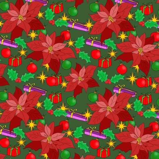
2. Class Project + Tools Needed: So when it comes to the tools that you're going to need for this class, all you need to take this class is an iPad and Apple pencil or any kind of other stylists that you might use with the following apps installed on your iPad, Affinity Photo, and Affinity Designer. If you enjoyed classes like this, make sure you check out some of my past classes on designing seamless repeats and other types of creative courses right here on Skillshare. I take you through my process of using the desktop to design some great seamless repeat patterns that can then be turned into like augmented reality that grounds for places like instagram or into stories or Snapchat. And then I have some really fun creative classes on how to use things like cricket and procreate, or how to make digital products like digital stickers and printables and things like that. Again, I'll make sure to link all of that within the class description so you can check those out as well. So when it comes to your class project, we will be creating two seamless repeats. One will be designed using the raster based Affinity Photo app, and one will be designed using the vector-based Affinity Designer app. The theme will be inspired by your favorite flora and fauna. I love drawing flowers and plants. I think it's a really great inorganic way to kinda get your hand moving when you're sketching. So I thought this would be a perfect theme for those of you who are just getting started or people who just really enjoy floral patterns and repeats your final pattern should be seamless, interesting to look at and include a cohesive color palette. And we're going to upload them to the class project gallery here on Skillshare for your class deliverables when you're ready, upload your process work and your final pattern to the class project gallery, you'll likely want to upload to your inspiration board with your imagery and your color story. And you'll want to also include some sketches of your motifs. I think it's fun to kind of show process work and I think it's great sense by other classmates as well. And then of course you'll want to upload your two final pattern. So one created an Affinity Photo and the one created in Affinity Designer. So who is this class geared towards? This class is geared towards anyone interested in learning how to create surface pattern designs using Affinity Photo and Affinity Designer on their iPad. Whether you're a seasoned pro and surface pattern design or someone just learning how to use the software. I want to work to ensure that you feel comfortable in the apps and the course I'm looking forward to creating with you today. Let's get started.
3. Research + Finding References: Usually the first thing that I like to do before I even get started in sketching or creating any kind of concepts or motifs for any of my surface pattern designs is to actually research. So I come up with a concept and late to research those ideas. So we're, we're looking at floral, floral pieces and fauna. So the idea is plants and flowers and things like that. So you could go outdoors right now it's winter here in Illinois. So I actually recently got some flowers as a gift for Valentine's Day. So I was taking some images and pictures and videos and looking at the makeup of the floral elements in the bouquet that I received. And that's a great way to pull inspiration. But obviously if it's warm or you are and you can go outdoors and find some actual real life visual inspiration. That's a great way to do this. But I also, like I said, I like to do research, so I like to pull out inspirational reference books. And then of course go online. The first one I wanna do is go through some imagery, reference books that are really great options that you can utilize that I just have on hand another great place to get resources as well as your, is your public library. So I would suggest going into the arts or gardening section if you're looking for some flower kind of inspired imagery, that's a great place to start. And then of course, like I said, going online, but we're going to look at some books that I have on hand right now. And it's a variety, some floral inspiration, some have all kinds of different inspiration in terms of pattern and design and visual imagery. First book that we're going to look at is the pattern source book. This is a fantastic book that has all kinds of beautiful imagery of different fabrics and textiles from all kinds of backgrounds as well as years. Some of the artwork goes back as far as the 1850s, hundreds. And then it goes all the way through to modern times. And that's what I like about this so much is that there's such a variety of different visuals that you can look at and be inspired by. Obviously, the idea isn't a copy, but to look at and take inspiration and build different elements and sketches. And I'm inspired pieces that you can pull together to create something that is your own. So when I'm looking at reference books, what I like to do is utilize little post-it notes to basically mark pages that I find inspiring or that I like in terms of the overall direction of the creative work that I'm looking at and what I'm trying to pull inspiration for when it comes to my own projects. I like the idea of also incorporating animals with the actual floral or plant like features. So this is something I'm going to mark as well. These really pretty heat transfer printed polyester florals are really fun to look at as well. I like these monochromatic oversize floral motifs to. These are really fun. If you're looking for something that is visually interesting. Doesn't require too many color options. I like this as well. And again, this is fun too. The idea of pulling in an animal along with plant life and florals, I think is really fun. So I'm thinking about what kind of birds can I pull in? What kind of shapes in options in terms of flowers can we use within some of the ideas that I have for this project? The next book I want to highlight is this beautiful Japanese children's fabric reference guide with textiles and fabrics that range from the 1950s to the 1970s. This is just a gorgeous book from shipper collection. And I just, I like this because it's a fun arrangement of different kinds of fabrics that are inspired by a useful touch. So, and you can definitely feel Tanja, the 70s color vibes inherit as well. But I loved that they utilized again animals and florals together, whether it be these little kind of like did see florals with bunnies are puppies. And then they utilize really fun bright colors. Also like having some of these braccio pieces that there's moments within the fabric. So it feels almost like a little scene that they kind of pull out and highlight within each of the layouts here, another reference book that I like a lot is this. And again, these are majority's are from shipper design books there. It's a great resource for all kinds of like fabric, textile, service, pattern design, design work in general. So this one is a rundown of abstract textile designs and it pulls in some floral elements. But I just wanted to highlight just finding a wide variety of resources that you can tap into outside of just the Internet. In addition to taking your own photos are going out and sourcing your own imagery in terms of floral and fauna pieces that you're going to look into. So again, this is just really a reference resource guide that highlights different fabrics from different eras. This is focusing on a wide range, but a lot of it is very much focused on the sixties, which is when you're likely to see some of these really beautiful kind of psychedelic, abstract dealing floral. So again, it's an abstract theme, but you still see floral references in here. So these are pink flowers in a Greek basket. And I like these kinds of resources as well, just for color inspiration. And that you can tap into as well. Greens on white for forest, the fact this is beautiful, pinks on white. And again, this kinda gives a bit of a floral fact here as well. Floral color smudges. So the idea is that you don't necessarily only have to draw realistic looking floral elements. You can also utilize stroke since in splashes and color smudges to kind of get this effect as well. So this is an example rose red pattern with black highlights. And then the next book that I want to highlight is the mastering the art of fabric printing and design book. There's different techniques, tutorials, and inspiration in This is focused on Adobe products, but I still think it's a great reference book in terms of looking at fabric printing from a holistic perspective, not just digital, but also looking at hand stamping. And it also includes some really beautiful inspiration and reference imagery as well as some great interviews with other fabric designer, surface pattern designers that you might find interesting. So what I like most about this book is that it does a great job of looking at helping people understand patterns and the different types of patterns and the elements that make up a pattern. So it highlights different types of motifs like geometric motifs, floral motifs like what we'll be working with today. Ethnic motifs when we're looking at more culturally inspired and influenced pieces, conversation or motifs, textures. And then it also goes into things like the different types of repeats, like a straight repeat, a brick repeat, half-drop, and random and tossed design, which is what we're likely going to be working on in our project just to keep things really simple. And then it also highlights different ways of creating different types of surface pattern designs like mirroring and composition, different directional, multi-directional styles, and then highlighting the importance of scale and layout density. And then like I said, they have these great profiles of designers. So Mary Mecca, which is a super famous brand that you're likely to know of on so the highlight them and then of course they go into color. So this is such a fantastic reference book. It does a good job of highlighting industry professionals the tools that you need, different ways of going about creating patterns aside from just the digital aspect. And then like I said, there's also some great inspiration as well when we're looking at different pattern types and imagery and different florals that they're highlighting within the industry. And then they also do a fantastic job of looking at this from a professional perspective, giving tips and tricks on things like building and developing collection, creating a portfolio, and then also things to keep in mind when you're looking at marketing opportunities for your work. Now that we've looked at some of the more traditional reference kind of book type inspiration, then we can jump into some of them are digital aspects as well. But before we do that, I wanted to just highlight. I also like to and utilize web sites like Spoonflower to look at in terms of inspiration and reference. And also as a way to organize and sell some of my own repeat patterns as well. So some of these are actual prints. In order to sell your repeats on a website like Spoonflower, you have to order and check your scaling on the coloring of your repeat patterns. So I do this and I usually do a full yard. And I'm able to then basically check all of my prints, their scales. Some of them come out too big like this, but that's a great example of why it's also important to test your print at home on a printer and then you're able to sell them online. Now that I'm done looking through my physical book kind of references, I like to also go digital. So of course, my main choice here is you could either do Google or Pinterest. If I'm Pinterest, to be an easy way to actually organize and find imagery that you would be looking for. It's basically like a search engine and of itself. And I use it a lot when I'm trying to pull together different types of imagery in one place. So I've already set up a flora and fauna board here on Pinterest. And I've just pinned images that relate to some of the concepts and flowers that I was looking at. And I've also pulled in some plant life as well, greenery and different things that I think relate well to the concept that I'm working on. I do want to add some more plants though and leaves. So I'm going to look up spring leaves and see what comes up is I'm looking for shapes as well as visuals. So this is a good one. So I'm gonna save that. I'm going to pin it to my flora and fauna file. And I'm just going to repeat this process until I find all the imagery that I think will make sense for what I'm looking for.
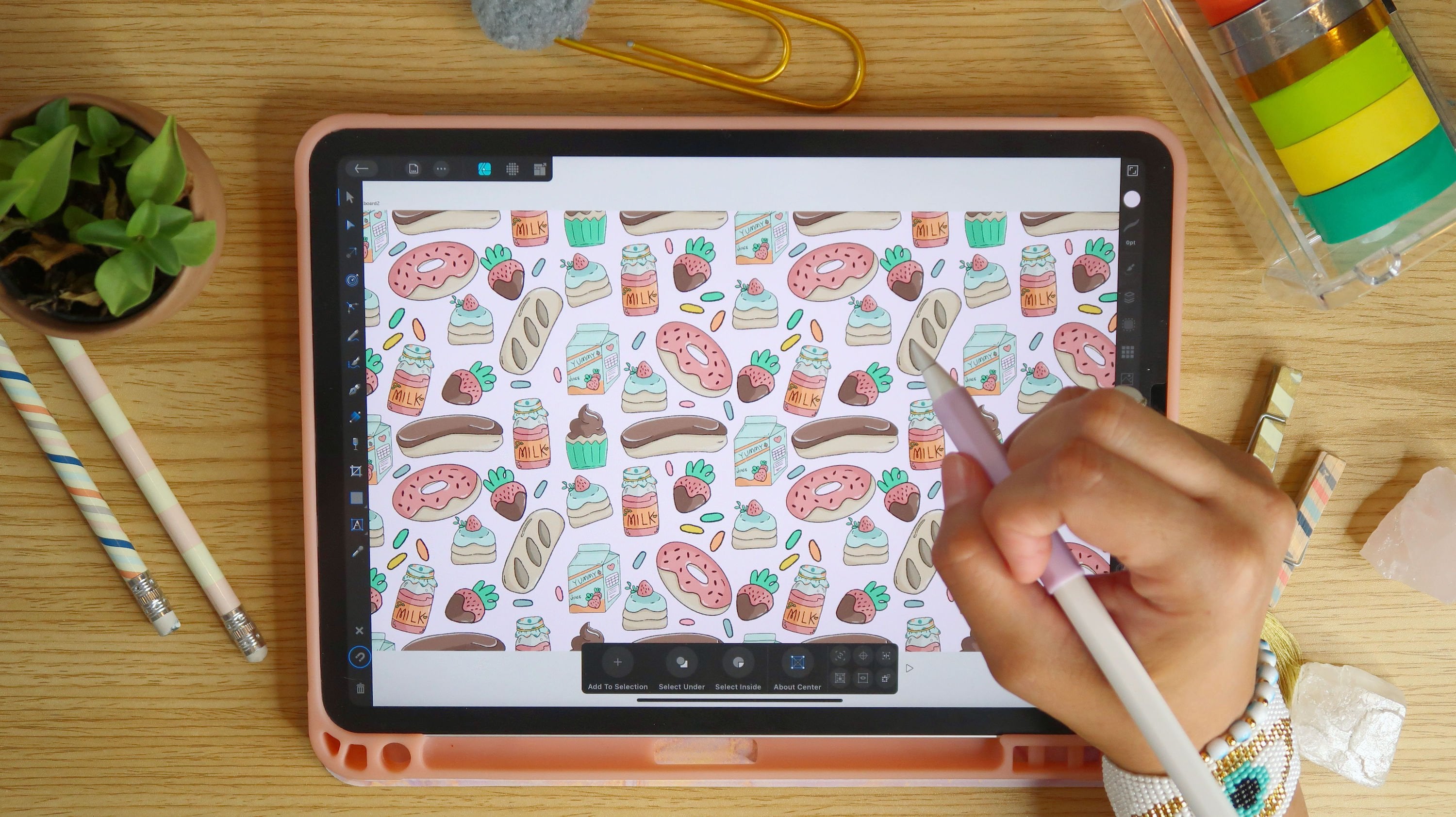
4. Creating a MoodBoard: Once I've completed filling all of my board with the pins that I think will work well for what I'm doing. And I like to jump into actually creating a mood board that I can reference back to when I'm working on my sketches. So the easiest way to do this is the first thing we have to do is actually find an access the PNG or JPEG files of each of these images. So to do that, usually you just want to click on your pin and then it will take you to wherever that image is. So once you've clicked on that image, usually it'll take you within the Pinterest app if you're on your iPad, would I like to do is hold down that image and drag it out and basically open it up in a web browser. So I'll get a side-by-side view of what I was looking at, Pinterest and then my actual web browser. And then what I can do is hold my finger down on that image and then add those two photos. And then I'll just repeat this process for all of the images that I want to pull into my mood board. Once I'm done pulling all of my images and saving them to my photos, I can exit out of Pinterest. I'll just double-click and then close out my file windows. So what we wanna do now is launch Affinity Photo so that we can create our mood board. I'm going to have a combination of the images that I found online as well as images that I've taken off some flowers that I have here at home. So to do that, we're going to launch Affinity Photo. And we're just going to set up a simple 8.5 by 11 file. So I'm going to go to the upper right-hand side. There's a little plus mark, question mark and a little pocket. So your place allows you to create a new artboard. Your question Mark takes you to the Affinity Photo help options, and then you can just X out of there and then the sprocket is basically your settings so you don't have to really do anything with this. I just want to highlight what you'll be able to see within this. Basically all of your preferences, your interface options, your color options, the different tools and what you can do to update and adjust for whatever your needs might be. And then we can hit Done. And then what we're gonna do is hit the Plus. This allows us to create a new artboard and we are going to select new document and we're going to change our dimensions to be 8.5 by 11 will change your dimensions for the width to be 8.5 and then the height to be 11. And then we're going to keep our DPI at 300. And that we don't have to worry about transparency for this, so we can just keep that turned off. You can adjust your color type. I'm just going to keep it at RGB eight for now because this is just something that we're going to be looking at on our device. And that if you are noticing that you don't have inches as your measurements, you can just go to the left-hand side. We're under where it says document, There's different types and then you can change the measurements. And it might say points or pixels for you and you could just change it to inches so you know, you're dealing with and then hit. Okay. Once we've done that, it creates new art board for us. And this is what that's gonna look like. And what we're gonna do is basically place our images in this as well as any color stories that we may have found or that we like or that are inspiring. So to do that, all we're gonna do is go to our upper left-hand side. If you touch this little question mark on the lower right-hand side, it'll tell you all the different studios and all the different tool names. So we'll mostly be working with the tools on that. A few of the studios here. But it also shows you up here what your main menus are. So you have your document menu, your command menu, and then you have the opportunity to change to different persona's. So what we wanna do is go over to our commands menu. It's set three.me. And what we wanna do is click on it. And then what we're gonna do is select Place and we want to place from photos. So all of the photos that we save off the Internet as well as any of the pictures that you may have taken. You can place them in here. So what we can do is if you get a pop up like this, you want to make sure you just allow access to all photos and then you can go to recent, recently added. However, your file system is organized. So what I'm gonna do is just go to recently added and start placing some of these images. So in order to import it, once you've clicked import, you just have to drag and it will resize the image. And you can place it wherever you want on your art board. If you ever want to move something, you just go to your Move tool on the left-hand side, it's the little arrow. And then you can click on your image and move it around your art board tool. We're just going to continue this process to place all the pictures that we have. Go up to your command menu, which is a three.me select Place, plays from photos, and then find your photos, and then place them wherever you see fit on your board. Once you've placed all of your images, if you notice that any images that you want to have overlapping another image are hidden, you can just click on your Layer studio. It's the little icon that looks like a stack of papers. You're going to click on that layer studio. And then what you can do is click on the actual image so that it's highlighted. You'll see that a tie lighted because it'll be outlined in blue. And then if you click on the layer panel, you'll notice that you can click on that layer, the layer that the image is on, and you can move it around by just clicking on it and dragging it. So for this one, for example, what we want to make sure is that this image is above the first one in this layer set. So I'm going to click on it and I'm gonna drag it above. And then you'll notice that the picture comes to the front. And then the last thing I'm gonna do is pull some colors from some of these images. So I really like this purple, pink and kind of like green and blue color story that I see in these flowers here. So I'm going to pick some of those. I'm going to color, pick some of these colors and create a little color guide for myself here in this empty space. So to do that, what I'm gonna do is Go to my left hand toolbar, select my square tool if you notice that it's something else. So you have to do is click on the shape. And then it'll give you a pop up here. And then you can select whichever options you want. I'm just going to keep it the square rectangle shape. And then I'm going to go over to my color studio here. And I'm going to select that little circle with the blue dashed through it, making sure that everything else is de-selected. I'm gonna, I'm gonna adjust my color so that I have an actual color. So I know what I'm working with when I create my square. And then I'm just going to take my Apple Pencil and drag across to create the shape. And then I'm just going to create a few more of these. I'm going to select it with my move tool, that little arrow tool. Make sure it's selected. You'll see it's outlined in blue. And then I'm going to go up to my three.menu. I'm going to select Duplicate. And then I'm just going to click on that and drag it, right? And then I'm going to select all of them by clicking on my last one. I'm going to put my finger down on my screen. And then I'm going to select the rest of these. And it'll allow me to select all of them at the same time. And then I'm gonna go to my three.me select duplicate again. And then I'm just going to drag those down. And then what I wanna do is color pick from my images. So I'm going to select that square first. And then on the left-hand side, I'm going to select my color picker tool, which is the third icon from the top. And then what I wanna do is go to this image here and color pick the colors that I like. So I'm going to select this purple. And you'll see that it's changed this and it's giving me the color up here as well. And then I'm going to select my next square. So I'm going to go back to my blue arrow tool or go back to my arrow tool, select my next blue box. Go to where I am going to pull my color fun. Select my color picker tool, and then click on the color that I want from each of these areas, and then go to my next Blue Square. Go back to that photo, select my color picker tool, and then select the next color. Go back to my move tool, my little arrow. Select the next square. Go back to that photo, select my color picker tool. Click on the next color. I'm going to repeat this process until I find all the colors I wanted. I wanted to have some pinks and purples as well as some mutual kind of blues and then of course, some grains. Once I'm done selecting all of my colors and placing all my image, my mood board will look a little something like this. So the idea is, and have reference for visuals and then a reference for your color options. And then what we're gonna do is export this. So now that we're done with this, we're going to go up to our document menu here. It looks like the little page with like a dog ear and three dots. And then what we wanna do is select Export. And then we can export this as a PNG or a JPEG. I'm just going to select JPEG for now. And then I'm going to go under my filename and click in it and I want to update this. So what you'll notice is a little pencil comes up in the lower left-hand corner. If we click on that, it'll pop out this little on keyboard Menu, select a keyboard and then it'll give you the keyboard to type. I'm going to delete this. And I'm going to rename it flora, fauna, moodboard. And then hit return. And then hit Okay. And then save it somewhere where you'll be able to access it. I'm going to save it on my iPad under Affinity Photo and then hit Save. And then I'm going to exit out of my Affinity Photo app by double-clicking my button here, swipe up to close my option here. And if you have a different iPad, you can just pull from the dock off and then be able to close out of air out of your different apps. But what we want to just do is double-check in our file system that our image is where we saved it. So I'm gonna select my file system. And then I'm going to go to my iPad, select Affinity Photo, and my mood board is indeed they're so we'll be able to open this up and view it. And the purpose of this adjusted that we will be able to place that image into Affinity Photo while we're sketching, we can just have it there on our actual WorkBoard so that we can reference back to it as we're working. Now that we've created our mood board, Let's get started. I'm sketching within Affinity Photo.
5. Sketching Motifs in Affinity Photo: So before we get into sketching on the iPad, I quickly wanted to show how you can pull in any lake hand-drawn sketches into your iPad really easily. I like I said at the beginning of this course, are really highly suggest you play around with the idea of sketching right in your iPad just because it makes it a lot more seamless in terms of working in the apps like Affinity Photo and Affinity Designer, you can sketch in them, create layers just for your sketches, create a file just first sketches, which is what we're gonna do in a moment. I know some people just prefer the idea of hand drawing their sketches and things like that. So I wanted to show a couple some sketches into your iPad using your camera and then how you can pull those into Affinity Photo so that you can actually digitize them. So I was working on some sketches from yesterday as well as city, just some floral concepts in motifs, pulled some of the ideas that I found in my references. Some of the ideas from my photos that I took, as well as some of the ideas from the photos that I found on Pinterest. And I would just hand sketching out some of these concepts today. So now that I'm done with them, suggest having at least 10 to 15 motifs that you can utilize or play around with. Keeping in mind things like line, weight, size, scale, and then having a mixture and a variety. So I have floral elements as well as leaf elements for that fauna aspect. And then even I drew what I think is kind of like a chicken bird. I don't know yet. We'll see if we pull them into anything. But I saw some of these vintage looking fabrics that had birds as well as leaves and flowers. And I thought it looked really fun. So I just did a fun little quick sketch, my own interpretation of a bird, but it kind of looks more like a chicken. What I suggest you do is using your iPad to actually take a photo of your final sketch, making sure you have nice, clean, even lighting. And then what you wanna do is make sure that your iPad is angled and any funky way, just so that you can have a nice, clean image. So it's almost like you're scanning it, but not really because you're taking a picture. So what I like to go into is just my photo app. And then I like to just take an HDR image is a high definition resolution image. And then I basically align everything up, keeping in mind my final piece and making sure I can get all of the elements within the image. I'm gonna move this up just so they can have a better view of how it kind of line everything up. And I do have to move my iPad over to the right because of where my camera is. And then I just try to keep everything study, make sure everything is in frame, and then I make sure that my iPad is flat so I have no issues with warping of the image. And then I snap a couple of photos. Once I'm done with that, I'll have the image transferred from my sketchbook onto my iPad. And you can zoom in really nicely to high-definition photo. And then I'll be able to bring this into Affinity Photo or Affinity Designer so that I can digitize these in my programs. Once I've pulled those images in and I've taken a photograph, then I can launch Affinity Photo and we can talk more about sketching within this app. So the first thing we wanna do is set up a file. So we have our mood board that you can always reference back out to. So I'd like to open that up just so that I can always have something that I can reference back to. But what we'll do is set up our new file. We're just going to have this be keeping in mind that we are likely going to be creating a repeat towel that's 2000 by 2000 pixels wide. I like to create larger than I need elements, especially when I'm working in Affinity Photo, because Affinity Photo is a pixel based, raster based program. So it's easy to scale something down. It's not as easy to scale it up and you can lose fidelity and you can end up having images and things like that pixelated. So I always suggest sizing up. So I'm thinking I'm going to create out an 11 by 17 inch artboard so that my elements should be big enough. When I create either a 2000 by 2000 square tile or 4000 by 4000 square tile. So to do this, what we're gonna do is hit the plus button in the upper right-hand corner that I showed you guys in the last video, we're going to select New Document. And then we're going to update our dimensions from what they currently are. And again, if you don't see this in inches, you can just go to the left-hand side, select your measurement options, click on the drop-down and then just click inches. And then we're going to update our width to be 11 inches hit Okay. And then our height to be 17 inches hit. Okay. And I think I'm going to work wide. So I'm gonna change my orientation from this up and down portraits DO to side landscape style. And then what I also wanna do is make sure I am working on a transparent background so that it'll be easier for me to pull my elements into my tile without having to separate it from the white background and then hit, Okay. And this is what the actual art board will look like. It'll have gray and white squares. So the first thing we'll, we'll wanna do before we get into adding anything, I just want to highlight that if we click on this little question mark in the lower right-hand side, it'll give you this pop up with all of the different elements on your screen. So on the left-hand side you have all of your tools. On the right-hand side, you'd have all of your studios. And then at the top you have your menu options at your document menu or command menu, and then your options to switch out of different persona's like Liquify persona, develop, export persona. We're mostly just going to stick with working in the photo persona for this because we're just sketching. We're gonna be using a lot of our tools. And then when it comes to the studios will likely be using our layer studio color studio brushes studio. And then when we get to actually working on our repeat, creating the actual repeat tile will be working in our filters studio as well. So the first thing we wanna do is go to our right-hand side and click on our layer studio. And then the layer studio looks like a little stack of papers. You'll get this little pop-out here. What we wanna do is hit the little plus here, which allows you to add a new layer. So we're just going to add a pixel layer. And then on that layer, what we wanna do is go to the left-hand side and select our shape tool and mind. His already have mine already has this rectangle or square shape tool already selected. But if you don't have that, if you hold down on it, you'll get this popup that allows you to select different shapes. So what I wanna do is just basically create a rectangle over this art board that's white so that I have a separate layer for my background than I do for any of the sketches that I create on top of it. And then I wanna go to the right-hand side and select my color studio here, it's that little circle. Then I'll have a color in it. And then I'm just going to change that color on the background color. I don't need anything. So if it's a color, you can just click on it and then select this little square with a blue line through it and it'll remove the color. And then for my tab color would I wanna do is just select a pure white. Go back to my shape tool making sure it's selected. You can then click on the color studio against so that it pulls it back in. And then making sure your rectangle tool is selected, drag from one corner to the next so that you can just create a rectangle that is white and covers your entire background. I like going a little bit beyond the edges, as you can see here, just so that I know everything is fully covered. And then I'm going to go back to my layers. And then I'm going to hit Plus again, and I'm going to create another pixel layer. And this is going to be our sketch layer. So we're going to rename this. So when I click on it, select the three.me here, which is your app, your layer options. And then where it says pixels, I'm going to click on that and then it allows you to update the name. This is just a great way to keep everything organized. I always suggest you rename your layers. So if you have the most recent version of the Apple pencil and your iPad and this app, you're probably going to be able to actually write the name in, but I prefer using the actual keyboard. So what you'll notice in the lower left-hand side is this little pen with an a on it. If you click on that, it'll give you your keyboard options, select Keyboard, and then it'll give you your keyboard. So I'm going to rename this sketch layer. Hit return and then, okay, and then it renames it. If you go back out into your layers, you'll see your layer is renamed. So making sure that layer is selected. And you can sketch on tablets. So what you can do first is place your actual mood board on your screen if you'd like. And the easiest way to do that is go into our command menu into three dot option. We're going to select that and then we're going to select Place. And then we're in a place from photos. And then what we're gonna do is we can either you can place the sketches that we've already worked on, or you can place your mood board and then just place it wherever you want by dragging. And then you can kind of work from here and move things around if needed. And you'll notice that your image is a separate layer from your sketch layer. So say you just wanted to work with your moodboard for right now and you're going to sketch next to this. What I would suggest is making sure your sketch layer is selected. And then we can go into all of these different options. There is the paintbrush option. There is an actual pen tool similar to what you might use in something like Affinity Designer or lake Illustrator. There's also an Erase tool which you'll use to erase any elements that you draw on if you don't like something aside from deleting it. But what we're gonna do first is work with some of our brush tools here, so that I can show you how you can sketch directly in the app. And then I'll show you how you can pull in your sketches is safe. You did sketches on a piece of paper and then he photographed them like we did before. I'll show you how you can place those in and then kind of clean them up here so that you can digitize them. So making sure that we are on our sketch layer, I'm gonna go to my Layers function select layers, and then go to sketch layer. And then I'm gonna go to my Color Studio and I'm gonna change my color from white to something like red so that it's easy to see. So I know this is going to be my sketch layer and then I'll do a darker color when I do the layer to clean up my lines. But for now we're just going to use a red color so it's easy to see what we're doing. And then I'm gonna go to my brush tool. And then you'll see you have all of these actions at the bottom. It allows you to adjust the width of your brush and how big or small it is. You can adjust the opacity. You can make it less opaque or more opaque. You can adjust the flow. And then you could also adjust the hardness. And then what we also wanna do is then select the brush tool studio on the right-hand side. And then it'll allow you to actually select the kind of brush that you're going to draw it with. So what I'm gonna do is pick something that's like a pencil. There's all kinds of different brush styles and brush types within this app, which is why I think it's fantastic. So what I wanna do, so you see if you click on where it says like the brush type and you scroll through, you'll have all kinds of different brushes, watercolor brushes, acrylic brushes, basic brushes. And that also you have pencils. So we're going to select pencils and then I'm going to select a 6 B pencil. And then just so that you can kind of see what it looks like. And if you have any issues with actually drawing on screen, just make sure Protect alpha is unmarked. And then you should be able to draw on your, on your screen. You can double tap with two fingers to undo. And then like I said, we can adjust. How thick or thin or line is by adjusting these levels down here, you can also click on that and it'll give you a path out and you can manually update it or like six pixels, it gives me a nice clean center line. I may actually make it a little bit bigger so that you guys can see it easier on screen. There we go. So it's easy to see making sure we're on our sketch layer. We can now begin to sketch. So just like you would sketch on a piece of paper, the idea is to sketch on your iPad. My suggestion again is to keep in mind sketching on different layers. And this allows because this image here is on one layer. If I sketch over it, it's not gonna do anything to it. And then I could always add layers on top to clean up my sketches. I also suggest keeping in mind things like weight and scale and having a variety of both weights and scales and a variety of elements on, like I said, 10 to 15 motifs will be great to work with. When it comes to building out your pattern. You have a ton of images that you likely found that you had here on your moodboard. I've already started sketching some. I'm gonna pull those in and a little bit, but I just want to show you how easy it is to actually sketch here in the app as well. And remember, these are sketches. They don't have to be perfect, they shouldn't be. It's okay if they're rough because we can always go back through and clean them up afterwards. And say we don't want to have this line here. What we can just do is select the eraser brush tool and then we can use it to just clean up any lines that we don't need or want. And because I was so zoomed in, this image actually ended up becoming quite small. So what you can also do is go to your upper left-hand menu and select your selections persona. So we are currently on our photo persona. If we select the little looks like a circle sprocket to the right of this. It is our selections persona and it gives you all of your selection tool. So I'm gonna select this free-hand Lasso. And then I'm going to select around this rose that I just drew. And then I'm going to select my move tool and it'll allow me to actually increase the size of this element so that I can have it a bit bigger. And then keep in mind, this is just a sketch, so it's okay if things get a little bit pixelated, which it kind of did. But because this is just our sketch, that's fine. Because we're going to add an actual layer on top of this to clean it up. Once I've done that, I'm going to go back to my three.me. I'm going to select, de-select. And then I'm going to click from my selection persona to my photo persona by clicking on that square. And then it'll take me back to my sketch element. It's okay if this looks a little pixelated because this is just our sketch layer and we'll clean it up on another layer after. So I'm just going to draw a few more elements and then I'm going to show you how you can actually bring in. Your paper sketches and then digitize them in this app here as well. As I'm drawing this because I'm going around in a circle. I'm I feel the need that I need to kinda like you could choose either physically turn your Canvas, but you could also utilize the Canvas orientation tool as well. So if you'd go to your document menu and you go down to orientation, it'll allow you to rotate it left or right. So I'm going to rotate it left a bit so that it's easier for me to kind of continue drawing the petals around the circle. And then I'm going to go back and I'm going to go back to orientation under my document menu, select Orientation and rotate left once more. And then this way can finish up the rest of these petals. And it's a little bit more comfortable to draw. And then just to get everything back to the original orientation, I'm just going to go back to orientation and I'm going to rotate left two more times and it should bring me back to what it was to start with. And I've got some sketches on here are ready. And then my next suggestion is actually pulling in the sketches that you may have created outside of the app. I guess had the app actually is really intuitive and it gives you options that feel very much like traditional tools, whether it be pencil or paint on. I'll show you that really quick. You can actually go into your brush tools. You can switch out of your pencil options. And they have inks, which are really beautiful and we can use these to ink our final pieces. And they utilize the pen pressure. So the harder you press in, the lighter you press will decrease or increase the line weight, which I think is really great. So it works with the Apple Pencil and 10 in terms of pressure sensitivity. And then it also has some really beautiful textures and watercolors options in terms of the different kinds of brushes that you can use. So this is just a basic watercolor. And again, these also work with pressure sensitivity. So however, hard or soft you push down will give you different and drying thicknesses. And you can also adjust the opacity, the width, the flow as well in your bottom options here. And then here I'll show you a few more options. So they have some beautiful acrylics as well. And again, these give just some great texture to the actual digital artwork. To undo all of this mess, I'm just going to take my two fingers and I'm going to tap on my screen until everything is back to what it was before. So you can use all kinds of different brushes and we'll work more with those brushes as we get into coloring.
6. Inking Motifs in Affinity Photo: But what I wanna do next is actually pull in some of our outside sketches so that we can actually refine those here on Affinity photo. So I'm going to go into my layer with the inspiration board, and I'm just going to turn it off for now. And that way it's not taking up any space. And I'm going to pull it to the bottom of my layers. I'm going to click on it with my Apple Pencil. I'm gonna drag it down. I'm going to pull it to the bottom. And this way I can just add additional elements on top. So this is still going to be my sketch layer, but what I'm gonna do is add an additional layer with my original outside sketches. So then I can start to add those and clean those up in here. So to do that, we're going to go into our command menu, the three.menu. And we're going to select Place and we're going to place from photos. And then we're going to find the image of our sketch that we took earlier. And that in order to place that, we are going to have to take our Apple Pencil and drag across. And then you can utilize this little arm that's outside of your frame. Two, rotate your image. You may want to make it a little bit bigger or smaller or whatever works for you. I'm just going to have it so that it's over to the left. And then I'm going to bring these images that I sketched, my sketch layer over here. I'm going to actually break those apart and I'm going to pull them into the white area here. So to do that, I'm going to turn off my photo image that I just placed. And then I'm going to go into my sketch layer really quick by clicking on sketch layer, my layers functions. And then I'm going to go into my selection persona again, the little circle. And then I'm going to go into my freehand selection tool and I'm going to select the rows. And then I'm going to go back into my photo persona of a clicking on it. And then I'm gonna go into my three.menu. And I'm going to select Paste Board, and I'm going to select cut. And this will cut this element out for me. And then I'm going to go back into my three.menu. Go to pasteboard and select Paste. What you'll see if you go to the right-hand side and you go into your layers, is that those elements are not each on their own separate layer. So we'll go back to our selection persona and we're going to go into our three.me and select, de-select. And then we're gonna go back into Photo Persona. And then I'm going to select my move tool. And I'm just going to move this rose over here. And then I'm going to go into the layer with the little kind of daisy image and then I'm just going to move that as well. And then I'm going to go back into my layer, turn on the sketches that I pulled in and then you'll see we have everything off to the side. So what I wanna do now is add an additional layer and this is going to be my refined layer for my sketches. So I'm going to clean up the lines and I'm just going to drag this layer all the way on top. So I'll have my two sketch layers with the sketches that we did in the app. And then I'll have the layer with the sketches that I took a photo of. And then we'll have this layer at the very top. We're going to rename this one to be our final line drawing. So I'm going to click on this, select my three dot options and that's my layer options. And then where it says pixel, I'm going to click on it. And then I'm going to rename this by clicking on where it says Enter name and then selecting my keyboard option here at the bottom. And then I'm just going to type in final line work. So I'm gonna change the color of this before I get started. I'm just going to use a nice dark black. And then I'm going to go into my layer options here. And I'm going to select the photo image. And then I'm going to go into my layer options with that image selected. And then I'm going to lower the opacity. Not so that I can't see it, but just so that it's light enough that it's not going to distract me from outlining it. And then I'm going to, I'm going to go back out of my layer options and then I'm gonna go back to my final linework layer. I'm going to select a brush that's more of like an inking brush. So I'm going to click on where it says basic. And then in the pop-up menu to the left-hand side, I'm going to go into my inks. And then I'm going to select a brush pen ink. And then I'm just going to adjust my size a bit in these options at the very bottom, I'm going to adjust my width. I think nine pixels should be good for this. And then I'm going to actually now zoom in and ink some of these sketches that I've created. You don't have to have it be perfectly the same on the idea is just to get the feeling of it. But obviously having the sketch layer underneath makes a huge difference so that you can just follow the outlines. And then I'm going to go through and begin to ink these elements. And if you find any of the studio or Tool Options, get in your way we can do is select that little square in the upper right-hand corner. And it'll pull all of your tools out so that you have all the space that you need in order to draw. All right, so for my pen, I'm actually going to use the analog nib. I liked the brush pen, but it has a tendency to kind of skip lines. And in order to color the way we are going to, we want to make sure all of our lines are completely closed. So this analog nib gives me just enough kind of texture so it feels handmade without it feeling too flat. And it still allows me to close off my lines really nicely. All right, and at 18 pixels, this should be good for me to work with. So now I'm just going to go through and outline all of my elements. And just like earlier, if you find that you need to rotate your screen, you're just going to go up into your document menu, go to orientation and then rotate it, whichever way you find will work for you. And then if you have elements that you don't want, like I have this little dash that crossed over. Just go to your eraser tool and you can just erase it with the eraser. And I'm just going to repeat this process. And so I finish outlining all of the different elements that I've added and then we can jump into coloring.
7. Coloring Motifs in Affinity Photo: Now that we finish inking all of our elements, what we can do is kinda start to clean up our layers and then we can jump into actually coloring these files. So I have a bunch of layers that I don't need anymore. So what we can do is just go in and select them like this sketch layer. We don't need that anymore, so we can use the trash can under our layers to delete it. Same with the sketch layer here on our rough sketch layer from our earlier roses, we can just trash can that one. And then we have our final line work. We have our background layer, and then we have a rectangle layer. So I'm gonna do is reorganize my layers so that I have my background and my rectangle group together. So what we'll do is we'll take our Appleton, select our rectangle layer, and then I'm going to hold it down and drag it so that it's right above the original pixel layer, which is our background. And I'm going to select the white rectangle layer. And then I'm going to select the next layer by just dragging my Apple pencil across it. And then you'll see both of the layers highlighted in gray. What we're gonna do is select this little icon that kind of looks like a puzzle. We're going to click on that and it's going to group it together. And you'll see the rectangle on the background. So I'll do is I'll select that group. I'll go to my layer options, the three.me, and then I'm going to select where it says group and then I'm going to rename it so that it is named Background. And then this again, you can just click back on your Layers option so that it brings you back to your main section. And this allows you to just kind of keep things organized. What I wanna do really quick though, is turn on my Instapoll board. I know it is. It's behind and blocking some of our imagery and that's fine. I just want to utilize it to pull the colors from the actual images. So I want to pull in some of the colors using the color picker tool. So what I'm gonna do is go into my color studio over here on the right-hand side. Right now it has a circle with a blue line through it. And then I'm gonna go to the left-hand side in my tools and I'm going to select Color Picker, which is basically this little eyedropper tool. And then what I'm gonna do is wherever I place my stylus, it'll pick up the color. But what we wanna do is make sure our background is no longer selected. And all we have to do is click outside of the art board. So I'm going to go into my color picker tool. I'm going to select this purple and then you'll see a pop-up in your color studio here. And then what we wanna do is add this color fill to our palate. So in order to add this fill to a palette, what we're gonna do is set up a new palette in our color studio. So we're going to select our colors. Studios are right now. Mine has a white circle. And then what I'm gonna do is I'm going to go over to my swatches at the bottom. I'm going to click on that. And then I'm going to select this little hamburger money at the top right area here. It looks like a square with three lines in it. And we are going to add a document palette. And once we've added it in. It'll say something like a named or my case it says unnamed two. And then I'm going to select that hamburger menu again. And then I'm going to rename palette. And then I'm going to update it so that I know this is my palette for my floral repeats. So you can name it whatever you want. I'm just going to name it floral repeat. And then hit return. And then you'll see that this is the palette that we're working with. And then what I'm gonna do is go to my eyedropper tool. I'm going to select this purple, and then I'm gonna go back to the hamburger menu and my swatches. And I'm going to select, add current fill to palette, and it'll add it to my palette. So this way, I always have access to my palette and I don't have to keep going back and forth too, inspiration board. So I'm just going to repeat this process for the rest of my colors. I'll do it one more time with you guys. Make sure I select my color picker tool. Click on the next color that I want. Go to my hamburger menu over here in the swatches. It's that square with three lines through it. Click on it, select, add current, fill to palette, and add it to my palette. Now I'm just going to repeat this process for the remaining colors. Once I've added all of my colors into my palette, I'll be able to access it as I'm working on this project, I'm going to go back out of my swatches by hitting my little back arrow. And then I'm going to close my color studio for right now, I'm gonna go back into my layer studio. I'm going to select my inspiration board and I'm just going to uncheck it again so that it's turned off. And then I'm going to go into my layers options here and then I'm going to add an additional layer. So the purpose of this layer is to add color to our elements. So what we're gonna do is select our layer studio and then I'm going to hit plus and I'm going to select pixel layer. And then I want to make sure that pixel layer is above my linework layer. So I'm going to select that pixel layer. I'm going to hit the three.me, which is our layers options and I'm going to rename it. So I'm going to select where it says pixels. And then I'm just going to rename this color layer. Once I'm done, I'm gonna hit Okay. And then I'm going to go back out of my layer options and I'll see that my color layer is indeed on top of my final work layer. And then I can begin to start coloring these elements in. So I'm going to go to my Color Studio, I'm going to go to my swatches. And then I'm gonna go to my floor repeats, and then I'll know I have access to all of my colors. So what I like about coloring in Affinity Photo is that it's actually quite simple and it could be very, very fast because you can utilize the flood fill tool. On the flood fill tool is this little bucket on the left-hand side and it's 12345 elements down. And this allows you to tap and fill any closed shapes. So that's why it was really important to make sure that our shapes we're awfully enclosed. So what I'm gonna do is I'm going to select the green that I want to work with. And then I'm going to select my flood fill tool. And before I do that, I just want to bring your attention down to the bottom portion of my screen. You're able to adjust your failure mode, which obviously will be working with Phil, but you could also adjust your source. So it's important that with this, because we've created a new layer on top of a layer with line work, we need to adjust our, our source two layers beneath so that it reads that we need to fill in only these lines here, and then you can adjust the tolerance as well. I found that for my tolerance, 20 percent works nicely. And then over here you want to make sure that right next is tolerance contiguous is selected so it knows the fill just whatever shape is outlined here. So this allows us to add color without having to change the original art layer. So now that we've set all of this up, now we can go in and literally just tap where we want to have color. So if we zoom in, I'm noticing that there's still a little bit of white. So what I'm gonna do is undo this by tapping with two fingers and then I'm going to adjust my tolerance and just increase it a bit and see if that changes anything. Yeah. So one side increase the tolerance, it fills two lines and then you don't see any issues with any lake blank spaces. So now I can just go through and update my colors. And then I'll just go one-by-one, incorporating the additional colors that I want into each of the elements. Again, just adjusting my color and then tapping wherever I'd like that color to fill. And again, this is one of the reasons why I really enjoy working in Affinity Photo. It just makes the process of coloring much quicker. And then I can go in and add detail work like shading and what not on top of this. And if you find filling a little small spaces difficult, All you have to do is just zoom in and then you'll be able to access the area that you're meaning to fill.
8. Shading Motifs in Affinity Photo: Once you're done filling all of your colors with your base colors, then you can go in. And on that same layer, if you wanted to adjust specific areas that maybe aren't enclosed, you can utilize your brush tool. So just as you were doing earlier with inking, you can adjust and change the brushes and actually add in colors where you could perhaps add textures and things like that as well into this section. So I'm going to add some shadows and some textures on a layer above. But first I just want to add a little bit more of this flat colors, but only to a specific area here on the bird. So I'm going to go into my inks. And I'm just going to select the comic ink pen. And then I'm going to adjust the width so it's a smaller size. And then I'm going to zoom in and then I'm just going to paint over where I'm trying to add the color. Just like you would do with a regular pen and paper or kind of like a coloring book. You're literally just coloring the space and utilizing your stylus. Okay? Once I'm done adding those colors, and then we can create our next layer that will utilize as a layer for shadow. And then we'll create another layer specifically for some texture. So we're just gonna go back into our layers studio. On the right-hand side, we're gonna hit the little plus icon select pixel layer. And then we want to make sure that that layer is above our color layer. So we're going to rename this layer by going two or three.menu, clicking where it says pixel, and then renaming this shadow and then hit return. So what we need to do is also edit the options on this layer. So with it selected, we're gonna go to our three.me and then we're going to change our opacity from a 100 percent. We're going to bring it down to about 50 percent. And then we're gonna change our color pass through from normal to multiply. And then what we wanna do is have this layer via clipping mask. So basically whatever we put on this layer, we only want it to impact and affect whatever is already colored and so that it doesn't go outside of that. So to create a clipping mask, all you have to do is take your layer, drag it so that it goes right on top of the color layer. And then you'll see it kind of creates this clipping mask within the color layer. You can actually select colors that are just a bit darker than your original colors. Or you could just do a quick and easy way. Um, pick like a gray and then adjust that gray color a bit so that it's not as dark or lighter. Or make it darker, make it lighter. And then go back to your color options in your swatches and then add it to your palette. And then we'll use that as our shadow. So basically, keeping in mind where do you think light might be hitting? I would suggest if you're going to want to add too much of this just because this is supposed to be a print. You don't want it to be too. You don't want to lose out on details that people might miss when they're looking at it. But I like to add a bit of shadow effect just so that it gives the image dimension and interests. So, and I don't do too much, but I want to do just enough so that it's interesting to look at when we're pulling everything together. So I've already selected my color, I've adjusted my layer and now I can begin coloring. So once we're out earlier, if you're if you're encountering any issues where your color isn't showing up, just make sure Protect alpha is unchecked. You'll see it in blue if it's selected. So just click on it so that it's grayed out and then your color should show up. So what you'll see is that by creating that clipping mask, even if I color outside of this, you're not gonna see it on the background. You're only going to see the color within any specific area that already has color. So keeping in mind lighting and where your lighting might be able to Josh's making sure that your lighting source is coming from the same on all of your elements so it doesn't look out of place. And then I'm just going to add where I think there might be a shadow for each of these elements. And just as we did earlier, you can also utilize the fill tool when you're actually creating shapes with a color. So in this case I'm going to change my source to current layer and then I'm going to select the fill tool, make sure my source is current layer. And then I'm going to tap in where I just created that shadow and then it'll fill the whole thing. And for me versus me having to color the entire thing in.
9. Adding Texture in Affinity Photo: Once you're done with your layers, you can go in if you would like, and add in an additional pixel layer that goes above this shadow layer by going into your layers function hitting the plus icon, adding a new pixel layer. And then it'll go right above your shadow. You can rename this layer by going into your layer options and the three.me clicking on where it says pixel. And then you can go in and add some texture if you like as well. So what we'll do is we'll change our layer option from normal to multiply again. And then we can bring our opacity down just slightly. It doesn't have to be as low as the shadow on, but I'd say about 70, 80 percent. And then you'll want to select a color that will be easily seen on tablets just so that we can see how this looks. And then I'm going to go into my brushes and then I am going to look for some textures so you can go in and select any of these regular textures that they have under here. Or you can do something like a watercolor texture if you want just to give it some interest. And for my texture, I don't want it to be multiply. I just wanted to be normal. And then you'll go into your brush options and select brush that has some interesting texture. So I'm going to select this watercolor bristle two. And then you're going to increase your brush so that it's quite large and can cover ALL whitespace. And then you can change it to any color you want. I'm just going to change it to a darker pink so that we can see what this looks like. You could do white, you could do whatever options you'd like. And then I'm going to just add a bit of this texture to some of these floral pieces. And you can decrease a tooth. You could see what the actual texture looks like a little bit more. And it just gives it an interesting effect. So you can do this for any of your pieces that you'd like. I'm just going to add a little bit here and there, and then I'll just change the color depending on what color I'm working with. But you can also do something simple like using a white color just so that it gives it something like a highlight. Or it can use a darker color just so that it gives it something more grungy feeling. And again, you can adjust the width of your brush as well. And that will make a difference.
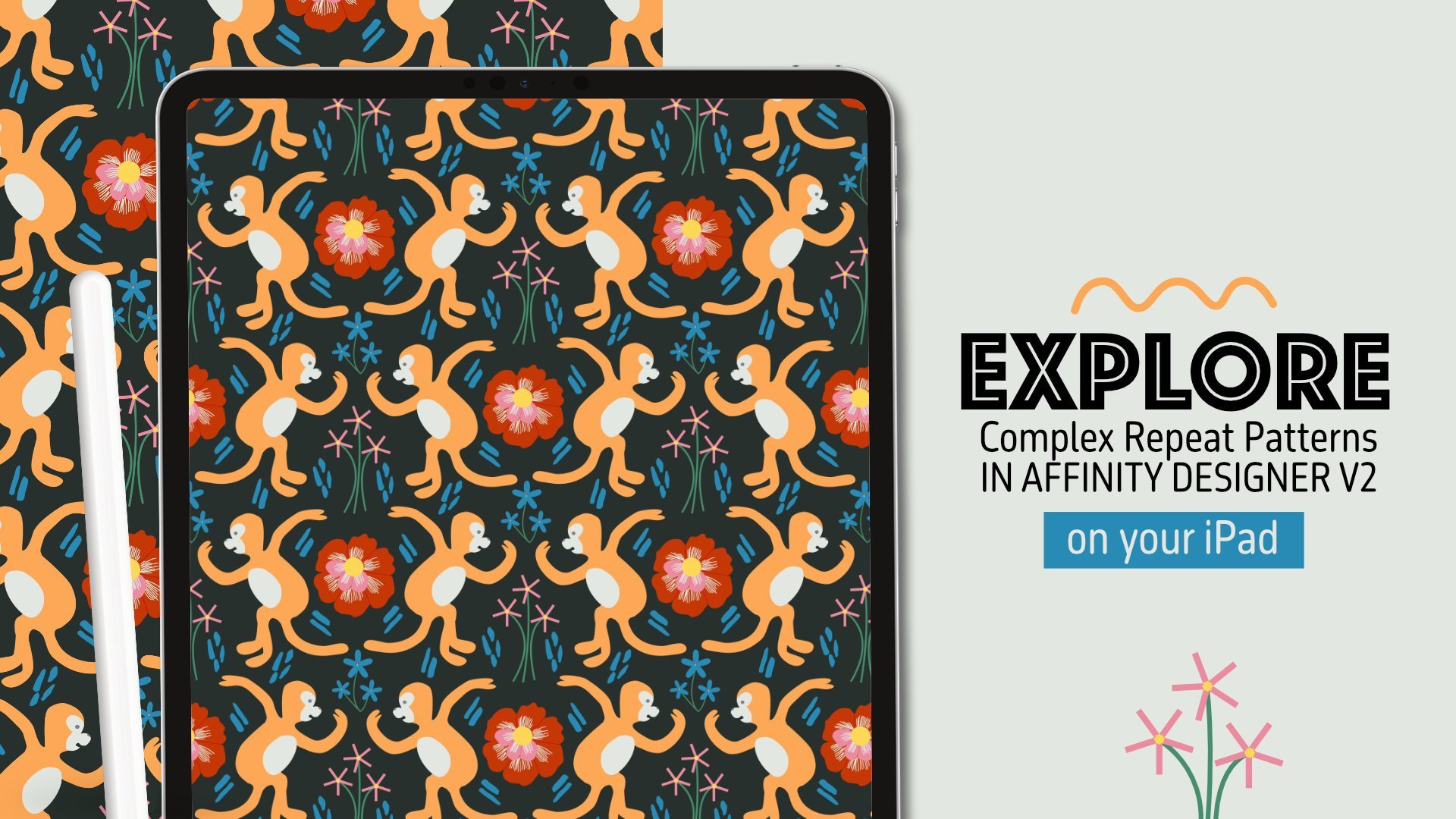
10. Prepping Elements to Repeat: So once you're done adding any additional elements that you wanted to add, then we can begin to actually assemble our pieces. So what I want to do really quickly is group all of these elements together and then we're going to make a copy of them. So to group them just like we did before, we're just going to select all of the elements. So we'll select the first layer and then drag across to the right to select the next layer. Drag across to the right says select the layer below that, and then drag across to the right to select a final color layer. And then we're going to select the little icon that looks like a puzzle and it's going to create a group. So this is all of our elements together in one group. I'm going to actually make a copy of this because what I wanna do is flatten our groups so that it's easy to pull pieces out and place them into the work that we're going to create with the actual pattern tile. But I wanna make sure I have an editable version of this that has all of my layers, my linework, the color, the texture, all that separated out in case I want to change something or I have to change something for a client or anything like that. With, with a raster based program like this, it's not as easy and simple to change the colors as it might be in something like Affinity Designer. So we want to make sure we have all of those layers editable. So what we'll do is take that layer, make sure it's selected. And then we're going to quickly gone through earlier Options, rename it. And I'm going to I'm just going to name it original. I'm going to go into my command menu, which is the three.me in the upper left-hand side. And then I'm going to select Duplicate and it's going to duplicate this group for me. So I want to go into that new group. I'm going to go into my layers options here, select that three dot circle here. And then I'm going to rename this flat file because this is going to be the layer that I'm going to flatten. And like I said, the purpose of this is just so that makes it easy for me to select all of the elements together. And then I'm also going to uncheck mark my original group so that we can't see it. I'm going to select this group and then I'm gonna go above right next to my layer options gives us are merged functions. So what we're gonna do is turn off our background first. And then what we wanna do is select in our merge options here, those little stacked papers, we're going to select Merge Visible. And the reason why we turn off our background is because if that's visible, it's going to merge these elements with the background and that's not what we want. And what you'll see is once we've done that, it's created a pixel layer with all of our elements, the colors, the line work, everything all flattened together. But below it you'll see we still have the original group here. So what we wanna do is select that pixel layer, turn off any other groups that may be on. And that'll we're going to go into our selection persona. And we're going to cut out some of the elements that we're going to want to use for today. So I'm going to use this bird and these leaves. I'm going to use these two flowers here. And I think I'm going to use maybe these flowers and this bit of greenery here as well. So I'm going to select these elements in my selections tool. So I'm going to. I'm going to be my selection persona, and then I'm going to go to the left-hand side, select my lasso, and making sure that I'm on that layer. I'm going to start last sewing the elements that I want to use. What you could do is from the start, make sure all the elements that you're working on are on their own layers. But I find that it's just a little bit more intuitive for me to just draw all the line work on one layer, draw all the colors and add the additional textures and things like that on one layer and then merge them together and then just pull them apart. But if you find it easier to work on layers for each element, that works too. So I've selected my first element and then I'm going to go back to my photo persona. I'm gonna go to my three.menu. I'm going to go to my pasteboard and I'm going to select Cut. Go back to my three.menu, go to my pasteboard and select Paste. And then it'll paste it back. And then you'll see in your layers it's created a new layer with that element on. So now we gotta go back to that pixel layer again. Go to our selections persona, which is that little circle right next to our photo persona. And the top menu here, go to our three.menu, select, de-select, and then go back to our Lasso tool, and then select the next element that we want to utilize. So I'm going to use the bird and these leaves, but I don't want them together, so I'm gonna make sure I just select the bird. And then I'm gonna go back to my photo persona after I've selected it. And you'll know it's selected because you see a little marching ants around it. So go back to my photo persona, go to my three.menu, go down to pasteboard, and then select cut, and then go back to my three.menu, select pasteboard, and then select Paste. And then it'll paste it back on. And again, you'll see a new layer has been created with just that element on it. To go back to your selection tool, go to your three.me select, de-select. And that if we're going to repeat this process once more and then I'll finish selecting all of the additional elements that I want. So I'm going to select these little pieces of greenery using my lasso tool. And then making sure I'm on the correct layer. Then I'm gonna go to my photo persona, go to my three.menu, and then I'm going to select Paste Board and select cut. And then go back to my three.me select Paste Board and then select paste. And then I'll do this for all of the elements on my art board. But I'm just gonna do this for the additional pieces that I'm going to use for this next step in our process. So if you're working on this on your own, you're going to want to make sure you select all of the elements that you're using. Now all of the elements that I'm planning on using are on their own layers. And that way it'll make it easy for me to copy them and duplicate them and paste them into a new artboard. Now we're going to jump into actually creating our pattern tile in Affinity Photo.
11. Building the Repeat Tile: Now to create our pattern tile, what we're going to need to do is go back out into our gallery. So we'll click that little back arrow. And then we're going to set up a new file. So we're going to set up a 4000 by 4000 pixels square. And this is going to be the tile that is the repeating tile. So we're going to hit the plus button in the upper right-hand corner of our gallery and we're going to select New Document. And then we're going to change our measurements from inches to pixels. And then we're gonna go to our width and our height and change it to 4000 by 4000. And then what we wanna do is make sure our background is transparent because we want to be able to add a color Without they're already being a color to our background and just have the actual visual elements repeat themselves. And then if you're planning on printing this or if you're only using it online, then you can decide what makes most sense for you. If you're planning on printing, you may want to use CMYK. But for now I'm just going to use RGB and it should be fine, but definitely look at your printer or if you're doing something like Spoonflower, see what the requirements are for their platform and then hit Okay, so this is the pattern towel we're going to be working with. It's 4000 by 4000 pixels. And what we're going to start to do is actually build out our repeating pattern by pulling in our elements and making sure we're only going to put them in the center. We don't want them too closely the edges because the process we're using is called a gene and it's going to pull things out from the center into our corners to help us create the repeat. So we just need to make sure things don't touch the edges and they stay in the center. So what we're gonna do is go back out into our gallery by hitting the back button. Go into our file with our sketches are not finalized artwork, and go into the layers and we're going to select all of these layers. So we're going to select the first layer and then drag across the second, third, fourth, fifth, 6, however many layers you have. And then I'm going to go into the three.menu and go into my pasteboard and select Copy. And then I'm gonna go back out into my gallery by hitting this little back button. And then I'm going to go into my pattern tile and I'm going to select three.me and I'm going to select pasteboard and I'm going to select Paste and it will paste all of the different elements on this. Once you place everything in, if things got re-size, that's fine. These should be big enough that you should be able to increase the size and you won't lose any kind of fidelity. So you just want to make sure all of the elements that you're planning on using are actually in here. And then you can resize them as you need. The idea for the placement is just to kind of work this through, kind of like a puzzle, see where things fit nicely, what makes sense, move things around as you need. And as I look at this, I feel like these elements because of the line weight, they feel like they don't make sense in here. I think I'm going to use these on their own in something, but for now I think I'm just going to use these four pieces here and then get rid of these two elements just because the line weights don't seem to flow as nicely with the rest of this. And so line weights on these are just a little bit thinner. So I'm just going to select that layer and then I'm going to hit the trash can. And then go to the other flower that I don't want to have here and then hit the trash can and it'll delete it off my board. And then I'm just going to kind of duplicate some of these elements and work them in. And then we'll get to the next step in this whole process. So to duplicate an element, I'm going to make sure that it's selected. You'll know it's selected because it'll be outlined in blue. And then I'm just going to go to the three.me select duplicate. It will duplicate this elements for me. And again, I'm just going to keep duplicating elements as I, as I work through this to see what seems to fit the best. So as I kind of place things that I'm just going to go through and adjust as needed. I'll use my move tool to select all of the elements and then I can just move things over as needed. And then again, making sure things are not too close to the edge. And then basically copying elements as I need them and replacing them throughout this frame. So I'm going to duplicate the bird once more and see if I can place it anywhere. And then you can also flip around your images as well. So if you're still, if you haven't selected, so I'm going to utilize my transform tool or my transform studio. We'll go down to this and it looks like a square with like a quarter of the cutout. We're going to select that, making sure that this element is selected. And then you can select flip and rotate. So I'm going to flip it so that it's facing the opposite direction. And for this particular print, I wanted to feel kind of like dense, so I'm going to overlap different elements. And then if you feel that any element is on top of something that you don't want it to be or you want it to be behind, you can just rearrange those layers. Got this set of leaves to be behind this flower. So I'm going to select that layer and drag it so that it's underneath. So once you've placed everything, then we can go into our move tool and we can select all of our layers. And then we go into our Layers panel and we're going to group these by selecting that little puzzle piece. And then what we wanna do is duplicate this. Once we've duplicated it, we're going to uncheck mark the original. And then we're going to flatten this just like we did before in our prior lesson, because we're going to be utilizing a function that requires a flat layer. So we're going to select the little stack of papers and we're going to select Merge Visible. And then you'll see it gives us a new pixel layer on checkmark. Any additional layers that may have been created with that pixel layer selected. We're going to go to the right-hand studio area. We're going to go to the affine function within our filter studio. And our filter studio looks like a little funnel. So making sure that that layer selected, we're going to scroll down to a theme. And then what we're gonna do is change our offset for x and y. We're going to keep this scale for x and y the same. And we're going to change our offset to 50 percent for AKS and 50 percent for y. And then we want to make sure our extend mode is wrap. And then you'll see all of the elements get pulled into the corners. And this creates a repeat for us. And then all we have to do is fill in the center with the elements we've already copied and that are still editable. So once we're done with that, hit Apply, and then go to your layer studio and we're going to turn on the original group. And we're going to turn off all the layers is we're not going to need all of them. And we're just going to turn them on one by one and move them around so that it basically fills up this space. And we just want to move things around to fill up the space nicely, making sure again, we don't touch any edges.
12. Exporting and Testing Your Repeat: So now that you're done filling in the gaps, what we can do is export this and then we can test the file. So to export this lecture document menu. And then we're going to select Export. And then we want to select PNG. You can rename it, hit Return, hit. Okay. And then we're just going to save that somewhere where we can access it easily. I'm going to save it to my folder called Affinity Photo and then hit Save. And then we're gonna go back out into our gallery and we're going to hit the plus icon and we're going to create a file that is larger than our tile so we can see your towel at a 100 percent. So our tile is 4000 by 4000. So we can do something that's like 8 thousand by 60000, so we can see what it looks like repeating. So we're hit New Document. And then we're going to change our measurement from inches to pixels. And then we're going to change our width to 8 thousand. Hit, Okay? I'm going to change our height to 16 thousand hit. Okay? And then we want to make sure our transparent background is selected so that we can add a background of our own color and then hit Okay, and then this is the file that we'll have. And then what we're gonna do is go to our left hand toolbar, select our rectangle tool. And then we're just going to drag and create a rectangle that goes over this. And we can update the color to whatever we want it to be. Go into your color studio. I'm just going to change it to white for now so it's easier to see the repeat. Once we've added that rectangle or you can do is duplicate it, I'm gonna make sure it's selected and we're going to duplicate it by going up to our three.me and then select Duplicate. And then what we wanna do is turn off the colors. So we're going to go into our color studio, and then we're going to select the square with a blue line through it so that we have no color in there. And then we're going to go to our fill tool. So we're not gonna do the color fill, the flood fill. We're going to go to the fill tool that's right underneath it. And then what we wanna do is change our fill type from none to bitmap. Once we've selected Bitmap, you'll get the option to find the file with your repeat. So I'm just going to find my fault, my floral tile. And it will fill showing what the full tile looks like and I think this looks great. You can also utilize these arms and pull them in. You can rotate, you can resize, you can increase or decrease, and you'll be able to see what your final repeat looks like. I think everything turned out great. So now let's jump into the next segment, learning how to create a repeat in Affinity Designer.
13. Setting up Your Affinity Designer File: So now that we're done with the affinity for o portion of this course, I want to jump into Affinity Designer. Unlike Affinity Photo, Affinity Designers, a vector-based program. So let's launch it by clicking on the app. And then very similar to what we saw in Affinity Photo will be in a gallery view once we launched the app in the upper right-hand corner or this same settings. So you can hit the plus button for a new canvas. You can hit the question mark for Affinity Designer help. And then you have this brackets for all of your settings. So let's hit the plus button. And then we're going to select new document. And we're just gonna do an 8.5 by 11 page so that we can sketch and pull in some of the actual sketches that we did earlier on the paper. And it showed you how to pull those into Affinity Photo will do the same kind of concept in Affinity Designer. So we're going to go to the left-hand side. There are these documents settings. We're going to change it from points to inches and then we'll update our dimensions to 8.5 bar width and 11 for height, and then change the DPI to 300. And then we want to make sure that we have a transparent background and we want to change our orientation to wide landscape. And then what we're gonna do is actually create an art board because this is the nice thing about Affinity Designer is that you're able to create art board so we can have our inspiration board on one and then we can do our sketching on the other. So hit Create our port and then select, Okay, and then this is what our work area looks like. In order to add an additional artboard where we can place our inspiration or our mood board. We're going to go to our document menu in the upper left-hand corner. Just like an Affinity Photo, if you hit the question mark in the lower right-hand corner, you'll see all of the names of the studios and the tools and your main menu bars up top. So we're going to go up to our document menu, which is the little piece of paper with the three dots and looks like it has a dog here at corner. We'll click on that. And then we're going to select artboards. And then at the very bottom you'll see this pop up. And basically you can change your presets to a specific selection or a specific size. Or you can just change it so that it literally will duplicate the current document. So we wanna keep our document preset and then hit the little Plus for insert art board. And then you'll see two art boards are added to your work area.
14. Exploring the Vector Brush, Pencil + Pen Tools: So what we're gonna do is place our mood board or inspiration board into this first art board here. So let's go into our document menu again. And then we're going to select Place Image, and then we're going to import from photos. And then we're going to go into our recent and then we'll just find the inspiration board we created. And then in order to place your image, you just have to drag it across. And that we're going to just take two fingers and move our art board over to the left and we're going to zoom in by. In order to zoom in, you're going to take your fingers and pinch out. And then to zoom out, you're gonna take your fingers and pinch in. And what we're gonna do is add a background to this in our layers panel. It's a lot of the layout of our user interface. In Affinity Designer is very similar to Affinity Photo. The only difference really is that you have different types of tools and some different types of studios on the right-hand side. But we have our layer studio just like in Affinity Photo, we're going to select that layer studio. It looks like a stack of papers and we want to make sure we're on our correct artboard. So right now our board, one with the inspiration board is selected, but we want to make sure we select our poor too. You'll know it's selected because once we click on it, you'll see this blue outline. And then what we wanna do is add a layer on top of this. So since we are working in vectors, we want to add a vector layer. But you can also work in pixels in Affinity Designer. And you can add pixel layers. But for now we're just going to add a vector layer. And you'll see that layers housed within art board tool. And you'll see it's kind of nested underneath. If you hit the little down arrow, it'll close the nesting. And if you click on it again and it faces down, you'll see the next thing and all the layers included in this. So making sure we're on Artboard 2 in the first layer, what we're gonna do is go to the left-hand side and go down to our rectangle tool. And we're going to create a rectangle that goes across our artboard. I that we're going to change the color over in our color studio on the right-hand side, and we're just going to change it to white. So it's easier to see. And then we're gonna go back into our layers, making sure our b2 is selected. We're going to hit that plus icon again, and we're going to select Vector Layer once more. And then you'll see a new layer is created. What you'll see now is this new vector layer is on top of the layer with the background. So what I wanna do is just kind of organize myself and rename the layer should just like what we were doing in Affinity photo. You can go and select the layer and then you can hit the little three dot option menu here, which is the layers options. And then where it says layer one, click on it and you can rename it. In the left-hand corner bottom here you'll see a little pencil with an a click on that. It'll give your keyboard options, select the keyboard and then you'll see the keyboard pop-up. I'm going to rename this background so I know it's my background. And then I'll go into the next layer and rename it sketch. So once you're done, hit Okay, and then go into your layers again to get out of your layer option, hit that little back arrow and then go into your next layer, layer 2. And then we're going to go into our layer options, which is that little three.me here. Click on it and then where it says layer 2, click on that again, and then click inside where the name is, and then click on your keyboard options and delete this and rename the sketch. So let's exit out of layer options again, making sure we're on our sketch layer. What we wanna do is go into our console tools or our brush tools and we can utilize those to sketch. And then of course we can add an inking layer on top. So I'm going to show you how to sketch first in here. And then we will go through how to take your sketch from your notebook paper and bring it into this and that's clean up your lines. So what the layer, the sketch layer selected, we can just click on the layer studio here and it'll pull it back in. So it's not taking up any of our workspace. And then over on the left-hand side, we have multiple options for brushes and pencils. So there's the pencil tool that you can utilize. There's also the vector brush tool. And then of course you have your traditional pen tool. So those are the three items that we are going to be working with today. So let's select the pencil tool first and then over on the right-hand side, Let's update ours, our color studio so that we actually have a color on. So just like what we did before, I'm going to select kinda like a red color so it's easier to see the sketch. And then I'm going to adjust my width of my pencil here. The width of my pencil, the very bottom, you'll see these options pop up. You can adjust the width. You can also add a controller if you feel like you need to have smoothing on your, on sketching, you can change the stroke color. If you want to use fill, you can do that as well. So if you notice that your stroke isn't the same color as what you selected, it could be because you have a stroke color, so you'll select that here and the very bottom options. And then you'll just want to change it so that it's a red and it's easier to see with the pencil tool, you're going to get much more, although very controlled and clean line, it's not going to be very textured. She's going to be really clean line. You could also change your controller option, which basically adjust the smoothing. You can adjust it by how fast you go. Velocity that will dictate the thinness or thickness of your line. You can also adjust by pressure. If you want to have pressure sensitivity in a variety of line strokes. You could also do automatic. And then you can also just do brushed default. Or you can select none, which will just keep it all one size based on your width. You can also utilize the vector brush tool, which is the next option. Down. With this, you can adjust the settings at the bottom. Again, you have your with your opacity, your stroke color and the controller. To change your width, you can just increase it or decrease it by dragging left or right. If you drag it right, it's going to increase. If you drag it left, that's going to decrease. You could also adjust the opacity. So how see-through it is here, you can change your stroke color here as well. And then same thing with the brush controller. You can adjust by rush Default automatic pressure or you can choose to happen none. I like having pressure on though because it allows me to get a variety of strokes. So let's adjust the width down a bit. So I'm going to bring it to about two points for now. The thing with this though, is unlike the pencil tool, you're able to adjust the brush settings and type. So if we go to the right-hand side and select our brush studio, which is the little brush here. You'll have a pop-out. And just like in Affinity photo, you have all kinds of different brushes from acrylics to watercolors, pencils, markers, inks. The same options just in vector format, which I think is fantastic. So we're gonna go to pencil. We're just going to select a classic HB. And then you'll see you get a nice pencil texture. Utilizing this vector brush. Only. It's actually vector points versus pixels within like a raster program. So this is a really great option. And then you can also edit and adjust these points by clicking on the little note tool on the left-hand side, it's below your move arrow. And you can actually adjust an edit your line node by node. And to undo, you can just double-tap on your screen until all of the elements are removed. Or you can just hit this little trash can in the lower left-hand side and it'll delete whatever element you have. So just select it with your move tool. You'll see it's selected by the blue outline and then you can just hit the trash can in the lower left-hand side and it'll delete it off of your screen. I like a lot of these brushes because they do a good job of giving you some really great textures. But they're vector so you can increase and decrease size without Losing fidelity. And then the next tool below that l will look at is the pen tool. And this is your classic Pen tool that you might be familiar with in something like Adobe Illustrator, you're basically utilizing point to create shapes. So if you take your Apple pencil and you just tap on your screen, you can create a shape. And then if you select your Node tool up here in the left hand toolbar, you can adjust those shapes. And then you can also play around with the settings at the bottom here, I'm going to get rid of this. Our tool, our brushes options by just clicking on our brush studio and it'll pull it in. But with this segment that we created selected, you can go down here into your options, your Pen Tool Options. And you can select different types of effects. So we can select smooth. And it will allow us to smooth out this shape by adding a node that allows us to adjust the curves of it. And we can create bezier curves with this. We can also change our node options to smart. Basically, it will know that we're creating a curve and we'll start to curve the shape for us. Making sure Smart is selected. I start creating the curve and it wouldn't know to curve it in for me. And then I can go in with my nodes and adjust as needed. So that's one option you can use. And then when you're done with this, you can just hit the little trash can and it'll delete everything off of your screen.
15. Sketching Motifs in Affinity Designer: Now that we understand how the brushes work and where some of the tools and studios are. What I wanna do is also highlight the different personas. So as a showcase in our previous lesson, you can change the different types of persona's. And I think what is really interesting and helpful in Affinity Designer is that you can actually create both pixel and vector-based artwork in one app. So before we start sketching on this, I want us to go to our layers really quick and we created this artboard 2 with the white background. What I wanna do really quickly is lock this layer so it doesn't move if you see like you can move it around so I don't want that to happen. So what I'm gonna do is go into this layer selected and then go to our three.me for our Layer Options. And then what we wanna do is select this little lack and it will lock this layer in place so it doesn't move as we sketch on top of it. So then we're gonna go back out of our layer options by clicking this back arrow. So once runner sketch layer, what I would like to do is change from our current persona, which is the designer persona. And then I want us to go into our pixel persona. That's the icon right next to the Affinity Designer app icon at the very top, upper left-hand menu. So once we click on that, it's going to switch persona's and you'll see that when we click on it, it gives us a little pop-up and we're going to now be in our pixel persona. And the pixel persona gives us access to all of the pixel related Affinity Photo related tools that we used before. So what I like to do is sketch and pixel persona because I just like how it works in terms of looking and feeling as if you're sketching with the real thing. And then I can vectorize it afterwards. So I start with sketching first, and then I can switch back to Affinity Designer persona, which pulls us back into a vector-based persona. And I can vectorize the sketches after. So with the pixel persona, we have access to all of the same brushes that we did before. So I'm just going to go into my brush studio on the right-hand side, select that and then change from basics and go down to my pencil brushes. And I'm just going to use a 6 B pencil. And I'm going to keep it red so that it's easier to see. And I'm going to zoom in a bit. And then I'm going to sketch in this area. Keep in mind you can only do pixel or you can only do pixel or raster based sketching on a pixel layer. And then you vectorize on a vector layer. It won't let you do vector artwork on a pixel layer, and it won't let you do pixel artwork on a vector layer. So just keep that in mind. So right now we have a pixel layer for our sketch group. And this is where we can sketch. So just like overdoing earlier in the previous lesson, you can just sketch in this area really quickly. There'll be four. We get started in this. I want us to go into our preferences. I don't know if anyone else has this issue, but I tend to. Draw and my pad of my hand often will touch the screen. So what we wanna do is ensure that our, our hand or any finger gestures don't create a line on our art board. So to do that, we'll go back into the Affinity Designer menu. We're going to go into our settings here in the upper right-hand corner. And then we're gonna go to Tools. And we want to toggle on touch for gestures only. So that will allow any of the gestures and the shortcuts we use, but it won't allow a finger to create a line with a pencil or a brush pen or anything like that. You can also go into the interface and adjust if you are right or left-handed and you can change it to a left-handed mode. And then under General, you can turn off or on show touches. So I just have this toggled off so that I don't have any issues when I'm working on my iPad and sketching and it doesn't cause any marks and then hit Done. So let's go back into our art board. And then I'm going to make sure that I am on the pixel persona. And then I want to make sure I'm on the correct layer, so my sketch layer, and then I'm going to select a paintbrush, the paintbrush tool. And then I'm going to go into my brush options and I'm going to change it from basic to a pencil. And I'm going to use the mechanical pencil 6 speed. And I'm gonna keep it red and increase the size just so you can see it a bit easier. And I'm going to zoom in and again to zoom in, I'll you have to do is pinch your fingers out and then to zoom out, pinch your fingers in. And I like this little set of images. So I think I'm going to pull that into this first sketch. And then we'll jump into outlining the pre scanned and sketch from earlier. Now I'm sketching things out. I just like to sketch out the shapes. And then I can go in and refine elements. So when I look at this as kind of got this diamond like shapes, so keep that in mind while I'm drawing around the circle. And then also, unlike say these daisies, the circle is actually quite small. So I can pull in the line work here and then readjust the size of that circle. And then I can just go into my eraser tool and then erase the parts of the element that I no longer need. And then it's okay for this sketch to be really rough because we're, we're gonna go back and refine it. And then the edges of the flower are actually quite rough and jagged. So I'm just going to go back in and create a jagged edge here. And then I can go through and actually erase the line afterwards. Once I've added that jagged edge, then I'm gonna go in, select my eraser tool, resize it so that it's smaller. And then I'm just going to zoom in and erase the parts of the element that I no longer need, which are basically these lines. And you don't necessarily have to do this. I just like doing this so that it makes it a little bit easier on me when I'm going back into refine my lines for the top sketch for the inking portion, just so that I know what I'm supposed to be drawing on top of. And it just makes it a little bit easier for me. And then again, if I need to increase the size of the eraser, I can just utilize these options down here, my width. And I can just drag it to the right and it will increase and drag it to the left and it'll decrease. And I think that's the beauty with Affinity Designer. They make it so that once you are used to one of their apps are one of those software, then it's a little easier to be able to access and utilize the next one just because the interface is all very similar, it's just with vectorizing vs. drawing and raster. You have to get used to utilizing the nodes and we'll jump into that on next one we work on inking. So this is basically sketching in a pixel layer.
16. Inking with the Pencil Tool: And now what we wanna do is add in our sketches from earlier and then we can work on actually digitizing these in a vector format. So what we're gonna do is we're going to step out of pixel persona and go back to Affinity Designer persona. And what I wanna do is place the original sketches that I did before that we used for our Affinity Photo options. And what we're gonna do just like what we did with placing the moodboard. We're going to go up to or document menu. And then we're going to select Place image. And we're going to import from photos. And then we're going to find our sketch. And then we're going to place it in. And then I'm going to rotate it so that the image is landscape. So I'm going to select my move tool, which is that white arrow in the left-hand toolbar. And then when I do that, it's going to outline my currently placed image in blue. And then I'll get this little note arm at the end here and then I can rotate it using that. So keeping in mind how layers work, once I place this image, you can no longer see that original sketch, right? So that's because that image was placed right at the top of our layer option. So what I wanna do is take that, pull it down beneath my pixel sketch. But what I'm gonna do is actually create a new layer. And we're going to actually outline this sketch that we did here, as well as, as well as one or two more elements from the old sketches here. Just so that we can get used to vectorizing. But I'm gonna do that on a new layer. So we don't want to be in a pixel layer, right? That's where we did this sketch. We're going to create a new vector layer. So in this art board, I'm going to hit the plus in my layers options and then I'm going to select new vector layer. And I'm going to go back into my layers and I wanna make sure that that layer is on top of my sketch layer and on top of that pixel layer, I'm going to rename this my inking layer. So I'm going to select this layer, go to the three.me and the layers Options and then click words as layer one and rename it inking. And then to get my keyboard, I'm going to select the little a and the pen there in the lower left-hand side and select my keyboard and it will give me my keyboard. I'll delete all of this, rename this inking, hit return, and it's renamed it. Now we can exit out of the layer options by hitting the little back arrow. And then just make sure that this layer is selected and it is. And then what we're gonna do is work on actually vectorizing these. So the benefit of vectorizing versus creating something in a raster based program like we did with Affinity Photo is that vector elements can be increased and decreased to infinity and you won't lose any of your quality. It won't become pixelated. Whereas with Affinity photo, you want to make your files and your sketches larger than they should be because it's easier to shrink them down than it is to blow them up. Whereas in Affinity Designer you're working with a vector program. So you're able to actually increase this as much as you need whenever you need it. So that's kind of the benefit of utilizing a vector-based program. And that's usually why you see things like logos and other kind of corporate artwork created like this. Because there could be a wide variety of formats that it's needed in. And a vector base element will allow you to increase the size to hover big. You need it from a magazine ad all the way up to something like a billboard. So what we're going to be utilizing is, and what I find to be the most intuitive is the pencil tool, but we can also use the pen tool and I'll show you how to utilize that as well. So what I'm gonna do is go back to this sketch layer really quick and I'm going to edit it so that again, we're going to bring down the opacity so it's a little bit easier to work with. So we're going to select the image with the photo. We're going to select our three.me and then we're gonna go to our opacity right at the top here, and then we're going to drag it down. Not so that it's absolutely gone and we can't see it, but just so that it's light enough that we're able to see what we're doing on top of it. Then we're gonna go back out into our layers and then select our inking layer. And then you can click on your Layer studio and I'll pull it back in. And then we're going to first work with the pencil tool. Keep in mind the pencil tool, the vector brush tool, and the Pen tool. All use node, all the line work that you'll be creating. An all the curves that you'll be creating are done with line segments. So just keep that in mind as you're working through this gets a little, it can be a little difficult at first, but once you get the hang of it, it's a little easier. That's also why I prefer the pencil tool because it's a little bit more intuitive. You can manually adjust the line width so that you can have different widths in a variety of widths of lines as you're drawing. So we wanna do when we're on the pencil tool is select the Sculpt Tool and it'll allow you to sculpt your shapes. You'll adjust your width here. You'll change the color of your stroke here. I'm just going to select all black for now so that it's easy to see. You can select to have a controller which will base your line width on either velocity, pressure, automatic, or whatever the brush defaults are. I'm just going to have none for now and show you what it looks like with one line width. And then we can utilize those others. You can also use a fill. So if you're creating a shape and it closes it, it'll fill it. And then if you hit this little arrow to the right here, you'll see the additional options for something like a stabilizer. So basically a stabilizer allows you to smooth out your lines so they're not as Jaggard. You just can select No Stabilizer. You can use it Rope Stabilizer, a Window Stabilizer. And it's really just the difference of what it looks like. If you use a rope stabilizer, you'll see kind of like a little rope at the end of your line segment as you're drawing, I'll zoom in so you can see there's a little like pink line that kind of drags the shape for you. So this just allows your, your linework to be a little bit more streamlined and not so jag it. So if you are someone like me where you might have shaky hands. And then this is something that can be really helpful. You could also utilize a window stabilizer or you could use no stabilizer at all. And if you look at it, the line is a little bit more jagged. Good. I prefer the window stabilizer because it's hard for me to kind of like close my lines when I use the rope stabilizer because the little segment at the end kinda gives you a gap. So I just like to use the Window Stabilizer. You could also increase or decrease how much is stabilized by clicking on where it says window here. And you can manually adjusted or you can just DO like you would normally with any of these elements down here, you can drag to the right to increase it and drag to the left to decrease it. I think a 10 should be good for us for now. And the beauty with Skulpt is that you can continue to create the shape without interrupting your actual line. So when I'm creating this shape of the link here, I'm going to end up naturally just kind of stopping there. And then I may want to rotate my canvas. If you are noticing that you can't find the canvas rotation tool, you may have to toggle it on and your preferences again. So just go back out into your gallery, select your settings, go to Tools, and then toggle on, allow rotation and all tools, and then hit Done. And you should be able to rotate your canvas now as well. And then to rotate, we'll do is we'll just select your art board using two fingers and then you can rotate left or right, just using your hand. So I'm going to rotate this just a bit so that it's upside down. And then I'm going to go back to my pencil tool. I'm going to zoom in and then making sure Skulpt is still selected. I'll be able to continue to add to this shape. And then I find this is just a nice intuitive way to create a shape using, using a vector element on but using the pencil tool. And the thing is with this, again, the line is all one size. You can actually go in and adjust the stroke as well by going into your stroke studio on the right-hand side. So you'd select this little, it'll say like mine says 2.1 right now, but it looks like a little stroke. It's right underneath your color studio. You'll click on that and you can adjust the width of your stroke here. You can also adjust the stroke type. If you were trying to do something really super creative, I just want to keep it really simple today. And then you can just continue building out the elements in this section. So now we've done this section. You could also fill this with color if you wanted. So right now it has a black outline. We can go into the color studio on the right-hand side and select our fill. And we could change the fill and we could fill this right away as we're working. But for now I'm just going to keep it black so you can see what's going on and then we'll continue to outline the shapes. So I was working on the bird, but we use that with the Affinity Photo one. So I want to work on some more of these floral pieces. So I'm going to go back to my pencil tool and I'm going to change my controller from none to pressure. And we can see what this does is basically it's going to change the end variety, the strokes and the width of the strokes. You see, the faster I drew that line, the thicker it is going to be in comparison to what I was doing earlier. So what this one, you just have to be careful. If you want consistency in your line weight, that you're applying the same amount of pressure as you're working through the, the image. And if you don't like how something turned out, again, just utilizing the two finger tap on your screen and it will remove whatever it is that you created. And if we look at this, the line kind of went out here. So I'm going to select my node tool, which is the little arrow underneath our move tool, which is that bigger arrow. And we're going to zoom in and then we can just take this and we can move the node n. So it goes right into where we wanted it to. Okay?
17. Inking with the Brush Tool: Now that I've gone through how you can utilize the pencil tool, I want to show how you can use the Brush tool and then the Pen tool to basically outlined in ink your shapes. So I'm going to work on this flower here. And I'm going to rotate it just so that I have it a little bit more in view. And then I'm going to go to the left-hand side. I'm gonna select my vector brush tool. And then I will go down to this bottom pop up here and I'm going to adjust my width. And to do that, all you have to do is either tap on your width and input what you'd like it to be. Or you can just drag to the right to increase it and drag to the left to decrease it. Then I'm gonna go to the right-hand side here to my Studios. I'm going to select my color studio. I'm gonna change my color to a stroke and then I'm going to remove the fill here by hitting that circle with the blue line through it. And then I'm going to go to my Stroke, change it to black. And then I'm going to go to my stroke studio here, which is right below my color studio. And it'll have the point like the width that your current shock is underneath it. You can change your stroke settings here. You can change it from just a regular stroke to a dotted stroke. Or a shop that's based on a pencil or brush tool that you're utilizing and can adjust the width here by pulling the slider left or right. So we're gonna go to my vector brush tool here. And we're gonna go to our color studio and make sure that we have no fill and the stroke is black. And then we're going to go down to our brush studio and we're going to select a brush. I'm going to select a, I'm going to select the Pen tool. And I'm just going to select a solid pen with pressure. And then I'm gonna go to my options at the bottom. And then I can adjust the width here. I can drag right to increase or left to decrease, or you can just click on it and you can manually enter it in. And then I'm gonna keep opacity at a 100 percent and then I'm going to select More. And then this is where you get some additional options within the brush editor, you can adjust your size variance. So I think I'm going to increase this just a bit. So again, to increase, you can click on it and drag right to decrease your drag left. Or you can just click on it and manually enter what you'd like. But I'm just going to have this so that it's just thinner at the ends and thicker in the middle. I'm not going to change the opacity variance. I'm gonna make sure under controller pressure is selected and then I'm gonna hit Okay, and this will give me nice lines that have sensitivity and will be thinner and thicker depending on how hard or soft I am drawing. So what I'm gonna do now is outline the next flower and then we'll utilize this brush so you can see what that looks like. And I'm just rotating my screen as I need. And then making sure that as I add the additional line segments, I'm trying to keep them as connected as I can. And I can always go back in and edit the nodes with the node tool. Now that I've gotten most of my outlines, what I like to do is select my node tool on the left-hand side, it's the second option below my move tool. And then I like to go in and just kinda revise some of these and make sure I like how they're looking and just edit them as a need.
18. Inking with the Pen Tool: Now I'm going to group everything together. I'm just going to go into my layers and then I'm going to turn that sketch layer back on so that we can see it. And then I want to show you one more option here. The Pen tool. The Pen tool is something that you have to get used to as you're working with line segments and Bezier curves. So it's just something that kinda have to finesse with it. You have to work with it and practice it. But it does give you some really great detail on. It's just something that you have to get used to. So what I wanna do is just something really simple to get started. And then maybe we'll do one more element that is a little bit more complicated. So I'm going to utilize these leaves as our example. I'm going to zoom in by taking my two fingers and pinching out so I can zoom in. And then I'm going to go to the pen tool here. And with the pen tool, just like all the other options that we've been working with, you can adjust the width of your stroke and you can adjust the short properties. We click on the pencil, you'll see this pop up on the bottom. Make sure Edit Mode is unchecked and you'll know that it is because it won't be outlined in blue. You can change your mode from pen to smart to polygon. We're just going to keep pen for now. And then we can adjust the width of our stroke here, the color. And then we can do something called use fill. So say you wanted to actually just fill a shape versus create an outline, you would use that. And then if you hit this little white arrow to the right, you'll get the additional options. You can close your line segments, smooth them, reversed on. There's all kinds of other options that we can play with. But for now, just for sake of ease, we're just going to look at how to outline some simple shapes. So my suggestion is thinking about how many points do you actually need to complete a shape? Something like this, doesn't need a million points to finish it. It's actually really only, as we see in this option right here. It's 1, 2, 3, 4, 5 points. So you want to use the least amount of points when you're creating your shapes. So I'm going to start at the center because it's kinda of like how I drew it. So I'm going to start at this point and I'm just tapping and that I'm going to tap at the bottom. And then I'm going to kind of create a bit of a, of a curve because it's the way it's shaped. And then I'm going to tap to the top over here. And then I'm going to drag my pen out to create these curves. And then I'm going to go back and tap this area here. And then I'm going to go to the bottom and pull my stroke arm out to the left. So I'm literally tapping and then pulling the arms out in order to get the shape. So let's try that one more time. So we're done with this one. I'm going to select the Move tool, click out of it, and then I'm going to click on the Pen tool once again. So I'm going to start at the center again, click, tap with my pen, and then go to the bottom point. And then I'm going to pull it out. And then when you pull out this way, it's going to create a really long curve, but you can pull out and down to adjust this. And again, if you don't like the way something looks, just double-tap with your fingers on your screen and it'll undo. So I'm gonna pull this down a bit and then pull it out. Once I've pulled that curve out that I'm going to tap back to the last point and then I'm gonna go to the top point to create my next shape. And then I'm going to pull to the, to the left. And kind of angle it up. And if you have any issues, you can always just go into your Node Tool, click on it, and then adjust your node as needed. And kind of edit as you're working through it. And then you're gonna go back to your Pen tool. Click on the last point that you made and then click towards the bottom to create your last curve. And then you're going to drag down. And then to the right. I think these are just really simple ways to practice creating these curves, kind of creating organic shapes. And then once you're done, select your move tool, click out of it, and then you'll have your shapes here. All right, Let's try this on a little bit more of a complicated shape here. So this tulip, I'm going to select my pen tool and I'm gonna keep in mind how I actually drew this shape. It kinda started at the top here and went out and down. So I'm going to use that as my starting point for creating this shape. So as I tap, I'm going to adjust my curves. And then try to keep in mind how many points are actually really need to create these shapes. And then just pull and adjust as I go. I find that actually using the Apple Pencil is a lot easier to create the Bezier curves than it is with my mouse, because I feel like it just feels a little bit more intuitive. So to, to continue adding to this shape, just hit the last point of your last plates. And then what I wanna do is bring this down to this line point here. And then again, just pulling the arm out in order to create that curve. And we can always go back and edit as we go. So now I want to add a new shape here. So I'm just going to hit the Move tool, tap out of it, and then tap back onto my pen tool and I'm going to create the new shape from this side. So I'm going to make sure the path crosses into this line so we don't see it. And then I'm going to go to this point here. And then I'm going to drag my pen down and over to the right. So it creates the curve that I'm looking for. I'm gonna go back to my last point and then I'm going to create the next curve that it goes down to here because I want to be able to get that kind of s-shaped. So I'm going to create this shape here and then finish out the curve here. So what I need to do is create a point a little less than halfway down. And then I'm going to pull my curve to the right and then hit that last point with my Apple Pencil and then take my final point here. And then it'll allow me to create the curve that I'm looking for. And if you have issues with this again, say you have to stop midway through like I just did hit the node tool and then you can just adjust. Once I'm done creating the shape, I can go back through and add the last little bits of this, of this top section here, I'll zoom in and create the points. And then if I notice anything off like something goes over a line, I'll just select my Node tool and then I'll adjust my points by dragging things in. So this line didn't close. So I'm gonna click on that and just pull it up. And I'm going to go in and add these extra texture lines here as well. And in order to add these texture lines, keep in mind that after you create the line and you add your curve, then you need to go back to your Move Tool and then tap off of it and then tap on your pen again in order to do the next line. Now that that's complete, we could add the stem and then that'll complete the section with inking. I'm going to zoom in once more, just double-check everything, select my Node tool and then I can just go in and kind of adjust things as needed, making sure everything looks the way I like it for it to look. All right, and then we can tap out of it. And then what I wanna do is select all of these so that I can group them all together. So I'm going to go to my move tool and then I'm going to drag over this flower here. And once everything is all selected and blue, I can go into my Layers panel and hit the puzzle piece. And then it'll group all of my elements. And then I can go into the Layers Options and then click where it says group and rename this. The nice thing about utilizing the pen tool and all of these different vector brushes and whatnot is that you can actually add it your minds after you're done, when you're working in a raster based program like Affinity photo, you can't do that as easily. So I want to highlight how this can be done really quickly. And then we'll move on to coloring with this tulip still selected. Let's go into our Stroke Studio on the right-hand side. You're able to adjust the width here really simply. And then you're also able to adjust the overall pressure sensitivity of the lines as well. You can add your notes to the lines and then drag elements down and up to create more of a fur texture. I personally like the way it looked with all the lines in the same size. But you can play around with this, see what you like, see what makes sense for what you're trying to create. So this is just a great option in terms of being able to edit your overall line work when you're working in this program.
19. Grouping Elements: Now that we're done outlining, what we can do is just go into our layers and turn off our sketch so that we can see what this looks like without the background. So once I turn it off, you'll be able to see what the line work looks like. I think it did a pretty good job. Again, you can just go in and double-check to make sure all of your lines are closed. And then what I'd like to do really quickly before we go into working with the the pen tool is group our elements together. So what you'll notice is that all of these are segments. These are all curves that you're creating when you're utilizing the brush tool or the pencil tool. So the idea is you're probably going to want to keep everything kind of organised. So yes, we have these all on one layer, but you might want to organize these by element. So I'm going to actually select all of the lines in this flower here by just dragging over. And then you'll see everything kind of outlined in blue. And then if you go over to our layers panel, you'll see all of these are selected and highlighted in gray. So what I wanna do is group them. We're going to go in the layers studio. And then in this upper top area of the menu, you can click on this little puzzle piece and it will group all of your elements. And then you can rename that group by clicking on it and then going into your layers options, clicking where it says group and then you get this popup and you can enter the new name. So I'm just going to rename this something like small flower so I know what it is. And then if you don't have the option for the keyboard, just click on that little a and the lower left-hand side, and then click on the keyboard. And you'll get your keyboard pop up. And then I'm going to exit out of my layer options. And then I'm gonna do the same thing for the rest of these that I already have on my art board. I'm just going to go to my move tool, drag across all of the elements, and then go into my layer studio and then select the puzzle piece and then go into my layers Options and then click where it says group and rename it.
20. Tips on Color Matching and Creating Swatch Libraries: So when it comes to selecting colors, aside from finding beautiful cohesive color palettes and other big thing you'd have to keep in mind, especially if you plan on printing out your final repeats in either in a fabric format like textiles, or if you're doing something like printing out notebooks or something like that, you do have to make sure that you have color, matte, some sort of color matching guide. So Spoonflower does a great job of offering a colormap that you can purchase from their website. It gives you the specific hex codes that they have and that you can print in terms of what is available on their system. So this is actually quite a large, this is quite a large colormap bomb. It's a big, huge piece of fabric and it does have some instructions through the bottom and how to use this Color Guide. Basically, this is a physical guide for how the colors that you see on your computer screen, how they'll appear when they're printed on this fabric. So the codes you see on the color squares are the RGB hex codes, which can be applied to digital files using image programs like Photoshop Illustrator or in our case, Affinity Designer and Affinity Photo. So this is a great option so that you can make sure the colors that you select actually match and look close enough. It's not perfect because nothing is ever truly perfect. But so that they look close enough to what your goals are for the final pattern color to look like. So this is a big option. Another option if you're working with, you know, physical printed products, the pan tone guides are a great option as well. And this is the traditional formula guide. This is an older one, but I'm still using it because I take good care of these. I don't keep these in light. I don't keep them out, keep them package when I'm not using them. The solid coded in the solid uncoated formula guide, which is great for printed products like paper or anything that's being printed on uncoated paper or kind of like glossy coated paper. So these are a fantastic investment. They are a little expensive. I wanna save this set was about a 100 bucks, but I do graphic design for a living and I often have to make sure that my colors match whatever it is the projects I'm working on for clients, as well as for my own shop and things like that. And these are a great investment tool that I use for my business. You could also, if you're a student who's an art school, I believe it might have some student discounts. Don't hold me to my word, but definitely look into that. But if you're in school for design, graphic, design, illustration, these would be a great investment for school as well, because. There, they allow you to ensure that what you're working on is consistent. So I would suggest this, but if you're working with fabrics and things like this, you probably want to look into purchasing the home and textile version of the formula guide. They have one specifically for, for fabrics and textiles and home goods. So I would suggest looking into that, especially if you are working with fabrics and you're looking at surface pattern design just from a textile perspective. You just want to make sure that the colors you see on screen at least are close to what you're going to actually get when you print something out. I like using this and a combination of these guides as well as especially if I'm loading to Spoonflower, I'm printing off of that. I'll use this color map as well. There is because the fashion and textiles one is so expensive. There is, there's like a color converter tool over on the pan tone website that you could try and use in order to kind of compare and contrast colors that you have unscreened and find the correct hex codes and convert them to a fabric into Excel hex code so that you can pull in something that actually matches what you're going for when it comes to printing your final fabrics. So it's kinda like It's not hit or miss, but it is something you have to play around with in order to get it just right. So if you just search pan tone color converter, it should be the first option in your search bar. Basically, it allows you to select the specific library that you're trying to match to. So you can use your guide coated, uncoated, your bridge coded. And then like I said, there's all of these additional options. So you would want to look at your fashion home and interior system. The ERA, little different than something like this because it's actually printed on fabric. That's part of the reason why they're so expensive. But if you click on this one for cotton TC x, it gives you all of the actual Pancho colors for specific colors. And then it matches them as well to your RGB and then your hex code. So you can kind of compared the hex for this and what you see on line to maybe what is printed on something like this. So would highly suggest checking those out just so that you can have consistent color values as you're working with these products and actually physically having them printed, being able to match things. Okay, so that is kind of my little spiel on color, color matching. These pan tone guides and resources that you can utilize in order to create consistent colors when you are working with actual final physical products to let me pull this back to I'm going to rotate it back to what it was. And then I'm going to go over here to our inspiration board and I'm going to color pick the gist of it. We have them in our swatches panel. What we're gonna do is first we're gonna go into our swatches panel on the right-hand side in our color pseudo select Color Studio. And then we're going to go down to Swatches. And then we're going to hit this little hamburger menu. And what we wanna do is add a document palette and it's going to be unnamed for now. But what we're gonna do is select that hamburger menu again and we're going to rename the palette. Select our keyboard, erase all of this, and then just call it floral palette so that you know what it is for hit return. And then we have this pallet. So now what we can do is go to the left-hand side. We have a, an eyedropper tool at the very bottom, and this is the color picker tool. We're going to select that color by just tapping on it. And then we're going to go into our hamburger menu here and then add current fill to palette. And we're just going to repeat this process for all of the six colors that we have here. So select the color, go to our hamburger menu, add current fill to palette. Click on the next one. Go to our hamburger menu, add current fill to palette, and then just repeat that for the rest of these colors. Once I'm done adding my colors to my palette, they'll all be here for easy access.
21. Coloring with the Pen Tool: Now that we're done outlining, I wanted to take a few of these elements and actually color them in. So I'm gonna take this small flower, these leaves and this tulip. And that's actually what we're going to end up using for our repeat pattern in Affinity Designer. So what I'd like to do first, those kind of clean up my layers and just get everything prepared for coloring. So we're going to go into our layer studio here. We're going to go into our layers studio on the right-hand side, if you're still in your layer options, just select the back arrow and it'll take you out of the layer options. And then what I wanna do is turn off the sketch this way can see what I have and revise and adjust as needed. So I'm going to use this flower, this to love envies petals. I feel like these petals are a little bit thick in terms of line weight. So I'm going to select them and I've already layered them. So I'm just going to go to so I'm just going to go into my leaves group, um, and make sure they're selected and you'll see that they're selected because they're outlined in blue. And then I'm going to go to my stroke studio and I'm going to adjust my stroke just a bit so that it's a little bit thinner than what it was previously, so that it feels like it matches better with the weight and the outlines of the tulip and this smaller flower here. So I'm going to take whatever elements I'm not working with and move them off to the side and then bring everything that I am going to be working with kinda closer together. And again, this is another reason why I like grouping these elements because you can move them really easily. So now that we have everything grouped, I have Artboard 2, I have our inking layer, I have our sketch layer. Let's turn off our background. And then what we also need to do is create a color layer. So I'm going to go into the layers options up here, hit the plus button select Vector Layer. And then R will give me a vector layer that is underneath my inking layer and above my sketch layer. So I'm going to click on this making sure it's highlighted in gray. Go to my Layers Options and then click words of layer one and change it and revise it so that it says color. That way, No, this is my color layer. I want to make sure I'm on that layer has I'm coloring on that way. I don't get everything mixed up, so I'm on my color layer, on this vector layer, I'm going to show you how you can use the pencil tool to color in your elements. And then we're going to create another layer that's actually going to be a pixel layer. And then I'm gonna show you how you can use the pixel persona. And then they'll fill tool to color it quickly, just like what we did in Affinity Photo. But to start with, I want to show you the vector options so we can go into the left hand toolbar and we're going to select the pencil tool. But this time around we're going to change things up a bit so we wanna make sure Skulpt is still clicked. And then we're gonna make sure that we have use fill selected because we're going to basically create a fill color. And then we want to make sure the stroke is turned off because we don't want to have a stroke because we just want to have it fill with color. And then we're going to click on Fill. And then we're going to select a color that we'd like, just so that I can test this out and show you what it looks like. And then we can go back in and actually update with the correct color from our color palette. I've selected a color that I think will work well and making sure my pencil tool is selected. The idea is literally to kind of color within the lines. I like to color right on the lines, not outside, but like right on it so that it literally will fill to the, to the edges. So I'm just going to take my pencil and I'm going to outline and then you'll start to see the color fill on coming together. And don't stress if, when you're coming down this curve here, it kind of goes down because we have sculpt. All we have to do is just go on top of that original line and then pull it over. So I'm going to bring our color studio and by clicking on it. And then we're going to watch this bill as we create the fill using the pencil tool. So I stop right here. The idea is to just take the pencil and then recreate that shape. And it'll continue to fill in the shape that you're working with. And then it fills a whole paddle n. So this is a little bit more time consuming when it comes to filling colors in, but you can, you can see that it's still relatively quick and it's more along the lines of basically kind of like coloring, like you would normally do. But you just have to be careful. It makes sure that all of your spaces are filled so you can zoom in if needed, use your node tool and adjust the nodes, and then it'll completely fill this shape. So once you're done, I'm going to select my move tool, click on it and I click outside of this, so it is not selected anymore. And then I'll go back to my pencil tool and I'll continue filling this end for the rest of this flower. And then I'm rotating my screen as I go, just because it's easier for me to follow the shape as I rotate it out. You could follow this exact same process using the pen tool. I just find it's again more intuitive to use the pencil tool because I'm literally just kind of following the lines and tracing over versus having to keep in mind the overall shape of the element. As I'm working to add points. Once I'm done with the petals, I can go in and color in this inner circle here with a brown. I'm going to click out of the shape here and then I'm going to select a green color. And then I'm going to sell in these petals here.
22. Shading and Texture with the Pen Tool: Now when it comes to shadow and highlights, we can do the exact same process using the pencil tool. On my main suggestion though, is to add a new layer above your color layer. And then what we'll do is create a clipping mass so that it doesn't, the shadow facts don't go outside of anywhere. There isn't color. So I'm going to go into my layer options. I'm going to go into my layer studio, select the plus hit vector layer, and then make sure that this is above my color layer. And then I'm going to rename it shadow. So I'm going to click on it, hit the layer options, which is the three dots. Click where it says layer 1 and then click on where it says Layer 1. Go to your keyboard, erase this and then update this to say shadows. Hit return, and then go back out of your layer options by hitting the back arrow. And then this layer, what we're gonna do is take it and drag it so that it goes right on top of the color layer and it will create a clipping mask for us. So now what I wanna do is in this layer though, I'm going to go into the layer options once more. I'm going to adjust my opacity and bring it down. And I'm going to change my options from pass-through to multiply. And then I'm gonna go into my color studio and then just find kind of like a gray color for now, you can do something more along the lines of utilizing darker versions of the original colors. But just for the sake of practice here I'm going to show you with a gray. And then just using the same kind of pen tool, nice, clean, basic kind of looking pan. We can just go through with that layer selected. And then we can click on Layer studio, so it pulls it back in. We can go through and add some shadow effects here. So again, clicking on the pencil tool, you can adjust the width as needed and keeping sculpt selected and keeping US fill clicked. That's what we're going to be utilizing to create some shadows here. Once M then coloring, I can then, if I'd like to add some texture just like what we did before. Again, creating a new layer above the color layer, hitting the plus icon select Vector Layer, and then clicking on that layer and then selecting Layer Options and then renaming it will rename this texture and hit, hit return and then go back into your layers options to exit out, hit the back arrow, and then you'll be back into your layer. And then what we wanna do again is take that layer and drag it right on top of the color layer. And again, this is going to create a clipping mask. And then we can go into Brushes studio on the right-hand side. And then we can change from the pens that we are currently using to something that has more texture, something like watercolor or dry media or acrylics will do the acrylic for now, I'm going to select this diluted acrylic stroke one. And then I'm going to go into my brush tool and then I'm going to increase it so that it's just a little bit bigger than what it originally was. And then I'm going to select it go white color making sure it's not my stroke but my fill. And then I'm just going to add some texture to our edges just to see what this kinda create some looks like. And again, just so you can see how the clipping mask works, it's not going to paint on the outside and the background. It's just going to paint wherever there is actually color. And you could add a whole bunch of texture and then decrease your opacity. Or you could just add a bit of texture here and there for some visual interests.
23. Coloring in Pixel Persona: So going back to our color layer, making sure it's selected, going back to our Layers Studio now, what we need to do is add a new pixel layer. So we're going to select plus and then select pixel layer. And then we need to make sure that that layer is not housed within our current color layer. We want this to be separate. And then we're gonna hit our, There's options. And then we're going to change the name from pixel to color too, so that we know this is our second color option. And then hit return. And then making sure that option is still selected. We're going to do this. It just like we did to do the sketching. We switched over to the pixel persona. And you'll see that pop up. And the reason being is that we're going to use some of the pixel options to color. So making sure we are in the correct layer because you can't do any type of pixel line work, pixel brushes or pixel, pixel functions on a vector layer, it has to be a pixel layer. So just like what we did in Affinity Photo, we can utilize the paint bucket tool, the flood fill tool because that's what that's what worked well for me. So what we're gonna do now is go into our flood fill tool, go into our color studio on the right-hand side. And then we're just going to go into our swatches and pick a new color. So making sure we're on the correct layer or pixel layer, what we wanna do is drag that layer above our inking layer. And the reason for this is so that the system knows where to fill and it's going to be based on our ink lines. So we're going to select layers beneath. And we're going to adjust our tolerance from about 20 to 81% because we want to make sure that it fills everything up to the lines. So once we have our settings adjusted, the pixel layer for the color is above our inking layer, then we can just begin to tap. So wherever there is an enclosed space, it'll fill the color for us. And again, it just, it's a lot quicker to tap than it is to do the outlining and the filling that way. So this is another option, but do keep in mind this is a pixel option. So then what I would like to do is go back to my color studio, so lacked the green again and then fill in the stem. Now when it comes to these leaves because they are open, in order to use the flood fill option, what we need to do is utilize our brush tool to outline the shape and have a closed shape so that it'll fill it. So remember when you're using the flood fill tool, it has to be in an enclosed shape or else it will flood the whole entire canvas. So in order to fill these colors, I'm gonna go back out to our photo persona. And then I'm gonna go back to using the pencil option. Making sure use fill is selected and sculpt is selected. And then I'm just going to fill it this way.
24. Changing Vector Colors: What I find to be most helpful when it comes to utilizing these vector-based programs is that it's really easy to change things up. So say you don't like the whale line looks, you can go back in and revise the vector. Say you don't want a specific color, you can go back and change it. So let's look at how simple it is. So if we go into this floral piece here, all of the yellows are next to each other in the group. So what we could do is just select those colors by clicking on the layer and then dragging right to select the rest of them. And then if we go into our color studio here swatches, we can go in and we can change them. We can pick from our current swatches or we can go back out into the color studio and adjusted based on what we have in the color wheel here. So it makes it really simple and actually very fast to be able to update some of these elements here without having to do too much extra work like deleting and recoloring and things like that. So I think that can be really, really helpful. So I feel like this green might be a little too muddy. So I'm going to go in and adjust all of the greens here. So I'm just going to select the greens from this current file here. And then I'm gonna go into my color wheel because they're all pretty much the same green. And I'm just going to kind of lighten this up just a bit. It's more of a lighter green and less of like a dark, muddy green. And then I'm going to go into this color group here. I can't change the stem of the tulip is easily because it was the Color Fill tool. But what I can do is go in and switch back to my pixel persona. And then I'm going to go into that layer, making sure that the pixel layer is selected. And making sure that the color green that I want to use is in my color studio and it is. And then I'll go to my flood fill tool and then I'm just going to fill an update the color. So it's not it's not as difficult because we are tapping and updating. Um, but like I said, it's just I, everything here within the vector side is very, very editable. So that's just something to keep in mind, something that I think is important and beneficial. And yeah, so this is, these are the final three pieces that I'm going to utilize for our next layout with our next pattern.
25. Grouping Elements for the Repeat: So now that we're done with all the coloring, we want to make sure we group all of the required elements together. We already kind of started doing this as we were creating our different layers. But there are certain sections like the curves of the colored portions of the leaves here that we would want to group together. So we'll go into the layers and we'll select all of them, and then we'll hit this little puzzle piece to group them. And then we could go back through and rename all of these layers. So I'm going to select my leaf pattern here. I'm gonna go to my three.me, click where it says group, and then I'm going to rename it leaves. And then I'm going to go back out of my layer options by clicking the little back arrow. And it'll take me to my main layers. And now we'll see that we have all of our layers kind of grouped together. So we have everything with the color, all of the inking. And then within the color we have the shadows, as well as the actual color outlines of each of the flower elements. So because we've organized our layers like this, it's gonna make it, make it easier for us to copy everything and paste it into a new art board. So what we wanna do is just click on these little drop-down menu so that it will close our layers off. And we want to select the color layer, which also includes our shadow because we created a clipping mask. And then we want to select our inking layer. And if there's anything in here that you don't want, now's the time to just delete it. And what we'll wanna do is we want to make sure we have each of these items basically separated out from the entire artboard. So if we look at how we grouped everything together, all of the colors altogether, all of the inking is altogether. And then all of our shadows are together in its own little layer so that we could create the clipping mask. What I like to do is make sure that all the color for one flower, all the shadow for one flower, and all of the inking portions for one flower or altogether in its own layer. And you can do this from the very beginning. But just the way my work flow goes, I end up creating color on one layer and then I separate it out. And this isn't the only way to do things, but this is just how I do things. And that's just how my process works. So if you find it easier to basically create each of your elements on their own ligand, their own layer, and in their own group to start with, that works, and that will probably save you a step. But for now if you're following along and doing things as I have been doing. And what we're gonna wanna do is kinda separate all of these elements out. So if we look at this, we have the tulip, we have the leaves. And I already start this process with this flower be here, but I want to walk you through the steps as well. So we have the tulip in a leaf. So what we're gonna do is select that tool up and we're going to pull this out of this layer and make it its own layer. You might notice that the layer goes all the way to the bottom. That's fine. Don't stress. We just have to drag it up and out of the artboard group. And that's fine. And then we'll wanna do is go in and grab the color of this and drag this up so that it goes below the tulip outline. And then we want to also go into our shadows here and grab all the shadows from our tulip, which are these first sets. So we're going to select all of these. And then we're going to grab them and pull them out so that they go above the color portion, the color group of the tulip. And then what I wanna do first is grouped the shadows together. So I'm going to select them and then hit the little puzzle icon here. And then I'm going to take that group and drag it so that it's right on top of our tulip. And if you notice that the colored like if you noticed that something happens where you're seeing all the color, we just have to go back in and revise our settings again. So we'll want to select this group and then we'll go to our three.me for our layer options. We want to bring our opacity down to about 50 percent. And then we want to change it from pass-through to multiply. And that should fix any issues. And the idea is to drop that layer right on top of the color so that it creates a clipping mask. And you'll know that it's created a clipping mask because you'll see it nested below the color. So now our color along with the shadow. And then we can select our tulip outline. And then we can go into our layers here and select the little puzzle icon. And it'll group it altogether. And you'll be able to move all of the elements within the grouping of this image together adds one, and that's what we want. So then let's go in to the leaves here and do the same kind of process. And then I would suggest actually going to this group first and then hitting your three.me and then changing the name by hitting where it says group and then go to where it says enter name here and then just rename it to lip final. And then you can hit the little back arrow out of your layer options. And then ELC or tulip on its own layer here. Now we want to do the same kind of thing with these little leaves here. So let's go to our inking layer. And our leaves should be selected or you can just drag across. And then what we also wanna do is make sure we have our shadows and our colors. So we already have our colors here below. So again, drag the leaves out of the group, out of your color group and pull them up. And then take your shadows, which again, they might have changed color because there ungrouped, you're just going to select those shadows. And then you're going to group them together by hitting the puzzle icon. And that'll we're going to go into our layer options by hitting this three.me here, dragging our opacity down to about 50 percent, changing from pass-through to multiply. And then just go back out of the layer options by hitting your back arrow. And then take this layered, take this group and drag the layer so that it goes right on top of the leaves color. And then you'll see it's created a clipping mask and it's going to go right into your color leaves options. Now what we're gonna do is select the color group, then select the outline group. And you'll see they're both selected. You can just click on one, drive across to click on the second. And then we're going to select the little puzzle icon so that we can group it together. And now all of the different elements for this will be grouped together. So now all three of my elements are movable and you see all of the different sections that we had on, on like the layered effect, the shadow, all of the textures, the color, and our linework. So now each of these is in its own group, which will make it much easier for us to now bring it into another file. So now that we're done with this, let's jump into setting up our art board to create a repeating tile.
26. Prepping the Live Preview: In order to set up a repeating tile, we're going to want to exit out of this art board by hitting this little back button. And we are going to set up a new file. So we're going to hit the plus icon in the upper right-hand corner. And we're going to set up a new document. What I like best about working in Affinity Designer is that I'm able to create a live preview of what my repeat will look. So unlike in Affinity Photo where we just do the tile and then we have to go and test it in another artboard. You can actually create a live preview in Affinity Designer. So what we're gonna wanna do is go into our document settings and change it from whatever measurement it's currently in mind right now is in points. I'm gonna change it to pixels. And we are going to create another 2000. By 2000 Our board. And then we want to change your DPI from whatever it is to 300. And then I want to make sure we select transparent background. And we want to make sure we select Create art board because we're going to have our tile and then we're going to have the preview. So we want to have two separate artboards and then you can hit Okay, once we are in our file, you'll see your art board has been created. And then we're going to go into our document menu and we want to select our boards. And then you'll see at the bottom you'll see this pop-up. And it allows you to create a new artboard based on a specific size. It's already in here or on your document, or you can do selection. What we wanna do is just hit Insert Artboard and it's going to base it off of the original document and that's okay, but what we'll do is update the size of this. So K plus and the new artboard is created. And with that art board still selected, we want to make sure we go into our transform studio, which is on the right-hand side here, it is the third icon up from the bottom, and it looks like a square with a quarter cut out of it. So we're going to select that. And these are your Transform menu options. And then what we wanna do is update our dimensions. So since our original file is 2000 by 2000 pixels, we want to update it to that. It's double, so to be 4000 by 4000 pixels. And now you'll see we have the larger file are the larger Arbor to the right and then the original to the left. The goal is that whatever we place on this is gonna show up in this. That's why I like Affinity Designer so much because you're able to preview your repeat pattern as you create it. And you don't have to go out into another artboard. So create a new file and then kind of go back and forth to test and adjust because you can do all that in one file. So just click on your transform studio, so it comes back in. And let's get started on creating the live preview. So let's select Artboard 1 once more. So select your move tool. Click on Artboard 1. You'll know it's selected because you'll see it outlined in blue. And what we're gonna do is basically create a symbol. What we wanna do is go into our Shape Tools. We're going to select our rectangle tool and then we're going to create a rectangle that goes all the way across art board 1, making sure it's the exact same size. And if you need to update your color in the color studio so you can see what you're doing. I'm just going to do and make sure there's no strokes. I'm going to remove my stroke. And then I'm just going to select this blue so that it's easy for you to see on screen. And then I'm gonna make sure my rectangle tool selected. And then I'm just going to drag a rectangle that goes all the way across my artboard. And then because I have magnetic selected in the lower left-hand corner here, it will snap to the size of this. But if you'd like to just double-check to make sure it's the exact size that you need it to be. Go back into your transform studio and then check your what, your width and your height in the dimensions. And they should both say 2000 by 2000. And you know that this is correct and in your position should be 000. Now what we wanna do is create a symbol out of this. So you can click out of your transform studio making sure a rectangle is selected. And you'll see in your layers here that your rectangle is selected because it's highlighted in gray. We're going to go into our Symbol Studio, and it is towards the center of RStudio options here. And it kind of looks like a circular, rounded version of the Mercedes-Benz icon. So we're gonna click on that. You'll see this little element pop up on the top here. We want to select this hamburger menu. And then we are going to select add symbol from selection. So making sure that square was selected, we're going to select add symbol from selection. And then we want to go into our Edit menu and we're going to select Copy. And then we want to select Artboard 2. And then we're gonna go back into our Edit menu and we're going to select Paste. And then we wanna do this three more times. Just select Artboard 1, making sure the square is selected and it is. And that'll we want to go into Edit menu, select Copy, and then select Artboard tool, and then we can just hit Paste three times. Now we should have all of the elements here. Once all of your elements are pasted, we're just going to drag them to their perspective corners. And you'll see that these green and red lines kind of pop up showing you that you're exactly where you need to be. Select the third one and again, allow them the magnetic options in the snapping options to work their magic. And then select your last one and get it in place. And like I said, you'll know everything's in place because you'll see these red and green lines popup. You can also double-check your work by going into the transform studio. So you wanna make sure that each one of these elements are in its perspective coordinates. So on this first one should be 000. So if we click on it and then go into our transform studio, you'll see our position is 000. This next one should be 0 to 1000. If we click on it. So yep, we're at 2000 for x, 0, for y. If we go to this bottom one, it should be 0 for x and 2 thousand for y. And then this last one should be 2000 by 2000 in terms of positioning. So these are all places where they need to be. And I know that sounds a little tedious. It's just an order for this preview option to work. We need to make sure that all of these tiles line up perfectly. And you also wanna make sure that all of the tiles are in their perspective and their perspective artboards. So our board two should have all of the symbols pasted four squares underneath. And then Artboard 1 should just have the one symbol which is our original. And then we can click out of the layers just so that we have more space to see. Select your Move Tool and just click out of it so that nothing is highlighted. And then this is what your board shall look like for your previous setup. You can actually go back through and save this and just use it as a template and have this be your master. I already have a couple of these already pre-made that I go back through and I use. But I did want to take you through creating this and then you can just duplicate this over and over and then updated as you need. But this is a great template to just kind of have already pre-made. Now, our board one is where you're gonna do all of your pattern and your repeat building are 42 is where you're going to preview it. So in order for us to see that this is working, we want to make sure that whatever we put here is going to show up and all four of these squares within our port 22. So keeping in mind that this is where we're going to be building our pattern. We want to make sure we select symbol. So whatever we put on this will show up here. So let's drag our cloud shape that we've selected. And then what we wanna do is go into our layers here. And then we want to take that cloud layer and drag it so that this goes into our symbols layer. And you want to make sure it's housed right in here. So basically, you want to make sure that little orange line pops up to the left of it. And then whatever we put here and whatever we do to whatever is on this original art board 1 will show up in our port 22. So if we move this, we select our move tool and we move this around. And we'll move around on our board too as well. So now we can begin to build our repeat patterns using the elements that we design in our separate file.
27. Building a Repeat in Affinity Designer: So let's just select that cloud. Let's trash candidate, and then it'll delete everything. And then let's go out into our sketch file. And let's select all of the elements that we're going to be creating with. So I've created these three elements. I'm going to select all three of them. I'm going to copy them. I'm going to go into my Edit menu. I'm going to select Copy. And then I want to go into a new file that I've created with the preview. And then I wanna go into my Edit menu again and select Paste. And then whatever we put on this will show up here. And then again, because we were working in a smaller file, we may have to increase the size of this and that's okay. Because that's the beauty of vector elements. You're not going to lose quality by increasing the size because it is a vector format. So I'm going to resize these so that I have them, how I want them on the first layer. And the beauty of this is that we just have to create these ones and then we can copy them and paste them and use them however we'd like. So I think I like the size of these elements and then I'm just going to reuse them and copy them and play around with them. There are some key rules to keep in mind though when you're working with Building in Affinity Designer, whatever you put on the left side of your square has to be on the right side. And then whatever you put up top has to be on the bottom. So when I'm working in Affinity Designer, as opposed to when I'm working in Affinity Photo, I actually like to start with my edges. So when we're working in Affinity Photo, we're starting with the center and then building out because the ethene tool brings everything to the corners for us. With this, we're building those edges and we're using the transform studio in order to pull those edges exactly where we need them to be. So I like to start building on the left side and the bottom. And then I, after I'm done with all of my edges, then I can start filling in the centers. So I'm just going to move these elements around and kind of play around with placement. I know that if I put this on this side, I need to have an exact copy on the other side. So once I've put this element on this left side, I'm going to go into my edit menu and I'm going to select Copy. And then I'm gonna go back into that menu and then select Paste. It'll paste it right on top. I'm not going to move this manually. I'm going to use math for this. So we need this on the exact opposite side file. So we're going to go to our Transform menu. And then what we wanna do is tap our X position and then just hit plus 2000 and then hit Okay, and this is going to move this exactly where I need it in order to start to create this seamless tile. What I like to do is once I've placed something and I know it's exactly where I needed to be. I like to select that new, that new pasted item that I moved. And then select the original element. And then I like to go into my layers and then select my layer options and just lock them. That way I can't move them and it won't mess up my, my outside edges. So I basically repeat this process again and again. But for now, I want to keep this unlike, because I do want to keep duplicating these elements and copying them and pasting them in and moving them as needed. But once I have everything on the edges where I want it, I like to lock them and then I can begin to build the center. So since I've put this in a corner, what I need to make sure I do is make sure that this is an every corner. So I need to make sure that this is exactly up from this original and then exactly to the side of the original. So just like what I did with a tulip, I'm going to select those small yellow flower here. And then I'm going to go into my Edit menu. I'm going to select Copy. And then I'm going to select Paste. And then I'm gonna go into my transform studio and go into my exposition. Click on it and then just hit plus 2000. Now if I were going from right, if I was going from right to left, I would select minus 2000 and then hit Okay, and I'll move it exactly where I needed. So then what I like to do is select both of these elements together. I do that by just holding my finger on the screen and then tapping the other element. And then I'm going to go into my Edit menu again, hit Copy and then hit paste. And now since I'm moving from bottom to top, I need to go to my y position in my transform studio. And then I'm going to select negative 2000 and then hit Okay. So whenever I'm moving from the bottom up, I'm going to use negative. Whenever I'm moving from the top down, I'm going to use positive. So I do plus 2000 if I was starting up here. But since I started at the bottom and I'm going up, I'm selecting negative 2000. If I were starting my edges on the right-hand side and I was going from right to left, I would do negative 2000 in my AKS. And then if I was starting from the left to the right like I was doing, then we'll do plus 2000 and dx. And don't stress out, That's a little confusing. We're going to keep working on the elements in our edges so that you get used to this. I'm going to zoom in a bit so you can see what we're doing. All right, I have all my corners in now. And then I'm going to just start copying elements and pasting some additional pieces. So I'm going to select this flower again. I'm going to hit my Edit menu, select Copy, and then paste it. And then I'm just going to move it to where I've liked to have it be. Keeping in mind that this big flower is here and we don't want it to take up too much base, but we do want to play around with the placement and it's okay to overlap and have things cover. I like the idea of sparse patterns, but I also like the idea of really dense ones that require you to play around with overlapping and filling up a lot of space on. But I also like having a space in between sometimes too. But to kind of keep in line with the original pattern that we made an Affinity Photo. I want to play around again with a dense, dense floral here as well. So now that I've placed this on the left-hand side, I need to make sure that I have it exactly across on the right-hand side. So with it still selected, I'm going to go into my Edit menu. And then I'm going to select Copy. And then I'm going to go back and again into my Edit menu. And then I'm going to select Paste. And then I'm gonna go to my transform studio, which I've kept open. And I'm gonna go to my AKS position and then I'm going to hit plus 2000. And then hit Okay, and it'll drag this exactly to the right here. Now I want to start filling some of this space in with some of these leaves. And then I'm probably going to repeat that to appear once more. Let's see what it looks like when we're zoomed out. You can start to see that all of the elements are starting to line up and create this seamless tile. And now we can start and continue to build within the center of this. But again, I like this because it's showing me exactly what I'm creating as I'm creating it. And then if I move something, that's going to move on this feed here. And if at any point you're having trouble tapping on an element that you want to copy. Just go into your layers, select that element and copy it. So I had the tulip selected. I'm going to go into my Edit menu. I'm going to select Copy and then select Paste. All right, Now with that element pasted, I'm just going to move it. And I'm going to utilize the little arm off the edge of this to rotate. And I like the idea, this kind of being a tossed pattern. I don't want all of the elements facing exactly the same way. So I'm just going to play around with placement on moving things, rotating them, flipping them on just to see what makes sense with the placement. So if I place this here, I need to make sure that I place an exact copy above it. So with that selected, I'm gonna go into my Edit menu, hit Copy, and then select Paste. And then I'm gonna go into my transform studio and go into my y position and select negative 2000 and then hit Okay, and it'll drag it up. And we're starting to see this all kind of come into order. Now I'm going to copy these flowers a little bit more and then copy the rest of the leaves here to finish filling in my section should just again keep in mind whatever you put up top has to be exactly in the same place below it, or to the left or right of it. So I've selected this flower, I'm gonna go into my Edit menu. I'm going to copy it, and then I'm gonna, I'm gonna paste it and then I'm gonna move it. When I think I'm gonna do is move these over just the bit. The beauty of this is that once you select the element I want to move. I can just select the original and then just move them together. They're going to move in the exact same place. Now let us put this flower piece up top here. I need to make sure that it's in the exact same place below as well. So I'm gonna go into my Edit menu, select Copy, and then Paste, and then I'm gonna go into my transform menu. And since I'm going from the top down, I'm gonna go to my y position and then I'm just going to select plus 2000 and then hit, Okay. Okay, I think I like placing it here in the center, so it fills up a little bit more space. And now what I'll do is I'll kind of use the leaves and these yellow flowers to create more of a patchwork feel as I'm placing the rest of these elements on. And keep in mind all of your elements don't have to be the same size. It's nice to kind of create a variety of sizes. You can adjust the scale and play around with the sizing and placement of these. They don't always have to be the same because it gives some visual interest. So I've resized this flower here just by dragging in my corners. And then I'm going to duplicate this a few more times so that I can move them around my art board. Once I'm done creating the repeat, then I can go through and export the final tile. If you'd like, you can create a new file and test it out on something like an 8.5 by 11 and then print it out. You can see what it looks like in color.
28. Exporting Your Final Repeat: I'd like to test them and print them out, burst at scale. So I can see what it looks like before I actually get them printed on a website late Spoonflower, and then they send me the samples. So now that we're done creating the repeat here, what we'll do is export this first tile. So what we can do is export this tile and then we'll test it on another sheet of 8.5 by 11 so that I can actually print it out and show you guys some of the physical versions of this. So you want to keep in mind you only need to export Artboard 1. The goal for our B2 was basically to act as a preview so you could see what the seamless repeat looks like and make sure that you're happy with how it looks and just test out placement in and get a live view. But personally, I still like to look at a physical copy just so I can kind of look at it a little bit more in detail and make sure I don't see any issues with it before sending it off to something like Spoonflower. So you wanna make sure Artboard 1 is selected. And then what we're gonna do is go into our document menu, select the menu up at the top at, and we're going to select Export. And then we're going to export this as a PNG. And we can keep everything on the left-hand side here the same, but we do need to change a few things here. Will want to update our filename to floral pattern to or to floral tiled to hit return. And then we want to change our area from whole document to art board 1. And then we're going to hit Okay. And then save it somewhere where you'll be able to find it. I'm gonna save it in my Affinity Designer file because this is an Affinity Designer project and it's just one way keep things organized and then hit Save. And I like to keep them separate because that's just how I organize things if I'm making it in photo versus designer. And now that I'm done with that, we can exit out into our gallery behaving or back button. And then we can hit the plus icon and select New Document. And then we're going to change this from 0.2 inches and then just change your width to 8.5 and then your height to 11. And then your GPI can be whatever you want it to be. I'm just gonna pick something higher-quality, like a 300. And then I'm going to my orientation up and down. I'm going to select transparent background and then just hit Okay. And then what I wanna do is use my rectangle tool. And then I'm going to create a rectangle across my art board here. And it doesn't matter what color it is because we are actually going to be utilizing the fill tool to test this. So just like how is that any photo had the sole tool. We have the full tool here on Affinity Designer. We want to select it. It's the ninth option down in your tool bar. And then you'll get that pop-up at the bottom. We want to change our type from solid to bitmap. And then it'll give you the pop up and you're able to actually select. So I'm going to go and find my file. It's under Affinity Designer for me. And then I found my floral tile here and then it fills it. And now the thing is to keep in mind, if you're filling it at a 100 percent based on the measurements that we created that file out, what does that look like? But you could also just go through and adjust with these arms just like what we did in Affinity Photo. And we can rotate, we can resize. So we can check to see what this looks like on an 8.5 by 11. And then this is my final tile. And I'm going to export this as a JPEG or PDF so it can print it out on a computer. So I'm gonna go back to my document menu. Now that I've resized everything, made it how I want it to look. Now I'm gonna go to my document menu, select Export once more, and then I'm going to export it. You could do it as a JPEG or a PDF, whatever you feel and find to do. I'm just gonna do a JPEG for now. And then make sure you update the file name. And then hit Okay, that wherever it is that you're working in, hit Save.
29. Course Outro: Thank you so much for creating and learning alongside be today. I hope you found this course helpful and that you're more comfortable designing surface pattern designs and seamless repeats on your iPad using Affinity Photo and Affinity Designer. I hope you enjoyed learning something new or a new way to do things that you already do today. Don't forget to submit your final project deliverables to the class project gallery. Remember to load images of your inspiration board, your whole process work with the sketches and of course, your two final patterns for your classmates and me to check out if this is the first class that you've seen of mine and you want to learn more about me and my work. Visit me online at www dot Bella Sophia creative.com. You can also check out more of my courses relating to the fashion and creative industries right here on Skillshare, check out the class description for the links to some of the other surface pattern design related classes and fashion related classes. Thank you so much for watching and for creating with me today, and I'll see you in the next one. Bye.
 Jenny Veguilla-Lezan, Latinx Designer & Illustrator