Transcripts
1. Chapter 0 Intro: My name is Miller-Sherrerd bridge and welcome to my course on how to create a sports and mascot logos. In this course, I'll show you different techniques and methods to create a professional sports logo, even if you can't draw very well. Specifically work on this frame level. And I'll go through sketching, vectorizing, coloring, and presenting process. If you're a beginner or have some experience in creating logos. This course will help you to improve and learn with tips and techniques. In every chapter, there are captions included so you can follow the course without any difficulties. Join me now unless they are creating.
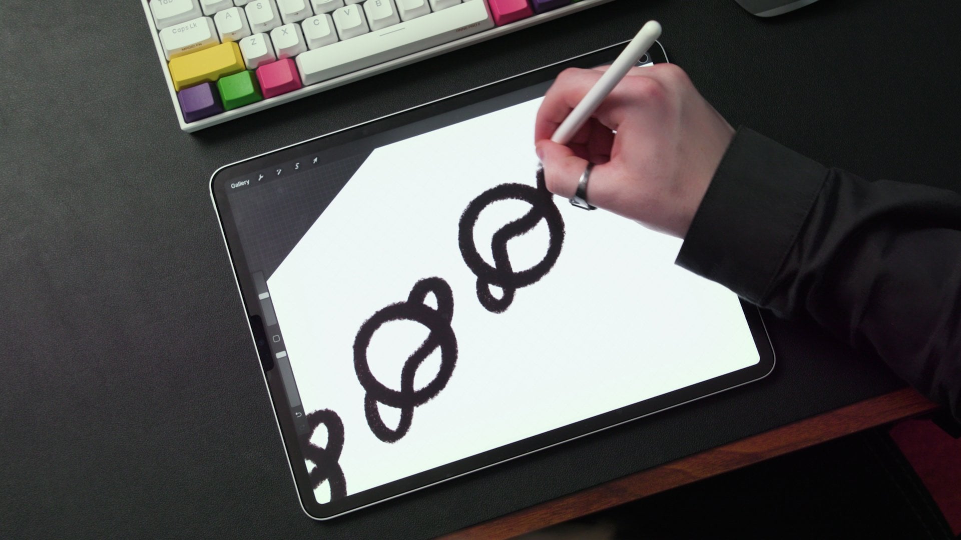
2. Chapter 01 Introducing Krita: Hello everybody and welcome. Thank you for watching this tutorial. I'm going to give my best to meet your expectations and hopefully teach you how to create your own Mascot logo. For start, we're going to use the software to create our sketch. That's the most important part of the design process. And for that important task, we will use critter, cliches and open source free software, and everyone can download it easily. So this switch you will see when you open it, it looks pretty blank and simple. Just click on a new file button and choose your preferences. Here are mine. And you don't have to use the same size. But I do recommend to set the resolution on 300 ppi, as well as RGB color and depth of 8-bit. So now when we actually start a new file, things look more interesting. To move around. Just hold down the spacebar and then click and drag. You can do this with Ben and tablet as well. If you don't own them, you can skip to my explanation on what can help you in that case. And later in Illustrator, we will use only mouse and keyboard. Now, I'll activate mirror. And since our logo asymmetrical, This helps us a lot and basically doubles the speed of our process. To insert a reference image, there are a few ways I simply click and drag my image in creator directly. It gives me different options and altruist insert as a new layer. If I want to move the image around, I can press T or choose this icon from this toolbar on the left. I'll move it in the middle now, but it doesn't have to be perfect. To resize an image. I'll press Shift plus T And I'll drag one of these coordinates. However, this way the image doesn't hold its proportions. So a hold on Alton shift and then drag, scale the image from the center. I'll reposition it better after that. Now I'll put the layer width references under layer one and set its capacity to 70%. To setup st. Just click on the past toolbar, putting numbers and press enter. I will also change the opacity on layer one down to 50% so I can see better the reference image under my sketch. To choose a brush tool, simply press B on your keyboard. Now if you go here in these two options, you can choose your own settings for brush here our mind and they work fine for me. You can play with this and find your own settings that suits you the best. These two options change depending on which tool is active. And here's another way to import reference image. It might work better for you if we choose the Spin from Toolbar, it gives me these different Tool Options and I can choose plus an insert my reference image that way. Now it can move outside the canvas and wherever I want. Ok, let's go back to the brushes. If I draw something here quickly and I want to delete or refined a line, I can press E to activate eraser. You can see that eraser is active if this button is turned on. After I'm done using it, I'll presi again to deactivated and keep drawing. I'll use that button a lot in sketching chapter to increase my brush size or hold down shift and drag to the right. And to decrease it, I'll drag to the left. I have set my two custom keys on my pen to zoom in and out. And the other way is to use wheel on the mouse, but I prefer this way. Also the pen has pressure points as a draw. If I don't press too hard, the line is thinner and the harder I press it gets ticker. That is also very convenient and it makes my life easier when I'm sketching. If however, you don't own pan and tablet, you can still follow this tutorial and make use of all the techniques that I'm going to show. And here is what I did before I bought my pen tablet. So it can be useful for you as well. So after I find my reference image, I open it on my monitor and I place a piece of paper over it. If the logo is symmetrical, just like ours, I mark only half of the image. I mark the important parts that will help them to draw the right proportions, like general outline, eyes, ears, nose, and mouth. After that, I finished drawing the sketch and take a photo of it with my iPhone. Then I send it to myself on email and downloaded to my computer where I can vectorize it in Illustrator. All right, I have more tips for your backend cruder, if I draw something and I like it, but I also want to try something else without losing my current work. I'll create a backup layer by pressing control j. That action copies the current layer and everything in contains. And afterward, I can turn off the visibility of layer below and keep on working without worries. If I mess up something, I can always come back to that backup layer. Lastly, I'll be using undo and redo actions frequently. And I'm pretty sure you're already knows those shortcuts. And that is all we are ready to start our sketch. And I hope you're excited just like I am. And I'll see you in the next chapter.
3. Chapter 02 Sketching: Hello again, and thank you for joining me in the most important chapter in this level course. By the end of this chapter, our sketch is going to be finished and 90% of our work will be done. All that'll be left to do is to vectorize our sketch and to present our logo. When I start drawing this sketch, I'd like to begin with an outline because it will help me Mark the general shape of the logo. After rare all-star refining the line and marking the eyes, ears, nose, and mouth. The more into detail I go, I'm going to use smaller brush and I'll use the eraser more often to refine those lines even further. As you can see, our reference image not perfectly symmetrical, and that is why we will focus only on one side and the mirror is going to take care of the other side. If you can draw well, however, you don't have to rely as much on the reference image. And you're not limited because you can draw your sketch in any pose you want. This is why I encourage you to practise drawing. And meanwhile, this technique can help you with your practice and you can make some great logos in the process. However, you'll notice that further I draw, I'll use reference image less because as I said, it's purposes to help us maintain the correct proportions of the ram. And after we accomplished that, we won't need it anymore. Draw. You'll notice that I keep my lines bold and soon or sorry, zooming in and out often because I want the slope to be recognizable even when it's smaller as well. Even when I go into details, I'll try to keep the lines as Boulder and is cleaner as I can. The moment I finished drawing over nose, eyes, ears, and mouth alter enough the reference image so I can see my sketch better. And so I can refine the look and fix what I don't like. At this point, the schedule doesn't look very pretty, but we need to go through that phase and watch how slowly but surely our sketch starts to look awesome. Although it is left to do here is to draw our eyes and ears. And afterward that face where turned, turnoff, the reference image will begin. Alright, now I'll start growing a beard just to further emphasize the shape of the logo. And the beard is one of the symbols of the male Ram. I'll leave it like this for now, and I'm going to work on the lines a little. And after I'll start making some changes because I'm not very happy with the current look of the sketch, but that is normal after turning off the reference image. As you can see, our zoom in and out more often now. And as I mentioned earlier, the more into detail I go, I will zoom in and make a smaller brush. But a federal From a little far away like this, I usually use medium or bigger brush size. Sometimes small changes can make a difference. And sometimes like now, I'll make some bigger changes and I'll start with horns. There are a lot of varieties of the horns. So here you can go wild and maybe create your own version of the logo with different horns. I decided to drove them in this shape where the twist behind the ears and then point with the dog to the outside. It is kind of classic shape that is most usual. But you can find some examples where the twist differently, cool, wider or more narrow, or some really crazy shapes and as well as different number of horns like for I encountered a lot of different examples while I was searching for the reference image. Here, I'm trying to draw that little dip on the horns. I lived like this for now and come back to that part later for dedicate myself to one part of the sketch and go too much into details. I might get discouraged later to make any changes to it, even if it doesn't fit well with the rest of the sketch. So I'm trying to keep the similar level of the details so I can make concert progress and so I can feel free to make any changes I want. Here I'm experimenting with the eyes area, making smaller or bigger movements in search for the look I want. And then when this rent look mean and ready to attack soon drawing his eyebrows this way. I'm also going to fix these lines on the forehead a little. I want to make them bolder and cleaner. Now, coming back to a beard. And I think I'll add one more point in the middle to looked fine as well, but with three, I'm more confident that it looks like a hairy beard. You can of course, keep the version you like. Not just with the beard, but with anything else. If you find something better the way it was before I change it, or you created something different from the start that you like more. Feel free to leave it like that. That also depends on your experience. For total beginners, I recommend following the best you can for now. And later you can create something yourself. Alright, I like the look of the sketch now, but I want to try something else. So I'll keep this works so far as a backup and press Ctrl J to create new layer in copy everything I had in previous layer. Now I can turn off the visibility of backup layer and keep on working without worries. The first big change I want to try is in the eyes area because it seems that I can add more thickness there to balance the thickness of the lines in the low. That is why I think it's important to keep looking at the logo is a whole thing and keep a good balance between dark and light areas. That is why I often zoom in and out and constantly switch between areas and working on. And now I'll remove pupils because they didn't fit in the treasures they made. They look tin because the folder tick area around them. And if I make eyes white, they look better in contrast with the surrounding area. I'll fix this Debye mating horns because I don't like how it looks with the rest of the logo. After this quick fix or say my work in the backup layer again. And move on with more stuff I wish to try. Because I can't imagine the sketch is a final result. Horns look obviously and finished, so start working on them again. I'm feeling free to add more drastic changes because I know I have my backup layer ready in case I mess up. I also just realize that years look too soft and undefined. Like they're not in the same style as the rest of the logo. Salt dreams in quickly. Now finished the bottom part of the horns. I'm keeping the middle of the horns dark because they twist behind the ears and they're in complete shadow. Because light source comes from the top and the top part of the horns are above and preventing the light to reach that area. In some of the next chapters, we will add more subtle shadows as well. But in this part of the process, we can use bold anticlines to position some of the darker shadows. I'll round off horns here so the shape of the horses emphasized. I'm fine with horns for now, but I'm still not completely happy. So I'll move on with different area and come back to the horns later again. This light area seems to Y2, MY soul change something there. I'm also considering bringing pupils back, but they still don't fit in this dark area. Solid makes and changes their area under eyes seems too dark and now to natural soil add light to the cheeks under the eyes. I'm still following a little more squared shapes instead of completely small ones. I'm zooming out to track how it looks with the whole logo. And I think that there is enough space for pupils Now. Before I add them, I'll say my backup layer once again. And placing them more to the middle of the face because RAM xyz are wide and if they're looking forward, their eyes move to the middle like this. I'm also adding white space to the top that serves like a reflection. I'm also adding whitespace under suited pupils have some space to breed. There is still something that bothers me. So you can see me making some moves and then zooming out to see how it looks. And if I'm not happy or press Control Z to undo that last action. Something here seems unbalanced for me, and I think that they're a little bit too much dark lines around Seoul cut-through these ones and mix imbalance or might bring those lines back later is a part of the solo shadows. We'll see. For now, I'll try to fix these lines and refine them. I definitely like this look better. And I'll say my backup layer once again. I'll move back to horns now. And after I'm done with them, I'll take a look again at the whole logo and fix stuff that I didn't notice before because my eyes got used to the look too much. I'm adding these details to the horns. You probably know what I'm trying to draw. These are those layers or marks on the horns that Dealey behind as they grow. I think the trees have the similar things in their core. And I think they're called the wooden rings. So non-growing the horn rings, let's call them that way. The further I'm working on these horns and the more I realized that I'm not a big fan of them, saw probably dedicate the next chapter to the horns only ultra out few versions and uses speedup video, but it'll be at a reasonable speed for you guys to follow what's going on. And it shouldn't be too hard for you, especially after you watch this chapter. And that is all for this chapter, guys. As I'm finishing these horrors, I'll invite you to the next chapter where I'll go through few versions from which you can choose your favorite or create your own version of the horns. Of course, if you like this version, you can keep it and skip the next chapter. Or you can watch the next chapter and keep this version if you like it the most.
4. Chapter 03 Speedup Horns versions: Hello again and welcome to the chapter dedicated to the horns and a quick preview of them. Wherever we are going to test out a few versions. And it's up to you to decide which one you prefer the most and which we try and you'd like to move on. This speed-up video is I mentioned in the previous chapter, but don't worry, it has reasonable speed and I'll be with you throughout the whole chapter talking about what I did and why. For the first version, at the start, I changed the layers name. And after that I deleted the bottom part of the horns and started drawing a new shape. It is similar to the previous one. I just wanted to extract OR it with this one and draw horns longer and wider. First, true in a general shape. And then I refined it. Even though I was not sure that I'll go on with this version, I was still trying to make it look respectable. So I can actually estimate if I like how it fits with the rest of the logo. Maybe over spending too much time detailing this one. But I wanted to get a good idea of how it looks. And if I even need to move on with the next version. When I finished it, I realized it horns are too wide and I just didn't like how that affected the rest of the sketch before I made a backup layer just in case a moved on with the next version, I compared to this one with the original shape of the horns. So I can see what are the biggest differences. For the next shape. I deleted a bottom part again and started drawing a more narrow shape of the horns. This time I wanted to fix what I didn't like in the previous version. I was also turning on and off the visibility of that old version to compare it with an active one. As I said in the previous version, I didn't like that the horns were too wide, but I did like how dare tubs were pointed aggressively to the outside. So I decided to try that with this version two. So far like this one the most. And you can see me drawing a more detailed look in order to fit it with the whole sketch. I also made some changes on the top part in order to fit in better with the bottom part that Andrew and I were smoothing these edges in order to make them follow the curvature of the horns better. The last version is similar to the previous one. We did top of the horn slightly changed. I felt that they can be bolder in simpler and that these changes will complement the rest of the sketch. The curvature of the horse is more playful on the previous version. So you can keep that if you like, that style more in if it suits you better. But I like this last playful and simpler style, better soil gone with that. With that being said, I'll go on with the last option. Again. You can choose yours and after you do, I'll see you in the next chapter.
5. Chapter 04 Shading: Hello again, everyone. In this chapter we're going to do some shading. This is going to be our secondary shading because as I explained in the scattering chapter, I use dark outlines is a shadow is well in some places and that is our primary shading. Here we are going to work on the secondary but also very important shadows because they will help us achieve that dimensional look of the logo that we are after. All, start with renaming my layer with shadows circuit easily located, and with turning down its capacity to 50%. I'll also bring opacity on my layer with sketched up to 100. As I decided for my sketched earlier, the light source comes from the top. And we will use these subtle shadows to support our primary ones. So as you can conclude, it might be a good idea to take about shadows while sketching because it will make our jobs easier. Now in this phase, the more sketches you draw and more lows you make, it'll start being natural for you. So don't stress too much about it now, but keep it in your mind and most importantly, enjoy your work. Here. I'll support my primary shadows by covering the years completely with the secondary ones. And you can already notice how they help us achieve that dimensional Look. I was talking about by adding more shadows to the horns like this. I'm trying to further achieve that look. Now that I'm happy with the horns, I'll move to the face of our RAM. I'll start with mode and worked my way up to the rest of the face. If you remember, I mentioned in the sketching chapter that I'll bring these lines next to the eyes as subtle shadows, which I'm doing now. But I'll extend them under the eyes like this and work on the refining next. After I'm done with that, I'll add one more shadow between eyebrows. And their job is to make our RAM angrier and more aggressive looking. If I added this shape as a part of the primary shadows, it'll be too strong and instructing, but with subtle looked like this, it looks perfect. I'm turning on and off the shadows layer to check the difference of the logo width and without them. And that can also help me detect something to fix. I made some changes. We'd chateaus in multi area and I'm happy would shadow is now. However, I noticed that the eyes were too wide for my taste, so I decided to quickly fix that. Now that I'm happy with the look, I'll say my file, always remember to do that. And we can move on to the next chapter. So I'll see you there.
6. Chapter 05 Final Adjustments: All right, before I moved to the illustrator, I want to make some final adjustments. But first, I'll create a backup layer and change the name of the copied layer and Haydn layer with shadows. Now the reason I am changing the horns again is that after looking closely, the curvature of the horns wasn't correct. They went wide on the top and the bottom part came straight down from behind the years salt change the top part now to make it look more natural. So just like in the previous chapter or speedup the sketching. And I'll meet you at the final look of the sketch. Now I'll fix these shadows quickly and we're ready to move to the Illustrator. Just be sure to save the file as JPEG and we're done.
7. Chapter 06 Illustrator Workspace editing: In this chapter, I will show you how I set up my workspace. If you already worked in Illustrator and heavier on preferences, you can skip this chapter. First started, I'll go to File New. And here my preferences. What i recommend here is to use 300 ppi and to uncheck the align new objects to pixel grid box. If you're opening an illustrator for the first time, this switch are going to encounter. And I'm using illustrators CC 2015. Yours might look differently depending on which version you have. But don't worry, just follow which tools you need to add to your workspace. And you should be fine. To add tools you need to your workspace simply go to windows tab and will choose from there. I'll start with a line tool now just hold and drag it to the side like this. We also have transform and Pathfinder tools there. So that'll save us some time. I'd like to have pathfinder tool on the first part there, but that's just my personal preference. And you can set these to your liking or just go through the tools that you're probably going to need most of the time. Next tool we're going to add is color. Same process. Click and drag it to the side above the line tool. Here on the side are a bunch of small icons. We probably have a lot of useful things there. But honestly, I don't use them and I ignore them for the most of the time. Now, I'll add layers and dragged him to the bottom here. By clicking this small icon, am adding layers and trash can is for deleting. The next important tool is transparency. And I'll put it above Pathfinder. I'll add the gradient tool next to it and stroke tool as well. I rarely use gradient and stroke would. There are some cases where I needed them, so I decided to keep them. Now to save your workspace, you can go to workspace, manage to rename and save your workspace, begging name and clicking on these new workspace cycle. As you can see, I already have mine saved and now loaded. As you can see, nothing much change except the small icons moved to the right so I can ignore them even better. That is all for this chapter and I'll see you guys next one where we are finally going to start vectorizing our logo.
8. Chapter 07 Illustrator Tips: In this short chapter, I'll quickly show you which tools are used the most in Illustrator. And I'll quickly show you how the pen tool works in case you didn't know. I imported the RAM image by dragging it in the illustrator. Here are usually turned off stroke and setColor to black. That's just my personal preference. Now we have two arrows here, the black and the white one. The black one is for moving and resizing an object. I will resize RAM image by holding Alt and shift and dragging one of these corners. Just liking crater, I move around by holding space and clicking and dragging. Also same liking credo. So what is the white arrow for? I'll demonstrated by using this rectangle. The white arrow controls the individual anchor points, but it can also move a whole object if all the anchor points ever selected with white arrow, I can also move handles from anchor points. I'll demonstrate that with this circle. By clicking on one of these points, handles show up. And now if I drag one of them, the other one follows. But if I hold ALT and then drag, I can control only one handle. And that is how it creates sharp corners. Now show you on our sketch how to use all of this. First, I'll delete all of this and resize our image. Next, I'll add a new layer and lock one with our image by clicking on the field between the I and the layers name. I'll start by adding an anchor point in the middle and dragging without releasing my click to create these handles. So the handle job is to direct where our curve will go. If I hold all takin directed wherever I want and I want to direct it to the next corner far sketch because our next anchor points will be there. I like to remove the color and stroke whenever could Pen tool, but you can leave the stroke on if you work better that way. Now you can see that the line coming out of the last anchor point is trade. And if I need the curve, I'll just click and drag to the next anchor point. I can also control the handle with the white arrow, just like I showed on the circle example. If I used white arrow, the curve will disappear. So I'll bring it back by choosing pen tool. And while holding gold, I'll click and drag from the anchor point and my handle and curve are back. I'll repeat this process under like creed may shape. Now show you how to quickly trim an object. And I'll demonstrate that with these two rectangles. I'll trim the bottom one with the top one. Now when they intersect like this, I'll press Shift and M And while holding gold, and you can see the small minus next tomorrow, I'll simply click and drag over the parts I don't need. And here's our result. Next, I'll show you how to quickly flip one side of the design to the other side. Let's imagine that this rectangle is finished half of our logo, and I want to mirror it the other side, all I have to do is to press letter O. And while holding Alt, I'll click on the middle point of the sketch. Now makes sure that vertical is selected. Even though you can flip it horizontally or under any other angle. Vertical is what we need most of the time. And now click copy. If I select a rectangle and activate pen to laughter, I can add anchor points to the selected object. And I'll manipulate that point now with white arrow by clicking and dragging it. I'll flip this objects. You can get a better idea of how the mirror works. These are all the tips I have for you in the Illustrator. And I'm going to use all of this in the next chapter, where I'm finally going to vectorize our sketch.
9. Chapter 08 Vectorizing: Alright, all is ready for vectorizing far sketch. And we'll start with a new file. I'll change size to 2 thousand pixels on both width and height. Altruists 300, four resolution and uncheck this box. Now drag my JPEG sketch, resize it, and place it in the middle. Now add a new layer and the layer retiree image. Now choose pen tool shortcut for that is letter P on my keyboard. But I'll just click on the icon because P also poses my recording of the process. Now turn off color and stroke here because I find it easier to work that way. But if you prefer, you can keep either of them on. I recommend starting from the center because it will make our job easier. I'll start by click and drag to extend those handles. Then I'll just click on the next corner. After that, I'll click and drag again for that small handle. Now, I'll hold Alt and drag a second handle to follow the next shape. And then again, click and drag, and again hold Alt and array, the second handle to the next corner. So probably get idea of how this is done. I put the anchor points to the corners of the sketch, and then I'm controlling those handles by holding Alt and dragging them. If I just click and there is no handle, I hold Alt and click and drag from anchor point to get a new one. The goal is to have as few anchor points as possible because that will give us smooth shape and better results. You can see me here going to the far corner and the line between doesnt follow sketch at all. But now press a and extend this handle. And then press p again and click in the middle of that curve to add a new anchor point with handles, which I can move here so you can follow the sketch now. Now finished decide by continuing with this lined to middle and connecting it with the bottom anchor point. Now add color and reduce transparency. To flip this on the other side, press o on your keyboard, then hold Alt and click in the center anchor point like this, and make sure that vertical is selected. Then click copy. Now that I have general shape, I'll start creating these white inner shapes. The same way we use the pen tool to create the dark overall shape. Now select all of those shapes in the press Shift M. I'll hold and drag over areas where one of these shapes to trim the wide part. I'll repeat the process on the opposite side as well. Now whatever I do on one side of the logo and then mirror the one I made changes on. Ok. Now I'll add a new layer and move all of my work to that layer by selecting all of the things I want to move. And then I'll click and drag the small rectangular to the layer above. I'm doing this so I can make space for colors and Shadows. Before I do that, I'll merge all of the hubs that are in contact with each other. And I do that by selecting the two of the halves by clicking on this first icon in Pathfinder. Now I'll select all of the inner pieces, copy them by pressing control be to copy them behind. After that, I'll select inner pieces from the top, as well as the dark general shape. And then I'll press Shift M. And while holding vault, I'll click on all of the inner pieces that give us the dark shape with all of those pieces trimmed from it. And we're doing that so we can add shadows more easily. After renaming the layers, I'll select inner pieces by clicking on the rectangle in the layer that selects everything in that layer and only have those pieces there. I'll group them by pressing control G. Now remove transparency on the top layer and I'll start characterizing shadows. I mistakenly plays the first piece of shattering the top layer that makes sure that all of your shadows are in the layer below and above that layer for a color purpose. Now that I finished with shadows, I'll select everything and hold Alt and click and drag to make a copy of everything. Next, I'll remove transparency on both of those. After data, I'll select in their pieces and offset them a bit. Because if I leave them like that, they might intersect with the lines from the dark shape, which in some cases shows us some weird artifacts. And we're trying to avoid that. I'm selecting them. Then I go to Effect, pet, offset pet. I'll choose some small amount and ten pixels seems fine. Next, while pieces still selected, I'll go to object and expand appearance. I realized that I didn't do that with tears, so I'll hide shadows on top of them by pressing control. And number three. And after I'm done, I'll press control old and number three to unhide shadows again. To create a stroke around a logo, I'll select everything, press Control B to copy to behind, press IY and choose white color, then merge all of that, put it to the layer below, and set it to the back. After that, I'll repeat the same steps for offset, but this time I'll go with 30 pixels. Now this method sometimes gives poor results around sharper corners. So I'll select the stroke copied so I can see which shape to follow. And then with transparency on 50%, I'll work on the top stroke. I'm removing extra anchor points by pressing minus. So my keyboard, by clicking on anchor points. After that, I choose pen tool again. And while holding gold, I'll click and drag from the anchor point to re-establish smoother shapes. I press a to better control the handles. After I'm done, I delete the backup stroke and I have to delete the other half of the stroke to flip the one I fixed. I'll just create a giant rectangle on the left side and remove the left part of stroke with shift and M. And while holding gold and dragging over shapes, I don't need. Now flip the stroke and merge it with the other half. And with that being done, I'll finish this chapter and I'll see you in the next one where we'll be working on some colors. And that is the final step before presenting our logo. See you there.
10. Chapter 09 Colors: Alright, it is time to give our low some nice colors. And there are a few ways to accomplish that. There are some websites where you can explore colors like floods, UI colors that come, or coolers, dot co. My favorite is color Hunt. And here is their Instagram page. They also have their website, colour hand.com, which is basically a better option because you can click on Color hex code and it is automatically copied to your keyboard. So you can just paste it in the hex color codes in Illustrator. Here's the color palette that I like. And on Instagram, they are the color codes here for each color. So I'll write these in hex field and have my colors ready for logo. So here's how to put in your hex code in case you didn't already know. And now do that for all four of these colors. So here these four rectangles with our colors. And now I'll transfer the colors from them to our logo by pressing i. And then with this color picker, I'll click on one of these colors. And then I'll hold Alt and click on the object I want to paint with the last color I selected. I can do same thing with the rest of these, but here is the easier way when there are many pieces. I'll select them all, grouped them with control G. And with all of them selected, I'll press i and then choose the color I want to paint all my pieces width. Also paint a stroke with the slight color and that does it. Here's our final look of the logo. And it can happen that you decided to design yours a bit differently or you chose a different colors. But the bottom line, this is the final step of the process I showed you to reduce tutorial. All that is left to do now is to show your work to your client and to the world. And join me in the next chapter where I'll present you some different ways of doing that. And there will also be our last chapter. If you made it this far, join me there for some final tips and ideas.
11. Chapter 10 Presentation and Mockup: Now that we have our final logo, it is time to use some mockups to presented. Here I have back helmet Mockup, which you can find on sports templates that net under Tab freebies. They're amazing. And if you wish to buy any markup from their site, you're most welcome to. Their files are very easy to work with and you have a lot of control over everything. This is not any kind of promotion, is just my honest opinion. For this chapter, we are going to use Photoshop. I have version CC 2015, and it has some similar shortcuts like Illustrator, but it also has some differences. And you'll see what I'm talking about soon. So when we open this mock-up, we have these layers in the right and they're all renamed accordingly. And it's easy to find what we're looking for. And that is this layer named Azure logo here. After we double-click on it, it'll open a new tab with new layers. We can remove this one and I'll leave levels and background there. Now, drag the logo in Photoshop and release. It will add our logo is a smart object and now all we have to do is to resize and reposition the logo. You might had these blue lines when you open the file. I hid them and reveal them with Control H. To resize the logo, use Control T. Now I'll change background with color picker by pressing guy. But it doesn't work exactly like in the illustrator. So now that I picked color from the RAM altruists background layer on the right and press Alt and delete to change the color. Next, I'll hide the blue lines again and save this by pressing control s. If you don't save it, nothing will change. So make sure that you don't skip that step. Now see the results and let's change background here now. I'll hide this text first and double-click on the background layer and choose my color by clicking on it here. We also could have changed the color by pressing Alton delete, but I wanted to show you this method as well. I will adjust our low here a little bit by changing its size and the position. You can as well make your adjustments, but don't forget to save after you finish and you like the result. You can save your work as a jetpack. You can also save this as a Photoshop file. But be aware that next time you open your mockup, you will have your work instead of default project that you found when you open the mockup. Here is our image that I saved. And here we have a bunch of other options. You can change color on everything on this helmet. And that is why I recommend this website to everyone because they really do an incredible job. You can change the color by double-clicking on the layer. And if you want to color pick from our logo, just click on whichever color you want. Now let's create a new file for Instagram shot. Go to File New and make dimensions of 1600 pixels on both width and height, and also make sure that resolution is 300 and that color is RGB. Now I'm going to drag our logo in Photoshop again and resize it. I'll change the color like I already showed, and now press acts on my keyboard to switch primary and secondary colors. Now choose the light blue with color picker. Next, I'll create a new layer above background, but under the logo and I'll press G to choose gradient. While holding shift for straight line, I'll pull aligned from top to the bottom and release. You will have to add gradient. You can go with solid color background. It is not really up to you. After happy with your shot, you can save it as JPEG or PNG for more quality. The last step I'll show is how to save your rector filed for a client. That means we'll save our logo is an EPS file. I'll open illustrator again, go to new file and choose these preferences. Now copy logo with Control C and paste it in new file with Control V. I'll resize it a bit and press control shift as to go save as and altruism Illustrator EPS from this menu. I'll rename it and press enter. After this window pops up, I'll press enter again. And that is all, ladies and gentlemen, I hope you learned something new. I hope this course was useful to you. And let me know if you're happy with your results. In case you need to ask me anything related to tutorial. Feel free to email me and I'll try to respond as soon as possible. The next tutorial I'll make is going to be about texts in sports logos. But first, I'll take a small break from this one. I hope you have fun and learn something new. Also, if you share your results, feel free to tag me and I'd love to see what you came up with. A live links to mind some RAM and dribble accounts. Soon you'll find me there. Finally. Thank you for watching this tutorial and I'll hopefully see you in some other courses I make.
 Milos Jevtovic, Sports Logo designer