Transcripts
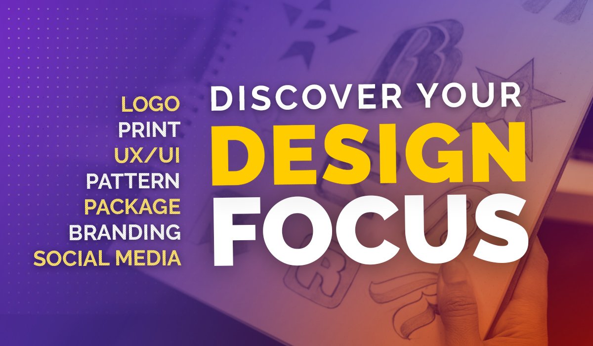
1. Introduction: Hey, do you want to learn how to create awesome game logos and also amazing graphic user interface for your game. So you're in the right place. In this course, we're not only going to learn how to make logos and graphics user interface step-by-step in Photoshop, we will also do the study behind what kind of color you should choose for your specific Kim, genre, which is color theory. And we will also learn what kind of shape language you should use for your specific game logo and make the best logo and also graphic user interface. Not only this much, we will also do an in-depth study behind forms in which we will learn what kind of fonts you should use and what kind of fonts you should avoid for your specific came genre, how the shape language is used to make your game logo looks much more better and how to represent what you want to represent using your came logo. We will also do the study behind different types of logos and there came logo layouts and what kind of UI layouts they are following how they are using colors to represent different types of things in their game Liao. In this course, we will create four different type of came logos, including hyper casual game logo, 3D game logo, adventure RPG game logos, and sci-fi game logo, as well as we will also create graphic user interface for all different types of kimchi corners for the best look and feel. Not only this much, you will also get more than 50 game graphic assets in this course, which you can use in your project with the project files which we will create inside this course. I am actually Sonya and I am teaching game are designed for more than two years and already completed 6 thousand plus students. And in this course, I have added all the knowledge which will help you to make your game look awesome and also help you to create the best game art for your word. So why are you waiting for? And I will see you inside the first lecture.
2. 1. Introduction to Color theory : So hey guys, here's our much, Sony and welcome to the first section of understanding how to create the game logos and also the game UI. So this is just basically the first section. We're just getting started with the colors theory, which is the most and most important stuff, okay? Even if you are just getting started with anything that you are going to do, Let's go, Let's say you are just going to start with game art also game logo, also a game UI also or anything. This will be most important stuff for you to understand. Your understanding should be clear. You should know the psychological meanings of each and everything and all this type of stuff. Okay, So we are getting started with the first thing. And in this section we will learn about the introduction and the meaning of color. How does the color theory words, what did choose, what not to choose, and the modern day stuff, and a lot of stuff. Okay, so that is it. So let's get started with number 1. Stuff is over here, the introduction to color. So here I have the introduction to color. So what is the meaning of color? What are basically colors are meant for? Okay? They are like for basically. So if I'll just add definition of colors, it's just like a phenomenon of light properly possessed by opposite, like producing different sensations on the eye as a result of the way it reflects or emits light. But the reason the main stuff is over here and that is expression. An expression is basically the most important stuff. Okay? Expression is like more in part because you are expressing your what you feel, the feelings. And that's how color is basically defines. It's not like the RGB is here, okay? It's about the psychological stuff is feel. What do you want them to feel with the help of color. Okay, Let's move to the another stuff. And that is the colored theory where basically what is the color theory? So the stuff is the color theory. If, if all just give you a proper definition, I'm adding some definitions also because it will just help you to remember something. Let's take it as a rules and guidelines for using the color in art and decide, okay, there's also do expect. So this is basically what I'm saying is from my side, it's not like it's written or it's like added some beer like this is exactly what it is not a rule of thumb. Okay. It's the way how you present it, how you use it, okay? The ultimate goal is to have the perfect, I can say like the perfect outcome. Okay? So there is actually two things over here. So first is psychological, the second is visual OK, how you are using residual colors, how you're visualizing your stuff, okay? And how you're connecting with it psychologically. And that's it, That's the theory of color. Even know more about debt basically later. So let's continue. So it's also affecting something psychologically, and it's also affecting the visually. Okay. Some things can be psychologically accurate. Let something can be visually inaccurate, like the quality or maybe the design style, or maybe the creativity can be lower. But if does psychology is perfect, make sure you also go for the right, for the visual tone. So, so let's continue to the next stuff and let's start with the meaning of colors. So here we are in the meaning of colors. So every color basically have expression. Okay, So let's continue. So the first color over here, we have blue, okay? So if you look at blue, just try and noticing every single stuff. You look at blue. What do you think? Blue is basically four. And there are banks that use the blue color, okay, Let me add bank or hear a lot of bang. In each and a lot of countries use blue color. It's foreleg communicating also, it's four P's, it's for calming is four. Also depression as you know in, in your, if you have watched a lot of like cartoons and this kind of stuff, you know, like if, let's say, if you look at over here, someone is like sad. If they want to make just so, so someone like sad, they add like this kind of blue lines on top of them and they just add some kind of blue gradient over here. So it just shows them like basically the stuff and that is like the depression. Okay. And also Lake loyalty because it's also connected with the trust and that's why it is over here with the with it's connected with the loyalty also, and that's why it is also connected with the trust. And integrity. So that's basically the meaning of blue color. So let's continue with the next of the next is red. So what do you think when you see red color? So that's what you have to remember. It's not something that you remember or someone taught you that red color is for the, for danger, for ambitious energy, passion, and excitement. This is not for that, this is psychological, okay? Nobody told you that red color means danger. You can you just got it automatically. Why? Because the blood is also red color. Okay. And it can be called as like that. Red colored is also for the blood, but red color is also for the rules. Okay? So there can be a lot of understanding, but the scenario, the environment also matters when it comes to the colors, okay? So it also danger, It's also has the ambitions. It also have the the energy. It also have the passion, excitement, and anger, okay, and I can also say like It's also have it for the love. So that is all the stuff. Now let's come to the next color is green. So green as you know, is known for nature, growth, balanced possessiveness, heal belt, and fertility. So that is it. So as you know, like a lot of banks also use green kind of color and also Lake as you know, the agriculture stuff use green color and also medical stuff use green color because it just shows automatically you if there's some kind of green kind of logo, green stuff is getting used. That means the it is something related to nature or growth or weld or like healing signed medical stuff. So that's what your brain will automatically know. Okay. You don't have to read a small line over there like this is a nature company know you will know it only because of the color and status, the fastest way of communicating. Let's come to the next stuff. And the oranges here, fresh, youthful and creative optimism, optimism and a venture. So orange is basically used for a lot of joyful stuff because yellow and orange is kind of like similar. So the, so they mix them and use it in that way. So now the purple is your purple is like used for royal imagination, creative, immature, individual and magisterial. So, so rial, because purple is kind of like a limited kind of use, they just use it like dark purple. So to show the royal stuff and also for the imagination, creativity and a immature even know it's somewhere if you start lake thinking a lot about the color theory, you will understand why the deep purple in the MS. Sure. So the other color is yellow. So yellow is as I've told you already, like, the orange color is also used for the choice rule and optimism, this kind of stuff. Yellow is basic sign of the happiness. So if, if you know like the emojis stuff, okay, so let's just create an emoji or here, you know, the smiley emojis added with yellow and it automatically just gives you a feel of like happiness. And that's why yellow is connected with that. And also like connected with the up, optimistic or here also and cheerful, so playful, that's why they added on their kids stuff. They may get stuff like yellow in this kind of self and impatient is also here, and criticism is also here and this kind of stuff. So the next thing is pink. So pink is link. They connected it from the, a lot of like, if you just look at the history, they connected pink with feminine and also silly, sentimental, romantic, exciting, and also love. So they added the pink as like a female side. It's like an emotional color for adding some romantic stuff and this kind of stuff. So that's why they use it in such a way. Adding the pink or they're OK. Now the gray is here. The gray color is just giving you the the sign of kind of sadness alone, emotional list, take dural sadness. And I'm just like Dude depressed because of like like kinda greased, dying of stuff because there is the gray is not even black, not even white is the mixture of both of them colors. And none of the other colors are added over here. So that's what it just gives you a sign of alone and sadness. It's like a downside color basically. Now lets the next thing and the next thing, brown, as you know that brown colors the color okay. Mostly used for the wood kind of stuff. So that's why it just automatically represents your subconscious mind that it is for the art, okay? It also represents the nature, it also represented the soil. It also represents the tree, all the stuff. So that's why brown color is like two connected with all the nature. So if you know, our ancestors lived a lot of their life on the nature and out in the nature, we became civilized, civilized after so many years. So they were just linked, living on the actual ground and the ground was like brown. So that's why it subconsciously added like the art color is brown, so it's the color of soil. It's like security also because as you know, the, the kind of like the ground is also over here. It also gives you a sign of security protection conferred on us. Also simple and organic, obviously because it's also represented the nature too. So let's come to the next color and that is the black. So black is like kind of if I'll say like it's kinda for aesthetic color over here, it black and represent a lot of things, okay, There is no less stuff over here. It black and also just represent you loneliness and sadness over here, sorrowful here. And sophisticated security of also security guards also have black kind of serve bodyguards also have black suits or they are even formal people like to have black suits, okay. Luxury also have kind of like black pores and black leather and these kind of stuff. So black represent those kind of stuff. Now let's come to the next thing and not as the white. So why do you like PRD, simple or calm, peaceful, a lake? Also like minimalism, nothing, innocence simplify. As you know, like people show lake white kind of flag and they just feel like they are aware that they don't want to fight anymore, this kind of stuff. So now in the next thing that we learn about the type of colors, wherever the colors type. So let's continue that.
3. 2. Types of colors : So here we are. Now, if you're talking about the type of colors according to the creation, okay? It is like according to their creation, okay? And we are not talking about the meaning. We have already learned the meaning or here, right now, we are talking about the actual type of color. So just look over here. They're RGB is for the digital stuff. Okay. Type of link color systems or here like, why do I call them systems? Because if you look at the screen, you're just looking at RGB stuff, okay? These are like only three colors mixing together and creating like millions of colors, okay, As you know, like 16.8 million colors are created only because of RGB. So if you'll look like adding blue and red ads creates the pink color. So even exactly like this, they use the CMYK. So it's for like clan, magenta, yellow, and black. They use key case for the black. So that's what they use CMYK and this kind of stuff is called S. If you'll look the Adding, they're not doing something like totally different. They are just adding yellow, pink, and this color called a clan. Okay? And they added together them and they created the RGB. It's like the total opposite. They're not using this three colors. They are using these three colors to create these three colors and then these three colors. So we'll create like millions of colors. So that's how the, this represents. So now let's talk about the primary colors, okay? As you know, RGB is the primary color. Then after creating, created with the help of primary colors, then comes a secondary color. And after using the primary and secondary colors together, then it comes the tertiary colors. So primary colors are like basic RCP, okay? And then if you just look at them, it's like the main actual RGB is over here. And if you add the RGB with together and start creating some primary colors, It's like mixing the primary colors and creating the secondary colors. And then it just connects with them. As you can see, the yellow and red is added over here. So we created orange here, and the yellow and blue is added. So we create a green, then we added these two and then purple. So that's how we start adding all the other stuff. And now here we come to the next part. So in the next part it is that tertiary colors. Okay? So now we, what we did is Phil come back over here. As you can see, the blue is now added with the green. And it added this kind of like sky blue color. And now green is added with yellow. So it created this light, green. So as you can see, there's like two difference over here, okay? And that's how we start creating colors and colors and colors. So it just fills all stuff. As you can see, this part is the primary, okay? And this is for the secondary. And this is for the tertiary. Okay. So if all just, just let me just mark them. The primary is already here, okay? And the secondary is over here. And the tertiary is over here. That's how we are creating the colors, okay? And if I start adding these two again, it will create another color. And then we add these all of them together. It will create another color and that's how they present color wheel. So that's the, that's how they create the color wheel. Okay, Now let's move on to the next thing and that is tint, tone and shade.
4. 3. Tint Tone and shade: So tint, tone and shade is over here. So basically what our tin, tin and show shade. So if you have used Photoshop, you will understand them. Understand them pretty easily. There is no night, no need to just give US a lot of your brain on this one. Tint is just for adding white color, okay. But it started like limited to saying like just increase the tamed and decrease the tint. You can also say that I just want a yellow tint on it. So making like a yellow tint on that, it means like you're adding a layer of yellow color on it, but with low opacity, with low transparency. Okay? So that's how the tint is added and the tone is like adding the black colors. So it's like if all this come to the tenth, It's like making the color, adding white, colored it like adding the brightness over here. So you can just say 10 is for the brightness, okay? And tone is for the another part of brightness. Slow adding black color, okay? And the shade is for saturation. So saturation like means you are adding the gray color. The more granular you add, the more desaturated it will become. And more saturated colors means is it will turn into gray. Okay, So that's how shade is worth. The shade means you are just adding gray color and making it low saturation. Now, let's start the study of color wheel.
5. 4. Color wheel and color schemes: So here we are in, in the next part and that is color wheel. So color wheels are like used to create, like took creating more colors. It's just, it's like a veal for all the colors, adding the primary one and the other one's that as if we have also seen in the previous lecture 2. So now this is basically called as the color wheels, as you know, the primary colors here, the secondary colors here, the third tertiary colors here. Okay? So this is how the color view is represented. And now the, another stuff over here we have, it's like we also added the, the tent a year. Okay. The shade here and also the tone here. Okay, it is added like that. So the stint is adding the brightness here and the tone is adding the black color here, and the shade is adding the saturation, all the stuff. So that's how the colors are actually generated. So as you can see that the primary colors here as a secondary color is 0, the tertiary colors here, and that's how they are created, the actual color wheel again. So let's move to the next thing and that is color scheme. So color schemes are like different type of color schemes are they are they are like complimentary split, complementary and not all of them, okay? And how they are used, how they are represented in these kind of stuff is used according to the psychological and unconscious mind also are there. Okay, so let's start with the first one. So here we have the complimentary color. So in the complimentary color views, like one primary color and one tertiary colors, if you look over here, let me just turn on my highlighter here. Okay, So if you look over here at this part is like the primary colors because you know, these three other primary colors. So we're just using Laika small, a color wheel v and not just make adding a lot of stuff on this one. Okay? So as you can see, these two are, these three are the primary color in this field only. This is the tertiary color. So let me just, okay, Here we are. This is the tert-butyl group, so it's like the complimentary color. We are just adding one, This one, That one, This one that like that. But it's not limited to that. It's like the complementary color means some color which has a segue directly complementing, compliment each other, like the one line, you can just add one line in the end your wheel, and you can just start adding and selecting any color you want. It could be one primary color like this, and it could be one tertiary color also lower there. You can just add one like this, as you can see, it just look around so that it can be like this. It can be like this, okay, here you can see how it is, how is it working? So you are just let me just close it. Okay. So you're just adding the one line directly complementing each other. And that's how you're choosing which primary colors we are using, which secondary color you are using. It can be tertiary color too. So as you can see or hear, these is the tertiary color and this is also the tertiary color. So both of them are getting using a complimentary color scheme. So that's how they are getting used. Okay, now, here you can see a lot of stuff is here, and now monochromatic color is also over here is the Azure. You can see this first color, the yellow is the primary and the together of them is like tertiary colors. So it's like using three colors in one way. And that's how the monochromatic is getting reduced. Simple, you can just use any tools. I knew kinda of like colors, look at them in this kind of way. Okay, monochromatic is like the shade you're using, one color, adding with each other. Okay, Now let's come to the next way that is split complementary. So split complimentary is like simple. You are just using the exact complimentary way, like this way, okay? But instead of choosing this color here, just using the other colors, like the, the neighbors of it. Okay? So that's how you just choose colors. It's simple. And now the next way is the, as you can see, you can also choose them like this. Now the next way is like that. Tragic. Okay? And this is how you are using the actually like, like a three, like kind of triangular click, Okay? And like a triangle, you're just creating a triangle, choosing the colors in such a way. And this is how you are creating this color scheme, okay? As you can see. And the other one is the actual triangular, okay? That's triadic. And you can also call it like a square one. Okay? So you're just using the exact way and you're just choosing in such a way. And that is like creating the square, like using the colors in like a squared, squared pattern with the help of the color wheel. So that's how you just choose them. You can also go with the rectangle is also here with the same way as you can see, the rectangular added over here. And you're just choosing them in a rectangular way. The analog is also here. So analog us is like just using one, only one color, okay? But just with the 10 tone and shade, you can see this Dentons over here that DO N'T is over here in the shade is already, it's like the only one color of any colors. So that's how we're just like ending this whole part, the series of understanding and the colors. And I hope you just understood them. Now. We're just going to get started with the practical stuff and understanding them in a practical way. So let's move to that.
6. 5. Hyper casual game - logo study: So here guys, here we are in the first part. And the first part here we are just like talking about the hyper casual logos and also the color schemes they're using, why they're using the topologies like this, and what are the understanding of that in such a way, okay, so this will be like a d, dy of about the theory, how to use them, how not to go, do's and don'ts also, we can say that. So let's get started with the first one. So here we have this chicken rings one. So just imagine what is the basic thing that you are just looking at? What do you get? First of all, in this one. So if I let us talk about mine, okay. So I'll just look at this yellow color, which is representing me kinda joy. So it's like a fun game. You don't have to think a lot of it distinct, okay, and this like happy chicken over here, it just like smiling and it also have the business like analyzing the art one, okay. Not going to look at them like a consumer way. Okay? We're just going with, as an artist, artistic and also like the unconscious, the way you are just learning the theory of art and making the logos UI and all stuff in such a way. Okay. Don't take them like as a user, we'll just notice them like this. They even notice it, but they won't notice it in such a way. They're unconscious mind will notice them. And that thing, we'll just make them feel the way that it is created. Okay? So the first thing is over here, the chicken is or adherence. It's like looking happy. It has like pride colors. Okay, so it's like, it's like a joyful game is over here. It's nothing serious in this game, you're just like playing this one too. Let go ahead with the boredom. It's like for the fun and all this kind of stuff. So you can see the bright color is added over here not because it's like the way they are just adding it just for like that. It's because the yellow color is just giving me the feel of Joys who are year. It's like for the fun stuff. And if you'll look at this topography and it's also like added in this tilted away in like a blob way. Okay. So okay. Like a blob way, which means like, it's like the fun and joyful stuff. So this is how they're alike. A simple logo is explaining a lot of stinks without even writing anything. It's just giving me this kind of field. The topography is like nothing is static. You can see that everything is like going up and down and these kind of stuff. So this is how they're just going with it. Okay, so now let's move ahead on another logo. So the other logo is over here and this is like a total sharp kind of stuff. Okay, so if I look at this, you can see this is like a high-quality picture that they created. Everything is like two perfect kind of stone. So now I can just get it like, I guess this game is about a kind of like a casual, I will have to like add some conflict brain on it. It's not like total cartoony. If I just look at this one, this one, it looks like a proper cartoon games. So it's like total fun. No, nothing is going to be like with the logic and all this council. So that represented with the logo. Now let's come to the next part, and that is the Tuscany villa. So that describes the Villa is just like giving me like a 3D. Stuff like a table. Start off with the flowers are like giving me for a romantic or it can be like this kind of stuff. The game, is that okay? Like adding with the nature also, the Villa also. Okay, this way. Now let's come to the next part and this is the most famous also, this game was like two famous, I've played this, we did, we even did the game design and analysis of this game, how they're creating that, how the joints at it on this one. So if you look at the logo, the logo is too simple, but the logo is representing the whole game. The goal, the whole game is basically in the voxel, as you can see, this pixel 3D way, okay? This is 3D, but it's like a pixel 3D and it's called voxel. So in this voxel, they are just using the exact same kind of logo, which is an pixel, but they just extruded it like this way. They added the depth and they created the logo as voxel without even creating it 3D. So it's just matching the whole, why, the whole environment, and because they just want to highlight it a lot, That's why they didn't added that light colors. They added the black color on it. So it's like just giving the BOP fill in this whole environment. Now the next thing is over here. So this is like the most common kind of game logos and mostly they use it. So if you look over here, the run is like nothing. It's like the four color logo over here. We have 1234 is over here. So that is it. That's enough. They just added it on here. So if you just analyze it a little bit, they are not just aiming for the whole game to be like the logo to look a little, a lot of complex, because if you just look at the schema, you will see that it's like totally matching and the I like both of them are connected and nothing is like going outside of that. This thing means that simplicity is over here. Also with the help of art, yellow color they are using because they're track as yellow. So this is one to match it. And they're like Run Cube runs. So you are curious, like running, you're just swiping it and that's it. It's like calm and tension free game. So now let's come to the other stuff and this is like the pirates spin. So the first thing if you look at this whole Forster, okay, we're just like doing the first study of local. So if you just look at this whole logo over here, they added like kind of like pride staff, the shadows, the coins here. It's totally looking like kind of games which is like a related two coins because the logo, whole goal, like it's total goal, stuff like with the even the color scheme is because of goal with gold. When everything is the goal, like adding the conflict, expensive stuff in a funny manner. So that's how they are representing the NLU course. Now, what thing to basically avoid in games, in game logos if you are especially making for not a casual game. So let me just give you a simple example. Candy Crush is a casual game. And like, let's say like cross, he would cross the road. This logo, okay, This game is a hyper casual game, which is like casual. You don't have to do a lot of stuff on that game. And it's like simple to just dab, dab, dab, and that's it. That's the whole game is. And they are just like giving you a calm vibe. And that is, it is just playing it in a freeway and that's it. So what are the things to avoid in hyper casual games? A lot of details is not important in your logo. So you can see that this, this logo over here. If I just tell you like to have this kind of logo in your, the hyper casual game, then it won't fit. Why? Because the hyper casual games basically created for the calm kind of stem, say, represent the simplicity and just the creativity in that set. So if you just look, it's not simple, it has a lot of details over here, some shades over here. Obviously this logo is for some other games, but we are just taking it as an example. Don't add a lot of this kind of stuff. And this represents like your game is going to get a little bit complex because your logo is us looking in such a way and you're not telling it without even writing, it's just representing, represented by your logo. So that's the thing that you have to learn to avoid it. Okay? Something like this. As you can see, this, this logo, is this getting a lot of complex over here, even if it's for like a casual, like hyper casual kind of game, you there is like added a lot of stuff and it's difficult to read. Everything is just matching with it. You can see the fruit is just getting blended with the whole color scheme. That's why the bomb is looking good, but the fruit is just getting blended with the backside and it's not popping up a lot. Okay? And here you can see this one is like looking create, okay? And just like garden pets over here, but still there's like the contrast, just like matching it over here. And now the bubble, bubble fluffy is over here. And it's like a foreign law, basically the casual game. But if you just look at it as a hyper casual game, we are talking about not to do something okay to avoid. So stop adding a lot of stuff. Just add some one or two stuff and just add like one or two features like the properties of your game and that's it. You don't have to do a lot of stuff. Simple, like less is more when you are creating a logo for a hyper casual kind of game. So that is it. We'll see you in the next lecture. And we'll just talk about some other games.
7. 6. Rpg game - logo study: So here we are, and this is the other part. And we are talking about the RPG logos and what are the properties that they add in RPT logos and what are the things they just like, go ahead with it and they just added and go with it. So these are the properties. So let's get started with the first one. We're just like physically doing the theoretical study of each different kind of logos of liberal on the Internet that I took. So this is like the first logo over here and that is like the kingdom of the Titans. Okay, so it's like the games and miniature and all this kinda stuff. So if you'll just look at it in general, you will just often looking at you will just get the first field of like, it's not hyper casual game. Neither It's like going to be a sci-fi and either is going to be fighting kind of game. Why you get that RPG feel is because of the foreign style that they are choosing. Okay? Why? Because if you just go ahead with the first of that is like the font style. You can see the font-style is like a little bit of curvature. It's like little details. And that's what makes them complex. And the complexity is presenting you that type of stuff. Okay? Like here you can see the, this thing is just going with that way, in this way. So this is what it's going with. Going to give you like a kind of like old feature, the kingdom of the Titans. So they're just like some kind of scored swords is going to be added on there. Why can I say that? Because it's just representing in that logo. Why BR just looking at it, after looking at it, the yellow color, which means that goal is just going ahead with that. And the iron field, that's this part is going to give me, and this is how they are adding. Now let's talk about the next off and the first look. After looking at this epic arena logo, what I feel is just this 2D, 2D. This is going to be a 2D game, okay? And this is just going to be like total fighting, kind of like a rootless kind of came. Why? Because the edges. So let's talk about the simple theory. If you don't know that late, Let's talk about the simple theory you are here. So the spikes, okay? And in general, in psychologically, if your logo is having like a rounded kind of stuff, It's going to be called S safe. Okay. And if you have spikes kind of stuff and that's repurse D refers the attack, the fighting, the edgy, it's going to be dangerous. So spikes shows the danger. Circles, doesn't show the dangers. So if you look at this logo, there's a lot of spikes. These spikes here, it's added over here and this bike. So it simply represents psychologically and also in my unconscious mind that this game is just going to be some kind of dangers and also staff. And because they added the two swords in the back, okay, and that represents, this is going to be like a 2D game with kind of sorts, okay? Like spikes are also added here. So note down all the things that, and I'm just giving you because I haven't added the each and every text on this. Okay? And I want you to remember everything of stem and you don't have to just basically learn all the nodes and just note them up because you will just get it on your head and you will be like, okay, yeah, this was the one thing. It will be added on your head and you don't have to recall again and again and check it. Your list that I've added this much disappointed to sweat is just something that you will remember. Okay, now let's go for the next logo here. So this one logo is like the line of edge which is written over here. So if you look at it, it's just showing me this kind of like a wing kind of pattern. Again, the spikes are added over here. It's like the, the format is also a little bit spiky. Okay. Here are the spikes are adding, okay. And the alert of this stuff is there's this added like this kind of symbol and a simple light is coming from this way. So it's like totally giving me a 3D RPG kind of stuff. This is going to be like a adventures tov v. I will have character customization and that kind of way, okay? And also you will have to play a lot of teams to understand this kind of stuff. So this is what is giving me the spikes are here. So which means I will have to do some adventures and this 3D text, okay, you can see this 3D stylus stays start just giving a nicer and nicer touch visually also and also like the spike way. Okay, now here we have another stuff and that is the rule of the kingdom. So if I look at it, there is a lot of around stuff also in this one, okay. You can see the rounds are here too, but also the spike is also here. Okay? But the text doesn't have a lot of edges, okay? Which means it is not like edgy a lot, so it's just giving me like a kinda like feel free golf stuff. And the color scheme is also important. The color scheme is also if you just go ahead with this one, the red color is also added over here. It's also pretty darker in the dark style. They're just adding some gray kind of stuff. So it's just giving like a hoarder a total fighting game. Nothing like that. And this one a little bit feels like it's joy one, it's 2D is going to be some joy. I will do adventure, not actually killing that kinda stuff. So that's, is represented because of the color scheme, because we are using the yellow and the light colors here, and also the brown color here, and also yellow as gold. Okay, There's spike, spike, spikes also over here which represents the games. Doesn't have a lot of stuff, okay. Like not that dangerous stuff. So it can be like a kid game or can be anything kind of stuff. So that's what it is. Just giving that look. Now, the other stuff, and this one is exactly like the previous edge line of edge one. Okay? So it's like the codon and you can see the spikes are also added over here. The things are here that the font also have the spikes on it. And it also have the 3D kind of stuff. So this is also like the, it's like giving an awesome look here and you can now understand the spikes are giving the other, it's like giving a totally different feel. And here you can see, now we take back the theory of the circle and the triangle when the circles give you a safer look and the sharpness gives you like a danger look. So here you can see this doesn't have a lot of spikes, okay, like it's the League of angels, the free riders. So with the help of writers, I can understand it. It's going to be like something like a racing game or something. But you can look, it's, it doesn't have a lot of spikes. It's like 2D, it's like a calm. So often even the fire is here and it's looking good. So that's representing may not know. This is not going to be like a total dangerous game. Blood is not going to involve in this one and a lot of stuff like that, okay, and the font-style is also doesn't have spikes on it. A lot like there's bikes, but not a lot. You can see the only spikes are over here. Okay. So it's not giving the danger locals over here and the color scheme is also joyful. So that's it. That's what do you can understand it. Now the next parts are also here. So you can see this, these two logos are giving me electrode to royal look, okay. And the back is also over here. You can see this here that this is not going to be like the total kind of like fully aggression, like angry kind of stuff. Okay, Here you can also see this, also have this card. So it is like giving a kind of X4, a battle kind of logo here. The light also like some kind of mystery is also in this game. So that's a lot of stuff is still represented because of the logo in the games. You, and you can see, look at this one, the dagger, well, okay, dagger, well, so here you can see the spike is also getting added, but, but also one more thing. They're adding the roundness also over here. And this one you can see it is also getting their rounds over here. So it's like the mix of that. But the spike is also here. Okay, It's going to be spiky. And the other stuff is I can just to give you like a simple note here, to note that also make your logo just 1. Only one thing memorable, okay, so if you're adding something in your logo just to make it memorable. So people will remember this, This kind of like amulet, the added over here like a Ruby or over here, which is just giving this kind of like view. And it's like an emblem logo. So it has like the proper kind of like this way. Okay. So it's like this. This is how they're using it. Now the next most famous logo is over here, and that is the World of Warcraft. Unfortunately, the quality is lik little bit lower, but that's okay. Here you can see it's also just giving me a joyful style and it also have the spiky way. And it just gives like, it's like a massive MMORPG. Murkiness like massive multiplayer game has, has, has its own the kinda of like fighting stuff and have a lot of story lines and this kind of free. So it's like giving me all this kind of field with the help of the logo. So to what, to a wide end, this kind of RPG games is, is that don't go for a lot of simplicity. Always remember what your game is. If your game contents, a lot of Lake Road lists kind of sting, it will involve blood. It will have like a lot of fighting stuff. There is someone going to get killed. It's going to be WAR, use off like dangerous weapons, War kind of stuff. So add them into your logo. Not like add them directly, just add just some properties, like add some kind of cuts like this. As you can see, there's some godsend this game which just shows like care, we're going to be some fight also like this. Some brightness like gold star, which means is this game is going to be royal. Some magic here which shows the magic in this game like, kind of like particle effect is also where here. So this is how your game is representing. Your logo is representing your actual game in RPG v. So this is it. Let's move to the, another way.
8. 7. Sci fi game - logo study: So hey guys, here we are in the next part of the course. So here we are and we're just going to look at the sci-fi whole logo series after are actually completing the RPT and all that stuff. But actually there's one thing that I just wanted to state player and I think I just forgot to say that in the RPG one. And that is this. These are all our, not only RPT, but these all are basically also the fantasy also. These are like fantasy logos also RPD is just a joiner. Okay? It's like a role-playing game is just a joiner. But these all of them are basically okay. Like the, I can say like a fantasy kind of logo like fantasy fight and these kind of so but they are like called mostly as RPG. That's why it called them our PGE2. So let's start with the sci-fi logo. So sci-fi are like or just call it sci-fi or college futuristic. And I basically like to call it as simplistic. Okay? These are the most important and the main thing that the, all the logos in sci-fi in this, nowadays logos are doing is they're going with simplicity and simple color stuff and this kind of step, however, there is one more point that all of these big companies are making them. They have a lot of marketing budget, So they don't have to focus a lot on logos and all this kind of stuff, but still we can do a lot of study of that. So if you look at this Titan fall logo, I have played this time fall game and this game was like awesome. But the thing that if you look at this whole stuff, if there's like only simplicity is also over here. It's like tag and fall is written on this like a unique font that the red, It's like straightforward and the game is like a pic. Okay, that's how they're just dealing with it right now and nowadays. So if we just look at this valley current, okay, a logo over here at this game was also a nice game. Ok. It's like the 55 for multiplayer game. Okay, but if you just look at this logo, it has like simplicity. But what makes it unique? It's the font. Okay? They just did a lot of work on the Font and they just worked on the symbol that they created. So the symbol is the one property that a user will remember the logo, okay? So the user will always remember that, okay, yeah, this V, Okay, This kind of V means valor and okay. On the other hand, this level which is the stamp one, and it is, if you look at this, it's like simplicity, It's like compact design. They're not dealing with the alot of cards, a lot of color theories and these kind of stuff. And that's how nowadays the logo theory is getting changed. Previously, people was like adding a lot of efforts on global lake, a lot of stuff, adding some colors, also some shield and this kind of stuff like adding the background on that in this kind of stuff. But nowadays, people are like going with simplicity. So because they are just like going with the simplicity is a feature. That's how they're feeling now. So if you look at this galactic column, nice logo, I really like this logo. We're here. Just look at this logo. It just gives you totally a futuristic feel, okay if you just ignore the background, okay. Just look at this one. It is just giving you this chromium effects. It's like just golden and copper and mixture of effect over here, which is over here. Okay? And the next icon, if you just look at this icon there, just added a simple rocket over here. And the rocket is just like going to any planet. And that's how they're just like adding the Galactic and it's like matching the galactic kind of things. And it's called Lick as colony. So that's how they're matching it. And they just usually, people really love cuts in cipher. Like I will say the sci-fi or futuristic around and kind of games. They usually like the cuts. See you again, remember that the CT scan make sure the half letters, the adding this kind of goods, this can make your local lake much more cooler. Okay, and now the next animal, so this is like a total Peg Company, okay, The Half-Life Alyx, but here, if you look at this logo is totally simple as like simple text over here with a unique fonts. So they instead of like going with the color theory, the art world, the paint and all this stuff. They all like switched to Font and they just started making unique phones, simplistic forums and that sit in white color and that's how they are dealing in sci-fi kind of stuff. Okay, and the other logo is over here we have, and this is the star feel. If you look at this logo, it's like looking great. Okay, It's like simple. They just added this circle over here, attached the l and t with it. And that's how they are doing, right? And that's what it's just making it unique. It's like the circle so that people will remember it ligates the circle logo and it's like the also called as like star field. The circle is representing the field and that's how they are ending it. Okay, so now let's come to the other big step forward here. If you just look at hallow and this was like the oldest sci-fi fighting came over here, which was like dot futuristic game of the old times. If you are remembered playing it, the halo had the simple stuff, okay, Also from the previous side, however, they just created it more simple now. But if you just look closely, there's like a lot of cuts occurred or here, or cut over here, or cut over here. Here. Okay, like sci-fi, people started adding these kind of cards. So this is becoming a trend nowadays. And this OH, is just also hadn't almost a half of the code of it. And that's how they are ending up. Now let's just look at this star field. So star field is basically like right now if you just look at this logo, they just are almost nowadays. They just remove this feel of this like this bevel effect over here, if you remember that. So this bevel effect is now it is getting removed from all the logos. If you just look at this all logos, they're like flat and they're like blame nowadays. So exactly, that's how they are just adding the StarCraft. So in this StarCraft, they added the two sign like this and they're like the only one. If you just look at them, they're just going with us. Spy goes over the spiky kind of look to make it make the logo cooler and adding like a two in the backside. And that's how they are adding the completing the logos. So this is it, this is it for these sci-fi when I know it's like short to understand the slick, simple to understand the sci-fi one. But always remember the fonts. They are just getting switched in and they don't want to use a lot of colors. They're just nowadays going with some simplicity in the side of the, at the time of sci-fi stuff. Okay, So let's move on to some other things also. So that's it for this lecture.
9. 8. Photoshop Layer styles 1 - basics : So hey guys here, VR in this learning section and we're going to give you most important stuff and the most important overview of everything that you need to know is the Lear's dialing, how you're going to use here styles to create your actual layers. Ok, so in this one V, you will learn every single style options, okay? And if you know all the style options of Photoshop, you should skip this one. But I will not suggest you to skip any lecture in this course. Because if you're skipping thing, it was just like possibly going to forgot are just miss any useful tip for you. Okay, so far are they useful tip? You should watch this. Okay, so let's get started in a more first thing is I'm just going to choose more than four K. It will be five k, Okay? Why I'm using five K, five K pixels because you are going to use your logo into different types of stuff, okay? It may be the phone. Okay. So your phone is going to be 901,920 by 10100. And I, and also your logo on your Play Store is going to be looking like with 512 by 512. So you're going to use the same logo in a 100 of places. So for that, okay, for that specific thing, we're making our logo in high resolution. Why? Because we can later decrease it down and then we can use it in any way. So I'm just going to choose five K by 5k. Or you can also simply go with ten K by ten K, It's like totally your choice. Okay. So I'm just going to go ahead with the five gay because I don't think the mobile screens are going to be more than five K and something related to date, even you aren't going to to put it and like the highest resolution possible for you, all this stuff, something like that. You can use that to later. I will also tell you how to do the compression and all that stuff. So here I have 2s and five key by five K, which is going to be a square. So there's no matter if I just put it as portrait or landscape, it was still, still going to be a square. So for that, let's get started and I'm going to use the resolution as as three hundred and three hundred will be the finest and the best resolution for me. Okay. So let's get started. You can also change the background color. I'm just going to simply go ahead and create a file. So here you can see our file is created over here, and you can see the doc size is 71 NB megabytes. And obviously we are not going to use this dark on our actual police station. I'll select Play, Google Play Store or the App Store or these kind of things. Okay, we have this for the actual creation. So we create the best quality in the starting. So as you already know how to use the Photoshop and all this kind of stuff. We are getting started with the actual style stuff, okay? Now, the most important stuff is I'm just going to add a shape or here, okay, Let's say I had this shape over here and I hire, I have this great allies, nice-looking shape, okay, to use the layer blending modes, I'm just going to simply double-click on this layer. And here I will have the Layer Style blending options and all the layer style, style and all this kind of stuff. Okay, So let's get started. So the first thing here we have is the blending options. So in this blending options, you will find all our functions are here like the S-CAR-GO stuffs and all these things with the plus icon, you can create it twice and twice and twice like this. Here you can see, okay, so this is how you're going to use them. So you can also just delete it if you want to. Okay, just simply hit this icon over here so you can just simply delete it like this. Okay, so now let's get started with the first thing and that is the blending options. So blending option is basically just like a face blending over here. So you can choose any kind of stuff like this, like normal and these kind of stuff, okay? And there is also a blend if option. If it's screen, then if you want to blend it, if you wanted to do something like that, you can also adjust the opacity. It's basically the same place. If you look over here, it's basically the same day, so we don't have to do anything related to that. Now let's start with the people at embryos. So Bevel and Emboss is the most, mostly uses the stuff over here in a while creating the UI and these kind of stuff. So here you can see we can adjust the depth. So in the starting, if you will see the style, you can choose the actual style that you want to go ahead with this in the starting. So I can go with MBA. So you can see the Ambrose is over here and I know it's like looking too short because we have like a huge canvas. That's why it is looking like that, but don't worry, we'll increase it. So I'm just going to zoom out quite a bit over here and now you'll be able to see it much, in a much better way. So the first thing is over here and that is the emboss, you can increase and decrease this depth. So you can see the depth is getting increase. Let me just increase the size after increasing the size. You can see this is how you can control the depth, like phase, how much you want to increase and decrease the depth. Here you go. For this, so emboss looks like this and there's also an inner bevel. So inner bevel, we'll just create a nicer payroll for you. Okay, so you just have to add just the perfect edge looking at a perfect looking one like this. So depth, we'll go ahead with this manner here you can see this is how it created the pebble and this is how you can just start creating your own. Are you can just go ahead with all this kind of like stuff that you want to create. Okay, So let me just do one thing. I'll just, first of all, create a totally barreled around one solid is increased radius from here, and I'll just simply create one. Okay, it's still, the radius is low, so let me just delete this previous ones and I'm just going to increase more radius because we are in higher and a bigger one. So here you go. This is how I wanted it to look like. Okay, So the first thing over here is the bevel. So I'll start with a biro. So after hearing the bevel is here you can see I can increase it like the depth over here and I can increase the size. And I can also increase this often. So if you want to soft and we'll just basically going to blur the edge. It's just making it hard and soft, okay? If you wanted to super odd, you can just decrease and you can also increase it. And now here comes the next part. I have my embryos over here. If I just want it to be outer barrel, it can be algebraically like this. If I want it to be inner bevel, it should be like this. So I'm just going to go ahead with a nicer looking one. And you can also just change the transaction from up to down where you want the lighting to be. Now let's come to the next thing and that is also most important, the shading part and the shading part, you can basically control the actual ankle. From there, you want to show the light so you can see the forefront dynasty. So we're here, the other angles are here. If you want just totally the light to be coming from total outer side, it will look like this. And if you don't want them to go to 3D, you can just go ahead like this. And the most important stuff that you should always remember while creating and doing this kind of stuff is Use Global Light. So if you just remove the Global Light, this particular object will have its own lighting options. Okay, and for this, what I mean is, let's suppose if I am creating two opposite over here, okay, let me just duplicate both of them. And in this one, let's go for an SNR of two, let's create three. So I have this three object over here, okay? And let's say if I'm just going to simply turned a Global Light and this one, and also turn on the global light in this one. So let me just add the Global Light, okay, here you can see this both of these two object will have the exact same lighting because you are playing with the Global Light, okay? And you can see this one doesn't have the global light. That's why it is not getting affected. So that's how basically the global lights work. And this will help you a lot while creating different kinds of lighting settings in the different, different dipole for objects. Okay? So this is how the pebble basically works. It's, it's like a real year and you can also just add just how much wrong you want them to be. Here you can see the lighting can be changed like this, okay. Here you can see you can play with the lighting as you want and you can also just turn on the NDA and lysine, okay, and that is it. So Opacity and others turf you just how to play a little bit and you will understand this one. The next one is the counter, so you can see if I just change it, It's, this one is basically for this flat surface. Here you can see this one is like a total flat. If I just do this one, as you can see, it's just getting totally blended like in this way here you can see light is also getting blended. It's just giving me like a 3D current weight instead of like using any preserves, I can also just carrots, giving it my own way, okay, own way of stuff here you can see I'm adding my own array here. Let's add another one. Okay, Let's go for this one. And let's say here you can see he got the double curl over here. So this is how you can create more different options over here. If you just click on this arrow, you will see all this stuff. Let's look at this one. Let's look at this one, this one, and there is like a lot of functions. Okay? So let's go with the smaller one for now. Okay, I'm just going to choose the analog stuff and that is the texture. Here. You can see we added the texture over here. I can scale it, decrease it and increase and decrease the depth in the scale in the textures. I'm just going to breeze through this one. And this is how you can see the depth of texture is also getting changed. You can also just modify them. So how you are going to use this one is basically you can add some textures related to wood, okay? And you can just simply go to the setting apart and you can just choose any pattern. Let's go for something like legacy pattern over here. Current pattern from legacy pattern hit, Okay, and it will just automatically, okay, I don't want to say anything, so I'm just going to choose any textures. Let's choose this one here you can see this textures are also just working in the same way with the depth. Okay, So this is how you can see what my actual thing is looking like. It's also getting affected with the lighting. Okay? And if I just play with the lighting here, you can see that texture is also working the way. So for these plays for, in this one, you can just choose any nicer texture, whatever you want to do, and something related to that, okay? And if you want to invert it, there is also an option to invert them. So this is it for the first option will go for the other options in the next lecture. So let's move ahead.
10. 9. Photoshop layer style 2 - Basics: So here we are and now we're just going to go ahead with the other stuff. So for now I'm just going to choose nicer, a good looking texture for now let's use this one, okay, or I can just remove these other stuff for them. So here's the next off and that is strokes. So strokes will just give you like this kind of line. You can just change it to inside, outside and even Center if you want to see, you can see it will be also inside, it will be all also outside. And this is how it is going to work. So I'm just going to place it outside and this is how I can increase and decrease it. So let's just take it like this because we are not a basically creating something, it's just an overview and we are just learning all the tools. So the next thing we have is the inner shadow. So in this inner shadow, what can I basically do is I can create a glow kind of effect of actual creating shadow. So for now let's cancel the Bureau and colors thing. Okay, now here you can just basically see the actual shadow which we are basically creating over here. So let me just please this object or here, certainly better regionally. And then I can use the rubric, or you can instead of double-click, right-click and go to the layer styles from this, we're displays over here. You can also just rasterize them if you don't want to have these kind of effects, okay. You can just simply double-click or over here or I can just simply just right-click and go to the Layer Styles Options. So where's the layer style option over here, okay, here is in the top blending options, just turn them on and here you will find out all the options. So after this, let's come to the next part and that is the inner shadow. So in this, with the help of inner shadow, you can just actually create a shadow on the top of your actual actual material. You can also just increase and decrease the size and display with the, with the distance a little bit over here and exactly the same way. Here's also the Global Light option. If you don't want a global light, you can change it. And this will have it its own mathematically using kind of stuff or a here. So I can just play it like that. And with the help of inner shadow, you can also create your own kind of stuff or a year, okay? So this is how you can create your own bevel over here, Split Interests increase the opacity. Here you can see a fetus increased. This one orange here. And phrases to go with the increasing, decreasing a little bit of size. So here you can see we just created a little bit of pebble, but only from the one side. This is how you can create them. Okay, so let's move onto the next thing and that is the Inner Glow. So inner glow is basically something that doesn't have the actual distance. Okay? So in inner shadow, you have distance, you have the angles. This is how an inner shadow. It's just like the one part of inner shadow. But with the help of this, you can create a lot of things like chokes and you can even create your own jitter OK, here you can see that jitter is over here. How much noise you want them. And I just wanted to be super smooth. So for that I'll just stick the noise so it will work like this. And there's also one more option for this stuff and that is gradient. I can choose any gradient for the help of over here. So let's say I will just choose this one or choose this one. So it will have its own gradient and it will work the way it is. So here is also blend. The more I fall, set it to normal, it will start working normally and I can just simply created to choke to this one. And this is how I can use it basically to create your own style. So that is it. Now let's move onto the next thing and that is the state. So basically what is stained with others give you a simple line answer. It's like creating the shine on your object here you can see the top shine, the bottom shine or you can just, if you're just increase the total distance over here, you're going to see it's going to be working like this, but right now it is inverted, so let's make it normal. So here you can see with the help of stains here, just using it in this way. And there's also angles. So with the help of angle, just place it like this and then I just start increasing the actual distance. You can see this is how it's working and tried to stick it. And here you can see the style is working this way. Okay, here again, here you can see this is how it is creating that. So let's decrease the opacity. And that is it. So this is how I can use the stain and that's how it's worse. So the next thing is the color overlay. So color overlay is, I use it mostly instead of doing color on all of the objects, I use the color overlay. You can just simply put any kind of color only on the top of anything. And you can even change any of the blending roles. You can also increase and decrease the opacity. So that's how you use it. You will learn it once you just start using all of these objects over here and then you will understand them. Now, the next thing is the gradient overlay. So gradient overlay is the exact same thing. It's just using a gradient on top of your object. And then you can also use it in your own blending options, okay, it just like this, allocating any kind of blended rate. Let's come to the next thing and that is the pattern overlay. So with the help of pattern overlay, thus, it's exactly the same options that were used in this part over here. But in this one you are basically just adding the only pattern on top of it. So let's choose this one here you can see we added this pattern, so let's just increase the scale a little bit. So here you can see this is how it is getting just working. So I'm just going to decrease this is remove this Bevel and Emboss for now, and that's how it's getting working. So I can also increase and decrease the kind of patterns and that's how it is working. The next thing is basically you can also use them for, let's say, if you are going to use some kind of fluid or some kind of leaf or something. You didn't just use your own pattern over here. You can just eat board your patterns. You can increase your create your own presets and load them, and that's how it's working. The next thing is the, our blues are red glow is exactly the inner glow stuff, but from the outside, it will start, it will work like this. There's a stroke borrower here and I'm just going to instead of green, I'll put it as normal, so it will start working as normal. So let's just increase the opacity here you can see the glow is too dark. Let's increase it anymore. Let's increase the, decrease the spread. And I just decrease or increase the range. So once I just do that here you can see how like a nicer glow, red color. So instead of red, let's go for blue. So here I have this blue color glue on the back of this stuff. So that's how the honor glory. So now less than the last thing is the drop shadow. So the drop shadow, if you look at drop shadow, it is exactly the same thing as output low, but the only different is you can also have the distance with the help of distance. You could just exactly like this kind of distance over here on the back and increase it, increase, decrease the same settings as if it was a really, I mean liberal in the Outer Glow. So now let's just look at this. You can also increase the opacity of it. And you can also increase the distance. You can just increase go with the districts like this here you can see the distance state do much. And you can synchronize this size and decrease the spread. So it will start working like an total actual shadow. Okay? And then after that, I will just decrease the opacity like this. And here you go. You can just look at them and increase the noise. Once you just increase the noise, you can see the noise is also working in this way. There is also a noise option exactly like the outflow has. So that is it for the Styles. And now the next thing is I just want, I would just want you all to understand and always know all the options which are available in this whole part is not only for that same work, okay? If you limit them, okay? The limit is in your mind, okay? Always remember, the limit is on your mind. You don't have to use the stroke always as a stroke. Maybe you can just go ahead and make this stroke apart of your drop shadow. So let me just give you a simple example. If I just increase the actual capacity and decrease the total noise and also decrease the size of it. Okay. And I just want have a nicer bill over here. So all what I will do, I will just increase this one over here, okay? And attach it like this, okay? And I will just increase, let's go further spread, okay, Once I just increase the spread, Let's increase the spread full and just start increasing the size a little bit. So here you can see it is matching. And now once I just tower it, how it does increase the stroke over here like this. So this is, you can just simply see, and this is how it is giving you the nicer look with the help of strokes, you just adjusted the drop shadow and also the strokes over here. So for example, let me just give you another example. So the other example is it can be, you can use the inner shadow as global. So, so if I just Decrease the total distance of it. And if I just increase it like this much, okay? And if I just have this kind of bevel, so what can I do next is I will just use the, the Inner Glow. So here's the Inner Glow here. And now let me just go back to static color and then I can use any other color. So after doing this, you can just see, you just have to just modify them like this. And let's choose something like Kirby and total darker. So here you can see you just get this smarter detail over here. In this part you have the dark shadow. At this part, you have the lighter shadow. So if I just move that the inner shadow for now, you can see how much difference we created with the help of these two stuff. So this is how you can use them, okay? So this is how they are getting fused or here. So that is also one part. And for the stain there's like thousands of examples that I have used. Don't use them all the way they are created. You can just go with it. You can use them for any stuff, okay? Some people use marquee tool for cutting and all this tongue, all this kind of thing. Or you can just simply create a new layer and selected for as filling, okay, These kind of stuff. Either you can select this marquee tool for actually painting, okay? You can just make this kind of stuff. You can just use it for movement, okay? This is how you can use. Each of the tools, have a lot of possibilities. So that's how you can do them. And after doing this kind of stuff, There's also one more thing is you can just actually copy the style. So with the help of this copy styles, you can just simply paste the whole styles into your other stuff. So which means you can save your styles somewhere. So let's space the styles here. You can see we got the exact, accurate looking stuff. So let me just create one, a new polygon in this kind of stuff. So if I just create this kind of opposite, if I displace the whole styles in this one you can see, and that's it. You have a new object with all the properties that you wanted to create. And this is it, this is how it works or do you can either go with the text, which we are going to do exactly. Offer some part. So let's just type test or a year. Let's choose a better font, which is better for you to look like. So let's choose this one. Here. I already have this, just close them up, okay, and now what I'm going to do, I'm just going to paste all the styles. So let's paste the styles here. And after that you can see in those tiles are added on top of him. Okay? And this is how you can go ahead with all the stuff. So that's 84 to the styling and Photoshop and that's it. Let's move ahead.
11. 10. Logo fonts set up - Hyper casual game : So hey guys, here we are in the actual section and in this section we are going to create the logo of hyper casual games offer watching all the lectures of the logo theory and color theory and also the layer style. Here we are creating our first logo in this course. So I know it's first of all, congratulations for completing all those lectures and all those sections. Here we are and we're going to get started making our logos and this one. So the first thing is have notes of what you're going to make. Okay. So the name of my team is oh, damn. Okay. So it's like having a kind of a different kind of idea where you're just like handling and balancing all of your objects. And once you just drop them, it's like, oh damn, I just drop them is the kind of came. So now is the genre of this game is kind of like arcade. It's watts I just setting up for now. Okay, but these kind of stuff doesn't matter a lot. If you're a game. Only, it will matter only when your game is totally unique and you want to have some kind of signature or some kind of symbol of your game on your logo. So that's the point where it will matter. So you just have to look at It's kind of like an arcade game, okay? And the next thing is the color scheme. What will be the color scheme? They are going with the green and yellow. So as you know, the green color is also for the kind of leave curves of yellow is for the joy and for the pop-up. So you can just go with these two colors. Okay, so now the next thing is the archdiocese, GB and boxy. Okay, so it's not totally voxel or kind of a debate, okay? The next thing is, these two stuff is here for you that you should learn. Either your client will provide you some real differences that you have to create from. Or he will just say user or creativity here is the staff. Make a unique logo, okay? He's not looking for inferences to make this logo looked like someone else's logo. So for now we're just going to go ahead with the US creativity because obviously I'm not going to create them after looking at some differences. Okay, let's create something different. So the summary is over here. It will say simple, but have contrast in color. Okay, I have better pop-up. So the logo should like totally pop. Okay. And the logo, it should be like a proper name and a watermark logo. Okay, So let's get started here we have all the properties already. So let's get started. So the first thing that I did is here I have the canvas of 5000. If you use click over here, you will see the 5000 by 5000, which means 10 inches by 10 inches of the canvas. And the resolution is 500 pixels. And I'm just using a nicer resolution because we're just going to go ahead and create the best quality for now. And after that, we are obviously going to compress it because fear creating a great quality here. That means we can just compress it for any kind of logos. Okay? And there's also one more thing that if you, if you want to just check how the logo will look like, you can just simply create one more Canvas. And in that Canvas you can just set it, set the width to 1080 and make the height to 1091920, which is basically for the mobile, the full height and width. And you can create, change the resolution to 32. Okay, let's hit Create. And here you can see it created a Canvas looking like the phones real and it displays, you can just simply place your local and look according to the resolution, how it will look like. So that is also a handy and simple way for using your logo and look how it is looking visually in different places. So let's get started. So the number 1 and the first thing that I'm going to do is I will type, Oh damn. So right now we are basically going to use typography and as you know, type Bronco free sometimes and somewhere have copyright on them. Okay. I can't use all the typography for my commercial use to have some free fonts, okay, if you are purchasing forms, that's great. If you don't want to produce hormones. There's also when great place for having free fonts. Okay, so that is called as 1, 1, 1 000 fonts. You will get this link also. And in this place you can just find out a lot of fonts which are free to use is I'm just simply click over here, which will just start out and filter all the photons which have these commercially free to use optionality here. And also remember, don't forget to just give them some kind of like attribute or some if you just, if you're just using it for like a grade and a big project, you can just go ahead and give them some thing if you want to, okay. Or just give them the stone-age something for them or just give them something because you're just using it for the query part. So if they think they should deserve something, you can just pay them or you can just, if you're just making it four legs, smallest 2D. Okay, I know you can just go ahead with your own weight. So here you will find all the fonts that you want to use. Or you can simply just go to the fonts.com and purchase Forms. Okay, there's also foreign space where you can just purchase Forms also. And there's also fonts.com where you can just go ahead and purchase Forms which you want to. So these are the places. So for now, let's do some free one. So here is a lot of free forums and I have already downloaded one which is called as the cocoa goes. So I'm just going to choose some cocoa goes kind of stuff. And I have here it is. So I'm just going to use this one for this logo. So let's place it over here. And the first thing I'm just going to say is o capital. Capital, obviously, that's press Caps Lock and discover it. Go, oh, I'm sorry. Not God. It's like damn. Okay. Let's go into damn. Okay. So let's just sort out it for now because we want it to be full word. So here you can see we just placed it now the only thing is, or here I just want to fix the spacing for the top one a little bit. So let's just attach them like in a much better way. And the next thing is I will just decrease the line height so it will have better breathing space for all the forms. Here you can see we got all the fonts. Now, let's get started and creating the actual colors over here. So you can see the logo will basically look like this because it's just like a font logo. So let's get started with the blending style over year. Okay, So let's start with the blending style.
12. 11. Layer style - hyper casual game : So here we are and getting started with a bending style. Here we have the first font and I will just simply double-click over here, or you can just simply right-click and go to the blending options. It totally depends on you how you want to go. So here you can see we have all these kind of like, kind of great options here. So first thing I will do, I will just go ahead with the color scheme. That is a screen, yellow. You can either like, wait a minute, I'm just not going to close it. Okay. So this is how you have to go in. So either you can just go and create, up creating or lay a. So let's do that normal for now, and let's go with the actual colors that they are looking for. So we're just going to go with pop-up green over here and a pop of yellow. So after this one, I'm just going to choose all the bowl of them, okay, Here you can see the lemon yellow is also matching or I can just simply go to the actual yellow one. And this is here. You can see this lowest looking too bright and it's great. So I can just simply make it a little bit flatter of this sign on this side. Okay. Here you can see is also great. So yellow down, cream, brighter. So it's like a joy, a game. That's why I'm choosing Nika a little bit flat naught 2 to light. Okay. So I can just adjust this one because I want the OH to be like total yellow and green, the dam to be total Korean. So for that, I'm just using a basic kind of flake way for the gradient. And each of them will have some, some of the shades of each other colors. So that's how it is going to look like. So that is it you can see it is matching the way. So let's look at it and I think it's the color is looking good. So let's do another thing. And that is going to be, let's go with other one. And the other stuff is I want to have kinda like a depth of it, okay, on it. So let's just add some strokes. After adding strokes, you can see it's not looking like kind of green. But the only and the most important thing over here is to have a picture in your mind. So I have a picture in your mind. Let's create one. I will add a drop shadow over here. After adding the drop shadow here you can see it added that drop shadow over here. I'm just going to simply increase in try matching the drop shadow according to Azure and want I will just increase the size a little bit and I will just rotate the angle just a little bit like this way. Okay? And I'm just simply creating the angle of it. And this is how you're going to create. So let's increase a little bit of the size. Not too much, not too less. So this is how it is looking like this. And then here comes to the next part and that is the size. I will just increase the size a little bit. Okay, like this. And it's also matching. We're here because we have a blobby kind of place over here. You can see it's matching the exact way as I wanted to do. I will just try placing it over here so it should match it perfectly. And also try to decrease the size of the stroke collaborate. So this is it. You can see the logo is looking much prettier, but right now here you can see this line which was showing over here. It's not looking great. So for that I will just simply add one space, or instead of space, I can add one space and I can just decrease the size of the space to have a little bit of gap on the escalation mark. So let's just choose it a little bit. And this is it. And it's looking kind of like good. And I can just do one thing. I can just select the top part over here and have a better space between all of them. So like, it can be like this words. You just have a look at this all for now. Okay? This module is looking create, so I'm just going to delete this part. And after that you can see there's like a proper kind of breathing space already here. And I think that's still, there shouldn't be a bit lesser space over here. Here you can see this is how it's looking like. Select them both. Increased degree, okay, here you can see, you know, this kind of stuff will take a lot of time because you just have to add just a lot of stuff here. You can see the, all the texts are matching. So I think that it should not match. This muscle does increase just a little bit. Okay. And this is looking kind of grade. So now the next part is I have to do is just have a better stuff for now. Let's just try manually doing for the each and each of them. So let's for the O and a, just try choosing a proper number for now. Let's have them like this much. And also for these two lists, choose minus 5. So minus 5 is okay. And this is, you can see the logo is over here. It's also looking blinky, but the next thing we want to have is to have one digit bit doubtful kind of pop stuff over here. So for that. What I will do, I will just make it a little bit of nicer and have some details on it. As I have told you, that hyper casual logos don't have a lot of details. But why I'm adding over here is to have some kind of emphasis on it. So I'm just adding some beer lower here and offer Bill you're going to see it's like totally looking, not that great. So for that, I'll just decrease the depth. Okay? So I'll try to decrease the depth like this, okay, here you can see and I will just decrease the size also a little bit over here. And after that, I will just try to decrease it like this much. Okay. And I will try adjusting the light and perfect manner to how to show the baby will also, and also to not to show the bill over here. So after this, you can see this is how we are just having them. And the next thing is we have to do is to have the highlight. Well, how you want to show the highlight, if you want to show it them normally, you can go with the normal one or if you wanted to or if you're under totally go with the Leiden, you can go with them. I really, this is how it will totally effect. So you can just select any of this hi late modes and I can just press, Continue pressing the down key. And once you just start pressing the down key, you can just see different kind of options. It will just scroll you through different type of options. You can see this is how the highlight is working. So I'm just going to go with the Hard Mix and the heart mix is also giving me or like concrete light over here. And instead of multiply, I will try to use the different option which looks much better for the, for the shadow. So let's choose better shadow, okay, you can see this one shadow is looking much better, okay? And it's also giving a nicer look. So this is it. Now let's just try having a little bit less opacity of shadow, okay, because it's too dark or array here and here's also the light on the top of it, software, both of these things hit, Okay, and here you can see you just created the first logo and it's also looking great because it's just like a spy, hyper casual and a word mark. Now let's try something different. Let's try decreasing the O also over here. And after disk, you can see it will simply automatically add all these to stuff and your logo is pretty much ready. You don't have to do a lot of stuff for D hyper catch with logos. Now, let's go with some details. Let's say you are, your game will have some kind of silica beads, kind of wave or some kind of like trees or something. So how you are going to add them on your logo. So for that, what I'm going to do, I'm just simply going to create a lack a nice palm tree for now. So let's create a palm tree or a year, or I can just simply go to internet and just have a palm tree or here. So let's just go with the of a nicer palm tree is I'm going to create. So here you can see and that is eta over here the tree is ready, but it's not looking great because I asked, created it quickly as possible. Don't worry, Let's go to the Internet and have a tree vector. Okay, this is what I need for now, let's go to the images and let's have palm tree. Okay, Here I have them. But what I basically need is just like simplistic one likes this, so I'm just going to copy it and I'll just paste it over here. And after basing it, I know like it's totally short, so let's increase it a little bit, okay, just by pressing Shift, you can just do this. And if you don't do that, you can just simply press the Alt key. So we'll just do it from a sender. So hit Enter and you can see it's also sharp and it's also looking great. So what do we are going to do is we are not going to use the exact like this one. We will just live like to place it at the reference and create our own. So I'm just going to go ahead with that. And let's create a better looking palm tree. Let's hit it. This one, you use the pen tool. If you move this one like this. Have your own like a to10 kind of way as how you want to use them. Okay. It's not important for you to go ahead exactly like that. All there's a school ahead as you want. Okay. So let's go with another one. Okay. Let's score with the either the fear. Another branch, I'm sorry. So let's do it. So here you can see the leaves are ready, the tree is almost ready. Let's bend it and let's add it over here. And after this, you can just simply click on this shape icon and you can just create the exact sheep as you wanted. So offer that. I will just simply remove the, the background reference and I will just try to adjust the tree from looking like too little bit different to have a greater look like face. And try adjusting them. So here you can see that tree is over here and it is ready. So looking good. So now what we are going to do is I would like to add like a little bit of layer over here and how Nika Lake Mead trees or here 12 or here on the top of my logo and it should look great. Okay, so for that, what I'm going to do basically get started with the clipping mass. So here I have my tree. Let's create the beach. So for the beach, I will do is I will create a new layer, okay, on this new layer, I will choose the paint pen to offer the pen tool, I will just simply come over here and go with this first one and another line over here like phase. And after both of them, I will just, and it like this. So after doing all those two things, okay, I will just create it also a shape. And after creating it as a shape, I will just attach it on my on my layer which have the logo software attaching is, as you can see here, it is difficult to look at it. So for that, instead of doing it like a normal attachment, I will just do it as as as a group attachment. So I'll just press Control G to have this kind of group and, and then I will just do it. So it will show me these kind of like look, but don't worry, this is not the final one. This is not basically the final one. What we are going to do is going to affect it only in this way. So let's try playing with some blending options. Now you just have to play some blending options like just start pressing the down key so it will start changing it and giving you like a better, different way here. Okay, so I think that the overlay and the top one which has the darker layer. Yeah, This one is looking great like this. You can see it is also matching the green wave and how also have this kind of like layers. Okay? So I will do exactly the same thing. And now I will just place my trees over here. So it should match the white too. So I'm just going to place it over here. Let's add one tree over here, okay? And then let's add on another tree over here, and let's just simply flip it and decrease the size of it and have it here. Okay, now I have these two trees are like a proper beach kind of look. I'm just going to one over here, one over there. Let's just have them smaller. Enter. After this Enter, hit right-click, select both of them, right-click and just flip them horizontally and just go ahead with only for the A1. So here you can see both of them are over here. The next thing here we have to do is select all of them for and then attach it. So here you can see they are all attached to, okay, now, not all of them attach to here, so I will just simply do it for all of them. Here you can see it is now a task only looking on the icon. So we're just going to do the exact same blending option over here on the tree. So for other trees, what I will do, I will just select all three layers, okay? And I will just do the lighting brand. Okay, So let me just wait a minute. It's like the Linear Burn. So I will just find the linear burn here. Okay, It's the Linear Burn and you can see it's not having the actual end. Like it's looking like this, which is like totally not that great or neither good. So for that, what I will do, I will just simply first of all, so offering, just having totally different all of these shapes, what I will do, I will just simply select all of them, okay? Offers us averages on clipping them. I will select all of them. Okay. And then I'll just press right-click and hit restaurants Lear. So it will have like a normal layers not mask, okay. All of them. And then I will simply change all of them to normal. So it will have a normal kind of way like this. And I will hit Control E and after that, I will select the Linear Burn. So you can see we don't have those problems which we are having previously. So this is how we can just fix that simple tiny problem. And I will just add over here and you can see this is how while no S looking like now the next thing is to decrease the opacity a little bit, because we only want them to look a little bit on the top of our logo after that here you can see it's looking great as we wanted. Okay, and that is we just completed our first hypo casual logo. And now the next thing is, I will just suggest you select all of them. First of all, save it where you want it to be shaved. So let me just save it on the work folder or say here, oh, damn and hit. Okay, and after that, you can see it has added over here. Now, let's check it on different devices.
13. 12. Device check - hyper Casual game: So let's get started. The first thing over here we want is I will just simply click create a new kind of a phone kind of one. Okay, So I will just create 1920 by 1080, okay? And after that, the height, okay, I'm sorry, I just praised it. Inverted. So let's create the width as 100 and height as 1920 and hit create and offer creating here you have a mobile window and what I will do, I will select all of them. Press Control, Z, it will create a newer camps or he had his first at them like an, a, an, a wrong way. So here I have this stuff for you here. I will just simply press Control J, which will just duplicate both of these stoves. And I'll press Control E, which will emerge all of them. So if which means it is only one layer now, and it is also rasterized. Okay? So here you can see it is also rasterized, which will mean, which means that I can't, I'm no longer change them for now in this layer only, but we already have one more layer which is the backup, which means I can change anything on this layers. Okay, so here, here it is, and I just completed it. Instead of rasterizing, there's also one more option that you can use. So you can just simply, first of all, just create a backup which means Control J and press right-click and then create convert to a smart object. Which means a smart object will have like this kind of layer which will have this smart object icon over here. You can just simply click on it. And here you can just modify it any way you want. Now, let's place it in our mobile view, okay, and I will just place it over here, control D. And I'll just decrease the size of this layer, okay, the spread pressing the Alt key or I can just press the Shift key with us and osteotomy together like this. Okay, I'm sorry, I just do it once again. Control D shift on tricky. And here you can see I can just place it in the center. So this is what it will look like on the top of my actual came. You can see the tiny details are over here also, and the colors are also matching. It's like the queue and it's hyper casual games. So that's how this is what it will look like on that place. You can see there's like no problem with any of the pixels because we just created it in a higher resolution and that's the advantage we got. So let's continue and let's create another logo and that is going to be awesome. So let's move ahead.
14. 13. intro and Set up - Rpg logo: Hello, hello guys, here we are. And in this first lecture, in this section, we are creating the logo of the game called Dragon war. And that game is going to be in the RPT and, and a higher graphic and like good graphic gain category. Okay, so in this one, we have the genre, which is adventure, Okay? And the color that they are just have, I have just added some pedometers here. Just give you a basic and a good idea about what to me, how to think and have a pretty good and a grade specific points about creating something. Okay, so the first thing also here is color. So the Golden is what we have to add. We have to add iron, we can have void also. And then the style, the style will be like fantasy, okay, so fancy, stylized. Okay, And then the special, special lady of the logo is there should be a symbol of lightning bolt. Okay, So you is how to find out where you will put the logo of lighting bowled over here and it should blue, okay, with the particle and light, okay? And the reference of any RPG friends you can take or you earlier creativity and that's it. Now the summary is spiky, okay, with the Royal fonts, spikier royal fonts, you can use them bold or reuse. One is based on you, and the next thing is light and particle effects and try to add some light also in it. Okay, so let's get started and let's get started creating it. So the first thing is here we have the, our document. You can just see it's 5000 by 5000 and the resolution is 72, but I'm sorry, I'll just fix the resolution. It does go to images. Just go to image size and you can change the resolution to 300, 300, okay? Yep. For now here you can see it's just getting a lot, so I'll just fix it to 1000 and hit Okay. And you can see we got the reservation perfect, and it's higher, it's awesome. So let's continue on. Let's create the logo. Let's get started with the logo.
15. 14. Fonts set up - Rpg logo: So here we are. And the first thing that you have get started with, your logo and your whole kind of like creations is references and the font. So we'll start with a font. So to get some basic and pretty good fonts, you can just go to 101 fonts.com. And in this place you can just find off, you just click on this simple gray icon over here, you will see the commercial, commercially free fonts here. So you can find out any font that you want. We just commercially free and you can either just pay them or donate them something or you can just, if it's your personal project, not like too big stuff of your company or something. You're just doing it commercially for now, this getting started with it, small, then it's okay to use it for free. But if you're using a Lidar huge project, which has a lot of big stuff, then you should go to simply fonts.com. And you can just go either go to Font space.com here. You can also find out a lot of fonts over here, okay? And there's also other array like purchase forums. You can just simply type per fonts. And you can just find out a lot of places to find and get fonts, okay? Buying phones and stuff so you know how to buy them. It's simple. Just find out what makes better for you and you can see please buy them. But that is also an option. I'm not saying to go ahead and buy the phone. You can also create your own form to create your old one, you will just need is references for fonts. So you can just simply search for Font reference. Okay, like this kind of reference, you can just have a better than a grade sheet about how they are just adding these kind of stuff. You can see this is how they are making it. So this is how you can also create your own simple font as you want. So to also create the phone in a better way, you should go ahead and start with adventure. So now the next thing is about references. Here you can see if I would just type out references. Our gimbal. They basically go look like some stylized, some realistic, some mixture of this kind of stuff you can see this is like total stylist stuff. So for that I'll just simply type logo. And here I will find a lot of adventure logos here you can see, here we have the Witcher, the richer adventure game mobile year-old. So, and there's a lot of logos you can just fine now you can take a lot of references. I already have wonderful friends. So we should get started. So you can just take a lot of free inferences as you can see how they are using the swore the flaming Thor. So which is like you can see the FMLA am I is missing. An eye is presented over here with the help of this sort. So it's easy to read also, and it's also looking good. So that's also a great creativity. You can see the adventure Thursday it is, this one is also looking grade. There's actually a lot of representation. A lot of you can see that Dr. Fox logo is also looking awesome. You can see it's also just have a simple texture here and strike of flat colors and that's looking great. So this is how you can find out a lot of, of your inferences. You can look at the styles, what kind of styles they are adding. You can see in the switcher logo there's like a small creatinine over here. If I just open the image and the big one. Okay, Let's let me just open it. Okay. Yep. So here we are. And now here you can just look at it that how they added the gradient over here, some pivotal is also added in the backside. Some drop shadow is over here, some textures also over here and the lights are also hear how the edges are created, how these are also over added over here. So this is how you can understand logos pretty good way. So that is it for the reference part, you can just go ahead and find out which font that you prefer the most and you think it's perfect for you, then you can get started with creating the logo.
16. 15. Block out logo - Rpg logo: So here I am. And now the first thing that we are going to get sorry with is the basic forms. So I have found the font of foreign. Its name is Kinsey, okay, so it's sins ill, and I will just basically going to use that. So for that, let's first of all use our text tool. So with the help of text tool, I will just add it over here. I can read the name. It's called the dragon wall or I can just make it something like dribble. Okay. So it's also going to look like so, okay, so let's go with the drag wall. So here I have added the drag a wall here and it's looking great. So for that, what to do? First thing I'll do is I'll increase the font size. I will make it much better, okay, So it should match with it. And if you feel like the first thing is if you feel uncomfortable, you can simply press CQI and you can just increase your canvas. So as I've already told you in previous lectures, these tools are not created for doing only one thing. You could do a 100 of things with this, okay, so this is how I can just increase and decrease the canvas size. I will just increase, increase it like this much I'll hit directly here. You can see this setup. There's like this kind of color over here because the background colors not set it to white. So I'll just do it. Press Alt, Delete and I'm sorry, control Denise, after that, you will just fill the color, whatever is added on these ballots. Okay? So this is how you can basically do it. Okay, now, let's get started with the first thing. And the first thing over here is going to be adding basically and increasing it over here. So I'm just going to go ahead or here, I will select them all and I'll increase the font size to big as much I want. So I'm also not going to increase if this much I will only make them necessarily as much I want. You can see, it is looking great. The D is Aguilar with capital. It's like looking a bit bigger than the others, and that's actually great. So now what we have to add is we have to add an effect of making it look like an ambulance, okay. Like a logo. So you can see the static one is like it can also be one way of representing your same logo. But what I think it should be like, go just a little bit like this, okay? And I will just add the ending like phase, okay, so it should go like a little bit like phase. And then I can just go like this. And this is how we will make the track ball like this. So it's going to be like the sign like that. For that, I'll just simply come over here, increase the size a little bit, okay. Make sure you remember how much you're going to increase it. Okay. So it's going to be like 290. Let's go for leg to 90. Okay. And then we just come to D increase it to 90. Okay. Because we just wanted to be like enough as much as the next one. So let's go for 290 year. You can just simply type it doesn't have to do a lot of work over a year. So now let's come to the L. Alice tried to make it like to 50. For now, we'll just make it 250. Okay, hit Enter. You can see it's now having better way. Just come to this one and I'll also just make it to 50. You can see it's also looking great. Okay, and now let's come to the center part and I think it should be to 40. Okay, Let's come to, to make it to 40, the font size. Okay, that's what we're doing here. And let's do the same with D another a. So, okay, to recreate the other array. And you can see, and it's looking great, solid just ofs, First of all, just fix the spacing where there's some problem. So first thing we are here at, here doing is basically the font setup. So don't, don't do this one, I'm sorry, just come to this spacing the letter spacing one. So here you can see the letter is should be this much space, okay, I like it better breathing space or a year. And then you can see this image is off. So I will just simply give them like a proper necessarily space for the work. Okay? Here you can see now they have better space, exactly same thing with this one also here. Just a little bit to gather. And okay, here you can see it's also, and you can see the RNA is also matching here. So this increases just a little bit, okay? Like this much. And also with the G and a, same stuff. So I will exist, fix them perfectly over here and a here I can see everything is perfect. Only the DNR us also having a lot of space. Okay, let's just do it with the d and r. So I think this is okay. Again, just do it with this one here, which will just add some, okay, wait a minute, let's do it. One character only. I can just increase and decrease it. And I think this module is okay and I will do with this one, and that is it. So everything is fixed. You can see the breed Level II ion species over here between all. The all, each and every single letter. Okay, so offer that. But let's start and doing the basic framing, okay, and setting. So first thing I will do, I will choose the Pen tool, okay, just said the PID the peaky and start your so what I will do, first of all, I will just create the shape that we created in the starting cell that's simply created like this one over here, okay, one hour here in the center. So let's say 0 is going to be the center. So I'm just going to place it over here or I can simply make it like this way, okay? And I will just ended over here. I will just come over here, select this one. And then I will just go like, Okay, let's select this one. I'm sorry, that's deleted. Select this one, and then I can just continue from this. Okay, here you can see it is over here added like this. And after that I will simply carry it like this and I will just do it in this manner. So I'm just creating the half side of it. Okay. And then I for creating basically the half side. If I just look at it and it's looking good. So what I'll do is just raise the peaky had the shape key. After this, you can see it's looking good. Okay, so if I just put it on the backside, you can see it's also matching the y. I can just increase, basically just size of this one a little bit from this way. Write it down, okay, and hit enter. And that is it. Now I will just press control J, which is for the SWOT shortcut for w duplicate II. Or you can just right-click and just do that duplicate layer. Here's the option duplicate layer, you can do that. So now for that offer Bordeaux listings, I will just simply try to flip this one out percent rate, right-click and just go to flip horizontal. After that, I will just place it over here and you can see it's getting a little bit bigger, a lot bigger than what we expected. So for that to fix that it's simple. First of all, I just I will just try to make it not to go a little bit this kind of color to be filled, I will just press a gray color. I will choose a stroke, OK, and then go with the black color, okay? And my stroke is ready over here. I'll increase the pixels here you can see it's looking much better, so I'll just delete the previous one. Okay. I'm sorry. You can just do one thing, okay. You can just lock the layer with the help of this lock 1. And then I have here, and I will just press control J, right-click, hit the Control D or you can just simply do one thing. You can just select this one or go to the show transformation controls hit right-click, okay? On this one, hit right-click, click on the, this one, flip horizontal. Added over here, okay, Here I got them. Just delete the previous one. So like this, now let's add it, attach it on the perfect place where you think it should be there. Okay. So I will just try to place it perfectly in a perfect manner, like over I think it should be over here, basically in the same line. So if you are having problems just adjusting them, okay, you can just click on this rules if you're not able to see this rulers, this go to the MAs or you can just simply press Control R with the help of control. I didn't show it. So you can just turn on light and just place it over here. The rulers will help you a lot in your whole life, okay? So this is how I can just add just how much it is just going with and how much is it not going. So I will just simply place them here. Okay. Like you can see a certain grade or you do have two options in this part. You can just select both of them and just merge them. Just right-click and come to the, come to the merge shapes. So you can just merge them, both of them. So it will start looking like this equity you can do is you can just simply choose this one as an example, okay? And just decrease the opacity a little bit. Increase a layer 1, okay, and choose the pen tool. And after the pen tool, you can start, okay? You can just first of all, make sure that it's perfect. So I think it's it's looking okay. There is no problem with it again. So I will just go ahead with the pen tool and create a new shape over here with the exact same dimensions like this. Okay, You can see this is looking great, okay? And then I will just press the Alt key and click on the same icon so it will disclose the angles of it, okay, and then I will just attach it over here. You can see this tiny small gap which is showing over here. So there's click over here you can see and I will just try to match it with the actual look. So here you can see it is getting mass. So I will just zoom out a little bit, okay? And I will just try to make this accurate as IMR as much as I want. So I'll hit enter. Okay, I'm sorry. Now after that, don't hit Enter. I'm sorry. I'll just hit the again Alt. And I will just click over here to cut the angles. And I'll just come back over here. And again, X make the angle exactly as same as I did for the previous one. Okay, and after that, you can see it is looking great. Okay. I can just adjust the angles a little bit from the side it okay. And you can see it has added over here, so I'll just come over here and I'll attach one. Okay? And this is what will happen if you don't cut the angle. So just cut the angles. Come back over here and it on at this part. Okay. And after ending it at this part, hit again, got the angles come back. Who are here? I know it's like a little bit too long process, but this will give you the best quality. So for that, just place it on the perfect, perfect place. To do that. Basically, I will just press an, add, a simple ruler over here. So with the help of ruler, I will be able to place it over here, soft replacing it over here. I will just come with the end, and the end is over here. So with the help of ruler, I will be able to properly understand how the end is going on and what is the flat place. So this is what our batteries is going to look like and it's looking awesome. So hit the shift key, and after Shift key will be added a shape. Just delete the background and paste this one in the background. As you can see, the drag a wall is looking. Okay, I'm sorry. Just first of all, pressed the Yuki or I will just go ahead with any single layer and I'll just remove this transformation control. And I'll place it on the top and also drag it on the top here and subtract the other rulers on the top. So this is what our basic logo is going to look like. And now what we have to do is add styles, add metals, and a lot of texturing, sliding particle effects and a lot of stock. So let's continue that in the next lecture.
17. 16. Coloring and design - Rpg logo: Okay, so here we are and now let's get started with the actual stuff that we are going to create. Now, what I want here, if you just look at all the parameters that I have added from my side here, here's the golden color, Here's the iron and would also here you can also add grungy and a lot of kind of stuff. It's totally your creativity and how you want to make it, make it okay, now, let's go for the first of, and let's try adding some sharp edges over here because we are also going to create some sharpness. Okay? So for that I will hit the pen tool, okay? And I'll add a new layer on the top of it, okay? I will just drag it out to limit, okay? And I will just start creating the sharp lines, okay, which will be in cold. And so remember, solid, just first of all, press U key or you can just simply come to the shape tool over here and just, instead of making it fill black out of the striatum, make it feel like yellow. So it will be yellow. So let's continue with the pen tool and started. So to start it, the first thing I want to do is I will just decrease the opacity of it just a little bit. So it'll be easy and better for me to see the pencil line. So I will just come from this side here, okay? And I will go with this one, and I will just do it this way. You can see this, okay? Here, I will just cut the angles and I'll just place it over here. And often the bot, the years, I will just simply, we're just, just think that you're just creating an exact stroke often. Okay. But not full, only the stroke of the right side software creating both of them. Here. You can see I will just end it in this part over here, like this. So this is also looking good here. And then I will just end it over here on our discussion to the unexplored and that is here. Okay? And this one over here also come to this one. Okay. Just make it a little bit like a round. Okay. So it should it should cover the half side of the let's say the bandage part. Okay. And then just end it like this. So this is what you're basically looking at and that's what I think it's looking great, but just try to fix the edges. So let's fix the edges. I just want to have like a spiky one. So I will just make it spiky. The more you will just make it like this, the more it will be bendy. Soldiers tried to make it this much spiky. Okay. And I will go with this one. So like this and hit this one over here. Okay. Try to place this one over here and okay, I'm sorry, just release it over here. And just do this one and just place it over here. Now I will just place it like this and this part, okay? And after placing in this part, I will also try to just increase the angles this march. Try to make it more spiky and I think I'm happy with this much. So press the P key, okay, and click on this shape. You can also create a selection. You can also create a mosque it based on you. Okay? But I use, I like to use with the shape because shapes are basically vector and you know the difference between the vector and pixels. So let's make a shape. So here you can see this is what our shapes looking like, but I think there should be some like more, better not to have this much amount of curves here. So I'll just try to fix the curves a little bit, okay? Like making it just code for this much and this much here. And that is it. Let's add here, over here like this. Let me try to make it sharp and not to have what kind of didn't D look. And there's also another way, so I'll just put it over here like this. And this is it, this is looking great. You can see the side of it as looking good. So I'll let us do the same thing that I will just press Control J to duplicate it, you can use, use the duplicate, this duplicate layer optional. So what I'd like to use the shortcut keys, press Control T right-click and flip horizontal. After doing that, I'll just place it over here. As you can see, it will automatically get snob, so it is not snapped here. Okay? If you're not, it's not easy for you to snap them. You can just simply decrease the opacity like this much and you can then snap it. Or you can just decrease the opacity of both sides and you can see how much and where you should snap them. So let's try making it exactly at the point, right-hand side, left side here you can see, this is looking great. I will increase the opacity here. I'll increase this one also here. And that is it. It's looking great. Now the next thing I want to create is for this bottom part. So let's do it. Once again. I will just try to add 12. We're okay like this. Okay, I like this much an exact lee, this much for the other side. Okay. If you are if it's difficult, don't worry, don't do that. Okay. I'm also just trying to show you that how you can do it without being that difficult. Okay. I'm just going to end in a year okay. Here. Like this and just place it here. Okay. I'm sorry, I just, I just want to move it, move it. Hold the Control key and click any of it. So you can just, you will be able to move it. So that's it. I this is how I just wanted to add it. Or I can just go ahead with this much. Okay. So this is it, It's plugging kind of like slightly. Okay. So let's see how it will look like after making it as a shape. So I'm just going to make it as shape, okay, Here we have with the shape and then I know you, yellow is difficult to see, so I'll just try to make it like a little bit darker, yellow or grayish color are, Let's go for like black color. Okay, let me choose better one. So radius, okay? So red is okay. I'm just going to duplicate it once again, control Z, control T, right-click and hit Flip Horizontal, added over here, as you can see that both of them are added here. And now I can just simply place them together here. Press Control E or for this, you can see the, the, the shape is now merged here. Can see the line is still added here. So I can just simply press like, you can just modify them as you want to. So what I'm going to do if you'll do this, this way, it will cut. So what I have to do is I will just simply select this much discard flake away. I'll go over a year Combined Shapes and offer. Okay, it's already combined basically here. So if I just do in this way, it will automatically combined into one subtract. Okay, So that is it. So now the first thing, if I even do this, it's just working the way I want. So for that, what I have to do basically is simply if I just even put it like this, There's going to be no problem, okay. Or if you want to just fix it again, you will have to do the exact same thing that we did to create a simple, like a one shape or here, okay? Because let's do, let's create a new shape. Okay? I think it's important too to know. Okay, so let's create a newer shape here, exact same one. So I'm just going to decrease the opacity a little bit, okay, like this much. So offered the opacity, I will just continue the works. So I'll just use the pen tool why we're doing it. You will understand it. Once we start doing this type of stuff, again, it's going to be quick, okay? Because we just wanted to measure it. Perfectly. Cut this one over here, place it exactly an accurate place. Press the P key. It ended up here. I'm just trying to place it like this. Drag it down like this much. So press control Z for now record again. And now I will be able to see the whole line basically. And so I think that's much is okay. Where I can dress, drag it down longer. Okay. So this much is okay. I'm just going to end it. Just close this one and create another angle at this part. So I ended up over here and just place it in this place. Okay? And I will just try to add it the exact same and perfect looking kind of line as you can see, it's now exactly the same. Okay, no Brahma. With that, I'm just going to use a PG again. And let's end it over here. So let's just try choosing the perfect angle. And that's actually important. You just have to go, it depends 0 and that's it. This is it. You can see this is how it's looking like. And I'm sorry, lets, you can see the shape is here. So I want to delete this right now is just delete this one, the previous references, and that's it. I'm happy with the budget back the embedded style. So let's continue with a desk styling.
18. 17. Basic styles - Rpg logo: So here guys, now, in this one we're going to continue with the actual styling so far, this tiling, all this, try to mark all your rename, okay, because this is going to be a little bit bigger. So I will just make our name, this one as the lower design. Okay? This is going to be like them left to design. And this is going to be the right. This is going, this one has nothing on it, so I'm just going to delete it. And this is the text as you know, and this is going to be the factory. So to rename them, basically, it's simple. It's simple. Just double-click on the name, you will be able to rename it. And now the next step is we have to go over our head. When IS is simply that to go with? Is simply to go ahead with the styles. Okay? So for the styles, I will just simply first of all, just remove the lock from it and now we'll get sought for demo with the styling. So for the styling, the first thing I want to add over here On this one is, okay, there is one more option. You can just press the right-click and you can just give them color. So let's say red colors for this main font. And I can just give like green color for this right than left, the yellow color for the right and left one hand. Let's say blue color for the newer design. And let's give like gray color. Gray color for the backside. So it's already set as like this, create one. So I can just place this one as creatine also so to make them look similar. So here you can see it's easier for you also to navigate. Now, the next thing I want to do is add style on this text. So for that I will just simply click the double-click. And now what we have to add here is the Golden Bible, sharp like a steel kind of stuff. Modality look. So for that, I'll use the pivot. So as you can see now, Bill is like looking not that great, but don't worry if you have a lot of settings here. So for these settings, I will just simply go to in our Bibles as you can see, and everybody was already here in the smooth. I'll just go with the cherries one. As you can see, this one is looking awesome. Here. You can see this is like, kind of like a perfect one here, right? So for this, let's continue with the depth. So I'm just going to go with the depth and increase the size as much as we want if you don't want to make them more soft, I'll just decrease the soft here as you can see up here reading, okay. You can see we have a nice-looking bevel on it. So the only matter right now, the next thing is about colors. So for this, let's go with the purple colors here we have, okay? So the first color is green. So the highlight color, which I won't write our here, going to be like the lighter yellow. So let's go with the light yellow. And now let's go to the next one. The screen one is which is set like this. I'm just going to make it like normal and edit. So it will work like a normal one. So this is the shadow color. So for the shadow color, I will choose this dark black. So again, you can see it's like totally looking totally different, but don't worry, you can just adjust the whole opacity of it. Okay? So, okay, I think this much is looking great here you can see, and now you can just also adjust the lighting angle, which angle you think it's perfect. If you want to have the light from the front, if this is the life of the fonts from the bottom, you can also have the bottom, but I think this angle is a king greater or AG and say like This is perfect. So let's, that's it. I can also show like a kinda of like lighter one here and that is it. So the next thing is the color overlays. A color overlay is added over here and the capacity was like too low. That's why it has it doesn't have any effect on it. So here you can see the right colored tint is already added here. So I'm just going to add a like a yellowish kind of ten door here. So let's, let me just select it. For selecting it, I can just find out the perfect hue from this part. So I think this march you. Okay, I'll just go for it this much. You this was hue is perfect. Okay. Let's come back to the bevel part. Okay, I'm just going to increase the capacity of shadow just a little bit. Just playing with the options here, okay? And also just make the lighting just a little bit lighter. So it should have the actual current density effects or I, or you can just decrease the opacity if you just wanted to make the opacity hour, you can see the shadow to have that could affect here. Now, there's also options for these highlighting mode and this mode always remember right now I'm placing them as mode, as normal. So if you want to do something else, you can just change them to normal to screen or some kind of like any other stuff. Let's say colors, doors to color. Dodge is like looking like this way. Or you can just go ahead and read the linear light, linear light, but it looks like this, or you can go with the hard light had light will go like this for right now. I'm just going to go ahead with the normal or you can just highlight them. They can simply choose any other color, how much you want to blow them so or you can just go ahead and simply written the whiter colors. I'm just choosing a lighter color here, and that's it. I'm happy with this much. So that is it. I'm also going to choose the much better colors, like a little bit lighter one, but should match the shade which I'm looking for it. So this is it. Okay, and don't worry about the colors will have a lot of options to do a lot of things with the colors. And we can modify them later too. So here you can see the text is added and it's looking great. Now the next thing I want to add is I want to have the same effects on these other styles, these other lines over here and this logo. So for that, what I will do our best to right-click on the layer. And I will copy Layer Styles and I'll paste them on this green layers, which are the right and left. Okay? So this right-click over here, right link and just paste the layer styles. And you can see after placing the layer styles, they all get the property. So I'm just going to paste the layer styles, okay, on the lower one, also a space down on the lower one. And you can see we got a nicer look over here. But I think it's a little bit dose, so to do that, so what I have to do now, I will just simply come back to over here and I think it's a little bit lighter or darker. So for that, I will just simply increased and create, choose a better color and seed of choosing the lighter color instead of choosing dot tint increase. Or you can see that teen don't share is all three things are over here. So I'll just go ahead with a little bit lighter color. So the lighter color is here. It's just about tweaking and finding the perfect light or perfect color. So I think this much pride is OK. Hit OK. I'll just simply say right-click copy the Layer Styles, and now I have to just paste them on three layers. I'll simply select all the layers and hit Play paste layer styles. And you can see the, all the colors are not to treat in this one also. Now I think the background should be black for this one, I'll just simply select the background color and place press Control Delete, I'm sorry, the Alt Delete to fill the actual color which I have in my bag in this palette over here to have a little bit reuse side of all my palettes and all stuff. I'll just choose a lighter green, green color like this color. So it will just give me also the dark color. And at the same time I will be able to see the back color of my own logo. Here you can see it is looking great and everything is matching. As you can see. If we had that problem, which was like previously using two shapes kind of stuff, this would have q ns, a lot of problems. So that's why we are creating, again, with the help of the, with the help of the, again using the pen tool and making it look like layout and go ahead with that way will help you in this week. So let me just give you a simple example for that mistake that you could have done if you haven't did that. So let's just select like this. Okay, I have selected this one. Let's create a shape here you can see it isn't our shape. I will just change the color for now. Let's just to show you that this is a space, okay? And if I just duplicate it and if I just rotate it, okay. I'm sorry, just flip it and plays them again like this. Okay. And I will just have selected both of them, just combined it and offer combining both of the kind of stuff. Let me just paste the actual layer styles on it. And as you can see here, it is now having this problem like this edge kind of problem. And why it is not having that subtract kind of effect. The reason is we just fixed it because of this combined shapes. If I just go ahead with them such that the font way it would have looked like this. So this is what basically they used to look like. If you just you can see the exclude the overlapping, this is what it would look like. So you can change the color, change the system to combine shapes. And this is, this is how they will look like when you combine them. So this is also one way. And if you make them, again, that will look exactly seamless and you don't have to play with the settings I can. And again, so this is what the basic styles are looking like. So let's move ahead to a lot and a little bit more advanced one.
19. 18. Gradient Background - Rpg logo: Hey guys, here we are. And in this lecture we are just going to continue with adding the details on the back side. So let's continue this to have the details. I want to add some kind of grungy us to have some grantees. I can just simply go to the unsplash.com. And here you can just search for currents and you will find out a lot of grunge. And don't worry, I have already found some for you. And here we are just going to continue and use one which is looking great. So you can see this one is looking good. I'm just going to place it inside the Photoshop. And After adding in my Photoshop, I'm just going to drag it and try to increase the size of it a little bit. Okay. Try to stretch it. As you can see, this right and left part is looking great. So I can just simply stretch it and this way. And I will just try to make it look much better for the actual look how high the Enter key and after hitting the Enter key, as you can see now this is what it will look like. Now what we have to do, first of all, is to just clip it. So I will just clip it on the background. This isn't, this isn't. You can see how it is going to look like. But the first thing is we have to do is we have to change the color from black to something else. Because on black, you can see a lot of modes doesn't affect. So for that, I'm just going to choose it as brown or dark brown. Let's go for like dark brown or not purple basically, Let's choose dark brown. So for the dark brown here can see we all like to go ahead with this kind of brown one like brownish. Okay. So a little bit like dark one and hit. Okay. And that's it. This color is perfect. Let's continue. And here you can see the crunches added. Now the next thing we have to do is change the blending mode of this layer. So we have to come click on this one and change the blending modes. I can just come to this color dodge, you can see the color at all. It's like totally different and have theories, a lot of options here. This overlay is also looking great. You can see this overlays looking good one. The soft light is like this. And let's come to the Hard Light, vivid light. You can just play around. Go ahead and look what, which one you found much more great looking. It's all about like some some goal through and some kind of like go play with that, okay? Like this, you can just choose Subtract and subtract will automatically subtracted white color from the black. So you can see the tiny red particles over here. You can see that the UI is totally different and the hue is totally different. For now I'm just going to choose something called overlay. Overlay is Great, okay? But now what I want is I don't want to have the particle or the Grinch on the total part of it. Okay, so what I want is the is, is this black part should have the red color, okay? Basically we don't want to go ahead with the red color, but we will just fix it later. So don't worry about color. There's always the option to change the color, and that is hue saturation. Now, what we have to do first is to invert it. So to invert it, I will just simply go to Image Adjustment and Africa adjustment. You can just come down to invert and you can just press Control I also, or you can just choose this one. As you can see now it's totally getting changed. It we're getting changed. You can just play with the opacity and she's the opacity as you want. So let's increase and decrease play with the opacity a little bit. You can see if I this increasing a lot, it will look like this. If I just decrease, it is going to look like this. But the problem is I don't want to make it look like crazy, so ready? So for that, I will just change the back, back shape color and the shape color is brown right now. So I'm just going to try to choose some better color like this gray one. So as you can see, the scary one is looking a lot better than that. Then those, okay, and let's continue with this opacity played. Let's try to place it like a little bit lesser. Okay. Even if I increase it like this much, It's looking good. So 73 is perfect. So I've added like a grunge also in the backside. But right now the problem is it's not matching the fly to mass divide. I just want to make it just a little bit less. But this much, this is too hard right now I want the black more, but the gray less. To do that, I will just do simple stuff and that is cogen to the image go to Adjustment and then you could just go to hue saturation. You can also press Control. You also, and you can also do that. And there's also one more thing and that is low. So let's do the levels, okay? In this levels place. And you can just do the levels for the particular place. It you can just adjust the lighting part. You can see the law, how much lighting you wanted to show, how much lighting you want, you don't want to show and how much, what is your output levels? So I can just play around with it a little bit. You can just play with the lighting like this march here and put it down like this. Play around a little bit. Okay, here we go. And just offer some tweaking and let me just decrease the swan or so. You can see this is how you can increase and decrease the brightness a lot. So I think this much dark it should be and dish much lighter should go like this much as perfect hit. Okay, and I'm happy with this output. Now what we have to do next is add a mask. So I will hit that this mosque layer offer this mask layer. I will be able to add a mask. So what is basically a mask? Mask works in the same way. The black part is just going to be decreased or removed. You can see that or, and also the white part is going to be look like that. Let's look. If I just add the black layer, can see the black color on the top of it. You can see that much part is going to get erased. If I add the white part, that part is going to look okay, so for that, let's continue the work. So I'm just going to add a mask on the top of it. So let's increase the size of it a little bit. Okay, and let's try to add, Let's add the black color from the top side, just like this and the debate. And also from the bottom, like stay here or here. Okay? I think right now as you can see, this is now looking a little bit getting fade out because our background colors exactly like that. So let me just change the background color to a little bit darker. Okay, press the Alt key and delete key. So you'll be, it will be easy for you to look at them in a proper, in a perfect way. So you can see this is what Okay. I'm sorry, I was just doing it under backdrop. I'm sorry. Let's just come back here. I'm just going to choose the black color with the help of this and select the mask layer. And selecting the mask layer here, I can just play with it. Have a better kind of like paper and this inner shadow here, whatever you want to say this, okay, this is it. So you're going to see, you know, this is how it's going to look like right now, for now. So let's change D, shape color scheme. So here we go and change it to a little bit more darker triangle in a little bit lighter here. So okay, let's choose this one. A little bit lighter or a little bit darker. Let's go with it. Much. And I think there's much is looking great. So here you can see this is also looking good. But the problem is here, if I just erase it, the back color should be exactly the same, but the shape should be darker, but it's not happening that way. Okay, So what I'll do, I'll just cancel this plan. Do control C, okay. I know it's nothing new. You have to try a lot of stuff and once things will work out and that's going to be perfect. So let's do it in different way. So I will just press control C, or you can just simply right-click on this part. Okay, and just delete layer mask head like this. You can see we are back to the original stuff. So what I will do, I will add one more layer and I'll just clip it on top of it. Okay, after clipping it, I will select the black color like this. Okay. So the thing to darker one, okay. And darker gray. And then I can just do the same thing that I want it for now. Let it be gray, which is exactly right now here. Let's do Control Z. Okay? And I'm just going to drag this way. And drag it in this way. You're not going to do it exactly total black because if it is total black, There's like exactly like no color. So always remember It's black, there's no colors and no colors is not looking awesome. So there should be like a pitch black, some kind of like gray stuff and something like that. Don't let the Grinch to be shown like a totally a 100 percent grunge is over here visible. There shouldn't be Grinch, but limited, not a lot. So I think this is, let's do Control C for nylon. Brush stroke is perfect. Let's add it in this way. Okay, let's increase it. We increase the size of the brush and do it in this way. You can see I'm just doing it in the border side and only this much part is going to be visible. Okay, This is eight and I think is looking great. Okay, so now let's do one thing. I'll just select this part, press Control U. And with the help of control you, I can adjust the lighting so I can just play around with the darkness. So I'm just going to make it just a little bit darker here. Like this much torque is. Okay. Or you can just make it also a little bit lighter, right? Okay, and that's it. Here we good to go. Now, the next thing is the backbone. So in this background, the shape over here is I'm just going to press Yuki and I will just try to add a little bit lighter color because since we have all the stuff that we wanted to add here, I'm just going to a little bit lighter color and that's actually perfect. It's looking great. Okay, Now let's change the color of the background for now, let's press the X key to switch it and press Alt Delete so you will be able to see it in this way. So this is what it will look like on the white background. If the background is black, it will look much better. So that's how these things actually works. So that is it, As you can see, we have added the gradient and the grungy here. So let's move ahead and let's add more details. Let's do the more N1 stuff. So let's continue with that.
20. 19. Grung and Dirt - Rpg logo: So here guys who we are and now in this one, we will add some grunge on the top of our letters. So here you can see the graph Gu of all is added over here. We want to have some kind of like a little bit of grunge on the drag or walls. So for that, I have already downloaded the crunch file here, we have it. Okay, it's only a little bit, so I'm just going to place it or inside of Photoshop CC and I will just hit Enter software that you can see. This is what it is going to look like and it's also a great big file. So we'll just try to place it exactly on top of the exact manner of our I go all looking kind of stuff. So just place it perfectly and that's it this much. I think it's great. So I'll place it on the exact top of the drag a wall font, and I'll just clip it exactly the same way as we did for this other part. And now you can see offer clipping, what is happening. It's not basically you will to see any single stuff why it is happening, because we are using the Bevel and Emboss. So if it's happening with you, you can just unclip it simply and just add a group on top. Put your this part, this text part inside the group, and then add the crunch on the top of it because we want what we want. Okay, So now you can see overriding. It's like exactly doing what we wanted. So here you can see the trend is added. I'm just going to remove the back part for a little bit. Okay. This part so this is it. You can see the grant is added on top of it. Now what we have to do is we have to change the blending mode to some different blending modes. Some blending modes, which looks much better. So as you can see, this lighting is looking great and it's like good one. It's just giving us some kind of this kind of stuff here, some cringes. But instead of that we can use some different one. Let's go ahead with the crunch add. Okay, this, I'm sorry, the Linear Dodge Add and it's adding grade one. You can see the color dodge is also create these colors of these. I can say like the screen one is also good, and also the lighting is also good. So let's choose better one. You can also go with the overlay. Overlay is basically like using totally different calculation. Now I'm adding some system, some kinda stuff like that. But we don't want to use it, so you just have to play around with it. I'm not just giving you a Pacific stuff like I know what to use. So I will just first tell you that use this one so you don't try other of them. So I will just always suggest you to go ahead and try a lot of stuff. Because if you stop trying, you will stop learning. So you always have to keep trying. So the first thing for the, all the stuff, I'm just going to go ahead with this color. I'll say color Linear Dodge, or let's say deciding, well, I think this Linear Dodge looks craters better. So I'm just add this one. And you'll see after this whole stuff, our text is added with the crunch, but the grant should be black. Exactly. Right. So how to do it black? What I will do, I will just try just first of all, let's try doing it exactly inward. Well, how is it will look like an inward? So let's go to the images, go to adjustments and go to the inward. Okay, I'm not using shortcuts allow for these kind of long stuff. And you can see after inward, it's like looking totally bad. So let's go back control Z. And this is Ed, you can see added over here. And this is how it is going to look like, right? So let's play with some different settings for now. So to play with some different settings, what I'll do first of all, I'll just remove it from the smart object and rasterize it. So I'll just press right-click and rasterize layer. So with the help of rasterize, it will be, it will be controlled with the all the layers, lights and all kind of stuff. Okay? And you can also, instead of using color dodge, you can go to some different options, okay? You can go to this different one and this difference basically, and it will have the black kind of that you wanted to add. And now if you haven't question what to do, if you, let's say you just want the have to grant, have the grunge of red, okay, uses one direction, tried to crunch. So how you will do that? Basically, you can just press Control U, okay? And again, this play with it. And now you can see the color of all of the stuff will start getting changed. And that's how you can get the red color. Okay? You'll just have to play with these only two settings there. One is this blending modes and the other is the hue. Okay? So as you can see, we added the grunge exactly the way we want to do. And now I know it's like totally getting a lived a lot of dirty, but we just have to make it. Go look, not that dirty. So there is a door options to fix the density of it. Okay. Either do it in manually or do it with the help of the levels. So let's go ahead with the levels. I will just select the layer. I will just go to the mode image, go to edges, print and go to levels. With the help of this level part, I will just simply play with some settings. I will just go ahead, you can see I just decrease the influence a lot. Okay. And this is how you can see how much Jordi, I want to just make them. I can just make it. I think this much is okay. Let me zoom a little bit. Okay, I think it's perfect. So let's zoom a little bit and let's look how much it is. Okay, I think it's perfect. It's looking great. So now the next thing we have to do SVR to fix some places like this RNA is like 230. So to do that, what I will do, I will add a mask layer. With the help of this mask layer, I will be able to do that. Do that manually is pressed or BG. Bg we'll be able to play with the Moscow stuff. So now this is how you can see I'm able to remove the extra crunch that I just don't want to have. Ok. You can see I'm just using it like normally slowly, not a lot of influence on adding because some part is clean, some part is not that clean. It will not look great. So for that I'm using and you can also do it with the help of opacity, or you can just use this way. Okay? So I can just decrease the opacity a little bit with the help of opacity, all the stuff that I will do will have less, less influencing. That's how it will be smoother, not a hard look over here. So this is it. I'm just going to focus specifically on to have the grunge only on the downside more if it's on the bottom part. So let it be on the bottom part. So this is it. So I think as much as perfect only for this L part, it's not that great. So let's move it a little bit. Okay. This much we don't basically want and no one will like to have this much grander kind of like dust on the text of it. Okay, So this is looking good. So let's just fix it. It I know it will take time. You will have to get ready with the homeless time kind of stuff. You will have to add some efforts to have better time to keep the best quality. Now I can see we added all the stuff and after that, Let's zoom out and look. Okay, It's looking good. We have this grunge particles, so you're, so let's look at it with the back part. So you can see this is having a nicer look on it and that's great. So what the next thing is I want to have is the lighting on the top of it. So for that, I'm going to go ahead and use green. And so for that I'll just click, double-click and add a gradient over here. With the help of gradient, I will be able to add some lighting. We'll use this gradient here. Hit Okay, and you can see it's not affecting anything. Why it's not affecting because we already have this bevel and emboss and all of these are set S normal. So this is on the top and that's why the gradients is not affecting. So don't worry if this happens with you. You don't have to worry about that. We have this adjustment tap layer. You can just go ahead like this and select your own creating Mac or with the help of these gradient map it will effect now, hi. This way, the way you want to add a gradient map works totally different way, okay? And the normal gradient work in totally different way, but we're not going to use the normal, this gradient map. Basically, we will only like to have Annette kind of actual gradient on top of our text. So to do that, I will add a solid color or there's also an option for gradient. Gradient map is different and gradient is different. So with the help of gradient, I can add this kind of gradient. You can see this is like going from top to bottom. So I can just choose this darker gray here. You can see we got two gradient and hit Okay, for now. Close it. Okay, and let's close it. I'm sorry. I'll just have to hit okay. Before that and say select this one. This one, OK, hit OK. And after that we got this gradient. So now I'm just going to clip it on the top of our layer. And after clipping it, offer a clipping it basically, you can see the gradient is adding, added on top of our layer, but still not able to see. The reason is basically because it's not set as screen, so I'm just going to place it as screen. So R for placing a screen, it will have like a tiny effect on top of our layer. Okay, so instead of adding it directly, normally, I will just place it on top of that. Okay. And the bottom of this, Let's put it on the top of it, and I will just add it on top of this group. So you can see now we are having the influence of gradients. So to have a better influence and imperfect stuff, which I just wanted, I will choose what I have, what I want. So I'll just choose the perfect gradient map. Like this. You can see the top part should be lighting up in the bottom part should be a little bit darker. As you can see, we are having this kind of effect and hit, okay, right now I think this is perfect. I was going to hit, Okay, and I will just play with some of these settings. So if I just place it as normal, you know, it will look like this. And if I displace it as this screen, it will look like this. So now let's just try some different options like this color dodge. So you have colored dodge is looking great and it's also having this kind of lighting and sharp low cord here. And I think this is perfect. So this is it for the text styles that we wanted to add. All of this though, colourful stuff and all these colors, gradient and all this kind of stuff. So it's great. Let's move ahead to the next lecture and add some more details on it.
21. 20. Bolt icon and light - Rpg logo: So here we are. And now in this one we're just going to get started with adding some more details in this. You know, the small detail of lading mole that we have to add and add some particles on it. So that's what is the goal is in right now I think it's the part the top part is getting a lot lighten up. So I'm just going to decrease the opacity so it shouldn't match with the overall flow. Okay? So I think that's just great. So let's see if I missed turning and turning on and off how innocent look, how it would look like. So it's looking great. So that's great. So let's continue with the next work. And that is going to be adding a lightning bolt over here. To add the lightning bolt on it. I will like to have lightning bolt shape, to have the lighting bowl shape, I will have to create it. So let's continue on. Let's create. So I'll just press the P key with the help of B. I will have the pen tool. And with the help of Pen tool, let's create it. So I'm just going to create a simple I can move over here. Let's just add it. Okay? Okay, I'm sorry, I just did it in the round layers and press Control C. Control C and Control V again and again, twice and thrice of this VIP. Okay. Let's just do it. Okay, So we are here now. I'm just going to add a new layer on top of it so I won't select anything. And then I can just come to it in this way. So I can see now. Okay, and if you just hold the Control key and double-click on this all options, you will be able to basically control them. So offer creating, I think it should go like this way, kind of lighting gold. It's like a red kind of stuff. So it's also making great. So let's continue and created into shape. As you can see, the shape is created. Let's zoom out. Let's see it. First of all, I just forgot to see, don't worry. So I will just save it. And after saving, I can just zoom in. I can just look, how is it looking like? It's looking great. So for creating a shape, Let's play with the shape a little bit. So first of all, I will add the same bill and Emboss kind of stuff on top of it. So for that I will just copy the layer styles and place it on it. So just paste layer style sets. You can see after pasting the Layer Styles, I got these kind of stuff, but I want this to look kind of like Chloe. So for that, I will just change the Bevel and Emboss normal to something like let's say or lay our, let's go and set it as a difference. Or let's say at it as instead of normal. And what can we choose for worldly? And for the black part, Let's set it as subtract, not Substack, let's put it as overlay. All of them are set to overlay. I'm just going to choose something which looks much better and also matches the wives. I'm just going to make it look a little bit like raid 1. So for this, I will just place the red color on the top and also the dark red or the bottom and hit okay, here you can see that we will have this two kind of like colors which are added over here. Let me just update it. Seconds. I'll increase the opacity like this. With this way. I know this color overlays also added. That's why it has this yellow tint, but don't worry, we'll fix it. So let's come to this Color Overlay and they'll just come over here to the red color. And I'll just try to have that exact red kind of night. Ok, select this way I hit Okay, hit Okay, and you can see we have a red gem kind of stuff. Okay, the next thing, you have to add SVM to make it look like glowing. So for that, I will just simply double-click and come to the Layer Style Option and that we have in next thing we have to add is, let's say inner shadow. And this inner shadow, I will add darker and we can see like a lighter color. This way. You can see this tiny line in the backside increase the distance over here to Mecca, increase the stroke. So increase the height. But right now, we don't have to do that. But I would just like to have this one set as the only brighter ones. So I'm just going to place it over here and hit OK, have WIP and increase the opacity a lot. So it will list like go outside for a total of kind of stuff and we'll just keep it like a ring light kind of stuff. And the next thing is the inner glow. For the Inner Glow evidence like to choose like a nicer red color. So years there Now I can just instead of hard light, I'll proceed as normal. I can increase and decrease that Joe kind of stuff like this. And now I will just decrease it to look. So let's see how does it look like? And that is it. We can see re-added kind of like glue stuff on it and that's it. So let's play with the colors a little bit more to have a nicer lighting on it. Let's play with it and then choose the best one for now. Okay. So for adding that stuff here, I'm just going to choose the lighting on it like this. It okay, angle CBR having this like kind of effect and then I will just choose better, like flowing kind of dark part. Just a little bit dark, not too dark. Just go for this kind of like amulets stuff. Okay, and this is looking great and steel forwardly. Let's try which one. Look at it on it. Okay, yep, here we just find out the color burn is looking great. Let's choose the same thing for the light. Which one gives it like a more of a clue kind of stuff. So I think anything like that? Okay. I think the hard mixes good or it's just me, totally white. So don't worry, I think this spin lightest better. So here you can see we are getting the glowing effect inside this kind of party SAS little bit dark. And this hoard stuff is like red light. So let's try fixing them a little bit. Increase the size a little bit your yard or K like this way, Let's continue with the Inner Glow. Increase the size and a bit like this way. And just go for the inner shadow. Increase this part. Let's decrease this way a little bit to increase this. Yup, here we find out the perfect one hit, Okay, and you can see we are getting that glowy kind of effect here because of this color scheme also in, because of it, but it is not actually getting glow. So to add the blue, Let's continue the work. And the first thing we have to kind of closed off. Next thing, first thing is drop shadow and the outer yellow. So let's choose the outer glow. So with the help of our blue, you can see it already added like a nicer Chloe effect over here. And you can change it to normal or any kind of stuff. So let's play with it unless find out which one's, which looks perfect. So let's see which one looks perfect. Linear Light, okay, up linear light is over here. You can see the orange of the back part is also getting too low, okay, if I just press divide, the only thing I will have to do is found, find out the color which just do the Dui, see how evolved for the red. So here you can see it's giving me the nicer red look with the help of this way so that you can also use it in this way. But right now I'm just going to go ahead with the red color. So let's find out which is perfect or not. The divide. Okay? Yep. The divide is also create. Let's choose. Okay? Yep, The Hard Mix is great. You can see it's giving me a nicer effect over here, okay, and the outer glow, let's add the drop shadow to it fits. So with the help of drop shadow, I can add an actual kind of like hard light over here, increase the size a bit, and then increase the spread. Also with the help of the increasing and decreasing spread, I'll be able to like more and more of this stuff. Okay? So if I just decrease the spread like this, it will be like total soft. You can see that it's like totally stopped and I can just increase in degrees that distance over here, but I don't want to do that. Now let us increase the opacity, but I don't think increasing capacity is a great idea. So this is it. It's adding a nicer glow on the other objects here. And I can just play with the settings, which one? Perfect way. Okay? So offer playing with all the colors. You just have to come to the final part, something which will add the actual light on it. So let me just find out which one looks better. Place. Yup, here we are and the hard mixes actually looking great. You can see this tiny little parties also added over here and I can just try some. I'm sorry. Not doing that. Great. Okay, So let's try some thousand for now. It's just going ahead. You can do that. I'm sorry. So you can just increase it a lot by a lot. And you can see this tiny like artists or here. But this much we can do with the help of that part. The next thing is we have to do is you have to do it manually. So let's continue that blowing part. I will just add a simple new top layer and I'll use a different BG with the help of peaky. I will just use risky brush tool. So I will just choose to pick a lighter color like this, much as perfect. And I will start adding light on top of it. Okay? All, let's try to add the light on this way. Over here like this. You can see we added it over here and this much is great. So I will just play with this 1 first of all and try to make it as the soft light or let's go for the heart to mix. Okay, I'm just going to, instead of making it from the top, I'll just put it in the backside so it will have a better look. So let's go with the overlay and some overlay is looking great. Okay. That's it. I can just press control you and I can also play with the lighting. Look like if I just make it lighter die occur. And also just if I just increase the opacity a lot. So this is what it will look like. Now. The next part is using the brush to again on the same layer. And I will just have to decrease the size and just add one more stroke over here. And this is in this area. So for doing that in the same area, you can see that lighting effect. So without it if will look like this, and with it it is looking like this and it's great. But I just found some of that a mistake over here, so I'll just fix it. Okay. I will just make it on the top. So it shouldn't match. Yep, That is it. It's perfect Now. It's also matching. So that is it. We added the light over here also. And the next thing we have to do is add some particles and also some clear a fact. Okay, so let's do that in the next lecture.
22. 21. light flare - Rpg logo: So here we are. And now what we have to do is we have to add some kind of like particle effects and also we're here. And a lot of things in this one to make this one beautiful, more beautiful and add some more details on it as much as possible. So the first thing I will just do a right Now here is instead of adding the white color in the CDO, finding the scholar, I will try to add white color over here. Okay, not this one In the drop shadow, okay, I'm sorry, the inner shadow, and I will just try to add the white color. So here you can see this is what it will look like. So the able to see how much it is influencing. Yup, and why it is more gray matter. And I'll go with a little bit more lighter like this. And a bit. Yup. And that is it. It's looking great. Hit. Okay. And now I think it's proper as what I wanted or I can just press Control Z or I can just press control. Okay, I go to file and this will displace over here and just go to redo, which is Control Z. And I can just read all that stuff. So Great. Well we're all now the next part is adding layer, some kind of particle effects over here. So for the particle effects, I will simply add a simple brush. Okay, Let's see. We are only using some stuff like not going to any website to get that particle at this, we will create our own particle effect here. So let's create one particle effect. So first thing over here, I will just create the clear. So for the glare, I will just simply press, use our soft brush, which is a liberal in Photoshop, and select a soft round brush. And I will just make it just a little bit harder. Not too much harder, but just a little bit harder. A little bit harder. Much harder is perfect. And I can increase the opacity electrophile and then click it and that's it. This is looking great. So now what we have to do is what I have to do basically, I'll just simply select white color, common the top and click here like this. And this is what it is going to look like. And I know you will say like what is this is looking ugly but don't worry, it is press Control T. And with the help of this, you can just hold the Shift key and squeeze it like this. And after squeezing it in such a way, I can just, I will be able to place it this and hit Enter here. You can see we are getting that clear kind of effect, but that is like an easy way of doing this test. Okay. It's like an easy way has squeezed the dad and let's add it over here. And this is going this way, not looking that much perfect, but this is also one way of doing it. So what I'm going to do is I'll just press right-click, hit warp. And with the help of warp, I'm just going to place the center part is sander. I'll just try to put the center when like as a circle, but also managed the player minus the light. And go with this. You can see this this kind of way. So a district know with placing darker on the top plot like this, hit Enter and Landsat. Now you can see me finally got what you wanted to see. And this is it. You can see, it's looking great. Now, again, you can play with the different kind of color options here. Let's see which one matches the Y that we are looking for. So in nothing basically matching, but don't worry, we can just place it at normal. And the normal way Hayden CV got the light flare, Alice tried to just decrease the opacity just a little bit. Not too much exist much is perfect, so I'm just going to place it over here. Okay. I will now continue placing it some places. Let's just add it. Over here. I'm going to dump of R. And also on the sign of the and G period is you're gonna see we got the lights. But to get these kind of light, you'll like to have some kind of like Influence first and then have the light. So for the influence, I will just add one more layer, okay? And I will just use the Brush key b. Then I will just add one, b will just add one brush over here. So then after it, just having the exact brush okay, here, I will just decrease it just to limit, okay, and I'll just go ahead with it and I will just press it basically over here. Shift tried to adjust dxi. Pathway. And that is looking great. Place it over here. And then I will just change it to something called overlay. And here with the because of orderly here you can see we are having the influence and it is just having this light on this part of area. So you can see because of the Orlando 79 is almost a kind of area. You can also just change it to soft light, some kind of like 90 area. Okay. So let's print out as changes to this. Okay. I'm sorry, I'll just select a different one. Okay. Yep. Here you can see this is how it is just getting that influence here. So I'm just going to select some soft light, some different kinds of light options, hormone system, label, which one looks better. So I think really is perfect. So release looking great. Let's choose the mouse. Fun. Let's add it over here. Press Control T, try to increase the size of it. And this is, it is also getting close. Okay, here you can see this is how it's tapping this lights on top of it. So what we have to do basically have this on top of our font, which we don't want that text. So there's put it first on the top of your text. So because we just have to clip it. So for this, I'm just place it over here on the top. Okay. Alice forgot to add the okay. Yeah, the gradient was off. That's why the lighting was less, but don't worry, we just turned it on and now I will also just clip it on top of it. Now it will have the light kind of blend. 0 does decrease the opacity because we just have to increase it just a little bit. So now you will be able to see the light kind of blend over here. This is how it's getting blend. So I will just press Control, Control T and I will just press Control J. And now we'll start adding the same blend into different places. Contrary, persuade Control D and able to just move the lighting into different paces. Hit Enter it, say hit Control Z. For now, let's see how this is going to look like. So as you can see, after duplicating, it will just automatically create a new layer because of it's, because it's a new layer on this, trying to police it in some different areas like this place, okay. When over here and add one on the same places where the night this okay. I am sorry. I suggested some round application. I'll just press Control T. And then I will just press Control T. And then I will just drag it over here. Okay, I don't know why my photoshops lagging a little bit. But don't worry, the work is done. Hit Enter. And as you can see, we are having the light flare. I will just flip them here together and just press Z and press. So model-driven because we have the light also on our logo and that's looking great. So let's move ahead to the next stuff. We will create something more awesome and that is going to be a particle effect on this part, okay, The Tableau. So let's do that.
23. 22. particle - Rpg logo: So here we are and now we are going to start with creating the actual, actual the particles. So 40 particles. What I'm going to think, what I'm basically thinking is, let's add one more layer, okay, Vietnam naming anything on the screen to group all this stuff for now, okay. Because I don't want to see a lot of stuff and I'll just name it as the lens clear or let's say lens. I don't know what lens flare. So I can see lens flare, the lens flares here. And on the top I just created a new kind of like layer over here. And now for a creating that here you can see the layers here. Now we have to add some particles. So for the particles, what I'm going to say, I'm going to do is I will just choose it to black color and I'll just decrease the size a little bit. Okay, and we'll just simply make it like the second, kind of like this. But instead of making it go like this kind of way, I'll just make it more harder. Much harder. You can say it's greater than. So now just tools, the black, black, select this way. And degrees this one. This one. Remember, we are basically not doing something extraordinary via this creating a brush. So here I have like a simple branched free side of it, some random particle effect. So I'm just going to select this much part, okay? That's much Bart, create a member only select this much part. Only the black part is going to get selected. It will eliminate the white part automatically. So I'm just going to go edit, Define, Brush Preset. And after doing that, I can just, you know, you can see this small icon here. It will show you how much is selected and I will just name it as our tickle again hit, Okay? And you can see I got the brush and express. You can see I can just do it like it's like a stamp or here and my handwriting I have. So let's delete this layer for now. Let's create a new York earlier. And now what I will do with the help of the brush, okay, let's assume out. But the help of the brush, and I will just create some simple kind of like some particle glows over here on the outside. So for that, let's just choose this brush. Let's select the actual color that we want. Let's choose red for now. And then I will just start doing this kind of stuff. But I know if I just do it right now or here, it will not random it from look like static database. It's total static grader, right? So what I will do, I will just go to the brush and this brush part, I will just go to Brush Settings and Settings. You can see there's a lot of options over here, okay? And these are like a lot of options. So for that I'm just going to go ahead with the scattering. So in the scattering option, you can see I can scatter it like phase C and C. This is what don't scatters looking like. So all this scattered just a little bit longer. Okay, and then I will just go ahead with the option. The next option is the color, I'm sorry, the rotation. I just want to just give some rotation options over here. So for the rotation option, I'll just go to the dynamic shape dynamics and this shape dynamics option. I can just do the angle rotation. And you can see this small window where here we're just showing me how much is it is going to get rotated. So I will displace it like this way and dated like this much and it's looking great. The ground, the roughness deter how much you want to just squeeze them like this. You can see I'm not squeeze them and you can also find out the minimum diameter if you want to do the size here, of course, we just wanted to do some style sitter like this much. Let's go back to the brush tip settings and I'll just increase the space a lot. So there should be enough space for each particles. As you can see. Let's come back to the shape jitter. I will just increase the shape to it or a lot more. And then come back to the spacing a little bit more. And that's it. This much is I think it's perfect. Let's continue with it. So I will just increase the size and start doing it in this way. As you can see, it's automatically creating kind of like particles. Great looking. So aside a little bit, okay, and then discontinuous. So let's create some over here. Here. You're like this way. Okay, Let's try doing these like the Size Jitter a lot. Okay, It's totally full now. Okay, let's delete it and create a new layer. And then do it once again. So the size determines going to get the correct. Or let's create a circle kind of stuff on this outside area. And that is a theory. And I think this much particle is perfect. Let's continue and let's play with the settings. So let's add some blending settings before this, let's play with some blending setting psalms going to place it like a total light, as you can see after this linear DOD, It's looking great and let's check how much it's going to look like. As you can see now this after this is like looking at total green stains on the goal here. Okay? So let's place it as a totally a lightened one. So let's go for the Linear Hard light. Okay? Let's choose Color Dodge or some kind of like, okay, so color dot is looking great. It's just going a little bit off. Let's come over here and let's choose the outer glow. So with the help of our tabloids, it will just go head like this much to do much. So let's decrease the opacity a lot. And I will just decrease the spread a lot and decrease the size a lot too. I was increased capacity for now to see the actual light. Okay. I just wanted to blow to be lonely and I will just decrease the size. For doing this host. You can see everything is added, okay? And now the next thing is inner shadow. So I, for inner shadow, it will have the proper look. So I'll just increase it a little bit. Okay, I'll just make it total white. I know total white is off. So let's play with the blending modes a little bit. Okay, how much the blending modes are doing and giving us the effects. Overlay is good. And the other one is just the overlays, oily and vivid lighting is also looking great. So that is also one thing. So let's play with the soft light is also good and the only sorts of great. So for now, I think the hard light is also great. So let's decrease the height. Hard light a little bit, just a little bit. Okay, so it can look like this. And you can see we added the particle successfully, adding our particles. You can see it. Now, the next thing is I have to do is I want to, I don't want to show them in this hard way. So for that, what I'll do, I'll just press Control D and tried to miss them and give them more of random, random feel of it. Okay? And I can just press right-click and do the war. And because of this war, it will have a nicer kind of like touch here. Okay, Here. This is what is going to look like when it's just form in this way is forming. And hit Enter. Now we have like more of going downside. Gradients. Allow this display with some bass decrease it, increase it, increase it, increase it. And I think this much it should be like 100 percent. There's no no other choice for that. Let's do with the masking one. I'll add some Moscow here, and I will play with it with the help of the white color, okay, piled in the places where I just don't want to show them a lot. Only thing is I just want to show that there is some particles. There's something happening but it's not too much. Okay? Yes, it is happening. Look at over here. It's something like that. So I will just first do the one thing. I will just select this whole self and increase the size of it. Okay, There's much, okay, and then now we'll just do the brush kind of stuff, like Not tiring too much. So this is our particle effect is also added over here. It's something like a magical stuff which is coming out from this over here. So let's save it for now. Okay, because I haven't. Now let's scroll down. And in the bottom here you can just find out this background layer. I will just fill the black color and the background layer hit Control, Delete. And here it is, That is it. You can just find out how our logo is basically looking like. So I think it's perfect. Let's play with some LUT and let's play with some filters and look if we can make it more better with the help of filters or not.
24. 23. Filters - Rpg logo: So here we are in this one, in this one lecture, we will just simply play with some filters and try to look if the filters or something is going to make it more better or make worse, or let's try it. So always try this, okay, I will suggest to you, you can just go to simply in this adjustment layer here, okay? And just click on this color lookup. And with the help of try to put the color lookup on the top of this whole project layers, okay, on the exact top. And now you can just select all of the different type of color lookup. So in this 3D LUT file, you can just select these all staff. Or you can see this is like giving them cinematic prints. This one is also great. And this crisp, warm Lucas to skewing the total intensity of light, giving the more intensity of light, it's also making it better. And this one is not good. And there's, this one is great. Okay? This one is also looking great. And there's like film stroke kind of stuff and different, different, a lot of options here. All of them are like basically making the intensity at a lot in the center when if you look at, okay, Just scroll down. You can see this one is also looking great. It's like a total cinematic kind of pitch. And then just scroll down this way and this part way through. So that is also great. Let's come to abstract and subtract one. I'll just scroll down and let's check how much abstract can affect our logo. Okay, that's one of those, great. And that's it. It's great. Let's add some device link and this device linkage, there is anything, okay, Yeah, it's the anyway pellet. So anyone palette is also making it great and yellowish kind of stuff. If I just go down and down and down, Let's check smoky and Smokies also grade so you can just turn on turn off this dinner, but it's not affecting a lot tray now, let's close it. So that's it. You can see how much it can affect your logo with the help of this simple color lookup stuff. And there is also what, a lot of options. And let's try the color balance. So here we have the color balance and with the help of this color balance layer, you can just balance the colors. Let's say you just wanted to decrease the yellowish part. All of your logo can just decrease it like this way. I see you want to just play with all this terms. So right now it's having the CMYK and RGB kind of stuff. But if you wanted to do different stuff, Let's say shadows, let's say highlights. You can just play with the highlights also. Here you can see the yellow highlights are getting increased to, and I'm just moving this triggers and these kind of options. So let's play with this part, okay, over here. Okay, and that is it. Now let's play with some shadows. I think I should just decrease the shadows a little bit. So for that, I want to play with that just a little bit. Not too much because the red is just too much. Don't just move them or not. It will just totally make your logo either very good or this destroy it. So and that's it. I think this is great. And that's looking awesome. There is a grunge is also were hearings like Draco or is also blinking and that's great. Let's try some different options over a year. And I think this is making it better. So let's try some different options like brightness and contrast. So with the help of God Ross, I can play with some brightness. You can see the contrast can be increased and decreased. I will just increase the contrast here like this and this, the brightness option you see here, you can see the brightness can be just drag down like this way. Or it can be brighter like this monitor for now, I think it should be this much and that's looking great. Right now. I don't, I don't think we need any brightness and contrast, so that is it. Let's try another filter. Okay? Let's try vibrance. So vibrance is something which makes your colors more of like stronger. So you can see this is how it affects. Okay? You can just see the, how is this affecting light. So I think this is okay and you can also increase the saturation, but I don't think it's a good idea. Let's make it like this much and this is great. So you can see this is how it is affecting. So I don't think there should be like a lot of vibrance in this one. Let's try some different, different kinds of options here. So let's go for the next one. Okay, let's play with some curve. So curves is also a great tool for that, okay? And you can just select any color which you want to modify and you can also just adjusted. You can see this is also showing you the darker and lighter part. You can also modify it just with this tool. You can see it's like it has the levels option and also the saturation hue saturation options at the same time. That's how it affects the local part. So I can just increase it like this was decreased the dark side here and you can see we just totally minimized a dark, minimize the green part, and be just totally made it darker and you can modify it in this way. This is how it is going to affect. Yep, it is difficult to use, but you can, once you just try it, you can just have a great laconic. Just, just tried to curve it a little bit and increase, decrease it. For now. I'm just going to decrease it just a little bit. Just tiny side from the black part. You can see once I do that, you can see this darker part is scanning affected like this. So I will just make it this much, just a little bit dark. Not too much. Okay. And this is great. So that is it. I think the logo is completed. We don't basically needed a curve and I don't think any color balance is still needed, but let's add it for now. So here we are. Let's decrease the opacity of the color balance. Opacity, okay, let's decrease it a little bit. This much as great. Let's zoom out a little bit now. And here we can see our logo is ready. So that's the end of this section, creating this drag a wall RPG game and adventure kind of logo with some particle effects also. And you have learned a lot of things in this one. So let's move ahead and try some different stuff. And there is also one thing that you just forgot. Let me just let you know again, if let's say you just want to change it to wall to veil. So uses wanted to E over here. So you can just simply change it. Let's say I just add E. And here we can see this is how easy it is to just only changed the spelling or do any kind of stuff here. So I'll just press Control Z because I just want to all for now, let's save it and let's continue to another section. That's it can congratulations for completing this much. Let's move ahead.
25. 24. Intro and set up - Sci fi logo: So here guys, here we are in these next section in this one we are creating a logo for the sci-fi came, and this is going to be fun. So let's get started with the first stuff and that is the, are the tradition and the overview about the logo. And I will always tell you that this is specifically important to have a lower If you about, as we've done in the past three logos, and that's how it works basically. So that's it here we have basically the name called Citicorp and that these runner is all of us like, let's say adventure and sci-fi. The color like white, kind of a burial, futuristic stuff you know about in the cipher, in the sci-fi stuff, and then the Arshile, it will be like realistic. So we just have to go like a triple a kind of stuff. Okay? And, and especially t, we just want a symbol with proper logo, icon and the ring friends, any sci-fi or your friends use any creativity, okay, and then some summary is over here a logo with a symbol and also with the word mark. So we just have to create kind of like a symbol of some kind of like, uh, like, let's say something which is totally like I can say, it's matching the wordmark also and also matching the symbol. So that is it. So we have this overview over here and now about the assignments here, I will also provide you a lot of these kind of stuff, okay, So you can just practice your creation, the ID on a lot of stuff, okay, You will get them. And the another thing, another important thing over here, and that is basically the, the names for logos. I know like it's difficult to find out and think your own names from your side. So you can just come to a lot of website. You will find out a lot of these conflict names over here. So you can practice creating some kind of like logos related with the name and these kind of stuff. So this is how I think it's basically going to work. So that's it. Let's continue and let's go to Photoshop and let's start creating our logo.
26. 25. Symbol and fonts - Sci fi logo: So here we are, and this is the first thing is all about creating the icon and setting up the fonts. So I'm just setting the first thing is exactly the 5000 by 5000 and the resolution is basically too much. I will just put it as three, it's 300 for now, let's create one. So here I have my Canvas in place free here, and it's pretty good, pretty good over here we are. So what I'm actually going to do right now is I will just try creating a kind of a symbol which is matching with the WIP. So let's start creating the symbol. So I think, Okay, so let's come over here. So it's like a science kind of like adventure kind of stuff and sci-fi stuff. So I don't know how like I didn't create it like a proper summary of the game. I just want you to think, what do you like to create by your own creativity and go with it. Okay, So that's it. Now, the first thing over here is the name. So I would just like to go ahead with the eye. I'll like play with some, I kind of like I would have tried to make the eye as a symbol in the side in the cycle. So I will just go for the eye. You can choose anything that you want, use your own creativity is C0 it CU you, okay, so be yourself. So that's it. So the first thing I would like to go ahead with is like just typing only if a name. So I will just simply choose the font with the help of t. And I will type here like the psi core. Core. Okay, So here we got it. So I'm just going to choose any random, like a good-looking, or I will just select any font which I already have from that website retreat I'm already talked about. So let's choose some kind of like lick normal and also like good-looking. Okay? And I think it is okay to go with this. So first thing over here is we have to create our own symbols. So creating our symbol is not difficult as we've done already on our previous lecture. So first, if you'd like to go ahead with sketching, okay, you can just go, It's getting, I'm sorry, I'm already using the previous brush, so I'll just do the nano brush. Okay, here we are. So I have this brush. So you can just go ahead. I would like to try creating some kind of like a spaceship like this. And then I'll just do it in symmetry. Okay, so let's turn it on to symmetry here I have this basic symmetry turned on. I will displace this slide over here. And that is it. Okay? So I will just select this layer and I'll just decrease this off burst size. Basically I'm not using the pen tab for now, so I'm just doing a rough sketching over here. Let's go for like some spiky kind of like this this kind of thing. And I were just to make it as I, so I think that this kind of eye is looking good. Okay, so I can just press Control D. And now I can just try modifying it if it's looking like the way as I wanted it to be. So I think this is cradled. So here I can just make it like this over here, over here, add it over here, and just do it like this. So this is what I think the I or the Great. Okay, So I can just put this kind of AI in these psi car logo, okay? And okay, so this is also looking kind of good. Okay, so I can just press Control T, try it, just try placing it over here. Let's see if it looks It's looking. Create are not. So yep, it's looking okay. From my side. So I'm just going to continue it now. Well, I'm not just confirming this font type. First of all, I'm just creating the symbol that I will have to Eilat, so play with later. So I'll just first create the simple symbol like this part. Okay, and then I can just play with it. So I'll just simply create the symbol. Try not to do a lot of band over here, explicit or here, disconnected. Doing it in this way. Disconnect and hours just make it like this. Or you can Sonu how hormones spiky that you want to make it. So it's all about being making it more HE or not. So I will just connect it over here. Okay. And that tip, I will just name it S shape. So that's it. Now, all those places over here, I think this is looking great. Okay, so now I will do, I will just duplicate it the same way as our total you, I will just flip it. Okay, and now here you can see basically what is happening is that the line is not in the center basically. So don't worry, we'll just fix it. Just press P to get the pen tool, the R just to the rulers who were already here, okay, and drag it in the center. So it will be automatically set on the center. Try placing it in the center just like this. Okay. Select the other shapes, Okay, And, and then just hold the Control key and place it over here. And okay, it will be like aligned in one perfect line. And then I can just do the same thing. Okay, I'm sorry. Okay, sorry. I will just have to zoom in a little bit. And here I can just select one shape. Okay, and that is it. Ok. And now here is another surf. Okay, Now that is it. I think it's it's perfect. Okay. So here we go and I have both of them and always remember to just use this combined shapes one, okay, the combined shapes. So after this I will just press right-click and go to the Merge Shapes. And I have this one shape over here, the proper shape that I wanted. So I just delete this one and now just look if the symbol is looking perfect or not. I think it's perfect. So the next thing I have to create a specifically the is top or hear a case. I'm just going to go with the top part of it. So I will just create it, okay? We'll just go with this, this way, okay, like 19 in the sender, other here, other here. Okay, so I think it's this one, It's perfect. T over this place it over here. Okay. And I'll just duplicate this one. Press Control T horizontally, and I'll just put it together to have like no line over here. And I can select both of them. Press Control E and I have one shape that I want it in sit symmetrically perfect also. So on. I will just increase the size a little bit because I just wanted to show like I over here without proper shape. So that is it. I got the symbol. So now the next thing is out. Now again defined some font which is looking like much better for this kind of stuff. Sample one is also looking create this tragic Pro, and I think it's, it's matching the white. So I'll just go ahead with the bold. Okay, and that is great. Okay, so that is it. I think I will just place it like face over here and I will just remove the eye. So okay, I'll just hit backspace like this. Okay, Let's hit Enter liquid gets a little bit over here to give other space over here. That is it, you can see the psi carp is added over here. Okay. And we're just basically didn't now going to just do the styling and all kinds of stuff. Now, I know that the symbol is ready, but we have to do, we have to perfection eyes like I have to make it perfect. The symbol should be like a properly perfect. And then we will just make it go more perfect. I had. Okay. So let's go ahead with this.
27. 26. Symbol Creation - Sci fi logo: Hey guys, So here we are and now we're just getting started with making these. I can look more better. So I'm just going to choose this all both the icons over here and I will just place it over here. So I'm just going to hide all the other stuff for now, okay? And we'll just only focus on these two things. So I'll just put them in center press Control T and increase the size a little bit. Okay, and after this, I think there's like no need to do a lot of stuff. So I will just try to add a circle over here to make it like a proper symbol kind of stuff, okay? And I will just make it a black stroke or here. And like there should be no failover here. So I'll just increase the stroke like this over here. Control T. This it over here decreases the size of the lipid. Okay, like this. Okay? So now I think it's looking, okay, so now what I have to do, I've to select both of these two things, okay? And just group them together for now, I'll just double-click and add, add a stroke. So stroke is, I'm sorry. I'll just select it wrong layer. The layer should be these two. So let me just name the top and VO 2, or I will save the data. Okay? So these two are over here at the top and down. Okay, I'll just group them. I will just go ahead over here and add the stroke. And after adding the straw, cowardice may get like white. It, okay? Okay. And I will just place this group on the top of this. So you will just be this kind of like white line over here. And this is it. You can see light. It's getting much more simplistic and It's looking like I've got symbol over here, right? It's too simple. There is only one single, one circle, but it is like making it complete. So if you want to link to some extraordinary stuff like some kind of like wings if you wanted to create over here. Let's say like these kind of stuff, this kind of stuff. Okay? So I think this much is okay. Okay. And then I will just write it like this much and I'll just end it like this. Okay. I got a nice shape or hair cell the shape it. Okay. And after that I will just place it over here are for that, I'll just duplicate it, press Control T and I will just make it horizontal like this. And here you can see how good it is looking at. I'll just put a ruler over here to have the perfect alignment because I just mess, I do the mess up sometimes. And I would just like to press it in the center also like okay. I'm sorry. Yeah, it's getting snapped. So the stoma little bit. Use the VGA displays the week. Okay, and that's it. Here we are. And I will just place this one over here to see how much like the length is set over here. So this person in the center, okay, and then the next thing, just go to the near to the monitor and just check F here. You can see I can just find out how much it is like almost it's like 1.5. Okay. One 23 They they list much 1.5. So I'll just have to place one over here for now just to check. So I'll just place it over here. So it should be like, okay, it's perfect. Now the rulers are also perfect, so I think I should remove it. This was just for the major men neck what I'm creating session note. So that is it you can see we just created like a simple kind of like a simply promptly looking symbol over here. It's like, I know it's just the rings are not like something totally different but it's looking okay or you can just simply remove them if you feel like that. So I'll try to go ahead and remove it for now or I can just place it in the center like this. Okay, You can also see this is what it will look like. So for now, let's, let's be like this. Okay, so that was just like an example. Sunscreen could delete them right now because I don't want to print them. Now. I know if you're thinking like the strokes are only just on this layer, but for you want like my one proper layer for that. So for that what I'm going to do is I will just zoom in a little bit over here. And I will just select this part of this, like the proper white part. If I just remove the background, you can see this is what the strokes are doing. What we just talked to remove that AD app from our circle. So far our central, what I'll do, I, there's actually two kinds of options. If you, if you want to, you can just simply. Go to your circle, choose the pen tool and just try to remove that much part. But right now we are using the combined one. So that's why it will work like this. So I will just use this abstract form shape. And I will just go ahead with this way. Okay? So just ended or here, or here. And do it like, as you can see, it just created like this much part of area if I just remove the stroke. So you can see this material is graded but it is like working in now. I can say like properly or like a properly strokes basis. That's why it's working like this. So if it's working, it's not happening that way. Don't worry, just use one circle and place it over here on the top, okay, in the perfect line. Okay? And I know it may be difficult for some people, but don't worry, just place it the perfect place, okay, like or here. I can just press Control T and increase the size of it. Ok, hit OK like this. And I will just select these two, okay? And then I will just go to, go to the press Yuki and go to the shape part. I will just select the subtract from the, from this one. As you can see, it is now subtracted and that area is now subducted. So if I know like because of the reason is okay. Yeah. Okay. So I know like because the reason is happening, this stays thing is just like changing it to be linked to subtract one. So what I have to do, I'll just select both of them. I'll press Control E. And now you can see that much part is now totally subtracted. So that is it. We have like a proper shape. Now, I'll just turn on the strokes for here also. Okay. I will select that perfect, like the proper shape here. I will just try to cut that much more. Okay? So this is what it will be. This was what occurred from this part and I'll just make this area and go like this and know this place. Ok. And now as you know, if I just remove this one, it is already subtracting. So this is it. And as you can see, we have the proper shape and it's working the way you want it. So that's how you can use the shape and creating the symbol like perfectly safe for you. Just come back over here. You can see we have like a proper the sidecar kind of like logo over here. So I can now play place it over here and I can just simply remove that stroke. Okay, So that is also 11 option when we do that. But if you all, Let's say you just wanted to do exact same thing. And it's this I can just say this. This is like a hard-coded like hard proper stuff. It takes time and you just have to place all these things to look at the proper shape. But what if you just want to do it in seconds? So how to do that? I will just press Control J to have a copy of this stuff. I'll press Control E to make it like a rasterized layer. And I'll just remove this earlier over here. So as you can see, I have this kind of like proper layer. Now I will just press Control W and select that much part of the stroke. Okay? And here you can see this much part of the shortcuts already selected. And then what can I do? And let's say, let's us not select that first part right now. And I discrete or one more shape over here, okay? And I will just place it. Let's, for example, let's take it like fully filled for now. And I will just place it over here, hit Enter. So I'm just going to make, I'm just going to hide all the previous stuff that we completed. Okay. So I have this one and I'll just place it in the bottom of our for our afforded that part. Okay. So this much part is over here. I will just place the circle on the bottom of it. And what I will do, I will select this much the strokes over here, okay? And now I just have to subtract it from that part. So I have already the selection. What I'll do, I'll list, I will just select this much barred. Okay, and I'll just click the, I'm sorry, not this hold the Alt key and just create that create amassed. So if I just remove this part, as you can see, that much area is now already deleted. Okay, here you can see. So this is how you can also do it in one way, right? So let's say you just want it to be only stroke. So I'll just go ahead and make it like only stroke. So I have here is the strokes. Okay, Let's increase the size of the strokes per k. You can see it is cutting in that much part regard the cuts. Okay. So this is how you can just do it in seconds so if you didn't understand it, no problem. I'm just going to repeat it because I know it's it's like a little bit complex process. So I will see you as one shape over here once again. Okay, I'll just create a basic circle, I'm sorry, eldest, create one circle over here again. And right now, okay. I just did it inside the inside the group. That's why. I'm sorry. So let's add one more layer. President. Select the shape created over here, okay? And I will just increase the size of it as much reoriented. And I'll hit Enter and I just press Yuki, remove this color, add a stroke. I increase the size of the stroke. Okay? Now what we have to do is we just have to remove this part, okay? This is what we wanted. So for that, what I want to do is here I have already the Lear that averaged arised from that group of, place it on the top. I will select the whole part of this much area, or you can just select only the stroke it's on you, how you wonder need it. Okay, and then I will just select that much area, okay. And I'll just select the shape, okay? Are you can either rasterize the shape also if you want to directly get from it, or you can either create a mask. So too, if you just do this mass like this, you can see masculine select only this much part. So to invert it, what to do? Just press the Alt key and then press the Maschine software that you can see. We got like proper cut over here so I can just remove this much part over here and I can just go back to where here you can see we've got the same output. But the reason of this one is that it is not going to work with much better with the resize part. You can see if you three sides part over here, it will be like this. You can see it's not going to work with a reassessment. So exactly the same thing. If it's a shortcut, It's not going to be the most perfect. It will not obviously give the perfect outputs, so that is it. So I'm just going to remove this restaurant layer also from here and also from this layer. And what we wanted, we have already created it over here. So I have this group which is basically the symbol, okay? And I can just place this part over here. So now we're just going to continue and create the start doing the styling thing.
28. 27. Layer styles - Sci fi logo: And now this increase, just add this big L. So here I can see their first year. You can see that why this is happening. The reason of this is there is some amount of space, as you can see, there's like one dot over here in the shapes. So that's why I basically suggests to recreate the whole shape. But that is like it is fixed tables so we can fix it. So I'll just go ahead over here. I'll just choose this one. You can see the shape is not perfect, so there is no problem with that. I'll zoom in a little bit. Okay. I'll just do it right at it. I'm at the top of it. Okay. And it's like overlapping each other. You just have to go to the top. Okay. And after I can just check, okay. This part should be over here. And yes, it is. Okay for now, let's check if the effects are working properly or not. So I can just zoom out. You can see bridges fix it. There was like some kind of overlapping stuff that was us making it like VR or something. Always remember that if it's not overlapping or like getting tangled. Okay. So let me just give you some example. I think that there shouldn't be There's an example here. It was like going like this. One wasn't like this, and another was like this. So that's why it was like creating some tiny edges inside here. So what I actually did right now is I just connected all of them like this hand and attach them perfectly. So that's why the problem is solved that out. Hey guys, here we are in this styling part. So we are getting started afraid, the first symbol, so this symbol, we are going to create all the styles. Okay, so let's get started. So after creating the whole symbol, I have this pleased it inside the one group is over here which contains all the shapes, Okay? And this group will be for the styles, okay, so I can just put all the styles on this one. So there's like group inside a group, okay? Select group as here every day that is also inside a group. So it's like this kind of hierarchy. So it's totally based on you how you want to use it, okay? There's no problem with anything. Now, what I'm going to do is first of all, I will create like a nice pivot, solid, metallic look over here, I think. So for that, first of all, I will go to the Shape 1, okay, I'm sorry, It's acidic. The wrong layer, okay, in the shape one double-click and it will open the Layer Styles. So after opening the layer selected go to pill and embossed. So in the bivalent emboss you can see we already have the previous setting send this would also looking great. So I think I don't want to take exactly the settings are over here. This is an inner bevel. You can also set is an outer bevel and you can just do the best that is already full. So as you can see that there's some kind of problem we're here, but right now we'll just make a trade. You can see now it's getting proper. So now what I will do all of the stride two and fix it. As you can see, you can also create an outer bevel like this. You can see in this way. But I would like to go ahead for the inside because inside looks much more cooler than the outside. So this is, you can see how it will look like and it's like giving kind of like the property look over here. So if you are having some kind of problem, choosing the perfect color, like I'm choosing over here is like the lighter white. Okay. For this right side and a darker gray okay. For their dioxide. Okay. But not too much. So I will I will not try to go ahead with too much of that. Okay. And now comes to the next thing and that is the color overlay. So color only set to white for now. What I like to try and put it as like the Great. So it will have this all kind of ingredient and all this kind of stuff. Okay? And now there is also stuff and that is called creating overly. Right now if I added because there's already two stuff added. And the next thing is the color overlay or is already over here, but I just wanted to put it on the top of it. So for that, what I will do, I will go to the style one. So we'll go inside this tailwind and then I can just add a gradient overlay on top of it and in any way as I want, so I can just do was this color, this color, any color and ones. So I will just go with this one. Okay, it's looking. Okay, let's try and put it as a linear Color Dodge, or Let's put it as the lighter color, a Leiden or screen or something like overlay or soft light. Okay, let's try some different one. Which one looks much better. So I can see which is perfect for us. I think the dark when is also create. Okay, let's go for the dark current. As you can see, the bottom part is black and the top part is like the lighter ones, so that you can calculate them in a perfect, in that systematic way. And remember that VM making this thing and this background will be black. In the back of it. So I'm just choosing a nicer. Okay, so you can see here I got this vivid light is looking great. So let's stress, try to make it like more fade and fade kind of stuff, so forth. And I will just make it like this way. Okay, you can see the white part should be there but not too much. So this is it. You can see the light is coming from the top part. And now I can just change the angle a little bit and just try to place it from there for the right side. So it will just give us a nicer look. So you can see, if I just turn it on, you can see it's just making everything darker and given us like a nicer light, nicer kind of late. Okay. So I can just increase this muscle a little bit more. Okay. So this is it, It's also looking great. And there's also one more option I just forgot to tell you. And that is the scope of the gradient and you can just come to the top and you can just also separately teens the opacity for that particular park. So let's say I just want to decrease the opacity of this one. So you can say the top part is for alpha and the bottom part is for the coloring. So I will just put this one alpha two lists so you can see the dark part. The black part will be less than k. You can see over here also. So I'm just going to make this a little bit dark, not too much. Okay. I only have, let's say a smudge of opacity and hit, Okay, hit, Okay. I'll suggest This much a little bit over here and hit OK soap, the agency it is set now and I'll hit Okay, and here you can see we've got that nice gradient over here, and it's also looking great. Now the next thing is, I would like to add is the stain. Stain. So this sustainable, just add like a light. It will just give us like more of a metallic properties and something like that. So I will just increase, you can see this is how the steam is basically look. If I just decrease the size, you can see how the it creates the border on the bottom for this decrease and decrease the distance like this. Okay. I can just increase more of the size like this. You can see if I just make it more hard, you can see this is how it is going to work like, okay. So this is how it works. I can just replace it with the help of the angle. I can place it. Here. You can see this white part is totally this. Okay. So to reread like an appropriate way, let me just turn on the black background which I created over here and I will just now let's look at the stain so you can see this is how the stain basically works. So I will just put a little bit of distance over here, okay, like this much over here and I'll just increase the size of it a little bit. You're going to see we got like a nicer. There are 19 over here. It will just automatically making us, making it look much more better and much more Perfect. Okay, So you can also just increase and decrease the distance and everything. I'm just going to increase the distance like and it just slipped, giving us sector back kind of light so I can distinguish the distance a little bit more. Over here. I will increase it or decrease it. You can see this is how it's working. So I can just place it like each of the side or in the sideway possible and then increase the stain like this. You can see we're getting a nicer dip over here. Activists light part over here from 0 to 100 and parks, Bakelite kind of thing. Okay, Now that said Here you can see we added it also over here. It is like giving us more metallic kind of stove. And everything is over here as right now, I think that there should be more of a darker stuff. So I will go to the bevel and emboss and just try to make the soft and less so it will be like more sharper and that little skew me more of a metallic look. Software. All these things, I think there's much is ok. Now, if you are just going to create some kind of like textures on this thing, have some kind of like these kind of stuff. So remember I already have grunge one that we used in the RPG one. So let's place it over here once again, OK, and let's take how it, how it will look like. So I will just place it over here, hit enter, okay, and I will just place it on the top of this group and I will disconnected like this. You can see the grand just added over here. I'll simply go to add it as an overlay. Or I can just simply go to screen so you can see this is how it works. This is hard Maze, difference, exclusion. You can just choose which is, which sets perfect for you. Or I will just simply go for a multiplier. Can see this is how the multiplier will work, that Dirk darken the color, burn. This, select a different part of it. And you can see this is what we can basically make of it, okay? And that is it. So you can just move it in this move ahead it okay, I'm sorry, not this one. I'll just select that particular layer. I'm just going to press Control Z, and I'll just select that particular layer press Control T. And then I can just release it as I want. Let's say I will place it for the down part here, enter, okay, and then I will just try to decrease the opacity a lot. So it will be just added over here just to show that yes, it is here. Okay. And exact same thing if you want to make it like lesser. Okay, So for that to go to the images, go to your adjustment the levels. And in this level Spark, you can just increase and decrease the night and shadows afraid, okay, so I can just degrees it and make it a little bit more harder. Okay, So for that, what I will do, I will just try to choose the perfect settings which matches for my pretty friends. I can just set it like this. You can see now I'm able to control it as much how much grunge I want to add. So hit, Okay, and here I think it's perfect. Let's do that in the next lecture.
29. 28. Fotns styling - Sci fi logo: So here I am. And now let's start with the next thing. And that is here we already add some grunge and I think the crunch. And in that branch part, let me just select this hit Control T and let's try placing it somewhere where it could be. Like them are much more press and good-looking. The right side can be much better. So like this or like this. Okay. And that is that, that is it for me. And also just change it from lighter color directly multiply so it will affect every single place. Okay, And for now, I don't think there's any need for Grinch, so I think it's perfect. So let's go for the next step, place the next thing we're here. And that is going to be like basically making it like proper for all this kind of stuff. So if you just go here, this Messiah, it is like getting too dark. So for that, what I'll do, I will go to the pivot one. Okay. And the spill of bigger than embolus, I will go to this MBO side. I will just choose a little bit lighter part, okay, a little bit lighter and not so much. Okay. Let's try it a little bit lighter or you can simply just go to this b1 also understandably true how much lighter you want. So I think this one is okay and hit Okay and hit Okay here. So it should be like sharp to see how much the full logo here, nothing should be blended like this part. So let's continue to the fonts and the other part. So for the other part, we all just place it over here and our lists for now. Let's just turn them all. Okay, let's see how they are. Okay. So it is the stuff was already like, let's remove it. It is already here, but it's difficult to see, so I'm just going to delete it for now. Okay. Because we don't have to do anything with them because we've already added all these styles on this one. So let's learn how to copy them. It's easy. This time is simply come to this style one. Okay, Let's just select first of all, all of these foreign. So first of all, here I have this font, a cave, and here I have it. And then I will just have to select this much the layer styles or a year. So I'm just going to duplicate this one, okay, after just duplicating, just press Control G, okay, and then I will just have a downside like this over here and enter. You can see me just place it over here, but that's not the way how we have to do it. So I will just have to do one thing. Just hide this first one. Okay, and the second one, Let's do it for the style, this text part. So this one is for the text one. So I'm also going to give it like a, like a simple color. So let's give it like a red color. So it will be known for us for this part is for the text. So here I have a blank layer, so let's delete it. I'm just going to place that over here and you can see over here. Now I have all the properties also added here too. So for that, I will just simply select this text in, change the color to something like grayish. And also to Australia and create just a little bit. Oh, okay. And that is it. Now, I know I know what you're thinking why we're having this kind of stuff because of the gradient. So because this is basically not in the right position. So the explicit or here and even see after that, we just got all the properties exactly same like this or on this side Corp logo. Okay? And now what we have to do is we just have to, first of all, it to be this part because we don't need it for this month. We already have one copy on the top, so I will just select all these three things. Okay? Let me just take one, okay, this layer is blank, so let me just delete it. So I have this top and bottom. I will just come here and I will just place it over here like this. Press Control T to just decrease the size a little bit. I will just add it over here, hit Enter, and now I know what you're thinking like. It's not giving us the look as this one. So let's fix it now. Let's come to this bevel option over here in which we have this bevel and emboss. I'm just going to select this much part, okay, and after this, I will come to this. Emboss Bevel and Emboss tried to change the settings a little bit. I will just try to decrease the size. Okay, to have like only for the outside one and have the glue as we wanted. So okay, that's much as perfect. And now the next thing is soft and I'm just going to make it as hard for now and now these distinct right now here you can see it's just going a little bit off, but whatever. Now let's just go ahead with a color too. I'm just going to make it a little bit lighter. The logo should be a little bit lighter because we have to show it a lot of places and they will be like different type of backgrounds. Okay. And I'm just going to hit, Okay, So I got the nicer look over here. And now the next thing that we have to do is we have to play with this place. So this is like an, another place. We have to use some, another kind of like pedometers. Now let's play with some stains so you can see the stain is like too dark, so let's just decrease the distance of it a little bit. Okay. Habit, but not too much. So I'm just going to have it like all here to give it a nice slide. Distinct if others increases. You can see this is just going to write over here. So I'm just going to make that the stance a little bit not to have this kind of like a line, okay? And it is there, but it's just giving less influence over here. So see how it's influencing. You can see this is how it is influencing. And that's great. Now let's go for the gradient. The gradient, and here we are. And then displays the angle. I'm just going to change the angle to the top to bottom. So here we have, okay, let's change it to top to bottom. So here we have the light on the top and the dark and the bottom. So here you can see the completed this part. So let's just have this much. And now if you're doing that, you will start seeing the mistakes that the things that material remaining, I'm sorry, not mistakes. Thanks, which are remaining. The first thing is it's just getting too dark. You can see this one side is not able to, we are not even able to see this. So how we are going to fix, there is a lot of options to just fix these kind of things which are like the star part over here we have the fixed said How to it. So it's also simple. You can either just go directly to the creating part and check if it's the gradient, we're just making it more darker. Yep, it is a gradient. So I'm just going to just do some tweaking between all this stuff. So let's just try playing with the light. Let's go to the B and let's try increasing it a little bit. Okay. There's a Select, Okay, I'm sorry, the white color. And then just try choosing a perfect color which is matching. Not too dark or kick. It is perfect hit, Okay, hit Okay, and hit Okay. Now I will just go out here. You can see this also. But this part is also getting too dark. So let's fix the dark side. Also when one more time, let's go to the steam part, okay? And check if there's some problem also with the gradient too. So I can also do one more thing and that is just play with this adjustment type. I can also decrease and increase the opacity of how much I want to reflect with the help of the gradient. So I can just tweak the opacity to a little bit less than 93 is okay, let's hit okay. And I think it's good. Let's go to the stain. Stain is also working fine. No worries with that. Now let's go to the bill and Ember settings, go to Pivotal settings, and just come to the actual place. Let's try, okay, Let's try fixing color here. And I think this, okay, so that is it. I'm able to see the lines and hit, Okay, now you can see everything is fine. It's the psi carpus here. Now, what is like, you can see this visually electrolyte over here. We can also play with the light. You can just directly go anywhere they believe the light, there's no problem with that. Now what we have to add is we have some add, some kind of light on the top part, like some kind of more, make it more better. So for that, let me just add one more thing. And that is going to be the dot in the end because it's like a corporation. So there's like a dark in the end. Okay? Now, after this all stuff, I'm going to play with some adjustments. So let's continue playing with just men in the next lecture.
30. 29. Filtering and adjustment - Sci fi logo: So hey guys, here we are in this next part. So as you know, right now and now we are just going to start playing with some adjustment and this one, and let's get started. So the first thing that I will too, who were here is start adding some adjustments to play with it and to do some, some of the changes, some trials. Let's try some different stuff on this one. So let's get started. So the first thing I will do is go to this icon over here with just for the adjustment and seed of this one, you can also just select it over here and you can also just go over here and add an adjustment layer, but that's also an easy way. And now you can just see all this kind of adjustment which are added over here and it's easy to just select any of them. So let's add a level. So after adding level, you can see it is inside the group, so just place it on the top of it. You know, if you select the group, it will just automatically have all the it will be automatically added inside that group. So I'm just going to rename it a Friday nights. It's still aren't. It's just a color. Nothing we changed. So here Vr, Let's play with the levels. Here we have delivered properties. You can also just double-click on this one and you will just see the properties over here, okay? And here we have the properties off level. So now we don't have to do anything with the background. So what I'm going to hold the Alt key and I will just clip it over here. Averages clipping it. I will only have access on this particular group which will not affect anything which is behind that. So, you know, the Our, how the clip maps work. So this is it. You can see now I can display with it. I can also make it like super back. You can see if you want something like total vectorized image, you can use that. Okay? And also you can, right now let's just place select Auto. You can see if you just do the auto, it will automatically set it. Okay, you can just sit up like this till, and I think only just had this decreasing just a little bit of the black side. You can see that black side, which was just making it getting blend in the background, will be much better if I just increase it a little bit more. So you see here, you can see now, perfect in It's looking great. So now the next thing I'm just going to do is going to be cranium. So now for gradient here you can see it's coming from the left side. So we don't have to do that basically. So I'm just going to use the black and white one, and I will just make the black one, the top one, which is the Alpha key. And I will just do with the opacity to totally like a CEO opacity and then wide one, just drag the right one hit, Okay, hit Okay, and here you can see the gradient is added. But right now we just have to do the gradient effect on the top of our text layer. You can see now we are getting totally different kind of effect after just flipping it on inside of the actual layer here you can see we are getting this kind of effect and now you can also do a lot of stuff. Let's say you just want to do some different colors. Changing life is, and you can see the color has different effect over here, the dark side is darker, the top one is lighter. I consider this, I can set up the white one, something like this. Okay, this is how it works. So I'm just going to place this one like this March, Not a lot. And I will just also make this one as white color. Okay, So both of them should be white, so it will make a better feed off layers. So that is it. I think it's okay for now. Okay. And Okay. Wait a minute. Let's just let's just do one thing. I'm just going to select like a less darker color. Let's select this much hit Okay, and hit Okay, after all these things, I'm just going to change the angle. So the angle is already like white for now. Okay? Okay, and after that, let's go to this thing and let's try some different kinds of effects. So let's, let's try Color Dodge. Okay, wait a minute. I guess there's some change that I did a kale It's Wait a minute, let's come over here. Your, I can just see it's 0. This one is also set as white. So I'm just going to make it black for once again. So it will have that on this backside because this alpha was like having different kind of opacity values. Okay, and I will just place it over here. Okay, I just did that to white and it was because of that as far as everything was like totally bright. So I hit. Okay. And you can see it's now having total of kind of like Brighton line on the top. Okay. And after that, you can just play with an odd thing because we just did it Color Dodge. If you do it normal, it will just affect like this. And you can just play with different kinds of settings if you want to make the top part like gluing a lot. So let's go for hard light as well for like a lot of things. Let's try Hard Mix and Hard Mix is looking great. Okay, So this is how the gradients also going to work. And now let's come to the next thing in that is Let's try photo filter because we didn't did it in ano for the previous lecture. And also some just going to flick of filters already added. Once you select this kind of stuff and you add a new layer, it will get automatically added inside that clipping mass. So that's how it works. So I'm just going to select the photo filter. You can see with the help of photo filter, you can just add a simple tint of different types of colors. You can make it like cool also. You can make it orange, red, green, any kind of colors. Let's try it red. You can see this is how it works and that's how it is working here. Okay? So let's try something like the cold one. This is the cold filter and this is how you can see the coal filter is showing us and you can see the white part is the shine of it. I can also just increase and decrease the density. If I just increase the density, you can see that tool changes. So I can just make it like this much bigger. And that is, this is how it is going to liberal. Again, it's looking good, okay? With and without it. It's just like a total simple tent over here and nothing. A lot of stuff is done over here. So this is how you can use in colors. So it's like a widened sci-fi logo. We don't have to do a lot of stuff on this one, so that's why let's add it. Let's end it over here. I'm just going to delete the photo filter or let's put the style one also over here. And that is said, our sci-fi logo is almost done. So that said, if you have to do a lot of like some more stuff, Let's add, this is how the gradient is going to look like. Like a simple gradient. Nothing, a lot of stuff on that. Now the next thing that we have to do is just increase the size of everything a little bit more. So I'll just press Control D. Okay. And I will just increase the size of everything so I can just flip fit them. Okay. Don't press the Shift key, just all the personnel to hold the Alt key and just place them in perfect ratio so I can just see them inside the sender. So I will hit Enter, and after that it will just load a little bit. And here we go, here it is just pleased. Everything is looking nice. Okay, you can see it's all create here. So this is how it is going to work. So wait a minute. Do that. Okay, here we have the logo off or sci-fi gain. So I'm just going to save it then. That is it. So let's move on to the next section.
31. 30. Fonts set up - 3d logo: So here guys, here we are in this lower creation one. So in this one we're just getting started with your one. So in this one VR creating a whole screen. And in this proper screen we will also create one button and also a logo like a proper screen, okay? As we can say that and we'll use the assets that I'm providing you. Okay? So for that I'm using a hundred and ten hundred and eighty pixels of width and nine 1920 pixels of height. So I'm just going to create it and the resolution is 300. So you can also increase and decrease how much you want it to be. But I'm using it for default again, the breakdown is set as white. Hit the Create button here we are inside now. So the first thing I'm just going to do is I will just simply create a logo. So the logo will be in 3D and it will be easy. So let's get started. The first thing is using the text tool. And I'm using this font with just the paddle, which is the Bhalla medic, paramedic a tiling. I don't know what to how to pronounce it, but okay. So the name of the game is going to be sword, okay? So I'm just using a basic name for announce using color, so let's use yellow color here, okay, and a little bit of orange, yellow, OK, hit OK. So here we have the simple texts want low, I'm just going to increase the size of it just a little bit, just by pressing the Alt key. So here this press Enter. So I think this is good, or I can just decrease the size, the syllabus, okay, Here we have it. What I wanted.
32. 31. 3d creation - 3d logo: So here I have the text and now what I'm basically going to do is turn this text into three. So for that, what I will do, I will just first go to this 3D. You can just find out where here you can see this 3D option or here, okay, if you're using some older versions, maybe that's not over here. What you can find out in the forums, how to add it on your version two if possible. Okay, So after coming to the 3D, we'll see there's a lot of options here, okay, but we're not going like that much deeper because if we start going inside this one, it will be like too much of that. Okay. So we are going to unnecessary stuff, the stuff that is related to your witness helpful for you. Okay. Because There's like a lot of stuff which you don't even need, just like adding this doughnut or here. So let's say if I wanted to add a doughnut or here, so I can basically add a donor just like this. You can see, if I just click on this one, you can see over here. Here is the donor it is here. You can just see this, this layer is now inside the donut. So this kind of stuff is also ordered here. So I'm just pressing Control Z, Control Z again and again, some back over here. So now cell the donor can be helpful for you. It depends on what you are creating. So we have to do is new 3D kicks duration, sorry, extra caution from selected layer. So I'm just clicking on this one and you can just see, hey, boom, we have our, our, our text is now in 3D. It's so simple, you can see with the help of direct link, you can just simply move it or dated on this axis. And also you can move it how you want it to be. Basically this is what liquid is. So if you come over here, you can see in this side, you can just find out how to rotate the whole angle of the camera. Okay? So this is how you can just move the angle of the camera too, but I just want to put it in this way. Okay, So this area like this way is looking Watchmen more and way more better seconds hold on this one and just find out this angle looks much better. And with the help of a onetime, this whole ring on this one, if I move with the help of this key, okay? You can see this is how I can do this. So I'm just going to placing it in this area over here, okay? And this way, and after placing it here, you're going to come to this right side. You will see like a bunch of options. There's a lot of options, okay, so what do we will simply do? We'll just use the Shape Presets. So I'm just going to choose perfect freeze it. So okay, let's find out which is the perfect result. You can see there's like a lot of presets here. Okay, let's, let's select this one. Okay, yup. You can see this one is looking kind of grade, okay. Yeah. Right now you can see this has some like, uh, not properly done, but don't worry, we'll fix it. Okay, so here we have a nice-looking 3D stuff for you here. And also there's like lot of options also in this property stabs. With the help of this extrusion depth. You can just increase and decrease the depth and how you wanted. So if I just do this, this will be turned into the backside of it. So because it is in the minus sign, displacing it back to that place. It should be okay, so it is now perfect, I think, or let's say this much is perfect. So I think this is perfect. So let's select it once again, back to the layer over here. So I'm just going to select this layer back like this. Okay, Let's come over here. Let's select this layer once again back to this one. And you will see this properties tabs here. So if you just select, basically selecting the, the VP, which is the move to lower here. So you will just get whatever all this options like this one, okay? So I'm not basically going to do a lot of stuff right now. We're just going to go simple. So I'm just going to place it and I will just try to rotate the camera angle if you want, you can just choose the camera angle two, or you can just simply choose this Rotate tool and place it in such a way. So I'm displacing it in this front wheel kind of way. Okay. And this is looking great. I'm just going to increase the depth a little bit more. Okay, here we can see the depth is kind of like much more better now. And here we go. I think it's perfect. So let's come to the 3D part. In this 3D part, they are like a lot of options, 123 and there's like a lot of this, the information models and all of these are basically the layers. If you want to just play with them, you can just play with the shyness. Let's say this is the shine, this is the reflection. How you want them to be, the roughness, the bomb and our staff side and thus not playing with them a lot. But you can try and you can just find out which works for you and all this stuff, okay? So I can just increase the shine more so it will have this conflict, darker shine, okay? And the Biddle material, you can just have whatever you want. So the material will have a different kind of shine. You can just see the changes happening over here. It's just taking some time because it's, I know it's 3D and you're doing it in basically Photoshop. So Photoshop is basically an atlas 3D software, but it has this functionality. So after this stuff, I think it is looking good, okay, There's no problem with that. So let's come to the layers and I think it's, it's okay, I'm done with it. Okay. So let's press the right-click and I'm just going to turn it into a smart objects. So because of smart object, if I just want to change it, I can just simply double-click on this place and I will be able to edit the 3D layer. So right now it is a smart layer, so it will work as a normal layer, okay, you can see I can just increase and decrease it. And now it's like a 3D. It's like a 3D image, but in 2D array, okay, so I can display whatever I want do if I just rasterize it. Even I can paint on it if I rasterize it. Okay, so I think it's looking great. And now I'm just going to add a stroke saw. With the help of a stroke, it will look much more better. So here you can see it has a stroke and here you go. You have this 3D logo. It's looking even without a lot of stuff, It's looking great. Now, there's also one more thing to fix this kind of like a sharp edges. What do you have to do is simply come over here and even this place just have to come in this side over here and select your old stuff. So here, once you just come to the 3D part, okay, You'll find out this small icon which has this cube inside it. Okay? So if you click on this one, it will start rendering that whole image. So let it render, okay, and after rendering it, it will, you will see the actual output of the image. So that is going to be fun and that is going to be like amazing. Okay, you can say that too. So let the rendering work properly.
33. 32. Filters and style - 3d logo: So here we are. And as you can see, the rendering is completed. And now after rendering that particular stuff, you can see the quality is much more better and everything is smooth and nice. Okay, so if I just, if you're doing it inside the smart HDR layer, just press Control S, So it will just save it. And all the, all the changes will be redirected to this place. And see here you can see. And now let's look at how it is looking. So you can see all of it is just showing this two dots over here. Okay, maybe that's some are something related to the rendering or maybe some stuff over here. Don't worry, we will remove them. There's it's not a big problem. Okay? And I can just select how much big stroke I want and I think it's looking great. So you can see it is looking great. Let's try some gradient and all the stuff on debt. So I'm just pressing W, double-click on this opening, this layer style. And after opening the Layer Style, I will just go to this Gradient Overlay Map. And I will choose a better overlay map here. So then I will strive and playing with some better effects. As I can see, this color burn is also looking great. And let's try some different color effects also. Let's go with that. Go with other effects. We're, let's okay. So Orly is also looking awesome, okay, sizing, It's great. You can see how, how sharper and how good it is just making that whole look here, right? So this is it. I think it's looking much better. So it's time to add some more advanced stuff which we have in our, the asset pack that you will get in this course and this color. So let's use them here. Let's play with that a lot because as you can see, the logo is ready then 3D lowest, ready. If you want to create some more words logo, you can do it again and again and created more. Do the, do the same thing repeatedly to different settings, try playing with some different settings. And that's how you can get this quality. And there's also one more thing. Let's say if you want to have some kind of shapes as we have done in the previous ones. Also, you can just start creating this kind of way here, okay, and then just turn it into shape or not, obviously not, not a black shape, it should be a white shape. And then I can just neighborhood like this. And after that, I can just change it to something called overlay or soft light or this kind of like different light you can see, it's just giving it a different look over here and you can also use it, but I think it's looking much grade over here. Okay, so what I have to do is I will just use the Smooth tool here to the brush here, and I will just remove this small particles. Let me just check what is the problem or here is there is something here which is affecting it or not. Let's try looking at here, okay, It's nothing probably released some glitch because of the rendering. So don't worry, it's fixed now. Now the next thing we are going to do is add the effect. So here we have the effect, but before adding all these different kinds of effects, I'm sword models object or here too. We are going to make it look much more attractive and also add the background. So I'm just going to click on this adjustment icon. You can also go to this adjustment here and you can add whatever you want to. So I'm just clicking on this one and adding this gradient over here. And I'm using some much better gradients. And let's choose a nicer looking gradient here, this one, not this one. Okay, Let's choose a better color and the top, Let's choose a lighter blue here, a darker and lighter blue. And for the bottom, Let's choose a brighter color like this, or maybe some greenish color. Ok, hit OK. So it's just an example, It's not a final product. I'm just choosing some random stuff here. So I'm just going to place it in the back as you can see how it is just giving us like a pop and a contrast effect. It's looking so beautiful. So now let's start adding the adjustment and doing the Edwin stuff. So let's move on to the next lecture.
34. 33. Particle and props - 3d logo: So here we are. So let's get started with adding some advanced particles. So here we have a lot of particles, stuff which we can use. So I'm just going to go ahead with this one. So I'm just going to drag and drop it inside my Photoshop and here you have it. So I'm just going to place it over here. And now I know what you're basically looking at is why this have this black background here. We want it to be transparent. So to make it transparent, you always have this blending modes here and you just have to play with it, Okay, This find out we just perfect. So as you can see, the slider and one also look good and this screen is looking much better. Okay? So as you can see, it is looking great. So I'm just going to press Control D and hold the Alt key so I can just move it in the center. Okay, so I'm just going to move it in the center part like this. So okay, I'm just holding the Shift key here. And then I will just are dated in this way and I will just increase it from the center by holding the Alt key. And here you can see it's just looking much nicer here, Right? The sword is here, that the, everything that we needed is also here. And now the next problem is this edges. So how you will solve it? It's simple. Use the mouse dog, press the B key, add the mask. Okay, President geeky, select the black color and remove the edges of this. So it's like this. It's simple, okay? This is how you can basically play with it. And if you do it in the center, it will just remove the center part like this and it will just give more better image immersiveness. Okay, and now let's come to the next thing. And the next step is adding some more object because I think it's looking nice. Yes. So let's move on to some objects. Let's add some Swartz. I know we are basically just adding it for the demo, for the learning purpose. Obviously it's not going to be the final thing because I know the deep models, the object of sword is basically in duty shaded. But what we are creating this for the hybrid schedule. So we're just adding it for the learning purpose. How you will blended, how you will add it. You'll use your ideas and all this kind of stuff. Okay, so let's choose some to source. I'm just going to choose some same looking sort this due to this kind of source. And I'm just going to drag and drop inside the Photoshop. And then I will just decrease the size of it just like this. Decreasing the size like totally. Press it over here. I'll just rotate it in this way. Okay. So we're just placing the swore like properly here. Okay, and I'm just not to press the Shift key, so here I have it. Okay. Now let's increase the size of it also here. And that is it. I think it's perfect. Let's, it's time for the next object here. And let's hold the Alt key to do it from the center. If you don't hold the Alt key, you can basically do it normally also. But if you hold the Alt key, it will be, it will move from the center part. Okay? And now I will just decrease the size from the center and I'll just rotate it this way. And I will place it over here, increasing the size a little bit more, okay, like face. Or I can also do same thing like adding same Swartz. So let's try adding seams towards it. I think it's going to look much better. So just press Control G, press Control T, right-click and flip horizontal. Flip it horizontally. You will just find out where to place them perfectly like this, I guess. Okay, let's place, place this one also over here. I'm just going to place the whole stuff in this kind of center. Okay, this is it. Now. The next thing here we have to do is put it on the top of it. Okay, So it will just give this kind of look. And basically I know it's not looking great, so I'm just going to decrease the size a little bit more like this, okay? And it's looking much better. So here you can see we have this word kinda logo with the sword, all this kind of different stuff. And I know it's, everything is not matching to each other, but still you are learning. So next step is, let's try some different stuff. Let's try this pooled of thunder and you're adding it over here. Okay, and let's see where we can add it. So I think that we can add it basically on the top and then I can just change it to screen and then I can just place it to anywhere I want. So let's press Control T and let's place it in the backside of it, black backside of the whole logo or we can just do it in this way, like this. Okay. So you can see like this. Yep. Okay. This one should look great. Okay. So I'm just going to remove everything that we added just for those permanent part of the temporary partial purpose. And I'm just going to place it like this. So here you can see it's looking amazing and I know this smaller a lines over here. So if you've got this kind of stuff, don't worry, just choose the disk kind of stuff. And why this is happening, because these particle effects are just created for the only Eigen purpose, but we can also use it in this way. It's simple, just erase the outlines, the outside part. And that's it. You can see it's looking much more amazing. Okay? Now, the next thing that we are going to do is create a button, okay, for this particular look over here. So let's move on that and let's create that.
35. 34. button Creation - 3d logo: So here guys, here we are. And now what we are going to do is create a simple button here. So for the burns, I'm just going to use a rounded rectangle. So let's add a rounded rectangle over here, which we have to enrich. We have to just add a play button over here in this place. So for that, I'm just going to place it here and let's press the UK with the help of Yuki. I'm just going to find out the perfect matching color with this contrast. So I'm just going to go ahead with a bluish color, okay, like a lighter blue With just go match between the yellow and green also here. So I think this one is looking great sunscreen to choose this color. Just always childless, check if it's matching, if it is matching or not and all this kind of stuff. Okay? So I think this is like, Okay, we can also just try some different colors. So let's go with the lighter one. Okay, Let's try with this color. Okay, Let's try matching it. Or we can just finally go into this mess, this, this way. Okay, That is it. You can see now this is like more of a contrast and also matching with our logo. So that is it. Now let's move to the next thing and that is adding the play button to adding the play button is basically easy us how to go to this custom shapes and you can just find out a lot of options over here. But these are like not a lot of options basically as I've saved, but we're going to create one more I can for you too. But don't worry, you will get icon set, also a label on your asset pack. Why I'm creating it right now here because I want you to know how to create the items. So I'm just going to choose and create a some kind of triangle. Hold the control key, double-click on this one so I can just play with the perfect triangle and I will just place it in this way. And then I will say shape. And after the shape, It's here, okay? And then I will just place it inside this one. Press Control D increase the size of the particular button. And you can see here is our Blackout is ready. And now the next thing is, so now the next thing is to add the styles on this one. So let's place it in the center. Okay, here we are. Now, let's add the style. So for the styles I'm basically going to do is adding the first thing in that instant below. So I will just add the pebble, not too much, just a little bit and decrease the size of it. Okay, Like this way. Here you can see we are getting a much more like a similar load like this, okay, of our logo. So if you want to basically mass the logo, you can just find out the perfect color, okay, for the, for the top and bottom for the shade also your head okay. You can see then instead of lighting, you can just turn it to normal and other one also normal, so it will have that particular color. I can also increase and decrease the opacity of it. And I think this is looking much better. So instead of this, I will just go with the white color again and have much better capacity. So you can see it's now also matching it in the perfect wave. Now let's do the next thing and that is the stride to match the perfect color of it. Okay, Here we have it. Now the next thing is adding the inner shadow. And the inner shadow is going to be like this. Why we are adding it? Because we have to add some kind of thick lighten up. Okay. So we just tap to light away. So I'm just going to choose the perfect blending mode of it. And let's do some dark on one. So let's choose the color dodge. Secular law is like too bright for now. Let's choose. Darken. Just increase this one. Or I can just directly to the black color. So this is what it will look like. I can decrease this one. And okay, here you go. And here you can see we've got our button that what I was looking for and I know it's not matching right now perfectly because it doesn't have all the properties. So for that, I'm just going to add the strokes which is the first of here, okay? And this is it, this is how it is going to work and then add the gradient overlay. So with the help of gradient overlay, it will have the same stuff that we added over here. It's the normal gradient and on the overlay stuff. So it has the same kind of lighting over here and the top of it. And now what I'm going to do with this triangle over here, I will try to blend it with the actual button. So for that, I will just add the first thing and that is the shape and the strokes, Okay, and then I will add the color overlay. Inside the color overlay, I will choose the same color which is in the background. And I will just decrease it and I will just try to make it a little bit more darker to have the, have the sense that yes, it's a plague. So it should look like a play button, right? And then I will just add this inner shadow and I will just decrease the chalk offered. And I will just increase the size also year increase the opacity, increase the equilibrium of the distance. Okay? And I can just choose the perfect angle which I'm looking for. So I can just find out the perfect angle. This angle is looking great. And I will just try to choose the perfect this way. Decrease the size, okay? And I would just like to go ahead and little bit more of this and this way. And this is at, it's lacking, kind of great here. Hit, Okay, and now you can see it's the playwright and S Now blending with itself. The play icon, I'm sorry, it's blending with itself so you can see it's looking like if I just remove the stroke so you can see it's looking like there is like a hole in that Lear. And that hole is here because of the, because of the inner shadow. So basically inner shadow is used in such a way. So if you feel the Without strokes, that looks much better, you can have it without strokes and with strokes, if you'd like to put strokes, you can have it with strokes. So I'm just going to place it in the perfect place here. And this is it. You can see we got a nicer looking UI and also create degrade deem screen. Now let's move to the next stuff and that is selecting the sword and both of them here, okay, like this on our press Control J to duplicate it and just decrees and added on the bottom, okay, like this. Now, the next thing that we have to add here is to have a sense of other stuff. So I will just try to do only one thing, our press that one layer one and I'll just decrease the size of it to show that this is not that much important, but done here. And I will just decrease the size of this one for now, okay? Because we're just not using a lot of icons here. Okay, Reagan also used and new icon here. Just go to the shape, go to custom shape and you can just find out like I think let's say we are just telling him to do a reading or like the hard one. So let's add a heart or here. So I'm just going to press Control Shift key and also the Alt key. If you do the shift key, you can just do it in this way. If you do the Alt key, you can do it in the center alignment. So I'm just doing it and the center line alignment. And after that I will just place it over here. Okay, and for placing here, I think it should be a little bit smaller. And after that here we have it in the center. Now you can see this whole layers which we have added on the styles which we have added in this layer, Albert's right-click and I will just copy the layer styles and I'll place it and paste it inside bad heart. So here you go. Now just to remove the remove the the previous Play button here, okay, And now I think it's looking good. So what we have to do next is, is change the actual color of this button. So to do that, what you will have to do is basically give it like a nicer, Let's say give it like a nicer color. So what do you have to do is if you want to change the color of this one, you'll have to play with this whole colors and all that stuff and these kind of stuff. So instead of that, you can do one more thing. You can add a hue saturation layer on top of this one. Okay, so let's add the hue saturation layer and a dotted, okay, after attaching it, you can just play with the hue saturation of the whole color is, and it's amazing. Okay, instead of just doing changes, changing all the settings, you can play with the hue saturation. And let's try finding the perfect color. And I think this color is looking good here, right? It's going to off contrast. But I think if it is under the yellow color wheel here, I can just find out it to look much more better, right? So, okay, here we go. And I think this is great. So I can just increase the lighting of it also here. Okay. And then I can just increase and decrease the saturation of it. And let's try adding this kind of saturation here. Let's try going this way, okay? And this way. So if you find like it's not having that particular effect because some Lear, some colors are not still getting a few if I just decrease it this way you can see only the base color is changing. So if this kind of stuff happens with you, you can just press right-click and make this as smart objects. So once it is a smart object, it won't have that difficulty. So if you can see the whole eat and everything will get changed once you do that. So I'm just going to find out what is perfect. So let's choose a nicer color for rich matches the heart symbol. So yep, this red color is looking great. Now you can see if I just increase and decrease it, the whole layer, the whole color is getting changed, okay? Now I am just increasing and decreasing it, the saturation and also desaturating it. So I think it is this way it's looking much better. So here you can see we have these two buttons and rich, All, each other have different colors. And now what I can do with the shape allows us to simply double-click and choose the color overlay. And I will just pick the color which is in the background of that tart and then go to B. And I will decrease the color of that like this. So it should have the shadow color here, and I'll just go in this way. Hit OK, OK. And here you can see, boom, we have completed our good-looking screen of a simple hyper casual games. So that is it for this. Let's save it. I'm just going to save it as a sword game UI screen. Okay, so let's save it here. And as you can see, it's, it's amazing to creating it in this way. So that is the end of this lecture, this section. So thanks so much for connecting. Thanks so much for watching is still here. See you in another video. That's it. And also congratulations for completing this discourse this much. And let's continue it. Let's keep trying. Let's do all the stuff that you want to do. Let's have your creativity. Do all the work with you and habit. So let's do that. So let's move on to another lecture.
36. 35. Hyper casual ui study: Hey guys, here we are in this next lecture. So right now we are getting started with of the hyper casual UI and understanding how and basically what is the UX user experience, experience that hyper casual games are looking to deliver. So the first stuff, or here we have, is the scheme is called as plank. Okay, So this is also kind of like off suited project and all stuff. So if you look at this whole game, you will just find out if you understood the psychology of colors and everything. So if you just look at all stuff, everything is like to pride. Everything is too like joy and ever stuff, something like this, because this game is just going to give you just a simple look and that is happiness. That's the goal of the hyper casual games. There just weren't there, just created with the goal of giving you a quick happiness, quick achievement, like quickly you just created distinct. So this is how, what, this is what the basic goal of the schemes or so now. But I guess you've already knew that the hyper casual games I like for the quick guests away of one uses. You're just feeling bored in a metro or somewhere. You just use, take out your phone and you start playing this game with one hand. There's like nothing you didn't have been gives your brain a lot. And that's how it is going to be end. Okay? Now, let's learn a lot up a little bit about the two weeks they are just growing and they are planning to give the user. So the first thing is, the first thing is there's like nothing that player will have to tap a lot. Okay. It's just a one tap game. Okay. If you look over here, wait a minute. Okay. If you just look over here, like there's like no buttons, simply the stamp anywhere. If you're just tapping, it will start building and that's where the whole gay base. So you are just, you don't need a lot of UI for this one. So let's come to the different one. The other game is here we have is this QB, okay? So in this queue B1, you can just see it's, it's have this kind of like a traditional looking kind of look over here. Okay? So, but if you just look at this simple UI, there are not going to tell anything to the user, okay, it's simple. Just the problem right now in this game or here is they're just showing this exit game and yellow instead of showing the play button in yellow because yellow gives more of more of a trendy or I can just select more of a popular than the exit game. And also one more thing, exit game is not something that you should add in your mobile game because you don't want your player to exit that game. If you just put our exit game button, it's more likely that you're clear of a light to press over here and tried to exit that game. Okay, so this is it. Now, It's simple to understand the hyper casual games because there's like nothing much more complex. They are just like created to give chill. Do the player like nothing else more. Okay, So this is how you can see the simplicity of the play. They also writing play over here, also giving this Play button. But there's like some flaws in this one because if they even put display option over here like this, okay, wait a minute, I'm just getting a little bit and less clumsy. So let's, let's, let's suppose if there'd only this kind of button over here and everything is a little bit down. Your blade will quickly start and you didn't even have to think a little bit more, but however, he still not able to, He's still not even going to think even a single second to find out how to start a game, because with the help of this icon over here. Okay. Now, the next thing is the leaderboard and more games because it's just like a tab game. So do you don't need a lot of UI? Let's move to the different one and that is the gut, the role that time travel one. So in this one you can just find out is it gives like a little bit of casual look over here, okay? But the good thing of this game is they're just showing their play, but in this yellow color, just as simply come here and click on this one. It also, it is too big, so you don't have to show the playerid republic for the plate. All right. And that's how it is going beyond it. So just click over here, start the game. And for the settings it is in the down part because your plate is most likely not to go to settings. Okay. He will just try to enjoy the game more okay, if, if he wants to find the settings, he is in need. So that's why he will just go to downtown side and click on the Settings option and this type of way, there's other options like smaller. So that's how you can just understand this is how it is going to look like. Now the next thing is this. The modern hyper casual games, which are like totally different, much more different than the previous casual games in the previous ETA. So here you will find out this game is, this game have a lot of options and a lot of UI, okay? Why? Because this game like have a progress of stuff. You can see this upgrades here. Okay. Now, let's talk about the first thing and that is this starboard starboard witness and yellow. Okay. Everything is okay. Now, the next thing is they're showing this, okay. You will automatically understand you are on the third level with the help of this yellow color over here. It's yellow, everything is in condoms. He will quickly understand, oh, I'm on I'm on the third level. Okay. That's it because of the color. So that's simple. And now if you just look downward here, they are just added this kind of dab categories. Okay. You are in the home right now. That's why the home is popping out. And it's also this blending with the whole scene. So it just gives user like a simple look. Okay, look, we are in the rear and the home scene who are here. Okay. And the next thing is the upgrade. So there's just adding all this color in the same way because you haven't selected them. And the next thing is just give the user something like, Oh, I have how he will know you have update with the hair above this notification pop-up over here. So I added this or here the added this on the top of it. It's more likely that your player would like to go over here. Why? Because the red color is different contrast. Okay. It's contrast. I'm sorry, just writing this way over here. Okay. Don't worry, you will get this PDF, okay? Now, now you can see these two sections are like per, working much perfectly. Now the next thing is that this idol reward. So while they are just adding this reward on top of the gameplay because It's day, want to show the advertisers. It's more likely that DC yours will give something like a new skin to the player and then they will just give them like you have. Hey, if you watch this video, you will get two x, which means you will get one more player skin, okay? So it's simple. Your player will simply like to watch it. Okay, so that's why it is more important. So they just added it on the top of the gameplay because they always want to show a lot of video ads and redo edge pays them will. So that's why that's also one more thing that you have to think a lot. And that's it on the top where here it's simple, it's just a game scores nothing. You just find out the first ie, find out the second guitar key. Here's your reward, here's your reward. Here is the reward. Okay? And there you have this three things which are just reward, reward and everything is to reward. Even the home icon is set as a reward. So they're all just looking to give you an instant, instant fun, instantly like plagiarize, like Hey, I just feel fun because I just got three kind of reward stuff here. And this value, find out this and the fourth level is just going to be easy. So once you just completed and the fifth level, you will also get another reward and reward. So that's how it will start collecting it, okay? And once you just have a lot of coins over here, they will just simply tell you to go upgrade, upgrade, upgrade, and that's how to keep this working. Now the next thing is this desert writer. So does it right as more like an idol kind of like DAP game thing else you have to do and there's like symbol stuff and that is just having upgrading your stuff. So this one is also one of the good looking UI. Okay, so you can see in the top you have this settings and the setting is also blending with the color. It's, they're just not trying to pop it a lot because it's not necessary, okay? If they need to change some settings, they will find out where the setting is, okay, and it's on the top, so still it is visible. Now the next thing is adding the logo here. And then the most important and the thing that I basically love is showing the gameplay of the key. It just gives the first time players are simple, kind of like excitement. Oh, this type of game will look like. So let's simply the start and play this game. So once it does start DHAP, this damp anywhere, the game will start, okay? And then they are showing this missions, okay, So machine is set as purple and the Gary just said as green. So they are showing that Gary just giving you more influence. Why? Because missions is just the part of the kind of game process and all that stuff. However, if you don't even go even here, you will just go through this whole stuff. It's how the game is greater, but the Gary, Gary edge will help you to upgrade your car. And if you want to create more of your car, it's more likely to go ahead for the in-game purchase, to watch the videos and all this kind of stuff. So this is how they plan all the stuff. Let's move to the next thing. Okay, so that's it, that's it for this lecture are here and I believe that that's like the simplest explanation of understanding the UI placement and UI experience, the user experience that the hyper casual games are looking for. So now if I just look ahead for the artwork side, okay, See the art side, you can see they are just going with the color. The most important stuff is color. And the n are the important stuff is the simplicity. And the other stuff is over here, and that is this shapes. Okay, so now if we just zoom in a little bit, what you're going to understand, you can understand how this, but then it's basically created. So let me just remove this lines for me. Okay? So why they are doing is this part is strokes. You can see this line over here, okay? And this other line is called as the inner shadow, okay? And after that you can see this. They have this one more Inner Glow here. We're just giving this blackout. They will top of it. Okay. And then the other shade is over here. Okay? You can see this is how the shade is they created, so it's simple. Nothing else is happening. Now in this, in this button, I'm sorry, in this title over here, they're just using this kind of like a pyramid stuff over here with the help of this, I cannot stand it sublevel. Okay, they're adding this pivotal and they're also added like the inner shadow and inner glow. That's why this center part is darker than the outer part. And that's it. And then they created this background bad days, and then they added the strokes on the background, bad days. And then they added this drop shadow and that's it, the end of this logo creation. Simple, okay, so you will get a lot of logos to create in this and the assignments which you can try and try to creating them. Okay, So that is it. Let's move to the next lecture. See you on that.
37. 36. New games UI study: So hey guys, here we are and now we're just basically doing this 30 of you and what are the most important aspects of UI? So here we are. In this one, we are just doing the study for the sci-fi games. We have some screenshots of the good-looking grade sci-fi games. So we'll try to study them and learn how they basically create their game. This much good-looking. Okay, so I'm just going to just simply use a brush. I'm just starting with do direct clear here. Let's decrease the phone like this. So I can just basically give you this kind of like marking. Now here, first of all, you can see this Palade in Main Menu look over here. So let's first of all, remember this one, okay, here you can see, now we have this image in this top of us 3.5. So you can just understand how the host office looking and how they are just basically giving you a look of the game without actually telling you what you have to do, okay? How are they doing that? The first thing is status, put the name of their game on the top of it. Okay, now, there's like the simple UI and UX, some principles. So we're here, okay? Which is related to these space, this element and lines and all this stuff. Okay? So if you'll look at the artworks over here, it's nothing complex. Okay, so the first thing, if you just look at this, even this button, it's basically nothing if I just zoom in over here, okay, I don't know why this call it is just getting a little bit desperate it but it's okay if we can just understand. It's nothing, just a gradient over here, a little, little bit of chain on the top of it. Okay, and that is it. It's nothing much more. And then there is like simple design on top of it. Okay, a simple design over here and they just put the leader board over there and that's it. They just completed one simple, but then it's just matching the whole white. Okay? Now, the next stuff is, you can just look at this kind of like dab system which is over here. This is looking much more grade over here. Why? Because it just gives you what they want to tell you. Okay. Hey, look, you're on this overview tab. So that's why they just put a light on top of it. Okay. And made every single one dull. Okay, but still visible. Okay. So now I just click on this one and it's now residuals. Everything inside it is now placed like this. So you just have to understand these kind of like small stuff. How you have to go with the UX, how you have to go with DUI and all this stuff. And now these all three things are added over here. And so basically this sci-fi games don't have like a lot of complex designs over here. The modern games and modern type of things basically like to go ahead with the simplicity, Mordor. And now you can see we have this username here. There's nothing to show like they didn't write coin here. It's just an icon of coin and gold color, which means you will just simply understand it's a coin. And now here's the diamonds again. And thus in the bottom part here you will find out the D buttons that clear will really like to press OK again and again. Okay, so they just find out the most pressed buttons. Okay, So some of the games used to put the final button of like fight or start in the center because they know like It's the most stuff variable this led to, go ahead like this. Either they put it over here or they put it over here. So this is how they basically planet, okay? Now, if you just look over here, okay, let me just erase them all, okay. If you just look at all this stuff, there's nothing there using which is complex that you can't create with a basic skill. Okay, So now what is difficult? The difficulty is you just have to have that creativity. You just how to put your mind, not in actual technical side, but in the actual creative side, you just have to understand what I have D used to give it like a proper balancing this kind of away. Okay. So you can see they just want to give this specific area a different category. So that's why the disk created this much color, a little bit dull. Okay, you can see this is not done brighter and this area is like more brighter. So that's why you are now seeing every single thing, okay, in a category without even having too much lines are too much stuff. You can see there's like one drop shadow over here just to give a simple look, to give it like this is like an sim simple area, okay? Now that is it, it's simple. Okay. Now let's move to the next game. Okay, here we have for tonight. And I know some of you and most of people have already played for night, so fortnight is like one of the most played game here you will understand that the modern stuff doesn't even use the pebbles, the gradient and all this stuff. If you just even swim on it, you can see there is nothing like gradient and all stuff at over here, okay? And you can see that all those things which are rich, the game wants you to know, okay, is highlighted. So you can see this whole color is everything over here is set as and just a dull color, not too bright, okay? And here you can see the battle, this part, okay, Only three parts over here, two. And this three is set into some different type of colors. Like these three colors are like, kind of like giving you a pop effect like Hey, displays. And you will disperse the triangle key. If you're on PC, you will click over here, which means a splay start the game. So then you can just change the mode from over here. So it's simple to understand now. Now if you just look over here, they're not even using a lot of design kind of stuff, the styling and all stuff there, like play. They love playing with the USD user experience. Now you can see or hear they like to place everything in proper categories and all of these areas over here. Okay. Now let's move to the next thing and that is this rally current. So in this while our end game, basically everything is sorted in a perfect manner, okay? There's like nothing you are, you will find difficult to find and that's the, that's the thing I'm with, the UI. So you can see they're not even using any kind of gradient, any kind of stains, a lot of designs and nothing is like that over here. It's too simplistic. So there's just put the play button on the top. Okay, so you will just click over here and there in the bottom you will find the start, the match. Okay? And that's the main thing that they are highlighting with their whole UI. Okay, and then the next thing is you can just find out your teams or here in this side corner and there's literally nothing in the left corner. Okay. Because they don't want you to go there again and again because that is the settings and all this other stuff. Okay. So you can see or hear your battle paths and all of this home collection carrier and all this kind of stuff. This is how they are basically sorting it up. Okay, Now let's move them next thing and that is the, the apex Legends. So epics, laziness like one of my favorite eigen, say like it's, the UI looks much better than other games do. And the way they put the character in the center with this conflict, animation, all stuff. It looks much Great. Okay, So you can see in the left part they're not even writing a pixelation because the user knows already they are playing epics laid into. They just put the kind of a logo we're here, like here you are. Now the next thing is display. Just highlight where the user, where you want your users to go. So that's why the ER plays in red color because they are in the place section. And the bottom part over here is the ready. If you press this ready key, the gain will start. So these are the CDA, the call to action. So rich you want to, that you want your users to mostly click. You want them to play more, play more. So that's why you are highlighting, and that's how it just goes. Easier for the player to understand where to click and we're not to click and where they will get this kind of stuff. Okay, Now, there's also one more stuff. So let's say uses wanted to show your players, you got something totally new in the game. So and you want your player to click over there and do some surfing or there. So what they do is they place some kind of like this, okay. Here, Hey, here you have this kind of like red dot. And I will, just unconsciously, my brain will think that there's something over here. That's why they're showing this red button over here. And I'll just click over here now I will find out all we got a new ligand or regard something new. Let's say if they put it over here. So it will just quickly show me that hole here we are in this battle pass. There's like something in this new and special part. So that's how they are like playing and conducting with their user. So it's the way of communicating with the help of visuals. Okay, see you won't get a new pop-up like Hey, look, this kind of like a dialog box saying this new, something that's new or hear nothing. They'll just press this kind of red color. So that's also one of the part of the UI, UI and UX. Let's move to the next one. And again here we have the devouring, okay, So involvement here you can see they just give you a nicer, uh, uh, most beautiful looking clear cards over here you can see this, this artwork is like precise and perfect. It's so perfect. So they just put it in the center, which shows you all the team members of your game, okay, like this. Then here you have this way. So you just have to place on this press on Display button, just come over here and start the match if you want to, if you want any of your friends to join here in the right side, you'll find a ruin. So that's how this, how simple they are playing with their actual UI. Now let's come to the, another part and that is basically the story more game. So the story mode games hear you if you already know Final Fantasy. So in this final findings you will is find out how, how simple and how like there's like literally nothing in this whole stuff. You can just see the Final Fantasy logo is over here. That means you are playing time or fantasy. Here you have this simple buttons, like nothing more and nothing less. Just go find out anything and it just wouldn't this kind of like a small cursor over here. It just shows you where you are and they are also wanted light, okay? And this is how they show you where you're basically going to press. Okay, so that's how they usually like to go ahead and play with all this UI and all this kind of stuff. Okay, So let's move on to the next lecture. Let's talk about some other charter.
38. 37. button - hyper casual : So hey guys, Welcome to another section. And this section we are getting started with the UI button creation for different type of games. So in this sections, in each lecturer's view, create some different kinds of buttons for each type of games, let's say hyper casual RPG games or let's say sci-fi games. So this is how all the works. So let's get started with the first one, and that is hyper casual game. So let's getting started with the hyper casual game. Let's say my team is going to be just simple and I'm just going to choose this rounded tool. So I'm just going to place it like this and I'm using the 5000 by 5000 of Canvas because I just wanted to show the best quality in this lecture. So that's why I'm using that. But you can just simply use the 1000, 19, 200 multiplied by 1, 0, 800 pixel, which is the basic mobile, mobile height and width. Okay, so you will just get up better and proper Horatio for your mobile phone, how your UI is going to look like. So this is it. That's all, That's it. First of all, I have my button over here, so you're just going to get started with the first button over here, which I have added here now. So I'm just going to get started with the first thing and that is going to be that is going to be a Play button. So let's place it over here. And now I'm just going to type play. And I know you can just see that because the size is like totally too big, so I'm just going to place it over here. Let's change the font, something simple. So I'm just going to use the cocoa say, and I will just make it like the all capital. So this is it, this is how it is going to get blocked out. I'll block out. So as you can see here, we just place the block ours if you're having difficulty in all the blackouts things. Well, let's learn one simple trick and that is just placing two on the top and right and left kind of stuff. You know, why this thing is just getting snagged because of the creation of our box that we created for the tool. Okay, so this is how it basically works. So I'm just going to place it in and centers so I can just see this is how it is getting snapped. Okay. So now I'm just going to just place it inside and Sandra away. And I can just place this one in the center of that particular maze. Let's add it over here, okay? And let's add it over here. Okay? You're gonna see, you know, it's simple. You can see this is like too much. Okay. So I'm just going to place it in the center and after placing it in the center. Okay. Wait a minute, that's not the center. Here. It can see the sander is over here once it is a sketch, not perfectly. Yep. Here we have it. I'm just going to place the box of the burn perfectly. It's important for you and everyone to have the perfect space. Okay, so I'm just going to hold the Alt key so I can just increase and decrease with the, from the center pivot. If you don't do that, it will just work like this. If you press the Alt key will work like this. So this is how I control it. So I'm just going to decrease the side like this and that's it. Let's just add over here, okay. You can also do this with and once you are just complete it with your your spacing and then you can just get started. So here you can see it is a set or here the spacing is proper from my side and I'm just going to get started with the styling. So you can see the button is displaced. It's, it's totally based on you how much spacing you want to show in your buttons, okay, there can be different, are different types of styles which you want to go ahead with. Okay? So right now we're just going with like basic casual style of buttons which are going to create. Okay, So it's like hybrid casual button. So I will just create two types of buttons over here, okay, And then, so for easy, like for making it easy for anyone to understand. So is it. Now, let's get started with the first first of all, your texts, some screen to significance tests here, I will select the white part and all this meat contains the color to white. And after changing the color to white, I will just go ahead with the back part. So I will just double-click over here and start doing my changes. But first of all, let's go for the green color on our basic stuffs on this. Going to change it to make green color and the color is too much brighter, don't worry, we'll just change it with the help of the code of the L. And even to go to the L, it will just give you some different kind of this color layouts stuff. You can just directly go to the height and just change it to white. This is how it is going to work. So that is it, at least seductive the color design or too light for now, let's just team differ and just making it a little bit darker. So that is it. I think this much a is perfect. But if you know, if you just look at and do some research, you'll find out most DO games and most types of games they have kind of like do simple, do simple. I can see like the art style and that our title have the same pole, buttons, hands simple, everything is simple with a lot of pop color, so that's how they also use. But right now we're learning the skills and the tools. So that's why I will try to go ahead and get a lot off and complexity and adding more stuff. But also at the same time, we'll try to go ahead with making it much more better. And as if you know, if you don't know this Blending Options, you can just play with them and you can just change the, change the channels. Let's add this one, the only red channel. So on that particular channel I will only see the red channel. And this is how you can just change the RGB of a particular layer. And there are a lot of type of these things. And so we're not going to do anything with that for now. So I'm just going to add the next thing and that is going to be drop shadow. So I will just set it to default to everything which was already on that. I will increase the distance a little bit and then I will just increase size and that much. So it should be added for the back part. Let's increase it this much less, increase the spread also. Okay, that is it. Okay, and I'm just going to increase it all the particular much. Let's go. Okay. Am I think there's much, it's okay. And you can see it there. Drop shadow right now is making this one will look a little bit more pop out. So let's go with the next thing in the quadrant. So in this burden, so I'm just going to start with this tiling and let's go to that layer styles. And the first thing over here is I'm just going to play with, is going to be, or you can also just start with a bevel. So here I have this bevel and I know like it's totally different to have this kind of stuff. Let's change it to color. Dodge listens to multiply, so it should work perfectly. Okay, Let's change the colors to white and black. So as you can see over here, it's linked to something totally different. I'm just going to change it this mode. And after change it to smooth out of this, place it in the center. Hello, so misplace it in the center. So 50, 50. So this is basically the default settings of the people anymore. So I'll just make a default because in my system it was just forgot to enter. So now you can see it has added over here. As you can see, this is how it is this making its own look over here. You can also, instead of innovatively can just do it for the outer pebble and our people just like totally different. So for that you will have to obviously use normal colors to give the outer bevel like better and kind of a different type of textures. So this is how it works. So let's go for inner bevel. I will just increase the size of it like this. As you can see this and not looking great unless it's decrease it this way and I think only this much scraped. Let's increase the softness to increase the size also here. And this is how it is looking like. So that is it. Let's play with some different settings too. I'm just also going to add the strokes. This reset them to default, which is black. So I have the black fonts here. It is set as inside one, so I'll just set it as outside and offer adding it it outside. You can see this is how the artist giving us our, US does kind of like look. Okay, Now let's add the drop shadow. And after adding the drop shadow, I will just make the drop shattered this a little bit more. Okay. And I'll also just change the angle, just going to remove the remove the global light from it. So that's how you can change and play with it. Okay? Now, let's try some different things and that is going to be like making it more harder. So let's just move it a little bit so it will be more reasonable for you. Okay, now let's just, just decrease the size of the electorally and also just the spread. And then I can just place the proper hide. I think this much height, proper and Alice increase the height. And once you start increasing the size, basically is start working in this way. And when she just do the spread, I'm just going to put the spread in the end and I'll just start decreasing the size and find out which is the perfect size that I'm looking for. So this is it, you can see this is how it is looking at it. So here I have it and now I'm going to increase the size increasingly totally black, and instead of multiplying is going to place it as normal. So here you can see we are just getting this kind of look over here and we're not making it like totally 3D, okay? Which is obvious, we will learn that also in this course, but right now, we're not going for the 3D art style, as you can see, we have the 3D option here too. But if you're not making a 3D, it's something like a 3D 2D mix. Okay, So for that, I will just try to cover up that particular part. As you can see, we just got it. So once you, once you increase and decrease the spread, you can just play with all those settings. And here it is. You can see this, okay, and here I've got this small button over here. And then you can just also play with the contrast. Let's say if you want the black, total black color hit, okay, and just to remove the drop shadow, you can see this is how it will also give us a nice contrast. But I would like to go ahead with the white color only. And you can also just change the, change the drop shadow. But right now let's, let's play with something years like a white color. Let's try adding some more, much different stuff inside it. Let's add a simple gradient on it. So let's add a gradient overlay over here. As you know, it's red light. That's why it has a different style folder already. So I'm just going to go with the multiply and you can see the lenses queuing us like totally different look. Here we go. And I'll just decrease the size of it. Okay, and you can see me got a nicer tint over here. So let's just come over here and let's come to this part and this decrease the opacity a little bit more. Okay, so because I don't want that much stuff over here, so I'll just set it over here. Hit Okay, and that. So let's try playing with some black color. I will have to use it. A black color only for the bottom. Not too much. Okay. So he did full. Okay. And you can see we've got a nicer looking button also over here. So the next thing that I think that I should play with is, so it's kind of like the angle, but I think 90 is proper, so this is it, it is added. I can also play with this gradient. Let's add the gradient like this much or this much. Okay, That's it. Let's try to play with some bill. So right here at this point. So if I just increase the softness, the softness is also increase, increases over here. If you just make it like this. This has already added like this. So this is it. Here we have the first variation of a simple button. If you don't like the back part of this type of part over here, you can only go ahead without the drop shadow and make it look like this. It's totally your preference, but I'm just making all this kind of stuff to explain you all this type of technique.
39. 38. button creation 2 - Hyper casual: So this is how we ended it. And now we are going to do a simple stuff and that's going to create. So now we are going to create the other button. And in the spring we are just going to make it totally different and not going to use all of the stuff which we used in this one. So let's try and play with it also here. So as you can see, we can also make it cartoony tokenistic type. If it is, click the layer and just press Control D, which will just turn on the transformation tools and it can just play with them also are here if you want to make it like cartoonish, okay? You can just do this way and this way. And this way. This is how you can just basically play with it, okay? So you can see it's looking more to Nino. So if you just want to play with it like this, I can just press Control D and right-click and then go to the Flip Horizontal. You can just make it like this. Okay, You can see it. This is how it will just create like a ladder kind of stuff over here. And there are a lot of possibilities. So this is how you're going to create a one, a hybrid schedule, a simple button over here. And now let's try creating a new one. And over here, first of all, I will just try to add something over here. Okay, let's, let's create this one also this, let's make it blue, okay, and now let's try adding a lighted, properly lighted kind of stuff. So I'm just going to only use the gradient. And you can see after adding the gradient here, we got it. So I'm just going to use they're creating as normally, and I will just add a normal color. Here it is. So you can see how much difference it is. Just the only normal. Normal is creating on this one is just giving us like a total green stuff. And once I just increase the opacity, you can see me discard the normal gradient overlay on top of it. Now, what next thing that we have to do over here is adding some more inner shadow. So let's add some inner shadow. But I don't think the gradient right now, what we have is perfect. So let's play with it a little bit. Let's try finding the perfect color which matches with that. Okay, So I think this is, this is great. You can see you're getting this kind of like the gradient, all of the stuff. Okay, so that is it. Yep, come over here. Let's try adding the yellow color over here on top of it. Hello everyone, more or less gray. Okay, and you can see here regarding, here we're getting the proper blending effect hit, Okay? And now what I'm going to do is just come over here and add the inner, inner below. So I'm just going to use the integral which is going to be black. And you can see we are getting the bill kind of effect, but not totally exactly same like prevail. So let me just placed it like Okay, wait a minute, let's just place it over here. Let's open the styles back again. And here we can see we are getting them. I can also just make it harder and also less hard. So I'm just going to make it a little bit harder and increase the increase the choke and also the size of it. Software doing this increasing size, Let's decrease this module we're here. And let's increase it this year we are, and that is here. You can see we got this nice kind of effect over here. Let's try it, the gradient anew or we just call as the inner glow or here and offer adding the inner glow. You can see we've got another inner glow, which is exactly like inner shadow and it was like totally the same. You can just play with them as you want. Okay. And now I'm just going to use a light shade of black, which is like grayish. And decrease the opacity like only this much, only 10 percent. And decrease, increase the choke here and also increased this much over here. Let's just decrease it this way. And this is, you can see we are just added more depth to it like more, more of more of like the bevel side. And you can see here we just added hit Okay, and offer adding all these two things. Let's try adding or doing something more, some different kind of stuff. So let's try adding some pattern overlay already here, software African ligand pattern early, you can see we didn't got a lot of stuff 4-year. The reason is because we are using the gradient set S normal and because of that, It's just put this whole stuff under that. So I can just set it as multiply OR here. And after setting it, just multiply it from me. I'll be able to see the pattern overlay which we are creating. So if I just increase and decrease it, this is how it will work. Increase it and this is, it is also affecting basically the size. If I just increase the size here you can see it's totally not looking that great. So let's remove this one and let's make this one asset as normal. So we will see all the colors are effectively hit, Okay? And this is how I described it like a new kind of effect. Let's try adding some different stuff. And that is called like light clear but without using the gradient. So for that, what we basically do is I will just open this whole stuff and you can see we got another gradient over here, which means I can create another layer of gradient on top of it. So I'll just use black and white one here you can see this is how it is going to affect this whole stuff. You can see how the lighting is affecting. The top part is lightened, dark part is this black. It's like much more better and much more perfect looking from this side. So what I'm going to do is instead of making it like faded on the screen to touch and connect all of them things. And you can see this is how it is looking. So I'll hit okay, and after that, after hitting the okay, I will just place this whole stuff left side. Okay, now, I will just set it to overlay. And you can see after all, it's totally changed the whole color stuff. But now the overlay, Let's try finding the perfect night. Let's go further. Leiden. Okay, You can see deal with the help of light and I can only get the white color and thus decrease the opacity. And you can see this is how we are going to lighting on the, on the top side. And I can also increase and decrease the scale. Seconds decrease the scale exists and I will just place it on the top. Ok, like this must talk and just try finding the perfect. Okay, this is too much. Let's go for this area. Okay. And hit Okay. And after that, Let's increase the size. Yep. And I think this is perfect. Let's try this one. For this area. Yep, and this is perfect here. Now let's hit, okay, and after all the stuff here, we ended it. And you can also play with a different type of like color dodge for some reason, if you want to add some color, add stuff and also the lighter colors. So lighter color enlightened is also almost seems I'm just going to go ahead with this much and you just get this kind of like overlay on the top of it. So let's try adding the same gradient effect on our previous button that we created. So let's add the gradient on the top of it. Let's add this gradient. Okay, I'm sorry, not this gradient which we already created. Let's create a new layer and then add a newer gradient. Let's connect both of them together like this. Okay. I'm sorry. I'm just using the wrong color on the plate, on the on the different button here. Let's add a new gradient over here on that where, you know, use this one, connect all of them together. After this HIT or k. And you can see we just get this conflict lighting, light or here. Okay? And now we're just going to put it as lighter and softer lighting. And you can see how the capacity is basically affecting it. Let's go for the next thing and that is later. We will likely also hear Linear Light is here the hard mixes also you hear hydraulics basically change every single thing. So let's let's put it as 19 for now, okay. And hit Okay. So you can see we got there, we've just got this kind of like a light layer over here. So this is also you can add more stuff. And the next thing that I'm just going to do is just place the same layer. I'm just going to hold Alt key and place it over here. So you can see is created as simple, a simple UI for your hyper casual games, which is just like the basic stuff for you. Okay? So I'm just going to see you it as the hyper casual games. So that is it hit Save and that is it We just completed and created holder stuff. Let's move ahead to the next lecture and let's learn something else.
40. 39. button Creation - Rpg game : So hey guys, here we are. And in this lecture, we are going to create a simple RPT burden for your RPG game. So let's get started. So the first thing here we are going to add is using with the help of shape because shapes are important, I'm just going to get started with the shape. I will just create the simple, like all six guide six sided keyboard here. We call it like the hexagon. And I'm just going to place it in this way. Okay, I like this. Hit the shift key is simple and you will get this kind of like this whole stuff. I'll press Control T and I'll just stretch it out a little bit. Only this much hit Enter and I'll just press a PG with the help of peaky. I will just get all these three. I will select all these three icons holding the Shift key, and then I will just drag it up like this. Hit Enter. And here you can see we got our basic shape for the stuff that we wanted. Now, let's choose the peaky and VR going to create the next thing. And that is going to be the, the shape for the perfect RPT icon here you can see we are only half this area. Let's add something awesome and cool looking stuff. So let's hold this area here, this area here, and let's connect this displays. Let's only core here. Okay? And now I will just add it. I will just have it here. Just a little bit tangle or I can just make it like arrow or something. Okay, here you go, saving the Scots the arrow and it's also great. Let's say shape. Okay. I'm sorry, I just Okay. We just selecting the wrong stuff. Let's select a combined one, London, say shaved. It was, it was set as subtract that, try that thing happen. Now you can see, right now it's just only a little bit of mood, so I will just place it over here. Okay. And that's it. Here we go. You can see this is what it is going to look like. I'm just going to do a duplicate press Control T right-click and then just slip it horizontal. And now I will just also add it over here. And I think having more space here is looking great so that now I know this is just going to kind of like upward, but still it is looking great. So what we are going to do now is adding some style. So for before adding some star analysts do the lockout first, I'm just going to add the play over here. And I know the style is totally different. So let's add the style which is the census, the census L which we have for the RPT stuff. So I'm just going to press Control T and C it off person gratuity. Oh, just increase the size of the font normally. And I will just place it inside the center. And thanks to Photoshop, it just do it automatically. I'm just going to displace it or here. Second is find out how much it is set S. So you can see we just got it all stuff setup. And now let's start playing with the shapes here. So the first thing that I'm going to do is play with the pill option. So let's add a bevel been. Before adding basically the pivotal, let's do, let's add the color. So I'm just going to make this one as a red, kind of like a Ruby buttons. And this, these all do stuff, a golden because this was the simple stuff that you wanted to create. Lists, make them yellow, okay, and now first thing first, let's choose this main shape here. And I'm just going to add the bill edge on this one. And I know this is added like this. So what the, the thing I want to do is instead of smooth, I will just change it to cherish and then I'll just increase the size. And I don't want it to be like totally place like that. And then I'll just try to decrease the softness to see you all be totally like this way. Okay? And I will just increase and decrease the size of hold both staff here. Again, you can see we just got it and it's looking good. Okay. And I know the darkness is like too much, so does decrease it a little bit over here. And then instead of Color Dodge, I will just set it to lighten two or something else. So let's try it out, which is looking much better and giving us like a nicer look. So I think night, I think Laden was the one giving us a nicer look. But the only problem is, I just wanted to read from the top. So it's added from this angle here. Okay? This is it and this is great. You can see these two top side of the heart also lighten up. So that is it. Let's try it with the opacity of the dark side and which is perfect. And this is the NZ, this is looking much nicer. So that is it for the first part and then the first shape. Now let's do the next thing for this area. And the next area is adding the bill and S2 over here. It's good to place it over here like this. Okay, now let's play with this whole settings, increasing the size totally and also making it not soft like Total hard like this. And so this is it, It's looking also good over here and sit for the bevel part. Let's copy the styles and let's paste it on the angles like this, based it on the other line angles. And you can see the first block out. Ready. Now let's try doing the next thing and that is going to be the other Edwin settings. So let's do them.
41. 40. Advance styling - Rpg game : So now here we are. And in this one we are just going to add some more advanced system in the center, Rumi. So let's play with it. So the first thing that I will do is adding some light from the top and bottom. So for that, I will just add the inner shadow with the help of inner shadow. We'll just increase, increase this side here. Okay? Let's try to increase the opacity, and let's try this one also. So you can see we just got this kind of inner shadow for now. What I'm going to do is I'm just going to say change the background to black. So for that outburst, Alt and delete, and with the help of that, I will just add black background. I will just fill that background layer with the black color. Okay? Now let's do one thing. Let's, let's continue with this thing. Okay, so here I have this inner shadow over here added on the, on my, on my button. So for that, and what we basically do is just add some drop shadow and also, sorry, inner shadow and also the globe. So we will add all of them together. So let's start. So the first thing is added over here, as you can see, it is still added here. So I'm just going to find out which is the perfect color for this area. It's a trial lighter. Let's try some other like white color. Okay, So like gutters added here. So basically we don't want the white color, so I will just choose the dark white color and I will just choose the perfect color, which gives us a nicer light on the top of our button. So let's go put it down here. Okay, so we just said SNR. So pull is kind of stuff. Okay, now offered doing the Hard Mix, you can see me just adding this glow effect and the, I think I should change d inner overlay, which is this one. So this part or in this overlay color, I will just change the I'm sorry. I just I wanted to change the color of the button because we're just going to do a lot of stuff on top of it. So we just wanted to be like flat in the center. Okay. So like this. So I think okay. This much a hit. Okay. And hit Okay. To I'll just place it like this area so I can see the actual changes on this kind of self. So here we have it. Now, the next thing that I'm just going to add on this one is just going to increase the light part of this area like this, because we just wanted to show the light also software making it more light up. I'll just try to not do the distance. Basically, I will just try to increase the stroke to increase the size. And that's it for today. You can just see this. We are just getting this kind of effect over here. And I can just decrease the stroke over here to, let's increase it over here. So this is honest going to work. Okay? You can also change it to some other light effect, like vivid light if you want. It's kind of like lighten up layers. Okay. But threatened, I think Hard Mix is perfect. So this is how I create usually most all this simple stuff. It's all about your experiment and all stuff. So you can see we discussed this nice kind of light effect. Now the next thing is just decrease the opacity a little bit because we just want to have a nicer look on the top of it. So now let's add the gradient overlay. Okay, there's already two gradients added some screen to do when a gradient, Let's add one gradient. So as you can see, after adding the gradient, there is no effect on top of it because the gradient is set already as high as this stuff, I'm just going to choose a different kind of thick layer. And because we are using the color overlay, There's, It's not having a lot of effect on our, off our gradients once I just remove it, again, just see how it is going to change our whole stuff and how it is just doing all this changes. For now, let's do one thing. Instead of using color overlay, I'm just going to change this color to the mean objects. So I'm just going to copy the snapshot who hit Okay, and hit, Okay, so offer this and I will just go press U and V, the help of you it from the sheep these, select this shape, all staff and I will just go, Come over here, place it here, hit okay, and after that you can see the color is set S dot color, which we are doing with the help of color. Nice, I'll just change it even after changing it, There's take note, no analytic really nothing of the change is done over here. Software doing all that stuff. Let's play it with the gradient. So I'm just going to play with. Try some rich gradient is looking create even we can create our own gradients. Let's choose the first one. And you can see after and just adding this first one. And you can see here we've got it. So I'm just going to increase the opacity a little bit. You can see offer adding, increasing the opacity only a little bit over here. I'm just going to place it in steed of mean linear. I'll just make it to the radial. Okay? So just do it radial. And after doing the radio, and it will be only in the center. So this is how it is going to affect. So I will just increase the size and the size is total with Phil. And I will just make it like this. So let's try doing it this way. Okay? And this is, you can see this is how it is looking. And what we have to do is we just wanted the center to relied on up. So I'll just do the reverse so you can see offer the regular stuff. It's totally like the total rehearsed. That part is dark now and now I can display with this area. So let's, let's do it this way, okay? And increase the size, increase this area. Okay, All layer. Now let's come to this part opacity and let's try decreasing it a little bit because we don't want to make it like totally dark. Let's go for this and let's increase it nor. So. Okay, yup, here we are. And the next thing is to try increasing the center part a little bit more. Sulfur. This here you can see it is added or here hit, okay, and after all those things, you can also just play with your opacity, tell us stuff or all of these things. I'm just going to place it like this for now, okay? Because it's just a nicer look. Now, the next thing we are going to add is the inner shadow. So, I'm sorry, the inner glow. So with the help of integral, we are going to create the hard tint on the top of it. So I'm just going to make enqueue it like try to give it like a turtle white color. Okay. And after making the white color, I will just put it in the center or in this area here. Okay? And if you want to add nice, you can also add nice if will look like this, but you can basically use the nice perfectly if you have like the fade effect. So I'm just going to use the nice. Let's try using nice and this one. And that is it for doing this kind of effect. Let's, let's play with the blending mode settings. Okay, the soft light is also matching and the hard light is also matching. So let's try playing with some colors, some different colored effects. Okay, Let's try going with a little bit lighter and also the white part of it. Okay. So this is how it is looking. So you can say, okay, and I think the Ruby part, the center when we part is looking great now here. So also the next thing is the gradient colors. Basically if I just go with the normal instead of write, the multiply can see the gradient has a total different color. Now, so far that because of that, I am using only the multiply or I can try some different color styles over he also. Okay, and I think this one is just having cities also here. And okay, Soft Light is added here. Come here, red light and a light. Pen, light and hard makes so it is set as hard and makes them hard mixes also giving a nicer like a density, denser lobe. So let's decrease the opacity just a little bit to give it much better. And now ingredient look so much as added. Let's try adding the stain. So indistinct, you know, a EBL already used it. So this is how it effect. So what I'm going to do is I will just rotate it for only the top and bottom. This is how I just want the effect to work like and I can also just increase and decrease the distance, like how much I want. So this is at the center. You can see this is how it is added. So let's decrease the size a little bit more. And once I increase the size, you can see it's getting much more software. Okay? So if I just increase this area and you can see we are getting this kind of like glowing effect because it is set as hard and make so if I just do it normal, it will be like this. So we are going to just go ahead with the lighter red color because that's what we have to add over here now. So let's try going ahead with the light red color. So this is in essence looking crater. Now, let's play with the Laden screen, dodge, the lighter color. And let's play with some different kind of effect, which one works and which crater looking for you. And from my side also, so. I think it's darken year also, it is also looking great. Let's try multiply. Okay? Or we can just directly finally go with only the normal one. So Leiden is also giving a nicer look. Let's try decreasing the opacity a little bit because we don't want it to be too hard for that part. Okay, and let's do one thing with the linear one. Let's try changing it to a black color. So once I do the adequacy, it's automatically as this kind of density and hit, Okay, and hit Okay, so I think this much detail for the inside Ruby is looking great. So let's check how much, how much stuff that we have added or killed and say remove everything. You can see the cyst and normal. And after doing all this, adding all the stuff, it's like totally different here now. Now there's also one more thing that I would like to add is the, is the glow because we're just making it like a gluing Ruby. So let's add the glue. So here we have it set as normal heart and mix some just going to do it normal for not excited, but I'll just show it. So let's start increasing it in this way. Increasing that nice too. I'm not going to basically do that nice. Okay? And instead of software, Alice go into precise score, screen grading scale. And also increasing this area here. Not being the fader or make it much better. So increase the size over here and like this. And yep, this much glow AS much better. So you can also choose this kind of stuff if you don't want to, go ahead with the one color, if your students, this kind of thing, you'll just see this is how it is changing. But we are not doing anything like that. So I'm just using the flat one color. And Let's decrease the rage or here also, if I just decrease the radius is basically just a softness. So in the jitters also, as you know, it's the thing about just changing all this kind of like noise and all stuff. So I don't also want to jitter, so you can just play with the quality, how much, and how the way you want the quality to be. So this is a tip, okay? Okay, here till, and we got a nicer glow year. If I just remove and add glow, you can see this is how it's just giving you a nicer feeling over here. So that is it. And now let's go ahead with the next thing. And that is the gold part. So in the 40, this gold part here, we are going to add some much more better effects. Okay, So let's try them. So after that, after doing that particular stuff, Let's do that in the next lecture.
42. 41. Advance filtering - Rpg game : So hey out what is up, guys? And here's ion, which should Sony back to another lecture. And in this lecture we are just going to do the simple and remaining stuff. And in this one, we're just going to complete it and do all the, all the remaining parts here. Okay? So the remaining thing is you can just look at this bar or here, okay? And how we are going to even just make this one look much more manageable exist. So for that, what I basically do is I'll just go to the Styles and I will just create like the gradient overlay. So in this gradient overlay, you can just is like mostly set as, as multiply. Okay? So they can see over here, okay, This is the way how Photoshop is basically just rendering that much part. So you can just let it be this way. It's okay, okay. Some kind of like glittery how for the sharpest rendering. So this is how basically we have to do so it's simple, just, I'm just choosing a normal and a basic, basic gradient over here. I will just place it like this way because I just wanted this kind of shade be all over here, okay, and I'll hit, Okay, now, instead of like using the multiply, I will use the luminosity. So with the help of luminosity, L will get this kind of like a cursory look over here. But you can see this part is just getting too dark. So for that, what I would do, I will just select this much part over here, okay? And artists select this way. And I will just increase the opacity. So once I just decrease the opacity, you can see this is how it is affecting it. I'm not going to make it like total darker, total light here. Okay. Like make it only in the center here. Okay, and this is how you can just manage it. I will just go and select on this one. You can just see this trigger. It's simple to move it and move around it, okay. And hit okay, and after getting okay, I will just decrease the opacity a little bit much, okay, because we don't have to make everything total black is how to give them like a simple kinda a gradient old stuff, okay? Like this country. A gradient like a glimpse of like a touch or these kind of stuff. Okay, this is how I just set the opacity here. And the size is already set to this scale over here and I'll hit Okay, and there are.
43. 42. Gui creation - Sci fi game : So hail guys, here we are in this next lecturer and night down. And this one we are starting with the, specifically for the sci-fi game like a futures take martyr, nor any kind of sci-fi. Maybe it's a thriller. It can be anything. If it is modern Native effort as fissures tick, you can use this kind of tricks and the things that we are going to create in this lecture. So let's get started. So the number one thing that you should have to take in your mind is if it's sci-fi, it is, if it is modern, everything will be so simplistic user and you don't have to add a lot of designs and a lot of efforts adding all of those things. If you're making sci-fi stuff less is more so first of all, I'm just going to choose the BG, which means I will use the pen tool. So with the help of Pen tool, I will just simply, simply create this kind of shape, only the left side. Okay? So let us try to place it in descender and I'll add it. So here you can see k. So just added over here in the center. Okay? Now you can basically see it's just a half of my button. So I can also just drag it and drop it like this with the help of Shift and Control key, I can just have it like a dash in this way, so I can just choose this way and then I can just select only this area as chose this one. That's the risk control shift. And let's add it over here like this, okay? And you can just say shape. So with the help of shape, it will, it will create a shape over here. And now what you have to do is just press Control J or Control T and right-click and hit Flip Horizontal, Which means is we'll just flip it horizontally and, you know, we don't even have the only flip horizontal. We also have to do it flipped watercolor. So here you can see we've got this kind of shape or here it's like a basic Shires sci-fi shape here. And now the next thing we have to do is select both of them, press Control E. So with the help of control E, you can see all these boards. Stuff is now attached, but before attaching them to press Control Z, okay, you can see, you can just press U key with the help of UK. You can just come over here and just come to this combined shapes, which mean you just have to combine both these shapes together, not to just subtract or attach it, make them like goals and in a different direction from each other. Okay, so I can just select this one Control T, and I'm just going to drag it a little bit inside so they both can be attached properly suppress control. With the help of control E, we can just basically merge it. And here we have the nicer burden. So now the first thing that I want to do with this button is I would like to just make a duplicate Control J and I will just place it in the bottom so I will be able to basically see how it will look like in game. So basically, whenever you will start working for a project, you will have to have a proper block out explaining and looking at them like how the UI will basically look like. Okay, you can just release some kind of like a box or here to see like this is the logo and how the whitespace is affecting the whole game. So it's looking okay and now I think I should just delete the whole stuff. Now the next thing we have to do is we have to add the styles and before styles. The first thing is the text. We have to add the text over here. So I'm just going to select the d, r, d, which means the text tool over here. And I will just please play over here. I know you are not able to see because it's too big, so does decrease the size. And now here you can see I have the Play Store here, and I'm just going to choose my a perfectly prefer able text size and that is it. I think this is in the end, the sender so forth again, once again, list, let's see what is where and what is in the center or not. You can see it with the help of the rulers, is how to please them like this and then just have to place them over here also in the center like this. And now you can see if it is in the center. And I think here you can see it is in the center, not in the center. So I'm just going to replace it a little bit now and now I think it is. Perfect. Okay. So that is it. I will just pleased it in sign in the center. Okay, so basically, if I tell you the reality of this will be done by the developer, you will only have to do the design and development will place the text basically. But still it is great to have this whole kind of like proper imagination and placing it in descender again. And I think it's just merges, right? Okay, so this much is right. And now the next thing we have to do is we have to start with the. With the actual shapes, I'll just press U key with the help of you and I will be able to do all of the styling, but right now we are not using these styles. I'm going to use the shape style, the style options in the shapes. So let's first of all to remove the fill and add the stroke. So with the help of stroke, I can create a stroke on the actual, on the actual shape. Here you can see we have the perfect looking strokes on the screen to first look and find the preferable color. And I think this sky blue is looking much better and I will just choose we'll just do the simple lessor's like tray. And you can see this is how it's looking right now. But what we have to do is we have to choose our nicer gradient. So let's choose a gradient and add it over here. But what we have to do is I am planning to make over here is like a light in the center and having this darkness side or where here, I guess, uh, let's do that. I will just put the actual color of the sky blue or this color over here. And number two is the light one, okay. Like this, much lighter or I will just place it over here like this. And I'll just place it in the center hold. Select this part, double-click and I'm going to select this one. It down, hit the brightness. I'll just decrease the brighter and a little bit like them as much hit. Okay, and after that, just select this one and I will just place it over here. Okay, just remove it from here. Select this one and I'll just place it over here. I'm sorry. Let's just click on this 1 first, okay? Okay, and then just do it once again. If you're just getting this white kind of, I'm getting this white color. So don't worry, just select just pick the drop and select it this way. I don't know why that's what's a problem. So I'm just going to drag it like this. And here you can see we have everything in the center, so it's 0 and I can see we have the scarf light, but now what we have to do is we have to basically play with it. So okay. I'm sorry, the thing which I was doing over here was not working because you can do it only in this kind of dab, which is the gradient editor. Read it and open that gradient editor. That's right, What's not working? Okay, So remember that now I'm just going to place it over here like in the center, just trying to play with the influence a little bit with the help of this diamond looking shapes or here, and let's just place it in the center like this way. I'll just come more here and just try to decrease the light part of it. I'm just going to make it increase the tone of it. Again, I think this much is proper. I'm just removing this one and adding again. Okay, let's just select this one runs and just selected place anywhere. So you will just duplicate it anyway, we'll click so that is it. So now I'm just going to decrease the influenza little bit, and this is how you can distinguish it. Let's decrease the light of this one also. Make it just a little bit, okay, here we are. So I think this much is perfect. Now the next thing is Vivekananda, the background to be black. So I'm just going to select the background, okay, Here I have the black color selected. Press the Alt Delete with the help of all delete, it will automatically fill that color for the background. And now here you can see, I'm sorry, here you can see we have this button over here. Now something is missing and that is basically some dark shadows. But also remember that if you are creating a sci-fi, but then don't add a lot of stuff on that. Try to make it look simple. But because simple is like less is more. So I'm just going to add only the inner shadow. With the help of inner shadow, I will be able to basically control the light. So here you can see this is how it is working. So I'm just going to increase the port, just the passage of the sender. Just make it like a little bit like this. You just have to play with it a little bit. Let's try to make the lightest coming from inside, something like this and hit okay, so here you can see we have the drop shadow, the inner shadows over here. Okay, let's check it once again over here. And we are not using any kind of distance, okay? It's in the center, so this is how it is working. Hit Okay, and I could see it's looking good. The next thing that I want to do is play with this border. So let's play with this border. So I'll just press double-click. Okay, not this double-click. This time because we are not using strokes, we are using the strokes of the shape. So I'll pursue offer selecting this one. You does nothing. It's just a simple tool to select the shape key, okay? And after that I will just select the stroke, hit this one, the gradient over here. I will select a good gradient which matches the y that I'm looking for an hour with us. Twos are nicer gradient, which is like much more prefer and much more perfect. Now let's choose this one. Light or here, okay, and I'll just choose this area. And like this lighting color, Let's choose the lightest story year. Okay. I think this is okay. And I think this one is this like the button it looking like this is also looking great. Okay, Let's try something else too. You just have to basically experiment and try all this kind of stuff. So I will just choose this white color here, and I will just try to pick that. Pick this simple, this color, but just a little bit more darker. With the gradient, okay, So I will just use it like this, okay, going like this way and a OK. And now I just have to just duplicate it and just click over here and just do the duplicate one over here for selected and then reselect anywhere else. So it will just automatically make it, make that particular place looking much more better. So I'm just going to increase it and making it more light. You can see it is how it is working. I'll just place it. This one over here. Just press the B. Okay. And not the B. He basically this much. And August 1st, the HLS and I'll just go to try to find the perfect match for this color. And I think this one is perfect. So I'll just redo the same thing. Just remove this one and I'll just place it over here. So I just did nothing. I just dragged it over here and this is how you can just add and remove it. So I'll hit okay, and after that you can see this is how it is looking like right now. I think the play is like too big, so I will just try to decrease the size of it. Press the select this, select this layer, whatever it is, the text layer, press Control T and just decrease the size a little bit, okay, if you do it with the help of shift, you can disturb, squeeze it and like do this kind of stuff. If you do it with the help of holding the Alt key, you can just do it from the center, like this Raider where the center is placed. So I think this much is perfect, so I will just place it in the center once again, hit Okay, hit Enter. And here we go. Here we have a good-looking sci-fi button. Now the next thing that I want to have here is I think that if I just add a simple created and the background of it, I can make it more, more, better or here. So I have this grid B and D here you can see we have the screen are, you are not able to see this right now because the background is also black, so you don't have to worry about that. Here we have, don't worry. I will give you this grid also in the, in the assignment files, but you can also create it. It's a simple, I'm just doing it just to save some time. So now I'm just going to press Control D with the help of Control D, I'm able to basically use the n transform the grid. But right now it's tech to begs. That's why it's not able to do that. So I just did a little bit of zoom out and zoom n Now just press Control T and 2's, sorry, just press Control and just try. Choose the perfect length. Okay, I think this matters. Okay, I hit Enter and after injury you can see this, is it looking like this? It's just getting faded because of the quality of the actual image. So you don't have to worry about anything, just place it in this way, okay? Okay. If you are having this kind of problem, you are selecting again, again the button. Just lock that layer with the help of this lucky press Control D, and I'll just place it over here. Press Control D. Press Control D. Okay, I'll press Control J and then press Control T. I'm just going to play it again and again so I can just increase the length of it. Okay. And I'll just press Control D again. I'm sorry. It's called as rid of it, not the length. Okay. I'm just going to select all these three ones. Press Control East to make one layer of all this stuff. And I'll just place it again in a perfect manner, regard I wanted to be and I'll press Control U, with the help of control you, I will have this Use saturation if you, if you do need to remember all these shortcuts to simple, just go to the Image adjustment here you will find out all the shortcuts here and width also all the stuff. Okay, all the names are written also over here. Now press Select the USA iteration, increase the lightness. If I just increase the light band, you can see it just becomes lighter. If I also increase the saturation will just automatically start getting more and more different color. Okay, So I have this white color now, if I just press the Control G once again, sorry, Control J, once again, it will start getting darker. You can see over here it is getting lap on each and everything. So I don't want this much darker, so I'll just choose three colors and attach, select all of them. Press Control E so I can just how only one layer. So I know it's not looking so worst right now, but we are not going to use it in this way. So the first thing I will do is I will just decrease the opacity of it to do only that much. How much I looking for. So I think this much is okay. So I'll just press Control T, increase the size of it, okay? Just press Control and Shift and Alt. So I can just place it in this perfect manner. Hit Enter here, you can see we just placed it in this kind of manner to give it more of sci-fi look. Ok, and now the next thing that I'm looking for is to make it much more blended inside it. So I'm just going to place it over here, okay, after placing it, I'm just going to use this mask layers. After creating the mask layer, I'm able to basically use the brush to remove and make it visible for the particular place. So let's just start removing it to the places where we don't want it. Okay. So I just wanted to give it like a simple look over here. You can see we're just getting really just doing nothing. It's just fading it in this kind of free. The more bigger brush you will make, the more softer edges we'll work off this brush and nothing else. So you can see after all this kind of stuff, you can see we have this gradient kind of look here. If you think it's too low, you can just increase the size of a two, okay, like this, you can see we have this scale over here too. So that is it. The gradient is also added. So let's move to the next thing and that is creating the horn effect also.
44. 41. Glow effect - Sci fi game : So here we are. And now I'm just talking about the, another advanced thing and that is the hover effect as you know, in the buttons and in this kind of like sections. Whenever you put your cursor on the top of that button, it starts reflecting in a different manner. So maybe just do some kind of animations. It do some kind of like the whole war and like kind of effect. So we are also creating another button, which is exactly like that. So I'm just going to duplicate this way. So how I did that, just hold the Alt key and just drag and drop it in the bottom like this. So it will have that, all that stuff. So I'm just going to place it in the just duplicate this area also this one also not doing the duplication of the grade basically. Okay. Just place it over here. And now after this, I will just select this, the newer one. Okay? And now what we have to basically make is we just have to, first of all unlock it, okay? So we just have to make some changes so it can just kinda effect for our player, for our or cursor. Okay, So this is how the UX works, how you are giving the field to the player with the help of the animations and all button stuff. Okay, So whenever you will work with your teammates and all these people, they will just stay what is the field they are looking for? 3d hub of that particular button. So now let's suppose this is that button we just not, doesn't have the cursor on top of it. So let's choose this one. I'm just going to select the layer one, okay? First of all, if you just select Okay, this one is perfect. Let's select this layer styles with the help of double Blake. And I'm just going to do nothing. I will just select the color overlay with the help of Color Overlay. As you can see, I'm able to press and place any color inside of this that via also done in the previous ones also. So I'm just going to choose the darkest blue color, which already this type of staying have. Okay, and then I will just go to this. B1 does increase the, increase the light a little bit more. It OK, hit OK. And now you can see this one looks a little bit more turned off. Then this one runs, you just hover on it. This kind of like gradient will show it. So this is how the hallway effect will look like. So I will also give you the simple video to explain how it is working. Now, the next thing also over here, which we can do in this part here, if I just go to press Control, D only Yuki, not nothing to control, only the UK. And then I can just go to this horror on, which is over here. So I can just know this part which will just simply remove this kind of light on the top of it also, okay? And then I can just select only one color over here. I'll also, let's say I'm using only this color and just decrease it a little bit more hit, Okay? And now you can see this is what it will look like. So it will be a little bit more dull than this one. So once someone who are on top of it, it will look like this. So this is how you can create a particular who're kind of effects. Okay, So whenever someone who wears on top of it, this button will transform into like this and it will automatically give the feel of the sci-fi effect. Okay, and there is also one more thing. If you also want to add the outer, outer glow on top of it, it will also make it look much more better. So let's do one thing. Let's add the outer glow. So let's adding the outer glow over here. And I know a glow is nothing without background. Okay, so I'm just going to select the particular button and just going to add the Outer Glow properly. Now, with the help of Outer Glow, I'm just going to choose the right color which I'm looking for. Let's choose this one, okay? The lightest color over here, like this, hit Okay? And now I can just spread it like this, okay, Right now it is set as Hard Mix. Let's put it normal so you will be able to see. And now I can also increase the opacity. If I just increase the opacity, humans, this will look like this and I know it's not create solve this, place it in the center. I can increase the size a little bit more and then I could just decrease the spread more and just decrease the spread. Or here you just have to do nothing does play with the settings and all stuff. So, so here I think it's looking great. So let's choose it a little bit wider. Let's go to this S and choose a light one with some kind of like light area. Let's choose the color Dodge, Linear Dodge, whatever just fits your E over here, overlay in kind of stuff. So for now I think like normal is perfect. I'll just increase the opacity a little bit more and a little bit this much. Okay? And then I can just as d dt of software, you can also just choose precise and precise. We work like this. You can see there's kind of glow, so I don't think precise as perfect. Let's remotely per size and literary software raid. Okay, and I can see this is how it will look like when somewhere, whenever someone will just place the cursor on top of it. So this is it. And you're going to also play a lot width of the outer glow. And whenever you like, you can also just increase and decrease the noise, whatever you wanted to add, how much you want to add it on the top of it. Okay? So I think this is perfect, so that is it. We have finally created it. So I'm just going to save this one as the Cy5 button and hit Save key. I'm sorry. Okay. There's also one more. I'm just going to place this final okay, hit the save button. So that is it. We have finally completed all three types of GUI buttons. So let's move on to the next section.
45. 43. Hover effect test - Sci fi game : So here I have created just a simple and a default. Or you can say like a demo creation of what, basically it for lookalike when you just put it in the horror section. So I'm just going to play this simple timeline here. And once I just put the mouse on the top of it, it will look like this. Once I put it again, it would be like this and go like this. This here you can see here you can basically understand how it is going to work, basically the same way. So this is just like a simple representation of just doing the whole war on top of that button. So this is it. So let's move to the next lecture.
 Akshat Soni, Game art designer & Graphic designer