Transcripts
1. Intro: Hi, my name is Evan. I'm a professional lighting artist in the animation industry. In this course, I'm going to teach you how to light a moody nighttime scene using Maya and Renderman. I've seven years of experience in the animation industry and I've worked on a variety of shows that have aired on Netflix, Amazon Prime, and the Cartoon Network, to name a few. I was also recently a finalist on a Renderman lighting challenge. This course will benefit you if you're interested in learning a little bit about the Renderman, Maya lighting tool set. You'll also learn various techniques and approaches and how to add an element of mystery and mood to your scenes. To start we'll briefly discussing the significance of reference as related to this project. We will then move into familiarizing ourselves with scene file that we'll be working with. After that, we'll start building the lighting up, starting with developing natural lighting setup, then the practical or set lighting setup and finally the dramatic or hero lighting setup. We will also go over creating the volumetric fog effects. Then we'll wrap the class up with compositing the final render for final output using blender. Thanks so much for checking this class out. I'm excited to see what you'll come up with. If you have any questions along the way, feel free to ask. With that said, let's get started.
2. Gathering Reference: In this video, we're going to quickly go over the process and importance of gathering reference. One of the most important parts of lighting any scene is determining the initial direction to take it in. Given that our goal here is to establish a moody or dramatic scene that already gives us a general idea of what to shoot for. But how can we achieve that? What specifically can be done to help us nail down that look? For me, the most important step in figuring that out is by looking at the work that other people have done, by taking advantage of the tools that we have available to us. My favorite tool for gathering reference is this one right here called PRF. This program is super easy to use and has a crazy efficient way to organize your reference. It allows you to simply drag and drop images from your preferred browser into its workspace. Just like this, doesn't get much easier than that. My favorite way of organizing my reference within PRF is by grouping certain types of photos together based off of what I'm using them for. Whether that's for modeling certain types of assets or trying to determine which direction I'm pushing the lighting in, all group them based off of those uses. Looking at these images though, we need to figure out exactly what we can take away from them that will help us to push towards that quote unquote, moody vibe that we're going for here. So the biggest thing it seems to me that helps to establish that look is that most of these scenes take place at night, which provides for a higher contrast image with darker lighting. Naturally this helps to hide some of the details which creates a feeling of mystery and suspense. Another thing that I noticed while looking at these is that many of them have some amount of fog or mist in them, as well as a strong light source highlighting the fog and often leading the eye through the frame towards a focal point. Obviously having these elements in our scene to some degree will be critical to achieving that moody look that we're going for. By all means, feel free to take your scene in a different direction and develop your own unique look or you can just match what I've done and learn what you can along the way. The choice is yours. See you in the next video.
3. File Overview: All right, before we dive in I just wanted to quickly go over the file that you'll be working with if you decide to follow along with this project. If you decide not to follow along, that's totally cool to feel free to skip to the next set of videos. I'm not going to spend too much time here since again, this course is designed to provide insight on how to specifically add mood and drama to a nighttime scene solely with the lighting. Since we won't be exploring any materials or models, I wanted to stay focused on what we will be working with which is the lights. Since there's no lights here, there isn't a time to go over. As you can see, we're going to be starting off with very basic blocked out geometry. I personally find it helps a ton to start lighting earlier rather than later as this helps to establish a direction for your lighting. Iterating earlier on is also much faster than if you wait until you have final models and materials since your renders will just take a lot longer because you're scene will be a lot heavier. If we go over to the outline, you'll see I have a render camera that I've aptly named Render Cam. It's clear to you guys and to myself what its purpose is. This will be the main camera that we will be working with. I have it set up already to match the final composition with the final focal length and depth of field settings. It's also locked down so it can't be moved accidentally. Again, since this course is focused on the lighting, I didn't want to distract from that by going over the camera creation process. Next, if you look below the camera and the outliner, you'll see a "Master" group. If we open up that you will see a "Geo" and "Lights" group. The lights group, as you can see, is currently empty. We will be adding lights to it throughout the development of the lighting for this scene. Now if we open up the geo group, you will see a "Final" and "Blocked" group. I have delegated both of these groups through their own display layers. All of the objects contained within those groups are attached to their corresponding display layer. If we go down to the right hand corner of Maya, you will see the display layer panel. If you don't see it, it might be collapsed or you may be on a different tab. In that case, in order to make it visible, you can simply click the "Channel Box/Layer Editor" tab and it should pop out. As you'll see, the blocked layer is the current visible layer. This is indicated by the "V", which is checked off in the far left column of the display layer tab. Now if we click the "V", We will then hide the block layer as you can see. Then if we click the far left box beside the final layer, we will now make the final group geometry visible. Now this geometry is obviously a lot more dense and heavy. We'll be working with this later on as we start to refine the lighting. But earlier on to make sure that we are maintaining a high rate of efficiency as we continue to iterate and develop our lighting, we will be working with the low resolution geometry and the block layer. But that wraps up this video and the next one will start building up the natural lighting. I'll see you in the next one.
4. Making the Moonlight: Welcome to the first video lesson where we'll be creating some lights within our scene as we develop our natural lighting setup. This light setup will consist of two primary light sources, one will be a purely directional light source and act as our moonlight, and the other will be a purely indirect light source which will be used to mimic light bounce from the sky. As we develop our lighting, it'll be essential to progressively building up one light at a time. This will help us to know exactly what each light is contributing to the scene and will ultimately help to speed up the process and prevent confusion and frustration down the line. For the first part, we're going to focus on establishing our moonlight. To create our moonlight, let's make a Pixar distant light by going up to the RenderMan shelf at the top of your Maya. This should be available to you if you have installed RenderMan. Then right-click on the yellow sphere or light icon next to the Sun icon. Now click on the Pixar distant light option from the drop-down. The light should now appear at the world origin within your view-port. Now let's name the light and move it into our lights group within the outliner. As a general tip, it's helpful to be consistent with your naming conventions in case you want to easily select something or group of objects later on using a wildcard. It's also just easier to see what's what within the outline and stay organized. Let's name the moonlight, all_moonlight_lgt. The all prefix indicates what the light is intended to affect. In this case, we want our moonlight to affect everything, hence the all prefix. If we want the light to affect only a specific asset, we could do so using Maya's light linking feature and start the name of that light using a three-letter abbreviation of that assets name. The next part of the name is the descriptor, which describes what the light is specifically used for within the context of the scene. The LGT at the end just indicates that this object is a light. To move it into the lights groups, simply middle mouse drag it into the group. Now with the light selected, if you press the W key, you'll enter into move or translate mode. You can now use one of the three arrows to move the light around within the viewport. I like to move this light and all lights really to places that makes sense within the context of the scene and also where they will be easily visible regardless of where I am within the viewport. Since this is a distant light which emits light for infinity, the only transform values we need to concern ourselves with in terms of how the light will affect the final render is the rotation values. That said, it's still good to place it in a spot that makes sense in the context of the scene and in a spot where you can easily select it. Since this is a moonlight, let's move it above the scene and scale it up a bit. A useful shortcut when moving and rotating objects around within a scene is Command+Shift and right-click. This allows you to change the Translate mode from World to Object and vice versa on the fly without having to go into the Translator Rotation options. All right. At this point we can enter into RenderMan's live render mode by clicking the blue RenderMan or icon at the top left of the viewport. This will help us to establish a direction for our moonlight as we can simply rotate the light and adjust its settings and we will see the results pretty much immediately. Now I've already determined the direction for our moonlight for this scene, so I'm just going to enter in the final values. You can copy them or you can just open up the next lesson file and they'll be set there. But feel free to do your own thing here. Next, we can dial in the intensity until we get something that looks about right. At this stage when I'm blocking in the lighting, I'll get something that looks good but I'll typically end up tweaking it further when I start to refine the lighting later on. So I won't spend too much time here. If we go to the attribute editor, I'm just going to enter in the final values for our intensity and exposure that have predetermined from working on this project beforehand. Next, we want to pick our color for our moonlight. You can take the color in a lot of different directions for a night-time look, but we're going to stick with more of a typical blue push here. Again, feel free to experiment with all of these values to see the different looks that you can achieve. Now there's one last thing that we want to adjust for our moonlight and that's the angle extent. Again, I found a value beforehand for the setting that worked out pretty well. But essentially what raising this value does is it softens your shadows. Since this is moonlight, we would get much softer shadows than sunlight, for example, as it has a much lower intensity. Realistically, they will barely be any directional shadows, but since they helped to shape our scene and indicate light direction, we still do want them to be fairly noticeable. Just keep in mind that as noted on the tool tip for this setting if you hover over it, increasing this value also increases the amount of light in your scene. You may need to adjust the setting depending on what you settle with. But that's about it for setting up our moonlight. In the next video, we'll set up the sky/natural ambient light. I'll see you there.
5. Making the Ambient Light: To finish off our natural light setup, let's use a Pixar dome light as our ambient light source. To create this light, right-click on the sun icon in the RenderMan shelf. Then select the Pixar dome light option. This will create a light within our scene that acts as a 360 degree light source that emits light for infinity, similar to the distant light. Next, let's name our dome light all_ambientsky_lgt. Now, let's move it into the lights group within the outliner. Now let's hide our moonlight and then turn on our live Render view within the viewport so we can start to see what this light is doing for us and begin to refine it. As you can see, we're going to have to make a couple of adjustments here, as by default, it's just too bright and white for our scene. It can be helpful to attach an HDRI to this light as it can help to achieve more realistic results providing accurate reflections and lighting information. With that said, however, for this scene, since it takes place on a waterfront at night, it didn't seem as beneficial to me to use an HDRI in this situation. As realistically, there wouldn't be that much surrounding a scene to contribute to the reflections or lighting. Instead, we can just use a flat color to fill out the scene here. When selecting a color, I find it's typically a good idea to use an analogous color relative to the moonlight, that accurately represents the general color that a night sky would be. In this case, let's use a dark blue. All right, now we're on the right track. We can actually leave the intensity at one since the color value is dark enough that it works for this scene. Generally speaking, the dome light by itself should look similar to how you'd expect the scene to look if it was dark and overcast. Now let's turn the moonlight back on. All right, there we go. That should finish off the natural lighting set up. In the next lesson, we'll create our fog box for the scene.
6. Making the Fog Box: In this next lesson, we're going to make our fog by creating a volume box. It can be helpful to make your fog prior to making your practical lights so you can see how they affect the fog once you start making them. That being said, there will be times when you want to turn your fog off when testing as it will add to your render times. To make our fog, let's go up to the Create menu and then go to Polygon Primitives, and then select the Cube option. Another way to make a cube, which is a technique I personally use more often as I find it to be faster, is by holding down the space bar with your cursor over the viewport and then going to the Create menu and creating the cube from there. Now that we've made our cube, let's move it into the lights group within the outliner and name it. Let's name it, geo_fogbox. Next we need to move it and scale it to encompass are seen to quickly move an object to the general area that you want it to be in. Well, within move mode, by hitting the W key, you can hold the V key to snap its position to the vertices of an already existing object by dragging it towards that vertices. From here we can move it, scale it, and rotate it to get it exactly where we want it. When doing this, make sure you don't scale it or move it over your camera, otherwise it won't show up in your final renders. Also keep in mind that you don't want to scale it too big and have it go way beyond your final framing as this will only add to your render times. Now before we assign our material to it, let's make a pixar sphere light as a test light, and change the cubes displayed to bounding box so we can see through it while we work in the viewport. First, let's make the sphere light and move it inside of our fog box to help us get a feel for how it's looking and to help us dial in the settings for it. After we've positioned the light within our fog box, let's go into the attribute editor and crank its intensity up to 100 and set its exposure to one. Now to set the cubes level of detail to bounding box with the cube selected, go to the attribute editor and then go to the Shape node tab for the cube. Now open the object display dropdown and then open the Drawing Overrides dropdown. Next turn on enable overrides and click the "Level of Detail" dropdown and then select Bounding Box. Now we can assign a Pixar volume shader to the cube. To do this with a cube selected, go up to the volumes icon in the render main shelf and right-click it. Now select the Create Pixar volume option. Now let's go into our live render mode to see how it's looking. As you'll see, renders will start to chug a bit as volumes are pretty demanding. Going forward, I'm going to start lowering the viewport resolution and I'm also going to start using render regions as this will help us to iterate a lot faster. To change a resolution go up to this icon at the top of your viewport, and let's change it to 50 percent for now, and to make a render region and click on the button right next to the one we use to change the resolution. Now you can click and drag on your viewport to define the area. These features are especially helpful when working with final textures and models. Now obviously the fog effect here is a tad bit too dense. With the cube selected, let's go into the attribute editor and take the density float down to 0.1. It's still too dense to this value, but now at least we can start to see the light source through the volume. Now let's take the density float way down to 0.002 just as a point of reference, I find, I usually end up using something like 0.001 or 0.002 when using this material. But now as you can see as we let our render resolve in the viewport, the fog is starting to look a lot more like we'd expect it to for this scene. Now before moving on, let's turn off our live render view for now. Otherwise, it'll just slow us down. The next thing we'll want to do for this scene is unlink the natural lights from the fog to ensure they don't have any effect on it and so become overpowering. To do this, go up to the Windows menu at the top of your Maya, and then go down to Relationship Editors and then go over to Light Linking and then click on Objects Centric, the relationship editors object centric light linking window will then pop up. This window is divided into two sides. The left side is your illuminated objects and the right side is your light sources. Whenever you click on an object on the illuminated objects side, and then on a light source on the light sources side, it will unlink that object from that light source. Let's open up our master group and then open up our lights group on the illuminated objects side and then click on the Moonlight and then the Ambient Light, our fog box should now be unlinked from these light sources. You can achieve the same type of light linking just in reverse using the light centric light linking window. In this case, object centric is just a bit faster. I'm going to keep in mind here is that from my experience that relationship editor has a tendency to glitch out from time to time and it won't show an object is being linked to a light when it actually is. If this happens, I'll just click the Object a couple times to make sure it's doing what I wanted to do. That wraps up the creation of our fog box though. Next, we can move on to creating our practical lights in the next lesson.
7. Making the Building Lights | Pt 1: Lamp Light: In this video, we're going to start making our practical lights and we're going to focus on the lights on the building in the background. Before we start making our practical lights, let's hide the block display layer and turn on our final display layer with the high-resolution geometry. This will help us get a better assessment of how the lights are really affecting the scene. I'm just going to bring up the "It" Window, also known as the RenderMan Image Tool. As you can see, I've done a render of where we're currently at with just our natural light setup in play. The render settings should be set up in this lesson file for you to do a test render as well if you'd like. This render will give us a good base to compare our progress to after we're done making the light that we'll be working on in this video. First, let's start with creating the lamp lights above the delivery doors. We can make one set up for the right side door than simply duplicate it and re-purpose it for the lamp on the other side. Let's start by making a pixar disc light. Now let's name it all underscore BG building, underscore A, underscore main, underscore LGT. Let's move it into the lights group. Now would also be a good idea to start organizing the out-liner some more as well. Let's make a group for our natural lights by shifts selecting them and hitting command G. Now let's name that group natural lights. Next, let's make a group for our practical lights by selecting the disc light and then hitting command G, and then naming that group practical lights. Let's move the disk light into place using the V hotkey that I mentioned in the last lesson to snap at two vertices on the lamp, then we can rotate it negative 90 degrees on the x-axis. Now, let's go into our top view to position it near the center of the lamp. To get to the top view quickly hold the space-bar down again to access the hotbox menu. Then hold right-click and select top view. To get back to your perspective view, you can do the same thing. When placing these lights will need to make sure we place them just outside the bulk geometry so that the light won't be trapped inside. If you do want to place your legs within certain geometry, you can also just turn off cast shadows on the render stance of the bulk geometry as an alternative. This is definitely necessary at times. We can turn on our live render mode for a bit as we build this light up. Don't forget to set your render regions and adjuster resolution as you test your lights as well. The first thing we'll need to do here is boost its intensity up a fair bit as it's barely noticeable at its default values. First, let's set its exposure to one. I find an exposure over one works well in most cases as it prevents you from having to work with ridiculously high and arbitrary intensity values, as it essentially doubles your intensity. At the same time, I'd be careful going higher than one is you can run the risk of blowing out your highlights. If you'd like to read up a little bit more on what the exposure value specifically does, feel free to read the RenderMan docs on the Pixar website. I find a good way to establish a final value for your intensities by pushing it to the point where it's blowing out and then cutting that value and half or by a full stop, until it feels about right. You're basically pushing it to one extreme and then taking it back to another and then finding the middle ground. Just to illustrate this, let's crank it to 1,000. Clearly, it's blowing out here to say the least. Now let's take it down to 500, and it's still way too bright. Now let's try 250. Now it's a bit more manageable and it's not blowing out as much, but it's still way too bright for what we're going for as it would distract from the subject in the foreground. Now let's take it down to 125. You see it's much better now, but the overhang is still too bright in my opinion and would just be distracting for this scene. To speed things up here, I'm just going to take it down to eight, which is the final value that I settled on for this scene. This technique is helpful when new to RenderMan, but when you get used to it, it does become a little bit less necessary, but it is still useful at times when fine tuning your lights. Next, I chose to use a light blue for its color, as I felt this provided nice contrast to the complimentary warm tones in the foreground that we'll be using later on. Let's pick a light blue for its color here. I already have one in my swatches, so I'll just pick that. You can pick something similar if you'd like. Let's go into our render camera view. To see through the render camera, let's go to the hotbox menu again using the space-bar, then go to panels perspective and then render cam. Now let's redefine our render region. It'll take a bit to resolve, but as you can see, our main lamp is looking pretty good. Let's stop our live render for now and do a quick test render in the image tool to compare it with the render that we saw at the beginning of this video. I'm just going to skip ahead so we can quickly compare the finished renders instead of waiting around for it to do its thing. There it is and it's looking pretty good. In the next video, we're going to create the light beam for this light seen in the final render.
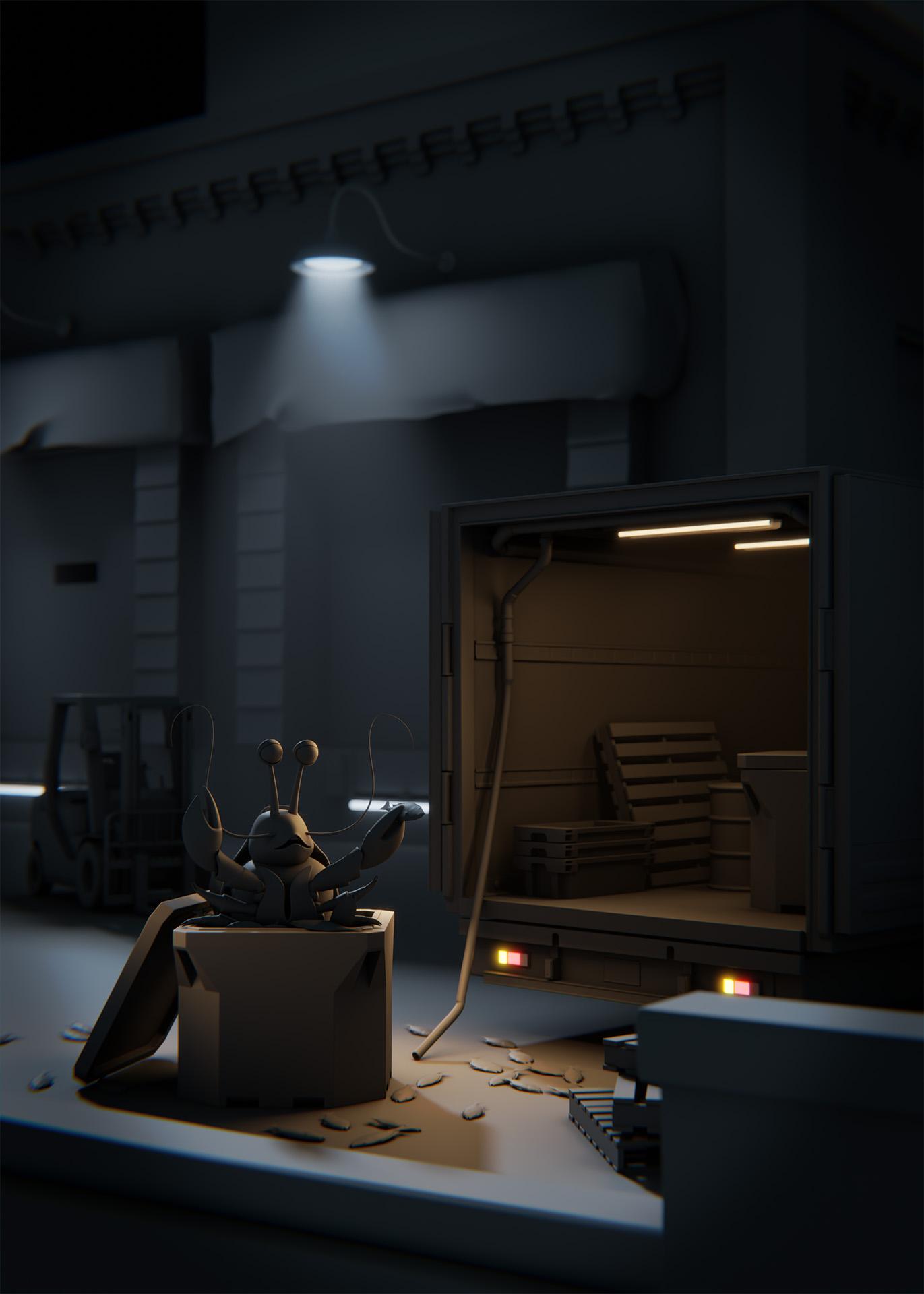
8. Making the Building Lights | Pt 2: Light Beam: We're going to start out here with a render of where we left off in the last video. It would be a good idea now before moving on to ask yourselves if there's anything else we can do with this light that would aid in the composition and help us to push the mood further. So with a lobster as our focal point, there isn't much separation between him and the background right now as they're both pretty dark. The rim light he's getting from the moon is helping, but his silhouette is still pretty hard to make out. We could boost the light's intensity a lot more to make the building brighter. But the overhang could start blowing out again and the building would probably become distracting. So if we go back to our PureRef reference board, you'll see over on the far side that I brought in the final render so that you can see how some of the reference images influenced it. We see again that many of these images have light beams or glowing light sources that help lead the eye through the frame and separate the subject. This one over here does a good job of isolating the person walking across the street and this one up here from Blade Runner 2049 does a good job of using fog to separate the main character from the background. But overall, the fog within each of these images really helps to add to the mood and mystery of each scene. This was clearly an element that played a big part in the final render of this project. There's an element of fog throughout, but I decided to add a prominent light beam right behind the lobster to help draw the eye towards him and create that needed background separation while adding to the moody atmosphere that we're going for. To set this light beam up I'm going go back to Maya. Now let's duplicate the original light and then name it. Let's name it "Lgt-BG Building-A-beam". Now let's link the light just to our FogBox so that we have more control over it. We can do this using the same approach we used in the last lesson. Let's go to our light centric "Light linking" window this time though, rather than the object centric window, and navigate to a practical lights group and select our beam light. Next, let's open our "Master" group on the "Illuminated objects" site and click on the "geo" group to unlink it from everything except our FogBox, which is inside of our lights group. Now it should only be linked to the FogBox. Next let's move the light down slightly so it's not overlapping the original light. I find it helps to have a bit of visual separation between my lights in the view port as it makes the light setup a bit more obvious when moving around and it helps to prevent confusion down the line. This is well, typically move a light at least a bit if I've duplicated it. I'm also going to scale it up a bit to make sure that the top part of the beam covers the full diameter of the lamp. Now let's go to our render camera using the space bar again. Then go to "Panels", "Perspective" and then select the "Render camera". Next, let's turn on our live render mode and make a render region of the area that we're testing. Let's make sure our resolution is set to 50 percent as well. So as you can see, it seems to be doing a whole lot of nothing. That's only because the light isn't strong enough to visibly affect the fog. So let's select the light in the outliner and then go to the "Attribute editor" and boost its intensity way up to 300. Now as we let it resolve, you'll see it's real foggy, but it's not very beamy. So let's narrow down it's cone angle from 90-30, incidence cone softness 2.6. That should be good. Now I'm going to hit the "Render" button and do a rendering the "Image" tool so that we can quickly compare the before and after. I'm going to skip on ahead though, I'll see you on the flip side. Here we are and as you can see, the small addition to our scene has made a pretty big difference. The lobsters popping more because it's silhouette is more defined and the overall mood has increased by 100 percent and it's only going to get moodier. I'll see you in the next video.
9. Making the Building Lights | Pt 3: Light Bulb Glow: In this video, we will be making the light bulb geometry on the building light emissive. This will make the light a lot more believable. To do this, let us select the light bulb itself and then go up to the Pixar surface icon in the render-man shelf. Now let us right-click it and select Pixar surface. Now, at the top of the attribute editor, let us enter in a name for the material. Let us name it, lightbulb_BGbuilding_Matt. Now if we go down to the glow drop-down, the color will be set to white by default. We are going to want it the same color as our lamp lights though, so let us select one of them. You can select either one here. Then go over to the attribute editor again and double-click it's color swatch. Now you can use the eyedropper tool to select its color and it will be added to your recently used Swatches palette. Make sure you click the Done button at the bottom as it will not save your swatch selection if you just close the window. Next, let us select the light bulb geometry again. Now let us go over to the attribute editor and then double-click its glow color swatch. Then select the blue color we just added from our lamp light. Finally, let us drag the glow gain up to one. You can test this now in the live render mode if you want, but it should be good to go. I am just going to do a quick render and it though to do a quick comparison with the old renders. Now it looks like our light actually has a light source. This finishes up the lamp light on the background building. Beyond this, I will just add a glow or glare effect and calm to seal the deal. Feel free to duplicate this light set up and use it for the other lamp over the delivery door on the left side. In the next lesson, we will move on to creating the lights underneath the delivery doors.
10. Making the Building Lights | Pt 4: Light Under Door: In this video, we're going to make the lights underneath the delivery doors. Since they're not intended to be seen up close and will be blurred out without the field, we can just use a PxrCylinderLight for these and turn its primary visibility on. Let's go up to the light button in the RenderMan shelf, then right-click it and select the "PxrCylinderLight" option. All right I'm just going to move it into place. Using the V-Key to snap the light into the general intended area, and then using the object translation mode, will help a lot when moving lights into place like this. I'm just going to skip ahead to where I have it positioned now. All right, and there we go. Now, let's set its color to the same color as the lamp lights. We can do this using the same method we used in the last video. If you still have the color available in your recent swatches palette, you can use that. If not, you can just go back to one of the lamp lights and grab the color again using the eye dropper tool. Now, let's turn on the lights primary visibility. This can be done within the lights basic attributes within the attribute editor. Now, let's set its intensity to three and its exposure to one. All right, and that should do it for this light. I'm just going to do a quick render and go back to the image tool to do a before and after comparison. All right, as you can see it's looking pretty good. It's bringing out a bit of detail on the set, focusing the eye more on that area of the frame, and adding to the mood a bit more. In the next lesson we'll move on to creating the lights for the truck.
11. Making the Truck Lights | Pt 1: Interior Lights: In this video, we're going to go over the lights for the truck. As you can see, I've already created position and scale the lights. I've also dialed in their settings and place them in the practical lights group within the outliner and named them. Since we've already gone over how to create lights in general and move them around, I don't want to waste your time by doing that with six more lights here. Let's just quickly go over the setup and talk briefly about why I did what I did. I've also created a glass material and assign it to the light geometry so we can see more accurately how the lights are affecting the scene. As you'll see, there's two sets of lights for the fluorescence inside the truck. There's a set of Pixar cylinder lights on the inside of the light geometry, and a set of pixel rectangle lights on the outside facing down. I used Pixar cylinder lights for the inside to mimic industrial fluorescent light tubes and then turn off cast shadows and the light geometry that surrounds them. To do that, I just clicked on the glass geometry and then went to the attribute editor. From there I went to this shape node tab and then opened up the render stats drop-down menu and turn off cast shadows from there. With its setup this way the light can pass through the geometry it's inside of and illuminate the inside of the truck. But let's hide the outer set of lights for now with "Control H" and then go into the render camera view and turn on our live render mode. When testing this, remember again to use render regions so you can see the result faster. Now realistically, this setup would usually be enough for the practical lights here. But for this specific scene, I wanted more visible light illuminating the inside of the truck. Typically, you could just boost the intensity of the lights we already have in place. But you're limited on how far you can push them here because the glass could start blowing out. This is what started happening to me and the final render the first time I set these up. These cylinder lights will act more as a visual representation for the lights, more than an actual contributing light source. Now, let's show the lights we had previously by "Shift" selecting them in the outliner and hitting "Shift H". Now what these lights in place, we have more freedom to push to the light intensity. As you'll see I've done here. This helps make it more believable that these lights could act as influencing light sources to nearby hero assets, in this case the lobster character. As you can see, there are already affecting him a bit as is. To establish the light intensity for these lights, it was really just a process of trial and error to see what look right. Will consistently cross checking my results with the reference. But that's about it for the fluorescent lights inside the truck and in the next video we'll go over the tail lights.
12. Making the Truck Lights | Pt 2: Tail Lights: In this video, I'm briefly going to go over the tail lights. As you can see here again, I already have them set up, so I'm just going to quickly discuss my approach. Since we don't see them up close, it's a pretty simple setup, similar to what we did with the cylinder lights inside of the fluorescence of the truck. I'm just going to pop in a pure ref again for a second so we can look at the reference images I used for these are. As you can see, the lights themselves are pretty bright in these photos to the point of being overexposed even. There's some finer details you can see here as well like the smaller bulbs inside and the layered glass. But again, since we won't be seeing them up close in the final render, we don't need to worry about these details. Now if we go back to Maya, the setup again is pretty straight forward. First I turn off cast shadows on the glass geometry by going to the attribute editor and then turning off cast shadows under the renderer stats. Then I just placed the Pixar rectangle lights inside them and refine their settings accordingly based off the reference. Now let's go into our render Camera View and turn on our live render mode and see how they look. I'm also just going to create a small render region over the area and set the resolution to 100 percent so that we can get a good look at them. As we let the render resolve, you'll start to see why it wasn't really necessary to focus much on the details as the lights themselves are a very small element within the frame. Beyond this, I will just add a subtle glow to them and crop But as far as the lights themselves are concerned, I think this should be good. That's it for the tail lights. In the next video, we'll move on to creating our dramatic or artistic lights.
13. Making the Dramatic Lights: In this video, we're going to go over the setup for the dramatic lights. These lights aren't always physical light sources visibly seen anywhere within the scene, instead, these are generally added lights. What's most important when setting these up is that we're aiding in the composition, they look believable within the context of the scene. Starting out in it, I did a render of where we left off previously after finishing up the tail lights. This is essentially light setup based purely in reality as there had been no extra dramatic lights added yet. Now, if I go down one in the catalog, you'll see the final render with all the dramatic lights in place. As you can see, most of the dramatic lights have been focused around the lobster to create some separation and make it pop a bit. How do we go about achieving this? One light at a time as always. The first dramatic light I added was the warm side light, which is influenced by the truck lights and it's acting as a rim light to help separate the lobster from the background. If we go back to it, I did a render of the scene with just this light turned on. As you can see, it's helping a shape of the lobster a bit more, and by it's spilling onto the ground of bed, it's helping to lead the eye toward that area of the frame as well. Now let's go back to mayan and turn on the backlight that's angled down a bit. All right, with that turned on, I'm just going to go back to it to show you what it's contributing to the scene. As you'll see, it's providing a bit of a light hit on the crate that the lobsters in, and it's also helping to shape the screen right side of his body a bit more as well. It spilled some light onto the ground as well, but I think that should be fine as it could be rationalized that the tail light is causing this. It's also helping the cell the extra bit of visible light on the screen right side of the lobster and crate, so I wouldn't be too concerned about the light spill on the ground right now. Now let's go back to mayan again and turn on the other back light. This one has a similar effect as the initial backlight we turned on, except this one is more focused just on the lobster. To do this, I just narrow down it's cone angle and set the cone softness to one for a smooth transition. I'm just going to go back to it again so we can see exactly what it's doing here. As you'll see, it's kicking up the side light on the lobster far a bit, which is helping to separate him from the background some more, and because of its settings and position, it looks pretty believable. Now we just have one more dramatic lights to go over. Let's go back to mayan. Now, let's turn on the screen left side light. As indicated by the light name, this light is a targeted light source linked only to the crate that the lobster is in. This was done to help bring focus to that area of the frame by shaping of the crates and more adding a bit of complementary warm contrast to help make it pop. I also isolated it to the top corner of the crate by tweaking the lights cone angle and softness settings. Now let's go back to it to see the effect that it's having. As you can see, the crate is now picking up a hit of warm light on its screen left side as expected. Now, you may be wondering why it's not linked to the lobster. To illustrate why choose to unlink this light from the lobster, I did a render to show as an example. As you'll see here, I just felt it was flattening them out too much and taking away from the dramatic mood. It also just made some awkward shadows down the center of his body, and that's why I decided to remove it from him. When adding dramatic lights it's important to keep in mind that they look like they're being motivated by either a visible pre-existing light source, or a potential pre-existing light source that could be off-camera somewhere. But that's it for the dramatic lights. With that done, we can move on to composing the final image in blender. I'll see you in the next video.
14. Compositing the Final Render: In this video, we're going to wrap this series up by compositing the final render. To composite the image we're going to use Blender. I used Photoshop the first time I did it, but Blender is a bit more accessible for most people, so we're going to use Blender here. To start off, I exported a tf of the final render I'd been testing in the previous videos through the RenderMan image tool or ''it''. Next in Blender, we'll just be using the compositing mode. To get into the compositing mode, you can just click the ''Editor Type Button'' in the top left corner and then choose ''Compositor''. Alternatively, you can also hit the ''Compositing Button'' in the top menu bar of Blender. Then you'll want to make sure to check on ''Use Nodes'' at the top of the compositing editor window. This will make the compositing workspace workable, allowing you to create and edit nodes within it. Now I want to do one of two techniques to view our render as we work. First, we can split the compositing editor into two editor windows and turn one of them into an image editor. To do that, you can go up to the top left corner of the editor window until the cursor turns into a plus sign or a cross hair icon. Now you can just drag down to create a new editor window. Next you'll want to click on the ''Editor Type Button'' again and select ''Image Editor'' like so. Now to actually view the render, you can just hold ''Command'' and ''Shift'' and then right-click the ''Image Loader'' in the compositing workspace. Now in the image editor again, you'll want to assign the viewer node to be the active linked image so that you can see the render. To do that, just click the ''Image Selection Drop-down Button'' and select the ''Viewer Node''. That's one way to view your render or result as you work. The other way is to just view it in the compositing workspace itself. Let's right-click the ''Divider Edge'' and select join areas. Now let's merge up the compositing workspace. Now click on the ''Backdrop Button'' in the top right-hand corner of the editor window. Now you should see the render show up in the compositing workspace. They'll be layered underneath any nodes that you create. Both techniques work fine, really just kind of comes down to preference. Now moving through the node treats pretty straightforward setup, generally speaking and shout out to BlendMaster on YouTube, I used his tutorial and how to create a vignette and Blender for this comp. I'll put a link to this video on the projects and resources section. Before diving into the ins and outs of the cop, there's a few essential things you need to know before copying in Blender. First off, the shortcut to make new nodes is ''Shift'' and ''A''. Then you can use the pop-up menu or search for specific nodes from there. Then to view the cone from a specific node, you can ''Command Shift'' click any node within the comp tree, and it will attach it to your viewer. Finally, the node inputs are backwards in Blender for some reason, so if you plug something into the bottom input, it will actually act as the top layer rather than the bottom. Now moving into the comp set up, I started off with an alpha over node to blackout the background by plugging the main render into the bottom input layer and then in the top input layer, I just set that to black. Going into the vignette setup, it starts off with a mixed node and just a flat white solid which is being layered over top of the render. Then the lens distortion with the distortion value at one is turning the white solid into an oval shape. Next, the alpha over node is layering the white oval shape that we now have over top of a black solid background layer. Then the blur is just blurring that result giving us the vignetting effect. Finally, that result is being layered over the final render with a mixed node set to multiply. Then I just brought down the opacity by dragging the factor on the mixed node 2.7. The next effect and the comp tree is just adding a bit of subtle bloom or glow effect to the lights and highlight areas of the render. This is achieved using the glare node with a mixed set to one and the threshold set to 0.1 here. The final render after the vignette is being plugged into the glare node and then that glare node is being added on top using a mixed node set to add. Here's before the bloom or glow effect is added and then here it is after. Typically could get away with using just this one glare note and then plugging it into this mixed note in the main pipe. However, with just this one glare node, I wanted more of a glow on the light on the background building, so I made another glare node to kick it up a bit with the size set to eight rather than seven. Then I isolated it using this mask and then added that on top of the original glare using a mixed node. Here's the glare before that adjustment was made, and here it is after. Lastly, I plugged the final result into a D-noise node, which cleaned up the render a fair bit. Then I plug that into a lens distortion node with the dispersion set 0.02, to get a slight amount of chromatic aberration to add a bit of realism to the render. Then to render the final image, you just need to make sure your final result, being the lens distortion here, is not only plugged into the viewer node, but the composite node as well. Then you can go over to the ''Output Properties Tab'' over here and you can set the output path directory and making a name for your file. Feel free to name it whatever you'd like here. Then you'll want to make sure you set your frame ranges, start and end frames to one on both ends. Finally, you can go up to the render menu at the top of Blender and select ''Render Animation''. Seeing this is a still image, another way you can render this out without having to set the start and end frames is by hitting ''Render Image'' instead of ''Render Animation''. Next, to save it out, you'll need to go to the top menu, select ''Image'', and then ''Save As''. Then you can specify your output directory and format from here. I would save it as either a PNG or JPEG, either is fine here. Now if we check the directory that we rendered to, we should be sitting there and ready to go. That wraps up this series. Thanks so much for watching, I hope it wasn't too painful and that you'll learn a thing or two along the way. Feel free to post any renders that you've done with this project in the project section. By all means, you can totally push the mood in your own direction if you'd like, or you can just copy what I did, that is cool too.
 Evan Coates, Lighting Artist