Transcripts
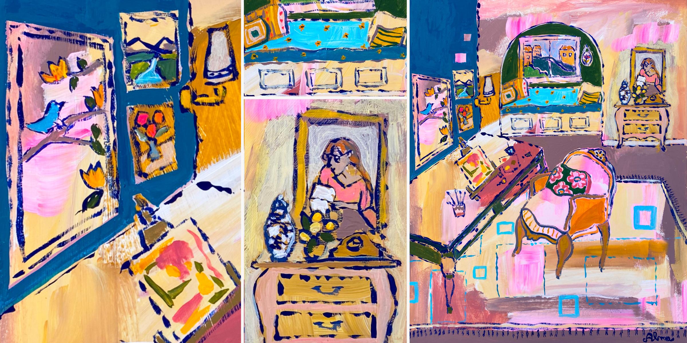
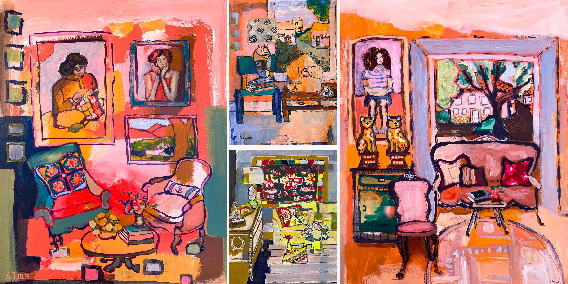
1. Introduction to Room Portraits: Hi, I'm Alma Cox. I'm an artist,
author, and painter. My career launched
almost 20 years ago with the publication of my book, Collage Fusion, where I created my own art process using
fabric and paint together. I love discovering
new ways to paint and sharing it with you here on
Skillshare and on Youtube. Currently, I'm
having a love affair with room portraiture. I so admire the rooms of Matis, Picasso and an Gough. But of course, I want to
create my rooms in my style. I think that we all want
to find our own style. In this class, you'll
learn my method for imaginatively
creating a room of your own that gives you several opportunities to
put your style on it. This is a class that
will ask you to trust yourself as you
follow the process. I'm calling this an intermediate
class because while I truly believe anyone can
paint with this method, it does require some confidence and a willingness to embrace a childlike approach to painting like we
find in naive art. Naive art is characterized by childlike simplicity
that doesn't necessarily adhere to the rules of perspective or
even proportion. If something looks like a chair, then it works with this process. However, we'll still use some of the essential
elements of art, like line, color, value, and shape, to create a
pleasing composition. Your final painting will be
made up of three layers, a background, an outline, and a final paint layer. My hope is that you come
away with a room that surprises you a little and
makes your inner child smile. In the next video, I'll
share my thoughts on finding personal meaning
with room portraiture. If you prefer to get going
on the process right away, then go ahead and skip ahead to the video on what to expect.
2. Finding Personal Meaning in Rooms: In this video, I'm
sharing a few ways that I find personal meaning
making room portraits. I hope it inspires you
to personalize your art and add those little touches
that speak to your heart. For me, it's important to value the different
aspects of me, who I am inside, especially those parts
of me that don't get a lot of attention
in my day to day life. There's a little kid
in me who shows up as a desire to be more
playful in my art. I loved my toy sewing
machine, for example, and including this
detail in an artwork actually inspired me to stretch
what I can do on video. Honoring a desire to include a particular detail in your art may trigger
a new idea for you, along with the enthusiasm
needed to see it through. Sometimes I hold
back with my art, sometimes out of the fear
of being too far out there, too quirky, especially about topics that I feel
passionate about. Making can also feel
lonely sometimes to me, since it's mostly a
solitary activity for me. I merge the two
uncomfortable feelings with a detailed piece that
is quirky and hopeful. Quirky because it celebrates how strongly I feel
about dogs and hopeful because it's art that
is visualizing more art, Friends that I want. Infusing your artwork with your vulnerable feelings
can be healing. And you may find, like I did, that your art
is even more relatable. When you do room portraits can contain a lot of feelings for me with the things that
I put inside of them. If I'm having a
hectic week painting, a cozy room can give
me what I need. With soft pillows
and a comfy chair, I can add little paintings that depict my feelings so
that they feel honored. By the time I'm done painting, I feel restored
to a better mood. Little symbols, like a blue
bird of happiness can infuse your art with your intention to feel happier in your life. It sends the message to your subconscious that
happiness matters to you. You may not be able to afford a big bouquet of
flowers, let's say. But painting a vase with them as a gift to yourself is
just as self loving. You can paint the
good feelings that you want more of in your rooms, and you can practice
self care with the messages that you intend
in the details that you add. I love the idea of an atelier, an art studio with a place
to rest and a dream, which is why I was so drawn
to my reference photo. As you pick your
reference photo, think about the feeling
that you want to have in this special room
that you'll be painting. What little touches
will you add to validate who you are
and what you love? In the next video,
I'll share what you can expect for
this art process.
3. What To Expect In This Class: I put together a
Pinterest board, linked below, called Cozy Rooms, and we'll use this as
reference material for creating a room
from your imagination. You'll create some thumbnails to warm up and then a sketch. This will be your map.
Please photograph your sketch. Thank you. Then you're going to
paint your background on your final paper
or canvas with some color guidelines
that I'll walk you through in the painting
your background video, please photograph your
background painting as well. Thank you. You'll use your sketch to guide
your painted outline. And it's at this
point that I really encourage you strongly to paint your outline without drawing it onto your
paper or canvas. First, you can do this. This will be the first
opportunity that you'll see your hand in the linework and it'll
really come through in the final painting and your style will really
show through as well. Finally, you'll add more color
to your last or top layer and bring the room together when the
painting is all done. Of course, I would like
you to add this to the class projects as well
in the section below. By sharing, you inspire
others to take the class. And sometimes it's
what someone needs, just to go for it and
be creative themselves. I think we can all
agree that we could all use more creativity
in our lives. I also want to adds a final
note that if you don't see a room that inspires
you on the Pinterest board, then please pour over some
beautiful rooms or so many in Pinterest and use that
as your reference photo. In the next video, I'll talk about the
supplies you'll need.
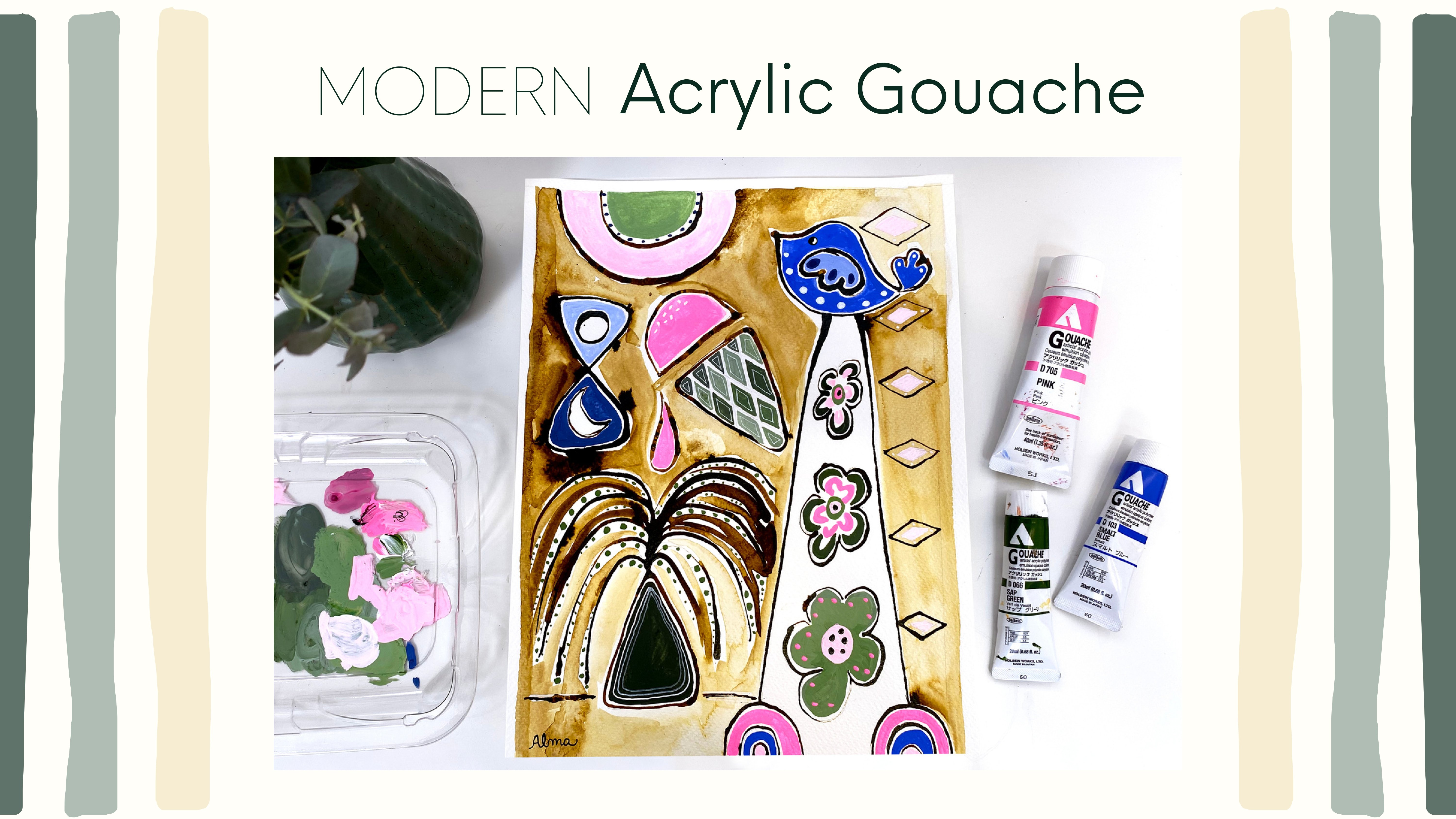
4. The Supplies You Need: For this project,
I'll be painting with acrylic guash because I like
the matte look of them. You can use acrylic
paints if you prefer, or if you already have
experience using oil paints, you can use those too. Please select three warm colors and two cool colors, and white. My approach is to pick the first colors that jump
out at me from the bin. You'll also need white paint
because I use a lot of it. I use regular acrylic and I
found that mixing it with acrylic Guh still maintains the matt look of acrylic
Gh that I really like. One of your warm or cool colors should be a very dark
value for outlining. Please don't use black. I'm using Prussian blue and I'm going to
be mixing it with a little ash rose to vary
the color of my outline. Another nice color to use
would be burnt umber. In addition, you'll
need a flat brush for the background layer, a round brush for your
outline and filling in increase the size of your round brush For a
bigger canvas or paper. I prefer a really loose style. I don't use tiny detail brushes. You'll need a pencil
and regular paper for your thumbnail sketches
and your warm up sketch. I use recyclable resealable
bags for my palette. And you'll also need water and
paper towels for painting. Paint on the substrate that you want to paint on
and that you feel comfortable using a heavy water or mixed media paper
works perfectly. But you can also paint in your water media
sketchbook or on canvas. I've had a lot of fun or dedicating a sketchbook
to my guash paintings. You want a heavy paper
that won't buckle, like 300 pound watercolor paper. For this project, I'll
be using a matt board, which is a paper surface
that I have cut with an Exacto knife in advance to fit an old frame
that I really like. I live in a humid climate. I like to protect
paper surfaces that I will frame later
with gel medium. Here's a review of
the main supplies. In the next video, we'll
create our thumbnails.
5. Creating Thumbnails and the Sketch: Thumbnails are a great way to
jumpstart a series of art. They are a way to
discover what you really like and you can
mix and match them. The secret behind them is that they will make you
a better painter. You are absolutely welcome to use my thumbnails
as a reference, set yourself up for
success by creating your thumbnails in the same
shape as your final artwork. This will help you
spatially as you compose. My art will be a
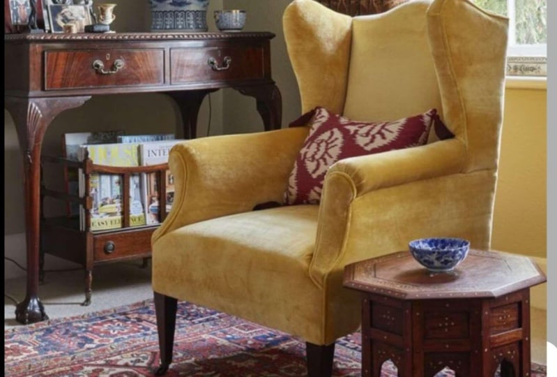
vertical rectangle. My thumbnails are rectangles. Pick the first reference
photo that you are drawn to and set it up in front of
you so it's easy to see. Begin like I have your laptop
open right in front of you. If that is what you're using, begin drawing the
general shapes. Don't add many details unless they pop into
your imagination. In this case, I want
more art on the walls. This is a great way to
also make sure that adding the details makes your
art really different and helps avoid
copyright issues. I emphasize window
details just to remind myself that I do
want to window in the nook, but I am deciding I
think I'm going to eliminate the lamp as I
create this first thumbnail. I realize right away that I
want a more traditional chair and my desk legs for the
artwork and a larger rug. I'll move quickly through
these other thumbnails because ultimately I
pick the first one, and that usually happens for me. It's usually the first
one that I can hardly wait to draw that ends up
being my final artwork. This particular
thumbnail challenges me architecturally to draw it. I pretend the curtains
aren't there, it's okay if your
furniture doesn't line up. My chair doesn't
line up to the desk. Some wonkiness is
totally acceptable, and it will give your
final artwork charm. Remember what I said about
proportion? It doesn't matter. While I love the
plant in the window, I think it's better
to put a plant on the side instead of
adding more furniture. When in doubt, keep it simpler. I really loved the
tiered lamp in this one. I will definitely be using
this lamp in a future artwork. This photo offers lots
of opportunity for personal details
inside the cabinet, on top of it, and on
that three tiered table. By this point, it's become obvious to me that I
like the nook idea, even though they are more
challenging to draw. This is what I mean
by thumbnails, helping to tell
you what you like. Sometimes what I want is to be pushed out of
my comfort zone. This next artwork was
probably my favorite, like this is the room
I want to live in. But I wasn't really
compelled to make something more with it for this
particular artwork. The challenge of
this unusual cluster of small tables really
appealed to me. I think compositionally, this is a beautiful image for
a future artwork. I think that I would use it and I would extend
the wall out to the left to include another wall and make
the lamp more prominent. I think the lamp
and the scance is a good way to draw the
eye back to the corner. You'll see me make
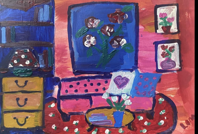
the sidewall more prominent in my final sketch. Now, this is my last pencil
sketch on a whole page. It measures about
eight a two by 11 ". I am using my pencil
as a guide to make my side wall more prominent
than my thumbnail. I have more space for art on the wall on the side with
my pencil as a guide. I'm also figuring out where the bottom of the nook arch is. I establish my corner
so it's easier to figure out the
placement of the desk. I encourage you to make a final sketch that's
based on your thumbnail. This is where you add more details that you want
to include in your painting. Remember what I said before, I strongly encourage
you to paint your outline without a sketch
on your final artwork. It will give your art
a more personal feel and will establish a
stronger style for you. Think of this
sketch as your map. The practice of
drawing it again with a little more
attention will create the brain muscle
memory that will help you paint your
outline with confidence. Remember, the process
is very forgiving. Wonkiness is allowed. Remember that I wanted
a traditional chair. I used this reference photo and I switched the orientation
of it on my phone. The angle was perfect
for the desk. You can also see
I used this desk as inspiration to
finalize its form. This is what I mean by having
thumbnails mix and match. The small dresser in
the background is one that I have been
making for other artwork. And you are welcome to
use the idea as well. It's really just I
used a dress that was similar and use it as inspiration
to create my own shape. Here I notice that the
desk extends too far back. I take this opportunity to
make those adjustments. When I go to paint, I feel that my map will serve as
my trustee guide. To finish my sketch, I find a table easel on the Internet that I used to
add details to the desk. These don't have to be
precise because the brush that I use is too thick and
will not let me be precise. I just wanted to
make sure that I practice the angle of
the easel so it comes easy to me when I do paint in the next video will
paint our background.
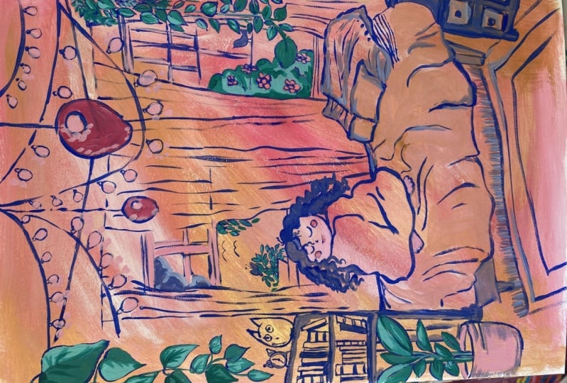
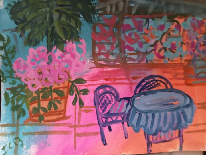
6. Loosely Painting the Background: Painting in the
background is one of my favorite aspects
of this process. In the same way that you led with your heart picking
your paint colors, at least I hope you did bring an energy of joy to
painting your background. Don't overthink it. Use
the three warm colors that you chose and white. Using white in your
paint will keep your color values in the
midtone to light range. Keeping the background lighter will create a final
painting with a lot of light
coming through from the background to
the foreground. This combined with your dark
outline and a few touches of darker paint mixes on the foreground layer will create contrast
that is appealing. The human eye sees contrast
before it sees color. We are naturally
drawn to contrast. That being said, you
can create contrast in your background with
your selection of warm hues by using a light, medium, and darker
value of those hues. For example, red would be
a darker value of pink. Same hue of red for both. But adding white to red creates
lighter values of itself, depending on how
much white that you add in my background. The ash rose is the darkest value of the
warm paints that I chose. It seems pretty dark, However, next to the Prussian blue that
I'll use for the outline, the ash rose becomes a medium value in
the final painting. Also, don't be afraid to mix
your warm hues together. You can paint
amorphous shapes like me or more squarish shapes. Soft squarish shapes will
give your final room a little more structured feel for more movement
in your background. Create wavy and circular shapes, allow your paints to blend. This will create softness, cover your entire
background with paint, and allow you to dry completely before adding the next layer. Use leftover paint to start backgrounds
in your sketchbook, on your paper media,
or on your canvases. I'll be adding more
leftover paint to this sketchbook page after I finish painting my next layer. In the next video, we
will add our outline.
7. Painting The Outline: Once your background
is completely dry, you're ready to add your
darkest hue as your outline. This part is really
about trusting yourself to recreate
the sketch that you've practiced in
your thumbnail and on your sketch directly onto
the surface with confidence. Of course, you can
use pencil lines before you paint if that makes
you feel more comfortable. But I do encourage
you to use paint. Instead, I find it goes a
long way towards embracing the imperfections
that actually give this process that
naive painting style that I talked about before. I'm going to reference
my detailed sketch or my map to figure out where I'll place my first
outline in the left corner. Use your pencil as a guide to help you figure out proportions. Loosely, find the main
line in your room, and that will help
guide the next lines. As you paint, go slowly. I enjoy a broken line, a line that appears a little thicker and thinner
as I go along. In this way I create
contrast with my outline. It's imperfect and
there are lots of gaps. Notice again that I'm
using Prussian Blue, but I have a little ash rose. Two to vary the color
of the outline as well. If you create a very wonky shape like for a chair,
just go with it. I can't emphasize enough
how accidentally creating a misshapen object can add
interest in an artwork. Distorting elements
like a window or doorway or an art wall can
really take the pressure off. Can you purposely misshape
another couple of items so that the wonkiness
feels intentional, Like how a child might
portray something. This chair outline is my portrayal of the
reference photo. Obviously it's different,
it's wonky and I like it. I feel like my personality comes through when I look at it. If you're not okay
with the shape that you're creating,
that's okay too. Just wait until your outline
is completely dry to paint over the part that
you want to change and use your background
colors to do that. Wait for those to dry
before you outline. Again, sometimes an object
can be frustrating. I spent several tries with
this polaroid camera. I took a break from painting, it got out my sketch, practiced it a few times. You can do the same thing. It actually inspired
me to make the camera oversized compared to the
furniture. It was a win. Wherever you are,
with your tolerance of your drawing is just fine. Give yourself grace and tell yourself that it's
just paint and that you are learning because
I'm using a bigger brush, my details are really just suggestions of what
the objects are. Our brains fill in the details. I don't need to paint in as many lines for my easel
as I even made in my sketch. Feel free to change your
mind as you paint as well or improvise
my pencil sketch, cut off the stresser, but because my
painting is bigger, I could fill in the rest of it. That was an improvisation. Since my rooms have
personal meaning to me, I like some of the
art that I portray to include images of things
that I enjoy doing. I encourage you to do
the same thing with your rooms like a person
reading, for example. I love books. I also love chinoiserie porcelain with
the blue and white motif. I add those details on my vase because
they make me happy, even though it doesn't necessarily
look like chinoiserie. Exactly. Again, these are just little suggestions that don't have to be
perfectly rendered. They're just a representation
of what I'm thinking about. If you have windows
or art on your walls, what is the feeling that you
want to have for yourself? If you were sitting
in this room, what symbols could you add that remind you of what you value? I appreciate the pastel houses here in Portugal where I live. Blue birds are a symbol
of happiness to me. I didn't know when I made the pencil sketch what some
of these details would be. But it's fun to see what
inspiration comes as I paint. To honor that
inspiration as I create, I encourage you to do the same
tune yourself to the ideas that come to you
and be willing to add them in as you go along. I'll let the outline dry completely before
adding the next layer, which we'll do in
the next video.
8. Painting the Final Layer: You'll take a little bit
different approach with the second layer
of your painting than you did with your
background painting. This layer will be a
little more considered. It's okay if you feel
a little scared. I just want to convey that this part of the painting
is really about listening and trusting yourself
and allowing the painting itself to guide you and let it tell you what
it wants and what it needs. The first thing to do
is assess if there are any issues that need
addressing with paint. For example, I
accidentally painted a line between the room
with the desk and the no. I would like to leave the
eye towards the nook, so I want to paint
over that line. I want the floor of the
two spaces to be the same. I'm painting over
the whole floor area and I'm going to leave
the rug alone for now. Sometimes it can feel a little painful to cover over
color that we like, but covering over the floor
really made the rug pop. And I like that it's contained. I decided to use the
ash rose because I don't want the floor to
stand out over the rug. The ash rose has a medium value between the darkest outline and the lightest
background colors. This process really
emphasizes value or contrast dark outline against
your lighter background. For this paint layer, use paint colors that contrast
against your background. If you just stay focused on what stands out against that
first background layer, you're going to create that contrast that will really
make your artwork sing. In your painting, you
decide where you want your viewer to focus and
you can do that with color. Like I said, I want to leave
the eye to the nook and because I already have a lot of bold color in the background, I'm choosing the peacock blue blended with a little
white top of the bed. And more peacock blue straight out of the
tube for the side. It's different than my
background colors already. It stands out because I can't
decide what to do next. I wait for the painting to
speak to me in the meantime, since I have quite a bit of
blue paint on my palette, and I know that I'll need
green for the leaves and in my flower vase and little spots in my paintings
and in my window scene. I go ahead and put a little
deep yellow on my palette to mix and make some
green with that blue. Because my window scene has cool and calm colors and I
want it to be a feature, I decide to paint the
nook dark green so that the window really stands out a bit more cool colors recede. Using the dark green makes
the nook feel deeper than it is and cozy for very tiny
details in your painting. Think in terms of contrast. Ask yourself what
color will make this detail pop compared
to its neighbor? High contrast is built into this process already
with a dark outline, but you can create
even more with a combination of very
light and darks. Later, I'll paint
the background of this tiny painting lighter so that my figure
stands out even more. I hope you love your colors
as much as I love mine. I'm finding it hard to paint
over some of the parts. For example, I love the desktop, so I want to preserve it. I decide that in order
to make it stand out, the front and the
side will contain it. Make sure that in your painting, you repeat colors for the front. I started with a shade of
blue that I had not used, but it didn't feel right, so I repeated dark
green from the nook. Repeating colors will keep
your painting cohesive. Move slowly as you paint. Keep assessing what is working about your painting
and move in sections. That's what's great about
having an outline to lean on. I painted the front of the desk. I realized that I also liked the drawers to stay as
they are, the background. I also paused and
noticed that I like the closest foreground
leg to remain as it is. If you paint over
something too quickly, you may cover something
that is already working about your
painting like the nook. I also want the
chair to stand out. In fact, I like the idea that it's the star
of the painting. It's the first stop that I
want the viewer to make. Before the eyes go to
the nook, ask yourself, how can you make a focal point
in your painting special? How can you mix the colors you
already have in a new way. To that end, there's a little gold behind the light fixture
that I really like. Look around your painting
to see if there's a color that you love that
you can bring out even more. I'm going to be
using a variation of this gold for the chair legs. But I decide immediately
that I want to keep the hot pink and lighter pink of the background in the
chair with your painting. Decide first what you like and how you can make what
you like stand out. More as I've been painting, I have been slowly adding little touches of color
throughout the details, including some pattern
on the pillows, there's some paint on the easel and details on the
little paintings. As you paint in your
larger key elements, use the paint to
highlight the details. Lighten some of it with white or darken it with your
darkest outline paint. Last but not least, I found
my paintings improved considerably when I stopped using so much water
to color mix. Instead, now I wipe my
brush with paper towels. Or if I need to remove
dark paint from my brush, I use water, but I remove the
excess before proceeding. In the next video,
I'll talk a little bit about fine
tuning the painting.
9. Fine Tuning the Painting: At this point in the
painting process, I get pretty tired. When I ignore painting fatigue, I start to make
some rash decisions based on negative thinking. I start to pick a part of painting and I know it's
time to take a break. It can be a short
one where I just take a snack or I go outside. Then sometimes I even have to come back
to it the next day. Coming back with fresh eyes can inspire decisions that make
your painting stronger. I made two decisions
after my break. I knew that they were good ones because I was
excited to add them. The first was bringing the bright blue of the bed
comforter to the foreground. By adding some square
shapes to the rug, this accomplishes two things. It emphasizes the
square shapes on the side of the bed and the
shape of the bed itself. It repeats that color
and keeps the eye moving toward the back
in your painting. How can you repeat the shapes, the viewer, towards
a focal point? How can you use shapes
to add pattern? Would it be more interesting
to use different sizes of a similar shape and
vary the line thicknesses? The second decision involves sacrificing part of
my beloved background with the peacock blue that I'm painting behind the desk
straight out of the tube. Doing so delineates
the corner of the room better and makes the
little art wall stand out. More like I said before, it's not easy to paint
over color we like. But sometimes it's necessary to make the overall
composition stronger. Would painting over something that you like in your painting? Help the painting overall? If you're sure, wait a day. Here's a trick to assess
if changes are needed. I take a photo of the
painting and change it to black and white on my
phone photo editor. This is a way to tell if
you need more contrast. In this case, I needed a
dramatic darker value in the room in addition to the dark green of
the nook and desk. In the next video, I'll
share where I go for inspiration that has
improved my room portraits.
10. Where to Find Inspiration Final: If you're interested in this
type of layered approach to art and you need a
little more support. I also created this fun class with the beginner
artists in mind. Give that a look. I joined an Instagram group called
Room Portrait Club, started by S. J Axel Bey, who receives approval from
interior designers and photographers to use their rooms as inspiration for artists. I think it's very
generous and it's going a long way toward helping
me improve painting rooms. It took courage for me to
post my very first artwork, and I encourage you
to give it a try. It's well worth it If you
follow designers on Instagram, don't be afraid to
reach out to them for permission to use
their photos as well. If your plan is to
keep your painting the same as their
photo, otherwise, make sure that you take several steps to make
your artwork different than the original to respect
copyrights of their work. If you love your home
like I love mine, this can be a continual
source of inspiration that is personal and a way to honor what makes your
home special to you. Visiting beautiful places during travel can also be a
way to memorialize a gorgeous room and super fun to see what comes to you
from that inspiration. Let's not forget
our furry friends that make a room or
a chair inviting. I hope you enjoyed this class. If you did, I would really
appreciate a positive review. Thank you. I can hardly wait to see your cozy room
in your style. Thanks for posting photos here. And if you do post on Instagram, please tag me so that I can support your work on
social media too. Finally, for more inspiration, have a look at my other
skillshare classes and my Youtube channel where I
have over 100 art videos. I'm so grateful that
you took this class. Thank you so much
and happy creating.
 Alma Cox, Painter ✶ Author ✶ Teacher