Transcripts
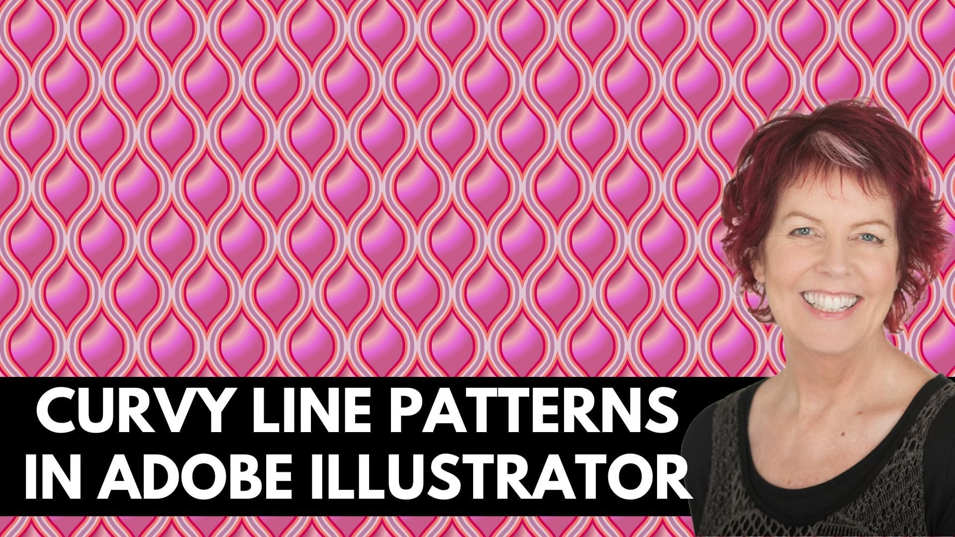
1. Layered Patterns in Photoshop Intro: Hello and welcome to this Photoshop class on making
multi-layered patterns. My name's Helen Bradley. I'm a Skillshare top teacher. I have over 270 courses
here on Skillshare and over 168,000
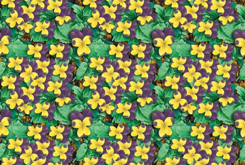
students enrollments. In this class, we'll make two multi-layer
patterns in Photoshop. One of these users or brush
that we'll make from a photo, and the second uses free
to download vintage art. The patterns are
made by stacking multiple layers of patent
elements on top of each other, and the result is a complex dimensional repeat
pattern swatch that you can use in your own
work for print on-demand, and to sell online. In addition, part of this
class focuses on setting up your workspace so that
you can work efficiently. By the end of the class,
you'll be able to create layered
patterns of your own, and you'll have learned
some handy tips and techniques for working
in Photoshop every day. Without further ado,
let's get started making multilayered patterns
in Adobe Photoshop.
2. Pt 1 Make the Brush: To make our leaf pattern, we're going to need
a leaf to use. I'm going to use this
image from unsplash.com. I'm going to give you the
download link for it. You're going to
download it and then open it up in Photoshop. I've already had it open today, so I'm just going
to reopen the file. Now I chose this
file because it is relatively quick and easy
to isolate the leaf. You're going across here to the selection tools and
you're going to select the new object selection too, l as it works really
well on this leaf. I'm just going to hover over it, and you can see that the
outline in pink is the leaf that's going to be
selected when I click using the object
selection tool. Let's open up the
layers and let's unlink this layer so it's not any longer a
background layer, it's just a regular layer. Now the leaf at the
moment is selected, so I want to select everything
that's not the leaf, because I would just
want to get rid of it. I'll choose Select,
and then Inverse. Now the area around the edge of the image is
selected but not the leaf, so I can just press Delete. Having done that,
I'm now going to turn this into a brush. I'm going to select
back on the leaf, and I do that by holding
the Control key, and click on the
layer thumbnail, that selects the leaf itself. I'm going to fill it with black, which I can do on the PC
by pressing Alt Backspace, if black is my foreground color. If it was the background color, I would press Command
and then backspace. That is Option Backspace, or Option Delete on the Mac, or Command Delete on the Mac, depending on whether it's a foreground or
background color. It's also possible to do it
through the film menu show. You go to Edit, and then Fill. One of the contents options in the fill dialogue here is black, so you could just click
"Okay" to fill it with black. I'm going to click away
from the shape here, and you can see it's
already still selected, doesn't matter whether
it's selected or not, but I'm just going to
make a brush from it. I'll choose Edit,
Define Brush Preset. If ever Define Brush Preset
is not available to you, then just check the
size of your document. This document is
small enough so that the brush I'm about to
make is small enough. There's a limit of 2,500 pixels, either vertically or
horizontally for brushes. If yours is bigger than that, you won't be able
to make it a brush. Just scale the image down a
little bit and try again. I'm going to call this palm
leaf, and click "Okay". Now I'm finished
with this image, so I can just close it. I don't need to save it.
3. Pt 2 Document setup: We need a document into which
to assemble our patterns. I'm going to click
"New File" and create a document 2,000 by
2,000 pixels in size. I'm using RGB color mode. I do have a white background. Now it's going to
help if we rearrange the screen a little
bit at this point. So I'm going to drag my
layers panel up over here. I want to just make sure
it's floating by itself. It can be a little bit
thinner than it is right now, and if you need to change
the thumbnail size, go to the fly-out
here and choose Panel Options and select
the larger thumbnail size. It will help you
throughout this class to have larger thumbnails here. We also want the
pattern's panel, so I'm going to grab
that and just open that. It can be a bit narrower. Our patterns are
going to go in here, so we need to be able to access that portion of the panel. I'm going to just shrink
that bar because I don't need much of that at all. I need my styles panel
so I'm going to go and open up and bring
in my styles panel just disassociated
from the sidebar there and just place it in here, and I need actions as well so go to Window and then Actions. Again, just drag
the actions across, close up everything else and
just put it into position. We're going to need
all those panels. Now in case we move things around and get a bit lost here, we're going to save
this as a workspace. So you'll come up
here to this icon on the far right of the screen, click it and choose
new workspace. We're going to call
this layered patterns. I'm just going to
check all these options and click "Save." Now the beauty of this, saving a workspace is this. If I go and move things around and do a few
things and decide, I need to go back to
the way it looked. We'll come up here to that
same icon and just choose Reset layered patterns and everything goes back
to where it came from. Given that we're going to have a pretty messy screen here, that's a really good
way of operating. Now as you open that document, you may find that
you already have your leaf brush showing and you've got the
brush tool selected, you can just click away
from that while you rearrange your screen
and save that workspace. But now we are
going to deal with the brush so I'm going
to the brush tool. If you don't see your
leaf brush go to the fly-out that's next to whatever brush is
currently showing here. Brushes will typically have
a number underneath them, which is their size, and come down here and find the palm leaf brush
that you created. I suggest that you learn to use keystrokes for this
particular class, and that is the open and
close square bracket keys. They make it very easy for
you to re-size your brush. The open square bracket key
is going to shrink your brush and the close square bracket
key is going to enlarge it. We need to set this brush up so it doesn't paint like this. I'll click on this icon here, which is going to be display
the brush settings panel. I can just drag it out here. We only need it temporarily. For our brush, we need
to adjust the spacing. You can see that
everything is jammed right up close together so we're going to increase the
spacing so that we have individual brushes
appearing so when I paint, this is what I'm
going to paint like so they're not stuck together. You could adjust size here, but I do really think that the open and close
square brackets or a better way of adjusting size. We'll click on
Shape Dynamics and then click on the actual option. We're going to
adjust size jitter. This is not rocket science, something like about 20 or 25%. That is just going to give you different size brushes
so you're going to get slightly smaller
and slightly larger ones. You can set a minimum diameter, not going to worry about that, but I'm going to set an angle jitter so now the
brush is going to paint at different
angles so we're going to get lots
of variety here. Roundness, jitter. If you
have a look down here, it's going to distort
the brush slightly, so it's more likely to look like slightly different leaves. I think that's a
good setting to use. You can also click "Flip
X Jitter" and "Flip Y Jitter" and so then
the brush is going to flip over its axis again, adding a little bit of variety without us having to
do too much work. I'm going to go ahead
and close this dialogue. I don't need it any longer. I'm going to select a
color to work with. So I'm going to work with
shades of turquoise. In the last palette,
you can note that we're working on
the background layer, right now I'm going to click the plus sign to
add an empty layer. That's going to allow me to keep the leaves and the
background separate, which will allow me to
create a transparent pattern as well as one that has its
own color background in it. Just going to give
us more variety. At this stage we're
going to work out just how big a brush
we're going to use. I'm thinking something like
about this size will be fine and I'm going to start putting
in some brush strokes. Notice that they're all
going on this layer. The important thing at this
stage is to make sure that nothing at all goes over
the edge of the document. If you put it over the
edge of the document, this is going to
fail spectacularly. You also don't want
to be right up close to the edge
of the document so make sure that you
allow a little bit of breathing space
around the edges. Now we are going to overlap this pattern a lot so it doesn't matter that some of your
leaves overlap each other. If you don't like
the way a leaf is going when you just
click to add it, just press "Control" or
"Command Z" and wait because the brush
is going to change shape or direction next time. Now at this point,
I'm pretty happy with our starting layer. We're going to build this
design up from lots and lots of layers so don't get too
enthusiastic at this stage. We need to add a drop shadow to delineate between this
leaf and the background. So I'm going to click
over here on the FX icon. I'm just turning my
brush off because it's really annoying
just watching it. Let's go to Add Layer Style
and we'll go to Drop Shadow. For your Drop Shadow, I suggest that you
select something like about 135 degrees. That's a shadow coming
in from the top corner. I just think it looks better. Make sure you have black
selected or dark color selected as your shadow color. We're going to set this
blend mode to multiply so it's going to
darken and you're just going to adjust down the opacity
to somewhere around 40%. Again, not set in concrete. We're going to experiment
with the settings here on the shadow because
these are a bit weird. When we go to size, you can see that it's
actually fuzziness. Size actually controls a bit
more of the fuzziness of the shadow and spread just
makes us shadow a bit thicker. So I think in an actual fact, have always thought that these are named the wrong way around, just be aware of that. And distance, I
don't want it to be a long way from the actual leaf. I just want a little
bit of a shadow. We'll bring down the
opacity a little bit. So this is a pretty good level
of shadow for our project. We want to be able to use this shadow without
having to set it up each time over and
over and over again. So I'm going to click here on new style and I'm going to call this layered
pattern shadow. I'll just click, "Okay." I'll click "Okay" again. If we have a look up here
in the Styles panel, a shadow has been added
to our styles panel so we can just grab it anytime we need it
from the Styles panel. We don't have to go through this step of creating
the shadow each time. But there are other ways
that we can maximize our workflow here and
a lot of this class is to do with a smarter
workflow and one of them is to actually make
a copy of this drop shadow. So I'm just going
to right-click on this layer and choose
Copy Layer Style. That copies the last style
to the windows or to the Mac clipboard so we
can use it again anytime. Now the workflow
for this pattern is that when we have
elements like this, we want to make them
into a seamless repeat. We want to break them
up and send them to all four corners
of the document. So we're about to apply
an offset filter to this. If you try and apply an offset filter with a drop
shadow, the thing breaks. So by the time you
get to the pattern, you'll find that you have
lines in the pattern. So it's crucial that
we do two things. Firstly, we rasterize
this layer, and then only after
we've rasterized it do we apply offset filter. I'm not going to
do that right now because I'm going to
do it as an action, because we're going to do
this over and over again. Again, it will be much
easier if we just selected an action rather than have to do all those steps ourselves. I'm going to add
an action group. Just click this folder
and I'm going to call this layered pattern and click "Okay" and that's just
naming the group. Now, before I set up the actual action itself
and go unrecorded, I need to make sure that I have this layer selected
because we don't want the action to have
as its first command, go and select layer 1 because this is not
going to be layer 1. The next time we
actually need to use it, it might be layer 2 or layer 3. So if we make sure that we have the layer selected
before we start, then the action is
not going to need to record actual selection. So I'm going to click
here, the plus sign, to create the action
and it's going to be called rasterize and offset. Right now I'm recording, so I'm just going
to click record and I'm going to do those steps. I'm going to right-click
this selected layer and choose Rasterize
Layer Style. You can see that that's actually baking the layer style into this particular layer and then I'm going to do my
offset with filter, other and click "Offset." The document size was
2000 by 2000 pixels. That's a way we created it. So I'm going to offset it horizontally 1,000 and
vertically, 1,000. It's going from this to
this and we'll just click, "Okay" and then we'll
just click, "Stop." This action is now ready to
perform anytime we need it. It's going to rasterize the current layer and
it's going to offset it so that these elements gets shot to the corner
of the document. I'm going to add a
new layer and I'm going to go and do the
same thing with the brush, only this time I'm going to be focusing on filling in the gaps. Again, making sure
that nothing at all goes over the
edge of this document that's critical and also making sure that
nothing gets so close that ultimately that it's shadow is going to
go over the edge. I've filled in the
middle bits here. I'm going to add my Layer Style. Now I can do it by either
clicking over here to add the Layer Style or I can right-click and choose
Paste Layer Style because it's in the
Windows clipboard. At this point, I just want
to rasterize this layer. I don't need to offset this because it's
filling in the middle. Just going to right-click and choose Rasterize Layer Style. We're going to test
this by choosing Edit and then Define Pattern. I'm just going to
call it leaf 1. In the next video,
we're going to test the pattern and continue to add layers to it to
create more dimension.
4. Pt 3 Add more layers: To test our pattern, we're going to choose
"File" and then "New". We need to create a
document that's much bigger than what we've
been working on. We're working on one that's
2,000 by 2,000 so something 6,000 by 6,000 is a
good setting to use. We've got the pattern's
panel open here. All we need to do
is just drag and drop the pattern
into the document. We can have a look and
make sure that we don't have any problems
with our design. You're looking for
any obvious seams. There shouldn't be any, but you need to check
for them and you should check every step that you
go because otherwise, if there are some
seams later on, they're going to be hard to identify exactly
where they came from. I'm happy with that so I'm going back to the document
we're working in. Because all these leaves
are the same color, I'm just going to right-click
and merge these down. I have one layer, that is this layer of leaves. I'm going to add a brand
new layer to the document, really critical
that you do that. I'm going to go and
get a different color. I'm actually going to work
on a layer below this so I'm going to make a
darker set of layers. I'm thinking that it
might have been nicer if I'd had a darker set
of layers underneath. I'm just positioning
this layer in the stack underneath the one that we
were working on previously. I'm going to click on the
"Brush" and I'm going to add some leaves underneath. Again, I'm working on
the same principle. The leaves need to go in the
middle area of the document nothing ever can cross
the edge of the document. Once I'm happy with
what I've got, I'm going to add my
Layer Style because we need to have those shadows. Then we're going to
run our actions. I'm going here to
rasterize and offset, just going to run the action. I'm going to come in here
and add some more layers, but I can't do it on the
same layer because I need to give these
their own shadow. We don't want to give the
existing ones extra shadow. Again, remembering that you
can control or command Z to undo a brushstroke if you don't like it and you can
vary your brushstroke, just go and use your open and close square
brackets as you need. Going to add my layer style then I'm going to
rasterize the layer style. Let's test this pattern out, but let's test it out with
the other element underneath. We're going to make a pattern. Go back to our test document and just drag and
drop our design in. Again, we're looking for any
obvious lines in the design. I'm definitely seeing
some lines here, but they're not
problems in the design. They're just elements
that are all lined up. I've got some horizontal
leaves that are just causing a little bit
of a problem with my eye, I can see that leaf in here. Let me just see if I can
isolate which one it is. It's this one in here. You could just trash
this layer and start again if
that is a problem. I think it is a problem so
I'm going to do just that. Not happy with the way it looks, just a bit worried about that obvious line going
through the pattern. I'm quickly going to
create that layer again. All my layers are going
onto a new layer. Try and make sure that
there's nothing that's obviously horizontal. Let's add our layer style. Let's rasterize the layer style, turn everything back on and
try that pattern again. Come into this document
and this is much better. I don't have that obvious horizontal because this
was not a good pattern, I'm going to right-click
it and delete it so it's just removed
from my collection. You don't want to
be saving things that are no good at all. We now have two layers that comprise these
darker elements. I'm going to
right-click the topmost one and choose "Merge Down". These are the darker elements
and these are lighter ones. I'm going to add a new
layer to the document. We're going to work
with a lighter leaf. We've got the layer selected, we've got our brush selected. If you want to,
you can just turn the visibility of these
layers off while you're working to actually create this first layer because this is the one that
we're going to throw to the corners of the
document anyway. I want this to be
fairly intense. We'll add our last style. We need to rasterize
this and do the offsets. I'm actually going to use
my action to do that. We're going to add another layer and just fill in the gaps. Again, we're adding
the new layer because this has to have a separate drop
shadow applied to it. You don't want to apply it to both layers because otherwise
we're going to end up with a double layer on this particular one
because it's already had a shadow applied to it that
has been rasterized into it. Let's just rasterize this. Now let's turn
everything back on. Let's make our
pattern and test it. This is becoming more
detailed as we design it. Now at this point,
I'd also like to look at this pattern on a
different color background. Let's go back to the pattern
document we're working in. Let's put these two
layers together. I'm just going to right-click
the topmost one and choose "Merge Down" so that we've
got light, medium dark. This time I'm going to turn off the background because I
want this to be transparent. We're going to make
this into a pattern. We're going to add
this to our document. Now it's got a white background because it's coming from here. If I turn this off,
you can see that the background is removed. I'm going to target
this background and choose New Fill
Layer, Solid Color. I find this is the easiest
way to add a solid color fill to a document because it allows me to experiment with
different colors. We can look and see
what it looks like on blue or dark
colors like black. Or we could even have a
look at it on red or pink. You can experiment with colors
if you like rather than having to commit to a color and drop it into the
background and go, well, I didn't like that, so let's go and find
something else. This is so much
easier to work with. I'm actually going to make
this background almost black. You can see that we've got
these layers of colors. We've got darker leaves
and lighter leaves. I think that we could be
well-served by adding a layer of very light leaves before
we add a contrasting leaf. Let's add a new layer. Let's go and choose quite a
light color for this one. Again, turning everything else off so we can focus on what we're doing although
the background might help me a bit here. These leaves are
the lightest ones, so they're going to
be fairly visible because they're going to
not only be at the top, but also be the lightest things. Our eyes are drawn to things
that are light and bright. Just be aware of that. This is one layer that you probably do want to
get quite right. Got all my elements in here. I'm going to rasterize
and offset this layer, add a new layer because
of course we need to have our drop shadow
be separate here. Fill in the gaps here
as much as I can. Just try for a
different leaf here. Add our layer style. You can continue
to add leaves even after you've added your layer
style, that's just fine. They all get the same layer
style applied to them. Pretty happy with that. Let's just rasterize it. Then let's turn
everything on except the background because
I want this to be transparent so I can test
it out on that black. I'm going to choose
"Edit", "Define Pattern". Now we've got some
lighter elements. Now I am looking here
and seeing that I've got some gaps and I saw that
in this pattern here. We're going to have a
look at how we might specifically address these gaps. Let me however, just
merge these two layers together so that the light
elements are by themselves.
5. Pt 4 Fill in the gaps: Now the problem that
we're facing here is that we want something here
and something here. To actually get things
into the right place is a different step to the
one that we've been using. Let's turn everything off so that we're not going
to be confused. Let's add a new
layer to the top. I'm going to continue to work in the color that I was
using, the last color. I'm going to add one leaf to
the middle of the document. I need to, of course, apply my layer
style to this leaf, and I need to, in this case, manually rasterize
it because I'm just going to do a
different offset for this. With our filter, we're going
to filter other offset. Now I don't want to break it up with thousand and
thousand because you can see what's
happening is it's going to the corners
of the document. But if I set it to
zero and thousand, you can see that it's being
sent to the top and bottom, but not to the corners. What we need to do is to offset the shapes that we
place in the middle of the document to zero on either the horizontal
or the vertical, and a thousand in
the other direction. You can see if I do thousand as horizontal and
zeros as vertical, it's just going in
the other direction. With that knowledge, we
know how to fill gaps. Let's fill this sideways
gap first of all. I'm just going to click, "Okay." Then when I turn
everything back on, you'll see that this
sideways gap has been filled to a certain extent. Let's turn everything off. Let's add a new layer, and let's put another
leaf in here. We might put a couple
in at this point. We're, of course, going
to add our last style. We're going to rasterize it, and this time we're going to do a manual offset filter,
filter other offset. This time we want
to do zero in the horizontal and thousand
in the vertical, and I'll just click "Okay." Let's turn everything
back on and check it in our master document. This is board It's white
background in with it. Let's go and create a version without the
white background. Let's fill in some of
those lighter areas. We're going to add
one final layer to this document and it's going to be something that is a complete contrast in colors. Let's come back
to this document. Let's "Right-Click" and we're going to do merge
down a couple of times because these were
all lighter leaves. Now they're on their own layer. Then the slightly darker leaves, darker again, very dark, and, of course, our background. I want to see what's happening
as I'm working here. I'm actually going to
turn all my layers on, going to add a new
layer to the document, and this time I'm going
to choose a sort color. These legs are going to be
highly visible because they're lighter because they're brighter because they're on the
top of the document. Everything is going
to make these leaves visible and say, look at me. Again, we're going to
add our layer style. Again, we're going to
rasterize and do our offset. I'm just going to
run the action will add a new layer to
just fill in any gaps. We don't want a lot
of these leaves, so I'm just going to be aware
of that. Close to the edge. Make sure it doesn't
go over the edge. Make sure we add our layer style here and then
rasterize this layer. This is the pattern swatch that we're going to save that
has the white background. While we're here, let's make one without the white background. Here's our white background, and here's our black
background version.
6. Pt 5 Recolor the pattern: If you're happy with your
design at this stage, let's go back to the document. Let's merge the top layer
into the second layer so that each of these layers contain just that one set
of color elements. It is possible to re-color
this pattern, of course. I'm going to click
the topmost layer, and then choose new adjustment
layer, hue saturation. Click "Okay". The hue
saturation adjustment layer is going to affect every
single one of these layers. It's possible to
come in and to make changes to the colors
that are in use here. I really like the brown here, but I'm really not happy with what happened to the yellow. All I'm going to do is just drag the hue saturation layer underneath the yellow
so it's not effective, so that I get nice brown leaves, but not happy with what's
happening to this top one. To separately alter the top one, I'm going to go back
and do the same thing, new adjustment layer,
hue saturation. But this time I'm
going to clip it, so what's happening here is
if I start adjusting this, I'm adjusting all of the leaves. But if I click
here on this icon, then this particular hue
saturation adjustment layer gets bent arrow applied to it. You can see this one doesn't
have it. This one does. What that's telling me is that this hue saturation
adjustment layer, this one here is only affecting the layer immediately below the layer that has the
yellow leaves on it. Now, I can separately adjust those yellow leaves to be whatever color it
is that I want. An orangey color, but I
might drop the saturation a bit and maybe make it
a little bit lighter, so we've got a full
look here if you like. Again, edit, define pattern, and we're going to do it
without the background as well, and let's test those. Here's the one with
the white background, and then here's the one
that is see-through, so it's picking up the color
of the current background. If I double-click on
this layer thumbnail, then I can experiment with different colors through here, and it might look
attractive with a turquoise blue or light
turquoise blue behind it. These patterns are quite easy to make once you get
used to the process, they're fairly thin
to make you can spend a bit of time
just playing around with the idea and
don't be afraid to toss an entire layer
if you don't like it, and try again and
see if you can get a better result with a
layer a second time.
7. Pt 6 Setup for the ClipArt Pattern: For this pattern,
we're going to need some artwork to use. I've sought some images that we can use from Heritage Type. These are free to use so you can just go and download them. We're using this
cherry chase group. We're going to download
as a zip file. On a PC, you'll
double-click that file to open it and
unzip the contents. On a Mac, it's probably going to happen automatically for you. As a result, you're
going to end up with a series of images. These are the images
from this collection. I'm going to, in Photoshop, create a new file to store
some of these images in. I'm going to use
something that is 2,000 by 2,000 pixels in size. If I open the folder of images over the top of my
Photoshop document, I can select and drag and drop
the images I want to use. I'm looking for things
that have some interest. I'm thinking this cherry here, this one with some green
leaves, more green leaves. I've got a multi-colored
cherry here. I've got some more
green leaves and there is one here that
is also the flower. This is a blossom.
That's plenty. Nine elements, I probably
won't use all of those. I'm going to drag and drop them into my Photoshop document. Every single one that comes in, I'm going to have to
click the checkmark to confirm it in a document. In the last pallet, you'll see that we
have a layer for every single one
of these images, so I'm going to
select all of them. They've come in
as smart objects. They don't have to
stay smart objects, not really going to help us. I'm going to right-click and
choose rasterized layers. That turns them from smart object layers into
just regular content. Going to click each layer
in turn and just size down the image and place
it in the document. I want to line these
up so I'll be able to see all of them very easily. I'm going to hold the
Shift key as I'm scaling them so that they're
scaling in proportion. You don't want to drop
them down too much in size because they're
no longer smart objects. To be able to upscale them, we're going to lose a
little bit of quality. My image, my final pattern, is going to be made as a
2,000 by 2,000 pixel pattern. If you want to make
a larger pattern for example you want to do it
for furnishing fabric, then you may want to start
with a larger document. Don't scale these
things down quite so far so that they're
not getting so small. But I think this is
going to be ending up as a reasonably
good size pattern. I'm just scaling
everything down here. I'm not scaling the
flower right now, want to do something
with the flower before I commit to it. I'm just arranging everything else nicely in the document, making sure that I have
the Move Tool selected, set to Auto Select in layer, which means that I can
just click on a element in the image and it will be
automatically selected for me. Let me just turn some of
these off for a minute and I want to bring this flower
to where I can see it, because I'm not happy with
the stem on the flower. I'm going to zoom in here, go to the eraser tool, make sure I have the
flower layer selected. You won't be able to
do this if it's still a smart object because you can't erase off a smart object layer. That's another reason
why we rasterized it. I'm using the clone stamp tool, just going to Alt click
on an area of the image to just paint out the stem. Not too worried about
that right now, let's just scale it down so
it's in better proportion. We'll turn back on the things
that I just turned off. Now we've got the elements
here that we're going to use. We need a document to assemble everything into going to choose File New and make a 2,000
by 2,000 pixel document. The problem I have right
now is that the content is in one image and I'm going to build
everything in this image. I'm going back to
my content image. It's really important to select that in preference to this one. If you want your screen
to look like mine, then we'll choose Window Arrange and then two up vertical. If you use two up vertical
with this image selected, it opens on the left-hand
side of the screen, which gives us this side
as a working image. I'm just going to scale
things a little bit better so that I
can see everything. I'd also like to bring back the workspace that we created for the first
set of patterns. I'm going to the layered
patterns workspace. That's just clobbered
most of my arrangement. Don't spend too
much time arranging things before you go back to that workspace because you're
just going to lose them. To move my document, I'm just making sure that I have the document selected
holding the space bar, and that just turns any
tool into the hand tool. We're pretty well set up now and ready to start
making our pattern.
8. Pt 7 Create the First Pattern Layers: To create our design, we're going to target this image over here and grab
an element to use. I'm going to grab one of
these sets of leaves, select it and then just drag and drop it into my
working document. We're going to do
pretty much what we did with the other layers. We're just going to place
things in the document. I think some of these
are a little bit big. I'm just going to
scale them down. You can also rotate
things around to have them go in
different directions. We can select them
and choose Edit, Transform, and we can, for example, flip vertical
and also flip horizontal. Unlike when we use a brush, we're going to end
up with everything on different layers. I'm actually going to merge
these layers together so that we can treat
this as a single object. I'm going back to my
styles palette to add my drop shadow style
to these elements. At this point, I can
determine whether I want to leave this where they are or whether I want to rasterize this layer
and do the offset. I think I'm going
to rasterize and do the offset on this
as a starting point. I'm just going to
run the action. We can continue to use this action because
our pattern document, the one we're assembling
everything into, is that same 2,000 by
2,000 pixels in size. We don't have to
re-record our action. I can't run my action though because I don't have
my layer selected. This is how things are looking. I want to fill in this area now, so I'm going to add a
layer so that we're not tempted to drop things onto the layer that
is already fixed. Let's drag and drop
this into the image. I'm going to add my drop
shadow to this layer. Now, I'm pretty happy with that, I don't think I need
to do anything more. I'm going to rasterize this layer style to bake
it into this layer, and I'm going to select these layers and merge
them all together. This is my layer for the first set of
elements for my design. I'm going to make a
pattern out of this. We need a document, try this out in. Make sure that you have this document selected
when you do this. File, New, I'm going to
create something that's 6,000 pixels by 6,000 pixels. You'll see that because
I had this image selected when I
made that document, it's sharing a little
tab here with this one, and we're not losing
this in the process. Just think it makes
it easier to work. I'm going to drag and
drop this into here. Right now it's
looking just fine. If you want to see it on
a transparent background, then let's save that
as a pattern too. I'm adding it to a
document but it still has a white background because the document had a
white background. Let's add a solid color fill
layer with New Fill Layer, Solid Color. Click "Okay". Make this black, because I just think these
look really awesome on black. That's what we've got so far. I'm going to add another
layer to this document. Let's go and find some
different leaves to use, making sure I have the
Move Tool selected. I'm looking at these
leaves in here and seeing the color variation. I think I'll go for this set because they are a
slightly different color. Let's drag and drop
them into the document. I'll Alt drag a duplicate away. Maybe rotate them a little bit. I'm pretty mindful that
there are spaces over here. I could fill this space here and here with this set
of cherry leaves, provided I use
that offset filter but only do half
an offset filter. Let's see how we would do that. I'm actually going to record an action for this in
case we needed again. I'm adding my drop
shadow to this. I want my action to rasterize the layer style and then throw
it to the left and right. I'm going to click
the plus sign, I'm going to call
this rasterize, and left and right. I'm going to "Right-click", because I'm recording right now, "Rasterize Layer Style". I'm going to run
my offset filter. But this time instead of
doing 1,000 and 1,000, I'm going to set it 1,000 horizontally and
zero vertically. It's been thrown
over to these edges. I'll click "Okay", and
I'll click to stop this. Let's go to this one, and let's go and use it
to fill these top edges. Let me make sure I've got
the right shapes selected. Let me add my drop shadow. This time we're going to create the rasterize on top
and bottom action. We're recording, so we're
focusing on what we're doing. Right-click and rasterize
the layer style, filter, other, offset. This time we want to
go top and bottom. We're going to go zero on the horizontal and 1,000
on the vertical. Check to make sure
that our image has gone top and bottom half at the top
half of the bottom, click 'Okay", and
then stop recording. Let's see what this
pattern looks like. Probably needs an element
in the middle here. Let's go and get
one more of these. Add our drop shadow to it, so it matches up with
the other elements. Let's make our pattern and
see what it looks like. It's filling in really nicely. We do have some gaps, but let's do that with a
different set of cherries. But let's focus on cleaning
up our layers palette, because it can get out of
control really quickly. I'm going to "Right-click"
and rasterize my layer style. I'm baking this in. Select the three layers that have this same
cherry on them. I'm just going to
merge them so that they'll travel as a group. It's going to be a
layer of elements. I want to start filling
in some of these gaps. Let's start with the flower, because that may be enough. It may not be enough. I think my flower is
a little bit big. I'm going to shrink
it down a little bit. Let's go and place
it on this image. Again, making sure that it
doesn't go over the edge, making sure it's not
too close to the edge. I'm just Alt or
Option dragging it. I've got flowers each
on their own layer, so I'm going to select all
of them "Right-click", I'm just going to merge them. Because it was pretty
easy to create, if I don't like
the way it looks, I can fix it up later on. Going to click to add
my layer style to this. Let's go and see what this
looks like as a pattern. That's really nice. I'm really liking that. Let's just go in and check
and make sure that there aren't any seams in this at all. It looks really good. One thing I did see on my
way through that I just want to show you that is
concerning me a little bit. I'm going to select this layer here that has little
flowers on it. The thing that's concerning
me is that part of this layer is hanging off
the edge of this document. If I went to do my rasterize and offset this one that is going to throw everything
into the corners, I think it's going to
break the pattern, and it's probably going to
break the pattern because part of this flower is
outside the document. If it were to happen
to you that an offset that you do
breaks the pattern, this is what you're going to do. You're going to come in
and select any layer and look and see where
the surrounds of it are. If you've got something over the edges that's likely
to be causing problems. You'll come in here
with the crop tool. I'm going to just
clear my crop tool. Let me just go and
find another tool. Let's go back to the
crop tool, cleared, and you'll see that
my crop rectangle is now all the way around
the edge of my document. Well, I'm just going to
press "Enter" twice. You could say that part of that document just
got lopped off. The result of this
is that if I was to do my rasterize and offset, then it won't break the pattern. Anytime you see anything that potentially is over the
edge of the document, there's a really good chance that it's going to
break your design. That's why you want to
continually come in here as you make each individual layer
and add it to your pattern. Just have a really
good look in here and make sure that you
haven't got any lines. Because if you have got lines, it's easier to find them now and do something about
them than find them later when you've got
nearly a pattern that you absolutely love and then you realize that things
just aren't working. I'm going to rasterize this layer style to bake
it into the document. At this stage, what I
would do is probably add another layer of content
in above this layer here, and then just work out
which of the layers I like. Because you can turn some of these layers off if
you don't like them. Let me go and see what
this element looks like. I don't think we've
used it before. I'm just going to use it to
fill up some areas here. I'm going to make it
a little bit larger. I think it's a bit small. I'm going to Alt drag
some duplicates away. If I want to change
the layering, I can do that later on. I'm not really worried about how it's layering at
the very moment. Let's go and put another one in. Let's turn everything
else off so I can just focus on
what's happening here. Being really careful that
nothing is going over the edge of this document or
that's not going to work. Let's join all those
together in the layer and add our drop shadow to them. Going to move them down, I think they're too high
up in the document. I think they might look
better further down. Let's bake our drop
shadow into the document. Let's add our flowers back on, turn our background off, and just see what
this is looking like. This is a problem now, you can see some distinct
horizontal and vertical lines. It's not that the pattern
is wrong of itself, it's just that we're
getting edges in here. It was much better
at this stage. I'm not going to deal with
this particular layer. I'm just going to trash it, and if I wanted to fill in these gaps or these areas
I would start again. Don't be hesitant to throw something away
if it's not working. If it's not working,
just get rid of it and try something different.
9. Pt 8 Finish the Pattern: Reworking that layer now with a different element and a little bit of a
different placement, I've ended up with a
much better result. There are a few tips for working on this
particular project. One of them is to try
and keep your layers palette as clean as
you possibly can. Make sure to bake
those layer styles into the layers by
rasterizing them and merge layers together when you've
got two elements that are the same and you think that it does make sense to merge
them together. If you've got empty layers
sitting around like I do, just get rid of them and then experiment with turning some of these layers off
and ask yourself, do you have a working pattern without some of these elements? Do you need all of
these elements? You might want to build up 5, 6 or even seven layers of
individual elements in this file and then just turn
some of them on and off and save the pattern and
see what results you get. I've been really conscious
of trying to even out the background areas
to make sure that they're not big areas of black. But you may want to actually
cover everything up. You may want to add multiple
additional layers of content so that you have practically no background
showing at all. It's just all entirely
your personal preference. But you'll find that these
patterns are very zen to make. They're really a pleasure
to play around with. You can always just throw a layer out if it
doesn't work and don't hesitate to
do that because sometimes they don't work. But having your screen set up to make it as easy as
possible to do this, make sure that you've
got the actions that are going to save
you having to do things repetitively and just have
everything organized neatly, well planned and you'll
find that these patterns are a really nice way
of spending an hour or two just playing around in
Photoshop and ending up with some really lovely patterns as a result of the
work that you've done.
10. Layered Patterns in Photoshop Project and Wrapup: We've now completed the video training portion of this course, so it's over to you. Your project for this
class is to create one or more of these layered
patterns in Adobe Photoshop, and post an image of your completed design
as your class project. I hope that you've
enjoyed this course, and that you've learned
lots about making layered designs and organizing your workspace in Photoshop. If you did enjoy this course
and when you see a prompt that asks if you would
recommend this class to others, please would you do
two things for me? Firstly, answer yes, that you do recommend
it, and secondly, write even in just a few words
why you enjoyed the class. Your recommendations help
other students to see that this is a course that they might like to take as well. If you see the follow
link on the screen, click it and you'll
be alerted when I release new classes. If you'd like to leave me a comment or a
question, please do so. I read and respond to all of
your questions and comments, and I look at and review
all of your class projects. My name's Helen Bradley. Thank you so much
for joining me for this episode of graphic
design for lunch, and I look forward
to seeing you in another class here
on Skillshare, soon.
11. Bonus video Photoshop CS5 issues: This is a bonus video
for anybody who's using an older
version of Photoshop, because the option to rasterize the drop shadow
layer is grayed out, so you can't use it. We need a workaround for this. I'm quickly going
to add a new layer to this document and I'm
going to paint on my layers. I'm just using one of the
built-in Photoshop brushes. It's all fuzzy and everything. I'm not here to make a pattern, I'm here to solve a problem. I've got my leaves here
on this new layer. I'm going to add my drop shadow. Now, I did create
that as a style. It's going to be
really important in these older versions of
Photoshop to do that. The first time you
create your drop shadow, make sure you save it as a style so you can apply it
to the document. That's because Photoshop
seems to be a bit finicky. When you go back to
the drop shadow tool, the next time it seems to have
reset all its preferences. They're not sticky,
so it's really hard to get consistent
drop shadows. That would be what
I would suggest it. Now, if we were to
right-click this, you'll see that rasterized
layer is here but we can't use it because
it's grayed out. The workaround is
going to be this, and we're going to
record it as an action. Let me just go to the
move tool so that, that brush is not
flicking in my face. Make sure that you
have the layer that you want to work on selected. Because again, we don't want
to build into the action, Select Layer 1, because next time it
won't be Layer 1. We have to be really
careful that this is going to work on any layer
that we have selected. Target your layer, first of all. I have a group here of actions, so that's already been created. Let's go and create our action. I'm going to call this
rasterize shadow. I'll click "Record,"
and note now that I am recording everything so I won't have
my wits about me. With this layer
already targeted, and make sure that you don't
click on it because we don't want to build
that into the action. We're simply going to choose
layer and then Layer Style. This is really weird, but it's Layer Style, and then Create Layer. Makes no sense at all. Well, it does make sense, but it's not a tool that
you would think of using. Layer Style, Create Layer. Click, "Okay." You can click, "Don't
show again" so that it's not going to be
shown again in this dialogue. I'm not going to
bother with that. I'm just going to click "Okay." Over here, just have
a look and you'll see that we've got
our original layer, but we've also got
its drop shadow. That's halfway to
solving our problem. Now, we have to
put the layer with the leaves on it together
with the shadow. That's what we came here to do. The problem is that the drop shadow layer has
a reduced fill on it. We're going to see
that in just a second. It's called a fill. In my case, it's about 39%. If we were to sandwich this layer and this
layer together, they're both going to
get that reduced fill, and so our leaves are
going to disappear. We have to fix the fill problem. We have to select the drop
shadow layer, but again, we cannot click on it
in the layers panel, because otherwise
we're going to build that selection into the action. We have to make sure that we select that layer
using keystrokes. That is holding down
the Alt key on a PC, that's option on a Mac, and tap the open
square bracket key. You should go down one step. You can see here it's called
Select backward layer. Now you can see here
that the fill is 31%, and that's just
going to not work. What we need to do now is
to set the fill to 100%. Then we go to the opacity
and we reduce heat. You need to reduce heat to a level that's going
to make sense to you. I think for me probably about
36% is going to be fine, but if you need to,
you can just go back and choose a
different opacity. You'll see that you're
going to get a line in the action for every one of
these selections you make, but just ignore that
because it's going to work just fine as long as you get to whatever opacities
that you want to be using. Then you're just going to
target that layer again. You're going to click on
it to set that layer, and as you can see that closes
up the opacity dialogue. It doesn't have the
effect of actually making that layer's name
appear in the action. That's really good. That's going to work to our advantage. Now we have to go
back up one layer. You can hold the
Alt or Option key, and you're going to tap the
Close square bracket key. That takes us back
to this Layer 1, but you can see
it's being read in the action as Select
Forward layer. In other words, go one step forward up the Layers palette. Now we want to merge this, and we use what's
called merge down, because that just
takes this layer and this layer and
puts them together. We get to it by choosing layer, and then merge down. You're just going to
click on that once. That sandwiches all these
together in one layer. Now we're done, so
we're going to click on the Stop Record button. That's all you need to do. Let's go and prove it. Let's just go and
create a new layer. Let's go and get our brush. I'm going to put a
few brush strokes here in this document. I'm going to add my Layer Style. Here it is over here. Now I'm going to run my macro. Let's go to Rasterize
shadow here. Let's make sure that we
have its name selected. I'm just going to click run it. You'll see that this
dialogue appears. If we turn that dialogue off, we're not going to
see at each time. That's probably a good idea because it's a bit
of a nuisance. It's gone ahead and
done everything. It's put the drop
shadow onto this layer. Everything's working as it would have in the later
versions of Photoshop. It's just that we've got a
little bit of a workaround, and we do have to fix the
problem of that fill on the drop shadow being
reduced because otherwise we can't merge
the two things together. I really hope that this helps anybody who is using
an earlier version of Photoshop to be able
to continue to do these wonderful Photoshop
layered patterns.
 Helen Bradley, Graphic Design for Lunch™