Transcripts
1. Introduction: - Hi , My name is Shane. I'd like to welcome you to my home studio, where we will paint Snowy Stream, which is an oil painting on eight by 16 stretch campus. This painting presented a number of challenges, which would be interesting for both the beginner as well as the intermediate and advanced oil painter. I chose to paint this painting inside from sketches and from photo reference materials. I chose to paint inside because the weather lately has been really cold. My experience is primarily pain plan air outdoors, which I strongly encourage folks to do. But when the weather is not cooperating, then we move inside to the studio and we paint from what we have. The real important part is that we actually paint from a sketch from the photograph we're trying to develop a painting, not a replica of the photograph itself, will also cover a number of techniques using a warm under painting and the push in the poll of warm vs cool. How important that is in landscape painting also discussed, lost and found edges, as well as a dynamic composition that reviews the energy that you're trying to depict or convey. I'll discuss the types of paint that I use. The importance of using an oil primed ground or world primed canvas or panel, and the drawbacks that using acrylic primed panel or canvas can present and the advantages of oil product will also talk about the types of brushes that I use, and we'll talk about the importance of trying to paint outdoors or least observed outdoors when translating a painting from a photograph or sketch inside the studio. So I hope you enjoy this tutorial painting video where I'm gonna try to share my 30 plus years of experience as a planet air painter, taking that experience from painting outside, observing nature and then bringing that back into the studio to be able to develop a painting, not a copy of a photograph, but to develop a painting. There's a distinct difference when doing that, So with that, let's get painting
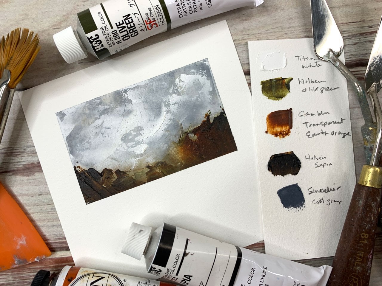
2. Materials: probably one of the most important things about any oil painting that we create or any acrylic painting that we create is thebe quality of the ground or the material in which we paint on. For most of my paintings, I paint on either a hardwood panel that is first been sealed with shellac and then primed with an oil based primer Prior to me knowing this, I would paint on like what most other people would paint on an acrylic gesso. Um, which did work. Okay, but what I found is that the acrylic Jessa would absorb the oil in the oil paint and would make the paintings very dull. Um, this technique that I use, which relies heavily on a transparent medium and the ability for the canvass the white of the canvas to reflect back, refract back the light in the paint. It's imperative that the oil is able to stay on the surface, which binds the pigments of the pigment just doesn't float on the surface. Very important, um, that we use an oil painting ground or primer two of the grounds that I like to use our the Windsor Newton oil primer, which is Alcon based which it allows for it to dry quite rapidly when compared to the gambling oil primer. Uh, the Windsor Newton will dry to the touch in about 24 hours and ready to paint in about three days. Or at least I feel safe painting on it in three days. Some key qualities of the Windsor Newton is just like the the the gambling. It's non absorbent, meaning that it will not soak up the oil from your paints. One of the downfalls if you look at it this way, I particularly like the fact that the surface that it leaves behind its self leveling, which makes it really slick, um, so you need to use the right brushes. And predominantly, what I use are very soft rosemary company Ma mongoose hair brushes don't thin out the Windsor Newton oil primer doesn't require it. In fact, it discourages you from trying to thin it out to save money. And what not now the gambling ground is just as good in the sense that it is also non absorbent. But what I have found is that it takes forever for it to dry at least a month, 22 months for me to feel comfortable and ready to paint on top of it, you can achieve a super slick surface much like the Windsor Newton, but what's also nice is you can also texturizing three gambling because it's of a much heavier body than the winds or noon. So that can also be a drawback. If you're just using brushes to apply the gambling ground on your canvas or wood panel, it could be awful hard on the brushes, but you can thin it out, unlike the Windsor Newton, which you should not usually when I used the gambling, and it will be for a much larger piece that is structurally sound and can support, um, a heavy oil primer or oil ground. I'll use a palette knife to trial it on and then smooth it out if I have to. Both of these grounds are readily available on Amazon, or you can purchase them at Jerry's are Ntarama or at Dick Blix. Um, they're very affordable. I think the gambling is probably a little more affordable. Um, they're both great products. I I use them depending upon the surface that I'm looking to paint on. But most the time I would say, 90% of the time I choose the Windsor Newton because of the convenience of the of the rapid drying time. And I can't look at a bare canvas or bear panel that's just ready to paint on. I tend to salivate and I can't wait. So I guess I can wait three days, which is much better than waiting about two months to paint to demonstrate the importance of Y and oil painting. Ground is so critical I've done a small demonstration here. This is a wash of transparent red oxide on an acrylic primed canvas and then followed up being wiped off with a turpentine soaked rag. And the more you wipe, the more, uh, where they're actually, the less material that you remove. As you can see, it has stained the canvas, and I'll come back with another turpentine wash to try to get rid of it. But it just doesn't take it all off. It leaves a slight stain, and if you're going for an under painting, this will work. But, uh, the transparent method that I paint and will not work on this in the next clip, we're gonna look at an oil primed canvas, which is generally more brighter. Then, in acrylic primes, the same wash. This is ultra marine blue and transparent red oxide come back again with a turpentine soaked rag, and as you can see, it removes much easily her easier than on the acrylic primed canvas. Um, come back again with a white, and I can wipe almost toe white, which means that the canvas itself is not soaking up the paint. Very important that we use an oil ground. So this is my go to palette every day, both in the studio and out in a plan air setting ultra marine blue, which is transparent cobalt blue, which is opaque meridian, which is transparent. I know that a lot of folks view Meridian as a hideous green, but what I really like about Meridian is it's a neutral green, meaning that I can really bend it warm or cool with the either the addition of either blue or its complement. Red. I also go back and forth for the red on my palette. Either be a lizard in crimson, which is a very strong color or arose matter, which is also semi transparent, as opposed to the full transparent that the Eliza in crimson is, um, the transparent red oxide is a staple to my palate. It's transparent. And the more that you work the color were, the more that you wiped the color of the warmer that it gets. I'll show that a little bit in the next demonstration clip, as well as with the transparent orange. Not only is it a nice tertiary color, um, to dull back, it's compliment, but it also can really warm up those cool, neutral colors, such as the Meridian Yellow OK Oakar, which is opaque. Same with a cad yellow medium in the cad yellow lemon and the titanium white. I've gone back and forth between using zinc white, which has a little more of a tenting power, as opposed to the harshness of the opacity of the titanium white. Um, but I still keep finding myself going back to the titanium white, because when I need an actual cool white, I always grab the titanium white. In this next clip, I will demonstrate Thean Porton so of working with transparent colors, the importance of pushing and pulling um, the warm versus the cool and the colors and how that can really translate into a, uh, luminous looking painting again, this only works if you use an oil, ground or oil primed surface to begin with. So in this wash, it's a dark, uh, variable mixture of transparent red oxide, ultra marine blue, a little bit of meridian, and occasionally I'll throw in a little bit of the Elizabeth Crimson. And here's the beautiful and benefit of working with transparent colors is as you work the colors with a rag or with a brush, you can really bring out the transparent nature. And here all I'm doing is suggesting you know the energy in which I'm trying to convey to the viewer just with random strokes, not really following any rhyme or reason. This again. This is only a demonstration of the practicality of using warm vs Cool. This is predominantly a warm under painting. So what will happen here, briefly is I will come on top of this with cool passages of either the well. Right now I'm doing the transparent orange trying to pop a couple areas, and you see, when I come back in, I can work that transparent orange and actually becomes lighter without adjusting the value too much, but it really warms up that area. And as you can see, when you work it into the other colors there, it really warms it up without over saturating that area with the orange. Here, I'm gonna come in with the darkest dark, which which is a stronger, more richer version of the ultra Marine blue in the transparent red oxide. This has been thinned down with my medium that I like to use. We'll talk more about that when we actually do are painting together. But again, we're just laying in the darkest darks weekend begin to establish form with these two rocks . Uh, what I'll end up doing here in the second is coming in with a rag or brush and wiping the the top most edge of each of these passages. So they blend and soften into the rocks, - coming in with mixtures of cobalt blue titanium white, ultra marine blue, a little bit of the meridian just to alter, uh, the color a little bit. But still staying within the same value of these highlight areas, you can see how thes colors sing on top of the warm under painting. It's very important that we don't over paint this area. We just suggest And as you can see, I'm using the paint brush like a pay impression that like a pencil, I'm taking advantage of the full length of the brush itself. If I was to use this like a pencil, I would end up scraping up that under painting area. So here I'm just softly suggesting form and shape of the tops of the rocks. This area is what being caught by ambient light from the sky above, and not any direct lighting from the sun or what? Not a quick tip when painting rocks. Not that we should actually paint rocks. We just paint shapes and value changes within that shape is to try to keep the values consistent both for the under painting and then for the top cool air here. Obviously, there is a little bit of change in difference in value, but the key is to not go so crazy or to make such a difference in value that the rock will look like a spotted rock. And although it does appear to be sort of spotty now, what's nice about this technique is you can come back in and work the paint. I'm not wiping it away. I'm just manipulating it by the use of the paper. Towel has no thinner on it, no medium on it. All I'm doing is moving the pain around, uh, so that it mixes a little bit with the under painting, and it becomes a more cohesive passage of both warm and cool light but also still suggesting form. Now what rocks would be complete without suggesting something for the rocks to sit on and amongst. So here I am using a mixture of meridian with a little bit of the lizard crimson, just to knock it back a little bit. As you can see here, I'm not drawing anything. I am just moving the paint, allowing the strokes to suggest detail now to suggest the light form or the warm portion of this green. This is just a mixture of meridian with cat lemon, which makes ah, beautiful color. It's almost a signature color for me when I paint plan air during the summer and spring months, not drawing anything. We're just suggesting, and you can see by using those transparent colors. The more we work the colors into and on the actual surface, the more transparent they become. And just for fun. I've taken the same palette and de saturated that entire screen to show you the value of each color before it's been affected or changed by any other pigment to it. And as you can see, the Veridian, which can be a gaudy color if left by itself in sometimes it doesn't play well with others . But if it's left by itself, it is Thebes darkest color on the palate. You can make it even darker by adding a little bit of ultra marine blue and just a smidge of the alerts from crimson to tone it back a little bit. And besides the titanium white, the cad yellow lemon is clearly the latest color. And just for a point of reference, that background is a 50% gray, which is what is underneath my glass palate. Um, it's very important that you use something that is neutral in color, like a gray underneath your palate so you can accurately judge your values. When painting on location were actually painting in the studios value, it only means something. It's it's totally relative to what it's placed next to. In other words, a dark color only looks dark when it's placed toe a light color, and the same goes for warm and cool. A warm is only warm when shown next to a cool.
3. Underpainting: so I'll begin. This painting was just a very quick, gestural drawing, not really trying to, uh, illustrate a painting. I'm just trying to find my away for what would be a good composition, just sort of laying in some boundary markers for where I want dark or cool shapes and really not trying to do anything except trying to make a little map of where I want different value changes, different plane changes in different compositional elements. It's real important here, too. Be loose and not tight. Uh, with a gestural sketch. We're just trying to indicate where we want certain things to be, and this is just a really thinned out mixture of transparent red oxide. Once that sketch is done, um, now I get to play and it to have fun. This is a mixture of a lizard, crimson and a little bit of ultra marine blue, and I'll alter that mixture with the addition of transparent red oxide or a little bit of transparent orange. And although right now this looks like a huge mess, this is a very thin wash that's been thinned out with turpentine and on the opposite side. I come with an even warmer mixture of Meridian and a little bit of either transparent orange or transparent red oxide. But we're not trying to paint anything. We're just suggesting, uh, basic local value in addition to basic, uh, local color. But more important, the temperature of the painting. Here's a mixture of all Tory in blue and transparent red oxide. I want this area over to the right of the canvas to be really dark, and now I'm just suggesting the tree shapes or those vertical components which will tie in . It's important toe. Link your darks together, and as the painting progressives, you'll you'll understand why that's important because you don't want things just kind of floating out into space. Um, here is a very, very thin mixture of transparent red oxide and ultra marine blue, Um, and this is just a background area to suggest what will eventually be a rock formation and dirt. Here is a mixture of ultra marine blue with a little bit of meridian on a little bit of transparent red oxide, and I'm trying to do here is just suggest the local color, but also the local temperature of the water as it uh, rests up against both snowbanks. You can tell that the temperature change in the background is a little bit cooler versus what's coming up here in the foreground with by adding the darks. When I come back over the top of this with a rag toe, wipe this area out. It'll be quite apparent how important how much I like working with these transparent colors is it's vital to establish a theme for the painting right out of the gate with Total uh, you know, you're just letting go, and you're letting the paint work its magic. One of the real fun things to do is then take a rag that's dry. It's not saturated or even dipped into the turpentine or medium, and all you're doing is wiping away. And because it's a transparent color, you can see the transparency come through. The more you wipe off course, you you know you can over wipe and go all the way at a white. But that's not what I'm trying to do. I'm just trying to suggest temperature that there's going to be something back there, but it doesn't play a vital role into the focal point, which will be just under the base of that tree. That's kind of curved. I know it's kind of hard to tell what that's going to be right now. But as the painting progresses, you'll see in the same thing with water. You're just tryingto suggest interesting things, and I know it's hard to tell in the video. But all the texture that is picked up by using this rag and wiping away, Um, this is the kind of stuff that's the money of the painting. To quote my friend Charlie Honey, Charlie Hunter, Um, people, the most important thing is, is the contrast in the image is what draws people in tow. Look at the painting, and then once they're right there looking at the painting about, you know, two or three feet away that then they can see all of the brushwork and all of the texture, and it makes it real interesting. So we want the painting to be as interesting when it's viewed from two feet away as its views from six feet away. When we apply the oil paint in this nature, it's much like working like a watercolor we put pigment on and then we can wipe it away, We can add or subtract any kind of medium that we use, which is another interesting topic to talk about is the medium that I use in the studio and Plantier. I like to use five parts of turpentine toe one part of Damar varnish in one part of stand oil. What that does speeds up the drawing time and so I'll be able to in a few minutes come right over the top of these initial washes without disturbing the this under painting. But it also gives the ability to have a little bit of a varnish added to the paint, so it kind of makes it look glossy can really add depth, especially when using these transparent pains. Here. I'm suggesting the darkest darks, which is just underneath the banks. We don't want to get too crazy here. It be easy to make this painting, uh, look like a hodgepodge of speckled darkness. We want to be able to connect these dark shapes with slight value changes in this mixture is just ah, warm mixture of ultra marine blue and transparent red oxide, leaning more towards the transparent red oxide weaken. Vary these mixtures up toe. Add a little more flavor to the painting by either increasing or decreasing the ultra marine blue, depending on the brand of transparent red oxide that you use. I like to use the gambling predominantly, uh, it could be very powerful, and it will be hard to get a cool dark in nature. When you look at the darks outside, most of the darks are warm in nature. They're not cool. So I tried toe bring this into the studio when painting from either sketches or photo reference. The initial stages for the development of form is by placing these dark shapes and dark transitions right up next to the lightest areas. And as you wipe out, you can reveal just, uh, uh, a suggestion of a shape which, when viewed together or completely with the rest of the painting, it looked like a tree or to look like a branch or to look like a bright bush. I'd like to call this phase of the painting, which is really the most energetic and will really dictate how the rest of the painting will go as we're setting the stage for what's yet to come. Um, there's a lot of energy in this painting right now as it is just with these passages of warm and cool, which hopefully if we don't overwork, it will remain with it right straight through to the end of the painting.
4. Background: here. I'm establishing the darkest darks for the rock formation on the left hand side again not trying to detail or outline any rocks, just suggesting where the darks should be. Toe Help Delineate form later on. This mixture is again ultramarine blue and transparent red oxide. An easy way to pull out shapes with oil is to use a brush just loaded with turpentine, and you can wipe away and remove Blot the paint away, revealing negative shape of what you would like to paint later. It only takes a few minutes, if that for that turpentine wash that I just pulled out to dry to be able to pain on top of it. And I'll do this, uh, throughout the painting to suggest form and shape. - Now I start introducing some of the darker values, but these air cool, thes air, indirect shade from the light. It's really important here to not get too dark. So you you're able to determine the temperature of your dark with a mixture of ultra marine titanium white and just a Schmich of the transparent orange toe. Dull it back. I'm cooling off. Uh, the background. I know that value right now, looks too dark. But later on, when I work that in, it'll be the same value as that tree line underneath again, bouncing back and forth between warm and cool to add interest to the painting, but at the same time not trying to make too much of a harsh change in the background, since that is not where our focal point, this is just the accompanying music to what will be the center of interest or the focal point for that treatments has the bend at the base, working with mixtures of ultra marine blue and Rose Matter. Hey, work down the tree line to establish the change in temperature and a little change in value . The closer that I get to the bottom of this tree line, I'll warm the colors up when I'm adding. Here is just a little bit of transparent red oxide in a little bit of meridian. Using a large soft bristled blender will pull all those brush marks together to soften that area before we come back in and add a different value toe to show some atmospheric perspective for that back tree line again, although this color may look like it's pure white. It's not. And as we work down and further away in the distance, a little bit of Mawr ultra Marine blue, and I'll vary that with cobalt blue, uh, to again establish that atmosphere perspective. Now, with mixtures of transparent orange and meridian, I can really start to establish and differentiate the warmth in that background and of a nice note. If you concede between the yellow Oakar and green color on the right, how it is complementary to the blue in the background really makes that area of the painting sing.
5. Blocking In Snow: now that we have the large value masses blocked in with the big temperature change in the background to the somewhat foreground. Now we can begin on working on those middle values and cooler temperatures for the foreground snow. These air just very thin washes of ultra marine blue with titanium white and a little bit of transparent red oxide to knock the chroma down. And then I will vary between ultra marine blue and cobalt blue, just to add some difference in it in the foreground, on the left, you'll see that the color it's more of, ah, purplish color, and that's the same mixture that I used overall for the rest of the snow. But it has just a little bit of rose matter or a lizard in crimson. And what I find, which is nice to paint when painting snow is snow, is nothing more than a reflection of what the colors are around it and above it. So this day was kind of an overcast day, but there was some sunlight peeking through the clouds and illuminating certain areas. I know that these values and these colors right now as it stands, look, um, kind of discombobulated, But you need these darks and you need this color change this and temperature change to be able to establish the planes, uh, for snow. So what I like to do is just imagine if you're outside. If you put a white sheet over something that's outside and let the natural light capture, you'll see that the white sheet actually collects the color that's around it and also from what's above it. So painting snow is is the same way. Um, it can be frustrating and it can be time consuming to get it right. But you just have to let go and paint. What you know is there for me. Uh, now comes the fun part when we get to do the push and pull of the warm vs, cool in the background trees. Uh, obviously we're coming in with a much, much darker value, but this is also it's hard to tell on the camera, but this is also a much warmer value than what's underneath it. It's a mixture of radian and transparent red oxide and transparent orange, and then we'll vary that up with just a little bit of the Eliza in Crimson Teoh to dial it down a bit, but also it it cools it off as well. Adding, these, uh, passages of warm vs cool will really add a different dimension to your painting and give it a lot of depth. Um, and we'll make it interesting if you're looking at it from a distance. But also, when you get up close, you get to see that nice light warm underpinning shine through these opaque passages.
6. Blocking in Trees: with a mixture of ultra marine blue and transparent red oxide. Come in and start to establish the dark values underneath the rocks and underneath the the snow bank along the stream. What this will help us do later on, when we start to refine the water in the stream, it'll make that plane of the horizontal plane of the water easier to delineate. Um, if you can get those in now, it's much easier, uh, then to try to do it later on. So pulling in some dark values just simple suggestions of tree shapes in varying the value but also varying the color temperature. Here you can see one of my favorite tools my finger and the beautiful part of using transparent red oxide is the more that you work the paint, rub it, wipe it away, the more transparent it becomes on. And then once you have that laid down, then you can come on, come over the top of it with a more opaque passage. What's nice is if you have a warm under painting, such as that transparent red oxide, and then if you lay a a cooler, opaque over the top of that. But still allow some of that undertone that warm undertone to show through it really adds vibrancy and life to the painting. So, trees, um, I get asked a lot how I paint trees. It's not a matter of painting something as you paint what you see, but easy tip is to paint the trees warmer towards the ground, and as the tree ascends into the sky, you paint them cooler. The big trick is to not change the value too much from bottom to top, because then that's when it will start to look odd. But if you can change the temperature from warm to cool, warm on the bottom, cool as the tree goes up into the sky. Uh, the trees will look and read more believable and in the background here, just establishing more darks to kind of separate and pull out that foreground tree. And that's just a mixture. And if you notice it's a cooler mixture of meridian rose matter a little bit of, ah, titanium white toe, lighten the value and again, bouncing back and forth between warm and cool passages will add depth and interest. This green in the background here is Viridian, with transparent orange, No white added at all. And it just adds a nice warm glow. You can see it. Uh, just sing next to the Rose matter and meridian underneath the complement of the red and the green.
7. Blocking In Stream: that will begin to block in the stream. In the background, I'm using ultra marine blue, a little bit of ridean and a little bit of the transparent red oxide to knock down the chroma as the water recedes around the bend. We need to establish that dark, and as the water comes closer to us, then we'll change the value. But more importantly, will change the temperature and you'll see that that color has a little bit of that. Same mixture from the background has a little bit of the transparent orange added to it. And as we come closer to the viewer to the foreground, we increase the amount of the transparent orange, but also not forgetting that we will change the temperature as well to give it interest. Water is transparent, but it's like a moving or rippling mirror. It captures the colors that are not only underneath it, like the riverbed or the stream bed, but it also is a reflector of the color above it. The sky, the trees, the snow, um, and all of that stuff. It's much like painting snow, except it's transparent in nature. Um, moving water is much harder to paint than still water. Ah, it's easy to get carried away and make it look all blocky and discombobulated. But you just have to let go paint naked paint like you don't care and put it on there. Um, if you don't like it, just wipe it off.
8. Setting the Stage: here I'm doing. Ah, what oil pain, especially using transparent colors, allows you to do, which is to wipe out if you don't like a particular areas I was trying to explain regarding the river. If you put a color on and as long as you're using and oil based primer such as the Windsor Newton were the gambling, it allows you to wipe the paint almost completely back to the white of the canvas. Um, I didn't like that color transition. Specifically, I didn't like that temperature transition in that tree, so that's why I wipe that out. Now if I hadn't wiped that out, and if I tried to just lay it color on top of that, especially since it has white in that mixture, it could have turned into a muddy color. And colors will tend to look muddy primarily if you if it's the wrong temperature compared to the color next to it. Many times I've done paintings where the colors look muddy, a wipe off or use my knife and scrape off and then using the same color but just a different temperature. Replace that color and it'll look fine. Uh, not so money here with mixtures of ultra marine blue, transparent red oxide and a little bit of a lizard crimson or transparent orange. We start to lay in the rocks and a little bit of the details. This is the refinement stage of the painting, where you come in and modify and make adjustments, toe value and temperature, uh, for the big finish. And, uh, we're still a few minutes away from the big finish, but you'll see what we're doing here is laying the groundwork for what we want to do, which is make this painting come alive, and you can't see the light without the dark and vice first, so you can't see the dark without the light. And here in the sky. This is when the painting will really start to come together. You can, if you squint while you look at the screen, you can see that that blue looks like it's a darker value than around, or the colors that around it. But actually it's not. It's a lighter value, and that is a mixture of titanium white and cobalt blue. A little bit of meridian mixed in, and I would just start toe, continue laying in those colors again, setting up for the big finish. A lot of these colors that I'm adding now are just those really powerful accents, um, the shadows behind the trees opposite of the sun or upset of light, those air mixtures of ultra marine blue and just a little bit of titanium boy. And I think you can see now there's a lot of depth starting to be built within the painting , not necessarily because of the values, but because of the temperature change from the background to the foreground and those subtle changes everywhere else.
9. Finishing Up: Now comes the part I've been waiting for, which is the finishing touches. This is where we get to apply the top planes of the snow as it faces the sun in the sky. These air, not mixtures of pure titanium white. These air a little bit darker and value, and you can see where I changed the temperature of thes colors in the background. I warm it up. Teoh, catch the reflection of the bounce light from the trees and direct late. And then I'll also cool it down with mixtures of ultramarine blue cobalt blue on dull those down with either transparent red oxide or transparent orange. Now in the background. Thes air dark accents just to add a little pops of color. What that help their helps do is separate those objects, those subjects in the background to bring them forward or to make them recede on these air mixtures of ultra marine blue meridian and transparent orange. Now, with pure white, you don't want to get too carried away. That's a common mistake. I see with snow paintings done by folks is that they snow is what they think is pure white . That's not true. Um But you do need that pure wait just to show where those planes of the snow are catching or indirect light. And it's it's Ah, this is really what makes the painting come to life. At least, uh, from my point of view, is being ableto have those slight changes in value and slate changes in temperature. Um, and by shaping and modeling thes forms is what gives the painting character. It makes it look like a painting and not like a photograph now, using my next favorite tool. Besides, my finger is the palette knife, um, an intimidating tool. But once you get the hang of it and just just do it, just be confident, because you can always scrape it off or wipe it off. Its liberating to paint with a knife, all of the different texture and direct application of color without muddying the color. Um, the knife conduce that for you. I try not to use it to early on in a painting. I try to wait for the end so I can get some nice imposter. Oh, passages in the painting. Nice thick paint to complement the transparent thin washes. That's what's nice about this technique. Um, I mean, it looks cool from a distance, but you can really see the work of the palette knife as a contrast to the brushwork up close. And it will give your painting when you're viewing it up close another layer of depth, or at least the illusion of depth. Um, and here I go again with the palette knife. I've done complete paintings with a palette knife, and I love those, um, and I like the push and pull of the brushwork with the knife at the end of ah, painting like this. Um, Mark Bogus is really good at at combining knife and brushwork. And obviously so is Richard Schmid. Um, just love the contrast. And with that, we'll call this painting done.
 Shane Harris, An Artist teaching in Southern Vermont