Transcripts
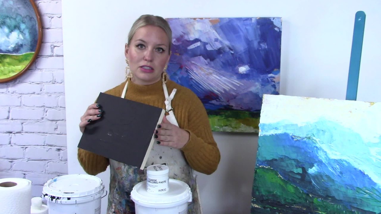
1. 1. Intro & Supplies: Welcome to my studio. My name is Samantha Williams Tchaikovsky, and today we're going to be doing a cold wax landscape using oil paint. Cooled wax is an especially interesting texture. It makes for a very dull, wax like finish once the painting is dry, but it allows us to get a great amount of volume, adding to our oil paints, as well as extending our oil paints toe last longer. Today's painting demonstration will be in this little painting here. This is my demo that I have included the images for in this workshop. As a visual artist, I am a full time practicing artist in oil, acrylic and watercolor. I enjoy working in all these mediums. Oil is one of my favorites, and today we are going to be creating something very beautiful. My supply list for today is going to include paper towels to do some clean up with always a good idea gloves. If you prefer working with gloves and oil paint, we are going to be using some higher all red acrylic as well. Assume Jess. Oh, so you will need acrylic gesso and parral red fluid acrylic in order to prep the panel that we will be working on. You will also need a 20 by 20 inch panel. I have also included a 20 by 24 inch. If you prefer a more rectangular composition, these are untreated unclimbed birch panels. So these are all ready to go. You just need to prep them with Jess. Oh, and with our red acrylic. And I have all the steps included in this video for them all over today, you will need a large one inch or two inch brush. This will be for Jess awaiting and preparing our panel. You will need to Palin eyes one larger one small. I've included a couple examples in your workshop supplies list, but these were the two that I will be using today. These were both metal palette knives making clean up a little bit easier. We simply will be wiping them out on paper towel so you shouldn't need too much other than the paper talent or clean up. And then for our colors, we're going to be using oil paint. I'm gonna be using Williamsburg. I have chosen Williamsburg Ultra Marine Blue Williamsburg feel Oh, blue a lizard and crimson or sorry, a lizard yellow as are yellow titanium white. And then I also have cadmium red for 1,000,000. You can use a variation of these colors. I've included some examples in your notes, but these because I will be doing the demonstration with Also included in your supplies list is our cold wax. So I will be using jacker cold wax and use this product for many, many years on throughout my university career is well, you could use Jack Warner gambling. Both of them are really wonderful product. They are a soft wax. A large tub like this will last a long time, but it does depend on the amount of texture that you are adding into your painting. If you had a lot of texture, you're gonna go through a little bit more of the wax. Also needed will be some palette paper. This is easy for cleanup in for this out once you're done. And then, of course, our reference image. If you choose to work from a different image, you're absolutely welcome to I have provided one for you that will be based off of the painting, and I've done here. It is available in a rectangular or square for mounts, you can choose either work, depending on how you'd like to work with this image. Or as I said, you can have your own. I just keep handy. It's really great to have that reference image here, So I'm super excited to be doing this workshop with you. This is one of my favorite ways of painting, and I used this for years. I hope you enjoy it. Remember, you can apply this to any image that you have any style of painting that you'd like. We are work you of relatively simple color palette. So I always welcome you to a coupon using this workshop in trying out this process, looking forward to having you guys here.
2. 2. Gessoing Panel: So for the first part of this project, we're going to be preparing our birch panel support Birch panel Supports can come. I'm primed as well as primed. You'll actually see the UN primed ones. Are this beautiful Russian birch. Now, we don't have to do much to this in order to prepare to paint on, but we do need to just so the panel. So in this course, I recommended either using a 20 by 20 inch panel or a 20 by 24 inch panel for filming purposes. I'm going to be using a little bit smaller, but these panels are from God trick. They're a Canadian company, and they do really phenomenal birch panels. I'm also going to be using a large brush. This is a flat. This is a flat from silver, Um, and like a large brush with a flat edge, this will really help control the marks that you're applying with your Jess. Oh, and give a good coverage. Overall, you can also choose to paint the edges at this time. Also with that Jess. Oh, we will be using Golden, Jess. Oh, I have a huge bucket of this on hand at all times. This is your basic preparation step for oil. Acrylic, Watercolor. You want to make sure these panels are prepared with some sort of Jesse, So I'm going to open this up, move this to the side, take my jumbo flat brush and dependence and Jess Oh, and basically going to put ah, little pool a Jessel on my support. Now, I don't need a lot. I need enough to cover One thing you'll notice is that as you're applying when you're Jess oh, dries, it will show your brush marks. So something to be aware of when you're brushing on is to either keep a really consistent or really typical or purposeful brushstroke as you're applying. So I'm going to use my brush all in one direction so that my brush marks will look the same under this panel. I've got a nice even coverage of Jessel all over. I can't at this time to choose paint, choose to paint my sides, but for now we're going to let this dry, and then we will move on to the next step
3. 3. Red Underpainting: So for our next step, we're going to be covering our newly prepped surface with of red. So the reason why we're doing this is I love having a little bit of color showcase underneath paintings, especially when they have a lot of green or a landscape color tone to them. So I recommended pirouette red. This is a golden fluid acrylic. This color is very intense, has a really beautiful red. I am squeezing some out onto a piece of palate paper here on, and I'm going to be using the same brush that I used as a Jessel brush. This brush has been washed out and cleaned and all ready to go, and I'm going to be painting my entire surface with this spiral red. Now, as a fluid acrylic, it does travel on top of this very easily without the addition of water, so you shouldn't need to add any water to this acrylic. Also, we do not need to go super super thick. We actually just want a nice even coat of red pyro. Red is one of my favorites underneath the landscape paintings, especially those with a lot of green, just because of the way the red works underneath. Now I do not need all the acrylic that I squeezed. Oh, but because you were working on a larger size panel, you may need a little bit more. Squeeze out a small amount, and as you're working, ADM. Or instead of squeezing out a ton and then having some leftovers again, you can see here and very conscious of my brush marks. So I'm doing them all in one direction and then back again in the opposite direction, just to make sure that I'm not having a lot of that brush texture on the surface, because this will show through my painting. Now we are going to set this aside to dry. Whether you're working on a square or rectangular surface doesn't matter. We're going to have them both in that red, beautiful red pyro color, and then we're going to let them dry. Also this time, if you wish to paint your edges with that same pyre Ole Red, that's a great way of sort of wrapping the painting around
4. 4. Drawing Out Composition: So our first step is going to be drawing out our composition. So I did provide you with either a square or rectangular shaped composition. Depending on the orientation of your panel and the size of your panel, I'm going to start with the rectangular version. So I have my image printed. I'm going to leave this beside me as a tool of reference. Um, and I have my panel already to go as well is a pencil. We're gonna do this lightly on top of the red just to give us an idea of the structure and how we'd like the painting toe look. So to get started, as we're looking at this image, one of the key parts of this image is going to be the horizon line. As with all landscapes, the horizon line truly makes the painting a landscape. Now, in this photo, our horizon line is going to be at the bottom of these mountains. Now, one thing that I always want to bring up is horizon line. Best practice. So when you're looking at a horizon line, especially in an image reference, we really want to avoid ever putting the horizon line in the middle of a painting. This divides the painting up into two separate areas. Thes two areas, then compete for attention. We really want to focus on having the horizon either lower or higher, avoiding that middle area. So, luckily in this photo, we do have the rise in line near the bottom of the painting. So I'm going to start by quickly sketching in where that horizon line would be. So I've got my horizon line and now when I'm looking at this painting on what I'm getting started, I really want to block this into planes, planes and shapes of color. So I have a large area of clouds up top and draw that in first because that's going to be all one color tone. I also have this beautiful set of mountains. You sort of have an angular shape to them all. One big shape. There are some really significant dips in here can also sketch those in, but I'm going to keep it simple, treating each area of color as one big block in the bottom half. I've got a lot of planes of color happening in this photo, so I have this beautiful green sort of separated here by a little bit of a darker shape over here, an area that's a little bit of a dark blue dark green. That one comes up like this. Another plane of super break color. This is where I can imagine my yellow going right into here and then right at the bottom, have a beautiful plane of break break green. So again I blocked this out into some basic shapes. I can add in some extra shapes into this cloud line. If I like again, keep thes simple, simple areas are better, so again have probably given myself about 10 shapes. Toe work on that will be enough, even for a larger size panel, because again, with the tools that were using, we're not going to get super super refined details. We're gonna have a lot of texture. I know a lot of color, so we're going to be focusing on smaller details with just the tips of our palette knife. But that's going to give us a limit to how detailed weaken go. So once you've drawn oh, your image, have your image ready, get your tools ready and some palette paper, and we're going to get going
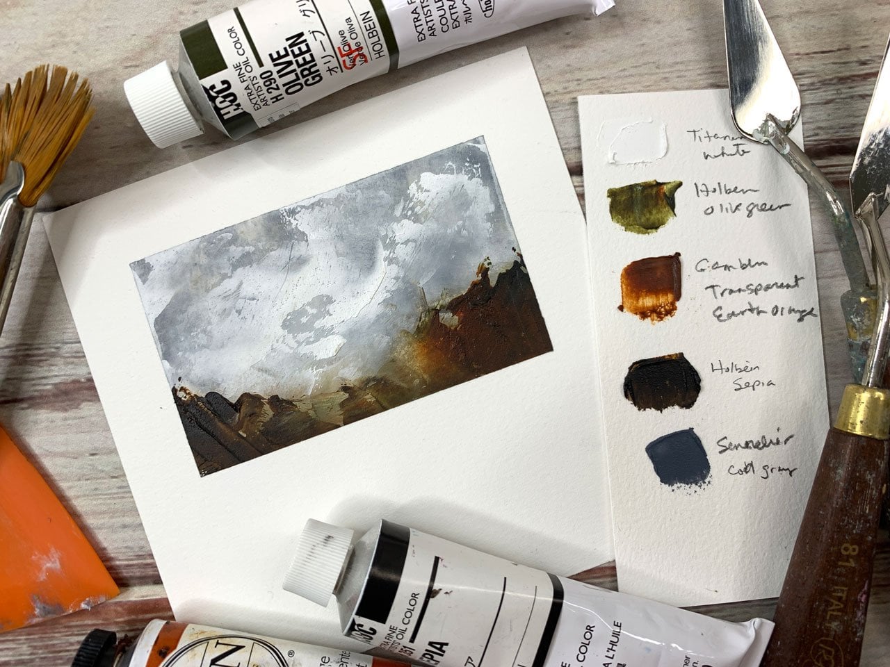
5. 5. Palette Mixing: our next step is going to be mixing our color palette. So in front of me here I have my door, Linds wax medium. You can also use gambling if you'd like. This is our cold wax medium, and I have my palette of oil colors. I recommended a yellow red to blues and a white. You can always substitute in different colors, depending on your reference photo. So for the reference photo that I have attached to this file, our photo uses a lot of these colors within that photo. And I would recommending, basing recommend basing your color palette on the photo itself. So to start off with door lens wax, Um, this is a really unique product, really lovely product. It is a combination of we've got bees, wax who got, um, pair of him wax. And we've got some resin and mineral spirits in here as well. So all the instructions air here. I'm choosing to our gloves. I typically do with oil painting. So all of my products were listed on here and with the ratios, it actually doesn't matter. Your ratio to paint. You can go heavy on the wax. Very light on the paint and vice versa. Depends on the drying time that you'd like to see and the consistency of the paint. So I do have a sheet of palate paper in front of me as well as some paper towels, toe white, my tools off on. So I'm gonna start by scooping out some of my wax so you can see it is a very soft consistency. All right, very soft. I'm going to plop this on my palette, and I'm going to make some groupings for my color. So I'm going to start with spacing this out so that I've got a palette of colors that I can work with now with painting. Um, especially using this image reference, I'm going to be heavy on more colors than others. So I'm going to lay out my palate accordingly. But I'm using about 60% wax to paint. That sort of my preference. Now, the way to recommend a titanium white These air a larger sized to you certainly don't need a lot. That's the amount of paint I'll be using for the titanium white. Um, I know titanium. Way to do. Go through a lot of it, so I may need more a little bit later, but I can always mix more. This one is a liver and yellow, a little bit of a different yellow tone. Um, I quite like this color to work with, but I also jests also suggested nickel azo yellow. Also phenomenal color to work with. On this is a cadmium red minus cadmium red ver millions. It's a little bit of a warmer color, a little bit more orangey, and I have some ultra marine blue and again I need very little paint. Um and this is sort of a cost savings method. I'm extending my oil paint with the wax, so this is going to help me save a little bit on the oil paint itself. My last bluest. A little blue, absolutely phenomenal color. We're in a showcase mixing. So what I would recommend is on your palate. Start with your lightest color. So I am going to start with my weight, and I'm going to actually mix this in with the wax. I like to premix everything, so I know everything's color is all set to go and workable that way. I don't have any marbling of the color in my wax at all, but you can see that's a lot of texture, a lot of product. And in between each round going toe, wipe this off on the tool. If I have any leftover product, can always swoop that up. Pop it back on the table there, just keeping my tools nice and clean. I'm using the medium size palette knife depending on the size. Is that you got, I would say the larger one for your initial application of paint. Your smaller one is good for color mixing. This is my fellow blue. You can see this is a very strong color. I need very little color in order to tent all of this wax again, Would wife this off in between and he left over residual color. I can pop back on immature. Got everything off that palette knife and mix up my other blue. This is, of course, ultra marine blue ultramarine pigment. Um, typically found, um, out in Afghanistan. Absolutely beautiful color made from leftist Liz Oula stone. It's again train a wipe off all that product. Clean off my tool Now. If you are using a more portable palate, one that's larger, obviously you can space out your colors a little bit more, but this worked relatively well for me. Going to move to the red. Now again, this is cadmium vermillion red. So it's quite a beautiful red, very strong color. And again, don't be afraid to use your paper towels. That's why we recommend having a full rule. This is the easiest way to clean up your tools. You can use a little bit of walnut oil on your tools as well, just to get that staining of color out of them as well. And lastly, me yellow. Yeah, because a reference photo does have a lot of green in it. I am going to premix some of my greens as well. I'm so I'm going to take from this yellow. I'm going to move over into this other section of my palette. I'm going to leave some of my yellow over here this way. I'm keeping it nice and clean and tidy when I need to use that bright yellow. But I'm also giving myself some maneuver room to create some greens. So let's make some greens. So here I have my Eliza in yellow. I'm going to take some of my fellow Blue and I really won't need a lot in order to tent this whole pile are really beautiful. Deep green, you can see as a color. It's a magnificent color. Absolutely beautiful, all right. And my next little batch, I'm going to do the same thing with just a little bit of my ultra marine blue, a little bit of a different shade in this one. I'm going to use a little bit less blue in order to get a little bit later. Green. I'm also gonna add a small amount of weight to this one. So keeping my tools nice and clean at a little bit of weight, just to give myself almost this bright, luminescent green. And again, that way, pre mixing my palate a have everything that I'm looking for. Obviously, I will be out of his avoid to my yellows a little bit later on and creating a little bit more of my red and orange mixture. But for starters, this is a great palette to work from
6. 6. Full Painting Part 1: All right. So I have my panel already to go. My marks are lined up for word like the composition to be. I have my reference photo off to the side where I can view it as I'm working. I have my palate names, all set to go as well. Asan, Paper towel toe wipe off my Palin eyes as I go. Now we've premix this palette with our cold wax as well as our oil paint. Again, this is about 75% wax to oil paint, but a lot of texture. I am going to start with a larger tool first. That's going to give me my bigger areas of color. And I like to start at the top and work my way down this way. My color. Stay nice and clean as a moving forward and down the painting. And then I'm also moving forward in perspective. I'm going from a Sfar away as I can to my middle ground to my foreground. So let's get going. So I'm gonna start at the top. We've got a really beautiful area blew up here. I'm going to block this in. I'm using this side of my palette knife And as you're working, you're gonna find that your palette knives will be sort of interchangeable back and forth between the large and the small. But I'm going to start off with my large now, As I'm working, I do not need to cover up all of the red. Sometimes leaving some of the red showing through is really lovely in a painting like this because we're using at red. It's sort of our underlying color. I'm putting in those dark blues. I'm gonna pick up some weight right away because I know I've got a lot of white happening in here and I really want to combine this along with my blue to showcase this. Now, you can do this on an easel as well. Um, obviously for filming purposes, it's a little bit easier for me to showcase this lying flat. You can see him leaving quite a bit of that texture on there, and that's absolutely fine. Once this dries, you can really matt sort of satin finish as you would with a wax finished painting. Um, and you can really use that to your benefit. This has a really nice finish to it. So as in building of some of these darker areas. I am just sticking with the blues for now. The minute I add in any green, I do find it gets extremely green extremely quickly. So I try to avoid adding green to anywhere near the sky, and I am really focusing on just getting these colors all melded together. As you're working with cold wax. Cold wax can take up to a few weeks to dry. I've had pieces take 2 to 3 weeks to a month really depends on the thickness of the wax that you've applied. If you have applied extremely thick wax to your painting, it may take longer to dry. Um, obviously, you've got a percentage of oil paint in there. If you're oil. Print percentages are a little higher than your painting will take a little bit longer to dry as well. I've picked up some of the ultra Marine blue I'm going to be adding that in here is well again. Having to blues is really important for skylines like this, because then you can really create some interesting variations within those cloud patterns , and as we refine it, you'll really be able to see that I'm covering just the tops of the mountains here. I know they're They're gonna work with them. Have a little bit of this ultra marine blue up here as well. Okay, so, Minister of blocking in those mountain shapes now our mountains and our photo reference, they are relatively blue. Um, I will be bringing a little bit of green into that as well, but they are really dark shapes. I'm gonna block these in again, really? Focusing on just blocking in, not refining right off the bat, just blocking in. Okay. Now, in our photo, we do have quite a nice mountain shape back here. That is quite significantly later. It is more of a great tone as well. So we are gonna mix up a little bit of a great So I have my blue gonna take a little bit of my red trying to keep everything nice and clean and separate. You can use a larger palette if you're struggling with that, develop a really nice lose heart, a purple tone here and then what we're going should going to do is pick up just a teeny bit of our yellow. And that's gonna help us tone this into more of a gray color. Now, this is quite a dark color. Um, considering we want, actually a little bit later than this, which is fine. We're going to take just the smallest amount of our mixture. Once we're happy with it, we're going to add some weight. So I'm gonna wipe off my tool at this point, make sure it's nice and clean, ready to go grab some more paper towels. And I'm gonna mix in quite a bit of white just to the smallest amount of this color that we mixed up and you can see you end up with this really beautiful neutral gray. And again, that was a mixture of our primaries. Mixing our primaries together is going to give you the best gray that you can work with. Um and I'm gonna block this in. Is that mountain shape in the background here? Got that blocked in picking up a little bit of the blue underneath, which is fabulous. Now I'm gonna work on this next banner here can wipe off my tool. I'm gonna look at some of these greens. I've got two shades of green and here I'm going to mix them together for my first area now because this is a little bit further away. I don't want this one to be quite a za vibrant has my green coming forward. So I'm gonna add just the smallest amount of white just to take out some of its vibrancy. And again, I'm running it along that horizon lines that this gives me the ability to really clean up. Clarify where that horizon line iss. I've got a large area of green here, and then I have quite a deep shadow underneath these greens. I'm actually going to use the darker green for that. That's going to give me a lovely shadow color. One of my all time favorite things is as as you're working along, paintings are meant to go through stages of working. They're not meant to look beautiful right off the bat. Oftentimes, or paintings are actually going to seem quite ugly for quite a long time. So I always like to remind artists remember that you're painting can be ugly. That's absolutely fine. It's supposed to be for quite a while. It's working through those ugly stages that's really going to see that benefit come through and it's gonna really make that painting sing, so you just need to give it a bit of time. So I added a bit of white in a teeny bit of that great tone in here just again to calm that down. I'm going to refine this a little bit later on. But for now that works in that first band of color. Now, my next band of color could be a little bit brighter. He would like to use some of this beautiful yellow. So this is a leisure in yellow. Gonna pick up just a team but of that weight just to make it pop, I'm gonna add it to this next plane. So the next plane is right up here Super, super bright. I can add that in and I have a darker plane right underneath it. This one is quite short. So it's a shorter area. Add a little bit of a darker tone right underneath it again. We're kind of playing around with the planes of color here and again. Don't feel like you really have to cover up all of the areas. That and you have this beautiful break green right in the foreground. Gonna add just a little bit of this right now. And then I'm gonna figure out what I'm gonna do in this middle ground area now. And your photo it is quite dark, so you can sort of play around with what you like. I like adding a little bit of dark in here, but I am going to use the ultra Marine blue. What? That's going to help me with his really push back this color, make it push right into the background rather than come forward. And it will let that green right in this front front banner really pop. So at this point, I am going to switch my tool when we're gonna do a little bit more. We're finding. So we are going to start at the top again. We're gonna add in some more color, more texture forward to start refining this image. Seven. Start looking at that beautiful light pattern that's happening right underneath these clouds. Now, all this is still extremely workable, extremely wet. So if you're looking for a clean color, you may have to scrape off an area to get it nice and clean again. I'm not afraid to build up the texture. That's the benefit of this product, as I can really use quite a bit of the texture in order to give these clouds quite a lot of volume. I'm working to that top cloud here, making this a little bit darker and again with this. Do not feel like you have to cover up the whole thing. If you have some red showing through, that's absolutely fine. I am going to try to make this feel a little bit more like a cloud, so giving it some rounded color strokes in here as well as having a little bit of the separation of these two areas here.
7. 7. Full Painting Part 2: And don't be afraid as you're working, if you're not like he an area, you can always scrape that off and rework it. This is oil paints. We do have the benefit of working with time. We have a lot of manipulating time, which is wonderful. I'd like to get a little bit more of this bright white in the mountains, but I'm gonna work on sharpening up this initial shape here. No, I've got this really sharp line that sort of come down from the mountains here at a little bit of this blue in because these air a mountain shape Do you want to add in some of the green as well and see how they're building up their in really nice shape to them. But I'm gonna work in this back mountain again. Take a little bit more of that gray gray down some of this color. And of course, Layton it as well have a lot of things going on in this back area. Here's I really wanna refine how I'm doing this. I've got two sets of mountains back years. I wanna delineate that there's another mountain in here so much you just gonna add a little bit of blue, right on top of all that weight, it gives me a really beautiful secondary mountain shape. Now, we also have quite a highlight. So I want to pick up some pure white and right where I've got that little bit of a highlight happening. Drag that right into here. And don't be afraid to bring in those super break colors right into the surface and then leave them. Now let's work on the other side, the rest of this mountain range again, I'm working in more of a directional brushstroke or palette Knife stroke. Just because these were really harsh edges on a mountain, they want to feel a little bit different than the cloud images do. Um, or the cloud marks do. So I'm trying to make these a little bit sharper, a little bit of a rougher edge to them. Just me that you feel that they're more of a mountain sheep reshape this guy a little bit. And then, of course, we have our larger set over here. Let's reshape these guys again a little bit harsher shape and I'm gonna actually make this one divided into another mountain range is more of a hill, That sort of running in front of this one ad that in a swell again just to give it a little bit of a division. And we also have a lot going around this little area here, a little bit of a different shape happening. So I'm really looking at the shapes in the photo. I'm gonna try to work with the shapes that exist in here. Got a lot of a highlight or in in that center, fooled. Then we actually a lot more dark that isn't in this painting yet. We're gonna add in some more dark and again benefit of working with something like cold waxes. I can literally go on top and add in that little bit lower horizon line again. This will blend in with my greens Really lovely. Can drag my palate me through It could always use a palette knife in different ways. You can use it at the tip or on the side. Just depends on the angle or the mark that you want to create. Is this really nice directional line happening again? This is that highlight that's in our sky. We're having that sort of dripped down in through the mountains, on a dragon down. We actually have a little bit of a highlight right on the surface. There. I'd like to wipe off my tools in between, keeping them nice and clean, that I can really blend that highlight in so that it's not quite as stark. This definitely there again. Just reworking some of the shapes of the Zagat my gray that I'm using. - All right, now let's work on the highlights right above these mountains before I go into the greens. We've got a lot of white that I'm missing in here or light blue. I should say it liked. Add in. This will help give us some sheet. I'd also like to create some areas of calm throughout this painting. They will lock going on so far. So I'd like to bring some areas of calmness, which means basically giving some areas that are more blocked out in terms of color. A little bit less, um, interesting. But it gives an area for your eye to rest. As you're looking at the painting you'll find with larger pieces. You can have more of the smaller details going on at the same time. But those areas of rest or justus important in small paintings as they are in large. So making sure that you have some areas to breathe Some areas where you're simplifying your marks, it all becomes one color Just really evens it out a little bit again. That ultra marine blue just going over some of this, getting rid of some of that red from popping through again. I'm gonna leave the red. I wanted to have a significant spot rather than just random. Um, you don't have to obviously cover it all up, but I wanted to have a purpose. Now, this clown still feeling a little rough to me. So I'm gonna work on this a little bit at a little bit more dark and hear this in my feel. Oh, - all right. So calm that down quite significantly again. I'm gonna add in that little bit of highlight that's on the tip of this mountain. A little bit of greatness there. Wipe off my tool. Obviously moved down again for work on this green. I've got a lot of dark happening here, which is perfect. Absolutely. Start building this green up. Now. This green is quite light in your photo right in this front parts. I am just going to take some of the later green, um, and the medium green. I'm gonna makes them, like, wait just so that they're a little calmer. And then also to push it back came and add some of that ultra marine blue that color really hopes. Push, um, colors backwards. It's also the greatest color to use for snow. So we're in at this in, and this is more That plane that's coming forward in the painting, you can see it stretches out over to here, Andrea. Well, we have a different directional mark in this one just so that I'm really showcasing the fact that is pulling forward in the ways was more like a plane Mark, you can imagine, like a prairie scene. This is sort of the area that's moving forward and away from us and bring it right up to this yellow again, being purposeful where that red pops through where you'd like it to be a little bit more shadow underneath this mountain range Here. Looking pretty nice so far, I'm going to work in this area here. This is quite neutral. So we want to take a little bit of that neutral color that we made with the red earlier on . I wanna make this a little bit more neutral so that this area in the middle is more the focal point. Um, I can also take my tools, scrape oh, different areas at some interesting marks. This way, this is quite fun to do just to give it a little bit more personality a little bit more going on. I am gonna take a little bit of a highlight here from that original highlight part up here and add a little bit into this part so that there's continuity, continuity of the light.
8. 8. Full Painting Part 3: now, looking forward, looking at this little bend here again wanna have a little bit of a shadow color happening on this edge, And then we're gonna work into that white a little bit more in this break yellow. So this bright yellow, though it's not in the painting as bright as this, um, you can tone it down. That being said, I quite like it as a contrast feature, if you'd like to tone it down, mixing with a bit of the red in a little bit of our great tone that sort of bringing it back to the color that it is underneath similarly to that color anyway. And this way, you're going to get this interesting reflection happening between the road underneath in the red on top. So I am just sort of leaving it in. Now, this again has a really plain feel. There's some plain lines in here. I'm gonna try to pull this in also in the patterning rate above it. You'll actually see those lines can add those directly in here. Have a little job of white over here because I think it needs it. Now I'm gonna build up this color again Well, that's softer. Love it more of a natural tone. By adding in some weight, we're gonna put this right on top again. I'm sort of dividing it up into these planes of color, running my tools on. This is how I like to make a lot of my mark making effects in my paintings. As I'm working at ASM refining, it can really see an interesting effect from the tools themselves. So as I'm working sort of add in the little marks as they see fit. Now we're gonna work towards moving into this area here again, this is a little bit more of a highlight in it. Some of the ad in that highlight. Now again, we made this gray earlier on. It's a really beautiful gray. I'm adding a little bit of white to it just to give it that little bit of a highlight happening. And again, don't be afraid to use your paper towels. Well, the wipe off your tools, we're gonna bring up this yellow and green right at the foreground a little bit more as we're working. And again, it's important to keep your tools clean throughout. All of this just makes it easier to do some of the bright tones. Now, I'd like this to be a little bit brighter here. We've got our harsh green, um, right above it. So let's make this a little bit of a brighter green tone at a greater green. We also have a little bit of ah, a break in this break green of years, adding that little bit of a darker green will help give it's, um, purpose. Here and again, it breaks up this dark. Now, this area here is quite dark for my liking, So I'm actually gonna take a little bit of it off. And you can do this with your palette knife and just using the side scraping off just a little bit said like this to be a little bit brighter in here, I'm gonna work towards adding in some of this yellow right on the surface. Now, if you leave any of this color underneath, that's fine. You're going to notice that it wants to come forward so you can go layer over layer on top of this and you'll really be able to see the colors. Pop was block in this area with a nice, bright tone we can add in our green after we got it all nice and blocked in nice and bright here. Now this seems very dull because we have breaking up all that area. So let's meet this a little bit brighter. Run this bright sort of cadmium orange color light orange for along this edge. Then they will scream it out a little bit to keep it nice and clean. Let's use some of that nice, bright green that we made earlier. Again, we're creating the illusion of depth, even though we're working in mostly layers of texture. Um, this creates the illusion of depth that something's happening on different planes. Things were moving in different ways. Adding in those lines in those little patterning elements really helped create that illusion. So again, I'm adding in a little bit more of that illusion here, but that beautiful grey underneath I'm just adding that in on top, I'm gonna make another nice, bright green here, work on the edge of here. You can see a lot of the process of working with cold wax is sort of going back and forth back and forth, seeing what works best for the painting itself. as I am working with it as I am manipulating it, I'm sort of going back to fourth, looking at it from afar. Taking a step back, pondering the benefit of working with annoy oil paint based product is we do have a lot of working time, so we really are able to play around with the effects of this. And I'm gonna work on this bottom edge because once they get this in place, I'll really have an idea of anything needs to change. Anything else needs to happen. Um, I'm gonna add some green. Now, if you want to add a break green over top of a red that the really neat thing about cold waxes, we really are able to just hover in some of that color, wiping off your tool. You can work and manipulate that color toe work best for you. But you can get these really beautiful nice break clean colors without picking up the color underneath because we are using like a wack substance that likes to sit on top of each other rather than mixing. Don't believe that, as is. I'd like to bring some light colors into this blue, so we're using this as a shadow to give us a little bit of definition in this landscape. So I'm gonna play around with this dark blue area. Now we definitely need some dark, but we don't necessarily need all of this dark. And we can also use it as a place to make a mark. So I'm actually gonna add in some nice little marks in here again. Do it Feels best in your landscaped opinion if you're working from this photo or not, Um, these little marks are really easy to making cold wax. My only recommendation has don't make crazy amounts of them, make a few and see what you think. And if you are consistently making smaller and smaller marks, you may need to stop and re evaluate where you add them in. I had a little bit of a highlight here to sort of the end of that one plane. And again, if you want to really delineate these, can use the tool to help you create these marks. So this really helps me edge this painting. Now, I've made a few too many in here, so I'm gonna smooth this out a bit again. Give myself a little bit of area of rest. That's absolutely fine. Now. The cheeky part of me likes to take colors like this one and reflect them in the landscape in another area rather than having them all over the place. I just like to reflect the color a little bit at a little bit up here, you can see my palate is definitely getting used. You'll definitely use all of that product that you have on and if you need to make more super easy to mix. Obviously we did the 75%. We've got this nice pairing of those bright popped areas. They sort of work with each other, not against. On that, we've got a little bit of, ah, cheeky way of balancing out the to. Now the only thing I'd like to work on is just this mountain appear. Finishing off this piece this blue again. We're using the ultra Marine blue. To really push back parts of this landscape on this just really helps us figure out how the landscape is built again. We're not looking for realism. We're not looking for super realistic details. We're looking for a feeling of the landscape, Um, and how we want it to feel in this space. So it really will depend on your mark making abilities and how you put your marks down. If you do really thick, pasty marks all over, it's gonna have a very different feel. This will dry whether you use tons of wax were just a little. Remember that with this it does take time to dry. So let it sit somewhere. Work can acclimatize. Sit, relax And it'll take probably 1 to 2 weeks, if not longer to completely cure. No. Again looking at this, I'd like to calm the sky down a little bit. So I'm gonna add a little bit more white to the sky. Got a little bit left on my palette. Just give it some areas of calm. And again we can be a little bit on the cheeky sudden at a little highlight in here. And then my last little step is really bringing out a little bit of a pop right to this foreground. I'm gonna scoop up a little bit of my yellow, a little bit of my white and that break green. I'm gonna add a little bit of a pop right in the front. This is just sort of one of the brighter colors had like it to be sitting right in the front of this painting. So that's where I would leave my painting. For now, we were We've refined the peace quite intensively. Now you can choose to rework this, play around with it for a little while, but eventually this will skin over and you will need to let it dry. So this is where I would leave this painting at this point.
9. 9. Finishing Up : thank you so much for tuning into this workshop. I hope you enjoyed it. I will be hosting lots of workshops on this new channel, including more pieces on acrylic as well as oil and water colors. So stay tuned, and for more information, feel free to visit my website, which is www dot Samantha Williams Chapel ski dot com. You can find that on the bottom of the screen here. Thanks again and I'll see you soon.
 Samantha Williams-Chapelsky, Visual Artist