Transcripts
1. Introduction: Hi, I'm ash, and I welcome you to this class on
landscape painting. In this class, you will
learn brass strokes, color compositions used to
achieve realistic effect, and not only that, you
will also learn how to bring out depth with the help of textures
in your painting. You can pretty much translate
these techniques used in this class to create your own landscape paintings
with professional look. I am very excited
to teach you in the upcoming landscape
painting lessons. Thank you for being till the end and I'll see you
in my next video.
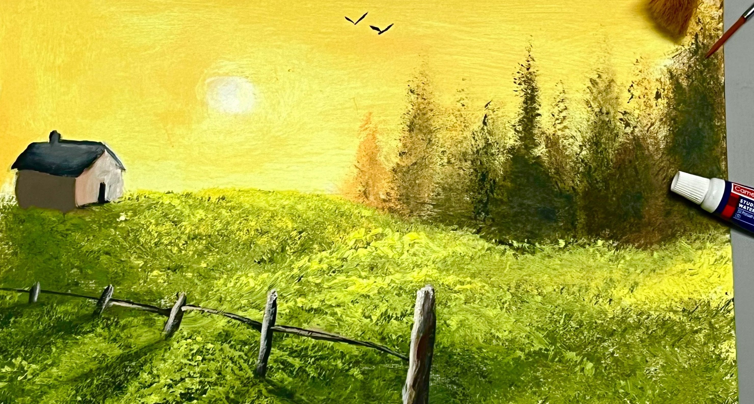
2. Background Hill Blocking In: Hi, and we'll come
back to a new video. In this video, let's
see how to paint in some trees as well
as some foliage. For that, we need a block in. So for that, I'll take in some black on my
modified flat brush. This was initially a flat brush, and I just for my convenience, I just reshaped it, but bring in some
bristles at the bottom. And with usage, the
bristles opened up. So this brush is very good. Of course, this is
mainly required for the highlights and
textures of the foliage. Let's come over here. So
this would be the trees, mainly trees over here. Let's sort of come
right over here and place in some more of that. Or this blocking in also
includes the river over here and the trees over here as well as the grass on which the
trees are growing simply. Let's go ahead and
get this done. I'm just trying
to blend them out evenly so that they dry
out evenly as well. You could even make
use of a fan brush or relatively any bigger brush. But since this is
on small surface, I prefer, you know, this brush. That is a modified flat brush. Yeah, this will go all
the way till there. I'm just using pure black. Because it looks good and it
gives you a lot of contrast. Again, a lot of paint. The better the blocking in, the better painting
you will get. Spend a lot of time on blocking in and let them fit prime. Simple. Then you'll get
automatically natural effects, the realisticness
which you want. He roughly marking it just for my understanding.
Here there is a river. There is some grass on which
the trees are growing, there's a line which
is filled with grass. On that, the trees are growing. And also, I have these trees. Okay. Now let them drying for at least ten to 15 minutes,
and I'll see you later.
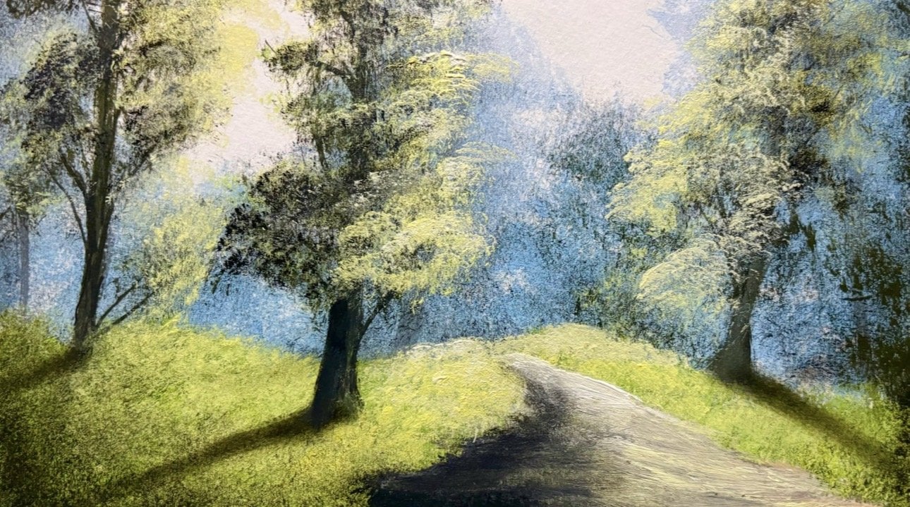
3. Foreground Tree Blocking In: Hi, and welcome
back to new video. In this video, let's
go and see how to paint in a pack lit tree. For that, we need a
brighter color relatively, so I'm going to take
in some lemonloo? And I'm taking this laminlo
on my modified flat flash. And that's sort of
come over here. Sorts more of that. It's a back lit tree, so
we need a lot of light. There'll be a lot of
light behind the tree. So first, we have to paint
in the lighter color first. And this beautiful little shape. Yeah, that's good. Okay, yeah, I like that shape. You can have any shape you want. Depends on your setting. Depends how big surface
or the painting on. Like for example,
if it's a canvas or if it's a watercolor
paper or an acrylic sheet, you just follow
these techniques, you'll get a realistic paint. Also for the grass,
let's go ahead and add in some of that same color. Yeah, this is just
blocking in part. I place more over here to
just in that contrast. Yeah, I'm happy with that. Now, I've added just
a bit of sap green on that same pile of paint on that same brush
without cleaning it. I've just wiped off the paint
whatever black came there. Yeah. Let's come right
over here and place in some cream to see what's
going to happen. There we go. Maybe we'll extend that
green a bit higher as well. I there. Yeah. Looks good. Take a lot of thick paint case I'm not trying to apply
too much pressure because if I apply
too much pressure, I'll see this
plaque blocking in. To avoid that, I'm adding very little pressure
here there is no ing in, so I can apply pressure. Look at that. I can
apply pressure how muchever I want over there. Look at that, I'll
just show you here. Look at that, we get that underneath the paint which
is there underneath. You got to apply very
carefully tapping it very gently.
Yeah, there we go. So these are the basic
things which, you know, sometimes some
painters overlook. If you follow these techniques, you can get a faster painting. You can paint very fast
and finish the painting. Yeah. Let's come right over here and follow the same
technique over here too, to get in some brighter color on these trees,
beautiful little trees. Okay, so these evergreens
will be like this. Yeah. There we go. I'll let them dry just a bit, and I'll show you
what I'm going to do. So the next video, let's
go and see how to apply some textures on these trees
and this grass. Thank you.
4. Texture For Foreground: Hi, and we'll come
back to a new video. In this video, let's
go ahead and see how to apply some textures and some effect realistic effects on this tree and on this grass. So for that, I'll take
in my old palette filled with just laloor with
which I painted tie. Okay, load the brush
full of paint. Fan brush. I'm using the fan
brush number two fan brush, and this is not completely dry, and we'll take
advantage of that. Let's come over here
in this part of the painting and get in some beautiful beautiful
little grassy effects. Yeah, there we go. We got some fat green color. That's the reason I
didn't let this to dry completely. Look at that. It's going to blend
in with this, blend in the sense it
look a part of this. This actually is a
part of this grass. You want to look like that. You want your painting
to look like that. So I'm just using
that technique. As they're going to go
forward, maybe the light is more is more light and
there's a lot of brightness. Planning it, let's
come right over here. Please more of that, softening it, softening in the sense it's getting lighter. It's almost gray.
When we started here, it was black and
when we came here, it is a gray, not almost grey. It's a gray color. That is
what we want in the painting. I'll create automatic effects. And beautiful little textures which not only make your
painting look beautiful, but also very realistic. Yeah. It's something over here
and there just a bit. Okay. I'll take in more
black and come over here at this corner, okay? And that's too much of
black in the sense, I can't continue
with that amount of black color in the brush
and continue here. No, that's not going
to happen and see, I'll get a black there. That's the reason I avoid
taking that color everywhere. You have to wipe off your
brush, not clean it. You can just wipe off your
brush and come over here on this tip on the upper tip
of this first stroke. Look that, for example,
this is the first stroke. Don't go from the bottom,
go from the top here. We usually work from
bottom towards the top, from the background
to the foreground, especially in
landscape paintings. So that we get a
meaningful effect. It makes sense, and it's going to beautify the
painting even more with depth and not only
textures with the depth, also you can make the painting look very realistic, not
only with the colors, not only with the
textures or adding mist, you can make the
painting look realistic by creating depth. How do you create depth
with the help of textures, with help of some what do you say some
colors with textures? Because things which are far
don't show a lot of texture. If you want to observe
any anscape painting or a landscape photograph. Okay, so I'm happy with
this. I sort of here. Maybe we might have to
come here and paint in some more of that brightness. Now we'll jump on to this tree. Here, I started from the
corner for the grass. But for Blet trees or
any balet element, especially in landscape, let's come here and start off
not exactly in the middle. We don't want it
to be too perfect. Otherwise it will
not look realistic. Let's come right over
here and sort of place in some darkness of shadows on
this tree in the middle, not in the dead middle,
not in the dead center, just here and there, as if
you're creating another tree. Yeah. Look, that's
giving you that effect, and I'll just wipe off my brush. Also when you're going to create the that is the texture
on this back tree. Make sure it follows
the shape of this tree. Not too much. Don't
waver shape too much. Let there be some common
shape between this, the texture, as well
as the blocking in that is this yellow color or
any tree for that matter. Yeah, look at that. So here, it's looking very concentrated. And as we go towards the
right or towards the left, I'm not going there
because pain is still wet. You can see paint there.
So it gets a bit open. The bristles open,
the paint gets less, wipe off the brush, and let's sort of see
that effect here. Yeah, look at that. Yeah, I'll go on this because
I'm liking that up. Yeah. There we go. Simple tapping it. Most of it the tapping it. So we need to wipe
out the brush again. Yeah, let's come on here. You can add in a bit
of brown if you want. Just a bit of brown, just a bit of filoca. To get that golden effect. But of course, black will
give you a contrast. Can I add those
colors with black? And let's come right in there, sort of given that effect. Look at that it's giving you
natural effect now itself. So what we'll do is now we need to handle the edges
of this tree. So for that, I'll just take
in some paint from there. Otherwise, you can remix
the color and keep it. Yeah, something like that. Let's come over here and
placing some more of those. Just happen very lightly,
very, very lightly. They should define those edges. Yeah, there we go. Define those edges
and to big that blocking in part just for that. I can go a bit hard
here because you know, I went a bit hard
because then we had to break in that
blocking in line. Okay, so in the next video, let's code and see how to
bring in some highlights and depth on the tree as well
as on the grass. Thank you.
5. Highlights For Foreground: Hi, and we'll come
back to a new video. In this video, let's going
to see how to paint in some highlights on this
tree and on this grass. First, we'll go with the tree. For that, I take in my
modified flat brush. I've taken in some lime, a bit of white and
touch of sap cream. Let's come right away
here and the natur little textures on this tree. Simple. It's a Bl tree, and it requires some textures. This not applying too much
pressure here as well. Each time you go back
and reload the brush, you may change a
shade, for example, add in some more white or cream or see what's
in food there. Look at that? Added
more lemon now. Let's come over here. Place some more color. We don't hide those
what's behind. Let them also pop, so
it looks realistic. Look at that. Let's right here. Maybe the light is
coming from the left. Tapping it there
with no pressure, almost zero pressure almost. Change the flavor,
change the shade. Come over here and listen
more to colors and textures. You can pretty much
translate this to any fandscape paintings just
to grow here and there. Yeah, there we go. We have it. Something that here too,
don't have too much. I want to overdo the highlights. Let's just bring it right here on the left
part of the tree. I'll take a lot of white and some limo and clean
this up just a bit. Sort of here and
there, not too much. It's very little pressure. Otherwise, chances
of blocking in color mixing will be high
low up plato pressure and ensure your pressure is
completely dry and also backdrop is complete Okay. And over here, dancing
something that colours on the right
side of the tree. Now we'll take my
fan brush textures will come over here and some
place in those textures, beautiful little textures here. Just tapping it decently. Not too much pressure. Too bad. Reload rush. Plc and simple. Yeah, I like that side. Look at that. We get a
natural effect now itself. Now let's go to
paint this grass. To paint the grass,
I'll take some limel and some white and I'll
add some sap green. I added some sap green
onto my palette. Let's splend those
colors and get a beautiful little
soft green colour. Now we need it even brighter. We'll go to some
white and lemon. I do there. Let's extend this. Just a bit. Yeah. I don't come over here and place
in the highlights. Here and there. Okay, I'm seeing something different,
which is unique. Let's stop there. Let me get in some more over
here too, as well. Let's go with some
black coat of texture. So now I've cleaned my fan
brush, you can see here, and I'll go in some black and some sam
green as you can see, very huge amount
of paint loaded. And let's combine it
over here and place in that highly loaded paint. Okay. Now go back
and wipe the brush. Because as we're
nearing the highlights, we don't want the
highlights to get spoiled. But you want texture.
Together texture, we need a different
color. Here, it's Black. So tap it very lightly and take off as much as
pink as you can. Yeah, there we go. That's here too.
Don't it too much. Taking some third color
from there in the corner. That also acts as a palette
at the same time. Packing it. Yeah, there we go. It's
something over here too. We'll make it a bit
pronounced here. Bit more detailing
the scooping it up.
6. Background Element Highlights: Hi, and welcome back
to a new video. In this video, let's
go and see how to paint in some foliage on this little piece of blocking
part and some grass. So to paint, I've taken
in my modified sat brush. Loca, this is loco, this is am and some
cream, sap cream. Okay. Let's get in that colour beautiful little almost
like a golden colour. Let's sort of come
and here. Yeah. I think this is a
good place to start. Do not tap it very hard. Don't tap it hard at
all. L here and there. Yeah, there we go. Maybe it's too bright, I think more floco. So this is this
is in the forest, so you have to maintain
that effect. Yeah. Let's over here. I'm taking thick paint, but also this comes
with huge commitment. When you've taken
a lot of paint, you have to ensure
that you're applying very little pressure because if you apply too much pressure, the texture will look
like just a brush stroke, which is commonly, scrubbed. So you don't want
that. You don't want that scrubbed stroke. And look at that.
It's going to create some pockets by itself
just by tapping it. So that's the thing which
has helped me to get realisticness on these
trees and foliage. And also change the flavor, change your shade, not
the color, but the shade. Like for example, you
can add more lemon and you can add in
more green when you go back so that it
looks more layered. I strap in it very hardly on the palette but when
I come onto the canvas, I ensure that there
is no pressure. No pressure. Just strap on it. You're in that. Yeah. So
let's take in some green now. Sort of come right over here, sort of break in that
line of that block then. Actually, if you take more paint on the brush
for this technique, it'll be useful because you
will get good textures and rough textures like foliage or some rocky tues if
you're painting rocks. Yeah, there we go
and here and there. There sort of patience. Just patience here
and you will get it. I'm damn sure you'll get
it if we do very slowly. Look at that? Yeah. That's effect I wanted. Now we'll take in more of loca as we come
towards the left, just to add in some more warmth. So that'll add in
depth to some extent. These are the little
things which you have to look out for when
you're painting. Okay, so let's come. Yeah, there we go. Sort of lightly
tapping it. That's it. Simply. But also, you have to maintain the same rhythm
when you're painting. I've ensured that this
is completely dry. That's one. Take in a lot of paint, apply very little pressure, and break in that line
is very important. Otherwise, it won't
be that realistic. Yeah. Look at that. There we go. We take a lot of paint, you can stay there on
the canvas painting the foliage for a
longer duration so that you don't
have to dip the brush again and again and
again on the palette. There a little bit more to go. You can make use of any other
used brush paint brush. Any other used
brush, for example, the tree and texture brush doesn't give you
the same effect. You can use a tree
and texture or the other brushes which are
used for getting textures. You can use them for getting textures after you've blocked, don't use them for
the highlights. But sometimes let's say you're painting on a
very small surface. So that point in time,
you can do that. Yeah. Let that not be even. Look at that, you're able to see this hides come over here
and creates more of those. Over here and there. Not much. Yeah. So don't skip the
spots like that and paint, it won't be feasible at that time if you
keep on switching. So don't do it like that. Yeah, it's giving you
the real skip almost. Yeah. There you go. A little bit more to go in. Yeah, I'm happy with this.
The texture very texturis. This is a texturized
painting. A lot of textures. Yeah. So doing it there. I make sure there is some
gap between the bushes or the trees or foliage,
whatever you're painting. Just ensure that
there is you know, there is some gap. Like for example, gap, this
one and this one, like that. I'll give you even more
and a lot of depth. So cover it there
and over there, I'll take very little paint
to get more textures. Step in it. But for that you need to
choose the right brush. That's also equally important. Not bad. There we go. We're done with this part
and we're left just with here in another one. Yeah, there we go. Okay. So the next painting, we'll go and see how to paint the grass right
over there. Thank.
7. Grass Painting: Hi, and welcome back
to a new video. In this video, let's go and see how to paint in some grass. So for that, I'll take
in sap green mixed with whatever pile of paint
I had on my fan brush, the old fan brush, which
I used previously. It's sort of mix in a beautiful little mid tonish green
color for the grass. Let's come over here. Let there be some gap between the foliage what is there
above and the grass. Okay. That's what's
going over here. And may just go and tweak in the shade of the grass so that
they don't look the same, and get a lot of variety. I've not added water till now. Turn the brush. This is a fan
brush, number two fanbush. As you go there, they
get thinner and here they'll be very thick and
dense and very detailed. Look at that. There we go. And now I add some white
same pile of paint. Come on here. Some
of that. Make sure. Like the tip of the brush is
facing towards the ceiling or roof. It looks like. Let's change some white
and mix it again. Let's get that effect. Look at that. Just
simple tapping it. Yeah, there we go. Yeah. O. So we've painted the grass till now and we have painted on the brighter
colors the midtone. So for in contrast, let's take in some black
on the same old brush, I've wiped off my brush so
that this doesn't turn gray. Good brush, full pink. But when you're going to apply
the texture, same as here. Very little pressure,
almost no pressure at all. Tapping, simple. Bit tapping will make it
look professional as well. Start off from the
bottom and you may work towards the top of the grass is what I meant. Here. Now we'll take an
even thicker paint and come onto this corner and place in some darkness because this is near and
it will create the depth. It's very important
to achieve the depth because just by
textures or the colors, they also contribute to depth, but a lot of it's
done with textures. Yeah, there we go. Now I've taken lightly some of
the same light color. Let's come right over here
and stab it even lighter. Yeah. Same color, not
lesser this time, so that we get that realistic professional look
for our painting. Okay. Now, I'll switch to the
modified flat brush, and let's paint this grass. Is a lot of detailings. Yeah. This is the same brush where I used to
paint the foliage above this is not
completely dry, so we need to be
very careful not to apply too much
pressure, especially now. Yeah. Yeah, life is not affair. I hope you're like
me to increase the height of that grass. Both of them look the same. But now they look different
because of the color, choice of colors,
angles, shapes. That's the way I go. Usually
the approach this approach I take here and there. Yeah, that's enough. So blending it, over tapping it. So the next video,
let's go to see how to apply some reflections.
Thank you.
8. River Reflections: Hi, and welcome
back to new video. In this video, let's
go and see how to paint in some reflections. So I've taken the same color, what is it above or
approximately on my modified flat brush and
take this tip of the brush. Sort of get in the chips. Approximate shapes, you know, just like not trying to, you know, tap it too hard. Yeah, there we go. And it's
a bed over here and there. So tap it. Just tap it. Don't over tap it. Otherwise, it will
get over blended, and you might not
get that effect. Yeah, use a different finger. Or even if you have a blender brush painting blender
brush, you can use that. Yeah. Just a reference. I'm looking for some warmth in the water as well
because I want it to approximately reflect
what has been shown above. Yes, I was sitting
there on the crush, the care of the brush,
and you sort of tap it. And when tapping it, I'm just
trying to blend it as well, not just tapping it.
Trying to blend it. Yeah, there is he
has to something. I'm afraid over here too. Now let's try to
blend all of them. Now I'll just take in
some sabrene here. So lily buds to get some interest to attract the
viewers of the painting. I like that. Yeah, that looks good. Maybe another one here. I should bit over
here and there to get that reflective and waters. So you can avoid it
right over there. You can blend them considerably
to tap will do it or just a soft flick of the
finger on that I help. Yeah, there we go. Yeah. With this, I come to the end of this class. I hope
you enjoyed it. Thank you so much for being till the end and I'll
see you next class. Thank you. Take
care and bye bye.
 Yashas G, Paint With Yash