Transcripts
1. Introduction: Hi, and welcome to
the Skillshare class. My name is Avraham, and I'm
a professional illustrator. Together, we're going to
learn all about using graphite pencils to make
this lovely barn drawing. This course is designed
for absolute beginners. Even if you have no
prior experience with graphite pencils or don't consider yourself
very good at drawing, this is the perfect
course for you. We're going to start off with an introduction to
different types of pencils, the hard and soft leads, and learn how we can get different values
from each of them. From there, we're
going to start to learn how you can
make different types of strokes that we'll be
using to build the farm. And from there, I'm going to
guide you step by step from the initial sketch
through how to do the entire drawing of
this barn together. So if you're excited to learn
about graphite pencils and how you can make this beautiful
barn, let's get started.
2. Holding the pencil: Most fundamental thing to do when you're starting out with pencil drawing is first to understand how
to hold the pencil. So there are going to
be two different ways. The first way is the way we hold a pencil normally when we write letters and
things like that, which is we have the pencil between the two
fingers and the thumb, and you have your side of your hand on the page,
and you can draw like this. Another way of
holding the pencil is more like a paintbrush, where you hold it
from the outside. And here, to stabilize it and get a
little more sense of pressure, you'd put your finger as a stabilizing anchoring point, and then you can draw like this. Okay. So these are two different
ways you can draw your pencil. Now, for warming up and getting used to using the pencil and what you can
accomplish with it, there are some exercises
that I recommend. The first is to start with
making circular motions, where you start above the paper with a pencil
not on the page yet, and you make a circular motion. And what we're going
to try doing is making where gets harder and
then light as you go along. So I'm going to press down
and then go up like this. It starts soft, starts
hard and ends up light. After you do this, you can
try doing it the other way where you start off
light and then do it hard. So we practice
this a little bit. These are a good warm up
exercise to do anytime. You could also so that was
holding it as a pencil. You can also try it now to
do it holding like a brush. Flip it over. It will
start from hard to soft. And then we go soft to heart. I have to have done
this a few times. The next exercise we can do
would be do the same thing, but with straight lines. So we're gonna make
varying the pressure and seeing what types of strokes
and weights we can get. So you get hard and light. Deep values and light values. And go side to side. And try the same thing again, holding the pencil like a brush. Well, use your whole arm,
not just your fingers here. You'll notice that when you're
doing it from the side, holding a paintbrush,
the strokes are wider. If I'm doing it like this,
the angle of attack, per se, is you're coming
at a higher angle so the strokes are sharper. But when you're holding
it from this way, you get much more
the broad length of the pencil. In the
next lesson, we'll get
3. Intro to Pencil Hardness and Value Exercise 1: Serious about getting
to pencil sketching, I recommend you pick up a
set of a range of pencils. This is one that I
got from Amazon, and it comes with a
range going from A, B, all the way to H.
What do these mean? B B represents a
soft lead pencil and H is a hard lead pencil. The higher the
number is either the softer or harder of that lead, and HB is right in the middle. It's possible to achieve a lot of drawing
with one pencil, but there are many
options out here, and each one will give
you a little advantage if you're trying to
achieve a certain effect. So in this lesson, we're
going to get familiar with the different options of
what each pencil can do. We'll take a subset
of each of these. So we're going to
start off with the HB, which is our middle grade. It's not too soft
and not too hard. And then we're going to
go fan out from there. We're going to take a
two B and a four B. And a six B. So these are increasingly
soft pencil lens. And then on the other
side, we're gonna go for a two H, four and five. If I had a six, if this
set had come with a six, I'd be using that one, but we are going to
make do with this. And this is really
more than enough. Now that we have our pencils, I try to keep them
arranged in order, so I have them here
from the soft on this side to the hardest
on the right side. What we're going to do
is create value studies. We're going to try to
do is create a range of pencil marks to see if we can go from very dark to very light. Ideally, we're going to
try to get ten gradations and we're going to use the different pencils
to see what we do here. So what we're doing is first, let's just make some squares. I'll use my HB one and
make ten squares here. Here we are. Ten squares. And starting with the
darkest and moving to light, we're going to try to go
from the darkest shade to the lightest one and see
if we can get a gradation. Now, what we can do is what the advantage of
these different pencils are is that the darkest that you can achieve with a hard pencil is nowhere near
as dark as a soft pencil. So, for example, if I put this
five H and I press really, really hard with over here. And right next to it, I'm gonna put down the six B. Can you see this difference? Let's keep going a
little bit closer. You can see that there's a drastic difference between the darkest darks
of each of these. I wouldn't recommend using the five H for all these values. That said, we're going to break up these ten into groupings. So we're going to
use our six B to handle the two darkest
values over here, say six B. Then we're going with the four
B to handle the next two. After that, we could use
our two B over here and HB two H and the four H and my five H or if you have a
six H, you can use that one. Okay, so that's the idea here. Starting here at
the darkest dark, so I'm pressing as hard as
possible, fill in the square. Moving on to the next value is going to be slightly lighter. So I'm going to continue
using the six B. But this time, I'm
going to apply a little bit less pressure. It's always easier
to make things darker but not make
things lighter. So we're going to
start off with a somewhat lighter variety here, but this is too many steps away because if we go like this, we're never going to make
it to zero over here. So I'm going to reapply this going over slightly
darker again. There. Now these two
gradations are very similar. Next, picking up the four
B, and we'll continue on. So here we're going to. We're going to fill
in this square. Trying to get trying to get the value just layer
than the previous one. I'm not pressing as full
hard as I could on this. But I'll go over a second
pass and make it darker. You notice I'm making slight
circular motions here. I'm not just going
back and forth. I'm not going back
and forth like this. I'm making circular motions. That helps fill in the area
in a more consistent manner. So I pressed fairly
hard on this, but still it's slightly lighter. Our next one is
the four B again. And we're going to do,
again, a light pass. Even if it's not coming out exactly as you would
like it to be, it's still just getting used to the pressure and the pencils. And you get better with time. I still find this hard myself, and we'll see how it comes out. Going over the square again with a little bit
harder pressure. Looking pretty good so far. When it gets to lighter
and lighter ones, it starts to get a
little bit tricky. Alright, two B, the last
of our truly soft pencils. Pressing very lightly. Because of soft pencil, so it puts down lead
dark pretty quickly. But Moving on to our HB pencil. Again, starring very soft touch. I find when I first put
the pencil onto the paper, the lead might be a
little bit sharper. So you see right here, this area, it's a
little bit darker. And then afterwards,
it starts to mellow out and become more even. The rest of it now,
you can see is very smooth, even coloring. So for that reason, it might be a good technique
before you start coloring large area to go in another
part of your paper or spare piece of paper
and first go like this to smooth out the lead. Let's try a technique over here and try to smooth this out a
little bit before we start. And now, over here, it
should be a very smooth, even coating that we're doing. Let's lighten up
my pencil touch, light up my touch to a little
bit lighter. Less pressure. And now that I've laid
down this first coat, I can see that I can really increase it just a little bit, make it a
little bit darker. M mistake. The last one is
going to be actually blank. So we have three more to go. Sorry. And this last
one is to be pure white. Small correction there. Okay. So where four
H for these two, and I'm trying to get a smooth
pencil right now. Okay? You'll notice also
that the softer leads, they cover a larger area more quickly than the harder pencils, and that's because the
soft lead blunts faster and so you can have a wider
area versus the hard leads, stay sharp even when they
are a little bit more blunt. So it takes a little
bit more time to cover an area that would be using
with a harder pencil. And last but at least we have
our five H for the softest one. Here we are. So we have our ten grades of value from dark to light
using these seven pencils.
4. Value Exercise 2: Next thing we try doing is
the same type of exercise, but now using one pencil. We're going to draw our squares. As I said before,
don't worry how well this is coming
out for you because, like, I personally
think that this one may did this a little too long, and I could have done that
a little bit lighter. But the idea is that as you just work more
with your pencils, you'll get familiar and
build up the skill, even if you're not
seeing it immediately. Make sure I draw enough
squares this time. Okay, here we are. Now, let's see if we can
do it all with one pencil. I said before, the two B
is a good choice because it's not too soft
and not too hard. I'll get you a little
further dark than the HB. But if all you have is
a number two pencil, then you're welcome to try
this just with that as well. So I'm pressing really
hard right now, and I'm seeing if I can match the hardness that we have in the sample
right above it. It's not quite as dark. It's close, but it's
not as soft as a six B. So it looks like to me
that what I'm getting with this one is closer to
the second value range. So here, make it a
little bit lighter. So this pass is
obviously way too light. So now I'm going to
go and do it again. A second pass, slowly building up the depth of how
deep the value is. I'm gonna slightly swivel the pencil so I get a
little sharper edge here, and that'll help me lay down a little bit darker color also. Next. Take your time with it and enjoy the process. And don't worry about
if it's not coming out just as you
expected it to be. Part of this exercise is
also just learning how you can gauge the values and how by going over an area a second time
or even a third time, that you can subtly vary
and change the value. Alright, so now here, I
have to start being really careful about how much pressure
I put down on the pencil. At this stage, I'm
having it just lightly touching
for my first pass. And now I'm gonna go on
a second pass slightly harder and lighter still. I think one pass is all
I'm gonna get out of that one. And now here we go. And then our last one
really, really light. The barest indication
of a pencil. Wow. Right. I think
it worked out. I could see here also that I was maybe a little too
dark on the top ones. I could have gotten a little
bit lighter in general, because if I did
this with a two B, so for sure, with
the other pencils, the harder pencils, it'd be also easy to get
those light values.
5. Value Exercise 3: How are you feeling after
those box exercises? Because we have some more. So now, what we're
going to do is we're going to do the
same type of exercise, but we're going to go through
and make a gradation, okay? So we're going to
have a long area. It's just draw out an area here. Here we are. And the idea is we're
going to go from dark to light where it blends
seamlessly as much as possible. This is not an easy
exercise, and again, even if it doesn't
come out the way you're expecting or hoping to, it's more the practice is giving you familiarity
with your pencils, even if the result
isn't perfect. So let us start here with
our six B and very dark. If at any point you need to
go on sharpen your pencils, please feel free to
do so you want to have enough lead to do this. Okay, so here I am.
I got to this part, and now I want to make
a lighter area here. So let's figure out first what the next level is over here. To make this darker. Okay. That is our six B gradation. And now we're going to
go and work on our 4o4b. So I should be over here, right? Um, anyway. Trying to make the
transition seamless here. And then from here,
we're going to go the next layer level lighter. Okay. Up to our two B. But it's interesting to compare and see, are you able to get the same value as when you're
doing before. Mine is looking a
lot lighter, a lot, but it's looking just a
tad lighter and so I'm a little bit concerned
that I'll be able to make it to the
end of this example. But that's our two B and
moving on to our HB. T H I have to get three more
levels to add this. This looks very hard. I'm not sure if I'll
be able to do it. I'm pressing as light
as I can with this four H. And I'm going over
it one more time. And now one more time, and
now one more block of four H. And this time only
going over it one time. I'm not even sure if
you can be able to see this on the screen. It is very, very light. And lastly, here we go. All right. Here we are. A gradation of values using all of
our seven pencils. And I'm sure you know
what's coming up next. It's going to do
this one more time using only the two B pencil. So if you're ready
for that, let's see how that's going to go.
6. Value Exercise 4: One more time, we're
draw our guidelines. Check. There are two
B has enough lead. Looks like it's doing fine here. And here we go. Starting off as dark as
possible. Our black. Spinning the lead, another
pass to make it even darker. Okay. And now let's go and see how we can lighten
this up just to touch. All we're using all
the same pencil, so it's gonna be a lot
more of a challenge. I'm working really hard on
trying to make this dark and just a value slightly less than the first one because as you
saw in the previous one, we ran out of color
values a little quickly, and I'm trying to do
a better this time. And that's the
whole idea of doing these exercises
that you just get more familiar pencils
and better each time. That's the hope. Even if you don't get
better each time, it's still just an
enjoyable process, and eventually you'll start to slowly see
improvement. Uh huh. Okay, that's three.
Moving up to four. I'm not sure what's
causing that over here. There's nothing
underneath my table. But whatever. I don't
know. Lost that. So you see how important it is not to interrupt while
doing this because this little blip over here is darker than I would
like it to be. But we'll just ignore that area, and we'll just go compare it
to what's right over here. One, two, three,
four, five, six. You can actually see these
differences, can't you? Seven. So we have three
more of these, right? 78, nine, and then 100
or whatever it is. We have 11 blocks. Okay. That's number seven. And now it's getting
really tricky. Okay. I was eight. Nine and And the last one here. Wow. Wow. Yeah. So again, this was a little bit
of a hiccup over there, but aside from that, I think this value study came
out really well. So I'd love to see
how you did on these. You can share them in the
Pj resources section. And again, don't worry
how they came out. Mine was definitely not perfect. You can see we have some
things here and there that aren't exactly as
well as I'd like it to be. But the idea is still it's
training and learning, and that's the most
important thing here.
7. Creating Textures: You're familiar
with how to create different values
with the pencils, the next most important
thing is to understand the fundamental strokes
you can get with a pencil. So for that, we
don't necessarily need so many different pencils. I just chose a few
here, a medium, hard and soft. We'll start
with our medium one. And I just want to demonstrate a few different types of
strokes you can get here. There's for sure not
an exhaustive list, and as you go along, will definitely find your
own that you like to make. I just want to demonstrate
a few here that I find are helpful in the
drawings that I make. So first, we're going to create a pattern by just doing
short up and down strokes. Even pressure the
whole way through. And there's a little
bit of gap between them to create this texture. We can compare that
with one long stroke. It's the same area,
the same value. But do you see the difference
whether you're using a one longer stroke or
three smaller strokes? And we can do the same thing going horizontally,
short strokes. And you can see the
little areas here. So they're not all connected. And we can do the same thing with
longer strokes like this. Similarly, we could
have diagonals, right? So we have diagonals like this. Let's try to get that bitter.
Go all the way across. So herring bone
pattern over here. We could also do wavy curves. Long or short. So there's different types
of strokes we can get. Also, we can change
the pressure. So we can start off
hard and go light. So we start like this and then lighten up
as we move along. Also, we can do a whole bunch of We can mix up our verticals, horizontals, and diagonals by going like, little patches of each, right? There's all using
similar pressure. Try to make sure that each one
is a little bit different. And then we can also vary our pressure as we're
doing that as well. So we could have some
lighter and some darker. See, these are all different
types we could do. As we do our curves, we can star of hard
and get lighter. And then we can also do
strokes where we're doing, like, just hard back
and forth like this. It's almost like a doodle
filling up this area. Parent like that. For more
organic type of strokes, we can go something like this. We have small, like, groupings of three or
four grass blades, we could say, where you
start hard at the bottom, and then it gets
lighter as you move up. I try to stagger
them a little bit because all these little patches don't grow
at the same height. And then we could
make it slightly use the same idea to make
tree branches by making long strokes where it's hard
digging and softer as it goes up and slight curves where they're attached
to each other. If you make reads, you
would just do longer at the same mostly from the
same area, right? That's how a bunch
of reads would look. We could also make a different
type of style of grass if we keep everything more
or less on the same area, but keep them further
apart like this. Not as much angling
to each stroke. And we could also do a type of stippling effect where
we're doing just dots, really small areas where
it's more in one area, and then we will
make it lighter. We do less and softer
dots as we move along. And then maybe a
type that's helpful, a style that'd be
helpful for bark is to do a stroke
that's up and down, not taking your pencil
off the page like this and could vary the hardness of how
much you're pressing. So these are a whole
bunch of different styles that you can do. I encourage you to
experiment with more and see what
it come up with.
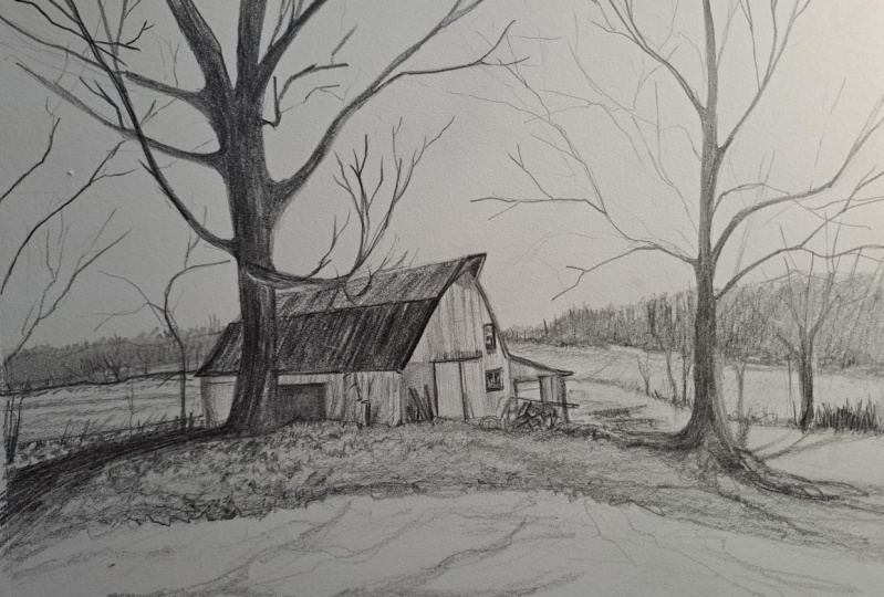
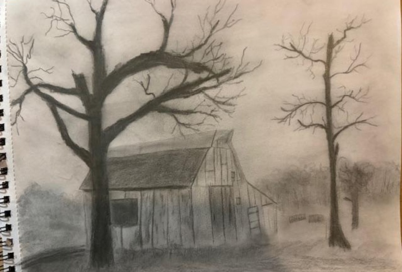
8. Sketching the Farmhouse: I want to take these skills
that we've acquired and apply them to drawing
this farmhouse. It's a fairly
straightforward scene, but it's going to require using all the things we learned and applying them to make this work. I've chosen four
pencils for this, six B, three B, H, B, and three H. And
the reason for this is most of this picture
is fairly dark, and I want to make
sure that we get some really dark
darks in for that. And then there's a lot of there's a little
bit of light area, and so for that, I
think our three H and HB will be enough. So with that in
mind, let's begin. I'm going to start off by sketching out the general
area of where everything is. So for that, most
important thing is first, we're going to see we
have a horizon line. So horizon line is sort of
going to be around here, it looks like, very gentle. Okay, and it goes to here, but on the right side, we have mostly trees
in the background, like in this area maybe. I might draw it a little
bit darker than I normally would just so it
shows up hopefully on camera. But normally we do very, very light, just barely
being able to see it. Okay? We also have
our main attraction here is going to be the barn. So I see that it
goes to around here. The roof comes down to here, get the basic angles
and shapes of it. And if we make any mistakes, that's why it's in pencil. That's also why it's light
so we can we can erase it. Let's some trees over here. And now we have some
big trees on this side. So we're just
basically getting in the general area of
all the objects, and then we can
start to focus on how we're going
to color them in. Mm Sal I want to make this
one a little bit lower. So a little eraser here. Fine. What I want to do,
actually, is I want to move this branch up a little
bit because I don't want the I don't want the tree trunk and the branch and the roof
to be touching so much. So I'm going to move this
up just a little bit. It's very rare that branches grow in parallel to each other. So try to make so that they are moving in different directions
to each other. Okay, so you have a tree that looks like
this a little bit. On this side. So another tree over here. Trying to gauge the width, like the width of this tree
compared to this one, right? So this one's slightly less. And these tree branches on
this tree are much thinner. I'm not going to
drive myself crazy trying to match every
single branch over here. We're just going to
give a general feel of what the branches are. I'm getting some
major ones right now, and then we'll just
move on from there after we have the major ones. I do think it's very
helpful when the branches overlap like this to give
it a lot more realism. Okay? This is our these are the
trees in the background. And then in the foreground, what else do we want
to add in here? Because I don't know
if I want to put all these different details, let's go get in some of the other structures
that I see on this barn. So we have a darker area
over here of something. We have a small
window over here. And then we have another window that seems to be
almost underneath it. Just a little bit to the side. And then we have some
structure over here, something something darker here than a later door over here. I chose a picture
that is in black and white because that way we
can focus on just values and tones and not get caught up in colors which might
be harder to translate. We also have over
here. Let's see. We have you looked like maybe, um, logs of some sort. Not entirely sure.
And then a pole. It goes here. So shadows in the foreground. And I think we can put those in a little bit
more later anyway, but just be aware of them. Okay. So now we have this. I can put down my 38 pencil
and I can move now to maybe my three B and start laying in some
of the darker areas.
9. Tree on the Left Side: I'd like to start with
the darkest areas first because that
way it will give us a sense of how dark we can make things and then make the rest of it lighter
in comparison. I also find that I've
typically had more of a challenge of being
dark sometimes. Pencil drawing sometimes end up being a little
bit timid and light. Now, one thing I'm doing
here is I'm trying to mimic, as in the previous example, is the strokes should follow the direction of the structure
is that we're building. So I'm doing for this tree, I'm doing long strokes
to mimic the bark. Leaving a little bit of gaps, and they're not entire
they're mostly straight, but slight variations
and moving side to side, because that's how bark is. Alright? This is, again,
just the first pass. I'm going to try to
make it darker and darker because in
the reference photo, I don't see any light there. I said, I have a tendency
to go light sometimes, so I have to work against that. Sum moosive strokes are
straight up and down, but they're slight angles. Being all the way
to the bottom here. I'm looking for the most part, this tree seems to be
a pretty uniform level of darkness all the way through. Mm hmm. Do now is come in
with a darker my six B and to really add
in the shadowy areas. So you can see how by
adding in the shadow here, it's going to really give it this volume and depth, right? So we can do that. But before I do more, I
just want to I want to continue filling in our
tree, the major area here. So now, when I'm coming
to the side branch, you see it's I'm not doing
up and down strokes anymore. I'm going to the side because now this is where the
branch is going over here. And then we turn to the
edge, we turn the edge, and I come up this Okay. Over here coming
in from the side. Horizontal strokes more again. Is how the tree sort of turned
these awkward angles and sudden without any
real rhyme or reason. And that definitely helps add to the realistic
look of these trees. All this is really at the same
darkness, the whole thing. And for here, this seems
to come out like that. Okay, over here. And now on this side, I'm
seeing that right now, this could actually be
a little bit higher relative to the sourced picture. So it doesn't make a
big difference to me, but why not make it a
little bit more accurate. So I'll just raise it up here. Just a few more brushes to go. Making sure that it
tapers as it goes along. And over here, it
can erase some of these branches that are I
drew a little bit too low. Over here. So when we get to over here, we can start doing that
type of flicky motion. But I want to wait until
we get more things done. So I started to do before here. We'll get our 60
pencil now and come in and add in really
a lot of the shadows. So over here, for example, like the one limb reaches the intersects with
the other one over here also, The underside of the branches. I'm doing short back and forth strokes at different angles. Sometimes I'm doing it this
way and sometimes that way because the training to simulate the bark a little bit
and the irregularity. It's not a uniform type of surface that would
have the same type of shading everywhere. I'll go with a slightly
lighter approach and just fill in a little bit some
of these white spots here. I'll leave a few because
they could be like little accent points on
the tree bark, right? And then we can also
do a little bit of some really hard
presses here and there, for shadows in the bark
cause those exist too. I'm spinning the
pencil as I'm doing this because it's a
blunt pencil, right? The lighter pencil
blunt very quickly. And so in order to get
a sharp lines here, I need to spin it a little bit, and that'll help get me some of those
sharper, darker areas. Okay. So here's our first tree.
10. Farmhouse Structure: Move on to the barn.
Okay? So the barn, we'll start off again with our three B, and we're
going to lay down. We have the roof. The roof has a few different
sections here, right? There's the top part,
which comes to like here, Something like this,
and then we have the next part of the barn here. So let's work on that. I'm going to come back to this branch after
we've done our barn. So I'm doing long strokes following the contour of
the shape of the barn. Right now, I'm just doing an even back and forth
on everything. Still in the direction
of the barn, the roof, because the discerning eye, you still will be able to
see them a little bit. You can still see
it's in an angle. You can still see a slight
diagonal in the strokes here. So now that I did this,
I want to come back and put a little bit of accents between some of them to show where the different
panels are, I guess. Trying to get the top to
be pretty straight because it's the outline of the
barn is very distinct. It's straight lines. It's not doesn't have anything
unusual protruding from it. Okay. The next segment
of the barn roof, we're going to go
down much darker, and it is very similar to the darkness and
value of the tree. So it might get
lost a little bit, but that's why it's important to have the different
directions, right? So if we have this
in a direction like this in a
direction at angle. So even though it's going to look very similar to the bark, it'll end up being a
little bit distinct. I'm spinning my pencil
slightly as I go along just to keep
the intensity up. The edges are the hardest part for me because in the middle, I can zoom along like this. But in the edges, we want
to make sure it's level and even because the pieces of wood are fairly even when they reach
the ends of the roof. So maybe we can
just zoom along on the middle and we'll come back and fix up the other
part. Let's try it like this. So here, and I'll
come back to here. So it's even though
it'll be easier at the edges to just go in a
different stroke motion, but the eye is going
to notice that. So I recommend that even though it might be a little
easier to do the other way, you'll have a better
result if you can continue your strokes always in
the accurate direction. I'm going to have this in. I do also a little bit darker. Okay. Get our six B and
we're going to add in some stronger lines every so often to match what I'm seeing in the picture and
the different boards, right? Because we have these boards
in here and there are irregularities and things
like that that make it really more realistic. Now, you'll notice that the
value of this lower part of the barn is crazy different
from what's above it. And obviously, we have
to go over that top one again and make it a little
bit darker, as well. So let's just go to
protect a piece of paper over here and
go over the top one, try to match that
a little better. It's always better to be a
little bit late sometimes because then you can
darken it up afterwards. So I'm working from this
edge because I realized the wood runs
slightly different. It runs a little bit
more of an angle. And so hopefully that will
fix it up a little bit. In the top, it looks even more of an angle like this
perhaps for a little bit. So even though these
are all wide areas of color of the same tone, but because of the way the
pencil strokes are going, you can actually see the
different planes here. Okay. So this is pretty good. I do want to add in a little bit more six B again here and a little darker air over here the weathering
of some of the wood, and now let's lay in the barn, this darker area, and
then we'll come in and put the rest of the lighter
part in afterwards. So here it's coming
again from more of a vertical direction. It's darker than this. I'll
have to go over it again. Okay. So now we
have that section. Let's go and do our house. So I'm debating if I
want to do it with the HB or the three B. I think I want to try it with a three B because then I can press
really hard and still be a different look because it's
such a hard lead, right? So you can see I'm pressing
fairly hard right here, and it's still quite light. Do we a second pass over
a few areas here to indicate where maybe some of the planks are for
the side of the house. Mmm. I'm holding the pencil
back further now from the tip because I want to
get a little lower angle, and to be honest,
I'm better holding pencil this way than as a brush. So if I a brush, it'd be even lower, right?
We could try it out. Okay. And add in a few more of these lines for the beams again. There are other things here
that we have to take into consideration the trees that
are growing on the side, and we'll get them in soon. Okay. Now, from here, we can do the same thing. Look at how strong
that line is there. And continue on to the
front of the house. There are, I see here, like, this area right
there is lighter. So this area we have
to do very gently. And after that, we can make
it a little darker again. And underneath this
hair is gonna be a little darker. Mm. Try to a full wash or
say this whole area, and then come back in
and add more details. So, for example, we have a very strong line
that goes over here. In fact, I shouldn't
be using the four for that one. The three H. I can use an HB and get
a little bit darker on it because it is pretty dark. And the window also Then the window below a similar idea. Here I'm going to
use here I want to use actually the three H to get the very sharp definition
of the window frame. I'm not doing full lines.
I'm leaving little spaces. Because we're not doing a we're not doing an architectural
drawing here. We want to hint to it. So let the eye fill
in the details. Okay. So this area,
sort of like a door. Darker area on top here. Um Okay. Now what's some of the
darker areas over here, we have something dark here. Hmm. This looks like a type of tree, maybe. So I'm gonna do short
strokes the outside, like the showing a kind of
branches coming out here that. And this on the barn itself
is sort of like, again, discoloration or just warping
or coloring on the wood. So I'm doing it very
straight up and down on that a little darker. You're also Okay, and on this side, we have something
that looks like a piece of wood or something
leaning up against the barn. Here we're doing
something darker in this direction to match the
shape of this piece of wood. So since it's darker,
it's going to cover up the straighter lines
that we had underneath it. But And then we have where the shadow
is underneath the barn. Darker at the top, it fades
off as it gets lower down. And then we get back
to the bottom here, it's darker again
because there's this thing growing over here or something. That's pretty good.
11. Vegetation on the Left: Let's go and start on
the left side here. I use my HB, and we're going to be
putting in these trees. So for that, we're
going to have, um, mostly up and down,
long strokes. Causes how branches are. What
I'm going to do now is I'm actually going to I'm going to lighten up this section
here where the top is 'cause I wouldn't have drawn it that
dark in to begin with, and we don't want
to see a line at the treetops. So here we go. Mm hmm. They're mostly straight at various little variant
angles. Mm hmm. Because the tree
branches don't grow in straight lines. But they
are generally long. And they go almost all the
way to the bottom here. There's a small gap where the trunks are and the
bottom of the trees. So we'll draw that in a second. Okay, this actually needs
to be darker than this, I'm seeing the darkness I drew this is really maybe the darkness of the
section underneath it. So let's go over this again. Pressing harder. Again, varying the different
strokes and angles. What's very important to
define that these are trees is that we have a few branches that come
out a little higher than the rest because that's
the nature of these trees. A few of them. They're not all the same exact height
and size. So we do this. I'll just give
that silhouette of trees come in here just
a little bit darker. We'll come back to that later.
But for now, that's good. And now we want to do is the
shadows under the trees. So for that, let's
go to our three B, and we're gonna do side to
side motions like this. Some gaps, but mostly dark the shadow isn't
completely consistent. And then we can add
in with our HB. Are different trunks. And most are the same thickness, but there are a few
that are thinner. Now we can do the
grassy area over here, like we started to here. But this time, tree the grass for sure, is
not going up and down. It's more to the side. So I'm going to, um,
do that like this. Fairly long, but
stopping every so often. You erase this section
here. We don't need that. So they're not exactly
straight lines. There's a little bit of
a curve happing to it. And then after this,
we have at the bottom, Let's get our three B again. And we have here some really
dark, this is too big. We have a darks a
shadow of the tree, perhaps that's what this
is that we're seeing here as it goes over the ground. And we also have small
grasses growing up from that. So let's do a shadow. Make sort of circular
motions for the shadow. Sort of representing how
it's falling over the Earth, clumps of Earth or something. It gets to here, it comes
down at a more steep angle. And just a little
bit more over here. So it's sort of seamless that the grass goes all the
way to that shadow area. And over here, if
you've done that, I'm gonna use the
six B to add in a little bit more darker
areas every so often. Now what's really important at this stage is getting all
those branches and whatnot coming over that are extending
out from this area here. So we're going to start
with the trees, okay? The trees were three B. We have one that is
growing over here. It comes up and it
has a hook over here, and then actually, it's
a little too dark. So that's lining
up a little bit. I didn't lift the pencil up fast enough as we
were going along. Okay. Fine. So like that. And now for here, we have some more things. Okay, the sizing, the
distance I did here, maybe not so exact to what
I'm seeing the picture. So I just have to
live with that. Okay, I know let's get our
HB for the areas over here. Actually, maybe even let's
try the three H for a second. I'm liking that more. I'm not trying to
draw every strand that would take forever.
It's not necessary. The important thing is
to indicate the contour and silhouette of
the shapes as they overlap each other. And
of course, the values. So we're trying to
get the silhouette and the value to match. Over here, there seems to
be some more darker types of grasses or something. I put at more of those in here and the angles that they're flowing out from let's see these little touches
like this that make the whole difference really
sell the picture this area. Also, I see that in the in
the grassy air over here, there's a little bit of
some shadows happening. Let's go put those in also, and they go along the
direction of the ground. When it comes to these
types of things, sometimes less is more because even though your eye might see all these
different things, but when you try to put into the picture, it ends up being, like, overwhelming of, like, these little details just
take on too much importance. So I just want to keep
it pretty minimal. Like this white dot over
here is too much for me. I'm going to gently tap it out. Something like that.
12. Foreground and Barn details: Next we have over here, we have a whole section
of grasses here. So for this, I just
have to indicate it. And what we're
going to do that is first figure out where
this section is. So it's sort of like
over here. All right. So we have a lot of interesting shapes
happening over here. I'm just going to
put in darks at some random spaces and leaving gaps to indicate
where the lighter areas are. Mostly the same value, and then I'm going to
come back afterwards and introduce a lighter value. So I'm doing small strokes
in various directions, sort of the way I
guess you would say grass would grow here, maybe. And it's an area
here that's almost like a continuous line. For me, this is the most, like, fun meditative
section of drawing because you just sort
of get lose yourself into doing little shapes and you're not trying for
any accuracy of anything. You're just sort of creating a mood and a feeling. And
so I like that a lot. You're pressing very
lightly to get, I guess, lighter areas. These could be shadows,
whatever it is. We'll come back to over here. This area still needs to be
a darker section I see here. So even though I think
it does go continuously, I'm putting this gap
in here on purpose, so it doesn't look
too artificial because as I said before, even if you see it with your eye, when you
get onto paper, it's actually a little better to put less than more sometimes. Over here, these
seem to be smaller. So I have to put really
small types of marks. Maybe a hint further away, more delicate, whatever it is, we'll come back to that section. Right now, picking my three H, put in a little more small
lines every so often. Like I see over here, the gradation between
the tree and the branch. The ground is smoother than it had before, so
I want to add it in. Okay. So now we are getting
to this section over here. For that, I guess we
can continue with our three H and try to simulate what we're
seeing over here as well. So it's very thin, gentle lines. I guess there must be branches or something that's
growing over here, leaving some white
space as well. And then we're going
to do is go in afterwards and fill in the gaps coming down with the three B
that we used before. I want to erase the bottom
of our board over here, 'cause you really don't
see where that happens. There's all this vegetation
here covering that up. Okay, so now we're gonna
come back in here and try to finish this section. So I'm pulling down. I'm
leaving little gaps of white ctating my pencil wry soften so I can try to
keep sharp some sharp edges It's all about the silhouette. See how I'm creating
this silhouette here we have this dark here, and then we have these
little areas where there's a little bit of
lighter and darker, and that's the grass
area over there. In the bottom here, we have these grasses that
come out at angles. So draw those in a little bit. So darker areas. Okay, we can come now back to our tree that we
started over here. Maybe I see it's a lighter area where it's
like grass in front of it, so I have to leave white
space for that, too. Um, let's continue here. Fish more of the ground. And to highlight the fact
that it's ground and put more sideways
horizontal strokes, it looks like this is
a road or something that's going to here. This area over here, we have
like where things intersect, that's always the most
challenging because you have to show how they overlap
one over the other. And that takes the most
thought and consideration. So over here, I'm putting short up and down
strokes with spaces, small gaps between the two to represent the grass
that may be over here. And now that I did
the grass part, now we're going to
do more, I guess, these are leaves and short at not necessarily
up and down angles. Okay. So we have at the
bottom of the house, a much darker area. So I'll try to draw that
in like this, up and down. That's some larger structures. These are I'm not
sure what they are, really, but we will
try to draw them in. Here's a long line. And then on top, we have
use our three es together very strong and thin top
to whatever this is. I'm imagining it's a type of
Mm beam of some sort, pipe. And then also we can sort of shade where it starts
to curve down. Okay. Continuing on with
these various things here. Something is curvy here, lines and dark comes down
to around here, I see. So let's put that in. And it's, again, the dark
of the shadows and the um, grass underneath or
whatever it is, gaps. I want to put lots
of lines strong and various angles to show the mechanicalness of this
or man made something. I don't know what it is, but the viewer doesn't
need to know either. They just have to realize
it's a structure and they will make up
something, right? So we moved from
the three B back to the HB to get strong
shadows over here, but not the same intensity
as we had before. So I think this was a
three B used over here, but it's okay. It's all good. Actually, I want to come back in with the three B and just do a few darker lines here. Okay. Okay. And now we have this section here. You have some grasses
that go like this. Following the general
contour of the ground, which is going up
and most like this. And now we get to
the bottom here, I'm going to do a
little more of the horizontal and for
some sharper lines, go to my 33 each. Uh, continue let's continue with the three H and
fill in this area. So this is, again,
mostly little grasses. So just do a few
short strokes here. Let's continue on the barn, just to finish that off. Go with our three B. And I want to do get the
inside of the roof and stuff. So we've here deep shadows to continue onto the I don't
know what we call this part, the uh structure, whatever. Mm. Okay, that comes out. I have a section here. I think three B is gonna
be too soft for me, so's switch back to the HB. And the other side of this
pole is also very dark. When it comes down, Mm. And using the three H to
shadow the underside. And then we can also do a
very light shading here. Very light. And then we can add in shadows
around the door. And there's a line over here. I need to keep switching to
the three H because I want a very fine line, which I think the other pencils
are a little soft for me. So I don't want to I need a very small line because
these are such small details. You know, I I do it
dark and it's huge, so it takes away
from the effect. I can't really do that.
Underneath this structure here, I can use my HB again try show
the shadow that's casting. So it's up and down, harder at the top, and
then slowly get lighter. As the shadow dissipates. I see that we could maybe make the barn top here
a little bit darker. So let's go over that
a little bit more. So in the picture, they
might be almost the same. Like this part of the roof and this part might
be nearly the same. I want to emphasize I want to make them slightly
different values. I make this one a
little bit brighter, just so it reads hopefully
a little bit better. Long strokes. So a little
harder than others. Similar over here, we
have a few harder ones. So again, the small little
details like this that really, give the character to the picture and make it
look more realistic. Okay, that's a
little bit better. So it's not as dark
as the top part, but right now, to my
eye, it's looking okay. We might revisit
it and change it, but right now, I'm happy
13. Foreground and finishing tree on left: I want to do right
now is the front part and sort of get this
out of the way and say, we're done with over here. So we have a very light
area here and then dark. Let's start with the dark part. Go with our six B, maybe a light six B, 'cause I don't want
to be as dark. The main This is really the
darkest area over here. And even if the shadow
is technically dark, I don't want to be
drawing the eye away by being too dark. So let's just um, do a light six B on it for now and see what
happens like this. With the shadows from
some unseen tree. M And this section is maybe where there's
foliage or some type of just leaves casting shadows. I'm not entirely sure, but I'm trying to do a
gentle side side motion, which is, hopefully also explaining the contours
of the ground over here. Switch back to the HB pencil
for some thinner lines here. It's also a shadow of some sort. Just filling in the area,
leaving some patches of white over here is like,
rock or something. So it's a little bit darker. But you can't get carried
away with it because it's such a nondescript
area that anything, it's hard to know what
you're looking at, and it's not supposed
to confuse the viewer. So just uh hinting to different shapes
on the ground to say it's not just a pure white,
nothing happening there. Here's a type of something else. Maybe it's a tree shadow. I'm not sure it
would be causing a tree shad over here, though. The area on the
ground over here, also just add in something mostly side to side
horizontal lines. Okay. So I think this
area is pretty good. So what we can do now is we can get this area we
never got back to. So we're going to
take our three B and finish this area up here. Long straight lines that follow
the shape of the branch. And here, it really does
go on top of the roof, which is sort of nice for
showing depth as well. And then we have on top, some weird stuff going on. So we have these long So some random strokes. I really want the end to be very delicate. Don't
want to overdo it. So there might be more, but I don't want to do more
than that on the edge. Over here, we can add more here. And this whole area is
a nice mess, right? So here, actually, I
don't want to make it so it looks just like the top part. I think that'd be a
mistake. So let's undo that with our Mr. Eraser. And we'll move it a little
bit more over here. We have branches going all
different directions here. Mm hmm. Over here, I suppose we
could also add in some more. You can spend hours
and hours doing this. But my goal is to get
the basic shapes in and let the viewer just interpret or understand
that there's more, even if we don't
draw them all in. So we have that for
now. Over to here. And what do we have left to do? I think on this side,
we're pretty good. Um, I could add in that these shows be a little
bit darker, maybe like that. I know, we have the background and the tree and a few
more details over here. And then I think we're
pretty much done.
14. Final details: Let's start with this
tree. Same approach. Same technique of using
long vertical strokes. Here I do see a little bit of a lighter area on one part
of the tree, like over here. So let's leave that area open and we can come back to that. I think it is a
very dark section. Mmm. It could be these store the same type
of trees or maybe not. Since the branches are a little bit thinner
on this type of tree, this one on the right side, I'm not entirely sure
it's the same tree. But aside from the branches, I think the bark can
be drawn very similar. So we're gonna do that. Fill in the areas again to
make it all uniform or less. And then over here, we're
going to do it later. And on the outside darker still. Right now, we have to I want to put in some of
the other structures. I want to make sure
the other structures are well defined here. We have this bar that
goes to something over here like this, maybe. And then from there, we have Looks like they're readjusted
to be a little bit higher. Okay. So let's put that
in straight line, whatever it is, and
definitely man made. Comes to here again, straight. Something curvy maybe. Something circular on
this end, it looks like. Then we have here it's also This is definitely a
circular the whole thing. So I put these curving types of strokes goes higher. On the top, switch
to our three H. Okay. And we can use our HP to put a few darker
areas as I see them. We have here a shadow. And, uh, This part where it's turned away from
the sun is a little darker. I as well. Okay, we have some circular
structure over here. It's gonna be a stick
in the shadows, some other interesting
shapes going on over here. Okay. And we can finish off with the grasses
that are over in the area. Now, this structure
actually cast a shadow, so we can clude that too. Go back to the three
B. Slightly lighter. Okay. And now, putting more of that
grass and stuff in here. Now let's get our
shadow in of the tree. Let's see if it comes
down like here. It's a little bit not
exactly accurate right now. This area here is
all one big shadow, and I'm not drawing it that way. So it'll be a little bit
different from our source photo. Now we have a little
stump over here, which on my first draw, got
the shape of it with my HB. Okay, and then we can put
it in with the three B. There are some branches
here that are much darker in the shadow area, so they'd be darker than
the shadows to show up. Now, the general grassy area over here is mostly horizontal, but I'm putting a few sticks sticking up to show where
things are growing. Okay. So what we have now
let's get in this poll. Especially since we have it
as a shadow Benie Mm hmm. And it's we have our background
and we have our trees. So let's first do this
background section with our HB. It's we just erase so
it makes it very faint. And we're doing something
like this again. What I see is that the trees
go to maybe around here. So I have to leave
space for that. Okay, so we'll do the
leaves. The tree to here. I see some areas where there's more dense trees and some places where there are
less dense trees. So, um, I have to leave
room for that, too. Like, over here, there's a little gap where there
aren't any trees. I can do this a lot darker, so let's go over it again. By doing it light like
this, we also allow for some of the trees to be
lighter branches, right? Not all the trees
are dark branches, so we have the majority be dark. But by going over first
pass with some light ones, we can say those are the
lighter of the trees. I don't want this bean to
look part of the tree. That's the issue. Make sure it's stands out
from everything else. And I can continue
with it on this side. Lots of little strokes for
the trees. First later. And then coming in darker again. I'm also looking
at the bottom half where that's going to be where the smother grasses
are going as well. So we want that to also be irregular shaped at the bottom. Sort of like the way
we did last time. I'm going to go and add in a few smaller tree
branches peaking up. We have a section over here that's a little taller
than everything else. Okay. Continue to that
three H. We can now do very light grasses in
the background over here. These are actually more up and down unlike what
we did on that side. So we're gonna have to keep them in the vertical
orientation. Here we have these grasses in say the background
that are vertical. We also have a tree
and some shadows. So we can put that
in now as well. Let's go with our tree.
It looks like it's well there's a sign also. So
we have a sign here. It's just some straightness gives some contrast. Be
nice to have a sign. Some shadow or something
underneath it. We have this tree now here gets to
about that height, and it's fairly small.
It's further away. Okay. And I'm making the
strokes also up and down, but shorter because they're
further away the tree. So they should all
be a little bit more hard to see. All
right? So you have this. And then we have
where it sort of makes its way into this
area up on the top here. And then gets hidden by all the the different branches and leaves and whatever's
going on over here. So So I want this shape to be a
little bit more. I'm drawing them sort of these small arcs to distinguish them and
differentiate from what's behind. And we also want some
longer straight lines for maybe the branches
that show through. And now we'll continue on with the grass that's at the bottom. Different heights, but dark. And then behind them are more
grasses that are lighter. Let's just erase this
line, if we can see that. And over here, we have shadows
that come in at an angle. Sort of like the contour
of the ground again. Very light. I'm actually gonna darken them
up a little bit. Have the shadow of the tree
merge with those shadows a little bit. Excellent. And, you want to add a few
more darker branches here. So we have more
parts of the tree. Let's get these major
details in here. A see how blunt this pencil is right here. So that's causing some issues. Okay. Switch the HB to get some of these thinner lines
I'd like to be darker, but it's just hard to get them. Uh, dark enough when they're
um they blunt like that. So. Okay. Lots of lots of branches here. It's all reaching up the sky. Try to make sure that
they are sicker at the bottom than thin as
they go towards the top. It's darker three B again. I think it would be a good
time to sharpen my pencil. So it's going to do that. I'm going to sharper again. Oh. Yeah. Plant some more
grasses over here. Alright. And, I think that's it.
15. 15 Thank you: Thank you so much for drawing me in this skill share class. I hope you had a lot of
fun drawing the barn and learned a lot about graphite
pencil at the same time. Remember, becoming proficient at using graphite
pencils is a process. And the more you
practice, the more comfortable and confident
you will become. Practice is key when it comes to improving your skills.
So keep on drawing. Even if you don't think you're getting the
results you want, I promise you,
you'll look back on your earlier work and be
shocked how far you've come. If you'd like feedback
on your drawing, textures or value studies,
I'd love to provide it. So please remember to upload your drawing or practice work in the project and
resources section. I'll be sure to give you
constructive feedback, both on what you did
well, as well as pointing out an area that you might
want to focus on to improve. If you have any comments or
questions about this class or want any specific advice related to graphite
pencil drawing, please reach out to me in
the discussion section. You can also let me know about any other drawings you'd like
me to show you how to draw. If you found this class useful, I'd really appreciate
getting your feedback on it. Reading your reviews is without a doubt the highlight
of my day and gives me so much motivation to
continue to produce the best possible
classes for my students. Lastly, please
click the Follow Bn so you can follow
me on Skill Share. And that way, you'll be
the first to know when I launch a new class
or post giveaways. Thank you again so
much. I look forward to seeing you in another
skill share class.
 Avraham Nacher, Artist & Photographer