Transcripts
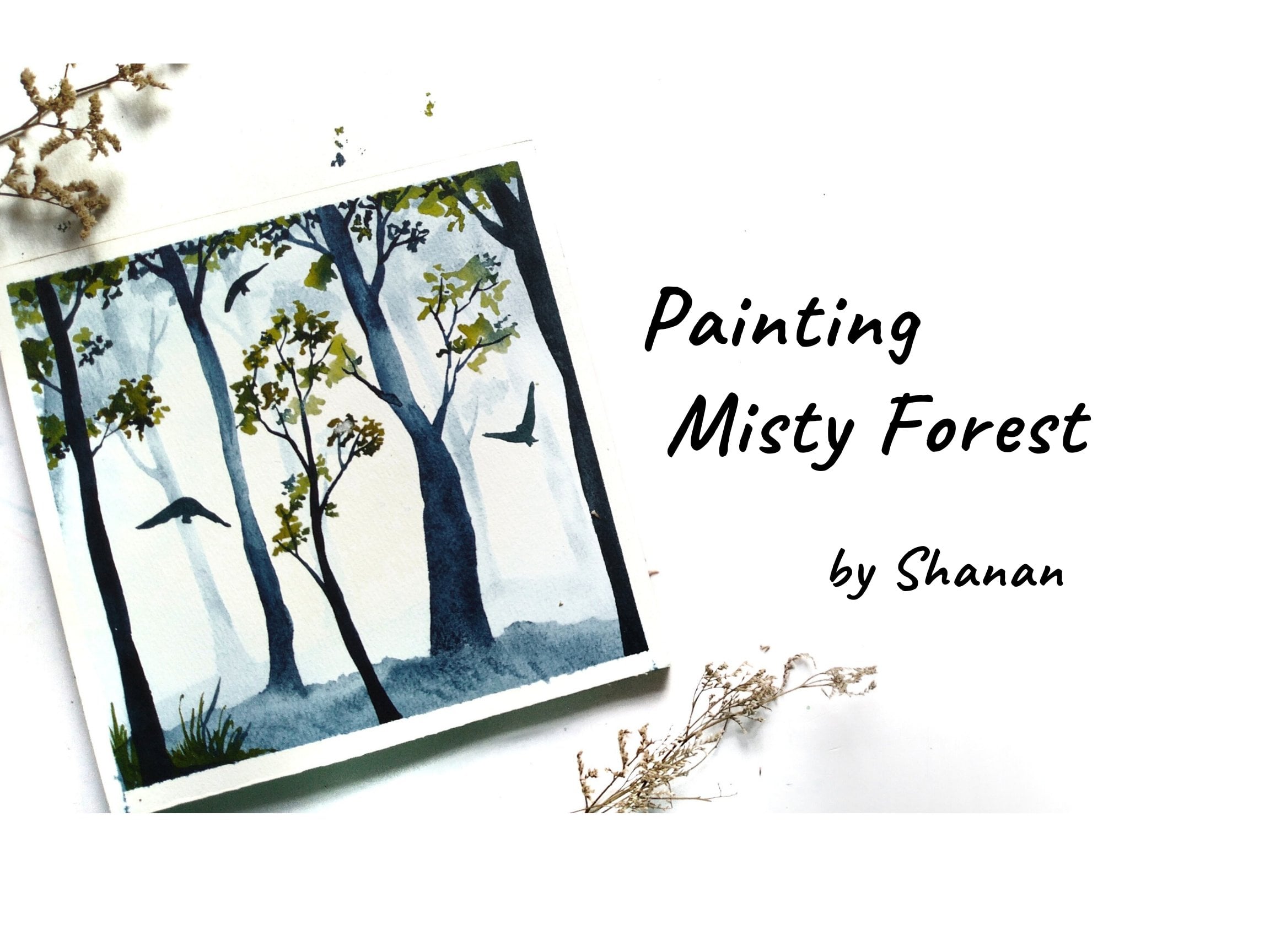
1. Intro LAKES AND REFLECTIONS: Hi, I'm challenged upon
an artist from India. Welcome to my Skillshare
class on building these beautiful lake
and mountain paintings. In this class, you're
going to learn the paint, sitting lake mountains and
reflections using watercolors. You will be very
surprised at how painting these landscapes can not
only be therapeutic, but sometimes also
help you to come out of the creative block
that you're facing. Because these are
very simple and easy paintings that
anyone can paint. If you are someone who loves softer and camera
looking paintings, but often get intimidated
by wet-on-wet techniques. Then this class is for you. I have explained
all that required techniques and also included a small practice session so that you get familiar with the
elements of the painting. Without any further
delay. Let's get started. I cannot wait for you
to join my class.
2. Art supplies: Hi again. I'm so glad you decided
to join my class. Before we start the
painting process, I'll walk you through the
overview of the class. First, I'll talk about the art supplies that I'm
going to use in the class. Then I'll be talking
about the techniques are basic techniques
of watercolors. Then I'll be showing you
some of the examples of how I've achieved
or certain results using wet on wet and wet on dry. Then I'll also explain
certain tips and tricks which helped me achieve certain
textures in the painting. Then we'll dive into the
class project one-by-one. Each day we will be painting
one project at a time. So on the first day, we are going to paint
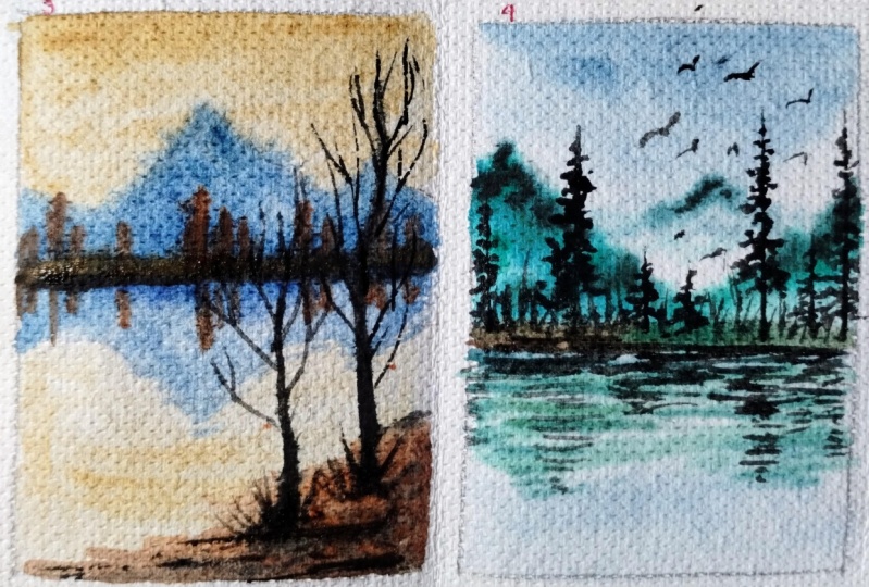
this particular painting. So this is the first
project in the class. Then we have this project
as the day to project. On the third day we will
be painting this project. The last project on day four, we will be painting this one. Let's talk about
the art supplies that we're going to
use for this class. The papers that I have used Dropbox for 40
GSM watercolor paper. This is thicker paper. You could also go
with 300 GSM paper. The colors that
I'm using here is artist grade paint from
various brands like scenario, White Nights, so art philosophy
and some more brand. And I have stored them
here in this palette. So I can mix the
colors in these wells. It is easier for me to
take the color and mix my own shade with all these basic colors
that I have here. You could use any
watercolor you have. I'll be sharing the name of the similar colors
that you can go with. The brushes that I have used. This one is Princeton
Neptune, size six brush. Size eight, round brush. Silver velvet, size
two, round brush. Here's my new brush, which is Rosemary size
for rigger brush. This is rigger brush and I
use this for fine liner. It holds a lot of paint, so I can do a lot
of detailing work. These are the four
brushes that I have used for this class. I've also used an old card to create these marks
in this painting. It will only be used
in one project than a pencil and an eraser for the
basic composition marking. And then we have masking tape for taping down the paper on a cardboard
like this is a clipboard. I keep my paper on
this and they pinned down using this
masking tape while I'm keeping this on the borders so I can delete
my water on my paper. Whenever I have to
create certain effects. Then we would also need
to solve for water, clean water, this
is already dirty. So take two jars of water. One is for cleaning your ears in the colored
brushes and then add the one to take clean water
for the background washes. And whenever you
need clean water, just have to dance
or photo handy. Then I have a spray bottle for wetting the paper
just in case I needed and napkin for wiping of the paints and extra
water from my brushes. Like let's see, I have
a lot of water in this. I cannot just apply it
on the paper, right? So before moving on to
the actual painting, I just dab it on to
this issue paper so that I have right amount
of water in my brush. And also the paint. I don't want to be
taking a lot of paint. So I have been cheer. So if I go and apply like this, it will have lot of spins right? Before applying the
paint onto the paper. I just dab it so that I have right amount of
paint in my brush. And also for creating
some textured effect. I, above all of the
extra pink tissue paper, just in case I need to
lift some paint dry off to speed up the drying process so that this pretty much it. You couldn't go with
any art supplies that you have already. Don't have to wait for
the exact supplies. So let's get started on it.
3. WET ON WET Technique: Okay, so let's talk about
wet on wet technique. This is a very common
technique used in watercolor, where we apply water and then on the wet surface
we apply paint. First, we apply clear
water on desired area. Then we apply the paint. Wet on wet is helpful
when you want to eat you soft and diffused
look in European things. So this kind of style is helpful for achieving
loose style of artworks. Don't create, oh nice bleed
and blooms in painting. And the results are
sometimes unpredictable. When I say wet on wet technique, it doesn't always mean
that you have to apply paint on awfully wet surface. You could also vary though, level of moisture
on the paper and then various kinds of results. E.g. now if I apply water and let it dry for some time
or use a hairdryer. So I'll be drying
this for about 50%. So now when the paper
is slightly damp, then if you apply some paint, it splits in a different way. In the first example, the color has spread very widely or creating many random blooms. But in the second example, it is spread in a
controlled manner, like we can direct the
pain in certain direction. Does spread, but
not to this extent. So based on the wetness level, you can assume various
results in wet on wet. The paper is very watery. The colors bleed
very wild manner. As you can see, the paper
has a lot of water in it. Let's try how the paints react. Kill. The color is running
all over the wet area. That is our title,
really unpredictable. The last one is two or three. And the first one was just right amount of water for ideal wet on wet technique. And the second one
is slightly damp. Like a controlled wet
on wet technique. You could also apply paint
on already painted surface. Let's say I want to
add some darker color. So you can apply it like this. Based on the dampness
of the paper, the colors will
behave accordingly.
4. WET ON DRY Technique: Next let's talk about the
wet on dry technique. So here in this technique, we apply wet paint
on dry surface. So here we get sharp edges and there is
no bleeding and blooms. When you apply this technique. Let's say I want to paint some
sharp or hard edged trees. So I'm going to just
directly apply the paint. Let's say from
here, we can paint. This technique is used to create a focus on
a certain element. Whereas the wet on
wet technique was to achieve soft and blurrier
and diffused look in the background. This creates a sharp effect, which creates a kind of focus. In the painting. Are here in this class. Like most of the paintings are based on wet,
on wet technique. Here. In this painting, the background is
blurry or and diffused. Whereas the trees you're in, the mid ground, they
are a bit focused. You can see sharp edges here. And here in this painting, the background is blurry
or the foreground element. These two trees are in-focus. So I have used wet on dry
technique for these two trees. For this as well,
have used wet on dry. So that is the difference between wet on wet
and wet on dry.
5. Practice & Examples: Absorb these paintings here, the mountains and trees. These how very
softer effect to it. So let us practice some wet on wet techniques to see how we
can achieve such results. So I'll take the same for 40 GSM paper and I'll
paint the background. You could use any
background color. I'm going with though, diluted version of
ultramarine blue. So this will be our background. Let's see. Here we
have the horizon. Above the horizon here, I'm going to paint a mountain, made the bond Dumbo. So if this wet on wet technique, we are able to achieve
a softer background. So we have a mountain. Let's paint the reflection of
this mountain in the water. Simply paint an inverted image. Now when you apply
paint on a wet surface, you will get these
higher like extra. So you can move your board in different direction so that you avoid such headlight effect. Just changed the
direction of the pins. So you can see how we
have prevented this. Moving on. I'll be adding some trees here near
the horizon area. So when I've added trees, I've also add the reflection. So similarly, I've used these techniques
in this painting. He wouldn't hear this. I have used wet on dry. So the background here. So here if you see
the paper was dry. So the colors did not
believe that well, if this happened
and you can take a damp brush and apply
some water around it. I will fix the mistake. And then maybe you
can apply the colors. If you want to add
some depth in this. Add some darker color. Similarly, for adding
extra in the mountains. Making this painting
I've added texture. So go for a slightly
darker color. And while it is wet, I add some lyme, some restaurants creating
depth in the mountain. Could do this before it dries. So if the paper dries, you'll get such hard edges. Again. It can be fixed
with a damp brush. Try to avoid it as
much as possible. Let's try another example. So in this, I'll first draw
some things so that you get a nice idea about what
it is going to be. Two mountain cheers
and maybe some trees. So when we are going
to perform wet on wet, the paper needs
to be wet, right? So let's read the paper. In some of the paintings we have graded affecting the sky. For that. And show you
how it can be done. It can eat blue water, any color of your
choice for the sky. And apply a ticket. Hello, at the top
and the bottom part. Now apply water and
pull the colors down and from the
bottom bullet upward. So we have a nice
gradient effect. Next door. Which color
mountain shall we begin? I use burnt sienna and a
little bit of crimson. So let's paint the mountain. Similarly for the
reflection part. You can add some
darker colors in the horizon area to
divide the perspective. Makes for the trees. I'm painting all
of these elements using wet on wet
technique itself. You don't have to draw each and every element in the painting. You could also directly
paint using your paintbrush. So this was a quick exercise. I hope you have
got a better idea about locking on
wet-on-wet technique. Next, let us add some
ripples in the water. So you can pick any
similar color and just add some horizontal lines, creating a sense of
movement in the water. So this is for the area towards
the words the foreground. Right? Now if I want to
have some ripple effect, I don't want the trees here. So what I'll do is just add some lines so that it creates a sense of
movement in the water. Remember, we should be using same color as that of
the underlying color for the mountain. Just go with the similar shade like this. So this happens when the
water is in moving state. If it is still water, we will have exact
replica of the damage. If the water is moving
and it is not still, then this kind of
ripples will be formed. So you need to decide in
advance what effect you want in your
painting. Next door. Let us practice painting these
rocks. It is very simple. You were to take a card or something or something
that has a rounded corner? No. I'm going to apply
some darker color. You could use any darker color. I'll go with bond, Dumbo, violet, blue, Payne's gray. On sort of darker colors. You paint the background first. And then window
corner of this card. Just apply some pressure. Something like this. And if you have pulled a lot of paint, then you can add some
darker color in between. Not just to define the shape. Let's practice one more time. Goes from black and brown. Some blue. Make this angle. Hold the paper tinge gene. The sheep can pull the colors awkward as well. So yeah, these are the
two examples you can practice as many times as you want until you're comfortable.
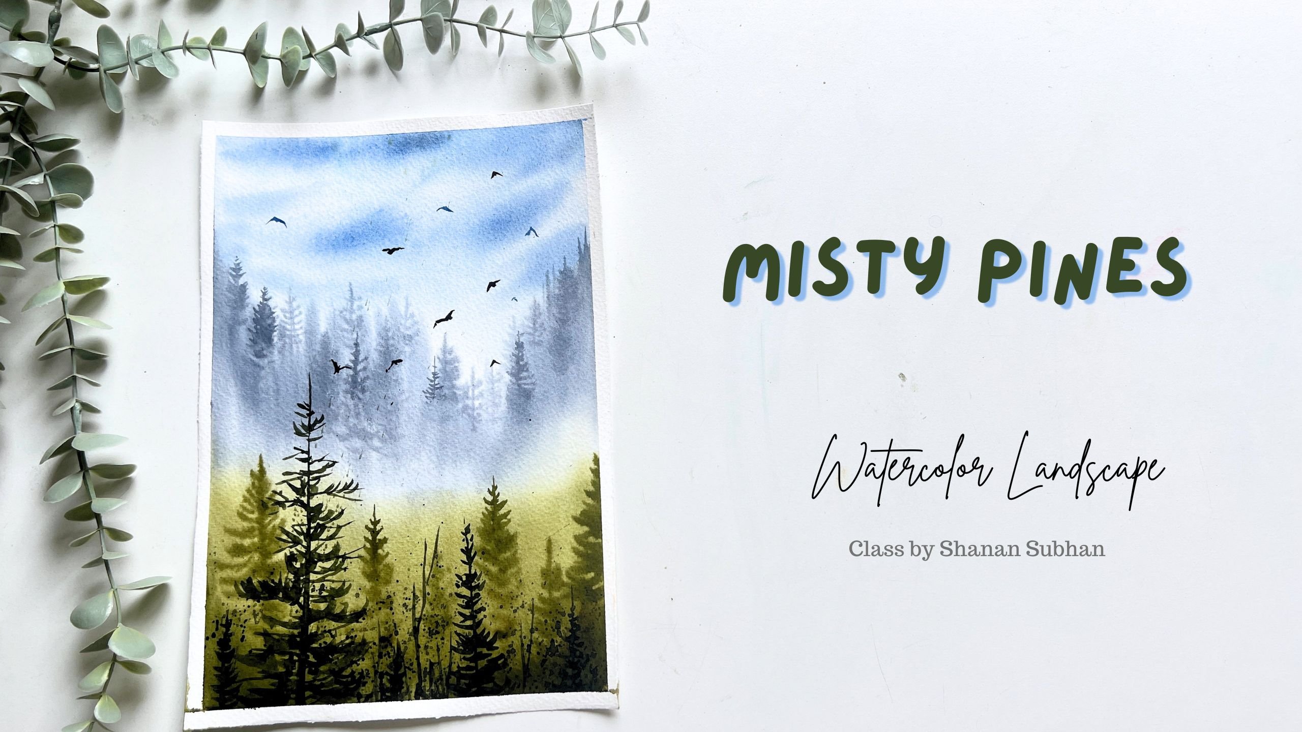
6. Day 1 Project: Welcome to the first
project of this class. Today we are going to create this artwork using very
simple techniques. Let us begin though
painting process. Here, I'm using loose
watercolor sheet and I'm taping it down
using masking tape. If you're using watercolor
pad or watercolor block, then you don't need
to use masking tape. Although if you want to have
a nice and crisp border, then you can go ahead and apply masking tape. It's up to you. When to apply the tape. Just run your finger over the masking tape to make
sure it is tightly sealed. Alright, so I have already
prepped the paper. Now let me mark the
composition of the painting. So yard first element,
though distant mountains. I draw two curves as mountains. In the center of
these two curves. I'm marking the horizon line. Next, I'm drawing
another mountain. This is slightly closer
to the real point. Draw the sketch. Very less pleasure
and very light lines. You don't want any
sharp pencil marks. That was the midground area. Now towards the foreground, we will draw the riverbank area. In between these two areas, we will have our lake water. Alright, let's start
with the painting. I'm going to wet the paper
and tidy for the base wash, which is going to be
wet on wet technique. So I'm applying water
using my mop brush. Spread the water evenly. Make sure you are
applying even coat of water on the paper is wet. First, I'm going to paint
the sky. And then what? So here I've taken no
L0 AKA to this color. I'm going to add
a bit of violet, which is complimentary
color to yellow. So I'll take a tiny bit of
boil it and mix it with a low. This will create a
mute their door. Like a neutral color. Basically it will mute down the vibrancy of a yellow color. So I load my brush with this paint and apply it
on the top of the paper. Then on the bottom part, which is a reflection
of the sky, wipe off all the paint that's on the masking tape and
edges of the paper. Oh, this might create
background's going forward. So please avoid that and
remove all the extra paint. Now to avoid sudden transition from this neutral
color to white, and just apply some tiny
strokes in the middle area, creating a smoother transition. I'm keeping this
masking tape under my board so that there is a
slight tilt while painting, which will help the colors
flowing lower direction. Next, let us paint
the distant mountain. Since this mountain is
far from the viewpoint, it will appear a bit hazy. So I'm going to use a bluish
tone for that mountain. So I have a fin, ultramarine blue, and a
little bit of cobalt blue. Ultramarine blue
is a cooler blue. Notice how I applied the
beams in single brushstroke. This will create or transparent
effect in the painting, which will make the The distant mountains
look very light and airy. Since the background is wet, the color spreads very widely, create impaired leg extra. So to avoid that, I'm turning my paper in different direction so that
we don't get such texture. With the help of my fingertip, I'm directing the color to
flow in certain direction. It's okay as long as you
don't spoil your painting. Anyway, this is going to
be in the background. Another layer that's going
to come on top of this. Next, I'm going to paint
the mid ground mountain. So for this I use paints gray, mix it in medium consistency, and apply the paint. This is the mountain and
below is the reflection. Leave some gaps in
those center area. And we shall apply some
ground color like what, Dumbo or burnt sienna. Any color you have. This will depict the ground
area indoor distinct line. Or it could also be
some orange trees. Let us leave it up
to interpretation. We don't have to define each and every thing
in your painting. Now, I'm adding some thicker
consistency paints gray. To add a sense of
definition to the mountain. Again, in this layer as well. We might get like texture. So turn the paper in
different direction so that it does not create
any hair-like texture. Donating different direction
and let gravity do its job. Alright, I think this is enough. Next, letters create water
ripples in the lake water. So I'm gonna take my
fine liner brush. You could also use
the pointed tip of your regular brush and just
apply some horizontal lines, creating a sense of
movement in the water. This will act as the ripples. Make sure you are applying
on damp or wet paper. If your paper has dried, then you can use diluted color. The idea here is to have very
subtle and minimum lines. Please avoid painting
darker lines for the ripples towards
the foreground area and we're applying
diluted blue color. Moving on, let us bring the
foreground grassy area. So I'll take this sap
green and mix it with a little bit of yellow
ocher and orange. So I want a warmer green color. I played on the bottom
part of the paper, which is, this is
a foreground area. Right? Now I'm going to dry this layer using a blow dryer. Will also let it dry naturally
by leaving it. As it is. What about ten to 15 min on the paper has
dried completely. Next, moving on, we will create partly submerged
in the water. This line will have some
rocks and some trees. So let's create that. Now to create this rocky area, I'm going to use an old guard. And some colors are
darker colors mostly. Mostly go with burnt umber. Ya lit Payne's gray
and cobalt blue. Take some colors in
random order and paint some shapes to depict the rocks. At this point, don't
worry about the shape. Next, apply clear water below this painted area to create
the reflection going forward. Next, I'm going to take a card and with the
help of this card, I create the rocky texture. Applying some pressure, you
can swiftly move the paint. This is also included in the practice session
of the class. If you have missed it, please go through it
again so that you feel comfortable while
performing this step. In case you are not happy with the outcome that you have
achieved with the guard. Go ahead and add some definition around the
rocks that you have created. This will help you define it. Now with the help of
my regular brush, I'll add some tiny
partly submerged rocks around this area. I take my God again and try
to give some shape here. This is totally optional. I'm not very much happy with the result here,
but that's fine. It doesn't have to be perfect. Moving on, let us
add some trees here. And start with the vertical line as though trunk of the tree. Now considering this
as their trunk. Next, add the foliage and
the branches in the tree. As always, I'm painting the foliage in a
very irregular them. I know. My aim here is to
make the tree look follow. So I randomly add some
branches in a zigzag manner. Now that we have our tree ready, let us also paint
the reflection part. So here the reflection
doesn't have to be perfect, indicating a sense of
movement in the water. So you can randomly add some wobbly lines
depicting the reflection. Next, let us draw another tree. This time it is going
to be on dry and bear tree to paint or dried branches. I'm switching to my
fine liner brush, which is size for
Rosemary rigger brush. This tree is not full as
compared to the previous tree. We will only have some
branches and no foliage. Painting that selection
try to create dosimetry. At least like 80 to 90% resembling should
be there, right? We cannot fail or totally
differently in the reflection. So make sure you're painting a similar looking image
in this lecture as well. Applying some darker colors. When the water touches the line. Seems it will be moist, so it will appear darker. I add more trees
around this area. Next, we'll create a sense
of balance in the painting. So for this painting, I do not have an exact
reference image as such. I'm simply going with my intuition to add these little elements
you're in there. You can also add some
tiny vertical lines. Next I'll take a mix
of yellow ocher and orange and apply it in
the foreground area. This will add us and so formed. So you need to keep in mind that the elements that are
closer to the foreground, they tend to appear warmer. Now, to add a sense of
depth around this area, I'm going to use a darker green color
by mixing sap green, black and a little bit of brown. By adding darker colors, you're automatically
enhancing the lighter colors. Also dabbing some
darker colors on the upper bond to
depict some shadow. Once you're done, let it dry. I'm using a hairdryer
to dry this. I'll write the paper, looks dry. Next, I'm going to
mix a green color. So I'll take some green and
mix it with the burnt sienna. Audio brush with
this color and paint some upward brushstrokes
depicting the grass blades. You don't have to
fully cover this area. Just some simple
random strokes or do you don't have to follow
exact same brushstrokes? Just go ahead and apply some
loose and free brushstrokes. It's okay even if
you make a mistake. Next, I'm going to
splatter some paint. So I'm going to cover
the upper area with rough paper and
splatter the paint. This technique will
help us achieve a fuller effect in the grass. Next, I'm going to add
some boards on the sky. These are tiny little boards. You can add more or less. It's up to you. All. You could totally
skip it as well. I'm also adding the
reflection in the lake water. Okay, So we are done
with this painting. Now, let us remove the masking tape to reveal the final look
of the painting. Gently peel off the
tape at an angle of about 50, 60 degrees. This way you want
to tell people, this is how our
painting looks like. I hope you enjoyed
painting this with me. I'll see you in
the next chapter. Until then, bye bye.
7. Day 2 Project: Alright, so let us
begin our next project. I have aimed down the
paper using masking tape. Now let us catch the
composition of the painting. This is the horizon line. We have partly submerged
land in the water. From here all we
have some trees. I'm not going to mark the
shape of the trees as of now. They will do it as and when
we paint using paint brushes, the horizon is further
away from this point. So this will act as the background element
in the painting. I'm marking some basic
lines for the trees. In the background. We really just
paint one mountain, me loudly or the reflection
of the mountain. But keep the composition
as simple as possible. Now load your brush with
clean water and apply it. The paper. This is to perform
wet on wet technique. Apply a generous amount of water and make sure you're
applying even cold. There shouldn't be any blocks of water in the center or corner. We are almost done
wetting the paper. Next letter, spin
this guy first. So I'll use a slightly neutral or a cooler blue
color for the sky. So I'm going to use
ultramarine blue. I'm a bit of burnt umber. This is to move down the
vibrancy of the color. Otherwise, the blue color
alone will be flashy. So I'll use this color mix to apply for the sky
and the water part. Here, I'm trying to
create a sort of transition from
lighter blue to white. For the mountain. Be using burnt sienna
and crimson color. Burnt sienna and crimson. 50, 50 per cent of the colors. Mix it together. Now with this color mix, I'll be painting the mountain. Now that reflection, even though area around
the horizon easy as abuse, do not apply any paint, their next, I'll switch to my
size eight round brush. Okay. With this,
I'm going to paint the distant or
treeline. Blue color. Brown, unwanted very vibrant. Muting it down a little bit. For the distinct area, I'm using blue color to
add a sense of haziness. Now let's also add some
reflection in the water. This area is further
away from the viewpoint. In the partly submerged area, we will paint the green
colored trees next. So for time being, we will only focus on the background element. So here I'm going to add
trees with green color. Adding some bonds here now
to make it a little warmer in the trees, in
vertical brushstrokes. These trees start from the
parties are moist line. And this is a bit closer
to the viewpoint. So it appears greenish in color. No trees in blue color are further away from the viewpoint. So that's the difference
in perspective. We've been forced
paint the trees and then create the
reflection in the water being the same color and
paint the reflection. You just have to create an inverted image of
whatever you see. The technique we have used. Here is wet on wet. Like I have explained in
the techniques chapter, based on the level of
replacing the paper, you will achieve
different results. The people currently
is about 50% damp. So you will see the
results like this. No, to keep the bottom
part lighter in color, I'm picking up some paint
using my damp brush. I have also applied
some yellow color, lemon yellow color. Next, a Payne's gray
or indigo color, and apply it along the horizon line in
the background area. I'll also add some
vertical lines here depicting the trees. The Payne's gray here has added depth to the
background element. Next, let us add some
depth to the mountain. No, they go the same color. Burnt sienna and pink. Sorry, Clemson. Load my brush with
this pain that both the extra paint and apply some brush
strokes like this. This will create a sense of
dimension in the mountain. Don't overdo it. Just some simple
lines here and there. We'll do the job. Now you can see the mountain has a sense of dimension to it. Lifting some pains from
the center part of this partly submerged land to create a sense of highlight. And below that, I'll be
adding some darker color. And also using this darker
color to create a sense of shadow and depth in the
bottom part of these trees. Now, this is an optional step, but you can define the shape of the trees by adding
some foliage. Some simple was exactly brushstrokes to define the
shape of the pine tree. This will add more
character to the tree Xian. So we have created the trees. Now for the reflection part, we need to add some
movement in the water. So what I'll do is I'll apply some horizontal lines depicting ripples and a sense of
movement in the water. You could choose to keep your lake water plain
and simple as well. That will indicate or
still water in the lake. If you want to add a movement, then you need to
add these lines. Anything that works for you. In the blue part of the water, I'll be adding some
diluted payne's gray. I think the larger ripples
around the foreground area, because it is closer
to the viewpoint. Excited to be adding some
brown colored brushstrokes. I don't want this
green trees area. So now we're going
to add some board. Pick any darker
color like brown, black being the birds. I'm using my fine
liner brush here, and I'm simply adding these. We inverted V-shape
to depict the boards. And the reflection of
the birds need not be perfect as there is some
movement in the water. So the reflection will
be distorted in shape. With the fine liner brush, I'm defining the
shape of the trees. You're adding fine lines
depicting the branches. And some, I need weeks. So I think these final
details is an optional step. However, this type is going
to enhance your painting. So I'll simply splatter some
paint around the tree area. Right? So we are done
with this painting. Remove the masking tape. So this is how our
painting looks like. I hope you have enjoyed
painting this with me. Know, share your class project and other projects. Gallery.
8. Day 3 Project: Welcome to day
three of the class. Okay, Let's start
another project. I'm wondering David Downes. Okay, so the paper is ready. I have already tapered down. Now. Run your finger over the edges to make sure that
the paper is tightly sealed. Okay, now, let's draw the
composition of the painting. So somewhere in the upper half of the paper and draw
this horizon line. Then a mountain. Would it be the reflection
of the mountain? And he really had some kind of lined leave some space to
depict the land area. And we will add the trees yard. I'm just adding the
skeleton as of now. We will define the shape
when we paint here. Towards though foreground,
let's add the riverbank area. I don't want these
pencil lines to be appearing in the end result. I erase them. But the composition is
going to remain the same. The pencil marks in the watercolor painting
should always be late. Keep that in mind. Okay, now we have the
idea of basic idea of where our mountains and
reflection is going to be. I can still see the light
markings for the mountain. Alright, Let's start. I'll keep the masking
tape under my paper. For creators like
L2 while painting. To begin with, I'll read the
paper using water spray. This way it is easier
to wet the paper. Now I just have to spread it
out throughout the paper. I'll be running my brush
multiple times over this paper to make
sure it is evenly lit. Just on the border around in different direction to remove all the extra water
that's sitting on the paper and also on the edges. Now with this same mop brush, this is size six brush. I'm going to mix and
yellowish orange color. So I'll take this ryan. Some orange and orange. Mix it in equal amount
applied on the sky. This is a mom going part, right? So I'm not applying
the color there. Similarly here on themed outside of the mountain shape
that we had drawn earlier. And it is okay if you apply the paint in the riverbank area. We are anyway going to cover
it up with darker color. Next, take a damp brush and lift all the excess colors from the masking tape or the
sides of the paper. If you leave it as it is, it might create some back-end. Could even use the
same brush or switch to slightly thinner brush. This is size eight round brush. That was size six brush. Okay, so now and
take cobalt blue, mix it with the, with the same color
and a bit of orange. I have added only about 10%
of yellow or orange color. Blessed is all blue. So I'm color is still glue. Will apply this on
the mountain area. If you're not sure
about the color mixing, then you could directly
use cobalt blue. Now let's paint the
reflection as well. Try to create the same shape
as that of the mountain. Note that I'm not mixing
blue and yellow here. If you mix it, you
will end up getting a greenish color in the sky. So next time, this is raw. Umber. I loved playing
around the horizon area. You could also go with
any other brown color, like burnt sienna,
Oregon, Dumbo. There is no restriction. This depicts the line
near the horizon area. Alright, so next let's
take indigo, Payne's gray. Any color will do. In the book. Let's add some trees here. At this point I'm simply
adding some vertical lines. Make sure you're repeating the same in the reflection
part as well. Try to replicate
the similar height. Also, your brush should not
have too much of paint. Just the right amount of
paint in your brush will create such kind of four trees. Now I'm applying some
overlapping brushstrokes. Your trees and mountains need not be exactly same as mine. Feel free to paint your
own style of trees. It is your way of
expressing the art. Alright, so we will
stop this video and move on to our
foreground element, which is the riverbank area. So I'll simply spray some water here just to make sure that
my paper is damp and not dry. Next, I'll take bonds here now and paint over here in
the foreground area. This is the part
that it will bank, like I said, paint this with Montana or any brown
that you already have. Next to adult sense of
depth in this area, I'll be adding a
slightly darker color. So mixed Payne's
gray with brown. Here. I don't want
this hairy texture. So I'm going to tilt my board
in different direction. And after this step, I'm going to dry it
using my hairdryer. I've been trying the paper to about 40 to 50% and then
we'll stop in the mid way. Okay, so let's stop here. The paper is about 40, 50% dry. Now I'm going to splatter
some water on this damp area. You can see these
blooms being formed. Right? Let us draw
it again fully. Alright, the paper looks dry. Now. Let's move on to add some further
elements in the painting. So here, to add some
depth in this part, I think some darker brown
lines here and dabbing it with my finger so that it
is not very prominent. Just blend it with
the background. Next, I'll mix black color. You could take any
darker color you have. And with this mix, let us paint the
foreground trees. I'm using wet on dry
technique for this, meaning I'm painting
on dry paper. So for this part, I'm going
to just dab some color like this so that the
tree gets blended. Well, let me show
you the closer view. Here. I've added the trunk of the tree and we'll add some
more branches. And painting very tiny lines. We can form the branches
into multiple fraud. Paint the branches in
any direction you want, keep it very irregular. The thickness of the branches depends on the pressure
you apply by painting. Suppose you apply more pressure, your lines are going
to be thicker. And when you apply lighter, very least pleasure, you're going to get
very thinner lines. So keep that in mind. I can also use a
fine liner brush. For the basic skeleton. I have used my size eight brush. And now for the tiny lines, tiny tweaks on the trees, I'm going to use this
fine liner brush. It really helps me to
create thinner lines. You could keep it minimal or add a lot of branches.
It's up to you. Relax some overlapping branches. This will make it
appear organic. All right, Now let's take some brown color and we'll
add some tiny lines. This will add a sort of
character to the grasses. You could even add
simple grass blades. So here I'll place my brush against the
paper horizontally and spread the paint really create a sort of textured
effect in the painting. I will repeat the same step
in the Verizon part as well. When you have a balance of
lighter and darker color, the painting will
appear harmonious. No. No, I'm a board.
Just one board. Seems like the bird is
flying away from this tree. You can add more
words if you want. All right, Then you're
done with the spending. Remove the masking tape. They do go. This is how
our painting looks like. I hope you enjoyed
painting this with me. Don't share your projects
under the Projects can be.
9. Day 4 Project: Welcome to day four
of this class. Today we are going to paint this artwork. So let us begin. So let us taped down the people first applying masking tape on all the sides and making sure that the
paper is tightly sealed. Now new finger over
the end just to make sure it is sealed properly. To start by sketching. So somewhere in the lower half, I'm going to mark
the horizon line about this as the sky
and below is the water. Next I'm going to wet the paper using my what does prayer. Next. I'm using a small brush to spread the water that
I have just played. Make sure you're applying
even coat of water. There shouldn't be any water
puddles or dry areas in the paper has to be equally weight throughout the surface. Play generous amount of water. Keep running your brush for some time until the
paper absorbs the water. Even if you're playing
one single coat of water. But chances are that it
might dry very fast. So a blank 234, so four dark, so that it
remains for a longer duration. Next, I'm going to take
a cooler green shade. So I have forest green. You could also use 3D in hue or any cooler
green that you have. But before that, let me paint
a minimal looking Skype. I take another brush
and simply apply some diluted payne's gray color in the sky and in
the water area. I forgot this step
in the beginning. So I don't want to waste that
green color in my brush. That's why I'm using
another brush here. Apply some simple brushstrokes depicting a minimum looking sky. I want these areas
to be white itself. Coming back to the green color. I'll be painting the
distant mountains and pull the colors down. I want to create a sort of misty effect
in the background. Here for the reflection part, I don't want the exact
same reflection. So I'll be painting the distorted shapes
using horizontal lines. Next time take very
diluted version of this. I'm paying the distant
mountain which is further away from the
previous mountains. Wipe off all the paint and
create a diluted appearance. Next, we will take
concentrated green color and paint on the top of
this mountain areas. This will depict the trees and the lower areas will
depict them as teapot. Next, I'm gonna place
masking tape under my paper to have a slight
delete while painting. Lifting the colors
from this part, right? You ablated FPR
and this will make it appear as though
there is some missed in the bottom
area near the horizon. Okay. So now this is
the horizon area. So your brown color. I'm using burnt umber and
diluted to midtone consistency. This really depict the
land near the horizon. Next, let us add some more darker colors
in the reflection part. These are the distorted
reflection in the water. Next, I'm going to mix a
very darker green color. So for that I will take the
same green, forest green, and Payne's Gray
plus burnt umber. So I'll mix these three colors together to form a
very darker color. You could also make
so black if you want. So now the paper is
almost 60, 70% dry. Here on this time period, I'm going to paint the trees. These are pine trees. And since the paper is almost
damp and about to dry, we might get some hard edges
in some of the places. But that's okay. We're not looking to create
or soft or blurrier trees, your paint the trees in a very irregular way. Don't try to achieve
any symmetry or uniformity that will
make it inorganic. So we are trying to
achieve a kind of organic look in the
trees we paint. So keep that in mind. So once I have added, although it isn't foliage, I'm going to add the tongue, but you could either draw the trunk first and then the branches, or the branches first. It is up to you, whatever is comfortable to you. You can go ahead with that. Reminding trees of
different heights here. This will bring about a sense
of harmony in the painting. I'm adding the partially
visible branches of the trees. I don't want to say do I add some vertical lines depicting the trees in the background? Next, I'm going to take my fine liner brush
and some burnt umber. I load my brush with
this paint colors and next I'll dab it
with my fingertip. Spread it with my act
as though soil or the debris near this area in doesn't have to look
exactly like this. I'm just trying to
fill up the space. Next, I'm adding some
darker underline that on this idea
and the bottom part. So there is no fixed number of trees that you have to paint. You can add as many trees
you want. It's up to you. Next, let us paint the
reflection of these trees. I'm not going to create the exact same shapes
in the reflection. We will be painting it
in distorted shapes. Like there's some
movement in the water. You might already know how to create Stillwater reflection and how to add a sense of
movement in the water. Here, I'm simply painting some zigzaggy lines
depicting the reflection. Next, I will take black and
I along the horizon line. This is the area where the
water touches the soil. So it appears darker. If you're someone who doesn't
like to use black color, then you could mix
burnt umber and Payne's gray that will
also appear black. Next, let us being
the birds in the sky. Next, I'll paint some
words when bluish color. This will add a sense of
distance in the painting. The foreground yard. Let's add some blue. I have some wobbly
and zigzaggy lines to depict a sense of
movement in the water. Now, I'm going to add
some bare and dry trees. This will be an optional step. You can only do
it if you'd like. Otherwise, you can skip it. Let's also add some
reflection in the water. Right? We are done
with this session. Let us remove the masking tape. So this is how the
building looks. Same time. I hope you liked it. Moshe,
your class project with me. Another project, gallery.
10. Outro - Thank you!!: Hi again. Thank you so much for
joining my class. I hope you had fun learning and being
thing along with me. Do share your projects
in the projects gallery. And if you like my class, please do share your review or feedback in the review section. That would really
mean a lot to me. And your support really
means a lot to me. Thank you once again. I'll
see you in my next class. Until then. Bye bye.
 Shanan Subhan, Watercolor/Gouache | Art Educator