Transcripts
1. Introduction!: Welcome everyone to this class. Today we're going to learn
how to edit a picture. To go from this to this, we're going to be
using Adobe Lib Rm. And it doesn't really matter if you've never used it before, because it will be a Steps
Step tutorial and you will have the file to download if
you want to follow along. You will learn all the
necessary things to edit any picture and turn it into
any step that you want. You will learn all
the essentials about Librom and you will know what every parameter does and when and how do you
need to change it. We will learn also
about masking, how to create presets, and how to export the pictures
to put the most out of them without wasting any more
time. Let's dive into it.
2. Crafting Art: Mastering Essential Adjustments: All right everyone, let's start
with the editing process. The first thing that
we're going to do is to simply import the
picture to Lightroom. To do this, we can click the Import button
right here below. And it will just
import the folder where the picture is here
in the folders panel. I have mine in the desktop. If you see here, there's the folder which is
called Lightroom Edit, and inside there's this picture. We're going to try
to find it here. It's basically where
the desktop is located. We basically have to
find the desktop here. If you don't know how
to reach the desktop or any place where your
folder is located, you can just click this
folder left click, and then press right click. And Properties, you can see
here which is in Spanish. Now, here to the location. We have to try to find this
location in light room. Let's here. And it was in local disk. We have to go to users, to the name of the user. The desktop should
be, here it is. This one, we have to try to find the folder where the
picture was located, which was light room edit. And you can see here's the picture that we're
going to play with. When we have this
folder selected, we can just click here on
Import, and it will import it. And you can see that
now we have it here. We can see now in folders, it shows this folder
that we have imported. As you can see now here on top, we are in the library layout. You may not see this because sometimes it simply
slides off of the screen. But you will see this
arrow here that you can press and it will always
stay here on top. These are the different panels
and layouts that we have. We're going to mainly
use these two always. These are quite specific for this tutorial
we're going to go in, develop, Develop is the
most commonly used, the most important panel. Basically what we need to
do is click this image, make sure that we
have it selected, and we can simply
press this pattern here to make it appear larger. We want to simply go to develop. We will see here below that this picture if we
import more pictures. Now in this desktop folder, we can drag pictures in and
they will show up here. Below, we don't need to create
more folders, actually, it's just dragging them in
that Lightrom edit folder. And they will always keep updating and they
will show up here. We will have all
the pictures that we want to edit here and
this is very comfortable. I'm going to close
these panels here. Everything looks
the same for you. That's basically
the general view of light Rom as you can
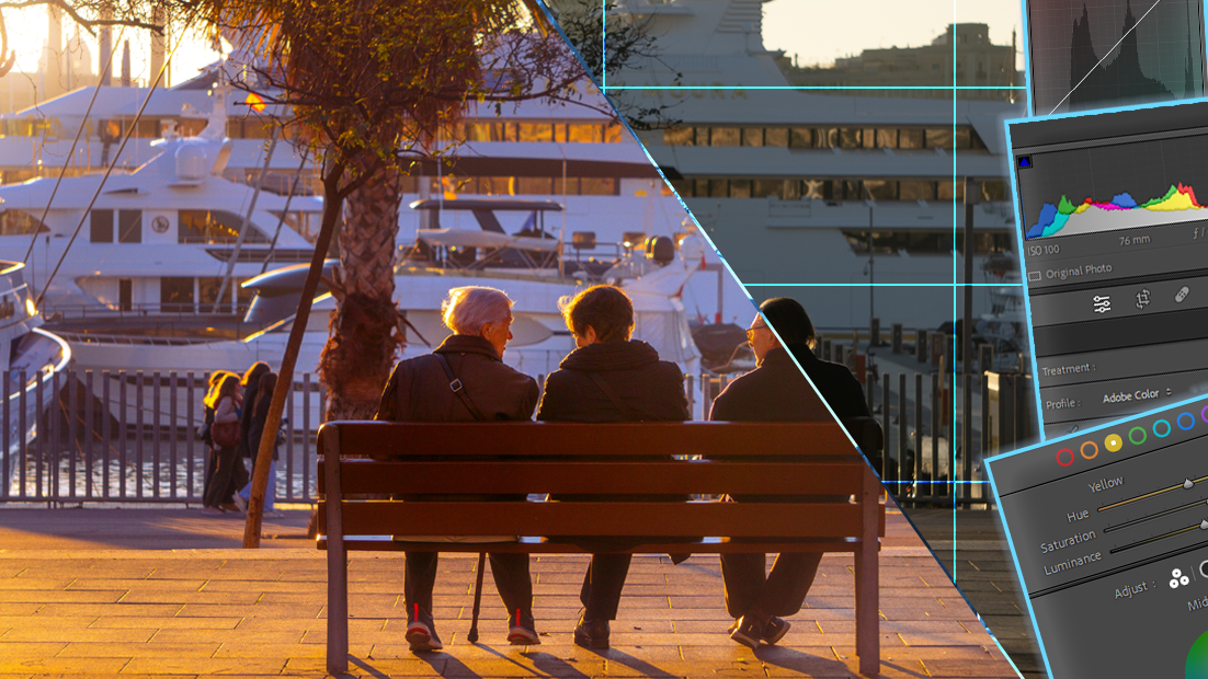
see here on top. This is the histogram
and you can see here the camera parameters that we
used to take this picture. If you understand a little
bit about photography, you know that is 176
millimeters of focal length, aperture, and the shutter speed, these were used to
take this picture. If you don't really understand
much about photography, this is not important
actually to know. This is just if you have
a professional camera, you can get a reference, an idea of how this
picture was taken. But even if you took this
picture with the mobile phone, it's completely doable as well. You don't really need to
care about these parameters, but they are here if
you are interested. Anyways, the history I'm
here to sum up very quickly, it just shows the distribution
of color of the image. A lot of people and
editors, photographers, will give a lot of
importance to the histogram, but honestly it's
not that meaningful. Sometimes I'm talking,
from my experience, it's something that
you can always use and it's great to know
of course, what it is. I'm going to just explain
it a little bit now. But it's not something that
you should worry too much about it because it's not always accurate in
the sense that, of course, the shape
and the graphs here that are shown are
of course perfectly done. But people claim that by just seeing the shape of
these curves here, they can know if the
picture is well taken. But that's not actually true, because in some pictures
we actually want the to be maybe shifted here, towards the left or
towards the right. And that doesn't mean that
the picture is taken. To put it simple, the Historam is a two dimensional graph. This is the vertical axis here. This is the horizontal axis. The vertical axis
counts the number of pixels that are in a
certain color range, and the horizontal axis
determines this color. The closer we are
to the left edge, the darker the color is. Let's say being the edge itself. The black color, as you can see here below
where it says 100, when we put our mouse on top
of the graph, it says black. And when we move towards the
right area, it says whites. As we can see, there's
not really much area on the whites because if
we look at the image, there's basically no
white, very little white. Even this in the
sky is not white. But we see that
there's so much conor, so much area towards the
dark areas of the image. As you can see here, it says blacks here,
It says shadows here. The exposure, the blacks
as you can understand, it's very dark colors. The shadows between dark, but not as dark as black colors, but still very gray colors
and dark colors as well. When we look at the image here, it's clearly a very dark image. Right now, even
this boat that you can see in real
life, it's white. But here in the image, if we zoom in, we can see that it's gray. The color in the
picture is gray. It really falls in this
category of the histogram. Therefore, here in the middle, there's not much color
because we don't really have bright areas in this image
apart from this side. Here on the left,
there's the sun. We consider this peak of colors, which represent for
short, this area. If we were to crop the image, we would see that this
probably disappears. In this case, we really get
some valuable information. It really doesn't provide actual information
about the picture. Because if we hide this picture and we
just see the Historum, we will not be able to tell if this picture
is well taken or not. You can tell that
it's a dark image, but it doesn't
really tell if it's great because what if we
take a picture of the snow? We would see that the Historum shifts so much
towards this side. People will say this
picture has too much white and it's too bright. But that's the
point of the image. In a snow picture, you
want it to be white. In a dark picture, maybe at night you will see that
there's so much dark. But of course is what we need. Some people always put so much importance on saying
that it should be balanced. And there can't be any picks, but in some images
you want picks. That's why I always
encourage people to understand the purpose and the distribution
is great to see. But honestly, you need to be able to judge
if the picture is well exposed or well edited by just looking
here on this frame. The picture itself, the
history, is just to help you. But it's not something that
you can rely everything on. But of course, it's something
that you will always hear. It's important to
know it because some of the parameters
that show up here, so the blacks, shadows, exposure the highlights,
and the white, there are all parameters here
that we will for sure use. It's something that you
can take into account. You can, of course, tweak the parameters
of the historram here. Just as you can see when
I put the mouse on top, this double arrow shows up. That if I drag it, you can see that I will try to drag this
towards the right. I will push all the dark
colors towards the bright, they will be lighter. As you can see how the
image gets lighter, because I pushed the blacks the darker areas and I moved them towards
a brighter side, I essentially made
the darker areas of the picture lighter. As you can see, this
is basically the same as tweaking this option
here, the Blacks, this area here that
shows up in green, highlighted in green, it's just basically pushed
towards the right. And we can just tweak this parameter here
or just decrease it. And as you can see,
when we decrease it, we push it even
harder to the left. We even make it darker. And as you can see now
it's extremely dark. So I'm going to
press control that to basically remain
at the beginning. This is the original
picture that we have here. There's nothing
edited right now. I'm going to first, before starting, I'm just going to mention this part here. This is the zoom and
this is very useful. I really use this a lot. Basically, when you put your
mouse on top of the image, always this magnifying
glass appears. If you press left click, it will simply zoom in. And it will zoom at this
value that you specify here. Whenever you click it, tweaks
from feet to this value. Or if you press
this one, it will just switch from
feet to this value. When you press feet, it
shows the entire image. If you press zoom, it will zoom 100%
100% is too much. I usually say something like 60% or 50% You can change that if you
press these arrows here, you can simply choose a value. Maybe 50% works nice. We can simply switch
from fitting the view, seeing the whole image, to zooming in a
little bit like this. As you can see, I
want to mention, this is the name of
the picture picture. It's basically the name that I chose in the folder that
we were talking about. It's just the name
that I've given to the picture for this tutorial, But here you can see the format or the extension of the picture. This one is R. It's maybe a format that
you've never seen before, but it's a format that Just simple image
like any other image, let's say, but this contains
more color information. This is similar to
the draw format, but you can of course, edit with a J Pec or PNG or basically any format
that comes from a phone or even a photo that you can
download from the Internet. Right now, you can edit it. It will probably
not be this format, but you can of course, work the same, it will
be the same everything. If you can choose the format, I would recommend
always choosing the highest quality format or the format that contains
the most information. This picture here, this
one is 30 megabytes. This picture, maybe a picture that you take with the phone. It's ten times less in
size because they try to optimize the size so they
don't take up much storage. But these pictures, usually
I took it with the camera. They contain much
more information. And you will see that when
we play with the sliders, even though this part
seems very dark, the information is still there. We can just make it show up
by just increasing exposure, while in other formats
like JP or PNG, the image remains dark. Because this is dark and
there's nothing of information, you can still play with that, but you will always
have more room to play with this high quality format. In this case, you can see here, it's the resolution
of the image. We can turn this off. I took it. This is the date too. If you press the
letter, it will switch from different views,
probably by press. Now, it shows the parameters of the camera. Shutter speed. Aperture IS millimeters, the lens that were
used in this case. If we press again, it will simply disappear. If you can press the
letter or it doesn't work, you can just go to here to view, go to Loop info and just press the control eye and you
can see that it shows up. And if I press it again, it disappears also
before continuing, I want to say something
very important. It is something
that, for instance, if I change any of
the parameters, let's just do that thing
that we did before. As you can see now we've made the blocks or the
darker areas brighter. But sometimes what we will
want to check is if it looks better or worse than the picture
that we took originally. If I want to see how it looked, I could press here
the reset button, and you can see that
turned back to original. If I press control, it will bring back the last
adjustment that I did. If I tweaked a lot of
options and press reset, it will go back to
the original picture. Pressing control would basically recover all of the settings, but that's very uncomfortable. I pressed the button
in the keyboard, the inverted slash, I will
put it in the screen. The key that you have to
press, the most common key, It will just go from before the original
picture without any edits. When we press it again, it will go to the edited picture
that we've done. This is probably the most key and you will use it
constantly to check if what you're editing is really looking good or word worse
than the original picture. Because this picture right here doesn't look bad right now, but it can be improved. But maybe if you want
some changes right now, maybe I've just
tweaked the blacks, But maybe it looks
better like this. I don't know. We can
just compare basically. And this is the perfect way of comparing the different results. And it's very quick to do. But what I wanted to say is that sometimes this
key will not work. If your labrum is in
another language, I had this problem
and it was quite hard to find a solution for it. There are other ways of, of tweaking or showing
the before and after. Like this, you can use
this reference view or the splitting view. You can basically
click this and it will show the before view in one side and the after
on the other side. This is good because you
can zoom in in both images. This is great, but I
still feel like it's better if you keep pressing, it will just swap
between the views and you can press the loop view. It will show the view that
we were using before. But I still feel
like it's better to simply press this
key because it's quicker than you don't have the split screen in order
to solve this issue. Because it may happen
that you're pressing this key in your keyboard,
it does nothing. In my case, it was
because my keyboard of the computer laptop is
set to another language. If you are using Lidrom
in another language, it won't work because that key in your language probably
does something else. Because as I said, it's
uncommon key in the keyboard. If it was probably a letter, the letter A, it would work. But they decided to
choose this key in lim. There's not like a panel where you can just
switch the key. References, you cannot simply specify the key that you want
to use for this comment. That's quite unfortunate. In order to solve this, maybe that's not something
that happens to you. But if it's happening to you,
you just have to install the language package to simply switch your
laptop keyboard. And when you press this key, it will to the key that
Lightroom wants to, to want this before
and after to happen. To do this is something
that you have to do this externally from
room. It's pretty simple. You have to simply go
to the parameters of the PC and just type language, probably in Spanish, but you will see probably
in your language. Here's like options of
keyboard and language. You can press here, it will open the
parameters of the PC. Again, maybe it
doesn't happen to you, but I feel like it's something
that worth mentioning. You simply go to hear at language this
doesn't work for me, with the US keyboard. With this one, it doesn't work because I'm switching
it like this. I'm doing this by pressing old shift and it goes
from different languages. When I select English from
the US, it doesn't work. But when I switch to
Spanish, it does work. Make sure that you understand this or are conscious
about this. Because maybe other
options as well will not work, other parameters. But we will very
rarely use keyboards, but I feel like this
one is very important. Just make sure that
you have it if you really want to use it, and if it doesn't work, that you know why
doesn't work for me. This was the case and I hope
that if you had the issue, it could help you right now. With this being said, I think
that we have the necessary, let's say ideas to
begin tweaking options. Let's remove the black that we switch to show the
before and after thing. Let's start by removing
the blocks that we increased to make the
before and after example. To this it's very simple. We can just drag it to
zero or type zero here. Or you can simply
hold the old key. Double click the blocks
I'm holding old. And double click here and
it goes back to zero. Well not to zero but
to the original state, the temperature, it
would go back to 500. If I press 5,000
double click here, it goes to 5,000 That's
something useful. If you hold Shift instead
and double click, it will move it towards
what it feels like, it's the value that
it should have. I'm pressing Shift
on everything, which is the same as pressing
the auto here button. Sometimes it just moves to
where it feels it's right. But pressing the reset
button here will simply turn everything to the
default setting that we're not going
to use the auto thing. Because really you can do much better yourself
than the auto. Usually the auto plays a
little bit from what I've said before with the Toromy tries
to make it more homogeneous. But again this is the auto, it looks better than the
original of course right now, but it could look extremely,
much better than that. This is a very simple edit that you can use a little
bit to get an idea. But again, what it's doing is simply making this more average. But again, as I said before, it's not something
that you always want. You don't always
want it to be flat and stable in like
a constant line. It's something that really
depends on the picture. I would suggest not really using the automatic
settings here and just doing by yourself what you feel like it's necessary. In this case, when you
look at this image, what's the first
thing that you think? Well, it is for sure
that it's dark, and of course it's very dark. This picture right now won't
really use technical terms. I could say it's underexposed, but if you are not
really into photography or if you have
never used lighten, these are terms that
might be confusing, but you basically think
that it's probably dark, just looks a bit
like it lacks light. In order to add light in the
picture to make it brighter, we have to basically
increase exposure. This is a very powerful tool, but sometimes we
don't always want to use it because it has
a very drastic effect, let's say before
increasing exposure. Let's try it though. As you can see, the image
is getting brighter. But what's the problem here? As you can see, it
looks brighter. But this is not looking good because it's making everything
of the image bright. This is already
getting too bright. These three people here
are not bright enough. In order to see the main
subjects bright enough, it would be something like this. Right now, they are
decently bright themselves. These three people,
but not the rest of the picture now
looks extremely bright. The exposure tweaks the
brightness of the entire image. But that's not something
that is handy right now, because we want to simply Said this, the background
is quite well lit already. That's not much that
we need to change. But we want to make them
a little bit brighter. We want to make them stand out. This picture is very dark. And as I said before, this
image when you look at it from what we said
before, it is very dark. I'm going to use
the historym here, but you don't really
need to use it. You just know by, by experience. But when it's dark, you can see that most of the
information of the picture, the pixels, most of them
are here in this area, towards the darker
parts, nuclear colors. The areas or the sliders that will have most
effect will be those ones because they basically modify most
pixels of the image. If you put your cursory, you can see that in here, the shadows get highlighted. And the blocks as
well just shows which parameter is each
region here of the graph. Of course, moving the shadows or the blacks has
a lot of impact. Let's try increasing
the shadows. I usually start always with the shadows in the
darker pictures. But of course, if it's
a very bright picture, it will make no sense
to increase the shadow. Let's say that the
Historum was inverted. In maybe picture, very bright picture in
the snow or something. There will be probably no
shadows or very little shadow. Even if you increase
a lot of the shadows or decrease them, it will basically
have no effect. Let's try to increase
the shadows for sure. Increasing the shadows means that we will make them brighter. Moving towards the right, it will make it right. And moving towards the left, it will make it darker shadows. It doesn't really mean that
it's the shadow from the sun. Of course this is a shadow. Yeah. Like a physical shadow. But lightroom doesn't know
what the shadow or not. It doesn't know that this is
a shadow and this is not. It simply targets shadows
by the color range. It will consider
probably this floor as a shadow as well as the two, but not because
this is pure black. But you can see that if
we increase the shadows, it will probably make the floor, the ground brighter
as well as this. Probably all of these areas that are gray, a little bit darker. Let's try. You can see I will
move it very drastically. If I put it to 100, the image looks very good, already looks much
better as you can see, if you take a look at, for instance, this
part of the image, you can see that increasing the shadows basically has
no effect on this part. That increasing the
shadows does nothing here, which is very great and this
is the key of light room, that you can simply make
certain color ranges pop up. In this case, increasing
the shadows will make these darker parts
of the image brighter, but it won't make these
brighter parts of the image brighter.
That's what we want. In this case, let's
increase them a little bit and you have to
simply tweak and move. I would always
suggest not going to 100 because it's too
much, it's too extreme. Even if you put it
like on 52 or 50, just doesn't have to be exact. But whatever value
you pick right now, there's still a lot
left to change. If we put it to 100 probably. We can easily fix that
by other parameters. I always recommend just
tweaking a little bit, but not too much
because otherwise when we move other parameters, it will just be too shifted or the shadows
will be too bright, so we won't get any effect
from other parameters. We can now use the
before and after. And you can see
that it looks much better because we've
gained a lot of light. See this palm tree
looks much brighter. It looks nice. These people, three people, they
look much better. See that the shoes here, they show up before they
were barely visible. Now they are much better. As I said before, of course
the ground is brighter too. These shadows are brighter. Understand shadows as the
shadows caused by the trees. But more color itself. Instead of shadows
you can understand as grays, blacks and grays. I would suggest that
because otherwise it's just too confusing if
it's your first time. But of course, shadows
usually have this color. Of course, when you
think about the shadow, it will always be
towards the dark area. It makes sense to
name the shadows. When I say gray, it would
be dark gray because the very light gray
like this is a gray. It's quite light, is lighter
gray than this gray here. This instead would be a
highlight because it's a gray that's closer to white
but not closer to black. In this case, you could
see highlights as light grays and this dark gray. But let's continue. We tweaked
the places for reference. Definitely, we need to tweak
them a little bit higher. I'm going to go to the
original, to the edited bill. Let's go to the plaques. And you can see that
they have a great impact, Something like this. Of course, before
switching anything. Well, this is the basic
correction of the image. You will probably do
this with an image, this looks much
better than this, despite of anything
or any idea that you want to edit. This is better. Simply it's better
because this is a picture that usually when they come straight
up out of the camera, they look, let's say
flat and underexposed. But for sure this
is much better. And if you take a
picture with the phone, it will rarely look like this will look already,
something like that. Because the phone
already correct different parts of the image, it tries to shift a, the histogram and
make it look better. That's great in this case. Before continuing
though, we need to know a little bit what we want to
achieve with this picture. Maybe you want a picture
to be very bright, but instead maybe you
will want it to be darker because you prefer the
silhouette of the people. This is already a great picture, but maybe you want them
to be more visible. Who knows? This is
entirely on you. In this case, at
least in my case, I want to make them visible. I want to make the whole
picture, let's say brighter. And I want to make it
more orange a little bit. Because this was
taken in the sunset, because there are
three elderly people, I want it to be
nostalgical picture or a picture that evokes nostalgia or a little
bit of a dreamy effect. Something warm, not
something to set. I want to boost the
oranges, the warm colors. This picture will look a
little bit like that and I will try to make
the sun stand out. A little bit more haziness here. Yeah, that's the
idea of the picture. But for sure we have to
consider what we want. In this case, I want to tweak the shadows up because I want them to show
in the picture. But if you don't want them
to show in the picture, you may want to keep
the shadows lower. It's something
that it depends on whatever your idea
or your criteria. As I said, I want everything on the picture to
be quite visible. I don't want silhouette
or something like that. In this case, you will probably
find yourself thinking, what if there's a shadow
part that I want to keep dark but also
a shallow part that I want to keep bright. Then the shadows will affect all the parts that are in
the dark rays of the image. It's something that's
a little bit hard because you will want sometimes to keep
some shadows darker. But some shadows, you want them to be a
little bit lighter. People are considered
shadows a little bit. But what if I want the shadows
on the floor to be darker, but these shadows from the
people to be brighter? Well, in this case, we have
to use this masking tool, which will basically use these properties only
in a specific region. We could just put a mask on
these three people and use the exposure contrast and all the tools only for this region where
the mask is located. So we're probably
going to use this a lot in this class because
for a great image, you always want to use mask. Because it's almost
impossible to get the perfect parameters by using these lighters that
affect the entire image. Sometimes we'll just want to
make, for instance, the sky, just the sky a little
bit brighter but not the colors that are
around it, who knows? It's just a thing about
what we want to achieve. In this case, we're
probably going to do this because as I said, increasing the shadows makes
them visible, which is nice. I like how they look now, but already I feel like
the image itself right now looks too bright
or like a faded film, which I don't like that it
shows here on the trees. It doesn't look good to me. We cannot go too high with the shadows on this
part of the image. But here on the center, it makes sense to
increase the shadows. For now, I'm just going to try to make adjustments that make the entire image look nice
and not just a specific area. For specific areas, we will
use the masks as I want them, these three people to stand out. I will just use a
little bit of contrast. You will see that increasing the contrast makes them stand out from the background
not too much. This is just a matter of tweaking parameters
a little bit. It doesn't make any
sense that you go to follow the specific
value just a little bit. It's a range of contrasts that
make this image look nice. It doesn't matter
if it's 24 or 25. Honestly, I'm just
going to leave it here. But you don't really
have to worry about the number itself. Just move it up or down
until it feels good of knowing that moving it up
will make them stand out, while moving it down
will make them blend in the landscape so make it
look very flat, you can see. Looks right now, very flat. But if we increase it, they'll stand out
a little bit more. So I'm just going to leave
it here on 24 for instance. But of course, these are
not original values. Like fixed values, we will probably tweak them
a little bit later. Because if I increase
the highlights, maybe then I want to decrease
a little bit more of the contrast because
the highlights already makes them
stand out or who knows. In this case, the highlights
are the sky for sure because the brightest part
of the image increasing it, you can see that makes
the sky look brighter. For the moment, I
don't think that we really need to
increase the highlights. I will leave them on zero. If I decrease them, it makes these parts of the leaves here
a little bit more visible. Which is nice because if
I increase the highlight, they will get lost in the sky. You can see, check
this branch here, it disappears when we
increase the highlight. I'm just going to
leave it right now on zero because even though it
looks a little bit better, if I increase it, I don't
want it to be this flat. I like the sky to
stand out a little bit more because right now
the image is too yellow. I want the sky to be a little white. A
little bit like this. We will go back to it later.
The same with the white. You can tweak them a little
bit and see what they make. The whites have more information here because it's a larger area. They will probably make
some parts of the sky and maybe this area here a little
bit brighter. Let's see. Yeah, in this case I like
the effect a little bit. I will just move it
to 30, for instance. Yeah, it's something that
you don't really need to put too much attention
because in this image for sure we're going
to use the masks. I'm just getting a reference
or a basic correction right now as this panel
says basic here. Now we can go to
the next options. We haven't touched the exposure, but I don't really like changing
the exposure as I said. Because it's just
too general and it makes everything too
bright or too dark. Only in specific
cases it will work. In this case, we have too
many range of colors. We have so many bright colors here and so many
dark colors here. By increasing it
or decreasing it, we just drawing a
part of the picture because increasing it
makes this part nice, but the sky look worse. Decreasing will
make the sky look a little bit less exposed, but they will get too
dark then in this case, we don't really want to even make this picture
darker from what it is. We're going to just stay
like this and we're going to try to change some of
these parameters here. Again, it really depends on the kind of picture
that you are editing. The vibrance and
saturation for me are one of the most commonly
used settings. But let's start with this one. The texture, what
the texture does is not something that can
be shown in the histogram. That's why there's
this line here, splitting the basic correction, in this case the texture
basically to see what it does, the best thing that
you can go to 100 and then to -100 and see
what the effect. But basically the texture, as the name says, it adds
texture to the image. It basically makes the
edges of the image, the sort of borders
or lines or say, contours of the image. It makes them stand out a little bit more So
as you can see, when there's any sort of plaque, anything that stands
out from the rest. So even this branch right here, we can zoom in 100 to it. We will see that
all of this gets sharper when we increase it. You can see the
effect that it makes. That happens for every
thing that stands out, even this grain or let's
say texture of the ground. It makes it more noticeable. Don't want to increase it
too much because as you can see now it creates
a very weird effect. I'm just going to definitely
go something low. For instance, nine.
Usually these parameters like texture and clarity, the clarity is quite similar. They are usually changed not much because
increasing clarity a lot, you will see that it just makes no sense unless you
really want this effect. And decreasing the clarity
makes it look blurry, which is nice in some cases. As I said, I wanted to make this part of the image blurry. I want to decrease the clarity
just here, for instance. But for the rest of the picture, it's probably good by default. Maybe increasing it
something like that, 95, something like that. But just a random value that
right now it doesn't have much importance
because until we start to change even more parameters, then it will make sense to
switch it a little bit more. Because right now it's something
that's not really fixed. We will be changing
this for sure, probably now.
There's the dehaze. It's not useful
in every picture, but in this picture, I feel
like it will be useful. But what the haze
does is basically it creates this faded look, but not in all the picture. It focuses more on getting a little bit of fading
in bright areas. It makes the effect
that what we can see, what it does by
decreasing it makes, as I said, the sort
areas be more foggy. And increasing. It decreases the sort of fog, in this case increasing. It makes not much sense for the look that
we're going for, but it will make sense
in a fogy picture. You can remove the fog or something that's covering
the screen a little bit. If there's like a color
covering the entire screen, it doesn't have to be fog. It will remove it,
which is pretty. But in this case, I like the look that it gets
when decreasing it. Something like that is too much. But I feel like
this looks great. You can see the before
and after because I really like this look
that we're getting here. You can see this
line of highlights. I think that they
look very great with the faded light coming from the sun here on the
left And right now we can quickly let the
Ns and saturation. But still I feel
like there's still the faded film that
I said before. The entire image. We will switch that probably with masks. But generally the general
look for meat looks nice. As I said, I like
these two options and I don't think I've
ever decreased them. I always increase them. I will increase them both. Increasing the birns, you
will see that it makes the image look more
saturated, more vivid. Increasing the
saturation is similar. But it's again one of these effects that
saturation is more general. A little bit like
exposure saturation. If you increase it, it
will saturate the colors, all the colors from the image. Any of the colors,
Everything will be more, not bright but vivid, and it will have more color. And the vibrants
will only target the unsaturated
areas of the image. If you have a very saturated color in a part of the image. If you increase the vibrants, it won't target that color because it already detects
that it's saturated. It will only affect
the unsaturated parts. But usually, I always like
tweaking a little bit both of them because this image by itself is quite unsaturated. We need for sure,
to add saturation. Let's try increasing it. Something like this already gets this orange color that I wanted. But now if we increase vibrancy, we will see that it doesn't
really make it more orange, but it will boost other colors. As you can see,
it really targets these colors of the upper area of the image that are
quite unsaturated, as you see in comparison
with the rest. It will make these greens stand out a little bit
more as you can see. Something like this,
I feel looks great. Right now, the image is
starting to get color. I really like how it looks. The thing is that it could look better in some areas for sure. As I said before, we
will need to use mask, but in general, this is
starting to look much better. A little bit too orange, I would say, in these areas. Or their faces don't
look that bright. They don't really appear
much in the image. I think that they could benefit from being a
little bit brighter. We're going to try
to do this later. In this case, we are finished
actually with the options. We have forgotten
ab
3. Layers of Control: A Deep Dive into Masking: Okay, people, let's
continue with the mask. The first thing that we're
going to want to do is to think about which
mask we will create, or basically think about what part of the image
we want to modify. In this case, I
think that the most obvious part is to make them, these people here, more blight. In this case, I
will want to create a mask around them.
How do we do this? There's this panel here, this tab which is mask. If we click here, we will see that we have
options to create a new mask. There's this first option
that says Select Subject. And this will automatically
create a mask for the people or the subject
that's in the frame. Usually, if it's a person, it will work very nice. We can try if it works and select these three persons,
but I don't think so. It will probably select
the bench as well. Either way, we're going to
do this without this tool, because most of the times
we will want to create mask in other parts of the
image where this doesn't work. As you can see, it has created the mask pretty accurately. The red part is the mask. It hasn't selected this
part, which is okay. But as you can see, it has done a pretty nice job. If we zoom in, we can zoom in here. Let's open the mask again. You can see how much of
a good job it has done, but we're not going to use this. If I were to do this on my own, I would use it, but for the
tutorial I won't use it. Because as I said, if
you are editing an image which has nothing or
no subject in it, is not something
that you can use. So we're going to just press
here the mask and delete it. But you can definitely use
it if you are doing this. Also, you can expand the mask and add more to a
mask or remove something. So in that case, we could
have added this part of the mask if we wanted
to add the bench. And here you have
the select sky, which is the same, but
it would select the sky. But we're not going to
do this because right now we want to
focus on this area. There are several
things of doing this. This is with these
three options here. A brush, as you can expect, is a way of doing
mask with the mouse. Or we can just paint. If I select the
brush, you can see that now my cursor is a brush, you can increase the size with the mouse or with
these parameters. Here, the father, the
flow of the density. These are some parameters that you usually
will leave at 100. You just play a little
bit with the size. We could create a mask by just dragging and painting
basically around them. This would do a pretty nice job. Always, the masks are
not something accurate, usually unless you want to focus on a very
specific part and they don't have to
be that accurate because they have feather in it. Feather is usually turned
at maximum by default. Check the difference
between this and this. This is much more smooth. The properties that
we tweak will be only affecting the red area if
we increase the exposure. For instance, you can see that they only
affect the red part. If we press the letter O, we will see the mask we can
press to show it or not. You can simply tweak
this option here. But this is what the mask does. The feather, as
you can see here, it's much more smoother here. You can definitely see where
the mask start and it's like a very sharp line from
one part to the mask. Here it's, it's a
smooth transition. We are going to always
use the feather. The flow and density are just small parameters that we don't really need to change. But we're going to
just leave this on default and we're going to
just play with the size. But as you can
see, we've created a mask very quickly around them, and of course now the
exposure is extremely high. But you can see that this
is a way of making them brighter without making the
rest of the image brighter, brighter, or darker,
or whatever you want. But you can apply
these properties of the basic properties that we've tweaked before,
just in that part. In this case, we
would want to remove this to erase a
part of the mask. You can see that
if we click now, we will paint and
increase the mask. If I do this, we will see
that I'm creating more mask. More areas of the picture will be affected with
these parameters. To erase the mask, I can just delete all the mask. By just clicking, I can
just delete the mask. We'll right click and deleting, or I just can click
it and delete. But we probably
don't want to delete the whole mask instead of paint. If I hold hold, you can see that now
the mouse changes and I have another brush with
the minus sign on it. This is the default
mask creation. If I hold down, you can
see that it changes. Now wherever I paint it will delete or erase the
mask as you can see. Now we get rid of this
mask here and you can see the one that
we painted before. You can see this very easily. We can get rid of the mask. Now we just have the mask here. In this case we can zoo
in, we are pressed here. We could zoom in
and just paint here and delete the mask in
this part area here. Basically create a hole here on the mask or just
basically get rid of it. This is a very good
way of being precise. For instance, I'm going
to show you another way. Let's click this
and press Delete. Now we have no mask. I'm going to show
you another tool, and I'm going to create
a linear gradient. A linear gradient is
different than a brush. It will create a mask that will cover the entire screen until it reaches the position
of the mouse here. If I click and drag downwards, you will see that it will
create a mask that will come from the top and it
will stop at the mouse. So you can see I can drag it a little bit
to increase the feather. This is a very sharp line. This is a much smoother line. Now that you know what
the linear gradient does, I will want to make
a mask around there. And this could be done easily
with the radial gradient, which is a way of making
just a circular mask. And this covers
them very nicely, but I don't really want to
make just a circle here. I want to make more like
square shaped thing that covers also the bench, and it fades out
smoothly to this. I'm going to use the, delete this mask, and I'm going to use the linear gradient. And I'm going to show you
this trick which is first selecting all of
them very nicely. Now we have them
selected and much more. This is too much mask, but make sure that them or the main subject is selected
in this case, that's nice. This is, the mask appears
here, we can see it. We want to delete
something about this mask. I want to get rid of
these parts of the edge. These edges, I don't want them. And maybe a little
bit from the ground, we're going to be left just with a squared squared To this, we can remove parts
from the mask. We can do this by simply clicking here,
Substract from mask. Now we basically have the
same properties of the mask, but this will subtract from the, but this will substract from this mask that we
just have created. If we select the
rush for instance, it basically activates
the erasing rush. Basically is like an eraser
two and as you can see, it will remove from the mask. And if we hold all now it will
switch to the adding mask. We can add mask, but
that's not what we want because we want to remove, but with another
linear gradient. This linear gradient that
we're going to do now, it will remove from
this existing one. Since the gradient has
this very way of fading, it will be very nice to make a very smooth transition
from the mask. I will start it around here. This gradient will
remove from that one. So something like that. And as you can see, removing this part of the mask that
was before here on this side, I removed it with the gradient. This is the gradient. You can
see it would be like this. But we are substracting it. Removed it from that part here. I'm going to do this again
with another linear gradient but to this side so we don't have to go
very close to them. Because otherwise we won't have room to make it fade away. Where we press is where
the gradient starts. Now if we drag, we can make it fade out. Something like this will
do. As you can see, now the mask is square. If you can see here
on the thumbnail, maybe I will remove a
little bit from the top as well. I will click here. I will use another
gradient to remove, maybe I pressed too far away. I will just do it again. We will have to press around
here, something like that. I will do one more
on the bottom. You could of course,
do this with a brush, just the same actually. But I wanted to show you this trick because
in some cases, it works very nicely. If you hold shift,
you can see that it straightens out the
gradient. It's not curved. This is nice to, yeah, as I said, you can do this
very easily with a brush. But in this case, I think it's a very important
thing to mention this thing about
substracting mask because you will use that
quite frequently sometimes. So now we're left
with this mask. If you increase, for
instance, the exposure, make sure that you
select the mask, increased exposure, you will
see the effect that it does. Of course, if you
increase them too much, you will always notice that there's this part of the
image is too bright. But the fading helps a lot to
make this much more smooth. I will increase definitely
the exposure here. I think that we can
benefit from that. Something like this,
decrease in the contrast will make the colors a
little bit more stable. There's not so much difference
in colors, which is nice. That's for instance. Okay, we don't really
need to change the shadows a little bit. I think that we can benefit. Something like that. Be careful that when we work with masks, the parameters are
much more sensible. Increasing the shadows
just by three, it's much more than what we've done before when we were editing the basic parameters
of the whole image because there's not so many pixels to modify and it only takes these
ones into account. Whatever you modify, it's just focusing on a
much smaller area. When you are happy, you can just press Do Now you have the same
image as before, but with a mask applied to it. Now, if you go to Basic, these are the options that
we've changed before. These are not the ones that we have just done in the mask, but you can now tweak
everything as before. So you can increase exposure. And this will always
affect all the image, regardless of the
mask that you have. So if you have a mask like this one that has made them
a little bit brighter, you can still change the
exposure and everything, but this will not be altered. So if you one, you can go to the mask
again by pressing the mask button and
selecting the mask here. This is the one that
we've changed it. This is very nice
because we always have the properties of the mask here. And here we have the properties
of the general image, increasing the
exposure of the mask. It doesn't affect the exposure here of the image,
it's still a zero. Also there's the trick
that you can go to the mask right click and press height and you can
see the effect of the mask. Or basically just press the switch here and you can see the effect of all the masks. This was before the mask. This is after. You can see
how much better it looks. We've gained a lot
of light on them. Now I'm going to create
another mask here. As I said, I want this to
be a little bit less white. I want to see more detail here
on the leaves of the tree. To do this, I'm going to add another mask. We're
going to click here. And we have to
press this button. So we're going to
create another mask. I'm going to do this with
another linear gradient. In this case the gradient
won't be straight. I will make it come like
dianglally, something like that. It only covers this area. We can move it a little bit after we've done it,
something like this. I think it will work here. What I want to do for sure
is increase the highlight. It could decrease the exposure, but it would make the trunk
of the tree also very dark. I just want to make
darker the sky. The sky is basically
the highlights. It could be the whites too, but there's not so much white in the sky.
It's mainly yellow. So it will fall in the highlights category
as you can see. If we zoom in, we can see that we're
gaining detail here on the leaves.
Something like that. But as you can see, the
transition here is quite visible. I will make the
fading effect bigger. Something like that. Okay,
I think now looks better. Bring them up a little
bit, something like that. Perfect. Now we have a
little bit more color here. Maybe if you allow me to, I will just the blacks a dark. We keep the tree a
little bit darker too. Yeah, this looks nice
as you remember. Also, I wanted to
do another thing in this corner which will, doing a little bit brighter. I'll just another
linear gradient like this small something like this will maybe fade it out generously that I want
to make it brighter. I'll do the opposite that I've
done here here in the sky. I decreased the highlights,
now we will increase them. As you can see, it
makes it brighter. Also what I'll do is basically
maybe decrease the clarity because I like how here on
the edge of the picture, it's a little bit faded. There's like a little bit of
fog, but here there's not. I will just decrease
the clarity here, which will make it a
little bit by which will basically
fade a little bit. This fog or maybe
increasing the dee, decreasing the de,
but in this case decreasing the literal
a bit of the color. I will keep it at
zero or even higher. But as you can see now, if
I increase the clarity, makes it a little bit blurry, which is nice.
Something like that. And maybe the decays looks good. If I increase it too, like the intensity that it gives to the color,
something like that. Now we've gained a little bit of color here on the bottom. If you want to modify
this mask, just click it. Maybe I will saturate it
a little bit and move it. Okay, Something like that works. I think that we've created
a nice effect if we hide this particular
mass for all of them. You can see that we've
balanced a little bit of color here and add it a little bit because maybe
it was too white here. You can see now more
orange, which is nice. Now we're going to
do another one here. One of my favorites, which is on the sun, will create a radial gradient,
something like that here. It's just a matter
of adding masks. Wherever you feel like it works, you can rotate it a little bit. I always like to make the fading effect of
the mask quite big too, because it makes
them blend in very nicely here for sure we have
to decrease the clarity. We want to make it blurry
maybe and decrease the haze. And as you can see,
we create the sun flare something like that I think looks very nicely. I don't really like this effect. Usually creates a very soft look in the sun, which is very nice. I'm very happy
about how it looks, but I feel like there's still something that
we can change about them. I will add now a gradient
radient on them. Maybe see if we can just slightly tweak some
of their properties. Maybe more shadows works
something like that. Just small adjustments
here on the mask. You can be completely free to change and modify anything because even if
you don't like it, you can just delete the mask. But sometimes it's
adding a lot of masks and see what looks better. Even if a mask, for instance the first one, we've decreased the contrast. But here on the next one,
you can increase it. It just seems counterintuitive. But if it looks good,
you can just do it. Also, I will show you
a trick which is, now that we've created
the circular mask, maybe you want to create another mask that's basically
the opposite of that mask. We can invert the mask. In this case I'm going
to duplicate it. As you can see in por, that's the mask that
we were using before. But if I press the
invert button here, now the mask is everything but the one thing
that we've selected. This is very nice
because we can just create gradient and invert it. So we'll have a mask
on all the image. But the part that's
inside the gradient, which is very nice in this mask, now that we've duplicated it, it has the same properties
as we have duplicated. We want to bring them to zero and we will see if
there's something to change. And let, as you can see, if I increase the highlights, see how we are affecting
basically only this part here. I want to make the
sun a little bit brighter as you can see. We can increase it, just make it stand out
a little bit more. Maybe we'll increase a
little bit exposure. Okay, that's another mask, I think that you can
see now the effects. That's before the mask, that's after the
mask. Pretty nice. Check how much of a difference. Also I feel like I will change. Let me see how it looks. Adding gradient
here on the sky and increasing exposure as to match a little bit the decrease of highlights that we've
created here on the first mass. I think this is very nice. Yeah, Yeah, something like that will make the upper part of the
image much more visible. We don't lose so much detail on these leaves
of the palm tree. And this tree here, as you
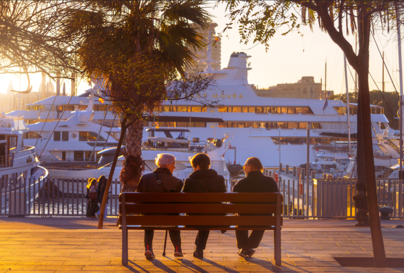
can see before and after. This was the beginning,
this is the end. Let's see if we can
add something else. I feel like the last
thing that I'm going to modify is the faces of
these three elderly people. I think that they could benefit from being a
little bit more exposed. In order to do this,
we will definitely have to use the brush mask here. Because this is a very precise, a very precise mask that we have to create very
precise selection. We can just zoom
in. And we're going to get the small brush. We're going to select
a little bit of faces. You can be a little bit generous because then you can just hold hold with a smaller brush, Even smaller, you can erase precisely what you
don't want to select. This will be a quite
precise mask without that much feather.
Be precise with it. Just going to select a
little bit the faces, Make sure that the
clothes don't get selected because we're going to increase the exposure
a little bit here. We don't want exposure
being increased here. Two, in part one, we're just going
to select a little bit quickly the faces just to make their skin tones more
visible. Something like this. We can always just play very
easily with the old key and the mouse wheel to just delete
some parts of the mask. Especially I don't want to
go outside like in the boat, plenty of other areas
because it will be noticeable here on the back. I should remove it because It should be dark
as it's shadow. But the parts of their faces
that are looking at the sun, facing the sun, I will
increase exposure. So see how it looks
as you can see. Something like that
makes a huge difference. We can play with some
other properties. I could maybe even desaturate
them a little bit. They look as orange, but I like the
effects a little bit. Also remember that
here in the mask, you can only modify
the basic properties. We don't have the
other properties, the effects the HSL, color, the color
grading, the tuncer. These are the parameters
of the mask and these are already the parameters
of the whole image. That's just the basic top
basically. But it's enough. So as you can see
with them out now, I think that I'm
pretty happy I will just slightly increase this one. Yeah, that's basically
it, isn't it? Let's make sure that it's
well centered Theoretically, that should be the
same distance from this vertical line to
the end of the bench, for instance, and the same one here to the end of the bench. Maybe it's not
precisely centered, I feel hard to be
exactly precise. Probably now it's a
little bit better. We can press the before and after and check the same
difference that we've made. It's crazy how much we can
get out of this picture. Check here on the left, the sun, We made this beautiful
effect out of nothing. Almost the people here in the middle part of
the image is so dark. And see how much color, we've recovered all the
faces. The details are here. We've created this effect. In the corner here,
it looks bright, while here it's a little bit
darker, which looks nice. A little foggy and dreamy. We've made sure that I
really like this part. Also in the sky, the leaves of the trees and
branches looks very nice. And see that the
boat, the windows of the boat are also orange, which makes sense,
like reflecting the colors of the sunset,
like looking at it. Now, it's just the
perfect thing. Maybe the last thing that I'm not convinced about is
that they look a little bit, the shadows, like the back
looks a little bit to orange. We just decrease the blacks
here a little bit more. We gain a little bit more of more realism, but not too much. That's perfect for me. I think every person has their style. This is something that you
can definitely play around. But yeah, you can see with
this the power of the masks. Let's just see again
what we've created. This was before the masks
and this is the after. There's so much difference,
especially on the sun. But more even here
on the main subject, you can definitely create
this improvement in an area. This is very important
to understand how to use masks here we've
created a lot of them, but it's always
something that you can create a just easy to use. And if you're not convinced, you can just delete it and it's very comfortable
working with masks. The essential process is to
first, without any mask, get a decent result and
try to get as close as possible to what you want
your final result to be. Then you can just start
applying mask and fixing small details which
make it look much better. And you can just basically be free and experiment with it. Now we have the perfect image, but before exporting
it and sharing it, we have to know several things. That all will show you in the next video because
they will be much shorter. But I want to keep it separated
so you have it organized. So let's go for it and I'll see you right here
in the next video.
4. Edit Once, Apply Anytime: The Power of Lightroom Presets: Everyone, let's continue
with this perfect image. What I want to teach you in
this video is very quick, but it's something that it's
very important to know. I would say because we've spent so much time
working on this image, we've tweaked all of these parameters much
more in the tone. All of these panels
have been tweaked. We've created so many masks, all of these sliders, stuff that we've
changed manually and we've put a lot of
effort into it. And this has a
value and it's like a secret recipe to
make a picture, go from this to this. This is something that's ours
with your editing style. Can you imagine having to
do this with every picture? We spend so much time. If you had a similar
picture that you took that same day and you want
it to be the same style, you could simply remember
the temperature, the exposure, the
contrast, everything. But definitely there's a way to make this much more quicker. In this case, maybe let me
do one last quick change. Maybe I will decrease
the temperature to decrease the orange of the boat. But yeah, that's it. But yeah, the thing is that we
can create presets. And the thing about presets that maybe you've
heard about them before, but people or photographers, they sell presets Because a preset basically all
of these parameters, It's basically a file that contains all of
these parameters. And whenever we apply
a preset to an image, it goes from this with just the press of a
button to all of this, right? It's not more than
that, a preset. The values of the exposure
contrast highlights. And this is a preset that works perfectly for sunset pictures. But all of these adjustments will probably not look good in a picture that's completely different from what it is now. If it's a picture
of a clear blue sky with clouds and maybe
some landscape, a mountain, it will make no
sense to apply this pit, because it will just make
it look very different and it will not
suit the picture, because now we've tweaked
all of these images, considering that our image has
to be warm and it contains already from the
original image a little bit of orange
and that is quite dark. But probably an image that another image
that you will take, it will maybe be too bright. So you don't need to add so much shadows or
just some parameters. These are perfect for this kind of picture
or very similar. We took a picture that same day. All of these parameters, it will work perfectly as
long as the picture is slightly similar or quite similar to this one.
This is very nice. We're going to create
a preset which will basically be all
of these options. And whenever we want to edit
a picture that's similar, we have our own style, which will be so easy to apply. We have this panel
here which is presets. We're going to press
the new preset button. We're going to create a preset. You can import them,
you can share them. The presets, you can
press Create Preset, and you can see that
we can name it. I will name it, for instance, warm evening,
something like that. You can choose the
group, but you can simply leave it on user presets. It will be basically the presets that come by defaulting
In the preset stop, you simply select
everything but the masks. I would never recommend
selecting the masks because whenever you
take a new picture, the mask will make no sense. For instance, the
mask that we've created on faces of
the other people. If you took now a
picture without these people or maybe
from the trees or a boat, we will not have the people, so we would have the mask here on the middle
of the picture. I will rarely suggest selecting
the masks unless it's a very general mask
that's always here on the side if you always
keep the S on the site. But it's not really recommended. I wouldn't suggest this
as well as the transform. It's just what comes by default. Again, if you rotate
this picture, it doesn't mean that
the next picture that you've taken has
to be rotated as well. Usually these ones
are not that useful, but for sure, the colors and
the basic tabs are amazing. To create a preset,
it's that easy. You can just press Create. As you can see, a new
preset is created here. For instance, let's press Reset. And we have lost all
of our progress, but if we press the warm
evening here on top, you can see that we
recover all of this. And that's basically
a thing that you can do to any picture. If I was to import
another picture here, we can basically apply
the same preset and it will paste all of the settings and we will
get the same effect. However, now here we
don't have the masks. That's a little bit risky. So make sure to press
control that if you've pressed the
same reset because the warm evening preset
doesn't remember the mask unless you have specially
chosen to remember the masks. That's basically a very
important thing that we can do. I usually do, as you can say, I have a few presets from
other pictures that I've done when I edit a picture and
I really like the results, I make the parameters a preset. And as you can see, I have here a few presets that I've
created from other pictures. But of course, they don't really look good on this picture. For instance, because you
can see a cinematic one, it just goes well for a
certain kind of pictures. In this case it
would work better in a picture that's
much more exposed, that doesn't have so
many orange color. This one tends to go
more towards the blues. But it's a way that you can
save all of your edits here. But here we have created
this one. All of this. We can finally go to
the last video and learn how to export
these pictures. It will be very quick, but it's important to know how
to do it properly. Make sure to stay
for the last one. And I'll see you there.
5. Exporting Excellence: Delivering Your Finished Edits: Hi again everyone. We're
happy with our result. It's time to export the picture. This is very simple,
but as I said, there's something to know when we have the picture selected. We can just be here on the
picture or we can go to the library and
show the grid view. We will see here all
the pictures that are in the folder that
was in the desktop. We can export multiple pictures. We're selecting one and then we can just shift and
click other pictures. We will select multiple
pictures, but in this case, we just want to export this picture. Right
now it's selected. We can just go here
to file export. This is right now here
the process of exporting. But before I'm just going to go inside the picture and
go to the develop again. And I want to go here to
the crop and in this case there's the aspect ratio
that you can switch here. Right now it's on
custom because we've basically modified the size
of a picture as we wanted. You can just move this
however you want, you export this picture,
anything that you want. Now it's on custom
because we have just selected whatever we
wanted from the picture. But before exporting, we have to consider if we want
to post this picture, where do we want to post it? Right. Because for instance, if you want to post this on
Instagram or if you want this to be a thumbnail of
Youtube video or anywhere, it won't work if you
export the whole picture. Because let's suppose that we want to give this picture to someone to hang it on a
wall and put it on a frame. But the frame of our painting, let's say, will be square. This picture has to
be square 100% if we want to make it appear
in a square frame. If we printed this picture,
it would be like this. Bigger on one direction
than another. It's bigger horizontally
than vertically. If we want to basically export
this picture as a square, we have to select the
one by one aspect ratio. And you can see that now this
picture is a square, right? If you want to, for instance, export this picture as a phone wallpaper or Instagram story or
this sort of stuff. You want to go 16 by nine and then press the
letter X to rotate it. And then we can enter and this is a picture that can work
perfectly on the phone. That's something
that you have to know because if you
export it in custom, of course you have more area. But it doesn't mean
that it's better. Because sometimes, again, if you want to post
it on instteram, you need to use the aspect
ratio of four by five. This one is the maximum
that will fit on Instam. This is very important. Or
if you want to post it on Facebook or if you want to
use in a Youtube video, you have to use
again 16 by nine, so you cannot fit
more than that. That's important to know
because if you really want to show the people, you will lose for
sure the top of the image custom is just a random proportion
that we've chosen. Again, for instance,
let's suppose that you want to post this on instrum. You need to choose
this four by five. You can do it vertically,
24 by five vertically. But you cannot show
more than this. You can make it bigger. This is still four by five, but of course, you've
lost the edit of the sun. You can rotate it,
which will work better. But again, we cannot fit
the sun unless we go right. This is something to always take into account
and that you can check it firstly before
creating a picture, because sometimes
it's just impossible. You cannot have a vertical
picture that will feature these three people like this and the sun
at the same time. It's just not
possible to feed it. I really want to emphasize
this because it's important to choose the
correct aspect ratio. In this case, since
I'm just doing this picture for an edit, for any website,
for any platform, I can just export it at
any size that I want. Because this is a
piece that I can open with my computer or
shared it anywhere, but it's just not
going to be posted. In this case, if I
wanted to post it, I will just choose
another aspect ratio that works fine with the
platform where I posted. But in this case I will just keep it like this for myself. I have the biggest aspect ratio which contains most information. I can now export it
file as we said, export, I don't know
how it's on default, but you can just
choose the location. For instance, I'm
going to choose the same folder as the
original pictures. It will go to that folder
that we have on the desktop. Let's do a sup folder. Actually, let's make a Su folder which will be called export. We can choose the
name of the picture. If you want to custom name, you can just get custom
name and we can switch it to edit a picture. Right now that's perfect. We will go to you J peck, and we will choose
the quality at 100% This is important
and that's basically it. We don't want to resize the picture or any sort of
sharpening water marking. These are very specific purpose if you want to add a water
marker or something like this, but you will definitely
always use the two. The quality is usually
set at 100% by default, so you don't really have
to switch anything else. You can just press export. And you will see that here on top you will just
show a progress. You can see exporting one file. Once this disappears, it will
mean that it's exported. And we will check the
folder on the desktop, and as you can see now it
has loaded and that's done. Let's just go to the
folder Lightroom Edit. We can go inside. We have this new folder which
is called export. We can go in and we have inside the edited picture is a J
pack as well, 25 megabytes. The big picture, I can just double click
it. There you go. This looks amazing what any improvement that we've done to this picture right now. You can just close this. And with this picture, you
can just send it anyone. You can post it anywhere and you can do
whatever you want. This is just the first picture, but you can edit
so many of them. As I said, you can just
drag pictures inside. Here will be the folder with the pictures without any edit. When you export them,
they will just be here. This is amazing and
you can keep editing. And actually if you've
edited a picture, I would really love to
see a picture of yours. So you can simply create a project and post
your pictures. Maybe you can post the
before and after the. I would really love to see that. If you can, it would mean a lot. So if you're happy to
share your results, I will just make sure
to look at it and comment and maybe give you
some insight if you want. That's basically it. I'm so happy that you're still
here listening to me. It has been a little bit long, but I'm sure that
you've learned a lot. It's just an amazing
software here, you can just tweak so much
options and I really like all the properties that
it has and you can see that it creates masterpiece
is out of nothing. It's just a great journey to edit the picture
and see it come alive. It's great when you
understand everything. That's basically what I have to say with this class
and I hope that you really enjoyed it and learn something that
you can keep from. Now on editing Lightroen, just at least get an idea
of what everything does and how to make your
pictures come alive. I'm going to say goodbye and I hope to see you very
soon until the next one.
 Auripher ∞, Creator